Archive for the 'Film scholarship' Category
Foreground, background, playground
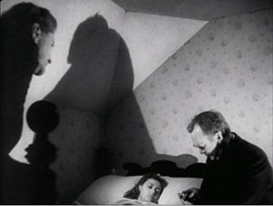
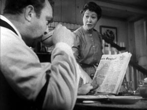
The Devil and Miss Jones (1941); The Hudsucker Proxy (1994)
DB here:
I’ve been waiting for thirty years for Alice in Wonderland. No, not the theatrical release of Tim Burton’s version. That interests me only mildly. I’m referring to the DVD release of the 1933 Paramount picture. I saw it on TV as a kid, and remembered it only dimly. But it bobbed up on my horizon in the summer of 1981 when I was doing research on our book The Classical Hollywood Cinema.
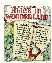 I was in the old Academy library in Los Angeles studying the emergence of certain compositional schemas. I can’t recall what put me on the track, but I requested the shooting script of Alice. What came was Farciot Edouart’s copy, over six hundred pages teeming with sketches for each shot. And a lot of those shots had a startling similarity to good old Citizen Kane.
I was reluctant to attribute pioneering spirit to director Norman Z. McLeod. Instead, I realized that these images’ somewhat freaky look owed more to one of the strangest talents in Hollywood history.
I tried to see Alice in Wonderland, but I couldn’t track down a print. So for years I’ve been waiting to find if it confirmed what I saw on those typescript pages. In the meantime, for the CHC book and thereafter, I’ve bided my time, sporadically looking in on the career of one of Hollywood’s most eccentric creators. He’s the subject of a new web essay I’ve just posted here (or click on the top item under “Essays” on the left sidebar). Today’s blog entry is a teaser trailer for that.
Deep thinkers
It’s commonplace now to say that Citizen Kane (1941) pioneered vigorous depth imagery, both through staging and cinematography. Many of the film’s shots set a big head or object in the foreground against a dramatically important element in the distance, both kept in fairly good focus. But where did this image schema come from?
The standard answer used to be: The genius of Gregg Toland and Orson Welles. In the 1980s, however, I wanted to explore the possibility that something like the deep-focus look had been a minor option on the Hollywood menu for some time. Once you look, it’s not hard to find Kane-ish images in 1920s studio films, from Greed (1924) to A Woman of Affairs (1929).
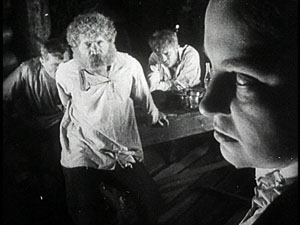
During the 1930s, William Wyler cultivated such imagery in some films shot with Toland, such as Dead End (1937), and some films shot by other DPs, such as Jezebel (1938). In turn, Toland had undertaken comparable depth experiments in films with other directors. Moreover, yet other directors, notably John Ford, had used this sort of imagery in films shot by Toland and others, such as George Barnes, Toland’s mentor. There are plenty of non-auteur instances too. (See my post on 1933 Columbia films.) We also find similar imagery in films from outside America. Here’s a stunner from Eisenstein’s Bezhin Meadow (banned 1937).
You see how complicated it gets.
What I concluded in Chapter 27 of CHC was that Toland and Welles didn’t invent the depth technique. They fine-tuned it and popularized it. Their predecessors, in the US and elsewhere, had staged the action in aggressive depth and used many of the same compositional layouts. But the wide-angle lenses then in use couldn’t always maintain crisp focus in both planes (below, American Madness, 1932).
Welles and Toland found ways to keep both close and far-off planes in sharp focus. They deployed arc lamps, coated lenses, and faster film stock. Although it wasn’t publicized at the time, we now know that some of the most famous “deep-focus” shots were also accomplished through back-projection, matte work, double exposure, and other special effects, not through straight photography. Again, though, this tactic was anticipated in earlier films. One of my favorite examples comes from a matte shot in Mr. Moto’s Gamble (1935).
Menzies seems to have planned for similar fakery. In the script for Alice in Wonderland we find: “CLOSE UP, leg of mutton. The room and characters in the background are on a transparency.”
The flashy depth compositions of the 1920s and 1930s were typically one-off effects, used to heighten a particular moment. Welles and Toland pushed further by making the depth look central to Kane’s overall design and by featuring such imagery in fixed long takes. The prominence of Kane may have encouraged several 1940s filmmakers, such as Anthony Mann, to make the depth schema part of their repertoire. But as the style was diffused across the industry, the hard-edged foregrounds became absorbed into dominant patterns of cutting and spatial breakdown. The static long takes of Kane remained a rare option, perhaps because they dwelt on their own virtuosity.
Digging up films made around the time of Kane, I found many filmmakers experimenting with the look that Toland and Welles highlighted. You can see touches of it in The Maltese Falcon (1941) and All That Money Can Buy (1941). Above all, there are two remarkable movies directed by, of all people, Sam Wood. Our Town (1940) turns Wilder’s play (itself surprisingly melancholy) into a Caligariesque exercise.
Several shots anticipate the low-slung depth, bulging foregrounds and all, that became the hallmark of Citizen Kane a year later.
Our Town also uses postproduction techniques that yield depth-of-field effects you couldn’t get in camera.
Perhaps even more startling is Wood’s Kings Row (1942), with deep-focus imagery that occasionally rivals Kane‘s.
From the evidence I was encountering, it seemed that Welles and Toland’s accomplishment was to synthesize and push further some deep-space schemas that were already circulating in ambitious Hollywood circles. Connecting some dots, I realized that one of the earliest champions of aggressive imagery in general, not just big foregrounds and deep backgrounds, was William Cameron Menzies.
Menzies frenzies
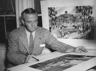
Menzies started out as an art director, most famously for United Artists. He designed sets for Mary Pickford’s Rosita (1923, directed by Lubitsch) and several Fairbanks films, notably The Thief of Bagdad (1924). He won the first Academy Award for set design and went on to a noteworthy career—most famously as production designer for Gone with the Wind (1939). He also directed films, such as Things to Come (1936) and Invaders from Mars (1953). Most significant for my purposes, he was production designer for Our Town, Kings Row, and three other films of the early 1940s directed by Sam Wood. And he designed the 1933 Alice in Wonderland. The drawings I saw in Edouart’s script were by Menzies or his assistants.
Menzies was one of the chief importers of German Expressionist visuals to the US. Although his early efforts leaned toward Art Nouveau effects, by the end of the 1920s he was cultivating a dark, contorted look keyed to the harsh geometry of city landscapes.
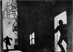
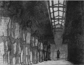
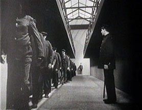
Since the late 1920s, Menzies had explored the possibility of steep depth compositions. He didn’t usually employ a big foreground, but he did favor overwhelming perspective–either abnormally centered or abnormally decentered. Here is his sketch for Roland West’s Alibi (1929) and the shot from the finished film.
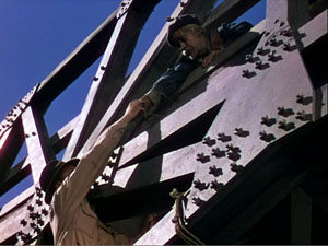
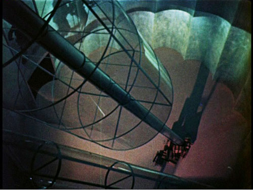
Menzies loved slashing diagonals created by architectural edges and worm’s-eye viewpoints. The harrowing opening of Things to Come is full of such flashy imagery.
Menzies calmed his style down for GWTW, although the sequences he directed bear traces of his inclinations. And in his work for other directors he managed to slip in a few odd shots. Here, for instance, is a typically maniacal central perspective view from H. C. Potter’s Mr. Lucky (1943). Squint at this image and you’ll see that it’s weirdly symmetrical across both horizontal and vertical axes.
When he met Sam Wood, it seems, Menzies found a director ready to let his imagination roam further. In these collaborations, we get depth shots à la Welles and Toland, but also skewed perspectives. Pride of the Yankees (1943/44) searches for ways to make a baseball stadium look like a Lissitzky abstraction.
Menzies subjects the partisans of For Whom the Bell Tolls (1944) to his sharp diagonals as well.
Alice, we hardly knew ye
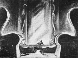
What then of Alice in Wonderland? Back in the early 1980s, I wasn’t permitted to photocopy or photograph script pages. Here is one of the few sketches I later found for the film. Alice crawls into the mirror with looming armchairs in the foreground.
Surely, I thought, the film would be an early example of the depth aesthetic that would be developed by Welles, Wyler, and Wood/ Menzies. Alas, the film has nothing like those imperious armchairs.
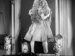
In fact, Alice proves a huge disappointment on the pictorial front. Menzies expended all his ingenuity on the special effects, coordinated by Paramount master Farciot Edouart. Although the spfx are not in the league of that other big 1933 effects-film King Kong, they are pretty solid for the time. It’s just that this remains a painfully arch, flatly filmed exercise.
But I look on the bright side. Menzies created some memorable movies, both on his own and with other directors. (Of his directed films, not only Things to Come but Address Unknown, 1944, remain of interest today.) Perhaps most important, his stylistic boldness may have encouraged other filmmakers to try something fresh. Most immediately there is Since You Went Away (1944), a big Selznick production that bears traces of the Menzies touch.
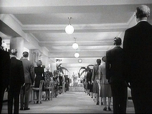
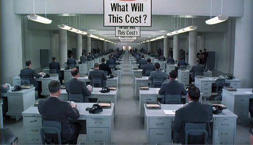
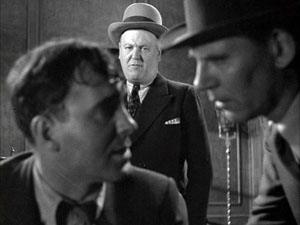
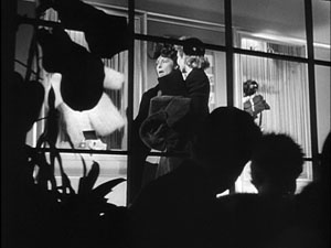
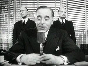
More broadly, Menzies represents a strand in American cinema that never really disappeared. His frantic Piranesian perspectives, canting the camera and filling the frame with grids, whorls, and cylinders, are still in use. And his head-on, wide-angle grotesquerie looks ahead to the Coen brothers. This shot of a department-store manager in The Devil and Miss Jones (1941) could come from any of their films.
Menzies’ films, though mostly not celebrated as classics, gave American cinema the permission to be peculiar. Meet me in the sidebar for a closer look at one of Hollywood’s most eccentric creators. Special thanks to Meg Hamel for going beyond the call of duty in posting that essay.
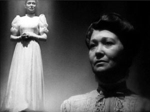
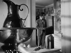
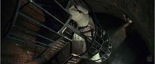
Invaders from Mars (1953); Shutter Island (2010).
From books to blogs to books
Kristin here:
This is a follow-up to David’s latest entry on the supposed death of film criticism.
![]() As academics rather than reviewers, we’ve tried to take advantage of the benefits offered by the Internet. In our pre-blogging days, David used his website to post articles. They came out faster than they would if submitted to a print journal, and they would reach a larger audience, at least in the short run. When we added a blog to the site, it became, as David wrote, “our own magazine.”
As academics rather than reviewers, we’ve tried to take advantage of the benefits offered by the Internet. In our pre-blogging days, David used his website to post articles. They came out faster than they would if submitted to a print journal, and they would reach a larger audience, at least in the short run. When we added a blog to the site, it became, as David wrote, “our own magazine.”
For a while putting a lot of entries no place but on the blog seemed fine. Our stat-counter tells us that a lot of the older entries get read. Either a teacher assigns them or someone finds an old link or discovers the blog for the first time through a new entry and then clicks around on a lot of the older pages. So it’s not as though the pieces disappear a few weeks or so after they’re written. The blog has become a large resource by now.
But what about the really long run? I tend to want to see my prose in print. It’s unlikely that the blog will completely crash, but what if it did happen? And what becomes of all the material on the blog in the distant (I hope) future when we’re not around to keep an eye on it?
Ironically, the internet has proved to be a good way of extending the life of our print books. David’s Ozu and the Poetics of Cinema went out of print, and now it’s online, improved with better pictures, many in color. My Exporting Entertainment was in print for such a short time that few knew I had written it; now it has found a home on the website. Now Planet Hong Kong is out of print as well. David plans to update it and post the new version on the website as well.
Ironically, just as we were contemplating the migration of our books from print to pixels, Rodney Powell, of the University of Chicago Press, inquired as to whether we would be interested in turning a selection of our blog entries into a book. It wouldn’t be necessary to take down the original entries, he assured us. We couldn’t have done that anyway, since our textbook Film Art has just added a feature that alerts teachers and students to relevant essays via URLs in the margins. But we agreed to such a collection, and we’ve just sent in the manuscript for copy-editing. The result, called Minding Movies, should be out next spring.
There hasn’t exactly been a stampede to collect blog entries as books, but some presses, including Chicago, are trying out this new genre. Profile Books has just published classicist Mary Beard’s It’s a Don’s Life, based on her blog of the same name. (I highly recommend her book, The Fires of Vesuvius.) Economists Gary S. Becker and Richard A. Posner’s Uncommon Sense (also the University of Chicago Press) culls items from The Becker-Posner Blog.
Apart from blog-based books, the University of Chicago Press has some more traditional books of film criticism in press. One is a collection of Dave Kehr’s reviews from his days with the Chicago Reader (1974-1986). In September it will also publish a book gathering writings by Jonathan Rosenbaum (some of which have also been posted on his website) called Goodbye Cinema, Hello Cinephilia: Film Culture in Transition. Chicago has announced a third volume of Roger Ebert’s Great Movies for October of this year. Although some of these pieces have been posted on the authors’ websites after their initial print publication, Minding Movies is unusual in that its entire contents, like those of the Becker-Posner book, were written designedly for the Internet.
Will people want books of blog material that’s available for free online? From our standpoint it seems odd. True, some people just don’t like reading anything longer than a few paragraphs on a computer screen. But choosing the entries to put into the book made us realize how big the blog has become over three and a half years. It’s not easy to just browse through.
This entry marks post number 320 on Observations on Film Art. We were able to include 31 of that total in the book, which will be around 96,000 words. The inescapable conclusion is that we have posted ten volumes’ worth of stuff on the blog. Whew!
Not that we would want to put everything on Observations on Film Art into print. There are a lot of relatively topical items like festival coverage and reports on lectures and conferences and DVD supplements. My piece on the “I Drink Your Milkshake” phenomenon brought us our single busiest day ever (over 20,000 page loads), but it dealt with a fad and certainly doesn’t deserve to go between the covers of a book. Still, quite a few of the entries do reflect research and analysis of the sort that we would ordinarily put into our articles.
Even before it ever occurred to us that we could put together a blog collection, colleagues had said, “Your stuff deserves to be published as a book.” Maybe that’s a sign of the lingering sense that print publication is still more serious than blogging. Another implication seems to be that, while pieces written to be posted online may be excellent and worthy of publication in any format, they also need to be rescued from the vastness that is the Internet. Yes, Google can help people find David’s entry on staging in There Will Be Blood in a flash. But if the reader doesn’t have any particular film or other specific topic in mind and just wants to see our best pieces, it’s not that easy.
Incidentally, “Hands (and faces) across the Table,” the There Will Be Blood piece, won’t be in the book. It contains too many pictures, which becomes more of a concern in print. There will be a few of the heavily illustrated entries in the book, but we had to balance those with others that don’t depend on images.
Whether books based on film and other media-related blogs will become a lasting genre has yet to be seen. Perhaps after a period of adjustment to the Internet as a venue for film criticism, we will return to the practice of the 1960s and 1970s, when Andrew Sarris, Pauline Kael, and other critics routinely saw their material collected as books. We might end up concluding that the Internet has not harmed books in the way that it has some newspapers and magazines.
If blog-based books do catch on, they will provide further counter-evidence to the notion that film criticism is dying out. If they don’t, the failure won’t prove that film criticism is dead, only that now it probably flourishes best online.
[March 22: Coincidentally, TV historian and critic Jason Mittell posted a related entry on his blog today. It’s entitled “Why a Book?” and ponders the pros and cons of publishing a scholarly book or putting the same material online. The piece doesn’t deal with the idea of a book collecting blog entries, but it touches on factors like long-range availability.]
Her design for living
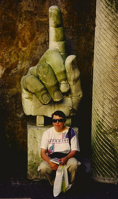
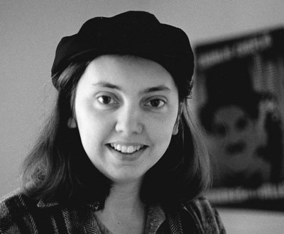
Kristin in Rome, 1997, in front of a “recent” hand from a colossal statue of Constantine. The Amarna statuary fragments she studies are twice as old.
DB here:
Kristin is in the spotlight today, and why not? She’s too modest to boast about all the good things coming her way, but I have no shame.
First, our web tsarina Meg Hamel recently installed, in the column on the left, Kristin’s 1985 book Exporting Entertainment: America in the World Film Market 1907-1934. It was never really available in the US and went out of print fairly quickly. Vito Adriaensens of Antwerp kindly scanned it to pdf and made it available for us. So we make it available to you. More about Exporting Entertainment later.
Second, Kristin is not only a film historian but a scholar of ancient Egyptian art, specifically of the Amarna period. (These are the years of Akhenaten and Nefertiti and their highly unsuccessful experiment in monotheism.) Every year she goes to Egypt to participate in an expedition that maps and excavates the city of Amarna. In recent years she’s focused on statuary, about which she’s given papers and published articles. Now we’ve learned that she has won a Sylvan C. Coleman and Pamela Coleman Memorial Fellowship to work in the Metropolitan Museum of Art’s collection for a month during the next academic year. So at some point then we’ll both be blogging from NYC. Think of the RKO Radio tower sending our signals to a tiny world below.
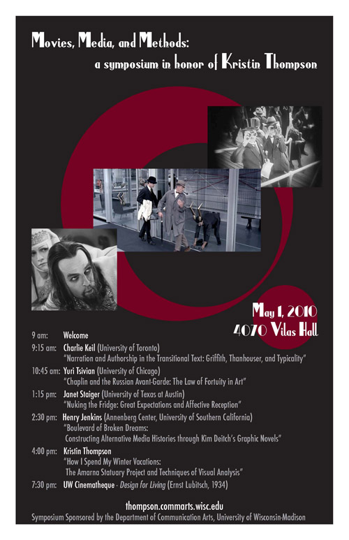
Third, she is about to turn 60, and in her honor the Communication Arts Department is sponsoring a day-long symposium. On 1 May we’ll be hosting Henry Jenkins, Charlie Keil, Janet Staiger, and Yuri Tsivian to give talks on topics related to her career interests. Kristin’s talk will survey her Egyptological work, with observations on how she has applied analytical methods she developed in her film research. You can get all the information about the event, as well as find places to stay in Madison, here.
Kristin came to Madison in 1973, a very good moment. Whatever you were interested in, from radical politics to chess to necromancy (there was a witchcraft paraphernalia shop off State Street), you could find plenty of people to obsess with you. Film was one such obsession.
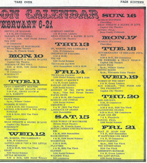
The campus boasted about twenty registered film societies, some screening several shows a week. Fertile Valley, the Green Lantern, Wisconsin Film Society, Hal 2000, and many others came and went, showing 16mm films in big classrooms in those days before home video. Without the internet, publicity was executed through posters stapled to kiosks, and the fight for space could get rough. Posters were torn down or set on fire; a charred kiosk was a common sight. Another trick was to call up distributors and cancel your rivals’ bookings. One film-club macher reported that a competitor had cut his brake-lines.
What could you see? A sample is above. What it doesn’t show is that in an earlier weekend of February of 1975, your menu included Take the Money and Run, The Lovers, Ray’s The Adversary, Page of Madness, Fritz the Cat, The Ruling Class, Dovzhenko’s Shors, Chaney’s Hunchback of Notre Dame, American Graffiti, Wedding in Blood, Pat and Mike, Camille, Yojimbo, Faces, Days and Nights in the Forest, King of Hearts (a perennial), Sahara, The Fox, Day of the Jackal, Dumbo, Investigation of a Citizen above Suspicion, Slaughterhouse-Five, Mean Streets, A Fistful of Dollars, Triumph of the Will, and The Cow. Not counting the films we were showing in our courses.
In addition, there was the Wisconsin Center for Film and Theater Research, recently endowed with thousands of prints of classic Warners, RKO, and Monogram titles. (There were also TV shows, thousands of document files, and nearly two million still photos.) When Kristin got here she immediately signed up to watch all those items she had been dying to see. She suggested that the Center needed flatbed viewers to do justice to the collection, and director Tino Balio promptly bought some. Those Steenbecks are still in use.
 Out of the film societies and the WCFTR collection came The Velvet Light Trap, probably the most famous student film magazine in America. Today it’s an academic journal, though still edited by grad students. Back then it was more off-road, steered by cinephiles only loosely registered at the university. Using the documents and films in the WCFTR collection, they plunged into in-depth research into American studio cinema, and the result was a pioneering string of special-topics issues. When I go into a Parisian bookstore and say I’m from Madison, the owner’s eyes light up: Ah, oui, le Velvet Light Trap.
Above all there were the people. The department had only three film studies profs–Tino, Russell Merritt, and me–though eventually Jeanne Allen and Joe Anderson joined us. Posses of other experts were roaming the streets, running film societies, writing for The Daily Cardinal, authoring books, and editing the Light Trap. Who? Russell Campbell, John Davis, Susan Dalton, Tom Flinn, Tim Onosko, Gerry Perry, Danny Peary, Pat McGilligan, Mark Bergman, Sid Chatterjee, Richard Lippe, Harry Reed, Michael Wilmington, Joe McBride, Karyn Kay, Reid Rosefelt, Dean Kuehn, Samantha Coughlin, and Bill Banning. Most of these were undergraduates, but Maureen Turim and Diane Waldman and Douglas Gomery and Frank Scheide and Peter Lehman and Marilyn Campbell and Roxanne Glasberg and other grad students could be found hanging out with them. A great many of this crew went on to careers as writers, teachers, scholars, programmers, filmmakers, and film entrepreneurs.
Into the mix went film artists like Jim Benning, Bette Gordon, and Michelle Citron. There were film collectors too; one owned a 70mm print of 2001 and didn’t care that he could never screen it. ZAZ, aka the Zucker brothers and Jim Abrahams, were concocting Kentucky Fried Theater. Andrew Bergman had recently published We’re in the Money, and soon Werner Herzog would be in Plainfield waiting for Errol Morris to help him dig up Ed Gein’s grave. Set it all to the musical stylings of R. Cameron Monschein, who once led an orchestra the whole frenzied way through Intolerance. The 70s in Madison were more than disco and the oil embargo. (To catch up on some Mad City movie folk, go here.)
These young bravos worked with the same manic passion as today’s bloggers. The purpose wasn’t profit, but living in sin with the movies. Film society mavens drove to Chicago for 48-hour marathons mounted by distributors. Traditions and cults sprang up: Sam Fuller double features, noir weekends, hours of debates in programming committees. Why couldn’t Curtiz be seen as the equal of Hawks? Why weren’t more Siodmak Universals available for rental? Was Johnny Guitar the best movie ever made, or just one of the three best?
There was local pride as well. Nick Ray had come from Wisconsin, and so had Joseph Losey, not to mention Orson Welles (who claimed, however, that he was conceived in Buenos Aires and thus Latin American). During my job interview, Ray came to visit wearing an eye patch. It shifted from eye to eye as lighting conditions changed. When he showed a student how to set up a shot, he bent over the viewfinder and lifted the patch to peer in. Was he saving one eye just for shooting?
In the big world outside, modern film studies was emerging and incorporating theories coming from Paris and London. Partly in order to teach myself what was going on, I mounted courses centering on semiotics, structuralism, Russian Formalism, and Marxist/ feminist ideological critique.
Back in placid Iowa City, where Kristin got her MA in film studies and I my Ph.D., we grad students had seen our mission clearly. Steeped in theory, we pledged to make film studies something intellectually serious: a genuine research enterprise, not mere cinephilia. Madison was the perfect challenge. Here cinephilia was raised to the level of thermonuclear negotiation, backed with batteries of memos, scripts, and scenes from obscure B-pictures. Confronted with a maniacal film culture and a vast archive, Kristin and I realized that there was so much to know–so many films, so much historical context–that any theory might be killed by the right fact.
Watch a broad range of movies; look as closely as you can at the films and their proximate and pertinent contexts; build your generalizations with an eye on the details. Our aim became a mixture of analysis, historical research, and theories sensitively contoured to both. The noisy irreverence of Mad City, where a former SDS leader had just been elected mayor and city alders could be arrested for setting bonfires on Halloween, wouldn’t let you stay stuffy long.
Kristin’s work in film studies would be instantly recognizable to humanists studying the arts. Essentially, she tries to get to know a film as intimately as possible, in its formal dimensions–its use of plot and story, its manipulations of film technique. I suppose she’s best known for developing a perspective she called Neoformalism, an extension of ideas from the Russian Formalists. Armed with these theories, she has studied principles of narrative in Storytelling in the New Hollywood and Storytelling in Film and Television. She has probed film style in Herr Lubitsch Goes to Hollywood and her sections of The Classical Hollywood Cinema. And she has examined narrative and style together in her book on Eisenstein’s Ivan the Terrible and the essays in Breaking the Glass Armor.
Contrary to what commonsense understanding of “formalism” implies, she has always framed her questions about form and style in a historical context. She situates classic and contemporary Hollywood within changes in the film industry–the development of early storytelling out of theatre and literature, or current trends responding to franchises and tentpole films. For her, Lubitsch’s silent work links the older-style postwar German cinema and the more innovative techniques of Hollywood. She situates Tati, Ozu, Eisenstein, and other directors in the broad context of international developments, while keeping a focus on their unique uses of the film medium.
Perhaps her most ambitious accomplishment in this vein is her contribution to Film History: An Introduction. She wrote most of the book’s first half, and though I’m aware of the faults of my sections, I find hers splendid. After twenty years of research, she produced the most nuanced account we have yet seen of the international development of artistic trends in American and European silent film.
Kristin has also illuminated the history of the international film industry. Everybody knows that Hollywood dominates world film markets. The interesting question is: How did this happen? Exporting Entertainment provides some surprising answers by situating film traffic in the context of international trade and changing business strategies. One twist: the importance of the Latin American market. The book also opened up inquiry into “Film Europe,” a 1920s international trend that tried to block Hollywood’s power. In all, Exporting Entertainment led other researchers to pursue the question of film trade, and I was gratified to see that Sir David Puttnam’s diagnosis of the European film industry, Undeclared War, made use of Kristin’s research.
More recently, Kristin has turned her attention to the contemporary industry, the main result of which has been The Frodo Franchise, a study of how a tentpole trilogy and its ancillaries were made, marketed, and consumed. Her love of Tolkien and her respect for Peter Jackson’s desire to do LotR justice led her to study this massive enterprise as an example of moviemaking in the age of winning the weekend and satisfying fans on the internet. She maintains her Frodo Franchise blog on a wing of this site.
Most readers of this blog know Kristin as a film scholar. They may be surprised to learn that she also wrote a book on P. G. Wodehouse’s Bertie Wooster books. Wooster Proposes, Jeeves Disposes; or, Le Mot Juste is a remarkable piece of literary criticism. Here she shows how Wodehouse developed his own templates for plot structure and style. Again, the analysis is grounded in research–in this case, among Wodehouse’s papers. So assiduously did she plumb Plum that she became the official archivist of the Wodehouse estate. This is also, page for page, the funniest book she has yet written.
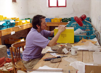
Her Egyptological work is no joke, though, and she has become one of the world’s experts on Amarna statues. She has published articles and given talks at the British Museum and other venues. Soon she’ll trek off for her ninth season at Amarna. There, joined by her collaborator, a curator at the Metropolitan, she’ll study the thousands of fragments that she’s registered in the workroom seen above. It’s preparation for a hefty tome on the statuary in the ancient city.
You can learn more about Kristin’s career here, in her own words. These are mine, and extravagant as they are, they don’t do justice to her searching intelligence, her persistent effort to answer hard questions, and her patience in putting up with my follies and delusions. You’d be welcome to visit her symposium and see her, and people who admire her, in action. While you’re here, you can watch a restored print of Design for Living, by one of her favorite directors, screening at our Cinematheque. In 35mm, of course. We can’t shame our heritage.
Poster design by Heather Heckman. Check out our Facebook page too.
Propinquities
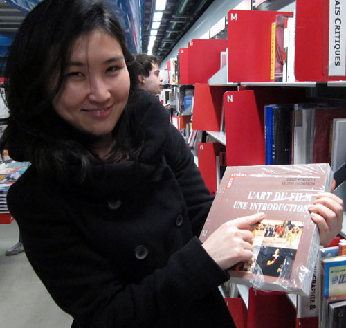
Jinhee Choi, Centre Pompidou, January 2010.
Propinquity: Nearness, closeness, proximity: a. in space: Neighborhood 1460. b. in blood or relationship: Near or close kinship, late ME. c. in nature, belief, etc.: Similarity, affinity 1586. In time: Near approach, nearness 1646. —Oxford Universal Dictionary
DB here:
In any art, tools and tasks matter. From the first edition of Film Art (1979) to the present, our introduction to film aesthetics starts with an overview of film production. How is production organized within the commercial industry, or within a more artisanal mode? What freedom and constraints are afforded within the institutions of filmmaking? How does current technology support or limit what the filmmaker can do? And how do filmmakers explain what they’re doing—not just as personal proclivities but as rhetorical “framings” that lead us to think of their work in a particular way?
Some would call this approach “formalism,” but that label doesn’t capture it. Traditionally formalism refers to studying an artwork intrinsically, as a self-sufficient object. In this sense, our perspective is anti-formalist: We look outside the movie to the proximate conditions that shape its form, style, subjects, and themes.
More literary-minded film scholars have sometimes been impatient with this perspective. Yet in the history of painting and music, it has yielded real advances in our knowledge. It continues to do so in film studies too, as I learned when we came back from Yurrrp to find some books awaiting us. (Kristin has already remarked on the stacks of DVDs that had accumulated.) Among these were books that illustrate the continuing value of situating film artistry in its most immediate context: the creative circumstances, the norms and preferred practices operating within traditions, the rationales that artists offer for their choices. Even better, the books were written by friends, so we have both intellectual and personal propinquity. I have always wanted to use the word propinquity in a piece of writing.
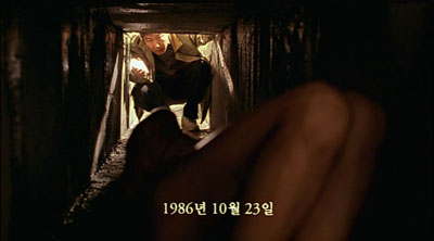
Memories of Murder (Bong Joon-ho).
Jinhee Choi’s The South Korean Film Renaissance: Local Hitmakers, Gobal Provocateurs is a wide-ranging survey of what some have called the “next Hong Kong”–a popular cinema of brash impact and technical polish, on display in JSA, Beat, Dirty Carnival, My Sassy Girl, and the like. But unlike Hong Kong, South Korea has a strong arthouse presence too, typified by Hong Sang-soo’s exercises in parallel narratives and thirtysomething social awkwardness. Between these poles stands what local critics called the “well-made” commercial film, as exemplified by Bong Joon-ho’s Memories of Murder.
Choi, a professor at the University of Kent, mixes analysis of cultural and industrial trends with consideration of crucial genres (notably the “high school film”) and major auteurs. She is the first scholar I know to explain changes in the Korean film industry as emerging from a dynamic among critics, filmmakers, private funding, and government sponsorship. A must, I would say, for anyone interested in current Asian film.
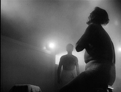
T-Men (Anthony Mann, cinematographer John Alton).
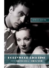 The South Korean Film Renaissance is matched by a work of equal subtlety, Patrick Keating’s Hollywood Lighting: From the Silent Era to Film Noir. Keating has an MFA in cinematography from USC, and his Ph. D. work concentrated on classical American cinema. His book captures the craft of the great studio cameramen, following not only what they said they were doing (in interviews and in the trade papers) but also what they actually did. He homes in on the contradictory demands facing artists who, they claimed over and over, had to serve the story. How do you claim artistry if your contribution is unnoticeable? This problem becomes acute with film noir, where the style is expected to come forward to a significant degree.
Keating scrutinizes the films with unprecedented care, tracing not only cameramen’s distinctive styles but showing that originality was always in tension with the conventional lighting demands of various genres and situtations. Many big names are here—John Seitz, Gregg Toland, John Alton—but the book also examines innovations coming from solid craftsmen like Arthur Lundin, who lit Girl Shy and other Harold Lloyd films. You won’t look at a studio movie the same way after you’ve digested Keating’s richly illustrated analyses.
Both Jinhee and Patrick were students here, and I directed the dissertations that eventually became these books. So of course I’m biased. But I think that any outside observer would agree that these monographs show the value of studying how film artistry and the film industry intertwine.
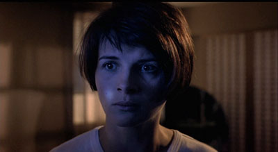
Blue (Krzysztof Kieslowski).
No less sensitive to the interplay of art and business is Patrick McGilligan’s Backstory 5: Interviews with Screenwriters of the 1990s. The collection is as illuminating as earlier installments have been. How could it not be, with career ruminations from Nora Ephron, John Hughes, David Koepp, Barry Levinson, John Sayles, et al.?
I’ve long found Pat’s Backstory volumes a treasury of information about Hollywood’s craft practices. Every conversation yields ideas about structure, style, and working methods. In this volume, for instance, Richard Lagravanese points out that scenes have become very short; with slower pacing in the studio days, scenes had time to breathe. And after claiming over and over that cinematic narration comes down to patterning story information, I was happy to read Tom Stoppard:
The whole art of movies and in plays is in the control of the flow of information to the audience. . . . how much information, when, how fast it comes. Certain things maybe have to be there three times.
In the studio days this last condition was called the Rule of Three: Say it once for the smart people, once for the average people, and once more for Slow Joe in the Back Row. Some things don’t change.
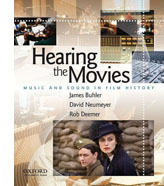 Pat McGilligan is also a Wisconsin alumnus, so to keep these notes from getting too incestuous, I’ll just mention that I know the distinguished musicologist David Neumeyer chiefly from his writing (though I have to confess I first met him when he visited . . . Madison). Along with coauthors James Buhler and Rob Deemer, David has published an excellent introduction to film sound. Hearing the Movies: Music and Sound in Film History is designed as a textbook, but it’s so well written that every movie lover would find it a pleasure to read.
The examples run from the silent era (including Lady Windermere’s Fan, a favorite of this site) to Shadowlands, and while music is at the center of concern, speech and effects aren’t neglected. There’s a powerful analysis of the noises during one sequence of The Birds, and the authors pick a vivid example from Kieslowski’s Blue (above), in which Julie is shown listening to a man running through her apartment building; we never see the action that triggers her apprehension.
The authors provide a compact history of sound film technology, including many seldom-discussed topics. For instance, 1950s stereophonic film demanded bigger orchestras and more swelling scores, while separation among channels permitted scoring to be heavier, without muffling dialogue. Throughout, Neumayer and his coauthors balance concerns of form and style with business initiatives, such as the growth of the market for soundtrack albums and CDs (a topic first explored by another Wisconsite, Jeff Smith, in his dissertation book). Once more we can arrive at fine-grained explanations of why films look and sound as they do by examining the craft practices and industrial trends that bring movies into being.
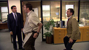
Watching back episodes of the American version of The Office recently, I’ve been struck by the premise it takes over from the UK original. This comedy of humors in Cubicle World is supposedly recorded in its entirety by an unseen film crew. I enjoy the clever way in which the show bends documentary techniques to the benefit of traditional fictional storytelling. The slightly rough handheld framings suggest authenticity, and the to-camera interviews permit maximal exposition by giving backstory or developing character or filling in missing action. The premise that an A and a B camera are capturing the doings at the Dunder Mifflin paper company permits classic shot/ reverse-shot cutting and matches on action.
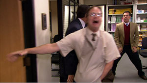
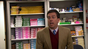
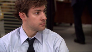
The camera is uncannily prescient, always catching every gag and reaction shot; even private moments, like employees having sex, are glimpsed by these agile filmmakers. Above all, the camera coverage is more comprehensive than we can usually find in fly-on-the-wall filming. For instance, Dwight is preparing Michael for childbirth by mimicking a pregnant woman and Andy, behind him, tries to compete. Here are four successive shots, each one pretty funny.
Somehow the cameramen manage to supply a smooth cut-in to Andy, and that’s followed by a reaction shot, from a fresh angle, showing Jim watching. The range of viewpoints, implausible in a real filming situations, is often smoothed over by sound that overlaps the cuts, as in both documentary and fictional moviemaking. (See our essay on High School here to see how a genuine documentary uses these techniques.)
Of course I’m not faulting the makers of The Office for not rigidly imitating documentary conditions. Any such blend of fictional and nonfictional techniques will involve judgments about how far to go, as I indicate in an earlier post on Cloverfield. It’s just to acknowledge that TV visuals have their own conventions, and these can be creatively shaped for particular effects. We ought to expect that those conventions would encourage close analysis as easily as film traditions do. Jeremy Butler’s new book Television Style offers the best case I know for the claim that there is a distinct, and valuable, aesthetic of television.
Following his own study Television: Critical Methods and Applications (third edition, 2007) and paying homage to John Caldwell’s pioneering Televisuality, Butler gets down to the details of how various TV genres use sound and image. Butler’s conception of genres is admirably broad, considering dramas, sitcoms, soap operas, and commercials, each with its own range of audiovisual conventions and production practices. His discussion of types of television lighting complements Keating’s analysis; put these together and you have some real advances in our understanding of key differences and overlaps between film and video.
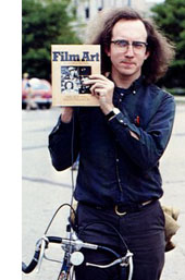 Kristin has met Jeremy, but I haven’t yet. In any case, Television Style shows that he’s a kindred spirit who’s made original contributions to this research tradition. Like Jinhee, Patrick, Pat, and David, he demonstrates that we can better grasp how media work if we study, patiently and in detail, the creative options open to film artists at specific points in history. He began thinking about these matters in 1979, as the photo attests.
None of this is to say that artistic norms or industrial processes are cut off from the wider culture. Rather, as becomes very clear in all of these books, cultural developments are often filtered through just those norms and institutions.
For example, everybody knows that in classical studio cinema, women were usually lit differently from men. But Keating notices that often women’s lighting varies across a movie, depending on story situations. He goes on to make a subtler point: there was a greater range in lighting men’s faces. Men could be lit in more varied ways according to the changing mood of the action, while lighting on women was a compromise between two craft norms: let the lighting suit the story’s mood, and endow women with a glamorous look. The fluctuations in the imagery stem from adjusting cultural stereotypes to the demands of Hollywood’s stylistic conventions.
Careful studies like these, alert to fine-grained qualities in the films and the conditions that create them, can advance our understanding of how movies work. Pursuing these matters takes us beyond both the movie in isolation and generalizations about the broader culture; we’re led to examine the filmmaker’s tasks and tools.
Resurrection of the Little Match Girl (Jang Sun-woo, 2002).


