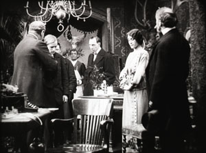
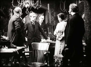
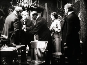
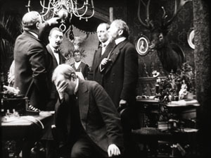
Archive for the 'Film scholarship' Category
Paris fun, in at least three dimensions
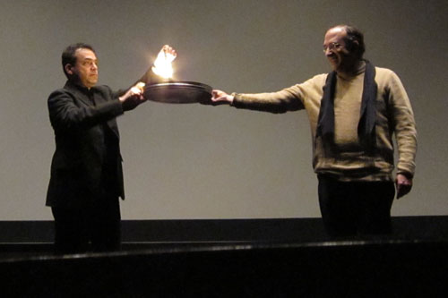
What he saves films from: Serge Bromberg faces down the flames.
We’re ending the first week of three in Paris. At the invitation of Jean-Loup Bourget and Françoise Zamour, David is giving three weekly lectures at the École Normale Superieure. He’s introducing some ideas about the development of film style in the 1910s and early 1920s, updated with new material from his summer research in Denmark and Brussels. Jean-Loup and Françoise have proven excellent hosts, and the first lecture seemed to go well.
 We thought that Paris in January might be chilly and rainy, but we figured it had to be warmer than Madison. It turned out that Paris is experiencing unusually cold weather—about what would be normal in Wisconsin. There was light snow yesterday and last night, and the wind-chill factor was enough to turn our fingers numb if we stayed out long enough. The fountain in the center of the intersection at the northeast corner of the Jardin de Luxembourg has gradually become an iceberg.
Turns out, though, that it is still warmer than Madison, which is having highs in the single digits, as the weather forecasters say, and lows below zero. We’re better off here, though we wish we had brought our parkas.
It’s like Avatar, but much shorter
KT here:
The cold has driven us indoors, to museums and movies. As always seems to be the case, the Cinémathèque Française is hosting retrospectives of American films—in this case works by Laurel and Hardy and Gordon Douglas. There’s also a 3D series, which caught our attention right away. It’s not just your standard Kiss Me Kate and Dial M for Murder programming. In addition to such classics, there are many obscure films. We happened to arrive in time for the final two programs of the series, which ran from December 16 to January 3.
Our first full day in Paris ended with an evening of shorts presented by Serge Bromberg, who in 1985 founded Lobster Films. Lobster has put out many DVDs by now, some of which we have reported on previously, here and here. In July, one of our entries on Il Cinema Ritrovato in Bologna mentioned that Serge presented a program of Georges Méliès films, in conjunction with the French release of Lobster’s huge DVD set of the great magician’s films.
Serge is quite a showman and obviously a popular figure, since there was a large crowd, including many families with children. On Saturday he chose and introduced a set of short 3D films in his series of programs usually titled “Retour de Flamme,” or “Saved from the Flames.” To begin the evening’s entertainment, he explained how, unlike modern celluloid 35mm film, the nitrate variety used up until the early 1950s ignites and burns easily. With the help of a rightly apprehensive volunteer holding up a film-can lid, Serge showed how modern celluloid catches fire only briefly and then dies out. The few inches of nitrate, however, flared up quickly.
Serge introduced each film thereafter, playing the piano to accompany the silents. The audience had been given both anaglyph (red-green) and polarized glasses, and Serge’s introductions to the films gave us time to switch between systems.
Many of the shorts shown on the program are available on DVD or YouTube, but the 3D effect plays best on the big screen. The evening began with an unannounced item, Three Dimensional Murder, a “Metroskopics” comedy short from 1942. A nervous detective visits a mysterious house and encounters Frankenstein, creeping hands, skeletons, and other ghouls and beasties, all of which find some occasion to throw things or hurl themselves toward the camera. The humor is, as a contemporary audience member might have said, pure corn and the 3D effects repetitive, but it was certainly a rare item.
Next came one of the Fleischer brothers’ cartoon shorts, Musical Memories. It was made with a patented system that used three-dimensional models as settings against which 2D cartoon figures drawn on cels moved about. (Such models can be seen fairly often in Popeye and other Fleischer cartoons of the 1930s.) There is some sense of depth. Still, the effect is strange, since the models have shading and the flat-looking figures do not. The cartoons are not 3D in the sense we typically think of, since there are no glasses involved.
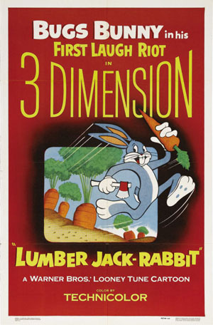
More cartoons followed, from the two main competing animation studios. Disney’s contribution was Working for Peanuts, a story set in a zoo with Chip and Dale stealing peanuts from an elephant and Donald Duck trying to foil them. Many a peanut seemed to fly out toward the spectator. Chuck Jones directed Lumber Jack-Rabbit (1954), a film that mixed size gags and spatial ones, with Bugs wandering into the domain of the gigantic Paul Bunyan. Perhaps not one of Jones’s best, but distinctly more interesting in 3D.
As Serge pointed out, most 3D technology was pioneered in the U.S. He included some exceptions, however, with a series of Soviet “Parade of Attractions” shorts shown at intervals during the evening. Experiments with underwater 3D photography and a garden of plants lacked soundtracks, but the final item, a vaudeville act with jugglers, had music and lots of bowling pins flying at the camera.
Unbelievably, there were efforts toward 3D as early as 1900. Serge showed some 3D experiments from that period by inventor Rene Bunzli. These were only about 10 seconds long and included a mildly risqué scene of a man arriving to visit his mistress and another discovering his wife in bed with her lover. The first color 3D film was shown: Motor Rhythm, made by Charley Bowers in 1940 for the Chicago Exposition and distributed by RKO. Using a combination of pixilation and 3D, the film shows a car jauntily assembling itself to a musical accompaniment, with many of the parts moving out toward the camera before attaching themselves in their proper places.
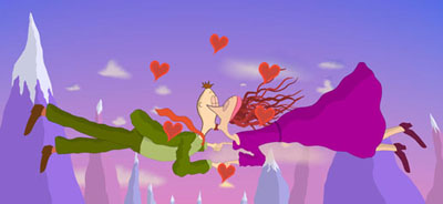
The National Film Board of Canada contributed Munro Ferguson’s Falling in Love Again, with characters wafted into the sky by road accidents and, while falling, falling in love. To watch it in high-quality 3D, go here. Pixar was represented by John Lasseter and Eben Ostby’s early digital experiment in 3D, Knick Knack, as a snowman trapped in a snow globe tries to break free to join a bathing beauty.
The evening ended with a surprise, two films that had never been meant to appear in 3D.
Méliès’s early shorts were often pirated abroad, and a lot of money was being lost in the American market in particular. After the Lubin company flooded that market with bootleg copies of a 1902 film, Méliès struck back by opening his own American distribution office. Separate negatives for the domestic and foreign markets were made by the simple expedient of placing two cameras side by side. The folks at Lobster realized that those cameras’ lenses happened to be about the same distance apart as 3D camera lenses. By taking prints from the two separate versions of a film, today’s restorers could create a simulated 3D copy!
Two 1903 titles–I think that they were The Infernal Cauldron and The Oracle of Delphi–triumphantly showed that the experiment worked. Oracle survived in both French and American copies, and the effect of 3D was delightful. For Cauldron only the second half of the American print has been preserved. Watching the film through red-and-green glasses, you initially saw nothing in your right eye, while the left one saw the image in 2D. Abruptly, though, the second print materialized, and the depth effect kicked in. The films as synchronized by Lobster looked exactly as if Méliès had designed them for 3D.
Film scholars gone wild
DB here:
William Cameron Menzies is most famous as an art director on films like The Thief of Baghdad (1924) and Gone with the Wind. He was one of the most visually daring artists to work in classic Hollywood; his eccentric framings and looming foregrounds may have influenced Orson Welles. (The Gothic distortions of Our Town and Kings Row are unlikely to be the creation of director Sam Wood.) Menzies also directed a few films, most notably the slightly nutty anti-Commie film The Whip Hand (1951).
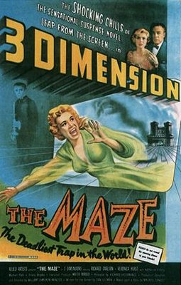
So Kristin and I had to go back to the Cinémathèque for Menzies’ rarely-seen 3D feature The Maze (1953). Alas, it was a washout. The feeble story concerns an heir returning to a castle to confront a giant frog, who may be his relative. I’d expected bravura deep-focus, with planes jutting out at me, but the film was dramatically and visually flat–no wordplay intended. The trailer, complete with fake bats on strings, is here.
We have other incidents to chronicle, but this dispatch can end with a quick list of some of the film friends we’ve encountered. We’ve already mentioned Professor Bourget, whose book on Fritz Lang came out recently (below left). We also ran into Cindi Rowell, an old friend from Pordenone and The Griffith Project, who had the excellent idea that we go to Chinatown–here hidden behind the facades of tower blocks. Cindi has vast experience in many aspects of film culture–preservation, programming, publication, web design, and the like–and is currently affiliated with the Middle East International Film Festival in Abu Dhabi.
Another old friend, Yuri Tsivian, is in Paris teaching during our visit, so we had a chance for a good dinner and lots of talk about editing in the 1910s. Below, he and Kristin pay homage to one of the shrines of Parisian cinephilia, the Studio des Ursulines movie theatre.
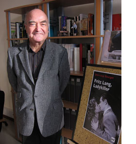
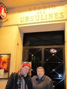
Left: Jean-Loup Bourget and his new book on Lang. Right: Yuri and Kristin at the Urselines.
Last night, with Kristin away in Berlin, I went to a dinner hosted by Jacques Aumont and Lyang Kim. Jacques is a major film theorist, whose many books and essays probe into the artistic qualities of cinema. His book on Eisenstein is available in English translation, as is his far-ranging study of the history and functions of images. Lyang is an outstanding photographer, whose book of haunting Christmas images Dans l’ombre de noël was just published in December. Among her pictures here are some gorgeous “fusion” images that recall our recent 3D experiences.
Then who should turn up but Marc Vernet and Rick Altman? It was an Iowa-Wisconsin reunion in the 10th. Marc is an expert on film noir, on cinematic images of absence, and on the American film company Triangle–associated with both Griffith and Ince. (Again, the 1910s.) Marc has set up a beautiful webpage full of information about early American cinema, and he blogs there frequently. Rick is known for his in-depth studies of film genre (especially the musical), film sound, and narrative theory. His most recent books, Silent Film Sound and A Theory of Narrative, are splendid contributions. Below, all four toast what turned out to be Rick’s birthday.
Today: More preparations for my lecture tomorrow, and of course at least one movie. Agora? Wiseman’s La Danse? Kinatay? The new Eugène Green, La religieuse portugaise? Or a rerelease (new print) of Minnelli’s Four Horsemen of the Apocalypse? Or….? The usual Parisian problem, but a good problem to have.
P. S. March 2010: After this Paris trip, I wrote an essay on William Cameron Menzies for this site.
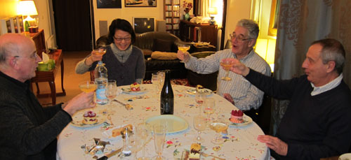
Jacques Aumont, Lyang Kim, Rick Altman, and Marc Vernet, 9 January 2010.
Seed-beds of style
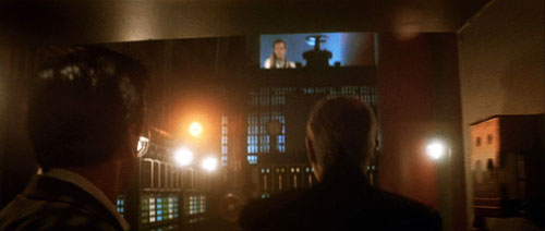
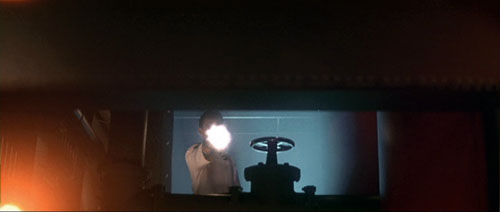
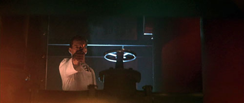
The Hunt for Red October.
DB here:
Seminar, orig. German (1889): A class that meets for systematic study under the direction of a teacher. From Latin seminarium, “seed-plot.”
I retired from full-time teaching in July of 2005. Since then, while writing and traveling (both chronicled on this website), I’ve done occasional lectures. But this fall I tried something else. At the invitation of Lea Jacobs here at Madison, I collaborated with her on a graduate seminar called Film Stylistics.
It was a good opportunity for me. I had a chance to learn from Lea, Ben Brewster, and the students and sitters-in. The class also enabled me to test and revise some ideas I’d already explored, while garnering new ideas and information. I helped plan the sessions and pick the films, but I had no responsibilities about grading. I hope, though, to read the students’ papers at some point after the term is over.
Our goal was to introduce students to studying style historically and conceptually. We focused on group styles rather than “authorial” ones because we wanted to explore particular concepts. How useful is the concept of group norms in understanding broad stylistic trends? Can we explain stylistic change through conceptions of progress toward some norm? Does the model of problem and solution help explain not only a particular innovation but also the group’s acceptance of it? How viable are notions of influence in explaining change? How much power should we assign to individual innovation? Can we think of filmmaking institutions as not only constraining style (through tradition and conformity) but also enabling certain possibilities—nudging filmmakers in certain directions? Does stylistic study favor a comparative method, one that encourages us to range across major and minor films, as well as different countries and periods?
These are pretty abstract questions, so we wanted some particular cases. Lea and I picked three areas of broad stylistic change: the emergence of widescreen cinema in the 1950s, the arrival of sync-sound filming in the late 1920s, and the development of analytical editing or “scene dissection” in the 1910s and 1920s. We tackled these areas in this order, violating chronology because we wanted to move from somewhat hard problems to the hardest of all: Why did filmmakers in the US, and soon in other countries, move toward what has become the lingua franca of film technique, continuity editing?
The results of our research on these matters will emerge over the next few years, I expect. In the short term, during my final lecture Tuesday I went off on what I hope wasn’t too much of a tangent. I got interested in one particular kind of cut, and it led me to see, once more, how different filmmaking traditions can make varying uses of apparently similar techniques.
More cutting remarks
My concern was the axial cut. That’s a cut that shifts the framing straight along the lens axis. Usually, the cut carries us “straight in” from a long shot to a closer view, but it can also cut “straight back” from a detail. What could be simpler? Yet such an almost primitive device harbors intriguing expressive possibilities.
Axial cuts aren’t all that common nowadays, I think. Today’s filmmakers prefer to change the angle when they cut to a closer or more distant setup. But such wasn’t the case in the cinema of the 1910s and 1920s.
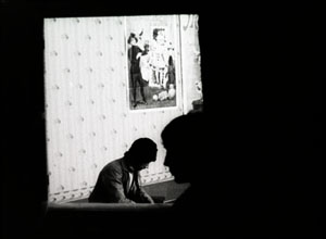
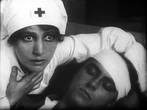
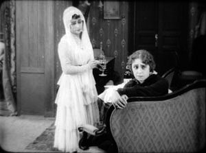
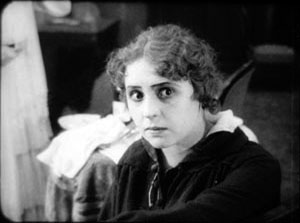
In the heyday of tableau-based staging, 1908-1918 or so, filmmakers seldom cut into the scene at all. European directors especially tended to shape the development of the action by moving actors around the set, shifting them closer to the camera or farther away. The most common cuts were “inserts” of details, mostly printed matter (letters, telegrams) or a photograph. But when tableau scenes did cut into the players, the cuts tended to be axial: the framing moved straight in to enlarge a moment of performance. Here’s an instance from the 1916 Russian film Nelly Raintseva.
During the mid-1910s, American films moved away from the tableau style toward a more editing-driven technique. This approach often relied on more angled framing and a greater penetration of the playing space, of the kind we’re familiar with today. But axial cuts hung on in American films, even in quickly-cut scenes. Lea pointed out some nice examples in Wild and Woolly (1917), especially those involving movement. In the example below, the first cut carries us backward rather than forward, and the second is a cut-in, but both are along the lens axis.
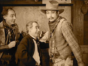
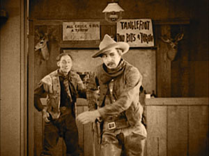
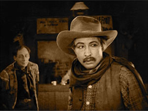
During the 1920s, axial cuts become a secondary tool of the American filmmaker, who now had many other camera setups available. But Soviet filmmakers of the 1920s, who adopted many American techniques in the name of modernizing their cinema, seemed to see fresh possibilities in the axial cut. For instance, in Dovzhenko’s Arsenal (1929), it becomes a percussive accent. The astonishment of a bureaucrat under siege is conveyed by a string of very fast enlargements.
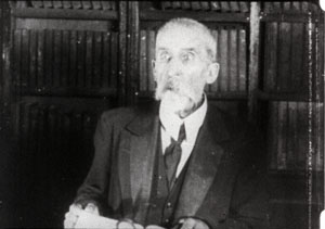
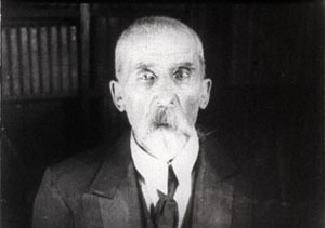
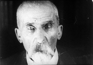
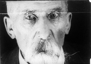
The Soviets called such cuts “concentration cuts,” a good term for the way they make a figure seem to pop out at us. From being a simple enlargement (in tableau cinema) or one among many methods of penetrating the scene’s space (in Hollywood continuity), the axial cut has been given a new force, thanks to adding more shots and making them quite brief.
This aggressive method for seizing our eye—Notice this now!—has appeared in modern filmmaking too, as in this passage from Die Hard (1988).
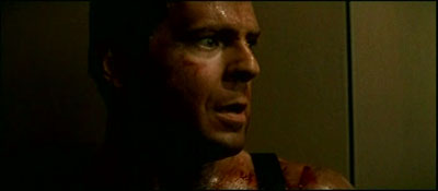
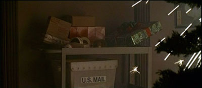
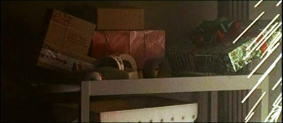
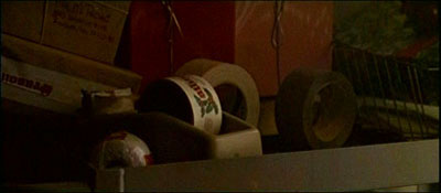
Here the axial cut is clearly subjective, rendering John McClane’s realization that he can use the Christmas wrapping tape in his combat with the thieves. Director John McTiernan employed the device again in The Hunt for Red October (1990). The frames surmounting this entry show the heroes suddenly being fired upon.
It seems likely that many modern directors became aware of this device from seeing Lydia’s discovery of the pecked-up body of farmer Dan in The Birds (1963). Hitchcock knew Soviet montage techniques, so maybe we have a chain of influence here. In any case, the somewhat overbearing aggressiveness of the concentration cut has often been parodied on The Simpsons. Here’s a recent example.


By the law of the camera axis
Axial cutting can be used more pervasively, as a structuring element for an entire scene. This is what Lev Kuleshov does in a climactic moment of By the Law (1926). Edith and her husband have kept the murderer at rifle point for days, and the strain is starting to show. She becomes hysterical, and Kuleshov uses a ragged rhythm of stasis and movement to convey it. First he cuts straight in from a master shot to a medium shot of her. I reproduce the frames from the film strip, for reasons that will become obvious.
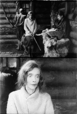
Then Kuleshov cuts straight back to the master setup. Again he cuts in, but to a closer view of Edith as she becomes more frenzied.
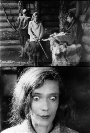
Cut back once more to the long shot, but only for fourteen frames. That shot is interrupted by a shot of Edith already laughing crazily, her head tipped back.
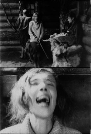
The shot of her laugh lasts only five frames, and this mere glimpse, combined with the blatant mismatch of movement, makes the onset of her spell all the more startling. When we cut back to the long shot her face and position now match.
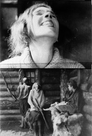
The abrupt quality of her outburst would not have been as striking if Kuleshov had varied his angle. As the earlier examples show, when only shot scale changes and angle remains the same, the cuts can be very harsh, and Kuleshov accentuates this quality with a flagrant mismatch.
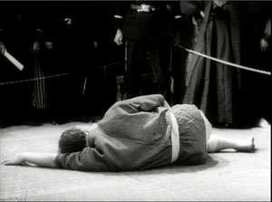
Akira Kurosawa likewise used the concentration cut to provide salient moments throughout his work; it almost became a stylistic fingerprint. At several points in Sugata Sanshiro (1943) he uses the device in the usual popping-forward way. But he varies it during Sanshiro’s combat with old Murai. He reserves dynamic, often elliptical cuts for moments of rapid action, and then he uses axial cuts for moments of stasis or highly repetitive maneuvers. In effect, the moments of peak action happen almost too quickly, while the moments of waiting are emphasized by cut-ins.
So at the start of the match, a series of axial cuts, linked by dissolves, present the fighters in a slow dance. But the ensuing throws are editing briskly. When old Murai is thrown and lies gasping on the mat, axial cuts accentuate his immobility. Kurosawa adds a rhythmic urgency on the soundtrack. After each cut-in, we hear the voice of Murai’s daughter, either offscreen or in his thoughts: “Father will win.” “Father will win.” “Father will surely win.”
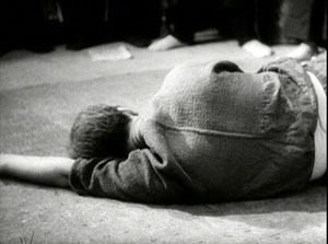
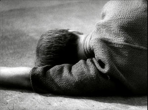
The matching of lines to the editing is at work in the Simpsons parody too, in which the Comic Book Guy’s words are heard in tempo with the concentration cuts. “You. Are. Acceptable.”
Montage and the axial cut
By now it’s easy for us to see that one scene from Alexander Nevsky (1938) opens with a series of axial cuts, out and in.
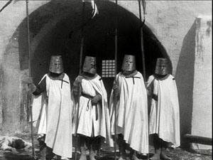
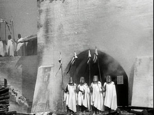
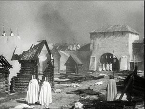
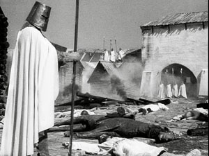
But why would Eisenstein, master of montage, regress to such a primitive device? He had occasionally used axial cuts in his silent films, as when we see Kerensky brooding in the Winter Palace in October (1928).
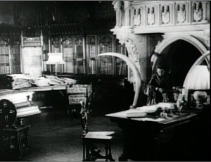
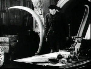
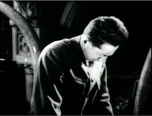
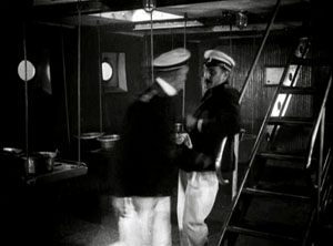
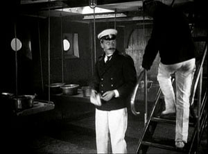
And Potemkin‘s famous cuts in to the Cossack slashing at the camera (that is, the baby, the old lady) are axial. (These cuts are pastiched by Eli Roth and Tarantino in Inglourious Basterds.) At the limit, Eisenstein toyed with the axial cut by moving the figures around during the shot change. In Potemkin, the ship’s officer reports to the captain that the crew has refused to eat. The captain leaves one shot and climbs the stair before Eisenstein cuts in to show him leaving again. The repetition would not be so perceptible if Eisenstein had varied the angle.
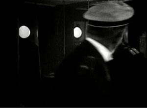
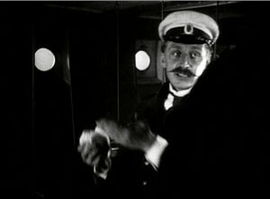
In the 1930s, Eisenstein began thinking about the axial cut as a basic structural element of a scene. In both his theory and practice, he promoted the axial cut to a level of prominence it hadn’t seen since the days of the tableau. Usually the cuts involve static subjects, like most of Kurosawa’s, but he still exploits the cut-ins to create vivid, if spatially impossible effects. At one point our popping in closer to Ivan the Terrible is doubled by him majestically and magically popping out of his tent to meet us, like a thrusting chess piece.
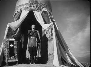
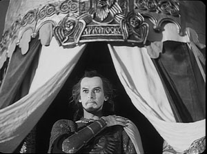
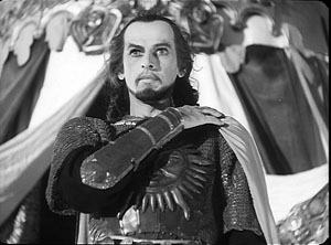
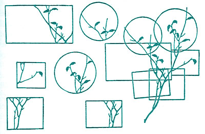
The new primacy of axial cutting comes from Eisenstein’s idea that “montage units” could powerfully organize the space of a scene. He thought that you could imagine filming a scene from only a few general positions, but then varying camera setups within each of these orientations. The montage unit was a cluster of framings taken from roughly the same orientation, as in the Pskov and Ivan scenes.
The idea may derive from his study of Japanese art, shown further above, in which he explored how a single image of a cherry branch could be chopped up into a great variety of compositions. In his course at the Soviet film school, he illustrated with a hypothetical scene of the Haitian revolutionary Dessalines holding his enemies at bay at a banquet. After imagining a master shot from the farthest-back position in the montage unit, Eisenstein proposes a series of dynamic closer views.
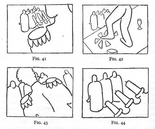
Eisenstein didn’t think that each scene had to be handled in a single montage unit. You could create two or three predominant orientations, with shots from each woven together. Or you could gain a sudden accent when a stream of setups from the same unit was interrupted by one from a very different angle. These ideas he put into practice throughout Nevsky and Ivan the Terrible.
Why? Eisenstein thought that combining shots taken from roughly the same orientation yielded a musical play between constant elements and variation. Each shot shows us something we’ve seen before but also something new, the way a bass line or sustained chords can continue underneath a changing melody. Eisenstein was convinced that this flowing weave of visual elements gave the spectator a deeper involvement in the film as it unfolded—an involvement akin to that found in Wagnerian opera.
The axial cut is a good example of how even a simple stylistic choice harbors rich creative possibilities. It also shows how a technique can change its impact in different filmmaking traditions. In the tableau tradition the axial cut was for the most part an abrupt enlargement heightening a moment of strong acting. In the early days of Hollywood continuity it became one editing option among many, and its power was somewhat muted. For the Soviets, concentration cuts could be multiplied and joined with fast cutting and big close-ups. The result could jolt the viewer by italicizing a face or an object–a purpose that has been taken up by contemporary Hollywood. For Kurosawa, the technique offered a way to contrast extreme movement and extreme stillness. And for Eisenstein, it suggested a global strategy for weaving visual elements into an immersive whole.
The protean functions assumed by this simple device remind us of how much there is yet to discover about film style. Despite all our discoveries over the last three decades, we have only begun. The name is apt: A seminar is where things start.
For more on the staging strategies of the tableau style, see On the History of Film Style and Figures Traced in Light: On Cinematic Staging, as well as blog entries here and here and here and here. You can find examples of emerging Hollywood continuity techniques in this entry on 1917 and this one on William S. Hart and this one on Doug Fairbanks. Sugata Sanshiro is at last available in a good DVD version from Criterion as part of its big Kurosawa box. Eisenstein’s ideas about the axial cut are explained in Vladimir Nizhny, Lessons with Eisenstein, trans. and ed. Ivor Montagu and Jay Leyda (New York: Hill and Wang, 1962), Chapters II and III. In The Cinema of Eisenstein I try to show how these ideas are employed in the Old Man’s late films.
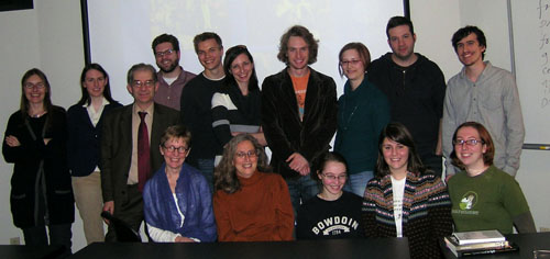
Seated: Leslie Debauche, Lea Jacobs, Rebecca Genauer, Pam Reisel, Amanda McQueen. Standing: Karin Kolb, Andrea Comiskey, Ben Brewster, John Powers, Tristan Mentz, Heather Heckman, Aaron Granat, Jenny Oyallon-Koloski, Jonah Horwitz, and Booth Wilson. Evan Davis had to leave early.
Now leaving from platform 1
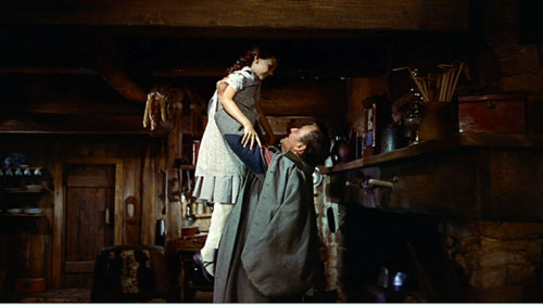
From a Facebook post by Tahereh
To all my friends:
What can I reply to Hossein? He’s pursuing me so avidly, but you know he isnt really a prime catch. No education, no house. If it werent for the earthquake, I wouldnt give him a second look. But he does interest me a little—he’s made me lose track of my lines so many times!
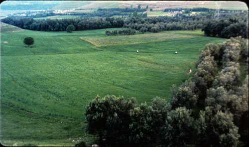
Oh no, now he’s chasing me across the field. What can I tell him? BRB!
DB here:
Many people in the film industry hold media studies in disdain, and often the feeling is mutual. Filmmakers recoil from the abstrusities of Big Theory, and academics often consider filmmakers gearheads (just before wagging their fingers and warning us about the Intentional Fallacy). But scholars like Rick Altman, John Caldwell, Janet Staiger, Kristin, and me, and younger folks like Patrick Keating and Ben Wright have been trying to study filmmakers’ creative choices in concrete ways. Some of us even ask filmmakers what they were trying to do.
So it’s heartening to see movement in the other direction. For quite a while academically trained filmmakers like James Schamus and Todd Haynes have brought ideas from their university studies into their films. Recently Reid Rosefelt composed an enlightening blog entry on Kathryn Bigelow’s intellectual side. Now some terms and ideas are being spread even more widely across the industry.
For example, in a recent Entertainment Weekly story about why women viewers like horror, we read:
One of the most consistent tropes of the genre is the character whom filmmakers call ”the final girl” — the survivor.
Actually, it was Carol Clover, scholar of horror movies and Scandinavian epics, who came up with the “final girl” nickname in her book Men, Women, and Chainsaws. Going back to the EW sentence, you notice that academics helped popularize the term genre too, which you seldom find in Hollywood’s patter before the 1970s. And the very word trope smells of classrooms and chalkdust.
Even more striking is a recent Variety article entitled, “Transmedia Storytelling Is Future of Biz.” Peter Caranicas explains that it involves “developing a piece of intellectual property across multiple media platforms.” The Star Wars franchise is the major modern instance, as Caranicas explains.
What Lucas did went several steps beyond old-style character licensing and brand extensions. He created a unified body of work with an extensive backstory and mythology, and he determinedly guarded its canon [another academic term—DB] while simultaneously opening up peripheral parts of his universe to exploration by other contributors.
One of my former students assures me that Kristin and I used the term “transmedia” back in the 1990s, but we have no memory of doing so. More relevantly, Liz Rosenthal reminds us that Peter Greenaway was pushing the concept in 1993. “If the cinema intends to survive, it has to make a pact and a relationship with concepts of interactivity and it has to see itself as only part of a multimedia cultural adventure.”
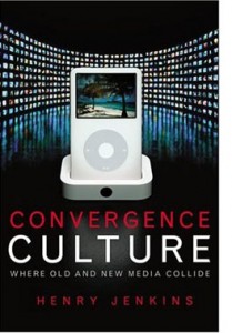
In any case, the person who brought the concept of transmedia storytelling to the forefront of media studies, and thus industry parlance, was another Wisconsin student, Henry Jenkins. Henry has made the concept part of his broader research into how modern media connect with audiences, particularly fan audiences. In his 1992 essay on Twin Peaks, he was already exploring how fans used the still-emerging internet to respond to a range of ancillary texts around Lynch’s TV series. You can get a quick acquaintance with his most recent ideas in this 2007 blog essay. For me, his argument emerged most vividly in a talk he gave at Madison some years ago. The lecture became the chapter “Searching for the Origami Unicorn” in his book Convergence Culture. For his more recent thinking, you can check his current course syllabus, which includes reading and web references, in the 11 August entry here.
The platform-shifting that Caranicas describes is planned and executed at the creative end, moving the story world calculatedly across media. These, dubbed by Jenkins “commercial extensions,” differ from “grassroots extensions,” which are created by audience members without the permission, or even the knowledge, of the creators. The commercial extensions are what I’ll be considering here.
From aggregator Movie MMORPG:
Welcome to a sophisticated world teetering on the edge of decadence. Get hammered on Italian cocktails. Fight your way out of a hospital jammed with nymphos. Cheat on your wife. Seduce a married man. Wander through the streets and stare at gushing water. Have you got what it takes to survive a day in LaNotteCity? You’ll get hooked, since the endgame is always inconclusive!
As it’s currently discussed, transmedia storytelling has two uncontroversial components and one rare but intriguing one.
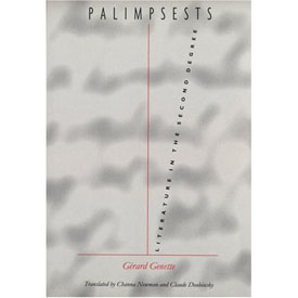 First, the term implies that a story is spread among a series of discrete “texts.” This “hypernarrative” idea was explored with taxonomic zeal by Gérard Genette in his 1982 book Palimpsests. His taxonomy of storytelling is worth considering a little here because he anticipated several possibilities we’re seeing now. Many of his categories have parallels in cinema, but I’ll stick to his domain, literature.
Novels and short stories feed off other novels and short stories. Obvious examples are parodies, pastiches, sequels, and continuations (sequels not written by the original author). Genette also considers what he calls the “transposition,” a very roomy category that’s of particular interest to us.
Transpositions are things like translations, rewritings, and literary adaptations, as when a novel becomes a play. A transposition also occurs when the original text is pruned or compressed, as in abridged versions of Don Quixote or Moby-Dick. At the other quantitative extreme is what Genette calls augmentation. Here, the derivative work expands the original, either in style (three sentences replace one) or narrative material (extra scenes or plots).
Yet another sort of transposition occurs when the story events in the original are rendered through alternative literary techniques. Charles Lamb retells Ulysses’ adventures in a different order than Homer does, and someone could rewrite the events of Madame Bovary in first person, from Charles’ point of view. When Genette was writing, he had to reach for some esoteric examples, but nowadays we have others. Alice Randall’s The Wind Done Gone (2001) retells Gone with the Wind from the point of view of a slave on Tara. The novel Wicked is a large-scale example, as is Tom Stoppard’s Rosenkrantz and Guildenstern Are Dead.
All these examples of hypernarrative operate within a single medium. The second condition of transmedia storytelling is, of course, that it crosses media. Genette considers drama and written literature to be all part of the same medium, but if you don’t, then novels turned into plays, like Les Miserables, would count as transfers across media.
In this sense, transmedia storytelling is very, very old. The Bible, the Homeric epics, the Bhagvad-gita, and many other classic stories have been rendered in plays and the visual arts across centuries. There are paintings portraying episodes in mythology and Shakespeare plays. More recently, film, radio, and television have created their own versions of literary or dramatic or operatic works. The whole area of what we now call adaptation is a matter of stories passed among media.
What makes this traditional idea sexy? I think it’s a third, less common component that Henry has spotlighted. Some transmedia narratives create a more complex overall experience than that provided by any text alone. This can be accomplished by spreading characters and plot twists among the different texts. If you haven’t tracked the story world on different platforms, you have an imperfect grasp of it.
I can follow Conan Doyle’s Sherlock Holmes stories well without seeing The Seven Percent Solution or The Private Life of Sherlock Holmes. These pastiches/continuations are clearly side excursions, enjoyable or not in themselves and perhaps illuminating some aspects of the original tales. But according to Henry, we can’t appreciate the Matrix trilogy unless we understand that key story events have taken place in the videogame, the comic books, and the short films gathered in The Animatrix. The Kid in The Matrix Reloaded makes cryptic reference to finding Neo by fate, but only those who have watched the short devoted to him knows what that means. If Sherlock pastiches are parasites, the texts around The Matrix exist in symbiosis, giving as much as they take.
This strategy differentiates the new transmedia storytelling from your typical franchise. In most film franchises, the same characters play out their fixed roles in different movies, or comic books, or TV shows. You need not consume all to understand one. But Henry envisages the possibility of creating a whole that is greater than its parts, a vast narrative experience that doesn’t end when the book’s last page is turned or the theatre lights come up. His idea seems to be echoed in Will Wright’s suggestion:
It’s a fractal deployment of intellectual property. Instead of picking one format, you’re designing for one mega-platform. . . . We’ve been talking about this kind of synergy for years, but it’s finally happening.
Stimulating as this prospect is, it remains rare. The Matrix is perhaps the best example, but Henry suggests that it’s also an extreme instance: “For the casual consumer, The Matrix asked too much. For the hard-core fan, it provided too little” (p. 126). More common is a Genette-style transposition, in which the core text—usually the movie—is given offshoots and roundabouts that lead back to it. As I understand it, the Star Wars novels operate under the injunction that although they can take a story situation as the basis for a new plot, in the end that plot has to leave the films’ story arc unchanged. Similarly, websites with puzzles, games, clues, and other supplementary material tend to be subordinate to the film, planting hints and foreshadowings (The Blair Witch Project, Memento). Alternatively, the A. I. website provided a largely independent story world that impinged on the movie’s action only slightly.
The “immersive” ancillaries seem on the whole designed less to complete or complicate the film than to cement loyalty to the property, and even recruit fans to participate in marketing. It’s enhanced synergy, upgraded brand loyalty.
For the most part Hollywood is thinking pragmatically, adopting Lucas’ strategy of spinning off ancillaries in ways that respect the hardcore fans’ appreciation of the esoterica in the property. Caranicas quotes Jeff Gomez, an entrepreneur in transmedia storytelling, saying that for most of his clients “we make sure the universe of the film maintains its integrity as it’s expanded and implemented across multiple platforms.” It would seem to be a strategy of expanding and enriching fan following, and consequent purchases.
As best I can tell, then, in borrowing this academic idea, the industry is taking the radical edge off. But is that surprising?
Excerpt from www.ballsup.net
What a bloody week. Just now had a chance to update things. Fact is, it’s me last post. Luckily I let that cellphone drop and grabbed the satchel just before it fell into the Thames. Me and the crew are now packing for Bimini, ready for living large but in a rush becuz Big Chris may be looking for us. Hang on, must upload now, someone’s knocking at me d
Henry’s chapter in Convergence Culture grants that “relatively few, if any, franchises achieve the full aesthetic potential of transmedia storytelling—yet” (p. 97). Perhaps that hopeful “yet” will be fulfilled outside Hollywood? In the realm of the avant-garde, Matthew Barney has elaborated his own private mythology, dispersed among artifacts and hard-to-see films. In this he followed Joseph Beuys and Salvador Dalí. But you could argue that these artists really weren’t telling an overarching story. They were creating secular cults, full of arcana that only the pious initiates of Gallery Culture could grasp.
What about something more accessible? This month in Filmmaker magazine, Lance Weiler has suggested that indie filmmakers embrace the concept of transmedia storytelling (though he doesn’t use the term). Weiler argues that the explosion of digital technology has so transformed narrative that the filmmaker has to keep up. Instead of creating a script, with its genre formulas and three-act layout, the filmmaker should generate a bible, which plots an ensemble of characters and events that spills across film, websites, mobile communication, Twitter, gaming, and other platforms. The filmmaker designs “timelines, interaction trees, and flow charts” as well as “story bridges that provide seamless flow across devices and screens.”
Weiler doesn’t offer any specific examples apart from his Head Trauma, a horror feature accompanied by an alternate reality game that involved mobile and online access. You can watch his account of the “evolution of storytelling” here, where he and Ted Hope speculate about transmedia storytelling as offering economic help to filmmakers, reclaiming authorship from corporations, and promoting new relations with the audience.
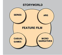 Hope and Weiler raise many fascinating questions about the prospects for multiplatform storytelling. At times, though, it seems that they accept the studio strategy of putting the film at the center of a multimedia ensemble. The diagram accompanying Weiler’s article illustrates that. It’s hard to think outside the franchise model, even if we want to denounce Hollywood for being stuck in an outdated commitment to the theatrical feature as foundational “content.”
We should welcome experimentation, so I wish Hope, Weiler, and other creators well. But I think we ought to recognize some problems with expanding story worlds in these directions.
For one thing, most Hollywood and indie films aren’t particularly good. Perhaps it’s best to let most storyworlds molder away. Does every horror movie need a zigzag trail of web pages? Do you want a diary of Daredevil’s down time? Do you want to look at the Flickr page of the family in Little Miss Sunshine? Do you want to receive Tweets from Juno? Pursued to the max, transmedia storytelling could be as alternately dull and maddening as your own life.
Sure, somebody might go for it. Kristin points out, though, that people who would be motivated to follow up on all the transmedia bits of a spreadeagled narrative are people who would identify themselves as part of a fandom. There aren’t that many films/franchises that generate profoundly devoted fans on a large scale: The Matrix, Twilight, Harry Potter, The Lord of the Rings, Star Wars, Star Trek, maybe The Prisoner. These items are a tiny portion of the total number of films and TV series produced. It’s hard to imagine an ordinary feature, let alone an independent film, being able to motivate people to track down all these tributary narratives. There could be a lot of expensive flops if people tried to promote such things.
Consider a deeper point. Transmedia storytelling in the radical sense is posited as an active, participatory experience. Henry suggests that fans will race home from the multiplex to study up on iconography in The Matrix. Weiler’s article is accompanied by a hierarchy that lists “layers of interactivity.” The most superficial is “Passive Viewing,” defined as “Sit back and watch.” (Here Weiler parts company with Henry, who doesn’t consider ordinary viewing passive.) Further along are layers involving social networking, playing games, discussing or interacting with characters, finding hidden content, and even creating elements of the story world.
But it seems to me that film viewing is already an active, participatory experience. It requires attention, a degree of concentration, memory, anticipation, and a host of story-understanding skills. Even the simplest story gears up our minds. We may not notice this happening because our skills are so well-practiced; but skills they are. More complicated stories demand that we play a sort of mental game with the film. Trying to guess Hitchcock or Buñuel’s next twist can engross you deeply. And the very genre of puzzle films trades on brain strain, demanding that the film be watched many times (buy the DVD) for its narrational stratagems to be exposed. Films are interactive in the way a board game is: each move blocks certain possibilities, another anticipates what you’re going to do (mentally).
Moreover, how the ancillary texts add to the film is a crucial matter. No narrative is absolutely complete; the whole of any tale is never told. At the least, some intervals of time go missing, characters drift in and out of our ken, and things happen offscreen. Henry Jenkins suggests that gaps in the core text can be filled by the ancillary texts generated by fan fiction or the creators. But many films thrive by virtue of their gaps. In Psycho, just when did Marion decide to steal the bank’s money? There are the open endings, which leave the story action suspended. There are the uncertainties about motivation. In Anatomy of a Murder, did Lieutenant Manion kill his wife’s rapist in cold blood? Likewise, being locked to a certain character’s range of knowledge is the source of powerful emotional effects. We want to make the discoveries along with the character, be he Philip Marlowe or Travis Bickle.
The human imagination abhors a vacuum, I suppose, but many art works exploit that impulse by letting us play with alternative hypotheses about causes and outcomes. We don’t need the creators to close those hypotheses down. Indeed, you can argue that one of the contributions of independent film has been the possibility of pushing the audience toward accepting plots that don’t fit clear-cut norms. That innovation shrinks if we can run home to get background material online. By following the franchise logic, indie films risk giving up mystery.
At this point someone usually says that interactive storytelling allows the filmmaker to surrender some control to the viewer, who is empowered to choose her own adventure. This notion is worth a long blog entry in itself, so I’ll simply assert without proof: Storytelling is crucially all about control. It sometimes obliges the viewer to take adventures she could not imagine. Storytelling is artistic tyranny, and not always benevolent.
 Another drawback to shifting a story among platforms: art works gain strength by having firm boundaries. A movie’s opening deserves to be treated as a distinct portal, a privileged point of access, a punctual moment at which we can take a breath and plunge into the story world. Likewise, the closing ought to be palpable, even if it’s a diminuendo or an unresolved chord. The special thrill of beginning and ending can be vitiated if we come to see the first shots as just continuations of the webisode, and closing images as something to be stitched to more stuff unfolding online. There’s a reason that pictures have frames.
In between opening and closing, the order in which we get story information is crucial to our experience of the story world. Suspense, curiosity, surprise, and concern for characters—all are created by the sequencing of story action programmed into the movie. It’s significant, I think, that proponents of hardcore multiplatform storytelling don’t tend to describe the ups and downs of that experience across the narrative. The meanderings of multimedia browsing can’t be described with the confidence we can ascribe to a film’s developing organization. Facing multiple points of access, no two consumers are likely to encounter story information in the same order. If I start a novel at chapter one, and you start it at chapter ten, we simply haven’t experienced the art work the same way. This isn’t to say, of course, that each of us has an identical experience of a movie. It’s just that our individual experiences of the film overlap to an extent that allows us to talk about the patterning of the story under our eyes.
In correspondence with me, Henry suggests that transmedia storytelling may work best with television because of the serialized format; different people hop aboard at different points. I’d add that television’s installment-based storytelling, operating in the lived time of the audience, allows time for viewers to explore or create media offshoots. The installment-based nature of serial TV poses intriguing aesthetic problems of continuity, coherence, and memory. (See Jason Mittell’s essay on this matter.) For films, however, which are typically designed to be consumed in one sitting, multiple points of entry will tend to make plot patterns less clearly profiled.
If transmedia storytelling is difficult to apprehend for the viewer, it also makes critical analysis and evaluation much more difficult. How might we analyze overarching patterns of multiplatform plotting in The Matrix? True, one can itemize the inputs and decipher the citations, but it’s very hard to show how they work together, how they unfold, what it all adds up to—except to note that different people will encounter information bits at different times and with different states of knowledge.
Gap-filling isn’t the only rationale for spreading the story across platforms, of course. Parallel worlds can be built, secondary characters can be promoted, the story can be presented through a minor character’s eyes. If these ancillary stories become not parasitic but symbiotic, we expect them to engage us on their own terms, and this requires creativity of an extraordinarily high order.
Henry Jenkins suggests that for big-budget projects, this means finding unusually gifted collaborators. In the indie sector, the obstacles are even more considerable. Whether the result is Wendy and Lucy or Goodbye Solo, creating a first-rate feature-length movie takes tremendous talent, sweat, and resourcefulness. It is immensely harder to create a story universe that sustains the same intensity and quality across platforms. True, you can sprinkle clues and cryptic references among websites and YouTube shorts. The formulas of genre (horror, mystery) help you generate shock effects and mystification in teaser trailers. Appeal to stock characterization helps you mount a “realistic” Second Life life. But building a vast, sturdy world teeming with distinctive characters, unpredictable plotting, and human resonance is an immense task.
We await our multimedia Balzac. In the meantime, maybe indie filmmakers should settle for trying to be Chekhov.
http://tinyurl.com/scarkiller
Debbie, sorry 2 hav left SOOOO suddenlike. am @ Gila flats = cactus + varmnts. LOL with Blankethead!!! :-/
Uncl Ethan
Thanks to Henry Jenkins for comments on this entry. He recommends that interested readers have a look at Geoffrey Long’s 2007 MA thesis on the Jim Henson company, available, along with many other MIT projects, here. Thanks also to Kristin and Jeff Smith for suggestions, and to Janet Staiger for correcting my memory and calling attention to Dennis Bound’s book on “transmedia poetics” as applied to Perry Mason.
PS 11 Sept: Henry Jenkins has responded to my entry, with the first of three installments starting here.
Searching for surprises, and frites
DB here:
Studying film history ought to be continually surprising. Yes, you often find your hunches and assumptions confirmed (which often means it’s time to check them again). But sometimes you find stuff coming out of left field that you had never expected. It would be too pompous to call these items breakthroughs, but every historian knows the little burst of pleasure that comes from seeing something that makes you say: How odd. I didn’t expect that. You might even allow yourself a Wow! now and then.
I was saying wow a fair amount during my two weeks in Brussels this summer. I go regularly, and not just for the moules, frites, and stoemp. I go to the Royal Film Archive, where I study old films. This time I was continuing to pursue some research questions that drove me in 2007 and 2008. What staging and editing strategies are at work in films of the crucial years 1910-1917? How might we explain the continuities and changes we find? I’m a long way from answering these questions fully, but I found some fresh and intriguing instances. One surprise is worth half a dozen confirmations.
Divas on parade
This year I concentrated on European movies. One of the most prominent genres of Italian cinema was the diva film, the movie whose dominant attraction was a beautiful, often fiery, somewhat otherworldly female star.The mesmeric charms of the genre have been celebrated in Peter Delpeut’s anthology film Diva Dolorosa, but the films really need to be seen in their entirety. The most comprehensive book on the subject is Angela Dalle Vacche’s Diva: Defiance and Passion in Early Italian Cinema, while my Wisconsin colleague Lea Jacobs has published detailed analyses of diva performance in Theatre to Cinema and here on the web.
In the 1910s, American cinema was turning out fast-paced films, but the diva films I saw provided less complex plots and remarkably protracted acting. An emblematic instance is the climax of Rapsodia Satanica (1917), starring Lyda Borelli. Alba has sold her soul to Mephisto in order to recover her youthful beauty. She toys with two men’s affections, and one kills himself (mysteriously leaving a scar on her face). The plot more or less halts.
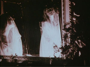
Alba retreats into her chateau and wanders the grounds. She glides forlornly through her garden, idles at the piano keys, and drapes herself along a bridge. She strews flowers on the floor and even dresses herself up as a priestess. Most strikingly, she floats into a cluster of mirrors and drapes herself in layers of veils, creating a gauzy shroud.
Run at 16 frames per second, this cadenza of apparitions consumes nearly a minute and a half. Such an exercise in atmospherics might be considered wasteful in an American film of the time, but it enhances the expression of Alba’s late-blooming spirituality—just before Satan comes to claim his pledge.
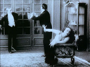
The same sort of languid choreography can involve other players. The diva’s performance, as Jacobs has shown, is often closer to dance than to orthodox acting, and she can weave arabesques around her more or less stationary suitors. At times the diva is a virtual acrobat. If you can call a contortion graceful, we can find it in the angular wrist maneuvers of Borelli in La Donna Nuda (1914).
The diva’s divagations are usually shot from a distance, and often there are big sets that are cleared of other actors to allow the actress maximum freedom and minimum distraction.At key moments, there might be a straight cut-in to the diva in medium-shot, but the visual narration keeps our attention fixed on a single arresting figure.
This tendency varies from the sort of ensemble staging that I’ve studied in more detail in On the History of Film Style and Figures Traced in Light. The staging is based upon the diva’s decorative elaboration of her emotional states, rather than in the shifting configuration of several actors. This difference reflects a variation in pace as well: The diva’s subtle changes of expression and posture emerge gradually, but the behavior of actors in ensemble scenes tend to accelerate the flow of action and reaction.
The spotlighting of the diva was not a big surprise, perhaps, but at least a reminder that there are always several tendencies at work in film in any period. More unexpected was the opening sequence of Il Fuoco (1915), in which the heroine visits a lake for a sketching session. As she sits down, a painter arrives to do some painting of his own. There follows a sequence of fourteen shots taken from eleven camera setups, some quite close to the actors. The sequence displays the sort of orthodox continuity that we associate with American films of the same year (The Birth of a Nation, Regeneration, The Cheat).
Granted, European films of the 1910s display freer camera setups in exterior settings than in interior sets. Still, the director of Il Fuoco, Giovanni Pastrone, shows an intuitive mastery of angled shot reverse-shots and consistent eyelines. It makes me eager to see whether other European filmmakers were developing a tradition of continuity editing akin to the American one.
Asta Nielsen was, so to speak, a Danish-German diva. A beanpole with a long face and a slash of a mouth, she might seem an unpromising vessel for languid eroticism. Yet Die Asta became an icon of silent film after her sultry dance in Urban Gad’s Afgrunden (The Abyss, 1910) won her an international audience. In Germany she turned out a vast number of dramas and comedies, with her as undisputed main attraction. Lest we think that the term “star” is a modern one, the title card for S1 (1913) is already playing a coy game.
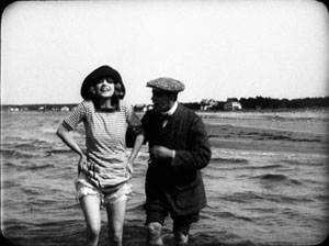
Again, with the spotlight on the heroine, the director’s decision can be simple. Evacuate the set and bring her closer to the camera, or if the set is cluttered, cut in to let Asta act.But she’s refreshingly unethereal, with changes of expression that are fleeting and unpredictable. At a lake with her lover, she flashes her legs at the camera and gives us a grin.
But a few frames later, her grimace becomes downright grotesque as she picks her way to shore. You can easily imagine her fear of losing her balance or stepping on a sharp stone.
Strong-willed and resourceful, Asta projects a wary intelligence. This, of course, doesn’t keep her from falling in love with worthless men.
Colorforms
Today’s archivists are determined to restore silent films to their original beauty, which includes the gorgeous colors achieved by tinting, toning, stencil coloring, and other techniques. Earlier this year Josh Yumibe came to our campus with a splendid collection of frames illustrating the range of possibilities. I saw several colored prints during my Brussels stay, including some original nitrate copies. Two from 1911 were films now acknowledged as “specialist classics.”
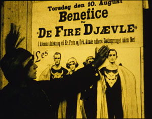
The Four Devils, directed by Robert Dinesen, is one in a cycle of circus films that was popular in Denmark at the period. A team of trapeze artists includes two men and two women; one couple has a steady romance, the other is fractured by the man’s attraction to a rich woman. Once Aimée is convinced of Fritz’s infidelity, she decides to kill him during a performance. The climactic “death leap” is rendered in about thirty shots, including one of an empty trapeze bar swinging. Under the big top, the compositions are full of detail and yet clearly laid out. And Dinesen reveals Aimée’s plan in one of the most ominous shots in silent Danish film.
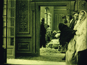
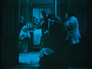
Even more visually remarkable is Victorin Jasset’s Au pays de ténébres (In the Land of Shadows, 1911), a grim naturalistic drama set among coal miners. The film occasionally displays principles of depth staging that would be elaborated in some of the masterpieces of 1913. In one scene, the miners’ families gather in an anteroom. As they wait to identify the men killed in a cave-in, the bodies are barely discernible in the distance.
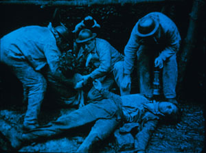
Au pays de ténébres illustrates a sort of structural usage of color. In scenes like the one above, the color is, in orthodox fashion, denoting a daylight interior. By contrast, the scenes in the mine are tinted blue, the standard hue for night and darkness.
But in the final scenes of the bodies assembled in the room of the dead, the color retains a blue cast, recalling the mine.
Thanks to the tinting, the living find themselves in the land of shadows.
Early auteurs
In the 1910s, we can find some distinct directorial approaches. One auteur is the German Franz Hofer, who liked to frame his actors in symmetrical architecture. Rectangular geometries are given a comic cast in Fraulein Piccolo (1915), a story about flirtatious officers and a schoolgirl forced to be both maid and bellboy. Here, two servants open doorways to watch a soldier starting to seduce the heroine.
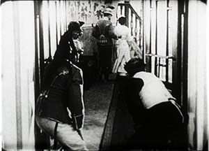
I hadn’t expected to find surprises in Henri Pouctal’s Chantecoq, a two-part French feature from 1916. Yet this espionage drama was consistently engaging, and not just because the popular comedian Pougaud played the deceptively naïve hero. Pouctal unrolls his scenes in an unusual variety of setups, including an astonishing low-angle view of two spies grappling with Chantecoq on the floor of a train compartment. The image recalls Anthony Mann’s steep railway compositions in The Tall Target.
Alfred Machin was Belgium’s preeminent director of the 1910s. He never seems to have seen a windmill he didn’t want to film, then burn down or blow up. Machin enjoyed recording Belgian folk culture, particularly village dancers, as is evident in classic one-reelers like Le Moulin maudit (The Accursed Mill, 1909), and he had a fondness for jungle cats like Mimur the leopard.
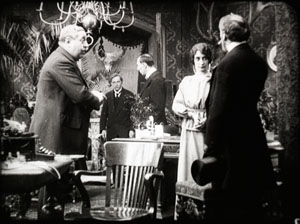
Each of the Machin features I saw shed light on my research questions. Le Diamant noir (The Black Diamond) confirmed that the European tableau style was by 1913 achieving considerable intricacy. In this film, Luc, a rich man’s secretary, is accused of stealing the daughter’s bracelet. The scene of the police interrogation is a muted ballet of figures retreating, advancing, blocking, and revealing.
The servant in the far distance returns to visibility when he’s needed to show the cops to Luc’s room.
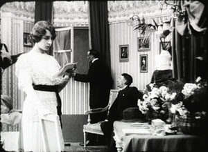
In Machin’s La Fille de Delft (The Girl from Delft, 1914), the tableau depth cooperates with some muted cutting. Kate is a famous dancer, visited by Jef, the young shepherd who has loved her since she was a girl. In her dressing room, while stage-door roués wait to take her out for dinner, she gets a message from him.
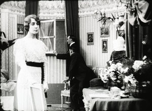
As she lowers the note, she makes her two playboy admirers more visible; we can see them opening the window.
They peer out, and we get an over-the-shoulder shot of Jef waiting outside.
When we cut back to the master shot, the men are mocking him and Kate is deciding whether or not to admit him. She goes to the window herself and looks outside. Again we get the over-the-shoulder framing, but in two beats: Kate looking, then Kate looking away.
The poignant framing lets us linger on her moment of decision. When she closes the window, we know that she has decided to abandon her childhood friend.
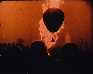
Simpler in its drama and staging is Machin’s official classic, Maudite soit la guerre (Cursed Be War, 1914). Adolphe, a young man from a country suspiciously similar to Germany comes to Belgium, or a place like Belgium, to learn aviation. Adolphe falls in love with his host’s daughter Lidia, but soon war breaks out between their countries and they must part. The rest of the film, which includes some spectacular aerial scenes (and, naturally, a burning windmill), pleads for peace and brotherhood. Released in May of 1914, Machin’s anti-war film now seems a futile warning.
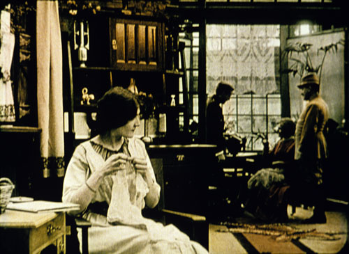
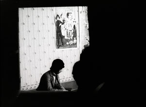
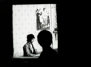
The Archive has restored the original’s Pathécolor, creating images of great loveliness. Some scenes show stenciled color, which helps articulate the planes of shots arrayed in depth. An example surmounts this blog entry. At other moments, deep red tinting enhances the battle scenes, notably one of an exploding dirigible.
In all, this outstanding restoration of Maudite soit la guerre reminds us of what audiences actually saw—films of deeply felt emotion, often accentuated by spectacular action like that on display today, and employing color with both intensity and delicacy.
The restorer’s art
During my stay, I particularly enjoyed the time I spent with Noël Desmet, supervisor of restorations at the Belgian Film Archive. Noël invented the most robust method of recovering silent film color. Around the world, archivists have adopted the Desmet system.
Noël is scheduled to retire in April of next year. His research will be continued by his colleagues, and he will enjoy some well-earned time among his orchids. Film culture rests upon the shoulders of committed archivists like him. Noël Desmet and his peers are the guardians of treasures, the patient preservers of the secrets and surprises harbored by the twentieth century’s most powerful art form.
For more on tableau staging in Europe and the US, see the entries linked above, as well as my notes from this summer’s visit to the Danish Film Archive, some comments on acting styles, my discussion of Charles Barr’s idea of gradation of emphasis, and an entry on hands and faces around a table. The most thorough analyses of these and other staging principles are in On the History of Film Style, Figures Traced in Light, and certain chapters of Poetics of Cinema.
For more information on Machin and Mimur, see the bilingual book edited by Eric de Kuyper, Alfred Machin Cinéaste/ Film-maker (Brussels: Royal Film Archive, 1995).The Diva Dolorosa disc contains extracts from major films, but unfortunately they aren’t specifically identified, and the original cutting patterns aren’t always respected. The difficulty with such celebratory appropriations of silent films is that they are unreliable as historical evidence. Worse, in today’s commercial market, such compilations make it unlikely that other video producers will launch complete DVD versions of the films.
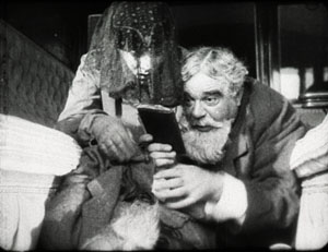
Tagebuch des Dr. Hart (Dr. Hart’s Diary, Paul Leni, 1916)
PS 18 August: Thanks to Armin Jäger for a name correction!


