Archive for the 'Film scholarship' Category
Invasion of the Brainiacs II
DB here:
What gives movies the power to arouse emotions in audiences? How is it that films can convey abstract meanings, or trigger visceral responses? How is it that viewers can follow even fairly complex stories on the screen?
General questions like this fall into the domain of film theory. It’s an area of inquiry that divides people. Some filmmakers consider it beside the point, or simply an intellectual game, or a destructive urge to dissect what is best left mysterious. Many readers consider it academic bluffing, another proof of Shaw’s aphorism that all professions are conspiracies against the laity.
These complaints aren’t quite fair. Early film theorists like Hugo Münsterberg, Rudolf Arnheim, André Bazin, and Lev Kuleshov wrote clearly and often gracefully. Even Sergei Eisenstein, probably the most obscure of the major pre-1960 theorists, can be read with comparative ease. Moreover, generations of filmmakers have been influenced by these theorists; indeed, some of these writers, like Kuleshov and Eisenstein, were filmmakers themselves.
But those day are gone, someone may say. Does contemporary film theory, bred in the hothouse of universities and fertilized by High Theory in the humanities, have any relevance to filmmakers and ordinary viewers? I think that at least one theoretical trend does, if readers are willing to follow an argument pitched beyond comments on this or that movie.
That is, film theory isn’t film criticism. Its major aim is more general and systematic. A theoretical book or essay tries to answer a question about the nature, functions, and uses of cinema—perhaps not all cinema, but at least a large stretch of it, say documentary or mainstream fiction or animation or a national film output. Particular films come into the argument as examples or bodies of evidence for more general points.
In about three weeks, about fifty people will gather at the University of Copenhagen to do some film theory together. It’s the annual meeting of the Society for Cognitive Studies of the Moving Image. I talked about the group last year (here and here) in the runup to our Madison event.
The sort of theorizing we’ll do, for all its variety, is in my view the most exciting and promising on the horizon just now. It’s also understandable by anyone interested in puzzles of cinematic expression, and it has powerful implications for creative media practice.
We’ll also be in Copenhagen for Midsummer Night, which is always pleasant. Go here for the lovely song that thousands of Danes will try to sing, despite terminal drunkenness. No real witches burned, however.
Concordance and convergence
But back to topic: Puzzles of cinematic expression, I said. What puzzles? Well, films are understood. Remarkably often, they achieve effects that their creators aimed for. Michael Moore gets his message across; Judd Apatow makes us laugh; a Hitchcock thriller keeps us in suspense. What enables movies to reliably achieve such regularity of response?
It’s not enough to say: Moore hammers home his points, Apatow creates funny situations, Hitchcock puts the woman in danger. Any useful explanation subsumes a single case to a more general law or tendency. So a worthwhile explanation for these cinematic experiences would appeal to more basic features of artworks, cultural activities, or our minds. We can pick up on Moore’s message because we know how to make inferences within certain contexts. We can laugh at a joke because we understand the tacit rules of humor. We recognize a suspenseful situation because… well, there are several suggestions.
This sort of question is largely overlooked by theorists of Cultural Studies, another area of contemporary media studies. They typically emphasize difference and divergence, highlighting the varying, even conflicting ways that audiences or critics interpret a film.
Studying how viewers appropriate a film differently is an important enterprise, but so is studying convergence. Arguably, studying convergence has priority, since the splits and variations often emerge against a background of common reactions. A libertarian can interpret Die Hard as a paean to individual initiative, while a neo-Marxist can interpret it as a skirmish in the class war, but both agree that John and Holly love each other, that her coworker is a weasel, and that in the end John McClane’s defeat of Hans Gruber counts as worthwhile. Both viewers may feel a surge of satisfaction when McClane, told by a terrorist he should have shot sooner, blasts the man and adds, “Thanks for the advice.” What enables two ideologically opposed viewers to agree on so much?
Films aren’t just understood in common; they arouse remarkably similar emotions across cultures. This is a truism, but it’s been too often sidestepped by post-1960 film theory. Who, watching The World of Apu, doesn’t feel sympathy and pity for the hero when he learns of the sudden death of his beloved wife? Perhaps we even register a measure of his despair in the face of this brutal turn of events.
We can follow a suite of emotions flitting across Apu’s face. I doubt that words are adequate to capture them.
Are these facial expressions signs that we read, like the instructions printed on a prescription bottle? Surely something deeper is involved in responding to them—for want of a better word, fellow-feeling. Indians’ marriage customs and attitudes toward death may be quite different from those of viewers in other countries, but that fact doesn’t suppress a burst of spontaneous sympathy toward the film’s hero. We are different, but we also share a lot.
The puzzle of convergence was put on the agenda quite explicitly by theorists of semiotics. Back in the 1960s, they argued that film consisted of more or less arbitrary signs and codes. Christian Metz, the most prominent semiotician, was partly concerned with how codes are “read” in concert by many viewers. Today, I suppose, most proponents of Cultural Studies subscribe to some version of the codes idea, but now the concept is used to emphasize incompatibilities. So many codes are in play, each one inflected by aspects of identity (gender, race, class, ethnicity, etc.), that commonality of response is rare or not worth examining.
A complete theoretical account, if we ever have one, would presumably have to reckon with both differences and regularities. The dynamic of convergence and divergence is a central part of one arena of film studies that has, for better or worse, been called cognitivism.
Sampling
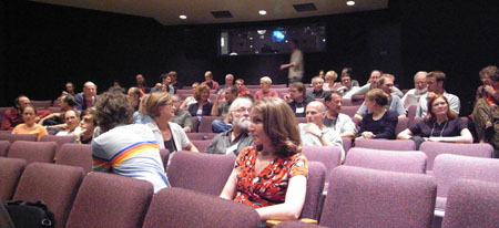
Gathering for Uri Hasson‘s keynote lecture, SCSMI 2008.
The cognitive approach to media remains a pretty broad one, and the Society for Cognitive Studies of the Moving Image hosts a plurality of approaches at its annual meetings. SCSMI has become home to media aesthetes, empirical researchers, and philosophers in the analytic tradition who are interested in interrogating the concepts used by the other two groups. Last year’s gathering, at our campus here in Madison, created a lively dialogue among these interests.
For instance, some of us Film Studies geeks wonder why people so consistently ignore mismatched cuts. Dan Levin’s ingenious experiments on “change blindness” provide a hilarious rejoinder. In one study conducted with Dan Simons, a stooge asks directions of an innocent passerby. As they’re talking, a pair of bravos carry a plank between them, and another confederate is substituted for the first one.
You guessed it. Most subjects don’t notice that the person they’re talking to has changed into somebody else! So how can we worry about mismatched details in cuts? Actually, Dan’s research isn’t just deflationary. It helps spell out particular conditions under which change blindness can occur.
Another stimulating talk was offered by Jason Mittell. He asked how long-running prime-time TV serials can solve the problem of memory. In this week’s episode what strategies are available to recall the most relevant action of earlier episodes? How can previous action be presented without boring faithful fans? Jason, who has a new book on American TV and culture out this spring, went beyond describing the strategies. He suggested how they can become a new source of formal innovation, as in the Death of the Week in Six Feet Under.
Sermin Ildirar of Istanbul University presented the results of a study on adults living in a village in South Turkey. These viewers were older, ca. 50-75, and—here’s the interesting part—had never seen films or TV shows. To what extent would they understand “film grammar,” the conventions of continuity editing and point-of-view, that people with greater media experience grasp intuitively? To facilitate comprehension, the researchers made film clips featuring familiar surroundings.
The results were intriguingly mixed. Some techniques, such as shots that overlapped space, were understood as presenting coherent locales. But most viewers didn’t grasp shot/ reverse-shot combinations as a social exchange. They simply saw the person in each shot as an isolated figure.
The discussion, as you may expect, was lively, concerning the extent to which a story situation had been present, the need to cue a conversation, and the like. I found it a sharp, provocative piece of research. Stephan Schwan, who worked with Sermin and Markus Huff, has become a central figure studying how the basic conventions of cutting and framing might be built up on the basis of real-world knowledge, and both he and Sermin are back at SCSMI this year.
Stephan Schwan, Thomas Schick, Markus Huff, and Sermin Ildirar, with Johannes Riis in the background; SCSMI 2008.
There were plenty of other stimulating papers: Tim Smith’s usual enlightening work on points of attention within the frame, Johannes Riis on agency and characterization, Paisley Livingston on what can count as fictional in a film, Patrick Keating on implications for emotion of alternative theories of screenplay structure, Margarethe Bruun Vaage on fiction and empathy, and on and on.
One of the best things about this gathering was that the ideas were sharply defined and presented in vivid, concrete prose. I can’t imagine that ordinary film fans wouldn’t have found something to enjoy, and of course many of these matters lie at the heart of what filmmakers are trying to achieve. Indeed, some filmmakers regularly give papers at our conventions. The much-sought link between theory and practice is being made, again and again, in the arena of the SCSMI.
Last year I came to believe that this research program was hitting its stride. My hunch is confirmed by this year’s gathering in Copenhagen. The department of media studies there has long been a leader in this realm. You can download a Word version of the schedule here.
Lest you think that the conference participants don’t talk much about particular movies, I should add that there’s one film we’ll definitely be talking about this time around. Our Copenhagen hosts have arranged for a screening of von Trier’s Antichrist.
Next time: Going deeper into cognitivism, and three recent explorations.
Malcolm Turvey makes a point to Trevor Ponech and Richard Allen, SCSMI 2008.
Kristin and I have talked about pictorial universals elsewhere on this site. See her blog entry on eyeline matching in ancient Egyptian art, and my comments on “representational relativism” here.
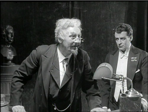
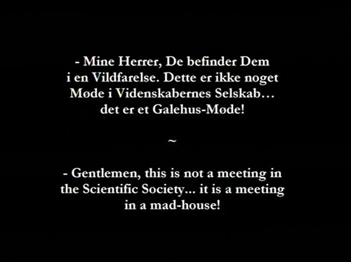
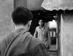
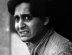
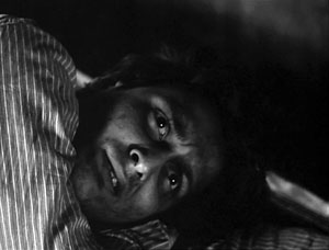
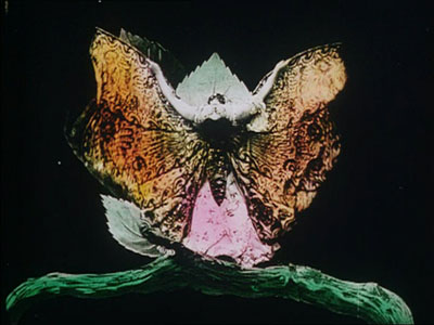
Images at the top of this entry are taken from the Danish film Himmelskibet (The Space Ship, aka A Trip to Mars, 1918).
Color, shape, movement . . . and talk
Bonjour Tristesse.
DB here:
Our weekly Film Colloquium is sort of like your old high-school assembly, except that it’s fun. The Film Studies area meets nearly every Thursday afternoon at 4 to hear a paper by a grad student, a faculty member, or a guest. It’s a great forum for ideas and information, and it gives the speaker a chance to try out a talk before taking it to a conference or lecture gig. The local audience is, in my experience, the toughest I’m likely to encounter. And this spring, despite a heavy travel and work schedule, Kristin and I caught two outstanding presentations.
Not in color, but colored
By now we all understand that silent films were most often shown with musical accompaniment, and sometimes sound effects. But we tend to forget that most silent films were in color too.
By the early 1920s, 80% of films were colored in one way or another. There were a few efforts to record the actual colors in a scene, but most often color was added after filming. Areas of the frame might be painted over by stenciling or by freehand. More commonly, the shots were dipped into dyes, yielding images that were tinted (washing over the image and coloring the areas of white, as in the frames below) or toned (coloring the darkest areas and leaving the white areas white). Over the years, film prints were preserved in black and white, partly because color stock was more expensive than today. As a result, even archival prints lost the sense of what audiences actually saw. Today archivists labor to reconstruct what silent films looked like in all their rainbow glory.
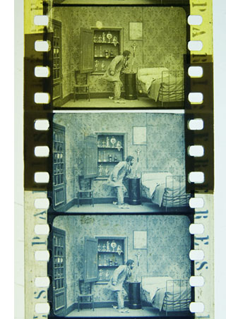 Professor Joshua Yumibe of Oakland University wrote his Ph. D. thesis on early color processes, and his Colloquium talk asked some powerful questions. We know that there was a transition in film artistry from the late 1900s to the early 1910s, a shift toward what Tom Gunning has called the “cinema of narrative integration.” As films became longer and were shown in more or less permanent venues, moviemakers began to tell more complicated stories. How, Josh asks, did this shift away from a cinema of isolated “attractions” affect practices of coloring? Do color processes affect the way stories were told? Do the color processes change how people saw the space on screen? How did the trade press respond to different strategies of coloring?
These are fascinating questions, and Josh’s exploration of them was careful and detailed. He has done enormous research on the various color processes, and he was able to trace several lines of development. For instance, he found that writers of the earliest years thought that color enhanced the sensual and emotional effects of the image, even creating an illusion of 3-D. In a shot like that of the butterfly dancer, people seem to have sensed that her multicolored shape was thrusting out of the screen toward them.
Josh argues that with the growing emphasis on narrative, color became more muted. Filmmakers were no longer aiming at momentary stimulation but at ongoing mood. Now tinting and toning came into their own. Color codes developed: blue for night scenes, yellow for sunlight, red for fire, amber for artificial light. Josh also explored the different ways in which European and US companies conceived of color; there seem to have been different color policies at Pathé and at American companies. But this wasn’t the end of change. In the 1920s, with the feature film now at the center of the theatre program, a wide variety of color practices emerged, including those isolated Technicolor sequences we find in films like The Wedding March.
The Q & A was as lively as the talk itself, and afterward, we repaired to a bar and thence to dinner. Josh’s talk was a model of deep, imaginative research and it kept us thinking and talking for a long time afterward. Not to mention his slide show, which regaled us with gorgeous shots that make you realize how much you’re missing when you see an old movie in black and white.
Bass, o profondo!
Another stimulating Colloq session was presided over by our old friend Jan-Christopher Horak, director of the UCLA Film and Television Archive. Chris was in town because our Cinematheque has been showcasing UCLA archival restorations across the semester, and he introduced our screening of The Dark Mirror. But we also got him to give a talk, and that was quite something.
Chris reminded me that we first met thirty years ago, here in Madison, when he came to do research on his dissertation. Since then Chris has been a top-flight scholar and author of many books. His Lovers of Cinema, published by our series at the UW Press, laid the groundwork for the popular film series Unseen Cinema. He’s also been one of the world’s leading film archivists, having supervised collections at Eastman House, the Munich Film Archive, Universal studios, and most recently UCLA.
Chris has long worked at the intersection of film, photography, and the graphic arts. He is one of the world’s experts on the 1920s German avant-garde; one of his early curatorial coups was a 1979 restaging of the pioneering Film und Foto exhibition of 1929. Chris has also long been fascinated by film publicity, having written a book on the subject. So it’s natural that he would gravitate toward studying the film-related work of Saul Bass, one of America’s greatest graphic designers.
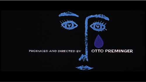
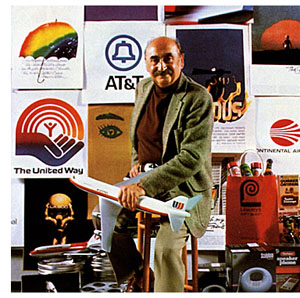 Chris’s talk focused not so much on Bass’s brilliant credit sequences for films by Preminger and Hitchcock as on Bass’s contributions to poster design. Bass turns out to have had a fascinating career, having worked in Manhattan advertising before moving to Los Angeles in 1948. Chris has found at least one early 1950s poster design that Bass probably executed, but he definitely worked for Preminger on publicity for The Moon Is Blue (1953) and Carmen Jones (1954)—the latter yielding to my mind one of the greatest credit sequences in film history. In 1955 Bass founded his own firm.
Throughout, he carried on the ideals of György Kepes, his teacher and a major conduit for Bauhaus ideas into America. Like his European models, Kepes promoted the idea of art as having cognitive value, teaching us to see the world in a new way. Kepes also emphasized that artworks could be of practical utility—an idea that chimed with Bass’s turn toward commercial design.
Chris was able to show that the Bauhaus tradition powerfully influenced Bass’s design principles. Who would have thought that the credits for The Seven Year Itch replayed Paul Klee? Obvious, though, when Chris showed us the images.
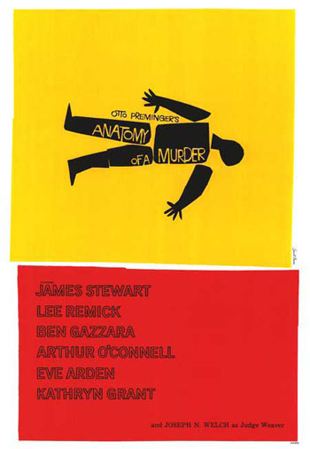
Chris emphasized two further points. First, Bass understood what we now call branding. We have to remember that it up to that time, most film publicity featured images of the stars, either in portraits or caught in typical scenes from the film. Bass’s poster design concealed the stars. Instead, he relied on dynamic geometrical design to capture a film’s mood in a powerful, stylized image. The result was an eye-catching logo, instantly recognizable: the flaming rose of Carmen Jones, the Vertigo whirlpool, the dismembered body of Anatomy of a Murder.
The key image could be repeated in newspaper ads, posters, credits, even the production company’s letterhead. When you saw the teaser trailer for Star Trek (“Under Construction”) dominated by that looming boomerang shape, you saw the heritage of Saul Bass. Who cares who’s in the movie? The very image is intriguing. No accident that Bass also designed many corporate logos, like the ATT bell and the United Way hand.
Chris’s second main point was that Bass was able to flourish because of the rise of independent production in the 1950s. Preminger, Hitchcock, and Wilder, acting as their own producers, could control the publicity for their films to a degree not possible for directors working in the classic studio system. Now films were sold as one-offs, and each film needed to pull itself above the clutter. In addition, Bass’s signature designs could set a director apart. In the 1950s, the Bass look was closely identified with his major clients like Hitchcock and Preminger, to the point that other designers for those directors tried to copy his style. I had always thought that Bass did the title design for Hurry Sundown, but Chris showed that it’s another artist’s pastiche of the master.
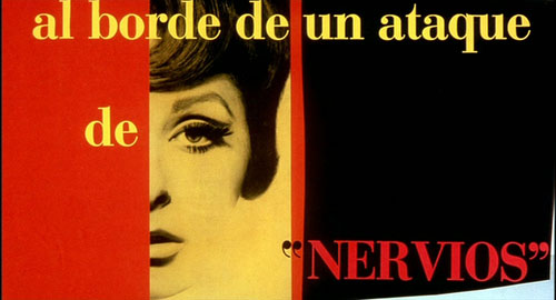
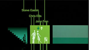 Chris’s talk reminded me that Bass contributed to making the opening credits a major attraction—not merely an overture, but an abstract treatment of the key story idea, a sort of graphic map that teases us into the main story. The opening sequences of Se7en and Catch Me If You Can (left) owe a lot to Bass’s idea that the credits should constitute a little movie, witty or ominous, tantalizing us with sketchy glimpses of what is to come. And Almodóvar’s diverting openings, probably the most sheerly enjoyable credit sequences we have today, are unthinkable without Bass. Synchronized with infectious music, Bass’s credit sequences can be seen as continuing the tradition of Walter Ruttmann and Oskar Fischinger, who back in the 1920s and 1930s made abstract films that advertised consumer goods.
For such reasons, I’m glad I hung around Madison after my retirement. With visiting researchers like Josh and Chris, who wants to go fishing?
Woman on the Verge of a Nervous Breakdown.
Thanks to Joshua Umibe for the silent-film illustrations. The first comes from Gaston Velle, Métamorphoses du Papillon / A Butterfly’s Metamorphosis (Pathé, 1904). Frame enlargement from Discovering Cinema (di. Eric Lange and Serge Bromberg, Lobster Film/Flicker Alley). The second comes from Albert Capellani’s Le Chemineau / The Vagabond (Pathé, 1905; tinted and toned). Frame enlargement Joshua Yumibe, courtesy of the Netherlands Filmmuseum.
Love isn’t all you need
Pat and Mike.
DB still in HK:
Last week the Hong Kong International Film Festival hosted Gerry Peary’s For the Love of Movies: The Story of American Film Criticism. It’s a lively and thoughtful survey, interspersing interviews with contemporary critics with a chronological account that runs from Frank E. Woods to Harry Knowles. It goes into particular depth on the controversies around Pauline Kael and Andrew Sarris, but it even spares some kind words for Bosley Crowther.
Some valuable points are made concisely. Peary indicates that the alternative weeklies of the 1970s and 1980s were seedbeds for critics who moved into more mainstream venues like Entertainment Weekly. I also liked the emphasis on fanzines, which too often get forgotten as precedents for internet writing. In all, For the Love of Movies offers a concise, entertaining account of mass-market movie criticism, and I think a lot of universities would want to use it in film and journalism courses.
 I should declare a personal connection here. I’ve known Gerry since 1973, when I came to teach at the University of Wisconsin—Madison. Like me, he was finishing a dissertation: he was writing a history of the gangster films made before Little Caesar. We spent good lunches together at the Fish Store. Gerry was one of the moving spirits of Madison movie culture—running a film society, writing and editing for the student paper, working with John Davis, Susan Dalton, Tim Onosko, and Tom Flinn on The Velvet Light Trap. I knew I’d come to the right place when somebody would drop by my office to talk about last night’s screening of Underworld or Steamboat ‘Round the Bend.
Like many of our generation, Gerry became a mixture of critic and academic. He taught at several colleges, wrote for The Boston Phoenix, and published books, notably Women and the Cinema: A Critical Anthology (1977) and The Modern American Novel and the Movies (1977). Most recently he’s edited collections of interviews with Tarantino and John Ford. He has moved smoothly into online publishing with a packed and wide-ranging website.
Gerry’s documentary comes along at a parlous time, of course. Most of the footage was taken before the wave of downsizings that lopped reviewers off newspaper staffs, but already tremors were registered in some interviewees’ remarks. Apart from this topical interest, the film set me thinking: Is love of movies enough to make someone a good critic? It’s a necessary condition, surely, but is it sufficient?
Gerry’s film includes the inevitable question: What movie imbued each critic with a passion for cinema? I have to say that I have never found this an interesting question, or at least any more interesting when asked of a professional critic than of an ordinary cinephile. Watching Gerry’s documentary made me think that everybody has such formative experiences, and nearly everybody loves movies. But what sets a critic apart?
Elsewhere, I’ve argued that a piece of critical writing ideally should offer ideas, information, and opinion—served up in decent, preferably absorbing prose. This is a counsel of perfection, but I think the formula ideas + information + opinion + good or great writing isn’t a bad one.
You really can’t write about the arts without having some opinion at the center of your work. Too often, though, a critic’s opinions come down simply to evaluations. Evaluation is important, but it has several facets, as I’ve tried to suggest here. And other sorts of opinions can also drive an argument. You can have an opinion about the film’s place in history, or its contribution to a trend, or its most original moments. Opinions like these allow you to build an argument, drawing on evidence or examples in or around the movie in question. Several of our blog entries on this site are opinion-driven, but not necessarily evaluations of the movies.
Most people think that film criticism is largely a matter of stating evaluations of a film, based either in criteria or personal taste, and putting those evaluations into user-friendly prose. If that’s all a critic does, why not find bloggers who can do the same, and maybe better and surely cheaper than print-based critics? We all judge the movies we see, and the world teems with arresting writers, so with the Internet why do we need professional critics? We all love movies, and many of us want to show our love by writing about them.
In other words, the problem may be that film criticism, in both print and the net, is currently short on information and ideas. Not many writers bother to put films into historical context, to analyze particular sequences, to supply production information that would be relevant to appreciating the movies. Above all, not many have genuine ideas—not statements of judgments, but notions about how movies work, how they achieve artistic value, how they speak to larger concerns. The One Big Idea that most critics have is that movies reflect their times. This, I’ve suggested at painful length, is no idea at all.
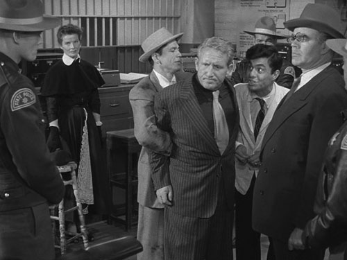
Once upon a time, critics were driven by ideas. The earliest critics, like Frank Woods and Rudolf Arnheim, were struggling to define the particular strengths of this new art form. Later writers like André Bazin and the Cahiers crew tried to answer tough idea-based questions. What is distinctive about sound cinema? How can films creatively adapt novels and plays? What are the dominant “rules” of filmmaking ? (And how might they be broken?) What constitutes a cinematic modernism worthy of that in other arts? You could argue that without Bazin and his younger protégés, we literally couldn’t see the artistry in the elegant staging of a film like George Cukor’s Pat and Mike. Manny Farber, celebrated for his bebop writing style, also floated wider ideas about how the Hollywood industry’s demand for a flow of product could yield unpredictable, febrile results.
One of the reasons that Sarris and Kael mattered, as Gerry’s documentary points out, was that they represented alternative ideas of cinema. Sarris wanted to show, in the vein of Cahiers, that film was an expressive medium comparable in richness and scope to the other arts. One way to do that (not the only way) was to show that artists had mastered said medium. Kael, perhaps anticipating trends in Cultural Studies, argued that cinema’s importance lay in being opposed to high art and part of a raucous, occasionally vulgar popular culture. This dispute isn’t only a matter of taste or jockeying for power: It is genuinely about something bigger than the individual movie.
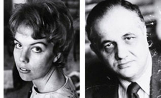 During the Q & A, it emerged that at the same period critics’ ideas had an impact on filmmaking. Sarris’s promotion of the director as prime creator, with a bardic voice and a personal vision, was quickly taken up by Hollywood. Now every film is “a film by….” or “ a … film”: auteur theory shows up in the credits. Similarly, the concept of film noir was constructed by French critics and imported to the US by Paul Schrader. Suddenly, unheralded films like The Big Combo popped up on the radar. Today viewers routinely talk about film noir, and filmmakers produce “neo-noirs.” It seems to me as well that Hollywood became somewhat more sensitive to representation of women after Molly Haskell (here, alongside Sarris) had brought feminist ideas to bear on the American studio tradition, avoiding simple celebration or denunciation. Film criticism had a robust impact on the industry when it trafficked in ideas.
You can argue that these are old examples. What new ideas are forthcoming from mainstream film criticism? In the Q & A Gerry, like the rest of us, couldn’t come up with many. On reflection, I wonder if the rise of academic film studies forced ideas to migrate to the specialized journals and the Routledge monograph. These ideas also had a different ambit—sometimes not particularly focused on cinema, or on aesthetics, or on creative problem-solving.
Of course ideas don’t move on their own. A more concrete way to put this is that bright, conceptually oriented young people who in an earlier era would have become journalistic critics became professors instead. The division of labor, it seems, was to aim Film Studies at an increasingly esoteric elite, and let film reviewers address the masses. It’s an unhappy state of affairs that we still confront: recondite interpretations in the university, snap evaluations in the newspapers. You can also argue that print reviewers, by becoming less idea-driven, paved the way for DIY criticism on the net.
What about information, the other ingredient I mentioned? If we think of film criticism as a part of arts journalism, we have to admit that most of it can’t compare to the educational depth offered by the best criticism of music, dance, or the visual arts. You can learn more from Richard Taruskin on a Rimsky performance or Robert Hughes on a Goya show than you can learn about cinema from almost any critic I can think of. These writers bring a lifetime of study to their work, and they can invoke relevant comparisons, sharp examples, and quick analytical probes that illuminate the work at hand. Even academically trained film reviewers don’t take the occasion to teach.
Most of the print criticism I’ve seen today is remarkably uninformative about the range and depth of the art form, its traditions and capacities. Perhaps editors think that film isn’t worthy of in-depth writing, or perhaps their readers would resist. As if to recall the battles that Woods, Arnheim and others were fighting, cinema is still not taken seriously as an art form by the general public or even, I regret to say, by most academics.
Yet other aspects of information could be relevant. Close analysis offers us information about how the parts work together, how details cohere and motifs get transformed. For an example of how analysis can be brought into a newspaper’s columns, see Manohla Dargis on one scene in Zodiac.
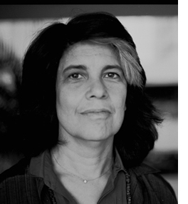 I’d also be inclined to see description—close, detailed, loving or devastating—as providing information. It’s no small thing to capture the sensuous surface of an artwork, as Susan Sontag put it. Good critics seek to evoke the tone or tempo of a film, its atmosphere and center of gravity. We tend to think that this is a matter of literary style, but it’s quite possible that sheer style is overrated. (Yes, I’m thinking of Agee.) Thanks to our old friends adjective and metaphor, even a less-than-great writer can inform us of what a film looks and sounds like.
In any event, I’m coming to the view that the greatest criticism combines all the elements I’ve mentioned. As so often in life, love isn’t always enough.
Gerry’s documentary doesn’t distinguish between critics and reviewers, but we probably should. Reviewers typically give us opinions and a smattering of information (plot situations, or production background culled from presskits), wrapped up in a writing style that aims for quick consumption. Today anybody with a web connection can be a reviewer.
Exemplary critics try for more: analysis and interpretation, ideas and information, lucidity and nuance. Such critics are as rare now as they have ever been. Far from being threatened by the Internet, however, they have more opportunities to nourish film culture than ever before.
The Big Combo.
PS 4 April (HK time): Thanks to Justin Mory for correcting a name error in the original post!
The eyeline match goes way, way back
Kristin here—
It’s late January as I write this entry, and in about a month, I’m due in Egypt for my annual three weeks of volunteer work on the Amarna Project at Tell el-Amarna, in Middle Egypt. (For the project’s website, see here, and for my part in it, click on “Recent Projects,” then “Material Culture,” and finally “Statuary.”) So as not to leave David with the entire blogging burden during that period, I’m writing this to be posted during my absence.
Given the occasion, I decided to write about a topic that has popped into my mind now and then: a little connection I observed between techniques of ancient Egyptian art and those of continuity film editing. In their reliefs, Egyptian artists were very conscious of the directions of figures’ gazes, and their strove in most cases to match the orientation of the accompanying hieroglyphs to those directions. This topic is not only appropriate, but it gives me a chance to show off my new hieroglyphic font—and to practice composing texts with it.
The connection between eyelines in reliefs and in film editing first occurred to me several years ago when our colleague Noël Carroll was giving a talk in the film-studies colloquium in the Dept. of Communication Arts here at the University of Wisconsin-Madison. He dealt with eyeline matches, or glance/object editing and took a cognitive-studies approach.
Noël’s argument was that such editing is not an arbitrary convention and that it draws upon an “innate perceptual behavior” shared by humans to look not just at other people but also at what those people are looking at. (I’m quoting here from the publication of his talk as “Toward a Theory of Point-of-View Editing: Communication, Emotion, and the Movies,” in his 1996 collection, Theorizing the Moving Image, from Cambridge University Press.) This tendency naturally manifests itself when babies begin at two to three months to follow the directions of their parents’ gazes. He claims that eyeline matching “can function communicatively because it is a representational elaboration of a natural information-gathering behavior” and also that such a link to our everyday perception helps make continuity editing easy to grasp.
If we can find comparable sorts of devices in art of a different era and culture, those devices help support claims about “cultural universals.” These are patterns of perception that all cultures share, though they will manifest themselves in art in different ways. Let’s take a look at a sort of eyeline matching that’s used in Egyptian reliefs. Only here it’s not an eyeline and a seen object being matched. It’s a match between an eyeline and the direction its accompanying hieroglyphs face.
Hieroglyphs and their orientation
First, let me get a pet peeve out of the way. A lot of people these days call hieroglyphs “hieroglyphics.” There is no such word, or shouldn’t be. “Hieroglyphic” is an adjective, as in “hieroglyphic text” or “hieroglyphic inscription.” But don’t just take my word for it; look under Etymology in the Wikipedia entry on hieroglyphs. (I note with annoyance that my spell-checker doesn’t highlight “hieroglyphics,” but it does think “eyeline” is wrong.)
Now, about directions. Egyptian hieroglyphs can be written horizontally or vertically, facing left or right. The default orientation is facing right, to be read right to left. How do you know which direction they’re facing? Even if you can’t read hieroglyphs, just look at the signs representing living things. Birds, people, animals, bugs, with rare exceptions they all face the front of the text.
There are all sorts of complicated exceptions to the rightward orientation. The late Henry George Fischer, curator of Egyptology at the Metropolitan Museum of Art, wrote a large book on the subject: The Orientation of Hieroglyphs, Part 1. Reversals (Alas, he never wrote Part 2.)
As Fischer says at the outset, “It is essential to stress the fact that Egyptian art and writing are interrelated to a degree that is unparalleled in any other culture. For it is from this fact that the orientation of hieroglyphic texts derives its logic.” And Egyptian art, despite its strangeness to many eyes, is intensely logical. Each person, creature, and object portrayed in relief will be shown from its most characteristic, recognizable view, whether that be in profile (such as a person’s face, legs, and stomach) or frontal (that person’s eye and shoulders).
In reliefs, the hieroglyphic texts in reliefs function as labels and descriptions of the things depicted or to quote the words of the people present. Hence, logically, the particular inscription relating to one person, creature, or object depicted will face the same direction as it does.
Two straightforward examples
The image below is a detail from a false door (the entrance and exit for the dead person’s soul in a tomb). It comes from an Old Kingdom tomb at Saqqara (5th Dynasty, roughly 2453 BCE). The relief depicts a husband, Nikaure, and wife, Ihat, along with two of their children.
Egyptian Museum, Cairo, inventory CG 1414
The pair sit opposite each other across a table full of offerings: long loaves of bread, portrayed vertically even though they are assumed to lie on the table. The two columns above Nikaure face rightward, as does he. They give his official titles and name. The two above Ihat face left and do the same for her. The son at the left faces right, as does the text above him, and his sister, at the right, faces leftward, as do her hieroglyphs. Despite the fact that this particular door belongs to Ihat, there is a slight male bias here, since the list of offerings above the table face right, as he and his son do—the favored, “stronger” orientation for hieroglyphs and people.
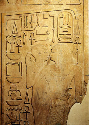 The basic conventions of Egyptian art were amazingly stable for a period of about three thousand years. We find the same principles in the Middle Kingdom. This relief (Egyptian Museum, Cairo, inventory JE 36809) on a column shows Senwosret I (12th Dynasty, reigned 1971-1929 BCE) being embraced by a statue of the god Ptah in its shrine. You wouldn’t think that statues embrace people, but pharaohs were considered divine and could communicate with gods’ statues in temples. The king is at the right, facing left. His name is in the oval cartouche above his head, and the columns of signs at either side of it give some of his titles. All face left.
The rest of the signs face right. They identify Ptah and describe all the things he’s giving the king: life, dominion, stability, health, and happiness. The column at the far left is a direct quotation of the god’s words. As in these two examples, almost any relief where figures are present facing different directions, the orientation of the hieroglyphs will be determined by which one they refer to. Obviously the Egyptians considered this sort of directional consistency very important.
Facing one way, looking the other
Indeed, the directions in which figures’ faces and eyes were turned seems to have been of particular importance. It’s not uncommon for a figure to be facing one way and looking back. In that case, that figure’s hieroglyphs will face backward as well.
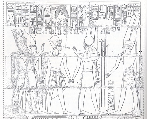
The relief below reveals the logic of this device very well. Two gods, Atum at the right and Montu with the falcon head (not all falcon-headed gods are Horus) are leading Rameses III to the king of the gods, Amen. (I copied this from Fischer’s book, and unfortunately he doesn’t specify where this relief is.) As they proceed, Montu turns back to hold the signs for “life” and “dominion” to the king’s face. The five right-most columns of text above refer to Amen and mimic him in facing leftward; they represent his speech to the king. The next five represent Montu’s speech and, because his eyes look leftward, so do the hieroglyphs. But not the little column of text in front of his stomach and kilt. That describes his action of leading the pharaoh to Amen, so those signs, written beside the part of his body facing right, also face right. Charmingly logical.
That sort of thing is one small part of what makes Egyptian art so appealing to me. Perhaps it gives you a better feel for why Fischer claimed that Egyptian art integrates writing and pictorial representation more thoroughly than that of any other culture. It also bolsters David’s recent entry about how studying the techniques and conventions of an artform enhances one’s enjoyment of individual artworks.
Amarna examples
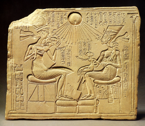
My favorite examples of head-turning reversed hieroglyphs come, not surprisingly, from the period I study, the Amarna era (18th Dynasty, New Kingdom, roughly 1350 BCE). One trait of Amarna art is its relatively casual depiction of the royal family. Previously the king had not been shown “behind the scenes,” playing with his children. Compare the Old Kingdom relief of Nikaure and Ihat, seated stiffly with their children at attention behind them, with the stela at the top of this entry. There the pharaoh Akhenaten lifts his eldest daughter, Meritaten, to kiss her. Opposite him sits his wife Nefertiti, holding the second daughter, Meketaten, on her lap, and balancing her third, Ankhesenpaaten, who stands on her arm or hip, playing with the decoration on Nefertiti’s familiar tall, flat crown. (A repaired crack has destroyed the child’s feet and some other elements of the relief). There’s a similar relief in the Louvre, by the way, where Nefertiti and at least two of the daughters sit on Akhenaten’s lap, but unfortunately only the lower part survives.
This stela is my favorite piece of Amarna art. I must confess that standing back in 1992 in the Ägyptisches Museum in Berlin and studying this sentimental little image (inventory 14145) was what finally suckered me into an obsession with the art of the era. It’s not just the appeal of the family scene, though. There’s an underlying complexity and innovativeness about this piece that makes it unique in the history of Egyptian art. It’s also not just sentimental. Such a stela would have stood in a private chapel in the garden of a rich family. The fecundity and nurturing shown in the image would be seen as indicative of the pharaoh’s protective role toward his country.
As is typical of Egyptian art, each figure has a label identifying him or her. Akhenaten’s and Nefertiti’s names and titles are in the vertical columns at the top, alongside the name and titles of their sole god, the Aten, or globe of the sun, which casts its life-giving rays down upon the group. Literally life-giving, since two of the rays’ little hands hold ankh-signs to the king’s face, and another two do the same for Nefertiti. Each daughter, though, has a label identifying her, all in the very formulaic phrases used on endless reliefs for this purpose.
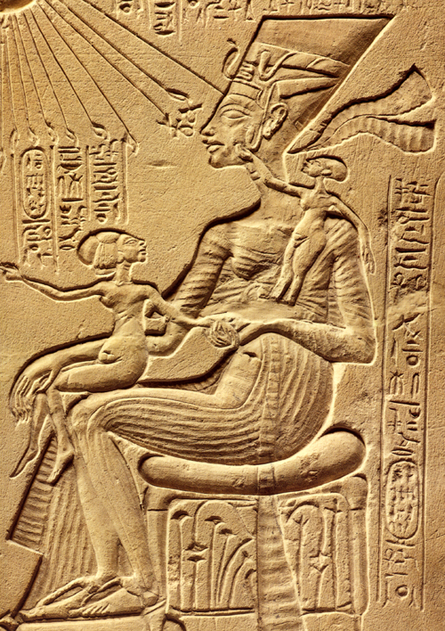
Here’s a detail of the part of the relief I want to focus on:
In contrast to the beautiful carving of the figures, the hieroglyphs here are rendered very badly, and it’s partly because they are so formulaic that one can read them all. I’ve used my new font program to lay them out legibly so you can see which way the inscriptions face. (The font couldn’t cram the four nfr-signs that appear side-by-side in Nefertiti’s name into the cartouche, so I settled for putting them on two lines.)
In the text running down the side, the youngest daughter is described: “King’s daughter, Ankhesenpaaten [i.e., “She who lives for the Aten”] of his body [i.e., Akhenaten’s biological offspring], whom he loves, born to the Great Royal Wife, Nefertiti, may she live forever and continuously.” The two other daughters have the same texts with their names substituted.
I’ve analyzed this stela in print, suggesting an interpretation of the brief narrative action that is going on in the scene (“Frontal Shoulders in Amarna Royal Reliefs: Solutions to an Aesthetic Problem,” The Journal of the Society for the Study of Egyptian Antiquities Vol. XXVII [1997, published 2000]: 79-98 and Pls. IV-VII). All I’m concerned with here is the fact that Meketaten has turned her head to look at her mother while pointing across at her father and sister. The short columns of text above her have been reversed accordingly:
There are other Amarna reliefs where a daughter turns her head, including one where the upper part of the princess is missing, and we can only tell she was turning to look at her mother because the few surviving hieroglyphs face the opposite direction from her feet. The reversal isn’t used in every case where a princess turns her head. In more formal offering scenes, where the princesses stand in a group behind their parents, a continuous row of short vertical columns above them gives the name and title for each. With all the rows lined up this way, the reversing of one daughter’s signs would look odd, and so the Egyptian artist kept all the columns facing the same direction. That’s another convention of Egyptian art: keep the graphic layout of the signs neat and pictorially appealing. They’re an important part of the overall image.
Reversed hieroglyphs and eyeline matches
I’m not trying to claim that Egyptian reliefs are just like film because the hieroglyphs are oriented by which was the figures are facing. There’s nothing comparable to an eyeline match in such images, since we see all the figures of a scene present at the same time, always depicted from head to toe. There is no need to match a figure’s eyeline to what he or she is looking at, since that, too, is present in the scene. There is no “offscreen space” in Egyptian reliefs.
Still, the Egyptians matched the orientation of hieroglyphs not just to the general direction a figure was facing but also to the specific eyeline created by head position. There was a logic to this, based on the fact that the direction of the gaze was deemed important and hence could be used to organize important elements of the composition of a scene—a static one in this case rather than one unrolling temporally across separate shots. That a culture so different from our own could come up with an artistic convention reminiscent of a technique in classical filmmaking suggests to me that claims about the naturalistic basis of eyeline matching and shot/reverse shot have merit.


