Archive for the 'Film scholarship' Category
Bergman, Antonioni, and the stubborn stylists
DB here:
Jonathan Rosenbaum has created quite a stir. His New York Times Op-Ed piece, “Scenes from an Overrated Career,” offers a fairly harsh judgment on the films of Ingmar Bergman. In one sense the timing was awkward; the poor man had just died. But the article wouldn’t have attracted much attention if Rosenbaum had waited a few months, so if creating a cause célèbre was his goal, he chose the right moment.
Timing aside, there wasn’t much in the piece that hasn’t been said by certain cadres of cinephiles for decades. Back in the 1960s, people called Bergman “theatrical,” “uncinematic,” pretentious, and intellectually shallow. He was even accused of hypocrisy. His spiritual, philosophical films always seemed to depend on a surprising number of couplings, killings, rapes, and gorgeous ladies, often naked. Rosenbaum contrasts Bergman with Bresson and Dreyer, more austere religious filmmakers as well as great formal innovators, and this gambit too is familiar from late-night film-society disputes. Jonathan’s case is news in the good, grey Times, but it’s an old story among his (my) generation.
I think that this generational antipathy has many sources. While Bergman had considerable academic cachet, this may have hurt him with smart-alecks like us. Cinephile priests and professors told us that Bergman was a great mind, but we suspected them of snobbery, for they often disdained even foreign filmmakers who dabbled in popular genres. Kurosawa was admired for Rashomon and I Live in Fear rather than for Seven Samurai and Yojimbo. And many of Bergman’s intellectual fans despised the classic tradition of American studio film. Hitchcock had not yet convinced literature profs of his excellence, and Ford was a gnarled geezer who made Westerns. Bergman and his acolytes seemed just too square. Our money was on Godard, especially after Susan Sontag’s magisterial essay on him.
Furthermore, some critics were on our side. Pauline Kael, with her nose for elitism, mocked ambitious European experiments like Marienbad. Andrew Sarris, who had a huge influence on our generation, initially registered respect for the arthouse kings. They proved that an artist could put a personal vision on film, thus buttressing the auteur approach to criticism. But Sarris retreated fairly fast. He was more unflaggingly enthusiastic about American popular cinema, and by contrast he often characterized the new Europeans as gloomy, middlebrow, and narcissistic. (He did, after all, coin the phrase “Antonionennui.”) Sarris made it possible for us to argue that, say, Meet Me in St. Louis was a better film than L’Eclisse or Winter Light. (1)
Of course I’m generalizing; no Boomer’s experience was identical with any other’s. Speaking just for myself, I didn’t have a deep love for Bergman, and I still don’t. I was drawn to his early idylls (Monika, Summer Interlude) and impressed but chilled by the official classics (Smiles of a Summer Night, The Seventh Seal, The Virgin Spring). Persona, I admit, was a punch in the face. Seeing it in its New York opening, I felt that all of modern cinema was condensed into a mere eighty minutes. But no Bergman film afterward measured up to that for me, and after The Serpent’s Egg I just lost interest, catching up with Cries and Whispers, Scenes from a Marriage, Fanny and Alexander, and a very few others over the later decades.
We can talk tastes forever. Maybe you think Bergman is great, or the greatest, or obscenely overrated. I think that there’s something more general and intriguing going on beyond our tastes. What makes this hard to see is that the venues of popular journalism don’t allow us to explore some of the ideas and questions raised by our value judgments.
Critical semaphore
Take some of Rosenbaum’s criticisms, which Roger Ebert has persuasively answered. I’d add that Jonathan is sometimes applying criteria to Bergman that he wouldn’t apply to directors he admires. Bergman isn’t taught frequently in film courses? So what? Neither is Straub/Huillet or Rivette or Bela Tarr. Bergman is theatrical? So too are Rivette and Dreyer, both of whom Rosenbaum has written about sympathetically.
More importantly, Jonathan’s critique is so glancing and elliptical that we can scarcely judge it as right or wrong. A few instances:
*Bergman’s movies aren’t “filmic expressions.” There’s no opportunity in an Op-Ed piece for Jonathan to explain what his conception of filmic expression is. Is he reviving the old idea of cinematic specificity—a kind of essence of cinema that good movies manifest? As opposed to theatrical cinema? I’ve argued elsewhere on this site that we should probably be pluralistic about all the possibilities of the medium.
*Bergman was reluctant to challenge “conventional film-going habits.” Why is that bad? Why is challenging them good? No time to explain, must move on….
*Bergman didn’t follow Dreyer in experimenting with space, or Bresson in experimenting with performance. Not more than .0001 % of Times readers have the faintest idea what Jonathan is talking about here. He would need to explain what he takes to be Dreyer’s experiments with space and Bresson’s experiments with performance.
In his reply to Roger Ebert, Jonathan has kindly referenced a book of mine, where I make the case that Dreyer experimented with cinematic space (and time). Right: I wrote a book. It takes a book to make such a case. It would take a book to explain and back up in an intellectually satisfying way the charges that Jonathan makes.
Popular journalism doesn’t allow you to cite sources, counterpose arguments, develop subtle cases. No time! No space! No room for specialized explanations that might mystify ordinary readers! So when the critic proposes a controversial idea, he has to be brief, blunt, and absolute. If pressed, and still under the pressure of time and column inches, he will wave us toward other writers, appeal to intuition and authority, say that a broadside is really just aimed to get us thinking and talking. But what have we gained by sprays of soundbites? Provocations are always welcome, but if they really aim to change our thinking, somebody has to work them through.
I’ve suggested elsewhere that too much film writing, on paper and on the Net, favors opinion over information and ideas. Opinions, which can be stated in a clever turn of phrase, suit the constraints of publication. Amassing facts and exploring ideas in a responsible way—making distinctions, checking counterexamples, anticipating objections, nuancing broad statements—takes more time. Academics are sometimes mocked for their show-all-your-work tendencies, and I grant that this can be tedious. But we’re just trying to get it right, and that can’t be done quickly.
Now you know why our blog entries are so damn long.
This one is no exception.
Too often film talk slides from being film comment to film chat to film chatter. Even our best critics, among whom Rosenbaum must be counted, make use of a kind of rapid semaphore, signaling to the already converted. Evidently his ideal reader agrees that good cinema is challenging and experimental, directing actresses is a minor talent, and being admired by upscale Manhattanites is a sign of a sellout. Readers will self-select; those who have congruent tastes will pick up the signals. But these beliefs aren’t really knowledge. They’re just, when you get right down to it, attitudes.
I’ll try to explore just one of the issues Jonathan raises but can’t pursue: the question of how stylistically innovative Bergman was. Of course, I can’t write a book here either. I offer what follows as simply the start of what could be an interesting research project.
One stylistic arc
The rise of European arthouse auteurs in film culture of the 1950s and 1960s put the question of personal style on the agenda, but back then we didn’t have many tools for analyzing stylistic differences among directors. We didn’t know much about the local histories of those imported films; as Sarris recently pointed out, L’Avventura was Antonioni’s sixth feature but was his first film released in the US. Moreover, we didn’t know much about the norms of ordinary commercial filmmaking, in the US or elsewhere. (2) Today we’re in a better position to characterize what went on. (3)
In most countries, quality cinema of the late 1940s relied on variations of the Hollywood approach to staging, shooting, and cutting that had emerged in the silent era. Directors moved their performers around the set fairly fluidly and used editing to enlarge and stress aspects of the action. You can see a straightforward example of this approach on an earlier entry on this blogsite.
Many directors of the period built upon this default by creating deep space in staging and framing. Using wide-angle lenses, directors could allow actors to come quite close to the camera, sometimes with their heads looming in the foreground, while other figures could be placed far in the distance. Several planes of action could be more or less in focus. Here’s a straightforward example from William Wyler’s The Little Foxes.
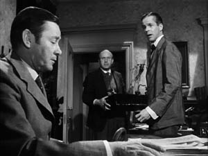
We find directors exploiting this approach not only in the United States but in Eastern and Western Europe, Scandinavia, the Soviet Union, Japan, Mexico, and South America. Here’s an instance from the French film Justice est faite (1950).
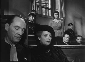
Why did this approach emerge in so many countries at the same time? We don’t really know. It wasn’t simply the influence of Citizen Kane, as we might think. The Stalinist cinema had developed deep-space shooting in the 1930s, and we can find it elsewhere. Probably Hollywood’s 1940s films helped spread the style, but there are likely to be local causes in various countries too.
In any event, during the 1950s two technological changes posed problems for this style. One was the greater use of color filming, which renders depth of field much more difficult. The other innovation was anamorphic widescreen, a technology seen in CinemaScope and Panavision. These systems also had trouble maintaining focus in many planes when the foreground was close to the camera. The flagrant depth compositions we find in black-and-white ‘flat’ films were quite difficult to replicate in color and anamorphic widescreen.
Through the 1960s, the deep-focus style became a minor option and directors found other alternatives to presenting character interactions. The most basic one was simply to station the camera at a middle distance and create a more porous and open staging, with fewer planes of action and simple panning movements to follow characters.
One new approach relied not on wide-angle lenses but on lenses of long focal length. Instead of staging scenes in depth, putting the camera close to a foreground figure, filmmakers began keeping the camera back a fair distance and using long lenses to enlarge the action. This accompanied a trend toward greater location shooting; it’s easier to follow actors on a street or highway if the camera shoots with a telephoto lens. The long lens also reduces the volumes of each plane, so that figures tend to look like cutouts (4). This lens facilitated the development of those perpendicular images I’ve called, in some writing and on this blog, planimetric shots.
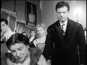
What fascinates me about this general pattern of stylistic change in the US is how many of the Euro auteurs go along with it. Take Fellini, who shifts from the bold depth compositions of I Vitelloni to the fresco-like flatness of Satyricon.
![]()
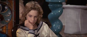
Likewise, Luchino Visconti’s early black-and-white work affords textbook examples of deep-focus cinematography, but in the 1960s he embraced the telephoto look, heightened by what we can call the pan-and-zoom tactic. In Death in Venice, the camera often scans a scene, searching out one player to follow then zooming back to reframe the figure in relation to others. One shot starts with the boy Tadzio, pans right across the hotel salon, to end on von Aschenbach, staring at the boy, and then zooming back to take in the larger scene.
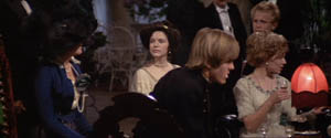
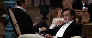
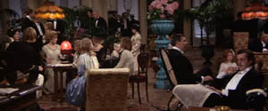
Probably Rossellini’s 1960s films, such as Viva l’Italia! and Rise to Power of Louis XIV, were key influences on this look.
Leaving Europe, there’s Kurosawa, who was the first major director I know of to build zoom and telephoto lenses into his style. Satayajit Ray followed much the same trajectory from the Apu trilogy’s flamboyant depth to the pan-and-zoom close-ups of The Home and the World. Not every filmmaker took the long-lens option, but as it became commonplace in the 1960s, many major directors tried it.
What about Bergman? It seems that in most respects he went along with the general trends. We find deeply piled-up bodies early in his career (e.g., Port of Call, below) and through the 1950s and early 1960s (The Face, below).
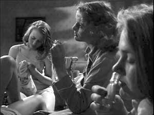
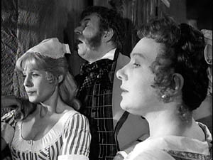
Like his peers, with color and widescreen he shifted toward more open staging, long lenses, and zooms. For example, one telephoto shot of Cries and Whispers zooms back as the little girl emerges, zig-zagging, from behind the lace curtain.
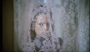
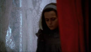
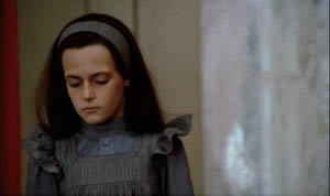
We might conclude that Bergman mostly worked with the received forms of his day. At the level of shot design, The Face might have been shot by the Sidney Lumet of Fail-Safe. But Bergman did innovate somewhat, I think. Most obviously, he sometimes had recourse to the suffocating frontal close-up, as in a childbirth scene from Brink of Life.
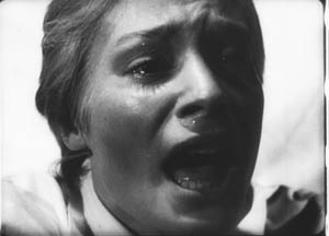
He develops this visual idea by creating heads floating unanchored in both foreground and background. Here’s a famous image from Persona.
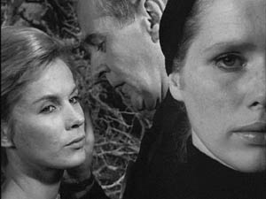
Pace Rosenbaum, I’d say that this sequence, with Elisabeth Vogler apparently quite oblivious to her husband’s mating with Alma, definitely “challenges conventional film-going habits”—or at least conventional ways we read a scene. It seems to combine the deep-space, big-foreground scheme of the 1940s with the tight close-ups of Bergman’s early work, and instead of specifying space it undermines it. We have to ask if what happens in the background is Elisabeth’s hallucination.
My case is very schematic, and we would need to study Bergman film by film and scene by scene to confirm that he stuck to the broad norms of his time. The norms themselves also deserve deeper probing than I’ve given them. (5)
But let’s push a bit further and examine Antonioni, that perpetual foil to Bergman. Broadly speaking, he passed through the same arc, from deep-focus compositions in the 1950s and early 1960s to telephoto flatness in his color work. Yet there are some important differences.
In the 1950s, unlike Bergman, Antonioni employed quite intricate staging, sustained by long takes. He usually didn’t opt for big foregrounds, favoring more distant framings and sidelong camera movements. The most famous instance is the startling 360-degree long take on the bridge in his first feature, Story of a Love Affair, but Le Amiche is also full of intricate staging in mid-ground depth. One scene shows fashion models bustling around after a successful show, congratulating the shop’s owner Clelia. She opens a card from her lover, is distracted by the arrival of her friends coming to congratulate her, and goes off with them. One model darts diagonally forward to investigate the message. All of this is handled in a single graceful take.
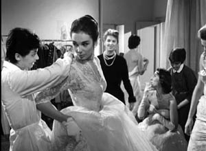
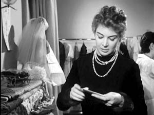
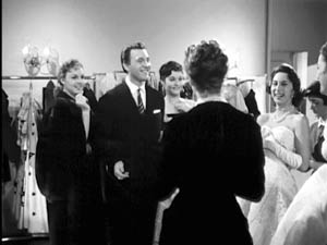
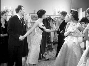
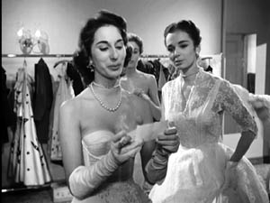
Antonioni relies on the fluid staging techniques developed in the early sound era and taken in diverse directions by Renoir, Ophuls, Preminger, Mizoguchi, and other directors of the 1930s and 1940s. Often, however, Antonioni’s characters move rather slowly and hold themselves in place, and as a result the overall spatial dynamic unfolds in marked phases. (6)
In the trilogy starting with L’Avventura, Antonioni relies on shorter takes and less florid camera movement. Now he emphasizes landscape and architecture so as to diminish the characters. If the expressionist side of Bergman plays up the psychological implications of the drama, the more austere Antonioni plays things down, “dedramatizing” his scenes by keeping the camera back, turning the figures away from us, and reminding us of the milieu. (You see the Antonioni influence on similar strategies in the work of Edward Yang, as I discussed recently on this blog.)
Once color came along, Antonioni changed his style, moving toward less dense staging and at times almost casual framing (as in The Passenger). He also had recourse to the telephoto technique, but I’d argue he brought something new to it. With Red Desert he accepted the abstraction inherent in the long lens and combined that with color design to create a pure pictorialism.
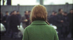
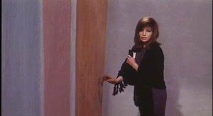
Ironically, Red Desert may have made Antonioni another sort of ‘expressionist’ than Bergman. The stylized palette of the film encourages us to ask if the industrial landscape is really so smeared and bleached out, or if we’re seeing it as Giuliana does. The same sort of painterly abstraction can be found in Zabriskie Point. In one scene, a pan over the travel decals on a family’s car window treats the boy inside as no more than another thin slice of space. Other scenes turn campus policemen into figures in grids.
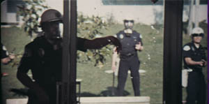
You might even argue that the pan-and-zoom style gets a kind of meta-treatment in the climactic shot of The Passenger. There in a grandiose technical gesture Antonioni’s concern for architecture, his refusal to underscore a melodramatic plot twist, and his love of camera movement blend with the technology of the zoom. At the time, several of us (maybe Jonathan too) saw this shot as a response to Michael Snow’s Wavelength, relayed through the sensibility of Passenger screenwriter and avant-garde filmmaker Peter Wollen. Now it looks to me like a natural response of a very self-conscious artist to a stylistic trend of the moment.
A bestiary of stylists
To get crude and peremptory: Let’s say that once a director has reached maturity and become a confident artisan, several choices offer themselves. The filmmaker can be a flexible stylist, a stubborn stylist, or a polystylist (sorry for the awkward term).
A flexible stylist adapts to reigning norms. Bergman could be an aggressive-deep-focus director, then a pan-and-zoom director. Both approaches to staging and shooting preserved the expressive dimensions that mattered most to him: performance (chiefly face and voice), Ibsenesque bourgeois tragedy, Strindbergian play with dream and dissolution of the ego, and other elements.
Most of the major 1960s arthouse directors, from Truffaut and Wajda to Pasolini and Demy, were flexible stylists in this sense. So were a great many Hollywood and Japanese directors, such as Lubitsch and Kinoshita. Perhaps Ousmane Sembene, who also died recently, would be another instance. Buñuel becomes a fascinating case: He adopts the blandest, calmest version of each trend, creating a neutral technique, the better to shock us with what he shows.
A stubborn stylist pursues a signature style across the vagaries of fashion and technology. Dreyer from Vampyr onward does this; I argue in the book Jonathan cites that he seeks to “theatricalize” cinema in a way that goes beyond the norms of his moment. Perhaps Hitchcock and von Sternberg (at least in the 1920s and 1930s) fit in here as well. Bresson, Tati, and supremely Ozu were stubborn stylists. Give them a western or a porno to shoot, and they’d handle each the same way. (7)
This isn’t to argue that stubborn stylists never change or always do the same thing. Mizoguchi has a signature style and yet remains fairly pluralistic, at least at a scene-by-scene level. I think that the test comes in seeing how stubborn stylists persistently explore the constrained conditions they’ve set for themselves.
Signature styles help a filmmaker in the festival market, so we don’t lack for current examples of stubborn creators: Godard, Theo Angelopoulos, Hou Hsiao-hsien, Kitano Takeshi, Tsai Ming-liang, and Jia Zhang-ke. Granted, some of these may be rethinking their commitment to their stylistic premises.
A polystylist tries out different styles without much concern for what the reigning norms demand. Polystylistics holds a high place in modernist aesthetics. After the great triumvirate of Picasso, Joyce, and Stravinsky, with their bewildering arrays of periods and pastiches, the idea of the modernist as a virtuoso steeped in several styles became a powerful option. What’s been called postmodernism is no less favorable to polystylism; if you mix styles, you’ve presumably mastered them.
In cinema, some polystylists are just eclectic. Steven Soderbergh can give us the portentous pictorialism of The Underneath or Solaris, the grab-and-go look of Traffic, and the trim polish of Ocean’s 11. More deeply, there are directors like R. W. Fassbinder, Raoul Ruiz, and Oshima Nagisa who seem to pursue polystylistics on principle. It’s as if, rejecting the very idea of a signature style, they set themselves fresh, severe conditions for each project.
After The Boss of It All, we may want to count von Trier as a polystylist, not merely a director who changed his style from one phase of his career to another. Perhaps the best current example is Aleksandr Sokurov; who would dare predict what his next film will look like?
This whole entry is pretty sketchy, I grant you. The categories need further refining. I’ve ignored sound, which is very important. I’ve emphasized visual style, and just shooting and staging within that. (Nothing about lighting, cutting, etc.) So this is tentative—notes perhaps for a book-length argument. But I’ve made my point if you see that some ideas and some historical information can put intuitions about originality into a firmer framework.
And I’ve left the value judgments suspended. If you think originality trumps other criteria, then Bergman doesn’t probably come up as strong as Antonioni, let alone Bresson or Ozu or Dreyer. But if you can entertain the possibility that a great filmmaker can accept certain norms of his time, making those serve other channels of expression, then Bergman can’t automatically be faulted. At least thinking about him and his peers in the context of the history of film art gives us some data to ground our arguments. The world is more interesting and unpredictable than our opinions, especially those we formulated forty years ago.
(1) I actually hold this opinion.
(2) I assume that the arthouse auteurs were no less commercial filmmakers than their Hollywood counterparts. They were sustained by national film industries and supported by the international film trade. Eventually many were funded by Hollywood companies.
My friend and colleague Tino Balio is at work on a book tracing the role of overseas imports in the American film market of the 1940s-1960s, and it should be a real eye-opener to those who persist in counterposing art cinema and commercial production.
(3) Some of what follows is discussed in Part Four of Film History: An Introduction.
(4) I talk about both the deep-focus and long-lens tendencies in Chapter 6 of On the History of Film Style and Chapter 5 of Figures Traced in Light.
(5) For a wide-ranging account of art-cinema norms, see András Bálint Kovács’ forthcoming book, Screening Modernism: European Art Cinema, 1950-1980.
(6) I analyze this tendency, using other scenes from Le Amiche, in On the History of Film Style (pp. 235-236) and Figures Traced in Light (pp. 151-152).
(7) Suo Masayuki’s My Brother’s Wife: The Crazy Family is a softcore film made in a pastiche of Ozu’s style.
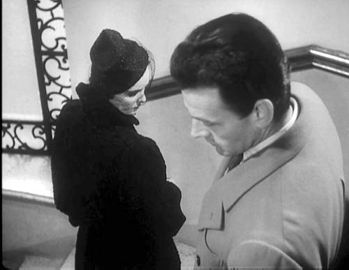
Story of a Love Affair (Cronaca di un amore).
PS, Sunday 12 August: Only a day later, new thoughts about something else I should have said about generational tastes. In the light of the Woody Allen eulogy that appears in the New York Times today, I think there’s more of a sub-generational split than I’d initially suspected. So here’s another gesture toward the sort of history of taste that Jonathan mentions.
Allen is in his seventies, a decade older than Jonathan Rosenbaum and me. He came of age in the affluent decade after the war. Allen saw Bergman films in the mid- to late 1950s, probably against the backdrop of Neorealism, British comedy, and French Cinema of Quality. In that context, Bergman’s movies looked pretty revolutionary.
But Jonathan and I came to maturity, if that’s the right word, in the mid-1960s. When I got to college in 1965, French directors (notably Resnais, Godard, Truffaut) and the Czechs, Hungarians, and others were getting established in US film culture. Bergman, Fellini, and Antonioni were already senior directors and soon they were starting to make what many of us perceived as career mistakes (Juliet of the Spirits, The Passion of Anna, even Blow-Up). Also, of course, concerns about their political alignments came more to the fore as the decade wore on. Many of my friends thought that The Battle of Algiers left all other films in the shade. These factors may have made the Boomers suspicious of “arty” foreign imports, of which Bergman’s work was a central instance. Interestingly, The Dove, a parody of The Seventh Seal and a film-society staple, came out in 1968, when Bergman may have been wearing out his welcome.
[Speaking of parodies, the SCTV skit, “Scenes from an Idiot’s Marriage”, in which Jerry Lewis (Martin Short) suffers the indignities of a cuckolded Bergman hero, is well worth checking out. The SCTV Fellini/ Antonioni parody, “Rome Italian Style,” is also pretty good, especially for its excellently awkward dubbing.]
Interestingly, Scorsese in age falls midway between Allen and us Boomers, and he contributes a Times tribute to Antonioni today. Maybe I have to split the generations even more: Bergman for 1955-1960, Antonioni for 1961-1965, Godard for 1965-1970? (Just kidding.) What strikes me are the differences in the essays. While Allen ranges widely, reports conversations, and praises Bergman in general terms, Scorsese’s piece evokes the texture of L’Avventura, suggesting how disturbing and demanding it was to watch. Maybe he inadvertently backs Jonathan’s claim that Bergman didn’t challenge his audience as much as he might have?
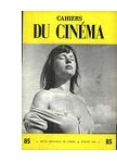 I’m grateful as well to readers responding to my arguments. Michael Kerpan kindly spread the word about my post on imdb and the Criterion Forum. Kent Jones wrote to point out that any argument about Bergman’s influence has to take into account the high regard in which he’s been held in France, among both critics and filmmakers. Kent itemizes not only Godard, Truffaut, and Rivette but Assayas, Téchiné, and Desplechin. It’s a fair point. Antoine de Baecque anchors much of his magisterial history of Cahiers du Cinéma around the mesmerizing power of that busty still of Harriet Anderson, flaunted on a 1958 Cahiers cover and swiped by Antoine in The 400 Blows. In 2003, my old friend Jacques Aumont published a large critical study on Bergman. Cahiers’ next issue will be devoted to the director.
Speaking of French critics and directors, on imdb above Bertrand Tavernier points out that my memory failed. I did see Scenes from a Marriage and Cries and Whispers before The Serpent’s Egg, not after, as my post suggests.
My late Bergman viewing remains gappy. I still haven’t seen the long version of Fanny and Alexander, which everyone assures me is a masterpiece. Last spring, my friend and Bergman scholar Paisley Livingston showed me portions of the TV film The Last Gasp (1995). It’s about Georg af Klercker, the fine Swedish director of the 1910s. It was intriguing, but I was put off by Bergman’s inadequate pastiches of af Klercker’s remarkably poised and complex shots. Now that’s fussy taste, I admit.
Watching movies very, very slowly
Children of the Age (1915).
DB here:
Before DVD and consumer videotape, how could you study films closely? If you had money, you could buy 8mm or 16mm prints of the few titles available in those formats. If you belonged to a library or ran a film club, you could book 16mm prints and screen them over and over. Or you could ask to view the films at a film archive.
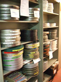 I started going to film archives in the late 1960s, when they were generally more concerned with preserving and showing films than with letting researchers have access. Over the 1970s and 1980s this situation changed, partly because several archivists grew hospitable to the growing field of academic film studies.
At first archives found it easier to screen films for researchers in projection rooms, but eventually many let visitors watch the films on stand-alone viewers. That way the researcher could stop, go forward and back, and take notes. In researching my dissertation in the summer of 1973, I watched films at George Eastman House in 16mm projection, but a few weeks later in Paris, Henri Langlois of the Cinémathèque Francaise allowed me time on Marie Epstein’s visionneuse (a term I’ve admired ever since).
Over the years Kristin and I have visited archives in various countries. We’ve become particularly close to the Royal Film Archive of Brussels, partly because back in the 1980s the head, Jacques Ledoux, believed that Kristin’s research was worthwhile and allowed us to visit regularly. Without the cooperation of Ledoux and his successor Gabrielle Claes, we couldn’t have done a great deal of our research. No wonder it helped us so much: the Belgian Cinémathèque is arguably the most diverse archive in the world.
Case in point: My current visit. I came with two goals. First, I had to prepare for my lectures in Bruges later in the month. These consist of eight talks on anamorphic widescreen. So I planned to watch four early CinemaScope films, plus Oshima’s The Catch (1961) and the SuperScope version of While the City Sleeps.
I also wanted to fill in a big gap in my knowledge about a major silent filmmaker. More on him shortly.
Viewing on a visionneuse
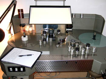
If you’ve never watched a film on a viewer, let me explain. The classic viewer is a flatbed, or viewing table. It’s the size of an executive desk. Two platters or spindles hold a feed reel and a take-up reel. Motors drive the film through a series of sprocketed gates, past a projection device (usually a prism) and across a sound head. The film appears on a smallish screen. There’s usually a little surface space to set a notepad, along with a lamp on an articulated arm.
Before digital editing came along, such machines offered the only way filmmakers could cut sound and picture. (Now most phases of editing are done on computer, with physical editing reserved for late stages of postproduction.) Eventually flatbeds were offered in simpler versions for playback rather than editing.
The most common American-made viewer was the Moviola, which was initially not a flatbed but an upright machine. Eventually the German Steenbeck and KEM became the high-end standards for editing picture and sound. The Brussels archive relies on the Prévost, an Italian machine that is very easy to maintain. The Prévost, seen above, beams the image from the prism onto a mirror hanging over the machine, which bounces the picture onto the screen.
35mm films are mounted on 1000- or 2000-foot reels, the latter yielding about twenty minutes of film at sound speed. A feature film will consist of four or more 2000-foot reels. Even if you watch a film straight through, without stopping to make notes, it takes time to change the reels, so a two-hour movie will probably consume nearly three hours on a 35mm flatbed. And of course researchers stop a lot to take notes and move to and fro across a scene. If I’m studying a film intensively, I probably consume about an hour per 2000-foot reel. Across my life, I wouldn’t dare calculate how many months I’ve spent in visionneuse viewing.
Viewing on an individual viewer has both costs and benefits. Sometimes details you’d notice on the big screen are hard to spot on a flatbed. But with your nose fairly close to the film, you can make discoveries you might miss in projection. (Ideally, you would see the film you’re studying on both the big screen and the small one.) In addition, of course, you can stop, go back, and replay stretches. Above all, you get to touch the film. This is a wonderful experience, handling 35mm film. Hold it up to the light and you see the pictures. You can’t do that with videotape or DVD.
The scary part of any flatbed viewing, at least for me, is watching the film whiz along under your nose at ninety feet per minute. If you haven’t threaded the thing properly, or if the print has a weak splice or torn sprocket hole, you can rip the film. For this reason, archives typically don’t allow a researcher to handle films they hold in only one copy.
The average film you watch on a flatbed has an optical soundtrack, that squiggly line that is read by an optical valve. But early CinemaScope films had magnetic tracks so that they could provide stereophonic sound. In the picture below you can see that strips of magnetic tape, like those in tape cassette players, run along both edges of the film strip. For my Scope films, I was obliged to use a Prévost that could handle mag sound–and of course one that could be fitted with an anamorphic lens to unsqueeze the image to the proper proportions.
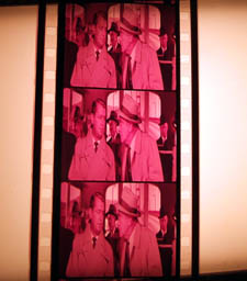
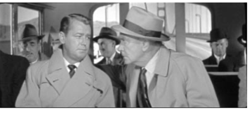
Hell on Frisco Bay (1954) was a color movie, but this print, like many from the period, has faded to bright pink. The Eastman color stock of the period was unstable, and many prints were processed carelessly. (In unsqueezing the frame, I’ve eliminated the color cast for better clarity.) Restoring color to films of this period is one of the major tasks facing film archivists. Cinema is a fragile art form.
Hours and hours of Bauers and Bauers
At the Giornate del Cinema Muto in Pordenone in 1989, Yuri Tsivian’s retrospective on Russian Tsarist cinema convinced a lot of us that good filmmaking in that country didn’t start with the Bolshevik revolution. Along with that retrospective came a wonderful book, Silent Witnesses, edited by Yuri and Paolo Cherchi Usai. Unfortunately hard to find now, it’s filled with information about pre-Soviet filmmaking.
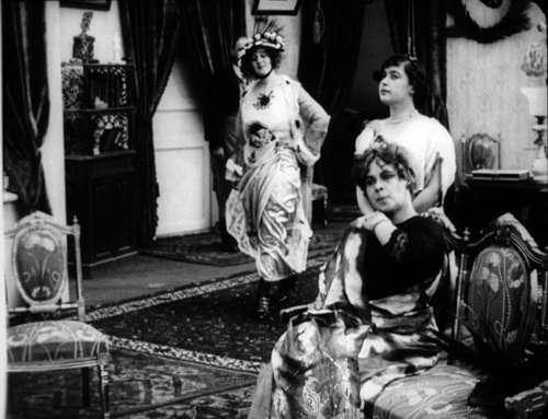
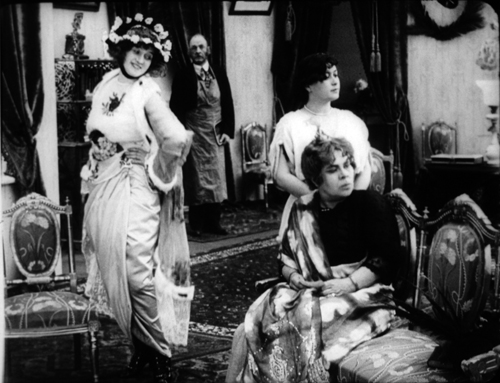
Although I enjoyed the Tsarist films, I didn’t know exactly what to watch for. It took me some years to appreciate their artistry, and some of my ideas about them showed up in On the History of Film Style (1997) and Figures Traced in Light (2005). In those places I studied 1910s “tableau” staging and used some examples from Yevgenii Bauer, by common consent the most pictorially ambitious Russian director of the period. Kristin and I also used Bauer as an example of tightly choreographed mise-en-scene in Film Art (p. 143). I thought it was time I examined his work more systematically, and I knew that the Royal Film Archive held some Bauer prints, which they acquired from Gosfilmofond of Moscow.
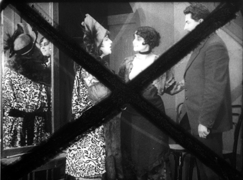
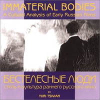 Bauer had a brief but prolific career. He started directing in 1912 and completed eighty-two films before his death in 1917. Unhappily, only twenty-six of his works survive. Just as bad, most of those lack their original intertitles, so we don’t have the expository and dialogue titles we expect in silent films. The placement of the titles is sometimes signaled by two Xs marked on two successive frames. Without titles, the storylines can get obscure. Yuri, Ben Brewster, and other scholars have sought to reconstruct something approximating the original titles by studying the plays and novels that Bauer adapted. Three of the reconstructed films are available on a DVD called Mad Love, and Yuri has also created an innovative CD-ROM (right) that takes us through works of Bauer and his contemporaries.
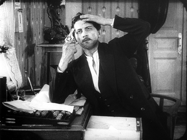
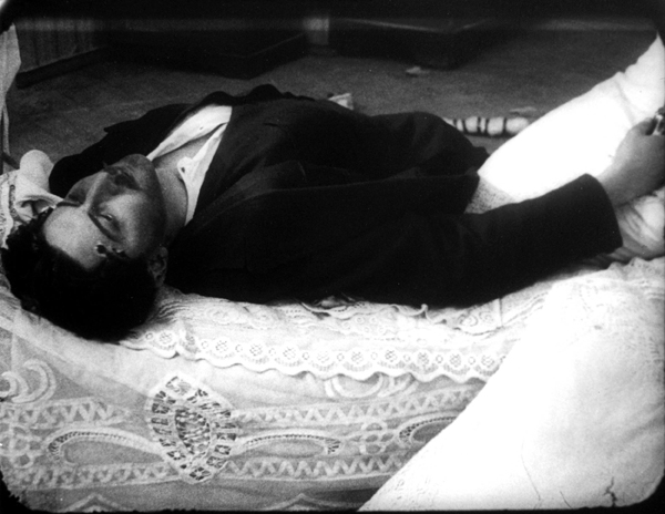
Although he made comedies, Bauer is most famous for his somber psychological melodramas, often centering on class exploitation. A woman becomes a rich man’s mistress; when she abandons her husband and takes their baby, he commits suicide (Children of the Age). A serving maid is seduced by her master and callously tossed aside when he marries a flirt (Silent Witnesses). Things can get pretty dark. This is the director who made films entitled After Death (1915) and Happiness of Eternal Night (1915). In Daydreams (1915), a widower sees a woman who strikingly resembles his dead wife. Like Scottie in Vertigo, he follows her and becomes increasingly obsessed. Did I mention that he keeps a ropy braid of his dead wife’s hair in a glass box?
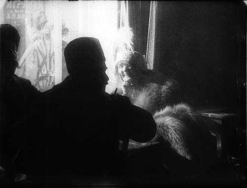
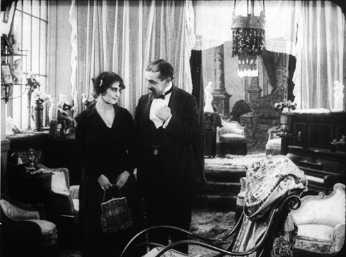
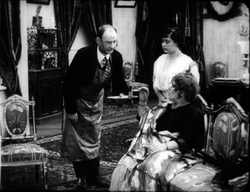
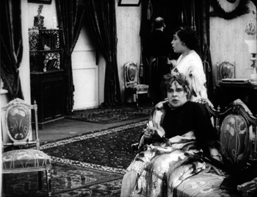
Seeing several films again confirmed my view that Bauer knew better than most directors how to organize a shot. His contemporary Louis Feuillade favored a quiet, sober virtuosity, but Bauer developed a flashy visual style. He’s most known for his ambitious use of light (Frigid Souls, below) and big, textured sets packed with columns, trellises, drapes, brocades, embroidered pillowcases, and other elements that add abstract patterns to a scene (Children of the Age, below).
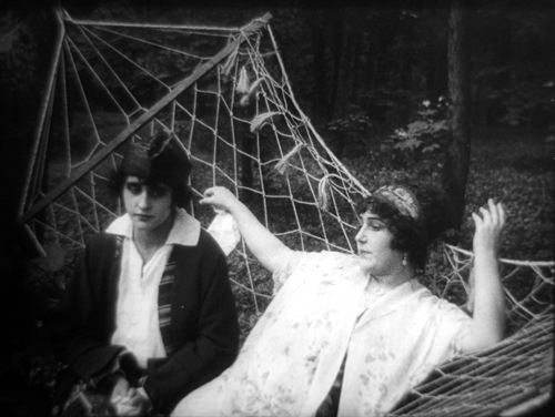
Even a hammock can be stretched and framed to create a swooping web around the innocent heroine of Children of the Age, ensnared by the demimondaine.
In particular, I admire Bauer’s constant inventiveness in moving his actors around the set in smooth ways that always direct our attention to what’s happening at the right moment. European directors of this period seldom cut up a scene into several shots of individual actors; the frame typically shows us the entire playing space. Directors were obliged to shift their actors across the frame and arrange them in depth, like chesspieces.
This master-shot, single setup approach might seem hoplelessly restrictive. Today we expect films to have lots of cutting and camera movement. How does the filmmaker sculpt the action, moment by moment within a static frame?
Blocking, as in blocking the view
I trace some principles of this approach in the books I already mentioned. I’ll mention two strategies here, and if you want to know more you can follow up in On the History of Film Style and Figures Traced in Light.
Filmmakers of the 1910s created intricate choreography by moving actors left or right, up to or away from the camera. Often they set up unbalanced compositions and then rebalanced them, creating a kind of spatial tension that parallels the drama. In the course of the action, actors close to the camera might conceal those that are farther away. The blocking of the actors, in other words, also sometimes blocks our view.
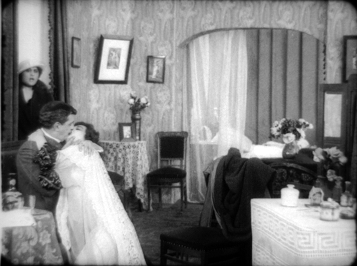
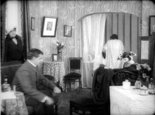
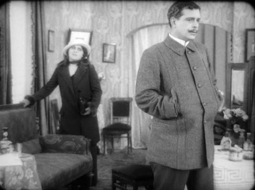
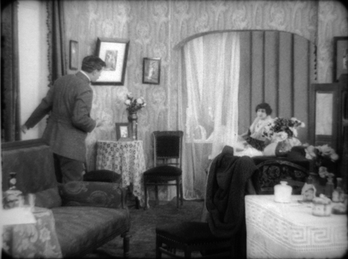
In Leon Drey (1915), Bauer tells the story of a cynical womanizer. In one scene, he’s dallying with his latest conquest when another of his lovers bursts into his apartment. The first phase of the shot is very unbalanced; most directors would have put the mistress at the door on one side of the frame and Leon and the woman in his arms at the opposite side. Immediately, though, the woman flees to the bed in the back of the shot and activates the right area of the frame.
As the mistress rushes to the woman in the rear, Leon strides to the foreground and his burly body blots out the drama between the two women. We’re forced to concentrate on his cold indifference to both of his lovers. Eventually his mistress comes to the foreground to remonstrate with him. Now, at the high point of the scene, we have a balanced frame. Note that Leon continues to conceal the first woman; the scene’s not yet about her.
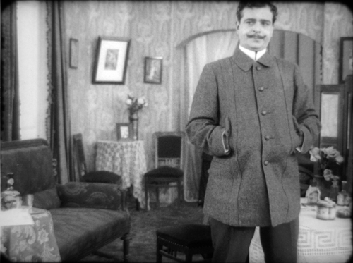
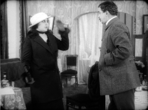
The mistress leaves, angry and desperate, and Leon placidly pays her no mind. As the door closes, he hurries to lock it and summons the first woman, now visible, back from his bed. He will have little trouble convincing her to return to his arms.
The dramatic curve of the scene has been expressed in compositional asymmetry and symmetry, concealing space and then opening it up.
Most directors of the period used principles like these to turn dramatic conflict into vivid choreography. Bauer also tried more unusual tactics. He was especially good at shifting actors’ heads very slightly to open or close off channels of action behind them. Here’s an instance from Her Heroic Feat (1914).
The butler informs Lina and her mother that the scandalous ballerina Klorinda is calling on them. At first Lina’s head is solidly blocking the doorway in the rear. As the butler goes to the rear door, Lina pivots a little to clear our view of that doorway.
Klorinda sashays in, and who could miss it? She’s wearing a bright dress, she’s centrally positioned, and she’s moving toward us. The other women refuse to look at her, but their immobility assures that we keep our eye on Klorinda. When she stops to greet them, then they move, pivoting away; Lina’s head goes back to blocking the doorway. Imagine how things would have gone if her head had been there when Klorinda appeared in the background.
Of course, we should also study the performance techniques of Bauer’s actors–a subject examined in a fine book by Ben Brewster and Lea Jacobs, Theatre to Cinema. The compositional tactics employed here work to draw our attention to the actors’ expressions and body language.
Still, not everything in 1910s ensemble staging owes a debt to the theatre. The changes in Lina’s head position, or Leon Brey’s calculated blockage of the women behind him, wouldn’t work on the stage; most of the audience wouldn’t see the exact alignment we get onscreen. Live theatre depends on varying sightlines, but in cinema, we all see the action from one position, that of the camera. Bauer, Feuillade, and their contemporaries realized that they could organize the action, down to the smallest detail, around what the camera could and could not take in.
The fluent choreography developed by 1910s directors is almost unnoticeable when you’re watching in real time. You’re supposed to register the what–the point of interest in the frame–rather than the how, the slight shifting of actors that highlights this face, then that gesture. By the time you realize that something has happened, the first stages of the process have slipped away, inaccessible to memory.
So there’s a need for slow viewing. Filmmakers have thousands of secrets, many that they don’t know they know. Sometimes we have to stop the movie, go back, and trace precisely how directors achieve their effects. Really slow viewing can help us discover how deep film artistry can be. All hail the visionneuse and the archives that allow scholars to use her.
For background on Bauer, see William M. Drew’s excellent career survey. I discuss Bauer’s relation to narrative painting in another blog entry.
In production and distribution of the period, the titles and inserts (close-ups of newspapers or messages) were sometimes stored on separate reels. In many cases, only the image reels have survived.
Several other Bauer films are available on Milestone’s invaluable DVD set Early Russian Cinema.
A many-splendored thing 1: Academics and premieres
This year’s Hong Kong International Film Festival is mammoth—at 23 days, perhaps the world’s longest. It’s smoothly meshed with the HK Filmart, a trade gathering for buyers and sellers, the Asian Film Awards, and a slew of other events, all under the umbrella of Entertainment Expo. The goal, Timothy Gray points out in a communique in Variety, is to confirm Hong Kong as a regional media hub.
So many things have happened to me since my arrival, and so many impressions pile up, the diary form is for now the best way I can recount my doings. In the course of my stay, I’ll try for less fragmentary reportage.
Saturday 17 March
Back in my favorite city. Plane arrived two hours late around midnight Saturday, and the Internets connection in my room didn’t work. Went to bed, got a surprising 8 hours’ sleep.
Sunday 18 March
Joined my friends Mette Hjort and Paisley Livingston for a shopping expedition with their kids Erik and Siri to Sha Tin, a megamall in the New Territories. That night I stayed with them in their newly renovated home in Sai Kung, with calming views of a park and a bay. Slept 4 ½ hours; read about Alien Autopsy, prepping for a future blog.
Monday 18 March

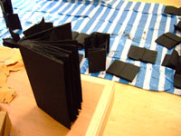
A busy day. Most of it was spent at cozy Lingnan University (one area shown above), where Paisley and Mette teach. I got a little tour and met artist-in-residence Jane Dyer, who’s working on some lovely pieces involving books. She finds ’em, shreds ’em, paints ’em black…and turns them into disquieting sculptures.

Had an informal sandwich lunch with the students in the Visual Culture program, then a more extended attack on dim sum with Mette (center), Jane (right), and Meaghan Morris, head of Cultural Studies at Lingnan and another fan of HK action cinema.
Late afternoon, I gave my CinemaScope talk, with an addendum on HK cinema’s use of Scope. Good questions afterward.
With Meaghan I rushed off to Wanchai, where she lives and where I was slated to see the new Milkyway film, Eye in the Sky, at the Convention Center. After a comical mishap involving changing taxis, I made it to the Center just as the crowd was gathering. I hovered on the edge, uncertain of what to do next, when Yuin Shan Ding, Johnnie To’s right-hand man, saw me and gestured me in.
So I walked the red carpet, waiting for somebody to stop me. I should have remembered: This is HK, where such events are unbelievably informal.
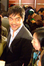
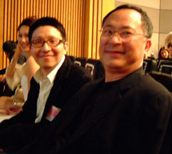
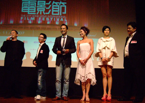
Inside I caught up with Shan and got my ticket. At that moment I met another old friend, Athena Tsui, who was coordinating things in the foyer. Behind her Simon Yam, Lau Ching-wan (above left), Johnnie To, and Yau Nai-hoi were giving press interviews in the glare of TV lights. After snapping some pix, I went in and took my favorite seat, down front and center—where I also found another old Hong Kong friend, Li Cheuk-to, bustling about seeing to a dozen matters. Soon the major players came in too. Above, it’s Yau Nai-hoi, director of Eye in the Sky, on the left and producer Johnnie To on the right.
Then the ceremony started. The principals (To, Yau, Yam, Kate Tsui, Maggie Siu, and Lam Suet) got up on stage and said a few words of introduction. Simon claimed that he gained twenty pounds for his role, while Lam Suet proudly said that he had not.
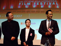
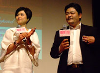
Compared to To’s own directorial efforts, Eye in the Sky is more conventional genre fare. It’s very linear, giving us essentially a ninety-minute pursuit sequence. As a result, we get almost no backstory about the plainclothes cops (Yam and Kate Tsui) who are tailing heistmeister Tony Leung Kar-fai. It does recall other Milkyway films, which are often built around games of chase and disguise. It’s also very much a street film; you see a lot of the Hollywood Road area, and there are nice images of passersby caught unawares.
Here forward momentum is everything, with virtually no pauses for reflection or just catching your breath. Each scene seems caught on the fly, with aggressive smash-and-grab camerawork. Eye contrasts intriguingly with To’s Expect the Unexpected, which exhibits more control of the run-and-gun look and immerses us more thoroughly in the lives of its police protagonists. Still, Yau’s career will be worth watching, not least because Hong Kong needs to replenish its cadre of young directors.
Audience response to Eye was enthusiastic. Darcy Paquet has some quick first thoughts here.
I Am a Cyborg followed, but I have several other chances to catch it, and sleep beckons. Back to the hotel. Tomorrow, Tuesday, is the biggest day of my trip.
My name is David and I’m a frame-counter
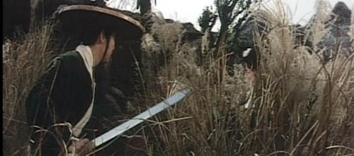
DB here:
Elsewhere on this site and in Figures Traced in Light (Chapter 1) and The Way Hollywood Tells It (second essay), I sometimes say rude things about the rapid editing in today’s films. But I’m actually a fan of fast cutting–when it’s precise, functional, and thoughtful. Most directors today don’t think about their cuts. Godard: “The only great problem of cinema seems to be more and more, with each film, when and why to start a shot and when and why to end it.”
My interest in fast cutting goes back to the 1960s, when I was first reading Eisenstein and seeing fims by Godard, Truffaut, Hitchcock, and, yes, Richard Lester. At first I would wind sequences backward and forward on a 16mm projector, stopping to pull the film off the reels to hold up to the light. For my dissertation on French cinema of the 1920s, I had a chance to examine films by Abel Gance, Jean Epstein, Germaine Dulac, et cie on editing tables or rewinds. In quickly-cut passages, the patterns of shot-length showed how a director could control the visual pace.
Over the years, when I studied 35mm film prints regularly, I periodically returned to my love of rhythmically cut passages. I studied Dreyer’s Passion de Jeanne d’Arc, the work of the Soviet Montage directors, and Asian action movies, from 1920s Japanese swordplay items to 1990s Hong Kong martial-arts sagas. Somewhat surprisingly, I found that Ozu, as in everything else, was there too; a lot of his intermediate spaces (landscapes, objects in rooms) are cut arithmetically.
By examining 16mm and 35mm prints, I could measure shot lengths in frames. In a sound film, a 24-frame shot would last a second on the screen. Things were trickier in gauging the cutting of silent films, since they were shown at rates between 16 and 24 frames per second. But at least the number of frames per shot gave me a sense of rhythmic relationships. A sequence in Jean Epstein’s Chute de la Maison Usher (1928) displays an arithmetical unfolding that would yield a distinct tempo at any projection speed of the era.
Directors have been counting frames for a long time. Experimental filmmakers like Brakhage did. Ozu had a special stopwatch built to register feet and frames during filming. Hitchcock cared about frame counting too. In Film Art‘s chapter on editing (pp. 224-225 of the new edition), we show how the gas station fire in The Birds gains impact from its steadily shorter shot lengths. The first shot lasts 20 frames, the second 18, the third 16, and so on down to 8 frames.
In sum, frame counting is one valuable way to find how a director can govern the pace of our pickup. When shots come this fast, our involvement can quicken as well.
When 35mm plays us false
For silent films, counting frames can be a problem if you have a “stretch-printed” copy. Since silent films often ran at something less than 24 frames per second (sound speed), some later film versions have been printed to repeat frames at certain intervals, to stretch out the print to 24 fps. That makes it easier to add a synchronized score to the print.
In the 1970s the Soviets were big fans of this procedure, rereleasing many classics by Eisenstein, Pudovkin, and others in stretch-printed 35mm and 16mm copies. The Soviet Montage filmmakers definitely counted frames, calculating the shots to play off each other rhythmically, so adding extra frames spoiled things. Worse, the stretch-printed versions often played sluggishly at sound speed, making the action spasmodic and blurring the figures. The result completely wrecked the rhythmic effects the directors were after. Even today, stretch-printed copies of Eisenstein’s Strike are in circulation.
Videotape and the 3:2 pulldown
Videotape arrived. The first Betavision players measured something–a little tally counter clicked away–but you couldn’t be sure what was being counted. Then came digital displays that measured hours, minutes, and seconds. But what about frames? When I tried to count frames on videotape, I found that the figures didn’t match those I got from film frames.
To see why, we have to remember that television developed its own frame rates. The technical details can get pretty daunting; see here for one account. I also recommend Jim Taylor’s DVD Demystified and Kallenberger and Cvjetnicanin’s Film into Video. Still, we non-engineers can get a general sense of what’s at stake.
There are two primary television standards, NTSC and PAL. NTSC (for National Television System Committee) is used primarily in North America and Japan. PAL (Phase Alternating Line) is common throughout Europe and Asia. Because NTSC video operates at a 60-Hertz refresh rate, the rate for individual frames is close to 30 per second. (Actually, it’s 29.97 fps.) The problem is this: Do you run 24-frame movies at 30 frames per second on television? This would make them look speeded up. Or do you pad out a second of film to fit a second of TV? American engineers took the second solution and created the so-called 3:2 pulldown.
In interlaced video, each “frame” is really two venetian-blind image fields presented as one image on your screen.(1) In the 3:2 pulldown, some film frames are selectively repeated to fill out the video playback format. The film is converted to video by making two fields from one film frame and then three from the next frame. Here is a useful diagram from a site on video transfer.
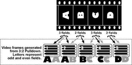
The 3:2 pulldown preserves three of the original four film frames (video frames AA, CC, and DD above).
But you don’t see this exactly this result when you jog/shuttle through a videotape frame by frame because the VCR has been engineered to display the 3:2 pulldown slightly differently. Stepping through a videotape, we find that some frames will show phases of movement and some repeat a phase. Depending on your playback machine and the tape itself, you may get varying patterns. Usually I see four video freeze-frames decomposing a movement, then they’re followed by an extra frame in which nothing changes.(2) That process turns 4 film frames into 5 display frames. Adding 6 repeated frames to the original 24 frames yields 30 video frames a second. I find that you can get a rough sense of the number of frames in the original shot by ignoring the repeated frames in the video display, but the video frames showing decomposed movement may or may not correspond to the actual film frames.
Laserdiscs and the frame count
Those heavy, rainbow-flashing 12″ discs: Cinephiles loved ’em. They gave us a sharper picture, properly letterboxed, along with terrific sound. Aficionados today still prefer the rich digital sound of laserdiscs to the compression of many DVDs.
Most laserdiscs used the CLV (Constant Linear Velocity) format, which preserved and even exaggerated the effects of the 3:2 pulldown. Counting frames meant stepping through the stills and ignoring the repeated ones, as with videotape, but often the coupled frames (AB and BC above) shivered wildly. But in the high-end CAV (Constant Angular Velocity) format, laserdiscs were able to make each stored frame pristine. This is why people thought that laserdiscs would be used archivally, for storing paintings, photographs, manuscript pages.
A bonus of the CAV format was that in transferring motion pictures to disc, one film frame could be matched to a single video frame. In fact, each film frame was assigned its own number, so the counter display spit out digits with blinding speed. During normal playback, the 3:2 repeated frames were added in, but in STEP mode, CAV laserdiscs gave you the original film frames one by one–steady, crisp, and bright. Frame-counting gained a new piece of hardware.
DVD and frame counting
Laserdiscs used optical analog technology for the image track. But consumers wanted something easier to handle, on the model of the music CD, so in came digital image technology via MPEG-2 and the DVD.
Despite all the differences between digital video and film (color, resolution, artifacts, etc.), DVDs in the NTSC format gained one advantage over tape. Like CAV laserdiscs, they could preserve the 24-frames-per-second rate of film. Essentially MPEG-2 technology encodes the film frame by frame. Flags on the DVD instruct the player to regenerate extra frames during playback. For a more detailed explanation, go to Dan Ramer’s article here.
The result is that during freeze-frame viewing, a DVD can yield the original film frames. Watch the Universal DVD of The Birds, and the frame-counts correspond to the 20-18-etc. layout we discovered on a 16mm print. Your remote’s STEP button moves through the original frames, hiding the repeated ones that were shown during normal playback.
But not always. DVDs can sometimes play us false.
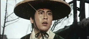
Before the DVD was a gleam in Warren Lieberfarb‘s eye, I studied King Hu’s wonderful A Touch of Zen on an editing table. There is a lot of frame arithmetic in the editing. During one swordfight, the mysterious stranger leaps away from the blows of Miss Yang and lands in a medium shot. He steps back, tipping up his face to reveal that she’s bloodied his head. He stares in astonishment. The shot lasts only 20 frames.
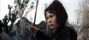
Yang stands still, holding her sword at the ready. The shot lasts a mere 9 frames, which dynamizes her stillness.
The stranger turns and runs out of frame in another twenty-frame shot. The static shot of Miss Yang now becomes an abrupt punctuation, and the stranger’s panic registers on us more sharply by being caught up in a repetitive rhythmic pattern.
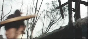
Yang plunges after him, in a twelve-frame shot.
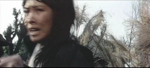
All four shots add up to less than three seconds of screen time, but they’re completely legible. It seems to me that the shots accentuate a pause in the fight by inserting a striking micro-rhythm, and then they dissolve that by letting the fighters continue the combat. Would that today’s filmmakers thought out their cuts so precisely! (If you want to learn more about King Hu’s editing style, see my Planet Hong Kong and the essay on him in the forthcoming Poetics of Cinema.)
But if you examine these shots on the US DVD of A Touch of Zen, you’ll find that the number of frames is way off from the film. The first and third shots run 25 frames each, not 20 frames; the second shot runs 11 frames (instead of 9), and the fourth 15 (instead of 12). Why? Inspection reveals our old friend, the 3:2 pulldown, at work. Improper authoring has left in the frames that should be jettisoned in step playback.
An even more severe instance: The sequence from Epstein’s Fall of the House of Usher that I admired in my dissertation days. It has become hash on the US DVD. When I try to count frames, I find that apparently the silent original has been stretch-printed and subjected to the 3:2 pulldown. When I click through the frames on a DVD player, I find that many frames are repeated, and some shots have doubled in length.
The lesson: Not all DVDs are created equal, or equally accurate in their correspondence with the original film.
What about PAL?
NTSC interlaced video has a 60-Hertz refresh rate. But PAL has a 50-Hertz one. That means not 30 video frames per second but 25. What do you do in transferring a film? The obvious answer: You speed it up.
Films shot at 24 frames per second tend to run at 25 in PAL videos, both tapes and DVDs. As a result, many films on European video run shorter than they did in the theatre, or on American DVDs. For example, Preminger’s Where the Sidewalk Ends runs 94:41 on the Fox DVD, but the same film, known as Mark Dixon Detective, runs 90:49 on the French DVD release. That’s a difference of nearly four minutes. PAL video playback of a 24 fps movie runs about 4% shorter than the original. For this reason, some European films are shot at 25 frames per second, to facilitate transfer to PAL.
So counting frames on a PAL videotape or DVD won’t necessarily mislead you on the number of frames, since none is repeated. That’s the case with our Touch of Zen example. Both the UK and the French DVDs of King Hu’s film yield the correct frame-counts for the shots in question. We just need to remember that each frame is onscreen for a tiny bit less time. In other words, each shot will contain the right number of frames, but that shot will be briefer in screen duration .
Note to Sátántangó fans: Yes, that means a much shorter movie. The PAL DVD available from England’s Artificial Eye claims to run 419 minutes; if you disregard opening and closing credits, the film runs a shade under 400 minutes. But the 35mm version I clocked here runs 434 minutes sans credits. So if you want to add 34 minutes to your life, watch the import DVD.
Note to Asian cinema fans: For reasons I don’t understand, many Hong Kong DVDs yield very blurred and vibrating still-frame images, not corresponding to the frames of the original film. These discs may be using a downmarket authoring process, or there may be problems converting to and fro between PAL and NTSC.
Progressive scan
This all applies to interlaced video, the original television broadcast format. Now we have progressive-scan video, for plasma and LCD displays and computer monitors. A progressive display, still adhering to the 60-Herz standard, is rigged to preserve the right number of film frames without repeating any.
But it does so by in effect combining two film frames together, and the step function may skip over several frames, or create a blurred composite that isn’t there on any frame. This is especially apparent on media-player computer software.
When I run my Touch of Zen shots on my computer, I get wildly abbreviated frame-counts in Step mode. In WinDVD, for instance, the first shot of the UK DVD registers as 8 frames, not 20; the second as 3 frames, not 9; the third as 9 frames, not 20; and the fourth as 6, not 12. Same thing for Epstein’s Fall of the House of Usher. On a tabletop DVD player there are more frames than in the original film; on my player’s software, there are fewer.
For this reason, I’d avoid trying to count frames on a computer’s media player.
So…..
Frame-counting is a nifty tool for discovering some secrets of filmmaking, but when we work from a video copy, we need to keep in mind the constraints of the various formats. And whenever possible, check the film!
(1) To complicate things, the scanning of alternate raster lines never yields a single complete frame. Before the image is fully completed at the bottom, it’s being refreshed at the top! To this extent, the video frame doesn’t have the stable, singular identity of a film frame. It can be encoded to correspond to a film frame, but as an image display, even a frozen frame is always in the process of being filled in. It’s just that our eyes, not designed to track such small-scale processes, are fooled.
(2) A quick sampling of my old VHS tapes shows that occasionally a tape doesn’t exhibit effects of the 3:2 pulldown. My Facets VHS copy of Where Is the Friend’s Home? plays back on two machines without any repeated frames. Perhaps this comes from making the transfer from a PAL master tape?


