Archive for the 'Film scholarship' Category
You the filmmaker: Control, choice, and constraint
DB here:
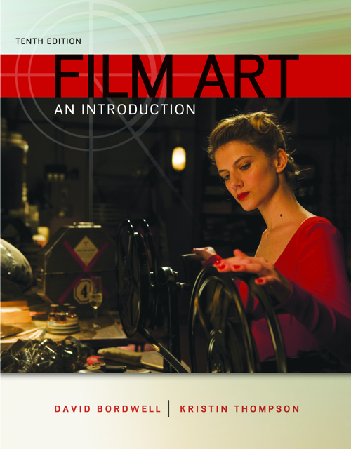
The tenth edition of our textbook, Film Art: An Introduction will be available in early July. It has so many new features that it’s our most extensive revision in at least a decade.
Kristin has already written about one of our major additions: supplemental film extracts from the Criterion Collection, with voice-over commentary and other sorts of analysis. (Go here for a sample.) These will be accessible to professors for incorporation into their syllabi. More of them may also become generally available on the Criterion website.
The text has been extensively rewritten, aiming at maximal clarity and freshness. There are many local changes too, with updated examples from a variety of films both old and new. Regular readers will notice that we have made two replacements: Koyaanisqatsi is now our example of associational form, and Švankmajer’s Dimensions of Dialogue is our example of experimental animation. Regretfully, we had to drop our earlier examples, Bruce Conner’s A Movie and Robert Breer’s Fuji, because they are available only in 16mm, and most teachers and readers don’t have access to them. On the other hand, we enjoyed analyzing the new items and think that they serve their purpose very well.
Today I’m going to point out some of the broader changes, while also considering the book’s overall approach.
Parts and wholes
When Film Art appeared in 1979, it was the first textbook in English written by people who had received Ph.D.s in film studies. Specifically, FA emerged from my teaching a lecture-and-discussion course called “Introduction to Film” to several hundred students each semester for many years.
In the mid-seventies, there were almost no film studies textbooks, and none of them seemed to us to reflect the directions of current research. As a result, the first edition of FA included topics that were emerging in the field, such as narrative theory and conceptions of ideology. It also suggested a coherent, comprehensive view of cinematic art, from avant-garde and documentary cinema to mainstream film and “art cinema.”
The book has changed since then, but its approach has remained consistent in two primary respects. For one thing, it tries to survey the basic techniques of the medium in a systematic fashion. Here the key word is “systematic.” It seemed to us that we might go beyond simple mentioning this or that technique—editing, or acting, or sound—and instead treat each technique in a more logical and thorough way. But film aesthetics wasn’t yet conceived in this way, so to a considerable extent the textbook had to offer some original ideas.
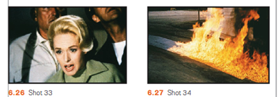
For example, most people thought of editing primarily as a means of advancing the film’s story. That’s certainly accurate up to a point, but we tried to go up a level of abstraction. We suggested that the change from shot to shot had implications for what was represented (the space shown in the shots, the time of the action presented), as well as for the sheer graphic and rhythmic qualities onscreen, independent of what was shown. That created four dimensions that the filmmaker could control, and we illustrated how Hitchcock shaped all of them in a sequence from The Birds.
Nobody before had surveyed editing’s possibilities in this multidimensional way. The result was that we were able to trace out several expressive options. We analyzed the 180-degree system for presenting story space, and Film Art became the first film appreciation textbook to explain this. We also laid out ways in which shots could manipulate the order, duration, and frequency of story action. We also considered sheerly graphic and rhythmic possibilities of editing, not all of which are tied to narrative purposes. Similarly, we tried to show that sound, another familiar technique, could be understood as a bundle of systematic options relating to sound quality, locations in space, relation to time, and other factors.
In sum, very often the array technical options had an inner logic. This urge to cover all bases helped us notice options that usually escaped critics. So by concentrating on the graphic dimension of editing, we noticed that some filmmakers tried to create pictorial carryovers from shot to shot, a device we called the “graphic match.”
A second core principle of the book was the idea that we ought to think about films as wholes. There’s a strong tendency in film criticism, in both print and the net, to fasten on memorable single sequences for study. There’s nothing wrong with this, of course, but we think it needs to be balanced by considering how all the sequences in a film fit together. That led us to consider various types of large-scale form, both narrative and non-narrative.
Again, this was new to the field. We showed students how to divide films into parts and then trace patterns of progression and coherence across them. This is a valuable skill for both intelligent viewers and people who might want to work in filmmaking. We showed how the distinction between story and plot could help explain large-scale narrative construction. We suggested that issues of point-of-view and range of character knowledge exemplified broader principles of narration, the ways films pass information along on a moment-by-moment basis. And although most film courses show narrative films (mine did too), we wanted students to think about other large-scale organizational principles too, such as rhetorical argument and associational form. Again, thinking about these more general possibilities led us to consider creative options that hadn’t been the province of introductory texts, such as rhetorical documentary and poetic experimental cinema.
These two efforts—comprehensive study of techniques and a holistic emphasis on total form—weren’t FA’s only salient points. We tried to incorporate more familiar elements from genre studies and historical research. But they did set the book apart, and do still. I believe that we made contributions to our understanding of film aesthetics. One measure of these contributions is the extent to which FA has been regarded as not only a textbook but an original contribution to film aesthetics. Another sign is the fact that other textbooks have relied, sometimes to a startling degree, upon FA for concepts, organization, and examples.
Categories, categories
Associational form: Koyaanisqatsi.
Still, we did encounter objections.
Some readers worried that FA’s layout of logical categories took away some of the magic and mystery: Art dies under dissection. Some also protested that filmmakers didn’t use the categories and terms we invoked. These concerns have, I think, waned a bit over the years, but I’ll address them anyhow.
First, as to the need for categories. As a genre, the textbook in art theory has a very old ancestry. Aristotle’s Poetics, a survey of what we’d now call literary art, bristles with categories—drama vs. epic, comedy vs. tragedy, types of plots, etc. In the visual and musical arts, from the Middle Ages into the Renaissance, writers tried to systematically understand the principles of artists’ practice. Leon Battista Alberti’s treatise on painting tried to show that as an activity, painting had many “parts,” such as drawing, color, and light.
This classificatory urge continued through the centuries, and it continues today. Pick up a book on the visual arts today and you’ll see chapters on composition, color, texture, and the like. The same goes for music; an introductory book will survey rhythm, harmony, melody, musical forms, and so on. There’s no escaping some sort of categorizing if we want to understand any subject, and this goes as well for art traditions.
The categories governing centuries-old arts are largely taken for granted. But film is a newish medium, and film studies a still-young academic discipline, so there remains a lot of exploratory thinking to be done. In the late 1970s, Film Art undertook some of that exploration.
A lot of thinking about film employs categories that are very abstract and general (say, “realism” versus “non-realism”). Our frame of reference tries to be more concrete, more fitted to the particularity of what films actually look and sound like. Whenever we could, we incorporated filmmakers’ explicit concepts into our analyses. FA, for instance, was the first appreciation textbook to introduce the principles of continuity editing that were craft routines among directors and cinematographers.
At other times, we tried to synthesize ideas that were circulating in the filmmaking community. For example, for several decades filmmakers and critics have been saying that editing is getting faster, close-ups are getting more prominent, and camera movements are becoming more salient, even aggressive. From studying hundreds of films, we came to the conclusion that these trends are part of a new approach to film style, and we dubbed that “intensified continuity.” That term aims to capture the idea that for the most part these techniques are in accord with traditional continuity editing, but they sharpen and heighten its effect.
Occasionally we tried to clarify concepts. Most notoriously, we borrowed from French film theory the distinction between “diegetic” and “nondiegetic” sound because all the other terms (“source music,” “narrative music,” etc.) seemed to us ambiguous or inexact. As with most categories, individual films can play with or override this distinction, but it’s a plausible point of departure because traditionally the distinction is respected.
Contrary to some objections, then, we often worked with ideas used by practicing filmmakers. Where traditional terminology seemed inadequate to those ideas, we created our own. And some effects we may notice in movies may have no currently accepted names. In some cases, as in the graphic match, the phenomenon may not even have been identified. We haven’t tried to conjure up fancy labels; we’ve just tried to point to the ways some films work. Anyhow, the term doesn’t matter much, but the concept does.
So one way to think about the categories of form and style in FA is to see them as bringing out principles underlying filmmakers’ practical decisions. A director may choose to do something on the basis of intuition, but we can backtrack and reconstruct the choice situation she faced. If we want to survey the possibilities of the medium, one way to do it is to build categories that show the expressive options available, even if filmmakers don’t sit down and brood on each one.
Thinking like a filmmaker
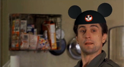
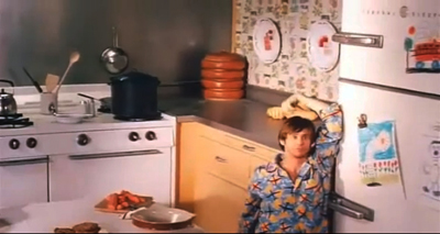
Walt Disney’s Taxi Driver (Bryan Boyce).
Categories are inevitable, and they allow us to consider creative choices systematically. Making this second point explicit is the most important overall revision in the new version of Film Art.
Previous editions took the perspective of the film viewer. This is reasonable: Teachers want to enhance their students’ skills in noticing and appreciating things in the movies. But from the start FA also indicated that the things we discussed also mattered to filmmakers. As the years went by, we incorporated more comments and ideas from screenwriters, cinematographers, sound designers, directors, and other artisans—often as marginal quotes that, we hoped, would reinforce or counter something in the main text.
Now, though, we’ve shifted the perspective more strongly toward the filmmaker—or rather, toward getting the viewer to think like a filmmaker.
Until recently, most of our readers hadn’t tried their hand at making movies. But with the rise of digital media, a great many young people have begun making their own films. Some of these are variants of home movies, records of concerts or parties or a night out. But many of these DIY films are more thoroughly worked over. They’re planned, shot, and cut with considerable care. Posted on YouTube or Vimeo, they exist as creative efforts in cinema no less than the films that get released to theatres or TV. If you doubt it, look at lipdubs, or meticulous mashups like Bryan Boyce’s.
So, we thought, many students are now able to consider film art as practicing filmmakers. For one thing, that means they’re more aware of the techniques we explain. (Probably nothing in Film Art is as tough as mastering Final Cut Pro.) Moreover, the very act of making films has made students sensitive to alternative ways of doing anything. Accordingly, this edition emphasizes that the resources of the film medium that we survey constitute potential creative choices which yield different effects.
Take an example. We can explain the idea of restricted versus unrestricted narration abstractly. Restricted narration ties you to a limited range of knowledge about the story action; unrestricted narration expands that range, often presenting action that no single character could know about. Filmmakers intuitively make choices along this spectrum even if they don’t use the terminology. Then again, sometimes they do. A while back we quoted the director of Cloverfield:
The point of view was so restricted, it felt really fresh. It was one of the things that attracted me [to this project]. You are with this group of people and then this event happens and they do their best to understand it and survive it, and that’s all they know.
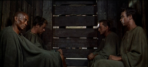
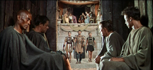
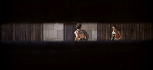
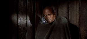
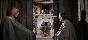
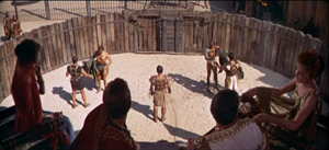
In Stanley Kubrick’s Spartacus, the hero and three other captives are chosen to fight in the arena. They sit sealed in the holding pen while we hear Crassus and his elite colleagues chatting pleasantly about their trivial affairs.
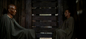
When the combat starts, we’re still confined to the shed. Crixus and Galeno are summoned out, and the door slides shut, leaving Spartacus and Draba alone.
The director has already made several important choices, notably contrasting the carefree chatter of the rulers with the grim prospects of the gladiators (the latter underscored by relentless music). But now there’s a big fork in the road: To show the first combat, or not?
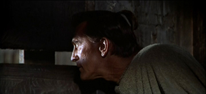
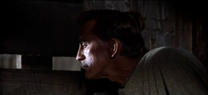
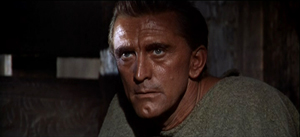
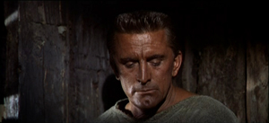
Kubrick chooses not to. We hear the call, “Those who are about to die salute you!” We hear swords clashing, and Spartacus peers outside through the slats. We see only what he sees.
Draba studies Spartacus, who closes his eyes to shut out the spectacle outside.
The two men share a look, but Spartacus turns his gaze away, as if unwilling to confront the cost of killing this man who has done him no harm.
This stretch of the scene is too detailed and varied for me to replay in full, but it’s all confined to the two men in the shed—their reactions to what they hear and what Spartacus sees, and the development of a mix of wary appraisal and desperation. No words are spoken.
The fight outside concludes, and at the climactic moment Kubrick cuts to a new angle that puts Draba and Spartacus in the same frame, realizing that their time has come. The door slides open again, and the men step out.
The exchange of glances has been just ambiguous enough to make us wonder whether the two will really try to kill one another. Restricting us to the holding pen gives us a moment to watch them pondering their fates and enhances the suspense about the outcome of their fight.
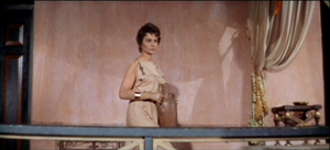
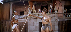
Every instant presents the director with a choice that can shape the viewer’s experience. When the men go out, Kubrick must decide on what to show us next. Most daringly, he could keep us in the shed and let us glimpse the fight from there. But that would be a very unusual option in American commercial cinema. Instead, the next shots expand our range of knowledge by shifting us to a different character’s reaction. Before showing us the arena, we get a shot of Virinia, the slave just bought by Crassus. As a result, she is marked as important before we get a general shot of the arena.
Eventally, a master shot ties together all the characters before we move to the next phase of the scene.
As Darba and Spartacus start their fight, you can argue that the effect of it is even stronger because we haven’t seen the earlier match. Restricted presentation of the first combat, seen only through Spartacus’s eyes, throws the emphasis on this one.
By shifting our attention to filmmakers’ areas of choice, we haven’t really abandoned thinking from the standpoint of the spectator. The two views complement each other. In effect, we’re reverse-engineering: thinking like a filmmaker sharpens our sense of how the spectator’s experience can be shaped. From either perspective, we need concepts, categories, and terminology.
To futz or not to futz?
Undercover Man (1949).
Once we notice the concrete results of creative choices by director, cinematographer, editor, and others, we’re inclined to compare how filmmakers have pursued different options, and how these decisions yield different effects. So you might contrast Kubrick’s treatment of the combat with the free-for-all in Ridley Scott’s Gladiator. There the period of waiting is short, and all the emphasis is put on the bloody combat.
Film Art uses the comparative method often, again to illustrate the range of choice available to the filmmaker. Let’s take some instances that have implications for both narration and sound. Telephone conversations are a staple of filmic storytelling. In such a scene, you as a director face a decision tree. Whatever you choose leads to other choices.
Should you show both characters in the conversation, or only one? A passage from The Big Clock presents both options, one after the other.
This illustration suggests that if the character on the other line plays a significant role in the story, you may want to show him or her. Max isn’t as important as Stroud’s wife and son. Once you’ve decided to cut back and forth, you’ll still have to decide when to cut—at what points to show us characters’ reactions. You might want to replay this clip to see how the cutting pattern highlights certain responses.
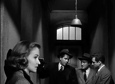
Alternatively, you can stick with one character and conceal the other party, even if that character is important. Here’s an example from Joseph H. Lewis’s Undercover Man.
Unlike Max in the Big Clock scene, this caller is an important character, a prospective snitch. By not showing him on the other end of the line, Lewis concentrates our attention on the federal agents and builds a little suspense. He goes even further: By not cutting in to Warren as he talks, the direction emphasizes the reactions of Judy, Warren’s wife. Her response is highlighted when she turns slightly into profile, registering her realization that her husband has to leave her on a dangerous mission sooner than she expected.
Sticking with one character triggers another choice about telephone talk: Do you let us hear the other party or not? So far, all our examples have suppressed the voice of the person on the other end of the line. But of course you could let the viewer hear that.
There’s a new problem coming up, though. You need to make it clear that the voice is coming through the receiver, not from someone outside the frame. So a convention has arisen: Words coming through the phone line are distorted, in a process called “futzing.” Here’s an example of subdued futzing from I Walk Alone.
And here’s a case from The Blue Dahlia illustrating the difference between the two sorts of sound even more sharply. Here it’s especially important to let the audience know that what’s being heard is a recording.
This isn’t to say that every choice is absolutely fixed. You can experiment. This is what King Vidor did in H. M. Pulham, Esq. Pulham gets a call, and though we stay with him, the voice isn’t futzed; the effect is a bit unnerving.
Vidor explains:
We were breaking with tradition. When the sound men took over, it became the cliché to put all telephone voices through some sort of filtering device. This made it sound distorted and weird. It occurred to me, why should the audience strain to listen? The person with the receiver up there on the screen doesn’t strain to hear the voice. There isn’t any kind of mechanical distortion. I thought we should just direct it to sound the way it sounded to the person.
The film’s plot concerns Pulham’s regrets about the missed opportunities of his youth. When he gets calls from old friends, their voices seem unusually immediate, more vital and “present” for him than the people in the life he’s leading now.
These creative options show how even small stylistic decisions affect narration and the viewer’s response. Presenting both characters on the phone creates more unrestricted narration, and this allows us to gauge reactions to the action. By showing only one character, you concentrate on that person and the people around them.
If you suppress the words spoken on the other end of the line, you maintain some uncertainty about what’s happening, and you don’t share with us what the listener knows. In contrast, if you let us hear what the listener hears, you tie us to their range of knowledge and perhaps create a bond with them. And as Vidor suggests, you can try to create a deeper subjectivity by letting us hear the speaker as the listener does.
Although Vidor’s experiment wasn’t taken up, directors have continued to try different ways of rendering phone conversations. It would be fun to compare Larry Cohen’s two “phone” scripts, Cellular and Phone Booth, in these terms—not least because of the eerie sound design applied to the mysterious caller harassing the hero of Phone Booth.
Choice and change in history
Un Chien andalou (1928); Blue Velvet (1986).
In such ways, the categories we survey can be thought of as a range of possible options facing filmmakers. But all of them aren’t available to every filmmaker. As every filmmaker knows, you choose within constraints, and some of those constraints are the result of history.
As in earlier editions, Film Art concludes with a chapter surveying artistic trends across film history. But now we’ve tried to integrate the idea of thinking like a filmmaker into that section, emphasizing the interplay of choice and constraint. Most obviously, budgets limit choices. Other constraints might be technological; not all filmmakers have been able to film in color, or to use advanced special effects. Some constraints involve matters of fashion: some acting styles and staging methods aren’t widely acceptable today. In our final chapter we show how certain traditions and schools of filmmaking confronted the constraints of their period and place. Sometimes filmmakers worked within those constraints, and sometimes they overcame them by trying something different.
At the same time, we break with our previous editions by weaving recent films into the history chapter. We try to show that the expressive choices made by filmmakers long ago have returned in our time. The earliest short films, based on novelty and surprise events, have successors in YouTube videos. Contemporary filmmakers draw on techniques favored by German Expressionism and French Impressionism. (Recent examples on the blog are here and here.) Current Iranian films owe a good deal to Italian Neorealism, while the Dogme filmmakers tried to revive some of the insolent force of the French New Wave. It isn’t just a matter of influence, either. Contemporary filmmakers face problems of storytelling and style that others have faced before. The choices our filmmakers make often recall those made in the past.
We’re very proud of this edition of Film Art. We hope that the changes will whet the interests of teachers, students, film lovers, and that generic “curious general reader”—who, we persist in believing, isn’t mythical.
Just to be clear: Our Spartacus example doesn’t appear in the book. Our layout of choices about handling phone conversations does, but with different examples. Thanks to Kevin Lee and Jim Emerson for advice on video embedding.
King Vidor’s remarks about H. M. Pulham, Esq. are taken from Nancy Dowd and David Shepard, King Vidor: A Directors Guild of America Oral History (Scarecrow, 1988), 188. A library of futzed sound clips is here. For a more detailed study of how phone conversations may be presented through both sound and image, see Michel Chion’s Film, A Sound Art, trans. Claudia Gorbman (New York: Columbia University Press, 2009), 365-371. (An outline of his typology is here, in French.) Chion’s research is a good example of showing how a systematic set of principles can underlie the practical decisions facing filmmakers.
Alert reader Chris Freitag has steered me to a recent and fine lipdub here. It exemplifies how competition within a genre can spur innovation. More specifically, how to create a new sort of lipdub? Well, how about proposing marriage?
Instructors interested in obtaining a desk copy of Film Art: An Introduction can visit this website.
Dimensions of Dialogue (1982).
P.S. 27 June: Some correspondence I’ve just gotten reminds me of two things I neglected to mention in the entry. First, this edition of Film Art contains a great deal more material on digital cinema, from production and postproduction through to distribution and exhibition. We’ve woven digital technology into sections on various techniques, particularly cinematography, and we’ve added material on 3D cinema.
Second, our decision to replace our sections on A Movie and Fuji doesn’t mean that those discussions will vanish forever. For some years we’ve been putting up older Film Art material as pdf files on this wing of the site. Later this summer we’ll be doing the same with the Movie and Fuji sections of the book. Instructors who want their students to read that material are welcome to send them there, where the essays can be downloaded.
PANDORA’s digital book
DB here:
Looking back at Kristin’s and my ventures online, I see a gradually expanding series of experiments. Step by step, maybe too cautiously, we’ve moved toward what you might call “para-academic” film writing–a way of getting ideas, information, and opinions out to a film-enthusiast readership whom we hadn’t reached with our earlier work. (Although we’re happy when academics take note of what we do.)
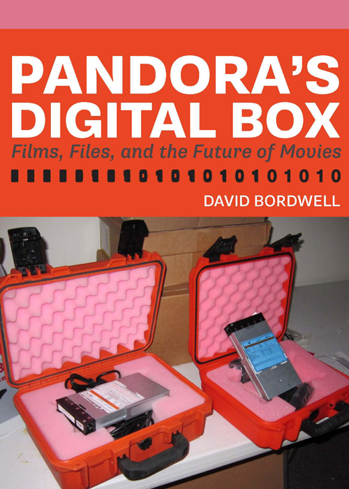
Today we have a new experiment to try. Pandora’s Digital Box: Films, Files, and the Future of Movies is now available here. Backstory follows.
Baby steps, then longer ones
To take another metaphor, we’ve been gradually exploring various niches in the online ecosystem. At first, back in 2000, knowing almost nothing about cyberculture, I dumped my vitae and a little essay onto my brand-new Geocities site. Later I saw the site mainly as a supplement to print publication, a way to add and correct things I’d written in my books Figures Traced in Light (2004) and The Way Hollywood Tells It (2005), along with material we’d included in our textbooks Film Art and Film History. By then I had retired from teaching.
I started to write more online. I began posting long, stand-alone pieces that I couldn’t imagine any journal or anthology publishing. (They’re in the list on the left-hand column of this page.) Somewhere around 2007, after finishing the collection Poetics of Cinema, I made Web publishing my primary expressive vehicle. So when I was asked to write pieces for various occasions, I tried to secure permission to publish them here as well. They too have wound up in the line-up on the left– a little essay on Paolo Gioli, one on Shaw Brothers’ widescreen cinema, and a liner note about The Mad Detective for the Masters of Cinema DVD line. There are more to come in this vein, including a historical survey of how film theorists have drawn ideas from psychological research.
While moving to fill the essayistic niche, we saw archival and revival opportunities as well. Thanks to Markus Nornes, I was able to republish the out-of-print Ozu and the Poetics of Cinema in a downloadable pdf version, with color illustrations. That’s on the University of Michigan Press site. Vito Adiraensens, who made a pdf of Kristin’s Exporting Entertainment, allowed us to post that on our site.
At this point, whole books we’ve done were available online. But those were straight reprints. The next logical step was to offer a revised edition. After the rights to Planet Hong Kong (2000) reverted to me, I decided to update and expand it and add color illustrations. I also decided to ask for money, making PHK 2.0 the only item on the site that wasn’t free. That was an experiment too, to see if the year I spent reshaping it might yield some payback. It did; so far, the sales have covered the costs of design and yielded me a little for my efforts.
Meanwhile we’ve explored the blog niche. Started in 2006, refreshed once or twice a week, our blog has become greatly satisfying to us. This entry is number 499. We’ve treated the blog wing of the site as a sort of magazine, with each entry as a feature or column or festival report or book notes. We write about anything cinematic, old or new, that interests us. The freedom is exhilarating, and we don’t lack ideas. I have a desk drawer’s worth of folders on topics I want to explore.
Nearly all of these are long-form endeavors. Some run to 6000 words. Even our festival reports, which could have been emitted in a flurry of communiqués, are blended into spacious pieces that permit us to compare films or develop a common theme. At a time when everyone declares that attention spans have shrunk to pinpoints, readers have been very patient with us. People still visit our blog, recommend it to others, and even Facebook and Tweet about it. Roger Ebert has been an especially generous supporter. Thanks to the efforts of Rodney Powell of the University of Chicago Press, we gathered some of our entries into a book, a “real” one called Minding Movies, and I’d hope that the length and contextual depth of the pieces gave them some bookish solidity.
Another niche coming up: As virtual books have found a public, I’ve made a book designed primarily for an e-reader.
Not bloviation, blogiation
Last fall, after realizing the scope of the digital conversion of movie theatres, I decided to write a series of blogs about it. I had no fixed number in mind, but I didn’t expect it to run as long as it did. I kept learning more, so the series, called Pandora’s Digital Box, stretched from December through March. I was encouraged by people who praised it in blogs and on social media. I decided to try to build a book out of the pieces.
Some people think that this is silly. One reviewer of our blog book, Minding Movies, wondered why anyone would buy something that’s available for free. More alert reviewers, like Scott Foundas of Film Comment (May/June 2011), understood that some readers don’t like to read long-form prose online, or don’t like zigzagging through the labyrinth that is our site, or want some guidance in selecting what to pay attention to. Moreover, by gathering items topically, the book suggested recurring themes and an overall frame of reference governing what we do. The broad aims of our enterprise aren’t apparent in a daily skim of each entry.
Still, Minding Movies was a varied mixture. Pandora was from the start a more focused series. And we added no new essays for our collection, but I had quite a bit more to say about the digital conversion. So I cooked up new rules for my latest experiment.
1. The original entries wouldn’t be taken down. As with Minding Movies, the entries will remain available online.
2. The book wouldn’t be simply a blog sandwich. I’ve rewritten, rearranged, and merged entries for smoother reading. The topics are more logically ordered, and the whole thing hangs together organically. The blogs formed a kaleidoscope; the book is a narrative.
3. The book would have lots of new material. It includes things I didn’t know when I wrote the blog, ideas that have come to me since, and as much background and context as I could supply. The original blogs amounted to about 35,000 words (enough for a Kindle single). The finished book runs over 57,000 words.
4. It wouldn’t be an academic book. It’s written in the same conversational tenor as the blog. I try not to make anybody’s head hurt. No footnotes, but….
5. The book would exploit online access. The text is unsullied by links, to promote continuity of reading. But a section of references in the back contains citations and hyperlinks to documents, interviews, sources, and sites of interest. This section tells you where I got my information and, if that information is online, takes you there.
6. The book would have to be for sale… Part of this experiment is to see whether I can make back what I’ve spent on the project. I reckon that my travel to theatres and events like the Art House Convergence in Utah, along with other expenses like paying our Web tsarina Meg to polish up my self-designed Word book, comes to about $1200. In addition, I’d like something for my extra time and effort.
7. …but not cost too much. Planet Hong Kong 2.0 runs $15, which I think is a fair price given the cost of designing a book with hundreds of color pictures. But Pandora is a lot simpler and has only a few stills. So I’m offering it for much less: $3.99.
Another Whatsit, but only $3.99
Pandora’s Digital Box: Films, Files, and the Future of Movies traces how the digital conversion came about, how it affects different sorts of theatres, how it shapes the tasks of film archives, and what it portends for film culture, especially the culture of moviegoing.
A key concern was trying to go beyond what I’d already written. For one thing, I try to answer questions I didn’t pursue in the blog entries. How did the major distributors orchestrate the transition? How did they reconcile the interests of the various stakeholders—filmmakers, theatre owners, manufacturers? By 2005, the specifications for digital cinema were established, but the real uptake came five to six years later. What led to the delay? How was digital cinema deployed outside the US? And so on.
Second, I provide background and context for areas I surveyed quickly online. For example, instead of sketching how a movie file gets projected, I take you into a booth and we follow the process step by step. The chapter on small-town cinemas reviews the role of single-screen theatres in the industry. The chapter on art-house cinemas goes back to the 1920s and shows remarkable continuity of taste and business tactics up to the present. Throughout, I consider how the US exhibition system has worked since the rise of multiplexes.
Third, there are unexpected tidbits. How did celebrity directors like Lucas, Cameron, and Jackson spearhead the shift to digital and later innovations? (I touched on that in a couple of recent entries here and here, but there’s more in the book.) Who invented multiplexes? Cup holders? When did those annoying preshow displays start, and more important, who controls them? How do distributors decide whether to release a movie wide or to let it “platform”? Why do art-house theatres serve coffee? There are even a couple of jokes (maybe more unintentional ones).
I think it has worked out well. I’ve tested the text on Kindle, Nook, and the iPad, and it fits very snugly. You just have to import it as a pdf from your computer. On the iPad, it seems to work particularly well with the app GoodReader, which permits smooth searches, easy bookmarking, and quick shifts back and forth.
As I mentioned above, you can go here to order the book. On the same page you can examine the Table of Contents and a bit of the Introduction.
It’s possible that some people might want to make a bulk purchase. Pandora might be used in a class, or given to staff members working at a film festival, or presented to members or patrons of an art house. For such worthy purposes, I can make the bulk price quite low. If you’re interested, please write to me at the email address above.
Self-publication is a risk for both author and reader. If you decide to buy the book, I thank you.
The next logical steps? A new ecological niche? A completely original book online, maybe. Or PowerPoint lectures with voice-over. Who knows? As Jack Ryan says at the end of The Hunt for Red October: Welcome to the new world.
Thanks as usual to our Web tsarina Meg Hamel, who did her usual superb job turning Pandora the Blog into Pandora the Book, and who has set up the payment process to be quick and easy. Earlier helpmates were Vera Crowell and Jonathan Frome, whose efforts in creating this site are remembered and appreciated.
The illustrations are from Kiss Me Deadly and Pandora and the Flying Dutchman, but you knew that. Thanks to Jim Emerson for his suggestions.
A man and his Focus
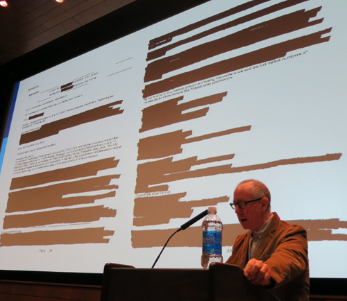
James Schamus on State Street, hailed by local livestock.
DB here:
“I wish,” one of my students said during a James Schamus visit to Madison back in the 1990s, “I could just download his brain.” Probably many have shared that wish. James is an award-winning screenwriter who has become a successful producer and head of a studio division, Focus Features (currently celebrating its tenth anniversary). No one knows more about how the US film industry works than James does. Yet he’s also deeply versed in the history and aesthetics of cinema. He teaches in Columbia’s film program, and his courses involve not filmmaking but film theory and analysis. How many people who can greenlight a picture have written an in-depth book on Dreyer’s Gertrud?
James came to campus last month for our Wisconsin Film Festival. His official event, sponsored by the University Center for the Humanities, was a talk called “My Wife Is a Terrorist: Lessons in Storytelling from the Department of Homeland Security.” That was quite an item in itself, tracing how James’ wife Nancy Kricorian discovered that she had a Homeland Security file. Pursuing that led him to broader meditations on digital surveillance in modern life. If he’s invited to present this in a venue near you, you’ll want to catch this provocative tutorial in how to read a redacted document.
While he was here, James spent a couple of hours in J. J. Murphy’s screenwriting seminar, and of course I had to be there. Herewith, some information and ideas from a sparkling session.
All battleships are gray in the dark
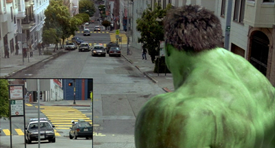
Hulk.
“This is not writing,” Schamus said. By that he meant that a screenplay isn’t parallel to a piece of creative writing, an autonomous work of art. Nobody ever walked out of a movie saying, “Bad film, but a great script.” In this he echoed Jean-Claude Carrière at the Screenwriting Research Network conference I visited back in September. A screenplay is “a description of the best film you can imagine.”
What sort of description? For certain directors, sparse indications are best. Collaborating with Ang Lee, Schamus knows he must under-write. Lee doesn’t want a movie that’s wholly on the page: “Ang wants to solve puzzles.” But for a studio project, the screenplay has to be airtight, since it functions as an insurance package for any director the producers hire. “A script has to be a battleship that no director can sink.”
James pointed out a bit of history. Back in the 1910s Thomas Ince rationalized studio production by using the script as the basis of all planning—budget, schedule, locations, and deployment of resources. The same happens today, with the Assistant Director breaking down the script for different phases and tasks of production. But on a studio project not everything is tidily planned in advance. Scripts can be rewritten during shooting or even later. Sometimes there are “parallel scripts”: stars can hire writers who spin out “production rewrites” to be thrust on the director. James, who has prepared the screenplay for Hulk and done his share of uncredited rewrites on other big films, speaks from experience.
Independent companies rely on screenplays too; Focus is writer-friendly. But in this zone of the industry, the writer needs to create a “community” around a script idea—a director or group of actors and craft people that support it. These are as valuable as a polished screenplay in getting a film funded.
What about the current conventions, like the three-act structure? James rejects the Syd Field formula. He thinks that the writer will spontaneously devise some intriguing incidents and arresting characters without recourse to beats, arcs, and plot points. “You can’t have half an hour go by without giving your characters something to do, or to shoot for.”
He also suggests that the writer’s second draft should be an exercise in rethinking the whole thing. “Don’t write your second draft from the first-draft file.” In your redraft, use flashbacks, play around with structure, or tell the action from a different point of view. This will engage you more deeply with the material and show you possibilities you hadn’t imagined. In terms I’ve floated in various places: take the same story world, but recast the plot structure or the film’s moment-by-moment flow of information (that is, its narration). Or try choosing a different genre. For The Wedding Banquet, James turned the original script, a melodrama, into a situation derived from screwball comedy.
Down in the mosh pit
Jim Carrey in Eternal Sunshine of the Spotless Mind.
James has been both an independent producer, in partnership with Ted Hope at Good Machine during the 1990s, and a specialty-division producer with Universal for Focus. The moment of passage for him came when, rewriting Ang Lee’s first feature, Pushing Hands, James realized that he had to get the whole project in shape for filming. After that, and The Wedding Banquet and Eat Drink Man Woman, producing followed naturally.
When James started, a single person could cover most producer duties on an indie film, but now it’s very difficult. Finding material, gathering money, signing talent, checking on principal photography and post-production, planning marketing and distribution across many platforms, tracking payments after release—it’s all a daunting task for one individual. Today an indie movie may list seven to twenty producers. Some probably helped by finding money, some worked especially hard to get material, and a few just slept with somebody.
A traditional producer’s job is to keep the budget under control. Today, with digital filming making special effects cheaper, screenwriters and directors think naturally of more elaborate visuals. This can work with something like Take Shelter, James suggested, but on the whole he thinks that directors shouldn’t jump to extremes. He recalled that using “handcrafted effects” cut the original budget of Eternal Sunshine of the Spotless Mind by a third, and that led to more unusual creative results, like outsize sets and in-camera trickery.
The “independent cinema” scene has always been quite varied. Again James had recourse to history: in the 1960s both United Artists and Roger Corman were labeled independents. The artier independent side developed through the infusion of foreign money and new technology. From the 1970s onward, overseas public-television channels invested in US films by Jarmusch and others, while cable and home video needed product and so financed or bought indie projects. The video distributor Vestron, for instance, could not acquire studio films, so, armed with half a billion dollars, the company began generating its own content. In the same era, pornography was shot on 35mm, and many crafts people learned in that venue and transferred their skills to independent cinema.
Today, however, the indie market is both more fragmented and more fluid. The spectrum space between tentpole Hollywood and DIY indies is being filled by net platforms and cable television. James pointed to the ease with which Lena Dunham moved from Tiny Furniture to the HBO series Girls. Downloading and streaming add to the churn. IFC and Magnolia distribute films, but these companies are owned by cable channels and hold theatrical venues as well. They acquire scores of new films a year, using theatrical releases to get reviews that can support VOD and DVD. Focus can tier its marketing in similar ways, using DVD and VOD outlets to lead viewers to content online under the rubric Focus World.
These new “paramarkets,” James suggests, are porous, overlapping, and still evolving. Traditional windows, he says, have become a mosh pit.
James had a lot more to say, and I expect to be referencing more of his ideas on VOD in a blog to come. But this gives you a taste of the energy and breadth of his thinking. He’s constantly busy but never less than enthusiastic and generous. He always has time to share ideas about anything, from politics to cinephilia. The most exhilarating thing about talking with him is that you know more excellent work lies ahead.
Apart from titles I’ve already mentioned, James Schamus’ screenplays include The Ice Storm, Ride with the Devil, Taking Woodstock, Crouching Tiger, Hidden Dragon, and Lust, Caution, Films that he produced and/or distributed include Poison, The Brothers McMullen, Safe, Walking and Talking, Happiness, The Pianist, 21 Grams, Lost in Translation, Shaun of the Dead, A Serious Man, Coraline, Brokeback Mountain, The Motorcycle Diaries, Eastern Promises, Atonement, Reservation Road, In Bruges, Milk, Sin Nombre, Greenberg, The Kids Are All Right, The Debt, Pariah, Tinker Tailor Soldier Spy…and plenty more.
Schamus provides a video review of the top ten Focus titles chosen by viewers for the company’s anniversary.
J. J. Murphy blogs about screenwriting, the avant-garde, and independent film here. His most recent book is The Black Hole of the Camera: The Films of Andy Warhol.
More on the concepts of story world, plot structure, and narration can be found in “Three Dimensions of Film Narrative,” in my book Poetics of Cinema. A brief account is here.
James Schamus lecturing, University of Wisconsin–Madison Center for the Humanities, 19 April 2012.
Once more, Mad City movies
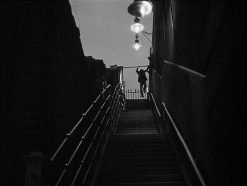
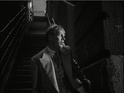
Night and the City.
DB here:
It’s been a busy time in Madison, at least for me. KT is in Egypt, peering at shards of statues and documenting earlier Armana excavations. I’m at home, having missed the Hong Kong International Film Festival (doctor’s orders) and wistfully wishing I’d been there for the tribute to Peter Chan Ho-sun (check out Fred Ambroisine’s interview at Twitchfilm) and a chance to see—Don’t say whoa!—Keanu Reeves, who was there with Side by Side, his new film on digital cinema (snif).
Instead of traveling, I’ve been doing other stuff. There were, and still are, last-minute checks and fixups on the new edition of Film Art. I went to some movies–Star Wars Episode I: The Phantom Menace, The Hunger Games, The Raid: Redemption, Carnage, 21 Jump Street—as well as screenings at our Cinematheque. Late at night I’ve been watching 1940s films for a long-range project. Most frantically, I’ve been working on a little e-book to be finished, I hope, in three weeks. It will be available on this site, ludicrously cheap, you will want one for sure, I bet, well, why not? More about it later.
In the meantime, Madison has hosted some remarkable visits. I’ve already mentioned Lynda Barry’s delightful presentation of Chris Ware and Ivan Brunetti. I must also mention two other dignitaries that illuminated our lives this spring.
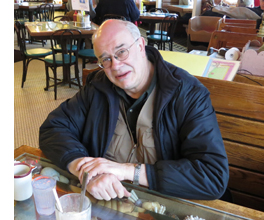 In early March, Tony Rayns (right), cinema’s man-about-Asia, came to pillage our city’s supply of DVDs and, not incidentally, give a lecture. It was his usual fine performance. “The Secret History of Chinese Cinema” took us through a series of unofficial classics stretching back to the 1930s, including Song at Midnight (1937), with its fairly off-putting defacement, and Scenes of City Life (1935), Tony’s candidate for the best unknown Chinese film. It was gratifying to hear him pay homage to Sun Yu, who attended UW’s theatre program long ago. Who knew that the great director of Daybreak (1933) and The Highway (1934) was a Badger?
More recently, we were visited by Schawn Belston, an old friend who’s Senior Vice-President of Library and Technical Services at Twentieth Century Fox. Our Cinematheque is running a string of Fox restorations, and Schawn brought along a stunning print of the lustrous noir classic Night and the City (Jules Dassin, 1950).
There’s a nifty story behind that print. Schawn and archivist (and Badger) Mike Pogorzelski discovered an original camera negative in the Movietone News vault in Ogdensburg, Utah. When they struck our print (directly from the neg) and showed it to Dassin a few years ago, he wept with pleasure.
Schawn found another version of unknown provenance. On the basis of the first reel, which he screened for us, this seems to be a British version, with a different voice-over narrator, varying footage and cutting patterns, and a lighter, more romantic score. As Schawn pointed out, this plays more slowly and is more of a melodrama than a thriller; it also makes the Richard Widmark character a little more sympathetic, I thought. Nobody has yet discovered why this version was made.
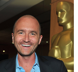 So a mood-drenched noir print, a new slant on postwar film, and a nice little puzzle. On top of those, a talk on the previous day by Schawn, discussing current restoration issues. Naturally the topic turned to the digital conversion, a hot topic on this site and elsewhere. Some basic facts from the inside:
*Lots of filmmakers are still finishing on film, but the plan is to make no prints available to US theatres after 2012. About 300 prints of current titles will still be made for the world market.
*Both Fuji and Kodak are still making film stock, even new emulsions, but the decline in usage will raise prices. A 35mm print now costs $4000, a 70mm print runs $35,000 and up.
*Storage problems are immense. The studio wants to save all the raw footage; in the case of Titanic, that comes to 2.5 million feet. Which version of the film has priority for the shelf? Typically, the longest cut, often the first preview print.
*All studios are still making 35mm negatives for preservation, typically from 4K scans. Ironically, their soundtracks, usually magnetic, can’t match the uncompressed sound of the files on a Digital Cinema Package (DCP).
*”Film is the most stable medium, but the preservation practices for it are the most vulnerable.”
*Nearly all film restoration is digital now, so the best way to show the results is probably digitally. That also makes for standardized presentation and less wear and tear on physical copies.
*Most classic films in a studio library are not available on DCP. If an archive or cinematheque or theatre wants one, there are ways to make on-demand DCPs. But it’s not cheap. A 2K scan runs $40,000; a 4K scan, somewhat more. Schawn opts for 4K because a digital version should be the best possible. It might be the last chance to make one!
*Films stored on digital files must be migrated frequently. Sometimes that’s done through “robotic tape recycling.” But there are problems with the constantly changing formats and standards. The Movietone News library was originally digitized to ID-1, a high-end broadcast tape format from the mid-1990s, so that material will need to be copied to something more current.
*Schawn believes that objective criteria about color, contrast, and other properties need to be balanced with concern for the audience’s experience. By today’s standards, original copies of Gone with the Wind and The Gang’s All Here look surprisingly muted. But to audiences of the time, they probably looked splashy, because viewers saw so few color movies. Restorers and modern viewers have to recognize that perception of a film’s look is comparative, and the terms of the comparison can change.
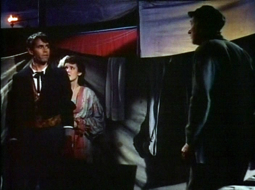
Schawn’s point was made after his visit with our Cinematheque show of the restored copy of Chad Hanna (Henry King, 1940). For a Technicolor film, it had a surprising amount of solid black, and not just in night scenes. We’re used to “seeing into the dark” via today’s film stocks and digital video formats, and we probably identify Technicolor with the candy-box palette of MGM musicals on DVD. We sometimes forget that chiaroscuro was no less a resource of color film of the 1940s than of black-and-white shooting of the period. A leisurely, charmingly unfocused story with a radiant Linda Darnell (she lights up the dark) and Fonda at his most homespun, Chad Hanna was good in itself and an education in color style circa 1940.
Schawn’s visit, like Tony’s, was informative and plenty of fun. We want to see both again soon.
Up next, as Robert Osborne would say: Some picks for the Wisconsin Film Festival, which launches Wednesday.
Thanks to Jim Healy, Cinematheque programmer, for arranging Schawn’s visit and the Fox retrospective.
Chad Hanna. Not, emphatically not, from 35mm; from Fox Movie Channel.


