Archive for the 'Film technique: Performance' Category
ON THE HISTORY OF FILM STYLE goes digital
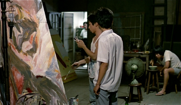
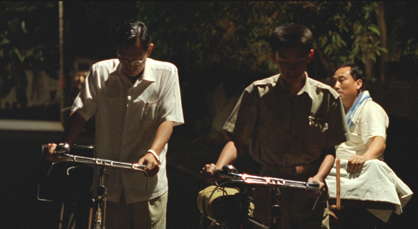
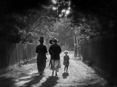
Dust in the Wind (1986).
DB here:
I was born to write this book.
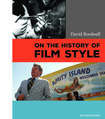 So I rashly claim in the Preface to the new edition of On the History of Film Style. That’s not to say somebody else couldn’t have done it better. It’s just that the book’s central questions tallied so neatly with my enthusiasms and personal history that I felt an exceptional intimacy with the project.
Baby-boomer narcissism aside, there are more objective reasons for me to tell you about the book’s revival. It came out in late 1997 from Harvard University Press, and it went out of print last fall. Thanks to our web tsarina Meg Hamel, it has become an e-book, like Planet Hong Kong, Pandora’s Digital Box, and Christopher Nolan: A Labyrinth of Linkages.
The new edition is substantially the original book; the pdf format we used didn’t permit a top-to-bottom rewrite. Errors and some diction are corrected, though, and the color films I discuss are illustrated with pretty color frames, not the black-and-white ones in the first edition. The new Preface and a more expansive Afterword explain the origins of the book and develop ideas that I pursued in later research.
The book analyzes three perspectives on film style as they emerged historically. One, what I call the Basic Version, was developed in the silent era and saw the discovery of editing as the natural development of film technique.
The second version, associated with critic André Bazin, modified that conception by stressing the importance of other stylistic choices, notably long takes and staging in depth. I call this the Dialectical Version because Bazin claimed that these techniques were in “dialectical” tension with the pressures toward editing.
A third research program, spearheaded by filmmaker and theorist Noël Burch, argued that the development of film style was best understood as the ongoing interplay between two tendencies. There’s a dominant style Burch called the Institutional Mode. Responses to that mode are crystallized in alternative practices–the cinema of Japan, for instance, or the “crest-line” of major works associated with modernist trends.
The book goes on to show how a revisionist research program launched in the 1970s built upon these earlier perspectives. Younger scholars sought to answer more precise questions about certain periods and trends. The revisionist impulse is best seen in debates on early cinema, which I survey.
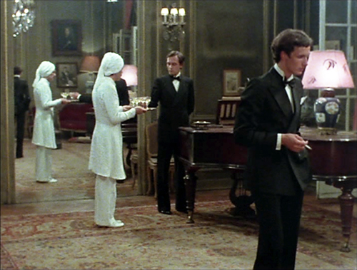
The book so far is historiographic, tracing out other writers’ arguments about continuity and change in film style. In my last chapter I try to do some stylistic history myself. I analyze particular patterns of continuity and change in one technique, depth staging. Certain conceptual tools, like the problem/solution couplet and the idea of stylistic schemas, can shed light on how certain staging options became normalized in various times and places. In turn, directors like Marguerite Duras, in India Song (1975), can revise those norms for specific purposes.
On the History of Film Style was generally well-received. John Belton, while voicing reservations, called it “a very good book. Anyone seriously interested in Film Studies should read it.” Michael Wood wrote in a review that “Bordwell is always sharp and often funny” (I try, anyhow) and called the last section “a brilliant account of the history of staging in depth.” The book has been used in some courses, and I’m happy to learn that there are filmmakers who find it useful. It’s been translated into Korean, Croation, and Japanese.
The book is available for purchase on this page. It’s priced at $7.99, a middling point between our other e-pubs. It’s a bigger book than Pandora ($3.99) and the Nolan one ($1.99), but it’s not an elaborate overhaul like Planet Hong Kong 2.0 ($15). Selling the book helps me defray the costs of paying Meg and digging up color frames. In any event, the new version is much cheaper than the old copies available at Amazon. It’s almost exactly the price of two Starbucks Caffe Lattes (one Grande, one Venti).
The archives and festivals that made the book possible are thanked inside, and they’ve continued to be hospitable and encouraging over the last two decades. Equally supportive are the students, colleagues, and cinephile friends with whom I’ve discussed these issues. So I reiterate my thanks to them all. And I hope this new edition, if nothing else, stimulates both viewers and researchers to explore the endlessly interesting pathways of visual style in cinema.
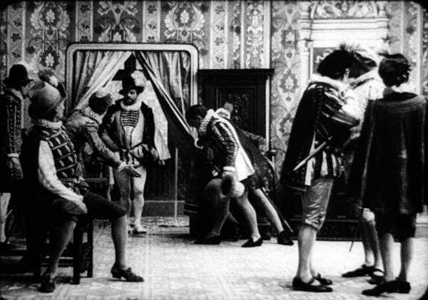
La Mort du Duc de Guise (1908).
Biomechanics goes to the Big House: BRUTE FORCE on the Criterion Channel
DB here:
If there’s one film technique that probably everybody notices, it’s acting. Reviewers are obliged to judge performances, and viewers often comment that this or that actor was admirably controlled, or wooden, or over the top. Yet acting is surprisingly hard to describe; the critic who can do it engagingly, as Pauline Kael could, wins plaudits.
I think it’s fair to say that film analysts haven’t on the whole found good ways to analyze acting. There are books about historical acting styles, and there’s a very good theoretical overview by—no surprise—Jim Naremore. Our colleagues Ben Brewster and Lea Jacobs have produced a superb study of acting in the early feature film, with careful attention to the conventions of the period. But I think there’s still more to be done in terms of analyzing how performers achieve their expressive effects.
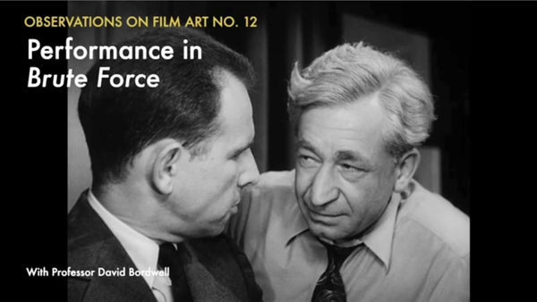
Or so I suggest in the newest installment of our series, “Observations on Film Art,” on the Criterion Channel of FilmStruck. Using Brute Force as an example, I try to lay out in brief compass some primary tools that actors wield. There’s an excerpt here. Today I’ll sketch out what I tried to do.
Bits selected and amplified
Talk about acting tends to set “realism” or “verisimilitude” against “artifice” or “stylization.” The Method, we sometimes say, is an example of realism, while Expressionist acting à la Caligari is at the opposite pole. Classic Hollywood acting, from the late 1910s into the 1940s, we might say ranges across the middle.
Accordingly, some theorists of acting are realists, favoring one zone and finding the other too artificial. Others are conventionalists; they argue that all acting, even the most apparently realistic, is actually stereotyped. It looks realistic because we accept the conventions of a time or tradition as the way people actually behave.
I think it’s worth suspending this polarity and simply looking at how performances are built up out of pieces. Like Meyerhold’s Biomechanics and Kuleshov’s engineering approach to acting, my perspective here is that of seeing performances as clusters of controlled choices about specific bodily behaviors.
As a first approximation, I propose that acting of any sort starts with some norms of human facial, vocal, and bodily expression.
Many of those norms might be universal. I’m risking disagreement here, since the US humanities are predicated on a fairly radical relativism. But I think that’s implausible. Is there any culture where smiling reliably indicates unhappiness? When frowning and shaking your fist in someone’s face indicates affection? Where pointedly turning your back on someone shows a willingness to engage socially? Where sloping your shoulders, tipping up your inner eyebrows, rearing back your head, turning down your mouth, and wailing indicates joy rather than misery? (The guitar-hugging rocker’s cry of anguished teen spirit draws on the ensemble of cues we see in the mother cradling her wounded child.) Nobody expresses pride by dropping to a crawl.
The context can qualify or negate these signals, of course. One may smile and smile and be a villain. But exactly because cordial smiling isn’t the default signal of villainous purpose, Shakespeare is able to make his point about deception. Any expression can be faked; that’s what acting is. At bottom, though, taken singly and reinforced by other inputs and circumstance, there are some reliable expressive cues in the typical case.
But even if you believe in the social construction of everything, my point still carries. Humans in any community emit a stream of behaviors in face, voice, hands, posture, stance, and so on. Maybe those bits are wholly constructed socially, or maybe universal proclivities play a role too. In any case, what the actor does, I posit, is survey the range of such behavioral possibilities for the role she is to play. She then does two other things.
First, she selects only a few. Any performance depends on picking a few behavioral bits to carry expressive impact.
Second, at any given moment, the selected features are emphasized, even exaggerated. The actor bears down on the selected behavioral bit, dwelling on it. The clumsy, sometimes contradictory flow of real-life behavior gets simplified and streamlined for easy uptake.
For example, certain body parts may dominate the impression. If we’re to watch the hands, the face can be fairly neutral.
Correspondingly, in cinema the shot can be scaled to stress the one gesture—in this case, a pat of comradeship.
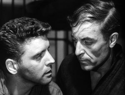
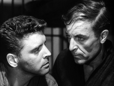
If we’re to watch the face, keep the hands and body still. Film technique can help you by recruiting our old friend the facial view. I talk about several examples in Brute Force, of which this is one of my favorites—two frontal faces, blatantly unrealistic but riveting (as Eisenstein knew; see below).
Only the eyes move, and one mouth, barely.
Or, if we’re to watch an eye-flick, keep the face neutral.
Indeed, you can argue that the development of the intensified continuity style, which concentrates on facial close-ups, gave the actors less to do with their hands and bodies than did the greater range of shot scales available to studio cinema from the 1910s to the 1960s.
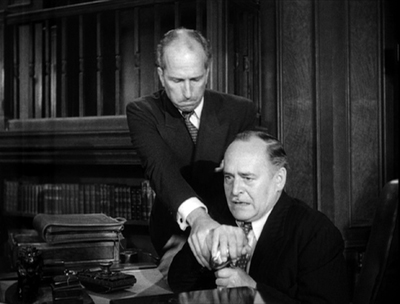
To smack us with a bigger impact, the filmmakers add up the channels. In this scene of Brute Force, the commissioner takes control of the prison from the warden, and the two men’s facial expressions—determination on one, fear on the other—are amplified by their paired gestures of wrestling for the loudspeaker.
The effort shows not only in their postures and fingers but their faces.
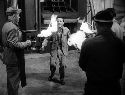
At high points, we can go for all-over acting, face and gesture and bearing and voice, as when the snitch faces his fate in the machine shop.
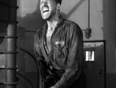
But note that even here, as an ensemble element, other factors are neutralized. The attackers are seen from the rear and poised or moving stiffly and inexorably. Similarly, the pure animal outburst of Lancaster’s performance at the climax depends on several factors of expressive movement swept together.
Wounded, he lets his boiling rage explode; even the frame can’t contain him. But even here there’s selection and emphasis. The head and voice and straining neck do all the work, while the arms remain taut.
The tools I survey are simple ones: eye areas (not so much the eyes as the lids and brows), mouth, tilt of the chin; bearing and stance; hand gestures; and rhythm of walking. In the Observations installment, I look at how the performances in Brute Force play off against one another, and I sum up the resources in Lancaster’s fierce performance, using all of the tools he had. That wedge of a back. Those mitts. Those slightly shifting eyes.
For preparing the Criterion Channel installment, thanks as usual to Kim Hendrickson, Grant Delin, Peter Becker, and all their colleagues.
The theatrical tradition is discussed by Alma Law and Mel Gordon in Meyerhold, Eisenstein, and Biomechanics (new ed., McFarland, 2012). On Kuleshov, see Kuleshov on Film, ed. Ron Levaco (University of California Press, 1974), pp. 99-115. I discuss Eisenstein’s approach to these problems, what he called mise en geste, in The Cinema of Eisenstein, pp. 144-160.
On actors’ use of eyes, go here; on hands, try this. I’ve discussed Lancaster’s skills before, here. More generally, when it comes to pictorial representation I defend a moderate constructivism against pure relativism here.
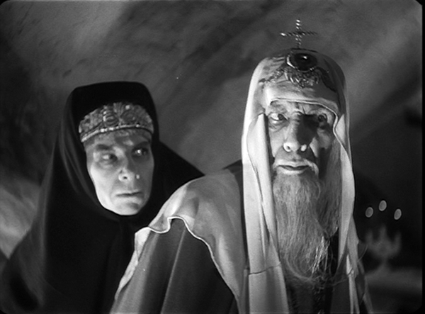
Ivan the Terrible Part II (1958).
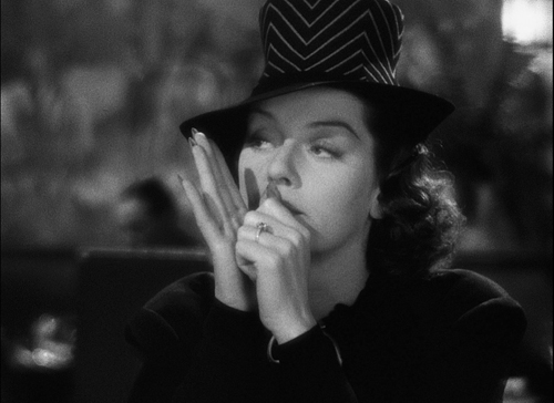
My girl Friday, and his, and yours
DB here:
Criterion has just released a fine edition showcasing two classics of American cinema: The Front Page (1930) and His Girl Friday (1940). His Girl Friday is in a new HD restoration, and the earlier film, long crawling around in disgraceful public-domain bootlegs, now has a 4K glow–maybe looking better than it did at the time. The extra fillip is that it’s a version that director Lewis Milestone preferred to the familiar one.
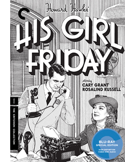 Along with the films comes a host of features: interviews and shorts about Howard Hawks, Rosalind Russell, and the making of HGF, radio adaptations of both the Front Page play and the HGF film, a short about Ben Hecht, trailers, appreciative essays by Michael Sragow and Farran Smith Nehme, and a session with me about HGF.
Needless to say, I’d be plugging this release strenuously even if I weren’t involved. Long-time readers of this blog know that an early entry hereabouts talked about the diverse paths HGF took to becoming the classic it’s now recognized to be. I used the film in many courses I taught during my early days at Madison. Kristin and I have been writing about the film since then as well, first in Film Art (it still retains its place from the 1979 edition), then in Narration in the Fiction Film (1985) and On the History of Film Style (1998). Other references sneak into our entries here from time to time. The Criterion edition offered me another chance to rattle on about a movie I still, after nearly fifty years, love inordinately.
What can be left to say? Plenty, but today I’ll mention just two items. First, what is a Girl Friday? And second, how unobtrusively delicate can film style be?
More slop on the hanging
The phrase “girl Friday” comes, ultimately, from Robinson Crusoe, Defoe’s 1719 novel of how the castaway protagonist turned a cannibal prisoner into his servant: his man, Friday. The hapless convert to Christianity gained his name because Crusoe rescued him on a Friday. An 1867 children’s story, “Will Crusoe and His Girl Friday,” shows a little boy and girl planning to reenact Defoe’s tale, adding gender insult to racial and class injury.
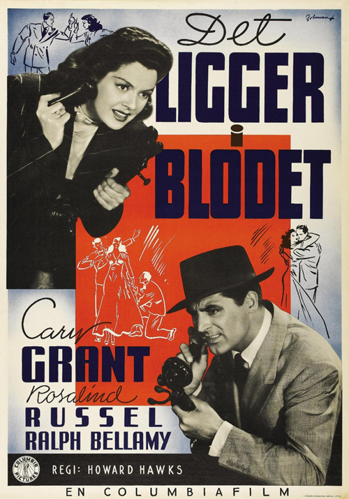
“My Girl Friday” was a spicy 1929 play about flappers who drug tycoons at a party and then convince them that the worst has happened. Consisting largely of scenes with chorus girls in bathing suits, it was dubbed by Variety “out and out smut.” Unsurprisingly, it found success on Broadway. During some weeks its BO take rivaled that of The Front Page, on stage at the same time.
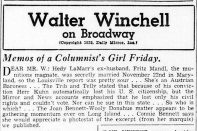
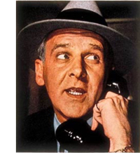 As far as I can tell, the phrase “girl Friday” became more prominent in American slang during the 1930s, thanks chiefly to columnist Walter Winchell (right, from Time 1938). At intervals from 1934 on, Winchell’s daily column carried the title “Memos of a Columnist’s Girl Friday.” The premise was that his secretary was an all-purpose newshound, gathering gossip and tidbits into a weekly memo to her boss. Evidently, Winchell’s secretary Ruth Cambridge (Mrs. Buddy Ebsen) didn’t write it. Under the “Memos” rubric Winchell could boast about his latest triumphs. His Girl Friday could ask innocently if “Mr. W.” saw the new Fortune poll of top columnists (in which he ranked high), or whether he noticed that several more newspapers had signed on to carry the column. Louella Parsons gave Winchell credit for publicizing the Girl Friday phrase.
He started a brief feud when he smelled poaching. In 1937, two aspiring screenwriters sold MGM a story they called “My Girl Friday.” It involved, according to Daily Variety, “adventures of a newspaper circulation rustler.”
With Trumpian self-regard, Winchell asserted that he had popularized many catchphrases that Hollywood had bought as titles: “Blessed Event,” “Orchids to You,” “Is My Face Red?” “Okay, America,” and even “Whoopee.” In addition, he noted that MGM had spent a cool quarter of a million dollars to enhance a scene of The Great Ziegfeld. In the face of such largesse, Winchell felt justified in asking for compensation.
Therefore we think it would be ducky if MGM sent $10,000 to us for the use of “My Girl Friday,” which became better known via this dep’t.
Winchell hastened to add that he would give the money to charity. He pressed his case in several columns and in radio broadcasts. Paramount joined the fray, claiming that it acquired the title when it bought the old play, so MGM couldn’t use it anyway. At which point the Hays Office was consulted.
Using his Girl Friday voice, Winchell responded that he claimed only to have popularized the phrase, and in any case what was $10,000 to Hollywood, especially if the money went to charity? Muttering about how MGM’s song “Your Broadway and Mine” swiped the original title of his column, Winchell subsided, as did the dispute. MGM evidently never adapted the story in question.
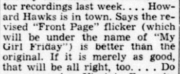
Then, on 9 December 1939, Walter ran this.
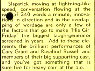
No hard feelings from Winchell, apparently. He may have benefited from the association with the movie. During production and even after release, the film was sometimes called My Girl Friday. And the linkage of a Girl Friday to the newspaper game, be it gossip or circulation rustling, fitted the movie well, as it evoked Winchell’s rat-a-tat radio delivery and his near-prosthetic adhesion to phone receivers.
Yet Winchell mysteriously dropped the “Memos” rubric from his column in 1941. In the decades to come, many businessmen would claim to have a Girl Friday of their own. Maybe the film ultimately popularized the phrase more successfully than Winchell did.
For the waiter
Daily Variety (5 January 1940), 3.
As a theatrical adaptation, His Girl Friday offers a challenge that Hawks accepted with ease. He had worked on films limited to a few interiors before, as with the train scenes of Twentieth Century (1934) and much of the airport action of Only Angels Have Wings (1939). He knew how to enliven situations unfolding in tightly confined settings.
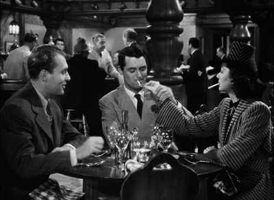
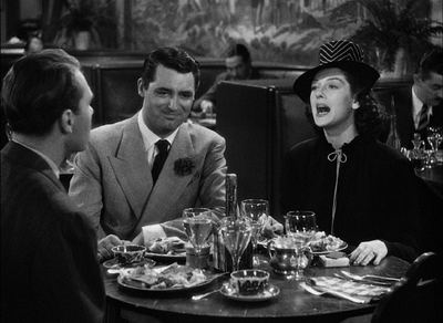
Apart from enjoying the fast-paced comedy, you can learn a lot about film technique from the way Hawks energizes his static, prosaic surroundings. Take his resolutely unflashy staging in depth. It’s most apparent in the pressroom of the Criminal Courts Building, as I suggest in the supplement, but there are plenty of felicities of staging elsewhere. The most apparently unpromising example involves the restaurant where Walter Burns takes his ex-wife Hildy Johnson and her fiancé Bruce Baldwin. What to do with this simple set?
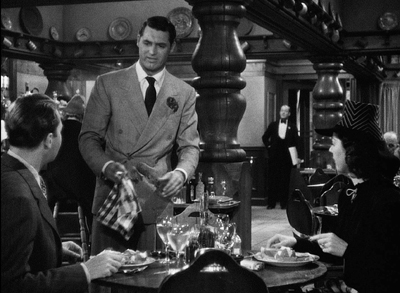
At a late point in the scene Walter will seek the help of the waiter Gus, who’ll call Walter to the phone. It’s a basic problem: How should the director prepare for that phase of the action? Hawks does it by setting up a zone of depth at the start of the scene, priming it quietly throughout, and paying it off when it’s needed.
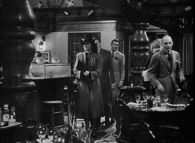
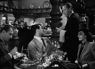
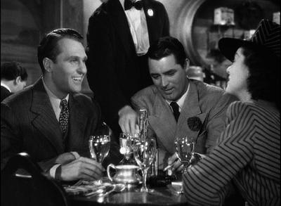
Bruce, Walter, and Hildy enter the restaurant from the background. (Novice directors please note: No need for a sign saying, “Restaurant.”) The group comes to a table in the foreground. After some comic byplay as Walter grabs the chair next to Hildy, the three get seated and chat with Gus.
This framing orients us to the table and the rear area by the bar. We’ll never leave this general orientation on the scene. This commitment, far from being simply “theatrical,” makes for economy as the action develops.
In the course of the scene, Hawks activates the rear zone by having Gus come and go from it. Of course that area isn’t emphasized. Who’s likely to notice Gus giving the sandwich order back there when there’s patter and funny business to watch right in front of us?
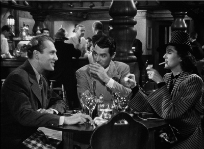
In the course of the scene, Gus will come back to the table, pouring water, delivering sandwiches, and getting kicked in the shin by Hildy, who’s aiming at Walter. Throughout, we’re quietly primed for that alley of space behind Walter to be occupied by Gus.
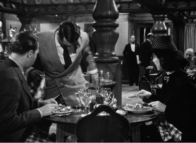
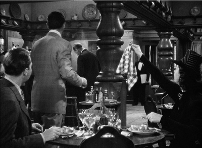
The priming pays off when Walter, realizing that he has to prevent Hildy’s taking the train today, deliberately spills water in his lap.
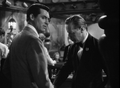
Walter pivots and heads to Gus, who’s back there in his domain, waiting to be pulled into the plot. He’ll summon Walter to the fake phone call.
No big deal–certainly not as eye-catching as the dazzling comedy around the table. But the care for such little things is the mark of a craftsmanship that uses space compactly, without fuss. No need for camera angles that show the fourth wall (or even walls two and three). No need to build more of the set on the side; this is Columbia, after all. Just let reliable Joe Walker light that background enough to keep us aware of it (out of focus for most of the scene) and then activate it when you need it.
Hawks was obeying the advice Alexander MacKendrick would later give:
Within the same frame, the director can organize the action so that preparation for what will happen next is seen in the background of what is happening now.
Or as Hawks put it in 1976:
You know which way the men are going to come in, and then you experiment and see where you’re going to have Wayne sitting at a table, and then you see where the girl sits, and then in a few minutes you’ve got it all worked out, and it’s perfectly simple, as far as I am concerned.
The unstated premise is indeed perfectly simple: You don’t need to show more space than the physical action requires. It’s a rare premise today.
How long is it?
This sort of priming fits neatly into a cinema based in continuity–dramatic, spatial, temporal. Hawks is a master of staging action so that it flows unobtrusively. At times, though, it’s fun to spot some discontinuities, and editing is a good place to look.
Ozu is, to my knowledge, the only director who invariably creates perfect match-cuts on action. Even Hawks has to cheat things a bit to make the editing flow. (Hildy’s pitching of her purse is an example I use in the commentary.) But consider how Hawks can get a spark out of a small, mismatched action.
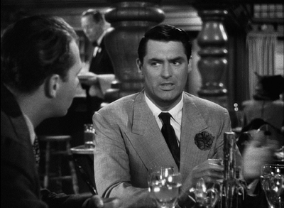
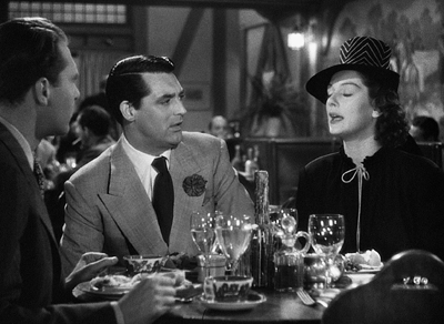
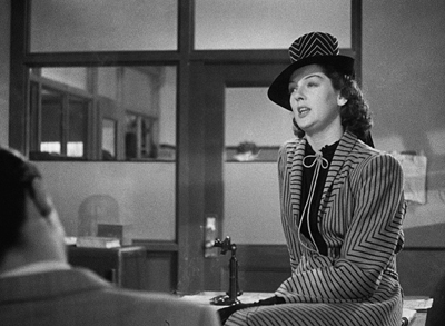
We’re still in the restaurant, and Walter has persuaded Hildy to cover the Earl Williams story in exchange for buying an insurance policy from Bruce. Talking of his upcoming physical, Walter boasts, “Say, I’m as good as I ever was.” Hildy fires back, “That was never anything to brag about,” and Walter reacts and turns his head. As he turns, we get these two shots.
At first Walter is stunned, apparently readying a reply; but at the cut, he’s sporting a grin. It’s partly a grin of triumph, showing that he’s gotten Hildy to do his bidding, but it’s also an appreciation of her wit: a sort of “That’s my girl” pride in her fast comeback. Strictly speaking, the cut’s a mismatch, but the instantaneous switch in reaction gives the scene double value.
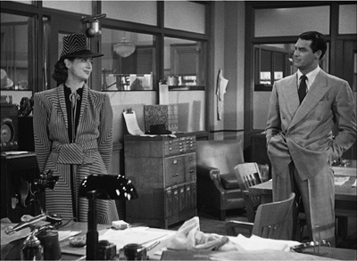
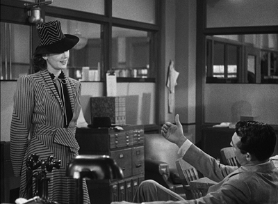
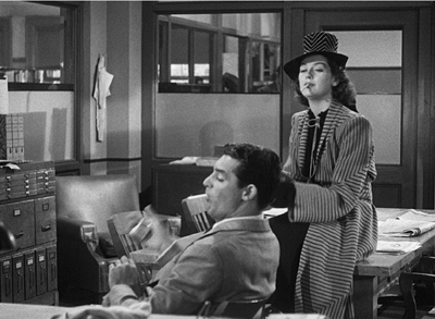
Finally, there’s framing. The rugged outdoor guy Hawks is as delicate as they come when it’s a matter of frame corners and edges, and his sense of pictorial balance is fastidious. Go back to the long opening scene in Walter’s office, when he and Hildy are going through the preliminaries. They size each other up before Walter sits down in his swivel chair.
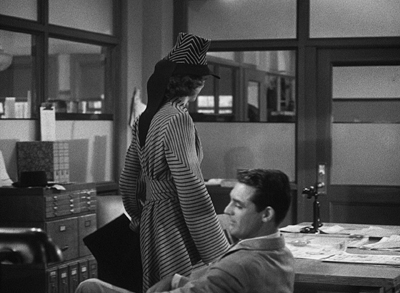
A slight track forward has planted Walter in the lower corner of the frame. A cut in to Hildy’s reaction (not shown) enables a transition to a slightly different framing. That setup allows Walter to invite her onto his knee, which pokes up from the bottom edge.
Joe Walker has obligingly edge-lit that stretch of pant leg, and it’s about the only thing moving in the shot, so we can’t miss Walter’s come-on.
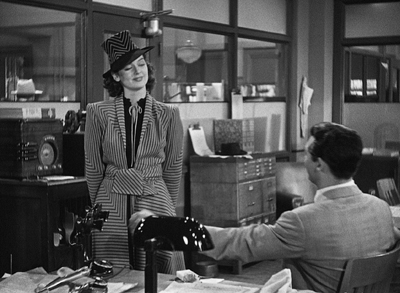
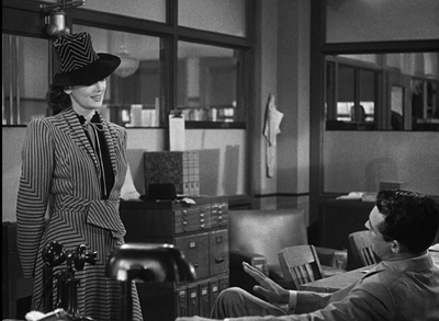
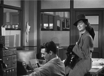
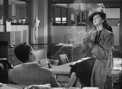
Now Hawks does something very pretty. Hildy moves to the table and perches on it. Hawks reframes with her, but keeps the shot oddly unbalanced, with Walter resolutely facing the area she’s not in.
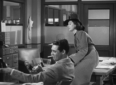
A sort of spatial suspense develops. Hawks sustains this odd framing while Walter picks up a cigarette, tosses one to Hildy, lights up, and tosses her a match. Fairly deliberately too, in what’s supposed to be Hollywood’s fastest movie.
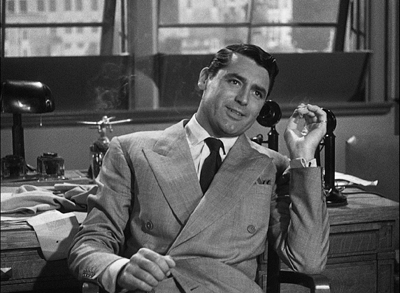
When both are smoking comfortably, Walter swivels his chair to snap his head into the lower left corner, which has been waiting for him all along. The simple movement provides the scene’s new beat, which starts with Walter’s line: “How long is it?” I haven’t yet mentioned that this is a fairly dirty movie, but you knew that.
The shot began with the actor’s head in the lower right, developed with that head poised midway in the frame, and now ends with the head cocked in the lower left. What looks like sterile geometry feels, on the screen, perfectly unforced. And lest we misread the “How long is it?” Walter innocently explains, in a medium shot, that he’s just wondering how long it’s been since they’ve seen each other. That in turn calls up an over-the-shoulder reverse angle, and the next phase of the scene is off and running.
At this point in film history, the cinematographer, while shooting, could not see exactly what the lens was taking in. The careful unbalancing and rebalancing of the shot had to be achieved through a mixture of expertise and intuition. The same thing with keeping Gus in reserve back there by the bar, and letting an incompatible take of Grant’s reaction stay in after a cut. It’s all perfectly simple, as far as I’m concerned.
Thanks to Kim Hendrickson, Grant Delin, and Peter Becker of Criterion for inviting me to spend more time with this splendid movie. Hawks’ quotation about keeping it simple comes from my On the History of Film Style (Harvard University Press, 1997), 149.
You can find background here on the restoration of The Front Page, supplied by Academy archivists Mike Pogorzelski and Heather Linville.
You can get a sampling of Winchell’s radio delivery from the period here, complete with nervous teletype clackings serving as transitions. For more background on HGF, go here. That entry observes the usefulness of the film’s lines in many situations. In this respect it resembles another Hawks film, that repository of worldly wisdom known as Rio Bravo.
Gus the waiter is played by the inimitable Irving Bacon, one of a dozen or so outstanding supporting players. This is another of the film’s triumphs: Regis Toomey, Porter Hall, Gene Lockhart, Abner Biberman, Roscoe Karns, and other memorable character actors all seem to be having fun. And Billy Gilbert as the wayward Pettibone is the friendliest deus ex machina in Hollywood cinema.
Finally, do audiences today know the meaning of Hildy’s flipped hand in response to one of Walter’s catty remarks? Has nose-thumbing gone out of popular culture? Apparently not.
P.S. 4 February 2017: On the Parallax View site, Sean Axmaker has the most in-depth appreciation of this edition of The Front Page I’ve seen online. And he has plenty to say about HGF too.
P.S. 2 February 2018: His Girl Friday is now streaming on FilmStruck, and among the bonus materials is the video essay I mention.
His Girl Friday (1940).
Is there a blog in this class? 2016
A Brighter Summer Day (Edward Yang, 1991).
KT here–
Another year has passed, and Observations on Film Art is approaching its tenth anniversary. The blog was never intended as a formal companion to our textbook Film Art: An Introduction. Basically we write about what interests us. Still, many of our entries use concepts from the book, and we hope that teachers and students might find them useful supplements to it.
As each summer approaches its end and teachers compose or revise their syllabi, we offer a rundown, chapter by chapter, of which posts from the past year might be relevant. (For previous entries, see 2007, 2008, 2009, 2010, 2011, 2012, 2013, 2014, and 2015.) For readers new to the blog, these entries offer a way of navigating through the site.
Chapter 1 Film as Art: Creativity, Technology, and Business
Film projection made the national news in late 2015 when Quentin Tarantino released his new film, The Hateful Eight, on 70mm film. Only 100 theaters in the USA, most of them specially equipped with old, refurbished projectors, could show it that way. We went behind the scenes to see how the theaters coped in THE HATEFUL EIGHT: The boys behind the booth and THE HATEFUL EIGHT: A movie is a really big thing.
This year the studios took tentative steps toward instituting The Screening Room, a system of streaming brand-new theatrical films to people’s homes for $50. Whether or not this service succeeds, it represents one new distribution model that Hollywood is exploring to cope with the increasing delivery of movies via the internet. See Weaponized VOD, at $50 a pop.
Popular film franchises can go on generating new products and influencing other films for years. We examine the lingering impact of The Lord of the Rings thirteen years after the third part was released in Frodo lives! And so do his franchises.
Chapter 3 Narrative Form
In this chapter we put considerable stress on the concept of narration, the methods by which a film conveys story information to the viewer. There is no end to the ways in which narration can be structured. Often one of the characters in a film can to tell us what happened. . . even if that character is dead. This, as we show in Dead Men Talking, is not as rare as one might expect.
The Walk combines narrative and genre in an unusual way. The first part is a romantic comedy, the second a suspense film, and the third a lyrical piece. We suggest why in Talking THE WALK.
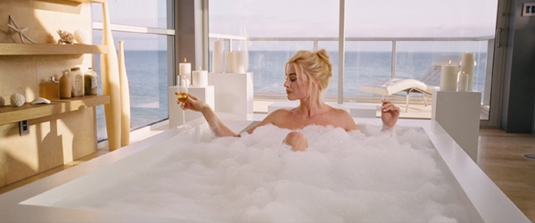
The way a film tells its story can vary considerably depending on whether it has a single protagonist, a dual protagonist, or a multiple protagonist (as in The Big Short, bottom). We examine some of the differences in Pick your protagonist(s).
Looking back over our blog as we passed 700 entries early this year, it occurred to us that several entries discussing principles of storytelling could be arranged to create a pretty good class in classical narrative strategy. We made up an imaginary syllabus in Open secrets of classical storytelling: Narrative analysis 101. No tuition charged.
With the very end of the Lord of the Rings/Hobbit franchise–the release of the extended DVD/Blu-ray version of the third Hobbit film–we discuss the strengths of the film and the plot gaps left unfilled in A Hobbit is chubby, but is he pleasingly plump?
To celebrate Orson Welles’s 101st birthday, we examined some of the sources for some of the techniques used in Citizen Kane, a film we analyze in detail in Chapters 3 and 8. See Welles at 101, KANE at 75 or thereabouts.
In Hollywood it is a common assumption that the protagonist(s) of a film must have a “character arc.” Filmmaker Rory Kelly, who teaches in the Production/Directing Program at UCLA, wrote a guest entry for our site. Rory analyzes the character arc in The Apartment, with examples from Casablanca, Jaws, and About a Boy as supplements. See Rethinking the character arc: A guest post by Rory Kelly.
James Schamus’ Indignation, an adaptation of Philip Roth’s novel, draws on novelistic narrative devices not in the original. In INDIGNATION: Novel into film, novelistic film, we suggest that those devices first became standard in cinema during the 1940s.
Chapter 4 The Shot: Mise-en-Scene
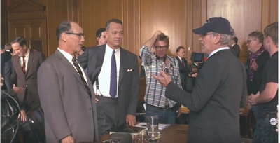
Teachers and students always want to us add more about acting to our book. It’s a hard subject to pin down. We introduce the great stage actor Mark Rylance, who was largely unknown outside the United Kingdom before he won an Oscar for Steven Spielberg’s Bridge of Spies, and discuss how he achieves his expressively reserved performances in that film and the series Wolf Hall. See Mark Rylance, man of mystery. (Above at left, on set with Tom Hanks and Spielberg.)
In an era when most staging of actors in movies follows a few simple conventions, we examine the more imaginative ways of playing a scene on display in Elia Kazan’s Panic in the Streets (1950) in Modest virtuosity: A plea to filmmakers young and old.
Continuing with the theme of acting and staging, our friends and colleagues, Ben Brewster and Lea Jacobs have put a revised version of their in-depth study of silent-cinema acting online for free. Learn about it and the enhancements that internet publishing has allowed in Picturing performance: THEATRE TO CINEMA comes to the Net.
Chapter 5 The Shot: Cinematography
We look at the visual style of Anthony Mann’s Side Street (1949) and show how a simple, seemingly minor technique like a reframing can create a strong reaction in the spectator. See Sometimes a reframing …
Framing a composition is one of the most basic aspects of cinematography. We discuss centered framing, decentered framing, balanced framing, framing in widescreen movies, and particularly framing in Mad Max: Fury Road (above) in Off-center: MAD MAX’s headroom.
In a follow-up entry, we discuss framing in the classic Academy ratio, 4:3, with emphasis on action at the edges of the frame: Off-center 2: This one in the corner pocket.
Chapter 7 Sound in Cinema
For the new edition of Film Art, we had to eliminate our main example of sound technique, Christopher Nolan’s The Prestige. But we put that section of the earlier editions online. THE PRESTIGE, one way or another takes you to it.
For those who have been looking for examples of internal diegetic sound, we take a close look (listen) at a sneaky one in Nightmare Alley: Do we hear what he hears?
The fact that the protagonist narrates The Walk in an impossible situation, standing on the torch of the Statue of Liberty and talking to the camera, bothered a lot of critics. We suggest some justifications for this decision in Talking THE WALK.
We offer brief analyses of the Oscar-nominated music from 2015 films in Oscar’s siren song 2: Jeff Smith on the music nominations.
Chapter 8 Summary: Style and Film Form
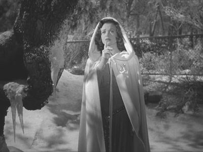
Many different filmic techniques can serve similar functions. Filmmakers of the 1940s had a broad range to choose from when they portrayed dead people, or Afterlifers, on the screen. We look at how their choices affected the impact of the scenes (as in Curse of the Cat People, above) in They see dead people.
Style and form in three films of Terence Davies: Distant Voices, Still Lives; The Long Day Closes; and especially his most recent work, Sunset Song. See Terence Davies: Sunset Songs.
Style and form in Edward Yang’s A Brighter Summer Day, on the occasion of its magnificent release by The Criterion Collection, in A BRIGHTER SUMMER DAY: Yang and his gangs.
Chapter 10 Documentary, Experimental, and Animated
Leo Hurwitz’s little-known documentary, Strange Victory (1948) has recently come out on Milestone’s DVD/Blu-ray. Released shortly after the end of World War II, it suggests that the Nazi atrocities were only an extreme instance of the cruelty of racism. We discuss the film and its relevance to the current political situation in Our daily barbarisms: Leo Hurwitz’s STRANGE VICTORY (1948).
Experimental filmmaker Paolo Gioli makes films without cameras, or at least, he cobbles together pinhole cameras of his own from simple materials. The results are remarkable. We describe his work and link to a recent release of his work on DVD in Paolo Gioli, maximal minimalist.
Chapter 11 Film Criticism: Sample Analyses
The eleventh edition of Film Art contains a new sample analysis of Wes Anderson’s Moonrise Kingdom. We discuss some additional aspects of the film in Wesworld.
Chapter 12 Historical Changes in Film Art: Conventions and Choices, Traditions and Trends
At the end of each year we avoid doing a standard ten-best list by choosing the ten best films of ninety years ago. For 2015, we dealt with The ten best films of … 1925 (including Frank Borzage’s Lazybones, above). It was a very good year.
A rare French Impressionist film, Marcel L’Herbier’s L’inhumaine, has been released on DVD/Blu-ray by Flicker Alley. We discuss the film and its background in L’INHUMAINE: Modern art, modern cinema.
Film Adaptations
Our eleventh edition offers an optional chapter on film adaptations from a wide variety of art forms and even objects.
For thoughts on popular female novelists whose books were adapted into films during the 1940s and 1940s (and who sometimes became screenwriters), see Deadlier than the male (novelist).
Adaptations can be made from nonfiction as well fictional books. We look at how Dalton Trumbo’s life was made into a biopic in Living in the spotlight and the shadows: Jeff Smith on TRUMBO.
In a series of entries, we have commented on the adaptation of J. R. R. Tolkien’s The Hobbit into a three-part film. For an analysis of the extended DVD/Blu-ray version of the third part, see A Hobbit is chubby, but is he pleasingly plump? (Links in that entry lead to earlier posts on this subject.)
As always, we have blogged about some recent books and DVDs/Blu-rays. See here (Vertov, sound technology, 3D), here, (Kelley Conway’s new book on Agnès Varda), here (experimental films, the first Sherlock Holmes, the Little Tramp), here (Tony Rayns on In the Mood for Love), and here (on some older foreign classics that have finally made it to home video in the USA, primarily those of Hou Hsioa-hsien). The publication of the eleventh edition of Film Art led us to look back on how it was written and some of the ideas that went into it. We took the occasion to introduce our new co-author, Jeff Smith. See FILM ART: The eleventh edition arrives!
We were also profiled in Madison’s local free paper, Isthmus, by Laura Jones, reporter and filmmaker. She read Film Art as a student.
The Big Short (2015).


