Archive for the 'Film technique: Performance' Category
DER GOLEM: Revisiting a classic
Kristin here:
In 2009, Il Giornate del Cinema Muto, the silent-film festival held each year in Pordenone, Italy, launched a new series. “Il canone rivisitato/The Canon Revisited” addressed the fact that many rare and often obscure silent films are made available through restoration each year, and yet many young enthusiasts who have started attending the festival have seldom had the chance to see the classics on the big screen with musical accompaniment. The opening group of films proved highly successful, and “Il canone rivisitato 2” will be presented this year, when Il Giornate will run October 2 to 9.
Part of the point of the series is to have historians re-evaluate these classics and examine how well they live up to their status as part of the film canon. Last year I contributed a program note on Paul Wegener and Karl Boese’s 1920 German Expressionist film Der Golem. This year I’ve written about Danish director Benjamin Christensen’s 1916 thriller Hævnens Nat (Night of Revenge, released in the U.S. in 1917 as Blind Justice), which will be shown this year, and rightly so.
When I went back and reread my Golem notes to remind myself what sort of coverage is needed, I decided that the text I wrote then might be of wider interest to those who weren’t at the festival last year. Thanks to Paolo Cherchi Usai, one of the festival’s founders and organizers, for permission to revise my brief essay as a blog entry. I’ve changed it minimally and taken the opportunity to add illustrations. Here’s what I said at the time:
Der Golem is a classic film—doubly so.
First, it has long nestled comfortably within the list of titles that make up the German Expressionist movement of the 1920s. Teachers of survey history courses are more likely to show Das Cabinet des Dr. Caligari (which premiered in early 1920) but a serious enthusiast will make it a point to see Der Golem (which appeared later the same year) as well.
From the start, reviewers recognized Der Golem as Expressionist. In 1921 the New York Times’ critic wrote, “Resembling somewhat the curious constructions of THE CABINET OF DR. CALIGARI, the settings may be called expressionistic, but to the common man they are best described as expressive, for it is their eloquence that characterizes them” (George Pratt’s Spellbound in Darkness, p. 362). In 1930, Paul Rotha’s The Film Till Now, the most ambitious world history of cinema in English to date, appeared. Highly influential in establishing the canon of classics, Rotha adored Weimar cinema, including Der Golem.
In 1936, the Museum of Modern Art obtained a large number of notable European films. The core collection of the young archive contained such prestigious titles as Caligari, Battleship Potemkin, Metropolis, and Der Golem. These films soon became part of the museum’s 35mm and 16mm circulating programs. With MOMA’s sanction as historically important classics, they remained the most widely accessible older films available to researchers and students alike for many decades.
There is, however, a second, largely separate audience: monster-movie fans. Starting in the 1950s, German Expressionist films were promoted as horror fare by Forrest J. Ackerman in his magazine Famous Monsters of Filmland. In 1967 Carlos Clarens included Der Golem in his An Illustrated History of the Horror Film. Really dedicated horror devotees pride themselves on their expertise across a wide variety of films, including foreign and silent ones. Der Golem became a certified horror classic.
In the 1950s and 1960s, companies offering public-domain 8mm and 16mm copies for sale enabled both film-studies departments and movie buffs to start their own film libraries. Ultimately home video made previously rare silent classics easily obtainable—including a restored Golem from the Friedrich Wilhelm Murnau-Stiftung, with new tinting and a musical score, on DVD. Such a presentation reconfirms the film’s status as a classic.
But what sort of classic is it? An undying masterpiece that one must see immediately? A film one should definitely watch someday if the chance arises? On the occasion of Der Golem being presented on the big screen with live musical accompaniment, we have a chance to specify what distinguishes it from its fellow exemplars of Expressionism.
I suspect that horror-film fans won’t feel that a reevaluation is necessary. Der Golem is a forerunner of Frankenstein and hence an important early contribution to the genre. It’s a striking film to look at and obscure enough to impress one’s friends during a late-night program in the home theater.
But for film historians returning to Der Golem in the early twenty-first century, after nearly ninety years of taking it for granted, what is there to say?
 Some would deny that Der Golem is truly Expressionistic. If one has a very narrow view of the style, insisting that only films with flat, jagged, Caligari-style sets qualify for membership in the movement, then Der Golem doesn’t pass muster. Neither do Nosferatu, Die Nibelungen, Waxworks, and a lot of other films typically put into the Expressionist category.
It’s a subject susceptible to endless debate. To avoid that, it’s helpful to accept historian Jean Mitry’s simple, useful distinction between graphic expressionism, with flat, jagged sets, and plastic expressionism, with a more volumetric, architectural stylization. If Caligari introduced us to graphic Expressionism in 1920, Der Golem did the same for plastic Expressionism later that year.
For me, seeing Der Golem again doesn’t much affect its status as an historically important component of the German Expressionist movement. It’s not the most likeable or entertaining of the group. Caligari has more suspense and daring and black humor. Die Nibelungen has a stately blend of ornamental richness with a modernist austerity of overall composition, as well as a narrative that sinks gradually into nihilism in a peculiarly Weimarian way.
Moreover, Der Golem’s narrative has its problems. None of the characters is particularly sympathetic. Petty deceits and jealousies ultimately are what allow the Golem to run amok. The narrative momentum built up in the first half of 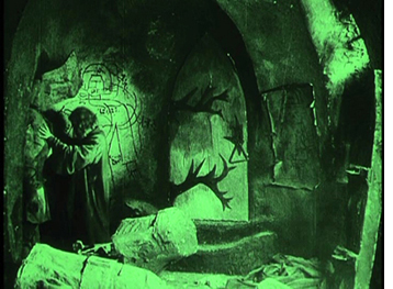 the film is inexplicably vitiated for a stretch. Initially the emperor’s threat to expel Prague’s Jews from the ghetto drives Rabbi Löw to his dangerous scheme of creating the Golem to save his people. Yet after the creation scene, the dramatic highpoint that ends the first half, we see the magically animated statue chopping wood and performing other household tasks that make his presence seem almost inconsequential. The imperial threat has to be revved up again to get the Golem-as-savior plot going again.
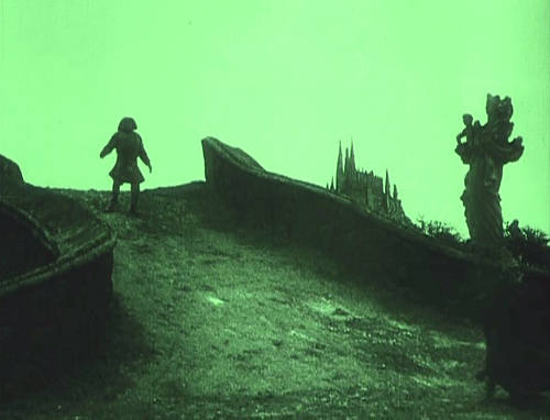
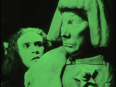
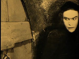
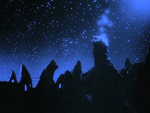
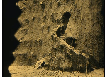
But putting aside Der Golem’s minor weaknesses, it has marvelous moments that summon up what cinematic Expressionism could be: the opening shot, which instantly signals the film’s style (below); the black, jagged hinges that meander crazily across the door of the room where Löw sculpts the Golem; the juxtaposition of the Golem with a Christian statue as he stomps across the crooked little bridge returning from the palace (at top).
Hans Poelzig was perhaps the greatest architect to design Expressionist film sets. He designed only three films, and Der 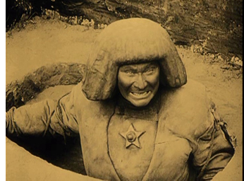 Golem is the most important of them. Once the monster has been created, Poelzig visually equates the lumpy, writhing towers and walls of the ghetto and the clay from which the Golem is fashioned. The sense that sets and actors’ performances constitute a formal, even material whole became one of the basic tactics of Expressionism in cinema.
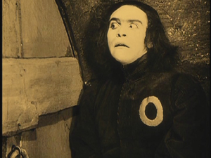
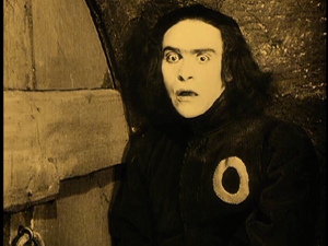
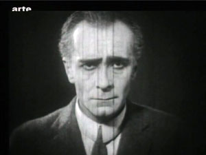
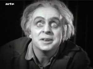
Speaking of performances: A lot of the actors in German Expressionist films were movie or stage stars who didn’t specialize in Expressionism. There were, however, occasional roles that preserve the techniques the great actors of the Expressionist theater. There’s Fritz Kortner in Hintertreppe and Schatten. There’s Ernst Deutsch, who acted in only two Expressionist films, as the protagonist in the stylistically radical Von morgens bis Mitternacht (out this month on DVD) and as the rabbi’s assistant in Der Golem.
Just watching his eyes and brows during his scenes in this film conveys something of the experimental edge that Expressionism had when it was fresh—before its films had become canonized classics.
METROPOLIS unbound
Fritz Lang has created a lot of pretty pictures and has discovered the astonishing talent of Brigitte Helm. I cannot blame him for not being able to cut the quantity of ideas in individual scenes mercilessly enough (the water catastrophe, the duel), but instead repeatedly trying out new lighting and angles. This time the film’s qualities lie precisely in these efforts: and if the viewer knows how to make the best of something, he will derive pleasure from these images.
Rudolf Arnheim, review of Metropolis, 1927.
Along with La Roue and The Battleship Potemkin, Metropolis (1927) is one of the great sacred monsters of the cinema. Many versions circulate, and restorations never seem to stop. A beautifully restored, though incomplete, version was premiered in Berlin in 2001. This is the basis of the most authoritative DVD releases. By now, however, everybody has heard about the 2008 discovery of a significantly longer version in Argentina, a 16mm preservation copy drawn from a scratch-infested 35 nitrate original.
Since 2008 a team at the Friedrich-Wilhelm-Murnau-Stiftung has been at work adding material from the Argentine version to the earlier one. Kristin and I have written earlier entries (here and here) tracing the progress of the restoration, and the team have produced a detailed website explaining their work. The result made its world premiere at the Berlin Film Festival earlier this year, and an exhaustive exhibition about the film has been running at the Deutsche Kinematek in Berlin.
Now I’ve seen it, at a screening during the Hong Kong International Film Festival. Frank Strobel, a member of the restoration team, conducted the Hong Kong Sinfonietta, and another collaborator, Martin Koerber, curator at the Deutsche Kinematek, was present to discuss the restoration process. A handsome booklet, cosponsored by the Goethe-Institut of Hong Kong, provided a lot of background. The film was projected digitally, but at very high resolution and looking quite crisp. I had a front-row center seat. I had a swell time.
Metropolis has never been my favorite Lang of the period, but this version makes the strongest possible case for the film. It’s hard to dislike its shameless, preposterous ambitions, its stew of biblical and modern ingredients, its bold architectural vistas, and its trancelike characterizations. Also, people running crazily about in gargantuan spaces can usually hold your interest.
I just met a girl named Maria
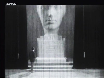
All [the American editors] were trying to do was to bring out the real thought that was manifestly back of the production and which the Germans had simply “muffed.” I am willing to wager that “Metropolis” as it is seen at the Rialto now is nearer Fritz Lang’s idea than the version he himself released in Germany. . . . There was originally a very beautiful statue of a woman’s head, and on the base was her name–and that name was “Hel.” Now the German word for “hell” is “hoelle” so they were quite innocent of the fact that this name would create a guffaw in an English speaking audience. So it was necessary to cut this beautiful bit out of the picture . . . .
Randolph Bartlett, The New York Times, 13 March 1927
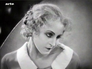
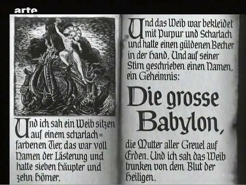
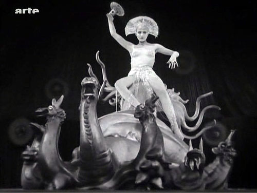
The new version gives the film a better narrative balance. Somewhat surprisingly, the plot hinges on one of the oldest and simplest narrative devices: mistaken identities. The overlord Fredersen engages the crazed scientist Rotwang to create a mechanical Maria who will lead the workers astray. Rotwang takes the occasion to avenge himself on Fredersen by having his robot urge the workers to destroy the machines. Two Marias, then–actually more, if you count the robot Maria’s incarnation as the Whore of Babylon in the Yoshiwara Club.
Thanks to the Argentine footage, we now know that another major character doubling involves Freder. At the start of the version we all know, Freder is visited by Maria and a flock of children. Upon seeing her radiant charity, he becomes suddenly convinced that he must join the oppressed workers, his “brothers and sisters.” Helping them has become his destiny. He gains an ally in Josaphat, an employee whom his father has brusquely fired. Descending to the cavernous machine halls, Freder switches identities with Georgy, a worker who returns aboveground to live Freder’s life. Freder wants him to go to Josaphat’s apartment, where they will meet. But the Thin Man, a long, leering hireling of Freder’s father, is charged with trailing Freder.
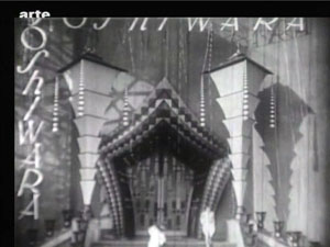
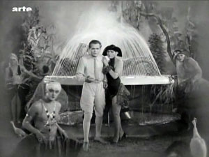
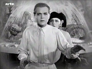
Stretches of the Thin Man subplot are missing from the previous version, but now we can see that Georgy/ Freder is a sort of early counterweight to the Maria/ Maria parallels. As in the latter case, the switch leads to misunderstanding, with the Thin Man following Georgy to the club and eventually to Josaphat. The Georgy substitution also allows Harbou and Lang to introduce the Yoshiwara Club early, but teasingly, in a rapidly dissolving montage. Only later will we get a good look at the delicious degeneracy inside.
As Martin Koerber indicated in several remarks, the older, most common version of Metropolis turns it into a science-fiction film, since it puts the robot Maria at the center of the plot. Just as important, though, is Freder’s plan for overturning class oppression, something fleshed out in the Georgy/ Josaphat material. Other new footage puts the relationship between Fredersen and Rotwang in a new light. We now see that Rotwang was in love with Fredersen’s wife Hel, and he has constructed not only a huge bust of her but also a “mechanical man,” outfitted with a distinctly female anatomy, as a sort of Hel substitute.
Fredersen diverts Rotwang’s plan to the purpose of mimicking Maria. So we get another doubling: Freder’s mother Hel becomes the firmware for the robot Maria through the machinations of two father figures. (Freder will kill one and redeem the other.) In all, the new footage yields a play of eerie Freudian substitutions.
The 2010 restoration also establishes the film as consisting of three large-scale movements. The first section, “Prelude” (Auftakt), runs a bit more than an hour. It shows Freder joining the workers and his father planning to have the Thin Man follow him. This part also introduces Rotwang, establishes Fredersen’s order to make a robot Maria, and ends with Rotwang’s capture of Maria. A second part, called “Intermezzo” and lasting about thirty minutes, is devoted to intertwining the Freder/ Josaphat plot with the creation of the robot Maria. The section more or less climaxes with a demo of the new Maria, dancing sexily at the Yoshiwara.
In “Furioso,” everything builds to a climax across a remarkable fifty minutes. The cloned Maria leads the workers to destroy the machines, fulfilling Rotwang’s plan to avenge himself on Fredersen, while the real Maria escapes from Rotwang’s compound during a fight between Rotwang and Fredersen. (We’re still lacking some of this footage.) At the same time, Freder and Josaphat converge on the underground city. The workers’ smashing of the machines triggers a flood from which the children must be saved. At the finale, during a hand-to-hand struggle with Freder, Rotwang falls to his death. There follows the famous epilogue in which Freder, “the Mediator,” must bring together hands (the foreman Grot) and head (the capitalist Fredersen).
Fluidity and freedom
This delirious fable is rendered with unrelenting zest. Lang has now perfected his breathless version of silent-film narration. He relies on simple, immediately graspable compositions, rapid crosscutting among different plotlines, and a dynamic approach to analytical editing.
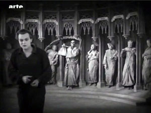
In the late 1920s, many American films became more heavily dependent on intertitles; it’s as if directors were anticipating talkies. But of Metropolis’s over 1800 shots, I counted only 26 expository titles and 156 dialogue titles—in a film running nearly 2 ½ hours. Lang plunges us into each scene with no fuss, and once we’re there, a smooth continuity carries us from shot to shot. Confronting the seven deadly sins in the cathedral, Freder turns away, twisting Georgy’s cap in his hands as he exits the frame.
Cut to the main area of the cathedral, and Freder is still twisting the cap as he enters the frame. (Like other shots from the Argentine version, this is slightly reduced because of the 16mm source.)
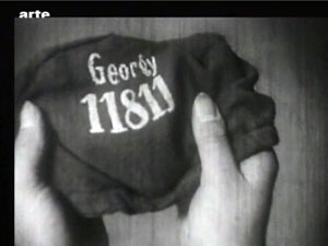
He lifts the cap, and we get his point of view on Georgy’s name and number.
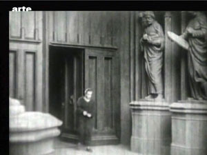
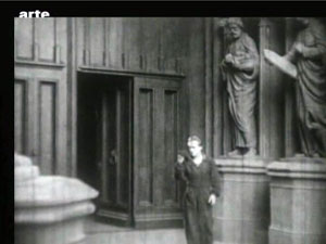
Cut to the Yoshiwara nightclub closing, as Georgy steps groggily into the street.
Here the new footage lets us see that Lang is exploiting the sort of verbal and imagistic hooks he had developed in earlier films: from Georgy’s cap to Georgy himself, with no need of an intertitle to take us to the new scene.
Lang’s freedom of camera position is typical of late silent cinema, but he deploys his angles with characteristic precision. As usual in Europe, Hollywood-style continuity isn’t completely adhered to—there are some crossings of the 180-degree line—but Lang is careful to keep us oriented to the action through eyelines. This allows great flexibility in camera placement.
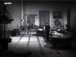
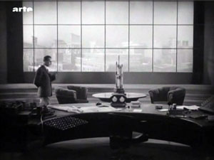
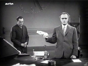
Fredersen is dictating to his secretaries while Josaphat is monitoring prices. A vast establishing shot shows all of them.
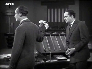
Fredersen’s pacing around his office allows Lang to introduce a new area around the window and the desk.
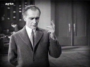
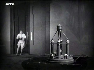
Now pacing in the center of the office, Fredersen pauses in his dictation and Freder bursts in behind him.
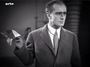
But Fredersen, who’s already holding up one hand as he speaks, simply twists his wrist, and this silences his son.
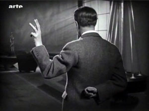
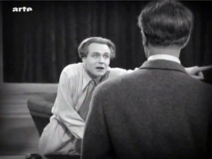
The shot approximates Freder’s point of view, but Lang gets a bonus from it. The sharp change of angle makes the imperious hand (and not, say, Fredersen’s expression) the compositional focus of the shot. In fact, this sort of hovering hand will become part of the characterization of Fredersen, and Lang will stress it through, once more, energetic changes of angle.
And still later, the framing will spotlight Freder’s pointing finger by pushing it to one zone on the far right of the shot.
Lang’s concise handling of such small actions forms a delicate counterbalance to the mass movements elsewhere in the film. Perhaps for him, both gestures and crowd scenes are merely two ways of creating a geometry that can activate every area of the screen.
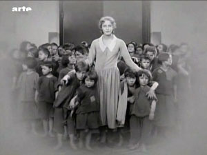
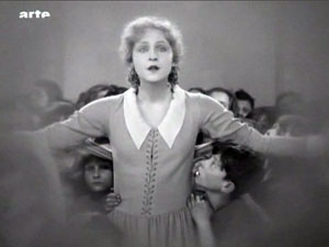
The carefully controlled freedom of spatial construction is facilitated by one of Lang’s favorite tactics: shooting from directly on the axis of character interaction. (No, Wes Anderson didn’t invent this.) Lang in effect sets the camera between the two characters so that they stare out at us, as if mesmerized. The technique is most memorable in the scene in which Freder is confronted by Maria and the children.
Again, though, the Argentine material brings more instances to our attention.
Putting the camera on the axis allows Lang leeway in changing his angles. From a shot on the center line, you can cut to pretty much any other area of space.
Lang’s crisp visual narration comes to a climax in the well-named Furioso section. As the action ramps up, the characters rush from spot to spot, hurling themselves into the frame and then abruptly halting to hold the composition.
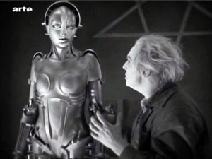
The extreme case is the robot Maria, whose head and limbs jerk puppetlike from one position to another.
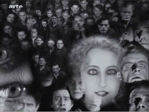
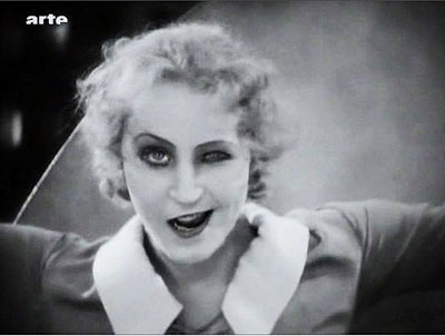
In all, Lang’s precise, almost diagrammatic visual style rushes us through the film’s wild plot and dazzling architecture. An emblem of precision in the service of slightly demented material might be that memorable close-up of the robot Maria: One eye staring out normally, the other half-closed, and the mouth half-twisted in a leer, as if the circuitry in the skull was failing.
A little encyclopedia
Martin Kroeber, Togichi Akira, Winnie Fu, Sam Ho, and Wong Ain-ling discuss preservation and restoration at the Hong Kong Film Archive.
In a Q & A after the screening, Martin Koerber and Frank Strobel shared information about the version. They and their colleague Anke Wilkening could publish a whole book about the restoration, but here are some highlights, drawn as well from Martin’s comments at a lengthy seminar at the Hong Kong Film Archive.
*Sources for information about the premiere version include a copy of the script (helpfully marked with reel ends and calculations about running time), censorship cards recording the credits and intertitles reel by reel, Gottfried Huppertz’s musical score, and thousands of production stills.
*Using these materials, earlier researchers were able to create a sort of mosaic of the version that premiered in Berlin in January 1927. The resulting study film embedded long swathes of blank footage as place-holders. The fact that the Argentine shots fitted in neatly proved the validity of that edition. This study film may be ordered on DVD at nominal cost by educational and research institutions.
*What’s still missing? Some shots in the Argentine version may have been censored; we’re missing a bit in which Georgy, at liberty in a cab, sees a woman baring her body. Also lacking is nearly all the fight between Rotwang and Fredersen, which enables Maria’s escape. In addition, the Argentine print lacks a scene showing a monk preaching in the cathedral, which yields some apocalyptic images.
*If the film plays fast for contemporary tastes, don’t blame the restorers. This version runs at 24 frames per second. Actually, for the 1927 premiere the film was run even faster. The score includes passages accompanying missing footage as well as over a thousand synch-points for specific onscreen action. On the basis of this evidence, it seems that the film was designed to run at about 28 frames per second. This reminds us that silent-film running speeds were far from standardized, and they sometimes exceeded the 24 fps that would be established for sound film. (For more on this matter, go here and scroll down a bit.) In addition, Frank mentioned that in theatres with orchestras, the conductor could regulate the speed of the film with a dial set into the podium.
*Why insert the cropped 16mm footage in such obvious fashion? Couldn’t the framelines be adjusted to match the surrounding 35mm material? Yes, but this slight blowup of the footage would falsify the shot scale of the original footage and not match comparable shots in the 35mm footage. Moreover, Martin pointed out that because not all the scratches and fuzziness of the 16mm material could be purged, it’s better to let these stand stand out somewhat as evidence of the vagaries of film history–like leaving some damage visible in historic buildings.
*Why is the restoration in black and white, since most silent film restorations are in color? Lang was opposed to tinting and toning, so Metropolis premiered in black and white. This caused a debate among critics, some of whom considered it a promising departure from contemporary practices of coloring scenes. The tinted versions that one can occasionally see are likely export versions colored at the request of distributors in particular markets.
*Although future screenings of the 2010 version are to be accompanied by other ensembles devising their own music, there’s a powerful case for retaining Huppertz’s original score. It reflects the filmmakers’ intentions, and its Wagnerian romanticism and modern rhythms are enjoyable simply as music. Just as important, Huppertz designed his score around leitmotifs that, as in opera, can call to mind characters who aren’t onscreen at the moment.
*Metropolis, Martin argued, is too often considered simply a late Expressionist film or an early science-fiction effort. Now we can see that it’s much more: “a compendium of everything in the air in 1927 Germany.” It brings together political ideas, debates about class society and urban life, current trends in the fine arts, acting styles, and cinematic experiments. It owes a great deal to the “monumental” films of the late 1910s, such as Joe May’s Herrin der Welt (1919), but it’s also a synthesis of what filmmaking had become since then. “It’s a little encyclopedia of 1927 cinema. . . . There’s something in it for everybody.”
To see the restoration with the stirring score, vigorously conducted by Frank, was a high point of my Hong Kong trip and indeed of my filmgoing year.
This version of Metropolis was simulcast, if that’s the right word, on 12 February by Arte during the premiere at the Berlin International Film Festival. My frames are taken from that broadcast version; hence the bug. The restoration will be screened on Turner Classic Movies in the fall, and then released on DVD in the US by Kino International.
The epigraph quotation from Arnheim comes from Film Essays and Criticism, trans. Brenda Benthien (Madison: University of Wisconsin Press, 1997), 119. The article about the US cut of the film, which became widely seen around the world, is Randolph Bartlett, “German Film Revision Upheld as Needed Here,” New York Times (13 March 1927), X3.
Thanks to Martin Koerber for an abundance of information. For further reading, he recommends Erich Kettelhut’s memoirs on designing and filming the project, Der Schatten des Architekten (Munich: Belleville, 2009), ed. Werner Sudendorf, with many documents from sketches and photos; and the Deutschen Kinemathek exhibition catalogue, Fritz Langs Metropolis, ed. Franziska Latell and Werner Sudendorf (Munich: Belleville, 2010). You can get a sense of the tangled history of the versions of the film from Martin’s article in the latter volume, which includes a detailed account of the digital restoration. An earlier version of his piece, keyed to the 2001 version, is available as “Notes on the Proliferation of Metropolis,” in Preserve Then Show (Copenhagen: Danish Film Institute, 2002), 128-137. The Metropolis exhibition runs through 25 April.
A special thanks to Lee Tsiantis, Langian extraordinaire.
Motion-capturing an Oscar
Kristin here:
Six years ago, when The Lord of the Rings: The Return of the King was nominated for eleven Oscars, there was considerable grumbling over the fact that Andy Serkis was absent from the acting categories. Many argued that his pivotal role in creating Gollum, the first convincing human-like computer-generated character, should have qualified him for a nomination.
Now we’re seeing a similar debate over the lack of actor nominations for Avatar, with Zoe Saldana’s performance as Neytiri especially mentioned as unfairly overlooked. An intriguing article on the subject appeared in the Los Angeles Times a few days ago. In it, James Cameron expresses annoyance with both the Screen Actors Guild and the Academy for the lack of nominations for his actors:
I’m not interested in being an animator. . . . That’s what Pixar does. What I do is talk to actors. ‘Here’s a scene. Let’s see what you can come up with,’ and when I walk away at the end of the day, it’s done in my mind. In the actor’s mind, it’s done. There may be a whole team of animators to make sure what we’ve done is preserved, but that’s their problem. Their job is to use the actor’s performance as an absolute template without variance for what comes out the other end.
Because of innovations in the motion-capture process, including a tiny camera hung in front of an actor’s face to capture its every nuance, Cameron insists on calling the new technology “performance capture.” In some sense it may be true that the performance is preserved, but once the film runs through the theater projector, can the audience really tell what that “template” was like? I think not, and that’s why there is a reluctance to nominate these actors.
Where is the elusive boundary?
Don’t get me wrong. I’m not saying that Zoe Saldana and Andy Serkis aren’t fine performers or that their acting did not contribute enormously to the characters they played. Indeed, Serkis’ mo-cap contribution to the creation of Gollum was originally intended to be far more limited than it turned out to be. His facial expressions and gestures were so useful to the special-effects people that he was involved for a much longer period, and techniques to allow him to perform onset with the other actors were developed.
But however fine the original acting and however great the aid it provides to the special-effects team are, the process doesn’t stop there. To a notable degree other factors intervene between the actors’ original performances and the characters’ final appearance on the screen. Let’s do some comparisons, using the publicity images that the studios themselves considered good indications of how close the expressions of original actors were to those of their characters.
Take the widely circulated image of Saldana juxtaposed with Neytiri shown above. There are numerous differences. For a start, the filmmakers obviously needed to make the Na’vi look like an alien species. They didn’t just give them tails and make them blue and really tall. Human as the creatures seem in many ways, their faces have a subtle suggestion of large felines.
The effectiveness of Neytiri’s snarl has a lot to do with the fact that she has been given exaggeratedly long canine teeth. Moreover, given the changes in the shape of the face, the mouth is not as large proportionately to the entire head as Saldana’s is; the tongue is not nearly as prominent or noticeable. Both tongue and lips are blue as well. All of these features allow the teeth stand out more by contrast.
Na’vi ears are pointed, and some of the lobes are apparently pierced with a small dark disk in the hole. Saldana’s ears played no role in her performance, but the laid-back ears in the Neytiri image, mimicking those of an enraged animal, contribute considerably to the shot’s impact. I remember noticing them while watching the film.
The nose and the wrinkles on and above it have been considerably changed. Unlike human noses, those of the Na’vi are smaller at the bottom than at the top, somewhat resembling lions’ noses. The wrinkles seem to be derived from canine or feline faces as well, extending from the inner end of the eye and arcing down toward the tip of the nose. The human frown lines at the lower center of Saldana’s forehead are transformed into larger, longer, curved wrinkles at either side; these start between the eyebrows and move up and to the sides. There they get extended by the curved areas of darker blue that radiate across the upper forehead, so that the lines of anger seem to cover more of the face. I suspect that relatively little of what the actors did with their noses has survived the special-effects processing. (In the image below, even the shape of Saldana’s naso-labial folds has been slightly altered.)
The change in the eyes is particularly important. Saldana’s eyes have dark irises within which the pupil is barely, if at all, visible. Na’vi eyes are much larger, to begin with, and the irises are light in color, a sort of yellowish tan. The irises fill more of the visible part of the eye, so that the whites of Na’vi eyes are minimized. As a result, the black pupil stands out dramatically. In terms of color, the model seems to be cats’ eyes, though the pupils remain round rather than slits, to avoid making the Na’vi too alien looking. Since the nose has been widened at the top, the eyes are also further apart than on human faces. (The norm with humans is for the eyes to be separated by a distance roughly equal to the width of one eye.)
Even in a less dramatic scene, when Neytiri is relaxed and smiling, some of these differences remain. The pointed ear is not laid back, but it sticks out from the side of the head at an angle that draws the spectator’s attention and makes the human-shaped face seem exotic–especially given that the Na’vis’ ears are placed higher on the skull than human ears are: while the human ear canal is about even with the cheekbone, in the Na’vi it opens at mid-temple level. Although the points of the canine teeth are not visible in this image, the teeth remain prominent because of their bright whiteness against the blue skin. Though partially masked by the headgear, the vaguely feline nose still differs considerably from Saldana’s. In keeping with the extraordinary height of these beings, Saldana’s neck has also been lengthened.
Again, I’m not saying that Saldana and the other actors in Avatar did not contribute enormously to the believability of their characters or that they did not aid us to empathize with them. On the contrary, although the big blue creatures did seem very odd in the trailers and posters, I have to admit that they quickly came to seem like real characters. Their design’s balance of human and alien is remarkable. I did not continually think of them as walking combinations of numerous elaborate special effects. The new facial-capture system renders expressions very well, as the frame at the bottom shows.
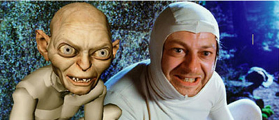
What I’ve pointed out here with relation to Saldana’s contributions to the creation of Neytiri applies as well to Serkis’ earlier contributions to Gollum. In the comparison images below, similar changes were made.
While Serkis’ ears were covered, Gollum’s are pointed and prominent. Here, too, the eyes have been enlarged and made a light blue so that the pupils stand out. Where the actor’s teeth are straight and even, Gollum’s are pointed, crooked, and separated by gaps. The cheeks have been hollowed and the eyebrows arched nearly to a point near their outer ends. Crucially, the body has been made inhumanly skinny, with long bony legs and arms that are not apparent in this image. I suspect that some naive audience members believed that a real actor had played Gollum, but to most the scrawny figure was a guarantee that no human could have performed the role. (The very thin waists of the extraterrestrials in District 9 served as a similar guarantee that these were not just guys in monster suits à la Invaders from Mars.)
With all the kinds of changes that I’ve pointed out, how would Academy members be supposed to judge these performances were they to be nominated in the traditional acting categories? Where is the boundary between acting and special effects? Despite actors’ and directors’ claims to the contrary, the movements and expressions caught by performance capture are changed in many obvious and not so obvious ways. A close inspection of the comparison photos reveals the details of the transformation, but in watching the film, the viewer cannot necessarily gauge what sorts of changes were made. I can well imagine that actors like Meryl Streep or Jeff Bridges would be justified if they objected to competing in the same Oscar category as what are essentially hybrid performances seamlessly combining the original acting and the digital transformation.
Possible new categories
One way I can imagine actors competing for awards would be for the Academy to create a separate category for motion-capture performances. To judge such performances fairly, the members would have to see videos running the original performance side-by-side with the finished film. This method might allow them to make a reasonable assessment of what the actor truly contributed.
At this stage in the history of film technology, such a category seems unlikely. So far, not that many people have been spoken of as deserving an Oscar nomination for a mo-cap performance. Even Bill Nighy, who was widely praised for his turn as Davy Jones in the second Pirates of the Caribbean film, was not touted as a possible nominee—probably because his face was so thickly covered with tentacles and partly because comic fantasy films tend not to be Oscar bait. So far the argument has primarily been made for Serkis and Saldana. Plus if the Academy did take the approach of requiring the sort of comparison film I’ve suggested, it would be a difficult and expensive thing to produce. Who knows whether Academy voters would watch five such films?
Maybe, though, as performance capture becomes less expensive and more widely used, there will be enough actors to make up a separate category. We’ve seen the animated-feature category grow from three to five nominees this year, and the number of such films being made suggests that five will become the norm. Animated films and live-action ones heavily dependent on motion-capture are somewhat similar technically, so a new category makes some sense.
A simpler and more logical alternative might be to create a category specifically for vocal performances. As has been pointed out in relation to animated films, an actor who is heard but never seen onscreen could in principle be nominated. Such a thing has never happened, but it’s not against the rules. (It’s easy to imagine that it could have happened for a performance like Celeste Holm’s unseen narrating character in Letter to Three Wives.) But with animated-feature and motion-captured performances becoming more common, a best-vocals category seems to make sense. After all, Serkis and Saldana and others like them do speak their characters’ lines, and their voices are typically not altered or enhanced very much. The digital manipulation of sound still lags considerably behind that of images.
The idea is not exactly a new one. The Annies, the awards given out each year by the International Animated Film Society, has two “Vocal Acting” categories, one each for film and television.
Very similar motion-capture technology can be used to create films that most people would agree are animated (The Polar Express, A Christmas Carol) and others that embed animated characters in a live-action setting (The Lord of the Rings, Avatar). Creating an Oscar category for vocal acting in animation or motion-captured, effects-based performances would make sense.
If actors are not yet being recognized for motion-captured performances, the Academy has been quick to honor the top scientific and technological innovators of the area of motion capture. In 2004, when The Return of the King won its golden statuettes, the less celebrated Academy technical awards included one to the Weta Digital team for its new approach to the creation of Gollum. (The award was shared with ILM for its similar use of the technique in creating Jar Jar Binks.) This year, on February 20, the Academy honored a team that included one Weta Digital member for “the design and engineering of the Light Stage capture devices and the image-based facial rendering system developed for character relighting in motion pictures” which was used on Avatar and The Curious Case of Benjamin Button.
Despite fears that motion-capture may someday make directly photographed actors obsolete, there seems little chance of that happening. These techniques are fantastically expensive and are likely to remain that way for some time to come. There seems little point to using such elaborate technology to make an actor look like a real person when traditional cameras can do it so much more easily, so motion-capture performances seem suitable primarily for fantasy beings who cannot be as believably created in any other way.
Thanks to Cathy Root for calling my attention to the Los Angeles Times article.
February 25: See also Mark Harris’ essay in Entertainment Weekly. He argues that the ineffable qualities of an actor’s performance simply cannot be conveyed through motion-capture.
December 14, 2011: A member of the special-effects team at Weta Digital who worked on Avatar has sent me a comment on this entry: “Your Avatar article nails it–there were so many daily discussions about secondary ear and tail animation!”
May 18, 2014: Thanks to David Cairns for alerting me to two recent items on Cartoon Brew: Amid Amidi’s “Andy Serkis Does Everything, Animators Do Nothing, Says Andy Serkis,” which comments on an interview with Serkis on io9, and Amidi’s follow-up interview with Lord of the Rings animation supervisor Randall William Cook, which quite convincingly argues that the animators changed and extended Serkis’ performance.
The movie looks back at us
DB, still at the Hong Kong International Film Festival:
Abbas Kiarostami has the widest octave range of any filmmaker I know.
His humane dramas of Iranian life, from The Traveller to The Wind Will Carry Us, have justly won acclaim on the arthouse circuit. He has written scripts as well, some—like the under-seen The Journey (1994)—that are as compelling as a psychological thriller. He can conjure suspense out of the simplest acts, such as whether an adult will rip up a child’s copybook (Where Is the Friend’s Home?) or whether a four-year-old boy locked in with his baby brother can figure out how to turn off a stove (The Key). Indeed, I think that one of the great accomplishments of much modern Iranian cinema, with Kiarostomi in the vanguard, has been to reintroduce classic dramatic suspense into arthouse moviemaking.
But at times Kiarostami has moved to an opposite pole, that of extreme minimalism and “dedramatization.” The drift toward a hard-edged structure was there in Ten (2002), which gave us one of his drive-through dramas—people conversing in the front seat of a car—but in severe permutational form (different drivers, different passengers). Rigor was pushed to an extreme in Five Dedicated to Ozu (2003): Five lengthy shots of water landscapes, each many minutes long, taken at different times of day. The biggest dramatic action was the ducks walking through the frame. With Kiarostami, it seems, we cinephiles can have it all—Hitchcock and James Benning in the same filmmaker.
Now Shirin (aka My Sweet Shirin, 2008) marks another highly original exploration. I don’t expect to see a better film for quite some time.
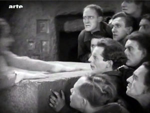
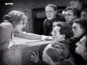
After a credit sequence presenting the classic tale Khosrow and Shirin in a swift series of drawings, the film severs sound from image. What we hear over the next 85 minutes is an enactment of the tale, with actors, music, and effects. But we don’t see it at all. What we see are about 200 shots of female viewers, usually in single close-ups, with occasionally some men visible behind or on the screen edge. The women are looking more or less straight at the camera, and we infer that they’re reacting to the drama as we hear it.
That’s it. The closest analogy is probably to the celebrated sequence in Vivre sa vie, in which the prostitute played by Anna Karina weeps while watching La Passion de Jeanne d’Arc. Come to think of it, the really close analogy is Dreyer’s film itself, which almost never presents Jeanne and her judges in the same shot, locking her into a suffocating zone of her own.
Of course things aren’t as simple as I’ve suggested. For one thing, what is the nature of this spectacle? Is it a play? The thunderous sound effects, sweeping score, and close miking of the actors don’t suggest a theatrical production. So is it a film? True, some light spatters on the edge of the women’s chadors, as if from a projector behind them, but no light seems to be reflected from the screen. In any case, what’s the source of the occasional dripping water we hear from the right sound channel? The tale is derealized but it remains as vivid on the soundtrack as the faces are on the image track. What the women watch is, it seems, a composite, neither theatrical nor cinematic—a heightened idea of an audiovisual spectacle.
Moreover, there are the faces. We see some more than once, but new ones are introduced throughout. Spatially, they float pretty free; only occasionally do we get a sense of where the women are sitting in relation to one another. All are stunningly beautiful, whether young or old. We get an encyclopedia of expressions—neutral, alert, concentrated, bemused, amused, pained, anxious. During a battle scene, faces turn away, eyes lower, and hands shift nervously. The best person to review this movie is probably Paul Ekman, world expert on the nuances of facial signaling.
The weeping starts, by my count, about thirty-eight minutes in, during a rain scene uniting the two lovers Shirin and Khosrow. Thereafter, tears run down cheeks, along jaws and mouths, down necks and nostrils. The film is an almost absurdly pure experiment in facial empathy. It arouses us us by our sense of the story unfolding elsewhere, somewhere behind us, enhanced by lyrical vocalise and brusque sound effects, but above all by these eloquent expressions. It’s a feast for our mirror neurons. If you’re interested in reaction shots, you have to recall Dreyer remarking that “The human face is a landscape that you can never tire of exploring.”
I once asked Kiarostami how he got the remarkable performances in shot/ reverse-shot that we see in films like Through the Olive Trees and The Taste of Cherry. He said that he simply filmed one actor saying all his lines and giving all his reactions, then filmed the other. Often the two actors were never present at the same time, especially when he shot the car sequences. This montage-based approach, creating a synthetic space simply by cutting, has been taken to an extreme in Shirin, where the soundtrack supplies the reverse shot we never see. We’re told that Kiarostami filmed his female actors here reacting to dots on a board above the camera! Indeed, Kiarostami claims he decided on the Shirin story after filming the faces. Despite that, Shirin becomes one of the great ensemble pieces of screen acting, although the actors almost never share a real time and space. (Take that, green-screen wizards!) Like Godard, Kiarostami has been busy reinventing the Kuleshov effect (perhaps by way of Bresson).
This catalogue of female reactions to a tale of spiritual love reminds us that for all the centrality of men to his cinema, Kiarostami has also portrayed Iranian women as decisive, if sometimes mysterious, individuals. Women stubbornly go their own way in Through the Olive Trees and Ten. The premises of Shirin were sketched in his short, “Where Is My Romeo?” in Chacun son cinema (2007), in which women watch a screening of Romeo and Juliet. But the sentiments of that episode are given a dose of stringency here, particularly in one line Shirin utters: “Damn this man’s game that they call love!”
One last note: Kiarostami built movie production into the plot of Through the Olive Trees. Now he has given us the first fiction film I know about the reception of a movie, or at least a heightened idea of a movie. What we see, in all these concerned, fascinated faces and hands that flutter to the face, is what we spectators look like—from the point of view of a film.
For more on the production background, see the lengthy interview with Kiarostami here.


