Archive for the 'Film technique' Category
Motion-capturing an Oscar
Kristin here:
Six years ago, when The Lord of the Rings: The Return of the King was nominated for eleven Oscars, there was considerable grumbling over the fact that Andy Serkis was absent from the acting categories. Many argued that his pivotal role in creating Gollum, the first convincing human-like computer-generated character, should have qualified him for a nomination.
Now we’re seeing a similar debate over the lack of actor nominations for Avatar, with Zoe Saldana’s performance as Neytiri especially mentioned as unfairly overlooked. An intriguing article on the subject appeared in the Los Angeles Times a few days ago. In it, James Cameron expresses annoyance with both the Screen Actors Guild and the Academy for the lack of nominations for his actors:
I’m not interested in being an animator. . . . That’s what Pixar does. What I do is talk to actors. ‘Here’s a scene. Let’s see what you can come up with,’ and when I walk away at the end of the day, it’s done in my mind. In the actor’s mind, it’s done. There may be a whole team of animators to make sure what we’ve done is preserved, but that’s their problem. Their job is to use the actor’s performance as an absolute template without variance for what comes out the other end.
Because of innovations in the motion-capture process, including a tiny camera hung in front of an actor’s face to capture its every nuance, Cameron insists on calling the new technology “performance capture.” In some sense it may be true that the performance is preserved, but once the film runs through the theater projector, can the audience really tell what that “template” was like? I think not, and that’s why there is a reluctance to nominate these actors.
Where is the elusive boundary?
Don’t get me wrong. I’m not saying that Zoe Saldana and Andy Serkis aren’t fine performers or that their acting did not contribute enormously to the characters they played. Indeed, Serkis’ mo-cap contribution to the creation of Gollum was originally intended to be far more limited than it turned out to be. His facial expressions and gestures were so useful to the special-effects people that he was involved for a much longer period, and techniques to allow him to perform onset with the other actors were developed.
But however fine the original acting and however great the aid it provides to the special-effects team are, the process doesn’t stop there. To a notable degree other factors intervene between the actors’ original performances and the characters’ final appearance on the screen. Let’s do some comparisons, using the publicity images that the studios themselves considered good indications of how close the expressions of original actors were to those of their characters.
Take the widely circulated image of Saldana juxtaposed with Neytiri shown above. There are numerous differences. For a start, the filmmakers obviously needed to make the Na’vi look like an alien species. They didn’t just give them tails and make them blue and really tall. Human as the creatures seem in many ways, their faces have a subtle suggestion of large felines.
The effectiveness of Neytiri’s snarl has a lot to do with the fact that she has been given exaggeratedly long canine teeth. Moreover, given the changes in the shape of the face, the mouth is not as large proportionately to the entire head as Saldana’s is; the tongue is not nearly as prominent or noticeable. Both tongue and lips are blue as well. All of these features allow the teeth stand out more by contrast.
Na’vi ears are pointed, and some of the lobes are apparently pierced with a small dark disk in the hole. Saldana’s ears played no role in her performance, but the laid-back ears in the Neytiri image, mimicking those of an enraged animal, contribute considerably to the shot’s impact. I remember noticing them while watching the film.
The nose and the wrinkles on and above it have been considerably changed. Unlike human noses, those of the Na’vi are smaller at the bottom than at the top, somewhat resembling lions’ noses. The wrinkles seem to be derived from canine or feline faces as well, extending from the inner end of the eye and arcing down toward the tip of the nose. The human frown lines at the lower center of Saldana’s forehead are transformed into larger, longer, curved wrinkles at either side; these start between the eyebrows and move up and to the sides. There they get extended by the curved areas of darker blue that radiate across the upper forehead, so that the lines of anger seem to cover more of the face. I suspect that relatively little of what the actors did with their noses has survived the special-effects processing. (In the image below, even the shape of Saldana’s naso-labial folds has been slightly altered.)
The change in the eyes is particularly important. Saldana’s eyes have dark irises within which the pupil is barely, if at all, visible. Na’vi eyes are much larger, to begin with, and the irises are light in color, a sort of yellowish tan. The irises fill more of the visible part of the eye, so that the whites of Na’vi eyes are minimized. As a result, the black pupil stands out dramatically. In terms of color, the model seems to be cats’ eyes, though the pupils remain round rather than slits, to avoid making the Na’vi too alien looking. Since the nose has been widened at the top, the eyes are also further apart than on human faces. (The norm with humans is for the eyes to be separated by a distance roughly equal to the width of one eye.)
Even in a less dramatic scene, when Neytiri is relaxed and smiling, some of these differences remain. The pointed ear is not laid back, but it sticks out from the side of the head at an angle that draws the spectator’s attention and makes the human-shaped face seem exotic–especially given that the Na’vis’ ears are placed higher on the skull than human ears are: while the human ear canal is about even with the cheekbone, in the Na’vi it opens at mid-temple level. Although the points of the canine teeth are not visible in this image, the teeth remain prominent because of their bright whiteness against the blue skin. Though partially masked by the headgear, the vaguely feline nose still differs considerably from Saldana’s. In keeping with the extraordinary height of these beings, Saldana’s neck has also been lengthened.
Again, I’m not saying that Saldana and the other actors in Avatar did not contribute enormously to the believability of their characters or that they did not aid us to empathize with them. On the contrary, although the big blue creatures did seem very odd in the trailers and posters, I have to admit that they quickly came to seem like real characters. Their design’s balance of human and alien is remarkable. I did not continually think of them as walking combinations of numerous elaborate special effects. The new facial-capture system renders expressions very well, as the frame at the bottom shows.
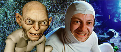
What I’ve pointed out here with relation to Saldana’s contributions to the creation of Neytiri applies as well to Serkis’ earlier contributions to Gollum. In the comparison images below, similar changes were made.
While Serkis’ ears were covered, Gollum’s are pointed and prominent. Here, too, the eyes have been enlarged and made a light blue so that the pupils stand out. Where the actor’s teeth are straight and even, Gollum’s are pointed, crooked, and separated by gaps. The cheeks have been hollowed and the eyebrows arched nearly to a point near their outer ends. Crucially, the body has been made inhumanly skinny, with long bony legs and arms that are not apparent in this image. I suspect that some naive audience members believed that a real actor had played Gollum, but to most the scrawny figure was a guarantee that no human could have performed the role. (The very thin waists of the extraterrestrials in District 9 served as a similar guarantee that these were not just guys in monster suits à la Invaders from Mars.)
With all the kinds of changes that I’ve pointed out, how would Academy members be supposed to judge these performances were they to be nominated in the traditional acting categories? Where is the boundary between acting and special effects? Despite actors’ and directors’ claims to the contrary, the movements and expressions caught by performance capture are changed in many obvious and not so obvious ways. A close inspection of the comparison photos reveals the details of the transformation, but in watching the film, the viewer cannot necessarily gauge what sorts of changes were made. I can well imagine that actors like Meryl Streep or Jeff Bridges would be justified if they objected to competing in the same Oscar category as what are essentially hybrid performances seamlessly combining the original acting and the digital transformation.
Possible new categories
One way I can imagine actors competing for awards would be for the Academy to create a separate category for motion-capture performances. To judge such performances fairly, the members would have to see videos running the original performance side-by-side with the finished film. This method might allow them to make a reasonable assessment of what the actor truly contributed.
At this stage in the history of film technology, such a category seems unlikely. So far, not that many people have been spoken of as deserving an Oscar nomination for a mo-cap performance. Even Bill Nighy, who was widely praised for his turn as Davy Jones in the second Pirates of the Caribbean film, was not touted as a possible nominee—probably because his face was so thickly covered with tentacles and partly because comic fantasy films tend not to be Oscar bait. So far the argument has primarily been made for Serkis and Saldana. Plus if the Academy did take the approach of requiring the sort of comparison film I’ve suggested, it would be a difficult and expensive thing to produce. Who knows whether Academy voters would watch five such films?
Maybe, though, as performance capture becomes less expensive and more widely used, there will be enough actors to make up a separate category. We’ve seen the animated-feature category grow from three to five nominees this year, and the number of such films being made suggests that five will become the norm. Animated films and live-action ones heavily dependent on motion-capture are somewhat similar technically, so a new category makes some sense.
A simpler and more logical alternative might be to create a category specifically for vocal performances. As has been pointed out in relation to animated films, an actor who is heard but never seen onscreen could in principle be nominated. Such a thing has never happened, but it’s not against the rules. (It’s easy to imagine that it could have happened for a performance like Celeste Holm’s unseen narrating character in Letter to Three Wives.) But with animated-feature and motion-captured performances becoming more common, a best-vocals category seems to make sense. After all, Serkis and Saldana and others like them do speak their characters’ lines, and their voices are typically not altered or enhanced very much. The digital manipulation of sound still lags considerably behind that of images.
The idea is not exactly a new one. The Annies, the awards given out each year by the International Animated Film Society, has two “Vocal Acting” categories, one each for film and television.
Very similar motion-capture technology can be used to create films that most people would agree are animated (The Polar Express, A Christmas Carol) and others that embed animated characters in a live-action setting (The Lord of the Rings, Avatar). Creating an Oscar category for vocal acting in animation or motion-captured, effects-based performances would make sense.
If actors are not yet being recognized for motion-captured performances, the Academy has been quick to honor the top scientific and technological innovators of the area of motion capture. In 2004, when The Return of the King won its golden statuettes, the less celebrated Academy technical awards included one to the Weta Digital team for its new approach to the creation of Gollum. (The award was shared with ILM for its similar use of the technique in creating Jar Jar Binks.) This year, on February 20, the Academy honored a team that included one Weta Digital member for “the design and engineering of the Light Stage capture devices and the image-based facial rendering system developed for character relighting in motion pictures” which was used on Avatar and The Curious Case of Benjamin Button.
Despite fears that motion-capture may someday make directly photographed actors obsolete, there seems little chance of that happening. These techniques are fantastically expensive and are likely to remain that way for some time to come. There seems little point to using such elaborate technology to make an actor look like a real person when traditional cameras can do it so much more easily, so motion-capture performances seem suitable primarily for fantasy beings who cannot be as believably created in any other way.
Thanks to Cathy Root for calling my attention to the Los Angeles Times article.
February 25: See also Mark Harris’ essay in Entertainment Weekly. He argues that the ineffable qualities of an actor’s performance simply cannot be conveyed through motion-capture.
December 14, 2011: A member of the special-effects team at Weta Digital who worked on Avatar has sent me a comment on this entry: “Your Avatar article nails it–there were so many daily discussions about secondary ear and tail animation!”
May 18, 2014: Thanks to David Cairns for alerting me to two recent items on Cartoon Brew: Amid Amidi’s “Andy Serkis Does Everything, Animators Do Nothing, Says Andy Serkis,” which comments on an interview with Serkis on io9, and Amidi’s follow-up interview with Lord of the Rings animation supervisor Randall William Cook, which quite convincingly argues that the animators changed and extended Serkis’ performance.
Light is a law
DB here:
What do we see when we look around us? A world teeming with creatures and things. We tend to ignore what enables us to see all that: light. To a great extent, that bias is wired into our perceptual systems. An orange looks the same color to us in sunshine and in shade. But photograph it, and you’ll see that actually it throws off very different wavelengths in the two situations. We evolved, it seems, to mute all the variations in light we encounter. Psychologists call this “the primacy of object perception.”
It takes an artist to shift from the what to the how, to notice how different patterns of illumination can alter the shape and texture of an object. A painter, a photographer, and a cinematographer must learn to see light itself.
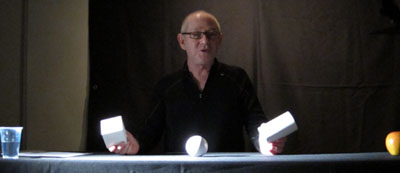
This was the core message of Steven Poster, an outstanding Director of Photography who came to visit Madison last weekend. Steven is probably most famous for working with Richard Kelly on Donnie Darko, Southland Tales, and The Box, but he has shot dozens of feature films, shorts, television movies, and pilots. He also has several Madison connections; he hung around the campus in his college years, saw Jules and Jim for the first time in the Memorial Union, and built a production house in Chicago with Mik Derks, who now works for Wisconsin Public Television.
Steven gave a workshop on cinematography that bristled with energy (five hours with only a brief break) and followed that with a screening of The Box, accompanied by a Q & A. Across a single packed Saturday, he took students and faculty on an adventure in seeing.
Seeing the light
Steven started as a still photographer at about age ten, and his ideas of visual design are very much allied with classic image-making. (He carried a Leica with him on his visit, and a display of his photos is currently mounted in a campus gallery.) He has a modernist bent too. He credits his years as a student at Southern Illinois University with introducing him to the ideas of the Bauhaus. He plunged more deeply into Bauhaus ideas at the Illinois Institute of Technology, where Mies van der Rohe and Moholy-Nagy taught.
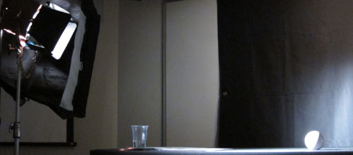
Later in his career, he studied at the Los Angeles Art Center College of Design. A turning point in his understanding came in Charles Potts’ photography course, when Potts began the semester by announcing softly, “Light is a law.” Steven’s talk for us, he explained modestly, was a “profoundly simple subset” of Potts’ course. Put it another way: In the Bauhaus spirit, he showed how simple principles yield subtle results. Armed with only a white ball, a white cube, and a white cylinder, he gave us a tutorial in the delicate modulations of vision.
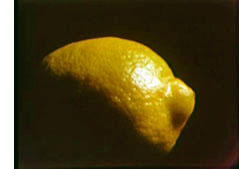 There are, Steven suggested, basically only two kinds of light: direct and indirect (or diffuse). Sunshine yields direct light; a cloudy day yields diffuse light. And when light falls on an object, the encounter has five components. The object gains a highlight, the bright region that suggests the direction of the light source. The object also acquires a shadow area. Between the highlight and the shadow is the boundary, or core—an important hint about the quality of the source light. (If the core has a crisp edge, the light is hard; if the core is a mild transition, the light is softer.) The fourth component is the shadow that the object casts on another surface. Finally, there is the specular or incident highlight, a spot of reflected light within the lit region. A specular highlight is a cue for texture as well as shape and light source. As Steven spoke, I kept thinking about Hollis Frampton’s Lemon (1969), a masterfully simple demonstration of many of these principles: slightly changing light reveals a prototypical shape (what other things have the outline of a lemon?) and a surface that is both shiny and bumpy.
By varying the type of light (direct or indirect) and the angle and distance of the source, Steven showed how these five components can be manipulated to bring out expressive qualities of the object. The cube, for example, can gain sharper contours through sidelong lighting, and illuminating the background can bring out its volume. Likewise, an object’s shadow area can be controlled through fill light—though Steven warned about over-filling, which can work against the precision provided by the key light. Another example is the way in which shooting glass or metal with pinpoint sources yields a scatter of specular reflections. If those aren’t wanted, as in some car commercials, the DP can use broad, diffuse illumination. This “liquid light” brings out contours through a softer gleam.
Of course a shot typically combines many objects, so the task of controlling how light hits them, and how they are arranged in relation to each other, becomes much more complicated. The shapes, textures, and emotional qualities of the elements have to be harmonized. “Elegant” was a word Steven used frequently: the composition, like the light, should be clear and well-defined. Needless to say, the result on screen can be grasped at a glance, but achieving such clarity needs painstaking control.
So seeing the light involves grasping everything around you, from landscapes and furniture to people’s faces and clothing, within the framework of highlights, shadow, core, and the like. This alone is enough to change your visual habits. But there’s more. By and large Steven made his adjustments without checking the monitor displaying what the camera was taking in. Standing almost anywhere, he could shift the light, tune the fill, and “wrap” the object, and on the monitor we could see the effect click into place. That skill demands more than a change in how to look at things. It’s an eye-body coordination that takes years of expert practice, an acquiescence to the law of light.
Behind the scenes
The discussion following this demo ranged across many aspects of cinematography, and Steven filled in abstract points with examples from his experience. My notes run to eleven pages, but this sampling should give you an idea of his stimulating presence.
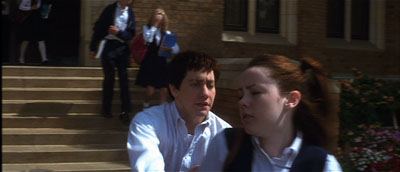
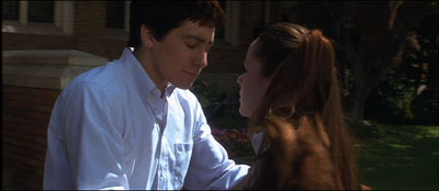
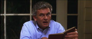
*A problem-solution dynamic emerged in one shot in Donnie Darko, above. We need to see Donnie’s face when he catches up with Gretchen, but the day was sunny and at first the faces display somewhat harsh shadows. But when the couple move toward a kiss, the solution came from their clothes: Donnie’s shirt and Gretchen’s blouse provide softer bounce light on his face.
*Steven stressed the need for complete trust and frankness between director and DP. “I won’t take a job if the director won’t look me in the eye.” Once that bond is established, the DP’s job is to protect the director and work to fulfill his or her vision. “My job is to protect the director.”
*Filmmaking is an intensely physical job, and so two concerns have to be paramount: safety and health. “No film is worth getting somebody hurt,” Steven remarked, so he insists that every crew member is a safety officer, looking out for everyone’s well-being. At the same time, filmmaking demands stamina, discipline, and a clear head, so everyone needs to have a healthy regimen and cultivate a certain “inner life” that keeps job pressures in perspective.
*Steven had much to say about the video assist. He suggested that it has led to directors using more close views, because such shots read better on small monitors. (I made a similar suggestion in The Way Hollywood Tells It.) Steven fights what he calls the “loss of scope” on video displays by presenting the digital dailies in full-size projection, as in the film-based days. “It reminds everybody that we’re making a big movie,” and it encourages directors not to overuse close-ups.
*Steven is happy with the digital intermediate process. As a cinematographer who wants to control all aspects of the image, he welcomes all the adjustments he can make in postproduction, especially thanks to the Lustre grading program. “It’s like being back in the darkroom again.”
*On Donnie, a low-budget film, Kelly and Steven were forced to shoot the family dinner scenes in a single night. To save time, they used “block shooting.” For each actor, a basic setup was established and all the actor’s lines from both scenes were taken at one time. It was faster to have the actor change clothes for the later scene than to shift the camera position and relight the setups.
*Speaking of table scenes, they pose a lot of problems. Even Steven finds such scenes “the hardest.” “Where’s the [180-degree] line in this situation? I’ve seen fights break out on sets about it.”
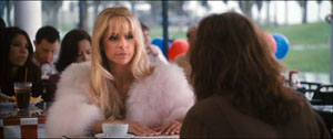
*At one point Steven talked about prominent objects in a scene, such as candelabra and ketchup bottles. If you use symmetrical reverse shots, those objects can jump distractingly from one side of the screen to the other. Steven tries to make sure that such eye-catchers appear in only one of the setups, not both. The coffee cup in this scene of Southland Tales is hidden in the reverse angles.
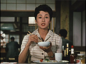
Steven’s point reminded me that Ozu breaks this rule of thumb and playfully lets his objects jump around the frame from cut to cut. Indeed, he often rearranged the props to heighten this peripheral dance. In one scene of Late Autumn, the tabasco sauce bottle pivots consistently, but the French’s mustard jar changes position.
*Steven thinks that 3-D will succeed this time, chiefly because of the push for 3-D television. The technique probably won’t work for all stories, and the format poses some technical problems. But the software is getting better, and filmmakers, such as Cameron in Avatar, are starting to avoid the gimmick of obects thrusting out of the screen. It’s better, Steven thinks, to let the depth recede into the movie’s world, making the screen a window. I recalled that this was the strategy used in Coraline, Up, and other films of last year, so perhaps this will become the dominant way that 3-D will be used.
*Steven urged students to get broad general educations and not become movie nerds. They should study history, political science, art, and literature. He pointed out that Werner Herzog, his friend and neighbor, insists in his Rogue Film School that literary classics are the basis of a film education.
*Steven has long been an advocate of unionization. As President of Local 600 of the International Cinematographers Guild, he explained how the Guild now welcomes members, especially women and people of color. I thought it was salutary to give students a taste of the practicalities of professional life by explaining what the Guild had accomplished.
*Steven did additional photography on Blade Runner, and he learned a great deal while gaining deep respect for Jordan Cronenweth, DP on the movie. Steven rewatches the film often, and each time he finds something new. On the last pass, he saw that in the search of Kowalski’s apartment, flickering streaks of light coming from inside the desk drawer call attention to the newspaper that Deckard finds there.
Back in 1980-1982, when Kristin and I were doing research on The Classical Hollywood Cinema, we found that Charles G. Clarke, Linwood Dunn, William Hornbeck, Stanley Cortez, and other professionals whom we interviewed were intellectuals, eager to explain the ideas informing their creative decisions. Steven Poster’s career is another outstanding example of how theory and practice work together, often unobtrusively, to conjure up the enthralling world on screen. I can’t imagine a film researcher, or just a movie lover, not wanting to know filmmakers’ craft and the principles informing it. Once you’ve visit the kitchen, movies gain a whole new flavor.
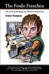
This blog has intersected with primary Bauhaus shapes before. I discuss “the dinner-table conundrum” in the first few pages of Figures Traced in Light. One of the best analyses I’ve read on illumination in the visual arts is E. H. Gombrich’s “Light, Form and Texture in Fifteenth-Century Painting North and South of the Alps,” in The Heritage of Apelles: Studies in the Art of the Renaissance (Ithaca: Cornell University Pres, 1976), 19-35. For more on Ozu’s penchant for letting brightly lit objects jump around the composition, see this chapter of my Ozu and the Poetics of Cinema. The Lustre program was devised for The Lord of the Rings, and Kristin discusses its origins and influence in The Frodo Franchise, pp. 280-281.
Special thanks to Steven for his visit, the Wisconsin Union Directorate for arranging it, and Erik Gunneson, Joel Ninmann, Justin Daering, and J. J. Murphy for setting up the workshop.
Blade Runner.
Paris-Berlin-Brussels express
Doktor Satansohn.
Our trip to Europe has come to an end, and so we finish with a post scanning some highlights.
The magic lantern learns new tricks
DB here:
What am I seeing? Many avant-garde films pose this question. Mainstream fiction film and documentary cinema have mostly relied on the idea that the image should be recognizable as “what it is.” But one strain of experimental film has worked to delay or even prevent us from making out what’s in front of the camera.
Sometimes we lose our bearings only briefly, as when we eventually identify pot lids in Ballet Mécanique or bits of sunlit linoleum in Brakhage films. Sometimes language points out what’s really there. The titles of Joris Ivens’ Rain and the Eames’ Blacktop: The Washing of a School Play Yard allow us to enjoy the ways that ordinary sights can yield unexpected abstraction. Sometimes we toggle back and forth, as when in Ken Jacobs’ Tom, Tom, the Piper’s Son recognizable human figures, however grainy, jump into sheer blotchiness and then back into something like legibility. But other times we can’t ever tell what we’re seeing. Brakhage’s Fire of Waters offers one of the best examples I know, with its jagged bursts of light in a smoky void.
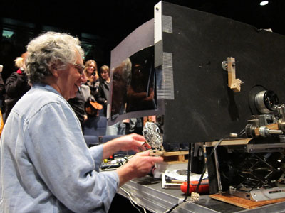
What am I seeing? The uncertainty was doubled during my visit to Ken Jacobs’ Nervous Magic Lantern performance at the Cinémathèque Française. I say “doubled” because at least with Fire of Waters and Tom, Tom I knew I was watching a film. With this display, What am I seeing? started as a question about the format itself. Was it a film, a video, or something else?
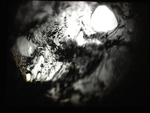
Then the question became the customary one. Off-white textures—pebbly, dribbly, stalagmite-like—swim in and out of focus. Some are viscous and globular, some are like tangled foliage. They seem to spiral, but actually (I put up a finger to measure) they barely move. The effect of movement is given by pulsations of pure black, breaking the lyrical effect of the surfaces with a harshness that becomes aggressive. Aggressive as well is the soundtrack, blocks of sound from subway platforms and traffic and kitsch Latin percussion, all played at high volume. The surfaces just keep shifting and not shifting, sort of rotating while jabbing out at us, lovely and anxiety-inducing at the same time.
At the end of the performance, people crowded around the cardboard booth in the middle of the theatre. As Ken and Flo Jacobs packed up, they showed how they had generated the effects. What had I been seeing? Neither a film nor a video but a true magic-lantern display, assembled on the spot. But what had I been seeing? Something created with home-made equipment of a startling simplicity. (Strapping tape was involved.) Our magicians explained their tricks, like magic-lantern operators of earlier centuries explaining the science behind their shows. But I think it’s best that you not know until after you have a chance to see what they create.
In earlier entries (here and here) Kristin and I have praised Jacobs’ films for showing how very slight adjustments in technique or technology can create disturbing cinematic illusions. In this vein, the first item on the Cinémathèque program, a video called Gift of Fire, turned Louis Le Prince’s brief 1888 street scene into a 3D movie. (The homage was appropriate because Le Prince experimented with multiple-lens cameras.) The Nervous Magic Lantern performance generated a different sort of illusion, one conjuring up micro-landscapes and otherworldly vortices. In all, Jacobs makes us realize how many evocative effects are still to be discovered by tinkering with images thrown on a screen.
Detour to Berlin
KT here:
As David mentioned in last week’s entry, I took a week in the middle of our visit to Europe for research at the Ägyptisches Museum in Berlin. The staff there welcomed me into their storerooms, and I spent the days looking at fragments and the records of their discovery and the nights downloading and backing up my photos. No time for filmgoing. The most I managed was a trip to the well-stocked arts bookshop Bücherbogen, which has one of the best selections of film books to be found in Germany. Our old friend, experimental filmmaker Carlos Bustamente, met me there, and we had a quick cup of tea–most welcome on a cold morning when the results of the biggest snowfall in decades were still blanketing many sidewalks and roads.
I did note one film-related phenomenon, however. Every day I took the S-Bahn from Savignyplatz to Friedrichstrasse. The tracks pass directly across the street from the Theater des Westens (that is, the western part of Berlin). It was playing Der Schuh des Manitu, a musical version of the 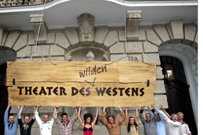 highly successful 2001 German film of the same name. (I hope the publicity photo at the left was taken in warmer weather than I experienced.) I mentioned the film here, in reference to the fact that every major producing country, and some minor ones as well, turn out their own local comedies, films that don’t travel well but are very popular locally.
By now it’s a familiar phenomenon in the U.S. for successful Hollywood films to be turned into stage musicals. It wasn’t always so. Back in the 1950s and 1960s, films were made of popular musicals, sometimes successfully, as with My Fair Lady, and sometimes not, as with Mame. But now the trend is the other way, with everything from Shrek to Hairspray getting the Broadway treatment.
It’s interesting to know that the same thing goes on abroad, though I’m not sure how prevalent such adaptations are. Der Schuh des Manitu, directed by Michael “Bully” Herbig, remains the highest grossing German film. Herbig doesn’t act in the stage play, as he did in the film, but he served as a creative advisor. The musical is a hit, having premiered on December 7, 2008 and it is expected to continue until at least the autumn of this year. There are several clips from both the film and the musical on YouTube. This one, at 8 minutes, gives a generous dose of the show. There are no subtitles.
I had only a couple of days back in Paris before we headed for Brussels for the final week of our trip. The German theme continued, since a few of the 1910s films David needed to see at the Cinematek here were German. The one I most wanted to see was Edmund Edel’s 1916 feature, Doktor Satansohn. Its main claim to fame is probably the fact that Ernst Lubitsch plays the title role. My book with Lubitsch started with his 1918 move to features, when he began to concentrate more on directing and less on acting. By 1920, with Sumurun, he appeared onscreen for the last time; being discontented with his performance as the tragic clown, he decided it was time to move behind the camera for good.
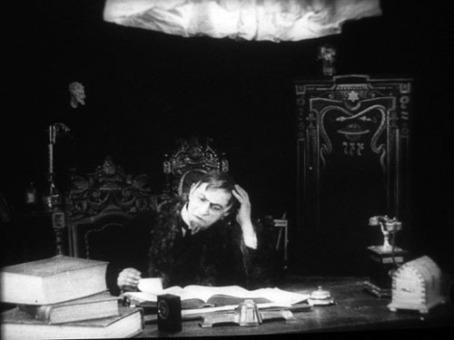
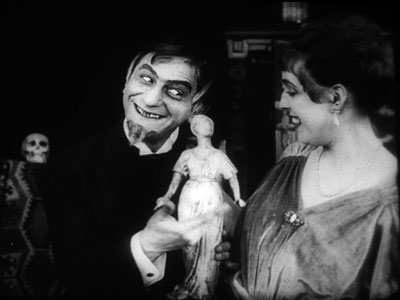
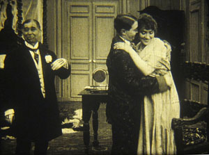
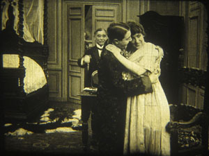
In the short films he starred in before 1918, Lubitsch often played a brash, ambitious Jewish youth, as in Der Stoltz der Firma (“The Pride of the Firm,” 1914). In Doktor Satansohn he’s a physician with a magical machine that transforms older women into beautiful young ones. We’re first introduced to a couple and the wife’s mother. When the latter makes a pass at her son-in-law and is rejected, she seeks the doctor’s help. His machine works by capturing the wife’s essence in a statuette and making the mother look like her daughter. Problem is, every time she’s about to kiss the husband, the doctor pops up with his devilish leer, visible only to the “wife.” David and I decided that the film is a comedy, though perhaps one only Germans of the day would find truly amusing. For one thing, the title character is clearly a Jewish caricature, one played to the hilt by Lubitsch. He decorates his machine with the Star of David and a Hebrew inscription (not to mention vipers and an image of Saturn).
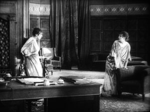
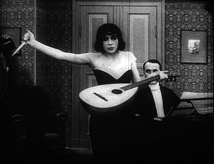
Stylistically it’s a fairly conventional film for its day, though the black background of the doctor’s office, with its stylized youth machine and satyr-like bust, gives a hint of Expressionism to come. (See our topmost image.) Inevitably near the end there comes the moment beloved of historians of pre-World War II German cinema. The real daughter, released from her imprisonment in the statuette, confronts her double in the doctor’s waiting room. The Doppelgänger motif strikes again.
I wonder if German films actually have more Doppelgängers in them than appear in other national cinemas. Do they really reflect the disturbed soul of the nation? Or did the possibilities of filmic special effects draw moviemakers to try and multiply single figures? Georges Méliès and Buster Keaton used in-camera techniques to multiple their own figures in virtuoso displays. I recall being impressed by The Parent Trap‘s duplication of Hayley Mills when I saw it as a kid, and the whole notion of a single actor playing twins and other lookalike relations is a common enough convention. In Doktor Satanssohn, the doubled figure appears only in this one shot, and it’s the leering Lubitsch, delighted with his own nastiness, who walks off with the picture.
The 1910s, again, and still
DB again:
We saw Doktor Satansohn while I was studying staging and cutting strategies of the 1910s, thanks to the remarkable holdings of the Royal Film Archive of Belgium, also known as the Cinematek. My comments on last summer’s visit are here.
Another German film, in a choppy Russian print, vouchsafed a new glimpse of Asta Nielsen. In Totentanz (Urban Gad, 1912), she plays a guitarist-dancer who must take to the stage to support her infirm husband. She attracts the devotion of a composer, and soon she feels attracted to him. Torn between desire and duty, she snaps during a rehearsal of his latest piece, “Totentanz.” In a chilling gesture, she uses his dagger to slice her lute strings.
Soon the two are locked in a violent erotic struggle, and a stabbing ensues. In all, melodrama as ripe as one could want.
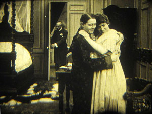
As ever, I was happy to have my hypotheses about tableau staging confirmed by several of the titles I saw. A minor French bedroom farce, Le Paradis (M. G. Leprieur, 1914 or 1915), had a brief passage of the sort of blocking and revealing we find in many films of the period. The painter Raphael Delacroix (no kidding) is pretending to be the lover of Claire Taupin to deflect the advances of randy M. Pontbichot. But Claire is actually the mistress of M. Grésillon. . . .
First, very frontal staging strings out Pontbichot, Raphael, and Claire. The older man relents in his pursuit of her.
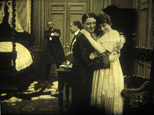
In the vivid depth characteristic of the tableau tradition, Pontbichot withdraws. But his position accentuates that central door, which starts to open.
Most remarkably, Pontbichot ducks almost entirely behind the couple, giving pride of place to M. Grésillon’s arrival in the center of the shot.
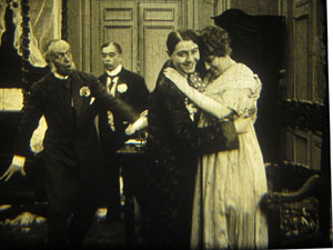
Pontbichot slides out in time to register Grésillon’s outraged reaction to finding his mistress in another man’s arms.
Grésillon rushes to the frontal plane, furious. As ever, a thrust to the foreground creates a major spatial/ dramatic event.
Although the Le Paradis passage is ABC compared to the emotionally powerful patterns of staging we find in Ingeborg Holm (1913), it illustrates how even average films could resort to the blocking/ revealing tactic within the deep-space geometry of the tableau.
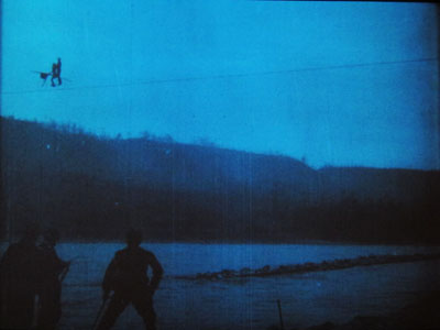
More flamboyant was Il Jockey della Morte (1915), an Italian circus film made by the Dane Alfred Lind. Its bold lighting and varied angles on the Big Top recalled the Danish films of a few years before. Halfway through, Lind launches a dazzling chase that features leaps from a tall bridge and bicycling stunts on a cable stretched across a river.
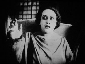
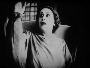
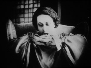
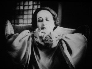
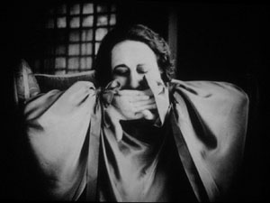
Another Italian film, this time a diva vehicle, suggests that by 1917 1923 (see below) the tableau style was already giving way had given way to scenes organized around close shots. (See below.) L’Ombra (Mario Almirante) starred Italia Almirante Manzini as a lively, trusting wife who becomes paralyzed. While her husband betrays her with her younger protégée, she gradually recovers bodily movement. Yes, a paralyzed diva seems a contradiction in terms, but one small-scale scene shows a remarkable range of emotions. Berta’s hands start twitching, one lifts up, and she stares wildly, as if it were an alien being.
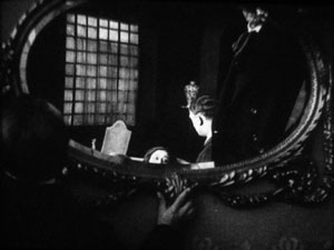
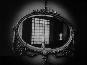
In an earlier scene, Berta had asked that a mirror facing her be tipped upward so that she would never see herself sitting immobile. This shot pays off now, when the hand ascends almost magically into the bit of reflection she can see.
When the hand descends, her astonishment turns into joy. She experimentally shoves the hands together, as if asserting her control.
In the end, she kisses her hands as if they were pampered children.
Manzini runs through many more micro-emotions than I’ve indicated here, but this sample is typical of the ways in which L’Ombra avoides the long-shot choreography of only a few years before and builds a performance out of face, body, and arms in a close framing. The mirror-shot motif shows that fairly careful filmic construction was emerging at this point too.
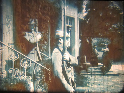
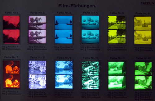
During my stay, I learned more about tinting and toning from the ever-helpful Noël Desmet. On the seldom-seen World War I drama L’Empreinte de la patrie (M. Dumeny, 1915), some images had curious oscillating patches of rusty brown. Noël explained that when Prussian Blue toning was combined with rose tinting, the chemicals eventually reacted to alter the pink cast. An example is shown at the top of this section, though the blue is more saturated in the original.
Once we get back to Madison, I’ll have to sort out all that I’ve learned from these movies. Onward and upward with the 1910s!
For more on Jacobs’ Nervous Magic Lantern, see Scott Foundas’ interview here. The Youtube clip doesn’t do the spectacle justice. If you must know something of Jacobs’ tools, the Dailymotion video from the performance I saw offers some clues. My notions about 1910s staging are laid out in On the History of Film Style and Figures Traced in Light. You can also find several discussions in earlier entries on this site. Just execute a search on tableau.
Now is a good time to thank Noël Desmet and Marianne Winderickx, both of whom are retiring from the archive in March. The research that Kristin and I have done over the years owes an enormous lot to them, and of course to the Director of the Cinematek Gabrielle Claes.
P.S. 15 November 2013: Ivo Blom has pointed out that the version of L’Ombra I saw wasn’t from 1917 but rather from 1923. Hence the corrections above. Thanks very much to Ivo! Go here for his blog and information about his newest publication on silent Italian cinema.
A tinting and toning sample card from the early 1920s. Courtesy Noël Desmet.
2-4-6-8, whose lipdub do we appreciate?
DB here:
“There is really no such thing as Art. There are only artists.” I tend to interpret the disarming opening of Ernst Gombrich’s Story of Art as a protest against the idea that art has an essence that unfolds through history. Those of us in film studies can spot the heritage of this Hegelian idea in one standard story that is told about how editing came to be a dominant technique. According to the formula, editing is “essentially cinematic,” but this essence didn’t reveal itself immediately. It emerged in phases, thanks to the insights of brilliant creators (Méliès, Porter, Griffith, the Russians). Understanding cinema’s history, according to this view, means tracking how film revealed its inherent nature.
In saying that Art doesn’t exist, Gombrich isn’t trying for an elaborate philosophical argument. He’s suggesting a way of understanding art history. His abrupt two sentences suggest that the historian shouldn’t presume that any art has an essence, a secret core that dictates how its history unfolds. He proposes seeing continuity and change in what we call the arts as springing from concrete activities of individuals and groups. Cinema’s history then becomes an account of the creative decisions of filmmakers faced with particular demands and problems. Some of those decisions can converge across the community. The results are trends, such as the increased use of editing, which have real consequences but which are aren’t the result of some secret, essential process.
Once we try to analyze art in terms of what creative communities have sought and achieved, we can ask how artists tend to behave. Across his career, Gombrich stressed that artists are sensitive to their circumstances. What tasks are assigned to the artists? What are the traditions and current fashions? What are the tastes of patrons? What constraints are put on the art-maker? How is art taught? How can the ambitious artist achieve distinction? (“What is there for me to do?”) What are the tricks of the trade at any moment? How do artists borrow from one another? And how might they compete with one another?
We often underrate competition as a stimulus to creativity. Gombrich notes that “the Dutch masters vied with each other, trying to outdo their rivals in certain accomplishments.”
Stressing the relevance of traditions not only implies an attention to the way art feeds on art; it should also make us aware of the cumulative nature of any such skill. What happens in such a hothouse atmosphere is that ambition leads to competition and frequently also to specialization, as it notoriously did in Holland.
In cinema, we might profitably consider competition as one source of the diversity within a tradition. I suspect that the great Soviet directors of the 1920s not only shared ideas but also competed by testing ever farther-out ideas about cutting. They also specialized in the manner Gombrich suggests by cultivating particular effects or genres: Pudovkin’s character-driven pathos, Eisenstein’s dynamic crowd effects, Kuleshov’s exploration of popular genres, Dovzhenko’s boldly elliptical storytelling. I’ve often thought that the Warner Bros. cartoonists probably walked out of the first screenings of Disney’s Snow White and the Seven Dwarfs (1937) with heavy hearts. How could they match that? They didn’t try. Instead, they cultivated something quite different: raucous, cynical, high-speed farce. And today, doesn’t it seem likely that Avatar took its final form as an effort to go beyond the CGI efforts of earlier directors—to prove that the director of Terminator II and The Abyss was still the King of the World of SPFX?
Boys and their long-take toys
One of the most visible arenas of cinematic competition is the sustained tracking shot following several characters. It requires a sort of virtuosity, or at least logistical skill, in coordinating everything—the speed and consistency of the movement, the passage of people in and out of the shot, the consistency of framing and focus, the timing of new information. Once somebody has executed such a shot, the challenge is thrown down to others. Can you make yours longer or fancier?
In The Way Hollywood Tells It, I noted that Brian De Palma saw just such a challenge in Raging Bull’s famous tracking shot from the dressing room to the prizefight ring. “I thought I was pretty good at doing those kind of shots, but when I saw that I said, ‘Whoa!’ And that’s when I started using those very complicated shots with the Steadicam.” This sort of schoolyard one-upsmanship is probably what Christine Vachon had in mind when she called the single-take scene a “macho” choice.
There are some longer-term trends as well. Elaborate takes used at the start of a film can be found in the 1930s and 1940s (e.g., Ride the Pink Horse, 1947), but Welles laid down a clear marker in the opening of Touch of Evil (1957). Thereafter, starting a movie with an intricate, sustained camera movement became something of an emblem of directorial ambition.
Already, however, Dreyer, Ophuls, and Mizoguchi had used long takes, usually with camera movement, as building blocks of a film’s overall design. With Rope (1948) Hitchcock raised the possibility of making an entire film out of even fewer such shots, an initiative continued by the Hungarian Miklós Jancsó, who developed the choreography of such shots to a new level by incorporating crowds, zooms, and rack-focus passages. Béla Tarr and Gus van Sant have been modern exponents of the technique.
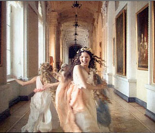
It was probably inevitable that somebody would try to make a feature-length film consisting of a single moving shot. Josh Becker’s Running Time (1997) renders a heist in what purports to be one take; there are cuts, but they’re pretty well disguised. Sokurov’s Russian Ark (2002; above) uses video technology to create a feature out of one genuine take, “a single breath” as he called it. At the same time, Sokurov added the condition that the shot would be an exploration of a labyrinthine space, in this case the Hermitage, and a trip through different eras of Russian history.
My lipdub can lick your lipdub
Perhaps it was Russian Ark, or maybe just TV walk-and-talks, that inspired the recent cycle of single-take video lipdubs. In these the camera moves through a locale and picks up one person after another, all lip-synching the soundtrack. September’s massively popular lipdub from l’Université de Quebec à Montréal may have furnished the prototype. In the US, a pair of current examples neatly illustrates how borrowing and competition among moviemakers can yield intriguing results.
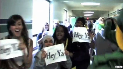
As you probably know, Shorecrest High School in Shoreline, Washington, mounted a very complicated lipdub—one take coasting through the school, picking up dozens of teens lipsynching to Outkast’s “Hey Ya!” before they all assemble in a theatre for a final shout-out. There are some somersaults too, which make any movie better. It is here.
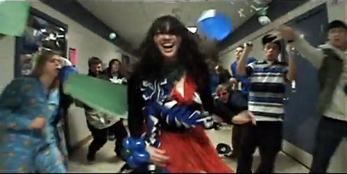
But high school rivalries resurfaced. Shorewood High School, traditionally at odds with Shorecrest in sports and band, struck back with a lipdub of Hall and Oates’ “You Make My Dreams Come True.” The new entry raised the stakes by shooting the action backward, somersaults included. Here it is.
There’s no shortage of backwards videos, but the Shorewood clip plays in clever ways with our biases in perceiving movement. Because we’re wired to grasp motion as advancing in time, we can’t easily reconstruct the actual movement that the figures executed. After seeing the film many times, I still found it hard to visualize the actual progression of the shoot, starting from the assembled crowd and ending on the young woman running backward to the vehicle that pulls away. (A forward version is here.) Moreover, both forward and backward motion have an uncanny symmetry, so that it’s hard to detect the latter except through subtle cues like the way garments fall or a gait with a special snap. Even the moments that flaunt the reverse-motion device, such as things originally tossed down into the frame, seem instead to fly up and into the hands of bystanders.
The stakes have been raised. What will Shorecrest come up with? A radical change of angle? (An entire lipdub done from a very high or low vantage point?) Or maybe a more demanding location? (With spring coming, I’d vote for a miniature-golf course.) Anyhow, my imagination is more limited than the filmmakers’. All that matters for my purposes is that the very fact of competition gave birth to a pair of ingenious and sprightly movies.
If you’re thinking that I wrote this simply to give everyone who Googles “Gombrich lipdup” at least one result, you miss my point. Just as Gombrich was never shy about using advertising imagery and children’s drawings to illustrate some basic principles of visual psychology, so we ought to notice any examples that vividly show how artists strategize in order to create something new within a tradition. Which is to say: Yes, I consider the young filmmakers of Shorecrest and Shorewood artists. Why not?
Gombrich’s essay on Dutch painting first appeared as “Mysteries of Dutch Painting,” New York Review of Books 30, 17 (10 November 1983), 13-17. It is reprinted in his Reflections on the History of Art (London: Phaidon, 1987). Shorewood has supplied a sort of making-of bonus here, with some more challenges to Shorecrest thrown in. To see the genre coopted by politicians (who apparently can’t get all their cohorts together in the same space), go here (thanks to Camilla Lugan). Maybe US politicos could get some more support if they tried bopping like this? They could hardly look sillier than they do already.
PS 31 January: Jason Mittell of Middlebury College has alerted me to his students’ lively long-take lipdub on the virtues of recycling.
PPS 1 February: Yogesh Raut writes that another historical precedent for the dueling lipdubs would be one older than the Quebec one I cited.
In your recent entry on lipdub videos you cite a video made in 2009 by students in Quebec as “the prototype.” I think a more likely candidate is this video made by a company called Connected Ventures and first uploaded in April 2007:
While there have obviously been a ton of similar videos made since then, I think the folks at CV (who I have no connection with) probably deserve a little hat tip as innovators. Of course, it’s possible that they were copying someone else, but in general they seem to be recognized as the starters of the craze (see here, for example).
It’s good to learn this. There are probably other precedents as well. I’d just say that a prototype need not be the first work in a genre tradition; rather, it’s a fully developed, typical instance. We take Little Caesar as a prototypical gangster film, but it’s not the first. The Connected Ventures project is indeed a single take, and it follows various people lip-synching. But it doesn’t explore a building in a targeted way, making the revelation of new space add visual variety, and the walking characters seldom pass us from group to group in tight choreography (it relies more on loose pans). Like other early efforts in a genre, it seems simpler and rougher than later entries. I suppose that supports my point that competition can spur filmmakers to surpass their peers; it seems that later lipdub adepts took up the challenge to make the single take more intricate. Still, I should probably have called the Canadian video “a prototype” rather than “the prototype.” Many thanks to Yogesh for calling my attention to a particularly early work in the genre.
2 May 2010: Tonight’s Simpsons episode, “To Surveille, with Love,” opens with a single-take lipdub pastiche/ parody showing Springfield’s citizens moving to Ke$ha’s Tik Tok video. Next morning: It’s here.


