


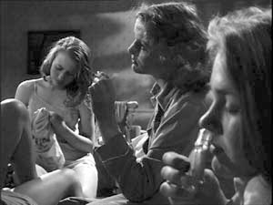
Archive for the 'Film technique' Category
Rat rapture
Recently we went to see Ratatouille and both loved it. We thought it was the best Hollywood movie we’ve seen this summer.
KT: Last October, in the infancy of this blog, I posted an entry on Cars. There I said, “For me, part of the fun of watching a Pixar film is to try and figure out what technical challenge the filmmakers have set themselves this time. Every film pushes the limits of computer animation in one major area, so that the studio has been perpetually on the cutting edge.” For Cars it was the dazzling displays of light and reflections in the shiny surfaces of the characters.
Figuring out the main self-imposed challenge in a new Pixar film is like a game, and I avoid reading any statements about the films by their makers ahead of time.
At first glance Ratatouille might seem to be “about” fur. True, there are lots of rats with impressively rendered fur—but fur was the big challenge way back in Monsters, Inc. Surely Pixar wasn’t repeating itself. To be sure, Monsters, Inc. contained only one major furry character, Sulley, and his fur was the long wispy type that some stuffed animals have. Difficult to render, no doubt, but different from the rats’ fur, which is dense, short, and has to ripple with the movements of the animals.
Not only that, but in Ratatouille, we see furry rats in all sorts of situations: just running round, crawling out of water and various other liquids, and in one virtuoso throwaway shot, emerging all fluffed up from a dishwasher. It’s all very impressive, but I didn’t think that was the main technical feat that the filmmakers were aiming at.

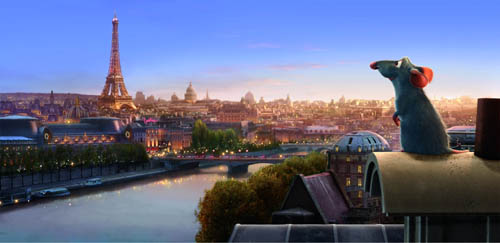
I quickly became aware that there was something different about the settings. Pixar films always have eye-catching settings: the beautiful and convincing underwater seascapes of Finding Nemo, the huge vistas of the factory in Monsters, Inc., the stylized domestic settings in the The Incredibles.
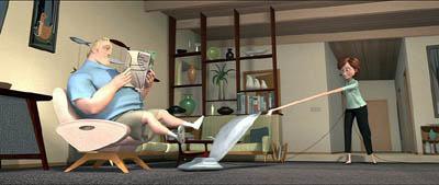
The Incredibles, the first film that Brad Bird directed for Pixar, was deliberately cartoony-looking, evoking the streamlined Populuxe look of 1950s cartoons. Ratatouille, his second effort, takes a very different approach. Here the settings are far more realistic and three-dimensional, approaching photo-realism in some of the Parisian street scenes. Often our vantage-point moves rapidly through these settings, twisting, turning, and plunging from high angle to low angle framings in a second. In the scene where the protagonist Remy is swept away from his family through the sewers until he emerges in Paris, the twists and turns of the pipes sweep by. Likewise, the camera explores the crevices of the restaurant’s crowded pantry.
The settings have a tangible and immediate presence beyond what we have seen in previous Pixar films, partly because so many objects in the surroundings are pulled into the action. Ingredients sit in bowls and jars that take up considerable portions of the kitchen set, and the rat dashes among them, sniffing to find the ones he needs for a new concoction. The lessons learned in Cars return here to make the shiny copper cooking utensils reflect their surroundings. The brick arch and floor tiles of the restaurant kitchen were individually tweaked, so that they don’t have the uniformity that CGI tends to give repetitive patterns. Dense combinations of bricks, tiles, wood panels, carpets, patterned wallpaper, glass, and Venetian blinds make every shot too busy for the eye to fully take in.
A delightful demonstration of all these features and more is given in the “Ratatouille QuickTime Virtual Tour.” 360-degree spherical space allows you to look up at the ceiling and down at the floor as well as scan the walls. (The download time is reasonably quick; you need to move your cursor into the window that opens and use it to scroll in any direction and at variable speeds. Use the shift key to zoom in and the control key to zoom out.)
DB: Two things, one general and one specific to Ratatouille:
(1) The idea of explaining artists’ works in terms of problems and solutions is common in art history and musicology, but not so common in film studies. It can be fruitful to consider that sometimes filmmakers face common problems and that they compete to solve them, or to find different problems they can solve.
I sometimes try to imagine what animators for other Hollywood studios thought when they walked out of Snow White and the Seven Dwarfs. Did the talents at Warners, Fleischer et al. just throw up their hands in despair? Disney must have been the Pixar of its day, challenging its rivals with a dazzling series of achievements along many dimensions. Disney had solved so many problems—of rendering color and depth, of catching detail and voluminous movement, of blending pathos with comedy—that the others could hardly compete in the same race. So it seems that they carved out other niches. Fleischer, though trying its hand at feature cartoons as well, concentrated on the familiar and presold comic-strip world of Popeye. Warners avoided child-oriented sentimentality and offered more insolent and whacked-out entertainment, personified in Bugs and Daffy. In today’s CGI realm, Pixar seems to set the pace, staking its claim before anybody else has realized the territory has opened up–though Aardman consistently offers something different.
(2) Along with the problems that you’ve mentioned, I was struck by what we might call a general task facing all animators: the need to display a sophisticated cinematic intelligence that fit contemporary tastes in live-action movies. So the pacing has to be fast (here, an average shot length of about 3.5 seconds), but it isn’t frantic. Today’s movies are overstuffed with details, so this is too; but here many stand out sharply. Central are all the minutiae of food and its preparation, which you mention below. Our friend Leslie Midkiff Debauche reports that her son, a chef, noticed the burn mark on Colette’s right forearm—a combat wound of the professional cook. Instead of the heavy satire and flatulence of the Shrek cycle, Pixar always gives us something that would engage us even if it weren’t animated.
Every director, I think, should study this film for lessons in making movement expressive. The velocity of our rats’ scampering depends on the surface they cross, and the differences in acceleration and braking are vivid. The vertigo-inducing river turbulence that carries Remy away from his clan displays the old Disney genius in rendering the behavior of water. There’s a caricatural difference in body language among all the characters, from the cadaverous Ego to the heaving movements of pudgy Emile and the spasmodic twirling of Linguini when Remy is at the controls. Shot scale is always well-judged. When there’s a moment of uncertainty about whether the kitchen team will support Linguini, the pause is accentuated by the fierce Horst taking a step forward toward the boy, in big close-up. Will this be the signal for the others to join him? The close-up conceals the key piece of information: Horst has stripped off his apron, and only when he lifts it into the frame do we realize that he’s walking out. Perhaps the visual expressiveness of silent filmmaking survives best today in animation.
KT: A secondary but still important challenge seemed to be the effort to find ways of rendering the textures of surfaces that are difficult to capture in animation. Most obviously the food—slices of carrots and tomatoes, stalks of celery—must look realistic and attractive if we are to believe that the dishes Remy devises are truly as scrumptious as the characters find them. (The film wisely sticks to soups, desserts, and, yes, ratatouille, sidestepping the problematic notion of an animal cooking other animals.)
Once you decide what you think the Pixar crew was working on extra hard in their newest film, it’s usually easy to find supporting evidence in interviews with the top people involved. For some reason Bird was reluctant to talk much about the big technical challenges for Ratatouille, but he gave a good summary in the interview on Collider.com:
I think our goal is to get the impression of something rather than perfect photographic reality. It’s to get the feeling of something so I think that our challenge was the computer basically wants to do things that are clean and perfect and don’t have any history to them. If you want to do something that’s different than that you have to put that information in there and the computer kind of fights you. It really doesn’t want to do that and Paris is a very rich city that has a lot of history to it and it’s lived in. Everything’s beautiful but it’s lived in. It has history to it, so it has imperfections and it’s part of why it’s beautiful is you can feel the history in every little nook and cranny. For us every single bit of that has to be put in there. We can’t go somewhere and film something. If there’s a crack in there, we have to design the crack and if you noticed the tiles on the floor of the restaurant, they’re not perfectly flat, they’re like slightly angled differently, and they catch light differently. Somebody has to sit there and angle them all separately so we had to focus on that a lot.
DB: This relates back to the idea that an animated film has to offer its own equivalent of what live-action has led viewers to expect. Since at least Alien and Blade Runner, we’ve come to equate realism with a worn-out world. No more spanking-clean spaceships, but rather creaky Gothic ones; no more shiny futures, only dilapidated ones. Bird acknowledges that once his team opts for more detailed settings, they have to look lived-in, rather than the rather generic ones we find in Toy Story and even The Incredibles. But then the food contrasts with this air of casual imperfection; it looks pristine.
KT: Speaking of food, in another interview, Bird expands on the difficulties of rendering it:
There was quite a bit of effort expended to make the food look delicious. Because if one of the things your movie is about is gourmet food, then you can’t have it not look delicious. And computers aren’t really very interested in making things look delicious. They’re interested in things looking clean and things looking geometrically precise, and usually hard not squishy – not tactile. Computers are great for perfection. They’re not great at organic things. We had to work really hard to get the food to look like you could taste it and smell it and enjoy it.
The interviews I’ve read don’t mention it, but the film also takes a small but impressive step toward solving the ever-difficult problem of rendering human skin. Most of the characters are given the usual smooth skin that we have come to expect in computer-animated films.
DB: Agreed! One of the things that put me off CGI animation years ago was the overpolished look of CGI surfaces. Volume without texture always looked plastic to me. But in Ratatouille, the Pixar team has made great progress in dirtying up the surfaces. That kitchen is full of spills and stains, but the faces are still pretty balloon-like, except for that villainous chef Skinner. He’s the most cartoony character, I suppose, and the range of expressions he passes through just in delivering a single line had me in stitches. The Termite Terrace legacy lives on in him.
KT: Yes, Skinner must have inspired the filmmakers. His face gets very sophisticated treatment. In most character animation, eyes and eyebrows are the main means of creating expressions in the upper half of the face. Several times, however, Skinner comes into extreme close-up, so that his expressions of rage and shock are complete with elaborate forehead wrinkles. There’s even a patch of pores on his nose. That degree of detail is used sparingly in this film, but perhaps we see a sign of things to come as the Pixar animators set up new hurdles to jump.
PS 25 August: For an interesting, more thematically oriented discussion of Ratatouille, see Michael J. Anderson and Lisa K. Broad’s entry on the Tativille blog.
PPS 31 August: Bill Desowitz has a lively and informative feature on the film, including behind-the-scenes interview material, at Animation World.
Unsteadicam chronicles
DB again:
A spectre is haunting contemporary cinema: the shaky shot.
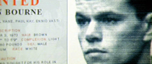
Viewers have been protesting for some years now. I recall friends asking me why the images were so bumpy in Woody Allen’s Husbands and Wives and Lars von Trier’s Dancer in the Dark. The Bourne Ultimatum, this summer’s wildest excursion into Unsteadicam, has put the matter back on the agenda.
If you drop in at Roger Ebert’s website, you’ll find many annoyed comments from readers about what one calls the Queasicam. The writers make shrewd points about the purpose and effects of director Paul Greengrass’s technique. I’ll try to add some historical perspective and a little analysis.
From whose Bourne no traveling shot returneth
First, what exactly are we talking about? Some viewers and critics think the jarring quality of the movie proceeds from rapid editing. The cutting in Bourne Ultimatum is indeed very fast; there are about 3200 shots in 105 minutes, yielding an average of about 2 seconds per shot. But there are other fast-cut films that don’t yield the same dizzy effects, such as Sky Captain and the World of Tomorrow (1.6 seconds average), Batman Begins (1.9 seconds), Idiocracy (1.9 seconds), and the Transporter movies (less than 2 seconds).
As for the series itself, The Bourne Identity, directed by Doug Liman, was edited a tad slower, averaging 3 seconds per shot. The second entry, The Bourne Supremacy, also signed by Greengrass, was as fast-cut as this, coming in at 1.9 seconds. People noticed the rough texture of the second one, but it didn’t arouse the protests that this last installment does. Something else is up.
Partly, it’s not the pace of the editing but the spasmodic quality of it. Cuts here seem abrasive because they interrupt actions and camera movements. Pans, zooms, and movements of the actors are seldom allowed to come to rest before the shot changes. This creates a strong sense of jerkiness and visual imbalance.
Still, a lot of the film’s effect has to be laid at the handheld camera. The technique in itself, however, shouldn’t shock us. The handheld aesthetic has been with us a long time. There were silent-era experiments with the technique by E. A. Dupont (Variety, 1925) and Abel Gance (Napoleon, 1927). It recurred sporadically after that, but in mainstream cinema handheld shooting became common in 1960s films as different as The Miracle Worker, Seven Days in May, Dr. Strangelove, and the dramas of John Cassavetes. Today, many films from Asia and Europe as well as the US rely on the device all the way through. The Danes call it the “free camera,” and I write about it here. The trend is so widespread that it’s been satirized: In the Danish comedy Clash of Egos (2006), when an ordinary workman gets a chance to direct a movie, he insists that the camera be put on a tripod, and the cinematographer complains that he hasn’t done this since film school. Directors nowadays tell us that they are in search of energy, a moment-by-moment spiking of audience interest. You can get it through fast cutting, arcing camera movements, sudden frame entrances, the nervousness of the handheld shot, or all of the above.
Roughhouse
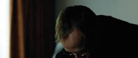
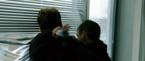
I think the upsetting qualities of the visuals in The Bourne Ultimatum derive principally from the particular way the handheld camera is used. Several of Ebert’s writers complain that the camerawork made them nauseated, and there seems little doubt that the shots are bouncier and jerkier than in much handheld work. Adding to the effect is the fact that Greengrass often doesn’t try to center or contain the main action. Sometimes, as in a fight scene, the camera is just too close to the action to show everything, so it tries to grab what it can. At other times Greengrass pans away from the subject, or shoves it to the edge of the 2.40:1 frame. In the standard technique of over-the-shoulder reverse angles, we see one character’s shoulders in the foreground and the primary character’s face clearly. Greengrass likes to let a neck or shoulder overwhelm the composition as a dark mass, so that only a bit of the face, perhaps even just a single eye, is tucked into a corner of the shot. This visual idea was already on offer in The Bourne Supremacy.


In The Way Hollywood Tells It, I described contemporary films as employing “intensified continuity,” an amplification and exaggeration of tradition methods of staging, shooting, and cutting. (I explain a little about it in this blog entry.) What Greengrass has done is to roughen up intensified continuity, making its conventions a little less easy to take in. Normally, for instance, rack-focus smoothly guides our attention from one plane to another. But in The Bourne Ultimatum, when Jason bursts into a corridor close to the camera, the camera tries but fails to rack focus on his pursuer darting off in the distance. The man never comes into sharp focus. Likewise, most directors fill their scenes with close-ups, and so does Greengrass, but he lets the main figure bounce around the frame or go blurry or slip briefly out of view.
Essentially, intensified continuity is about using brief shots to maintain the audience’s interest but also making each shot yield a single point, a bit of information. Got it? On to the next shot. Greengrass’s camera technique makes the shot’s point a little harder to get at first sight. Instead of a glance, he gives us a glimpse.
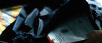
Although this strategy is more aggressive in this third Bourne installment, we can find it as well in Supremacy. An agent pulls a document out of a carryon bag, and for an instant we can see the government seal. In the next shot the agent bobs in and out of the frame, as if the camera can’t anticipate his next move.
Later in Supremacy, the camera jerks across a computer display and suddenly focuses itself, evoking the jumpy saccadic flicks with which we scan our world.


Greengrass claims that his creative choices were influenced by the cinema-vérité documentary school and cites as well The Battle of Algiers, which helped popularize the handheld look in the 1960s. At other times he says that the style is subjective: “Your p.o.v. is limited to the eye of the character, instead of the camera being a godlike instrument choreographed to be in the right place at the right time.” But our point of view isn’t confined to what Bourne or anybody else sees and knows. The whole movie relies on crosscutting to create an omniscient awareness of various CIA maneuvers to trap him. And if Bourne saw his enemies in the flashes we get, he couldn’t wreck them so thoroughly.
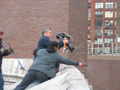
The Bourne Ultimatum belongs to a trend of rough-edged stylization sometimes called run-and-gun. The film has been described as bare-bones but it’s actually quite flashy. All the crashing zooms (accompanied by whams on the soundtrack), jittery shots, drifting framings, uncompleted pans, freeze-frame flashbacks, and other extroverted devices call attention to themselves. You can find earlier instances in Oliver Stone’s Natural Born Killers and U-Turn, along with stretches in Michael Mann’s latest films. In milder form you find the style on display in TV crime shows, as well as in the notorious docudrama The Road to 9/11.
The most extreme practitioner of this style is probably Tony Scott. From Spy Game through Man on Fire, Domino, and Déjà vu, he has taken this aesthetic in delirious directions. His framing is often restless, as if groping for the right composition. In this shot from Domino, the camera starts a bit too far to the right, shifts left to frame Frances a little better, zooms back hesitantly, then finally stabilizes itself as he grins at the Motor Vehicles worker.

A single shot may give us not only changes of focus but jumps in exposure, lighting, and color; sometimes it’s hard to say whether we have one shot or several. The result is a series of visual jolts, as in Man on Fire.


Scott, trained as a painter, pushes toward a mannered, decorative abstraction, aided by long-lens compositions and a burning, high-contrast palette. For Supremacy, Greengrass adopted a toned-down version of Scott’s approach, while in Ultimatum, he favors drab surroundings and steely colors. Still, both men’s approaches to run-and-gun are frankly artificial, and both remain within the premises of intensified continuity. Of the Waterloo Station sequence Greengrass says: “It has got a sense of energy.”
The Bourne coverup
There’s one more function of Bourne’s style I want to consider. In an earlier post, I quoted Hong Kong cinematographers’ saying about the shaky camera. The handheld camera covers three mistakes: Bad acting, bad set design, and bad directing. It’s worth considering, as some of Ebert’s correspondents do, what Greengrass’s style may serve to camouflage. One suggests that because the cutting doesn’t let the viewer reconstruct the fights blow by blow, anybody can seem to be a superhero if the filming is flurried enough.
Just as important, the director who is just (apparently) snatching shots doesn’t have to worry about building up performances slowly; s/he can simply give us the most minimal, stereotyped signals in facial close-ups. Lengthier shots let the actor develop the character’s reactions in detail, and force us to follow them. Classic studio cinema, with its more distant framings and longer takes, lets you follow the evolution of a feeling or idea through the actor’s blocking and behavior. The villain in the average Charlie Chan movie displays more psychological continuity than the nasty agents in Bourne Ultimatum.
Moreover, run-and-gun technique doesn’t demand that you develop an ongoing sense of the figures within a spatial whole. The bodies, fragmented and smeared across the frame, don’t dwell within these locales. They exist in an architectural vacuum. In United 93, the technique could work because we’re all minimally familiar with the geography of a passenger jet. But in The Bourne Ultimatum, could anybody reconstruct any of these stations, streets, or apartment blocks on the strength of what we see? Of course, some will say, that’s the point. Jason himself is dizzyingly preoccupied by the immediacy of the action, and so are we. Yet Jason must know the layout in detail, if he’s able to pursue others and escape so efficiently. Moreover, we can justify any fuzziness in any piece of storytelling as reflecting a confused protagonist. This rationale puts us close to Poe’s suggestion that we shouldn’t confuse obscurity of expression with the expression of obscurity.
The run-and-gun style is indeed visceral, but let’s be aware of how it achieves its impact. I’ve argued in Planet Hong Kong that the clean, hard-edged technique of classic Hong Kong films allows extravagant action to affect us viscerally; by following the action effortlessly, we can feel its bodily impact. We’re shown bodies in sleek, efficient movement that gets amplified by cogent framing and smooth matches on action. But in the fancy run-and-gun style, cinematography and sound do most of the work. Instead of arousing us through kinetic figures, the film makes bouncy and blurry movement do the job. Rather than exciting us by what we see, Greengrass tries to arouse us by how he shows it. The resulting visual texture is so of a piece, so persistently hammering, that to give it flow and high points, Greengrass must rely on sound effects and music. As a friend points out, we understand that Bourne is wielding a razor at one point chiefly because we hear its whoosh.
What else does the handheld style conceal? Since the 1980s, in many action pictures the cutting has become so fast, and often capricious, that we can’t clearly see the physical action that’s being executed. That complaint is justified in Bourne Ultimatum, certainly, but here the style also seeks to make the stunts seem less preposterous. Instead of showing cars crashing and flipping balletically, Greengrass barely lets us see the crash. All the conventions of the action film are smudged in Bourne Identity, as if a sketchy rendering made them seem less outlandish. In a Hong Kong film, Bourne in striding flight, grabbing objects to use as weapons without missing a beat, would be presented crisply, showing him executing feats of resourceful grace. But many viewers seem to find this sort of choreography outlandish or cartoony. So when Bourne plucks up pieces of laundry and wraps them around his hands to protect them when he vaults a glass-strewn wall, Greengrass’s shot-snatching conceals the flamboyance of the stunt.
Finally, I’d argue that the style camouflages something else: plot problems. I’m not talking about the hero’s indestructibility, which is a given in this genre. John McClane in Die Hard 4.0 survives about as much mayhem as does Jason Bourne. But there are some howlers here that, because of the rapid pace and the just-barely-visible action, are somewhat muffled. By whisking the action past us and forcing us to keep up, the film doesn’t allow us to dwell on its holes and thin patches.
The plot, praised by so many, is actually a very simple one: Find Guy A, but when he’s killed, locate the clues that will lead you to Guy B, etc. until you get to Mr. Big. The mechanics of how the clues are pursued remain obscure. (Skip ahead to the next paragraph if you haven’t seen the movie.) Why would an all-powerful CIA operation house its key players in offices that can easily be watched from a neighboring building? How does Bourne get into Noah Vosen’s office, past all the security? Is the revelation of Bourne’s identity and his training regimen really much of a surprise? The wrapup, showing the bad guys exposed by the press and punished by government investigation, seemed risible, not only because of the current inability of either press or congress to right any wrongs, but because I had no idea to whom Pamela Landy has faxed the incriminating documents. “You can’t make stuff like this up,” remarks one sinister agency boss, but many, many films have done so.
I’m not against handheld styles as such, and even Late Tony Scott Rococo can have its virtues. Yet I find the style as practiced by Greengrass to be pretty incoherent and nowhere near as engaging as most critics claim. It just seems too easy. But then, I think that certain standards of filmmaking craftsmanship have pretty much vanished, and the run-and-gun trend is one more symptom of that. Given the praise heaped on The Bourne Ultimatum, however, things are unlikely to change. Next time you head to the movies, you might want to bring your Dramamine.
Thanks to Vance Kepley and Jeff Smith for engaging discussion about The Bourne Ultimatum.
The Bourne Supremacy.
PS: I’ve done a followup entry on the Bourne series, elaborating on these points and adding some new ones.
PPS: One more, I hope final, cluster of comments on Ultimatum, this time on the plotting.
PPPS 5 January 2008: Spielberg weighs in on the Bourne style; thanks to Fred Holliday and Brad Schauer for calling my attention to this.
PPPPS 22 September 2008: This blog post and its mates have stimulated critical discussion in Spain. Manuel Garin has a lengthy piece on the Unsteadicam style in Contrapicado.
Bergman, Antonioni, and the stubborn stylists
DB here:
Jonathan Rosenbaum has created quite a stir. His New York Times Op-Ed piece, “Scenes from an Overrated Career,” offers a fairly harsh judgment on the films of Ingmar Bergman. In one sense the timing was awkward; the poor man had just died. But the article wouldn’t have attracted much attention if Rosenbaum had waited a few months, so if creating a cause célèbre was his goal, he chose the right moment.
Timing aside, there wasn’t much in the piece that hasn’t been said by certain cadres of cinephiles for decades. Back in the 1960s, people called Bergman “theatrical,” “uncinematic,” pretentious, and intellectually shallow. He was even accused of hypocrisy. His spiritual, philosophical films always seemed to depend on a surprising number of couplings, killings, rapes, and gorgeous ladies, often naked. Rosenbaum contrasts Bergman with Bresson and Dreyer, more austere religious filmmakers as well as great formal innovators, and this gambit too is familiar from late-night film-society disputes. Jonathan’s case is news in the good, grey Times, but it’s an old story among his (my) generation.
I think that this generational antipathy has many sources. While Bergman had considerable academic cachet, this may have hurt him with smart-alecks like us. Cinephile priests and professors told us that Bergman was a great mind, but we suspected them of snobbery, for they often disdained even foreign filmmakers who dabbled in popular genres. Kurosawa was admired for Rashomon and I Live in Fear rather than for Seven Samurai and Yojimbo. And many of Bergman’s intellectual fans despised the classic tradition of American studio film. Hitchcock had not yet convinced literature profs of his excellence, and Ford was a gnarled geezer who made Westerns. Bergman and his acolytes seemed just too square. Our money was on Godard, especially after Susan Sontag’s magisterial essay on him.
Furthermore, some critics were on our side. Pauline Kael, with her nose for elitism, mocked ambitious European experiments like Marienbad. Andrew Sarris, who had a huge influence on our generation, initially registered respect for the arthouse kings. They proved that an artist could put a personal vision on film, thus buttressing the auteur approach to criticism. But Sarris retreated fairly fast. He was more unflaggingly enthusiastic about American popular cinema, and by contrast he often characterized the new Europeans as gloomy, middlebrow, and narcissistic. (He did, after all, coin the phrase “Antonionennui.”) Sarris made it possible for us to argue that, say, Meet Me in St. Louis was a better film than L’Eclisse or Winter Light. (1)
Of course I’m generalizing; no Boomer’s experience was identical with any other’s. Speaking just for myself, I didn’t have a deep love for Bergman, and I still don’t. I was drawn to his early idylls (Monika, Summer Interlude) and impressed but chilled by the official classics (Smiles of a Summer Night, The Seventh Seal, The Virgin Spring). Persona, I admit, was a punch in the face. Seeing it in its New York opening, I felt that all of modern cinema was condensed into a mere eighty minutes. But no Bergman film afterward measured up to that for me, and after The Serpent’s Egg I just lost interest, catching up with Cries and Whispers, Scenes from a Marriage, Fanny and Alexander, and a very few others over the later decades.
We can talk tastes forever. Maybe you think Bergman is great, or the greatest, or obscenely overrated. I think that there’s something more general and intriguing going on beyond our tastes. What makes this hard to see is that the venues of popular journalism don’t allow us to explore some of the ideas and questions raised by our value judgments.
Critical semaphore
Take some of Rosenbaum’s criticisms, which Roger Ebert has persuasively answered. I’d add that Jonathan is sometimes applying criteria to Bergman that he wouldn’t apply to directors he admires. Bergman isn’t taught frequently in film courses? So what? Neither is Straub/Huillet or Rivette or Bela Tarr. Bergman is theatrical? So too are Rivette and Dreyer, both of whom Rosenbaum has written about sympathetically.
More importantly, Jonathan’s critique is so glancing and elliptical that we can scarcely judge it as right or wrong. A few instances:
*Bergman’s movies aren’t “filmic expressions.” There’s no opportunity in an Op-Ed piece for Jonathan to explain what his conception of filmic expression is. Is he reviving the old idea of cinematic specificity—a kind of essence of cinema that good movies manifest? As opposed to theatrical cinema? I’ve argued elsewhere on this site that we should probably be pluralistic about all the possibilities of the medium.
*Bergman was reluctant to challenge “conventional film-going habits.” Why is that bad? Why is challenging them good? No time to explain, must move on….
*Bergman didn’t follow Dreyer in experimenting with space, or Bresson in experimenting with performance. Not more than .0001 % of Times readers have the faintest idea what Jonathan is talking about here. He would need to explain what he takes to be Dreyer’s experiments with space and Bresson’s experiments with performance.
In his reply to Roger Ebert, Jonathan has kindly referenced a book of mine, where I make the case that Dreyer experimented with cinematic space (and time). Right: I wrote a book. It takes a book to make such a case. It would take a book to explain and back up in an intellectually satisfying way the charges that Jonathan makes.
Popular journalism doesn’t allow you to cite sources, counterpose arguments, develop subtle cases. No time! No space! No room for specialized explanations that might mystify ordinary readers! So when the critic proposes a controversial idea, he has to be brief, blunt, and absolute. If pressed, and still under the pressure of time and column inches, he will wave us toward other writers, appeal to intuition and authority, say that a broadside is really just aimed to get us thinking and talking. But what have we gained by sprays of soundbites? Provocations are always welcome, but if they really aim to change our thinking, somebody has to work them through.
I’ve suggested elsewhere that too much film writing, on paper and on the Net, favors opinion over information and ideas. Opinions, which can be stated in a clever turn of phrase, suit the constraints of publication. Amassing facts and exploring ideas in a responsible way—making distinctions, checking counterexamples, anticipating objections, nuancing broad statements—takes more time. Academics are sometimes mocked for their show-all-your-work tendencies, and I grant that this can be tedious. But we’re just trying to get it right, and that can’t be done quickly.
Now you know why our blog entries are so damn long.
This one is no exception.
Too often film talk slides from being film comment to film chat to film chatter. Even our best critics, among whom Rosenbaum must be counted, make use of a kind of rapid semaphore, signaling to the already converted. Evidently his ideal reader agrees that good cinema is challenging and experimental, directing actresses is a minor talent, and being admired by upscale Manhattanites is a sign of a sellout. Readers will self-select; those who have congruent tastes will pick up the signals. But these beliefs aren’t really knowledge. They’re just, when you get right down to it, attitudes.
I’ll try to explore just one of the issues Jonathan raises but can’t pursue: the question of how stylistically innovative Bergman was. Of course, I can’t write a book here either. I offer what follows as simply the start of what could be an interesting research project.
One stylistic arc
The rise of European arthouse auteurs in film culture of the 1950s and 1960s put the question of personal style on the agenda, but back then we didn’t have many tools for analyzing stylistic differences among directors. We didn’t know much about the local histories of those imported films; as Sarris recently pointed out, L’Avventura was Antonioni’s sixth feature but was his first film released in the US. Moreover, we didn’t know much about the norms of ordinary commercial filmmaking, in the US or elsewhere. (2) Today we’re in a better position to characterize what went on. (3)
In most countries, quality cinema of the late 1940s relied on variations of the Hollywood approach to staging, shooting, and cutting that had emerged in the silent era. Directors moved their performers around the set fairly fluidly and used editing to enlarge and stress aspects of the action. You can see a straightforward example of this approach on an earlier entry on this blogsite.
Many directors of the period built upon this default by creating deep space in staging and framing. Using wide-angle lenses, directors could allow actors to come quite close to the camera, sometimes with their heads looming in the foreground, while other figures could be placed far in the distance. Several planes of action could be more or less in focus. Here’s a straightforward example from William Wyler’s The Little Foxes.
We find directors exploiting this approach not only in the United States but in Eastern and Western Europe, Scandinavia, the Soviet Union, Japan, Mexico, and South America. Here’s an instance from the French film Justice est faite (1950).
Why did this approach emerge in so many countries at the same time? We don’t really know. It wasn’t simply the influence of Citizen Kane, as we might think. The Stalinist cinema had developed deep-space shooting in the 1930s, and we can find it elsewhere. Probably Hollywood’s 1940s films helped spread the style, but there are likely to be local causes in various countries too.
In any event, during the 1950s two technological changes posed problems for this style. One was the greater use of color filming, which renders depth of field much more difficult. The other innovation was anamorphic widescreen, a technology seen in CinemaScope and Panavision. These systems also had trouble maintaining focus in many planes when the foreground was close to the camera. The flagrant depth compositions we find in black-and-white ‘flat’ films were quite difficult to replicate in color and anamorphic widescreen.
Through the 1960s, the deep-focus style became a minor option and directors found other alternatives to presenting character interactions. The most basic one was simply to station the camera at a middle distance and create a more porous and open staging, with fewer planes of action and simple panning movements to follow characters.
One new approach relied not on wide-angle lenses but on lenses of long focal length. Instead of staging scenes in depth, putting the camera close to a foreground figure, filmmakers began keeping the camera back a fair distance and using long lenses to enlarge the action. This accompanied a trend toward greater location shooting; it’s easier to follow actors on a street or highway if the camera shoots with a telephoto lens. The long lens also reduces the volumes of each plane, so that figures tend to look like cutouts (4). This lens facilitated the development of those perpendicular images I’ve called, in some writing and on this blog, planimetric shots.
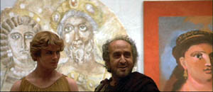
What fascinates me about this general pattern of stylistic change in the US is how many of the Euro auteurs go along with it. Take Fellini, who shifts from the bold depth compositions of I Vitelloni to the fresco-like flatness of Satyricon.
Likewise, Luchino Visconti’s early black-and-white work affords textbook examples of deep-focus cinematography, but in the 1960s he embraced the telephoto look, heightened by what we can call the pan-and-zoom tactic. In Death in Venice, the camera often scans a scene, searching out one player to follow then zooming back to reframe the figure in relation to others. One shot starts with the boy Tadzio, pans right across the hotel salon, to end on von Aschenbach, staring at the boy, and then zooming back to take in the larger scene.
Probably Rossellini’s 1960s films, such as Viva l’Italia! and Rise to Power of Louis XIV, were key influences on this look.
Leaving Europe, there’s Kurosawa, who was the first major director I know of to build zoom and telephoto lenses into his style. Satayajit Ray followed much the same trajectory from the Apu trilogy’s flamboyant depth to the pan-and-zoom close-ups of The Home and the World. Not every filmmaker took the long-lens option, but as it became commonplace in the 1960s, many major directors tried it.
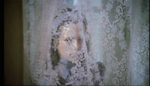
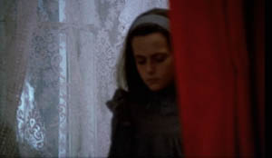
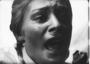
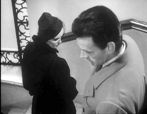
What about Bergman? It seems that in most respects he went along with the general trends. We find deeply piled-up bodies early in his career (e.g., Port of Call, below) and through the 1950s and early 1960s (The Face, below).
Like his peers, with color and widescreen he shifted toward more open staging, long lenses, and zooms. For example, one telephoto shot of Cries and Whispers zooms back as the little girl emerges, zig-zagging, from behind the lace curtain.
We might conclude that Bergman mostly worked with the received forms of his day. At the level of shot design, The Face might have been shot by the Sidney Lumet of Fail-Safe. But Bergman did innovate somewhat, I think. Most obviously, he sometimes had recourse to the suffocating frontal close-up, as in a childbirth scene from Brink of Life.
He develops this visual idea by creating heads floating unanchored in both foreground and background. Here’s a famous image from Persona.
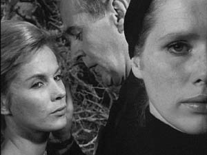
Pace Rosenbaum, I’d say that this sequence, with Elisabeth Vogler apparently quite oblivious to her husband’s mating with Alma, definitely “challenges conventional film-going habits”—or at least conventional ways we read a scene. It seems to combine the deep-space, big-foreground scheme of the 1940s with the tight close-ups of Bergman’s early work, and instead of specifying space it undermines it. We have to ask if what happens in the background is Elisabeth’s hallucination.
My case is very schematic, and we would need to study Bergman film by film and scene by scene to confirm that he stuck to the broad norms of his time. The norms themselves also deserve deeper probing than I’ve given them. (5)
But let’s push a bit further and examine Antonioni, that perpetual foil to Bergman. Broadly speaking, he passed through the same arc, from deep-focus compositions in the 1950s and early 1960s to telephoto flatness in his color work. Yet there are some important differences.
In the 1950s, unlike Bergman, Antonioni employed quite intricate staging, sustained by long takes. He usually didn’t opt for big foregrounds, favoring more distant framings and sidelong camera movements. The most famous instance is the startling 360-degree long take on the bridge in his first feature, Story of a Love Affair, but Le Amiche is also full of intricate staging in mid-ground depth. One scene shows fashion models bustling around after a successful show, congratulating the shop’s owner Clelia. She opens a card from her lover, is distracted by the arrival of her friends coming to congratulate her, and goes off with them. One model darts diagonally forward to investigate the message. All of this is handled in a single graceful take.
Antonioni relies on the fluid staging techniques developed in the early sound era and taken in diverse directions by Renoir, Ophuls, Preminger, Mizoguchi, and other directors of the 1930s and 1940s. Often, however, Antonioni’s characters move rather slowly and hold themselves in place, and as a result the overall spatial dynamic unfolds in marked phases. (6)
In the trilogy starting with L’Avventura, Antonioni relies on shorter takes and less florid camera movement. Now he emphasizes landscape and architecture so as to diminish the characters. If the expressionist side of Bergman plays up the psychological implications of the drama, the more austere Antonioni plays things down, “dedramatizing” his scenes by keeping the camera back, turning the figures away from us, and reminding us of the milieu. (You see the Antonioni influence on similar strategies in the work of Edward Yang, as I discussed recently on this blog.)
Once color came along, Antonioni changed his style, moving toward less dense staging and at times almost casual framing (as in The Passenger). He also had recourse to the telephoto technique, but I’d argue he brought something new to it. With Red Desert he accepted the abstraction inherent in the long lens and combined that with color design to create a pure pictorialism.
Ironically, Red Desert may have made Antonioni another sort of ‘expressionist’ than Bergman. The stylized palette of the film encourages us to ask if the industrial landscape is really so smeared and bleached out, or if we’re seeing it as Giuliana does. The same sort of painterly abstraction can be found in Zabriskie Point. In one scene, a pan over the travel decals on a family’s car window treats the boy inside as no more than another thin slice of space. Other scenes turn campus policemen into figures in grids.
You might even argue that the pan-and-zoom style gets a kind of meta-treatment in the climactic shot of The Passenger. There in a grandiose technical gesture Antonioni’s concern for architecture, his refusal to underscore a melodramatic plot twist, and his love of camera movement blend with the technology of the zoom. At the time, several of us (maybe Jonathan too) saw this shot as a response to Michael Snow’s Wavelength, relayed through the sensibility of Passenger screenwriter and avant-garde filmmaker Peter Wollen. Now it looks to me like a natural response of a very self-conscious artist to a stylistic trend of the moment.
A bestiary of stylists
To get crude and peremptory: Let’s say that once a director has reached maturity and become a confident artisan, several choices offer themselves. The filmmaker can be a flexible stylist, a stubborn stylist, or a polystylist (sorry for the awkward term).
A flexible stylist adapts to reigning norms. Bergman could be an aggressive-deep-focus director, then a pan-and-zoom director. Both approaches to staging and shooting preserved the expressive dimensions that mattered most to him: performance (chiefly face and voice), Ibsenesque bourgeois tragedy, Strindbergian play with dream and dissolution of the ego, and other elements.
Most of the major 1960s arthouse directors, from Truffaut and Wajda to Pasolini and Demy, were flexible stylists in this sense. So were a great many Hollywood and Japanese directors, such as Lubitsch and Kinoshita. Perhaps Ousmane Sembene, who also died recently, would be another instance. Buñuel becomes a fascinating case: He adopts the blandest, calmest version of each trend, creating a neutral technique, the better to shock us with what he shows.
A stubborn stylist pursues a signature style across the vagaries of fashion and technology. Dreyer from Vampyr onward does this; I argue in the book Jonathan cites that he seeks to “theatricalize” cinema in a way that goes beyond the norms of his moment. Perhaps Hitchcock and von Sternberg (at least in the 1920s and 1930s) fit in here as well. Bresson, Tati, and supremely Ozu were stubborn stylists. Give them a western or a porno to shoot, and they’d handle each the same way. (7)
This isn’t to argue that stubborn stylists never change or always do the same thing. Mizoguchi has a signature style and yet remains fairly pluralistic, at least at a scene-by-scene level. I think that the test comes in seeing how stubborn stylists persistently explore the constrained conditions they’ve set for themselves.
Signature styles help a filmmaker in the festival market, so we don’t lack for current examples of stubborn creators: Godard, Theo Angelopoulos, Hou Hsiao-hsien, Kitano Takeshi, Tsai Ming-liang, and Jia Zhang-ke. Granted, some of these may be rethinking their commitment to their stylistic premises.
A polystylist tries out different styles without much concern for what the reigning norms demand. Polystylistics holds a high place in modernist aesthetics. After the great triumvirate of Picasso, Joyce, and Stravinsky, with their bewildering arrays of periods and pastiches, the idea of the modernist as a virtuoso steeped in several styles became a powerful option. What’s been called postmodernism is no less favorable to polystylism; if you mix styles, you’ve presumably mastered them.
In cinema, some polystylists are just eclectic. Steven Soderbergh can give us the portentous pictorialism of The Underneath or Solaris, the grab-and-go look of Traffic, and the trim polish of Ocean’s 11. More deeply, there are directors like R. W. Fassbinder, Raoul Ruiz, and Oshima Nagisa who seem to pursue polystylistics on principle. It’s as if, rejecting the very idea of a signature style, they set themselves fresh, severe conditions for each project.
After The Boss of It All, we may want to count von Trier as a polystylist, not merely a director who changed his style from one phase of his career to another. Perhaps the best current example is Aleksandr Sokurov; who would dare predict what his next film will look like?
This whole entry is pretty sketchy, I grant you. The categories need further refining. I’ve ignored sound, which is very important. I’ve emphasized visual style, and just shooting and staging within that. (Nothing about lighting, cutting, etc.) So this is tentative—notes perhaps for a book-length argument. But I’ve made my point if you see that some ideas and some historical information can put intuitions about originality into a firmer framework.
And I’ve left the value judgments suspended. If you think originality trumps other criteria, then Bergman doesn’t probably come up as strong as Antonioni, let alone Bresson or Ozu or Dreyer. But if you can entertain the possibility that a great filmmaker can accept certain norms of his time, making those serve other channels of expression, then Bergman can’t automatically be faulted. At least thinking about him and his peers in the context of the history of film art gives us some data to ground our arguments. The world is more interesting and unpredictable than our opinions, especially those we formulated forty years ago.
(1) I actually hold this opinion.
(2) I assume that the arthouse auteurs were no less commercial filmmakers than their Hollywood counterparts. They were sustained by national film industries and supported by the international film trade. Eventually many were funded by Hollywood companies.
My friend and colleague Tino Balio is at work on a book tracing the role of overseas imports in the American film market of the 1940s-1960s, and it should be a real eye-opener to those who persist in counterposing art cinema and commercial production.
(3) Some of what follows is discussed in Part Four of Film History: An Introduction.
(4) I talk about both the deep-focus and long-lens tendencies in Chapter 6 of On the History of Film Style and Chapter 5 of Figures Traced in Light.
(5) For a wide-ranging account of art-cinema norms, see András Bálint Kovács’ forthcoming book, Screening Modernism: European Art Cinema, 1950-1980.
(6) I analyze this tendency, using other scenes from Le Amiche, in On the History of Film Style (pp. 235-236) and Figures Traced in Light (pp. 151-152).
(7) Suo Masayuki’s My Brother’s Wife: The Crazy Family is a softcore film made in a pastiche of Ozu’s style.
Story of a Love Affair (Cronaca di un amore).
PS, Sunday 12 August: Only a day later, new thoughts about something else I should have said about generational tastes. In the light of the Woody Allen eulogy that appears in the New York Times today, I think there’s more of a sub-generational split than I’d initially suspected. So here’s another gesture toward the sort of history of taste that Jonathan mentions.
Allen is in his seventies, a decade older than Jonathan Rosenbaum and me. He came of age in the affluent decade after the war. Allen saw Bergman films in the mid- to late 1950s, probably against the backdrop of Neorealism, British comedy, and French Cinema of Quality. In that context, Bergman’s movies looked pretty revolutionary.
But Jonathan and I came to maturity, if that’s the right word, in the mid-1960s. When I got to college in 1965, French directors (notably Resnais, Godard, Truffaut) and the Czechs, Hungarians, and others were getting established in US film culture. Bergman, Fellini, and Antonioni were already senior directors and soon they were starting to make what many of us perceived as career mistakes (Juliet of the Spirits, The Passion of Anna, even Blow-Up). Also, of course, concerns about their political alignments came more to the fore as the decade wore on. Many of my friends thought that The Battle of Algiers left all other films in the shade. These factors may have made the Boomers suspicious of “arty” foreign imports, of which Bergman’s work was a central instance. Interestingly, The Dove, a parody of The Seventh Seal and a film-society staple, came out in 1968, when Bergman may have been wearing out his welcome.
[Speaking of parodies, the SCTV skit, “Scenes from an Idiot’s Marriage”, in which Jerry Lewis (Martin Short) suffers the indignities of a cuckolded Bergman hero, is well worth checking out. The SCTV Fellini/ Antonioni parody, “Rome Italian Style,” is also pretty good, especially for its excellently awkward dubbing.]
Interestingly, Scorsese in age falls midway between Allen and us Boomers, and he contributes a Times tribute to Antonioni today. Maybe I have to split the generations even more: Bergman for 1955-1960, Antonioni for 1961-1965, Godard for 1965-1970? (Just kidding.) What strikes me are the differences in the essays. While Allen ranges widely, reports conversations, and praises Bergman in general terms, Scorsese’s piece evokes the texture of L’Avventura, suggesting how disturbing and demanding it was to watch. Maybe he inadvertently backs Jonathan’s claim that Bergman didn’t challenge his audience as much as he might have?
 I’m grateful as well to readers responding to my arguments. Michael Kerpan kindly spread the word about my post on imdb and the Criterion Forum. Kent Jones wrote to point out that any argument about Bergman’s influence has to take into account the high regard in which he’s been held in France, among both critics and filmmakers. Kent itemizes not only Godard, Truffaut, and Rivette but Assayas, Téchiné, and Desplechin. It’s a fair point. Antoine de Baecque anchors much of his magisterial history of Cahiers du Cinéma around the mesmerizing power of that busty still of Harriet Anderson, flaunted on a 1958 Cahiers cover and swiped by Antoine in The 400 Blows. In 2003, my old friend Jacques Aumont published a large critical study on Bergman. Cahiers’ next issue will be devoted to the director.
Speaking of French critics and directors, on imdb above Bertrand Tavernier points out that my memory failed. I did see Scenes from a Marriage and Cries and Whispers before The Serpent’s Egg, not after, as my post suggests.
My late Bergman viewing remains gappy. I still haven’t seen the long version of Fanny and Alexander, which everyone assures me is a masterpiece. Last spring, my friend and Bergman scholar Paisley Livingston showed me portions of the TV film The Last Gasp (1995). It’s about Georg af Klercker, the fine Swedish director of the 1910s. It was intriguing, but I was put off by Bergman’s inadequate pastiches of af Klercker’s remarkably poised and complex shots. Now that’s fussy taste, I admit.
Two Chinese men of the cinema
A Brighter Summer Day.
DB here:
This summer two major figures in Chinese filmmaking died. One was Edward Yang (Yang Dechang), one of Taiwan’s finest directors, who died on 29 June. But before I pay tribute to him, I want to acknowledge another figure who had a great impact on Asian cinema.
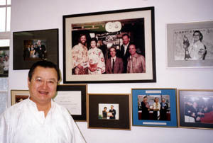
Charles Wang died on 6 July. Along with his brother Fred, Dr. Wang ran Salon Films, the major supplier of film equipment for Hong Kong and a principal one for East Asia and the Pacific Rim. Charles graduated with a degree in chemistry before inheriting the business from his father. As Hong Kong filmmaking grew in sophistication, Salon grew along with it. Most Hong Kong films bear the firm’s brand in their end credits.
 Since 1969 Salon has provided top-flight cameras, lenses, lighting gear and other technical support for both local and visiting productions, such as Mission: Impossible III‘s Shanghai shoot. An early triumph was winning the Panavision franchise for the region. The company even supplies trampolines and landing cushions for martial acrobatics, as this glimpse inside a Salon van shows.
When I interviewed Dr. Wang in 2003 he kindly gave me information about the company and the development of film technology in Hong Kong. He showed me his many awards and talked enthusiastically about Salon’s new efforts to assist mainland moviemaking. In recent years, Salon was investing in films such as Zhang Yimou’s Hero. Like most Hong Kong film people, he was very accessible and generous; he even gave me a lift back to my hotel. Charles Wang was a major force in the Hong Kong industry and will certainly be missed.
Laconic cuts and long takes
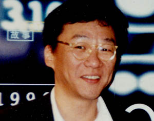
I met Edward Yang twice. First, at a Hong Kong Film Festival reception, we chatted about his film Mahjong (1996), which had screened. I got to know him a little better in fall of 1997, when we were both invited to the Kyoto Film Festival. We ate and watched films together, and we shared baby-boomer nostalgia; it turns out that he and I (and Hou Hsiao-hsien) were all born in the same year.
I found him friendly, thoughtful, and open to appreciating all film traditions. He spoke of enjoying Japanese swordplay movies in his youth, and he admired American films for their gripping stories. Still, his preference for ellipsis and understatement came through. When we met Kitano Takeshi for dinner, Edward praised a crisp transition in Sonatine: to show the gang going from Tokyo to Okinawa, Kitano simply gives us a quick pan of the sky accompanied by the sound of a jet plane.
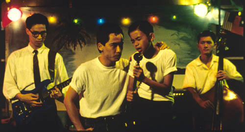
Yang was an accomplished cartoonist, and I thought that this background partly explained his early style, on display in the short film Desires (1982) and in the features That Day, on the Beach (1983), Taipei Story (1985), and The Terrorizers (1986). In these films Yang often breaks his scenes into simple but striking fragments. After the police shootout in The Terrorizers—one of the most enigmatic and elliptical opening sequences in modern cinema—the Eurasian girl staggers out to the street. Yang gives us her collapse in quite abstract, percussive images. Her foot hits the pavement. Cut. She takes a step and falls out of frame; the camera holds on the empty frame. Cut. She’s lying on the crosswalk. I imagine these as forceful, laconic comic-book panels.


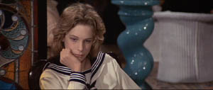
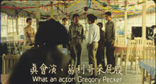
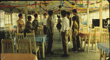
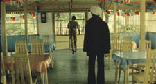
With A Brighter Summer Day (1991), my favorite of his works, Yang tells another gap-filled story but treats the scenes in long, distant, often decentered takes reminiscent of Hou. Now his frames are more dense with figures and furniture, and layers of action extend quite far back. In Figures Traced in Light, I devote a little—too little—analysis to one admirably staged passage. Another of my favorite scenes in A Brighter Summer Day shows the hero Xiao S’ir developing a romantic attachment to Ming, the girlfriend of the absent gang leader Honey. They sit in a brightly decorated café.
Suddenly Ming darts out of the shot, leaving Xiao S’ir and the other boys staring. From their point of view we see that Honey, dressed in a sailor suit, has returned and Ming has gone to meet him.
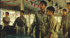
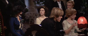
Yang cuts back to the boys as Honey’s gang starts to threaten Xiao S’ir. Abruptly, Ming runs into the shot, past the boys, down the long central aisle, and out of the café. (In a 35mm print you can see her pausing and lingering outdoors.)
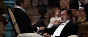
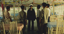
The group closes around Xiao S’ir; only Honey’s entry breaks the tension. He leads the boy into the depth of the shot, the camera following them.
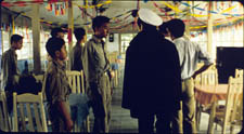
Honey warns Xiao S’ir off, and our hero goes outside, mimicking the path Ming had followed.
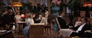
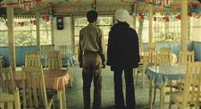
As Honey turns his attention to his gang and an upcoming skirmish with their rivals, he moves back down the aisle, the camera backing up. Once his business is done, Honey drifts back to the rear door.
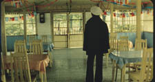
Honey pauses far from us, at the window. Yang cuts to show what he sees: Xiao S’ir, in flagrant violation of the warning, talking to Ming outside.
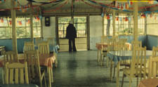
First we got Xiao S’ir’s point of view on Honey and Ming; now, in a reversal, we get Honey’s point of view on Ming and Xiao S’ir. In scenes like this, Yang merges his developing skills in long-take staging with cuts that develop not only the action but story parallels. Very distant framings, characters moving to the rear of the shot and turning their backs: Yang “dedramatizes” the scene. Further, by shifting point of view, he leaves us guessing about story information: What led to Ming’s running away from Honey? What are Xiao S’ir and Ming talking about now? Yang created a laconic visual approach that, I’d argue, invests fairly standard dramatic situations with a tantalizing uncertainty.
Yang’s best-known film is, of course, Yi Yi (2000), and it won him the wide appreciation that he had long deserved. It’s a warm and gentle work, less innovative than his earlier efforts but utterly typical of his vision of lives pervaded by melancholy routine and abrupt disappointment. People often remarked that the adolescent hero of A Brighter Summer Day resembled Edward himself. Perhaps too in Yi Yi Yang’s enigmatic pictorialism is echoed in the idea of a little boy who makes photographs of people’s heads seen from the rear. Like the director, the boy (named Yang-yang) displays a reticence that respects the mysteries of people’s private lives.
We already have a very useful guide to Yang’s work in one chapter of Emilie Yueh-Yu Yeh and Darrell William Davis’ book, Taiwan Film Directors. And Criterion’s Curtis Tsui has done a wonderful edition of Yi Yi, as Brian Hu shows here. We must hope that Criterion, Eureka, or another gilt-edged DVD publisher will soon bring us Yang’s other works in the pristine editions they deserve.
A Brighter Summer Day (1991)
In 1998, when we screened A Brighter Summer Day at our Cinémathèque, I wrote a program note. I reproduce it, lightly revised, as a quick pointer to one of the great films of the 1990s.
With Taipei Story (1985) and The Terrorizers (1986) Edward Yang established himself as one of the two leaders of the Taiwanese New Wave generation. At first it seemed that he and Hou Hsiao-hsien had agreed to a division of labor in their subjects and styles. Hou tended to concentrate on life in the countryside, or on rural characters transplanted, bewilderingly, to the modern city. Hou was also deeply interested in the history of Taiwan; his most acclaimed film, City of Sadness (1989), is a panoramic survey of Taiwanese society immediately after World War II. Hou’s tranquil style favored a contemplative mood and muted emotion.
Yang, by contrast, tended to focus on the lives of well-to-do urbanites in a contemporary setting, Taiwanese yuppies plagued by anomie and the desperation of love and work. His elliptical editing technique, reminiscent of Resnais, fractured time and space, while his compositions had a painterly starkness. The Terrorizers shuttles kaleidoscopically among characters at its beginning; their relations only gradually settle into intelligible patterns. Whereas Hou tended toward nuance and quiet drama, Yang was unafraid of shocking, inexplicable bursts of bloodshed.
Now it seems evident that this impression of a division of labor was somewhat schematic. Hou’s range of interests has widened, with new emphasis on the violent world of urban crime (Goodbye South Goodbye, 1996), and he has come to rely on quite disorienting transitions between past and present (Good Men, Good Women, 1995). Likewise, with A Brighter Summer Day Yang turned to history and cultivated a more sober style of filming, with lengthier shots and a fixed or barely moving camera. This approach throws down a challenge to the razzle-dazzle of contemporary popular cinema—from Hollywood, Hong Kong, and even the American “independents”—and invites us to scrutinize, moment by moment, the details of action unfolding on the screen.
Three years in the making, A Brighter Summer Day was a triumph of independent production. At a period when the Taiwanese film industry was virtually dead, Yang found money (mostly Japanese) to mount a project of remarkable ambition. Over half the cast and crew had never worked on a film before. At first released in a three-hour version, the film was re-released in a four-hour director’s cut, and this has become the standard version.
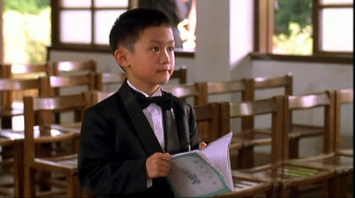
The historical event examined in A Brighter Summer Day took place in Taipei in the 1960s, when an adolescent boy about Yang’s age stabbed a young woman. At epic length Yang creates a web of circumstances around the event. He shows the interplay of traditional culture—filial duty, education as an ideal of social advancement—with popular culture, especially the rock n’ roll songs that recur throughout. Yang has said that Americans might not realize the shattering force of rock in other cultures: “These songs made us think of freedom.”
The film has over eighty speaking parts, most filled by nonactors, and it intertwines several characters’ destinies. On first viewing, the film can be somewhat bewildering to a non-Taiwanese audience, so a plot sketch may help. (Skip to the next paragraph if you don’t want to know the action in advance.) At the center is fourteen-year-old Xiao Si’r. He tries to be a dutiful student, but with his friends Cat and Airplane, he lives on the fringes of the Little Park gang of teenage thugs. When Xiao Si’r reports seeing a gang member with another boy’s girlfriend, he triggers a power struggle in the gang. As his friends fall by the wayside and rival gangs fight for control of local turf, Xiao S’ir becomes involved with Ming, a girl who’s attached to Honey, exiled leader of the Little Park gang. A major climax occurs during a gang rumble at a rock n’ roll concert. Interwoven with the juvenile intrigues are political matters; the police pursue and question Xiao S’ir’s father about his Communist friends. Xiao S’ir becomes friendly with Ma, a general’s son, before they start to compete for Ming’s favor. The rivalries build to a tense schoolroom confrontation and a tragic finale in the park. In the final scene and over the credits, a radio transmission broadcasts the names of the students who have passed their school entrance exams.
The plot is even more intricate than my bare-bones summary can indicate; I haven’t discussed the boys’ adventures in a film studio or Cat’s singing career or the slender line of action involving Xiao S’ir’s sister. The breadth of action is extraordinary, and a sense of the contradictory pulls of daily life emerges steadily. No less demanding is Yang’s style—scenes played in darkness, few close-ups, with medium-shots and long-shots keeping us at a distance from the characters. But the result is a dispassionate look at teenaged passions, a deromanticized treatment of young people growing up in a repressive milieu. A Brighter Summer Day (the English title comes from Elvis Presley’s “Are You Lonesome Tonight?”) is an elegy to the ideals and mistakes of youth, an analysis of the vanities of the male ego, and a view of a generation painfully facing the limitations of tradition, the constraints of political oppression, and the demands of the modern world.
Yi Yi.