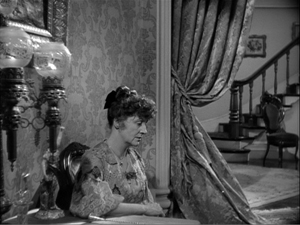
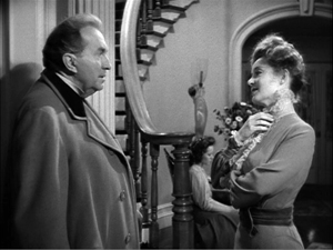
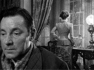
Archive for the 'Hollywood: Artistic traditions' Category
BIRDMAN: Following Riggan’s orders
DB here:
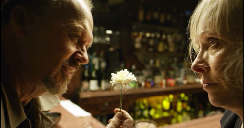
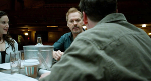
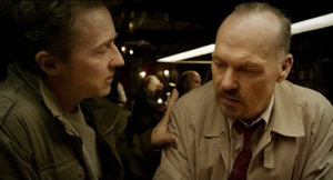
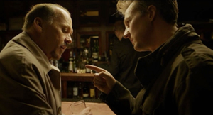
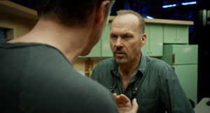
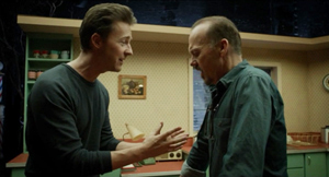
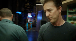
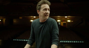
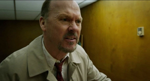
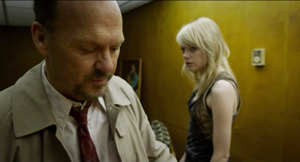
In a Broadway bar, the New York Times drama critic has just told Riggan Thomson that her review will destroy his play. Riggan snatches up her review of another production, reads it quickly, and declares it packed with meaningless “labels.”
There’s nothing in here about technique. There’s nothing in here about structure. Nothing here about intention.
Happy to oblige, Mr. Thomson. Spoilers ahead.
Structure: Icarus rises
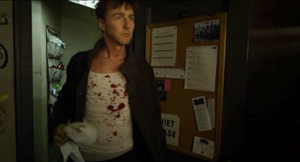
Birdman’s plot covers six days at a critical period in Riggan’s life. He’s an over-the-hill movie star identified with playing the crime-fighting superhero Birdman. Now he’s directing and starring in a play he has based on Raymond Carver’s short story “What We Talk about When We Talk about Love.” The film’s plot starts on the day before the first preview, when during a rehearsal Riggan hires the arrogant but talented actor Mike Shiner. Three nights of more or less bungled preview performances follow. The climax comes on opening night. In the play’s suicide scene, the despondent Riggan shoots off his nose. The Times critic publishes a rave review and Riggan, recovering in the hospital, finds that he has a Broadway triumph. His response to that, however, is rather ambivalent.
The film feels a little odd—“quirky” is the official term—but its blend of comedy and drama is constructed along familiar lines. The major characters have goals. Riggan wants to prove he can do something valuable, while paying homage to Raymond Carver, who encouraged him when he was starting out on the stage. Riggan is also disturbed by his failures as a father and husband; mounting this play about love would seem to be an act of penance. The protagonist’s search for authentic success and psychological stability might remind you of 8 ½ and All That Jazz, which also endow their protagonists with flamboyant fantasy lives.
The other characters state their goals in that confessional mode typical of melodrama. (Extra motivation: in the world of the theatre people are always ready to overshare.) Mike wants to express himself artistically and to make Riggan’s play conform to his standards of honest realism. Lesley, the female lead and Mike’s girlfriend, wants to make her Broadway debut a success. Jake, Riggan’s producer, is trying to pull the whole thing off. Riggan’s scowling daughter Sam is looking for a settled life after a stint in rehab, while Riggan’s girlfriend and second lead Laura wants to have a child. As the plot develops, in true Hollywood fashion, the major characters achieve their goals.
Structurally, the plot falls into the four parts that Kristin has found to be common in Hollywood features.
The Setup lays out the premises for the action—identifying characters, explaining their motives, and articulating their goals. It’s packed with exposition, ranging from the old standby in which a character announces what the other character knows (“You’re my attorney. You’re my producer. You’re my best friend”) to the meeting with the press in which Riggan’s past as a movie star and his hope for this production are redundantly laid out. The thirty-minute setup ends with the first botched preview and Riggan’s moment with his ex-wife Sylvia. He explains that the production means everything to his self-respect.
The Complicating Action, a counter-setup which redirects character goals, centers mostly on the effects that Mike has on the show. Since he drunkenly improvised during the first preview, Riggan realizes they have to come to some understanding. Mike’s onstage antics in the second preview threaten Lesley’s hopes for a breakout career. They break up, and Mike and Sam begin flirting. Mike also steals the spotlight in a newspaper feature about the production, even swiping Riggan’s story about Carver’s encouragement. More deeply, Mike’s rants against Hollywood make Riggan feel even more fearful that his play will be a disaster and he’ll be a laughingstock. All of these anxieties come to focus in an extended inner dialogue between Riggan and Birdman, who insists that he will fail and will have nothing left. Riggan is ready to cancel the show, but Jake pushes him forward.
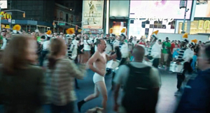
About an hour in, near the midpoint, we get the Development. This typically consists of a holding pattern. The plot doesn’t advance much. Riggan’s conflict with Mike deepens and his worries about the show mount. Lesley thanks him for giving her a chance, he reprimands himself again for being a bad dad to Sam, and Sam and Mike become a couple. A comic interlude, probably the film’s most widely-known scene, adds to Riggan’s debasement. He’s locked out of the theatre and, wearing just his underpants, races around the block through a Times Square crowd.
Reentering the theatre, he plays the crucial motel scene by lurching down the aisle and onto the stage, where he enacts the suicide. It’s also during the Development that Riggan meets Tabitha, the Times critic, and learns that, sight unseen, she plans to roast his play. The next morning his fantasies take over and, urged by Birdman, he enjoys a swooping and soaring flight around the theatre district.
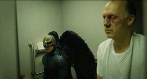
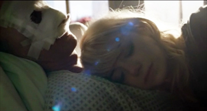
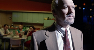
The fourth part, the Climax, begins with the intermission during the premiere. The audience drifts onto the sidewalk, praising the first act. Backstage Riggan tries to calm his nerves. After confessing to Sylvia that he once tried suicide, he takes the pistol on stage and prepares for the motel scene. On stage, as if succumbing to Birdman’s rhetoric, Riggan confesses, “I don’t exist.” He blasts off his nose. After a brief montage, the epilogue shows us the result. Recovering in the hospital, Riggan has a successful play, a sympathetic ex-wife, and a daughter reconciled to loving him. Even Birdman, sitting on the toilet, is for once silent.
But the very last moments are equivocal and for once you won’t get the spoiler from me. Suffice it to say the tag is ambiguous in magical-realist fashion.
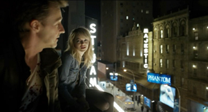
The plot helps us trace character change along classical lines. Key locales mark phases of the action. Sam and Mike meet on the rooftop twice, Riggan visits the bar twice, and Riggan’s ex Sylvia comes to his dressing room once in the Setup and once in the Climax. Whenever we return to the stage we see a version of either the apartment quarrel or the motel suicide. (We do glimpse, also twice, a hallucinatory scene of dancing reindeer, associated with Laura.) The main arenas are the stage and Riggan’s dressing room, which is the site of eight major scenes. The corridors snaking around the theatre serve as transitional spaces. As the film goes on, González Iñárritu tells us, the corridors get narrower and dingier. The fairly rigid time-structure of the plot finds a counterpart in a to-and-fro spatial pattern that measures Riggan’s jagged decline.
I’ve barely mentioned one of the crucial factors in the film’s narration. From the start Riggan hears the voice of Birdman admonishing him to return to superhero movies and give up this arty stuff. At certain points, it seems that Riggan gains some telekinetic powers, enabling him to smash flower pots, furniture, and light bulbs with the wave of a hand. These moments can be construed as subjective, in the sense that he “actually” destroyed them in a normal rage but felt that he was disposing of them through a superhero’s powers.
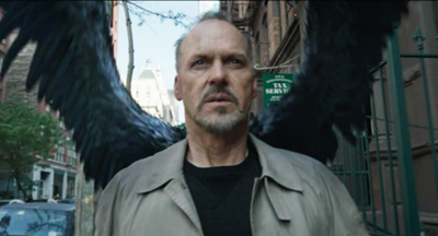
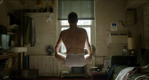
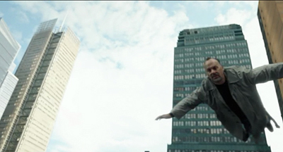
These powers are suggested at the start with an image of him levitating during meditation. They come to a kind of climax when he launches himself, a trench-coated Birdman, into the air, in a flight that serves as a counterweight to the humiliation of his naked canter through Times Square. Again, the film’s narration suggests that it’s all in his mind: after he lands and returns to the theatre, a cab driver pursues him demanding his fare.
The nagging voice of Birdman supports another kind of structure, a thematic one pitting East Coast and West Coast values. The material is traditional, being given sharp expression in The Band Wagon. The opposition goes back at least to Twentieth Century (1934, a Hollywood satire on Broadway pretensions) and Merton of the Movies (1922, a Broadway satire on Hollywood vulgarity). Of course the two artforms feed off one another. Twentieth Century started as a play, and Merton was made into a movie. The Producers began as a movie mocking Broadway, it became a hit Broadway musical, and the musical was made into another movie.
Birdman revisits these well-worn themes. Mike and Tabitha excoriate Riggan for his trashy films; only the theatre is real art. By contrast, Birdman’s croaking whispers remind Riggan that millions of ordinary folk like his blockbuster movies, while the theatre is for phonies. Mike’s narcissism and pretentiousness, the absurdity of his notion of realism, and the snobbishness of Tabitha all support Birdman’s point. As is common in such movies, the Eastern elite is shown as a pushover for superficial seriousness and ham acting. At the same time, Riggan sincerely wants to pay homage to the emotional core of Carver’s story; he may just not realize how bad the idea is.
The eternal Hollywood/Broadway opposition is sharpened in the light of new entertainment trends. Birdman tells Riggan that old superheroes—presumably those of the vintage of Michael Keaton in Batman (1989)—have it all over “posers” like Downey and the new generation. This motif refers, I think, to the modern trend toward troubled superheroes, set up in Burton’s Batman and carried to neurotic extremes in later comic-book sagas. But of course Riggan personifies the troubled superhero himself.
The sense of Riggan being old-school is reinforced by another familiar thematic duality, that of the young versus their elders. Riggan’s conflict with his daughter recycles the motif of a father so obsessed with work and seduced by false values that he ignores his daughter. (What is it with our filmmakers and this father/daughter thing? Is it just a way to pair older men with cute younger women in a safe way?) Sam berates him for being invisible in today’s world.
You hate bloggers, you mock Twitter, you don’t even have a Facebook page. You’re the one who doesn’t exist. . . . You’re not important. Get used to it.
The modern definition of entertainment includes the Internet, a realm that Riggan enters only by accident during his skivvy promenade. Sam’s denunciation reiterates Birdman’s insistence that Riggan doesn’t exist, except that she makes it worse: even if he returned to the Birdman role, no one would care.
The presentation of superheroics in Riggan’s fantasy mocks summer tentpoles, and would appear to express director Alejandro González Iñárritu’s distaste for action extravaganzas. But the movie is pretty hard on the theatre world too. It’s unfair for Mike and Tabitha to castigate Riggan now that playing a superhero has become artistically legitimate. The only performers Riggan can imagine replacing his wounded cast member are accomplished actors (Harrelson, Fassbender, Renner) who also star in franchise entertainments. The new entertainment economy shows that Riggan was a pioneer; now everybody wears a cape. But these stars routinely do serious films, even Broadway drama, along with tentpole movies. Why can’t Riggan cross over too?
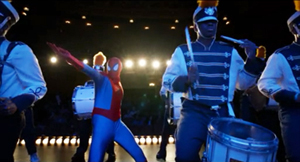
The disruption that arrives when popular entertainment invades the sacred space of the theatre finds a hallucinatory expression during the climactic montage. Now street drummers and superheroes crowd the stage of the St. James. What price Tabitha’s Art of the Theatre with Spidey drawing big crowds?
At the end, Riggan earns his accolades as an actor, but what he’s been after, hinted at in the references to Icarus and the liberation of his flight over the city, is validation of his worth. Once he realizes he is indeed loved (by ex-wife, daughter, best friend), he’s happy to pay the price of his nose. He gains a new superhero cowl, a gauze-bandage mask, and a surgical version of Birdman’s beak. And now that flight is no longer fleeing, he can consider all his options.
Technique; or, Intensified continuity without cutting
This plot could easily have been presented in a manner typical of today’s moviemaking, both indie and mainstream. That is, there might have been hundreds or probably thousands of shots. But Birdman, we’re told by people who should know better, consists of a single shot.
Any viewer can see that’s not true. Depending on how you count the opening quotation from Raymond Carver (is it part of the credits, or a separate shot?), there are sixteen discernible shots in the movie. Apart from the titles, the opening gives us three quick images—a seaside landscape with jellyfish, two shots of a plunging comet—and the final portion of the film provides a montage of nature scenes, interiors, and stage performers.
Admittedly, these shots account for little of the running time. The bulk of Birdman consists of what appears as a continuous shot running a little over 101 minutes. In production, several shots were merged seamlessly into the one that we perceive. The hospital epilogue consists of another long take, that lasting about eight minutes, and it too may have been assembled from separate takes.
Filmmakers confront a lot of options for handling long takes. The boldest, probably, is the static framing that doesn’t use camera movement. This option is employed in early cinema (viz. the Lumiêre films), in the tableau tradition I’ve gabbled about fairly often, and by some very rigorous directors like Hou Hsiao-hsien, Andy Warhol, and Jean-Marie Straub and Danièle Huillet. But most films using long takes rely upon camera movement.
In Birdman, unsurprisingly, the camera movements are typical of Hollywood’s modern intensified continuity style. For example, we often get the push-in on a character close-up.
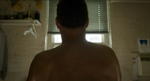
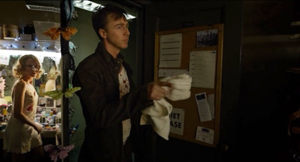
We get orthodox Steadicam movements trailing a character from behind or backing up as he or she strides toward us. This yields the familiar walk-and-talk.
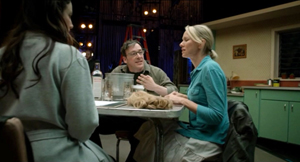
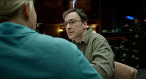
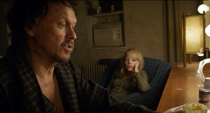
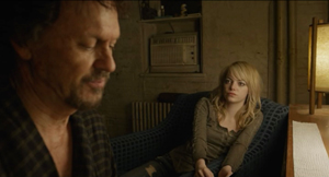
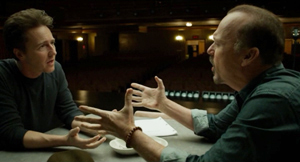
And we get the standard treatment of people around a table, with the camera circling it to pick up each one’s reaction at a critical point.
To a great extent, then, Birdman’s long-take style stitches together schemas that are well-established in contemporary Hollywood. Another current device is the occasional depth shot yielded by wide angle lenses. This technique was well-established in Hollywood in the 1940s, and today’s filmmakers rely on the same sort of tools that classic cinematographers used: strong lighting and wide-angle lenses.
The wide-angle lenses used on Birdman, only 14mm and 18mm, don’t always create wire-sharp focus in depth, but they provide enough visibility to create depth effects. Sometimes the rear plane is made sharper through racking focus.
More pervasively, in many long-take films, the camera movements replicate the patterns we find in an edited scene. Editing gives the camera a kind of ubiquity: it can go anywhere. Tethered to unfolding time, the long take sacrifices the ability to change views instantly. Yet in such films the action is staged and framed so that nothing important escapes our notice. The action gets spelled out as precisely as it would if the scene were edited.
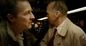
People have wondered a lot about the hidden edits that blend Birdman‘s long takes, but more important, I think, are the ways that the style adheres to standard editing patterns within its long takes. For example, the over-the-shoulder angles of shot/reverse-shot are mimicked by a camera arcing to favor first one character, then another.
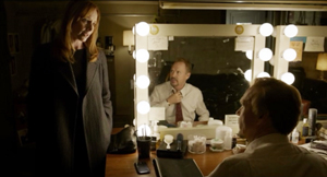
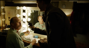
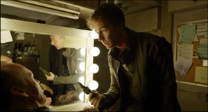
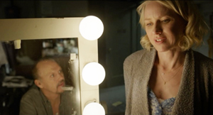
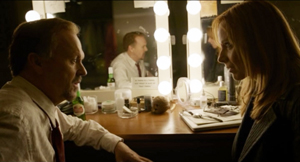
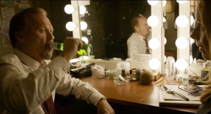
We can get shot/ reverse-shot effects via mirrors.
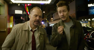
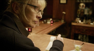
A pan can also approximate a point-of-view shot, as when Tabitha sees Riggan at the other end of the bar.
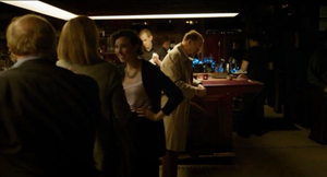
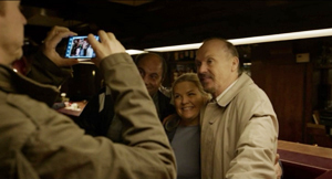
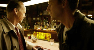
Throughout, the ensemble staging motivates shifts that would normally be covered by cuts. Mike and Riggan are seen from behind the bar, but when customers spot Riggan and ask Mike to take a picture, the camera sidles around the bar.
As Mike and Riggan turn back to the bar we are effectively 180-degrees opposite to the first setup.
With cutting, a similar shift would have been motivated by changing the axis of action through shifts in staging.
Long-take shooting can’t mimic editing perfectly. An unbroken shot doesn’t yield the instantaneous change of angle supplied by a cut. But the scene can’t be allowed to go dead while the camera operator shifts to a new spot. So the interval between one sustained angle and another has to be filled up by dialogue and physical action. One way to motivate the change of camera position is through the actors’ changing positions. In the bar scene, the fan’s photo op motivates the camera move.
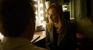
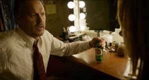
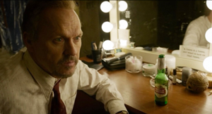
Alternatively, the actor’s gestures can provide some wedged-in bits. When Riggan and his wife have an intimate talk at his dressing table, he executes some business with a beer bottle that justifies shifting the angle to favor him.
Once we’re on him, he turns serious and the dialogue and facial expression motivate a push-in.
In normal shooting and cutting, the technique is fitted to the unfolding action. With a commitment to the long take, the director must fit the action to the technique. This is why, I think, González Iñárritu and his DP Emmanuel Lubezki spent months blocking the action on a sound stage and hiring stand-ins to move around the sets they’d built. Long before the actors came on the set, the filmmakers had mapped out many wedged-in bits of action they’d execute.
Giving up cutting forces other storytelling decisions. A narrative film typically distributes knowledge among its characters, and so the long-take camera must carve a path through the story world that either restricts or expands what we know. The mobile long take sticking with one character tends to restrict our knowledge. The long take that shifts among characters gives us a wider range of information. And whenever one character leaves another, there’s a forced choice: Which one does the narration follow? This is a choice in any storytelling medium, but in the long-take film the options are narrower: the issue is which one the camera will follow.
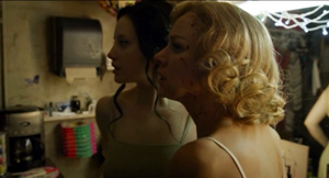
Birdman stays mostly with Riggan, but in the Complicating Action and Development sections, the narration needs to give us information on the doings of Mike, Lesley, and Sam. So, in another act of fitting and filling, the choreography must make those characters adjacent to some other action. The mazelike playing space of the film, in the bowels of the theatre, facilitates these comings and goings, so that we can drop one character and pick up another. When Lesley and Laura kiss, Mike interrupts them and Lesley hurls a hair dryer at him. He ducks out.
We could stay with Lesley and Laura, or follow Mike. We follow Mike so that we can shift to the new scene, with him visiting Riggan to complain about the pistol and then joining Sam on the roof. Nothing more of consequence will happen between Lesley and Laura; following Mike will lead us to the next story bit. The camera sees all that matters.
The long take’s muffled mimicry of orthodox editing pays some dividends. Arcs and short pans work when characters are close together, but if an encounter is played out in medium shot and one character pulls away, the camera is forced to pick a target. Whom will it follow? This effort becomes quite expressive when Mike is punching up Riggan’s table scene. Just as Mike takes over the rewriting of the lines, he hijacks the camera.
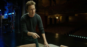
Things start with the usual circling shot.
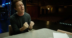
As Mike’s pitch builds, he breaks from the neutral two-shot and circles Riggan. The camera favors him as he walks off, returns to the table and exhorts Riggan to turn up the tension. (“Fuck me!”)
Now that the two are in proximity, we can see Riggan, infected by Mike’s energy, deliver a more spirited line reading.
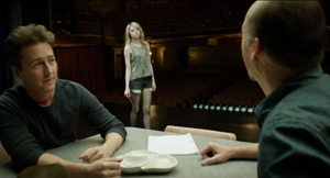
The scene ends with a segue to the next passage of walk-and-talk, as Sam comes onto the stage in depth.
In such scenes, the obstinate commitment to the long take itself motivates a dramatic effect. Later, Sam’s tirade about Riggan’s irrelevance gains force because the camera swings to her and stays fastened there.
In a cutting-based scene, there would have been the temptation to show Riggan’s reaction while Sam is unloading on him. True, we could get the same delayed revelation of his response by letting her tirade play out before cutting to him. But given our tacit adherence to the long take, and given the initial framing, we can’t see both of them. The refusal of editing itself justifies holding on her and suppressing his response. In the same way, showing her somewhat chastened pause and then following her walking past him motivates finally revealing his reaction.
A bonus: This scene’s concealment of the reverse angle—what is Sam seeing?—anticipates the film’s final image.
What about the long take’s effect on time? The plot’s tension relies upon the pressure of time. A great many actions are jammed into a short, continuous span. This is a common effect in films built around both a deadline and a confined space. Birdman‘s long take, with its rapid tracking movements and hurly-burly entrances and exits, enhances the pressure. But we need to note how much this result relies on another sort of “hidden editing.”
We often hear that the long take ties us to “real time.” And clock duration, with one minute onscreen equaling one in the story, is indeed a convenient, normative default. Yet suitably cued, a long take can halt duration in the present to give us flashbacks, as we’ve seen at least since Caravan (1934). Films by Angelopoulos, Jancsó, and others have shown that the long take can compress or expand story duration, and even replay events. The remarkable Iranian single-shot feature Fish and Cat of 2013 is full of ribbon-candy time wrinkles.
Once more, Birdman plays it straight. Like a normal movie, it uses sound bridges and night-to-day transitions to skip over stretches of story time. The film is a clear-cut example of the difference between story time (the years of Riggan’s career and the others’ lives), plot time (six days), and screen time (about 110 minutes). The central long take creates ellipses akin to traditional scenic links, and it does so in ways that are easy to grasp as we’re watching.
Intention: The expected virtues of ignorance
The crucial creative decision behind the film was the choice to shoot the extended take. González Iñárritu asserts that he didn’t model the technique on Rope but rather on the long takes of Max Ophuls. He also acknowledges that he was enraptured by Aleksandr Sokurov’s Russian Ark, a feature film that was indeed shot in one long take (thanks to video, but without CGI blending).
The status of the long take has changed across the history of film. In the first twenty years or so, it was more or less taken for granted as the most basic way to shoot a scene. Longer takes became rarer in most national cinemas during the 1920s, with editing becoming the preferred technique for building up action. Even complicated camera movements were consigned to comparatively brief shots.
The long take in today’s sense emerges most vividly in the early sound period, when directors began to use it creatively. During the 1930s, some long takes would be static or relatively so, in films like John Stahl’s Magnificent Obsession (1936) or musicals, especially those featuring Fred Astaire. Other long takes would make extensive use of camera movement. A great many early talkies begin with a fancy traveling shot before moving to more orthdox, editing-driven scenes. And the musicals of Busby Berkeley flaunted outrageous crane shots. In Japan, the USSR, France, Germany, and many countries, the sound cinema brought a renaissance of long takes, propelled by camera movement.
For the most part, this technical choice was felt to serve the story. You sustained the shot because the rhythm of performance benefited, or because you wanted to explore a space through a camera movement. In Dreyer’s Vampyr (1932), the tracking shots are designed to create uncertainties about where characters are when they go offscreen.
Behind the scenes, though, the filmmakers felt a certain pride in making a solid tracking or crane shot. A lengthy camera movement was a challenge because the cameras were big and bulky, they had to roll smoothly on tracks or other supports, lighting had to be controlled carefully, and equipment noise might be picked up.
Despite the difficulties, in the 1940s, some American directors seemed to have welcomed longer takes. The new interest probably owed something to new technology, such as the crab dolly’s ability to edge the camera through narrow spaces and turn in many directions. With complex camera movements easier, the takes could become longer. At a time when most films averaged eight to ten seconds per shot,Otto Preminger could make Daisy Kenyon (17 seconds), Centennial Summer (18 seconds), Laura (average 21 seconds), and Fallen Angel (33 seconds). There were as well Billy Wilder with Double Indemnity (14 seconds) and A Foreign Affair (16 seconds), Anthony Mann with Strange Impersonation (17 seconds) , and John Farrow with The Big Clock (20 seconds). This isn’t to mention the big long-take films of the period from The Lady in the Lake to Rope and Under Capricorn. The opening of Ride the Pink Horse contains a remarkable long-take tracking shot, and one shot in Welles’ Macbeth consumes a full camera reel.
It seems that for some directors sustaining the take was itself the main concern. The more complex the locale—a crowded room, a busy street, an overgrown landscape—the more that the sustained camera movement would be considered, at least by those in the know, as a difficult technical accomplishment.
The result was virtuosity, but with an alibi. Long takes are flashy. But…they can save money. (All those script pages covered fast, no need for editing.) They can be justified as realism. (The action can build over “real time.” Besides, don’t we see reality in a “continuous shot,” not cuts?) They can be motivated as subjective. (By staying with a character over a stretch of time, we become identified with him or her.) Regardless of these reasons, or excuses, there’s an undeniable bragadoccio associated with the protracted camera movement. Your peers in the industry will recognize what you’ve done, and cinephiles will applaud your bravado.
The Movie Brats seized on the virtuoso camera movement and long take as a mark of prowess. A new competition sprang up between Scorsese and DePalma, encompassing Raging Bull, Bonfire at the Vanities, Goodfellas, and Snake Eyes. Even a straight-to-video heist movie like Running Time (1997), choosing to hide its cuts in the Rope manner, has a bit of playground swagger. (Bruce Campbell is in it too.) No wonder that Christine Vachon remarks that shooting a whole scene in one is a “macho” choice.
It’s in this context that we can appraise González Iñárritu’s declared intentions. He was clearly drawn to the virtuosic side of the very long take, and his DP Emmanuel Lubezki had made the complex camera movement his signature with Children of Men and Gravity. After Snake Eyes showed that CGI could stitch together several long takes into a seamless whole, many directors saw that digital filmmaking could extend the shot beyond anything in analog cinematography. A new level of virtuosity was called for, not only the logistics of choreography but the skills of hiding the cuts. Do it right, you might even get tossed an Oscar or two.
The filmmakers justify Birdman‘s technique on familiar grounds. There’s realism:
We are trapped in continuous time. It’s only going in one direction. . . .This continuous shot [yields] an experience closer to what our real lives are like. (González Iñárritu)
There’s subjectivity.
I thought [the continuous take] would serve the dramatic tension and put the audience in this guy’s shoes in a radical way. (Lubezki)
To really not only understand and observe, but to feel, we have to be inside him. [The one shot] was the only way to do that. (González Iñárritu)
Is it showoffish? No, it serves the story.
All the choices we made were serving the purpose and dramatic tension of the characters, not about “Look how impressive we can be.” All the shots were meant to serve the narrative of the film. (González Iñárritu)
But there’s still virtuosity—art conceived as a triumph over self-imposed obstacles.
It was risky! Every scene—good or bad—I had to leave in. It was an endless strand of spaghetti that could choke me! Every note had to be perfect. (González Iñárritu)
I’ve never cared much for González Iñárritu’s films; they always seem too close to their influences. (My remarks on Babel are here.) Still, Birdman seems to me a fascinating example of how traditions can be revisited, or at least repackaged. I can also appreciate the skill with which the whole affair has been brought off. But I also wish that critics and mainstream filmmakers would be more accurate and comprehensive when talking about film form and style. Birdman isn’t a single-shot movie, and to insist on that point isn’t just pedantry. Part of the critic’s job is to look at what’s there, and a full account of the movie (which mine isn’t) would need to reckon in the other shots the film presents.
Critics should acknowledge that the long take has other expressive possibilities, some of them impossible to reduce to the patterns of continuity editing. To go back to Hou Hsiao-hsien, Flowers of Shanghai consists of thirty-five shots, nearly all made with a gently shifting camera. But Hou’s mobile long takes retain the intricacy of his static shots in earlier films. The camera may circle the action, but at each moment it’s not only following one character’s movement but drawing into view other movements, greater and lesser, nearer and farther off–the whole thing building up gestures and dialogue and facial reactions, as if by brush strokes, into a rich sense of characters coexisting in a story world and a social system. The result is a gradation of emphasis, to use Charles Barr’s neat phrase, that enriches our sense of the drama.
And sometimes the camera will not see all. Hou accepts the limits of the long take by making some action visible, some action partly visible, and some action unseen, even within the frame. Characters and props slide in to block the main action, sometimes shifting “against the grain” of the camera’s movement. The film’s visual flow doesn’t replicate the schemas of traditional scene analysis; often we must strain to see a gesture or reaction.
Hou’s isn’t the only way to use long takes, but it’s one that deserves more attention. Granted, he and other explorers in this vein will never win an Oscar. But our critics, too often dutifully repeating PR talking points, should signal that the enjoyable virtuosity of Birdman is only one way to employ the rich resources of cinema.
I’ll save for another time a reply to Riggan’s question to Tabitha: “What has to happen in a person’s life for them to become a critic anyway?”
My background information on Birdman‘s technique comes mostly from Jean Oppenheimer’s article, “Backstage Drama,” American Cinematographer 95, 12 (December 2014), 54-67. So does the quote from Lubezki above. A shooting script for the film is here. Information about the concealed digital cuts is in Bill Desowitz’s Indiewire piece.
Kristin’s model of four-part plot structure is discussed in several entries and in my essay “Anatomy of the Action Picture” and the book chapter “Three Dimensions of Film Narrative.”
The idea that a camera movement can recapitulate the pattern of analytical editing was floated by André Bazin and developed in detail by John Belton, “Under Capricorn: Montage Entranced by Mise-en-scène,” in his Cinema Stylists (Scarecrow, 1983), 39-58.
For more on the long take, see our entry “Stretching the shot.” The Christine Vachon quotation is linked there, as is De Palma’s sense of competing with Scorsese. The first essay in my Poetics of Cinema discusses trends in long-take shooting and camera movement in the 1940s. See as well Herb A. Lightman, “The Fluid Camera,” American Cinematographer 27, 3 (March 1946), 82, 102-103, and “‘Fluid’ Camera Gives Dramatic Emphasis to Cinematography,” American Cinematographer 34, 2 (February 1953), 63, 76-77. On Dreyer’s camera movements in Vampyr, see my book The Films of Carl Theodor Dreyer. I discuss Angelopoulos, Hou, and long-take staging generally in Figures Traced in Light: On Cinematic Staging. On this site, I discuss Hou’s staging practices here and here. And for discussions of intensified continuity style, see The Way Hollywood Tells It.
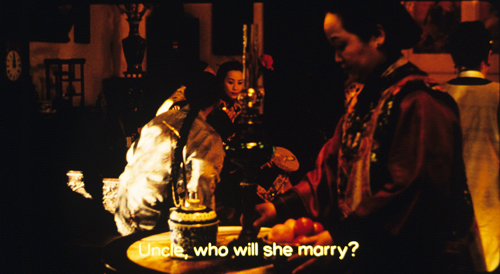
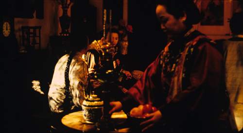
Two frames from Flowers of Shanghai (1998) are below, showing the camera’s slight movement around the central lantern and Pearl’s face, as well as the shift in the young man’s posture as he waits for an answer to his question. He’s in the process of clearing a bit of space for us to glimpse the older man, Hong, who’s sitting between him and Pearl.
P.S. 24 Feb 2015: Thanks to Paul Mollica for a name correction!
Pure hits of storytelling: Westlake, Oswalt, Brackett
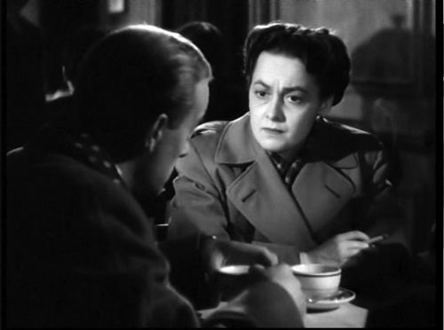
To Each His Own (1946).
DB bere:
Old friend and student, and proficient blogger, Paul Ramaeker writes:
I’m in the middle of Slayground now. In his Stark guise, Westlake as a writer really is as fearsomely directed and effective as Parker himself. I was thinking about the particular narrative pleasures here, like the way that delayed exposition works with the perspective switches between different sections. There is such precision to the way he builds certain effects in a systematic way, the way that we see Parker making plans, going around Fun Island doing things, but Stark not telling us what, exactly. I really did not get the logic of painting white circles in the house of mirrors–I thought of them as targets. Then, [spoiler excised] it makes so much sense, and becomes such a pure hit of storytelling, producing such a rush of pleasure in the reading.
That’s the way Donald E. Westlake worked. With Elmore Leonard and Ed McBain, he was one of the top crime-action writers to emerge in the postwar boom in paperback originals. He wrote a huge number of novels and some screenplays (The Grifters, The Stepfather). Several films, notably Point Blank, The Outfit, The Ax, and Made in USA, were taken from his books.
I’ve paid tribute to Westlake’s prose in this entry, but why not another Richard Stark passage to show how it’s done? Many of the novels start with a “When” clause, and upon relaunching the series in 1997, Westlake picked a dilly:
When the angel opened the door, Parker stepped first past the threshold into the darkness of the cinder block corridor beneath the stage.
The “When” clause hooks you in firmly, with the last word of the sentence locking in a framework that explains the opening. Here’s a simpler prototype Westlake himself picked, from Flashfire:
Parker looked at the money, and it wasn’t enough.
Anybody else would have cut the and and put in a period. This is better, I think because it quietly leads us to expect something more: a piece of action, a demand for more money. Anyhow, once we’re arguing about whether to put in an and, we’re talking about a real writer.
Slayground is one of those nifty experiments Westlake tried, this time putting two books in a divided POV arrangement. Both Slayground and The Black Bird begin with the same action, a getaway described almost identically in each one. Parker and his sidekick Grofield separate. One book follows Parker’s fate and other follows Grofield’s. I want to read both right now.
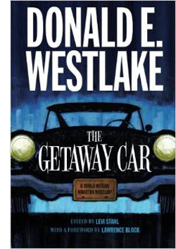 Before I do, though, I must signal (a) the University of Chicago Press’s brilliant idea of reprinting all the Stark novels; and (b) Levi Stahl’s wonderful compilation The Getaway Car: A Donald Westlake Nonfiction Miscellany. This consists of essays, memoirs, and interviews, running from 1960 into the 2000s. There’s even a recipe for tuna casserole contributed by Dortmunder’s girlfriend May.
You learn a lot about Westlake’s life, of course; for one thing, you learn how Made in USA became unseen in USA for several years. A career-survey interview with a convicted bank robber is alone worth the price of admission. Stahl adds in fragments from an autobiography (“I was born in Brooklyn, New York, on July 12, 1933, and I couldn’t digest milk”).
Westlake was a thoughtful observer of his tradition, and he offers historical surveys and close readings of his hardboiled predecessors. He compares the prose of Black Mask writers Hammett and Carroll John Daly, and calls Raymond Chandler “a bookish, English-educated mama’s boy whose raw material was not the truth but the first decade of the fiction. This is not to denigrate Chandler, or at least not to denigrate him very much.” He praises Richard S. Prather for his “bonkers” style (“She was as nude as a noodle”) and registers his admiration for lesser-known contemporaries like Peter Rabe. He offers the best analysis of George V. Higgins I know, and his appreciation of Rex Stout warms the heart. Acknowledging the cunning ways that Stout hides plot gaffes under Archie’s patter, Westlake notes that perhaps Stout had “an affinity with those Indian tribes who deliberately include a flaw in their designs so as not to compete with the perfection of the gods.”
You also learn about the market. Westlake was a “fee reader” for Scott Meredith literary agency, one of the most prestigious around. He became a self-supporting writer in 1959, when he churned out over half a million words, all published. Writing an Avon paperback in 1960 would earn you $350, or $2800 in today’s money, but writing a serial for a magazine like Analog could net $450 for only 18,000 words. There’s a marvelous letter from that year in which a twenty-seven-year-old Westlake complains to a top publisher that he can’t get his best science fiction accepted, and that specific editors traduce the work of writers he knows. Stahl calls it “one of the most spectacular acts of bridge burning in the history of publishing.” Again, the author’s gesture recalls Parker’s chilly recklessness, but with jokes.
Popcorn and Red Vines
In his recent interview with the New York Times, Patton Oswalt included the Stark/Westlake Man with the Getaway Face as one of his favorite books of all time. It comes as no surprise that this gremlin polymath gets Stark/ Westlake. Those who know his fine Zombie Spaceship Wasteland will find more of the same in Silver Screen Fiend: Learning about Life from an Addiction to Film. As ZSW traced his early standup career and its intertwined relation to nerd culture, this quasi-memoir traces his early years in LA, writing for MadTV by day, honing his comedy act by night, and watching movies obsessively at all other times.
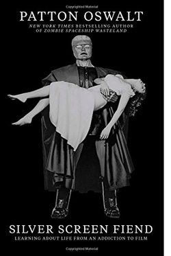 Despite his fondness for sitting far back (I’m down front) and mixing popcorn and Red Vines (I’ve been a Dots man for sixty years), Oswalt has left us the best memoir I know of being a sheer headbanging movie geek. A sort of nonfiction Moviegoer (Walker Percy), or a prose version of Cinemania, that disconcerting documentary in which everything reminds you of you, Silver Screen Fiend takes us into hard-core hell-for-leather filmgoing.
Filmgoing is the operative idea, not just film viewing. The book is set on the cusp of the DVD revolution, when the big-screen experience was so much better in contrast with VHS. There are descriptions of favorite theatres and fetishized experiences like Cocteau’s Beauty and the Beast and a Hammer movie marathon. At the same time, this “sprocket fiend” was also a “stage ghoul,” trying to out-kill the other standup comics at the Largo. The two obsessions fed each other, as when Oswalt arranged public readings of the script for Jerry Lewis’ legendary Day the Clown Cried.
Throughout, the movie madness emerges as another channel for the explosive energy of a young man burning with ambition. At the theatre the splendid lunacy might be onscreen, or in the row behind you, where Lawrence Tierney was talking loudly back to Citizen Kane. The moment pulsates because Oswalt wanted to be in movies too, maybe as a character actor.
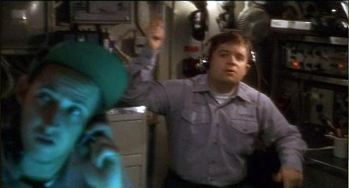
The book hits one of its high points in telling of his big break, in Down Periscope (1996), where he utters one line as the camera sweeps past him. He describes the process of filmmaking as hammering slowly away at the movie that isn’t there yet. It’s like “blasting a tunnel through a mountain. Or brushing every grain of sand off of a fossil. You attacked it relentlessly.” Oswalt squeezes pages of entertainment out of brooding over how to deliver “There’s a call for you, sir. Admiral Graham.”
Rest assured that every movie you see where an actor delivers just one line? They’ve put this kind of thought into it. Sometimes you can see it. Sometimes they can hide it. But everyone who gets in front of that lens has this inner conversation. I was having mine now. I was about to speak on film.
The moviegoing spiral ends on 20 May 1999, when Oswalt sees Star Wars: The Phantom Menace. The postmortem at a dinner marks the moment when the addiction subsides. “It hits me, sitting there with my friends, that for all of our bluster and detailed, exotic knowledge about film, we aren’t contributing anything to film.” He realizes that film should be one ingredient in the fuel for your life. “But the engine of your life should be your life.”
The epiphany is movingly described. (I wish I could say I’ve learned the same lesson.) Oswalt implies that film frenzy was a phase he went through, and now he’s grown up. (I wish I could say the same for me.) Yet I’m encouraged that Oswalt has not gone cold turkey. He’s passed from gourmand to gourmet. “My love of movies has turned into a love of savoring them.” And he can’t resist movie comparisons when describing that day-and-date release sometimes called Life. “Faces are scenes. People are films.”
In the back of Silver Screen Fiend are thirty-three pages listing all the films Oswalt saw across four years, along with the theatres where he saw them (New Beverly, Nuart, Tales Café et al.). Plenty of pure storytelling hits there. Far from makeweight, these pages create a new list of the kind he obsessed over in Danny Peary’s books. How many twenty somethings will start checking off the titles here?
The team
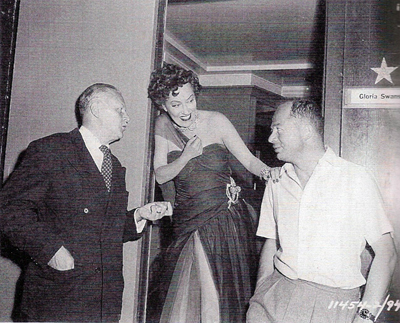
Charles Brackett, Gloria Swanson, and Billy Wilder.
On his very first night at the New Beverly, Patton Oswalt caught, and was caught by, Sunset Blvd. and Ace in the Hole. He mentions they were “co-written and directed” by Billy Wilder. He doesn’t identify the other half of the co-.
Nor do most people. In the case of Sunset Blvd., that fellow was Charles Brackett, who now stands revealed as not only a gifted writer but the Samuel Pepys of classic Hollywood. “It’s the Pictures That Got Small,” edited by Anthony Slide, is an absorbing chronicle of a tempestuous collaboration and the lifestyles of an era. A Harvard-educated WASP from Saratoga Springs, Brackett became a novelist, was made drama critic for The New Yorker, and sat at the Round Table with the likes of Woollcott and Parker. After some of his fiction was adapted to film, he moved to Los Angeles.
Brackett’s early work seems to have been undistinguished, though I’d defend at least Picadilly Jim (1936). Eventually he wound up at Paramount partnering with Wilder, and under the aegis of Lubitsch they clicked for Bluebeard’s Eighth Wife (1938) and Ninotchka (1939). There followed Midnight (1939) and Hold Back the Dawn (1941) for Leisen, and Ball of Fire (1941) for Hawks–an early title of which, we learn here, was Dust on the Heart. Then came Wilder’s directed pictures, from The Major and the Minor (1942) to Sunset Blvd. (1950). Brackett was active in the Screenwriters Guild, became a producer, and continued to write scripts for his producing projects, including the delirious Niagara (1953) and the insufficiently delirious Journey to the Center of the Earth (1959). The Uninvited (1944), Brackett’s first solo production, remains charming, and To Each His Own (1946) is an interesting wartime weepie, with Olivia de Havilland massively frumped up. Miss Tatlock’s Millions (1948) also has its defenders.
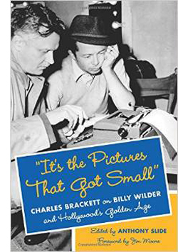 “It’s the Pictures That Got Small” is a plump album packed with tiny but revealing snapshots. Although Brackett wrote entries nearly every day, he often made do with very brief mentions. Slide has edited them judiciously and arranged them chronologically, with some stitching to fill in events. A 1936 entry strikes a warm chord:
I am to be teamed with Billy Wilder, a young Austrian I’ve seen about for a year or two and like very much. I accepted the job joyfully.
By 1943, Brackett is recording something much more rankling:
My consciousness that, after years of partnership, his first free act was to stab me in the back…my conviction that he’s turned into a second-rate director…my knowledge of the awful thinness of his mind, his stupidly limited interests. Alas, alas. And my knowledge that I am as little stimulating for him as he is for me.
During this supposed phase of creative drought, they were working on The Lost Weekend.
Apart from charting this bumpy collaboration, Brackett gives us a lot of information about how films got made. We learn about studio differences (Paramount less disciplined than MGM) and the importance of telling stories to others, face to face. I found plenty to feed my act-structure appetite. I was happy to find how often moviemakers went to the movies. Brackett attends dozens, both premieres and regular shows, and he records how easily screenwriters could summon up an older picture to be screened, even at a rival studio. This from 1947:
In the afternoon Billy and I saw Mr. Deeds at Columbia to check on certain similar situations in The Hon. Phoebe. It proved helpful and an excellent picture despite curious non-sequiturs and at least one horrible scene, Cooper absolutely charming. I could see some loathsome Capra characters beginning to unfold, but still in the lovely promising bud stage.
As a writer, Brackett is no less captivating than Westlake or Oswalt. We can rejoice in his Algonquin acidity.
Chaplin seems to me as repellant a human being as I’ve ever been in the room with—a thin, reedy voice, a show-off-hog face, and hysterical protestations of liberalism.
Jean Arthur called us, worried about the fact that there’s another woman in the picture [A Foreign Affair]. “I have sex appeal,” she said calmly, but inaccurately.
Greeted at the office by a nasty little note from Charles Jackson [author of the novel The Lost Weekend]. I had addressed him as “Birdbrain” in a telegram, something I could do to any friend—but an unsafe term to use to a man five feet tall.
And there are flat-out funny stories. Here’s just one, reported by Wilder.
[Von Stroheim] has always thought Swanson too young and desirable for the role of Norma. “Look at her,” he said. “I would like to fuck her now.” “I,” said Billy, “would rather fuck you.” “You have,” von Stroheim retorted.
If it didn’t happen, I want it to have.
In short, three more items for your shelf—repositories of good stories in themselves, prods and teases for your own thinking about story-making.
The University of Chicago Press has mounted a fine infographic on Westlake/Stark’s Parker novels here.
P.S. 19 January 2014: Thanks to David Cairns for correcting a slip. My original entry said that Brackett co-wrote Ace in the Hole with Wilder. Actually, the collaborators on Ace were Lesser Samuels and Walter Newman. Be sure to check David’s excellent Shadowplay site.
Down Periscope (1996).
Problems, problems: Wyler’s workaround
The Little Foxes (1941).
DB here:
For me, shooting is a struggle where you only get to be happy for five minutes before you start thinking about the next problem to solve.
Ruben Ostlund, on Force Majeure
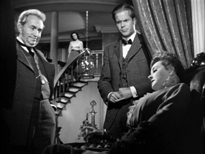
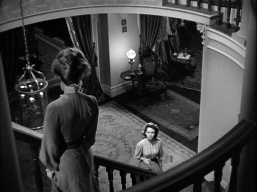
One of the most famous shots in American cinema occurs at a climactic moment in The Little Foxes (1941). Regina Giddens has just learned that her sickly husband Horace has let her brothers get away with a business deal that double-crosses her. They will reap all the rewards of bringing a factory to town, while she, who engineered the deal and expected Horace to fall in line, will get nothing. Horace is already not far from death, and their quarrel in the parlor precipitates a heart attack. He spills his bottle of medicine and needs some from his upstairs supply.
Regina refuses to go fetch it, and instead Horace must stagger up and out. While she sits, fiercely waiting, on the sofa, he tries to pull himself upstairs, but he collapses on the steps. Once he has fallen, and perhaps died, she stirs to action and rouses the household.
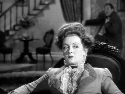
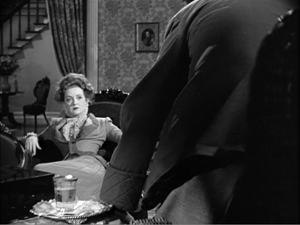
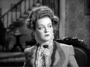
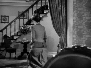
Lillian Hellman’s original play had been a Broadway success, and this was one of the most notable scenes. How did Wyler stage it? Very oddly, as the frame up top suggests. We can’t really see Horace’s struggle on the stair. Not only does the camera put Regina in the foreground, but Horace is out of focus in the rear, at least until she rises whirling and runs to the background, the damage done.
Why did Wyler stage it this way? It depends, as Bill Clinton might say, on what your definition of why is.
Deeper, closer
1941 was the breakout year of deep-focus filmmaking in Hollywood. Citizen Kane, The Maltese Falcon, Kings Row, Ball of Fire, I Wake Up Screaming, How Green Was My Valley, and several other films set the pace for a new stylistic option. In this style, the action is staged in depth rather than perpendicular to the camera, as most scenes in Hollywood cinema were. And the camera lens creates depth of field, in which even fairly close foreground planes are just as sharp as the action in the rear. Such images weren’t unknown before; we can find them in silent cinema. But from 1941 on, depth staging accompanied by depth of focus would be increasingly common in Hollywood dramas, from thrillers and melodramas to film-noir exercises. Not all shots would be designed for maximal depth; continuity editing and closer views would still be used. But we do find such imagery becoming more common, particularly at moments of tension.
Cinematographer Gregg Toland is usually cited as a main source of this trend, and his work on Kane and Ball of Fire, as well as Ford’s Grapes of Wrath (1940) and The Long Voyage Home (1940), became models of the new look. Toland also worked with Wyler on several films, including The Little Foxes. But even without Toland, Wyler had in some films cultivated a deep-focus look (as had Ford). Coming when it did, The Little Foxes proved a powerful demonstration of the deep-focus style.
Three aspects stand out. First, there’s a certain economy of presentation. As Wyler and others pointed out, depth imagery permits directors to minimize editing. Instead of cutting from action to reaction, we see both at the same time.
Wyler suggested in publicity of the period that this gave the viewer more freedom of where to look, and André Bazin seized upon this rationale as part of his aesthetic of realism. Just as in the real world, in some films we must choose what to pay attention to.
But The Little Foxes went beyond the moderate deep focus of Stagecoach and other films to create very aggressive images. This is the film’s second novelty. Several shots place the foreground very close to the camera. As a result, we get looming faces or objects in the front plane, and we still see well-focused dramatic elements behind.
A third source of power is less noted. In The Little Foxes, Wyler found ways to make deep shots comment upon the plot. For instance, the action offers Regina’s daughter Alexandra, usually called Zan, a choice of being more like her mother (tough and vicious) or her father (tolerant and gentle). At other points Zan is paralleled to her ineffectual, alcoholic aunt Birdie. At one point, Birdie has predicted that Zan may wind up like her.
In a theatre production, there would be many staging strategies that would create these parallels, but Wyler uses a particularly striking one. One evening, while Regina and her brothers plot their scheme, Birdie has been relegated to a chair far from the discussion.
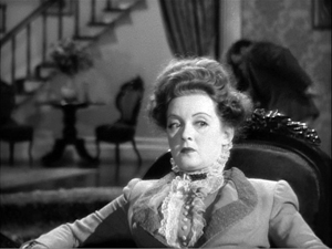
The composition diagrams Birdie’s situation in the scene and her place in the family. Then Wyler cuts in to her.
This might be seen as a bit of heavy-handed emphasis, but actually he’s doing two things. He’s making manifest her reaction, a numb resignation to being excluded. He’s also setting up, thanks to another depth composition, the chair in the hallway by the staircase. At the climax, it’s Zan, as beaten down as Birdie, who slumps in that chair.
Thanks to depth staging and deep-focus cinematography, the second image emphasizes Birdie’s solitude and prophesies Zan’s.
Which only makes my first question more pressing. Some shots of the quarrel leading up to Horace’s collapse on the stair exhibit flagrant deep focus.
We know from other shots in the film, like the Birdie/Zan comparison, that Wyler could have simply shown us Regina on the sofa in the foreground, in long shot or medium shot, while keeping Horace in focus in the background. In fact, Wyler tells us that Toland said, “I can have him sharp, or both of them sharp.” Why opt for shallow focus that makes Horace’s staircase seizure blurry and hard to see?
Fun with functions
Asking why? about something in an artwork actually veils two different questions.
The first is: How did it get there? The answer is a causal story about how the element came to be included.
The second sense of why is: What’s it doing there? That’s not a question of causes but of functions. How does the element contribute to the other parts and the artwork as a whole?
Take the second question first. You can imagine many functional reasons for Wyler’s choice. Exactly because the rest of the film keeps image planes sharp, this moment gains a unique emphasis. Horace’s collapse is marked as a major turning point in the plot. In an ordinary film, we wouldn’t notice an out-of-focus background. Here, by reverting to the more traditional choice, Wyler makes shallow focus stylistically prominent. For once in a film, a dramatic high point isn’t given to us with maximum visibility.
Another function is character revelation. In the film as a whole, we haven’t been consistently restricted to any one character. Here, Wyler could have concentrated on either Horace or Regina, or he could have given them equal treatment. An obvious choice would have been intercutting shots of Horace crawling up the steps with shots of Regina, impassively turned from him. Probably most directors would have done it that way.
Alternatively, we might have been attached to Horace, letting us see Regina in the distance. That would have diminished her reaction and played up Horace’s suffering.
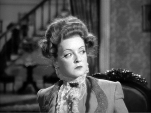
Wyler’s choice puts the emphasis not on the action—thanks to the distant framing, Horace’s collapse can almost be taken for granted—but Regina’s reactions, or rather non-reactions, moment by moment. We’re made to see her turning slightly to listen to his struggles, while her staring eyes suggest that she’s visualizing the action with a horrified fascination. It’s as if her denying him the medicine was an experiment in seeing how far she could go. Now she knows. Her straining face is virtually willing her husband to die.
Keeping both this monstrous woman and her victim in focus would have divided our attention, then, and Wyler wants it squarely on Regina. He seems to have said as much in interviews.
We said we’ve got to stay on Bette all the time and just see this thing in the background, see him going in the background, but never lose her.
I wanted audiences to feel they were seeing something they were not supposed to see. Seeing the husband in the background made you squint, but what you were seeing was her face.
The second remark suggests another functional result of Wyler’s choice. By making the collapse almost indiscernible, we become very aware of what we can’t see. Thanks to selective focus, Bazin remarked, “The viewer feels an extra anxiety and almost wants to push the immobile Bette Davis aside to get a better look.” The dramatic tension of the scene finds its counterpart in our frustration to see what any other film would show us.
Finally, we should note that the staircase is an essential element in the film’s drama. Horace’s collapse is only one major incident taking place around and on it. Significantly, when Zan finally breaks free of Regina and the rest of the family, the matriarch learns of it standing on the stairs. Having all but murdered her husband there, now she sees her daughter abandon her.
Shoot my good side
The Bishop’s Wife (1948).
There are other functions we, as good critics, might seek out. For all of them, there is probably a loose causal story we’re relying on: Wyler and his colleagues made some choices that bore fruit. Some of those choices may have aimed at fulfilling the functions we notice. Other functions we notice may come along as bonuses—unintended but still benefiting the scene. Unintended consequences, good or bad, come up in art as elsewhere.
There remains the other implication of why-did-they-do-it questions: the one that seeks out quite specific causes that govern the scene. How do we tackle that?
In my book On the History of Film Style, from which some of these Little Foxes observations are drawn, I argued that we can make stretches of stylistic history intelligible by thinking in terms of problems and solutions. Art historians have done this for a long while. Assuming that you want to suggest that something in the picture is farther away than something else, how do you do it? One way is through overlap, as in Egyptian art. Here the fishermen overlap the background, their legs overlap each other’s, and the strings of fish that one is carrying overlap some legs.
Later image-makers suggest variable distances through size variations, placement in the format (a little bit of that here, with the river above/behind the men), tonal contrast, atmospheric perspective, linear perspective, and other techniques. These can be considered solutions, available to artists of different times and places, to the problem of suggesting three dimensions on a flat surface.
A problem/solution way of thinking can clarify some developments in the history of filmmaking too. If you have to represent two actions taking place simultaneously, how can you do it? Crosscutting, as Griffith and others showed in the 1910s, solves that problem. It offers spillover benefits too, such as controlling pace. Similarly, there’s the problem of representing spoken dialogue. Silent films solved this in various ways—through a commenter in the theatre (the benshi in Japan), through actors voicing the roles behind the screen, and most commonly through intertitles. Later, synchronized sound solved the problem in a more thoroughgoing way.
These are very general answers to the how-did-it-get-there question. Occasionally we get more concrete information about problems and solution. For example, some Hollywood stars believed that one side of their faces was more appealing than the other. The stars with the most power could insist on being filmed on their good side, which led directors to make particular staging choices. (Claudette Colbert insisted her left side was her good side, so she’s usually positioned on screen right, with her face turned toward screen left.) David Butler knew that Edward G. Robinson likewise favored his left side, so Butler needed to stage Robinson’s one appearance in It’s a Great Feeling (1949) with him entering a scene from right to left and playing in that position.
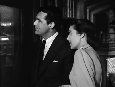
One vain star is problem enough, but what happens when you have two who prefer being shot from the same side? According to Henry Koster, the demands of Cary Grant and Loretta Young led to the staging of the scene shown at the top of this section. (For my reservations, see the codicil to this entry.)
The Little Foxes production provides evidence of another very specific problem. In staging the staircase collapse, Wyler faced an unusual difficulty. The actor playing Horace, Herbert Marshall, had a prosthetic leg.
Marshall lost his right leg, from the hip down, in World War I. Through practice he managed to stroll quite smoothly nonetheless, and he became a significant star and featured player in theatre and films. He doesn’t need to walk much in The Little Foxes because his character is rolled around in a wheelchair. But the parlor-and-staircase scene was very demanding. As Wyler explains:
Now there was another problem involved with that, and that was the fact that Herbert Marshall has a wooden leg and couldn’t make the stairs, you see. This is a trade secret. I had him stagger in the background, get behind her and just for a moment when he gets to the stairs he had to go to a landing over there, and just for a moment went out of the picture. And a double came in and went up the stairs, staggered way behind out of focus.
Here you can see Marshall leave the foreground.
An axial cut in to Regina shows him stumbling behind her and going out of shot in the distance. This much Marshall could manage.
At that point the double stumbles into the frame and starts to crawl up the staircase.
Regina leaps up and runs to the rear, and the camera racks focus to the stair, but by now the double’s face is out of frame.
So the director solved the problem of the actor’s disability by a combination of deep staging, the use of a double, and shallow focus. This “trade secret” yielded a range of effects that, I think most viewers would agree, were vivid and exciting.
But there’s always more than one way to do anything. Given the constraint of Marshall’s artificial leg, or a player’s insistence on being shot from one side, or the leading lady’s overnight pimple, a director can work around it in several ways. One of the few critics to notice the implications of Wyler’s choice was Raymond Durgnat, a critic very sensitive to style.
Given a “pimple” or a “wooden leg,” different stylists will find different solutions. One changes the camera-angle; another introduces a last-minute panning shot; another will retain the original set-up, but throw heavy shadows to conceal the offending detail; another will interpose a pot of flowers or a table-cloth to conceal the trouble spot from the camera. The director has ample opportunity to maintain his style in the face of “accident.” And it’s no exaggeration to say that such stylists as Dreyer and Bresson would imperturbably maintain their characteristic style even if the entire cast suddenly turned up with pimples and wooden legs.
I’d add only that the director’s choices are further constrained. Beyond the immediate problem, the broader pressure of norms will kick in. The norms of classical studio lighting, cutting, and performance limit the ways Toland and Wyler can cover up Marshall’s infirmity. The norms of quality A-picture American filmmaking of the period militate against, say, editing the scene so that a dummy is substituted for Marshall on the stair. (We might get that in a serial, though.)
There are also the intrinsic norms set up in The Little Foxes as a formal whole. These favor handling the scene in depth in some way. Wyler reports the decision: “We said we’ve got to stay on Bette all the time and just see this thing in the background, see him going in the background, but never lose her.” Wyler’s earlier choices in the film created a kind of path-dependence for this critical moment. Deep-space staging could stay in tune with the rest of the film; but because of his actor’s infirmity, he could give up deep-focus cinematography. This solution created a vivid variant on the film’s intrinsic norm.
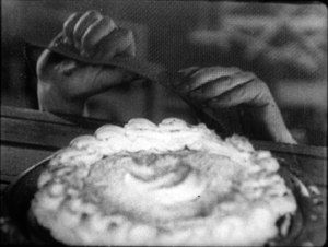
You can also argue that by deciding to call our attention to a distant plane in soft focus, Wyler fell back on something he had tried before. In the extraordinary late silent The Shakedown (1929), he showed a pie being stolen in a diner. First, there’s a close-up, then a shot of the main couple looking to the background. In the center, out of focus underneath the coffee urn, the pie is slipping away.
The action isn’t very discernible in my image, which is from a 35mm print; but the scene is shot quite soft anyway. I think audiences notice the gesture, slight as it is, because it’s centered and nothing else is moving in the frame. More visible is the background action in a shot Wyler and Toland used in Dead End (1937). Two gangsters are sitting in a bar debating kidnapping a child. In the out-of-focus background,we can discern a woman wheeling a baby carriage along the sidewalk. She isn’t the target, just a sort of reminder of children’s vulnerability. As in The Little Foxes, a centered background action attracts our attention and makes us strain to identify it.
Faced with a similar problem in The Little Foxes, Wyler had the chance to dramatize a soft-focus background to a much greater extent than in these films.
One more causal factor might have shaped Wyler’s decision. Lillian Hellman’s original play takes place wholly in the Giddens’ parlor and the hallway behind. The play text indicates that the staircase is in the rear of the set, with a landing offstage. The furniture sits downstage, closer to the audience. The foreground/background interaction in Wyler’s staging is already there, in a rougher form, in the play’s set arrangement.
And how does the play handle the moment of Horace’s collapse? When Horace’s medicine bottle breaks, Regina doesn’t move. Calling for Addie the maid, Horace leaves and staggers to the rear playing area.
He makes a sudden, furious spring from the chair to the stairs, taking the first few steps as if he were a desperate runner. Then he slips, gasps, grasps the rail, makes a great effort to reach the landing. When he reaches the landing, he is on his knees. His knees give way, he falls on the landing, out of view. Regina has not turned during his climb up the stairs. Now she waits a second. Then she goes below the landing, speaks up.
REGINA: Horace, Horace.
The foreground/background dynamic, as well as the frozen indifference in Regina’s performance, are written into the scene’s stage directions. Hellman’s instructions yield a further hint: Horace “falls on the landing, out of view.” Within the norms of the deep-focus aesthetic, Wyler and Toland found a cinematic equivalent for this barely-offstage action–one appropriate for their film’s particular style. They make Horace present, but he’s “out of view.”
Somebody may say: “See? You don’t need all this fancy analysis. At bottom, Wyler was forced to shoot the scene this way because of Marshall’s bum leg.” This retort assumes that causal factors always trump functional ones. Instead, I think that by considering causal factors, insofar as we can know them, alongside functional ones, we can better understand filmic creativity in history.
Durgnat’s point shows us how. Even when contingent circumstances “force” a filmmaker to change course, there are always several ways to do that. Picking any option brings in a cascade of other constraints and opportunities. Once Wyler has decided to double Marshall and sustain the take on Davis, soft focus is more or less necessary so we don’t spot the stand-in. But the soft-focus provides a nifty opportunity to create the sorts of functions and effects we’ve already noticed.
Like everybody else, filmmakers choose within constraints—some apparent, some less visible, many just taken for granted. Those constraints limit what can be done, but they also enable other things to happen, perhaps things that the filmmaker couldn’t have planned in advance. Once other filmmakers realize the results, they can plan in advance. A moviemaker today can try out Wyler’s solution, free of the pressures that drove him to it. A significant part of filmmaking’s traditions may consist of workarounds.
The Ostlund epigraph, apparently not available online, is taken from Hollywood Reporter’s December awards issue, p. 13. My Egyptian picture comes from the Metropolitan Museum of Art. It’s called Fish Preparation and Net Making, from the Tomb of Amenhotep (1479-1458 BCE), as rendered by Nina de Garis Davies. I draw the stage directions in The Little Foxes from Lillian Hellman, The Collected Plays (Little, Brown, 1971), 195.
My quotations about It’s a Great Feeling and The Bishop’s Wife come, respectively from two books by Irene Kahn Atkins, David Butler (Scarecrow, 1993), 227; and Henry Koster (Scarecrow, 1987), 87. Koster’s memory fails him in his account of the Bishop’s Wife window scene. It seems likely that Loretta Young favored her left side, which is her dominant orientation throughout the film. But there’s no evidence in the film that Cary Grant favored that side of his face too. The scene at the window is too brief to count as an instance of much of anything.
When I wrote On the History of Film Style in the mid-1990s, I had the nagging memory that Marshall’s artificial leg played a role in Wyler’s staging, but I put it down as legend. (It’s a pity I didn’t pursue it, because the information would have fitted snugly into my sixth chapter.) Only when I discovered a 1972 interview with Wyler, with the “trade secret” mentioned above, did I realize there was something to the story. That interview was once online, but seems to have vanished. It’s available at Columbia University. Durgnat’s discussion is in Films and Feelings (MIT Press, 1967), 41. My other quotations from Wyler come from Axel Madsen, William Wyler (Crowell, 1973), 209.
Otis Ferguson reported on the filming of a different scene in The Little Foxes; I discuss that here. More generally, on the Bazin-Wyler connection, see this entry. Other Wyler-related entries can be canvassed here. For more on Hollywood’s development of deep staging and deep focus, see not only On the History of Film Style but also Chapter 27 of The Classical Hollywood Cinema: Film Style and Mode of Production to 1960. As for Bette Davis’s eyelids, much in evidence here, there’s this entry.
Visual storytelling: Is that all?
Mission: Impossible (1996).
DB here:
The phrase “visual storytelling” is a very modern invention. It seems to be unknown before the mid-1940s, and it doesn’t really become common until the 1990s. It applies to film, of course, but it also refers to comic strips and other media. Sometimes it carries a prescriptive edge: In a pictorial medium, you should tell your stories visually—rather than, say, through lots of talk. The motto is sometimes summarized as Show, don’t tell.
Elsewhere on this site, I’ve argued that sometimes that advice should be ignored. A monologue about incidents in the past can sometimes be more powerful than a flashback depicting them. That power often owes something to the actors’ performances—which are, after all, no less visual than the story action being told us.
Similarly, who would attack great films like His Girl Friday for being too talky? An essential pleasure of American cinema from the 1930s on is the way that some scenes let dialogue take the lead. And it’s not just the words but how, and how fast, they are spoken.
Still, I do enjoy scenes that cut the gab and give us a flow of pictures that coax us to follow a story. My pantheon of great filmmakers includes Eisenstein, Keaton, Griffith, Lang, and many other silent masters. But mentioning them reminds me of something else that needs to be said.
Visual storytelling is seldom purely visual. In film, it needs concepts and music and noises and even dialogue to work most fully. We can learn a lot, I think, by starting with “purely visual” passages and see how they’re reinforced by other inputs.
Pictures, plus
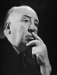
Take the most vociferous defender of visual storytelling, Sir Alfred Hitchcock.
I want to put my film together on the screen, not simply to photograph something that has been put together already in the form of a long piece of stage acting. This is what gives an effect of life to a picture—the feeling that when you see it on the screen you are watching something that has been conceived and brought to birth directly in visual terms.
Yet Hitch needed words and music throughout his career. Put aside the talkathons that are Lifeboat, Rope, Under Capricorn, and Dial M for Murder. His silent films, including The Lodger and others, need written intertitles (dialogue-based, expository) to present the drama. The brilliant Albert Hall sequence in the first Man Who Knew Too Much (run here, analyzed here) would lose much of its power without the tight synchronization of shot-changes with the musical score. I yield to no one in my admiration for the climax of Notorious, which cuts rhythmically as the main characters gather in a knot and step slowly down a staircase. But the progress of the drama needs the snatches of dialogue no less than the close-up glances and POV shots, and they get integrated into the implacable beat of descent.
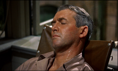
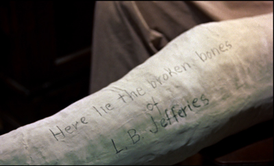
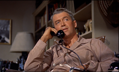
Then there’s Rear Window, which has a fascinating double opening. The first uses imagery, music, and sound effects to present the situation of Jeff laid up in his apartment over the courtyard. After a tour of the neighbors’ flats, seen from a distance, we’re shown why Jeff is lying there in a sweat.
But during the next scene Jeff gets on the phone with his editor. Now much of the information we got visually is reiterated in dialogue.
Jeff’s optical POV cuts during the phone conversation also recapitulate the neighbors’ routines that we’ve seen in the first sequence. By the end of this second scene, image and sound have explained his situation wholly, thanks to a division of labor. The first, wordless sequence is a kind of test for the viewer, and the second serves as the answer key.
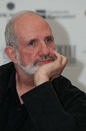
Which brings me to Brian De Palma, Hitch’s self-conscious heir. Of the 1970s generation, he was the most explicit in defending the purity of the pictures in motion pictures.
1973: I always have very precise visual ideas and then try to construct a story around them as opposed to writing a story and then trying to figure out how I’m going to shoot it. . . . As far as I’m concerned, you are dealing with pure cinema—that is, with what is right on the screen—and you should try to think what it will look like.
1984: Images run through my brain all the time. Lately I’ve been thinking about rearview mirrors. You can see people in the next car out your rearview mirror. They’re always doing the most personal things—putting on makeup, fighting, kissing, whatever. I want to put that in a movie. Someone could see a murder in their rearview mirror.
1992: Do you really want to go to work every day and shoot two-shots of people talking to each other? Is that directing?
2002: I’ve been obsessed with this kind of visual storytelling for quite a while, and I try to create material that allows me to explore it. I did quite a lot of it in Femme Fatale. And it put me on a course of, “How can I find visual ideas and work them into the stories I want to tell?” That’s something that haunts me all the time.
Hence the famous De Palma set pieces. Usually scenes of violence, they’re handled through elaborate crosscutting, optical POV, steep high and low angles, slow-motion, bravura camera moves, and extreme deep focus (often with a split-focus diopter). We think of the murders in Sisters and Dressed to Kill, the stalking of Nancy Allen in Blow Out, the baby carriage in Union Station in The Untouchables, and the outrageous Cannes festival opening of Femme Fatale.
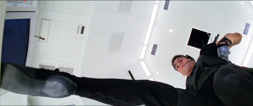
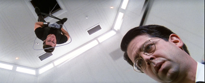
Then there’s the invasion of CIA headquarters by Ethan Hunt’s scratch team in Mission: Impossible (1996). In the director’s search for pure cinema, this might be the purest of all.
From here on in
The invasion sequence runs an astonishing eighteen minutes and, as typical of a film’s Development section, constitutes almost pure delay. You can imagine doing it in a couple of minutes, or a lot more.
The main portion of the sequence crosscuts several lines of action. The hacker Luther crouches over his monitor in the firetruck, tracking the parties in the building. Inside Claire tags and dopes the analyst Donloe. From the air duct the venal Krieger suspends Ethan on a rope as he drops down into the black vault (which is white). Ethan must dangle above the computer keyboard extracting the NOC list of agents. We also get occasional glimpses of Kittridge, Ethan’s nemesis, in a central control room.
These lines of action are conveyed through several striking visual ideas. We get the geometry of De Palma’s beloved bird’s-eye camera positions.
There’s extreme depth, jamming two dramatic elements into sharp relationships: Ethan and Donloe, Krieger and the rat approaching him from behind.
Even the rather perfunctory tag, the firing of poor Donloe (“Mail him his clothes”), is rendered in a flashy split-focus shot.
Compared to what we expect from a blockbuster, this sequence depends to a remarkable degree on a quiet flow of visual information. David Koepp, one of the screenwriters, explains De Palma’s plan:
He had another great idea, which was a reaction to the current state of summer movies at the time. He was tired of all the noise, of the bigger bigger bigger noisier noisier noisier setpieces, and desperately wanted to come up with one that used silence instead. He cackled at the idea of a big summer movie set piece that was predicated on silence.
The result is nice case study in visual storytelling. It also indicates how even a pure instance needs non-visual elements to be understood.
Top among those elements is genre. We know a heist situation when we see one, and that knowledge forms a kind of hollow form, a schema into which we slot the elements that generate suspense. What elements? There’s the need for silence and concealment. There’s Donloe, the oblivious analyst who comes in and out of the vault; he must be distracted, but he may still return at the wrong moment. There are unexpected obstacles—a suspicious guard, a curious rat, and a drop of sweat. There’s the risk of a telltale detail that may betray the invaders, such as Krieger’s dagger, dropped onto an arm rest. Over it all hovers a deadline, so that the heist becomes a race against time. (Not only is there a clock in the room, but a digital readout warns us of the rising temperature in the room, another potential giveaway.) Visual storytelling is enormously helped when we bring so much prior knowledge about the type of situation we confront.
“From here on in,” Ethan warns the team, “absolute silence.” For them, maybe, but not for us. The music continues a bit before subsiding for about ten minutes. Even then, the silence isn’t absolute. We hear the hum of the vault, the scratchy patter of the rat approaching Krieger in the ductwork, and the squeaking of the rope as Krieger pays it out and strains to keep Ethan poised above the floor.
Clearly, in his concern for visual storytelling De Palma isn’t ruling out noise and music. What he’s opposed to is talk. But there is talk, however discreet, here too. In M:I, I count about two dozen lines of dialogue once Krieger and Ethan get positioned above the vault. These chiefly involve Luther whispering information to Ethan about Donloe’s whereabouts. Granted, many of his lines are very terse (“He’s in the bathroom,” “Check,” “Good”). Still, dialogue serves as a good redundancy factor, accentuating the suspense of the situation and at one moment giving us access to Luther’s reaction, when he discovers that what Ethan has nabbed is the precious NOC list.
Just as important, our experience of the full suspense of the scene depends on talk we’ve heard earlier. Ethan has gathered his team on the train and is explaining how the security system at Langley works. Using a strategy that goes back to Lang’s M, M:I presents Ethan’s verbal walk-through of the procedures as a voice-over for footage of Donloe executing them. The sequence introduces us to Donloe, familiarizes us with the constraints of the heist, and maps out the normal going-and-coming rhythm that Donloe’s spasmodic upchucking will disrupt.
So the vault break-in can rely on relative silence partly because the situation has been given fully by Ethan’s verbiage. In a way, it’s the reverse order of the Rear Window tutorial: dialogue first, then images to give it dramatic impact.
Drop by drop
Let me close today’s entry with a less obvious but still nifty passage of (audio-) visual storytelling. It comes at the start of Mission: Impossible.
Instead of the usual and wasteful extreme long shots of the city we’re in, taken from a distance or coasting high above the streets, we start immediately, in the closet where Jack Harmon is bent over a monitor. Already we have two things to watch: the sting operation captured by a hidden camera, and the reactions of Jack as he watches.
Correction: Three things to watch. There’s also the owner of the feminine arm on the frame edge of the opening setup. The camera’s track-in eliminates it, but the reverse angle on Jack reminds us that some woman is there, in the right background and out of focus. The script calls her a “whorehouse waitress,” but that’s not apparent from what we see in the film.
Cutting back and forth between Jack and the monitor not only gives us his reaction, but reminds us of the woman, who changes position in the shots.
Once the official Kasimov has given the name Ethan needs, the team’s goal is achieved and Jack can search it on his computer. In the meantime, Kasimov needs to be dragged off without fuss, and so must be given a drugged drink. That, we now understand, is the task of the woman hovering in the background of Jack’s shots. We’ve also been primed by the tray with bottle and glasses in the first shot.
One option would be to pan or cut to the woman behind Jack and show her doping the drink. (This is what the shooting script seems to call for.) We might even see the woman’s face as she does it, but even if we don’t, a shot emphasizing her would give us a lot of other inessential information about the room.
De Palma makes another choice. This woman is important only in terms of what she does. Panning to her, or supplying a separate shot, and showing her face might make her seem as important a character as Jack, Ethan, or Claire. She’s not. So De Palma reduces her to her function: doping the drink. And for economy, she does it in the same setup previously devoted to Jack’s reaction. She’s kept in the background.
But the problem now is making sure the audience sees the gesture. De Palma could presumably have given us one of his split-focus shots, but here he does something more daring. The woman’s hand is above the upper frame edge, so all we see is the eyedropper in action. As it squeezes dope into the glass, all sound except Jack’s typing is cut from the track. We hear the drops very loudly, in what Jean Epstein called a “sonic close-up.” The precision of the sound compensates for the fact that the gesture is out of focus.
The bit ends when she slips out of the room in the background….
…and enters the scene shown on the monitor to serve the drink.
This is a tidy piece of classic continuity. If we don’t understand what’s happening, it’s not De Palma’s fault. Now that we see the serving woman more clearly, as one among several functionaries, there’s no reason for us to think she’ll be important in the action to come. By contrast, as Ethan revives Claire, we get tight reverse shots of them—not only underscoring their importance but setting up the quasi-affair that will be important in the plot ahead.
As often happens, the scene conforms to an action schema we have about crime and spy skullduggery: drugging your adversary’s drink. Here the schema is actualized in a way we don’t normally see, but the essential cues are present. And even this gesture has a larger purpose. We can expect the M:I team to drug somebody else, as indeed they will in the Langley exploit. Then we can get a proper close-up to understand that Claire’s task is accomplished. And of course drops will become pretty important when Ethan is dangling just above the vault floor.
I wish I had time to consider other examples of visual storytelling in Mission: Impossible. There’s the credits sequence, for instance. In reviving the TV series’ original glimpses of the episode to come, the sequence yields something that is very rare in feature film: anticipations of particular things we’ll see. TV network programming gave us bumpers that offered teasing previews of high points in the next show up. Did M:I, like I Spy, swallow up such “flashforwards” into its credit sequences? And how much did these TV credits owe to the anticipatory images in the credits of Goldfinger?
Above all, I’d like to spare time for the very clever flashbacks that, at the climax, show us how the initial murder of the team actually went. I call them clever because it’s not at that moment certain whether they are flashbacks constructed solely for us, to tip us off to the betrayal, or whether they also represent Ethan’s new understanding of that early bloodbath. But of course those quick flashbacks depend on nonvisual information as well, especially the voice-over that accompanies them.
Still, I hope I’ve said enough to suggest that “visual storytelling” in film needs both sound and more impalpable factors—context, familiar situations, genre conventions—to work. And those factors in turn depend on our knowledge of conceptual structures (schemas) that the film prompts us to lock in. As usual, narrative movies provide the audience an instruction kit, coaxing us to apply our knowledge to a fresh instance. In other words, the eye is part of the brain.
Many thanks to David Koepp for information about the production of Mission: Impossible. For some of David’s ideas about visual storytelling go here. The shooting script is available online here. Watch for David’s next directorial effort, the 60s-style intrigue comedy Mortdecai, coming 23 January!
My Hitchcock quotation comes from his 1937 essay, “Direction.” The version of that piece I’ve used is in Hitchcock on Hitchcock, ed. Sidney Gottlieb (University of California Press, 1995), 256. The De Palma quotations are all from Brian De Palma Interviews, ed. Laurence F. Knapp (University Press of Mississippi, 2003), 12, 84, 131, 177.
Why do Development sections tend to include delays? See Kristin’s blog entry here and her Storytelling in the New Hollywood. I discuss her layout of plot parts in another Mission: Impossible installment in “Anatomy of the Action Picture.” On the imagery of Dial M for Murder, there’s this blog entry.
Mission: Impossible.


