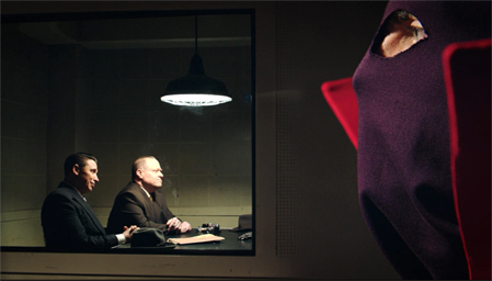
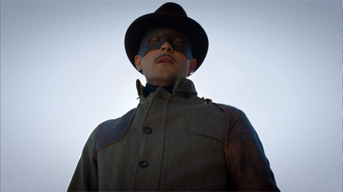
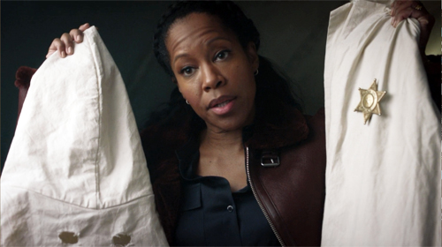
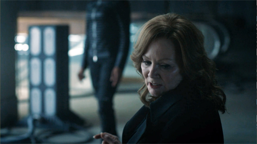
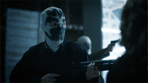
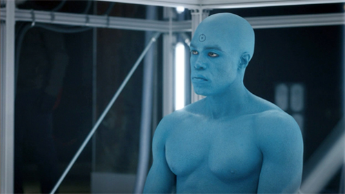
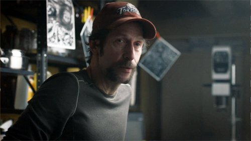
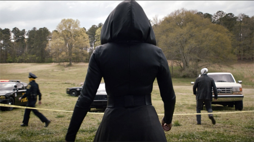
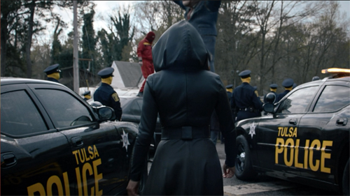
Archive for the 'Hollywood: Artistic traditions' Category
Hollywood starts here, or hereabouts
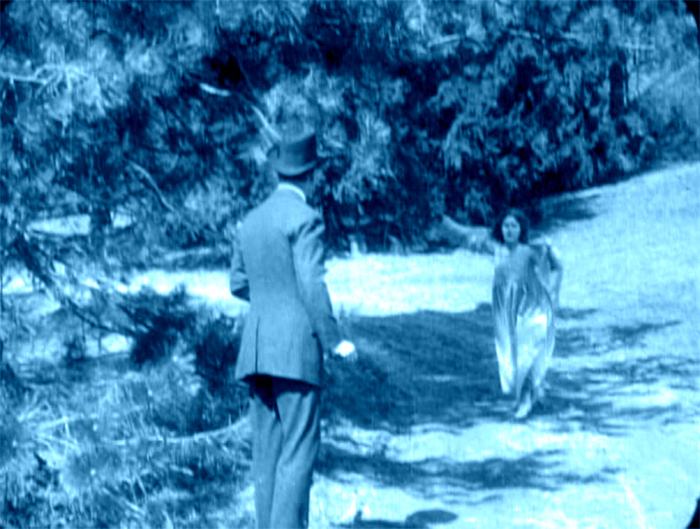
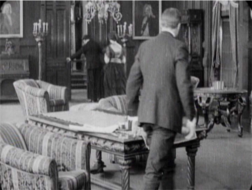
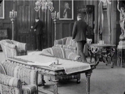
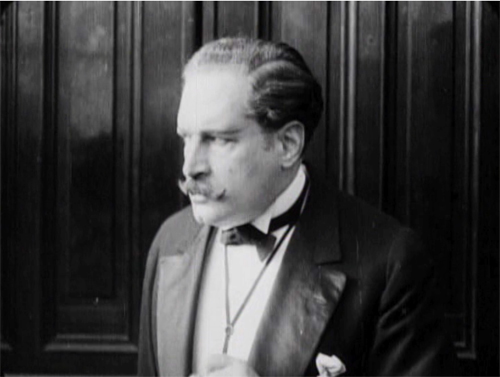
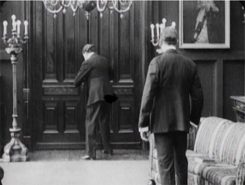
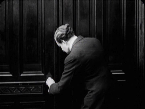
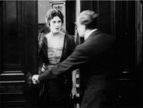
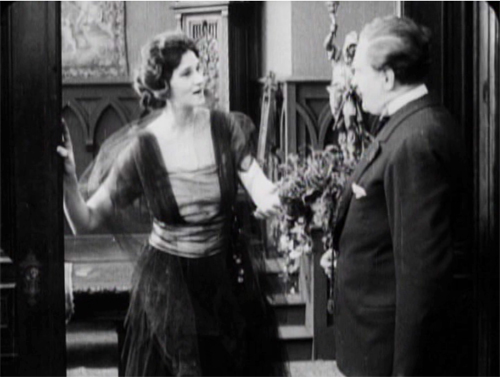
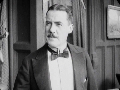
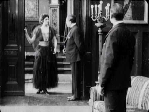
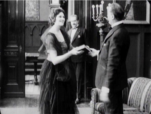
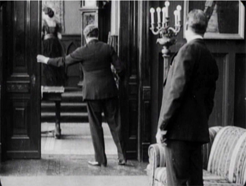
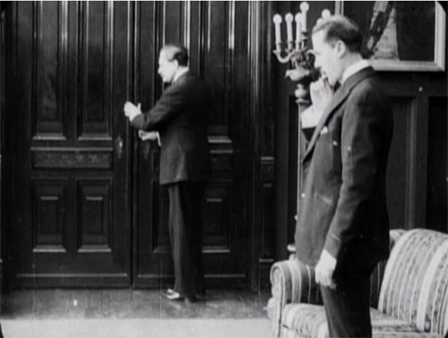
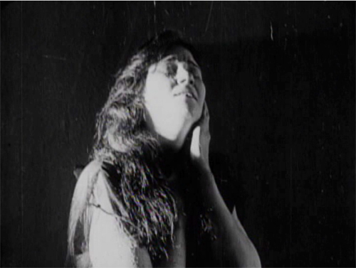
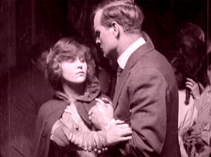
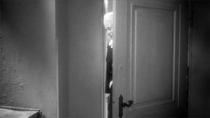
The Woman in White (1917). Toning by DB.
DB here:
Do you know Wilkie Collins’ The Woman in White? I hope so.
The traps set by this novel of mystery and suspense–a prototype of what was called “sensation fiction”–are still ensnaring audiences. Serialized in 1859-1860, it became one of the best-selling books of the nineteenth century. Merchandisers pounced on it, offering Woman in White cloaks, bonnets, perfumes, and songs. Stage and film adaptations followed. The Brits, always eager to mine classics, have created no fewer than three TV versions (1982, 1997, and 2018). There’s a pretty good Warners “nervous A” picture from 1948, with Sydney Greenstreet as the deadly, jovial Count Fosco.
The 1917 version from the Thanhouser studio is, lucky us, currently streaming on Vimeo for free. It’s also available on DVD, as part of the excellent series of Thanhouser films. The print is a 1920 re-release, but nothing significant seems missing or altered.
Apart from its entertainment value, the Thanhouser Woman in White can teach us a lot about film history. Why? Because it sums up very forcefully what American narrative cinema could do in that crucial year 1917. Forget your Griffith, leave aside (regretfully, just a moment) your Webers and Harts and Fords and Fairbankses. The mostly unheralded team of screenwriter Lloyd Lonergan and director Ernest C. Warde have given us a concise demonstration of the power harbored by classical Hollywood from the start. The storytelling tools assembled in that era remain with us still.
Women in peril
The novel’s plot is a tale of–well, plots. Counterplots too.
Collins’ book is hugely complicated, swirling together secrets, hidden identities, abduction, impersonations, illegitimate birth, bigamy, insanity, forged records, fake tombstones, assorted hugger-mugger, and timetables that even the author had trouble keeping straight. The intricacy is magnified by Collins’ decision to adopt a “casebook” structure, in which participants and onlookers write up their accounts of what they witnessed. Each piece of testimony is restricted wholly to one character’s viewpoint, and the writers are forbidden to fill in material they learned later. “As the Judge might once have heard it, so the Reader shall hear it now.” This stricture isn’t fully observed, though, because at least one witness sneaks looks at what counterparts have written.
The book’s key image is, of course, the apparition that greets Walter Hartright on the road one sultry night.
There, in the middle of the broad, bright high-road–there, as if it had that moment sprung out of the earth or dropped from the heaven–stood the figure of a solitary Woman, dressed from head to foot in white garments; her face bent in grave inquiry on mine, her hand pointing to the dark cloud over London as I faced her.
Recovering his senses (“It was like a dream”), Hartright listens to her gap-filled story and helps her find a cab. But soon he sees two bravos halt their carriage and hail a policeman. They ask: Has he seen a woman in white? No. Why does it matter? What has she done?
“Done! She has escaped from my Asylum. Don’t forget: a woman in white. Drive on.”
The first installment ends here, and the adolescent window opens a little wider.
The main plot centers on Laura Fairlie and her half-sister Marian. Hartright is engaged as Laura’s drawing teacher and they fall in love. But Laura’s father has promised her to Sir Perceval Glyde, an apparently upright aristo. (Collins was opposed to marriage as an institution. His class hatred comes out as well, though perhaps not as scathingly as it does in his other masterpiece, The Moonstone.) Once the marriage takes place, Glyde introduces into the household Count Fosco, a suave “doctor” with the habit of letting his pet mice scamper around his waistcoat. It doesn’t take long for Marian to realize that Glyde has a Secret, and she must turn detective to protect Laura from him.
Without pressing into spoilers, you can already tell that this lays down a template for the sort of story Hollywood would later love to tell. The Woman in White is a prototype for the woman-in-peril plot that we’ll find in Suspicion (1941), Shadow of a Doubt (1943), The Spiral Staircase (1946), The Two Mrs. Carrolls (1947), Sleep My Love (1948), and many 1940s classics. These in turn rely on literary works in Collins’ wake by Mary Roberts Rinehart, Mignon Eberhart, and other women authors who updated Gothic and sensation-fiction conventions for the twentieth century.
Lloyd Lonergan was said to have suggested reducing the eight-reel cut of The Woman in White to only six. It’s indeed a tightly coiled presentation of Collins’ sprawling plot. Swathes of backstory are dropped. Instead of Collins’ multiple narrators we get an omniscient narration that shifts freely across various intrigues. Fairly quickly we learn that Glyde and Dr. Cumeo (the Fosco of the novel) are scheming to switch Laura with her lookalike Anne, the woman in white. We also realize that Marian, as an obstacle to the plan, is in mortal danger. Thanks to crosscutting, we’re aware of several lines of action unfolding at once, and in a film full of spying and eavesdropping, compositions tell us who’s snooping on whom.
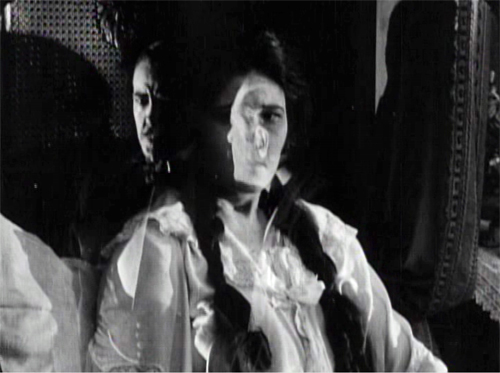
Still, some revelations are saved for the end, notably one that looks forward to the flashback-heavy 1940s. When Laura and Marian discover Glyde’s secret, their informant gives them the crucial information in a flashback, which precipitates a fiery climax. The flashback device was previewed when Marian, recovering from her collapse, recalled the plans she heard on the patio between Glyde and Cumeo; a nearly Surrealist dissolve superimposes that earlier scene.
In preferring to give us a lot of information, favoring suspense over surprise, this Woman in White is typical of Hollywood scriptwriting of the classical years. In particular, the film employs strategies later elaborated by Hitchcock (discussed here and here and here). One scene in particular displays the Hitchcock touch, years before Sir Alfred took up filmmaking. Even more specifically, let’s note that the basic situation looks forward to Notorious: a woman imprisoned by her husband and a confederate is slowly softened up for disposal.
Choreography, cutting, and showing us the door
Anyone who has viewed films with critical attention must be aware that in a film we are constantly, and without knowing it, being directed what to look at. In a stage play you may be looking at one moment at the actor who is speaking; at another moment watching the face of the person addressed, or observing the behaviour of other characters on the stage. If you go repeatedly to the same play, you may choose to look at different actors in a different order, for you certainly cannot observe everybody and everything simultaneously. But in a film, the lens of the camera is constantly telling you wha to look at–it may be a close-up of the actor’s hand, by the movement of which he betrays the emotion not visible in his face.
T. S. Eliot, 1951
The 1910s were an exciting era in cinema because, as I try to show in this video lecture, the foundations of “our cinema” were laid then. The film business, movie culture, and mass audiences settled into patterns that would hold for over a hundred years.
Just as important, the forms and styles of film craft were put in place. Among those changes was a transition from a style that relied on performance and staging to an approach more reliant on editing, on breaking scenes into many shots. The dominance of editing as a principle of guiding attention is evident from the Eliot quotation; he can’t conceive that staging, lighting, and other “theatrical” techniques could steer us to the important parts of the action.
The earlier, “tableau” approach to scenes was perfectly capable of funneling attention too, but editing had many advantages, both economic and aesthetic. By 1917, as Kristin and Janet Staiger and I argued in The Classical Hollywood Cinema, the editing-based approach had coalesced into the dominant style. The Woman in White is a nifty illustration of what an ordinary film from that year could accomplish with cutting–while still retaining vestiges of the tableau style.
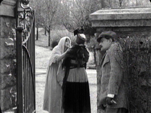
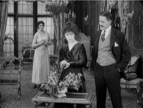
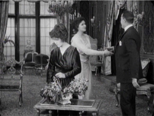
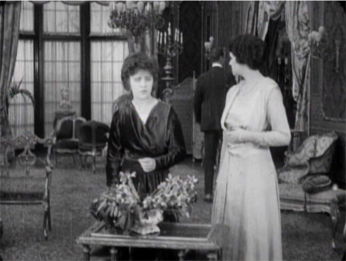
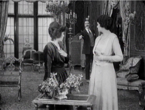
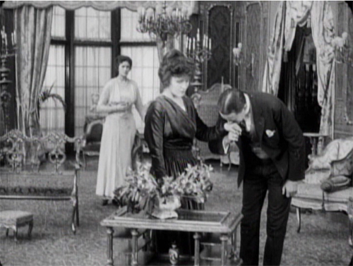
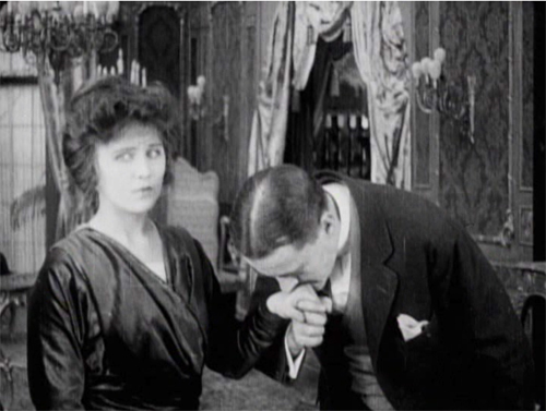
A simple example of the tableau technique comes when Sir Perceval Glyde calls on Laura and Marian. He has just kissed Laura’s unwilling hand, and Marian comes up from the rear of the shot to him. As she moves forward, Laura shifts aside slightly to clear our view of the others. This choreography doesn’t seem stilted because it expresses Laura’s withdrawal from her fiancé.
This is an example of the Cross, the staging technique that coordinates actors’ switching positions in the frame. Marian moves from frame left to frame right as Laura shifts to the left.
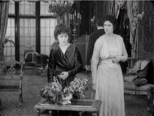
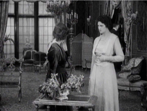
The tableau approach often plays between a lateral arrangement of characters in the foreground and a more diagonal array of figures packed into depth. As the shot unfolds, Marian is given a beat to take notice of Laura’s reaction as Glyde retreats to the background. She conveniently blocks his departure as she looks warily back at him.
But Glyde steps back into visibility in the distance as he says goodbye, with the women turning away from us so that we’re sure to concentrate on him. Then as the women turn back to react, he can be glimpsed leaving on the far right.
Doorways in the distance, characters advancing to and retreating from the camera, figures spreading themselves out horizontally but also blocking our view of things behind them, only to reveal them at the right moment–these tactics of the tableau became supple and subtle during the late 1900s and throughout the 1910s.
Eliot need not have worried that our attention would stray. Centering, frontality, movement vs. stasis, lighting, gesture, and other creative choices push us to notice the important elements of the scene. And these factors aren’t equivalent to what we see on the theatre stage; the optical properties of the camera lens create a very different playing space. (See here and here.)
Tableau staging hung on in editing-driven cinema, but it tended to be relegated to the role of an establishing shot. The first part of this scene consists of another tableau setup broken by a cut when the slimy Glyde kisses Laura’s hand.
Here the closer view underscores his gesture while isolating Laura’s concern.
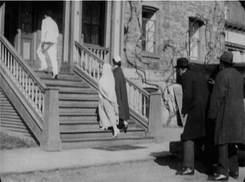
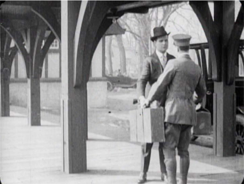
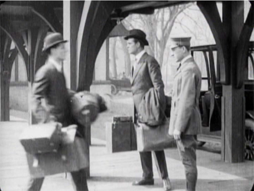
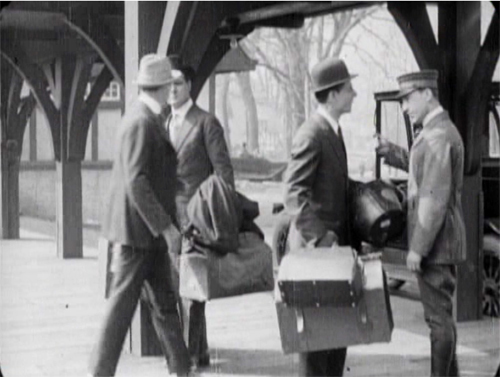
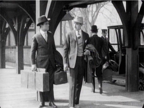
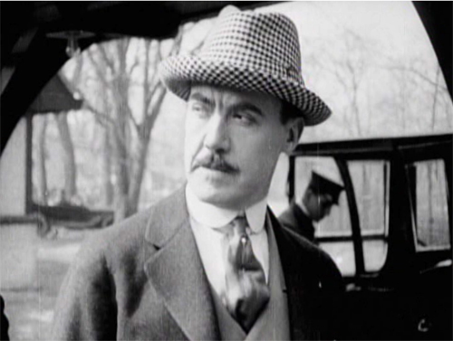
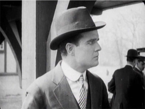
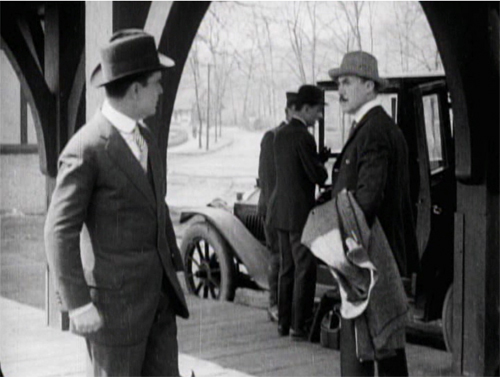
The coordination of staging and cutting is nicely shown when Walter Hartright, having resigned from his post as Laura’s teacher, accidentallly encounters Glyde at the train station. Glyde is coming to arrange his marriage to Laura, so the plot needs to establish the friction between the two men early on. As they confront each other, Glyde’s assistant loads his luggage into the cab in the background.
The first phase of the scene choreographs the men’s encounter through the Cross.
Then close views underscore the significance of the encounter.
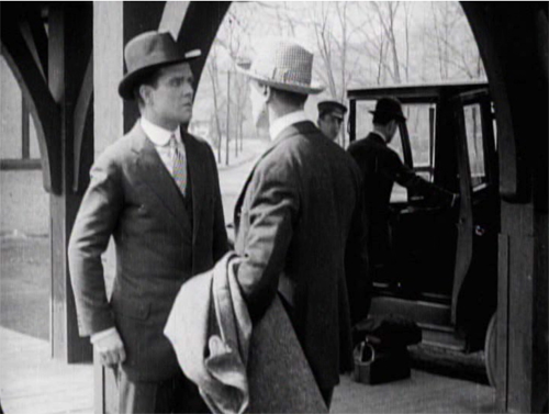
Cut back to a two-shot that reorients us.
The fact that it’s not the same framing as we saw at the start indicates the reliance of the style on editing; even the full view is re-calibrated in light of changing shot scales. And during the shot of Walter, Glyde’s position has changed from his orientation in his medium shot. That’s the sort of flexibility editing gives you. The new arrangement heightens the clash of the two men. (Typical of the 1910s emphasis on depth, Glyde’s assistant and the driver continue to load the cab in the background.)
Glyde’s enlarged hand kiss and the inserts of the two men in the station scene exemplify the axial cut. This is a cut made along the lens axis of the camera–a straightforward enlargement of a chunk of space. It’s very common in 1910s cinema, and it’s still around, though it’s not as common as it was. Editors came to prefer analytical cuts that were more angular, yielding less the sense of a sudden enlargement. Sometimes you’ll see claims that cut-ins or cut-backs should shift the angle by 30 degrees. Yet Kurosawa and Eisenstein made powerful use of the axial cut, and it’s sometimes used as a self-conscious device. During the 1910s, some directors began using the over-the-shoulder (OTS) framing as a way to assure distinct angle changes.
The cut to Glyde’s creepy kiss is also a match on action, smoothly linking Glyde’s gesture across the shot change. This too emerged in the 1910s and became a mainstay of classic editing technique, to this day. (See my earlier post on Watchmen for contemporary examples.)
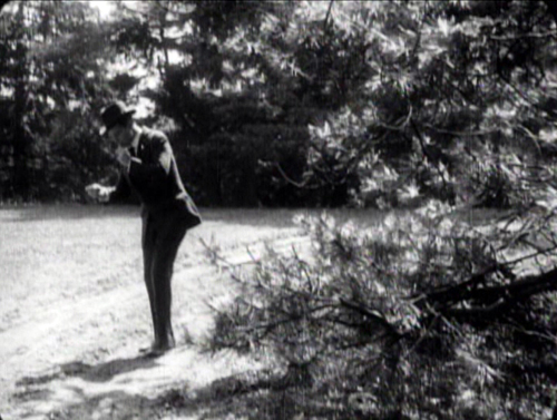
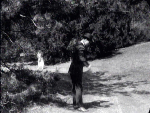
The Woman in White has several adroit matches on action, which shows that the learning curve among directors was more or less complete by 1917. When Walter first encounters the mysterious woman on the road, his striking a match is carried across a cut, with the second shot introducing her coming toward in him n the distance.
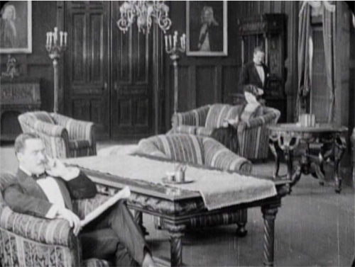
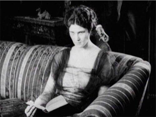
One of the most common editing devices of classical continuity is the eyeline match, and filmmakers were mastering this from quite early on. By 1917, it was part of every director’s tool kit. We can see how it works together with the other techniques in a fine, smooth scene that leads up to a crucial turning point in the action. Glyde and Dr. Cuneo are in the library, where Marian is uneasily reading a novel. Cuneo moseys over behind her, softly threatening, and an axial cut matching his movement lets us know she notices.
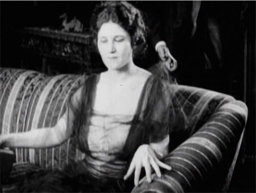
Another match on action brings her off the sofa. Love those delicately splayed fingers.
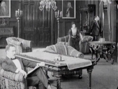
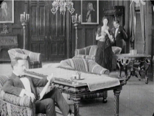
As she starts to leave, we get the Cross, as Glyde rises from his armchair and goes frame right. We now get the start of a major piece of business: Cuneo’s byplay with the sliding doors.
Securing their privacy, Cuneo prepares to consult with Glyde about their skulduggery. But a match on action, carried by a powerful axial cut–a huge enlargement from the extreme long shot setup–alerts us. He’s listening.
Another match on action as he busies himself with the door. A new diagonal composition prepares us for a shot of Glyde to come shortly. And yet again Cuneo is matched as he opens the door.
The payoff: Cuneo has detected Marian outside listening. She bluffs, saying she left her novel behind.
Now comes the shot that was prepared for by the over-the-shoulder long shot above. It’s not an axial cut, but a genuine reverse angle on Glyde, who’s suspicious about Marian’s return.
This is a killer shot because the camera can assume a drastically new position. It has put us in between the characters in a way we weren’t in the station scene. In effect, there’s an axis of action running from Glyde to the doctor and Marian at the door. The reverse angle is a one-off technique at this moment, but the possibility of penetrating the dramatic space in this way will be central to continuity cutting.
Now tableau principles can kick in. Marian comes forward and gets the book while Cuneo watches warily in the background.
In the course of the shot, Marian leaves, and this time, thanks to deep staging, we and the plotters can see she’s not eavesdropping. As she goes upstairs, Cuneo closes the door and the men can settle down to scheming.
Five matches on action, a striking eyeline match, restrained but pointed performances, and a cogent staging of the action have yielded a vigorous, engaging scene. By 1917, classical screen storytelling is well established in even a run-of-the-mill production. But there’s nothing run-of-the-mill about the suspense that follows this trim tension-builder.
1910s noir rides again
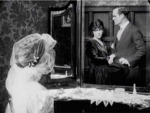
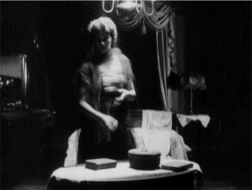
The Woman in White illustrates a lot of other 1910s innovations in pictorial storytelling. There are, for instance, some concise special effects, as when on Laura’s wedding day she sees herself and Walter in her vanity mirror.
There are also dramatic lighting effects, motivated by firelight, single lamps, and eventually lightning flashes.
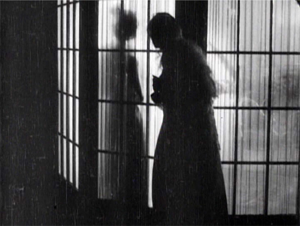
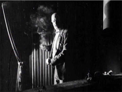
But more audacious is a sustained experiment in “1910s noir.” At that period filmmakers began associating crime and mystery with shadows and stark lighting. (See this entry.) When Glyde and Dr. Cuneo adjourn to the terrace to discuss their scheme, we get a remarkable instance. I won’t indulge my impulse to shower you with images, but I’ll try to suggest why you should try to see the sequence for yourself.
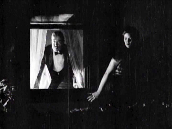
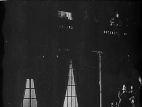
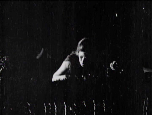
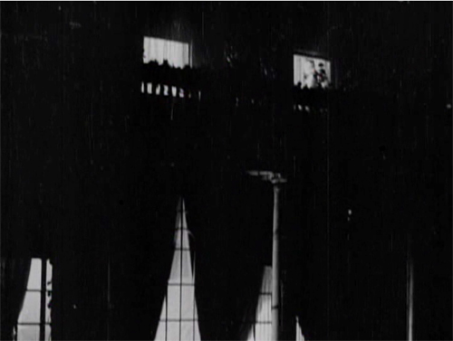
While the men smoke and talk outside, Marian has seen to the sleeping Laura before going to her own bedroom. (A sign of the film’s tidiness is the way it establishes the main characters’ rooms in the upstairs hallway. This geography becomes important when Glyde and Cuneo exchange Anne for Laura.) Opening her window, Marian hears the men outside and ventures onto the balcony above them. This yields a remarkable extreme long shot: She eavesdrops from above.
It’s a difficult shot by later standards. The main action is wildly decentered, set off on the right. But at least this framing has the virtue of preparing us for the later development of the scene, which will involve Marian sneaking along the balcony back to her room, where the light comes from.
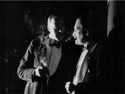
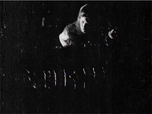
The vertical layout of the action is immediately clarified by two closer shots, a lovely chiaroscuro image of the men and the other of Marian listening.
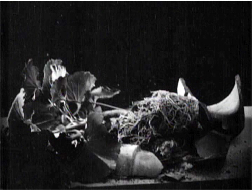
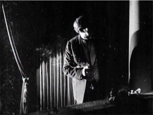
She hears just enough to suggest the men’s scheme before complications ensue. Glyde goes inside and upstairs, where he might discover her. Meanwhile, a rainstorm starts, and Marian dislodges a potted plant. Cuneo turns, in a new setup that emphasizes the railing in the right foreground, so that we can see the fallen plant. The shattered pot is given a close-up more or less from Cuneo’s viewpoint. His reaction supplies a moment of suspicion.
Marian, now drenched by rain, seems trapped between her two adversaries. Will one or both discover her?
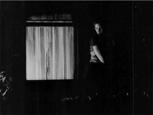
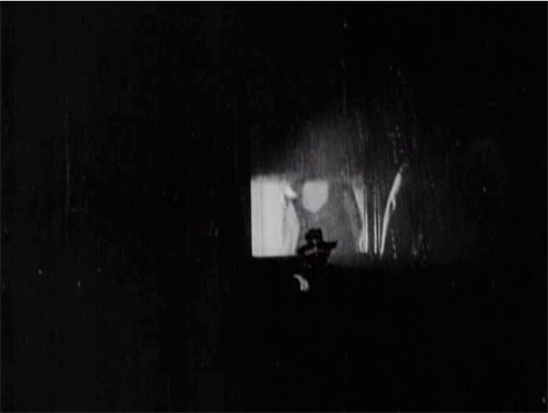
Glyde who has gone to Laura’s window and is looking around outside. We’re reoriented through a new master shot of the house, a framing that varies from the original setup. The shot shows both Laura’s and Marian’s windows lit. There follows a dark passage in which Marian creeps up to Laura’s window. That action takes place in the shot I’ve put up above.
An extra twist: Glyde looks out, but then pulls the shade. Little things mean a lot. A soaked Marian manages to crawl back through her window.
Apart from its virtuosity in handling cutting and lighting, the sequence is crucial for the plot. Marian collapses from her exposure to the storm, and her illness provides a pretext for Cuneo to isolate her while he and Glyde proceed with their plan.
I invoke Hitchcock because this long passage of suspense depends on our knowing all the relevant factors in the situation, and the possibility of a giveaway–the smashed plant–drives up the tension. What I’m really saying, I guess, is that Hitchcock expanded and deepened story mechanics that were already in place in the silent era. Apart from refining them, he managed to brand them as his own.
No film from 1917 or thereabouts is faultless in executing the new editing-based style. The Woman in White has its share of mismatches. Then again, so do movies from the 1920s to the present. (Don’t get me started on the mismatched cuts in The Irishman, 2019.) The crucial point is that the system of Hollywood storytelling and style is in place, and not in a crude form. Talk all you want about post-classical cinema, chaos cinema, post-cinema–whatever. The variations we detect today arise against a background of stable norms that remain a lingua franca of world filmmaking, and they’re headed well into their next century.
Thanks to Ned Thanhouser for years of faithful service to the studio’s legacy. Now is an ideal time to visit his site for background on this remarkable company and the efforts to preserve its output. A staggering 132 Thanouser films are available for streaming on Ned’s Vimeo channel.
To find out more about what preceded this crystallization of techniques, see Charlie Keil’s Early American Cinema in Transition: Story, Style, and Filmmaking 1907-1913 (University of Wisconsin Press, 2002).
An excellent survey of Collins’ place in the history of dossier novels is A. B. Emrys, Wilkie Collins, Vera Caspary and the Evolution of the Casebook Novel (McFarland, 2011). Her treatment of Caspary and Laura, both favorites of this blog, is just as valuable. My quotation from T. S. Eliot comes from “Poetry and Film: Mr. T. S. Eliot’s Views,” in The Complete Prose of T. S. Eliot: The Critical Edition, vol. 4: A European Society, 1947-1953, ed. Iman Javadi and Ronald Schuchard (Johns Hopkins University Press, 2018), 581.
For lots more on 1910s storytelling, see the categories 1910s Cinema and Tableau Staging. Flashbacks, the woman-in-peril plot, and other conventions that coalesce in the 1940s are discussed in my Reinventing Hollywood: How 1940s Filmmakers Changed Movie Storytelling.
The Woman in White (1917). Toning by DB.
Who will match the Watchmen?
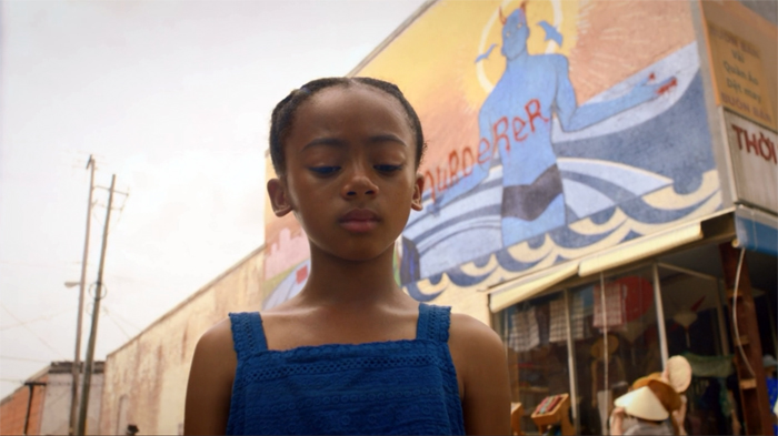
Watchmen (2019), Episode 7.
DB here:
If we want to understand the craft of filmmaking, we should pay attention to what filmmakers say about their technique. Sometimes we have to confirm what they tell us with other evidence and the onscreen results, but practitioners usually offer unique angles on their creative choices. For this reason I found it fascinating to come upon what Director of Photography Gregory Middleton had to say about his work on HBO’s limited-series Watchmen.
I had read the comic back in the 1980s and was intrigued by its experiments in pictorial storytelling. I’d also seen the movie, which I thought not as adventurous as the book and vitiated by the book’s adolescent nihilism. (Your mileage may vary.) But Middleton’s interview made me watch the series. So I thought I’d use this anxious pause in normal activities to share some ideas with you.
Middleton has a lot to say about the visual design, such as the sort of lenses he used to get startling depth effects. These echo some common graphic-novel compositions.
But I got more interested in other questions. How does the show adapt some classical cutting techniques? And how do those techniques square with the “editing” techniques we get in the original comic?
Here’s the relevant passage:
And transitions are the biggest tell when you cut from a beat of one thing to a beat of something else. In the case of the comics, one of the transitional devices we wanted to use to echo the graphic novel is the match cut. In the comic you’ve got one panel with a character in the foreground and someone in the background. The next panel is the same character in the foreground, but they are somewhere else — or somewhere else in a different outfit. And the background is something similar, but it’s something else, and you’re basically just jumping time because you’re really with the character and where their state of mind is, so the intervening time between how they went from here to there is irrelevant.
There is a great one in episode two where Angela walks back after they just sat down, and she sort of disagrees with the idea of going to rustle up the people at Nixonville, and she walks away, and she’s pacing as a match cut to her pacing at the police lineup at Nixonville. You go right where she’s thinking, like Okay, I don’t want to be here, but now I’m gonna be here, and suddenly you’re right there.
The match cut is also a way to instantly transport the audience without introducing a lot of other extraneous visual information. In episode four, we did her opening and closing her trunk when she is going to just get rid of the wheelchair she’s cut apart. She chucks it in the trunk, slams the trunk, and it’s a match cut to her opening the trunk, and she’s already somewhere else. And that just works — you don’t need to see her driving and parking and all that. The point is you just know she is dumping this thing, and it’s a nice, clever way to keep you on point with where she is with her intent.
Afterward, it’s like he’s just jumped ahead again — both places, same time. So it’s a way to sort of double-use that technique. It just takes a lot of planning and preparation. Nicole [Kassell, director/producer] and I worked hard on all the transitions in that episode to try and achieve that effect and make it interesting.
The transitions between scenes that Middleton is discussing are, I think, what have been since the 1940s called “hooks.” His comments open up some ideas about how editing works with them.
There are some spoilers, but not my usual quota.
Matchmaking
We can enhance our understanding of filmmakers’ creative options if we systematize a little bit the choices they face and the terms they use. That’s what I try to do in the online essay on hooks between scenes. There I suggest that we can have four sorts of palpable hooks from shot to shot: sound/sound, sound/image, image/sound, image/image. My examples come from National Treasure (2004), a movie that revels in tricky transitions.
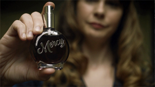
For example, one transition in Watchmen creates a sound/ image hook. The Game Warden tells Adrian, “No Mercy” and we cut to a close-up of a Mercy perfume being tested on a focus group.
Middleton calls the cuts that create image/ image hooks “matches.” “Match” is a broad term that points up a general principle of cutting for continuity. In a match shot-change, which might be a cut or a dissolve, something in shot B picks up something that was in shot A. Without distinguishing different types of matching, Middleton is stressing how continuity editing techniques, normally applied within scenes, can be used as transitions between scenes as well.
So let’s create an initial menu of possibilities. Within scenes, there’s the eyeline match, which shows a single character looking, followed by a shot of what the character sees (not necessarily from their optical viewpoint).
Shot/reverse exchanges like this one often rely on the eyeline match, but need not; you can have a shot/reverse pattern if the characters aren’t looking at each other. (Imagine two people talking with their backs to each other.) The eyeline match can link more than two characters within story space.
There’s also the match on action, where a bit of movement in A is carried over into B, despite the change of camera position. The scene between Wade and Angela continues with a combination of the eyeline match and the match on action.
Another sort of match plays upon the sheer pictorial qualities of the two shots. As Middleton says, shapes and color patches can be carried over from the background or foreground or both. Filmmakers don’t seem to have developed a specific term for this type of shot change, although they were clearly using it from at least the 1920s onward. (Eisenstein was the most explicit.) In Film Art: An Introduction, Kristin and I proposed calling the lining-up of compositional features from A to B a graphic match.
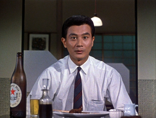
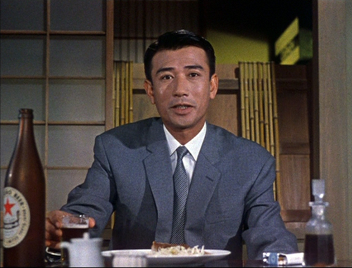
Precise graphic matches are common in experimental films, but they seldom show up within scenes of narrative films. Still, Eisenstein, Lang, Ozu (here, from An Autumn Afternoon), and a few other directors made bold use of them. And they’re obviously a matter of degree: Ozu can match an overall shot in some detail, as above, or just one portion of the frame.
We might add the possibility of the “category match,” as when a prop in shot A is followed by something comparable in shot B. Imagine cuts among wanted posters inside a sheriff’s office.
When we move beyond the individual scene, what are the possibilities? Clearly, all types of match-cutting can be used for transitions.
In Watchmen, an eyeline match shifts us from Angela, lying wounded on her living room floor, to a view of Judd looking down at her in the hospital when she awakens. Here the eyeline yields an optical POV.
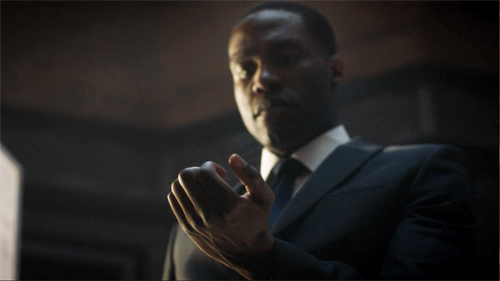
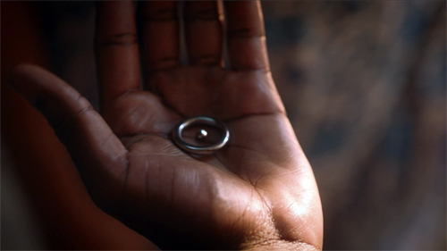
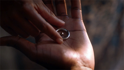
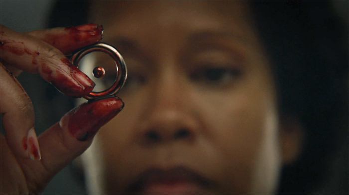
A match on action takes us from one scene of Cal opening his hand to another as Angela reaches for the hydrogen-atom ring.
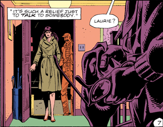
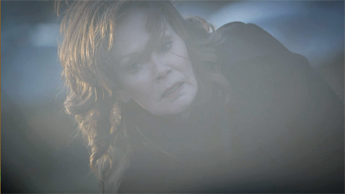
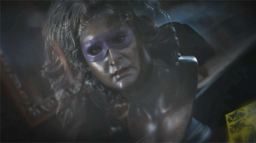
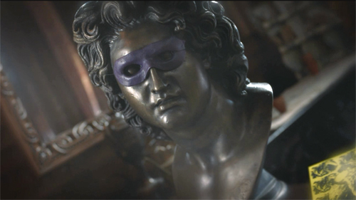
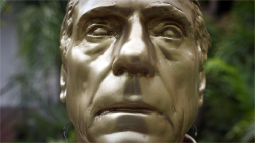
A hook can also exploit a graphic match. As Laurie lies sideways after a bomb blast, the image dissolves to a similar composition, a twisting view of a masked bust.
Middleton points to one striking moment that viewers are likely to notice: a match on action that’s also a bold graphic match. Angela strides away from one scene and continues her movement, and her compositional thrust, in a new location, Nixonville.
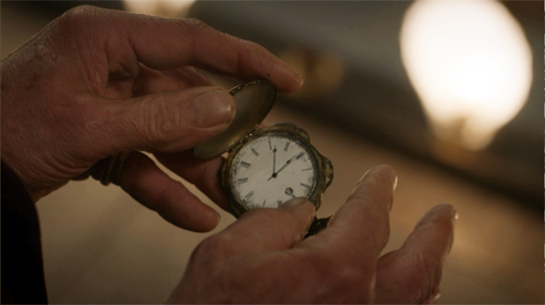
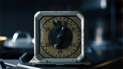
The “category match” is at work on occasion too, as when one scene ends on a pocket watch and the next starts on a clock face.
The category match blends with the graphic match when hands links scenes.
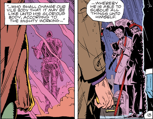
What seems to have sensitized the show’s creators to the possibilities of hooks is the fact that the Moore/Gibbons comic makes punchy use of graphic matches between panels. These are often used to signal character memories by opening and closing flashbacks.
Vivid as these examples and others are, the hook, even the graphically matched one, has a long lineage, as my essay tries to show. The creators of Watchmen are working in a distinct tradition of classic filmmaking.
Showing and showing off
More broadly, that classic tradition favors speed and quick pickup. The new Watchmen is essentially a police procedural, unlike the comic and the feature film. Accordingly, the investigation of a crime is interwoven with the personal lives of the police, the “cop soap opera” that brings in friends, family, lovers, and secrets from the investigators’ pasts.
The crucial backstory involves Angela Abar, who knits together many threads. The child of a US black soldier and a Vietnamese woman, she became a policewoman in Tulsa and underwent the new militarization of the force in response to white supremacy. Some of the earlier Watchmen team, notably Adrian Veidt and Dr. Manhattan, are still exercising their power, while Laurie Blake, the daughter of Silk Spectre, is now working for the FBI.
Like the comic, the series must move the plot swiftly between past and present. The comic splinters time more audaciously, jumping back and forth across its grid of nine vertical panels. But in a classical film, where you don’t normally pause or go back, the story must unwind linearly, and so other strategies come forward to impose a felt pattern.
Older films might dwell on the aftermath of a scene, letting the tension relax a little, and provide a cadence that marks off a distinct section. Modern films, especially if they’re presented in the distracting environment of home viewing, display a need to maintain a rapid pace. So scenes push to a high point, then provide a “button” like that close-up of Laurie, and then move swiftly to the next. Among other advantages, this tactic keeps people from pausing or changing the input. Still, the scene shifts need to be clear fairly quickly.
Hooks can help on both fronts. They snap up the pace, keep us alert, maintain interest from moment to moment. A less clear-cut hook can provide a bump of surprise that teases us into the next scene. Soon, though, we will get imagery, and especially dialogue, that anchors us in the ongoing action.
Hooks also provide motifs that can cascade through the film. Adrian’s ambitions to be the new Alexander the Great are provided by cuts that mock his pretentions.
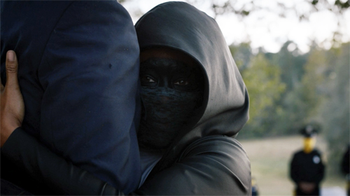
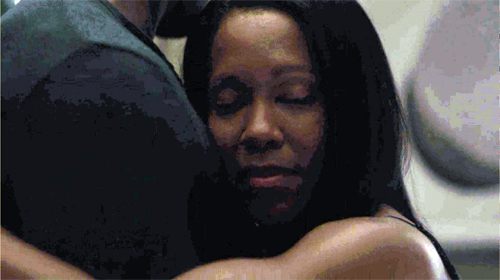
And, as in the comic, the cinematic hooks facilitate subjectivity. The most common way classical storytelling justifies unrealistic or nonlinear narration is through getting into characters’ heads. (Middleton: “You’re really with the character and where their state of mind is.”) Abrupt and startling cuts can be motivated if what we see is a memory, a dream, or a hallucination. This is what we get when Angela embraces Judd’s legs: a match-on-action hook to a flashback of her slow-dancing with Cal.
The most elaborate hooks can provide something more: a certain elation in virtuosity. The precise matching of Angela’s stride across those two scenes above is a stylistic flourish that asks us to appreciate the care and bravado of the filmmakers.
Watchmen‘s hooks, however flamboyant, stand out against a pervasive backdrop of classically constructed scenes. We get lots of over-the-shoulder reverse angles, properly timed reaction shots, now-standard cuts to extreme distant shots that provide a “beat” for the scene, and other devices that have been around for decades. Plenty of other traditional strategies for narrative coherence are on display, from goal-oriented protagonists and deadlines to newspaper headlines and TV broadcasts as sources of impersonal narration. There’s even the inevitable Hollywood line: “What are you doing here?” As usual, striking moments emerge out of a familiar flow of narrative cause and effect, with some mysterious gaps eventually filled.
Paging the Watchmen
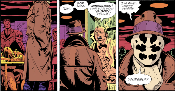
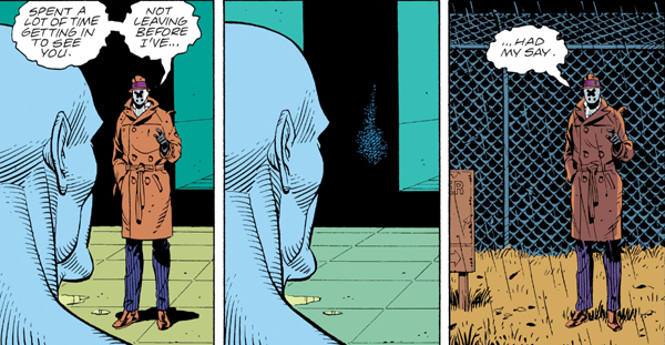
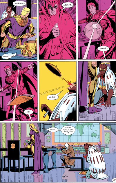
Comics artists absorbed the lessons of continuity filmmaking. If the hooks in films stand out by contrast with the overall smoothness and linearity of classic construction, something similar happens in comics. Here are three “continuity shots” from the Watchmen graphic novel, complete with obedience to the axis of action, reverse-angle cutting, and a “single” for emphasis on Rorschach’s reaction.
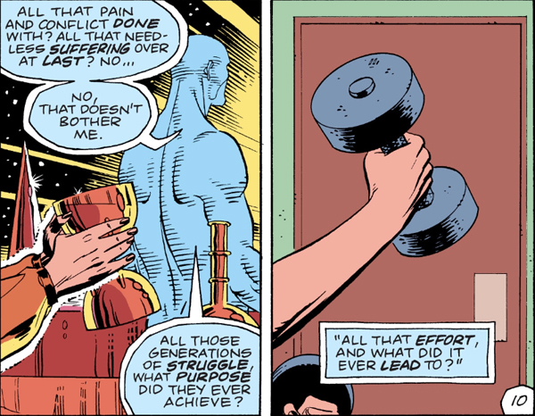
Even a match-on-action hook can be suggested, as when Laurie’s lifting a goblet on Mars “cuts” to her as a teenager lifting a dumbbell.
Graphic continuities and discontinuities can be motivated by science-fiction premises, as when Dr. Manhattan teleports Rorschach out of the facility. The sense of instantaneous change wouldn’t be so strong if Rorschach’s size and placement in the format weren’t kept constant.
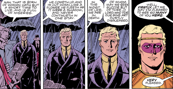
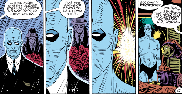
In a way, the graphic continuities are almost needed for the time-shifting transitions. A new angle on Adrian at the start of the funeral flashback below would be more confusing than the frontal close-up that completes a gradual enlargement of his face. The new costume and the “offscreen” dialogue cue us to a new scene.
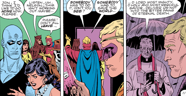
To keep things tidy, the flashback ends with a foreground graphic match on Adrian, leading us back to the funeral.
As ever, popular narrative maintains symmetry and redundancy to keep the action clear. Here’s a more “staggered” but no less symmetrical foreground graphic match–used, again, for subjectivity.
The rectilinear staging evokes either a track-in (the first two panels) and a track-back (the last two) or axial cuts in to and back from Dr. Manhattan. (The Soviets called these in-and-out edits “accordion” cuts.)
So there are some rough equivalents between film editing and the principles binding comic panels, especially ones this jammed with information. But comics have unique resources too–ones that Watchmen‘s creators were well aware of. Dave Gibbons notes that he exploited techniques articulated by the great Will Eisner, “where you could, say, hold the camera’s point of view and have characters walk past it, or follow the characters through a scene acrosss a changing background, where you could echo panel compositions . . . .”
The echoes Gibbons mentions depend on the fact that the book page and its role in a two-page spread create a force-field that displays the story both as a timeline and a spatial array. Panels are at once phases of action and a simultaneous order of images, and the interplay of story information and pictorial pattern can become quite rich, even baroque.
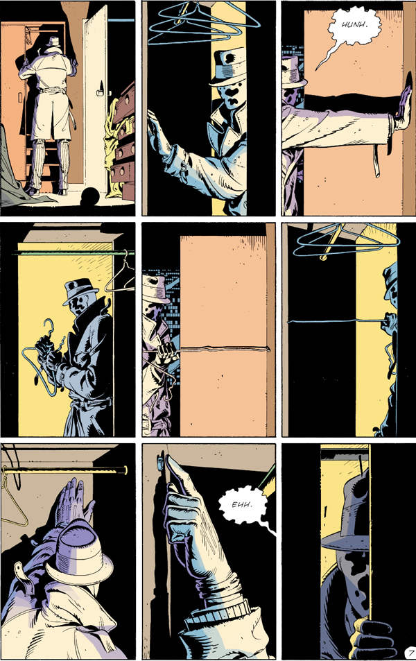
Consider when Rorschach rummages in the Comedian’s closet. Even if we could replicate the panels in a movie shot by shot, the page’s severe structure couldn’t be grasped as a simultaneous whole onscreen.
The echoes are striking. Panel 1, the establishing shot, is enlarged in panel 7 on the bottom row, as is panel 2 in panel 8. Each lower-tier mate is markedly closer than the top one, emphasizing the growing sense of discovery. Panel 2, with its sidelong strips of solid black, is echoed in panel 4 and panel 6 (a slight “pan” left from 4) and, with another enlargement, in panel 9, the climax. The color slabs (yellow/black, grey/purple) accentuate the repetitions and variations. The middle stretch, panels 3-6, forms a suite of variations as well (5 picks up 3, 6 picks up 4), while Eisensteinian cuts flip us back and forth across the axis formed by the straightened coat hanger. All the cuts are compass-point shifts, moving us in 90-degree multiples. The crisp geometry of the découpage renders the unhurried professionalism of Rorschach’s search, an effect accentuated by the snapshot imagery (no motion lines).
The effect depends in large part on the presence of all these images on the page at once. The alternation of shot scale and color fields can be discerned only by seeing the overall architecture of the page.
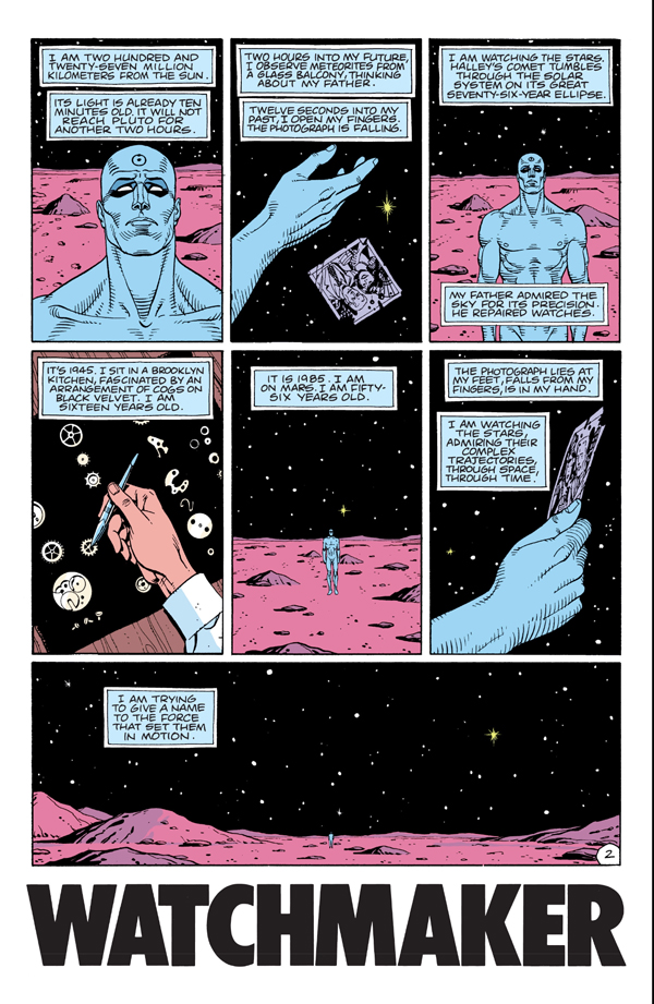
Panels 1, 3, and 5 build to the climax of the wide framing on the bottom as we pull farther back from Dr. Manhattan during his soliloquy. Panels 2 and 6, echoes of a close-up of the photograph, provide a sharp contrast to the landscape and emphasize the power of memory. That power is enacted in another variant of the hand image, as the young Jon Osterman arranges watch parts, like stars, on a velvet ground.
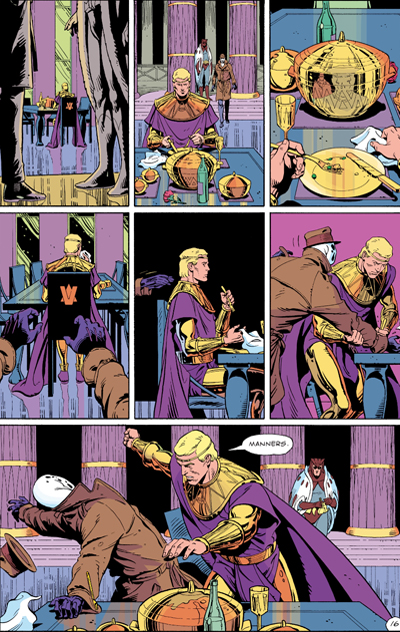
The page is one standard mid-size unit for the comics story, but the two-page spread is the next phase up. A continuous action can be spread across the open book, with echoes emerging. In the big fight scene, the shifting POV (occasionally objective, but also bouncing us among Rorschach, Adrian, and Daniel) is capped by symmetrical wide panels at the bottom of each page. The rose-tinted panels on the right page add their own fillip of pattern.
In a film such symmetries and variations unfold over time. We can make them apparent only through a “spatialized” analysis, spread out on the page like a comic-album layout. (Such were those pioneered by Raymond Bellour in the 1960s and 1970s.) In comics, these patterns strike us immediately, as a primary and palpable expressive vehicle. One-off devices like the graphic match can be sustained both on the screen and on the page, but each medium stamps its own structures on the flow of time.
There’s a lot more chop and change in the space-time continuum of the Watchmen comic than I can do justice to here. (Some pages run three time periods simultaneously.) But my main point should be clear. As usual, when we start to pay attention to the films and media artifacts that fascinate us, we always find more going on than we realized. Both movies and comics work on us so directly that their design subtleties can easily pass unnoticed. We can keep reverse-engineering them as long as we like, and we’ll learn a lot. And the creators can be very helpful guides about what to pay attention to.
I first became aware of Gregory Middleton’s comments by reading the review essay by Namwali Serpell, “In the Time of Monsters,” New York Review of Books (9 April 2020). I’m grateful to Serpell for calling my attention to the problem of cutting in the Watchmen series.
The essay is somewhat misleading in its account of match cutting, which is said to create “‘jumps’ rather than flows from shot to shot.” It’s actually just the opposite. The match cut creates continuity of time, space, and graphics between shots. It need not, as the essay claims, link two settings, and it’s not an alternative to a “splice cut,” which is a term with no currency I’m aware of. (A splice is simply the physical join between film strips, and it can govern any type of cut. Splices are increasingly rare with the dominance of digital editing.) The alternative to match cutting would be discontinuity cutting.
Serpell’s essay is worth reading for its interpretive dimension. She argues that for all the creators’ efforts to create strong images of minority heroes fighting white supremacy, there is a critical, antiheroic aspect to the original comic that isn’t picked up in the series. The sanctioned violence of Angela, Wade, and others is treated as unproblematically righteous.
I’d largely agree. Yet I’m not sure that the original book’s portrayal of superhero trauma (the result of the go-to source, childhood abuse) elevates these caped crusaders much. They seem to me best understood as part of that cycle of debunked superheroes we find in other 80s comics, notably The Dark Knight. Why would someone put on a mask to fight crime alone? What dignifies vigilantism? Are these “the heroes we need now”? These, we’re told, are deep questions, but they seem to me the tropes of a quickly standardized set of conventions. They signal a “new complexity” and “adult attitude” comparable to the romanticism of film noir and the cynicism about samurai ideals we find in Japanese swordplay movies. Bringing heroic genres low is itself a genre convention.
More broadly, I’d propose that the the storytelling strategy Serpell highlights is part of the common move within thematically ambitious mass-market movies to be strategically ambiguous. Creators, I’ve suggested here, often throw many things against the wall to see what will stick. They can then point to contradictory aspects which show balance. So yes, Angela tortures members of the Seventh Kavalry, but (a) they’d do the same to her; and (b) she’s driven by righteous vengeance for ancient wrongs; and (c) we want to make you a little uncomfortable with her vigilantism anyhow. Nowadays, it may be that what seem involuntary contradictions are deliberate efforts to have things many ways at once. This maximizes viewer outreach and gives critics fodder for debate. For another recent instance, see the previous entry on The Hunt.
The Dave Gibbons quotation comes from the supplement “The Phenomenon: The Comic That Changed Comics” available on the DVD of the Director’s Cut of Watchmen, 9:35-10:14.
Raymond Bellour’s “spatialized” analyses of repetition and variation can be found collected in The Analysis of Film (Indiana University Press, 2001). Some efforts of mine are in On the History of Film Style and in Ozu and the Poetics of Cinema (available for free, if patient download here), as well as in other material on this site.
Watchmen (2019).
Hunting Deplorables, gathering themes
The Hunt (2020).
DB here:
I recently participated in a Film Comment podcast with Nic Rapold and Imogen Sarah Smith. It was fun. Yes, The Hunt was involved.
And last month I posted a “blog lecture” for my seminar on Poetics of Cinema. Because it included references to classroom material, I thought it was too insular for general consumption, so I posted it privately. Encouragingly, some of our regular readers wrote to ask about accessing it, so today I’m putting up a more broadly-aimed version. Again, yes, The Hunt is involved.
We like to watch (and listen)
First and fast, some foundations. As Paul Krugman might say, wonkish ones.
Most basically, I’m interested in two questions: How do films work? How do they work on us? The first question, I think, can productively start with filmmaking craft and the norms that filmmakers work with in their historical situation. Within and against those norms, filmmakers create work that blends tradition and innovation. I’m interested in conventions–the conventional side of “unconventional” works, and the unconventional side of more apparently rule-abiding ones. I sometimes say I want to know filmmakers’ secrets, even the secrets they don’t know they know.
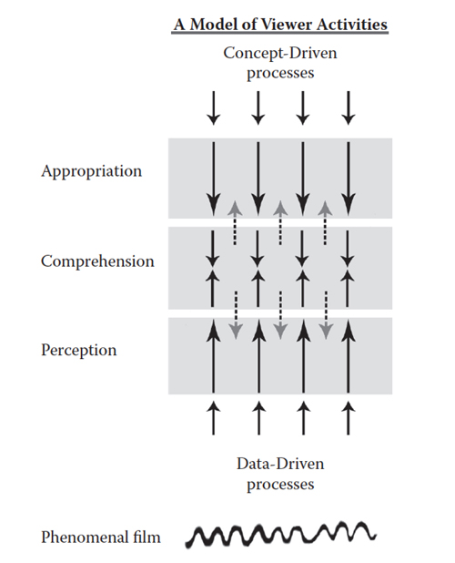
But asking how films work on us has driven me to posit a conception of spectators’ activities. After all, in any art it’s legitimate to try to explain how the design features of a work are shaped to elicit effects, ranging from perceptual and emotional ones to broader effects of comprehension and what I call appropriation. I assume that in every sphere “the beholder’s share” in watching movies is considerable, and active.
Using a common psychological distinction, I’ve argued we can roughly understand this process with a diagram, above.
The activity proceeds both “from the bottom up” via the fast, mandatory, specialized activities of visual and auditory perception. The process works as well as from the “top down” via more deliberative mental acts. Comprehension, typically of story patterns, operates in the middle. So you “just see” a man in tights walking across the shot. Thanks to story comprehension skills you “just see” Batman striding to face off against a crook. Thanks to your wider conceptual schemes, you can appropriate that as patriarchy in action, or the pain of vigilante justice, or a template for an action figure you might buy, or whatever. Where’s emotion? At all stages, I think.
And all these processes seem to me inference-based to some degree. In grasping artworks, even perception has an inferential dimension, going beyond the information given. Patches and contours on the screen are grasped as people, places, and things; sound waves are grasped as speech and music. The process is inferential because these perceptual conclusions are defeasible, as most illusions are. Things might be otherwise than they seem; we bet (fast, unreflectingly) that things are as they seem until other information pulls us up short. Similarly, story comprehension relies on skills of inference we’ve developed since childhood, built partly upon our social intelligence. And appropriation is obviously inferential, building hypotheses about the meanings and uses we can ascribe to film.
Perception and comprehension are strongly shaped by the film’s form and style. But as we go up from perception, the filmmaker’s power decreases and the viewer’s power increases. Viewers wield most power in appropriation, those top-down, concept-driven inferences that pull the film, or at least the viewer’s construct of the film, into wider projects.
Let’s think of appropriation as most basically using the film for myriad personal or social ends. That activity involves, for want of a better term, themes–ideas, categories, dualities, pop-culture memes, right up to wider beliefs about the world. Cultural processes, affecting the lower levels to some degree, are at work here most explicitly.
At this moment, when many people are sheltering at home, they are appropriating films for many purposes–to distract them, to entertain the kids, to learn more about health policy or the effects of pandemics. Fans, I assume, are seizing the pretext to binge on a saga they love, or check out a series they’ve put off. Online critics, pressed to turn in copy, are mustering their new listicles, recommendations of films to watch while we’re in lockdown.
This situation is just a special case of appropriation, of finding aspects of the film that can be recruited for purposes that may or may not accord with the filmmakers’ original intentions. No producer planned for Outbreak (1995) or Contagion (2011) to serve as audiovisual aids during a plague.
As my Batman example indicates, interpretation is a rich instance of appropriation, displaying how resourceful people can be in their inferential elaborations.
I wrote the book Making Meaning: Inference and Rhetoric in the Interpretation of Cinema (1989) as an attempt to spell out my ideas. I concentrated on two critical institutions, journalistic criticism and academic interpretation. But I think my claims could be applied to “amateur” critics and fandoms too. (This blog entry on Room 237 gestures in these directions.) Another article on this site, “Film Interpretation Revisited,” is a summary of the book, as well as a reply to critics.
So much for “the beholder’s share.” Can we go back to the “maker”? In a later section I’ll float some ideas about the place of thematics in relation to form and style. I’ll also consider how artists can anticipate and manipulate the appropriation process–a sort of meta-strategy to grab control higher up the chain.
Yes, spoilers for The Hunt are involved.
Interpretation, whys and wherefores
Interpretation seems to me to involve two tasks. First, there’s problem-solving: How should I interpret this film (or show, or whatever?) Second, there’s argument, or rhetoric: How should I make the case that this interpretation is worthwhile? Making Meaning has a lot to say about critical rhetoric, but I’ll concentrate on the problems interpreters set themselves.
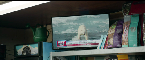
I assume that interpretation ascribes meanings to films. What sorts? I start with referential meanings (a big category including building the story world as well as tapping into real-world information, like specific times and places). In The Hunt, recurring TV images of polar bears struggling on melting ice floes nudge us to remember the climate crisis.
There’s an extra referential layer in the chyron, which expresses Fox-News style skepticism about climate change. That line helps confirm the right-wing ideology that supposedly permeates the quickee mart.
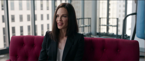
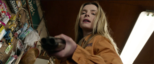
The other sorts of meaning I identify are more abstract. They include explicit meaning, usually given in language. In The Hunt, Athena expresses her disdain for the Deplorables whom she has gathered her friends to kill. She articulates a part of the film’s explicit meaning: The elite treat their social inferiors as prey.
There’s also implicit meaning, suggested through many cues, not just verbal ones. Crystal, the fierce fighter who confronts Athena at the end, is too laconic to speechify, and she never asserts that the underclass can be resilient and pitiless. But we are to grasp that meaning through her behavior–as the prey fighting the predator. Story comprehension feeds our interpretive move. By the end of the film we may take the polar-bear footage as implying that the Politically Correct hunters care more for these beasts than their vulnerable fellow humans.
Referential meaning, explicit meaning, and implicit meaning are typically under the control of the filmmakers. Clearly Craig Zobel, Damon Lindelof, Nick Cuse, and their colleagues want us to make the inferences I just made, along with many others. But it wouldn’t be a stretch to say that some implicit meanings escape the filmmakers. I’ll try to show later that filmmakers sometimes try to back up and frame their films to cover those unintended implications.
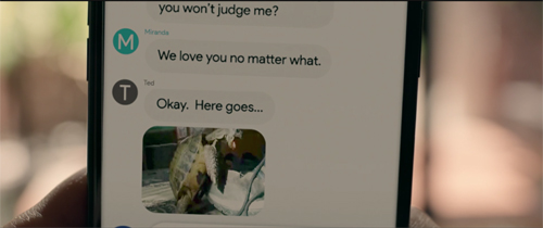
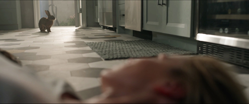
We can argue about some of these meanings. In The Hunt, Crystal recalls a childhood story of a race between a rabbit and a turtle. The rabbit lost through laziness, but he took revenge on the turtle by killing him and his family. The tale becomes part of a motif: Early in the film we see a video of a turtle humping a boot, while at the end we see a bunny hop into a gory kitchen.
After telling the story, Crystal declares she’s not sure whether she’s the rabbit or the turtle in the hunt. I think we’re supposed to think about whether the underclass (if it’s the turtle) can ever win more than a temporary victory. This sort of equivocation about implicit meaning is common in artworks. Indeed, the clash of implications encourages us to interpret them. The tactic might seem designed only for “difficult” films, but it’s surprisingly frequent in mainstream movies, as I’ll suggest later.
A fourth sort of meaning, I think, is what people have come to call symptomatic meaning. Here the film says more than it intends. It reveals, like a psychoanalytical symptom, an “unconscious” problem with the explicit and implicit dimensions put forth. (This is the “hermeneutics of suspicion,” which Susan Sontag discusses in “Against Interpretation” in relation to Marx and Freud.)
Critics may say that cheerful Eisenhower-era comedies betray anxieties about gender and identity. Some consider superhero franchises as unwittingly betraying a commitment to fascistic authority. From this perspective, Indiana Jones is less an adventurer than an imperialist. Symptomatic meanings leak out and can’t be contained. If implicit meaning is the filmmaker being more or less subtle, symptomatic meaning works behind the filmmaker’s back.
The Hunt is of course ripe for symptomatic interpretation, as I’ll mention below. However much its sympathies may seem to lie with the prey, it seems unable to avoid double-edged gags at their expense.
For all of these types of meaning, the process I posit is the same. The viewer maps, from the top down, concepts onto cues and patterns found in the film. Given the results of perception and comprehension, the viewer selects certain items to bear the meanings we bring to the task.
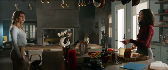
For example, I said that Athena articulates the predatory view of the oligarchy. Why did I pay attention to her and her words rather than, say, the layout of comestibles on the kitchen island? Because I have a rough but well-practiced mental schema for personhood. That’s more salient in building up a narrative than spotting bits and pieces of scenery. (These details can become salient, as the cheese-slicer will eventually, but the filmmaker has to make them so, as hand props or in close-ups or whatever.)
Making movies mean (but not like Zahler does)
The information in a film is most simply a flow of images and sounds. Perceptually I go beyond that information to recognize a person. Given that my person schema is furnished with properties like beliefs, desires, consciousness, and so on, I can build up a sense that Athena is stating her views on late capitalism.
Similarly, my repertoire of person schemas enables me to build up a sense of Crystal’s character, based on her appearance, speech, and actions. She too has beliefs (she’s being hunted), desires (she wants to survive), plans (she will fight), and attitudes (she scorns the sissified elites). She has character traits. In certain relevant respects, she’s like us and the people we know.
Filmmakers are practical psychologists. They know, from having consumed films as well as made them, how to highlight information and make it vivid and salient, so that we’ll lock in our concepts easily. For lots of reasons, we’re interested in other people, so that gives film artists an immediate purchase on using characters and their actions to convey abstract or general meanings.
For symptomatic interpretation, the same process holds. Character recognition and construction will be important for finding the flaws and failings of the film’s primary meanings. Of course, the symptomatic critic may “read against the grain” and look for less salient items that betray the film’s unconscious meanings. The fact that the climactic confrontation takes place in a kitchen could suggest that the filmmakers, for all their flaunting of strong women, are assuming a patriarchal ideology: Woman’s place, even as a killer, is in the home.
And the very end of the film, with Crystal strutting out as a fashionista, suggests that she has bought into the shallow values of the elite.
She’s not leading a revolution but killing her way to upward mobility.
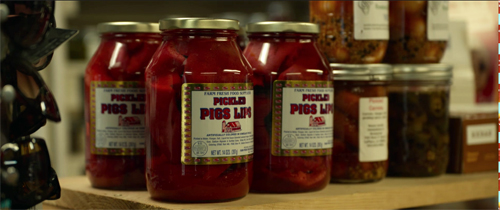
I emphasize character as a site of interpretive elaboration because it’s so central to all critical schools, from fandom and journalism to the upper reaches of Academe. It’s not the only set of cues that get mobilized, though. Small details dropped in can serve too. A jar of Pickled Pigs Lips in a fake quickee mart reveals the sneering disdain of the hunters who’ve set up the display, but some viewers may find that it nudges us to mock trailer-trash taste.
The glimpse we get of the jars before the camera pans away seems to be the sort of cue aimed at “committed viewers,” willing to freeze the frame in playback to look for touches like this.
In Making Meaning, I talk about structural patterns as well, like journeys and character relationships, which prompt us to assign interpretations. There are stylistic cues too–not just the soundtrack with its dialogue and not just written language, but also camera movements, cutting, lighting, and so on. All these can be recruited to bear meanings. Critics often interpret a low angle as conferring power on a figure. Style, at bottom aimed at guiding attention and creating emphasis through the line of least resistance, can sometimes come forward and fill less concrete and fundamental functions–that of suggesting implicit or symptomatic meanings.
To wax wonkish again, Making Meaning suggests that the abstract meanings critics map onto cues are organized as semantic fields,which are in turn processed by assumptions and hypotheses. All that machinery is put into motion through schemas (prototypes and mental models) and heuristics (short-cut reasoning routines provided by social milieu or personal proclivity). The result is a “model film,” the film as interpreted by the critic.
You need lose no sleep over these matters. I simply argue that interpretation is a rational, fairly systematic process of informal reasoning operating within institutions that reward certain activities. Academics reward novel “readings,” while arts journalism does less elaborate versions as well. Even the “male gaze,” though stripped of its Lacanian baggage, has found its way into mainstream criticism (and the film industry).
Themes are memes, sometimes
“Themes come cheap,” I said one night in the seminar, rather flippantly. “They’re practically free.”
What I was suggesting was that themes are often obvious in a way style and overall form aren’t. They rise out at us unbidden. Before people watched The Hunt, they had been alerted to look for certain meanings. Mass media, critics, and the filmmakers had primed us to catch the big ideas the film was laying out.
That’s because films take meanings not only as effects but also materials. Films are made out of images and sounds, but they’re organized through form and style . . . and themes. If we look at it from the filmmaker’s standpoint, themes (like subject matter) can be treated as stuff to be worked on through technique. Like subject matter, they can float “obviously” on the surface, protruding a bit but still tugged by the flow of form and style.
In the Poetics Aristotle posited the category of “thought” as a component of tragedy. This term appears to mean something rather special. “Thought” isn’t what characters in drama think, or even what the playwright thinks. Rather, it’s what the characters say: their efforts to crystallize ideas and feelings in statements. The functions of thought in this sense “are demonstration, refutation, the arousal of emotions such as pity, fear, anger, and such like, and arguing for the importance or unimportance of things.”
The plot, Aristotle says, must create its effects through events and their patterning, “but these must appear without explicit statement, whereas in the spoken language it is the speaker and his words which produce the effect.” Thought in Ari’s sense spells out what action leaves tacit.
The Hunt does both. Ideas, images, and stereotypes circulating in US society have been taken by the filmmakers as already-fairly-processed material to be reworked into images and sounds and story. The explicit and implicit meanings critics build out from the film are the result of form and style shaping all this stuff into a perceptible, comprehensible experience. At moments, though, the oligarchs and the Deplorables state their sociopolitical views pretty frankly, as in the text message above. As Ari puts it, “they argue for the importance and unimportance of things.” Thought-as-theme is a prime cue for interpretation.
Themes can become not only material but also pattern. Certain genres of narrative are heavily “thematized” in that their organization is based on explicit or implicit meanings. Allegory is a classic instance. The Pilgrim’s Progress has a thematic armature, crystallized in the journey of Pilgrim to the Heavenly City. Ditto Animal Farm, which is usually taken as an allegory of the Russian Revolution. (Interestingly, The Hunt cites Animal Farm.) I expect that right now some grad students are writing papers about The Hunt as an allegory of working-class resistance.
Other heavily thematic genres are parables, fables, and the like. Crystal’s childhood story of the rabbit and the turtle becomes a parable of social injustice.
There are lots of ways that themes provide formal architecture. Some early films, like One Is Business, the Other Crime (1912), depend on thematic contrast. Here the fate of a poor man forced into thievery is juxtaposed with the law’s ignoral of a rich man’s transgressions. (Class resentment didn’t start with The Hunt.) Griffith’s Intolerance (1916) tries for a four-way thematic comparison/contrast of prejudice through the ages.
We also have “social cross-section” films, where stages of the narrative enact encounters with various institutions. As critics have noted, in The Bicycle Thieves(1948), Ricci’s search for his stolen bike brings him into contact with the labor union, the government, the church, and the bourgeoisie–none of whom are of help. A similar cross-sectional dynamic suggests social critique in Mizoguchi’s Life of Oharu (1952) and Fellini’s La Dolce Vita (1960).
Granted, in such modes, the film’s thematic skeleton can seem obvious. Other films leave meaning more free-floating, and even allegories can be less clear-cut than they may seem. (Think of Kafka.) I just want to signal, for the sake of comprehensive coverage, that filmmakers, like other artists, draw upon abstract ideas and meanings as materials to be reworked by their art.
To be good critics, we ought to be aware of both the materials and the transformations that come from them. I suggest this in a piece I’ve flagged before, “Zip. Zero. Zeitgeist.”
The filmmakers fight the power (of viewers)
The filmmaker’s power wanes as we move toward appropriation. But not completely. Filmmakers can use themes to manage a film’s reception.
For example, the Russian Formalist literary theorists floated the idea of the “biographical legend.” This is a public version of the artist’s life that can guide interpretations of the work. Boris Eichenbaum suggested that the Americans had one biographical legend for O. Henry, but the Russians built up a different one.
Critics and commentators build up the biographical legend in order to support interpretations, but the artist can contribute to the process. When Christopher Nolan tells us that as a youth he loved Star Wars, noir movies, and experimental fiction, he’s inviting us to put his own “intellectual blockbusters” in a certain perspective. He’s flagging certain cues, inviting certain mental sets, coaxing us toward certain inferences.
It’s not news. Contemporary critics took Douglas Sirk’s 1950s melodramas as glossy reflections of the superficial values of Eisenhower America. But when he was interviewed by Jon Halliday, he presented himself as offering a Brechtian critique of those values. Later critics eagerly started scanning the films for narrative and stylistic cues that suggested implicit meanings that subverted the suburban bourgeoisie. Chabrol, typically jaundiced, put it this way:
I need a degree of critical support for my films to succeed: without that they can fall flat on their faces. So, what do you have to do? You have to help the critics with their notices, right? So, I give them a hand. “Try with Eliot and see if you find me there.” Or “How do you fancy Racine?” I give them some little things to grasp at. In Le Boucher I stuck Balzac there in the middle, and they threw themselves on it like poverty upon the world. It’s not good to leave them staring at a blank sheet of paper, not knowing how to begin. . . . “This film is definitely Balzacian,” and there you are; after that they can go on to say whatever they want.
If critics can use the artist to interpret the film, why can’t the artist use the critics to steer us toward preferred interpretations?
It isn’t just the filmmaker doing this. Auteur personas created by the filmmaker, the industry, and critical discourse can be seen as pushing us toward certain thematic interpretations.
Now to finish with a point I suggested above. It’s often in a filmmaker’s interest to avoid consistent and clear presentation of themes. I’ve come to think that many ambitious Hollywood films are systematically ambivalent about what they are “saying.” Rather than make a weighted, compact statement of “thought” in Ari’s sense, they scuttle and shuttle between alternate thematic possibilities. Or rather, they shuffle several disparate “thought” statements to counterbalance one another.
This has many benefits. It can stoke controversies. Is The Dark Knight in favor of vigilantism, or does it celebrate anarchy, or does it hold out hope of noble self-sacrifice? Nolan says:
We throw a lot of things against the wall to see if it sticks. We put a lot of interesting questions in the air, but that’s simply a backdrop for the story. . . . We’re going to get wildly different interpretations of what the film is supporting and not supporting, but it’s not doing any of those things. It’s just telling a story.
Another benefit: If someone objects to one piece of thematic material, you can always say, “But look, we offset that with this…” It’s a way of widening the film’s appeal to many lines of thinking, while marketing the film as complex.
The creators of The Hunt claim to have aimed the film at smugly woke people like themselves in an effort to humanize the Other.
So we heightened the reality as much as we could. Some of the people who are being hunted are literally the guy with the tiki torch or a guy posing next to a dead animal; they’re two-dimensional stereotypical representations of what liberals see conservatives as. And then we had to do the same thing with the liberals. But there had to be one character in the movie, the hero who defied the conventions of stereotyping, who when you look at her you basically say, “Oh, she has an accent like this. She wears clothes like this. This is who she is.” And let’s be wrong about her. Let’s let the movie be about the cautionary tale of, here’s what happens when you get it wrong.
I think that the idea the audience wants Athena to be wrong about Crystal is maybe our own interior desire to say, “Maybe I’m wrong about my uncle who I’m screaming at at Thanksgiving. Maybe there’s a little bit more to him than meets the eye. Maybe I’m trying to put him in this specific lane because we have to choose a side, but maybe there’s many sides and there’s a little bit more nuance in the conversation.”
The caricaturing of the woke characters allows woke viewers to recognize the satire (and since woke viewers are likely to be educated, they know that satire exaggerates). Presentation of the Deplorables is exaggerated too, confirming that “There’s many sides.”
But there’s a kink for a symptomatic reading: Crystal may not be an actual Deplorable. We never learn her politics. She has been kidnapped in error, mistaken for a fierce Trumpist with the same name. So again the film manages to have it many ways. “Getting it wrong” here doesn’t mean disparaging a right-winger but rather not knowing whether somebody is right-wing or not. The real conversation is postponed because of a mistake. (No mistakes, no stories.)
I don’t mean to sound cynical about this. Art is opportunistic. We just ought to be aware that filmmakers can make the meta-move, using whatever means they can to close off interpretations that they might not prefer. Ultimately, since appropriation is top-down, they can’t control everything we might ascribe to the film. (See Room 237 again.) But there is a bit of a struggle there. Filmmakers will always try to join and constrain the hunt for meaning in their movies.
There’s a lot more to be said about interpretation, but I hope that readers will find something worth considering here. I may redo other Private seminar entries as public ones when time permits.
Thanks to Nic Rapold of Film Comment and Imogen Sarah Smith for a pleasant discussion. My citation of Aristotle on “thought” is from Stephen Halliwell, The Poetics of Aristotle: Translation and Commentary (Chapel Hill, 1987), 53. The reinterpretation of Sirk’s melodramas was undertaken in Jon Halliday’s interview book Sirk on Sirk (Secker and Warburg, 1971). The Chabrol quote is from Making Meaning (Harvard University Press, 1989), 210.
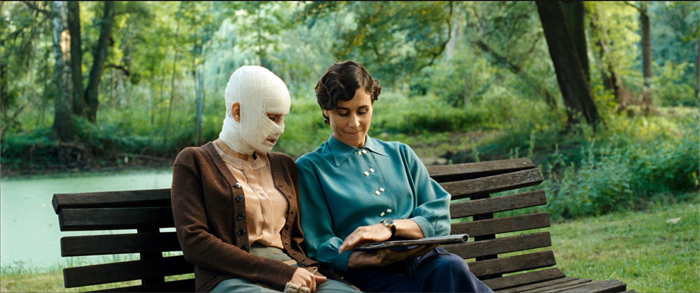
Phoenix (2014), one of the Christian Petzold films discussed in the Film Comment “At Home” podcast.
Stuck inside these four walls: Chamber cinema for a plague year
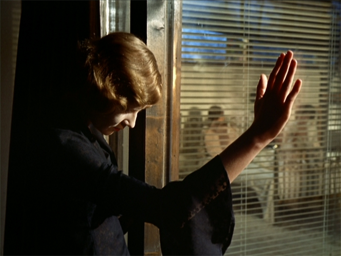
The Bitter Tears of Petra von Kant (1972).
Privacy is the seat of Contemplation, though sometimes made the recluse of Tentation… Be you in your Chambers or priuate Closets; be you retired from the eyes of men; thinke how the eyes of God are on you. Doe not say, the walls encompasse mee, darknesse o’re-shadowes mee, the Curtaine of night secures me… doe nothing priuately, which you would not doe publickly. There is no retire from the eyes of God.
Richard Brathwaite, The English Gentlewoman (1631)
DB here:
We’re in the midst of a wondrous national experiment: What will Americans do without sports? Movies come to fill the void, and websites teem with recommendations for lockdown viewing. Among them are movies about pandemics, about personal relationships, and of course about all those vistas, urban or rural, that we can no longer visit in person. (“Craving Wide Open Spaces? Watch a Western.”)
Cinema loves to span spaces. Filmmakers have long celebrated the medium’s power to take us anywhere. So it’s natural, in a time of enforced hermitage, for people to long for Westerns, sword and sandal epics, and other genres that evoke grandeur.
But we’re now forced to pay more attention to more scaled-down surroundings. We’re scrutinizing our rooms and corridors and closets. We’re scrubbing the surfaces we bustle past every day. This new alertness to our immediate surroundings may sensitize us to a kind of cinema turned resolutely inward.
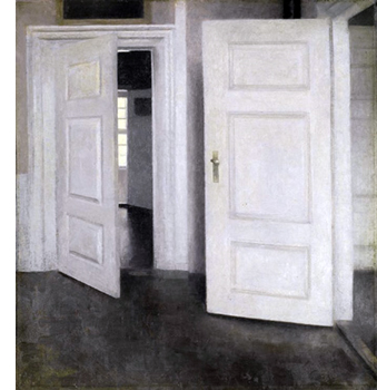
Long ago, when I was writing a book on Carl Dreyer, I was struck by a cross-media tradition that explored what you could express through purified interiors. I called it “chamber art.” In Western painting you can trace it back to Dutch genre works (supremely, Vermeer). It persisted through centuries, notably in Dreyer’s countryman Vilhelm Hammershøi (below).
Plays were often set in single rooms, of course, but the confinement was made especially salient by Strindberg, who even designed an intimate auditorium. For cinema, the major development was the Kammerspielfilm, as exemplified in Hintertreppe (1921), Scherben (1921), Sylvester (1924), and other silent German classics. Kristin and I talk about this trend here and here.
In the book I argued that Dreyer developed a “chamber cinema,” in piecemeal form, in his first features before eventually committing to it in Mikael (1924) and The Master of the House (1925). Two People (1945) is the purest case in the Dreyer oeuvre: A couple faces a crisis in their marriage over the course of a few hours in their apartment. (Unfortunately, it doesn’t seem available with English subtitles.) But you can see, thanks to Criterion, how spatial dynamics formed a powerful premise of his later masterpieces Vampyr (1932), Day of Wrath (1943), Ordet (1955), and Gertrud (1964).
Dreyer wasn’t alone. Ozu tried out the format in That Night’s Wife (1930), swaddling a husband, wife, child, and detective in a clutter of dripping laundry and American movie posters.
Bergman exploited the premise too, in films like Brink of Life (1958), Waiting Women (1952), his 1961-1963 trilogy, and Persona (1966). (All can be streamed on Criterion.)
Chamber cinema became an important, if rare expressive option for many filmmaking traditions. Writers and directors set themselves a crisp problem–how to tell a story under such constraints?
The challenge is finding “infinite riches in a little room.” How? Well, you can exploit the spatial restrictiveness by confining us to what the inhabitants of the space know. Limiting story information can build curiosity, suspense, and surprise. You can also create a kind of mundane superrealism that charges everyday objects with new force.
On the other hand, you need to maintain variety by strategies of drama and stylistic handling. Chamber cinema–wherever it turns up–offers some unique filmic effects, and maybe sheltering in place is a good time to sample it.
Herewith a by no means comprehensive list of some interesting cinematic chamber pieces. For each title, I link to streaming services supplying it.
Bottles of different sizes
From David Koepp I learned that screenwriters call confined-space movies “bottle” plots. There’s a tacit rule: The audience understands that by and large the action won’t stray from a single defined interior. In a commentary track for the “Blowback” episode of the (excellent) TV show Justified, Graham Yost and Ben Cavell discuss how TV series plan an occasional bottle episode, and not just because it affords dramatic concentration. It can save time and money in production.
Usually the bottle consists of more than a single room. The classic Kammerspielfilms roam a bit within a household and sometimes stray outdoors. But their manner of shooting provides a variety of angles that suggest continuing confinement. Dreyer went further in The Master of the House. He built a more or less functioning apartment as the set, then installed wild walls that let him flank the action from any side. Then editing could provide a sense of wraparound space.
The variations in camera setups throughout the film are extraordinary. Dreyer would create more radically fragmentary chamber spaces in La Passion de Jeanne d’Arc (1928), while his later films would use solemn, arcing camera movements to achieve a smoother immersive effect. (For more on Dreyer’s unique spatial experimentation, here’s a link to my Criterion contribution on Master of the House. I talk about the tricks Dreyer plays with chamber space in Vampyr in an “Observations” supplement on the Criterion Channel.)
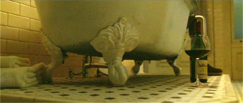
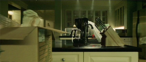
Likewise, Koepp’s screenplay for Panic Room allows David Fincher to move 360 degrees through several areas of a Manhattan brownstone. The film also offers a fine example of how our awareness of domestic details gets sharpened by a creeping camera.
Trust Fincher to find sinister possibilities in a dripping bathtub leg and a kitchen island.
Confined to quarters
Detective Story (1951).
Many chamber movies are based on plays, as you’d expect. Unlike most adaptations, though, they don’t try to “ventilate” the play by expanding the field of action. Or rather, as André Bazin pointed out, the expansion is itself fairly rigorous. They don’t go as far afield as they might.
Bazin praised Cocteau’s 1948 version of his play Les parents terribles (aka “The Storm Within”) for opening up the stage version only a little, expanding beyond a single room to encompass other areas of the apartment. This retained the claustrophobia, and the sense of theatrical artifice, but it spread action out in a way that suited cinema’s urge to push beyond the frame. The freedom of staging and camera placement is thoroughly “cinematic” within the “theatrical” premise.
Depending on how you count, Hitchcock expanded things a bit in his adaptation of Dial M for Murder. Apart from cutting away to Tony at his club, Hitchcock moved beyond the parlor to the adjacent bedroom, the building’s entryway, and the terrace.
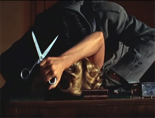
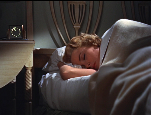
An earlier entry on this site talks about how 3D let Sir Alfred give an ominous accent to props: a particularly large pair of scissors, and a more minor item like the bedside clock.
Hitchcock gave us a parlor and a hallway in Rope (1948), but when Brandon flourishes the murder weapon, the framing audaciously reminds us that we aren’t allowed to go into the kitchen.
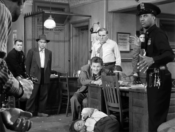
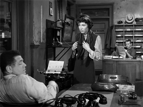
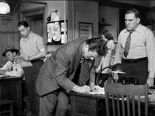
Bazin did not wholly admire William Wyler’s Detective Story (1951), despite its skill in editing and performances; he found it too obedient to a mediocre play. True, the film doesn’t creatively transform its source to the degree that Wyler’s earlier adaptation of The Little Foxes (1941) did; Bazin wrote a penetrating analysis of that film’s remarkable turning point. Detective Story is more obedient to the classic unities, confining nearly all of the action to the precinct station. Although I don’t think Wyler ever shows the missing fourth wall, he creates a dazzling array of spatial variants by layering and spreading out zones of the room. In his prime, the man could stage anything fluently.
As Bazin puts it: “One has to admire the unequaled mastery of the mise-en-scène, the extraordinary exactness of its details, the dexterity with which Wyler interweaves the secondary story lines into the main action, sustaining and stressing each without ever losing the thread.”
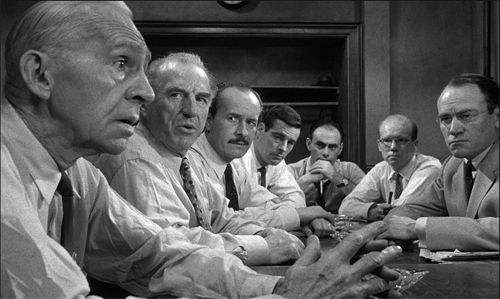
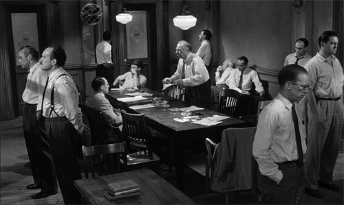
Some films are even more constrained. 12 Angry Men (1957), adapted from a teleplay, is a famous example. Once the jury leaves the courtroom, the bulk of the film drills down on their deliberation. Again, the director wrings stylistic variations out of the situation; Lumet claims he systematically ran across a spectrum of lens lengths as the drama developed.
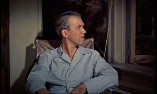
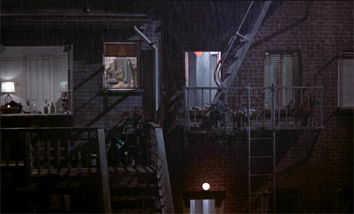
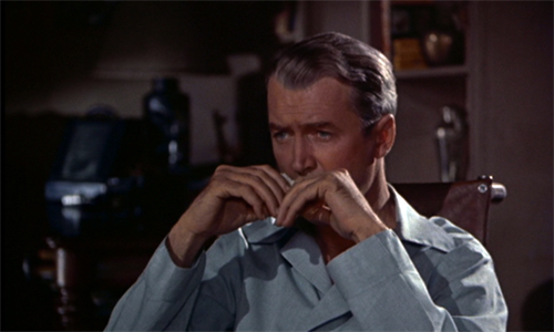
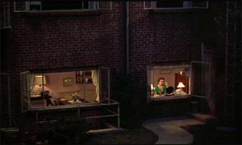
But you don’t need a theatrical alibi to draw tight boundaries around the action. Rear Window (1954), adapted from a fairly daring Cornell Woolrich short story, is as rigorous an instance of chamber cinema as Rope. Here Hitchcock firmly anchors us in an apartment, but he uses optical POV to “open out” the private space.
With all its apertures the courtyard view becomes a sinister/comic/melancholy Advent calendar.
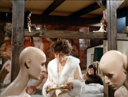
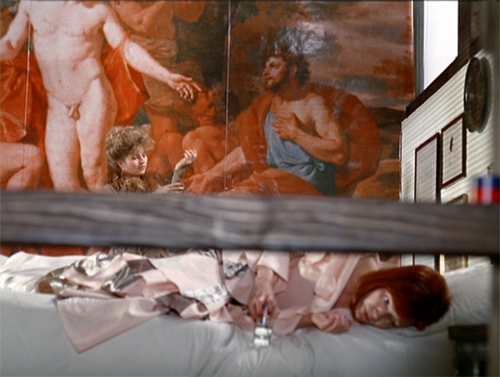
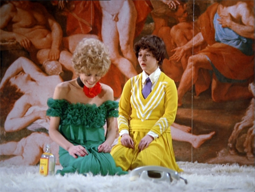
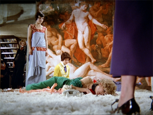
Fassbinder’s Bitter Tears of Petra von Kant (1972) denies us this wide vantage point on the outside world. This space seems almost completely enclosed. But Fassbinder finds a remarkable number of ways to vary the set, the camera angles, and the costumes. We’re immersed in the flamboyant flotsam of several women’s lives. The result is a cascade of goofily decadent pictorial splendors.
It’s virtually a convention of these films to include a few shots not tied to the interiors. At the end, we often get a sense of release when finally the characters move outside. That happens in 12 Angry Men, in Panic Room, in Polanski’s Carnage (2011) , and many of my other examples. Without offering too many spoilers, let’s say Room (2015) makes architectural use of this option.
On the road and on the line
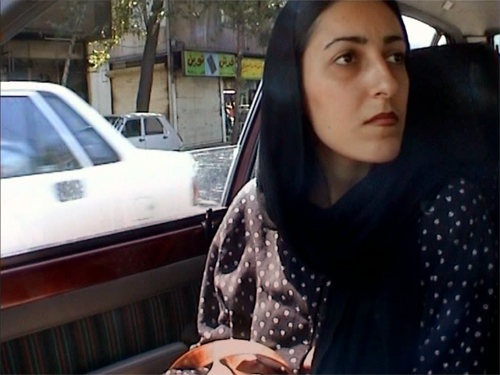
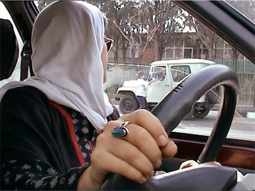
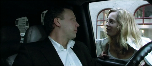
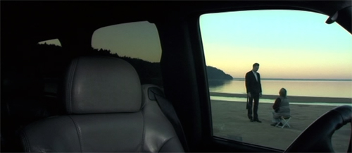
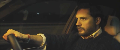
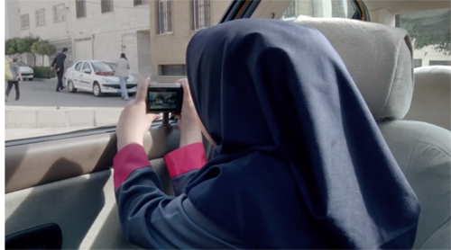
Filmmakers have willingly extended the bottle concept to cars. The most famous example is probably Kiarostami’s Ten (2002), which secures each scene in a vehicle and mixes and matches the passengers across episodes. The strictness of Kiarostami’s camera setups exploit the square video frame and always yield angular shot/reverse shots. They reveal how crisp depth relations can be activated through the passing landscape or in story elements that show up in through the window.
Perhaps Kiarstami’s example inspired Danish-Swedish filmmaker Simon Staho. His Day and Night (2004) traces a man visiting key people on the last day of his life, and we are stuck obstinately in the car throughout. This provides some nifty restriction, most radically when we have to peer at action taking place outside.
Staho’s Bang Bang Orangutang (2005), a portrait of a seething racist, takes up the same premise but isn’t quite so rigorous. We do get out a bit, but the camera stays pretty close to the car. I discuss Staho’s films a little in a very old entry.
Like autos, telephones provide a nice motivation for the bottle, as Lucille Fletcher discovered when she wrote the perennial radio hit, “Sorry, Wrong Number.” The plot consists of a series of calls placed by the bedridden woman, who overhears a murder plot. The film wasn’t quite so stringently limited, but the effect is of the protagonist at the center of several crisscrossed intrigues.
A purer case is the Rossellini film Una voce umana (1948), in which a desperate woman frantically talks with her lover. It relies on intense close-ups of its one player, Anna Magnani.
It’s an adaptation of a Cocteau play, which Poulenc turned into a one-act opera. In all, the duration of the story action is the same as the running time.
I wish Larry Cohen’s Phone Booth displayed a similarly obsessive concentration, but we do have the Danish thriller The Guilty, where a police dispatcher gets involved in more than one ongoing crime. We enjoyed seeing it at the 2018 Wisconsin Film Festival.
And of course car and phone can be combined, as they are in Locke (2013)–another play adaptation. Tom Hardy plays a spookily calm businessman driving to a deal while taking calls from his family and his distraught mistress. Those characters remain voices on the line while he tries to contend with the pressures of his mistakes.
House arrest, arresting houses
Sometimes you must embrace the chamber aesthetic. In 2010 the fine Iranian director Jafar Panahi was forbidden to make films and subjected to house arrest. Yet he continued to produce–well, what? This Is Not a Film (2012) was shot partially on a cellphone within (mostly) his apartment.
Wittily, he tapes out a chamber space within his apartment. Then he reads a script to indicate how absent actors could play it and how an imaginary camera could shoot it.
But his imaginary film still isn’t an actual film, so he hasn’t violated the ban. So perhaps what we have is rather a memoir, or a diary, or a home video? Panahi’s virtual film (that isn’t a film) exists within another film that isn’t a film. Yet it played festivals and circulates on disc and streaming. The absurdity, at once touching and pointed, suggests that through playful imagination, the artist can challenge censorship.
Panahi slyly pushed against the boundaries again with Closed Curtain (2013, above). Shot in his beach house, it strays occasionally outside. Next came Taxi (2015), in which Panahi took up the auto-enclosed chamber movie, with largely comic results.
More recently, he has somehow managed to make a more orthodox film, 3 Faces (2018), which considers the situation of people in a remote village.
The chamber-based premise needn’t furnish a whole movie. As in Room, Kurosawa’s High and Low (1963) is tightly concentrated in its first half. We are in two enclosures, a house and a train. The film then bursts out into a rushed, wide-ranging investigation. Large-scale or less, the chamber strategy remains a potent cinematic force.
They say that the last creatures to discover water will be fish. We move through our world taking our niche for granted. Cinema, like the other arts, can refocus our attention on weight and pattern, texture and stubborn objecthood. We can find rich rewards in glimpses, partial views, and little details. Chamber art has an intimacy that’s at once cozy and discomfiting. Seeing familiar things in intensely circumscribed ways can lift up our senses.
So take a break from the crisis and enjoy some art. But return to the world knowing that for Americans this catastrophe is the result of forty years of monstrous, gleeful Republican dismantling of our civil society. Rebuilding such a society will require the elimination of that party, and the career criminal at its head, as a political force. This pandemic must not become our Reichstag fire.
Yeah, I went there.
Thanks to the John Bennett, Pauline Lampert, Lei Lin, Thomas McPherson, Dillon Mitchell, Erica Moulton, Nathan Mulder, Kat Pan, Will Quade, Lance St. Laurent, Anthony Twaurog, David Vanden Bossche, and Zach Zahos. They’re students in my seminar, and they suggested many titles for this blog entry.
Bazin’s comments on Detective Story come in his 1952 Cannes reportage, published as items 1031-1033, and as a review (item 1180), in Écrits complets vol. I, ed. Hervé Joubert-Laurencin (Paris: Macula, 2018), pp. 918-922, 1059. My quotation comes come from the review, where he does grant that Wyler is the Hollywood filmmaker “who knows his craft best. . . . the master of the psychological film.”
The tableau style of the 1910s probably helped shift Dreyer toward the chamber model, which he learned to modify through editing. I discuss Dreyer’s relation to that style in “The Dreyer Generation” on the Danish Film Institute website. Also related is the web essay, “Nordisk and the Tableau Aesthetic.”
Some other examples could be mentioned, but I didn’t find them on streaming services in the US. It would be nifty if you could see the tricks with chamber space in Dangerous Corner (1934); fortunately it plays fairly often on TCM. There’s also Duvivier’s Marie-Octobre (1959), a tense drama about the reunion of old partisans.
I especially like the 1983 Iranian film, The Key, directed by Ebrahim Forouzesh and scripted by Kiarostami. It’s a charming, nearly wordless story of how a little boy tries to manage household crises when Mother is away. It has the gripping suspense that is characteristic of much Iranian cinema, and the boy emerges as resourceful and heroic (though kind of messy). Kids would like it, I think.
Also, I’ve neglected Asian instances. Maybe I’ll revisit this topic after a while.
P.S. 1 April 2020: Thanks to Casper Tybjerg, outstanding Dreyer scholar, for corrections about the nationality of The Guilty and the Staho films.
Gertrud (1964).


