Archive for the 'Hollywood: The business' Category
Industrial strength
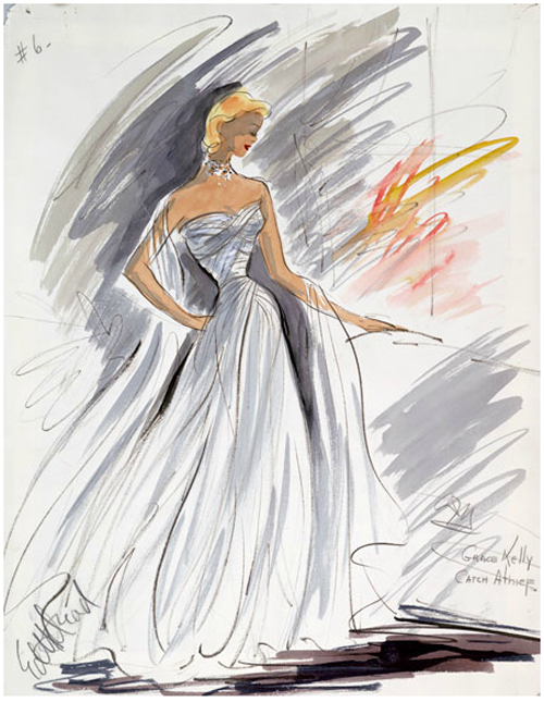
Edith Head costume sketch for To Catch a Thief. From Edith & Oscar: A Costume Exhibit, WCFTR website.
DB here:
Until the 1970s, academics interested in film seldom paid close attention to Hollywood as an industry. Some economists and historians of law were beguiled by the sight of an oligopoly eventually dismantled by Supreme Court decree. But these scholars weren’t particularly interested in the products of the studio system.
People interested in the movies took three positions. The most dogmatic, voiced by one of my grad-school professors, ran this way: “Money doesn’t matter.” That is, art will always triumph over business. If a movie is good, the circumstances of its making are irrelevant. And we study only good movies, so we needn’t consider the business.
Another view acknowledged the importance of the industry but saw it as a vague, overarching force. Creative artists were seduced by it or struggled against it. A powerful director like Chaplin or Hitchcock could control his work to a considerable degree. For the less powerful, the studios (along with censorship agencies) were barriers to creative work. They forced directors to bow to the demands of moguls or a debased public.
The third view was largely celebratory. The studios represented a wondrous confluence of talent at every level, from script to music, and the System mysteriously spun out marvels of drama, comedy, and spectacle: Hollywood as Gollywood. Researchers in this tradition ferreted out as much information as they could about the old days, infusing encyclopedic ambitions with fan enthusiasm.
What came to be called “Wisconsin revisionism” or “the Wisconsin Project” proposed some alternatives.
Auteurist in the archive
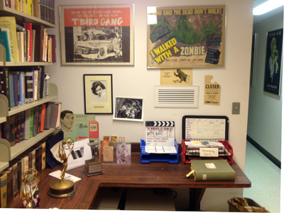
Corner of WCFTR office area. Photo: Mary Huelsbeck.
When I came to UW–Madison to teach in 1973, I was an auteurist with a taste both for Hollywood and foreign cinema. I knew relatively little about how the studio system functioned. Its machinations were simply factored out of my consideration. Directors, from Hitchcock and Hawks to Dreyer and Mizoguchi, were what loomed in my consciousness, and I wanted to spend my life studying what they had accomplished.
But contact with students, faculty, and campus personalities at Madison changed my thinking. There was The Velvet Light Trap, a defiantly unofficial magazine that ran special issues on all manner of non-auteur subjects, especially studios, periods, and genres. There were ambitious film societies like Fertile Valley and the Green Lantern, showing offbeat items. There were smart, well-informed grad students. There was the Wisconsin Center for Film and Theater Research, which housed thousands of prints, the center of my lustful thoughts both day and night. The WCFTR also housed vast archives of papers, scripts, photos, and other documents of Hollywood’s golden era.
Then there were Professor Tino Balio and Dissertator Douglas Gomery. My conversations with them, both in and out of the office, showed me that there were fruitful questions to be asked about the nature and conduct of the studio system. These two scholars, I think, more or less invented the rigorous historical study of Hollywood as a business enterprise.
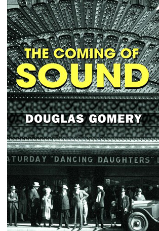 Take Doug’s dissertation (and subsequent book). How did Warner Bros. innovate sound? Was Warners, as most accounts claimed, a threatened company, desperately driven to try a new technology to stave off bankruptcy? Doug answered the question in a revelatory way: The evidence pointed to Warners’ innovation of sound as a carefully calculated business decision made by a company that had already explored the technology and the market. In fact, WB was not going bankrupt, it was actually expanding into other domains, including radio. By using a traditional historical model of technological diffusion, Doug made the Warners’ decision intelligible. He served as a TA in my first course at Wisconsin, and our friendship proved to be a case of the student teaching the teacher.
Tino, who was presiding over the WCFTR, became another premiere scholar of filmmaking as a business. His books, anthologies, and book series brought immense attention to our collection of material on United Artists, Warner Bros., and RKO. He taught courses in the history of the industry, both survey courses and in-depth seminars. I think I learned more sitting on examination committees with him than I had in many of my grad-school lectures.
Many of the research questions asked by Tino, Doug, and their peers didn’t concern the movies themselves. Some did, though. I remember Cathy Root’s study of stars as strategies of “product differentiation.” More broadly, in the 1970s and early 1980s, some of us suspected that the Hollywood system of production, distribution, and exhibition could affect what then was called “the film text.”
As a result, Kristin, Janet Staiger, and I tried to show how Hollywood’s mode of production did more than simply limit gifted artists or yield pop-culture diversions. In The Classical Hollywood Cinema (1985), we tried to understand how the organization of production shaped work routines, technology, adjacent institutions, conceptions of quality, and other factors that did impinge on how the films looked and sounded. Over the years these aspects of filmmaking practice took off on their own, becoming somewhat detached from the industrial conditions that created them. When the studio system faded away in its classic form, the community’s notions of narrative construction, stylistic expression, professional practices, and other factors hung on. The economics changed, but the aesthetics persisted.
Now there are many people working to show how industrial factors interact with filmmakers’ creative choices. Kristin and I have continued these explorations in books and blog entries, extending them to other periods (e.g., the 1910s, the New Hollywood, the 1940s). I like to think that much of our work over the last decades has tried to blend the careful empirical and explanatory work of Tino, Doug, and others with the analysis of art and craft typical of film criticism. We can ask some questions that cut across the over-simple Art/Industry split.
Let a thousand projects bloom (motto, People’s Republic of Madison)
This exercise in autobiography was triggered by some recent events. One is the spiffy new website for the Wisconsin Center for Film and Theater Research. Under its recent director Michele Hilmes and current director Vance Kepley, the Center has gotten a new jolt of energy. It’s promoting its vast collections in an attractive way and is starting to spotlight some that weren’t well-known. The selections are bolstered by informative program notes by Maria Belodubrovskaya, Booth Wilson, and others.
Certainly the Center’s heart, for historians of Hollywood, is the United Artists collection. This assembles United Artists business records from 1919-1965, scripts and stills from Warner Bros. and RKO, and several thousand film features, shorts, and cartoons, mostly from 1928 to 1948. Then there are the hundreds of named collections, provided by individual donors. The refurbished website calls attention to several of them: the personal and business correspondence of Kirk Douglas (some items now digitized), the Blacklist collection (six of the Hollywood Ten represented), the dazzling array of Edith Head’s costume designs (okay, I’m going a bit Gollywood). There are records for Otto Preminger, Walter Wanger (the basis of Matthew Bernstein’s biography), and Shirley Clarke. The restored Portrait of Jason was discovered in her collection.
Lately, needing information on Guest in the House (1944), I turned to the WCFTR screenplay by Ketti Frings. Her name looks like a Scrabble hand, but she turns out to be a fairly significant screenwriter, contributor to The Bells of St. Mary’s (1945), Dark City (1951), and By Love Possessed (1961). Some other day I must get around to prowling in the papers of Vera Caspary, an extraordinary person who is far more than the author of Laura (though I’d be happy just being that).
Beyond Hollywood, the Center holds major collections of Russian cinema and, more recently Taiwanese cinema. And if you must leave cinema behind for theatre, you can investigate Eugene O’Neill, George S. Kaufman, and many other luminaries. In sum, a resource to make you happy for decades.
A career and a conference
The expansion of the Center owes everything to Tino Balio, who served as director in its crucial years. It was he who acquired the UA treasures and many of the named collections. Access to the UA papers enabled him to write the definitive history of the company, but it also created a huge spillover effect: dozens of research projects were nourished by his pursuit of this collection—which came to us at a time when virtually no universities, not even those in LA, were seeking Hollywood corporate records.
So it’s fitting that, as the WCFTR redesigns its public profile, we see the publication of Tino’s Hollywood in the New Millennium.
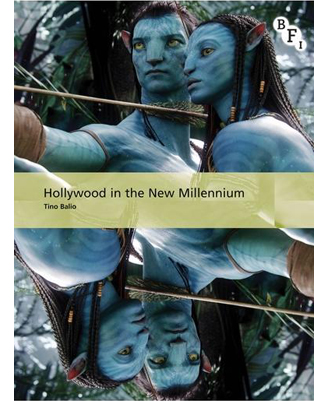 In a sense it’s a sequel to his earlier books, The American Film Industry (1976, 1985) and Hollywood in the Age of Television (1990). But these were anthologies, whereas this is through-composed. It’s most like his magisterial survey of the business strategies behind the art-film explosion, The Foreign Film Renaissance on American Screens, 1946-1973 (2010): a careful study of a remarkable period in US film history.
Hollywood in the New Millennium charts the trends that characterize the last fifteen or so years of the American film industry. It surveys financing, production, distribution, exhibition, ancillary markets, and the independent realm. Tino analyzes the ways in which new technologies have changed all these areas, mostly to the benefit of the bottom line, but he also recognizes that technology can undermine the business, especially in the hands of what he calls “the I-want-it-for-free consumer.”
He surveys studio policies, attempts at synergy, and viral marketing. He traces the rise and fall of executives and is especially strong on the emergence of the overriding strategy of the tentpole picture aimed at teenagers and families. Since all studios belonged to entertainment conglomerates, the constant demand was for large-scale profits. For all its financial excesses, the tentpole strategy, Tino argues counterintuively, was an austerity measure.
By the decade’s end, every studio was in the tentpole business. Although the costs of producing and marketing such pictures were enormous, they were the only types that could perform on a global scale and generate significant returns. . . . The sure thing was a good hedge against a dying DVD business, the fragmentation of the audience, and the unknown impact of the internet and social media on Hollywood marketing practices.
In short, you could not ask for a more concise, reliable map of where Hollywood is today. The bibliography is expansive enough to inspire other researchers to dig into both printed and online sources.
Tino has exercised a remarkable influence on two generations of film scholars, but in an almost surreptitious way. Now every film student learns about the structure and conduct of the film industry, but few know that Tino played a pivotal role in making this sort of knowledge central to academic film study. Now in his mid-seventies, Tino has left a peerless legacy of research.
Speaking of research, our campus will be hosting a major conference that includes the WCFTR as a key component. The Screenwriting Research Network International is holding its annual gathering here on 20-22 August. I attended the Brussels SRNI conference two years ago and wrote about it here and here. I think it’s fair to say that a hell of a time was had by all. This is a stimulating bunch, and anyone interested in filmmaking would benefit from attending.
 Keynote speakers this year are Larry Gross (48 Hrs, True Crime, We Don’t Live Here Anymore, Veronika Decides to Die), Jon Raymond (Old Joy, Wendy and Lucy, Meeks Cutoff , and several novels), and. . . Kristin!
The scholars are no less stellar and include Kathryn Millard, Richard Neupert, Jill Nelmes, Steven Maras, Riikka Pelo, Eva Novrup Redvall, Nate Kohn, Ronald Geerts, Andy Horton, Ian Macdonald, and a great many more. Go here for a complete program. You will be impressed.
Needless to say, among the guests are many UW alumni: Patrick Keating, Colin Burnett, Maria Belodubrovskaya (currently a faculty member too), Brad Schauer, Mark Minett, Mary Beth Haralovich, and David Resha. All of them have been steeped in archival research, centrally at WCFTR. Also home-grown are the conference organizers, J. J. Murphy (who blogs here) and Kelley Conway, who is finishing her book on Agnès Varda after immersion in that great lady’s personal archive. Another faculty member, Eric Hoyt, is curator of the remarkably full and free Media History Digital Library; expect him to divulge newer-than-new research sources and methods. I’ll crowd into the act with a paper tied to my 1940s book.
All in all, I see a pleasing continuity from my salad days, through forty years of teaching and viewing and writing, to this moment: a new Balio book, a sparkling shop window for the Center, and new generations of researchers eager to show that The Industry and The Art of Cinema aren’t always that far apart.
Earlier memoirs of Mad City culture in the 1970s-80s are here and here.
For more on the origins of Wisconsin revisionism, see my introduction to Douglas Gomery, Shared Pleasures: A History of Movie Presentation in the United States (University of Wisconsin Press, 1992) and this entry. We have a blog entry on Tino’s Foreign Film Renaissance on American Screens here.
On the remarkable Vera Caspary (Wisconsin’s own) see not only her fine thrillers Laura and Bedelia but also her Bohemian autobiography The Secrets of Grown-Ups (McGraw-Hill, 1979).
Thanks to Steve Jarchow, CEO of Here Media and Regent Entertainment, for his many years of support of the WCFTR’s activities.
Kelley Conway, Tino Balio, and Lea Jacobs; Madison, WI September 2011.
Pandora’s digital box: End times
35mm projection booth at Market Square Cinema, Madison, Wisconsin; 10 May 2013.
DB here:
When exactly did film end? According to the mass-market press, here are some terminal dates.
July 2011: Technicolor closes its Los Angeles laboratory.
October 2011: Panavision, Aaton, and Arri all announce that they will stop manufacturing film cameras.
November 2011: Twentieth Century Fox sends out a letter asserting that it will cease supplying theatres with 35mm prints “within the next year or two.”
January 2012: Eastman Kodak files for bankruptcy protection.
March 2013: Fuji stops selling negative and positive film stock for 35mm photography.
Each of these events looked like turning points, but now they seem merely phases within a gradual shift. After all, the digital conversion of cinema has been in the works for about fifteen years. The key events–the formation of a studio consortium to set standards, the cooperation of technical agencies and professional associations, the lobbying for 3D by top-money directors–didn’t get as much coverage. Because so many maneuvers took place behind the scenes and unfolded slowly, digital cinema seemed very distant to me. To understand the whole process, I had to do some research. Only in hindsight did the quiet buildups and sudden jolts form a pattern.
On the production end, it seems likely that filmmakers will continue to migrate to digital formats at a moderate pace. Proponents of 35mm are fond of pointing out that six of 2012’s Oscar-nominated pictures were shot wholly or partly on film. (To which you might well respond, Who cares about Oscar nominations? I would agree with you.) Yet even 35mm adherent Wally Pfister, DP for Christopher Nolan, admits that within ten years he will probably be shooting digital.
What about the other wings of the film industry, distribution and exhibition? Put aside distribution for a moment. Digital exhibition was the central focus of the blog series that became my e-book Pandora’s Digital Box. There I try to trace the historical process that led up to the big changes of 2009-early 2012.
Today, a year after Pandora’s publication, everybody knows that 35mm exhibition of recent releases is almost completely finished. But let’s explore things in a little more detail, including poking at some nuts and bolts. As we go, I’ll link to the original blog entries.
Top of the world!
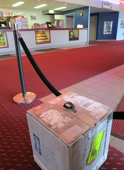
35mm print of Warm Bodies about to be shipped out from Market Square Cinemas, Madison, Wisconsin; 10 May 2013.
The overall situation couldn’t be plainer. At the end of 2012, reports David Hancock of IHS Screen Digest, there were nearly 130,000 screens in the world. Of these, over two-thirds were digital, and a little over half of those were 3D-capable.
Northern European countries have committed heavily to the new format. The Netherlands, Denmark, and Norway are fully digital, while the UK is at 93% saturation and France is at 92%. Both national and EU funds have helped fund the switchover. Hancock reports that in Asia, Japanese screens are 88% digital, and South Korean ones are 100%. China is the growth engine. Rising living standards and swelling attendance have triggered a building frenzy. Over 85%, or 21,407 screens are already digital, and on average, each day adds at least eight new screens.
In the US and Canada, there were at end 2012 still over 6400 commercial analog screens, or about 15% of the nearly 43,000 total. My home town, Madison, Wisconsin, has a surprising number of these anachronisms. One multiplex retains at least two first-run 35mm screens. Five second-run screens at our Market Square multiplex have no digital equipment. That venue ran excellent 2D prints of Life of Pi (held over for seven weeks) and The Hobbit: An Unexpected Journey. It’s currently screening many recent releases, including the incessantly and mysteriously popular Argo. In addition, our campus has several active 35mm venues (Cinematheque, Chazen Museum, Marquee). Our department shows a fair amount of 35mm for our courses as well; the last screening I dropped in on was The Quiet Man in the very nice UCLA restoration.
Unquestionably, however, 35mm is doomed as a commercial format. Formerly, a tentpole release might have required 3000-5000 film prints; now a few hundred are shipped. Our Market Square house sometimes gets prints bearing single-digit ID numbers. Jack Foley of Focus Features estimates that only about 5 % of the copies of a wide US release will be in 35mm. A narrower release might go somewhat higher, since art houses have been slower to transition to digital. Focus Features’ The Place Beyond the Pines was released on 1442 screens, only 105 (7%) of which employed 35mm.
In light of the rapid takeup of digital projection, Foley expects that most studios will stop supplying 35mm copies by the end of this year. David Hancock has suggested that by the end of 2015, there won’t be any new theatrical releases on 35mm.
Correspondingly, projectionists are vanishing. In Madison, Hal Theisen, my guide to digital operation in Chapter 4 of Pandora, has been dismissed. The films in that theatre are now set up by an assistant manager. Hal was the last full-time projectionist in town.
The wholesale conversion was initiated by the studios under the aegis of their Digital Cinema Initiatives corporation (DCI). The plan was helped along, after some negotiation, by the National Association of Theatre Owners. Smaller theatre chains and independent owners had to go along or risk closing down eventually. The Majors pursued the changeover aggressively, combining a stick—go digital or die!—with several carrots: lower shipping costs, higher ticket prices for 3D shows, no need for expensive unionized projectionists, and the prospect of “alternative content.”
The conversion to DCI standards was costly, running up to $100,000 per screen. Many exhibitors took advantage of the Virtual Print Fee, a subsidy from the distributors that paid into a third-party account every time the venue booked a film from the Majors. There were strings attached to the VPF. The deals are still protected by nondisclosure agreements, but terms have included demands that exhibitors remove all 35mm machines from the venue, show a certain number of the Majors’ films, equip some houses for 3D, and/or sign up for Network Operations Centers that would monitor the shows.
The biggest North American chains are Regal, AMC, and Cinemark. They control about 16,500 screens and own fifty-three of the sixty top-grossing US venues. The Big Three benefited considerably from the conversion. By forming the consortium Digital Cinema Solutions, they were able to negotiate Wall Street financing for their chains’ digital upgrade. They also formed National Cinemedia, a company that supplied FirstLook, a preshow assembly of promos for TV shows and music. Under the new name of NCM Network, the parent company now links 19,000 screens for advertising purposes. NCM also supplies alternative content to over 700 screens under the Fathom brand: sports, musical acts, the Metropolitan Opera, London’s National Theatre, and other items that try to perk up multiplex business in the middle of the week.
The digital conversion has coincided with—some would say, led to—a greater consolidation of US theatre chains. Last year the Texas-based Rave circuit was dissolved, and 483 of its screens, all digital, were picked up by Cinemark. More recently, the Regal chain gained over 500 screens by acquiring Hollywood Theatres. The biggest move took place in May 2012 when the AMC circuit was bought for $2.6 billion by Dalian Wanda Group, a Chinese real estate firm. Combined with Wanda’s 750 mainland screens, this acquisition created what may be the biggest cinema chain in the world. Wanda has declared its intent to invest half a billion dollars in upgrading AMC houses.
Meanwhile, vertical integration is emerging. In 2011, Regal and AMC founded Open Road Films, a distribution company. It has handled such high-profile titles as The Grey, Killer Elite, End of Watch, Side Effects, and The Host. Cinedigm, which began life as a third-party aggregator to handle VPFs, has moved into distribution too, billing itself as a company merging theatrical and home release strategies tailored to each project.
It has become evident that the digital revolution in exhibition permits American studio cinema a new level of conquest and control. Distribution, we’ve long known, is the seat of power in nearly all types of cinema. Whatever the virtues of YouTube, Vimeo, and other personal-movie exhibition platforms, film’s long-standing public dimension, the gathering of people who surrender their attention to a shared experience in real time, is still largely governed by what Hollywood studios put into their pipeline.
On the margins and off-center
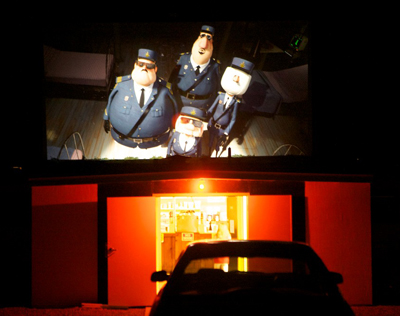
View of Madagascar from the Sky-Vu Drive-In, 2012. Photo by Duke Goetz.
While the Big Three grew stronger, what became of smaller fry? John Fithian of NATO suggested that any cinema with fewer than ten screens could probably not afford the changeover, and David Hancock suggested that up to 2000 screens might be lost. Recent speculation is that drive-ins will be especially hard hit. Pandora’s Digital Box, as blog and then book, surveyed those most at risk: the small local cinemas and the art houses.
I fretted about the loss of small-town theatres, not least because I grew up with them. Data on such local venues are hard to get, so for the blog and the book I went reportorial and visited two Midwestern towns. The blogs related to them are here and here.
The long-lived Goetz theatres in Monroe, Wisconsin, consist of a downtown triplex and the Sky-Vu drive-in. They’re run by Robert “Duke” Goetz, whose grandfather built the movie house back in 1931. Duke is a confirmed techie and showman. He designs and cuts ads and music videos to fill out his show, and he personally converted all his screens to 7.1 sound. So it’s no surprise that he’s a fan of digital cinema. But back in December his digital upgrade took place during the worst box-office weekend since 2008–a bad omen, if you believe in omens.
Seventeen months later, Duke reports more cheerful news. Everything has gone according to plan and budget. The company that installed the equipment, Bright Star Systems of Minneapolis, has proven reliable and excellent in answering questions. Duke especially likes the fact that digital projection allows him to “play musical chairs with the click of a mouse.”
I can move movies from screen to screen in short order or download from the Theatre Management System to any and all theatres at one time, so when the weather is damn cold, for Monday -Thursday screening I’ll play the shorter movies in the biggest house. . . . I am now able to start the movies from the box office with software that accesses the TMS, so it’s just like being at the projector. It saves my guys time and keeps them where the action is.
Duke programs his offerings to suit the tastes of the town, and for the most part, he can get the films he wants. Attendance at the three-screener has increased, partly, he thinks, because of digital. Even marginal product gets a bit more attention when people find the image appealing. Duke says that Skyfall played so long and robustly partly because it was a strong movie, but also because the presentation was compelling. Thanks to his subwoofer, viewers could feel onscreen shotgun blasts in their backsides. Immersion goes only so far, however. Duke remains leery of 3D: “People are tired of paying the extra charge, and with the economy in my area I’ll still wait.”
Contrary to trends elsewhere, the Sky-Vu has benefited strongly from digital display. Duke’s was the first North American drive-in to sign up for the NEC digital system. People comment on how the bright, sharp image has improved their experience. The drive-in had “a tremendous summer,” with the first Saturday night of Brave, coupled with Avengers, proving to be the best night of the year. Measured by both box office returns and number of admissions, that show did better than Transformers the summer before. Last fall, when the Sky-Vu was the only area drive-in still open, some patrons traveled 2 1/2 hours from Illinois. The only problem with digital under the stars was that Duke couldn’t get a satisfactory VPF deal for an outdoor cinema because he doesn’t run it year-round.
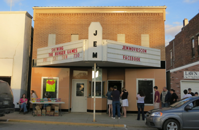
While Duke runs the Goetz theatres as a family business, the JEM Theatre in Harmony, Minnesota is more of a sideline for its owner-operator Michelle Haugerud. A single screen running only at 7:30 on weekend nights, the JEM plays a unifying role in the life of the town. But it’s a small market. Harmony consists of only 1020 people (many of them Amish), and the median household income is about $30,000. Michelle had to finance the conversion through donations and bank assistance. The task was complicated by the unexpected death of her husband Paul, who ran the JEM with her.
Michelle reports that the digital conversion hasn’t increased business. Box office was about the same in 2012 as in 2011, and so far this year ticket sales have been down. It has been a slow winter and spring throughout the industry, and people are hoping the summer blockbusters will lift revenues. But the JEM faces particular problems that the Goetz doesn’t.
Michelle wants to show films in first run, as Duke does. But the distributors typically demand that she play a new movie for three weeks. That’s not feasible in her small town, so Michelle winds up missing out on films she knows would draw well. In addition, she’d be willing to screen two shows a day, the first a kid movie and the second an adult picture, but the companies don’t allow this double-billing. Moreover, she thinks that the shrinking windows–the speed with which films come out on Pay Per View, VOD, and DVD–are eroding her audience. “Many people are willing to wait for these releases since they now realize they will be out shortly after they hit the theatres anyway.”
Michelle and her family run the JEM as much for the community as for themselves. She is hoping for better times.
Converting to digital has made showing movies easier, and I have had no issues with the new equipment. However, it has not helped with ticket sales at all. I am holding on and committed to this year, but if I get to the point where it is costing me personally to stay open, I don’t think I will continue. I love having the movie theatre and would love to keep it going. I do feel if I had a say on what movies I showed and when, I would do so much better.
Kickstarting the arthouse
Robert Redford addresses the Art House Convergence, January 2013.
Several managers and programmers of arthouse cinemas around the country have formed an informal association, the Art House Convergence. It meets once a year just before the Sundance Film Festival, which many members attend. When I visited the conference in 2012, the digital transition was the central topic. It aroused curiosity, bewilderment, frustration, and some annoyance. This year, things were different.
Participants were calmly reconciled to the inevitable, and some looked forward to it. On one of the few panels that took up the subject, moderator Jan Klingelhofer of Pacific Film Resources began by asking: “How many of you are still on the fence about digital?” Just one hand was raised.
On the panel, technology experts from major companies showed how new projection systems could be installed even in offbeat venues. The New Parkway in Oakland was once a garage, and the Mary D. Fisher Theatre in Sedona is a converted bank. Panelists also gave information on choices of technology, from lamps and servers to the best screen materials for 3D. The teeth-gnashing is over, and now art-house leaders are focusing on practicalities: the best strategies suited for their business models.
A private, for-profit art house faces many of the problems faced by Duke Goetz and Michelle Haugerud, except that the art-house is screening films of narrower appeal. Because the audience is smaller and more select, many art houses have become not-for-profit entities created by community cultural organizations. They are dependent on donations, private or public patronage, and miscellaneous income from many activities, not only screenings but filmmaking classes, special events, and other activities. A good example of the diversity of outreach an arthouse can have is the Bryn Mawr Film Institute, whose director, the estimable Juliet Goodfriend, also coordinates the annual AHC survey. So the coordinators of the not-for-profit theatre must persuade boards of directors and generous patrons that the digital upgrade is necessary.
Small venues, whether private or not-for-profit, can’t benefit much from economies of scale. A multiplex can amortize its costs across many screens, but a big proportion of art houses boasts only one or two. Add to this the fact that multiplexes are encroaching on the art-house turf with crossover films like Moonrise Kingdom and upscale entertainment like opera and plays from Fathom. Even museums are starting to install digital equipment and play arts-related programming.
The chief task, of course, is paying for the upgrade. Last year’s AHC session was often about the money. Small local cinemas like the Goetz could benefit from VPF deals, but for many art houses such deals weren’t a good option. These houses don’t run enough films from the Majors to repay the subsidy. While they’re often eager to take something from Fox Searchlight, Focus Features, and the Weinstein company, they book a lot from IFC, Magnolia, and other independent distributors.
A common solution was to launch fundraising campaigns from the community, much as Michelle did in Harmony. One of the biggest initiatives was that conducted by the boundlessly energetic John Toner and Chris Collier of Renew Theaters in Pennsylvania. Without going for a VPF, they raised $367,000 to pay for converting three screens (one in 3D). John and Chris are vigorous advocates for the new format, and their “This Is Digital Cinema” series treats restorations of classics like Gilda and The Ten Commandments as showcases for the DCP. At AHC 2013, John and Chris provided an entertaining PowerPoint presentation on how they managed the switchover; for a prose version, you can read John’s account here.
Likewise, the Tampa Theatre raised $89,000 from its community. But what if your community can’t sustain such a big campaign? I hadn’t predicted in Pandora how powerful Kickstarter would be in the film domain, and the results are initially encouraging. Donations to the Cable Car Cinema and Cafe of Providence surpassed the goal by six thousand dollars, and the theatre is already preparing for the new equipment. The final 35mm program will be, what else?, The Last Picture Show, complete with pulled-pork sandwiches. The Crescent Theatre of Mobile won nine thousand more than it asked for, and Martin McCaffrey, venerable moving spirit of Montgomery’s Capri Theatre, followed suit and came out ahead by about the same amount.
Currently the Kickstarter site lists dozens of conversion projects, and many have met their goals–with Boston’s Brattle and LA’s Cinefamily hitting over a hundred thousand dollars. The pitches are pretty creative (“The Cinefamily is a non-profit movie theater with awesome programming, but crappy everything else”) and so are the giveaways (the Skyline drive-in of Everett, Washington offers a vintage speaker box that’s “clean and suitable for presentation”).
So maybe predictions were too pessimistic. Will we lose so many theatres to the switchover? Maybe not. But raising money for the initial conversion isn’t the whole story.
Technology: Running in place to keep up?
In the shift to digital projection, some would say the pivotal moment came with the success of Avatar and other 2009 3D releases (Monsters vs. Aliens, Ice Age: Dawn of the Dinosaurs, and Up). In 2009 there were about 7400 digital screens; a year later there were nearly 15,000. Then the acceleration began. Ten thousand screens converted in 2011 and eight thousand more the following year.
But I see 2005 as another major marker. In 2004, there were only 80 digital screens in the US. By the end of 2005, there were over 1500. The early adopters were pushed by the emergence of 3D, heavily touted by several major directors at NATO’s annual convention and the strong 3D releases of The Polar Express (2004) and Chicken Little (2005). So there were two bursts of digital adoption, both driven by 3D.
With 3D as a Trojan horse, digital entered exhibition. The format eventually settled on was the Digital Cinema Package, an ensemble of files gathered on a hard drive. The movie, with subtitles and alternate soundtracks, is wrapped in a thick swath of security files. The studios, petrified of piracy, had delayed the completion of digital cinema for some years until an ironclad system was protecting the movie. The DCP can be opened only with a customized key, delivered to the theatre separately from the hard drive. Typically the key is sent on a flash drive, so that the staff member need not retype the tediously long string of alphanumeric characters that make it up. Copying that key into the theatre’s server, its theatre management system, or the projector’s media block allows the film to be played on a certified projector.
A digital projector suitable for multiplex use relies on one of two available technologies. Sony’s proprietary system works only on its own projectors. Texas Instruments’ Digital Light Processing (DLP) technology was licensed to three manufacturers: Christie, Barco, and NEC. By fall 2010, all four companies had produced high-level, and quite expensive, machines capable of producing 4K displays. The rush to convert led to thousands of units being bought over a few months. This was great for business in the short term, but how could the manufacturers count on selling the product in the years and decades ahead? Michael Karagosian sketches the problem: “The big challenge today for technology companies is the massive downturn in sales that is destined to take place the last half of this decade as the digital installation boom ends.”
One way to expand the market was offered by cheaper machines. In fall of 2012, all the manufacturers introduced DCI-compliant projectors suitable for screens around thirty feet wide. The machines were still quite expensive, but they were marginally more affordable for the smaller or independent exhibitors who had been reluctant to convert or who had missed the deadlines for VPF financing. To maintain a quality difference from high-end machines, the cheaper versions typically lacked some features. They might be capable of only 2K, or they might not permit a wide range of frame rates, or they offered less brilliant illumination.
Another answer to a saturated market was continuous research and development. No sooner had exhibitors installed the “Series 2” projectors introduced in late 2009-early 2010 than speculation began about enhancements. How soon, for instance, might we expect 6K or even 8K resolution? Two other innovations were responding to problems with the dimness of digital 3D images.
One possibility was laser projection, which would be expected to brighten the image considerably. Laser projectors may start appearing in Imax cinemas later this year, but for most venues the current costs are prohibitive, running about half a million dollars per installation.
3D light levels could also be boosted by shooting and showing at higher frame rates than the standard 24. Peter Jackson famously experimented with 48-frame production on The Hobbit: An Unexpected Journey, and some theatres screened it that way. Response was mostly skeptical, with critics complaining of the hypersharp, “soap-opera” effect onscreen. The frame-rate issue has mostly quieted down, but it did trigger academic studies of the perceptual psychology involved in frame rates. In addition, James Cameron has insisted that his sequels to Avatar will be shot at an even higher frame rate. Most projectors require new software in order to increase frame rates.
Alongside developments in the projection market have come new devices for sound. As Jeff Smith pointed out in an earlier entry, innovative sound systems have been enabled by the switchover to digital presentation. 35mm film stock constrained the amount of physical space on the film strip that auditory information could occupy. Now that sound is a matter of digital files, sound designers can add many tracks for greater immersive effects—so-called “3D audio” platforms. Barco’s Auro 11.1 system and Dolby Atmos position several more speakers around the auditorium, including ones high above the audience. Costs of installation for these systems run from $40,000 to $90,000.
Still, projector and sound-system manufacturers can assume that business will continue because of the pressures for change inherent in digital technology. Experienced equipment installers suggest that a digital projector’s life is between five and ten years. Already the Series 1 projectors introduced in 2005 are becoming obsolete. Chapin Cutler, of Boston Light & Sound, notes:
A digital projector is a computer that puts out light. How many computers will you go through in the next ten years?
How many Series 1 projectors are still in use and supported by the manufacturers? Try buying parts for them. I know of one that was purchased four years ago that has been pushed into a corner. It has sat there for about two months so far, with no end in sight. (Thank heavens they still have their 35 mm gear!) It is broken and the manufacturer cannot supply parts; their customer service department doesn’t know about the machines, as they have only had to deal with the newer models; and the parts are not listed in their own internal parts book. Yes, four years old.
When replacement parts are available, they can be exceptionally pricey. A projector’s light engine, central to the image display, can run $22,000. And if an exhibitor buys a brand-new projector some years from now, the studios aren’t likely to launch a new round of VPF financing.
So even if a theatre can afford the expense of conversion today, upgrades and maintenance will demand big commitments of money in the years ahead. John Vanco, Senior VP and manager of New York City’s IFC Center, has put it well:
Many, many small, independent theatres, which are vital to the survival of non-studio films, will end up being fatally hobbled by the transition. They may be able to raise funds to cover the initial conversion, but what will crush many of them in the long term is the ongoing capital resources that will be necessary to continue to have DCI-compliant equipment in the next ten and twenty years. . . .
In the same way the current inexorable pattern of planned obsolescence forces consumers to continually repurchase computers, phones, etc., cinemas too are going to find that they have to spend much more for cinema equipment over the next twenty years than they did, say, from 1980 to 2000. . . . So these technological progressions will make it harder for those small theatres to survive.
Dylan Skolnick of Huntington, New York’s Cinema Arts Centre adds to Vanco’s point. “We have great supporters, but I can’t go back to them every five-to-ten years with a ‘Digital Upgrade or Die’ campaign.”
The problem is acute for small and art-house venues, but it isn’t minor for the Big Three either. Unless film attendance jumps spectacularly (it has been more or less flat for several years), exhibitors may need to raise ticket prices and the costs of concessions. This strategy may work in urban areas but won’t be popular elsewhere. Moreover, part of the boom in box-office revenues during recent years has been due to the upcharge for 3D features. But in the US, 3D revenues are currently leveling off at about $1.8 billion, a drop from the format’s 2010 peak of $2.14 billion. In 2012, 3D’s market share slipped as well. It isn’t clear that people would flock to 3D if the images were brighter. And if 3D television takes off, stereoscopic cinema will seem less compelling as a novelty.
Some observers hold out hope for glasses-free 3D technology in theatres, a change that would probably boost business. But the difficulties of creating 3D of this sort for multiplex venues are immense. The glasses-free platforms proposed by Dolby are aimed at small displays, like TVs, smartphones, and tablets. Of course, if 3D without glasses were devised for big screens, it would almost certainly demand yet another projector redesign.
No more silver bricks
When it comes to distribution, digital isn’t there yet. The UPS and Fed Ex corps still bring movies to multiplexes the old-fashioned way. The little briefcases are a lot lighter than hulking metal shipping cases, but we’re still dealing with physical artifacts.
At least for the moment. Festival submissions are already being placed in Cloud-based lockers like Withoutabox in an effort to replace DVD screeners. Online delivery is already being used for many of those operas, ballets, and other forms of “alternative content” flowing onto screens from various suppliers. A Norwegian distributor sent a 100 gigabyte local film, fully encrypted, to forty cinemas in the spring of 2012. This and experiments in other countries employ fiber-based networks, but the Digital Cinema Distribution Coalition, a joint venture among Hollywood studios and the Big Three exhibition chains, is exploring satellite systems.
So much for the impassive silver bricks in their cute pink beds on the cover of Pandora’s Digital Box. They may become as quaint as film reels and changeover cue-marks. For a time, the hard drives may survive as backup systems that will reassure exhibitors, but eventually no physical site may serve as the movie’s home. An exhibitor will download the film to the server, apply a decryption key sensitive to time, venue, and machine, and the movie will be, as they say, “ingested.”
In the Pandora book, I included chapters on other exhibition domains I haven’t revisited here. Take archives. More and more studios refuse to rent prints, will not prepare DCPs of most classic titles, and won’t let theatres screen Blu-ray discs commercially. So repertory cinemas turn to archives, seeking to rent 35mm copies that may be irreplaceable. In addition, archivists, laboring under tight budget constraints, are racing to preserve and restore their material on film, which remains the most stable support medium. At the same time, archives are expected to get involved in preparing high-quality digital versions of popular classics. Henceforth most restorations that you see will be circulated on 2K or 4K, as Metropolis, La Grande Illusion, and Les Enfants du Paradis have been in recent years.
Film festivals, as Mike King, one of our Wisconsin Film Festival programmers observes, are now file festivals. Cameron Bailey reported that of the 362 titles screened at TIFF last year, only fifty-one were on film. Last month, our annual event ran twenty-one new films on film; most were 16mm experimental items. The remaining 132 were on DCP, HDCam, Quicktime files, or DVD/Blu-ray. On the plus side, independent filmmakers are learning to encode their films in the DCI-compliant format, often without layers of security, so at least in this respect technology may not be a severe barrier to entry.
As for me, I’m still in the midst of churn. I watch movies on film, on DCP, on DVD and Blu-ray and VOD, even on laserdisc, and sometimes on my iPad. But my research will miss 16mm and 35mm. Some of the questions I like to ask can be answered only by handling film. Last weekend I sat down at a Steenbeck flatbed and counted frames in passages of Notorious and King Hu’s Dragon Inn. This sort of scrutiny is virtually impossible on DVDs and Blu-rays, which don’t preserve original film frames.
What I’ve lost as a specialist is offset by many gains. Since the arrival of Betamax and VHS, nontheatrical cinema has expanded to limits we couldn’t have imagined in the 1970s. Thanks to consumer digital formats, more people have more access to more movies of all sorts than at any point in history. Although some aspects of film-originated movies are hard to recover on digital playback, we can study cinema craft to an extent that wasn’t possible before. Digitization has allowed sophisticated visual and sonic analysis to bloom on websites around the world. See, among many examples, Jim Emerson’s Scanners and A. D. Jameson’s work on Big Other.
With the rise of nontheatrical consumption, though, what’s most at risk is theatrical cinema: film viewing as a public forum. Exhibition outside film festivals is already starting to narrow to recent releases and a few approved classics. We will be able to watch The Suspended Step of the Stork and Leviathan on our home screens for a long time to come, but very seldom on the scale that benefits them most.
As ever, the problem of technology isn’t only a matter of hardware. Technology develops within institutions. Hollywood has standardized a new technology favoring its goals. The institutions of minority film culture–festivals, art houses, archives, local cinemas, schools–need to be robust and resourceful to maintain all the types of cinema we have known, and the types we might yet discover.
Since Pandora was published, a very comprehensive guide to the mechanics of digital projection has appeared: Torkell Saætervadet’s FIAF Digital Projection Guide, and it’s a must. One rich treatise I didn’t cite in Pandora is Hans Keining’s 2008 report 4K+ Systems: Theory Basics for Motion Picture Imaging. Michael Karagosian’s website is an excellent general source on digital exhibition in the late 2000s.
Screen Daily provides a good overview of the new technology on display at CinemaCon 2013. For general background on industry trends after the changeover, see the Variety article “Filmmakers Lament Extinction of Film Prints.” As for archives, Nicola Mazzanti edited a very useful European Commission study, Challenges of the Digital Era for Film Heritage Institutions (Berlin/ UK, 2012). May Haduong surveys current problems of print access and film archives in “Out of Print: The Changing Landscape of Print Accessibility for Repertory Programming,” The Moving Image (Fall 2012), 148-161. The piece requires online library access, but a summary is here.
Much of the industry information in this entry came from proprietary reports published in IHS Screen Digest. Thanks to David Hancock for his assistance with other data, and to Patrick Corcoran of NATO for updated information on theatre conversion. Thanks as well to Chapin Cutler, Duke Goetz, Michelle Haugerud, and Dylan Skolnick for permission to quote them. I’m also grateful to Jack Foley of Focus Features and Joshua Hittesdorf of Market Square Cinemas. Finally, I want to thank Russ Collins and his colleagues at the Art House Convergence for mounting another splendid event and for inviting me back last January. I continue to learn from the discussions on the AHC listserv, and I’m particularly grateful to John Toner for his reports on independent cinemas’ funding efforts.
Other entries on this site offer material on the digital transition. There’s “It’s good to be the King of the World,” on James Cameron’s push for 3D TV; “ADD = Analog, digital, dreaming,” about the powers of photochemical cinema on display at the Toronto International Film Festival 2012; “Digital projection, there and here,” some notes on the situation in Western Europe; and “Side by side: Quick catchups,” includes notes on sources for studying digital cinema. In “16, still super,” veteran programmers talk about how they continue to rely on this format; in the process they convey their commitment to providing unusual fare.
P. S. 15 May 2013: Rebecca Hall of the extraordinary Northwest Chicago Film Society has posted a continually updated list of theatres that are dedicated to showing films in 16mm and 35mm.
P.P.S. 12 June: David Hancock has just presented a very full report entitled “Digital Cinema Worldwide: 35mm phased out in many countries, though some lag behind.” It is published in the June IHS Screen Digest. One of my remarks above has been corrected in light of some information in the report: I claimed that Belgium has fully converted, but David’s figures indicate 96.5% conversion.
David predicts that by end 2013, 90 % of world screens will be digital. Even India is making the move, as circuits relying on DVD or other low-resolution sources are converting to DCI-compatible equipment. Those regions slowest to convert include Italy, Greece, and Spain (not surprisingly, given recent austerity policies), as well as areas of South America and the Pacific (e.g., Thailand, the Philippines). Thanks to David and his team at IHS Screen Digest for their comprehensive coverage of this process.
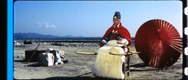
Dragon Inn (King Hu, 1967). 35mm frame enlargement, taken on Fujichrome 64.
Jack and the Bean-counters
Kristin here:
I don’t know about you, but back on January 16 about the last thing on my mind was the release, still six weeks away, of Jack the Giant Slayer. It wasn’t a film I was planning to see. Not many people were, as it predictably turned out. I was more concerned with a recent release, The Hobbit: An Unexpected Journey, and whether the decision to turn a two-part film into a trilogy had adversely affected the narrative. I posted my some-good-news-some-bad-news entry that day.
Not as giant as they might think
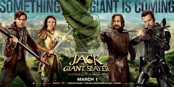
It turned out on that same day there were some fans of fantasy films and/or Bryan Singer, the director of Jack, who were exercised about the recently released poster for the film (reproduced above). I discovered this from a Hollywood Reporter story published in the wake of Jack’s disappointing opening weekend, when it grossed $27.2 million domestically. The story led off with an anecdote about the poster kerfuffle:
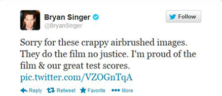
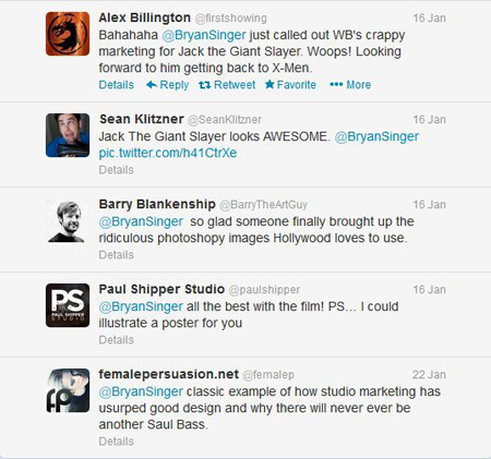
When Bryan Singer sat down at his computer in mid-January and read Internet comments criticizing a new Warner Bros. poster for his big-budget epic Jack the Giant Slayer, he fumed. He didn’t care for the cartoonish image of the film’s stars brandishing swords and standing around a swirling beanstalk. So Singer complained on Twitter. “Sorry for these crappy airbrushed images,” he wrote Jan. 16, irking Warners’ powerful marketing head Sue Kroll. “They do the film no justice. I’m proud of the film & our great test scores.” An insider confesses, “Bryan felt like he had to apologize to his fans.”
This gesture annoyed studio executives, who demanded that Singer take it down. He hasn’t. The apology won him some points with the fans, as some sample tweets in response show:
Do any current Warner Bros. executives know who Saul Bass was? More to the point, do the studios have any idea how much fan devotion is gained by directors like Singer, Peter Jackson, and Guillermo del Toro, who try to communicate directly with the fans as often as they are allowed to, and even sometimes when they aren’t? If the studios did have any idea, they would encourage directors to hold question-and-answer sessions on fan sites and communicate via social media far much more than they do now. I suspect studios give up tens of millions of dollars in free publicity by treating fans as potential spies, spoiler-mongers, and authors of vicious reviews based on trailers.
Ring? What Ring?
This disappointment with Jack’s poster reminded me of an incident that happened late in the filming of The Lord of the Rings. I describe it in The Frodo Franchise:
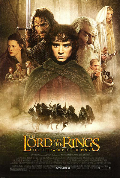
On 16 Dcember 2000, New Line’s president of domestic theatrical marketing, Joe Nimziki, met with the director concerning the Rings publicity campaign. One of his purposes in visiting Wellington was to meet the cast, who would be involved in the upcoming press junkets, parties, and premieres. The occasion soured when the filmmakers and actors saw the proposed poster design. Based on its audience research, New Line had concluded that Rings would appeal primarily to teenage boys, and the design was busy and garish. The actors backed Jackson up, threatening not to participate in the marketing campaign if it proceeded along those lines. Jackson had a mock-up poster made, featuring muted tones and a simply design centered on an image of the One Ring. The design was not used, but it gave New Line a sense of what the filmmakers considered appropriate. (p. 81)
When I made my first research trip to Wellington in 2003, I had no idea that this incident had occurred. Someone high in the production mentioned it to me out of the blue during an interview, which led me to think that this person considered it important and wanted me to mention it. After nearly three years, it obviously had remained a sore point. (I did describe the incident, but in general I portrayed the few mistakes I mentioned in my book as part of a learning curve that the studio benefited from.) Unfortunately I have never seen the offending poster design. I have seen one of what were apparently two mock-up copies of Jackson’s version made, on the basis of which I wrote the brief description above. The design was too muted in color and minimalist in layout to be useable, but it evidently served its purpose.
Obviously there’s a big difference between the handling of these two offending poster designs. New Line, which produced The Lord of the Rings, took the trouble to show the cast and crew the planned poster and acceded to their wishes about replacing it. As a result, the cast participated in the many press junkets and other publicity events. I’m not sure which poster design for The Fellowship of the Ring convinced the cast, but the one at the bottom of this entry was the main one used. Definitely better than the one for Jack at the top.
Warner Bros. presumably did not bother to show Singer the poster, or test it on fans, or do anything to make sure that it would boost rather than dampen potential moviegoers’ enthusiasm. It is as conventional a poster as one could imagine for such an expensive film.
The irony in all this is that New Line also produced Jack the Giant Slayer. Due to various post-Lord of the Rings failures, primarily The Golden Compass, New Line is now a production unit within Warner Bros. It doesn’t handle its own distribution or marketing, having been downsized by about 80 percent. Warners takes care of everything except the production itself.
Doesn’t amount to a hill of beans
Jack’s opening weekend’s gross was followed by a nearly 64 percent drop during its second weekend. It just went into second run last week, so its theatrical life is rapidly tapering off. In the same Hollywood Reporter story that alerted us to the poster tweets, author Pamela McClintock called Jack “the latest in a string of dismal 2013 domestic releases.” She added,
Revenue and attendance are both down a steep 15 percent from the same period in 2012, wiping away gains made last year. Jack may have cost far more than any of the other misses, but in assessing the carnage, there’s a collective sense that Hollywood is misjudging the moviegoing audience and piling too many of the same types of movies on top of one another.
I think that collective sense is shared by almost every ordinary viewer. Jack the Giant Slayer. Really? For that matter, Hansel and Gretel: Witch Hunters? Upon merely hearing these titles, I didn’t expect them to be hits. In the wake of The Lord of the Rings and the Harry Potter series, Hollywood has been pushing fantasy harder and harder, but there is a limit. I think that has been reached with the mini-trend toward adapting fairy tales with adults in the lead child roles. Making Jack a “giant slayer” (grammar-police note: this should be “giant-slayer”) doesn’t hide the fact that this is really “Jack and the Beanstalk” re-titled by committee.
Recently Variety reported that the success of Alice in Wonderland early in the year (it was released in March, 2010) has led studios to release films of the summer-tentpole type well before the traditional Memorial Day weekend opening of the summer season: “Warner Bros. started this year’s March madness with the pricey Jack the Giant Slayer, which never sprouted.” Disney’s Oz the Great and Powerful opened one week later.
Now there’s a film I wanted to see, and many others did, too. It’s currently still in first run and pushing toward the $500 million mark worldwide. With a reported $215 million budget plus publicity costs, that’s not a big hit (it’ll probably become profitable in Blu-ray, streaming, etc.), but it’s doing a lot better than Jack. Jack’s budget is reported at slightly under $200 million, with marketing costs of over $100 million. As of now it has grossed a little under $200 million worldwide. A week after Oz, The Croods appeared, aimed to some extent at the same audience as the two films that preceded it. In short, Hollywood is not only making a lot of children’s fantasies, adapted to a broader audiences including adults, but it is releasing them opposite each other.
Fans? what fans?
This is not to say that all such films fail. I found Oz a clever film, better than most critics have given it credit for. It presents an imaginative riff on the 1939 The Wizard of Oz as if it had been made using classical storytelling techniques but with digital technology.
But back to that claim that “Hollywood is misjudging the moviegoing audience.” It’s hard to imagine a group of executives sitting around a big table and seriously thinking that an expensive digital extravaganza based on “Jack and the Beanstalk” would bring people flocking to theaters, yet they did. Why? Possibly because they are out of touch with the fandoms they depend on.
Back when I was researching the Lord of the Rings online fandom and its relationship to New Line’s publicity department, it seemed that Hollywood was beginning to understand fans. It was a hard learning process, but New Line’s executives reluctantly gave some big websites occasional access to sets and once in a while sent them news exclusives. Such openness, grudging though it was, generated free publicity and goodwill. The studio also allowed Peter Jackson to interact with fans, though in strictly controlled circumstances.
Warner Bros. is a different animal altogether, and it has squandered much of what goodwill New Line gained in those days. The Jack the Giant Slayer poster controversy provides perhaps one clue as to how indifferent studios now are to their public and how much their insularity can damage their bottom lines.
The Hobbit: An Unexpected Journey, made by New Line under the tight control of Warner Bros., has of course done very well financially. It grossed over a billion dollars worldwide–though just barely, at $1,017,003,568. If we could adjust worldwide figures for inflation (impossible due to different inflation rates in different countries), each installment of The Lord of the Rings would undoubtedly turn out to have earned more. This despite all the surcharges for the many 3D screenings of The Hobbit.
Why didn’t it do quite as well as the previous entries in the franchise? Perhaps some people who had liked Rings were put off by their perception of The Hobbit as more of a children’s film. Perhaps it was partly the reviews, which were considerably less enthusiastic than for any of the three parts of Rings.
I wonder, though, if Warner Bros.’s lack of interest in the fans might have had something to do with it. Consider what New Line had done for fans in the marketing of Rings as compared to what Warner Bros. has done with The Hobbit. New Line started a pioneering website, managed by Gordon Paddison, that drew millions of fans long before The Fellowship of the Ring appeared. Gordon Paddison, now running his own publicity firm, has created a Hobbit website as well, but it’s primarily a large ad for the Blu-ray and DVD, with none of the free wallpapers and other items that were so popular on the Rings site. Even a live online event from March 24, during which Peter Jackson answered fan questions, was re-posted there without the brief preview footage from The Desolation of Smaug–an unkind cut that annoyed fans greatly. This was especially unfair because to log in to the live event, one needed a code enclosed in the Blu-ray/DVD package, and the Blu-ray release hadn’t occurred in many part of the world by March 24. Not good public relations.
The main online publicity venue for The Hobbit has been Jackson’s own Facebook page, where ten production vlog entries were posted at wide intervals. These later became the main supplements for the theatrical DVD release. Given the breezy, open tone of these vlog entries, it seems possible that they can be credited more to Jackson’s initiative than Warner Bros.’s.
New Line also licensed a company to create a fan club for The Lord of the Rings, complete with an excellent bimonthly magazine. A considerable amount of effort was put into the eighteen issues that appeared, including interviews not only with the filmmakers but with the makers of licensed tie-in products. Fans were encouraged to send in questions for the interviewees, and some of these got included. The names of the charter members of the club were run in a crawl after the credits of the extended-edition versions of the DVDs, a process that, even at a rather fast clip, ran for about twenty minutes. This won huge loyalty from fans, even those who joined later and didn’t get into that crawl-title.
For The Hobbit, there was no fan club and no magazine. I can imagine that the Rings fan club generated a relatively small income for New Line compared to the many other licensed items, but it created much enthusiasm among fans. The film’s official Facebook page is a feeble substitute.
For decades people have been saying that Hollywood executives are out of touch with their audiences, make too many movies, spend too much on their movies–especially in age of special-effects-based blockbusters. It’s an old complaint but one that may be a genuine and growing problem as executives with no personal film production experience control the output of studios owned by huge corporations.
The Hollywood Reporter story that began with the anecdote about Singer’s apologetic tweet ends with some insight:
Privately, studio executives concede that Jack was a feathered fish, neither a straight fanboy tentpole that Singer (X-Men, Superman Returns) is famous for nor a pure family play. “Sometimes you simply have a movie that is rejected,” laments one Warner executive, a common refrain these days in Hollywood. “You can spend as much as you want, market it a zillion different ways, and it still doesn’t work.”
Someone might point out that Jack and Rings are not comparable projects. Rings was adapted from a beloved classic and already had a significant fan base. Jack was not based on a novel and had no such fan base. But I believe that the big studios view fantasy as a genre with a broad, somewhat unified fan base consisting of people who will go to see just about any fantasy film. The failures of not only Jack and Hansel and Gretel but also of others like Mirror, Mirror show that that’s not the case.
The answer is out there
 One solution to the studios’ isolation could be to get on the Internet, keep tabs of the huge amount of fan opinion already there and appearing every day, and get a sense of what the real audience wants.
For a start, there is no “fantasy” fandom. There are fandoms around specific stories or series or movies or games. They create websites and Facebook pages and videos. Many fans are quite smart and understand the conventions of the fantasy genre. They know how the industry markets things to them. (Witness all the accusations that fly when a studio repackages a film yet again as a DVD/Blu-ray with only minimal changes in the supplements.) They know exactly what they want marketed to them and what they don’t want. Richard Taylor, the head of Weta Workshop, which designed many of the collectibles as well as the Rings and Hobbit films, is a hero to fans. Affluent Rings fans who get married can commission Daniel Reeves, the calligrapher for the franchise, to design their wedding invitations. Denny’s Hobbit meals, on the other hand, are viewed variously as merely amusing to downright offensive.
There are also rivalries among fandoms. Ask a Ringer and a Harry Potter fan who is the greater wizard, Gandalf or Dumbledore, and watch the feathers fly.
There was a vivid example of this just last month. The MTV Awards nominations for 2012 were posted for fans to vote on. In the Best Hero category there were Snow White (the Snow White and the Huntsman version), Batman, Catwoman, Iron Man, Hulk. and Bilbo Baggins. Shortly into the voting, Snow White was at first place with 13,556, with Bilbo dead last with 226 (left).
Snow White beating Iron Man and Batman? Ringers realized at once that this was not an overwhelming vote for Snow White but for Kristen Stewart, and it was happening because of the Twihards–the devotees of the Twilight series.
Rallying around, Ringers began trying to get people to Vote Bilbo. Fans created memes for tweeting and re-tweeting. TheOneRing.net, the biggest Tolkien website, got involved in helping coordinate individual efforts into a unified campaign to spread the word. Spiegel Ei posted a amusing video on Vimeo, “put a ring on it #VoteBilbo,” in which Bella Swan (Stewart’s character in the series) meets several Rings characters, reads Tolkien’s novel, researches it on the Internet, and abandons her world for Middle-earth. The short film was so clever that MTV’s website even featured a news story , linking to it–a strange case of bias that may have helped sway the voters. (The # symbol in the title comes from the fact that fans could vote only by tweeting for one of the six nominees.)
Even so, during the final exciting week, the MTV vote seesawed back and forth between Snow White and Bilbo, but the Ringers’ campaign won out, with Bilbo attaining a margin of just over 100 thousand:
Measured by the box-office records of all the films, Snow White would seem to be least popular. Yet it wasn’t the ticket-buying audience as a whole voting. It was the hardcore fans–and mostly fans from a different fandom at that.
Cliff “Quickbeam” Broadway has posted an excellent rundown of the campaign on TheOneRing.net, “When Fandom Comes Together: How #VoteBilbo Rallied the Ringers.” It conveys how a large number of devotees worked very hard for free to create an almost professional-level campaign for a character and film they loved. All this within the space of a few weeks.
I’m not saying that a studio marketer could go onto the Internet and find hard facts on fans’ likes and dislikes. It’s something one gets a feel for by looking at the message boards on TheOneRing.net or checking out The Leaky Cauldron (the biggest Harry Potter fansite) or liking a bunch of directors’ and films’ Facebook pages. By the way, it’s odd that Peter Jackson has a FB page that, with its nearly 800 thousand Likes, has become the main online publicity site for The Hobbit, while Bryan Singer doesn’t even have a FB page. Does that suggest any systematic approach in WB’s publicity campaigns? True, Jack has a FB page, but these days every film does.
 What sorts of things can you learn by looking at such sites and pages? It’s interesting, for example, that Cliff’s fandom story includes one of many images that were devised by fans for the twitter campaign for Bilbo, one not from Rings or The Hobbit, but from Game of Thrones (right). Ringers would instinctively know that Lord of the Rings fans would be far more likely to read George R.. R. Martin’s book series or watch the TV adaptation than would Twihards. Not only would they recognize the image shown (the character played by Sean Bean, who was Boromir in The Fellowship of the Ring), but they would know that “Snowwhite is coming” is a riff on a portentous line from Game of Thrones, “Winter is coming.”
It is also interesting that TheOneRing.net catered to the slightly older-skewing demographic that is far more important in Rings fandom than in Twilight fandom. As Cliff says: “We have an audience that included older-generation folks who had never used Twitter, so we gave quick and easy instructions to help guide our friends toward their goal.” New Line’s audience research, which originally convinced them that teenaged boys were their primary audience, didn’t reveal that other big audience–which most Ringers would know about.
These little details may not be important in themselves, but picking up many of them from fan discussion adds up to an overall view of characteristics and attitudes. Fans are also quite clear on their likes and dislikes as far as directors and stars go. Just the other day on a thread on TheOneRing.net, Lusitano gave his opinion concerning future possible adaptations of material from Tolkien’s The Silmarillion and Unfinished Tales: “If in the future they end up being adapted, it is only sensible to give them to someone else [other than Peter Jackson]. Tim Burton, perhaps? ” Such an adaptation would, I think, be unwise, but a producer who went down that road ought to be interested in that opinion.
Clearly from the way most studios treat most fan sites, they aren’t particularly grateful for any of this. They also don’t seem to recognize that the most devoted fans working for such sites or posting on their own FB pages, YouTube, and Vimeo, have an extraordinary expertise concerning one fandom and often several.
Possibly the studios do closely monitor fansites. Certainly some people in the Rings filmmaking team read TheOneRing.net. When Guillermo del Toro was slated to direct The Hobbit, he even joined the Message Boards and participated in discussions fairly frequently. Naturally the fans adored him for it. If he had stayed on as director, would WB have allowed him to keep up that practice? Probably not unless he cleared every contribution with the studio publicity department.
I’m not saying that cruising online fan outlets would guarantee that the studios would get such a feel for their public that all the films they greenlight would be successes. There are always inexplicable flops. Why did audiences who flocked to Tim Burton and Johnny Depp’s Alice in Wonderland reject the same team when Dark Shadows appeared? Was it just the difference between the sources: a universally known classic book vs. an old TV show with a devoted but small cult following?
Still, when I hear about such incidents as the ones I’ve described here, I can’t help but feel that the fans are a far more valuable source about potential audiences than the studios realize. Why do studios not identify certain particularly knowledgeable and devoted fans as experts and hire them as consultants? Or at least quietly study what they say and do and benefit from it? Maybe then they would know what many of us already know: that the impending failure of some films, like Jack and Hansel and Gretel, is bone obvious from the start.
All this is not to say that Jack the Giant Slayer is a bad film and not worth seeing. It has gotten some surprisingly good, if not rave reviews, though its score on Rotten Tomatoes is only 52% (and 61% among fans). It’s just that WB should have known what they were getting into.
“We didn’t have a sense that VERTIGO was special”: Doc Erickson on classic Hollywood
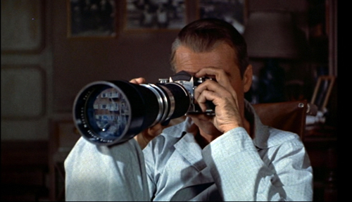
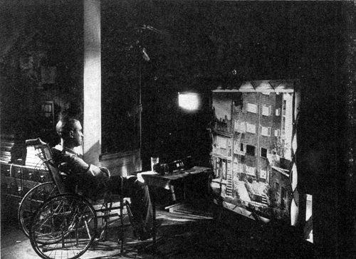
Rear Window (1954); illuminated transparency used to create the lens reflection.
Note: This entry was nearly finished when Roger Ebert died on 4 April. I had intended to send it to him in advance. I think he would want me to post it as I’d planned–just before this year’s Ebertfest.
DB here:
On 17 April, about 1500 people will gather at the Virginia Theatre in Urbana, Illinois, for a celebration of movie love known as Ebertfest. Among Ebertfest’s many guests will be C. O. “Doc” Erickson.
This genial man, who visits Ebertfest each year, is a Hollywood veteran. He was production manager for Alfred Hitchcock, Sidney Lumet, John Huston, Anthony Mann, Roman Polanski, and Ridley Scott. In later years he was associate or executive producer on Chinatown, Urban Cowboy, Popeye, Blade Runner, Looking for Bobby Fischer, Groundhog Day, Kiss the Girls, Windtalkers, and many other projects.
In short, he was an eyewitness to film history. During our visits to Ebertfest Kristin and I have often talked with Doc about his career, and last year I interviewed him for an hour. I thought it was time we set down some of the things we’ve learned. I’ve supplemented Doc’s remarks to us with quotations from Douglas Bell’s 2006 detailed, book-length interview with him.
Setting the scenes
Sunset Boulevard (1950).
Doc began working for Paramount Pictures in December 1944, a year after his graduation from the University of Illinois—Champaign-Urbana. This young man, not yet twenty-one, stepped into the studio that would harbor, across the next few years, The Lost Weekend, The Blue Dahlia, The Strange Love of Martha Ivers, Unconquered, I Walk Alone, A Foreign Affair, Sorry, Wrong Number, The Big Clock, The Heiress, The File on Thelma Jordan, The Furies, Sunset Boulevard, and several Bob Hope, Bing Crosby, and Martin and Lewis comedies.
Initially he worked on estimating the budgets for back-lot and set construction. Doc’s unit would try to give the director some leeway. “Ultimately, it wasn’t [a director’s] fault if the set went over budget. . . . We had to try to get enough money in there so that it wasn’t going to go over budget, because then we’d catch hell.” Then Doc and his colleagues would monitor the building of the set to make sure that the specifications were followed and the budget was adhered to.
Doc moved to stage management and supervision, which required him to plan how a production’s sets were arranged in a sound stage. Four or more sets would have to be fitted together, jigsaw-fashion. Doc would try out arrangements by shifting cutout sets on something like a bulletin board, marked with entrances, walls, and power sources. This was called “spotting the sets.” Spotting was much easier in the days of overhead lighting; lighting from the floor, which became more common as the decade went on, posed extra problems.
Once used, the sets might be dismantled, with different departments rescuing what they could use again. A whole set might be saved for another picture (“fold and hold”). B-pictures recycled sets from A pictures. At the other extreme, ornate interior sets might use units drawn from luxurious houses that had been dismantled. From New York mansions came pieces that were shipped to Hollywood and resassembled to create a salon or ballroom.
Paramount’s back lot included big standing sets, including a train station with some cars on the track. “Then, of course, you had pieces of the train in the scene dock, that could be dragged out and assembled on the stage.” A street at the south end of the lot was used for Westerns and featured a mountain that blocked the view of the adjacent RKO studio.
I’ve long been struck by the fact that articles from the classic period seldom talk about the look of sets for ordinary rooms. So I asked: What colors would be found on the sets in black-and-white movies? Doc smiled. “Black and white—or rather, shades of gray.” Sometimes a bit of green would be added. (I’ve read that sometimes snow was painted yellow to make it dazzle.) Pause and think about how hallucinatory it must have looked: actors moving through a three-dimensional black-and-white movie.
The crew was expected to average fifteen to twenty setups per day, at a period when shooting a top-line feature took anywhere from seven to twelve weeks, or even more. The Paramount policy was to press ahead and finish with a set quickly, even if not every shot was taken. Retakes were likely to be close views of the actors and could be picked up later without need for the full set. This flexibility was feasible because most productions were still shot inside the studio walls. Despite the trend toward location shooting in the late 40s, Doc says, “We weren’t off the lot very much.”
The 1940s saw the rise of the hyphenate filmmaker, and this trend was vigorous at Paramount. The studio roster boasted screenwriter-directors Preston Sturges and Billy Wilder and several director-producers, including Cecil B. DeMille, Mark Sandrich, Mitchell Leisen, and John Farrow. At Paramount, Doc recalls, “The director was king.” No wonder that one of the most kingly figures of the period wound up there for several years.
A step up
The Misfits (1961).
Doc had moved into the role of assistant unit production manager for Secret of the Incas (1954), directed by Jerry Hopper and starring Charlton Heston and Robert Young. His new job involved managing the day-to-day work of filming as a liaison between the production office and the shoot. A production manager works closely with the assistant director to keep the work on schedule and within budget.
When Hitchcock made his five-picture deal with Paramount and was preparing Rear Window, his assistant director, Herbert Coleman, found that all Paramount’s established production managers had been assigned. Coleman asked Doc to take the job, and Hitchcock approved. Doc’s experience with budget estimating and set supervision made him a natural choice for promotion.
Doc supported Hitchcock on several films, becoming a guest at the director’s home and traveling with him. After finishing Vertigo, Hitchcock shifted to studios that had their own personnel for production management. Hitch offered Doc a place on his television series, but Doc moved on to other Paramount pictures: “I wanted to remain in the feature film world.” He worked in Manhattan with Sidney Lumet on That Kind of Woman (1959). Doc admired Lumet’s meticulous planning of every shot, as well as his insistence on table readings of the whole film before shooting.
Doc then teamed up with John Huston. In 1959 Huston was trying to launch The Man Who Would Be King, and for location scouting he took Doc and other team members on a forty-day trip around the world, paid for by Universal. But that project was put on hold. Doc went on to manage production for The Misfits (1961), Freud (1962), and Reflections in a Golden Eye (1967). On the latter two films, Elizabeth Taylor lobbied for Montgomery Clift—winning on Freud, losing on Reflections. (Brando got the part.)
Knowing my interests, Doc pointed out some of Huston’s directorial touches, including some striking uses of deep space. In the image above, Montgomery Clift’s quarrel with the rodeo judge is framed in the car window while Marilyn Monroe frets that he could have died in his fall from the bull. Doc also thinks that Huston showed adroit staging in the Reflections scene showing Brian Keith wiping lipstick off his mouth while Elizabeth Taylor, in the back seat, uses the rearview mirror to help her repaint her lips.
The movie industry was pushing toward ever more spectacular projects, and Doc sometimes went epic. After a production manager on 55 Days at Peking (1963) quit, the film’s editor, Robert Lawrence, suggested Doc. The film’s direction was credited to Nicholas Ray, but the bulk of the footage was shot by Andrew Marton. There followed Doc’s stint on The Fall of the Roman Empire (1964). He recalls Anthony Mann’s excellent eye for composition. The most tangled production was Cleopatra (1963), which had begun shooting in 1960 and was plagued with constant delays. Doc was there for the last eight months of shooting, up to August 1962. He worked under Lewis Merman, the Fox production manager (“one of the greatest human beings I’ve ever known”). Merman was also known as Doc, so the production had both a Big Doc and a Little Doc. It needed even more docs.
Hitch
For my current research I asked Doc a lot about 1940s studio practices, but I couldn’t avoid touching on what everybody asks him about. How was working with Hitchcock? Hitchcock productions have been chronicled in detail by many writers, so I’ll just pick some bits that Doc brought out for me.
On Rear Window (1954), Doc’s expertise in squeezing sets into a sound stage came in handy. The script demanded that the camera be confined to Scottie’s apartment and that we see only what could be seen from that room. Remarkably, Doc recalls no matte shots being used on the production. The apartment, the courtyard outside, and the apartment building opposite were all installed on a single stage.
Doc was struck by the lighting limitations of this complex and confined set. The color film stock was quite slow, and so illumination levels were very high. He told Douglas Bell:
We had to pour so much light into those apartments, up where Raymond Burr was, it almost put him on fire. It was terrible. Or you would never be able to see him, from where we were shooting. . . . But today it would be nothing, it would be a cinch.
Lens length was also a problem because the camera couldn’t easily simulate the telephoto view of the apartment across the courtyard. Doc found a way to mount the camera outside the window to get a little closer to the opposite building and suggest the enlargement provided by Scottie’s long lens.
Hitchcock had claimed he would need only twenty-four days to shoot Rear Window, but it ran to thirty-six, and its cost was considerably beyond what he had estimated. So great was Hitchcock’s standing in the industry that Paramount didn’t object, knowing the result would be a major picture. Doc was on the set every day. Hitchcock would position the actors and frame the shot, but then return to his chair to watch.
Hitchcock liked Doc and picked him again for To Catch a Thief (1955). For this they left the studio and shot on the Riviera for several weeks—Doc’s first location shoot. After the on-site filming was finished, Hitchcock returned to Paramount for studio scenes and Doc stayed to oversee helicopter shots of the roadways with special-effects specialist Wallace Kelly. The team followed the famous Hitchcock lists and storyboards for such second-unit footage.
Without a break Hitchcock drafted Doc for The Trouble with Harry (1956). Originally to be set in England, the story was transposed to New England. Despite some location work, there were a surprising number of studio exteriors (as are quite obvious to our eyes today). Doc supervised the building of woods on Stage 14, but then scattered around leaves brought in from Vermont and New Hampshire.
Doc was involved in scouting locations in Marrakech and London for The Man Who Knew Too Much (1956), along with assisting Coleman and Hitchcock in the usual way. Hitchcock clashed with John Michael Hayes on the project, and according to Doc, Steven Derosa’s account of the contretemps in Writing with Hitchcock does justice to the complexity of the situation.
Doc’s memories of the master’s next production, Vertigo, are detailed, but they and other participants’ accounts are chronicled in Dan Auiler’s Vertigo: The Making of a Hitchcock Classic. What I found surprising were two of Doc’s responses to the project. Doc found that the production went very easily. He thinks that was because he had learned so much about location shooting with the overseas demands of To Catch a Thief and The Man Who Knew Too Much. My second surprise: “We had no sense that Vertigo was special.”
I’m out of step with the world’s critical consensus. I wouldn’t consider Vertigo the best film of all time, or even the best film by Hitchcock. (My votes would go to Shadow of a Doubt, Notorious, Rear Window, and Psycho. All seem to me perfect, endlessly exhilarating pictures.) To a great extent, I think that American Hitchcock never stopped being a 40s director, so I tend to see Vertigo as an uneven mix of plot elements and visual ideas from that wild era. Good as the film is, I think, the expository scenes are rather flatly filmed and lack the flair that Hitchcock brought to such scenes in his earlier films.
But thanks to the undeniable brilliance of many other scenes, along with the revolution of taste promoted by the Cahiers du cinéma critics and the long suppression of the film (making it a sought-after treasure), Vertigo has become a holy grail of obsessional cinema. Its plot premise has fed cinephiles’ fantasies. In the history of taste, a fairly creaky tale of murderous deception has become the ultimate vessel of filmic fascination. One hero’s delusion now epitomizes all movie-made illusion.
Give Doc the last word: “When we finished Vertigo, we never thought of it as being the film that everybody thinks it is today. It’s become bigger than life itself.”
Thanks to Doc Erickson for affable and informative conversations.
Being mostly interested in the Old Hollywood, Kristin and I didn’t question Doc about his work of more recent decades. Those activities are covered in Douglas Bell’s extensive interview, recorded in An Oral History with C. O. Erickson (Los Angeles: Academy of Motion Picture Arts, Margaret Herrick Library, 2006). I’ve drawn much information from this volume. I thank Jenny Romero, Special Collections Department Coordinator at the Herrick Library, for facilitating access to it, and to Kristin for examining it for me during her recent visits to Los Angeles.
For a detailed account of the division of labor on 55 Days at Peking, see Bernard Eisenschitz, Nicholas Ray: An American Journey, trans. Tom Milne (Faber, 1993), 378-389. Andrew Marton, who took over the shoot after Nicholas Ray was dismissed, estimated that sixty to sixty-five percent of the finished film was his work. See Andrew Marton Interviewed by Joanne D’Annunzio: A Directors Guild of America Oral History, 413-418.
Herbert Coleman’s book The Hollywood I Knew: A Memoir: 1916-1988, revisits his AD work with Hitchcock in considerable detail, and many of the anecdotes he recounts involve Doc Erickson. For more on the production of Hitchcock’s films, see Patrick McGilligan’s Alfred Hitchcock: A Life in Darkness and Light and Bill Krohn’s Hitchcock at Work.
Without any planning, the last six months or so have been this blog’s Hitchcock period. The entries include items on Dial M for Murder (screened at the Toronto International Film Festival last September), on David O. Selznick, on the first Man Who Knew Too Much, and on the rise of the suspense thriller during the 1940s. On Lumet, for whom Doc also worked, you can see this entry. The production photographs in today’s entry are taken from Arthur S. Gavin, “Rear Window,” American Cinematographer 35, 2 (February 1954), 76-78.
Kristin and Doc Erickson, Ebertfest 2009.


