Archive for the 'Independent American film' Category
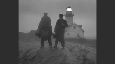
THE LIGHTHOUSE: A period film with period style
Kristin here:
David and I first saw Robert Eggers’ The Lighthouse at the Vancouver International Film Festival, and he wrote briefly about it at the time. About halfway through the screening or less, I realized that what I was watching was a modern combination of two important historical trends of 1920s German cinema: Expressionism and the Kammerspiel.
I am partial to German silent cinema, particularly Expressionist films, for their daring stylization. The movement gave rise to some great films by two masters, F. W. Murnau and Fritz Lang. I’m even fond of the leisurely pacing that characterizes so many Expressionist and Kammerspiel films. At times some scenes resemble the slow cinema of recent decades.
Kammerspiel was a larger trend in the theater of the day, and it has its equivalent in English and American drama, the chamber play. Most of the Kammerspiel films in Germany were written by the great scenarist Carl Mayer, also responsible for many of the Expressionist classics from Das Cabinet des Dr. Caligari on. Kammerspiel films include most notably Hintertreppe (Backstairs, Leopold Jessner, 1921), Sylvester (1923) and Scherben (1923). Some would consider Murnau’s The Last Laugh (1924) to be a Kammerspiel. Carl Dreyer also made one in Germany, Michael (1924, with a scenario by Thea von Harbou) and one in Denmark, The Master of the House (1925). Such films typically involve a small cast of characters who come into conflict in various ways, invariably ending badly, typically with death, suicide, murder, and/or imprisonment. The Lighthouse clearly qualifies.
The Lighthouse is also a horror film, or at least a lot of critics think so. Thus it fits cozily into the Expressionist movement, of which several Expressionist films are now considered early classics of the horror genre: Caligari, Nosferatu, Der Golem, Warning Shadows, Die müde Tod and other less well-known films.
Critics did not fail to notice The Lighthouse‘s links to silent cinema, and in particular Expressionism. Richard Newby’s review in The Hollywood Reporter remarks on: “The filmmaker’s decision to shoot the film in black-and-white and in the aspect ratio of 1.19:1, giving The Lighthouse the appearance of a silent film born of German Expressionism.” He also calls it, “Equal parts Lovecraftian horror story and existential chamber piece in the vein of Jean-Paul Sartre’s No Exit.”
Screen Daily reviewer Lee Marshall caught both the Expressionist and Kammerspiel aspects:
Shot in an expressionist black and white that harks back to cinema’s earliest years, The Lighthouse provides a marvellous chamber-drama platform for two actors, Robert Pattinson and Willem Dafoe, who seize the opportunity with gusto.
[…]
Referencing everything from German expressionist cinema of the 1920s to US silent comedy, the photography of Edward Weston and the from-the-ground-up perspective in the paintings of Andrew Wyeth, Jarin Blaschke’s photography is starkly compelling.
Manohla Dargis’ review in The New York Times explicitly notes German Expressionist cinema:
With control and precision, expressionist lighting and an old-fashioned square film frame that adds to the claustrophobia, Eggers seamlessly blurs the lines between physical space and head space.
The film’s more sustained pleasures, though, are its form and style, its presumptive influences (von Stroheim’s “Greed,” German Expressionism), the frowning curve of Winslow’s mustache, the whites of eyes rolled back in terror.
One might add that the dreams and hallucinations, shown from Winslow’s viewpoint, reflect the innovations of French Impressionist cinema of the 1920s. This sort of stylistic subjectivity, however, was highly influential and has been widely used ever since. It was quickly picked up in German cinema of the 1920s, and some of the classics of the day, especially The Last Laugh (1924) and Variety (1925), are more noted for their subjective camerawork than are the earlier French films that originated the practice. Overall, The Lighthouse has the flavor of a German film from the 1920s.
Lots of filmmakers have attempted to imitate silent cinema, and often they succeed to a degree. They shoot in black-and-white (but don’t add tinting and toning), put just music and maybe some sound effects on the track, and have some exaggerated acting. Perhaps they set the story in the past, as Michel Hazanavicius does with The Artist (2011). A more careful attempt is Blancanieves (2013).
No matter how careful the combination of such elements is, the result usually doesn’t really look like an old film. The Lighthouse really does look like a silent film, in the sense that it looks as if it were shot using the film stock available in that era. It does not, however, pretend to be a silent film, as The Artist does. The Lighthouse doesn’t eliminate the dialogue. Its narrative and tone bear distinct resemblances to those of German and French films of the 1920s, but its story is presented with more overt sexual content and extreme violence than mainstream silent movies would have included.
It helps that Eggers is clearly a cinephile and has watched a wide variety of films from many periods. Cinematographer Jarin Blaschke has also worked as a still photographer and also knows a great deal about older film stocks and lenses. They both knew a lot about films of all periods.
When asked in an interview for American Cinematographer what were the team’s “references” (films shown to crew members as models), Blaschke responded:
A bit of Béla Tarr for tonal dreariness and patient use of camera. Bergman’s camera language, as always. [Eggers’ liked the strong night lighting of In Cold Blood. There were some nautical silent films, including Flaherty’s Man of Aran, [which was shot] on orthochromatic stock with strong, direct close-ups. [The influence of] Eisenstein was there for montage, and bold, hard cuts. Optically, the films we watched from the ‘20s and ‘30s were very appealing in their subtle fringe distortions and the way highlights would shimmer. [p. 63]
In the end, the most influential references were M—an inspirational and modern film in terms of visual language—and Bresson’s Pickpocket, which influenced [our] use of close-ups, especially actions with hands. These helped steer The Lighthouse away from the purist confines of the turn of the century, and more toward early modernism.” [pp. 63-64]
M seems rather an odd choice, but Blaschke describes its inspiration in an interview for Kodak:
Watching that, I found a very modern film with surprising camera movement but more importantly: a modern, creative mastery in how visual information was withheld from the audience, how information was rewarded, and when,” says Blaschke. “With this new inspiration, I felt there was a highly-effective framework for me to express myself visually. Stepping away from a mere 19th-century emulation, we were on to something more surprising and layered.
In a DGA podcast interview, Eggers discusses the nearly-square aspect ratio:
And then, the boxy aspect ratio, we were shooting in 1:19.1, early-sound aspect ratio. There’s a Pabst film, Kamaradschaft, that takes place in a mine, which is probably the only other film that makes sense to use this aspect ratio, because Pabst is shooting vertical objects, like the smokestacks, and we have our lighthouse tower, and then the cramped mineshafts, and then the cramped interiors of this thing. Because we’re using spherical lenses, it’s actually taller, so it’s a great aspect ratio for these close-ups. You don’t need flab on the side. You just have Robert Pattison’s cheekbones, Willem Dafoe’s cheekbones in all their glory on these old lenses.
Who knows what other films are these two are familiar with? But one can assume that they watched some of the classic German films of the 1920s, both Expressionist and Kammerspiel.
The Lighthouse and German Silents
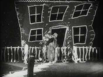
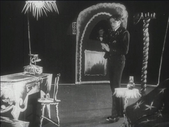
Early German Expressionist films often used jagged, abstract sets, more like paintings than like actual buildings or landscapes. Caligari is the most familiar instance, but here are a couple of examples from Von Morgens bis Mitternachts (1921, Karlheinz Martin).
The second image demonstrates particularly well how light was often represented by streaks of paint. The overhead hanging lamp at the upper left is a fringe of spikes, and the flames on the huge candlestick at the left are five wisps of paint. Highlights from these “lights” are painted on the desk and chair at the lower left.
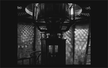
Hollywood films have seldom used distorted sets of this kind. They appear occasionally, as in Son of Frankenstein (1939, Rowland V. Lee) and Beetlejuice (1988, Tim Burton). Most of the time, though, when people speak of expressionist style in films noir or horror films, they’re talking about graphic effects created by lighting. That lighting is not created by streaks of paint but by fancy lighting effects. That’s mostly the case in The Lighthouse. The lighthouse tower and the service buildings around it were designed to be authentic copies of features in real historical lighthouses. The distorted stylization comes from lighting effects, from simple underlighting to patterns created by patterned holes in the lighthouse interior.
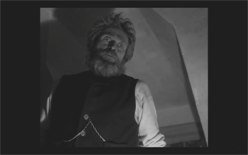
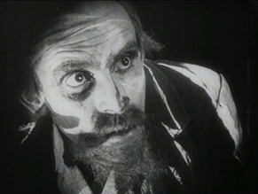
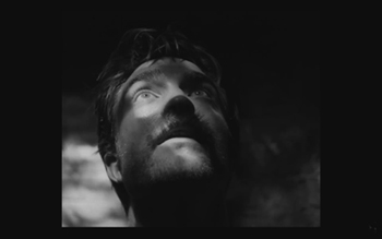
The same is true of acting. In German Expressionist films, actors’ faces were often painted, especially with dark patches around the eyes and pasty white skin. Compare this close-up of Ernst Deutsch’s face, as the Cashier in Von Morgens bis Mitternachts, with that of Robert Pattinson, where the distortions are created by light and shadow.
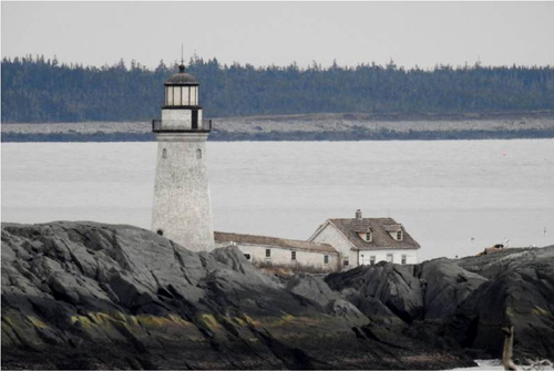
Most of the classic German Expressionist and Kammerspiel films were studio-created. Sets were built either in studios or on extensive backlots. In contrast, Eggers wanted to use an authentic lighthouse. Scouting failed to turn up one with adequate access roads, so the lighthouse and service buildings were built, with faithful adherence to period locales, near the tip of the Cape Forchu Lighthouse peninsula (down the road from a modern lighthouse).
This location is far from from isolated, but the film manages to create a sense of loneliness and dread nonetheless. The huge crashing waves and storms were not generated digitally but were practical effects. According to the Kodak story, “Most of the water work was shot in a large, emergency-responder’s training pool, capable of generating waves in varying sizes and patterns, located near Halifax.” The film contains a few digital effects, mainly to turn the peninsula into an island.
Eggers seems to share the sensibility of the German silent directors: “In a perfect world, I would have liked to have built every single building, for control, control, control, control, control.” (From the DGA interview)
As to Kammerspiel films, The Lighthouse reminds me most of Scherben, which deals with a man who works as a linesman for a railroad. He, his wife, and their daughter live in isolation in some woods and live a stultifyingly dull existence. The intrusion of a railroad inspector who seduces the daughter leads to drama as the linesman gradually becomes enraged and kills him. The style of the film is quite different from that of The Lighthouse, but the dynamics of conflict and gradual deterioration of the central character are somewhat similar–if more restrained in his slow burn and stolid demeanor.
Scherben only became generally available earlier this year, when I wrote about its Filmmuseum Edition DVD release. I have no idea whether Eggers ever saw it at an archive screening or in somewhere else. He more likely saw Hintertreppe, which has long been the only one of the classic Kammerspiele commonly accessible.
Bringing back orthochromatic, sort of
In the DGA interview, Eggers discusses the choice of film stocks:
We thought orthochromatic film stock would really be the way to go, which, among other things, the main thing about orthochromatic film stock is that it’s not sensitive to red, so red is rendered black. So the rosy skin tones on a Caucasian renders darker. So Eisenstein, that’s why all those Russian faces look so tan, and in Hollywood they’re wearing white pancake makeup to compensate for the orthochromatic stock [….] So we liked Double-X negative. The blacks bottom out suddenly in a way that’s very satisfying, as we remember it from watching old movies.
Apparently Eggers and Blaschke investigated having orthochromatic 35mm stock custom-manufactured for them, but the expense was too great. A cheaper way had to be found.
In the American Cinematographer interview, Blaschke describes testing Kodak’s Double-X 5222 35mm film, color 35mm negative film, and digital capture with an Arri Alexa: “In addition to much larger grain, the Double-X has more ‘tooth.’ Even if you match the overall contrast in the DI [digital intermediate], the Double-X had more ‘local’ or ‘micro’ contrast, which emphasizes texture and better differentiates similar tones” [p. 61]. (Double-X 5222 was introduced in 1959 and has been used on such films as Raging Bull [1980] and Schindler’s List [1993].)
Despite these advantages, however, Double-X is a panchromatic stock, with sensitivity to the entire visible spectrum. To solve this “problem,” Blaschke ordered a custom-made filter that would eliminate the red-to-mid-yellow end of the spectrum, thus simulating orthochromatic film effectively [AC, pp. 66-7].
The choice of lenses was also done with an eye to maintaining the artificial orthochromatic look. Blaschke tested many vintage lenses and settled on Baltars, designed in 1930s. The two used in the film were made in 1941 and 1944. In the Kodak interview, he says, “The vintage Baltars were the most shimmery of the bunch I tested, and really were the most stunning portrait lenses I have ever seen,” he says. “The highlights really glowed, but stopped just short of heavy-handedness. Optics like these could add a layer of complexity on top of our hard, orthochromatic look to pull people into the world of the film.” A rehoused 1905 50mm lens was used for some flashback images, and some replicas of 1840 Petzval lens designs were used in flashbacks and “heightened moments”[AC, p. 64]. Blaschke describes the effect in an interview on the Motion Picture Association website: “Blaschke says that for those more “out there sequences,” he had a special lens designed—called a petzval—that contains a lot of aberrations. “It creates a very squirrely look. The background almost falls out of focus, like a globe, and you get this very swirly effect.”
Lighting The Lighthouse
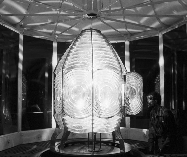
Those swirling light patterns you see on Pattinson’s face in the movie are a real phenomenon—we found ourselves just wanting to gaze into the Fresnel lens. We could have stayed all night staring into the light.
Robert Eggers, Cannes Press Release
Apparently the decision to set the film in the 1890s arose during the search for the ideal lighthouse. In an interview with Eggers in Architectural Digest, he remarks, “‘I wanted there to be a mystery in the light. Inside the beacon. So we knew we needed to set it in a period where we would have a Fresnel lens,’ he explains. Not many lighthouses still have functional ones today. ‘They look like Art Deco spaceships, and they are very magical and jewel-like. So we knew that was going to place us in the second half of the 19th century.'” (See the bottom for an image of the film’s custom-made Fresnel lens mesmerizing Winslow in the climactic scene.)
The decision to imitate orthochromatic film had a considerable impact on the lighting used. Ironically, it meant that a great deal of light from modern lamps, had to be used. Eggers admits as much in the DGA interview.
Obviously we weren’t lighting it like an old movie. We were lighting it using our practical fixtures, but of course, if this were an old movie, you would see the flame of the kerosene lamp and there would be a movie light lighting the scene. But what we did was we had a 600W halogen bulb on a flicker dimmer in all those scenes. And it was really, coming from Alexa and fast film stock, it was so bright. People were wearing sunglasses when we were doing night interiors.
Double-X is slow, even slower than color negative stocks. Modern digital cameras can typically shoot with less light than shooting on film requires. Putting together slow film stock, a filter (albeit one that cut down the light availability by less than one stop), and older, slower lenses meant that the cinematography crew had to use huge amounts of light, as a Variety interview with Blaschke explains:
Blaschke says he prefers to model his lighting in a real-life way, which was tricky on “The Lighthouse.” He and gaffer Ken Leblanc worked with Kodak Double-X stock — Blaschke calls it the only practical black-and-white film left after Plus-X was discontinued in 2011 — which is much less sensitive to light than even color film stock. Between the optics, the film stock and the filtration, Blaschke and Leblanc had to use about 15 to 20 times more light on set to get the look they wanted than on “The Witch,” which was shot on an Alexa.
“Even though it’s a very dark movie, the sets were actually blindingly bright,” says Blaschke. “We’d put 500- to 800-watt halogen bulbs in the lanterns that would flicker and were only a few feet from an actor’s face. The way we make movies now, people have gotten used to a very low light level; it’s trendy to shoot wide open, digitally at 800 or even 2,000 ASA. Our actors talked about how they couldn’t see each other sometimes, which I felt bad about.”
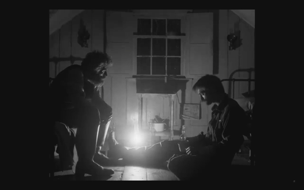
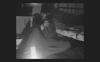
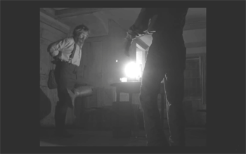
This halogen light is used in the night interiors, such as the scene of the drunken dance, below, and the later scene of the pair drinking in their shared bedroom, at the top of this section and the entry.
This combination of a very bright lamp with slow film and a filter cutting down part of the spectrum of light entering the lens meant that the light fell off very quickly away from the lantern. That effect is also very evident in these scenes. Backgrounds are dimly visible, and the actors often become silhouettes.
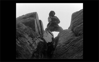
The result is a heightened sense of the two main characters being trapped together in small islands of light surrounded by blackness. We have no sense of how many lanterns the house contains, but we never see more than one at a time. At one point Winslow is seen in bed with a book, and the dim light from the window above him makes it hard to believe that he can see well enough to read. Even the daytime scenes are gloomy and gray. A low angle with the blank, light sky as rendered by the “orthochromatic” film makes Winslow and the dark rocks around him look nearly black.
Few silent films shot on orthochromatic film look this consistently dark, and it’s clear that the filmmakers were not simply trying to replicate the look of an old film. Blaschke admits as much in yet another of the many interviews on the film’s techniques: “It wasn’t about trying to make it look like older films but rather choosing a frame that lends itself to the tall and narrow sets and helps you visually withhold information from the audience. It also had a secondary effect of evoking compositions of 20th century modernist photography,”
In the DGA interview, after describing the various technical details of design, setting, and cinematography, Eggers explains:
This is fussy and it’s nerdy and it’s fun to talk about in this forum, but why do this? One, it says the movie’s old; it takes place in a time when black-and-white photography existed. But two, this is a bleak, austere story, and I feel like black-and-white is the best way to tell this story, and color is only going to mar things. Again, with this orthochromatic filter, it knocks our blue skies, which if we have them—which we really did—into something white and bleak and stark and harsh.
To get really nerdy about it, panchromatic film stock had largely replaced orthochromatic by the late 1920s and early 1930s, the only period in which a nearly square aspect ratio was standardly used. Moreover, the Baltar lenses were invented in the 1930s. Halogen lamps are a comparatively recent innovation in film lighting. So the combination of the ortho and the boxy look and the rest of it aren’t “authentic” in any strict sense. The filmmakers were not using lighting equipment of the 1920s or any modern equivalent. In short, they weren’t trying to replicate the look of any one specific type of old film. As a way of creating the illusion of an old film, as well as an appropriately grim tone, it works better than anything else I’ve seen.
A few final notes
First, I have seen The Lighthouse’s budget given as $4 million. That’s in the film’s Wikipedia entry, which cites an AP release from May 2019 that says only that the film’s budget was larger than that of The Witch but still modest. The New York Times ran a story about the film’s trailer in July, noting that the budget for The Witch had been $4 million, which Box Office Mojo also gives as the cost of the earlier film.
I have not been able to find a reliable figure for The Lighthouse’s budget, but clearly it was distinctly more than $4 million.
Second, according to Eggers in the DGA interview linked above, that’s real dirt (sifted to rid it of the odd pebble) that Winslow shovels down onto Wake in the climactic scene–not some namby-pamby ground chocolate. Not to mention that the puddle he’s lying in was frigid. Even the Expressionist actors didn’t go so far. The Academy should give Dafoe his Oscar already.
Third, watching The Lighthouse with a sell-out crowd in the biggest venue at the Vancouver International Film Festival, The Centre for the Performing Arts, was one thing. There people were eager to see this film, which had premiered in the Directors’ Fortnight thread at Cannes in May. It won the International Federation of Film Critics (FIPRESCI)’s prize for best film. It was quite another thing to watch it by myself during its run at a local multiplex.
The Lighthouse played at three multiplexes in Madison, with full-day schedules at each. It’s still playing at one of them, twice a day. I was alone when I saw it a few days ago at a 10:25 am screening. After being in a crowded festival audience, the second experience made me wonder how in the world such a challenging film made it into such wide release and how a more mainstream audience would react to it. (It maxed out at 958 theaters November 1-6 and has been falling since. Its gross through November 10 is $8,915,216 domestically; Box Office Mojo so far has no figures for foreign markets.)
The frames from The Lighthouse have mostly been taken from trailers. I have not cropped the frames reproduced above to their 1.19:1 format, since on theatrical screens, the audience sees the image as window-boxed, with black stretches on either side. (The exception is the bottom image, a press image released by distributor A24; it is either a frame with the black sides cropped or possibly a production still.) Perhaps Eggers and Blaschke’s idea would have been for theaters to move the screen’s masking to the edges of their images. Given the realities of modern exhibition, however, such versatility is not part of the screening technology. I found that the window-boxing on the big screen was a constant, subtle way to call attention to the unusual compositional results. What The Lighthouse will look like on various formats for streaming is hard to imagine.
Speaking of the aspect ratio, a number of critics have called 1.19:1 a silent-film format. In fact it was only used in the early sound era, when room had to be made on the filmstrip for the optical soundtrack; later the image was shrunk slightly into the classic Academy ratio of roughly 4:3. During the silent period there was no absolute standard ratio, though the image was in usually not far from the Academy ratio.
The American Cinematographer article cited is Patricia Thomson, “Stormy Isle,” AC (Nov 2019): 60-67.
In one of the quotations above, Blaschke says that Man of Aran (1934) was shot on orthochromatic film. This seems unlikely, given that Flaherty had made one of the first American features to use the new panchromatic film stock, Moana (1926). Kodak stopped making ortho in 1930. Possibly Flaherty, who started work on the film in 1931, did revert to ortho for it, but it seems unlikely.
Ernst Deutsch, who plays the Cashier in Von Morgens bis Mitternachts, was one of the great Expressionist actors of stage and screen. I have mentioned him before, for his role in Der Golem; when Von Morgens bis Mitternachts was released on DVD; and for his role in the non-Expressionist Das alte Gesetz, released on Blu-ray by Flicker Alley last year.
On horror and fantasy in German silent films, see my “Im Angang war …: Some Links between German Fantasy Films of the Teens and the Twenties,” in Paolo Cherchi Usai and Lorenzo Codelli, eds., Before Caligari: German Cinema, 1895-1920 (Pordenone: Edizioni Biblioteca dell-Immagine, 1990), pp. 138-161.
Baschke mentions Eisenstein as an influence in the editing, but presumably neither he nor Eggers had read Eisenstein’s essay arguing in favor of a square aspect ratio. His belief was that such a frame would give equal compositional weight to the horizontal and vertical dimensions of the screen. (“The Dynamic Square,” Jay Leyda, ed., Film Essays and a Lecture [New York: Praeger, 1970], pp. 48-65.
The photograph of the lighthouse set on Cape Forchu is by Dan Robichaud and appears in Carla Allen’s story on the filming in the local Digby Courier. A search for “Cape Forchu Lighthouse” on Google Maps yields many photos of the area and reveals the very rocky terrain over which Winslow pushed his wheelbarrow. The modern lighthouse is a popular tourist attraction, in case you ever visit Yarmouth in Nova Scotia. There is even a restaurant inside it. (Appropriately enough, “The grilled lobster and cheese sandwich was amazing,” according to one visitor.)
[January 13, 2020. Blaschke has been nominated for an Oscar in the Best Cinematography category. Unfortunately the film was not nominated in any other category, as it deserved to be.
February 8, 2020. Blaschke has won a number of awards for the film, most notably the American Society of Cinematographers Spotlight Award, and, just today, the Film Independent Spirit Award for best cinematography.]
Some highlights of Venice appear at last
Sunset (2018).
Kristin here:
Going to the Venice International Film Festival in 2017 and 2018 has been a joy. Still, there’s a downside for our readers. We write about the films that premiere there in early September, but the films themselves appear months–sometimes many months–after the festival ends.
Of course, two titles, Roma and The Ballad of Buster Scrugges, appeared fairly soon on Netflix, and First Man had an October opening. After a delay, one of David’s recommended films, Dragged Across Concrete, had a quick, spotty theatrical release and is now available on several streaming platforms, as well as DVD and Blu-ray.
Two others of our Venice favorites are in narrow theatrical release only now, and we think you should seek them out.
The other Manson film to see this year
One film is Mary Harron’s Charlie Says, about the lead-up to and aftermath of the Manson killings. David wrote about it in a report on crime-related films at the festival. We both liked it very much, as a very original approach to the subject. Now Manohla Dargis has published an enthusiastic review, calling the film “powerful and deeply affecting.” Critics have split in their opinions, but we’re with Manohla on this one.
In all the complaints last year over Venice only having one female-directed film in competition, the many women whose films premiered in other threads were largely overlooked. I saw several of them, and I was very glad I put Harron’s film on my viewing schedule.
Seeking out Sunset
My favorite film from the festival was Lázló Nemes’s Sunset. Yes, I loved First Man, Roma, and The Ballad of Buster Scruggs, but Sunset was an instant classic, a film I wanted to see again while I was only a third of the way through the initial viewing.
Usually at festivals we have to include groups of films in each blog entry, even though they deserve more attention. In Sunset‘s case, I waited until I could see a screener and read the interviews with the filmmakers in the special Hungarian journal issue devoted to the film. I devoted a single analytical post to it (which links to an online version of that journal issue).
Without serious spoilers, since it’s a film of mystery and suspense, I tried to convey its unconventional approach to extremely restricted point of view and its brilliant camerawork and design. Many reviewers, however, have dismissed it as baffling or incomprehensible. I obviously disagree. It’s a challenging film, there’s no question about that. But aren’t there great artworks that are challenging in various ways? Works that mystified their original audiences? In order to appreciate them, don’t we expect that we’ll need to experience them more than once or twice? Of course, most reviewers don’t have that option before publishing their responses, but all the more reason to be cautious about condemning something because it’s thoroughly unconventional.
We looked forward to another chance to see Sunset on the big screen, and now it is in release. Its only local venue was at the AMC Classic Desert Star 15 just north of Baraboo, on the edge of the Wisconsin Dells. About 40 minutes of driving brought us to an impressive multiplex from 1999 with a desert theme. The Desert Star name comes from the fact that the theater is located in a much larger Kalihari entertainment complex, with indoor miniature golf, an amusement park with Ferris wheel, and other attractions. An odd venue, but a pleasant one.
For me, on third viewing, the film held up entirely, and I think I figured out a few of the things that had been unclear to me before. I’m sure another viewing will be illuminating as well, though there are clearly ambiguities that can never be resolved, intendedly so. David, seeing it for the second time, was even more impressed than at Venice.
Sunset is not coming out in the UK until May 31. Nemes himself is currently touring theaters showing the film on 35mm (schedule here). It was shot in 35mm and looked great on the huge screen of the Lido’s Sala Grande. Artificial Eye has announced that a Blu-ray will be released in the UK later this year.
Thanks as ever to Michael Barker of Sony Pictures Classics for his help with this and our earlier entry.
AMC Classic Desert Star 15, Baraboo Wisconsin.
Accident forgiveness: J.J. Murphy’s REWRITING INDIE CINEMA
Maidstone (1970).
DB here:
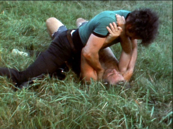
Did you ever want to beat up Norman Mailer? The impulse must have flitted through the minds of many who paged through his work, saw him on TV, or encountered him swaying pugnaciously at a party. Rip Torn took the opportunity. One day in 1968, he whacked Mailer with a hammer and started to strangle him. As the distinguished author tried to bite off Torn’s ear, Mailer’s wife leaped into the fray and his children shrieked with fear.
This scene, totally unscripted, appears in Mailer’s film Maidstone (1970) and opens J. J. Murphy’s new book Rewriting Indie Cinema: Improvisation, Psychodrama, and the Screenplay. Nothing could better prepare us for his exploration of the traditions–and sometimes jarring consequences–of spontaneous performance in modern American movies.
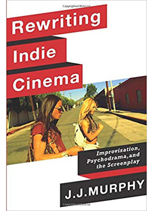 I couldn’t have predicted that J. J., who was in grad school with Kristin and me, would turn to research. He began as part of the Structural Film movement, achieving wide renown with Print Generation (1974) and (my personal favorite) Sky Blue Water Light Sign (1972). After he was hired here at Wisconsin, he rejuvenated our production program and went on to make independent features: The Night Belongs to the Police (1982), Terminal Disorder (1983), Frame of Mind (1985), and Horicon (1994).
At the same time, he was teaching both production and screenwriting. His books reflect his deepening interest in the creative process of making a film outside the Hollywood system. His initial study, Me and You and Memento and Fargo: How Independent Screenplays Work (2007), focused on the principles of screenplay construction that emerged with US indie cinema. Then, in The Black Hole of the Camera: The Films of Andy Warhol (2012), J. J. offered the most complete analysis of this superb body of work. In the process, he opened up a new vein of exploration. The idea of psychodrama proved an exciting way of explaining the fascinating, awkward performances in films like Kitchen (1965), Vinyl (1965), and Bike Boy (1967).
Now the concept of psychodrama gets full play in an ambitious account of the changing role of improvisation in off-Hollywood cinema. What happens, J, J. asks, when filmmakers give up the screenplay? How do they construct a story, define characters, build performances? Rewriting Indie Cinema sweeps from the 1950s to recent films like The Rider and The Florida Project. By looking for alternatives to the fully prepared screenplay, it posits a fresh way of thinking about American film artistry.
Human life isn’t necessarily well-written
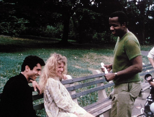
Symbiopsychotaxiplasm: Take One (1968).
To start off, J. J. proposes that we think of improvisation in a systematic way. Of course, the concept can be treated broadly. Even Hitchcock, we learn from Bill Krohn, improvised on the set much more than he claimed. But J. J. suggests that improvisation can be considered as a basic creative concept, a founding choice for art-making.
In the 1950s, many American artists began to embrace chance, accident, and personal expression. Abstract Expressionism, bebop, the Judson Dance Theater, Robert Frank’s snapshot aesthetic, and other tendencies valued spontaneity as both authentic self-expression and a challenge to conformist culture. The idea of spontaneity was carried into cinema by Jonas Mekas and fueled what became the New American Cinema of John Cassavetes, Shirley Clarke, and other filmmakers.
But the idea had deeper sources in another trend that J. J. painstakingly brings to light. The Austrian theater director Jacob L. Moreno developed in the 1920s what he called the Theatre of Spontaneity (Das Stegreiftheater). Performances consisted of purely improvised dialogue. When Moreno emigrated to America, he founded “Impromptu Theatre” in the same vein. His 1931 performance at Carnegie Hall was greeted by the New York Times with some disdain:
The first play, like the ones that followed, turned out to be a dab of dialogue uneasily rendered by its hapless players. . . . It became more and more evident that heavy boredom, rather than “forms, moods and visions,” were [sic] the product of the actors. Demanding wit above all else, the Moreno players lacked that essential as fully as the premeditation upon which they frown so heartily. The legitimate theatre, it can be reported this morning, is just about where it was.
Of course improvisation had already proven its worth in vaudeville and in jazz and other musical idioms. Today versions of Moreno’s “spontaneous theatre” flourish in comedy clubs.
Before coming to America, Moreno had discovered that improvisation had therapeautic functions as well. When a couple enacted the frustrations of their marriage, the audience was moved and Moreno was convinced that this “psychodrama” harbored artistic possibilities. Moreno’s wife Zerka called psychodrama “a form of improvisational theatre of your own life.”
J. J. shows Moreno’s pervasive influence on the postwar American scene. Psychodrama became one trend in social psychology, used to help prisoners, narcotics addicts, and even business executives. Woody Allen, Arthur Miller, and other artists were aware of Moreno’s work as well.
Drawing on Moreno but recasting him for film-related purposes, J. J. proposes a spectrum of improvisational options. There’s the completely improvised, ad-lib option, seen in Maidstone and much of Warhol’s work. Here the performers just make it up as they go, though with minimal framing of a situation. Then there’s the possibility of “planned” improvisation, in which there’s a story outline and more or less pre-set scenes. Sean Baker’s Tangerine (2015), for example, was made from a seven-page treatment that included only a couple of lines of dialogue. Then there’s the “rehearsed” option, in which the players collaborate to prepare the scenes and develop the characters, workshop fashion. In production the performers mostly stick to the “script” they’ve created. J. J. points to the films of Cassavetes as a clear case.
Any given film can mix these options, so that some scenes are planned roughly while others are purely ad-lib. And a filmmaker can explore the spectrum across several films, as Joe Swanberg has done.
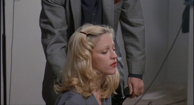
Where does psychodrama come in? J. J. shows that any of the three points on the improvisation spectrum–pure, planned, and rehearsed–can yield performances that are based in the actual mental states and personal histories of the players. In our Cinematheque screening devoted to his book, Abel Ferrara’s Dangerous Game (1993) served as an example. Harvey Keitel invested his character, an intransigent film director, with the still simmering emotions he felt after his breakup with Lorraine Bracco. Meanwhile Ferrara set up scenes that would provoke Madonna, playing Keitel’s actress, to break character and reveal her immediate responses.
Ferrara wanted to attack Madonna’s celebrity image, and J. J. reads the aftermath to a rape scene in the film being made as projecting the star’s own stammering outrage at having been exploited.
Throughout the book, when improvisation becomes psychodrama, fiction moves closer to documentary. The last chapter examines how certain films considered documentaries, like Robert Greene’s Actress (2014) and James Solomon’s The Witness (2015), cross over into psychodrama from the other side, so to speak.
A detailed study of William Greaves’ Symbiopsychotaxiplasm: Take One (1968) shows how Greaves used psychodramatic techniques to create an even more complicated film-within-a-film than Dangerous Game. Two characters, Freddie and Alice, are played by five different pairs of actors, with all their scenes recorded by a bevy of camera and sound staff.
Greaves also incorporates self-criticism. When crew members object to the script, another participant remarks: “Human life isn’t necessarily well-written, you know.”
Given these conceptual tools, J. J. goes on to trace the production methods employed by a wide range of filmmakers, from Morris Engel in The Little Fugitive (1953) and Cassavetes in Shadows (1959) to Mumblecore and after. Through a mixture of film analysis and background research, he brings to light a vast variety of creative options that can bypass fully-scripted cinema.
Rewriting the unwritten
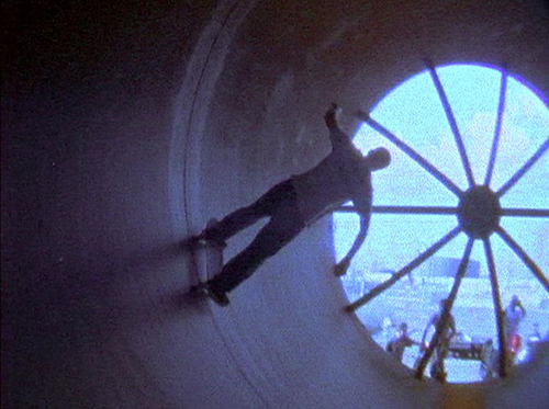
Paranoid Park (2007).
J. J.’s survey of production methods is embedded in a new historical argument about the shape of off-Hollywood filmmaking. The New American Cinema of the 1950s, which Mekas called “plotless cinema,” was wedded to a sense of realism. But it operated within limits. Cassavetes serves as a benchmark: “I believe in improvising on the basis of the written work and not on undisciplined creativity.” By balancing the planned with the impromptu, his films allowed for the actors to surprise one another. At the same time, Shirley Clarke’s Portrait of Jason (1967) showed how psychodrama could pass easily into documentary, exemplifying Erving Goffman’s theory that everyone is playing theatrical roles in everyday life.
This open approach to screenwriting and screen acting was explored by many filmmakers in the 1960s and a little after: not only the well-known Warhol and Mailer but also Kent Mackenzie, Barbara Loden, William Greaves, and Charles Burnett. J. J. examines all this work in admirable detail. I was especially happy to see that he includes Jonas Mekas’ The Brig (1964), the harrowing film that showed me, in my undergrad days, what the New American Cinema could do in filming a play.
By the time Ferrara made Dangerous Game, most independent filmmaking had moved away from improvisation toward more tightly scripted expression. J.J. traces the institutional pressures operating here. The Sundance Film Festival and PBS’s American Playhouse favored fully-planned projects compatible with the Hollywood standard. The Sundance Institute, launched in 1981, explicitly aimed to correct what was considered the two faults of independent production: screenplays and performances.
The success of polished work like sex, lies, and videotape (1989) and Pulp Fiction (1994) created new norms for American indie cinema. Director-screenwriters like Soderbergh, Tarantino, David Lynch, Hal Hartley, Todd Haynes, the Coens, and Todd Solondz were models for younger filmmakers. As J. J. points out, their screenplays were often published as part of the marketing of the films. Framing the new trend as dominated by the screenplay helped me understand why Bryan Singer, Doug Liman, Karyn Kusama, and other indie filmmakers who came up in the wake of this generation moved so easily to mainstream genres and big-budget projects.
But history plays strange tricks. In the 2000s, filmmakers who felt constrained by the demands of tight scripting began to try something else. J. J. pays special attention to Gus Van Sant, who after proving his commercial craft, made some films with varying degrees of improvisation: Gerry (2002), Elephant (2003), Last Days (2005), and Paranoid Park (2007). Some of the Mumblecore directors relied on screenplays, but the prolific Joe Swanberg adopted a free-form approach, to which J. J. devotes a chapter.
J. J. goes on to survey the work of Sean Baker, the Safdie brothers, Ronald Bronstein, and other directors who have revived the New American Cinema’s impulses in the digital age. He concludes:
Digital technology in effect, democratized the medium, allowing young filmmakers to revive cinematic realism precisely at a time when indie cinema was at risk of losing its identity. In the new century, the use of improvisation and psychodrama provided a sense of continuity with indie cinema’s roots.
J. J. retired from UW–Madison at the end of 2018, and last Saturday night he was honored at our annual screening of student projects. He has been a constant force for good in our department, and we owe him more than we can say. Among those debts is this outstanding contribution to US film studies.
The book’s title carries a double meaning. American independent cinema has been, at crucial periods, “rewritten” by filmmakers who relied on spontaneity rather than a cast-iron screenplay. At the same time, J. J.’s panoramic research in effect rewrites that history. I’m sure that other researchers will build on his wide-ranging arguments, which put the creativity of artists–filmmakers, performers–at the center of our concerns.
J. J.’s books join a cascade of recent work by other colleagues here at Wisconsin. This blog has highlighted Jeff Smith’s Film Criticism, the Cold War and the Blacklist (2014), Kelley Conway’s Agnès Varda (2015), Lea Jacobs’ Film Rhythm after Sound (2015), Lea’s and Ben Brewster’s enhanced e-book of Theatre to Cinema (2016), and Maria Belodubrovskya’s Not According to Plan: Filmmaking under Stalin (2018).
P.S. 9 May 2018: Thanks to Adrian Martin for correction of a misspelled name!
Kelley Conway awards J. J. Murphy a gilded Badger at the Communication Arts Showcase, 4 May 2019.
Pockets of Utopia: TRUE STORIES
True Stories (1986).
DB here:
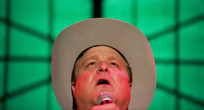
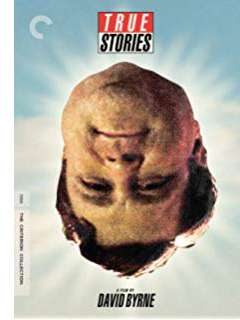 Fall of 1986 saw two helpings of twisty Americana from a pair of Davids. Lynch’s Blue Velvet was released in September, and Byrne’s True Stories followed less than a month later. In a year dominated by the Goliath known as Top Gun, the Davids stood little chance. As of January 1987, Blue Velvet had made $3.5 million domestically, while True Stories, on a budget of $5 million, earned only $1.2 million, less than The Toxic Avenger. But both acquired cult followings, especially on videotape.
In the decades since, Blue Velvet has received luxurious DVD and Blu-ray treatment. True Stories, however, wasn’t well-served by Warners’ offhand DVD transfer. Now the Criterion people have given us a lustrous Blu-ray edition of another movie that shows that the 1980s weren’t all big hair, padded shoulders, and John Hughes pity parties. This will quickly become a fetish object for the vast True Stories cult. Visit us way down in the codicil for details.
This movie has been a favorite of mine since I saw it in 1986. Kristin gave me a 16mm print for a long-ago birthday. I’ve wanted to write about it for years, and the Criterion release provides a nifty opportunity. (Full disclosure: I’ve done work for the company. Fuller disclosure: I happily paid for this Blu-ray.)
But I realize that music is so ingredient to the sneaky pleasure of this film that I need expert help. Hence this entry will be followed by one by Jeff Smith. Jeff, as you probably know, is our collaborator on Film Art: An Introduction and our FilmStruck/Criterion series Observations on Film Art, as well as being a frequent contributor to the blog. His deep knowledge of music will yield an entry you’re sure to find interesting.
Many true stories
In the film’s publicity Byrne was at pains to claim that he drew the narrative material from tabloid articles he collected over years of touring with Talking Heads. These clippings supply the initial characterization of the lovelorn Louis Fyne, the Lazy Woman lolling in bed, and the Culvers who never speak directly to each other. Other aspects of the film come from fringe culture more generally, like conspiracy theories and extraterrestrial communication. (The Computer Guy sends signals “up”; in a cut scene available on the Criterion release, he’s transmitting New Age music to be picked up by aliens.)
At the end of the published screenplay, Byrne admits that he used these and other faits divers as inspiration more than as well-documented material. Is this stuff true? “I don’t even really care. . . . It seems to give the movie an extra little bit of excitement to think that maybe it could be true.” The dossier he collected includes not just weird anecdotes but articles about prefab architecture, the computer industry, the malling of America, and other social developments. These are just as important “true stories” as any tales from The Weekly World News.
Do all these stories add up to A Story? Sounding a bit like Wim Wenders, Byrne notes: “Movies are a combination of sounds and pictures, and stories are a trick to get you to keep paying attention.” So he began with drawings, which he posted on walls and kept shuffling around. Eventually two screenwriters, Beth Henley and Steven Tobolowsky, pulled a plot out of them, but Byrne went on to fragment that considerably. The result shifts between episodic and classically plotted cinema.
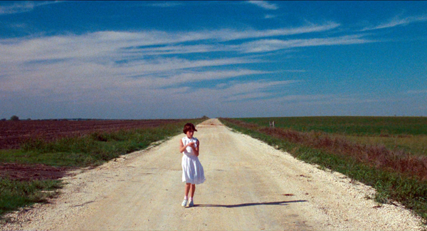
True Stories has a clear time frame: four days, from Wednesday to Saturday night in and around the fictitious town of Virgil, Texas. This period is followed by an indeterminate gap, ending in an epilogue showing a wedding and the Narrator’s departure. The whole tale is framed, beginning and end, by the solfège song of a little girl on the road. Jonathan Demme told Byrne that a movie needs a clock, so the plot creates a soft deadline, the variety show on Saturday.
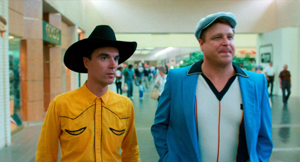
We get something like a tandem story line. First, there’s Louis Fyne’s quest for a woman to marry. More casually, we explore everyday life among the locals. Mostly these revelations come through the wanderings of the Narrator, a lanky outsider dressed in cowboy clothes nobody else wears and possessed of hesitant curiosity. At times, without his guidance, we get other glimpses of town life, such as the habits of the Lazy Woman and the divination powers of her servant Roberto. There are also some very brief vignettes on the margin. The big show ties up the romance line of action when Louis’s stirring performance of his song, “People Like Us,” rouses the Lazy Woman to propose to him. Despite Byrne’s desire to avoid “too much story,” I think most viewers are grateful for a fairly tidy plot that helps us engage with these offbeat characters.
Our Town (not)
Because of the film tries to survey small-town life, it’s been compared to Thornton Wilder’s play Our Town, and it seems that Byrne considered that one model. Still, the differences are pretty important.
Our Town concentrates on two families in Grover’s Corners, New Hampshire. People live close together and duck into each other’s kitchens and stop to gossip in front yards. But in Virgil there’s mostly no there there. That town is seen chiefly in empty night vistas, lit by blinking traffic lights. Only the parade seems to energize the fairly sparse main drag.
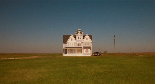
Virgil is hollowed out; all the big stores relocated to the mall. This is the new Main Street, the Narrator explains, and even the music club sits among boutiques and chain stores. Elsewhere, people’s homes homes squat in splendid isolation, like the Lazy Woman’s mansion, or in half-finished developments pasted against a desolate horizon. People have to reinvent themselves in new spaces, we’re told; the cloistered community of New England hasn’t been rebuilt in the exurbs of the New Southwest.
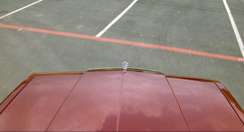
Hence the importance of driving scenes, of which the film has some of the most beautiful in all of cinema. The Narrator cruises the flat, baked landscape, the sky reflected gorgeously in the sheen of his red convertible. Without a car, you can’t join the community, and the Sesquicentennial Parade boasts its share of customized transport, from the Low Riders to the Red Mustang Shriners.
Our Town builds its action out of work and family routines, ceremonies marking marriage and death. The pathetic fate of Simon Stimson, the church musician, warns of the perils of solitude. The romance of George and Emily shows that marriage at least provides companionship and at most nourishes devotion. Across three days separated by years (and with a flashback to a fourth day), Wilder tries to put this entire mundane rhythm into a cosmic context, a cycle of birth and death that should teach us to appreciate each precious instant of life.
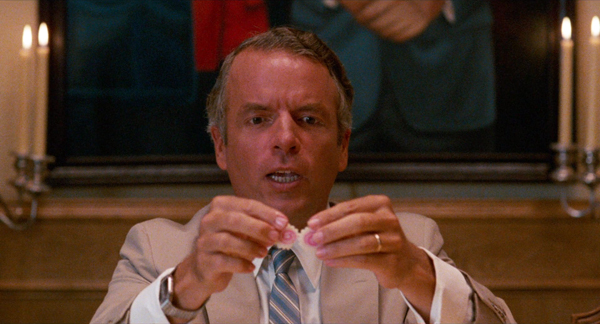
So too, in its way, does True Stories. But here the work routines are post-Fordist: Earl Culver explains that people don’t differentiate between working and not working. He’s thinking of techies like the Computer Guy, who ransacks the mall for equipment to tinker with at home. But the blue-collar employees get into the 24/7 spirit. They make their day on the assembly line as casual as lunchtime, talking about love and money and quirks, even crooning to one another. Louis in the Clean Room can spare a moment for a monologue about his love life. At the bar and the mall, the same workers cross paths. In Greater Virgil, leisure is an extension of the break room.
The only family we see in detail are the Culvers, who under a surface perkiness play out rigid roles (and the parents don’t talk to one another). The Cute Woman and the Lying Woman seem to want more, as both meet Louis on dates, but neither can really break out of her obsession (smiling, lying). Even Louis’s eventual mate, the Lazy Woman, gets out of bed only to phone him. After the wedding he has joined her under the covers, presumably to watch TV forever.
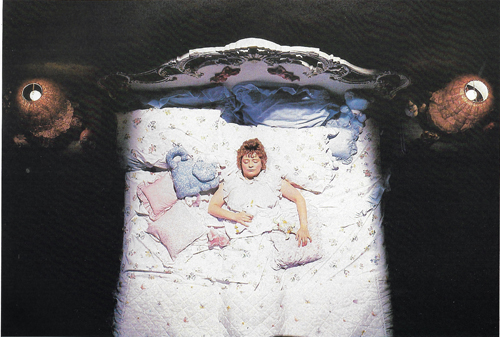
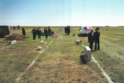
Death haunts Our Town, and the same goes for True Stories in its original form. In the screenplay and footage shot, the Cute Woman dies during the parade (overcome by the sweetness emanating from the babies on display). The film’s final scene would have shown her funeral, where the Narrator shares thoughts with Roberto. Byrne deleted her death and burial as too sad, thereby also losing her melancholy Molly-Bloomish bed monologue. (These scenes are in the supplemental material as analog video; below are production stills.)
In a way, the burial would have rounded things off. While Louis’s quest for a wife is rewarded, the Narrator’s inquiry into Virgil’s not-so-wild life could have ended with his discovery of a death from pathetic obsession. It would have been marked by the Lying Woman’s pointless lie: “She was my best friend. . . . We had so much in common.” The comic grotesque would have become the pathetic grotesque.
Excising this scene leaves a gap. After Louis’s wedding (which the Narrator doesn’t attend), the Narrator is seen simply driving off and reflecting on why he likes to forget. Denying us a farewell between the two characters who have built up a friendship in the course of the film, expelling the foreign visitor back to the road and the horizon, Byrne gives us another flavor of sadness. Their encounter was as transitory as everything else in this post-Our Town landscape. And as we’ll see, the Narrator’s meditation as he drives off carries a burden as important as the postcard addressed to “The Mind of God” in Our Town.
Virgil’s guide
Our Town’s Stage Manager is omniscient. He knows everything about Grover’s Corners, past, present, and future. (He predicts the death dates of some people as he introduces them to us.) He indeed stage-manages the action, calling on experts and even summoning George and Emily to reenact their courtship. Yet although he can interact with characters, he can stand outside the story and address us directly. His presence comes to seem comfortable and reliable. He’s an all-controlling guide—at least until the climax, when Emily takes over the narration and tries to return to the world of the living.
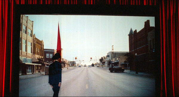
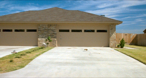
The Narrator of True Stories doesn’t stage-manage anything. He starts out omniscient, lecturing to us about the history of Texas and the occasion for Virgil’s celebration. But once he steps through the slit in the screen, he mostly becomes a naïve, passive presence. He quizzes locals as they deliver monologues, and he seems politely puzzled by their outrageous claims. His dude-ranch getup and geeky silhouette make him almost childlike. He marvels at all the nicknames for highway drivers and is staggered when he sees a four-car garage. (“Who can say it isn’t beautiful?”) The film is almost over when he assures us that this is not a rental car: “This is privately owned.” Who ever thought to ask? And now that you mention it, who does own it?
True, the Narrator issues grown-up pronouncements about the Varicorp chip-assembly plant, but it’s in the bland tones of a PR brochure. He gives us stray factoids like a schoolboy proud of memorization. Even his pronunciation (“special-ness”) suggests either ignorance or awkward efforts to be cute. He might be the incarnation of the voice in one of Byrne’s Knee Plays (“Social Studies”):
I thought that if I ate the food of the area I was visiting
That I might assimilate the point of view of the people there
As if the point of view was somehow in the food….
When shopping at the supermarket
I felt a great desire to walk off with someone else’s groceries
So I could study them at length
And study their effects on me
What sort of narrative authority is this?
A sort, I think, we find in the calculated vacancy of post-Pop art culture. It’s the blankness of (Texan) Robert Wilson’s po-faced theatre spectacles, where counting off numbers and metronomic gesturing suggest behavior “on the spectrum.” It’s Jeff Koons, maker of gilded Michael Jacksons, saying, “Removing judgments lets you feel, of course, freer, and you have acceptance of things, and everything’s in play, and it lets you go further.” It’s above all Warhol, who perfected affirmative blankness in art and life.
I’m not more intelligent than I appear. . . . The world fascinates me. It’s so nice, whatever it is. I approve of what everybody does.
It’s an artistic strategy that invokes what Viktor Shklovsky called “defamiliarization” and Brecht called “estrangement.” The aim is to make us perceive ordinary life afresh, without the preconceptions we normally bring to it.
For Wilson, repetition and abstraction in the glowing stage box resensitize us to the unique signatures a body traces in space. For Warhol, and his decadent successor Koons, what gets “estranged” is contemporary mass culture, images of Elvis or soup cans or electric chairs or achingly cute balloon bunnies. We’re not far from Romanticism’s cult of the innocent eye, except that we’re not achieving a lyrical insight into nature but rather the thrill of seeing kitsch reveal elusive beauty and unexpected emotion. (I think that this is the point of Tati’s Play Time as well.)
Defamiliarization was of course on Thornton Wilder’s agenda too. Our Town’s bare-bones staging and breaking of the fourth wall aimed at refreshing our perception of stereotypes of rural life. The local-color writers before him had either celebrated small towns (Cather, My Ántonia) or condemned them (Anderson, Winesburg, Ohio), but neither had given them such archetypal poignancy. In Our Town, we might say that Edgar Lee Masters’ Spoon River gets redeemed by cosmic purpose.
Like others in the New York art scene, what Byrne sought to defamiliarize was American commodity culture. He had done it throughout the Talking Heads’s songbook, but with a sour, somewhat superior tone. That doesn’t entirely vanish here, I think, as in the moments of satire during Earl Culver’s dinnertime monologue, which becomes a pitch for letting a hundred Silicon Valleys bloom.
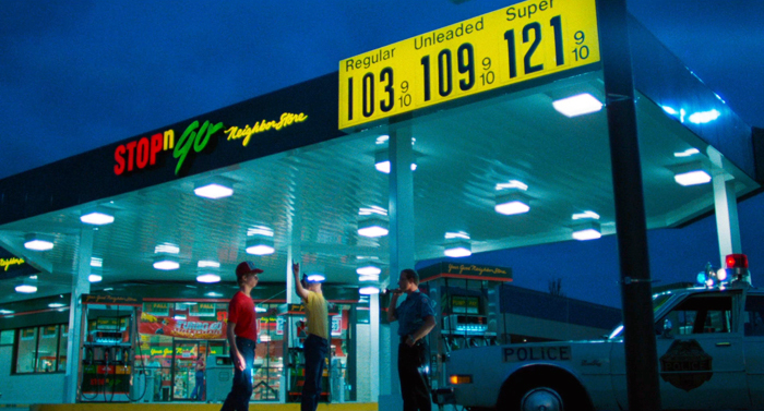
Such mockery is aimed mainly at corporate culture, while the community as a whole gets treated with a more grave affection. Does the sobriety check in the shadow of a Stop’n’Go (up top of today’s entry) owe something to Robert Wilson’s gestural tableaux? The gravity also stems from the planimetric framings, recalling not only Wilson but Walker Evans too.
These angles defamiliarize the landscape of exurbia, and their slightly comic monumentality will be echoed by Wes Anderson and other filmmakers of the 1990s.
As for the affection: I think the gee-whiz acceptance of commodity culture we find in Warhol and Koons becomes something different in True Stories. The good folk of Grover’s Corners, cradled among kin and friends, don’t need to assert their individuality, but the Virgilians define themselves by comparison shopping—and rebranding. True Stories is in part an appreciation of how people creatively remake all the crap pumped out for them to consume.
Amateur virtuosity
None of them seemed to feel alienated. They seemed to respond to mass culture in a very individual way—like, they take a prefabricated house and do something odd with it on the inside. I guess I was sort of proposing that here are these other possibilities—and maybe it was also a little bit of someone from New York imagining these little pockets of Utopia out there.
Near Spring Green, Wisconsin, sits the House on the Rock, a wondrous homage to the maxim “Too much is never enough.” In one hall a pneumatically controlled orchestra plays while you wander among a brewery, a pipe organ, and display cases, while above you hangs the engine of a whaling ship. With its carousels, dollhouses, Titanic souvenirs, and calliopes, welling out of the darkness in spotlights and glowing primary colors, the House on the Rock shows that if you plunge deeply enough into kitsch you come out the other side with something sublime, or at least surreal.
True Stories is in part about that plunge into tackiness, steered by a very 80s concern with the intersection of high and low. Can you endow kitsch with an avant-garde disorientation? Can you infuse avant-garde art with the good dirty fun of kitsch?
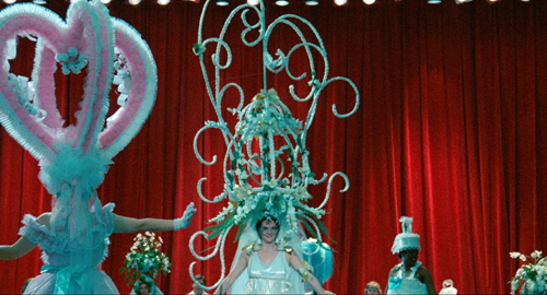
Byrne tries. The fashion show blurs the line between inspired tastelessness (a wedding dress like a wedding cake) and PoMo gallery art, the grass leisurewear provided by Bill Harding of Chicago. In the Criterion Making-of, Byrne insists that Adelle Lutz’s costumes are only one step beyond what you could find in Sears Roebuck of the day.
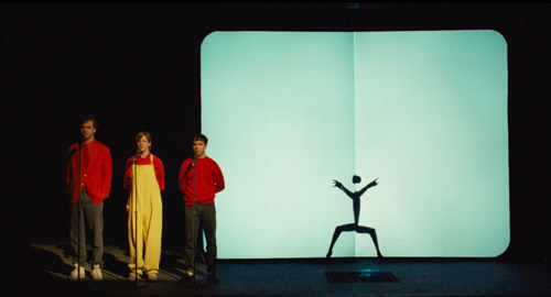
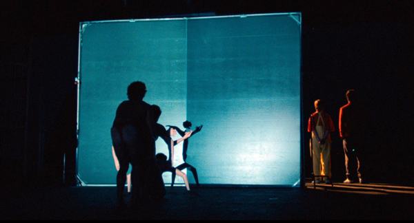
The Red Mustang Shriners, genuine as can be, constitute straightfaced populist eccentricity in a House-on-the-Rock vein. So do many of the variety acts, such as the Apache Belles and the eerie Shadow Dancers. And Mr. Tucker’s bungalow is actually the home of artist Willard Watson (aka The Texas Kid); footage of his encounter with Pops Staples is featured in the Criterion disc. This is another way the title levels with us: Many of the disconcerting images and sounds we encounter are as true as any story.
Some of the moments present authentic local music, like the accordion number in the Tex-Mex club where Ramon performs. Yet more often Byrne navigates the meeting of high and low in a striking way. While artworld-based Performance Art was going mainstream in the 1980s, Byrne starts from the other end and gives highbrow legitimacy to outsider performance art.
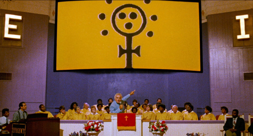
Virgil’s routines and ceremonies become occasions for impromptu performance. Instead of a traditional Happy Hour dance competition, there’s a lip-sync contest (“Wild, Wild Life”), with performers using their body to spin associations off the lyrics. A fashion show gets its own catwalk waltz, and a sermon on conspiracy theories becomes a stomping gospel tune. (It provocatively incorporates video clips assaulting the blue-sky tech promises of Earl Culver and Varicorp.) The Talking Heads music video “Love for Sale” absorbed TV commercials; now the film makes the video part of the flow of ads and programs on the Lazy Woman’s monitor. In Virgil, a parade can be a variety card, and a talent show can be as off-kilter as a string of pieces in a SoHo loft.
Amateurism isn’t necessarily clumsy; it has its own virtuosity. Why shouldn’t auctioneering be a sort of rap? Why shouldn’t children enact a love story with ventriloquist dummies? Why can’t people on the prairie come up with mysterious shadow choreography? At the climax, Louis is able to channel his search for love into a country and western song that he belts out with a confidence we haven’t seen from him before.
“Ideally,” Robert Wilson told an interviewer, “what we’d like to do onstage is to present ourselves.” The songs in True Stories, Byrne said, aimed to
give relatively placid people—like you or me—a justification for being vibrant and full of energy, for expressing themselves and exposing their insides to everyone else in the town.
Yet an audience isn’t necessary. Late at night a businessman dances alone at his office window, and a carpenter takes the empty stage to sing an aria. At the beginning and end, on the endless road, a little girl murmurs a song and makes mesmeric passes at nothing. She expresses herself in a fusion of naïve art and Downtown minimalism: It’s at once childish warbling and a Meredith Monk tune.
Our (favorite) town
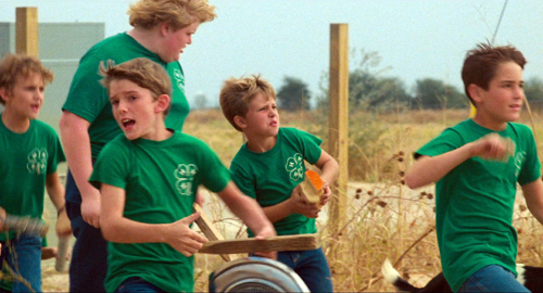
That song stands out as a sort of primal beginning of all the film’s performances. It becomes the orchestral underpinning of the Narrator’s introduction to Texas history and his first trip down the expressway. The same spirit emerges in the 4H kids’ spontaneous brick ballet “Hey Now.” Childhood, it seems, is media-free, back to the basics of bodies and castoff noisemakers.
The kids’ direct expression is starkly different from the media-enabled activity we see among the grownups. One character, Ramon, is associated with radio; he thinks that each of us transmits our feelings on wavelengths he can pick up. Naturally, he’s written a song about it. The Lazy Woman, on the other hand, is identified with television, her main contact with the outside world.
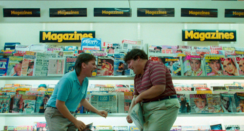
Mr. Tucker is an LP aficionado; the Computer Guy works on early digital sound. Documentary film is represented as a collage of Puzzling Evidence. Print media surface as the hectic tabloids read by the teenagers.
The sensational stories in the tabs, the wellspring of Byrne’s film, shape the Lying Woman’s confabulations. Grover’s Corners was never plugged in to the flow of information like this.
All these factors—the mix of avant-garde and down-home artmaking, the nutty byways of populist performance art, people responding to a multimedia environment—heighten the effect of estrangement. The film’s opening montage has an arch knowingness, anachronistically mixing Raquel Welch cheesecake with dinosaur lore. Call it comic defamiliarization. But things grow more sincerely felt as we go along, so that the crazy grotesques of Virgil become not so crazy or grotesque after all. Many are waiting on love.
The Narrator, a tenderfoot in a Stetson, is curious and unflappable. His puzzled acceptance of everything that comes his way encourages us to forget what we think we know about hayseeds, the sovereign state of Texas, high-tech industry, suburban sprawl, prefab buildings, and dorky parades. The last we hear of him, he’s already deleting the file, but I doubt we can.
Well, I really enjoy forgetting. When I first come to a place I notice all the little details. I notice the way the sky looks, the color of white paper, the way people walk, doorknobs. Everything. Then I get used to the place and I don’t notice those things any more. So only by forgetting can I see the place again as it really is.
In the film’s final moments, the Narrator’s confession of Warholian passivity turns into a defense of defamiliarization that could have come from Shklovsky. “Art,” he wrote, “exists that one may recover the sensation of life; it exists to make one feel things, to make the stone stony.” We can perceive true stories only by stripping away our preconceptions.
Byrne the creator has suggested that the film allowed him to find his way back to emotions beyond comfortable irony. “It was hard to go around not liking everything.” We can debate a long time why the end of Louis’s song, “We don’t want freedom/ We don’t want justice/ We just want someone to love,” both shocks and satisfies us. (Today, a Deplorable would change only the lyric’s last word.) But as an expression of sheer self-presentation, it’s hard not to sympathize with this Texas Bachelor.
Although the Narrator can forget, we don’t have to. According to the final song, we can remember this as our favorite town. With this film, Byrne makes sentiment safe for hipster consumption.
Working with Byrne and DP Ed Lachman, producer Kim Hendrickson and her team have supervised a brilliant 4K edition, the first time the film has been presented in 5.1 sound. They’ve included some precious material culled from new interviews, period footage, and excised scenes. There are also informative essays by Rebecca Bental, Joe Nick Patoski, Spalding Gray, and Byrne. The making-of is the best example of the genre I’ve ever seen, and the documentary on Tibor Kalman is quite informative on Byrne’s visual imagination. (The Criterion cover art is one of Kalman’s rejected designs.) One bonus short is a piece of analog video shot behind the scenes; another, by Bill and Turner Ross, is a contemporary return to the places shown in the film.
The film was shot full frame, to be masked in projection; some video versions displayed it at 1.37:1, others at 1.85:1, which is the one presented here. Kim was assisted by technical director Lee Kline, and audio supervisor Ryan Hullings. Also very helpful in the restoration and supplements was Christina Patoski, who organized a large portion of the original production. Many participants supplied photos and notes from preproduction.
Most of my quotations from David Byrne come from the Introduction in the book of the film: True Stories (New York: Penguin, 1986). Byrne’s remark about pockets of Utopia is quoted in Michiko Kakutani, “David Byrne Turns His Head to Movies,” New York Times (5 October 1986), 92.
The Warhol passage comes from Gretchen Berg, “Nothing to Lose: Interview with Andy Warhol,” Cahiers du cinéma in English no. 10 (1967), 40-42. The Robert Wilson quotation comes from Calvin Tomkins, “Time to Think,” in Robert Wilson: The Theater of Images, 2d ed. (Harper and Row, 1980), 84. The Shklovsky quotation is in “Art as Technique,” in Russian Formalist Criticism: Four Essays, ed. Lee T. Lemon and Marian J. Reis (University of Nebraska Press, 1965), 12. I say more about Shklovsky and narrative here.
True Stories.


