Archive for the 'National cinemas: France' Category
Three women of Cannes: A guest entry by Kelley Conway
Visages Villages (2017).
DB here:
Kelley Conway, friend and colleague here at Madison, has just made her first trip to the Cannes festival. All her adventures won’t fit on one entry, so she focuses this report on encounters with three outstanding women in French film culture: Agnès Varda, Laetitia Dosch, and Nathalie Coste-Cerdan. Kelley is the author of several books and articles on French film. Her recent book is on Varda, which we reviewed here. She wrote for us earlier this year on La La Land, and last year on French films at Vancouver.
Sneakers or heels?
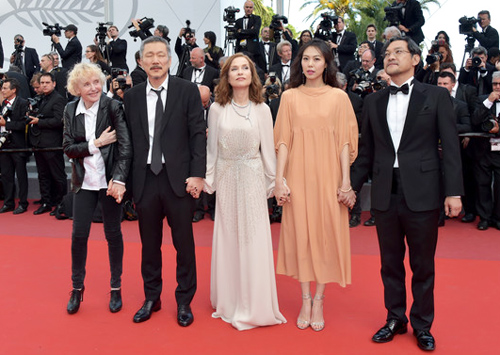
On the red carpet, Claire’s Camera creatives: Claire Denis, Hong Sangsoo, Isabelle Huppert, Kim Minheet, and Jeong Jinyoung.
The red carpet, replaced every day, is the epicenter. Standing on the edge, you’re mesmerized by the ritualized movement of humans across it. First, ordinary invitation-holders cross the carpet and move up the stairs and into the Grand Théâtre Lumière.
Once the mortals have taken their seats, the actors, directors, and L’Oréal models arrive. Women dressed in evening gowns pause and pose for the photographers while fans watch hungrily from beyond barriers and heavy security.
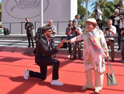
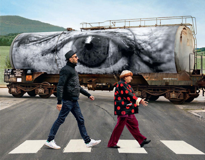
There are different styles of traversing the carpet. Dior-clad Rihanna took her time, striking vampy poses worthy of Theda Bara and apparently savoring every minute of the experience. No-nonsense legend Claire Denis moved briskly toward the stairs wearing a simple black pantsuit. Agnès Varda and JR, the photographer/muralist and co-director of Visages Villages, clowned it up.
Sometimes, in a gesture that is oddly moving, the director and actors who worked together on a film link arms, pose collectively, and stride the red carpet as one.
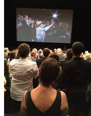 The videographers track the stars right into the theater. Once you get in and find a seat, you can follow other celebrities’ carpet progress thanks to a live feed. We watch them sit down and then we stand up, treating them to a standing ovation before and after the projection.
The whole thing seemed a little overwrought and absurd until I saw tears in eyes of Hong Sang-soo, Agnès Varda, and Laetitia Dosch, an actress you will soon adore. Cannes is a huge promotional machine and a herculean feat of event management, but flashes of humanity shine through.
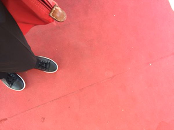
Even bystanders are subject to a dress code. For afternoon screenings, I was allowed to wear my sneakers. For the evening screenings of the films in competition, heels are de rigueur for women. Men are allowed to retain their sneakers, but I set aside this injustice and contemplate other elements of the Cannes experience.
The mise-en-scène of women on the red carpet can make Cannes appear fatally retrograde; one must look to the screen and behind the scenes for evidence of the modern woman. Let’s take a look at three women (and there are many more, of course) who deserve a kind of scrutiny that exceeds the red carpet défilé: Agnès Varda, Laetitia Dosch, and Nathalie Coste-Cerdan. What have these women, a director, an actress, and an educational executive, contributed to Cannes?
The Director: Through the Eyes of Varda and JR in Visages Villages
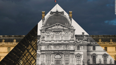
Visages Villages, which just won the Golden Eye Documentary prize at Cannes, is ostensibly a portrait of several small French villages. But it’s mainly a chronicle of a journey, an artistic collaboration, and a friendship between 30-something JR and 80-something Agnès Varda. JR is the hugely talented street artist and Instagram sensation, well known for his photographs and installations, notably his transformation of I.M. Pei’s glass pyramid at the Louvre in 2015.
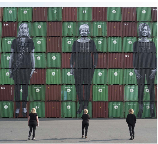
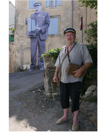 As with Varda’s Les Glaneurs et la glaneuse and Les Plages d’Agnès, we accompany the filmmaker, this time with her new collaborator in their “photo truck,” as they travel through France, gleaning ideas and experiences. We meet retired coal miners, cheese makers, factory workers, a mail carrier, a waitress, and the stalwart wives of three dockers in Le Havre, and we watch Varda and JR create and display epic photographs of them. The resulting images render ordinary humans and their remote communities extraordinary.
As in her past work, Varda urges us to take a good look at people and places we have previously overlooked, exercising her extraordinary gift for making us care about strangers. But the film is not merely an empathetic social document on rural France. Visages Villages affirms the allure of art and art-making, or rather the “power of the imagination,” as Varda describes the focus of their film. We witness the various stages in the duo’s collaboration: planning, considerable horsing around, execution, and discussion of the outcome.
The film reminds me of Chronique d’un été (1961), which also sought to document the lives of ordinary people while chronicling a collaboration (between Jean Rouch, Edgar Morin and their friends). In Visages Villages the result of the collaboration is, typically, the creation of a monumental photograph of a person placed in an unlikely setting: the wall of a decaying building in an isolated village, a container at the port of Le Havre, a barn on a lonely farm. As Varda did with Mona in Vagabond, the lonely single mother of Documenteur, and the widows of Noirmoutier, Varda and JR imbue their subjects with dignity, while maintaining a respectful distance.
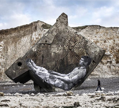
Visages Villages models a way of seeing and a way of being. JR and Varda laboriously plan and execute an installation consisting of a photo Agnès made in 1954 of the late photographer Guy Bourdin. JR and his crew construct a scaffold and paste the photo on the side of a massive bunker from W.W.II that had fallen from a cliff onto a Normandy beach.
We watch the whole thing come together beautifully via time lapse, only to learn that it was washed away by the tide within 24 hours. Instead of grieving the short life of the work of art, the pair move on, ready for their next adventure, which is how Varda has lived her whole life, fearlessly seeking new projects, curiosity and generosity intact.The human eyes and the spectre of Jean-Luc Godard are important motifs and Varda finds a way to merge them. A visit to Varda’s ophthalmologist, where she receives an injection to treat her macular degeneration, results in JR pasting a close-up of her eye on the cylindrical body of a gas truck.
JR propels Varda through the Louvre in a wheelchair, paying homage to Godard’s Bande à part and reminding us that looking at art has always been one of Varda’s passions. Near the end of the film, JR consoles Varda in Rolle after her old friend Godard callously stands her up, by finally offering her (but not us!) a glimpse of his eyes liberated from his habitual sunglasses.
In the hands of anyone else, this portrait of provincial people and an unlikely friendship might have resulted something thin and inconsequential. Instead, it’s a poetic window into the process of creation, an ode to the elevation of the ordinary, and a primer on the way to live.
The Actress: Jeune femme (aka Montparnasse Bienvenue, directed by Léonor Sérraille with Laetitia Dosch)
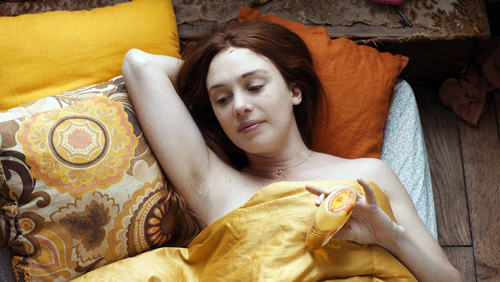
Two moments of stunning direct address bookend this beautifully acted, droll and moving film about a 31-year old woman on the verge of a nervous breakdown. The film opens with a scene of Paula (Laetitia Dosch) pounding furiously, first with her fists and then with her head, on the door of her unresponsive ex. While getting bandaged at a clinic, she rants extravagantly in direct address: “I was everything to him and now I’m nothing.” The final shot of the film reveals Paula staring directly at the camera again, this time calm and resolute, restored to a position of strength and hard-earned wisdom. Jeune femme is about a woman who comes to Paris to track down her ex, only to find a better version of herself.
I spoke with actress Laetitia Dosch about what it was like to create the role of Paula. Dosch worked in French boulevard theater and attended the prestigious two-year “Classe Libre” program of the acting school Cours Florent before enrolling at the Swiss National Conservatory, where she received a classical and avant-garde formation. Director Léonor Sérraille had recently won a screenwriting grant from the CNC and was looking for an actress to play the role of Paula when she saw footage of Dosch on YouTube. She wrote Dosch a letter and they soon began working together. Sérraille was busy during the day, but the two women found time to meet nearly every evening for six weeks. They discussed the character, explored Paris together, and saw films.
 Dosch’s explosive performance in Jeune Femme, which is both highly verbal and often idiosyncratically physical, might lead one to assume that significant improvisation occurred during the shoot, but no. Sérraille’s script was meticulously written, even “écrit au millimetre,” Dosch said, which she appreciated, because it helped her “figure out how the character thinks.” The film charts the transformation of a slightly manic, spurned woman into a person who realizes she’s better off without her older, famous, photographer boyfriend, for whom she was a muse.
Our flawed protagonist leads a precarious existence. Essentially homeless at the beginning of the film, she benefits from the generosity of a lovely woman she meets on the subway by failing to correct the woman’s mistaken impression that Paula is her long-lost childhood friend from Lyon. She confiscates her ex-boyfriend’s cat and eventually abandons it at a vet clinic. But she cobbles together a life, babysitting a depressed little girl whose existence she brightens with cotton candy and aria singing; making repeated attempts to reconnect with her estranged mother; selling lingerie at a mall in Montparnasse, and making new friends, notably a single dad from Senegal with a degree in economics who works as a security guard at the mall. When circumstances force her to make some big decisions, she surprises us. As Dosch described her character, “This is the story of a muse who stopped being a muse, or rather became her own muse.”
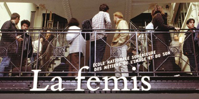
It’s worth contemplating Jeune femme’s conditions of production. The crew was comprised mainly of women, most of whom graduated from France’s prestigious national film school, Fémis. The film was awarded an avance sur recettes by the CNC (Centre National du cinéma et de l’image animée), which afforded Sérraille the time to write the screenplay. Institutions such as Fémis and the CNC are the backbone of France’s celebrated cinema ecosystem. A portion of each film ticket sold goes to the CNC, which in turn, distributes the funds to nourish the entire system of film education, production, and exhibition.
Here, more than anywhere else in the world, state resources flow in the support of screenwriters, directors, and even exhibitors who make and show films that might not exist or thrive without aid. In 2016, for example, the French art et essai (art house) exhibition sector accounted for 22.4% of all film attendance in France and benefited from nearly 15 million euros in aid from the CNC. French films retain a relatively high local market share. They attract 35.8% of admissions, while 52.9 % go to American releases.
The Education Executive: Nathalie Coste-Cerdan
Fémis is an important part of the system. Nathalie Coste-Cerdan, until recently the Director of Canal +, is now the General Director of Fémis. Created as IDHEC in 1945, Fémis was restructured and renamed in 1986. The school, which graduates fifty students each year, is funded by the CNC and supervised by the French Ministry of Culture and Media and the Ministry of Higher Education. The current president of the school is Raoul Peck, who directed most recently I am Not Your Negro. Prestigious grads include Noémi Lvovsky, Arnaud Desplechin, François Ozon, Céline Sciamma, Marina de Van, and Rebecca Zlotowski.
Because the school is supported by the CNC, French students pay next to nothing (433 euros per year) for this four-year education. Foreigners must pay 10,670 euros per year, but this is still a bargain by American standards. Students must have a B.A. or M.A. before entering one of the six main programs at Fémis, which are directing, producing, screenwriting, sound, cinematography, and editing.
The school keeps adding programs. A new two-year program trains people who want to work in distribution and exhibition. Another new program, La Résidence, trains recent high school graduates in film production for one year and is aimed at enhancing diversity at the school. Yet another new program, also lasting one year, was created to train students in the writing of television series because “ambitious television series are not so common in France,” admitted Coste-Cerdan.
I attended a panel organized by the CNC at its beachfront headquarters at the Cannes Film Festival to hear about film education in France and elsewhere. Representatives from Fémis, Ciné-Fabrique in Lyon, and films schools in Poland and Argentina compared their schools’ structures, fees, curricular goals, and, especially, their efforts to support international exchanges. Coste-Cerdan asserted, “It’s impossible to be a national film school today without being international.” In line with this trend, Fémis accords 10% of its spots to foreign students, creates special programs for foreign students, and runs exchange programs with film schools in other countries.
Seeking to “encourage international co-productions, be on the cutting edge of the industry, and open students’ minds to other points of view,” the school sends each and every Fémis student abroad to study in a partner institution. Fémis students study screenwriting at Columbia University, documentary film at the Beijing Film Academy in China, or sound design at VGIK in Russia. Fémis sends students to, and accepts students from, CalArts, Tokyo University of the Arts, INSAS in Bruxelles, the Universidad del Cinea in Buenos Aires, and the Korean Academy of Film Arts in Seoul, among others.
One Fémis program, linked with the Filmakademie of Baden-Württemberg, offers a one-year course designed for aspiring producers. The training takes place in France, Germany, and England and includes sessions at the Cannes, Berlin, and Angers film festivals.
Fémis also offers yet another innovative tactic, a three-week program for European documentary filmmakers who wish to develop a documentary film based on archival material. Here, aspiring documentary makers get help with re-writing, the preparation of a dossier for financiers, tips for dealing with producers and broadcasters, and pitching skills.
The results have been encouraging. The “Gulf Summer University” at Fémis has had luck attracting nine students from the Gulf region for its 5-week training program. Recently, a young Chinese woman from the Beijing Film Academy came to Paris and made a “poetic, philosophical” documentary about the Chinese community in Belleville. Coste-Cerdan characterized the exchange programs as, among other things, an exercise in “soft power,” designed to export the ideals of French film system elsewhere and also to challenge French students by exposing them to other cultures.
Cannes is a mecca of glamour and an enforcer of hierarchies, of course, but it’s also a place where one can have a serious conversation about now to improve international film education. It’s a place where one can see comedies like Noah Baumbach’s The Meyerowitz Stories (New and Selected), which is really good, by the way, but also films like Abbas Kiarostami’s gorgeous 24 Frames and Karim Moussaoui’s En attendant les hirondelles, a superb Algerian film. It’s also a place where one can see director John Cameron Mitchell, whose How to Talk to Girls played at Cannes this year to mixed reviews, serve as DJ and perform with a punk band at the “Queer Party.” It’s also a place where a taxi driver raved about the dialogue in the films of Michel Audiard and color design in Pedro Almodóvar.
I’d like to come back here some day, but I want to wear my sneakers on the red carpet, even at night.
Thanks to Agnès Varda, Laetitia Dosch, Françoise Pams, Pierre-Emmanuel Lecerf, and Nathalie Coste-Cerdan for their kind cooperation.
The 1162 French film theaters categorized as art et essai received, on average, 12,820 euros each in 2016. See “La Réforme de l’art et essai,” Le Courrier art et essai, n. 256, May 2017, 12.
Red carpet photos by Zimbio and Pascal Le Segretain/Getty Images; Coste-Cerdan photo from Times Higher Education Supplement. Other photos by Kelley Conway.
P.S. 28 May 2017: Jeune Femme won the Caméra d’Or prize for best first film.
Camera connections: RED on FilmStruck: A guest post by Jeff Smith
Red (1994).
Jeff Smith here:
The Criterion Channel’s new installment in our Observations on Film Art series on FilmStruck presents me talking about Krszystof Kieslowski’s late masterpiece, Three Colors: Red (1994).
In the film’s final scene, chance and fate combine to bring a couple together. My comments trace how a cluster of cinematographic techniques has indicated the couple’s connectedness long before they become aware of one another. Red explores one of the director’s favorite themes: the ways that characters can be linked by mysterious, unspoken emotional bonds transcending the bounds of time and space.
Today I go into a little more depth regarding Kieslowski’s use of cinematography. Since there are spoilers, you may want to watch the film, on FilmStruck or some other platform, before going on.
Three colors, many meanings
Blue (1993).
Kieslowski made Red after Blue (1993) and White (1994). Although all were well received by critics, Red was the most celebrated. It won the Palme d’Or at the Cannes Film Festival and was nominated for three Oscars, including Best Cinematography and Best Director.
The widespread acclaim for Red proved to be bittersweet; Kieslowski died just two weeks before the Academy Awards ceremony took place. Although the director’s untimely passing might have given his film a boost in Oscar voting, Red ended up being overshadowed by other more high-profile nominees. Forrest Gump took home six awards, including Best Picture, Best Actor, and Best Director. Pulp Fiction topped Red for Best Original Screenplay. And the conventionally pretty imagery of Legends of the Fall aced out Piotr Sobocinski’s much more innovative work for Best Cinematography.
The basic conceit of the Three Colors trilogy derives from the nationalist ideals associated with the French tricolor: freedom, equality, and brotherhood. Kieslowski himself downplayed the significance of the tricolor by claiming that the films’ “Frenchness” was largely a result of the film’s financing. In interviews, Kieslowski claimed that the three colors of the trilogy could just as easily have been red, yellow, and brown if the money for the films had come from East Germany rather than France.
Still, even as Kieslowski himself made light of the films’ connection to French values, his comments can seem a bit coy. While the films continue Kieslowski’s longstanding interest in chance, fate, and parallel lives, each entry also offers an idiosyncratic take on the particular ideal associated with its respective color.
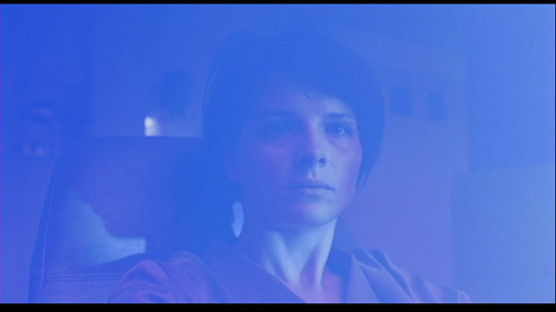
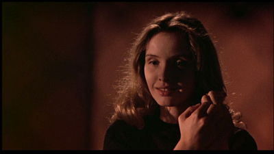
In Blue, Julie, the young wife of a composer, is devastated by the deaths of her husband and daughter in a tragic car accident. Forced to start anew after the loss of her family, Julie learns that her husband was not the man she thought she knew. In the midst of tragedy, the combination of grief and new knowledge paradoxically affords Julie a revitalized sense of existential freedom. With everything she had once cared about now gone, Julie relinquishes her roles as wife and mother, and her life takes unexpected paths as a result.
Deep sadness is not usually a trait that we associate with liberté. But Kieslowski’s surprising treatment of this theme is reminiscent of the famous line from Bob Dylan’s “Like a Rolling Stone” that states, “When you ain’t got nothing, you got nothing to lose.” Reduced to nothing, Julie finds new love and new purpose.
In a similar vein, White explores the idea of equality in rather unusual and unexpected way. One might expect Kieslowski film’s to be about political equality given his home country’s long struggle to achieve independence. Yet Kieslowski instead offers a dark comedy of betrayal and revenge.
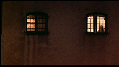
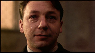
The film explores the power dynamics of marriage by focusing on a young couple living in Paris. Dominique seeks a divorce from her husband Karol Karol, a Polish immigrant working as a Parisian hairdresser. The divorce leaves Karol impoverished. He is forced to go back to his native Poland where he plots revenge. White then takes an almost Hitchcockian turn as Karol fakes his own death but leaves evidence that incriminates Dominique. When Dominique is convicted for murder, Karol is finally able to “balance the scales” in his relationship. But the film’s haunting conclusion leaves Karol’s future with Dominique completely in doubt. In a distant POV shot, Karol gazes at his ex-wife through the window of her prison cell.
They exchange sad smiles, realizing that they still share an emotional bond despite their earlier duplicities.
He ain’t heavy, he’s my brother(hood)
Kieslowski’s take on brotherhood (fraternité)in Red proves to be equally askew. The film’s central plotline concerns Valentine, a young model and student living in Zurich. She is brought by circumstance into the personal orbit of Joseph Kern, a cynical retired judge. Valentine has accidentally injured Kern’s dog, Rita, and seeks him out to see what she should do. Upon learning of the accident, Kern replies with indifference. Shocked by his apathy, Valentine asks Kern whether he would react any differently if it was his daughter who was run over.
Later Valentine returns to Kern after he sends money to pay for the dog’s veterinary care. During this visit, she discovers that the judge is using a radio to monitor the phone calls of his neighbors. Once again, Valentine rebukes Kern, this time for invading the privacy of others.
Chastened by Valentine’s disapproval, Kern begins to reform. He voluntarily confesses his spying to both his neighbors and police. He also accepts Valentine’s invitation to attend a fashion show in which she is a model. Under Valentine’s influence, Kern rejoins life, coming out of his isolation and resuming normal human interactions.
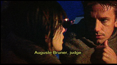
Red features a subplot involving a younger judge, Auguste, who is betrayed by his girlfriend, Karin. While the professions of the two men, Kern and Auguste, provide a simple story parallel, Kieslowski pushes this idea further than most other directors would. In fact, Kieslowski introduces so many similarities between the two characters that Auguste seems to be simply a younger version of Kern.
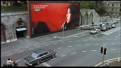
For example, the manner in which Auguste learns that Karin is cheating on him is remarkably similar to Kern’s account of his own wife’s infidelity. Moreover, Auguste owns a dog that he later appears to abandon much as Kern seems to give up on Rita after Valentine injures her. Both characters share a physical proximity to the other’s female counterpart. That is, Auguste lives near Valentine just as Kern lives near Karin. Lastly, Kern and Auguste both stop their cars at an intersection dominated by Valentine’s image on a huge billboard.
In a more telling parallel, Auguste describes an odd coincidence that occurs as he is walking to the site of his law exam. Auguste accidentally drops his book, and the book falls open to a page that contains information that later appears as a question on the exam. Later, after the fashion show, Kern describes an identical situation when he was a young man. Although Kern and Auguste never meet, viewers are further encouraged to recognize these similarities based on the physical resemblance of Jean Pierre Lorit to Jean-Louis Trintignant.
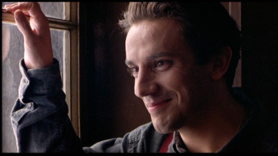
Instead of exploring brotherhood through more familiar conceits, like family, friends, or community, Red treats it as a metaphysical concept. In Red, brotherhood is an unseen force that binds people together, often in ways of which they are unaware. More importantly, though Kieslowski develops this idea through a story that is riddled with similarities, parallelisms, and synchronicities. And these apply not just to our two male protagonists, but also to the film’s central couple, Auguste and Valentine.
How do you represent destiny?
You’re a filmmaker. The story you’re telling is about a couple that spends much of the movie separate from one another. Perhaps they don’t meet until late in the film, maybe not until its final scene. How do you communicate to the audience that these two people are destined to be together? Over the years, filmmakers have utilized a wide range of techniques and devices to solve this problem.
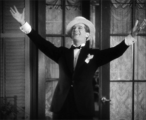
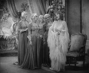
In some early musicals, filmmakers created parallel scenes featuring each character to foreshadow their later romance, as in Ernst Lubitsch’s The Love Parade. First, the caddish Count Alfred talks with his valet and sings “Paris, Stay the Same.” Then Queen Louise talks with her courtiers and sings “Dream Lover.”
More recently, filmmakers include certain plot details to suggest that the characters are meant to be together. In Sleepless in Seattle, Annie believes herself to be reenacting scenes from the Cary Grant-Deborah Kerr weepie, An Affair to Remember. Annie takes each of these uncanny experiences as signs that the radio caller named Sleepless in Seattle is her true soul mate.
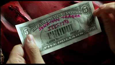
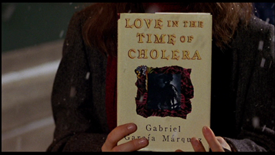
In Serendipity, John and Sarah meet in the film’s first scene. They separate, but they send personal tokens into the world inscribed with their names and phone numbers: a $5 bill and a copy of Love in the Time of Cholera. If these items return to their lives, it will be a sign that the couple will reunite.
In other cases, a filmmaker might use the formal properties of the medium to hint at the character’s destiny. In Turn Left, Turn Right, Johnnie To uses color and composition to anticipate the couple’s fateful encounter late in the film.
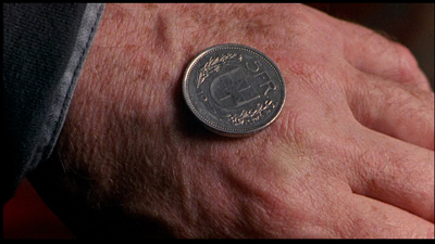
In Red, Kieslowski relies on a similar cluster of devices to suggest the workings of chance and fate for Valentine and Auguste. Like the films mentioned above, the director foreshadows the fate of his characters through a number of odd coincidences. At one point in the film, Valentine voices her hopes that her boyfriend, Michel, will call when the phone suddenly rings. Similarly, during one of Valentine’s visits to Kern’s home, they eavesdrop on Auguste and Karin discussing their plans for the evening. Auguste decides to flip a coin to determine whether he will sit home studying or will join Karin for an evening of bowling. As Kern and Valentine listen to this conversation, the judge also flips a coin, which comes up with the same result reported by Auguste.
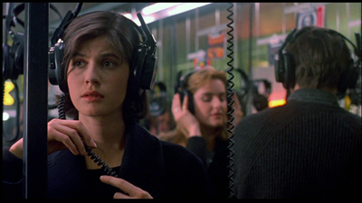
Later in a visit to a music shop, Valentine listens to an album of music by the composer Van den Budenmayer. Unbeknownst to her, Auguste and Karin listen to the same album just a few feet away. (Taste in music seems to link all four of these characters, as we see this same Van den Budenmayer record in Kern’s home.)
Although these parallels provide a narrative basis for Kieslowski’s theme of connectedness, they are strengthened by his stylistic choices. Four particular techniques emerge as the most salient: the use of color, framing, deep staging, and camera movement. Of these, camera movement is the most important.
Oh, telephone line, please give me a sign
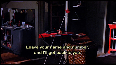
The use of camera movement to suggest the couple’s connectedness is established in the film’s first sequence, which follows a phone call’s path through a communication network that links England to Switzerland. Red begins with a medium close-up of a man dialing a telephone.
Although we don’y realize it at this early point in the film, in retrospect, we can surmise from the framed photograph of Valentine and the copy of The Economist sitting on the desk that this is Valentine’s boyfriend, Michel, who is working in England.
As we hear the number being dialed, the camera follows the phone line down to the socket in the wall. The next shot of the sequence traces the phone’s electromagnetic signal as it feeds into a major trunk line for thousands of other phone customers. The camera begins to spin as it moves forward through these wires. The resulting image is a welter of color and movement.
In the next shot, the camera continues to move forward rapidly, following the signal as it passes through the underwater cables buried beneath the English Channel. Here again, we might easily miss the significance of this shot since it comes so early in the film. Yet it plays an important role by foreshadowing the location of the tragic ferry accident that concludes the film.
The camera dips into, then out of the water, and reverses course, now tracking rapidly backward. It seems to pass through several red brackets that arch over the phone company’s transatlantic cables. The next two shots chase the signal as it travels in the phone lines of an apartment complex. By now, the camera is moving so fast that the lateral tracking movement is seen as a blur of light and metal. The next shot shows the camera spinning wildly. The camera then swishes past a telephone switchboard until it finally stops on a single flashing red light.
For a director not especially known for stylistic flourishes, this opening camera movement is a real corker. Yet its significance goes beyond extravagance. It previews the way Kieslowski will use camera movement to underscore the characters’ physical proximity to one another. It also foreshadows the many missed connections Valentine and Auguste will experience before finally meeting one another at the end of the film.
Morning routines, broken glasses, and fortuitous falls
Later camera movements creating physical connections are more staid than this bravura opening sequence. But they do establish a pattern that carries through the remainder of the film.
The next scene begins with a shot of Auguste gathering his books and preparing to take his dog for a walk. The camera follows Auguste and his dog as they cross the street, but drifts away from them, craning up past the red awning of Chez Joseph to introduce our protagonist, Valentine. The camera reframes Valentine as she moves about her apartment engaged in a phone conversation, confessing her loneliness as she prepares to leave for a photo shoot.
When Valentine mentions the weather, the camera tracks toward an open window, allowing us a glimpse of Auguste in the distance, returning to the entrance of his building. By blocking and framing the scene in this way, Kieslowski cleverly creates a bookend effect. It begins and ends by underlining the characters’ proximity to one another, suggesting a strange synchronicity to their actions in the process.
As the film goes on, Kieslowski encourages the viewer to notice the way that Valentine and Auguste’s paths continually cross, even as they remain largely ignorant of one another’s presence.
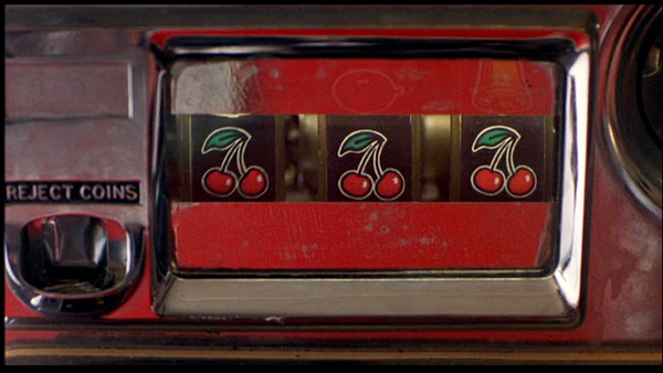
Consider the scene in which Valentine wins a jackpot playing the slot machine. Kieslowski begins the scene with a shot of Valentine exiting her car. The camera tracks slightly to the left to reframe Valentine as she walks to the entrance of Chez Joseph. Valentine buys a newspaper, and as she begins to read the front page, a figure steps in front of her holding a carton of Marlboro cigarettes.
The figure passes through the frame so quickly that it’s only in the subsequent shot that we realize it was Auguste, seen here entering his apartment with his dog. After Auguste has exited the frame, the camera racks focus at the same time that it pans left and tilts down to reveal the slot machine. We then see a close-up of Valentine’s hand as it enters the frame and pulls the handle downward. In this instance, Kieslowski’s framing makes us work harder to see the connectedness of the characters. Auguste is framed so that we only see his torso. Valentine is framed so that we only see her hand.
Later in the film, Auguste is unable to contact his girlfriend and drives off in a panic. He makes a hasty U-turn, framed through the window of Chez Joseph. As the red Jeep pulls away, the camera tracks right to follow it, but then continues its movement toward the slot machine, revealing three cherries that earlier produced Valentine’s jackpot.
The owner of Chez Joseph had told Valentine the three cherries were a bad omen. It will prove to be true as well for her counterpart, Auguste.
Another example of the couple’s connectedness occurs in the brief scene at the bowling alley. After a couple of shots that establish the setting and Valentine’s presence within it, Kieslowski cuts to a shot of Valentine rolling her second ball of the frame. The camera is positioned in the space behind the seating area in the alley.
From this initial set-up, the camera then tracks left past several other bowlers and stops on a close-up of a broken beer glass, a lit cigarette, and a crumpled package of Marlboros. The camera cranes up slightly on these objects, lingering briefly to enable the viewer to grasp their significance. Here again, Kieslowski has opted for a slightly elliptical way to suggest Auguste’s presence, which was presaged by the phone conversation overheard by Kern. The broken beer glass and lit cigarette suggest that Karin never showed up for their date, and further that Auguste left the alley in a huff.
Perhaps the most interesting camera movement in Red occurs in the scene in which Kern and Valentine meet after her fashion show. Kern explains that when he was a young man, he used to sit in the balcony in that same auditorium. On one occasion, he dropped a book and it fell several feet to the floor below, but opened to a section that is covered on the law exam he was about to take. (Recall that the same thing happens to Auguste as he crosses the street.)
Kieslowski could simply have Kern recount his story, but instead the director treats the moment much more dynamically. The camera traces the path of the book’s fall. The camera starts at a high angle looking down at Kern and Valentine near the stage, and ends at a low angle looking up at them.
Through a simple camera movement, Kieslowski has reinforced another of the film’s major themes: the interpenetration of the past with the present.
The unbearable redness of Being
As I’ve already suggested, camera movement seems to be the most important device for conveying Kieslowski’s central themes. It’s a vivid way to physically embody the unseen connections that link Valentine and Auguste together before their coincidental meeting after the ferry accident.
Still, camera movement is not the only technique to carry such significance. Color also proves important, especially since the film’s title prompts particular attention to it.
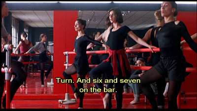
Toward the start of the film, Kieslowski seems to tease us with all of the red things that appear in the frame as in the shots of Valentine’s apartment and the ballet studio.
Yet he was also careful to point out that red is not even the dominant color in the film’s palette. Working with the film’s production designer, Kieslowski opted to emphasize browns and blacks, in part because the colors are associated with the world of courtrooms and legalese that connect Kern with Auguste.
Yet, even as an accenting color, red still draws the eye toward it. One reason for this is Kieslowski’s restricted palette, which features very little green and almost no blue. Red pops out because it is often the only bright color within the mise en scene, which mostly features more neutral earth tones.
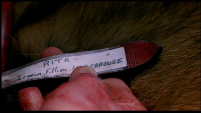
Because red is conventionally associated with things like love, passion, anger, and danger, we might be tempted to match those meanings to the film’s story. And there are some moments in Red where such color symbolism seems like a possibility. Consider, for instance, the insert of Valentine’s bloodstained hand checking Rita’s tag.
Yet, for every one of these moments, there are a dozen others where the color seems to have no such correlation. Why, for instance, would we ascribe passion or anger to Chez Joseph’s awning or to the three cherries on the slot machine?
Since the color is present in almost every scene, one would be hard-pressed to find any coherent pattern based on such traditional associations.
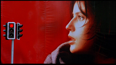
Instead, like camera movement, red seems to function as a visual metaphor for the film’s off-kilter treatment of brotherhood. Indeed, Kieslowski anticipates Auguste and Valentine’s eventual coupling by consistently linking them to red props and decor. Auguste has his red jeep, which we see several times throughout the film. He also is shown toting cartons of Marlboro cigarettes, which are identifiable through the brand’s signature color.
Valentine, on the other hand, is frequently shown with red colored clothing and textiles. When Valentine takes Rita out for a walk, she wears a red sweater and carries a red leash. She sleeps with a red shirt that serves as a substitute for her absent boyfriend, Michel. During a photo shoot, Valentine poses against a vibrant red backdrop. Lastly, Valentine is shown in several different settings where the décor is dominated by red, such as the ballet studio, the bowling alley, and the auditorium where the fashion show takes place.
Viewed in this respect, color in Red functions as a classic instance of an intrinsic norm. By rejecting more conventional extrinsic meanings associated with the color, Kieslowski instead treats red as something that develops more localized significance. Given his longstanding interest in the workings of chance, fate, and destiny, it should not surprise anyone that red objects, costumes, and settings come to symbolize these larger cosmic forces.
The Breath of Life
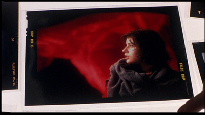
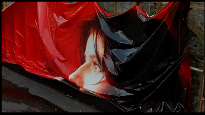
The color red is also prominent in Valentine’s “breath of life “ billboard ad. The ad is shown at least six times in the film, and its recurrence will play an important role in preparing for the film’s climax.
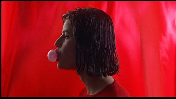
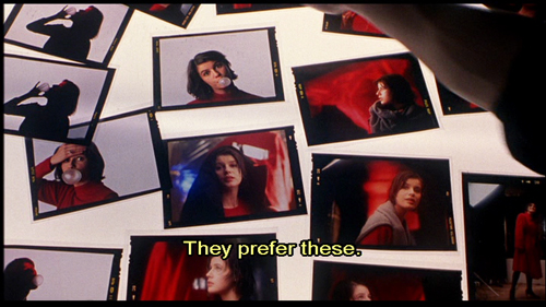
We first see the ad in production during Valentine’s photo shoot. She is posed in profile, and her mood seems playful. She blows a bubble with her gum, presumably using the product featured in the campaign. The photographer asks Valentine to remove the gum from her mouth and to tie her sweater around her neck. He then instructs her, “Be sad. Sadder. Think of something awful.” By asking Valentine to imagine tragedy, the photographer is able to get the image he wants.
We see the resulting photograph a few scenes later amongst a pile of other snapshots from the session. Jacques, the photographer, calls our attention to it by indicating that the shot likely will be used in the campaign.
The billboard itself is later shown on two separate occasions. We first see it looming over the traffic intersection where Auguste’s red jeep is stopped.
We see the same image again when Kern drives to Valentine’s fashion show.
It appears again just before the film’s climax in a brief shot showing workmen taking the billboard down.
One might assume that Kieslowski has put a cap on the “breath of life” visual motif. But he revives it one final time, albeit in a way that inverts much of its earlier significance in the film’s plot. Red’s climactic scene begins with Kern walking outside to retrieve his newspaper. On his way back, he glances at the headline, which notes that hundreds of people are dead in a ferry accident on the English Channel.
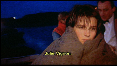
Kern then turns on his television to learn the latest news of this tragedy. A reporter states that there were only seven survivors of the accident. In a rather tongue-in-cheek gesture, six of the seven survivors happen to be characters from the Three Colors trilogy. We first see a shot of Julie Vignon, who is described by the reporter as a composer’s widow.
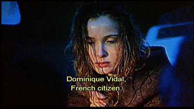
This is followed by shots of Karol Karol and his wife Dominique.
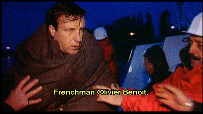
Next comes a shot of Olivier Benoît, a family friend who had become Julie’s lover in Blue.
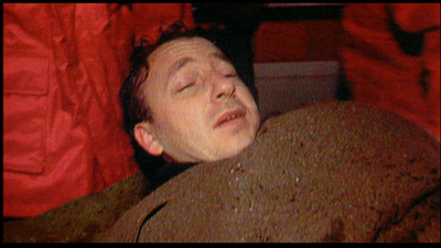
Finally, we see a shot of the two Swiss survivors, Auguste and Valentine.
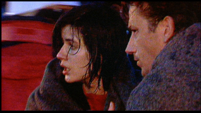
For the first time in the film, the two characters are shown looking at one another. The television image freezes on Valentine and Auguste.
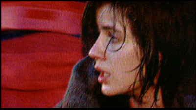
The camera slowly zooms in on the image on the television to get a closer view of Valentine. When the zoom ends, the video image is eerily similar to the “breath of life” billboard.
The gray blanket has taken the place of Valentine’s sweater and the red windbreaker of a rescue worker replaces the red cloth backdrop of the ad. But Valentine’s facial expression and pose approximate that in the ad.
The video image, however, seems to reverse many of the advertisement’s earlier associations. During the shoot, Valentine only pretends to be sad. Her expression and pose are commodified, used to sell chewing gum to punters taken in by the image’s sensuous visual appeal. In contrast, the video image of Valentine’s rescue captures her genuine response to tragedy. Valentine’s look expresses a sense of shock and surprise that she survived when so many of her fellow passengers died. Moreover, the gloss of the billboard advertisement has been replaced by the roughhewn look and “on the fly” reality of video reportage.
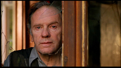
From this shot, Kieslowski cuts to an enigmatic medium close-up of Kern, who stares into the morning sunlight through his window.
The shot seems to pose more questions about the story than it answers. Is Kern merely relieved by the news that Valentine has survived? Or is there something deeper behind his rueful smile? Does Kern feel responsible for Valentine’s situation? After all, he recommended that she take the ferry rather than fly and asks to examine Valentine’s ticket in their last meeting together.
For some critics, the shot adds a Shakespearean wrinkle to Kieslowski’s film. For these critics, this shot suggests that Kern, like Prospero in The Tempest, has conjured the storm out of thin air in order to satisfy his psychological desires.
Whether or not we see this moment as a reference to The Tempest, it seems clear that Kern has uncannily anticipated Valentine’s fateful encounter with Auguste throughout the film. Consider the following:
- Kern predicts Karin’s breakup with Auguste. He also claims that, despite Auguste’s declaration of love for Karin, that Auguste has not yet met the right woman. This language is echoed later when Kern describes his own despair after learning of his wife’s affair. The Judge says to Valentine, “Perhaps you are the woman I never met.”
- Earlier in the film, Valentine says she is thinking of cancelling her trip to England because of her brother Marc’s legal troubles. Kern insists that she keep her travel plans saying it is her “destiny.”
- Kern acknowledges that he crossed the English Channel as a younger man in pursuit of his wife and her lover, Hans Holbling. His quest came to naught, however, when he learned that his wife died in an accident. Both the trip and his wife’s fate prefigure the ferry tragedy that ends the film.
- Kern describes a dream he has of Valentine as an older woman. Kern’s account of the dream prophesies that Valentine will meet a man and that the couple will grow old together.
All of these things seem to foreshadow Auguste’s fortuitous meeting with Valentine in the aftermath of the accident. Since Kern is, at least in some indirect way, responsible for the couple’s meeting, he has given Valentine a gift in addition to the pear brandy that the two previously enjoyed together. In Auguste, he has given Valentine a younger version of himself.
At its heart, Red is an existential mystery. When Valentine and Auguste meet at the end, their union seems less like coincidence and more like the outcome of divine intervention. Yet, in retrospect, Kieslowski has carefully prepared us for this moment by using color and camera movement not only to underscore their physical proximity, but their many missed connections.
In exploring the French value of fraternité, Kieslowski’s unusual treatment of the subject emphasizes the invisible forces that bind people together even as they elude our conscious grasp. Although Kieslowski likely didn’t intend Red to be a valedictory film, it is a fitting testament to his larger oeuvre as a director. In a story suffused with grief and regret, Red’s final scene suggests that love and hope can bloom in even the most bleak situations.
Thanks as usual to the Criterion team, particularly Peter Becker and Kim Hendrickson, for their support. Kristin, David, and I are very happy to be involved with their FilmStruck activities.
For more on Krzysztof Kieslowski’s films, see Annette Insdorf’s Double Lives, Second Chances: The Cinema of Krzysztof Kieslowski, Joseph G. Kickasola’s The Films of Krzysztof Kieslowski: The Liminal Image, and Marek Haltof’s The Cinema of Krzysztof Kieslowski: Variations on Destiny and Chance. Two collections of interviews with Kieslowski have been published: Kieslowski on Kieslowski and Krzysztof Kieslowski: Interviews. For a concise overview of the films in the Three Colors trilogy, see Geoff Andrews’ monograph in the BFI modern classics series.
An earlier entry considers the ways that film stories rely on chance and coincidence, with Serendipity as a central example.
Wisconsin Film Festival: Cutting to the chase, and away from it
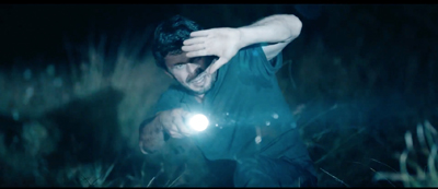
Nocturama (2016).
DB here:
Despite my recent jab at D. W. Griffith, I gladly give him credit for making crosscutting a central technique of narrative cinema. Using editing to switch our attention from one story line to another is a fundamental resource of moviemaking everywhere.
Crosscutting is most apparent in those passages of quickly alternating shots that build tension during chases and last-minute rescues. That’s a prototype of what we credit Griffith with consolidating. But crosscutting is used outside such climactic stretches. Hollywood silent features often crosscut story lines throughout the film, without pressure of a deadline and without much happening in some lines of action. It seems to be a way that filmmakers found to keep the audience aware of many story strands.
Crosscutting is a cinematic version of a very old narrative strategy, that of alternating presentation. Once you have several story lines, you can switch among them. Homer does this in the Odyssey, interweaving Ulysses’ wanderings, Telemachus’ efforts to find him, and Penelope’s holding off the suitors.
Homer initially handles these lines in large blocks, in separate “books.” After attaching us to Telemachus in Books 1-4, Homer shifts us to Ulysses for a long stretch. Such interlacing can be found in medieval narrative too, and of course it dominates modern novels, with chapters shifting among action lines and character viewpoints.
Crosscutting large chunks can give way to shorter bursts. Ulysses’ travels occupy several books, but as he approaches Ithaca, Homer interrupts Book 15 to switch back and forth between him and Telemachus, also headed for home. In cinema, this sort of accelerated crosscutting, often driven by a deadline, has become identified with Griffith’s The Lonely Villa (1909), A Girl and Her Trust (1912), and other Biograph shorts. He lifts the principle of crosscutting to a vast scale in his features. The Birth of a Nation (1915) alternates North and South, home front and battlefront, carpetbaggers and Klansmen in a novelistic fresco.
Crosscutting usually implies some degree of simultaneity. While Telemachus searches for his father, Ulysses leaves Calypso and the suitors run riot in the palace. The notion of actions taking place at more or less the same moment is especially important in chases and last-minute rescues.
As a plot reaches its climax, there can be a sort of site-specific crosscutting too. Once Ulysses and Telemachus have joined forces to slaughter the suitors, Homer’s narration sometimes switches among areas of the fight, as in the battle scenes of the Iliad. While father and son hold off the suitors in the main hall, two servants capture one suitor in a storeroom. We recognize this technique of adjacent alternation when novels and films gather all the major characters in one spot for the climax and shuttles among them.
Crosscutting remains a basic filmmaking tool for most movies on our screens. Where would the Fast and Furious franchise be without it? But some contemporary filmmakers have made fresh uses of the technique. In Inglorious Basterds, Tarantino adopts the big-segment option, alternating lengthy blocks of action before using faster crosscutting when characters converge at the climax. Christopher Nolan has experimented with various tactics, including crosscutting different phases of the same action (Following) and crosscutting among embedded segments, dreams within dreams (Inception).
So there are still lots of options out there to be explored. Just look at some films shown at our Wisconsin Film Festival. Beware, though, of light and heavy spoilers.
Attachment plus anxiety
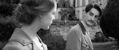
Frantz (2016).
At one end of the spectrum: Must you always use crosscutting? Wigilia, a charming short feature by Graham Drysdale, suggests not.
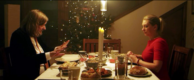
It’s built on two Christmas eves a year apart. In the first, a Polish refugee who cleans house for a brusque businessman is alone for the holiday and in his apartment prepares the traditional holiday meal—not for herself but for her absent family. She’s interrupted by the businessman’s vaguely hippy brother, and the two learn about each other as they share the meal. In the second evening, after the businessman has left the apartment to his brother, she returns and they bond more intensely.
Apart from an inserted dream sequence, we stay within the apartment. This concentration derives from the production circumstances; Graham explains that he was given a chance to make the film in short order, and to keep it manageable he came up with the idea of limiting the locale. He shot 53 minutes of footage in five days in the apartment, then did the two final scenes in two days. The narrowly focused drama, with many lines improvised, has no need for the free-roaming tactics we associate with crosscutting.
Crosscutting tends to give us a fairly unrestricted range of knowledge; often we know more than any one character. In The Girl and Her Trust, the telegraph operator holding off the robbers can’t be sure that her boyfriend is rushing to her rescue, and he can’t know how close the robbers are to seizing her. Alternatively, when we’re mostly restricted to one character, we don’t find a great deal of crosscutting.
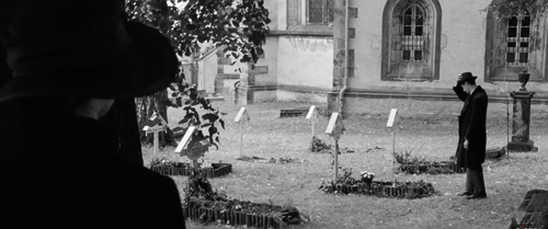
That’s the case in François Ozon’s Frantz, a remake of Lubitsch’s Broken Lullaby (1932), also shown at WFF. Anna’s fiancé Frantz has been killed in the Great War. Out of sympathy his parents have taken her in and treat her as a daughter. But when she sees Adrien, a melancholy Frenchman, haunting Frantz’s grave, she gets curious. Most of the ensuing film is restricted to what Anna learns,
Adrien visits the family. Flashbacks lead us to think he’s what he hesitantly claims to be: a friend of Frantz from prewar Paris. But he has been pressed to tell the parents what they wished to hear. Adrien actually came to the village to beg their forgiveness for killing Frantz on the battlefield, where they met for the first time. Although we surely have reservations about the sad, apprehensive young man, we don’t learn the truth until Anna does, at about the midpoint of the film’s running time. By this time she has fallen in love with him.
There is some alternation of viewpoint in the film. A few scenes attach us to Adrien during his stay in the village, chiefly when he confronts bitter locals who still consider France their enemy. Still, these scenes don’t give us much direct information about the true backstory. And after Adrien has left and Anna has sought to keep the parents in the dark about the past, we remain attached to her. No crosscutting shows us Adrien’s return to France and his life there. As a result, we’re able to feel curiosity and suspense when Anna decides to track him down. The revelation of his civilian life raises a set of unexpected conflicts.
Both Wigilia and Frantz show that avoiding crosscutting can be a powerful way to keep our attention fastened on characters, the better to let their words and behaviors, as well as their inner lives, get primary emphasis. Crosscutting yields a panorama, while refraining from it can aid portraiture.
Crosscutting as usual
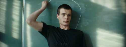
The Student (2016).
More toward the center of the spectrum lies ordinary crosscutting, the alternation among scenes that provide a broad perspective on the action. In Arturo Ripstein’s Western Time to Die (1965), the plot alternates between scenes featuring the returning convict Juan Sayago and episodes showing the reactions of different townsfolk—chiefly the sons of the man he killed. We also learn of efforts from women in the town to prevent the sons from taking revenge. This “moving-spotlight” narration isn’t perfectly omniscient, though. The plot gradually fills in information about what led up to Sayago’s crime, while revealing that the sons’ mission would amount to avenging a dishonorable father.
A similar sequence-by-sequence approach is seen in The Student, aka The Disciple, a Russian film by Kirill Serebrennikov. A fanatical teenager has become the scourge of the classroom, barraging teachers and pupils with Bible quotations and denunciations of bikinis. His mixed-up fundamentalism, which leads him at one point to challenge evolution by donning a gorilla outfit, is unpredictable and a pure power trip, Biblical bullying.
His mother can’t manage him, the administrators are reluctant to take stern action, and the school priest sees him as a potential recruit to the clergy. Only one teacher, Elena, challenges him with a mix of humor and sympathy. But to combat his increasingly wild behaviors, which include making himself a full-size cross which he can stretch out on, she too sinks into Scripture. She hopes to quote the Bible back at him and dislodge his dogmatism, but she too becomes obsessed and estranges herself from her boyfriend. Meanwhile, Venya gets his one true disciple, a limping underdog, and his campaign against homosexuality, science, and secularism turns violent.
A good part of the narration locks us in to Venya’s Dostoyevskian ferocity, thanks to a restless use of the “free camera” in lengthy following shots. (The film has only about 150 shots in 113 minutes.) But we do range more widely to get a broader view. The moving spotlight shows the mother’s frantic consultations with school officials, and Elena’s clashes with them, as well as with her boyfriend. Still, the climactic scene, which assembles all but one of the characters in a single meeting, has no need of a broader view. Like Wigilia, The Student draws its final power from drilling down into a confrontation around a table.
Gaps and folds in time
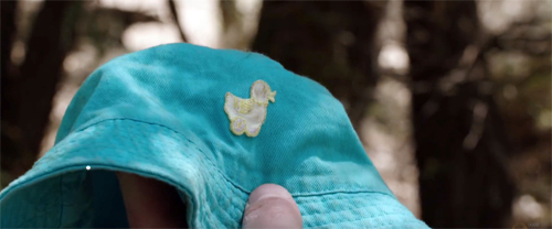
Killing Ground (2016).
Griffith rang many changes on his last-minute-rescue template, and one of the most startling occurs in Death’s Marathon (1913). A dissolute husband, bored with his life, decides to commit suicide and notifies his wife by phone. She calls the family friend, who races to prevent the death. Surprise: He’s too late.
A hundred-plus years later, crosscutting builds and then deflates suspense in the Romanian film Dogs, by Bogdan Mirica. There are two protagonists: Roman, a city fellow who has inherited his grandfather’s idle farm, and Hogas, the police chief. Both face off against sadistic hoodlum Samir and his thugs. A human foot has popped up (literally, in the first shot), and Hogas tries to trace its owner, while Roman decides how to dispose of the farm. Samir explores other possibilities, none very savory.
At first we’re restricted to Roman, who is frightened by distant lights and gunshots out on the property, and Hogas, who doggedly pursues his investigation. The alternation between them keeps Samir offscreen for some time. When he surfaces in a suspenseful drinking bout with Roman, and when Roman’s girlfriend comes to pay a visit, the threats start building.
The climax starts out as pure Griffith. Mirica crosscuts Roman’s drive back to rescue his girlfriend, Hogas’ pain-ridden walk to the farmhouse, and Samir’s ominous approach to the isolated woman. Interestingly, the pace of the cutting doesn’t much accelerate in these last moments; there isn’t a lot of alternation, and the emphasis is on prolonged actions (Hogas’ trudging pace, interrupted by coughing up blood, and Samir’s laconic dialogue with the girlfriend).
By the time Hogas arrives, he finds he’s too late. The conventional mystery and suspense of the first stretch are undercut by showing us only the eerie aftermath of a violent climax. Art-cinema norms can de-dramatize crosscutting, but the maneuver remain a revision of what Griffith tried for in 1913.
Three years after Death’s Marathon, Griffith showed the possibility of crosscutting radically different time frames. Intolerance (1916) interweaves four historical epochs while using crosscutting within each one as well. Since then, crosscutting has sometimes been used to juxtapose past and present (The Godfather Part II, The Hours), or alternative futures (Sliding Doors), or a real story and a fictional one (Full Frontal). Interestingly, Griffith is a bit more daring than these directors. These films usually alternate sequences or entire blocks. At first Intolerance does that too, using titles to mark the shift among its four eras. But as the film reaches its climax, Griffith cuts freely from one period to another. These shot-to-shot time shifts, jumping centuries in the burst of a cut, remain an audacious formal discovery.
In all these examples, we’re cued to realize when we move to another period. But Killing Ground, a grueling Australian thriller by Damien Power, doesn’t announce its time-shifting. It exploits our default assumption that crosscutting implies more or less simultaneous action.
At first Killing Ground does give us rough simultaneity, alternating between the yuppie couple, Ian and his fiancée-to-be-Sam, and a pair of gun-loving locals. But then the couple make camp near another family’s tent.
Through careful use of eyeline matches and other continuity cues, the narration welds together actions that are actually taking place at different times. The family’s evening meal and their foray into the woods happen well before Ian and Sam arrive, but the cutting implies that the two groups are living side by side.
Like Griffith, at moments Power shifts between the two periods on a shot-by-shot basis. Small disparities, like a baby bonnet and the placement of the campers’ vehicles, accumulate. By the time Ian follows one of the psychopaths into the woods, we realize that earlier events have been salted through the present-time action, the better to delay revealing the family’s fate. From then on, orthodox crosscutting takes over as Ian runs for help and Sam tries to hold the rampaging peckerwoods at bay.
The kids aren’t alright
At the distant end of the spectrum, how about building a whole movie out of full-blown crosscutting? A sustained example at WFF was Bertrand Bonello’s Nocturama. (Major spoilers ahead.)
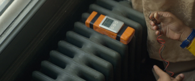
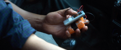
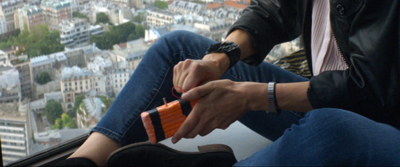
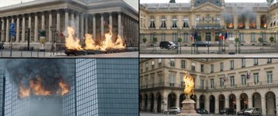
For the first fifty minutes or so, we follow nine young people silently threading their way through Paris. They ride the Métro, pace along the street, pair up, separate, crisscross, and assemble at four sites—a line of parked cars, an office building, a Ministry, a statue of Joan of Arc. They’re setting bombs.
We can identify them only through their looks and behaviors. David and Sarah touch fingers fleetingly on a train. We learn from flashbacks that Samir and Sabrina are sister and brother, and their friend is the younger African Mika, all presumably from emigrant families. Flashbacks also show them meeting to plan their action and, once set on course, dance the night away.
There’s an unexpected shooting, but the bombs go off more or less as planned. The group assembles in an upscale department store to meet another confederate, the security guard Omar who will host them overnight. This brief “nodal” moment of unification melts away. Crosscutting follows them as they wander from floor to floor in a parallel to their passages through Paris.
The first section merges the art cinema’s best friend, the prolonged walk, with a thriller-based suspense: we don’t really know what they’re up to until we see a pistol at around 18 minutes and bomb materials somewhat later. The threads knot when we see a quick montage of the bombs.
This fine-grained crosscutting looks ahead to the fragmentary handling of the action in the department store, where the moving spotlight shifts rapidly as the conspirators disperse, assemble in pairs or trios, and disperse again.
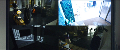
Crosscutting is the principal way filmmakers imply simultaneous action, but a lesser option, often favored by Brian De Palma, is the split screen. Bonello uses this device to show the result of the bombings. The shot looks forward to the quiet surveillance-camera display in the security office as the police prowl the shopping aisles. We see the kids moving from quadrant to quadrant, with an occasional flare marking a nearly soundless kill.
The terrorists’ motives are barely sketched, and they’re a cross-section of middle-class and working-class kids. Some are unemployed, others have low-end jobs, while others are on track for professional careers. A flashback shows several, perhaps meeting for the first time, while waiting for job interviews. The film’s second large part paints them as victims of consumer lust as they try on upscale fashions and make-up, but the point isn’t hammered home. To some extent they’re just killing time in what they think is a safe house.
Nocturama‘s crosscut climax balances, in more condensed form, the first section, as the conspirators are discovered by the police. At one point, an innocent who has come upon them by accident gets more emphasis than the gang members. His final moments are replayed through multiple viewpoints, as if the stranger’s fate drives home to them what death looks like up close. Soon enough each one will know exactly.
It might seem the height of film nerdery to join up films seen at a festival through their different uses of one technique. But is it any more of a strain than those journalistic accounts of how a batch of festival choices reflects The Way We Live Now? Every Berlin or Cannes or Toronto seems to bring forth think pieces looking for a common thread among radically different films, hoping to find today’s social mood in movies begun perhaps years before? Like most zeitgeist readings, they’re pretty easy to whip up.
But technical choices are more concrete than hints of the mood of the moment. Moreover, if you’re interested in cinema as an art, it can be enlightening to reveal the variety of creative options that are still available. The art may not progress, but our understanding of it can. And it’s heartening to find filmmakers refreshing traditional techniques to give us powerful experiences.
Just as important, studying how our contemporaries find new possibilities in something as old as crosscutting can encourage ambitious filmmakers today. The menu is open-ended. There’s always something new, and rewarding, to be done.
We had a wonderful time at this year’s Wisconsin Film Festival. Thanks to all the people and institutions involved, and especially the programmers Jim Healy, Mike King, and Ben Reiser. Each year it just gets better.
Wigilia is currently streaming on Amazon. Nocturama has just gotten a US distributor, the enterprising Grasshopper Film.
Good discussions of interlaced plotting in medieval tales are William W. Ryding, Structure in Medieval Narrative (Mouton, 1971) and Carol J. Clover, The Medieval Saga (Cornell University Press, 1982). Yes, it’s Carol “Final Girl” Clover.
For Tarantino’s use of block construction and time-bending, go here. We discuss Nolan’s penchant for crosscutting in this entry and that one, and at greater length in our e-book on his work.
The ten best films of … 1926
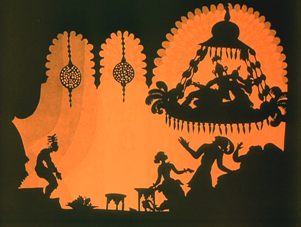
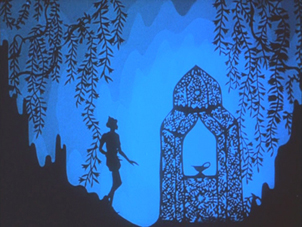
The Adventures of Prince Achmed.
Kristin (with some help from David) here:
David and I have been offering this greatest-of-90-years-ago series almost as long as this blog has existed. For earlier annual entries, see 1917, 1918, 1919, 1920, 1921, 1922, 1923, 1924, and 1925.
I approached 1926 with the assumption that it would present a crowded field of masterpieces; surely it would be difficult to choose ten best films. Instead it turned out that some of the greatest directors of the era somehow managed to skip this year or turn in lesser films. Eisenstein had two masterpieces in 1925 but no film in 1926. Dreyer made a film that is a candidate for his least interesting silent feature, The Bride of Gromdal. Chaplin did not release a film, and Keaton’s Battling Butler, while a charming comedy, is not a plausible ten-best entry. The production of Lang’s Metropolis went over schedule, and it will appear on next year’s list, for certain.
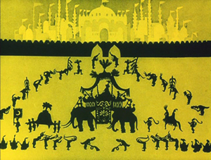
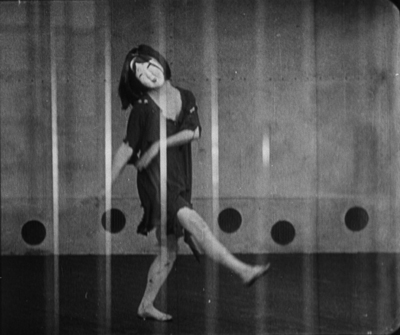
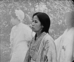
Still, the Soviet directors were going full-tilt by this time and contribute three of the ten films on this year’s list. French directors on the margins of filmmaking created two avant-garde masterpieces. Two comic geniuses of Hollywood already represented on past lists made wonderful films in 1926. A female German animator made her most famous work early in a long career. I was pleased to reevaluate a German classic thanks to a sparkling new print. Finally, Japan figures for the first time on our year-end list, thanks to a daring experimental work that still has the power to dazzle.
The Russians are coming
Vsevolod Pudovkin’s Mother was a full-fledged contribution to the new Montage movement in the Soviet Union. By the 1930s, that movement would be criticized for being too “formalist,” too complex and obscure for peasants and workers to understand. Nevertheless, being based upon a revered 1906 novel of the same name by Maksim Gorky, Mother was among the most officially lauded of all Montage films. It tells the story of a young man who is gradually drawn into the Russian revolutionary movement of 1905. His mother, the protagonist of the novel, initially resists his participation but eventually herself joins the rebellion.
Along with Potemkin, Mother was one of the key founding films of the Montage movement. Its daring style is no less impressive now than it must have been at the time. One brief scene demonstrates why. Fifteen years before Mother, D. W. Griffith was experimenting in films like Enoch Arden (1911) with cutting between two characters widely separated in space, hinting that they were thinking of each other. By 1926, Pudovkin could suggest thoughts through editing that challenged the viewer with a flurry of quick mental impressions.
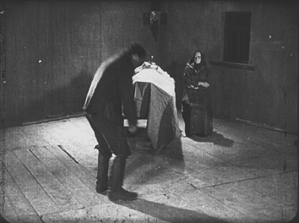
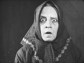
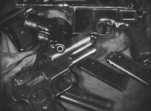
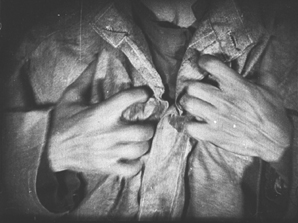
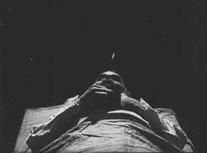
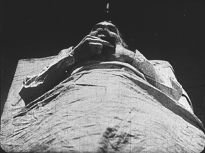
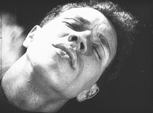
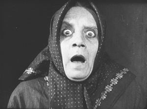
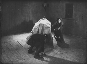
As the Mother sits beside her husband’s dead body, her son, a participant in the 1905 failed revolution, comes in. He is about to bend down and open a trap-door in the floor (73 frames). A cut-in shows her horrified reaction (12 frames), and there follows a brief close shot of some guns she had seen him hide under the floor in an earlier scene (11 frames). Even shorter views of a man clutching his chest (8 frames), two jump-cut views of the dead husband (3 frames and 2 frames), and a tight framing of the son being shot follow (8 frames). We return to her face, registering even greater horror (15 frames). A return to the initial long shot shows her leaping up to try and stop her son from taking the guns out to participate in a seditious act (31 frames).
The series of five shots goes by in a few seconds, and we are challenged to grasp that the guns are a real memory, while the shots of the man’s chest and her son’s anguished face are visions of what might happen. The shots of her husband’s body suggest that she could soon end up sitting by her son’s corpse as well. The jumble of recollection, imagination, and reality are remarkably bold for this relatively early era.
Mother also contains two of Pudovkin’s most memorable scenes, the breaking up of ice in the spring as a symbol of the Revolution and the final violent attack on the demonstrators, including the heroine.
Mother was released on DVD by Image Entertainment in 1999, but it seems to be very rare. An Asian disc, perhaps a pirated edition of the Image version, is sold on eBay. I’ve never seen the film on DVD and can’t opine on these. The time is ripe for a new edition.
Pudovkin was one of the filmmakers who had studied with Lev Kuleshov during the early 1920s, when Kuleshov made the famous experiments that bear his name. Pudovkin played the head of the gang of thieves in The Adventures of Mr. West in the Land of the Bolsheviks, which I included in the ten-best list of 1924.
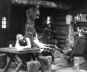
Kuleshov had moved on as well to direct his most famous film and probably his best silent, By the Law, based on Jack London’s story “The Unexpected.” Set in the Yukon during the gold rush, it involves five people who are cooperatively working a small claim and discover gold. Taking advantage of a warm autumn, they stay too long and are trapped for the winter. One of the men kills two of the others, and the heroine, Edith and her husband Hans are left to determine the fate of the killer, Dennin. Edith insists on treating him strictly according to the law. After enduring the harsh winter and a spring flood, the couple finally act as judge, jury, witnesses, and, after finding Dennin guilty, executioners.
The great literary critic and theorist Viktor Shklovsky (one of the key figures of the Russian Formalist school) adapted the short story, condensing it by eliminating the opening section of Edith’s backstory and a few scenes in which a group of Indians appear occasionally to help the prospectors. The result is a concentration on the tense drama of a three people trapped together in a tiny cabin.
In the 1924 entry, I mentioned that Kuleshov’s team emphasized biomechanical acting and that Alexandra Kokhlova was adept at eccentric acting. She delivers a bravura performance here, as Edith moves closer to a breakdown as the months go by.
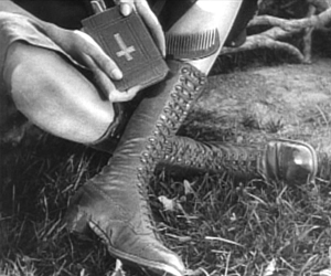
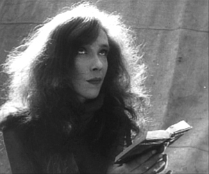
Kuleshov also puts into practice the experiments in imaginary geography that his classes had made. Although in this film he didn’t unite shots made in widely separate spaces, he did favor scenes built up of a considerable number of detail shots before finally revealing the entire space in an establishing shot. Edith, for example, though glimpsed briefly asleep early on, is introduced in a later scene by a shot of her boots and Bible, followed by a shot of her head as she read the Bible. The scene also contains close shots of the other characters before a general view of the cabin interior shows where each of them is.
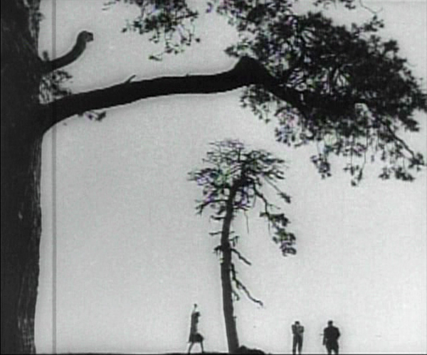
The scene of the execution includes one of the most famous images of the Monage movement, a framing with the horizon line at the bottom edge of the frame and the sky dominated by trees (see bottom). Any number of framings of tall features such as trees and telephone poles against a huge sky appeared in Montage and non-Montage films, and this device became so common as to be a trait of the Soviet cinema of the late 1920s and early 1930s.
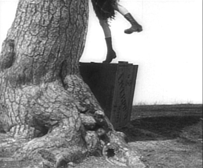
The desire to hide the actual hanging led Kuleshov to stage is behind the larger of the two trees, as Edith and Hans struggle to carry out their sentence on Dennin. This leads to some eccentric framings, such as our view only of Edith’s legs as she teeters on the box where Dennin stands, presumably adjusting the noose (see top of this section).
A beautiful print of By the Law is available on DVD from Edition-Filmmuseum.
Grigori Kozintzev and co-director Leonid Trauberg did not study with Kuleshov, but they shared a passion for eccentricity. Having started out in the theater, in 1921 both contributed to the “Manifesto for an Eccentric Theater,” a dramatic approach based on popular forms like circus and music-hall. In 1922 they founded the “Factory of the Eccentric Actor” group and two years later transformed it into FEKS, devoted to making films.
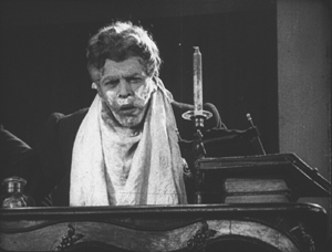
The Overcoat (also known in English as The Coat), their second feature, was based on a combination of two short stories by Gogol, an author whose grotesque creations were very much in tune with their own tastes. It tells the story of a poor, middle-aged low-level government clerk, Akaky Akakievich, who is bullied over his shabbiness, particularly his worn-out overcoat. Scrimping to buy a new one, he finally purchases a magnificent new coat and finds his status suddenly raised–until the coat is stolen.
Andrei Kostrichkin was a mere twenty-five years old when he played the fiftyish clerk, but he was highly effective and provided another model of the eccentric actor. As Akakievich he stands with bent legs and twisted torso, as if flinching away from a blow, and walks in tiny steps along perfectly straight lines through the hallways in his office building. When he applies to a Person of Consequence for help in recovering his stolen coat, the official leans over his desk to look downward, with a high-angle point-of-view framing of Akakievich appearing dwarfed by the other’s superiority.
The script of The Overcoat was adapted by another Russian Formalist critic and theorist, Yuri Tynjanov.
Unfortunately The Overcoat does not seem to be available on any form of home video.
Petit mais grand
The IMDb lists 23 directing credits for Dimitri Kirsanoff from 1923 to the year of his death, 1957. He is largely remembered, however, for one film, the 37-minute Ménilmontant, a melodrama about the travails of two sisters orphaned as children by a violent crime. Each is later seduced by a callous young man who leaves the heroine a single mother and her sister reduced to prostitution. It belongs to the French Impressionist moment. (We deal with Impressionist films in other entries: La roue, L’inhumaine, L’affiche, Coeur fidèle, The Smiling Madame Beudet, Le brasier ardent, Crainquebille, and El Dorado, as well as DVD sets of Impressionist films by the Albatros company and by director Jean Epstein.)
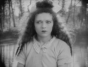
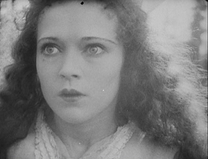
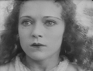
The story itself is simple and indeed might be thought clichéd were it not for two factors. First, there’s the performance of the delicately beautiful Nadia Sibirskaïa as the protagonist. There’s also the lyrical, melancholy use of the settings, initially in the countryside and later in the desolate working-class Parisian district whose name gives the film its title. The simplicity of the narrative also makes it one of the most successful of the attempts to tell a story visually, eschewing intertitles.
The film’s most famous scene is its abrupt, shocking opening. With no establishing shot, there is a series of rapid shots of details of faces, hands, a window, and an ax, during which we can barely discern that a man has committed a double murder. The spectator cannot possibly know who these people are and why the murders occur.
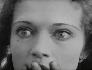
Instead of offering an explanation, the action then shifts to two little girls playing in the woods. As they return home, the camera begins to concentrate on one of them, apparently the younger, as she arrives at the murder scene and reacts in horror. Kirsanoff presents her expression in a series of five shots, linked by what David has termed axial cuts, from medium shot to extreme close-up as she gradually realizes what has happened.
There had certainly been axial cuts before this, including in Potemkin, but Kirsanoff probably went further than anyone of the era by including so many shots, by making each so short, and by moving his camera forward in such small increments. It is difficult to notice every cut, particularly the one from the third to the fourth shot, and the effect adds an unsettling quality to an already intense moment.
After this opening, a funeral scene reveals through labels on the grave that the murdered man and woman are the children’s parents. We might have suspected that the killer was a jealous husband discovering his wife with her lover. As it is, we never learn whether the crime was the result of a love triangle or the random act of a madman.
The rest of the film establishes the sisters now grown up, working in a workshop making artificial flowers and sharing a small flat in Menilmontant. The heroine’s brief romance leads to a baby, and superimpositions and other Impressionist techniques depict her despair and contemplation of suicide. Beautifully melancholy atmospheric shots of the streets of the neighborhood punctuate the action and underscore the dreariness and hopelessness that the heroine faces. The ending, though an improvement in the heroine’s lot, does little to dispel the overall grimness of the story.
Menilmontant is included in the out-of-print set “Avant-garde – Experimental cinema of the 1920s & 1930s.” It has been posted twice on YouTube in a low-rez format.
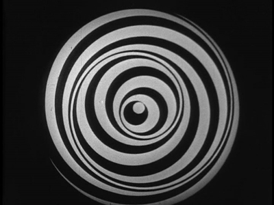
Even shorter is Anémic cinéma, the only venture into film directing by the great French Dadaist, Marcel Duchamp. It’s hard to compare a roughly seven-minute abstract film with narrative features, but this short is so innovative and influential that it’s also hard to leave it off the list.
Duchamp went through a phase of spinning artworks, including some “Rotoreliefs” that he attempted to sell as toys. These were similar to some Victorian optical toys, such as the Phenakistopscope and the bottom disks of Zoetropes. See Richard Balzer’s website for a collection of such devices, as well as “The Richard Balzer Collection” on tumblr, which contains gifs that animate some of the disks, done by Brian Duffy. Some of these resemble the spinning spirals and embedded circles that Duchamp used for his short. (See the top of this section.)
These spinning abstract circular images alternate with slowly spinning disks with sentences laid out as spirals. These involve either alliteration or puns or both. Unfortunately the English subtitles cannot render these in a way that conveys the original intent. For example, “Esquivons les ecchymoses des esquimaux aux mots exquis” becomes “Let us dodge the bruises of Eskimos in exquisite words.” The meaning is the same, and even the echo of the first syllables of “Eskimos” and “exquisite” is retained. Nevertheless, the similar syllables in two other words in the original are lost, as are the echoes of “moses,” “maux,” and “mots.” It is rather as though someone attempted to render “Peter Piper picked a peck of pickled peppers” into another language quite literally. (The Wikipedia entry includes a complete list of the sentences in French.)
Duchamp’s purpose was presumably to create an artwork with minimal means, including quasi-found objects, the disks he had made for another purpose. His idea is clearly reflected in the title, Anémic cinéma, which suggests a weakness or thinness of means. “Anémic” is also an anagram for “cinéma.”
Anémic cinéma is available in the same collection as Menilmontant, linked above. it is also available in the similarly out-of-print set, “Unseen Cinema.” There are numerous versions on YouTube, varying in quality. Some of these have been manipulated by other artists.
Lloyd and Lubitsch
Though Chaplin and Keaton might have had off-years in 1926, Harold Lloyd did not. Over the past several years, Lloyd has gradually been gaining the admiration he deserves. He used to be known largely for Safety Last (1923) and The Freshman (1925), two excellent films which, however, are not his finest. Girl Shy (1924) and The Kid Brother (1927) are better known now for the masterpieces they are. For Heaven’s Sake (directed by Sam Taylor), which clocks in at a mere 58 minutes, is just as good.
Lloyd plays a breezy millionaire, J. Harold Manners, who unintentionally helps Brother Paul found a mission in the downtown slums of Manhattan. He falls in love with Hope, the missionary’s daughter, and decides to help out around the place. By this time Lloyd was known for his spectacular chase scenes, and there are two here. Initially he puts a twist on the chase, luring a growing crowd of criminals into racing after him, ending in the mission. Gaining their respect, Harold makes the mission a happy social center.
The romance provides one of my favorite comic intertitles, leading into a love scene: “During the days that passed, just what the man with a mansion told the miss with a mission–is nobody’s business.” The love scene in turn includes a visual joke that emphasizes the rich boy – poor girl contrast.
Harold’s rich friends hear that the pair are to be married and determine to kidnap him to prevent the inappropriate match. The result is a lengthy chase through the streets of Manhattan, with the drunken thugs rescuing Harold and using a variety of means to get him back to the mission in time for the wedding–as when the drunken leader of the group demonstrates his tightrope-walking abilities on the upper railing of a double-decker bus (see above).
Two years ago, when I put Girl Shy on my list, the New Line Cinema boxed set of Lloyd films was out of print and hard to find, and the separate volumes appeared to be going out of print as well, with Volume 1 not being available at the time. The situation has changed, and the boxed set, though apparently still out of print, is now available at reasonable prices from various third-party sellers on Amazon and Barnes & Noble. The set contains a “bonus disc” with extras, including interviews and home movies. The same is true for the three individual volumes (here, here, and here). For Heaven’s Sake is in Volume 3.
Inevitably, coming directly after Lady Windermere’s Fan, probably Ernst Lubitsch’s greatest silent film, So This Is Paris does not quite live up to its predecessor. Still, it’s a very fine, clever, and funny film, and it marks Lubitsch’s last appearance in these lists until sound arrives.
The opening scene, running nearly twenty-five minutes, is as good as anything Lubitsch did in this era. Set in Paris, it’s a slow build-up of misunderstandings and deceptions involving two affluent couples in apartments across the street from each other. One couple, Maurice and Georgette Lalle, are practicing a melodramatic dance in Arabian costumes. Their marriage seems to be a rocky one. Across the street, Suzanne Giraud is reading one of the lurid “Sheik” novels that were popular at the time, involving “burning kisses” in its final scene. Put into a romantic mood by this, she looks out her window and sees the head of a man in a turban at the window opposite–Maurice relaxing after his strenuous rehearsal.
Her husband Paul arrives home, and she kisses him passionately. Apparently not used to such affectionate greetings, he is puzzled until he, too, looks out the window. By now Maurice has doffed his turban and necklaces and appears to be not only naked but also examining a piece of his anatomy.
Paul jumps to the conclusion that this sight is what caused Suzanne’s unaccustomed display of passion. He calls her to the window, and we see Maurice in depth through the two windows.
Suzanne then asks if Paul is going to stand for such a thing, and he goes to the other apartment to confront Maurice. Instead he finds Georgette, who turns out to be an ex-lover of his. She introduces him to Maurice, who is very friendly and charms Paul. The latter who returns home and claims that he has beaten Maurice and even broken his cane on him, though in fact he had simply forgotten it. Shortly thereafter Maurice visits Suzanne to return the undamaged cane and takes the occasion to flirt with her. It’s a beautifully plotted and developed farcical scene. The film is based on a French play and could easily have become stagey in its adapted form. Yet the byplay between the two apartments via the windows allows Lubitsch to avoid any such impression; the misunderstandings based on optical POV recall the racetrack scene of Lady Windermere.
The rest of the film develops the two potentially adulterous affairs, primarily with Paul secretly taking Georgette to the Artists’ Ball. Here Lubitsch uses an elaborate montage sequence to convey the wild party, with superimpositions and shots taken through prismatic lenses.
Such sequences were primarily developed in German films and were still fairly rare in American ones in 1926. Similar techniques convey Paul getting drunk on the champagne he and Georgette are awarded when they win a dance contest–the announcement of which on the radio broadcast of the ball alerts Suzanne to her husband’s presence there with another woman.
So This Is Paris is less famous than Lubitsch’s earlier American comedies primarily because it has never appeared on DVD. Marilyn Ferdinand, in a blog entry that gives a detailed description of the film, writes that Warner Bros. claims not to own the rights to the film anymore and therefore has made no effort to bring it out on home video. On the other hand, a four-minute excerpt of the dance montage sequence was included in the Unseen Cinema set (disc 3, number 18), and the credit there is “Courtesy: Warner Bros., Turner Entertainment Company.” Whatever the rights situation is, a home-video version of this film is in order. A beautiful 35mm print is owned by the Library of Congress, so there is hope.
Two German flights of fancy
I must confess that I was disappointed the first time I saw F. W. Murnau’s Faust, and I have never warmed up to it in later viewings. I am delighted at having occasion to look at it again for this 1926 list, since a recently discovered and restored print reveals that the main problem before was the poor visual quality of the print formerly in circulation.
Different local release prints survived in a number of countries, but there were basically two original versions made: the domestic negative for German release and the export negative. These were shot using two camera side-by-side on the set, as was the standard practice in much of the silent era, given the lack of an acceptable negative-duplicating stock. The primary camera contributed most of the shots to the domestic negative, though in some cases where the second camera yielded a superior take, that was used in the domestic negative. Conversely, inferior takes from the primary camera sometimes made their way into the export negative. The result, as we now know, was that both the visual quality and in many cases the editing of the scenes was markedly different in the two negatives.
The version familiar for decades originated from the export negative. Recently the domestic negative was rediscovered, and the Friedrich Wilhelm Murnau Stiftung restored the that version using the that negative, supplemented with material from a variety of other prints. The result closely approaches the original German release version, including the original decorated intertitles. The contrast in quality between this restoration and the old, familiar Faust is remarkable.
Given how dark the film is, details in the backgrounds could easily be lost. The scene in which Faust is called to help a woman dying of the plague is revealed to have dramatic staging in depth against a very dark room contrasted with the stark foreground underlighting of the woman’s haggard face. Faust enters from behind the daughter and comes forward to her, after which his movement is balanced by the daughter retreating into that same dark background.
The famous aerial journey of Mephisto and Faust from Germany to Italy (below left) always looked rather hokey, but the detail revealed in the extraordinarily extensive model makes it far more impressive. Similarly, when one can actually see the sets, visual echoes become apparent. For example, Faust first encounters Gretchen and follows her into the church, where he finds himself barred from entering by his pact with Mephisto. Later, when Gretchen has been abandoned, she laments when not permitted to enter there.
No doubt some motifs of this sort were visible in the earlier print, but their clarity here enhances both the beauty and the craft of Murnau’s film.
Faust is available in several editions on DVD and Blu-ray. DVDBeaver ran a detailed comparison among seven of these, including a selection of frame grabs. To my eye, the 2006 DVD “Masters of Cinema” version of the domestic print, released by Eureka!, looked the best. (The two-disc set also includes the export version.) The Blu-ray from the same source, released in 2014, looked slightly darker. The box for the Blu-ray also includes the DVD, however. These releases are Region 2. The film is available on Blu-ray in the USA from Kino.
Both Eureka! releases’ supplements include a booklet, a commentary track, a Tony Rayns interview, and a lengthy comparison of the domestic and export versions. One particularly striking example is drawn from the scene in which Mephisto talks with Gretchen’s brother in a beer hall, with the domestic version on the left.
While watching Faust, I kept grabbing frames, far too many to be used in this entry. They were simply too beautiful or impressive to be passed over, and they made my final selection of illustrations difficult. The only other film for which this was true this year is Lotte Reiniger’s silhouette-animated feature, The Adventures of Prince Achmed. The restored, tinted print that is currently available is even lovelier than the older black-and-white version.
Reiniger seems to have invented the use of jointed silhouette puppets, and she still is the first artist one thinks of in relation to this form of animation. She continued to practice it until the 1970s. (See the link below to a collection of many of her short films.) Her one feature film remains her most famous and is probably her masterpiece.
It involves far more than simple black figures moving against a light background. As the frame at the top of this entry shows, her characters, furnishings, and locations, all rendered in paper with scissors, were often elaborate indeed. Characters wore feathers, jewelry, fancy wigs, and other decorative elements. The hanging platform has many little tassels, and the lamps are rendered in delicate filigree. The backgrounds are not blank but have varying layers of saturation that suggest a depth effect, the equivalent of atmospheric perspective. At the left in the top image, a series of identical curtains start out a dusky orange and in three stages lighten until there is a bright, solid glow at the center.
In the frame at the left below, the same sort of shading creates the depth of a cavern, setting off the tracery of the foliage and the kiosk in which the hero finds the magic lamp. On the right, very simple shading suggests a vast and elaborate palace in the background, while Reiniger fills the foreground with many small figures, all marching out to surround the procession of the caliph.
By choosing a classical fantastic tale, Reiniger found the perfect subject matter to fit the technique that she invented. Both the subject matter and the sophistication of the animation give her films a timeless look. Her reputation remains high today as a result. One scene in Harry Potter and the Deathly Hallows Part 1, “The Tale of the Three Brothers,” was made in a style inspired by Reiniger’s work. (I discuss it here.)
A restored, tinted version of The Adventures of Princes Achmed is available from Milestone. A combination Blu-ray/DVD release of the film is available from the BFI. (I have not seen this version.) Note that these have somewhat different content. The BFI version has five Reiniger shorts from across her career along with a booklet. The Milestone version has only one of the shorts, but it includes a documentary about Reiniger. (This documentary was on the 2001 BFI release of the film on DVD but is not listed among the extras on its Blu-ray.) See also the BFI’s collection of many of her shorts, “Lotte Reiniger: The Fairy Tale Films,” which I discussed here.
[Dec 27: Thanks to Paul Taberham for pointing out that Prince Achmed also has no intertitles and gets along without them very well.]
Into the asylum
David here:
Few western viewers of 1926 saw any Japanese films, but Japanese audiences had been watching imported films for a long time. Hollywood films could easily be seen in the big cities, and The Cabinet of Dr. Caligari (released in 1922), La Roue (released in early 1926), and other films from Europe had made a strong impression on local filmmakers. One fruit of this influence was the wild Page of Madness (Kurutta ichipeiji, aka “A Crazy Page”).
Directed by Kinugasa Teinosuke and based on a story by the renowned experimental writer Kawabata Yasunari, the film bore the influence of German Expressionist and particularly French Impressionist cinema. Page of Madness set out to be a bold exercise in subjective filmmaking. But it wasn’t widely seen at the time, and wasn’t revived until 1971, when Kinugasa discovered a print in his house (reportedly, among cans of rice). Apparently the version we have is slightly edited.
A woman has been confined to a madhouse, and her husband has taken a job as a janitor there to stay in touch with her. Many of the scenes are presented as the hallucinations of the wife and other inmates, while abrupt flashbacks attached to the husband fill in the past. But this story is terribly difficult to grasp. There are no intertitles (perhaps an influence of The Last Laugh, shown in Japan earlier in 1926), and the film is a blizzard of images, choppily cut or dissolving away almost subliminally.
Viewers of the period had the advantage of a synopsis printed in the program, and there was a benshi commentator accompanying the screening to explain the action. Because we lack those aids, the film seems more cryptic than it did at the time. Even when you know the story, though, Page of Madness often surpasses its foreign counterparts in its free, unsignalled jumps from mind to mind and time to time. It remains a powerful example of narrative and stylistic experiment, from its canted framings and single-frame cutting to its frenzied camera movements and abstract planes of depth (thanks to scrims à la Foolish Wives, 1922).
For nearly fifty years it has remained a milestone, a grab-bag of advanced techniques and likely the closest Japan came to a silent avant-garde film.
Page of Madness is not commercially available on home video. It is occasionally shown on TCM, and a reasonably good print is on YouTube. Aaron Gerow’s A Page of Madness: Cinema and Modernity in 1920s Japan is an indispensable guide to Kinugasa’s eccentric masterpiece.
By the Law.


