Archive for the 'National cinemas: Germany' Category
Looking different today?
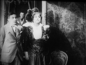
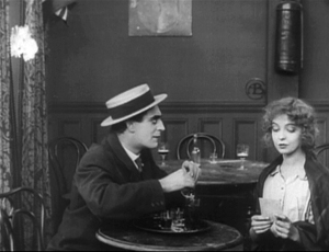
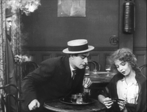
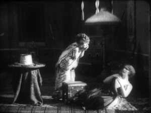
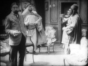
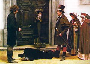
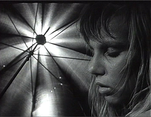
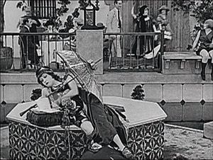
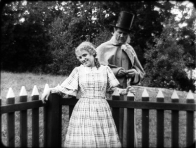
Johan (1921).
DB here:
Earlier this month Manohla Dargis wrote a New York Times article on how we watch, or should watch, films that some audiences consider slow and boring. She suggested that appreciating such films requires us to cultivate fresh ways of seeing. Her article and my interests coincide on this matter, so I wrote an entry developing some ideas about viewing strategies and skills. This piece also, happily, brought new readers to Tim Smith’s experiment in tracking viewers’ scanning of a scene in There Will Be Blood.
Today I explore another angle on the problem of how to watch movies that aren’t the normal fare. But this time what’s abnormal for us was once normal for everybody. I look at the pictorial possibilities that emerged in the 1910s. Those possibilities are of interest if we want to fully understand film history, but they offer some mysteries as well. If viewing movies involves skills, did people a century ago have the ones we have? Or did they employ different viewing habits, ones that we have to learn?
Editing, your imaginary friend
I write from my annual research trip to the Royal Film Archive of Belgium, now known as the Cinematek. For some years, I’ve been looking into feature filmmaking of the 1910s. On every visit I’ve found rich material, movies off the beaten path that give me a sense of the immense creativity of that early period. (See the bottom of this post for links.) The official classics of these years, by Chaplin and Griffith and Fairbanks and Bauer and Gance and Sjõström and Feuillade, remain remarkable, and Kristin’s latest entry makes a case that Alberto Capellani belongs among this heroic company. But you can also find extraordinary moments in ordinary movies. Even the most banal film has something to teach me about what choices faced the era’s filmmakers.
One of those teachable elements involves the ways in which directors guide our attention. We know that editing serves to shift our attention from one part of a scene to another, but so does judicious staging. This is one of the great lessons of the cinema of the 1910s. Watching films from that period convinced me that the craftsmanship of Anderson in There Will Be Blood, and of other directors reliant on long-take ensemble staging, has deep roots in filmmaking tradition. But the golden age of cinematic staging was relatively brief, and it was eclipsed by an approach based largely on editing. That approach is, essentially, still with us.
Let’s start by appreciating the technique that became most prominent. By the late 1910s, Hollywood filmmakers had more or less perfected what we’ve come to call the classic continuity editing system. The camera could penetrate the most intimate exchange, breaking it up into intelligible bits. Here, in a minor Metro film called False Evidence (1919), Madelon tries to persuade her father that she, not her boyfriend, is responsible for a crime.
After giving us father and daughter close together in profile, the camera has somehow squirmed in between them, showing each one in a tight 3/4 view. Or rather, the cutting has forced the staging to pull the characters a bit apart so that each one can have a frame to him- or herself. Spatial plausibility gives way to dramatic urgency; what we care about are clear views of their emotional responses. As long as the spatial relations remain clear, they can be just approximately consistent.
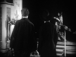
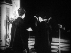
For a little more finesse, we can look–as usual–to Rio Jim. William S. Hart’s films are among the most visually elegant and ambitious of this period, and even his less-known items seldom disappoint. John Petticoats (1919) gives us “Hardwood” John Haynes, a rough-edged logger who finds he has inherited a New Orleans dressmaking shop. His comic introduction to the place, in the company of a new friend he’s made, uses editing to tease us. The two gents come in, with John bewildered by a feminine world he’s never known. They pause before a model sashaying on the stage, and when she pauses, she’s blocked by the Judge’s body.
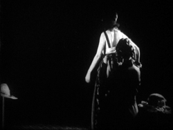
We’re left without the revelation of her appearance, but when her dresser comes forward to peel off her wrap, we cut, in effect, “through” the Judge to get a clear view of the disrobing. The blocked shot teased us, but the cut pays us off.
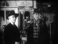
Now that the model bares a lot more than before, the biggest tease begins. How will John react? The answer is given in the next shot, a nearly 180-degree shift from the earlier framing of the men that incorporates a mirror in the background to keep the model onscreen.
Thanks to a cut, action and reaction are given in the same shot–in fact in the same zone of the frame, the center.
A pass, a pat, a squeeze
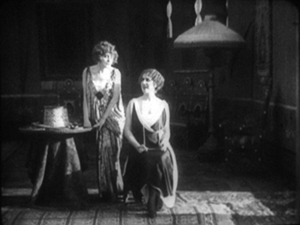
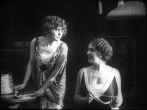
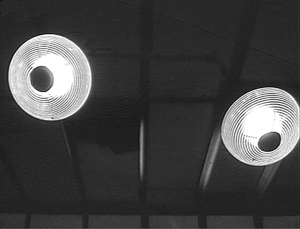
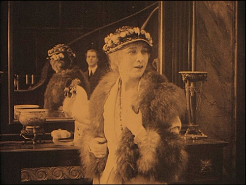
Fabiola (1918).
Many European directors were moving in the same direction as Lambert Hillyer in John Petticoats. Although they might not use as many shots or as many different angles as their American counterparts, they were confidently breaking their scenes up into closer views, often through axial cuts that take us straight into or out of the action, along the lens axis.
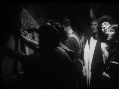
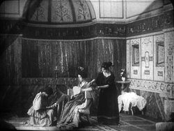
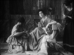
Take Enrico Guazzoni’s Fabiola (1918), henceforth known to me as Fabulosa. Normally I consider the Roman oppression of Christianity one of the least fertile topics for a good movie, but Fabiola proves me wrong. For one thing, the title names a rather unpleasant woman who barely figures in the action until the climax. For another, Guazzoni proves an adept filmmaker. I was struck by those immense sets that distinguish the Italian costume drama, the dazzling lighting (see above), and the skilful editing.
Our introduction to Fabiola comes as she sits disdainfully in her household, attended by servants. After a long shot showing off the set, an axial cut takes us closer to her.
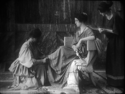
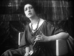
She turns as her tardy servant Sira comes in. Having stretched her elegant neck, Fabiola tips her head forward slightly, in a bob of disdain.
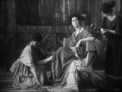
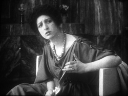
Another axial cut takes us still closer to her. And in a few frames her gesture, at once haughty and angry, is repeated. (The streak across the first image below is the splice, so this is the very first frame of the next shot.)
This, I think, is no mistake. The matches on action elsewhere in the film are quite precise, and indeed earlier Italian films have shown that directors used this device skilfully. Guazzoni wanted to stress Fabiola’s head movement, and he used the same tactic, the overlapped action match, that some Americans would use and that many Soviet directors drew on later. This slight accentuation of Fabiola’s gesture is a vivid way to introduce the character, caught in a characteristically scowling moment. Very soon, in a fit of pique she’ll jab Sira with a hatpin.
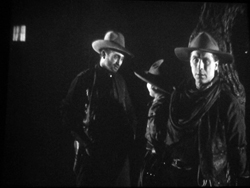
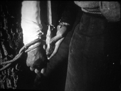
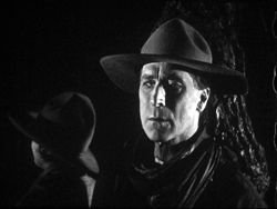
On the whole, keeping the setups close to the camera axis is the default value in Fabiola. For the Americans, though, cutting made the camera almost ubiquitous. A year after John Petticoats, O’Malley of the Mounted (1920), lets Lambert Hillyer again resort to intelligible shifts of setups. O’Malley, played by Hart, has gone undercover to track a killer. Posing as a robber, he has joined an outlaw gang, but they’ve discovered he’s betrayed them and plan to hang him at sunup. He’s lashed to a tree and guarded by his enemy, the brutal Big Judson. But Rose Lanier, who has drifted along with the gang, is going to help O’Malley escape. The cutting will show us exactly how she does it, and why.
Rose interposes herself between Big and O’Malley, chatting up the thug. A cut of about 180 degrees takes us to the opposite side of the tree and shows her slipping a knife toward O’Malley’s hand. We’re so familiar with this sort of insert that we’re likely to forget that once it was fresh.
O’Malley starts, then shifts his gaze toward Big.
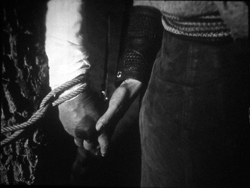
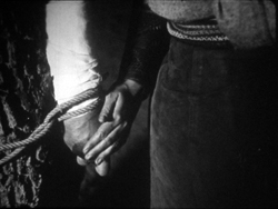
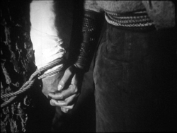
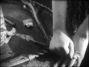
Then comes a simple, remarkable shot. Rose slips the knife to O’Malley. Then she pats his hand. Then she gives it a squeeze.
Mystery and charm of the American cinema, as Godard would say: a single cut-in of hands can give us a lot. First there’s the narrative information (I’m passing you the knife), then Rose’s expression of support (Good luck!), capped by a burst of affection (I love you). The whole thing takes less time than I’ve used to tell it. Surely this ability to invest plot-driven detail shots with heartfelt emotion helped American cinema conquer the world. I’m tempted to say that we could sum up of the power of Hollywood, in its laconic prime, with that formula: the pass, the pat, the squeeze.
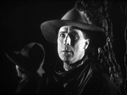
This shot is as compact in its expression as the previous one. It’s impossible to capture here all the emotions that flit across O’Malley’s face: hope of eluding death, realization that Rose loves him, anxiety that surviving will make him choose between love and duty. Rose’s brother is the killer he’s been tracking, and in a perversely honorable way O’Malley had looked forward to being hanged. That would have spared him arresting the boy. Now he must live, enforce the law, and lose the woman who has saved him.
I saw some European films that absorbed such continuity tactics quite deeply. Above all, Mauritz Stiller’s Song of the Scarlet Flower (Sangen om den Eldroda Blomman, 1919) and Johan (1921) relied heavily on analytical editing in the American fashion, including angled shot/ reverse shot. As in Fabiola, some of the discontinuous cuts have their own logic. I wish I had time to explore those Stiller films in more detail–particularly their use of turbulent rivers as dynamic plot elements, not mere landscapes. Maybe in some future entry….
Four-quadrant style
Before they adopted the analytical editing characteristic of American cinema, directors were still able to guide our attention. The so-called “tableau” style, about which I’ve waxed enthusiastic on this site before, became a rich tradition in the 1910s. Editing within the scene is minimized. (Apparently most European directors didn’t consider it a creative option in its own right until later in the decade.) The drama is carried by performance and ensemble staging. Relying on movement, acting, and composition, the director controls where we look and when we look at it
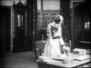
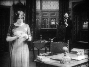
To take a straightforward example, consider the rather ordinary melodrama Le Calvaire de Mignon (Mignon’s Calvary, 1917). The scheming and dissolute Dénis de Kerouan wants to wreak misery on his brother Robert. While Robert is out of the country, Dénis hires a forger to fabricate a letter indicating that Robert has a mistress. Dénis leaves the letter on the desk for Robert’s wife to find.
Dénis has exited through the central entryway, and into the empty study comes Robert’s wife. She discovers the letter.
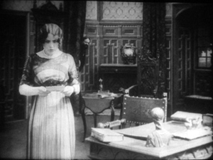
She moves to the left foreground and starts examining it. At this point Dénis’ face peeps out from behind the central curtain. The director makes it easy for us to notice him because nothing else is happening in the set, and Denis’ face is rather close to the wife’s. It’s almost as if he’s looking over her shoulder.
Once we register Dénis’ presence, the director can proceed to balance the shot. All that empty real estate on the right of the frame asks to be filled, and that’s what happens.
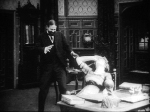
When the wife reads the damning letter, she collapses rightward into the chair, just as Dénis rushes forward to take charge of the situation.
This move exemplifies the staging technique known as the Cross, which motivates the switching of characters’ positions in the frame.
Simple as it is, this portion of the prologue of Le Calvaire de Mignon shows how, without cutting, a director can steer us to one or another zone of the shot through such cues as faces, centering, proximity to points of emphasis, and movement. Something similar happens in one, more striking moment of another fairly unexceptional movie from the period.
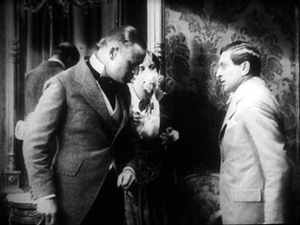
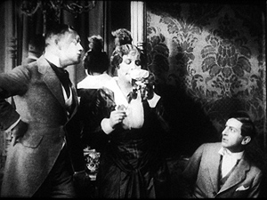
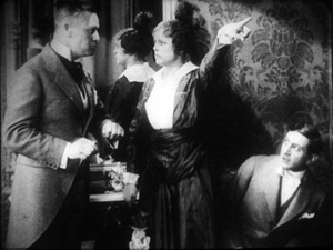
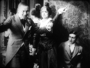
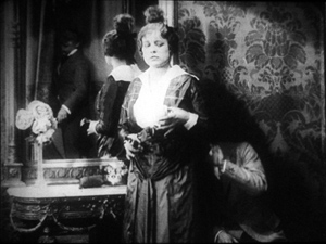
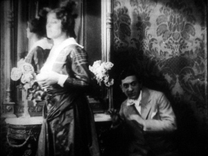
Nobody will claim Der Stoltz der Firma (The Boss of the Firm, 1914) is a masterpiece, or its director Carl Wilhelm is a master. It’s one of the many comedies in which Ernst Lubitsch starred before becoming a director. Here he’s Siegismund, a bumbling young provincial with more aspirations than abilities, who simply lucks into marrying the boss’s daughter. On the way to the happy ending, he wins the patronage of a fashion designer, Lilly, whose husband finds her flirtation with the young parvenu none too innocent.
Wilhelm’s use of the tableau approach isn’t especially dynamic in most of the film, but there’s one flashy scene. Wilhelm gets us to watch a very small, tight area of the frame and then gently swings our attention to a wider swath of action. As usual, everything depends on a sort of task-commitment on our part: Watch what’s likely to forward or enrich the ongoing narrative.
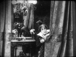
Lilly lures Siegismund into a changing room, with the composition showing him reflected in a mirror behind her. This sets up an item of setting that will be central to the scene.
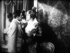
Once inside, he coyly presents her with a flower and they draw close together. Since we tend to concentrate on faces, the small area encompassing their two profiles is likely to draw our attention. Nonetheless, the shot is notably unbalanced, as if anticipating something coming in from the right side.
Abruptly Siegismund and Lilly draw apart, and the space between them, in the mirror, is filled by the face of Lilly’s husband, coming through the curtain.
I’d bet that a Tim Smith experiment would find that nearly every spectator is already watching this small zone in the upper left quadrant of the shot. Faces, especially frontally positioned ones, command our notice, and thanks to the mirror we here have three of them. Moreover, movement is an attention-getter too, and all three faces are in motion. Mr. Maas’s face, in fact, gets notably bigger and clearer. His wrathful expression is another reason to watch him.
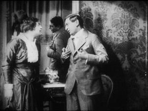
The husband’s body enters to fill the frame, then presses into the center of the shot, blotting out Lilly as he faces down Siegismund.
Now the director controls the speed of our gaze quite precisely. Maas slowly rotates, forcing Siegismund to swing from left to right, as if he were attached to the bigger man by a rod. This yields, again, that nice sense of refreshing the frame that we always get from a Cross.
Siegismund collapses into the lower right of the frame, flinching from the fight that’s about to start. Lilly soon shoves aside her husband’s chastisement and melodramatically tells him to leave. “We’re divorcing!” the following intertitle says.
Mr. Maas takes it in stride, shrugging and spreading his arms. He leaves, and thanks to the helpful mirror we can see him chortling as he glances back and passes through the curtain.
If we hadn’t already noticed Siegismund cowering behind Lilly in the lower right quadrant, we will now. Lilly angrily flounces to our left (the Cross again). Siegismund rises to explain he hadn’t meant to cause a rift in the marriage.
We’re back to something like the initial setup, but now with Siegismund centered, the couple further apart, and a less unbalanced frame. The drama, which now consists of Lilly inviting him to tea tomorrow, can proceed from here.
A different way of seeing?
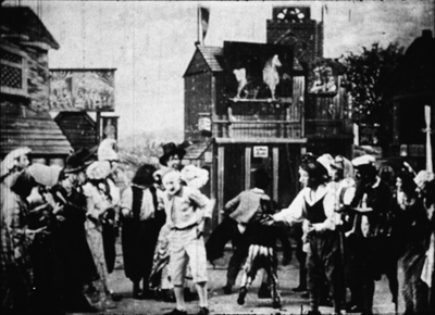
Tom Tom the Piper’s Son (1905).
We’ve become used to editing-driven storytelling, and I’m convinced that we can learn to notice the staging niceties of the tableau alternative. But what if early filmmakers explored some other ways of looking that are far more unfamiliar to us today?
Noël Burch, in his 1990 book Life to Those Shadows, argued that in the first dozen years or so of cinema, movies solicited viewing skills that we lack today. He suggested that early filmmakers often refused to center figures and crammed their frames with so much activity that to our eyes the shots look confused and disorganized. In Tom, Tom, the Piper’s Son (1905), Burch notes, the bustle of the fair, the reliance on an extreme long shot, and the absence of any cutting make the central event, Tom’s swiping of the pig, difficult to catch. In the frame surmounting this section, Tom is making off with the pig in an area just right of center, but the antics of the clown and the response of the crowd may well distract us from the main action.
The result, says Burch, is a mode of filmmaking that demanded
a topographical reading by the spectator, a reading that could gather signs from all corners of the screen in their quasi-simultaneity, often without very clear or distinctive indices immediately appearing to hierarchise them, to bring to the fore “what counts,” to relegate to the background “what doesn’t count” (p. 154).
Later developments linearized this field of competing attractions, creating a smooth narrative flow “harnessing the spectator’s eye.” Among these developments were the presence of a lecturer at many screenings (telling people what to watch) and, of course, the growth of the continuity editing system. But Burch suggests that the “primitive mode” hung on until about 1914.
A famous example is a shot from Griffith’s Musketeers of Pig Alley (1912). The gangster has lured the Little Lady (Lillian Gish) into a back room and distracts her with a photograph while he tries to dope her drink, in a precursor of date-rape drugging. But the Snapper Kid, another gangster, has been keeping an eye on her and follows. As the gangster starts to pour the drug out, the Kid’s entry is presaged by a whiff of cigarette smoke.
At the crucial moment, we have three things to notice: the Little Lady’s obliviousness, the gangster’s pouring the drug, and the full entrance of the Snapper Kid.
Today’s director would likely resort to editing that shows the doping, then the Kid arriving, then the doping again, and leaving us to infer a vague sense that they’re happening at the same time. Griffith’s choice gives us genuine simultaneity, but at a cost. Two cues compete for our attention: central composition for the drink, major motion on the edge for the Kid’s entry. In my experience, viewers tend to notice the appearance of the Kid, but to miss the business with the drink. (Another passage for Tim Smith to test!) By today’s standards, Griffith has failed as a director, but Burch’s view suggests that 1912 viewers, more sensitive to “all-over” composition, could have registered both actions, perhaps by rapidly scanning back and forth.
During my trip I found a fascinating example of this issue, as well as an apt counterexample. Both involve daggers.
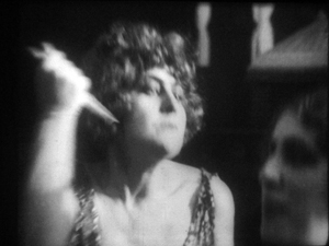
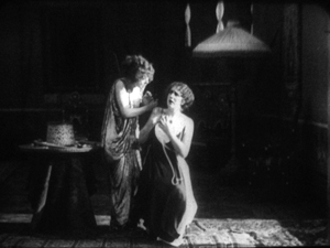
In Maman Poupée (1919), a remarkable Italian film directed by Carmine Gallone, a devoted, somewhat infantile wife learns of her husband’s affair with a society woman. Susetta confronts the mistress and begs her to break off the affair. The woman laughs in her face. What happens next is given in several shots, mostly through axial cuts.
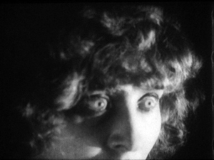
The linear editing, as Burch indicates, lays everything out for us step by step. The close-ups accentuate what is important at each moment: Susetta seizing the dagger, stabbing her rival, and–in a remarkably modern-looking extreme close-up–registering her horror at what she has done.
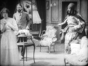
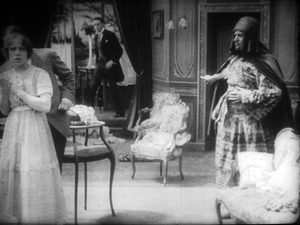
Two years before, Marcel Simon, the (Belgian!) director of Calvaire de Mignon, handled a similar situation rather differently. The diabolical Dénis, whom we met earlier, has succeeded in destroying his brother’s life. It remains only for him to force Robert’s niece Mignon to marry the Algerian Emir Kalid. Kalid is at first humble, beseeching Mignon to become his bride, but then he gets rough. We might note already that Mignon, while fairly near the camera, hovers close to the left frame edge.
In their tussle, Mignon snatches something from Kalid’s waistband and flings him far away to the right.
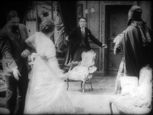
What’s up? Mignon has grabbed the Emir’s dagger and stands poised with it pressed to her heart. But we haven’t been able to see that dagger very clearly (no cut-in close-up here, as in Maman Poupée) and she’s returned to her position far off-center. It’s likely that a viewer today wouldn’t understand that she’s holding the men at bay by threatening suicide. Would a 1917 viewer be as uncertain? Would the situation, plus her posture and the men’s hesitation, be enough to get the point across?
Moreover, this moment goes by very quickly. Scarcely has Mignon struck her pose when her true love, René, bursts in behind her–frontal, fairly centered, and moving fast. Meanwhile, Dénis is sneaking up on her, hugging the left frame. Mignon makes a break for René, dropping the still almost indiscernible dagger.
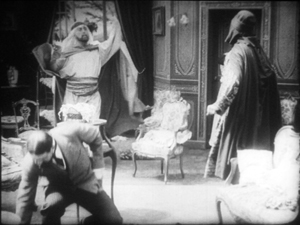
While Mignon and Rene embrace in the right rear doorway, blocked from our view by Kalid, Dénis stoops over. It’s a timely adjustment, giving us full view of the benevolent Le Maire sweeping into the room.
As the two men confront one another–the climax of the scene–director Simon has the effrontery to let Dénis steal the show. He picks up the dagger, which now can be seen more or less plainly, weighs it in his hand, and looks out for a brief, pondering moment.
We seem to have a late example of the Snapper Kid Effect, in which important actions compete for our attention. Is it clumsy direction to perch Mignon on the frame edge as René rushes in, and to let Dénis recover the dagger while we’re supposed to concentrate on the face-off between the two powerful men? Or would audiences have tracked all the strands of action and enjoyed their simultaneity?
On this site and elsewhere, I’ve assumed that directors in the 1910s structured their compositions for what Charles Barr calls “gradation of emphasis,” a fluid pattern of primary and secondary points of attention. I’ve argued as well that Burch exaggerates the decentered, nonlinear compositions of even the earliest years. Many of the films staged by Lumière cameramen are designed cogently, and so are many films from the 1900s. (Tom, Tom might be the exception rather than the norm.) Yet every so often, you get a later case, like Musketeers of Pig Alley or Le Calvaire de Mignon, that suggests that some viewers might have been more adept at tracking simultaneous events than we are.
A still broader question remains. Let’s assume that people were able to follow and enjoy films in the tableau style, even when that style pushed toward illegibility. What enabled people to adapt, and so quickly, to continuity-based movies? Some scholars and filmmakers argue that continuity editing achieved its power and worldwide acceptance because it mimics our natural mode of perception. At any moment, we’re concentrating on just a small portion of our surroundings, and this is like what editing does for us in a scene. On the other side, Burch and others would argue that continuity filmmaking is only one style among others, with no special purchase on our normal proclivities. On this view, classical continuity’s apparent naturalness hides all the artifice that goes into it, and this concealment makes its work somewhat insidious. I’ve offered some thoughts on this problem elsewhere, but I bet I tackle it again on this site some time.
In any case, we need to study films that seem odd or difficult, whether they’re recent or from the distant past. We’re guaranteed to find some striking and unpredictable things that provoke us into thinking. That’s one of the pleasures of exploring the history of film as an art.
For earlier studies of the tableau style on this site, see this entry on Bauer, this one on 1913 films, this one on Feuillade, and this one on Danish classics. This entry discusses the emergence of Hollywood-style continuity, and this one explores the exemplary editing in William S. Hart films. I go into more detail in two books, On the History of Film Style (chapters four and six) and Figures Traced in Light (chapter two) and in the essay, “Convention, Construction, and Cinematic Vision” in Poetics of Cinema. The last-named piece tries to stake out a middle position on the “naturalness” of continuity editing. Kristin has analyzed Alberto Capellani’s films as instances of the tableau trend, last year here and just last week here. She also weighs in on the debate about whether viewers of his time were better prepared to grasp the action than we are. More generally, Capellani’s career exemplifies the major and swift stylistic changes of the 1910s. When he went to America, he became pretty adept at the emerging continuity style, as the Nazimova vehicle The Red Lantern (1919) indicates. Of course that’s got some striking single images too.
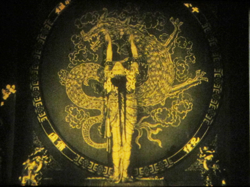
The Red Lantern (1919).
More riches from Bologna
We’re still catching up with last week’s generous Cinema Ritrovato in Bologna, the world’s premiere festival of restored and rediscovered films from all eras.
DB here:
O Segredo do corcunda (The Hunchback’s Secret, 1924) was more than a curiosity. Directed by the Italian Alberto Traversa, it was the first Brazilian feature screened abroad. It also has a documentary bent in that it shows a bit of what coffee farming was like in that era. The plot traces how the budding romance between a poor boy and the plantation owner’s daughter is blocked by the overseer Pedro, who actually killed the boy’s father.
The film illustrates penetration of Hollywood filming technique around the world. The linear plot includes a flashback explaining key motivation, a romantic subplot with helper characters, and a last-minute rescue built out of parallel editing. Scenes are filmed and cut according to continuity principles, with eyeline matches and angled changes of setup. There is even a split-screen delirium sequence.
Yet the film was out of step with Hollywood in one respect: the proportion of titles, especially dialogue titles. O Segredo do Corcunda has a lot of intertitles; they make up 22% of all its 518 or so shots. Somewhat similar proportions can be found in the mid-1920s in Hollywood, as Upstream and Cradle Snatchers indicate. But what’s different is the proportion of dialogue titles to expository ones. Most Hollywood films of the period have a very small proportion of expository titles, usually no more than 15% of all titles, and often much less. Fazil, discussed in an earlier entry, has 118 dialogue titles and only seven expository ones. But in O Segredo the 65 dialogue titles comprise 57% of all titles, leaving the 49 dialogue titles to make up the difference.
Why does this matter? In The Classical Hollywood Cinema, I argued that American generally tend to favor methods that let the story seem to tell itself. Although an early silent feature might have many expository titles, in the late 1910s and the early 1920s, films began minimizing expository titles and letting dialogue carry the action. By the 1920s a US film would have relatively few expository titles. The pattern is visible across a film as well, with expository titles most common in the opening scenes but diminishing as the plot proceeds. In Segredo, not only do expository titles do more work, they’re spread out pretty evenly across the film. An external narrational authority is there from start to finish.
I suspect that the method of fading external authority is an identifying mark of American silent film and is rarer in other cinematic traditions. If that hunch is right, we can ask: Why did other countries persist in using expository titles so much? Matters for further research!
Polustanok (A Small Station).
Boris Barnet started out as one of Lev Kuleshov’s circle, and he became a well-established director. Not as famous as the Big Three (Eisenstein, Pudovkin, Dovzhenko) or even Kuleshov, Barnet directed charming comedies like The Girl with the Hat Box (1927) and The House on Trubnoi Square (1928) and heartfelt dramas warmed by music, such as By the Bluest of Seas (1935). But many of his later films are unknown to me. I couldn’t catch all the titles in the Barnet retrospective, but the two features and one short I saw convinced me of his gifts.
Those gifts come off as gentle and genial in the wartime feature A Good Lad (Slavny Maly, 1942). A French pilot’s plane is downed in a Russian forest, where a resistance group is hiding out and forming its own little community. Living under the imminent threat of discovery doesn’t forestall songs, romantic affairs, and mistakes born of the language gap. (“I love you.” “I don’t understand.” “I don’t understand.”) Somber notes are struck when the village poet strides along singing patriotic tunes set to Borodin’s melodies, and soon the German soldiers are finding some partisans to threaten. With the villagers’ help the plane is repaired and soars into the sky to engage the enemy. The film seems to take place in an otherworldly realm, floating between an idyll and a battlefront drama.
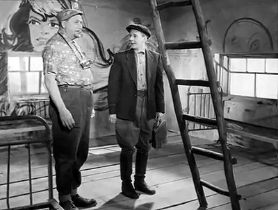
Twenty years later Barnet could indulge in a more relaxed pastoral. Polustanok (1963) is variously known as Whistle Stop or A Small Station. A Moscow scientist goes on a painting vacation to the countryside. He settles into a collective farm where many painters have come before and winds up in a shed that is underfurnished (the chickens have to be shooed out) and overdecorated (the walls are covered with graphic inspirations). With something of the episodic structure of M. Hulot’s Holiday (though without its rigorous underlying timetable, at least to my eye), A Small Station rings variations on the fish-out-of-water situation of Pavel Pavlovich. He makes friends with a local delinquent, the party man, and cute girls. He even gets some support from the grumpy farm lady who has been painted many times and in many styles, some surprisingly unofficial in those Krushchev years. After Pavel sets painting aside, he and the delinquent build a brick stove for his shed. He signs it as if it were a work of art. He can return to Moscow reinvigorated, and as so often happens in films like this (Local Hero comes to mind), the departure is bittersweet.
Barnet’s light touch was nowhere in evidence in the long-unavailable short Priceless Head (A Bestsenaya golova, 1942). On every corner of an occupied Polish city, the Nazis have mounted a reward poster for a wanted partisan. He realizes he’s trapped, and meeting a penniless woman unable to feed her sick child, he offers to let her turn him in. This impossible choice is rendered in precisely controlled drama, with not a wasted shot or false note. Priceless Head shows that Barnet was an outstanding dramatic director, as well as Soviet cinema’s most unassuming lyricist.
Underground New York.
What would a trip to Bologna be without a foray into the 1910s? Kristin will have a lot to say about the biggest discovery, the consistent excellence of Alberto Capellani, so I’ll contribute a mite on the things I enjoyed. Of course I tracked the Feuillades. Roman Orgy (1911) was fairly tame, even allowing for a climax of Christians crunched by lions in the arena. Bébé est neurasthénique (1911) was shamelessly silly, with the little rascal pulling dishes off the table and then escaping punishment by feigning illness. His gift for rolling his eyes back into his head proved to be as funny on the tenth instance as on the first. But the most peculiar Feuillade entry was a sort of satiric PR response to Les Vampires. Lagourdette Gentleman Cambrioleur (1916) shows Musidora, no longer Irma Vep, absorbed in reading the novelization of Les Vampires. Marcel Levesque decides to woo her by pretending to be a debonair thief, so he convinces his valet and cook to pose as wealthy opera patrons. He’ll then display his skills by robbing them in front of Musidora. The two-reeler accepts, in a mocking spirit, the charge from bluenoses that sensational stuff on the screen only encourages crime.
Lagourdette has its nice points, notably its tendency to supply very large close-ups of its principals. (Who knew that Musidora had freckles?) This technique, almost absent from Feuillade’s features of the period, may have been an adaptation to the star-driven nature of the product. As Annette Förster noted in her introduction, the film involved a sort of product placement, and Gaumont’s stars, no less than its literary spinoffs, were branded items. The movie is minor Feuillade but significant in showing that as early as 1916, filmmakers were seeking synergy.
Mauritz Stiller began directing in 1912, and through 1914 he turned out some 20 films. All have been assumed lost, but one surfaced in Poland a few years ago. It was restored in 2011 by the Swedish Film Institute, so once more Ritrovato hosted a “second world premiere.” Gränsfolken (People of the Border aka The Border Feud, 1913) is derived from a Zola novel. A boy and a girl fall in love, but their families live on opposite sides of a border. For the girl’s father, loyalty to country comes before all else, and so he tries to block the marriage. Nonetheless the couple unite, but they face a dilemma when the two countries plunge into war. Will the young man fight for his old homeland or his new one? And will his ferocious brother kill him as a traitor?
Stiller had mastered the tableau style of the 1910s. Although nothing in the film displays Victor Sjöström’s virtuosity in staging, Stiller gets a lot of mileage out of the two families’ densely furnished parlors. Every inch of the frame is used at some time or another; a figure lying on a tall bed can roll into view in the upper left corner of the shot. The exteriors are picturesque and often framed geometrically. I need to see Gränsfolken again to do justice to its visuals, but the fairly restrained playing and the emotional intensity of the situation prefigure what would become signature elements in Stiller’s style in work like the Thomas Graal comedies and of course Herr Arne’s Treasure (1919).
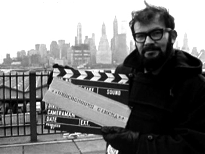
Jumping far ahead to the 1960s, it was a pleasure to see Gideon Bachmann’s Underground New York. Shot in 1967, it treats protests against the Vietnam War as of a piece with the avant-garde film scene. Shirley Clarke, Jonas Mekas, the Kuchars, Bruce Conner, and other legendary figures are captured in quick, telling portraits. Andy Warhol confides that acting in his film involves not performance but “faking it.” There are many lively moments—Conner dancing in pegged pants, Mekas tearing up company checkbooks—and enough nudity to suggest that new filmmaking and political protest were tied to erotic liberation.
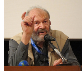 Bachmann, dynamic and articulate at 84, offered many thoughts on the film and how he wound up making it. A cosmopolitan intellectual, he began producing an interview show for WBAI radio, a major initiative in American film culture. His talks with Fellini, Tarkovsky, and others proceed from his conviction that “The person is more important than the film.” By that he means that you never really make the film you have in your head—you get at best 80%–and you end up lying about your mistakes. But the person has an achieved identity. “My life’s work is to meet the people behind the camera.”
Over eight hundred hours of those meetings have been preserved in Bachmann’s audio archive, Vox Humana—The Voice Bank. The model for Bachmann has always been not the interview, with its predictable questions and stale answers, but the conversation, “just friends talking.” Bachmann, a straightforward and serious man, was forty when he made Underground New York, and he retains the mature lucidity on display in his comments in that film—and in his film criticism, which I remember reading with pleasure in Film Quarterly in the 1960s. We’re likely to get an earful of his archive, for Criterion has already signed up the North American rights to the Vox Humana collection.
KT here:
Given the great abundance of films at this year’s festival—some might say an overabundance—I singled out out three threads to concentrate on. I resolutely ignored the others unless I could somehow fit a film in here and there. Naturally I chose the second part of the Albert Capellani retrospective that began last year; I wrote about the 2010 season here and will do a follow-up soon. I also chose the 1911 “Cento Anni Fa” programs, since, as usual, the festival presented films from exactly one hundred years ago. Not surprisingly, the most interesting among these were by Feuillade, which David covers above, and Capellani. Finally, since I have a particular interest in Weimar cinema, I stuck with the “Conrad Veidt, From Caligari to Casablanca” retrospective.
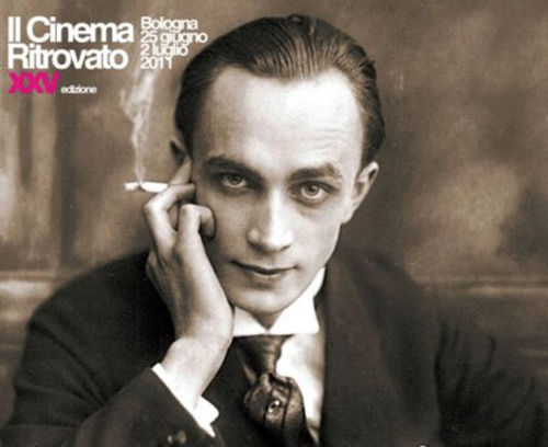
The title refers to what are probably Veidt’s two most famous roles, as the somnambulist Cesare in Das Cabinet des Dr. Caligari (1920) and his final performance, as the Nazi Major Strasser, in Casablanca (1942). But presumably on the assumption that just about everyone knows these two films well, Il Cinema Ritrovato didn’t show either one. Instead, the program successfully assembled a group of lesser-known Veidt performances. Despite the fact that I’ve seen a lot of Veidt’s films from the 1910s and 1920s, almost all the items on offer were new to me. The selection seemed designed to display the considerable range of an actor often identified with villainous roles, like his portrayals of Nazis in the 1940s, or downright demonic, like Ivan the Terrible in Waxworks.
Almost none of the films in the program were newly discovered or restored. Most were drawn from existing prints held by various archives. The Wandering Jew, for example, was a beautiful print from the National Film and Television Archive, but it was full of splices, often with whole lines of dialogue missing. The exception was The Thief of Bagdad, a newly restored version shown as one of the evening screenings in the Piazza Maggiore. Not having the stamina that we once had for nearly round-the-clock film viewing, David and I missed all of those. I also passed up the familiar Waxworks (1924, Paul Leni), which I gather was shown in the same dark, indistinct version that has been circulating for years. It’s a film ripe for restoration, but perhaps no better material survives. That would be a pity, since it’s the one film that three of the main Expressionist actors, Veidt, Werner Krauss, and Emil Jannings appeared in together. Leni is also an interesting director, as well as a set designer; perhaps a retrospective of his largely unknown body of work could be arranged someday.
Apart from these, the program pulled together an admirable selection of films. The earliest, Dida Ibsens Geschichte (“Dida Ibsen’s Story,” 1918, Richard Oswald), was a sequel to the original version of Das Tagebuch einer Verlornenen, later remade in 1929 by G. W. Pabst with Louise Brooks. Veidt features relatively little in Dida Ibsen, playing a rich man who takes Dida as his mistress. The film is stolen by Werner Krauss, however, playing a highly eccentric man who forces Dida to marry him and then terrorizes her and their little daughter. Their home is crammed with what appear to be the exotic souvenirs of the husband’s adventures, including Asian furnishings and curios, as well as a parrot, crocodile, and lively python. Krauss carried the latter curled around his body much of the time. Indeed, where else could one see two snake-carrying villains in a single week? Three days later I watched Burl Ives sporting a cottonmouth moccasin in Nicholas Ray’s Wind across the Everglades, a film from the color series that I managed to fit into my schedule.
Veidt’s demonic roles are well represented here not only by Waxworks but also by the 1922 historical epic Lucrezia Borgia (also directed by the prolific Richard Oswald). I had expected the latter to be the usual stodgy historical drama, but it was livelier and more enjoyable than I had expected. Veidt plays the ruthless Cesare Borzia, lusting after his sister Lucrezia and scheming against her repeatedly until he leads a suicidal attack on the fort where her husband is defending her. The fort itself is an immense, lumpy set of the kind common in German epics of the 1920s, That, along with the huge armies of extras, suggests that this was one of the biggest-budget films prior to Metropolis.
Veidt was more versatile than such roles would suggest, however. He often played intense, suffering young men, as in one of F. W. Murnau’s earliest surviving films, Die Gang in der Nacht (1920, not, as in the catalogue, 1922). Veidt plays a supporting role as a mysterious, spiritual young painter who has been blinded. His more cheerful side was in evidence in the wonderful musical The Congress Dances (19331, Eric Charell); there as the confidently scheming Metternich he smilingly relishes eavesdropping on officials and politicians and reading their sealed letters with a contraption involving a bright lamp and magnifying lenses. He plays a Prussian military hero in Die letzte Kompagnie (1930, Kurt—later Curtis—Bernhardt), an early talkie shown in what appeared to be an English-language version, part dubbed, part redone with the actors speaking English.
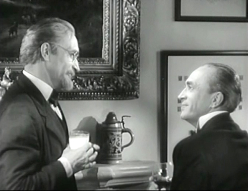
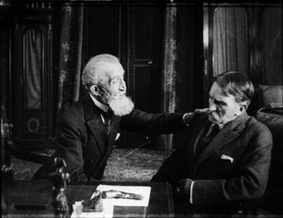
Veidt’s ability to play both sympathetic and dastardly characters was shown off in the final two offerings, scheduled back to back, in both of which he plays diametrically opposed brothers: Die Brüder Schellenberg (1926, Karl Grune) and Nazi Agent (1942, Jules Dassin). Seeing the two films juxtaposed was odd. In each one, the evil brother is played by Veidt as he usually looked, with dark hair slicked back from his face, while the virtuous brother is gray-haired, reserved, with a little goatee (below). One has to suspect that Dassin saw the earlier film, and in fact Die Brüder Schellenberg was screened at the festival in an American print entitled Two Brothers.
The Mosfilm site offers some Barnet titles for downloading, without subtitles and for a fee. The short list includes A Small Station. The opening twelve minutes, with subtitles, can be found on YouTube. A Good Lad is available here, for free, without subtitles.
For a lovingly compiled fan site, see The Conrad Veidt Society, but beware the Wikipedia entry.
[Thanks to Armin Jäger for correcting my mistake on the date for The Congress Dances.]
Conrad Veidt and Conrad Veidt in Nazi Agent.
Venues and visions
Vitrine outside future quarters of the Film Society of Lincoln Center (detail).
DB here:
During our month in NYC, we didn’t visit only art museums (although KT was at the Met a great deal). We also, no surprise, hit some of the city’s premiere movie spots. The places were often as impressive as the films, and all deserve the support of cinephiles both local and visiting. Herewith, a recap of our visits.
Fun things happen on your way through the Forum
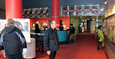
Mike Maggiore, in the lobby of Film Forum.
Film Forum, running since 1970, has established itself as an outstanding venue for new releases and classics. It has done heroic work over the years. I stopped by to see my old Wisconsin friend Mike Maggiore, one of FF’s programmers, and met his colleagues, including Karen Cooper, a legend in US film culture. They had just recently had a remarkable triple-night string of visitors: Scorsese introducing his new documentary Public Speaking, Jerry Schatzberg with Scarecrow, and Paul Schrader with a fresh print of Diary of a Country Priest. The current FF program, running on three screens, is here and it’s very rich.
Uncle Boonmee will have hit FF by the time you read this. Chris Ware’s gorgeous poster decorates the Forum lobby.
The gem of Astoria
Under MoMI projection, Rachael Rakes (Assistant Film Curator), David Schwartz (Chief Curator), KT, Ethan de Seife (Professor, Hofstra).
The refurbished Museum of the Moving Image in Astoria is a thing of great beauty. Family-friendly, with lots of hands-on kid activities, it also offers a bounty to the cinephile.
For one thing, it has a superb screening theatre. We sampled it when MoMI screened a pretty print of King Hu’s The Valiant Ones (1975). Kristin and I were happy to see our old favorite again.
The same hall gave us a restoration of Manoel de Oliveira’s Doomed Love (1978). The movie, 4 ½ hours long, was shot in 16mm for television. It frankly acknowledges its novelistic source by including stretches of letters and florid declamation (“I will be dead to all men, except you, Father!”), as well as a plot turning on forbidden love and oppressive social relations. This is a world of parlors, convents, trusty servants, candlelit rooms, barred windows, and lovers who actually waste away. The title could apply to virtually every character, down to the maidservant who adores our protagonist and vows, “When I see I am not needed, I will end my life.” The affair draws others into its downward spiral, leaving the hero plenty of time to reflect on his misery and the pain he has inflicted on others.
The plot is quite engrossing in the manner of a triple-decker novel. That makes it all the more surprising that we get no Viscontian spectacle or even the plush upholstery of a Masterpiece Theatre episode. The presentation is rather dry and detached. I wondered if Ruiz’s recent Mysteries of Lisbon, drawn from another novel by Camilo Castelo Branco, was in effect a reply to Oliveira’s film. By comparison with Ruiz’s sparkling compositions and glissando flashbacks, Doomed Love looks reticent and austere.
The austerity is heightened by a self-conscious stylization. The music is aggressively modern, and the lengthy takes (the average shot runs about a minute) are often shot with the low, straight-on camera reminiscent of early cinema.The film begins with a partial view of a door opening, inviting us into the story world, but obliquely. The film closes with a hand lifting a bundle of love letters from the sea and a voice-over (Oliveira’s) explaining how the novel came to be written. The images provide as overt a marking of a narrative’s beginning and its end as you could ask for, and one completely in keeping with the film’s balance between respect for artifice and its concern to let compromised passions leak through.
MoMI also hosts a splendid exhibition of media technology. One floor is a wonderland of cameras, sound rigs, printers, and projectors of all sorts, from film to TV and beyond. One favorite among many: A Mitchell VistaVision camera from 1954. It’s a funny-looking thing, but it took very crisp pictures. The horizontal film transport allowed larger and sharper images than the vertically-run formats that were normal for 35mm.
There are also displays devoted to screenplays, make-up, hairdressing, and special effects. I was especially taken with the finely detailed miniature for the Tyrell corporation building in Blade Runner.
In all, MoMI deserves all the praise it has gotten after its reopening. Rochelle Slovin, the founding director of the museum, started in 1981 and is retiring this week. She can be proud of what she and her colleagues have accomplished.
Jaywalking down Broadway
Wundkanal (Thomas Harlan, 1984).
Then there’s Lincoln Center, another long-time shrine of cinephilia. Like MoMI, the Film Society is in the process of building. The new complex will house theatres, a café, and a flexible lobby space. It’s scheduled to open in late spring.
The Film Society’s František Vlácil retrospective early in our stay brought this little-known filmmaker to my attention. I had seen only his best-known item, Marketa Lazarova (1967), and that quite a while back. So I was happy to catch his charming early short, Glass Skies (1958), and three features.
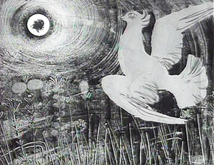
Vlácil mastered both filmic poetry and prose. The White Dove (1960) is a simple, lyrical story of two young people who never meet: a girl living in a beachside town and a wheelchair-bound boy in the city. Alternating sequences show them brought together by the homing pigeon that the girl sends out. The boy in a moment of thoughtless cruelty shoots the pigeon with his air rifle. Soon, with the help of an artist living in the same apartment house, he nurses the bird back to health. The film is richly shot in crisp, wide-angle black-and-white, and Vlácil exploits eyeballish imagery to create links between the girl’s seaside milieu and the artist’s Chagall-like paintings.
Like most filmmakers moving from the 1960s to the 1970s and from black and white to color, Vlácil recalibrated his visual design. Smoke in the Potato Fields (1976) gets your attention from the start with its disconcerting cutting during an airport departure. Laconic and elliptical, shot with long lenses and long takes, it tells an understated story of a middle-aged doctor moving to a small-town clinic. We get a cross-section of the townsfolk, from ambulance driver and gravedigger to censorious nurse and an unhappy married couple. The central drama concerns the doctor’s care for a tomboyish girl who gets pregnant and considers an abortion.
Shadows of a Hot Summer (1977), set in 1947 and shortly before the Communist takeover of the Ukraine, is more conventionally gripping. A farm family is held prisoner by rapacious resistance fighters. The taciturn father has no allies among the locals, who seem to resent his prosperity, and he dares not call attention to his plight. As in a Boetticher film, the hero plays his hand judiciously, mostly passive but carefully picking the battles he can win. The final sequence, precipitated when the marauders find him hoarding shotgun shells, is a taut, suspenseful exercise in action cinema. Shadows of a Hot Summer has daring stretches of silence and an unsettling score, along with discreet zoom shots typical of the period worldwide. These installments in the Vlácil retrospective show that we nonspecialists still probably underestimate the range of artistry that could be achieved in the apparently inhospitable atmosphere of Communist Eastern Europe.
 Film Comment Selects brought us a host of strong items, of which I caught four. I had missed Jia Zhangke’s I Wish I Knew (2010) at Vancouver, so I was happy to catch up with it. It seems to me a moving but minor effort in his career, lacking the bolder organization of the comparable Useless (2007; the latter in our blog here) and 24 City (2008). I didn’t think that the figure of the wandering woman Zhao Tao, punctuating people’s recollections of life in Shanghai, developed very much. Still, I was struck by how much Jia’s interviewees were able to say about the effects of the Cultural Revolution on their lives, and there is an unforgettable account by a woman of her father’s execution at the hands of the KMT.
I’m a big fan (at a distance) of the Chauvet caves and their Ice Age imagery, so Herzog’s Cave of Forgotten Dreams (2010), a 3D tour of the site, was right up my alley. The film turned out to be a strong argument for 3D (as Kristin anticipated), since it lacked that sense of cardboard-cutout planes you usually get and really brought out volumes. The tigers, bison, and other wondrous creatures seemed to bulge and ripple across the walls.
The biggest revelation the Film Comment program held for me was the double bill of Thomas Harlan’s Wundkanal (Gunwound, 1984) and Robert Kramer’s Notre Nazii (Our Nazi, 1984). Wundkanal was made by Thomas Harlan as part of his crusade to expose the bad faith of postwar Germany, where many former Nazis held positions of power. Harlan’s father was the Nazi filmmaker Veit Harlan, and as Kent Jones pointed out in his illuminating introduction, the son seems to have taken upon himself the burden of guilt that his father should have felt.
Wundkanal proposes that a terrorist gang has kidnapped the respectable citizen Dr. Seibert, interrogated him about his murderous past, recorded the sessions on videotape, and eventually staged some of their own suicides as part of the exercise. Dr. S. is played by Alfred Filbert–himself a Nazi let out of prison for medical reasons. The whole production, then, becomes both a vision of Germany’s blindness to history and a trap for a man whom Thomas Harlan suggests has gotten off far too easily. “A new idea: to use the real criminal, to deceive him and convince him it was a film about him.”
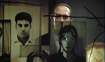
Filmed by the great Henri Alekan, it is a phantasmagoria. We are in a sunless bunker jammed with old photos, thermos jugs, automatic pistols, video clips from a Harlan film, and other detritus: a sort of chamber-play version of a Syberberg no-man’s land. Questioned by offscreen interrogators, Dr. S. admits to his crimes plaintively. The hallucinatory quality of the exercise is enhanced by sound cuts that split a sentence into bits (sometimes clear and close, sometimes filtered through speakers) and a drifting camera that may start on Dr. S. but then wanders across the litter to end on a video image of Dr. S. testifying in another session, at which point the sound of that session may take over. In one passage, the camera tours the room and picks up several bits of Dr. S.’s testimony, in the real space and in several video monitors crowding the area.
Kramer’s Our Nazi is in a way a making-of for Wundkanal, but it’s also a powerful film in its own right. Acting as his own cameraman for the first time, Kramer (director of the classic militant films The Edge, Ice, and Milestones) takes us behind the scenes to show Thomas Harlan’s obsessions and to expose Filbert more directly than Wundkanal does. Harlan talks of the fatal love he had for his father, reflecting that the old man’s charm finally withered in the face of his inhuman complicity with the Reich. Intercut with this soliloquy are shots of Filbert being made up for his video scenes, as he talks of his dueling scars and his youth: “All the ambitious men became Nazis.”
Our Nazi gives us two disturbing confrontations, one with Kramer sitting Filbert down and charging him with crimes against humanity, the other more prolonged and painful. Harlan and the crew encircle their star and hurl accusations at him. This scene, glimpsed and abstracted in Wundkanal, pulls the viewer in different directions as the feeble old man tries to escape Harlan’s relentless recitation of Filbert’s war crimes. In the discussion with Kent Jones after the screenings, Paul McIsaac rightly called the Kramer film a demonstration of the concreteness that direct cinema can yield. Shot in Hi-8, Our Nazi counterbalances the abstract, somewhat detached artifice on display in Wundkanal. Kramer dwells on unexpected details, such as Alekan hesitating to autograph a souvenir production photo for old Filbert. The two movies need to be seen together because they engage in a crosstalk that yields provocatively different information, emotions, and cinematic resources.
Our month in New York went by all too fast. We seldom visit the city these days; I’m in Hong Kong more often than Manhattan. Our trip brought back memories of my undergrad visits from Albany in the 1960s (packing four films into a day-trip) and, during the 1970s, doing dissertation research and visiting friends and teaching for a semester at NYU. It also allowed me to get back in touch with some of my oldest friends, like Rich Acceta-Evans from junior-high days. And the trip reminded me of what a cosmopolitan film culture is like, with institutions like these and still others (Anthology Film Archives, MoMA, etc.) braving tough times to bring the right movies to lucky audiences.
Apart from those named above, I want to thank the friends we met with during our stay. Scott Foundas was particularly helpful on this entry. I gave talks at various venues, so I’m grateful to Malcolm Turvey of Sarah Lawrence College, to the NYU Film Studies faculty, and to Patrick Hogan at the University of Connecticut–Storrs. Special thanks to Ken Smith and Joanna Lee for arranging a visit to the Museum of Chinese in America for a discussion of Planet Hong Kong.
Speaking of Planet Hong Kong, I discuss The Valiant Ones in Chapter 8 there, as well as in the essay “Richness through Imperfection: King Hu and the Glimpse,” in Poetics of Cinema. For a sensitive examination of Doomed Love, go to Tativille.
Some films in the Film Society’s Vlácil retrospective are available on DVD from Facets Multimedia. Wundkanal and Our Nazi have been issued on a single DVD edition with English subtitles, and it can be found on the Edition Filmmuseum site. Every film studies and filmmaking department should order it, I believe. See also “Truth or Consequences,” Kent Jones’ essay in Film Comment 46, 2 (May/ June 2010), 48-53, from which I’ve taken the Harlan quotation. Jones discusses other films, including Christoph Hübner’s 2007 study of Thomas Harlan, Wandersplitter, which is also available on a Filmmuseum disc. Thomas Harlan is one of the main interviewees in the documentary Kristin recently wrote about, Harlan: Im Schatten von Jud Süss.
For more coverage of the “Film Comment Selects” series, see R. Emmett Sweeney’s review on the Movie Morlocks site, with particularly discerning remarks on I Wish I Knew. Jesse Cataldo provides sharp commentary on Wundkanal at The House Next Door.
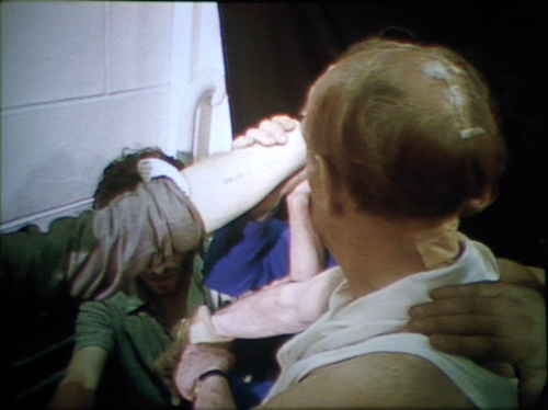
Alfred Filbert, confronted with the tattooed arm of an Auschwitz survivor (Our Nazi).
The ten best films of … 1920
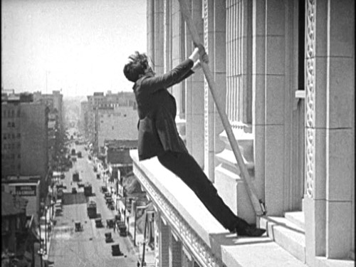
High and Dizzy
Kristin here:
Three years ago, we saluted the ninetieth anniversary of what was arguably the year when the classical Hollywood cinema emerged in its full form. The stylistic guidelines that had been slowly formulated over the past decade or so gelled in 1917. We included a list of what we thought were the ten best surviving films of that year.
In 2008 we again posted another ten-best list, again for ninety years ago. This annual feature has become our alternative to the ubiquitous 10-best-films-of-2010 lists that print and online journalist love to publish at year’s end. It’s fun, and readers and teachers seem to find our lists a helpful guide for choosing unfamiliar films for personal viewing or for teaching cinema history. (The 1919 entry is here.)
There were many wonderful films released in 1920, but, as with 1918, I’ve had a little trouble coming up with the ten most outstanding ones. Some choices are obvious. I’ve known all along that Maurice Tourneur’s The Last of the Mohicans (finished by Clarence Brown when Tourneur was injured) would figure prominently here. There are old warhorses like Das Cabinet des Dr. Caligari and Way Down East that couldn’t be left off—not that I would want to.
But after coming up with seven titles (eight, really, since I’ve snuck in two William C. de Mille films), I was left with a bunch of others that didn’t quite seem up to the same level. Sure, John Ford’s Just Pals is a charming film, but a world-class masterpiece? A few directors made some of their lesser films in 1920, as with Dreyer’s The Parson’s Widow or Lubitsch’s Sumurun. Seeing Frank Borzage’s legendary Humoresque for the first time, I was disappointed—especially when comparing it with the marvelous Lazy Bones of 1924. (Assuming we continue these annual lists, expect Borzage to show up a lot.) Chaplin didn’t release a film in 1920, and Keaton and Lloyd were still making shorts, albeit inspired shorts. Mary Pickford’s only film of the year, the clever and touching Suds, is a worthy also-ran. Choosing Barrabas over The Parson’s Widow or Why Change Your Wife? over Sumurun has a certain flip-of-the-coin arbitrariness, but we wanted to keep the list manageable. But they all repay watching.
The year 1920 can be thought of as a sort of calm before the storm. In Hollywood a new generation was about to come to prominence. Griffith would decline (Way Down East may be his last film to figure on our lists). Borzage will soon reach his prime, as will Ford. Howard Hawks will launch his career, and King Vidor will become a major director. The great three comics, Chaplin, Keaton, and Lloyd will move into features. In other countries, an enormous flowering of new talent will appear or gain a higher profile: Murnau, Lang, Pabst, Eisenstein, Pudovkin, Dozhenko, Kuleshov, Vertov, Ozu, Mizoguchi, Jean Epstein, Pabst, Hitchcock, and others. The experimental cinema will be invented, and Lotte Reiniger will devise her own distinctive form of animation. Watch for them all in future lists, which will be increasingly difficult to concoct
In the meantime, here’s this year’s ten (with two smuggled in). Unfortunately, some of these films are not available on DVD. They should be.
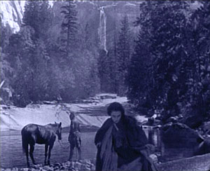
The great French emigré director Maurice Tourneur figured here last year for his 1919 film Victory. The Last of the Mohicans is just as good, if not better. I haven’t read the Cooper novel, set during the French and Indian War, but it’s obvious that Tourneur has pared down and changed the plot considerably. The sister, Alice, is made a less important character, with the plot focusing on two threads: the Indian attack on the British population as they leave their surrendered fort and on the virtually unspoken attraction between the heroine Cora and the Mohican Indian Uncas. The seemingly impassive gazes between these characters, forced to conceal their attraction, convey more passion than many more effusive performances of the silent period. The actress playing Cora also wore less makeup than was conventional, de-glamorizing her and making her a more convincing frontier heroine.
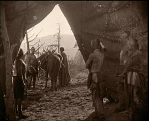
The film is remarkable for its gorgeous photography, with spectacular location landscapes, some apparently shot in Yosemite (below left). Tourneur’s signature compositional technique of shooting through a foreground doorway or cave opening or other aperture appears frequently (below right). (Brown’s account of the filming in Kevin Brownlow’s The Parade’s Gone By makes it sound as though he shot most of the picture, but in watching the film I find this hard to believe.)
Finally, the film stands out from most Hollywood films of its day for its uncompromising depiction of the ruthless violence of the conflict between the British and those Indians allied with the French. The scene in which the inhabitants of the fort leave under an assumed truce and are massacred can still create considerable suspense today, and the outcome puts paid to the notion that all Hollywood films end happily.
The word melodrama gets tossed around a lot, and many would think of much of D. W. Griffith’s output as consisting of little besides melodramas. But Way Down East is the quintessential film melodrama. An innocent young woman (Lillian Gish) is lured into a mock marriage and ends up deserted and with a baby. The baby dies and she finds a place as a servant to a large country family, where the son (Richard Barthelmess) falls in love with her. Her sinful status as an unwed mother leads the family patriarch to order her out, literally into the stormy night. She ends up on an ice flow, headed toward a waterfall. Along the way there’s comic relief from some country bumpkins and a naive professor who falls for the hero’s sister. It all works, partly because Griffith treats the main plot with dead seriousness and partly because Gish elicits considerable sympathy for her character.
Not only is it a great film, but it provides a window into the past, preserving a popular nineteenth-century play and giving insight into the drama of that era. It’s hard to think of another feature film that conveys such a genuine record of the Victorian theater, directed by a man who had made his start on the stage of the same period. (Unfortunately the film does not survive complete. The Kino version linked above is from the Museum of Modern Art’s restoration, which provides intertitles to explain what happens during missing scenes.)
Way Down East displayed a conservative attitude toward sex that was rapidly receding into the past–at least as far as the movies were concerned. The same year saw two films that set the tone for the Roaring ’20s in their more risqué depiction of romantic relationships: Cecil B. De Mille’s Why Change Your Wife? and Mauritz Stiller’s frankly titled Swedish comedy Erotikon.
De Mille has featured on our previous lists, for Old Wives for New in 1918 and Male and Female in 1919. Why Change Your Wife? ramped up the sexual aspect of the plot, however, as a Photoplay reviewer made clear: “”Having achieved a reputation as the great modern concocter of the sex stew by adding a piquant dash here and there to Don’t Change Your Husband, and a little more to Male and Female, he spills the spice box into Why Change Your Wife?” The plot is not nearly as daring as this suggests. Gloria Swanson plays a wife who is straight-laced and intellectual, driving her husband to spend time with a stylish woman who tries to seduce him. Yet he flees after one kiss, and after his wife divorces him on the assumption that he has cheated on her, he marries the seductress. The heroine discovers the error of her ways and becomes sexy in her dress and behavior. As a result the husband regains his old love for her, and they remarry. No actual adultery occurs, and the first marriage is affirmed with a happy ending.
Why Change Your Wife? may have seemed more daring because De Mille here externalizes the shifting relationships through the costumes to the point where no viewer could miss the implications. Initially the wife’s demure dresses mark her as prudish, while the woman who lures her husband away is dressed like a vamp. Once the wife lets go, she dons similar revealing, expensive designer clothes. As a result, the male members of the audience might revel in a fantasy of their ideal wife, and the women would delight in displays of fashions most of them could never own in reality. It proved a successful combination. We tend to forget it now, but the 1920s was full of variants and imitations of Why Change Your Wife?, often featuring a fashion-show scene that was nothing but a parade of models in outlandish clothes. (Early Technicolor was sometimes shone off in such sequences.) Top designers like Erté were recruited to bring their talents to such films.
Fashion as a selling point in films remains with us. The glossy new version of The Hollywood Reporter, recently decried by David, now has a regular “Hollywood Style” section. The November 24 issue ran “Costumes of The King’s Speech,” and the December 1 issue describes “Fashions of The Tourist,” with photos of Angelina Jolie in her various costumes. In addition to shots of the stars, both articles feature enticing close-ups of lipstick, shoes, jewelry,and purses.
A double feature of Why Change Your Wife? and Erotikon would provide a vivid sense of the differing moral outlooks of mainstream America and Europe in the post-war years. In Erotikon, the situation is reversed. An absent-minded entomologist neglects 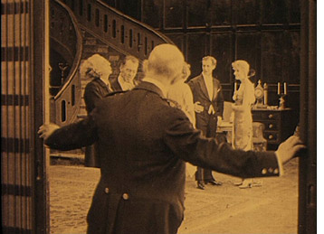 his sexy wife, who is having an affair with a nobleman. She is in love, however, with a sculptor, who is having an affair with his model. The sculptor returns her love, but eventually becomes jealous, not of her husband, who is his best friend, but of her lover. When the husband finds out that his wife has been unfaithful, he is mildly upset, but he settles down happily with his cheerful young niece, who pampers his taste for plain cooking and an undemanding home life. About the only thing these two films have in common is that they view divorce, which was still quite a controversial issue in the 1920s, as sometimes benefiting the people involved. Adultery actually occurs rather than being hinted at but avoided, though faithful monogamy is ultimately put forth as the ideal.
Erotikon reflects some of the influences from Hollywood that were seeping into European films after the war. Sets are larger, cuts more frequent (though not always respecting the axis of action), and three-point lighting crops up occasionally. Yet Stiller maintains the strengths of the Scandinavian cinema of the 1910s, with skillful depth staging (left) and a dramatic use of a mirror. In the opening of a crucial scene where the sculptor confronts the wife with her adultery, tension builds because she does not know he is watching her until she sees him in the mirror (see bottom). Still, apart from its European sophistication, Erotikon could pass for an American film of the same era. Stiller and lead actor Lars Hansen would both be working in Hollywood by the mid-1920s.
I can’t allow the nearly unknown director William C. de Mille to take up two slots this year, though it’s tempting. William’s career was shorter than that of his much better-known brother Cecil. It peaked in 1920 and 1921, though, and I still look back fondly on the films by him that were shown in “La Giornate del Cinema Muto” festival of 1991. That year saw a large retrospective of Cecil’s films, and the organizers wisely decided to include a 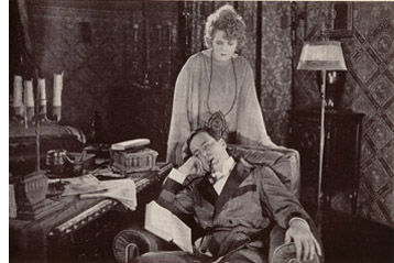 sampling of William’s surviving work.
The two men’s approaches were markedly different. Where Cecil by this point was setting his films among the rich and using visual means like costumes to make the action crystal-clear to the audience, William was more likely to favor middle-class settings with small dramas laced with humor and presented with restrained acting and small props. Despite William’s skill as a director and his ability to create sympathy for his characters, he never gained much prominence, especially compared to his brother. He retired from filmmaking in 1932, at the relatively young age of 54. Yet obviously he was attuned to his brother’s style, having written the script for Why Change Your Wife? It may be characteristic of the two that Cecil capitalized the De in De Mille, while William didn’t.
Relatively few of William’s films survive, but these include two excellent films from 1920, Jack Straw and Conrad in Quest of His Youth. I don’t remember Jack Straw well enough to describe it. It involved the hero’s falling in love with a woman when they both live in the same Harlem apartment building. When her family becomes rich, Straw disguises himself as the Archduke of Pomerania in order to woo her. Sort of a Ruritanian romance but played out in the U.S.
I remember Conrad in Quest of His Youth better. The hero returns from serving as a soldier in India. He feels old and decides to try and recover his youth. The first attempt comes when he and three cousins agree to return to their childhood home and indulge themselves in the simple pleasures of their youth. Eating porridge for breakfast is a treasured memory, but the group discovers that this and other delights are no longer enjoyable to them as adults. Conrad goes on to seek romance elsewhere and eventually finds a woman who makes him feel young again. The film’s poignant early section manages in a way that I’ve never see in any other film to convey both nostalgia for the joys of childhood and the sad impossibility of recapturing them.
Neither film is available on DVD. Indeed, I couldn’t find an image from either to use as an illustration. The only picture I located is a rather uninformative one from Conrad in Quest of His Youth, above right, which I scanned from William C.’s autobiography (Hollywood Saga, 1939). It’s no doubt an indicator of William’s modesty that the frontispiece of this book is a picture of his brother directing a film.
Maybe this entry will serve as a hint to one of the DVD companies specializing in silent movies that these two titles deserve to be made available. They’re high on my list of films I would love to see again.
Most people who study film history see Das Cabinet des Dr. Caligari very early on, though they probably push it to the backs of their minds later on. I have a special fondness for Caligari precisely because I did see it early on. I took my first film course, a survey history of cinema, during my junior year. Maybe I would have gotten hooked and gone on to graduate school in cinema studies anyway, but it was Caligari that initially fascinated me. It was simply so different from any other films I had seen in what I suddenly realized was my limited movie-going experience. It inspired me to go to the library to look up more about it, a tiny exercise in film research.
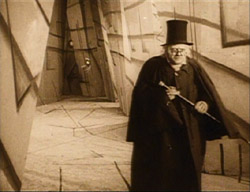
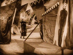
Some may condemn it as stage-bound or static. Despite its painted canvas sets and heavy makeup, however, it’s not really like a stage play. Many of the sets are conceived of as representing deep space, though often only with a false perspective achieved by those painted sets:
Still, in an era when experimental cinema was largely unknown, Caligari was a bold attempt to bring a modernist movement from the other arts, Expressionism, into the cinema. It succeeded, too, and inaugurated a stylistic movement that we still study today.
I haven’t watched Caligari in years (I think I know it by heart), but I’m still fond of it. The plot is clever grand guignol. It has three of the great actors of the Expressionist cinema, Werner Krauss, Conrad Veidt, and Lil Dagover, demonstrating just what this new performance style should look like. The frame story retains the ability to start arguments. The set designs area dramatically original, and muted versions of them have shown up in the occasional film ever since 1920. Even if you don’t like it, Caligari can lay claim to being the most stylistically innovative film of its year.
As I did for our 1918 ten-best, I’m cheating a bit by filling one slot of the ten with a pair of shorts by two of the great comics of the silent period. Both have matured considerably in the intervening two years. In 1918, Harold Lloyd was still working out his “glasses” character. By this point he is much closer to working with his more familiar persona. Similarly, in 1918, Buster Keaton was still playing a somewhat subordinate role in partnership with Fatty Arbuckle. In 1920, he made his first five solo shorts, co-directing them with Eddy Cline.
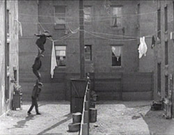
The Lloyd film I’ve chosen is High and Dizzy, the second short in which he went for “thrill comedy” by staging part of the action high up on the side of a building. (See the image at the top.) Four years later he would build a feature-length plot around a climb up such a building in Safety Last, one of his most popular films. In High and Dizzy, Harold is not quite the brash (or shy) young man he would soon settle on as the two variants his basic persona. The opening shows him as a young doctor in need of patients. He soon falls in love with the heroine, and through a drunken adventure, ends up in the same building where she lies asleep. She sleepwalks along a ledge outside her window, and when Harold goes out to rescue her, she returns to her bedroom and unwittingly locks him out on the ledge. The film is included in the essential “Harold Lloyd Comedy Collection” box-set, or on one of the two discs in Kino’s “The Harold Lloyd Collection,” Vol. 2.”
Neighbors was the fifth of the five Keaton/Cline shorts made in 1920. (It was actually released in early 1921, but I’ll cheat a little more here; there are other Keaton films to come in next year’s list.) It’s a Romeo and Juliet story of Keaton as a boy in one working-class apartment house who loves a girl in a mirror-image house opposite it. Two bare, flat yards with a board fence running exactly halfway between them separate the lovers. Naturally the two sets of parents are enemies.
Lots of good comedy goes on inside the apartment blocks, but the symmetrical backyards and the fence inspire Keaton. We soon realize that his instinctive ability to spread his action up the screen as well as across it was already at play. The action is often observed straight-on from a camera position directly above the fence, so that we–but usually not the characters–can see what’s happening on both sides. For one extended scene involving policemen, Keaton perches unseen high above them, hidden. Even though we can’t see him, the directors keep the framing far enough back that the place where we know he’s lurking is at the top of the frame as we watch the action unfold. The playful treatment of the yard culminates in an astonishingly acrobatic gag that brings in Keaton’s early music-hall talents.
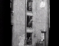
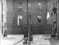
The boy and girl have just tried to get married, but her irate father has dragged her home and imprisoned her in a third-floor room. She signals to Keaton, across from her in an identical third-floor window. A scene follows in which two men appear from first- and second-story windows below Keaton, and he climbs onto the shoulders of the two men below. This human tower crosses the yard several times, attempting to rescue the girl; each time they reach the other side, they hide by diving through their respective windows:
They perform similar acrobatics on the return trips to the left side, carrying the bride’s suitcase or fleeing after her father suddenly appears.
Neighbors is included as one of two shorts accompanying Seven Chances in the Kino series of Keaton DVDs, available as a group in a box-set.
Our final two films lie more in David’s areas of expertise than mine, so at this point I turn this entry over to him.
DB here:
With Barrabas Feuillade says farewell to the crime serial. Now the mysterious gang is more respectable, hiding its chicanery behind a commercial bank. Sounds familiar today. As Brecht asked: What is robbing a bank compared with founding a bank?
Over it all towers another mastermind, the purported banker Rudolph Strelitz. In his preparatory notes Feuillade called him “a sort of sadistic madman, a virtuoso of crime . . . a dilettante of evil.” Against Strelitz and his Barrabas network are aligned the lawyer Jacques Varèse, the journalist Raoul de Nérac (played by reliable Édouard Mathé), and the inevitable comic sidekick, once again Biscot (so perky in Tih Minh).
The film’s seven-plus hours (or more, depending on the projection rate) run through the usual abductions, murders, impersonations, coded messages, and chases. But there’s little sense of the adventurous larking one finds in Tih Minh (1919), in which the hapless villains keep losing to our heroes. The tone of Barrabas is set early on, when Strelitz forces an ex-convict into murder, using the letters of the man’s dead son as bait. The man is guillotined. The epilogue rounds things off with a series of happily-ever-afters in the manner of Tih Minh, but these don’t dispel, at least for me, the grim schemes that Strelitz looses on a society devastated by the war. Add a whiff of anti-Semitism (the Prologue is called “The Wandering Jew’s Mistress”), and the film can hardly seem vivacious.
According to Jacques Champreux, Barrabas was the first installment film for which Feuillade prepared something like a complete scenario, although it evidently seldom described shots in detail. The film has a quick editing pace (the Prologue averages about three seconds per shot), but that is largely due to the numerous dialogue titles that interrupt continuous takes. With nearly twenty characters playing significant roles and some flashbacks to provide backstory, there’s a lot of information to communicate.
Of stylistic interest is Feuillade’s movement away from the commanding use of depth we find in Fantômas and other of his previous masterworks. Here the staging is mostly lateral, stretching actors across the frame. Very often characters are simply captured in two-shot and the titles do the work, as if Feuillade were making talking pictures without sound. Once in a while we do get concise shifting and rebalancing of figures, usually around doorways. Here Jacques vows to go to Cannes and tell the police of the kidnapping of his sister. As Raoul and Biscot start to leave, Jacques pivots and says goodbye to Noëlle, creating a simple but touching moment of stasis to cap the scene.
Full of incident but rather joyless, Barrabas will never achieve the popularity among cinephiles of the more delirious installment-films, but it remains a remarkable achievement. The ciné-romans that would follow until Feuillade’s death in 1925 would lack its whiff of brimstone. They would mostly be melodramatic Dickensian tales of lost children, secret parents, strayed messages, and faithful lovers. Barrabas is not available on DVD.
You might think that a movie that opens with a frowning old man studying a skeleton would also be somewhat unhappy fare. Such isn’t actually the case with Victor Sjöström’s generous-hearted Mästerman, a story of a village pawnbroker obliged to take a young woman as a housekeeper. With his stovepipe hat and air of sour disdain, Samuel Eneman, known to the village as Mästerman, is a ripe candidate for rehabilitation. Once Tora is installed and has put a birdcage (that silent-cinema icon of trapped womanhood) on the window sill, the scene is set for Mästerman’s return to fellow feeling. But she is there merely to cover the debts and crime of her sailor boyfriend, and eventually Eneman realizes he must make way for young love. The drama is played out in front of the townspeople, and as often happens in Nordic cinema (e.g., Day of Wrath, Breaking the Waves) the community plays a central role in judging, or misjudging, the vicissitudes of passion.
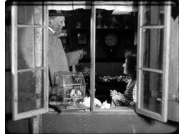 As a director Sjöström is a marvel. His finesse in handling the 1910s “tableau style” shines forth in Ingeborg Holm (1913), but unlike Feuillade and most of his contemporaries, he immediately grasped the emerging trend of analytical editing. His The Girl from the Marsh Croft (1917) and Sons of Ingmar (1918-1919) show a mastery of graded shot-scale, eyeline matching, and the timing of cuts. In Mästerman he continued to use brisk editing and close-ups to suggest the undercurrents of the drama. He moves people effortlessly through adjacent rooms, and his long-held passages of intercut glances recall von Stroheim. On all levels, Mästerman deserves to be more widely known–an ideal opportunity for an enterprising DVD company.
For a valuable source on Feuillade’s preparation for Barrabas and other of his works see Jacques Champreux, “Les Films à episodes de Louis Feuillade,” in 1895 (October 2000), special issue on Feuillade, pp. 160-165. I discuss Feuillade’s adoption of editing elsewhere on this site.
Tom Gunning provides an in-depth discussion of Sjöström’s style at this period in “‘A Dangerous Pledge’: Victor Sjöström’s Unknown Masterpiece, Mästerman,” in Nordic Explorations: Film Before 1930, ed. John Fullerton and Jan Olsson (Sydney: John Libbey, 1999), pp.204-231. For more on some of the directors discussed in this entry, check the category list on the right.
Erotikon.


