Archive for the 'National cinemas: Russia and USSR' Category
The ten best films of … 1928
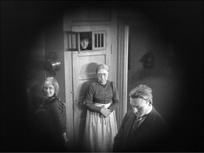
La passion de Jeanne d’Arc
Kristin here:
Time for our twelfth annual alternative to the usual list of the ten best films of the current year. Instead, I offer a list from 90 years ago, in part for fun and in part to call attention to some lesser-known classics that are worth discovering. (See here for our lists from 1917, 1918, 1919, 1920, 1921, 1922, 1923, 1924, 1925, 1926, and 1927.)
The year 1928 marked the triumphant conclusion of the silent cinema. Very few sound films were made that year, and those that were often included only music, perhaps sound effects, and occasionally some passages of dialogue. Sound was not innovated because the silent cinema was in aesthetic decline. Quite the contrary. It was initially an enhancement that film-industry people assumed would make films more lucrative. In most cases the “talkies” that followed over the next few years were inferior to their silent predecessors, in part due to the limitations of the new sound technology. Those who opposed the addition of sound could point to the films of 1928 as evidence that the young art form had already reached a peak of perfection that was being tarnished by the addition of recorded sound.
In compiling this year’s list, I came up with eight titles that seemed unquestionably to belong on it. There were another six on a list of possibilities for the final two slots. More than in past years, this year gave me a chance to go back and rewatch films I hadn’t seen in a long time, in some cases since graduate school in the 1970s. Some held up well, some not so much. In a few cases, restorations made since my first viewings revealed new strengths in films I remembered from poor prints.
As always, there are films that have been lost but which plausibly could have filled out the list, most notably Ernest Lubitsch’s The Patriot and F. W. Murnau’s 4 Devils.
First, the eight obvious choices, in no particular order apart from #1.
1. La passion de Jeanne d’Arc.
Not every year includes a film that is not only one of the tops of its year but of all cinematic history as well. Carl Theodor Dreyer’s final silent film is one such masterpiece.
Jeanne d’Arc seamlessly blended the stylistic traits of the great artistic film movements of the 1920s, German Expressionism, French Impressionism, and Soviet Montage and made something new and unique of them.
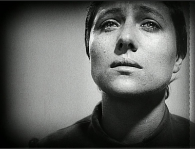
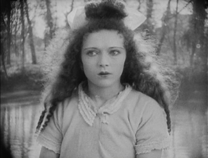
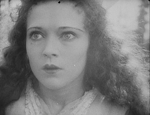
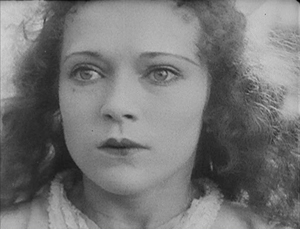
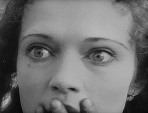
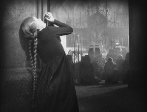
Expressionist designer Hermann Warm’s past credits had included two films that have featured in these lists, Robert Wiene’s Das Cabinet des Dr. Caligari and Fritz Lang’s Die müde Tod. Warm collaborated with French theatrical designer Jean Hugo to create spare, white, off-kilter sets that focus our attention on the spiritual drama. Fast editing conveys subjectivity, as in the scenes where Jeanne is threatened with torture and where the citizens are suppressed when they riot after her execution. Rudolph Maté’s cinematography is startlingly dependent on close shots, particularly on the face of Jeanne, played by Renée Falconetti in one of the most intense and affecting performances in any film.
The steady progression of the action condenses days of trial testimony into one apparently continuous story. Between the sets and this inexorable march toward Jeanne’s martyrdom, there is a sense of both spatial and temporal disorientation that focuses our attention intensely on the central conflict.
Until 1981, prints of Jeanne d’Arc were indistinct and incomplete. A pristine print that restored the original visual quality and detail was found in Norway. (The film was among the early ones to be shot on panchromatic film stock without the actors’ using makeup. The result is a detail of texture in the faces that enhances the performances tremendously.) This print is the basis for the Criterion Collection’s edition of the film.
It’s a film that one can see over and over and still be overwhelmed at the originality and intensity of Dreyer’s vision. We saw it projected last November in Houghton, Michigan, with Richard Eichhorn’s recently composed accompaniment, “Voices of Light,” essentially an oratorio and film score rolled into one. We were somewhat trepidatious about whether the score would be distracting, but it proved very effective. Once again, I was reminded of how great this film is. (“Voices of Light” is an optional accompaniment on the Criterion edition linked above.)
2. October
If Jeanne d’Arc gains intensity through a nearly claustrophobic treatment of space, Sergei Eisenstein creates an epic tenth-anniversary celebration of the 1917 Revolution in his October (finished and released a year late).
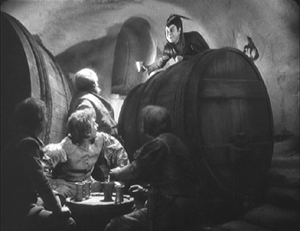
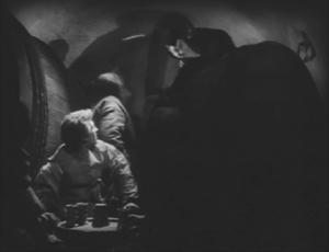
Perhaps the most extreme example of Soviet Montage’s frequent avoidance of a single protagonist, October cuts among a wide variety of the people involved in the revolution. Workers pull down a statue of the Tsar. Lenin speaks at Finland Station. Kerensky and his officials luxuriate in their Winter Palace headquarters. Sailors wait on the Aurora battleship. Elderly citizens try to protect the specious February Revolution. Female soldiers are summoned to protect the Palace from the attacking Red forces. Looters steal bottles from the Tsar’s wine-cellar. The result is a sort of patchwork collage of the Revolutionary events leading up to the storming of the Winter Palace and the attack itself, with a slow build to an exultant climax as the Red forces triumph.
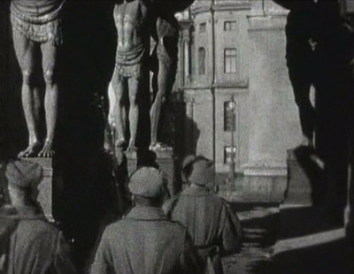
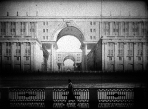
Eisenstein was given extraordinary access to the locales of the actual events, so that the vast halls of the Winter Palace and the trappings of royalty (Fabergé eggs and fancy crystal liquor bottles) give a sense of reality rare in fictional reenactments. (There was a time when October was plundered for “documentary” footage of events which had not been recorded by cameras at the time.) He used the settings to ridicule the anti-revolutionary forces, as when young cadets are summoned to help fight the Red forces and are dwarfed by the muscular colossi that line one area of the Palace’s exterior (above).
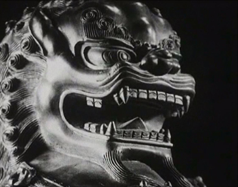
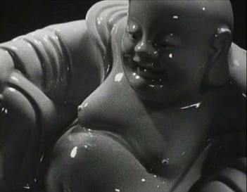
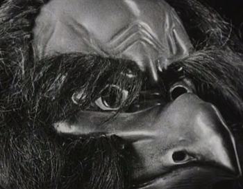
The film also represents Eisenstein’s experiments with “intellectual montage,” where he attempts to convey ideas strictly through juxtaposing series of images. In belittling the phrase “for God and country,” he tries to reduce the notion of “God” to absurdity by linking a long series of increasingly exotic depictions of deities from different religions.
Whether Soviet audiences of the late 1920s could make anything of such passages is impossible to know for sure, but one suspects that some of them would have been incomprehensible. Still, it is exciting to see an artist playing with such possibilities. Certainly the technique lived on, whether from the simple juxtaposition of cackling hens and gossiping women in Lang’s Fury or Jean-Luc Godard’s dense, often impenetrable strings of images, especially in his political films.
October exists in many versions. Beware the heavily cut versions under the title Ten Days That Shook the World. These images were taken from the 2008 release by the Soviet Ruscico company in its “Kino Academia” series.
3. Spione
Despite the widespread enthusiasm for Lang’s Metropolis, his other big films of the 1920s–Dr. Mabuse, der Spieler, Die Nibelungen (Siegfried and Kriemhilds Rache), and Spione–seem to me better. Metropolis is perhaps flashier in its design and conception and certainly very entertaining, but it’s also sprawling and implausible and essentially pretty silly.
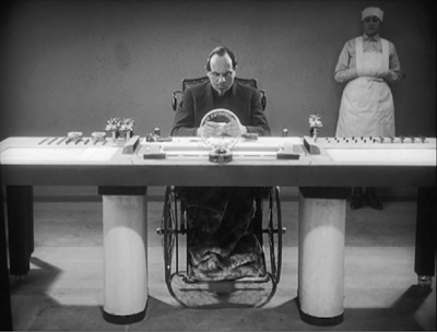
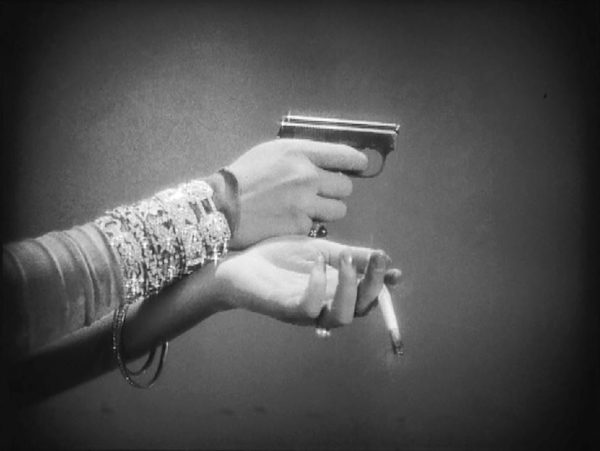
Spione, on the other hand, has a tight, fast-paced narrative. It’s sort of Dr. Mabuse boiled down to one feature instead of two, and with the villainous Haghi (again played by Rudolf Klein-Rogge) as a banker secretly masterminding a spy ring rather than a gambling racket. There are no great “heart vs. hand” themes here–just a rattling good tale stylishly presented. Expressionism has disappeared in favor of a streamlined look (above), and Lang’s editing has sped up since Mabuse.
There’s not much point in detailing the plot here, since it would involve too many spoilers. Discover it for yourself if you haven’t already.
Spione circulated for years in the truncated American release version, which is how I first saw it. A 2004 Murnau Stiftung restoration of the complete version was a revelation, not only for its more complete narrative but for its superb visual quality. It’s a feast of shots that only Lang could have composed (above and bottom). These frames are from the Eureka! DVD, but the company has subsequently released it in dual format DVD and Blu-ray. Kino Classics has also released it in Blu-ray. The same company has put out a boxed-set of all Lang’s silent films (including Die Pest im Florenz, directed by Otto Rippert from Lang’s script). We were given this recently and haven’t had time to explore it, but it looks like a must for any fan of Lang.
4. L’Argent
Marcel L’Herbier makes his second and final appearance on this annual list with his epic adaptation of Emile Zola’s L’Argent, updated to contemporary Paris. (See the 1921 entry for El Dorado; I also wrote about the Flicker Alley releases of the restored versions of L’Inhumaine [1923] and Feu Mathias Pascal [1925].)
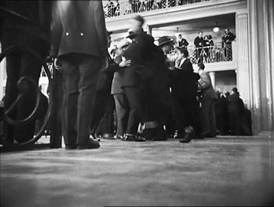
Inspired by Abel Gance’s even more epic Napoléon (1927), L’Herbier set out to make a film that would require a large budget. To obtain that, he made a deal for his own company, Cinégraphic, to co-produce with the mainstream studio, Cinéromans. The result contains brightly lit sets of big banks and expensive apartments, as well as shots made in the Paris Bourse over a three-day weekend (above). L’Argent also had an all-star cast. It included Brigitte Helm and Alfred Abel fresh off Metropolis, thanks to the German distributor, UFA. It also meant that Cinéromans tampered with the film, re-editing and shortening it.
Given L’Herbier’s reputation as an aesthete and an avant-garde filmmaker, L’Argent was dismissed by many at the time as a purely commercial endeavor. It remained unseen and hence virtually forgotten for decades. A screening at the New York Film Festival in 1968 surprised and impressed the spectators. The real recognition of the film as a major artwork came, however, in 1973, when critic and theorist Noël Burch published his monograph, Marcel L’Herbier (Paris: Seghers, 1973). In it he hailed L’Argent as a masterpiece, devoting the entire final chapter to an analysis of it. Burch also wrote the entry on L’Herbier for Cinema: A Critical Dictionary: The Major Film-makers ([New York: Viking Press, 1980], Vol. Two, pp. 621-28), edited by Richard Roud; again Burch devoted much of his text to L’Argent.
I have expressed my reservations about L’Herbier’s films in earlier entries, but for me L’Argent is the big exception: stylistically daring and narratively engaging. Perhaps adapting Zola led L’Herbier to make a more conventionally suspenseful film than usual. Referring to the French Impressionist movement in general, Burch wrote, “L’Argent undoubtedly marks the end of the period of experimentation, since it is itself the culmination of all these experiments–not just L’Herbier’s, but those of the first avant-garde and even, to a certain extent, of the entire Western cinema (with the exception of the Russians)” (Roud, pp. 624-25).
The story involves two powerful bankers who spar for control of one large bank’s standing on the stock market. One, the villainous Saccard, aims to send a famous aviator on a perilous flight across the Atlantic to promote his bank’s oil holders in Latin America–while seducing the aviator’s wife during his absence. The other, Gundermann, tries to thwart him by buying up shares of his rival’s bank and then selling them to cause a drop in the bank’s value.
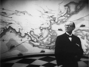
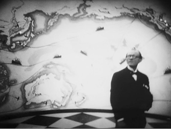
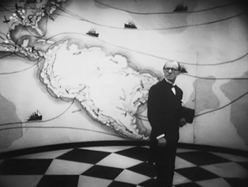
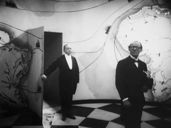
In portraying all the complex machinations going on, L’Herbier adopts a restless camera, frequently moving among and around characters rather than following them. The most striking example comes early on, when an underling comes to visit Gundermann and waits in an odd, unfurnished room decorated with a map of the world. As he looks around, the camera circles him until a servant unexpectedly appears through a door and escorts him in.
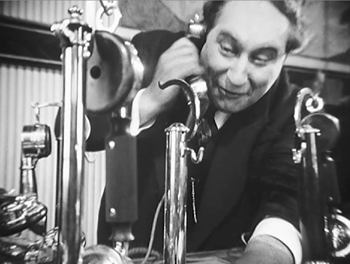
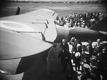
The odd distortions in these shot exemplify another cinematographic technique that was in increasing use during the late 1920s: conspicuous wide-angle lenses. On the left below, Saccard is nearly dwarfed by one of his telephones, while on the right the scene of the aviator’s departure makes the plane’s wings jut into the foreground and extend far into the background.
There are some subjective moments, carrying forward the tradition of French Impressionism. Yet for the most part the restless camera, the distorting lenses, the odd angles (see the top image of this section), and the unusual crosscutting are not subjective, which makes this an atypical Impressionist film. Instead they suggest the unnatural, disconcerting world of capitalism, of money and those who struggle over it. Perhaps by minimizing character psychology and striving to represent more abstract concepts, L’Herbier briefly carried Impressionism to a more political–and dramatic–level.
In 2008, L’Argent was released on DVD by Eureka! in the UK as a “Special 80th Anniversary 2 x Disc Edition.” The source material was a beautiful fine-grain positive struck from the original negative, with something close to L’Herbier’s original intended cut. It includes Jean Dréville’s Autour de “L’argent,” a 40-minute making-of (surely one of the first of its type), recorded during the original production. The DVD is still in print and is, as far as I know, the only release of this restored version.
5. Steamboat Bill Jr.
This was the first Keaton film I ever saw, and I immediately became a fan. (The director is credited as Charles Reisner, but we all know that Keaton was primarily responsible for the direction of his films of this period.) It’s not as good as The General (what is?), but it beats out The Cameraman, Keaton’s other feature of this year, by a nose.
Keaton plays the dandified son of a gruff steamboat owner. He returns home from school and gets put into working clothes by his father, whose deteriorating steamboat is competing for tourists with a larger, newer boat. Naturally young Bill is in love with the daughter of the other steamboat’s owner. The action mainly consists of Bill, Sr. trying to prevent Bill, Jr. from clandestinely meeting his girlfriend.
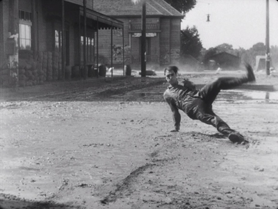
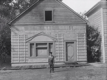
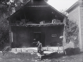
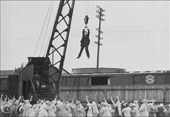
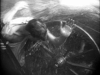
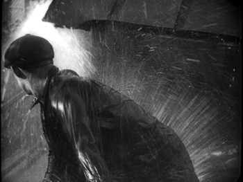
There’s lots of humor along the way to the climax, in which a huge storm hits the town. It’s a classic sequence of Keaton pulling variant gags on the situation of being in a high wind (above) and surrounded by collapsing buildings and flying objects. Perhaps Keaton’s most famous, and dangerous, gag comes when he pauses in front of a house’s façade, which tears loose and falls straight down on him–with a window sparing him from being crushed.
Reportedly the top of the frame missed his head by six inches, but we know Keaton was a little crazy in how far he would go for a laugh.
Steamboat Bill, Jr. was the last film Keaton made with his own production company. The Cameraman was made at MGM, and though it is very good, thereafter his career slowly declined after his move to that studio. This will, alas, be the last Keaton film represented in this series.
6. The Circus
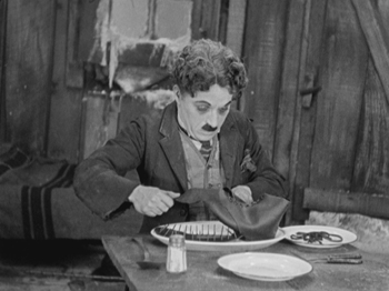
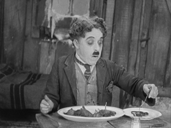
Coincidentally, The Circus was the first Chaplin film I ever saw. I happened to take my first film course at the point where Chaplin had re-released The Circus, accompanied by a new musical score he composed himself. (Skip, if you can, the added opening, with Chaplin singing a maudlin song over an excerpt from later in the film.) The re-release was 1969, though I must have seen it in 1970 at Iowa City’s art-house, the Iowa. (Also coincidentally, my father managed the Iowa when he was at the university there on the GI bill in the years immediately after World War II. He was dating my mother at that point, and there she saw Day of Wrath. Hence when David and I became a couple in the mid-1970s, she understood what the book he was currently working on was about. But I digress.)
The print I saw at the Iowa was pristine.
Up to that point, The Circus had been unavailable to most viewers, though I suspect bootleg prints circulated among collectors. It’s among the least known of Chaplin’s features, and it’s still hard to see. There’s a Park Circus DVD available in England, consisting of the re-release version equally in mint condition; that’s the one I’ve taken these illustrations from. More recently the film has been released as a Blu-ray/DVD combination. There is also an Artificial Eye Blu-ray available, which gets high marks from DVD Beaver. I haven’t seen this and don’t know whether it’s the re-release version or the original.
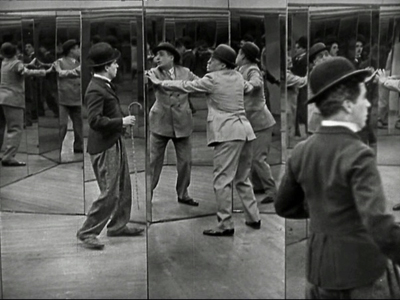
Chaplin plays his Little Tramp character, introduced wandering around the sideshow attractions near a circus. Mistaken for a pickpocket, he flees among the booths, occasioning a brilliantly staged triple scene in a hall of mirrors. When he first enters it, he is alone and struggles to figure out how to exit. A short time later, pursued by the pickpocket, the two stumble into the room, and a comic chase ensues (above). Finally, a cop is chasing Charlie, who tries to confuse him by luring him into the mirror maze. It’s a set of gags that builds, with the figures popping unexpectedly into the foreground when we had assumed that the real actors were in the depth of the shot. Each scene in the maze is handled in a single take from the same camera setup.
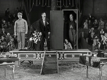
The flight from the cop leads the Tramp into a failing circus cursed with a group of highly unfunny clowns. Charlie inadvertently and unwittingly becomes a sensation for his antics, including his invasion of a magician’s act.
The cruel circus owner hires him, supposedly as a prop man, and the show becomes a huge success. Charlie falls for the maltreated daughter of the owner, who in turn becomes smitten by a handsome tightrope walker. Trying to impress the daughter, the Tramp goes on when the tightrope walker fails to show up one day. The result is a classic extended scene of Charlie on the high wire, executing a series of comic moments before the whole thing is topped off by a group of monkeys who escape and end up swarming over him as he struggles to keep his balance.
I hope now that The Circus is becoming more available, it can takes its place beside Chaplin’s other features.
[December 29: Thanks to Valerio Greco for alerting me that a restoration of the original version of The Circus is underway in Bologna, to be released by The Criterion Collection.]
7. The Docks of New York
I’ve already written about this, Josef von Sternberg’s final silent feature, in 2010 on the occasion of The Criterion Collection’s release of it alongside Underworld and The Last Command in an essential box-set. The six films von Sternberg made with Marlene Dietrich after she came to Hollywood generally get more attention than any of his silents. If I were allowed three of his films for a proverbial desert-island situation, I would take Underworld, The Docks of New York, and Shanghai Express.
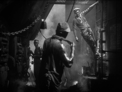
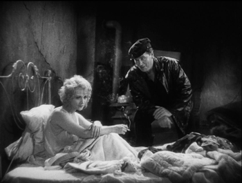
Docks is a concentrated dose of the atmospheric cinematography the director is famous for, in this case employed to create the grungy settings of the film. In the opening, the oil and sweat on the stokers’ bodies (above) is palpable, and the fog, hanging nets and lanterns, and smoke of the dockside sets establish the sleezy, hopeless milieu that drives the heroine to attempt suicide.
Apart from the impressive visuals, the film gains much of its appeal from its two central performances. Betty Compson manages to gain our considerable sympathy for “the Girl” in a remarkably short time, and she has to–the film is only 75 minutes long and she spends her first onscreen appearances unconscious after her near-drowning. George Bancroft, known mostly for supporting roles in westerns, came into his own as the protagonists of three von Sternberg films–including Thunderbolt but not The Last Command. Here he again plays the big lug with a well-hidden heart of gold.
Unfortunately the von Sternberg silents set from The Criterion Collection is out of print. Track it down somewhere or hope for a Blu-ray release.
[December 29: Peter Becker of The Criterion Collection tells me that, although a Blu-ray release is not yet scheduled, there is a good possibility that it will happen.]
8. Storm over Asia
After Mother and The End of St. Petersburg, Storm over Asia (the original title translates as “The Heir of Genghis Khan”) is the last of Vsevolod Pudovkin’s three great silent features. Unlike the first two, it is set in Mongolia. The Soviet industry officials were concerned to portray the Revolution in the various other countries that along with Russia made up the Soviet Union.
The story takes place during the Civil War years that followed the Revolution. A young Mongolian peasant tries to sell a valuable fox fur at a trading post, but the British dealer cheats him. The peasant strikes him and is forced to flee into the mountains, where he joins the Red partisans fighting the British imperialists. (This does not follow historical fact, since the British occupied parts of Siberia and Tibet, but not Mongolia. In reality, for a brief period in 1921, White Russian forces drove out the Chinese from Mongolia. In response, the Red Army moved in, supporting the Mongols in their quest for independence.)
The British shoot the protagonist but discover on him a document that seems to identify him as the heir of Genghis Khan. So they set him up as a puppet ruler in order to control the local population. Eventually he rebels and leads a storm-like assault that defeats his oppressors.
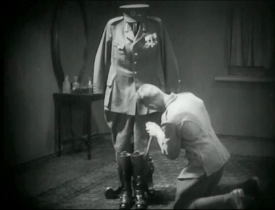
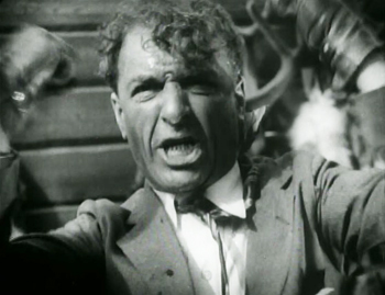
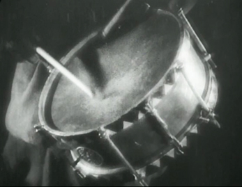
Storm over Asia uses many of the Soviet Montage devices that by 1928 were fairly conventional. For instance, there are many rapid, rhythmic alternations of shots. When the fur trader reacts angrily against the protagonist’s resistance to being cheated, brief shots of his angry call for troops to capture the young man alternate with shots of a drum being beaten. The final “storm” battle uses rapid montage as well. There is also the usual visual symbolism mocking the enemy, as exemplified by the empty officer’s uniform in the shot above.
Early Montage films tried to do away with a single central character in favor of a focus on the masses. October, for example, has no main hero. In Storm over Asia, though, the story arc is definitely crafted around the Mongol’s growth into a rebellious leader of his people. We will see Eisenstein opting for a central identification figure in Old and New (1929).
My illustrations were taken from the old Image release, apparently no longer available. The Blackhawk print has been released by Flicker Alley.
Those are the eight films I put on my “top” list. I thought of stopping there, but the number ten is sacred for such lists, plus part of the point here is to throw a spotlight on lesser-known films.
I gathered a second group of films that might claim the remaining two slots. These were mostly films that were already hallowed classics when I was in graduate school: King Vidor’s The Crowd, Jean Epstein’s La chute de la maison Usher, René Clair’s The Italian Straw Hat, and Victor Seastrom’s The Wind. Beyond that there were the more recently rediscovered and much admired film, Paul Fejos’ Lonesome and the still little-known The House on Trubnoya, by Boris Barnet.
Oddly, the three American films on this list have some distinct similarities. The Crowd and Lonesome are surprisingly parallel. Lonesome follows two lonely people in New York finding each other and falling in love in one hectic day. The Crowd starts with a somewhat similar situation–both even involve dates at Coney Island–but follows the couple through several years of happy times and misfortune during their marriage. The Wind is less realistic, dealing with a sensitive young woman who travels to the west and, plagued by the incessant wind and a real or imagined rape, slips into madness. All three strive to reject the conventional Hollywood romance. Unfortunately all three, however admirable for most of their plots, lead to abrupt, implausible happy endings.
I saw The Italian Straw Hat in my graduate-school days and found it remarkably unfunny, given its reputation. Returning to it now, I still find the first two-thirds largely devoid of humor. (The dance scenes during the wedding party seem interminable, with no little vignettes or gags among the characters at all.) The last portion picks up, but on the whole it’s hardly the model French farce it is held to be. Certainly Clair made a leap forward in skill and sophistication in his early sound films. (Les deux timides, also 1928, is no doubt a better film.)
The Italian Straw Hat probably owes its classic standing in part to the fact that the Museum of Modern Art acquired and circulated it early on. Curator and critic Iris Barry adored it and lauded it in a 1940 essay (reproduced in the booklet included in the Flicker Alley release.) I wonder how many others of the films considered classics have become so because they were among the few silents available in the decades before the 1960s, when film studies and archival curatorship began to be more comprehensive. Knowing the range of international films we know now, would these films have become quite so highly respected above others? I found myself reluctant simply to fill out my list with old standards. The choice was difficult.
Wanting to avoid carrying on the older canon at the expense of more recently rediscovered films for at least one of my films on this list, I always try to include a little-known but worthy film here. This year there is only one (if you don’t count L’Argent), and that is Barnet’s The House on Trubnoya.
The final slot goes to Epstein’s The Fall of the House of Usher. I have always considered this a somewhat tedious film, but the restoration of the film’s full length and improved visual quality in the Epstein box-set released in 2014 by La Cinémathèque Française makes it far more interesting and effective.
So here is the completion of my list.
9. The House on Trubnoya
Boris Barnet was a member of Lev Kuleshov’s school in the early years after the revolution. He played a major role in Kuleshov’s The Extraordinary Adventures of Mr West in the Land of the Bolsheviks, and he began directing films on his own with the wonderful serial, Miss Mend. He made more films, and some others may show up in our coming lists. Right now, there’s The House on Trubnoya.
The House on Trubnoya is included in Flicker Alley’s major DVD set, “Landmarks of Early Soviet Film.” (I can’t believe that we didn’t feature this on our blog, but it includes eight major Soviet films of the silent era.) The copy on the back of the box describes Barnet’s film as “often described as one of the best Soviet silent comedies.” I’m not sure that’s a major distinction, though Kote Miqaberidze’s Georgian satire My Grandmother (1929; available on DVD and Fandor’s Amazon streaming site) is quite funny, as is Ivan Pyriev’s The State Functionary (aka The Civil Servant; not, as far as I know, available on home video). But The House on Trubnoya is my favorite among the comedies I’ve seen.
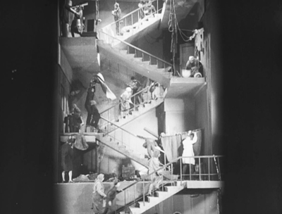
It’s a satire on middle-class citizens’ maltreatment of their servants, though it doesn’t become Soviet-style preachy until well into the story. The film begins by setting up the titular house (on a well-known street in Moscow). We see it via its staircase and landings in the morning, rendered in a vertical view that looks startlingly like an iPhone image (above). It also recalls the seven levels in the staircase elevator shot climbing upward to 7th Heaven, though who knows whether Barnet had seen that by the time he planned his film. The residents of the various apartments emerge to use the communal stairway as a junkyard and work area, dumping trash, splitting firewood, beating curtains, and generally abusing the rules of the building, as one conscientious young Party member points out.
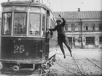
We are introduced to a barber, whose lazy wife makes him do all the chores. Then suddenly we’re with a professional driver with his own car. Just as suddenly we’re watching a peasant girl chase her runaway duck through a maze of traffic and nearly get hit by a tram. As the driver brakes hastily and jumps out to see if she’s hurt, there’s a freeze-frame.
A narrating title declares, “”But wait, we forgot to tell you how the duck ended up in Moscow.” Reverse motion leads to another title, “A day earlier.” A flashback to the heroine’s comic departure from a train station in the middle of nowhere shows the very uncle whom she is going to Moscow to visit arriving at the station just after she has left. Finding herself lost in Moscow with her duck, the heroine gains employment as a put-upon maid serving the barber and living in the house on Trubnoya. Her political awakening and the rehabilitation of the House on Trubnoya form the rest of the plot.
The House on Trubnoya is, in short, an imaginative, clever, and funny Soviet Montage film. Barnet’s other films are worth exploring as well. Check out The Girl with the Hatbox from 1927; it didn’t make last year’s top items, but it was on the long list.
10. La Chute de la maison Usher
Jean Epstein, who was probably the finest of the French Impressionist directors, has figured in these ten best lists before, in 1923 for Cœur fidèle, in 1924 for the little-known L’affiche, and 1927 for his masterly La Glace à trois faces.
I have long considered La Chute de la maison Usher interesting for its use of German Expressionist-inspired sets, but the fuzzy, incomplete prints that for decades were the only available versions made it difficult to enjoy. The restored version on the complete DVD set of Epstein’s works, which I discussed here, makes it far more interesting.
Taking its slim plot from Poe, the film follows a visit by an elderly man to the isolated castle of his old friend, Roderick Usher. Usher is painting a portrait of his beloved wife, but it is soon made clear that each time he presses the brush to the canvas, a little of her life is drained away–though the local doctor is mystified by her decline.
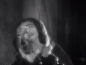
The film retains some of the traits of Impressionism, as when Madeline’s reaction to the effects of her husband’s painting are rendered in a superimposition of negative and positive images of her face.
The film has a minimal plot, but its focus is largely on experimentation in creating an eerie atmosphere. Shots of books falling in slow motion from their shelves, of curtains blowing in a cold wind that seems perpetually to invade the house, of frogs copulating in a nearby pond, and of the Expressionist-derived decors contribute less to a linear plot than to a mood of undefined menace.
The castle’s exterior is represented by obvious cardboard models, which tends to undermine the effect created by the interiors. The cheapness of these models is particularly noticeable in the climactic scene of the destruction of the house. This is unfortunate, but one must give Epstein credit for having done so much with so little.
This will be Epstein’s final appearance in our “Ten Best” lists, but I would like to call attention to his other 1928 film, Finis Terrae, the first of what the Epstein box-set collects as his “Poémes Bretons.” These are less Impressionistic, though Finis Terrae has a few impressive subjective shots. They are more realistic and poetic, largely involving the sea.
As I wrote at the beginning, 1928 was part of the period when the American industry was on the cusp of making sound standard in its films. Other national cinemas followed at various paces. One film that did not quite make my top-ten list demonstrates what must have worried film theorists and critics–and no doubt some filmmakers.
The restored version of Lonesome includes some dialogue sequences in a film otherwise accompanied by recorded music. There is an enormous contrast between the silent and sound footage. The story is largely told visually, but the dialogue scenes, clearly done in a sound-proof studio, are delivered in a stilted fashion by the young actors who are otherwise so casual and lively. The prospect of whole films being made in that fashion clearly disturbed lovers of films like La Passion de Jeanne d’Arc and Steamboat Bill, Jr. Watching Lonesome gives a dramatic insight into this slice of cinema history–a period that fortunately lasted only a few years as the technology improved and as filmmakers increasingly managed to make sound films that were just as imaginative, artistic, and engrossing as their silent predecessors.
January 6, 2019: Thanks to Docks of New York fan Tony Lucia for a correction on that section.
Spione
Ninotchka’s mistake: Inside Stalin’s film industry
DB here:
It’s a commonplace of film history that under Stalin (a name much in American news these days) the USSR forged a mass propaganda cinema. In order for Lenin’s “most important art” to transform society, cinema fell under central control. Between 1930 and 1953 a tightly coordinated bureaucracy shaped every script and shot and line of dialogue, while Stalin frowned from above. The 150 million Soviet citizens were exposed to scores of films pushing the party line.
True? Not quite.
When cows read newspapers
The Miracle Worker (1936).
In the film division of the University of Wisconsin—Madison, we’ve developed a reputation for revisionism. We like to probe received stories and traditional assumptions. In Soviet film studies, Vance Kepley’s In the Service of the State challenged the idealized portrait of Alexandr Dovzhenko, pastoral poet of Ukrainian film, by tracing his debts to official ideology. In my book on Eisenstein, I suggested that this prototypical Constructivist opens up a side of modernism that is artistically eclectic, and even conservative in its gleeful appropriation of old traditions.
Now we have a new book telling a fresh story. Maria (“Masha”) Belodubrovskaya’s Not According to Plan: Filmmaking under Stalin draws upon vast archival material to argue that filmmaking, far from being an iron machine reliably pumping out propaganda, was decentralized, poorly organized, weakly managed, driven by confusing commands and clashing agendas. Censorship was largely left up to the industry, not Party bureaucrats, and directors and screenwriters enjoyed remarkable flexibility.
Was this an ideological juggernaut? Aiming at a hundred features a year, the studios were lucky to release half that. In 1936 95 films were planned, but only 53 were produced and 34 made it to screens. From 1942 on, those millions of spectators saw only a couple of dozen annually. The nadir was 1951, with 9 releases. (Hollywood studios released over 300.) The flood of propaganda was more like a trickle. Theatres were forced to run old Tarzan movies.
When quantity became thin, apologists claimed that quality was the true goal. But Ninotchka’s hope for “fewer but better Russians” wasn’t realized in the film domain. Critics and insiders admitted that nearly all the films that struggled into release were mediocre or worse.
Not According to Plan shows that Soviet institutions were incapable, by their size, organization, and political commitments, of organizing a mass production film industry. Efforts to set up something like the U.S. studio system ran up against obstacles: there weren’t enough skilled workers, and decision-makers clung to the notion of the master director. Boris Shumyatsky, who visited Hollywood and tried to create something similar at home, got his reward at the muzzles of a firing squad. But brute force like this was rare; there were few administrators and creators to spare.
The great plan was to have a Plan—specifically, a thematic one. Production would be based on an annual cluster of powerful topics like “Communism vs. capitalism” and “Socialist upbringing of the young.” Personnel were slow to realize that themes were not stories, let alone gripping ones, and the real work of imagination remained un-plannable. Starting from themes rather than plot situations, the overseers could judge only final results, which meant enormous investments in development and production—all of which might never yield a politically correct movie.
Production, wholly divorced from distribution and exhibition, couldn’t count on the vertical integration of Hollywood. Masha shows in rich detail how policies and routines worked against large-scale output. One of the most striking of those policies was the veneration of directors. A great irony of the book is that Hollywood filmmaking, with its platoons of screenwriters both credited and uncredited, was more collectivist than production in the USSR. Soviet directors enjoyed enormous stature and power. They were often the moving force behind a production, bringing on writers and then recasting the script during shooting. Assemblies of directors formed review committees, discussing and often defending their peers’ work. As Masha puts it:
The filmmaking community, and specifically film directors, never gave up on the standard of artistic mastery. They listened to the signals sent by the Soviet leadership, but then incorporated these into their own professional value system, which developed in the 1920s outside the purview of the state. Using the state’s discourse of quality and their peer institutions, they enforced their own shared norms of artistic merit.
The downside of this system, plan or no plan, was that when the film didn’t pass muster, the director was to blame. Yet the twenty or so “master” directors could survive failed projects. New talent wasn’t trusted; there were too few directors; and most basically, the organization of production remained artisanal. The role of the producer (let alone the powerful producer) scarcely existed. To a surprising extent, Soviet cinema encouraged the director as auteur. How’s that for revisionism?
Screenwriters weren’t as powerful, but they did their part. Masha has a fascinating chapter on the changing conceptions of the Soviet screenplay. The “iron scenario,” modeled on a Hollywood shooting script, was intended to lay out the film in toto, so directors couldn’t overshoot or make changes. This initiative, predictably, failed. There followed other variants: the butter scenario, the margerine scenario, and the rubber scenario (no kidding), then the emotional scenario and the literary scenario.
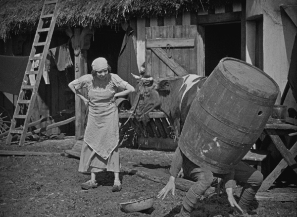
Masha traces the work process of screenwriting and the mostly futile efforts of literary figures to leave their stamp on a production. A similar stress on process characterizes her occasionally hilarious case studies of censorship. Some of these expose the limits of industry self-censorship. One agency signs off on a film, the next one castigates it, the next one reverses that judgment, Pravda weighs in, and finally Stalin speaks up—with a completely unpredictable verdict, à la Trump. The tale of Medvedkin’s The Miracle Worker, which jumped through all the hoops and wound up being banned after initial screenings anyhow, might have been written by Zoshchenko or Ilf and Petrov. Among the elements judged “absolutely impermissible” were shots of cows reading newspapers.
The artistic and popular success of Soviet films during the New Economic Policy (1921-1928) had spurred hopes for a mass-market sound cinema that was also of high quality. What crushed that dream? Masha gives us the hows (the machinations of the studios and government bodies) and the whys (the underlying causes and rationales). Not According to Plan is a trailblazing study of what she calls “the institutional study of ideology.” It’s also a quietly witty account of the failures of managed culture. How could artists be engineers of human souls if they couldn’t engineer a movie?
But go back to the quality issue. What were those Stalinist films like artistically?
Socialist Formalism
Three projects I’ve undertaken led me to Stalin-era cinema. Nearly all English-language film histories ignored it, or reduced it to boy-loves-tractor musicals. So Kristin and I wanted our textbook Film History: An Introduction to consider it. (Revisionism again.) My Cinema of Eisenstein and On the History of Film Style built on what I saw at archives in Brussels, Munich, and Washington DC.
As a result I sought to mount an argument that Stalinist cinema was worth our attention, especially from the standpoint of film technique. The run-of-the-mill productions seemed fairly shambolic, but the top-tier dramas revealed an academic style that interested me. Some films recalled, even anticipated, innovations taking hold in Europe and America, but other creative choices were surprisingly offbeat, and not what we associate with standard propaganda.
For one thing, it was clear that montage experiments didn’t end with the 1920s, the arrival of sound, or even the “official” establishment of Socialist Realism around 1934. Granted, classic continuity editing rules the fiction films of the 1930s and 1940s, and the most flagrant extremes of the montage style were purged.
But some moments recall the silent era. These passages are typically motivated, as in Hollywood and other national traditions, by rapid action. Military combat calls forth stretches of 2-4 frame shots of bombardment in The Young Guard, Part 2 (1948). The combat scenes of The Battle of Stalingrad (1949) include very brief shots. In one passage, an artillery blast consists of three frames—one positive, a second negative, and a third positive again, creating a visual burst.
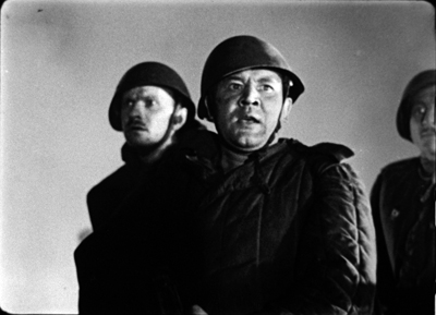
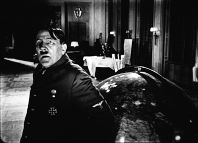
The abrupt disjunctions of the 1920s style can be felt a little in one cut of The Fall of Berlin (1950), when at the end of a long reverse tracking shot, Alyosha and his comrades rush the camera. Cut to Hitler recoiling, as if he sees them.
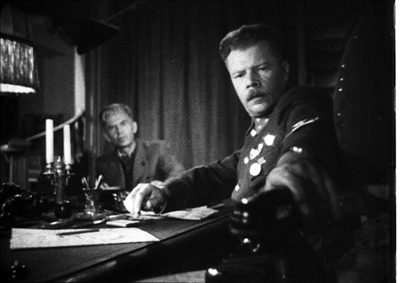
As you’d expect in an academic tradition, the use of fast cutting for fast action isn’t disruptive. A little more unusual is the embrace of wide-angle lenses, often more distorting than in Western cinema. Wide-angle imagery was used by 1920s filmmakers, often to caricature class enemies or to heroicize workers. The same sort of thing can be seen in Kutuzov (1945), when a soldier is presented in a looming close-up, or in Front (1943), when a gigantic hand reaches out for a telephone.
This use of wide angles to give figures massive bulk continued through the 1950s, as in The Cranes Are Flying (1957).
The 1940s aggressive wide-angle shots run parallel to Hollywood work, when in the wake of Citizen Kane (1941), The Little Foxes (1941), and other films, many directors and cinematographers created vivid compositions in depth. Those weren’t unprecedented in America, as I try to show in the style book, but there were some early adopters in Russia as well.
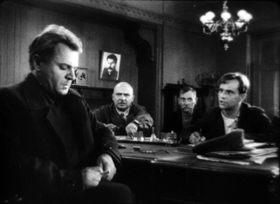
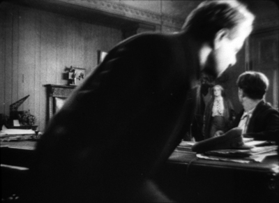
Obliged to show meetings of saboteurs, workers, generals, and party leaders, Soviet filmmakers had to dramatize people in rooms, talking at very great length. The result was a tendency toward depth staging and fairly long takes. The low-angle depth shot stretching through vast spaces became a hallmark of this academic style in the 1930s and after.
Director Fridrikh Ermler, one of the few directors who was a Party member, claimed that he devised a “conversational cinema” to deal with the prolix dialogue scenes in The Great Citizen (1937, 1939). The movie teems with shots that wouldn’t look out of place in American cinema of the 1940s.
As a solution to the problem of talky scenes, staging of this sort makes sense as a way to achieve some visual variety, and to show off production values. By the 1940s, such flamboyant depth became even more exaggerated. We see it in the telephone framing from Front above, as well as in The Young Guard Part 1 (1948, below left) and the noirish stretches of The Vow (1946, below right).
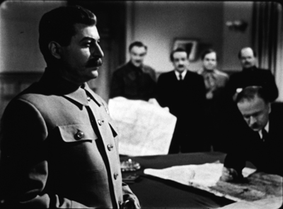
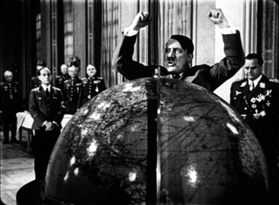
The Fall of Berlin can use depth to contrast the placid self-assurance of Stalin with a ranting Hitler, bowled over by his globe. Is this a reference to the globe ballet in The Great Dictator?
It’s well-known that for Kane Orson Welles and Gregg Toland wanted to maintain focus in all planes, sometimes resorting to special-effects shots to do so. The Soviets valued fixed focus as well, as several shots above suggest. It could be maintained if the foreground plane wasn’t too close, and the depth of field would control focus in the distance. Hence many shots use distant depth. At one point in The Great Citizen, when a woman interrupts a meeting, the official in the foreground trots all the way to the rear to meet her.
The sense of cavernous distance is amplified by the wide-angle lens.
But sometimes pinpoint focus in all planes wasn’t the goal. Another way to activate depth was to rack focus. In this scene of Rainbow (1944), the man who has betrayed the village comes home and discovers a delegation waiting to try him. At first they’re out of focus, but when he turns they become visible.
Focused or not, some of these shots push important action to the edge of visibility in a way that would be rare in American cinema. In A Great Life, a snooper is centered but sliced off by a window frame and kept out of focus, while a trial scene is interrupted by a figure far in the distance who bursts in to announce a mine collapse.
The Great Citizen shows Shakhov discussing a suspect, who hovers barely discernible in the background over his left shoulder. I enlarge the fellow and brighten the image.
This makes Wyler’s sleeve-shot in The Little Foxes seem a little obvious.
The Great Whatsis and the masters of the 1920s
The New Moscow (1938).
If American movies favor titles called The Big …., the Soviets liked The Great …. (Velikiy). But The Big Sleep doesn’t look all that big, and The Big Sick is big only to a few people, and The Big Knife doesn’t even have a knife. In the USSR, calling something big summoned up monumentality. Stalinist culture was grandiose in its architecture, sculpture, painting, literature, and even music, with symphonies of Mahlerian length and oratorios boasting hundreds of voices.
Accordingly, one effect of the depth aesthetic was to grant the characters and their settings a looming grandeur. Earth-changing historical events were being played out on a vast stage that framing and set design put before us.
Naturally, battles are on a colossal scale. Napoleon broods in the foreground (Kutuzov) and troops march endlessly to the horizon (The Vow).
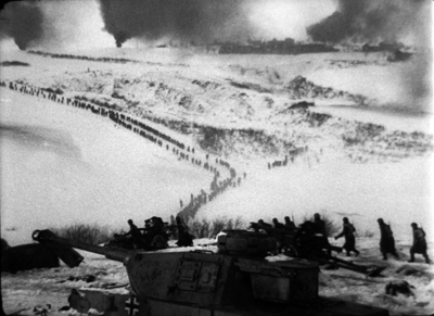
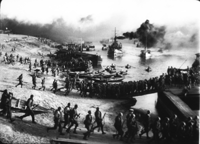
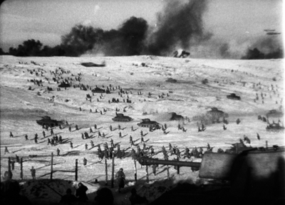
1940s films feature wartime landscapes on a scale almost unknown to Hollywood. If God favors the biggest battalions, God would seem to love the Russians (a prospect that otherwise seems invalidated by history). Below: The Battle of Stalingrad.
These landscapes are surveyed in long tracking shots, a habit that survived in Bondarchuk’s War and Peace (1966-1967).
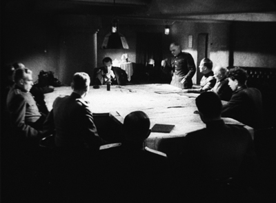
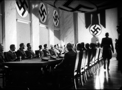
Soviet forces command impressive headquarters (The Great Change, 1945), perhaps necessary to balance the Nazis’ resources (The Vow).
Parlors and committee rooms are remarkably big, and even prison cells (The Young Guard Part 2) and farmhouses (The Vow) have plenty of room.
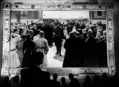
Gigantism wasn’t unknown in 1920s cinema, or in Russian painting both classic and recent. The Vow seems to justify its scale by reference to a Repin painting, which the characters see on display.
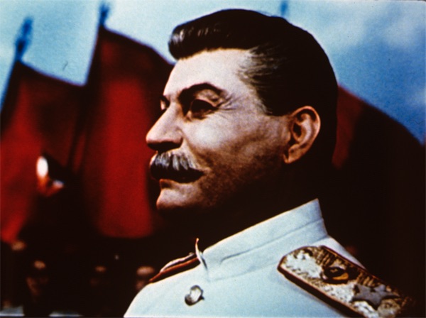
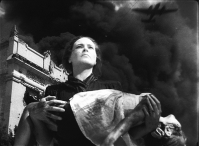
Not only were the 1920s silent classics monumental; they became monuments. Masha records the veneration that the “master” directors felt for the works of Eisenstein, Pudovkin, Kuleshov, Barnet, and other predecessors. Moments in the Stalinist cinema seem to refer back to that era. The Battle of Stalingrad evokes the mother with the slain child on the Odessa Steps, and The Vow has the nerve to superimpose on Stalin (friend of farmers) an image of concentric plowing from Old and New.
These can be taken as cynical ripoffs, but in a way they testify to the fact that great silent films had forged some enduring iconography.
VIP: Very important, Pudovkin
You don’t hear much about Pudovkin’s 1930s and 1940s films, but they can be exuberantly strange. Eisenstein aside, he stands in my viewing as the director who played around most ambitiously with the academic style. Perhaps he was encouraged in this by his young codirector Mikhail Doller, but Pudovkin had already tried out some audacious strokes in A Simple Case (1932) and Deserter (1933).
For a high Stalinist example take Minin and Pozharsky (1939). This tale of seventeenth-century warfare seems virtually a reply to Alexander Nevsky (1938), as Mother (1926) responded to Strike (1925). Minin opens with statuesque staging reminiscent of Eisenstein’s film, but the scene is handled in telephoto shots and to-camera address. The combat scenes employ handheld battle shots, along with close-ups of fighters and horsemen that aren’t stylized in the Nevsky manner.
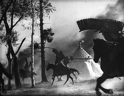
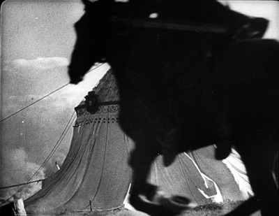
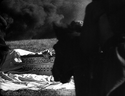
But there’s more than pastiche here. One battle shows the Russian forces rushing from the left in tight tracking shots, while the enemy forces move from the right in panning telephoto. Especially striking are axial cuts, beloved of Soviet filmmakers for static arrays, employed in movement. Horses sweep past a tent in extreme long-shot; they smash into the tent in long shot; and in a closer view the tent lies trampled as other horses continue to flash through the foreground.
The shots are 50 frames, 38 frames, and 13 frames respectively. For a moment, we might be back in the great era of Soviet editing.
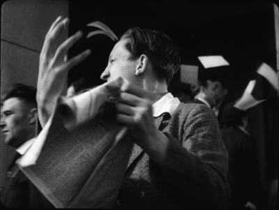
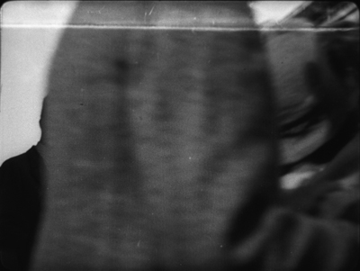
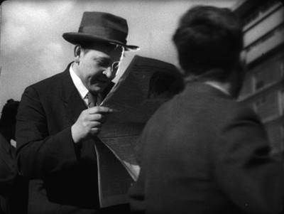
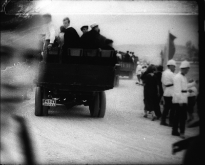
Victory from 1938 is a drama in which aviators set out to rescue an interrupted around-the-world flight. Here Pudovkin and Doller invoke the depth staging of the era only to disrupt it with what we might call “smear” cuts.
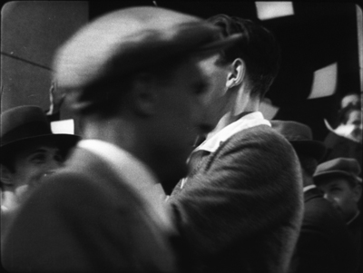
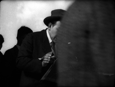
During the parade for the departing airmen, for instance, a young man happily tossing papers, in another grotesque wide-angle shot. He’s blocked by a man passing through the frame. Match on action cut to another figure, close to the camera and moving in the same direction. This figure wipes away to reveal a man reading a newspaper.
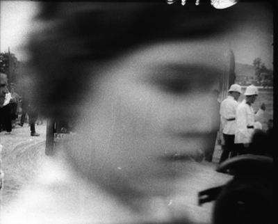
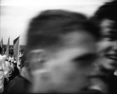
This sort of weird graphic match becomes a stylistic motif in the film. Later, when the rescue has been completed, another crowd scene yields a similar pattern of depth smeared and exposed. A shot of the parade is sheared off by a woman’s passing face. That cuts to a man’s passing face, which moves away to show the crowd behind him.
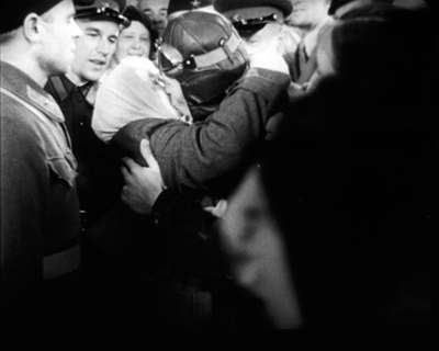
The patterning pays off when the victorious plane rolls triumphantly through the frame, blotting out the image, to be graphically matched by a passing figure who unveils the pilot’s mother embracing him.
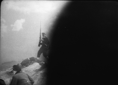
In Admiral Nakhimov (1947) Pudovkin and Doller employ the smear-cutting technique during a battle scene. Stills are totally unable to capture the way this looks. Soldiers charge up a hill, and their falling bodies, briefly blocking the camera’s view, are given in jump-cut repetitions that suggest, through a spasmodic rhythm, the sheer difficulty of advancing.
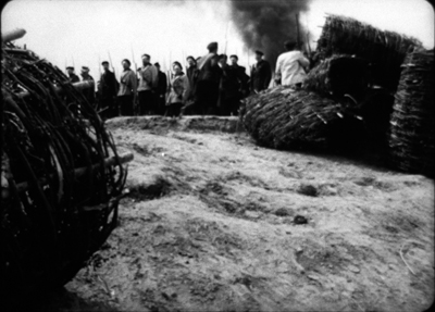
Even stranger is the moment when soldiers rush toward a distant fortification, with a latticework basket in the foreground. Cut to the hill edge, with a comparable blob moving leftward through the frame. It turns out to be a fighter’s shoulder.
The oddest part is that this second shot is only six frames long, and every frame after the first is a jump cut; that is, some frames have been dropped as the blob makes its way across the image. The effect on your eye is percussive, and seems to be anticipated by Pudovkin’s experiments in popping black frames into shots in A Simple Case. What kind of director thinks like this?
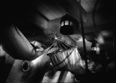
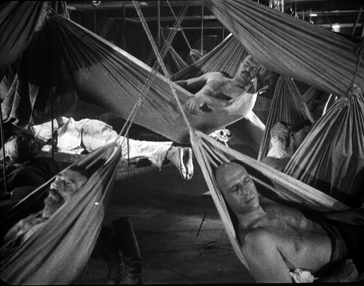
Of course these Pudovkin/Doller films also subscribe to the official look, with monumental depth staging. The films acknowledge the 1920s tradition as well. Admiral Nakhimov casts a personal look back to Pudovkin’s great rival. A shot of the crew’s tautly bulging hammocks recalls, maybe cites, the crew’s sleeping area of Potemkin.
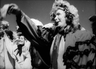
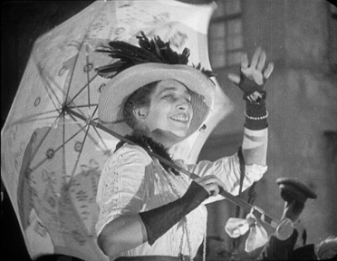
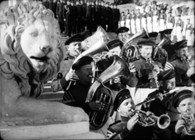
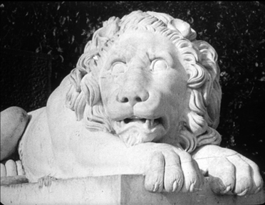
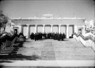
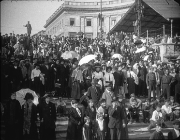
In Odessa, Admiral Nakhimov echoes Potemkin even more strongly. We get waving crowds, the stone lions, and a reminder of those famous steps.
In sum, the Stalinist cinema holds a unique interest for students of the history of film style. Not only did it apparently constitute a significant development in technique, but in forming a tradition, it provided a counterpart and sometimes a counterpoint to developments in the West. Later that tradition became something for directors to react against (Tarkovsky and Sokurov come to mind) or to adapt to new purposes (I’d put Jancsó in that category). For all the behind-the-scenes bungling, it became much more than a propaganda vehicle.
Scholars who study Stalinist film are usually impelled by an interest in propaganda or an interest in the audience’s response. My questions were different. I was driven by my interest in Eisenstein and comparative stylistics. So I tried to investigate the formal and stylistic norms of Soviet cinema. Some of those norms Eisenstein helped create, and then revised for his own ends.
Still, I feel like a butterfly collector picking out vivid specimens for an expert to explain. I can’t supply the hows and whys. How did filmmakers manage to create these remarkable images? What technical resources, of lenses and lighting rigs and film stock and set design, permitted them to craft these striking shots? Were their peers and masters insensitive to this official look? Was it taken for granted? Or was it self-consciously promoted and taught? Some of these schemas are developed in Eisenstein’s lectures at the Soviet film school. And how, at a more micro-level, do these patterns function in the individual films?
As for the whys: Why did filmmakers embrace these options rather than others? And why did they develop, sometimes apparently in a spirit of play, some oddball technical innovations?
Such questions seem to me compelled by films that turn out to be more artistically interesting than most commentators have noted. One of the most corrupt and brutal political systems in world history produced films of considerable interest, and a few of enduring value. I hope experts try to figure this all out. I bet Masha Belodubrovskaya will lead the way. Her new book is a splendid start.
Masha is no stranger to this blog, having translated Viktor Shklovsky’s remarkable “Monument to a Scientific Error” for us.
This is a good place to thank all the people who helped me see Stalinist films in archives over the decades. That number includes Gabrielle Claes, Nicola Mazzanti, and the late Jacques Ledoux of the Belgian Cinematek; Enno Patalas, Klaus Volkmer, and Stefan Droessler of the Munich Film Museum; and Pat Loughney, then of the Library of Congress.
I learned of Ermler’s “conversational cinema” (razgovornyi kinematograf) from Julie A. Cassiday’s “Kirov and Death in The Great Citizen: The Fatal Consequences of Linguistic Mediation,” Slavic Review 64, 4 (Winter 2005), 801-804. The depth aesthetic of high Stalinist cinema proved valuable when 1960s bureaucrats decided to make Stalin disappear. See our online supplement to Film History: An Introduction.
There are more examples of “Stalinist formalism” in On the History of Film Style–recently declared out of print, but soon to appear in a new electronic edition on this site. See also my Cinema of Eisenstein for arguments about how he created and then swerved from some of his peers’ norms.
Today’s Google Doodle pays tribute to Eisenstein on his birthday. But they make him a slim, hip metrosexual. Revisionism can go too far.
Kelley Conway, Masha, and Scott Gehlbach, at a party last night celebrating Masha’s book–and her winning tenure! Kelley’s contributions to our blog are here and here and here.
The ten best films of … 1926
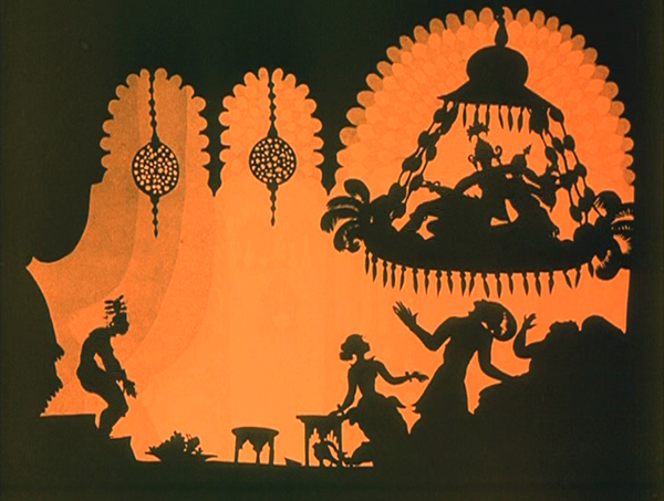
The Adventures of Prince Achmed.
Kristin (with some help from David) here:
David and I have been offering this greatest-of-90-years-ago series almost as long as this blog has existed. For earlier annual entries, see 1917, 1918, 1919, 1920, 1921, 1922, 1923, 1924, and 1925.
I approached 1926 with the assumption that it would present a crowded field of masterpieces; surely it would be difficult to choose ten best films. Instead it turned out that some of the greatest directors of the era somehow managed to skip this year or turn in lesser films. Eisenstein had two masterpieces in 1925 but no film in 1926. Dreyer made a film that is a candidate for his least interesting silent feature, The Bride of Gromdal. Chaplin did not release a film, and Keaton’s Battling Butler, while a charming comedy, is not a plausible ten-best entry. The production of Lang’s Metropolis went over schedule, and it will appear on next year’s list, for certain.
Still, the Soviet directors were going full-tilt by this time and contribute three of the ten films on this year’s list. French directors on the margins of filmmaking created two avant-garde masterpieces. Two comic geniuses of Hollywood already represented on past lists made wonderful films in 1926. A female German animator made her most famous work early in a long career. I was pleased to reevaluate a German classic thanks to a sparkling new print. Finally, Japan figures for the first time on our year-end list, thanks to a daring experimental work that still has the power to dazzle.
The Russians are coming
Vsevolod Pudovkin’s Mother was a full-fledged contribution to the new Montage movement in the Soviet Union. By the 1930s, that movement would be criticized for being too “formalist,” too complex and obscure for peasants and workers to understand. Nevertheless, being based upon a revered 1906 novel of the same name by Maksim Gorky, Mother was among the most officially lauded of all Montage films. It tells the story of a young man who is gradually drawn into the Russian revolutionary movement of 1905. His mother, the protagonist of the novel, initially resists his participation but eventually herself joins the rebellion.
Along with Potemkin, Mother was one of the key founding films of the Montage movement. Its daring style is no less impressive now than it must have been at the time. One brief scene demonstrates why. Fifteen years before Mother, D. W. Griffith was experimenting in films like Enoch Arden (1911) with cutting between two characters widely separated in space, hinting that they were thinking of each other. By 1926, Pudovkin could suggest thoughts through editing that challenged the viewer with a flurry of quick mental impressions.
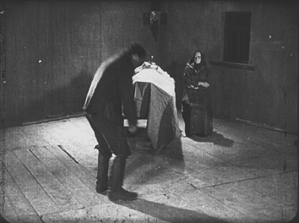
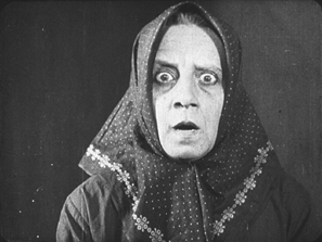
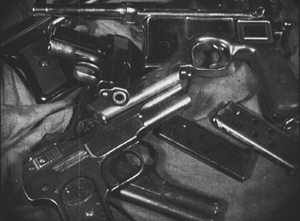
As the Mother sits beside her husband’s dead body, her son, a participant in the 1905 failed revolution, comes in. He is about to bend down and open a trap-door in the floor (73 frames). A cut-in shows her horrified reaction (12 frames), and there follows a brief close shot of some guns she had seen him hide under the floor in an earlier scene (11 frames). Even shorter views of a man clutching his chest (8 frames), two jump-cut views of the dead husband (3 frames and 2 frames), and a tight framing of the son being shot follow (8 frames). We return to her face, registering even greater horror (15 frames). A return to the initial long shot shows her leaping up to try and stop her son from taking the guns out to participate in a seditious act (31 frames).
The series of five shots goes by in a few seconds, and we are challenged to grasp that the guns are a real memory, while the shots of the man’s chest and her son’s anguished face are visions of what might happen. The shots of her husband’s body suggest that she could soon end up sitting by her son’s corpse as well. The jumble of recollection, imagination, and reality are remarkably bold for this relatively early era.
Mother also contains two of Pudovkin’s most memorable scenes, the breaking up of ice in the spring as a symbol of the Revolution and the final violent attack on the demonstrators, including the heroine.
Mother was released on DVD by Image Entertainment in 1999, but it seems to be very rare. An Asian disc, perhaps a pirated edition of the Image version, is sold on eBay. I’ve never seen the film on DVD and can’t opine on these. The time is ripe for a new edition.
Pudovkin was one of the filmmakers who had studied with Lev Kuleshov during the early 1920s, when Kuleshov made the famous experiments that bear his name. Pudovkin played the head of the gang of thieves in The Adventures of Mr. West in the Land of the Bolsheviks, which I included in the ten-best list of 1924.
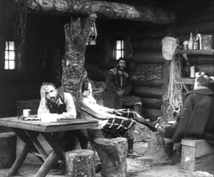
Kuleshov had moved on as well to direct his most famous film and probably his best silent, By the Law, based on Jack London’s story “The Unexpected.” Set in the Yukon during the gold rush, it involves five people who are cooperatively working a small claim and discover gold. Taking advantage of a warm autumn, they stay too long and are trapped for the winter. One of the men kills two of the others, and the heroine, Edith and her husband Hans are left to determine the fate of the killer, Dennin. Edith insists on treating him strictly according to the law. After enduring the harsh winter and a spring flood, the couple finally act as judge, jury, witnesses, and, after finding Dennin guilty, executioners.
The great literary critic and theorist Viktor Shklovsky (one of the key figures of the Russian Formalist school) adapted the short story, condensing it by eliminating the opening section of Edith’s backstory and a few scenes in which a group of Indians appear occasionally to help the prospectors. The result is a concentration on the tense drama of a three people trapped together in a tiny cabin.
In the 1924 entry, I mentioned that Kuleshov’s team emphasized biomechanical acting and that Alexandra Kokhlova was adept at eccentric acting. She delivers a bravura performance here, as Edith moves closer to a breakdown as the months go by.
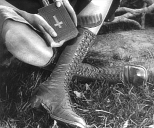
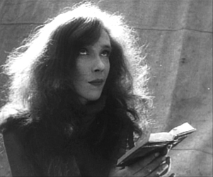
Kuleshov also puts into practice the experiments in imaginary geography that his classes had made. Although in this film he didn’t unite shots made in widely separate spaces, he did favor scenes built up of a considerable number of detail shots before finally revealing the entire space in an establishing shot. Edith, for example, though glimpsed briefly asleep early on, is introduced in a later scene by a shot of her boots and Bible, followed by a shot of her head as she read the Bible. The scene also contains close shots of the other characters before a general view of the cabin interior shows where each of them is.
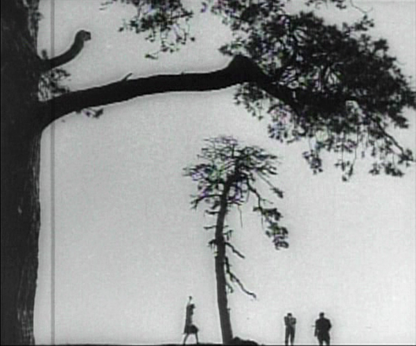
The scene of the execution includes one of the most famous images of the Monage movement, a framing with the horizon line at the bottom edge of the frame and the sky dominated by trees (see bottom). Any number of framings of tall features such as trees and telephone poles against a huge sky appeared in Montage and non-Montage films, and this device became so common as to be a trait of the Soviet cinema of the late 1920s and early 1930s.
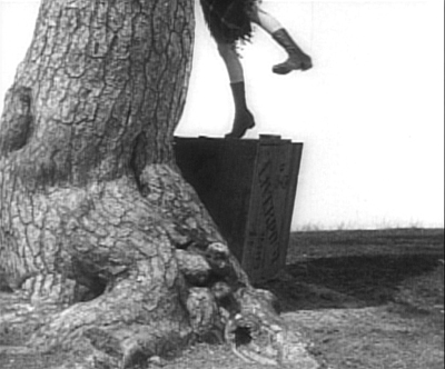
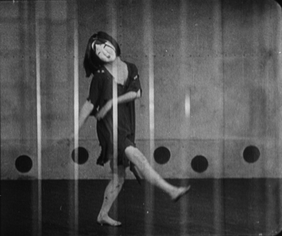
The desire to hide the actual hanging led Kuleshov to stage is behind the larger of the two trees, as Edith and Hans struggle to carry out their sentence on Dennin. This leads to some eccentric framings, such as our view only of Edith’s legs as she teeters on the box where Dennin stands, presumably adjusting the noose (see top of this section).
A beautiful print of By the Law is available on DVD from Edition-Filmmuseum.
Grigori Kozintzev and co-director Leonid Trauberg did not study with Kuleshov, but they shared a passion for eccentricity. Having started out in the theater, in 1921 both contributed to the “Manifesto for an Eccentric Theater,” a dramatic approach based on popular forms like circus and music-hall. In 1922 they founded the “Factory of the Eccentric Actor” group and two years later transformed it into FEKS, devoted to making films.
The Overcoat (also known in English as The Coat), their second feature, was based on a combination of two short stories by Gogol, an author whose grotesque creations were very much in tune with their own tastes. It tells the story of a poor, middle-aged low-level government clerk, Akaky Akakievich, who is bullied over his shabbiness, particularly his worn-out overcoat. Scrimping to buy a new one, he finally purchases a magnificent new coat and finds his status suddenly raised–until the coat is stolen.
Andrei Kostrichkin was a mere twenty-five years old when he played the fiftyish clerk, but he was highly effective and provided another model of the eccentric actor. As Akakievich he stands with bent legs and twisted torso, as if flinching away from a blow, and walks in tiny steps along perfectly straight lines through the hallways in his office building. When he applies to a Person of Consequence for help in recovering his stolen coat, the official leans over his desk to look downward, with a high-angle point-of-view framing of Akakievich appearing dwarfed by the other’s superiority.
The script of The Overcoat was adapted by another Russian Formalist critic and theorist, Yuri Tynjanov.
Unfortunately The Overcoat does not seem to be available on any form of home video.
Petit mais grand
The IMDb lists 23 directing credits for Dimitri Kirsanoff from 1923 to the year of his death, 1957. He is largely remembered, however, for one film, the 37-minute Ménilmontant, a melodrama about the travails of two sisters orphaned as children by a violent crime. Each is later seduced by a callous young man who leaves the heroine a single mother and her sister reduced to prostitution. It belongs to the French Impressionist moment. (We deal with Impressionist films in other entries: La roue, L’inhumaine, L’affiche, Coeur fidèle, The Smiling Madame Beudet, Le brasier ardent, Crainquebille, and El Dorado, as well as DVD sets of Impressionist films by the Albatros company and by director Jean Epstein.)
The story itself is simple and indeed might be thought clichéd were it not for two factors. First, there’s the performance of the delicately beautiful Nadia Sibirskaïa as the protagonist. There’s also the lyrical, melancholy use of the settings, initially in the countryside and later in the desolate working-class Parisian district whose name gives the film its title. The simplicity of the narrative also makes it one of the most successful of the attempts to tell a story visually, eschewing intertitles.
The film’s most famous scene is its abrupt, shocking opening. With no establishing shot, there is a series of rapid shots of details of faces, hands, a window, and an ax, during which we can barely discern that a man has committed a double murder. The spectator cannot possibly know who these people are and why the murders occur.
Instead of offering an explanation, the action then shifts to two little girls playing in the woods. As they return home, the camera begins to concentrate on one of them, apparently the younger, as she arrives at the murder scene and reacts in horror. Kirsanoff presents her expression in a series of five shots, linked by what David has termed axial cuts, from medium shot to extreme close-up as she gradually realizes what has happened.
There had certainly been axial cuts before this, including in Potemkin, but Kirsanoff probably went further than anyone of the era by including so many shots, by making each so short, and by moving his camera forward in such small increments. It is difficult to notice every cut, particularly the one from the third to the fourth shot, and the effect adds an unsettling quality to an already intense moment.
After this opening, a funeral scene reveals through labels on the grave that the murdered man and woman are the children’s parents. We might have suspected that the killer was a jealous husband discovering his wife with her lover. As it is, we never learn whether the crime was the result of a love triangle or the random act of a madman.
The rest of the film establishes the sisters now grown up, working in a workshop making artificial flowers and sharing a small flat in Menilmontant. The heroine’s brief romance leads to a baby, and superimpositions and other Impressionist techniques depict her despair and contemplation of suicide. Beautifully melancholy atmospheric shots of the streets of the neighborhood punctuate the action and underscore the dreariness and hopelessness that the heroine faces. The ending, though an improvement in the heroine’s lot, does little to dispel the overall grimness of the story.
Menilmontant is included in the out-of-print set “Avant-garde – Experimental cinema of the 1920s & 1930s.” It has been posted twice on YouTube in a low-rez format.
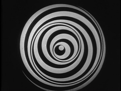
Even shorter is Anémic cinéma, the only venture into film directing by the great French Dadaist, Marcel Duchamp. It’s hard to compare a roughly seven-minute abstract film with narrative features, but this short is so innovative and influential that it’s also hard to leave it off the list.
Duchamp went through a phase of spinning artworks, including some “Rotoreliefs” that he attempted to sell as toys. These were similar to some Victorian optical toys, such as the Phenakistopscope and the bottom disks of Zoetropes. See Richard Balzer’s website for a collection of such devices, as well as “The Richard Balzer Collection” on tumblr, which contains gifs that animate some of the disks, done by Brian Duffy. Some of these resemble the spinning spirals and embedded circles that Duchamp used for his short. (See the top of this section.)
These spinning abstract circular images alternate with slowly spinning disks with sentences laid out as spirals. These involve either alliteration or puns or both. Unfortunately the English subtitles cannot render these in a way that conveys the original intent. For example, “Esquivons les ecchymoses des esquimaux aux mots exquis” becomes “Let us dodge the bruises of Eskimos in exquisite words.” The meaning is the same, and even the echo of the first syllables of “Eskimos” and “exquisite” is retained. Nevertheless, the similar syllables in two other words in the original are lost, as are the echoes of “moses,” “maux,” and “mots.” It is rather as though someone attempted to render “Peter Piper picked a peck of pickled peppers” into another language quite literally. (The Wikipedia entry includes a complete list of the sentences in French.)
Duchamp’s purpose was presumably to create an artwork with minimal means, including quasi-found objects, the disks he had made for another purpose. His idea is clearly reflected in the title, Anémic cinéma, which suggests a weakness or thinness of means. “Anémic” is also an anagram for “cinéma.”
Anémic cinéma is available in the same collection as Menilmontant, linked above. it is also available in the similarly out-of-print set, “Unseen Cinema.” There are numerous versions on YouTube, varying in quality. Some of these have been manipulated by other artists.
Lloyd and Lubitsch
Though Chaplin and Keaton might have had off-years in 1926, Harold Lloyd did not. Over the past several years, Lloyd has gradually been gaining the admiration he deserves. He used to be known largely for Safety Last (1923) and The Freshman (1925), two excellent films which, however, are not his finest. Girl Shy (1924) and The Kid Brother (1927) are better known now for the masterpieces they are. For Heaven’s Sake (directed by Sam Taylor), which clocks in at a mere 58 minutes, is just as good.
Lloyd plays a breezy millionaire, J. Harold Manners, who unintentionally helps Brother Paul found a mission in the downtown slums of Manhattan. He falls in love with Hope, the missionary’s daughter, and decides to help out around the place. By this time Lloyd was known for his spectacular chase scenes, and there are two here. Initially he puts a twist on the chase, luring a growing crowd of criminals into racing after him, ending in the mission. Gaining their respect, Harold makes the mission a happy social center.
The romance provides one of my favorite comic intertitles, leading into a love scene: “During the days that passed, just what the man with a mansion told the miss with a mission–is nobody’s business.” The love scene in turn includes a visual joke that emphasizes the rich boy – poor girl contrast.
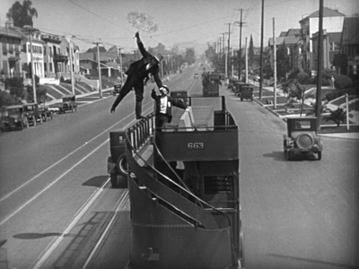
Harold’s rich friends hear that the pair are to be married and determine to kidnap him to prevent the inappropriate match. The result is a lengthy chase through the streets of Manhattan, with the drunken thugs rescuing Harold and using a variety of means to get him back to the mission in time for the wedding–as when the drunken leader of the group demonstrates his tightrope-walking abilities on the upper railing of a double-decker bus (see above).
Two years ago, when I put Girl Shy on my list, the New Line Cinema boxed set of Lloyd films was out of print and hard to find, and the separate volumes appeared to be going out of print as well, with Volume 1 not being available at the time. The situation has changed, and the boxed set, though apparently still out of print, is now available at reasonable prices from various third-party sellers on Amazon and Barnes & Noble. The set contains a “bonus disc” with extras, including interviews and home movies. The same is true for the three individual volumes (here, here, and here). For Heaven’s Sake is in Volume 3.
Inevitably, coming directly after Lady Windermere’s Fan, probably Ernst Lubitsch’s greatest silent film, So This Is Paris does not quite live up to its predecessor. Still, it’s a very fine, clever, and funny film, and it marks Lubitsch’s last appearance in these lists until sound arrives.
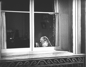
The opening scene, running nearly twenty-five minutes, is as good as anything Lubitsch did in this era. Set in Paris, it’s a slow build-up of misunderstandings and deceptions involving two affluent couples in apartments across the street from each other. One couple, Maurice and Georgette Lalle, are practicing a melodramatic dance in Arabian costumes. Their marriage seems to be a rocky one. Across the street, Suzanne Giraud is reading one of the lurid “Sheik” novels that were popular at the time, involving “burning kisses” in its final scene. Put into a romantic mood by this, she looks out her window and sees the head of a man in a turban at the window opposite–Maurice relaxing after his strenuous rehearsal.
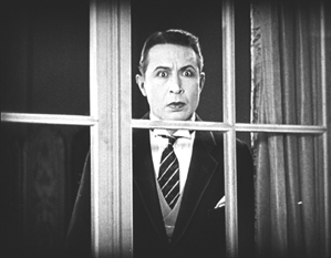
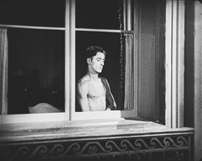
Her husband Paul arrives home, and she kisses him passionately. Apparently not used to such affectionate greetings, he is puzzled until he, too, looks out the window. By now Maurice has doffed his turban and necklaces and appears to be not only naked but also examining a piece of his anatomy.
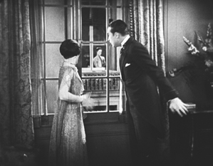
Paul jumps to the conclusion that this sight is what caused Suzanne’s unaccustomed display of passion. He calls her to the window, and we see Maurice in depth through the two windows.
Suzanne then asks if Paul is going to stand for such a thing, and he goes to the other apartment to confront Maurice. Instead he finds Georgette, who turns out to be an ex-lover of his. She introduces him to Maurice, who is very friendly and charms Paul. The latter who returns home and claims that he has beaten Maurice and even broken his cane on him, though in fact he had simply forgotten it. Shortly thereafter Maurice visits Suzanne to return the undamaged cane and takes the occasion to flirt with her. It’s a beautifully plotted and developed farcical scene. The film is based on a French play and could easily have become stagey in its adapted form. Yet the byplay between the two apartments via the windows allows Lubitsch to avoid any such impression; the misunderstandings based on optical POV recall the racetrack scene of Lady Windermere.
The rest of the film develops the two potentially adulterous affairs, primarily with Paul secretly taking Georgette to the Artists’ Ball. Here Lubitsch uses an elaborate montage sequence to convey the wild party, with superimpositions and shots taken through prismatic lenses.
Such sequences were primarily developed in German films and were still fairly rare in American ones in 1926. Similar techniques convey Paul getting drunk on the champagne he and Georgette are awarded when they win a dance contest–the announcement of which on the radio broadcast of the ball alerts Suzanne to her husband’s presence there with another woman.
So This Is Paris is less famous than Lubitsch’s earlier American comedies primarily because it has never appeared on DVD. Marilyn Ferdinand, in a blog entry that gives a detailed description of the film, writes that Warner Bros. claims not to own the rights to the film anymore and therefore has made no effort to bring it out on home video. On the other hand, a four-minute excerpt of the dance montage sequence was included in the Unseen Cinema set (disc 3, number 18), and the credit there is “Courtesy: Warner Bros., Turner Entertainment Company.” Whatever the rights situation is, a home-video version of this film is in order. A beautiful 35mm print is owned by the Library of Congress, so there is hope.
Two German flights of fancy
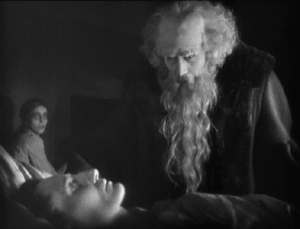
I must confess that I was disappointed the first time I saw F. W. Murnau’s Faust, and I have never warmed up to it in later viewings. I am delighted at having occasion to look at it again for this 1926 list, since a recently discovered and restored print reveals that the main problem before was the poor visual quality of the print formerly in circulation.
Different local release prints survived in a number of countries, but there were basically two original versions made: the domestic negative for German release and the export negative. These were shot using two camera side-by-side on the set, as was the standard practice in much of the silent era, given the lack of an acceptable negative-duplicating stock. The primary camera contributed most of the shots to the domestic negative, though in some cases where the second camera yielded a superior take, that was used in the domestic negative. Conversely, inferior takes from the primary camera sometimes made their way into the export negative. The result, as we now know, was that both the visual quality and in many cases the editing of the scenes was markedly different in the two negatives.
The version familiar for decades originated from the export negative. Recently the domestic negative was rediscovered, and the Friedrich Wilhelm Murnau Stiftung restored the that version using the that negative, supplemented with material from a variety of other prints. The result closely approaches the original German release version, including the original decorated intertitles. The contrast in quality between this restoration and the old, familiar Faust is remarkable.
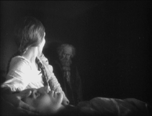
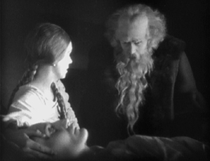
Given how dark the film is, details in the backgrounds could easily be lost. The scene in which Faust is called to help a woman dying of the plague is revealed to have dramatic staging in depth against a very dark room contrasted with the stark foreground underlighting of the woman’s haggard face. Faust enters from behind the daughter and comes forward to her, after which his movement is balanced by the daughter retreating into that same dark background.
The famous aerial journey of Mephisto and Faust from Germany to Italy (below left) always looked rather hokey, but the detail revealed in the extraordinarily extensive model makes it far more impressive. Similarly, when one can actually see the sets, visual echoes become apparent. For example, Faust first encounters Gretchen and follows her into the church, where he finds himself barred from entering by his pact with Mephisto. Later, when Gretchen has been abandoned, she laments when not permitted to enter there.
No doubt some motifs of this sort were visible in the earlier print, but their clarity here enhances both the beauty and the craft of Murnau’s film.
Faust is available in several editions on DVD and Blu-ray. DVDBeaver ran a detailed comparison among seven of these, including a selection of frame grabs. To my eye, the 2006 DVD “Masters of Cinema” version of the domestic print, released by Eureka!, looked the best. (The two-disc set also includes the export version.) The Blu-ray from the same source, released in 2014, looked slightly darker. The box for the Blu-ray also includes the DVD, however. These releases are Region 2. The film is available on Blu-ray in the USA from Kino.
Both Eureka! releases’ supplements include a booklet, a commentary track, a Tony Rayns interview, and a lengthy comparison of the domestic and export versions. One particularly striking example is drawn from the scene in which Mephisto talks with Gretchen’s brother in a beer hall, with the domestic version on the left.
While watching Faust, I kept grabbing frames, far too many to be used in this entry. They were simply too beautiful or impressive to be passed over, and they made my final selection of illustrations difficult. The only other film for which this was true this year is Lotte Reiniger’s silhouette-animated feature, The Adventures of Prince Achmed. The restored, tinted print that is currently available is even lovelier than the older black-and-white version.
Reiniger seems to have invented the use of jointed silhouette puppets, and she still is the first artist one thinks of in relation to this form of animation. She continued to practice it until the 1970s. (See the link below to a collection of many of her short films.) Her one feature film remains her most famous and is probably her masterpiece.
It involves far more than simple black figures moving against a light background. As the frame at the top of this entry shows, her characters, furnishings, and locations, all rendered in paper with scissors, were often elaborate indeed. Characters wore feathers, jewelry, fancy wigs, and other decorative elements. The hanging platform has many little tassels, and the lamps are rendered in delicate filigree. The backgrounds are not blank but have varying layers of saturation that suggest a depth effect, the equivalent of atmospheric perspective. At the left in the top image, a series of identical curtains start out a dusky orange and in three stages lighten until there is a bright, solid glow at the center.
In the frame at the left below, the same sort of shading creates the depth of a cavern, setting off the tracery of the foliage and the kiosk in which the hero finds the magic lamp. On the right, very simple shading suggests a vast and elaborate palace in the background, while Reiniger fills the foreground with many small figures, all marching out to surround the procession of the caliph.
By choosing a classical fantastic tale, Reiniger found the perfect subject matter to fit the technique that she invented. Both the subject matter and the sophistication of the animation give her films a timeless look. Her reputation remains high today as a result. One scene in Harry Potter and the Deathly Hallows Part 1, “The Tale of the Three Brothers,” was made in a style inspired by Reiniger’s work. (I discuss it here.)
A restored, tinted version of The Adventures of Princes Achmed is available from Milestone. A combination Blu-ray/DVD release of the film is available from the BFI. (I have not seen this version.) Note that these have somewhat different content. The BFI version has five Reiniger shorts from across her career along with a booklet. The Milestone version has only one of the shorts, but it includes a documentary about Reiniger. (This documentary was on the 2001 BFI release of the film on DVD but is not listed among the extras on its Blu-ray.) See also the BFI’s collection of many of her shorts, “Lotte Reiniger: The Fairy Tale Films,” which I discussed here.
[Dec 27: Thanks to Paul Taberham for pointing out that Prince Achmed also has no intertitles and gets along without them very well.]
Into the asylum
David here:
Few western viewers of 1926 saw any Japanese films, but Japanese audiences had been watching imported films for a long time. Hollywood films could easily be seen in the big cities, and The Cabinet of Dr. Caligari (released in 1922), La Roue (released in early 1926), and other films from Europe had made a strong impression on local filmmakers. One fruit of this influence was the wild Page of Madness (Kurutta ichipeiji, aka “A Crazy Page”).
Directed by Kinugasa Teinosuke and based on a story by the renowned experimental writer Kawabata Yasunari, the film bore the influence of German Expressionist and particularly French Impressionist cinema. Page of Madness set out to be a bold exercise in subjective filmmaking. But it wasn’t widely seen at the time, and wasn’t revived until 1971, when Kinugasa discovered a print in his house (reportedly, among cans of rice). Apparently the version we have is slightly edited.
A woman has been confined to a madhouse, and her husband has taken a job as a janitor there to stay in touch with her. Many of the scenes are presented as the hallucinations of the wife and other inmates, while abrupt flashbacks attached to the husband fill in the past. But this story is terribly difficult to grasp. There are no intertitles (perhaps an influence of The Last Laugh, shown in Japan earlier in 1926), and the film is a blizzard of images, choppily cut or dissolving away almost subliminally.
Viewers of the period had the advantage of a synopsis printed in the program, and there was a benshi commentator accompanying the screening to explain the action. Because we lack those aids, the film seems more cryptic than it did at the time. Even when you know the story, though, Page of Madness often surpasses its foreign counterparts in its free, unsignalled jumps from mind to mind and time to time. It remains a powerful example of narrative and stylistic experiment, from its canted framings and single-frame cutting to its frenzied camera movements and abstract planes of depth (thanks to scrims à la Foolish Wives, 1922).
For nearly fifty years it has remained a milestone, a grab-bag of advanced techniques and likely the closest Japan came to a silent avant-garde film.
Page of Madness is not commercially available on home video. It is occasionally shown on TCM, and a reasonably good print is on YouTube. Aaron Gerow’s A Page of Madness: Cinema and Modernity in 1920s Japan is an indispensable guide to Kinugasa’s eccentric masterpiece.
By the Law.
The ten best films of … 1925
The Big Parade (1925).
Kristin here:
As all about us in the blogosphere are listing their top ten films for 2015, we do the same for ninety years ago. Our eighth edition of this surprisingly popular series reaches 1925, when some of the major classics of world cinema appeared. Soviet Montage cinema got its real start with not one but two releases by one of the greatest of all directors, Sergei Eisenstein. Ernst Lubitsch made what is arguably his finest silent film. Charles Chaplin created his most beloved feature. Scandinavian cinema was in decline, having lost its most important directors to Hollywood, but Carl Dreyer made one of his most powerful silents.
For previous entries, see here: 1917, 1918, 1919, 1920, 1921, 1922, 1923, and 1924.
The lingering traces of Expressionism vs the New Objectivity
The Joyless Street (1925).
Last year I suggested that German Expressionism was winding down in 1924. It continued to do so in 1925. Indeed, no Expressionist films as such came out that year. What I would consider to be the last films in the movement, Murnau’s Faust and Lang’s Metropolis, both went over budget and over schedule, with Faust appearing in 1926 and Metropolis at the beginning of 1927.
Murnau made a more modest film that premiered in Vienna in late 1925, Tartuffe, a loose adaptation of the Molière play. The script adds a frame story in which an old man’s housekeeper plots to swindle and murder him. The man’s grandson disguises himself as a traveling film exhibitor and shows the pair a simplified version of the play, emphasizing the parallels between the hypocritical Tartuffe and the scheming housekeeper.
The film has some touches of Expressionism but cannot really be considered a full-fledged member of that movement. The lingering Expressionism is not surprising, considering that some of the talent involved had worked on Robert Wiene’s Das Cabinet des Dr.Caligari: screenwriter Carl Mayer, designers Walter Röhrig and Robert Herlth, and actors Werner Krauss and Lil Dagover.
The visuals include characteristically Expressionist moments when the actors and settings are juxtaposed to create strongly pictorial compositions. These might be comic, as when the pompous Tartuffe strides past a squat lamp that seems to mock him, or beautifully abstract, as when Orgon is seen in a high angle against a stairway that swirls around him:
A restored version is available in the USA from Kino and in the UK in Eureka!‘s Masters of Cinema series. (DVD Beaver compares the two versions.) The restoration was prepared from the only surviving print, the American release version; it runs about one hour.
The other German film on this year’s list, G. W. Pabst’s The Joyless Street, contrasts considerably with Tartuffe. It was arguably the first major film of the Neue Sachlichkeit or New Objectivity trends in German cinema. I have already dealt with it in a DVD review entry shortly after its 2012 release. The restoration incorporated a good deal more footage than had been seen in previous modern prints, but it remains incomplete.
Once more the comic greats
The Gold Rush (1925).
For several years now these year-end lists have mentioned Charles Chaplin, Buster Keaton, and Harold Lloyd, in various combinations. Early on it would was Chaplin alone (Easy Street and The Immigrant for 1917) or Lloyd and Keaton alone (High and Dizzy and Neighbors for 1920). In a way most of these films were placeholders, signalling that these three were working up to the silent features that were among the most glorious products of the Hollywood studios in the 1920s. In our 1923 list, each found a place with a masterpiece: Chaplin’s A Woman of Paris, Keaton’s Our Hospitality, and Lloyd’s Safety Last.
This year we may surprise some by giving Lloyd a miss. For years The Freshman was thought of as his main claim to fame, perhaps alongside Safety Last. I think this was largely because The Freshman was the one of the few Lloyd films that was relatively easy to see. (Perhaps also because Preston Sturges dubbed it an official classic by making a sequel to it (The Sin of Harold Diddlebock, aka Mad Wednesday, 1947.) Now that we have the full set of Lloyd’s silent features available, it emerges as a rather tame entry compared to Safety Last, Girl Shy, or our already-determined entries for 1926, For Heaven’s Sake, and 1927, The Kid Brother. Let’s just call The Freshman a runner up.
Keaton’s Seven Chances takes one of the most familiar of melodramatic premises and literally runs with it. James Shannon discovers from his lawyer than he stands to inherit a great deal of money if he is married by 7 pm on his 27th birthday–which happens to be the day when he receives this news. A misunderstanding with the woman he loves leads to a split, and in order to save himself and his partner from bankruptcy, Shannon determines to marry any woman who will volunteer in time. Hundreds turn up.
The result is another of the extended, intricate chase sequences that tend to grace Lloyd’s and Keaton’s features, and to a lesser extent Chaplin’s. In fact Seven Chances has a double chase. The first and longer part involves a huge crowd of women gradually assembling behind Shannon as he unwittingly walks along the street. This accelerates and keeps building, exploiting various situations and locales, as when the chase passes through a rail yard and Shannon escapes by dangling from a rolling crane above the women’s heads. Eventually the action moves into the countryside, where the brides temporarily disappear, taking a short cut to cut Shannon off, and he ends up in the middle of a gradually growing avalanche.
Seven Chances is available on Blu-ray and DVD from Kino.
Of all the films on this year’s list, Chaplin’s The Gold Rush is probably the most widely familiar. The Little Tramp character, here known only as a “Lone Prospector,” blends hilarity with pathos in a fashion that is actually typical of relatively few of the director/performer’s films overall. It is, however, how many people think of him.
The Gold Rush looks rather old-fashioned compared with Seven Chances. Although the opening extreme long shots of an endless line of prospectors struggling up over a mountain pass are impressive, much of the action takes place in studio sets, sometimes standing in for alpine locations. Both the cabins, Black Larsen’s and Hank Curtis’, are like little proscenium stages, with the action captured from the front. Yet the film depends on its brilliant succession of gags and on the Prospector’s status as the underdog who is also the resilient and eternal optimist.
The best bits of humor arise from Chaplin’s ability to create funny but lyrical moments by transforming objects metaphorically. Given the plot, some of the best-known gags arise from meals. One is the dance of the rolls, part of a fantasy sequence in which the Prospector dreams of entertaining a group of beautiful women at dinner (above), when in fact the women stand him up. Trapped by a storm in a remote cabin, the Prospector and his partner cook one of his shoes. He serves it on a platter and carefully “carves it, with the leather becoming the meat, the nails bones, and the laces spaghetti.
Many home-video versions of The Gold Rush have been released, but the definitive restoration of the 1925 version is available from the Criterion Collection.
The Golden Age in full swing
Lazybones (1925).
When people speak of the “Golden Age” of the Hollywood studio system, they usually seem to mean the 1930s and 1940s (and the lingering effects of the system in the 1950s). A look at Hollywood films of the 1920s shows that it was already functioning at full steam. Three features of 1925 display the utter mastery of continuity storytelling and style and a sophistication that matches films of subsequent decades.
Lady Windermere’s Fan may be the best silent made by Ernst Lubitsch, who has appeared on these lists before. It arguably ranks alongside Trouble in Paradise and The Shop around the Corner as one of the best films of his entire career. It’s a loose adaptation of the Oscar Wilde play, but it’s pure Lubitsch throughout.
Anyone who thinks that the classical Hollywood system was merely a set of conventions that allowed films to be cranked out with minimal originality could learn a lot from Lady Windermere’s Fan. Its completely correct use of continuity editing, three-point lighting, and the like does not preclude imaginative touches and methods of handling whole scenes. There’s the sequence when Lord Windermere visits the mysteriously shady lady Mrs. Erlynne in her drawing-room. The camera is planted in the center of the action, with frequents cuts as the two characters move in and out of the frame and even cross behind the camera. There’s not a hint of a mismatched glance or entrance across this complex and unusual series of shots. There’s the racetrack scene, as everyone present watches and gossips about Mrs Erlynne in a virtuoso string of point-of-view shots.
The racetrack scene ends with a wealthy bachelor following Mrs Erlynne out of the track. The camera moves left to follow her, keeping her in the same spot in the frame. As the man gradually catches up, Lubitsch uses a moving matte to hint at their meeting without showing it or cutting in toward the action.
A good-quality transfer of Lady Windermere’s Fan is only available on DVD as part of the More Treasures from American Film Archives 1894-1931. (Beware the copy offered by Synergy, which according to comments on Amazon.com is from a poor-quality, incomplete print.)
The one title on this list whose inclusion might surprise readers is Frank Borzage’s Lazybones. I remember being bowled over by this film during the 1992 Le Gionate del Cinema Muto festival in Pordenone, which included a Borzage retrospective. I found the more famous Humoresque (1920) a disappointment, but Lazybones was a revelation. This is another case of a film that was simply unknown when film historians started writing about the Hollywood studio era. It was not discovered until 1970, when it was found in the 20th Century-Fox archives. As a result, Lazybones was, as Swiss film historian Hervé Dumont put it in his magisterial book on the director, “revealed as the most poignant–and the most accomplished–of Borzage’s works before Seventh Heaven.”
Year by year since we started this annual list, I looked forward to recommending Lazybones, and now we arrive there. I rewatched it for the first time to see if it really deserved to make one of the top ten. The answer is yes. For me, this is as good as 7th Heaven, or as near as makes no difference.
It’s difficult to describe the plot of Lazybones, since it doesn’t have much of one. Steve (played by the amiable Buck Jones) is a very lazy young man living in a rural village. He has a girlfriend, Agnes, whose mother scorns him. The girlfriend has a sister, Ruth, who returns home with a baby in tow. In despair, Ruth leaves the baby on a riverbank and tries to drown herself (image at top of section). Steve rescues her, and she explains that unknown to her family, while she was away she married a sailor who subsequently went down with his ship. She has no proof of this and knows her tyrannical mother will assume that the baby is illegitimate. Steve decides to keep her secret and adopt the apparent foundling himself.
All this happens during the initial setup. Then the little girl, Kit, grows up into a young lady. Along the way, not all that much happens. Steve, lacking any goals, stays lazy, which sets him apart from the energetic, ambitious protagonists of most Hollywood films. Kit is shunned by her classmates and the townspeople, and Steve tries to shelter her from all this. He loves Agnes but quickly loses her to a richer, more respectable man. He goes off to fight in World War I, becomes an accidental hero, and returns home after perhaps the shortest battlefront scene in any feature of the period. Kit finds a boyfriend.
What makes all this riveting viewing is its mixture of quiet comedy and poignancy. Steve is so amiably and unrepentantly loath to work that he is scorned by nearly everyone, and yet he commits an act of great kindness for which he gets no credit at all, except from his devoted mother. It is clear that these snobbish townspeople would scorn him even if they knew how he has kept Kit out of the orphanage and made a happy life for her.
The film is beautifully shot, and Borzage displays such an easy mastery of constructing a scene, particularly in depth, that it is easy to miss the underlying sophistication. Early on, Agnes and her mother arrive at Steve’s house. As Agnes waits outside the fence in the foreground, Steve tips his hat to her, in the foreground with his back to the camera. The mother passes by him toward the house, her mouth fixed in a sneer. We may think that Steve is oblivious to this, but once she passes out of the frame in the foreground, he puts his hat back on and slips it down over his face rather cheekily as he glances at her, his gesture suggesting his indifference to her opinion of him. (Note also the subtle touch of his lazily fastened suspenders.)
Borzage has mastered the use of motifs that are so characteristic of Hollywood cinema. There’s a running gag about the dilapidated gate of the picket fence around Steve’s and his mother’s house, with each person remarking “Darn that gate!” as they struggle through it. The repetition becomes cumulatively funnier because about two decades pass in the course of the film without the thing being fixed. The acting, particularly of Buck Jones and Zasu Pitts (as Ruth), is affecting.
It’s difficult to convey the charms of such an unconventional film, but give it a try and you may be bowled over, too.
A superb DVD transfer of Lazybones was included in the lavish Murnau, Borzage and Fox box (2008). The 20th Century-Fox Cinema Archives series offers it separately as a print-on-demand DVD-R. I’ve not seen it but suspect that there would be some loss of quality in this format. Besides, every serious lover of cinema should have that big black box sitting on their shelves next to the Ford at Fox one.
Returning to the more familiar classics, my final Hollywood film of the year is King Vidor’s The Big Parade.
Apart from its success and influence, however, The Big Parade remains an entertaining, funny, and moving film. Vidor’s scenes often run a remarkably long time, suggesting the rhythms of everyday life. One such action involves James fetching a barrel back to where he and his mates are staying so that he can turn it into an outdoor shower. When nearly back, he encounters Melisande, whom he initially can’t see. His stumbling about and her increasing laughter at his antics are played out at length (see top), as is a supposedly improvised scene shortly thereafter where James tries to teach Melisande how to chew gum.
A very different sort of prolonged scene is the long march of James and his comrades through a forest full of German snipers in trees and machine-gunners in nests. They begin by walking through an idyllic-looking forest, then increasingly encounter fallen comrades, and finally reach the Germans.
For years the prints of The Big Parade available were less than optimum, with some based on the 1931 re-release version, where the left side of the image had to be cropped to make room for the soundtrack. A 35mm negative was discovered relatively recently, however, and is the basis for the superb DVD and Blu-ray versions released in 2013.
Finally, I turn you over to David for some comments on films that fall within his specialties.
Eisenstein, action director
Watch this. Maybe a few times.
These two seconds, violent in both what they show and the way they show it, seem to me a turning point in film history. Here extreme action meets extreme technique. The spasms of the woman’s head, given in brief jump cuts (7 frames/5/8/10), create a sort of pictorial fusillade before we get the real thing: a line of riflemen robotically advancing into a crowd.
It’s not usually recognized how often changes in film art are driven by showing violence. Griffith’s last-minute rescues usually take place in scenes of massive bloodshed; not only The Birth of a Nation but the equally inventive Battle at Elderbush Gulch use rapid crosscutting to treat a boiling burst of action. The Friendless One’s pistol attack in Intolerance is rendered in flash frames that Sam Fuller might approve of. Later, the Hollywood Western, the Japanese swordplay film, the 1940s crime melodrama, the Hong Kong action picture, and many other genres pushed the stylistic envelope in scenes of violence. Hitchcock’s vaunted technical polish often depended on shock and bloodletting, from a bullet to the face (Foreign Correspondent) to stabbing in the shower (Psycho). The free-fire zone of Bonnie and Clyde and Peckinpah’s Westerns took up the slow-motion choreography of death pioneered by Kurosawa. Extreme action seems to call for aggressive technique, and intense action scenes can become clipbait and film-school models.
Sergei Eisenstein is celebrated as the theorist and practitioner of montage, whatever that is; but he insisted that what he called expressive movement was no less important. Just as montage for him came to mean the forceful juxtaposition of virtually any two stimuli (frames, shots, elements inside shots, musical motifs), so he thought that expressive movement ranged from a haughty tsar stretching his stork neck (Ivan the Terrible) to peons buried up to their shoulders, squirming to avoid horses’ hooves (Que viva Mexico!). In Eisenstein, psychology is always externalized, crowds move as gigantic organisms, and any action can turn brutal. (I fight the temptation to call him S & M Eisenstein.) We can trace influences—Constructivist theatre, the chase comedies coming from America, his interest in kabuki performance—but when he moved into cinema from the stage, Eisenstein became an action director, in a wholly modern sense.
Eisenstein’s first two features bracket the year 1925. Strike was premiered in January, The Battleship Potemkin in December. The first was apparently not widely seen outside Russia until the 1970s, but the second quickly won praise around the world. Potemkin’s centerpiece, the Odessa Steps sequence, became an instant critical chestnut, proof that cinema had achieved maturity as an art. Owing nothing to theatre, this massive spectacle was as pure a piece of filmmaking as a Fairbanks stunt or a Hart shootout. But of course Eisenstein went farther.
The Steps sequence was probably the most violent thing that anybody had ever seen in a movie. A line of soldiers stalks down the crowded staircase. A little boy is shot; after he falls, skull bloodied, his body is trampled by people fleeing the troops. Another man falls, caught in a handheld shot. A mother is blasted in the gut, and her baby carriage, jouncing down the steps, falls under a cossack’s sword. A schoolmistress who has been watching in horror gets a bullet in the eye–or is it a saber slash? The sequence ends as abstractly as it began, if “abstractly” can sum up the horrific punch of these images.
The film is much more than this sequence, of course, but every one of its five sections arcs toward violence, and each payoff is shot and cut with punitive force. The mutiny itself is a pulsating rush of stunts, unexpected angles, and cuts that are at once harsh and smooth. The whole thing starts with a rebellious sailor smashing a plate (in inconsistently matched shots) and ends with the ship confronting the fleet, a challenge rendered by percussive treatment of the men and their machines.
In Strike, Eisenstein rehearsed his poetry of massacre, along with a lot of other things. Instead of rendering an actual incident, as in Potemkin, here he portrays the typical phases any strike can go through. The plot starts with injustices on the shop floor, escalates to a walkout, and then—of course—turns violent, as provocateurs make a peaceful demonstration into a pretext for harsh reprisals. Throughout, Eisenstein experiments with grotesque satire and caricature. The workers are down-to-earth heroic; the capitalists are straight out of propaganda cartoons; the spies are beastly, the provocateurs are clowns. Every sequence tries something new and bold, and weird.
The most famous passage, well-known from his writings if not from actual viewing, is the climax. Here a raid upon workers in their tenements is intercut with the slaughter of a bull. Montage again, of course, but what isn’t usually noticed is the remarkable staging of that police riot, with horsemen riding along catwalks and fastidiously dropping children over the railings. For my money, more impressive than this finale is the earlier episode in which firemen turn their hoses on the workers’ demonstration. The workers scatter, pursued by the blasts of water, until they are scrambling over one another and pounded against alley walls. This is Strike’s Odessa Steps sequence, and for throbbing dynamism and pictorial expressiveness–you can feel the soaking thrust of the water–it has few equals in silent film.
For Eisenstein, the bobbing, screaming head in my clip was the “blasting cap” that launched the Odessa massacre. Is the woman the first victim of the troops, or is her rag-doll convulsion a kind of abstract prophecy of the brutality to come? Yanked out of the actual space of the action, it hits us with a perceptual force that goes beyond straightforward storytelling. Kinetic aggression, making you feel the blow, is one legitimate function of cinema. Eisenstein is our first master of in-your-face filmmaking.
After many tries, archives have given us superb video editions of Potemkin and Strike, both available from Kino Lorber. Potemkin’s original score captures the film’s combustible restlessness. Strike seems to have been shot at so many different frame rates that it’s hard to smooth out, but the new disc makes a very good try, and it’s far superior to the draggy Soviet step-printed version that plagued us for decades.
Chamber cinema
Every so often a filmmaker decides to accept severe spatial constraints, creating what David Koepp calls “bottle” plots. Make a movie in a lifeboat (Lifeboat) or around a phone booth (Phone Booth) or in a motel room (Tape) or in a Manhattan house (Panic Room) or in a remote cabin plagued by horrors (name your favorite). In the 1940s several filmmakers were trying out a “theatrical” approach that welcomed confinement like this; Cocteau’s Les Parents terribles, H. C. Potter’s The Time of Your Life, and of course Rope are examples. Today’s filmmakers are still exploring “chamber cinema.” The Hateful Eight is the most recent instance, with most of its chapters set in Minnie’s Haberdashery.
Typically, the chamber films in any period aren’t “canned theatre” like the PBS or English National Theatre broadcasts. Chamber films push the camera into the space, often showing all four walls and letting us get familiar with the rooms the characters inhabit. But this requires not only a carefully planned setting but also a good deal of cinematic skill in smoothly taking us to the primary zones of action.
Carl Dreyer was one of the earliest exponents of chamber cinema. He had seen initial examples in German Kammerspiel (chamber-play) films like Sylvester (1924) and had made a mild version himself in Michael (1924). Dreyer took the aesthetic to new heights in The Master of the House (1925).
Long before Akerman’s Jeanne Dielmann, Dreyer gave us a film about housework. Ida’s husband Victor is unemployed, so while he loafs and drifts around town, she struggles to keep things going. He pays her back with scorn and abuse. The plot is structured around two days, which yield a before-and-after pattern. At the end of the first, Ida leaves Victor, and a month later, his realization of his mistakes is revealed by his behavior in the household. The drama comes not only from the characters’ conflicts but from the way they handle everyday things like butter knives and laundry lines.
Rendering the household in all its specificity obliges Dreyer to rethink continuity filmmaking. He lays out the geography of the home by shooting “in the round” and cutting on the basis of eyelines and frame entrances. (He displays the same confidence in the “immersive camera” that Lubitsch displays in Lady Windermere’s Fan.) He trains us to notice landmarks, to associate bits of action with particular areas of the apartment, and to sense the characters’ changing emotions in relation to small adjustments in composition. The film is an exceptionally fluid, assured one, and it prepares for more daring Dreyer experiments to come: the fragmented interior spaces of La Passion de Jeanne d’Arc, the creeping camera of Vampyr, and the intensely theatricalized late films Day of Wrath, Ordet, and Gertrud. Little-known at the time, The Master of the House has come to be regarded as one of the most quietly perfect of silent films.
The most lustrous edition of The Master of the House is the Criterion release. It contains an in-depth interview with Danish film historian Casper Tybjerg and a visual essay that Abbey Lustgarten and I prepared. Criterion has posted an extract from the essay. More about this release is here.
In connection with the eleventh edition of Film Art: An Introduction, to be published in mid-January, we have added ten new online Connect video examples. These include one based on clips from the Blu-ray of The Gold Rush, which the Criterion Collection has kindly allowed us to use. We discuss two contrasting styles of staging used for comedy effects in the isolated cabin set.
The Dumont quotation is from his Frank Borzage: Sarastro à Hollywood (Cinémathèque française, 1993), p. 108.
Lea Jacobs and Andrea Comiskey have examined the complicated early distribution of The Big Parade in their “Hollywood’s Conception of Its Audience in the 1920s,” The Classical Hollywood Reader, Steve Neale, ed. (Routledge, 2012), p. 97.
Eisenstein’s aesthetic of expressive movement, and its relation to montage, is discussed in David’s The Cinema of Eisenstein. On Dreyer’s “theatricalized” cinema see his The Films of Carl Theodor Dreyer, and this essay on its sources in 1910s tableau filmmaking. Eisenstein’s exactitude in matching gesture to sound and cutting is demonstrated in Lea Jacobs’ Film Rhythm after Sound, reviewed here.
Lev Kuleshov’s second feature, The Death Ray, doesn’t make our top-ten list for 1925, but as a bonus we include its poster (by Anton Lavinsky), which must rank among the most beautiful of that year.


