Archive for the 'National cinemas: Spain and Portugal' Category
Silent films, old and new
Blancanieves
Kristin here:
February and March have been good to silent cinema. Time for a round-up of some highlights as we impatiently anticipate Il Cinema Ritrovato, coming up in a little over two months.
Publications on Albert Capellani
In reporting on the 2010 and 2011 programs of Il Cinema Ritrovato, I highlighted one of the festival’s major revelations, that of the silent films of Albert Capellani. These generous doses of Capellani’s splendid films were put together by Mariann Lewinsky, who realized his importance after she included some of his shorts in her annual “Cento Anni Fa” programs. In my entries I argued that Capellani was revealed as one of the early cinema’s great masters. (The 2010 entry is here, and the 2011 one here.)
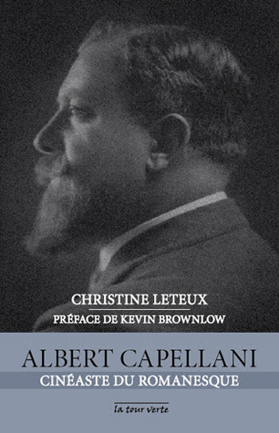
Not surprisingly, during the intervening years, scholars have been busy researching Capellani’s films and career. March 6 to 24 saw a major retrospective at the Cinémathèque Française. (Information on the program is still available online, as is a detailed press release.) Shortly before it began, the first biography appeared: Christine Leteux’s Albert Capellani: Cineaste du Romanesque, with a foreword by Kevin Brownlow.
Leteux discovered Capellani in May of 2012, thanks to seeing Notre-Dame de Paris and Les Misérables at the Forum des Images in Paris. Setting out to learn more about the filmmaker, she realized how thoroughly his memory had nearly vanished from film history. She sought out and received the cooperation of his grandson, Bernard Basset-Capellani, whom she describes as “intarissable” (inexhaustible) on the subject.
The result is a solid, traditional biography, with chapters mostly organized around the companies for which Capellani worked (Pathe, SCAGL, World, Mutual, and so on) and some of his key films (Les Misérables, The Red Lantern). The prose style is easily readable French, at least to someone like me with an average knowledge of the language. For an interview with Leteux concerning the book, see here.
The book is on sale at the Cinémathèque’s shop, which unfortunately does not sell online. It was supposed to be available on Amazon.fr, but so far is not. The easiest way for those outside France to order it is through three third-party book-sellers on amazon.fr, all offering it at the cover price of 14.90 €. Leteux’s book is a vital source for anyone interested in early cinema.
I was pleased to see that the last chapter ends with some quotations from my second entry on Capellani, ending with “With the end of the main retrospective, however, it is safe to say that from now on anyone who claims to know early film history will need to be familiar with Capellani’s work.”
The book includes a filmography and list of films available on DVD. These include a new one, a restoration of The Red Lantern by our friends at the Cinematek in Brussels, available on Amazon.fr or directly from the Cinematek’s shop.
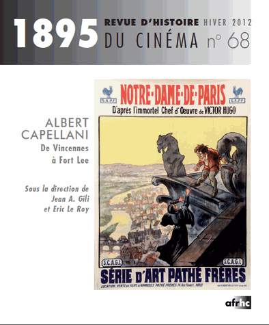
The French-language historical journal on cinema, 1895, timed its March, 2013 issue to coincide with the Cinémathèque’s retrospective. It is entirely devoted to Capellani. I have not had a chance to see it yet, but the table of contents is available here. The only online purchasing source for individual issues I have found is here; the page gives a lengthy summary of the contents.
Mariann continues to search for more surviving prints for restoration and eventual inclusion in future editions of Il Cinema Ritrovato. She has sent me some tantalizing news about recent discoveries and restorations. There will be a third Capellani season in 2014. This will probably include some of the director’s American films: Social Hypocrites (now restored), Flash of the Emerald (the one surviving reel), Inside of the Cup (surviving but so far with no projection print), Eye for Eye (two surviving reals), Sisters, and the French film Le Nabab. Other possible restorations include House of Mirth, La belle limonadiere, and Oh Boy!
A description of the 2013 Ritrovato festival is available here.
Nanook and friends
Early this year we posted our annual list of the ten best films of ninety years ago. It featured the classic early documentary, Robert Flaherty’s Nanook of the North. In March our friends at Flicker Alley released a two-disc Blu-ray edition of Nanook paired with the 1934 Danish feature, The Wedding of Palo (Palos Brudefærd). The latter is one of those titles that one occasionally encounters on the fringes of older historical surveys, but it has been difficult indeed to see. This new print is a 2012 restoration from a George Eastman House original 35mm nitrate copy.
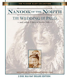 Nanook is familiar enough, but The Wedding of Palo is not. It was made by the Danish explorer and anthropologist Knud Rasmussen, who appears in a brief introductory passage. Clearly he was influenced by Flaherty’s work. He combines a simple fictional narrative with documentary scenes of traditional Inuit life in eastern Greenland. The basic story involves the heroine Navarona, whose brothers are reluctant to lose their housekeeper by allowing her to marry. Two men of the tribe court her and come into violent jealous conflict. Interjected are sequences of a salmon hunt, a festival, a traditional song duel between the two rivals, and a polar-bear hunt. The staged dialogue scenes involve sound recording, with no subtitles but the occasional brief intertitle to translate.
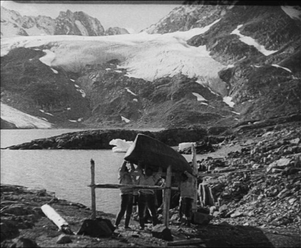
As in Nanook, the non-professional actors are remarkably natural, especially the “actress” portraying the heroine. There is a cute young boy brought in at intervals for comic appeal, and the members of the village seem always to be laughing and enjoying a suspiciously carefree life. The film has the advantage of more spectacular scenery than that in Flaherty’s film, with huge mountains and glaciers in place of the vast ice-covered vistas (see bottom image).
As usual, the Flicker Alley team has gone beyond the call of duty with this release. It includes not only the two features, but six bonus films, as described in the press release:
Nanook Revisited (Saumialuk) by Claude Massot was made in the same locations used by Flaherty. It shows how Inuit life changed in the intervening decades, how Flaherty consciously depicted a culture which was then already vanishing, and how Nanook is used today to teach the Inuit their heritage. Nanook Revisited was produced in 1988 on standard definition video for French television. Dwellings of the Far North (1928) is the igloo-building sequence of Nanook re-edited and re-titled as an educational film; Arctic Hunt (1913) and extended excerpts from Primitive Love (1927) are by Arctic explorer Frank E. Kleinschmidt; Eskimo Hunters of Northwest Alaska (1949) by Louis deRochemont shows many activities seen in Nanook thirty years after, and Face of the High Arctic (1959) depicts the ecology of the region, produced by the National Film Board of Canada.
Altogether, the films run an impressive 281 minutes. There’s also a booklet with excerpts from Flaherty’s book, My Eskimo Friends, an essay by Lawrence Millman, “Knud Rasmussen and The Wedding of Palo,” and notes on the films.
Snow White and the Seven (?) Bullfighting Dwarves
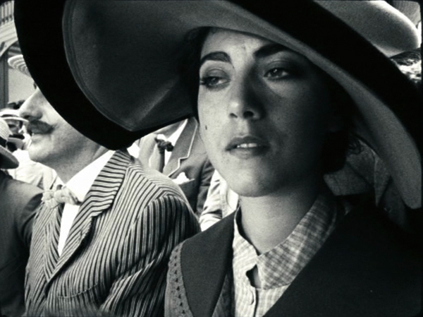
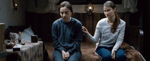
In 2011, a French film, The Artist, gained huge attention in the infotainment media as a modern version of silent cinema, winning yet another Best Picture Oscar for the Weinstein brothers. It was a reasonably successful imitation of mid- to late 1920s cinema during the transition to sound. Now a much better modern silent film has arrived, Pablo Berger’s Blancanieves, a loose version of the Snow White story transposed to 1920s Spain. A famous bullfighter is paralyzed after being gored in the ring. His wife dies in childbirth and his scheming nurse marries him. She keeps his daughter, Carmen, away from her father by setting her to work as a downtrodden servant in his country estate. Upon her father’s death, the evil wife schemes to have her killed, and she escapes to the protection of a troupe of six bullfighting dwarves who, possessing uncertain arithmetic skills, bill themselves as seven bullfighting dwarves.
While The Artist was a fairly good imitation of 1920s Hollywood filmmaking, Blancanieves is a pastiche of the 1928-29 era of European silent cinema. It draws on what I have termed the International Style of filmmaking, a late 1920s blend of influences from the French Impressionism, German Expressionism, and Soviet Montage movements. One could almost pass it off as a genuine film of the era.
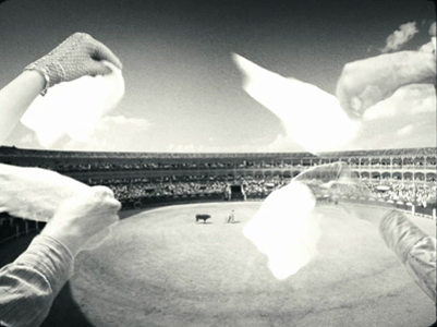
At times there are subjective effects à la Impressionism. A superimposition conveys Carmen’s memories of her father’s crucial instructions to her, and superimposed images of hands waving handkerchiefs present the enthusiam of the crowd’s plea for the bull to be pardoned.
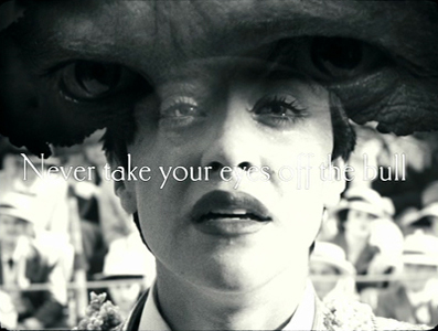
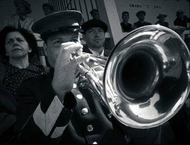
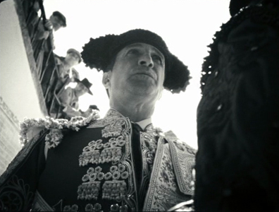
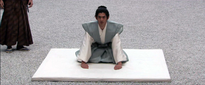
This was also the period in which the power of the wide angle lens, particularly in close-ups and in low-angle shots, was exploited, initially in Soviet cinema and then all over Europe. Blancanieves is full of such shots, as in the frame at the top of this entry and in these two shots from the opening scene:
There are also montage sequences, building up to flurries of very short shots. This accelerated-editing technique is typical of both Soviet and French filmmaking of the era.
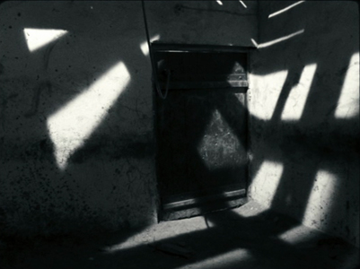
The too-frequent use of handheld camera in Blancanieves detracts somewhat from the feeling of authenticity. In the late 1920s, cameras were too heavy to be handheld. They could be strapped to the body of the cinematographer with harnesses, but that creates a subtly different look. And during the late 1920s, shots with the camera holding on a character while the background spins around behind him or her would have been achieved by placing both camera and actor on a large turntable. (This effect apparently was pioneered in Germany in the mid-1920s). But the occasional dramatic lighting effects, particularly in the climactic scene, are distinctly reminiscent of German cinema.
In general, the narrative is charming and amusing. The heroine’s pet rooster provides exactly the sort of comic relief that is common in films of the 1920s, and the story has an effective fairy-tale quality. I found the ending a bit disappointing and certainly not typical of the films of the 1920s. Still, Berger has clearly watched an enormous number of 1920s European films and absorbed their styles. He can imitate the International Style remarkably well, telling a tale that is appropriate to the 1920s and yet has a touch of humor that doesn’t belittle the silent era.
Blancanieves was released in the US on March 29 and is currently making the rounds of art-houses and festivals.
Other entries discussing the International Style and wide-angle filming at the end of the silent era can be found here and here.
The Wedding of Palo
Got those death-of-film/movies/cinema blues?
Night Across the Street (2011).
DB here:
The cinema-is-dead complaint, Richard Brody helpfully points out, is now an established genre of movie journalism. In the last few weeks David Denby, David Thomson, Andrew O’Hehir, and Jason Bailey have in different registers sought to revive this quintessentially empty polemic. I’ve gone on about the tired conventions of film reviewing about once every year on this soapbox. (Try here and here and here and here; Kristin got in some licks too). For now I’ll just say that I’m convinced that the Death of Cinema (or Hollywood, or the Intelligent Foreign Film, or Popular Movie Culture, or Elite Film Culture) is simply a journalistic trope, like Sequels Betray a Lack of Imagination or This Movie Reflects Our Anxieties. In short: an easy way to fill column inches.
These squibs seemed especially damp this time around because while these guys were knocking Hollywood and/or art movies I was enjoying the Vancouver International Film Festival. If you’re willing to watch mainstream entertainments from outside Hollywood, or films that aren’t the bland arthouse fare full of stately homes and British accents, or even films that don’t chop every scene to splintery images, Dr. Bordwell has a cure in mind for you.
Had you been looking for breezy or outlandish entertainment, for example, the Dragons and Tigers wing didn’t disappoint. Helpless, from South Korea, is a thriller built around identity theft. I thought it was clumsily plotted, but it sustains curiousity through the apparently bottomless series of discoveries a man makes about his missing fiancée. Jeff Lau’s East Meets West is a Hong Kong farrago of rapid-fire gags, weird haircuts, references to old Cantopop, and nonchalantly wacko storytelling. Granted, the central idea of making the Eight Immortals of legend into modern superheroes (and one supervillain) is smothered by Scott Pilgrim-style SPFX. Still, I will watch Karen Mok Man-wai and Kenny Bee in anything, albeit for different reasons. Closer to mainstream Hollywood tastes was Nameless Gangster, in which a restless flashback structure traces the rise of a flabby brute from customs agent to top drug smuggler. Yoon Jongbin’s slickly-made film ends with an abruptness that recalls the conclusion of The Sopranos.
Of all the pop-entertainment movies I saw at VIFF, the audience favorite was doubtless Key of Life, a nifty Japanese crime comedy. An amnesiac hitman and a shambolic slacker swap identities in a cunning series of coincidences that brings on some satisfyingly menacing underworld types. Intersecting the men’s misadventures is a hyperorganized OL, or office lady, who determines to find herself a husband within a month. Everything sorts itself out, of course, with one nice wrapup saved for the middle of the closing credits. This is the kind of Japanese diversion I’ve recorded a liking for earlier (Uchoten Hotel and Happy Flight). Hampered by a wretched title, Key of Life probably won’t get US theatrical distribution, although it may make some headway on VOD. Aussie movie maven Geoff Gardner and I agreed that if we had the money, we’d buy the remake rights.
Everything new is old (again)
Tabu (2012).
Form is the new content, they say. (Too simple, but some do say it.) No surprise, then, that part of what appeals in contemporary cinema is its overt reworking of previous styles. Neo-noir is perhaps the most common current example, but ingratiating retro-stylings were on display in more rarefied forms at VIFF.
Part of the appeal is the rediscovery of the glory of the 4:3 aspect ratio. Kristin has already talked about how Pablo Larrain’s No appropriates a seedy U-matic look to tell its tale of 1970s Chilean politics. A similar pastiche effect emerged from Mine Goichi’s All Day, a short that used even grubbier video to parody Japanese family dramas. May we expect to see more VHS-looking movies? I wouldn’t mind.
Silent cinema pastiches are usually lame, as witness The Artist, which scrambles history and treats old films as oddly soft-minded. (No Hollywood drama of the late 1920s would have been built around a protagonist so feeble he tries to commit suicide twice.) Jean Dujardin, and contemporary audiences that adore his film, should catch up with Hayashi Kaizo’s To Sleep As If to Dream (1986), in which the contemporary story is played as a silent film and the rediscovered (fake) old film is accompanied by benshi commentary and music. The “forged” footage in Forgotten Silver also shows how good filmmakers can create convincing, pleasantly anachronistic imagery.
 At VIFF, another D & T short, Yun Kinam’s black-and-white Metamorphosis (right) tried to replicate the look of silent cinema. While a family crowds around a deathbed, we get disruptive editing, aggressive depth, and even static flashes (those vein-like seepages into the image caused in old films by cold temperatures). As a retro exercise, Metamorphosis is better-informed and more evocative than what we get in The Artist. Suggestions of Maya Deren and Menilmontant gives these images the aura of having been exhumed from the archive.
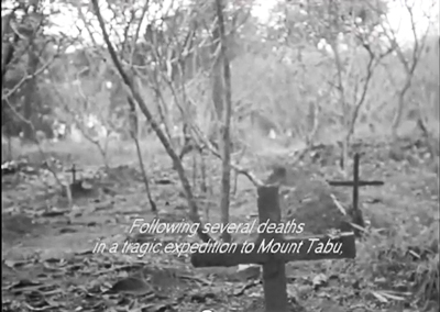
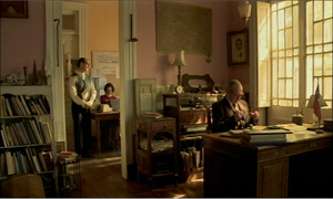
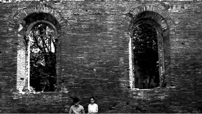
More celebrated since its Berlin triumph (two awards) is another 4:3 exercise, Miguel Gomes’ Tabu. A vaguely 1920s prologue shows a brooding tropical explorer who has seen his ex-wife as a ghost. Then Part 1 (“Lost Paradise”) takes us to stately black and white imagery of contemporary Lisbon. It’s late in December, and Pilar is concerned about her elderly neighbor Aurora. The old woman is taken to a hospital and asks Pilar to find Aurora’s old lover, Ventura. By the time Pilar discovers him, it’s too late. After Aurora’s funeral, Ventura starts to explain how they met in Africa. Here starts Part II (“Paradise”).
Now the film becomes hypnotic. In Africa, Aurora is married to a sturdy, good-natured colonist, and she can hunt and shoot with the best of them. Ventura and his friend Mario, who’s becoming a pop crooner, are taken into the household. He and Aurora begin a torrid affair. Part II is rendered without onscreen dialogue, but not in exact mimicry of silent cinema. There is piano music, it’s true, and much of the action is carried by letters, as in a lot of silent movies. But there are no intertitles; instead, all the action is played out with the support of Ventura’s voice-over, occasionally supplemented by the young Aurora reciting letters she wrote. Moreover, Mario’s band and his singing are rendered in full lip-synch. More eerily, as Ventura explains the rise and collapse of the love affair, we get highly selective bits of noise—not everything audible in a scene, but perhaps the tinkle of glasses or a faint wind. These become the aural equivalent of glimpses.
“Paradise” gives us silent cinema not replicated, but refracted through memory and romantic longing. In a film paying homage to Murnau (a forbidden romance as in Tabu, the name Aurora recalling Sunrise), Gomes has apparently also sought to give us something like the “part-talkies” of 1928-1929. Those films had full-blown dialogue scenes (as in Part I) and other scenes containing only music and effects (Part II), relieved by synchronized musical numbers (a sequence showing Mario’s band performing by the pool). Tabu recovers something of the strangeness of those transitional films, notably Sunrise itself, while remaining highly contemporary. It knows that we can turn to tradition when we want to rekindle a romanticism that would look high-flown today.
Long live the long take
Beyond the Hills (2012).
At about 16 seconds per shot, Tabu has the same cutting rhythm as some early talkies, like The Black Watch and Hearts in Dixie. Today, as we’ve seen, the long take is increasingly the province of movies that play chiefly at festivals. All other things being equal, a movie with around 1200 shots, like the very popular Danish import The Hunt, will be an easier sell on the arthouse circuit than, say, Beyond the Hills, with only about 110 shots in 148 minutes. It’s a pity. Although The Hunt is a solidly crafted drama in the Nordic enemy-of-the-people tradition, it moves rather predictably across the combustible subject of false accusations of child molestation. Beyond the Hills, by Cristian Mungiu, director of Four Months, Three Weeks, and Two Days, is more enigmatic and demanding.
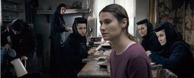
Voichita is a nun in a rural Orthodox enclave in Romania. She’s visited by her friend Alina. The two grew up as best friends in an orphanage, but Alina went to Germany to work, and now she insists that they must run off together. Voichita resists. Alina claims that Voichita once agreed to this plan. Has the young nun changed her mind and committed to the church? Or is Alina’s plan an idée fixe that Voichita has simply humored, without ever intending to join her? Were they perhaps lovers? Alina’s endless staring at Voichita and her lunges at suicide suggest deep passions at stake.
The refusal to supply full exposition makes characterization enticingly uncertain. Voichita’s wide-eyed sympathy for her friend can be seen as both pliable and stubborn, while Alina’s nearly wordless reprimands imply that Voichita has betrayed her. But perhaps Alina is just asking too much, or Voichita is being too unbending. The couple’s drama is played out against the stringent background of a female community ruled by a priest. Alina is incorrigible, not responding to the gestures of salvation extended to her, and agreeing, stone-faced, that she has committed every sin on a list of over 400. Eventually the pious souls decide that Alina is possessed, and her demons must be exorcised. In a simple gesture of solidarity, Voichita declares something like love for Alina, but too late.
Alternating discreet handheld takes with fixed shots staged in depth, making no concessions to impatience or easy responses, Beyond the Hills recalls the sobriety of Dreyer’s Day of Wrath and Bresson’s Les anges du péché. It plays out in a rougher-textured, muddier world, but it’s no less concerned with the dynamics of compassion and cruelty, dogmatism and eroticism. In each, a woman is ready to sacrifice herself for love. As Romania’s Oscar submission, Mungiu’s film deserves to find an audience in the US.
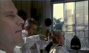
Long takes were also a specialty of the late Raúl Ruiz, whose penultimate film, Mysteries of Lisbon, won him probably the widest audience of his career. That film displayed his fascination with proliferating stories, but its adherence to a single plane of reality was exceptional in the career of a fabulist who enjoyed confounding all types of realism. In that regard, Night across the Street, his last fully completed work, is more characteristic.
An old office worker is about to retire and is convinced that someone is coming to kill him. While Don Celso awaits his assassin, he fraternizes with his co-workers, with schoolteacher and author Jean Giono, and with others in the hotel where he resides. He also recalls his childhood, when he talked to Long John Silver and went to movies with Beethoven. Eventually the plot shifts levels of reality even more radically, as one séance blends into another, characters shot down in a massacre return to life, and eventually Celso takes credit for inventing the people around him.
Mungiu’s handheld shots have no place here. As in Mysteries of Lisbon and his Proust film, Time Regained, the camera glides through this world with velvety assurance. Sometimes the characters do too, as they seem to ride the dolly or saunter in front of a blatantly unreal backdrop. Ruiz subverts academic cinema by using its well-upholstered technique, but he also mines film history. He revisits tableau staging in the shrewdly split set of Don Celso’s office, and he continues to exploit his more-Wellesian-than-Welles big-foreground technique.
Above all, the boy’s trip to the movies, in an awkwardly tilted image in which the usher usually blocks the screen, pays typically skewed homage to the medium’s enchantment. The mock film of Ruiz’s Life Is a Dream has given way to The Foxes of Harrow, the Hollywood cinema of Ruiz’s childhood.
Land, sea, and sky
small roads (2012).
When one thinks of the long take, James Benning comes quickly to mind, and small roads is true to form—in more ways than one. Forty-seven fixed shots in 102 minutes take us from the Far West to the South and to the Midwest before shifting westward again. The roads are indeed small, far from superhighways and traffic circles. As usual, landscape is the protagonist and slight shifts in image or sound arrest our attention. There are plenty of perceptual teasers. When a distant truck descends the distant sloping road above, it vanishes. Will it re-emerge in the nearer road? At another point, we wonder when, or if a car we hear will appear in the frame.
Hogarth spoke of art that leads the eye “on a wanton kind of chase,” and Benning’s roads—almost never seen from dead center, so we’re not given central perspective—carve oblique or sinuous paths into fields, plains, deserts, and forests. Road signs reenact the curve of the roadway, with carets and squiggles providing spare geometric “readings” of the piled-up surfaces of color and mass. There’s also some synesthesia. In one shot, I thought I heard mist rolling in. The topographies are real but through Benning’s strict scrutiny they become as fantastical as Ruiz’s dreamscapes.
That’s why I suspect that roads aren’t the real subject of the film. They serve as a pretext for Benning’s recurring interests in how wind curls clouds and makes branches tremble, how light outlines trees, how shapes like squat black oil derricks and the textures of fat snowflakes and soggy leaves can command the frame. Now that Benning has moved to digital filming, he has discreetly inserted some CGI. I couldn’t spot any, though one partial moon in daylight looks suspicious to me. No matter. Painterly beauty, along with a certain placid mystery, is enough for any movie nowadays.
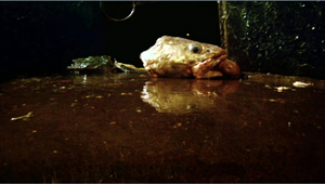
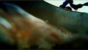
At the other extreme lies the bustle of Leviathan, a poetic, quasi-abstract documentary by Lucien Castaing-Taylor and Véréna Paravel. The filmmakers capture a New Bedford fishing trip through GoPro digital mini-cameras worn by fishermen, tossed into a netful of fish, or dragged through the water. Long takes abound here too, but it’s hard to say how many. As in The Man with a Movie Camera, the very boundary between one shot and another is put into question. So is the boundary between us and the space onscreen, as we’re weirdly wrapped in the extreme wide-angle yielded by this lens.
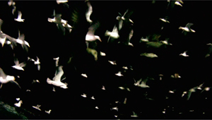
This is what you get when no human eye is looking through the camera. Often, in fact, nobody could look through the lens. No head, let alone human body, could occupy the space of some of these shots. Chains roll out past us from churning greenish darkness, while fish drift and slither on all sides. We’re right next to a gull trying to use its beak to lift itself to another area of the hold. Here the fish-eye lens lives up to its name. The camera bobs in a tank as fish are tossed in and spin aimlessly past. Coasting along the edge of the craft, we dip abruptly in and out of the heaving water, our plunge accentuated by brutal sound cuts. We chase starfish and ride waves, spinning up to watch gulls blotting out the sky. Accelerations of speed (again, Man with a Movie Camera comes to mind) render the action hallucinatory, especially since the shutter can capture foam with strobe-like precision.
One result is a disembodied, dehumanized vision of sea and sky: The camera as flotsam. But we also get bumpy, skittish visions of human labor definitely tied to bodies that harvest the ocean. Work activities are filmed from cameras lashed to the fishermen’s heads or lying on the deck among scallops to be shucked. Most documentary close-ups of artisans’ tasks are taken from far back and with long lenses; here the very wide-angle GoPro lenses not only show tasks from the inside, but their distortions exaggerate each gesture, sometimes heroically, sometimes grotesquely. Either way, human activity has been defamiliarized no less than undersea life.
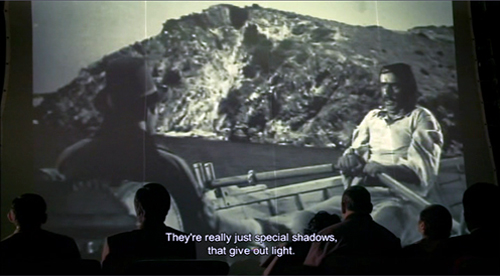
We start the movie immersed in a welter of details and stay enmeshed for nearly an hour. Only then do we get an “establishing shot” showing the boat deck and mapping the overall process of filling and emptying the nets. And fairly soon after that, as if to parody the usual documentary about fisher folk, we get a four-minute shot of the captain dozing off while watching a TV show (apparently The Deadliest Catch). Leviathan ends with a sequence that brackets the chiaroscuro of the opening, but we no longer see a clam’s-eye-view of being snagged. Instead, we get barely illuminated darkness with whiffs of crimson teasingly darting to the edge of the frame, as if to signal the end, before swerving back to the center, then heading offscreen. Again, Ruiz has the line: Special shadows that give off light.
Ready to declare cinema dead? There is a cure for your malaise. We call it a film festival.
More of my thoughts on Ruiz can be found here and here. His widow Valeria Sarmiento completed his very last project, The Lines of Wellington.
On small roads and digital manipulation, see Michal Oleszczyk’s discussion at Slant and Robert Koehler’s informative review in Variety. In correspondence Benning confirms:
Yes, lots of compositing, but no speed changing, although the border cops are going around 100 mph. . . . Shot 26 has a sky that was filmed the next day about 100 miles away. And yes the moon was out, but that shot is pointing north so I filmed the moon in the southern sky during the day, and put it into the northern sky. All the compositing was done with shots I made; always somewhere nearby. (100 miles is nearby when you circle 2/3 of the US.)
You can learn more about Leviathan from Dennis Lim’s article on the filmmakers in the New York Times. The New York Film Festival provides a lengthy Q & A on its website. See also Phil Coldiron’s “Blood and Thunder: Enter the Leviathan“ in the latest Cinema Scope, with some superb frame enlargements. Above all, don’t miss the extract on vimeo, which gives you a good sample of the splendor of this film.
Leviathan (2012).
How to watch an art movie, reel 1
Sueño y silencio (2012). Shot 1.
DB here:
We all know that Hollywood films and their counterparts elsewhere obey certain conventions of style and story. (I say conventions to put it neutrally. Some will call them formulas, some will call them clichés.) Against that tradition some critics and film lovers posit what’s been called “festival cinema” or “art cinema,” a tradition that favors individual expression and more unusual storytelling. But can we say that this tradition also has its conventions?
I think so. Let me take an example that you’ve probably not (yet) seen. Jaime Rosales’ Sueño y silencio premiered in the Directors Fortnight at Cannes this year, went into distribution in Spain recently, and will probably be making the festival rounds. I think it’s a good film, but my appraisal is beside my point today. I want to use the film as a sort of “tutor-text,” a handy way of talking about how such movies engage us in ways different from more mainstream films.
Paranorms
Central to my claim is that such films cultivate intrinsic norms, storytelling methods that are set up, almost like rules of a game, for the specific film. In a way, every film does this. I once wrote that “every film trains its spectator”–an idea that Jim Emerson put more pungently as “Any good movie–heck, even the occasional bad one–teaches you how to watch it.” Up to a point, we figure out the film’s characteristic stylistic and narrative strategies as it unrolls.
Of course most films’ intrinsic norms match what we can call extrinsic norms–those codified by the tradition. Hollywood films frequently simply follow the conventions of genre, structure, style, and theme that have flourished for a long time. What the art film does, I think, is what ambitious Hollywood films try to do: It tries to freshen up its intrinsic norms. But it does this according to broader principles of the art-film tradition. In other words, an individual device might seem strange, even unique to this or that movie, but the function it fulfills is familiar to us from our knowledge of the tradition’s conventions. We figure out the device because we assume it has a familiar function.
Take an example. How does the film indicate that certain images are flashbacks? Classical Hollywood films provided clear markers: Dissolves as transitions, wobbly music, voice-over remarks indicating that a character was recalling the past. But 1960s art films found other devices–slow-motion, shifts to black-and-white or a different palette, cuts to images that would have been out of place in a continuous scene. Viewers who understood the concept of flashback could infer that in this film, flashbacks were signaled through an unusual intrinsic norm. Fairly soon, of course, these devices were widely copied and became extrinsic norms, to the point that Hollywood films picked them up.
I’ve tried to make this entry a primer in art-cinema comprehension strategies. Many of this site’s readers have had a lot of practice in watching films like Sueño y silencio, so in a way what I say won’t come as a surprise. Yet many skilled viewers know the conventions only tacitly. Critics are well-versed in the tradition, but they typically talk only about the film at hand and don’t examine how it connects with more general principles of storytelling. Noting these guidelines, then, helps us understand criticism as well as movies; we can gauge critics’ reactions more exactly when we realize they’re responding to particular conventions.
Since Sueño y silencio has had such limited exposure, I’ll dwell only on the film’s first twenty minutes, its first reel. If you don’t want any spoilage at all, stop reading right now. But actually, my commentary tells you less about the film’s plot twists than the early reviews. I’m just trying to illuminate how such films work and, of course, entice you to see the film if it becomes available to you.
Fifteen shots
When we go to a movie we usually know a good deal about it. For now, though, let’s pretend you haven’t been privy to any information about what you’re going to see in Sueño y silencio. You just take it as it comes. But of course you’re exercising your eyes, ears, and mind all the while.
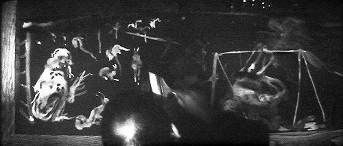
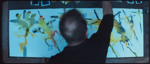
First you see a water-color painting being finished, in fast motion, by an unidentified painter (see the still at top). The image is pretty hard to determine. What seems to take shape is an image of a vaguely simian creature on the left, some animals in the middle, and a humanoid slung on what looks like a spit. What can this image have to do with what follows? Is the painter our protagonist, and will we learn about his creative endeavors? No. The shot functions as a kind of narrational mystery: We ask not only what it signifies, but why we’re being shown it.
This is as good a way as any of formulating an initial guideline for the hardcore art movie: How the story is presented is as important as what is presented. For instance, is this image offering a cluster of motifs that will be important in the film? When the film is over, we might be able to find out something about the painting or the painter, and we might find some connections to the plot.
So a second guideline: Often we’ll have to go outside the film to understand its story. This contrasts with most mainstream movies, which don’t make reference to recondite things like Spanish abstract painters. As it turns out, the painting refers to Abraham’s pious willingness to sacrifice his son Isaac to God, but it treats the tale in a disturbingly primal way.
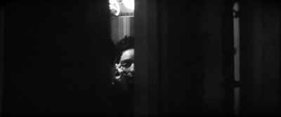
Now the story proper seems to be starting. We watch a woman putting on eye make-up, seen through a slit in a door. There’s no dialogue, and the camera waits patiently; the shot lasts nearly a minute. This is the first signal that the film will be observing everyday routine, in more or less real time, from a stationary standpoint. The intrinsic norm that shapes nearly all the film–one fixed shot per scene–is being put into place. This stylistic choice isn’t unique to this film, but it is characteristic of art cinema. When there aren’t dramatic goings-on, as with Paranormal Activity‘s locked-down surveillance camera, the static shot usually asks us to adjust our expectations to a slowly unfolding exposition.
Why start with this woman (whom we’ll learn is called Yolanda)? I think it’s because, as the film goes on, she will be the focus of most of our attention, particularly once the drama starts. In a way, the film is following a very common extrinsic norm: Identify your protagonist early.
But the director gives with one hand and takes away with another. Yolanda isn’t doing anything of particular dramatic significance. At the same time, Rosales conjures up another, more unusual norm: obscured vision. We don’t see Yolanda fully and adequately. Throughout the film, our knowledge of what the characters do, even what they look like, will be cramped by such stylistic decisions. The film resists quick and easy comprehension; it asks us to make some effort. A new guidelines suggests itself: Be prepared to fill in a lot. And expect occasionally to be wrong.
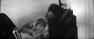
A man (later identified as Oriol) and a little girl (Celia) are reading a storybook together. The tale is about monkeys in a park, and one escapes (in a book illustration they describe). Maybe this monkey connects back to the simian creature we saw in the painting? Later in the film, a zoo and a park will become very important.
But before we even get to these motifs, we notice that the filmmaker isn’t telling us who these characters are, or what their connection is to the woman we saw in the previous shot. We might assume that they’re a family, but a Hollywood film would tell us clearly and quickly (“Hi, Mom!” “Hi, honey. What are you and Dad reading?”). Here we have merely a possibility. A new guideline: A lot of exposition can be left to the imagination.
We’re also invited to consider the possibility that Oriol and Celia are especially close, since the other daughter we’ll meet, Alba, isn’t in this scene.
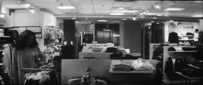
A long shot in a clothing store lingers for a while before Yolanda and two girls drift in from the right and wander to frame left. They are browsing for an outfit for Celia. Yolanda suggests a couple of choices, but Celia rejects them as uncool. Now we have better reason to take Yolanda as the mother of the family, but given that Oriol isn’t shopping along with them, there’s always the possibility that the parents are divorced or separated, swapping the kids back and forth. The basic circumstances of the family are held in suspension for some time.
The empty frame that opens this shot suggests another guideline. In many art films, settings take on a weight that they don’t have in many mainstream films. We’re used to them as a more or less neutral container for the real action, the clash of characters pursuing their goals. Films like Sueño y silencio may contain moments that function like the descriptive passages in a novel. These blocks of space invite us to focus on surroundings–to see them as abstract designs (planimetric framings like this work well), or to recognize their concrete layout, as here when Yolanda and her daughters have to thread their way through the aisles. Just as the unmoving long take asks us to feel the pressure of time, we should be ready to register space as space.
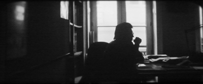
The next shot, of Oriol at his desk in his office, is doubly obscure: He’s in silhouette, and he’s talking to a man who is offscreen. This introduces another norm of the film: Often we won’t see both partners in a conversation. The framing will usually concentrate on the family members, as if the secondary characters are really secondary. But there are exceptions, and surprises as well.
The offscreen man is discussing his career, and from the conversation we learn that Oriol is an architect. But by starting with his role as father (reading to Celia), the film invites us to infer that the family may count more for him than his job does. (Imagine if the plot began by showing him at work, then showed him at home.) And just as he was patient and calm with Celia, he’s the same way with the young man offscreen.
In other words, first impressions matter in all films. They provide an anchoring bias that later developments will be measured against. In fact, an extended crisis later will propel Oriol into his work and away from his family. So while mainstream films tend to reinforce first impressions, many art films will nuance or even negate them. This can create an impression of character complexity, or of a narration that doesn’t pretend to know everything about the story.
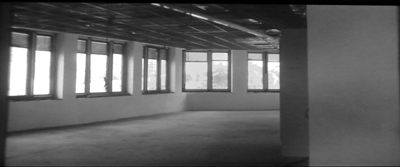
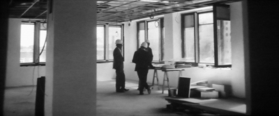
Six and a half minutes in, the narration breaks one of its “rules.” A smoothly tracking camera takes us through a building under construction. For a few moments we’re allowed to register this as a specific place before the camera halts on a distant view of Oriol and some colleagues discussing the construction project.
In story terms, this could seem pretty redundant; we know Oriol is an architect. (Okay, now we know he’s a hands-on architect, but still…) But I think that the shot is important as resetting the film’s intrinsic norms. Later in the film, we’ll get small doses of camera movements of different types (one lateral track, one handheld shot, a couple of gliding Steadicam moves). It’s almost as if Rosales is sparingly spreading several alternatives out alongside his procession of static shots–a creative choice that will continue to dominate the film.
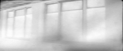
On the second viewing, it seemed to me that the payoff of this loft shot occurs when the camera moves away from the men and back toward the windows. Bursts of flash frames, as if the film were inadvertently exposed, end the sequence.
At the plot’s first turning point, we’ll get another moving shot, with the camera mounted on a car, and that will be broken up by a fusillade of flash frames like these. We’re used to foreshadowing in plot terms: the gun in the drawer in act one will get used at the climax. But we should expect that art films will use stylistic foreshadowing, often in place of the dramatic sort.
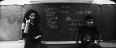
Now the exposition, oblique though it is, starts to hang together. Scenes of the family together (shots 2-4) are followed by a pair of shots showing Oriol at work (5 and 6). In another planimetric shot we see Yolanda at work, teaching Spanish to French students. But so far no conventional drama has started. Rosales has concentrated on showing the family’s daily lives and then lets us infer relationships and character from lots of ordinary activity. In shot 5, Oriol speaks as an idealist, saying that a building project’s budget ought not to determine the result. Here Yolanda is patient with her (unseen) students as she teaches them vocabulary through a guessing game.
For the Hollywood screenwriter, character is ultimately revealed through conflict. In many art films, character is revealed–or kept under wraps–through routines. This strategy puts an emphasis on what the person is like when not grappling with problems–on what we might call their enduring natures, or (as in Bresson) on their essential mystery.
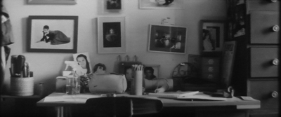
More empty space: A girl’s bedroom, with photos and projects and lots of colored pencils and pens. Audrey Hepburn looks out at us. As in the clothing shop, setting comes forward. This time the locale encourages us to make inferences about character: later we’ll learn that Alba likes to draw and paint.
And more indirection. Offscreen conversation between the girls is followed by the two of them stepping partially into the frame. By now we can see that this film will deny us a lot. What will it give in return? Emotion–a domestic tragedy is going to strike–but muted emotion.
The girls play together, but it’s their gestures and voices (talking about a game they’ll play) rather than their faces that we have to fasten on. Art-cinema narration is a lot like what we find in a mystery film, but we’re teased with clues about basic story action. Instead of who done it? we ask what are they doing?
Now the scenic norm is firmly in place: We’ll be lucky to get half the scene: one character, or offscreen sound, or partial framings. In the ninth shot, all we see of Oriol is his arm. Still, maybe at last a drama is getting going. The boss complains that Oriol commits the firm to projects and then, once it’s on the hook, everybody has to fulfill his plans, regardless of the cost. Oriol replies that he’s flexible and willing to have the overages deducted from his pay. This leaves the boss flummoxed.
Yet this isn’t the core of the plot; nothing comes of the boss’s exasperation. An art film may give us nascent conflicts but never develop them, or pay them off. Characters may come and go without preparation, and chance events may divert the plot. Are these tactics more realistic than what we get in tightly plotted films? Some would say so; they’d say it’s more like the way life moves. In any event, it’s an important convention of this filmmaking tradition.
Parallels matter more than causality in many art films. While Oriol confronts job problems, Yolanda chats with other teachers. They consider the fact that kids don’t like foods that they’ll enjoy when they grow up. She suggests adding some chorizo to lentils, accentuating her as a Spaniard teaching in Paris.
Again a routine is invoked, but now we get a good look at the woman we’ll be seeing a lot of. Unlike the distant shots we’ve had so far, this shows us her curly hair, sharp chin, and gleaming eyes. The gentle, easygoing nature she revealed in shot 7 is confirmed. The film is introducing us to her very gradually, again through routines.
A variant of shot 3 (but Dad now with both daughters) and shot 4 (both daughters with Mom). The girls are waiting for their music teacher and Oriol keeps them amused. His closeness to them is reiterated, so that later when he changes his attitude, that becomes more marked.
Again the emphasis falls on everyday “undramatic” activities. Rosales is really pushing his luck. “For a long time,” wrote one critic, “nothing much is happening and the feeling of directorial self-indulgence is tangible.” Actually, we’re only fifteen minutes into the film at the end of this shot. Patience, please.
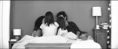
Some would say that the movie could begin here; many movies would. The parents are together in bed (so it’s presumably not a split-up family) and sharing time with the kids. They’re telling each daughter how she was born. One came out yelling, the other as if swimming.
Again, though, it’s all in the staging. We scarcely ever glimpse the daughters’ faces, and at many moments, as in my frame here, the parents are blocked by the kids. Like the slit composition in shot 2, the silhouette of shot 5, and the distant framing of shots 4, 6b, and 11, this shot gives us a willfully stingy stream of information. But the presentation is consistent with the staging and framing that contribute to the film’s intrinsic norm, so we’re not as startled by this shot as we might be if it cropped up in an ordinary film. It also varies the norm: Now characters don’t have to be off frame to be invisible.
Some critics would be inclined to say that this shot, like others “distances” us from the characters and their situation. But we shouldn’t confuse pictorial distance with emotional distance. Long shots can be emotionally wrenching; just look at the last two shots of Mizoguchi’s Sansho the Bailiff. I’d prefer to say that in what could have been a sentimental scene, the composition and the actors’ understated playing keeps the emotion simple and understated.
This is the first time we see the whole family together. It’s also the last. Some art films are quite laconic.
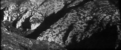
Laconic, did I say? Cut to a rocky landscape and the sound of a car engine. Is a car visible in the shot? Two screenings in 35mm didn’t reveal it to me. Again we’re invited to suspend our narrative interest and study a space.
Soon we’ll learn that this shot stands in for the travel to visit the grandparents. The bed scene makes no mention of the upcoming trip, so this landscape comes as a surprise. The moment reminds us that the film lacks cohesion devices, those elements that tie scenes together through:
Plans: For instance, maybe “Tomorrow you get to go see Grandma and Grandpa!”
Appointments: “Don’t forget you have to get up early for the trip!”
Deadlines: “Oriol, can you make it there before nightfall?”
Hooks: Those lines of dialogue that link the end of one scene with the beginning of another :”Don’t you love that wrinkled terrain near where your father and mother live?”/ cut to landscape.
Mainstream plotting tries to bind one scene to another tightly, making their succession seem smooth and inevitable. We’ve become so used to this that many art films feel fragmentary. We can’t easily predict what we’ll see next. After all the images of people, Rosales’ “empty” shot is surprising.
This refusal of tight scene-to-scene connections creates a different sense of time and forward-moving action. Movies like Sueño y silencio present life as one damn thing after another, not necessarily one damn thing because of another.
In laying out those possible transitions, I just construed shot 13 retrospectively, knowing what came next. The action’s causality has to be figured out afterward; we often have to think to understand what we’ve just seen. This is one of many reasons that we must often watch such movies twice (or more) to appreciate them fully.
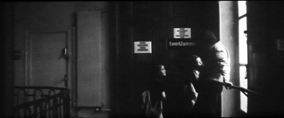
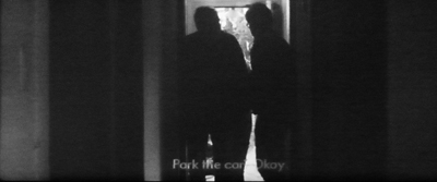
Now more opaque/oblique presentation. An old man comes through a doorway, illuminated briefly.
As the old man becomes a silhouette, another silhouette emerges. It must be Oriol, by his voice and his glasses, but we have to pay attention to be sure. Is Yolanda there too? And the daughters?
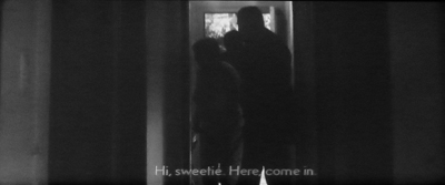
the even more obscure figure of a woman comes bustling in from the right and starts speaking to someone in the adjacent room. “Hi, sweetie!” Our inference engines have to work up exposition again. Older couple: probably grandparents. Grandma doting on (unseen) granddaughter. But only one daughter? And no Yolanda?
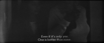
Yes, only one daughter came. “One is better than none,” Grandma says as she leads the girl–on a big screen, you can make out that it’s Celia–to the foreground and out right. And no sign of Yolanda, so we must infer that Oriol made the trip only with the one daughter Celia. Hollywood tends to tell you important story points three times; art movies, less often. It’s the mystery-story model again: basic information is given through clues and hints.
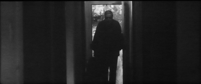
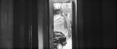
Finally, delivering on the early line of dialogue in which Oriol says he’ll move the car, the camera dwells on the corridor. Then we see the car backing up. Ending with the distant doorway we saw at the start, the shot is given a neat curve of development.
It would have been much simpler to show an exterior long shot of the house, the old folks coming out toward the camera to greet the car as it pulls up, Oriol and Celia climbing out, hugs all around, and so on. But then we wouldn’t have been as actively engaged in the way the scene develops; we’d immediately label it “Family visit.”
One way to think of art-movie conventions is that they’re reworking of elementary story actions we’ve seen before, but transformed through choices about narration (suppress some information) and visual and auditory style (choose an elliptical or “difficult” way of shooting the action). I think this tendency is one reason some critics think that such films heighten our awareness of both ordinary life and the conventions of art. “The Dream and the Silence,” says one, “is the work of someone with enormous intelligence and a need to see the world afresh.”
Surely not every viewer will grasp the points I just made. (I didn’t myself on the first viewing.) Any artwork needs some redundancy, so the next shot/ scene stabilizes our understanding of the situation. It’s now clear that Celia and her father have come for a holiday. She goes walking in the forest with her grandmother, who explains about grasses and trees on their property. They wander out of the frame, and the camera drifts away from them. Their conversation fades out, and the camera continues its trajectory….
…until it stops at a dark mass of bushes. Why?
I wish I could answer with confidence. The camera movement is a complement to the forward tracking we saw in the construction site during shot 6, but that’s not enough to explain the strong emphasis given to this foliage. Is it meant to evoke the rough, Art-Brut look of the painting in shot 1? Given what comes in the next five minutes, are these brambles a premonition of catastrophe?
In a way, the shot brings us back to the watercolor painting of the opening. In films like this, there will always be some images, sounds, or scenes that resist easy sense-making. They become interpretive nodes for critics to probe, sometimes for years.
These fifteen shots constitute the film’s first reel, and they lock in place many of the intrinsic norms. But these norms won’t simply be repeated in the course of what follows. They will be varied in cunning ways. The omission of certain information will keep us in suspense, heightened by framing that excludes what we need to know. After we’ve become used to the norm of the offscreen speaker or listener, one later shot will use it surprisingly, with disquieting emotional effect. After shots in black-and-white, two are in color. After the rigorous objectivity of what we’ve seen so far, we’re surprised to see a shot that is likely to be a hallucination. And the film’s one optical POV passage will be decoupled from its owner, in both time and space.
The variations keep us engaged in the ongoing effort to assemble a coherent story, with each scene forcing us to rethink the one that it replaced while sensing the emotional currents at play within both of them. In Sueño y silencio, the conventions of art cinema allow Rosales to present profound pain with a measure of tranquility. We can register this mixed emotion all more acutely because we’ve participated in creating it. We grasp the conventions he’s exploiting, and we can enjoy seeing them employed in fresh ways.
There are several scenes from Sueño y silencio on YouTube, but I wouldn’t necessarily suggest watching them. They’re pretty meaningless out of context. See this review for a little background on the making of the film. Rosales claims that he used nonactors and let them improvise their scenes.
The ideas in this entry are reworkings of points I’ve made elsewhere, notably in Narration in the Fiction Film and in the essay “The Art Cinema as a Mode of Film Practice.” If you’re interested in that essay, I’d prefer you read the revised version in Poetics of Cinema. On this site, another analysis of intrinsic norms in an art film is the entry on the excellent In the City of Sylvia.
I’m grateful to Cinédecouvertes, the annual festival conducted by the Cinematek of Brussels, and specifically to Sam DeWilde for bringing Sueno y silencio. Thanks also to Clémentine De Blieck for technical assistance and to Gabrielle Claes for enlightening conversation about the film.
Sueno y silencio: Miquel Barceló paints “El sacrificio de Cristo.”
Son of seduced by structure
The Skin I Live In.
DB here:
Contemporary Hollywood films can play prettily with time, parallels, and point-of-view, at least within certain boundaries. (We’ve talked about this with Source Code, Inception here and here, and other titles further back.) But if you want to see filmmakers coloring outside the lines, a film festival provides a wider sampling of ingenious storytelling strategies.
Last year, in “Seduced by structure,” I wrote about films that worked ingratiatingly with flashbacks, stories within stories, and the like. I’m still a sucker for these things, and several of the offerings at the Vancouver International Film Festival have enticed me. Since these are rather new films, I’ll try to avoid spoilers.
Flashbackhand
Harakiri.
Perhaps the simplest case I’ve encountered so far is Miike Takeshi’s 3-D Harakiri: Death of a Samurai. It’s seventeenth-century Japan, and penniless samurai are eking out survival through the “suicide bluff.” They arrive at a noble house and ask to commit seppuku on the premises. Because the family won’t risky sullying the family name, the ronin are paid to go away. But the head retainer of the house of Ii is done with the game. The suicide bluff, he maintains, dishonors the samurai code.
A severe-looking ronin appears and asks to die in the Ii compound. The retainer explains to him that recently they had a similar request.
Thus begins the first of two flashbacks. It’s confined to the visit of a very young samurai making the suicide petition, with harsh and grisly results. We return to the narrating frame, and we find that the original petitioner isn’t dissuaded. Why not? And why are the three swordsmen most implicated in the young man’s visit missing today?
A second flashback, more or less from the standpoint of the older petitioner, goes far back in time to fill in the youth’s identity and background. This structural choice shows several worthy things that a flashback can do. It can flesh out things that were merely hinted at earlier, in both the present-time sequences and the first flashback. The flashback can create mysteries by virtue of its placement, as indicated earlier. It can build its own narrative momentum: Even though we know vaguely how things are likely to go, we get to see the gaps filled in with unexpected details.
The flashback pattern also creates two layers of response. We know the young man’s fate, so everything in the leadup gains an extra pathos. Meanwhile, as we recall the present-time situation, the older petitioner’s action remains suspended and we want to return to it to see how it develops. A bonus is that arranging the film in flashbacks allows an intense, arresting scene to appear at the film’s beginning, with the young ronin’s petition, and then assign a cluster of swordplay fights at the end. Arranged in linear story order, the scenes would have created a slow-burning opening and a crowded conclusion, with several violent scenes close together.
A more audacious play with flashbacks is found in Pedro Amodóvar’s elegant, decadent The Skin I Live In. As with Harakiri, we begin far along the story’s development. A beautiful young woman is imprisoned in a postmodern equivalent of the mad scientist’s lair, a designer house filled with sumptuous furniture and high-tech gadgetry, including a close-circuit video system that lets the doctor keep an eye on his prey. Already there are plenty of questions, particularly when the young woman, Vera, asks to stay with Robert forever.
We quickly asume that she is the object of the doctor’s experiment in creating unblemished, fire-resistant, and snugly fitted human skin. (Almodóvar used a digital intermediate chiefly for the purpose of making the actress’s skin perfect) But more questions arise when a horrendous jewel robber named Zeca, dressed in a tiger skin (it’s the carnival season), breaks into Vera’s sanctuary.
Melodramatic twists come thick and fast, and the first flashback, sponsored by the maid Marilia, tells us of how Robert’s first wife was burned in a car crash. His daughter Norma saw her mother commit suicide and became deeply disturbed thereafter.
The family history gets even more tangled with two later flashbacks. One, initiated by Robert as he sleeps (though it seems more “objective” than a dream) takes us back six years and fills in more of Norma’s sad history. The second, more peculiar, return to the past is obliquely introduced by Vera. The narration seems pretty reliable, and it replays some of the events presented in Robert’s flashback. The curious thing is Vera doesn’t appear in any of the scenes. Shouldn’t she be present for at least some of the action she is “recalling”?
The question is answered with the sort of shocking finesse that Almodovar summons up effortlessly. The flashbacks in Harakiri fill in and flesh out what we’ve seen, while the flashbacks in The Skin I Live In reveal layers of shocking discoveries about what’s really going on in the present-time situation. The flashback structure doesn’t fulfill the film’s opening so much as yank the bottom out from it. Perverted story action summons up perverse narration.
I wish I could say more about these formal arabesques, but secrets must be respected. Suffice it say that Miike provides us a sober, dignified jidai-geki making modest use of 3D and lacking the outlandish gore that he’s come to be identified with. It’s not even as action-oriented as last year’s 13 Assassins. Harakiri ‘s most striking moments are quiet ones. A woman picks splinters out of her dead husband’s bloody hand. Earlier the same poverty-stricken man, having dropped a pair of eggs on the pavement, stoops and licks up their contents.
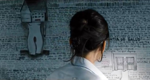
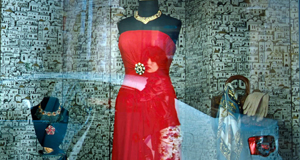
As for The Skin I Live in: Almodovar’s eye for fashion is still teasing; the credits list is a pageant of brand names like Gucci and Prada. He can also plant nifty little motifs, as when the tidy graffiti with which Vera has filled her cell are echoed by the window display in a dress shop.
As usual, the story of revenge and unspeakable desire, or rather revenge as unspeakable desire, is wrapped in smooth technique, wondrous music, and eye-gratifying palettes. The flashbacks help too.
She said, he said
Split plot structures have become more common in recent years. Hong Sang-soo provided one of the most striking versions in The Power of Kangwon Province (1998); a recent instance is Apichatpang Weerasethakul’s Syndromes and a Century (2006). In the most common case, the film is split into two long sections, with each line of action following a different character or presenting alternative possibilities. Sometimes the lines present successive lines of action, as in Chungking Express. Sometimes the lines are more or less simultaneous, suggesting different viewpoints on the same events. Often the two lines intersect, so we get scenes replayed from different viewpoints or suggesting alternative versions of events–even parallel universes.
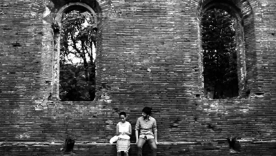
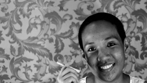
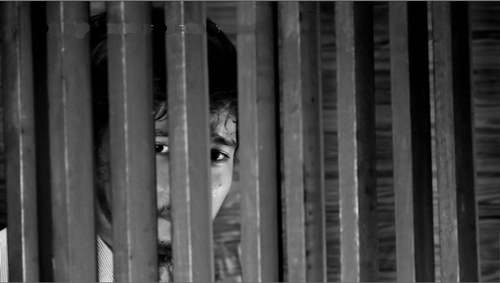
This sort of cleft plot patterning is exploited engagingly in The Natural Phenomenon of Madness, a Filipino film by Charliebebs Gohetia. A brief prologue sets up the situation. A man and a woman, friends since childhood, are having sex, and suddenly it turns rough. Both will later think of his action as a rape. He leaves in the morning, she chops off most of her hair, and they proceed to live their lives separately, sometimes converging, usually not.
The first long chapter, called She, follows her days wandering the city, signing up for a medical study, visiting a grave, inducing a miscarriage, and pursuing Him, whom she loves more than anyone. The second section, “He,” traces his efforts to induce another woman to marry him, to assuage his guilt about the rape, and to get Her to help him with his bone-marrow transplant. Both lines are taking place at roughly the same time and pace. The woman’s autobiographical monologues addressed to offscreen medical personnel are paralleled by the man’s increasingly sorrowful confessions to a priest. She’s a Bohemian artist, He’s a store owner wracked by Catholic guilt. At times, we see them doing things alone that suggest a sort of spiritual synchronization: She stands at a bridge and shouts, and later we see Him doing the same thing.
He and She meet occasionally, and then we get the same scene twice. Or do we? Every repetition is played out in symmetrically varied ways. For instance, early in the She chapter, He is already seated by a wall playing with an origami (of the sort my grade school used to call a Cootie Catcher). She joins him.
In His story’s version, she’s already there, playing with the origami, and He comes to join her.
Moreover, the conversation isn’t the same each time. So are the apparently iterated scenes completely different meetings, taking place in the same locale and filmed in similar fashion? Some cues suggest that the tandem sequences represent only one occasion. For instance, both of these wall scenes purportedly show their first meeting since She cut her hair. As we’re watching, we might be forgiven if we’re not sure of the variations: The repetition comes about 67 minutes later than the original scene. We’re left with meetings that are partly repetitions, partly variations: alternative universes embedded in one, perhaps.
One effect of the parallel plotting is to heighten the differences between the two protagonists. As Gohetia suggested in the Q & A after the VIFF screening, She actively chooses ways of living her life, while He clings passively to his situation, hoping that the other woman will marry him, that somebody will donate bone marrow, and that the Church may offer help. Both have unrequited love: She wants him, He wants another girl. There are plenty of abstract parallels, such as that between the medical establishment and the clerisy, but the precise, locked-down shots help us notice physical differences too, such as the walk through Manila streets with distinct gaits. And the final convergence of the couple nicely echoes the prologue. The Natural Phenomenon of Madness shows that once a new narrative strategy enters the public domain, filmmakers can play with its components, twisting them like facets of a Rubik’s cube to engage us in fresh ways.
The Skin I Live In will be released in the US by Sony Pictures Classics on 14 October. The American Cinematographer story on the making of the film may be read here.
P.S. 6 October 2011: Thanks to Philippe Mathieu for correcting an erroneous film title!
P. S. 14 August 2012: Thanks to Marvin Ortiz for correcting two characters’ names in my account of The Skin I Live In.
The Natural Phenomenon of Madness.


