Archive for the 'New media: Technology' Category
Paris-Berlin-Brussels express
Doktor Satansohn.
Our trip to Europe has come to an end, and so we finish with a post scanning some highlights.
The magic lantern learns new tricks
DB here:
What am I seeing? Many avant-garde films pose this question. Mainstream fiction film and documentary cinema have mostly relied on the idea that the image should be recognizable as “what it is.” But one strain of experimental film has worked to delay or even prevent us from making out what’s in front of the camera.
Sometimes we lose our bearings only briefly, as when we eventually identify pot lids in Ballet Mécanique or bits of sunlit linoleum in Brakhage films. Sometimes language points out what’s really there. The titles of Joris Ivens’ Rain and the Eames’ Blacktop: The Washing of a School Play Yard allow us to enjoy the ways that ordinary sights can yield unexpected abstraction. Sometimes we toggle back and forth, as when in Ken Jacobs’ Tom, Tom, the Piper’s Son recognizable human figures, however grainy, jump into sheer blotchiness and then back into something like legibility. But other times we can’t ever tell what we’re seeing. Brakhage’s Fire of Waters offers one of the best examples I know, with its jagged bursts of light in a smoky void.
What am I seeing? The uncertainty was doubled during my visit to Ken Jacobs’ Nervous Magic Lantern performance at the Cinémathèque Française. I say “doubled” because at least with Fire of Waters and Tom, Tom I knew I was watching a film. With this display, What am I seeing? started as a question about the format itself. Was it a film, a video, or something else?
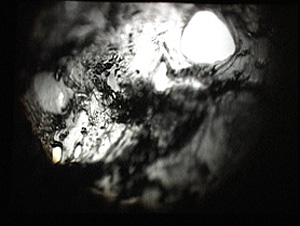
Then the question became the customary one. Off-white textures—pebbly, dribbly, stalagmite-like—swim in and out of focus. Some are viscous and globular, some are like tangled foliage. They seem to spiral, but actually (I put up a finger to measure) they barely move. The effect of movement is given by pulsations of pure black, breaking the lyrical effect of the surfaces with a harshness that becomes aggressive. Aggressive as well is the soundtrack, blocks of sound from subway platforms and traffic and kitsch Latin percussion, all played at high volume. The surfaces just keep shifting and not shifting, sort of rotating while jabbing out at us, lovely and anxiety-inducing at the same time.
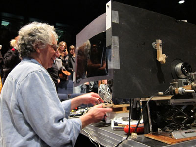
At the end of the performance, people crowded around the cardboard booth in the middle of the theatre. As Ken and Flo Jacobs packed up, they showed how they had generated the effects. What had I been seeing? Neither a film nor a video but a true magic-lantern display, assembled on the spot. But what had I been seeing? Something created with home-made equipment of a startling simplicity. (Strapping tape was involved.) Our magicians explained their tricks, like magic-lantern operators of earlier centuries explaining the science behind their shows. But I think it’s best that you not know until after you have a chance to see what they create.
In earlier entries (here and here) Kristin and I have praised Jacobs’ films for showing how very slight adjustments in technique or technology can create disturbing cinematic illusions. In this vein, the first item on the Cinémathèque program, a video called Gift of Fire, turned Louis Le Prince’s brief 1888 street scene into a 3D movie. (The homage was appropriate because Le Prince experimented with multiple-lens cameras.) The Nervous Magic Lantern performance generated a different sort of illusion, one conjuring up micro-landscapes and otherworldly vortices. In all, Jacobs makes us realize how many evocative effects are still to be discovered by tinkering with images thrown on a screen.
Detour to Berlin
KT here:
As David mentioned in last week’s entry, I took a week in the middle of our visit to Europe for research at the Ägyptisches Museum in Berlin. The staff there welcomed me into their storerooms, and I spent the days looking at fragments and the records of their discovery and the nights downloading and backing up my photos. No time for filmgoing. The most I managed was a trip to the well-stocked arts bookshop Bücherbogen, which has one of the best selections of film books to be found in Germany. Our old friend, experimental filmmaker Carlos Bustamente, met me there, and we had a quick cup of tea–most welcome on a cold morning when the results of the biggest snowfall in decades were still blanketing many sidewalks and roads.
I did note one film-related phenomenon, however. Every day I took the S-Bahn from Savignyplatz to Friedrichstrasse. The tracks pass directly across the street from the Theater des Westens (that is, the western part of Berlin). It was playing Der Schuh des Manitu, a musical version of the 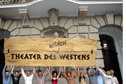 highly successful 2001 German film of the same name. (I hope the publicity photo at the left was taken in warmer weather than I experienced.) I mentioned the film here, in reference to the fact that every major producing country, and some minor ones as well, turn out their own local comedies, films that don’t travel well but are very popular locally.
By now it’s a familiar phenomenon in the U.S. for successful Hollywood films to be turned into stage musicals. It wasn’t always so. Back in the 1950s and 1960s, films were made of popular musicals, sometimes successfully, as with My Fair Lady, and sometimes not, as with Mame. But now the trend is the other way, with everything from Shrek to Hairspray getting the Broadway treatment.
It’s interesting to know that the same thing goes on abroad, though I’m not sure how prevalent such adaptations are. Der Schuh des Manitu, directed by Michael “Bully” Herbig, remains the highest grossing German film. Herbig doesn’t act in the stage play, as he did in the film, but he served as a creative advisor. The musical is a hit, having premiered on December 7, 2008 and it is expected to continue until at least the autumn of this year. There are several clips from both the film and the musical on YouTube. This one, at 8 minutes, gives a generous dose of the show. There are no subtitles.
I had only a couple of days back in Paris before we headed for Brussels for the final week of our trip. The German theme continued, since a few of the 1910s films David needed to see at the Cinematek here were German. The one I most wanted to see was Edmund Edel’s 1916 feature, Doktor Satansohn. Its main claim to fame is probably the fact that Ernst Lubitsch plays the title role. My book with Lubitsch started with his 1918 move to features, when he began to concentrate more on directing and less on acting. By 1920, with Sumurun, he appeared onscreen for the last time; being discontented with his performance as the tragic clown, he decided it was time to move behind the camera for good.
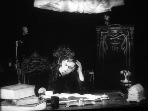
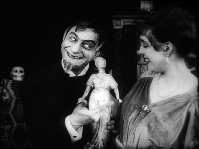
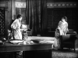
In the short films he starred in before 1918, Lubitsch often played a brash, ambitious Jewish youth, as in Der Stoltz der Firma (“The Pride of the Firm,” 1914). In Doktor Satansohn he’s a physician with a magical machine that transforms older women into beautiful young ones. We’re first introduced to a couple and the wife’s mother. When the latter makes a pass at her son-in-law and is rejected, she seeks the doctor’s help. His machine works by capturing the wife’s essence in a statuette and making the mother look like her daughter. Problem is, every time she’s about to kiss the husband, the doctor pops up with his devilish leer, visible only to the “wife.” David and I decided that the film is a comedy, though perhaps one only Germans of the day would find truly amusing. For one thing, the title character is clearly a Jewish caricature, one played to the hilt by Lubitsch. He decorates his machine with the Star of David and a Hebrew inscription (not to mention vipers and an image of Saturn).
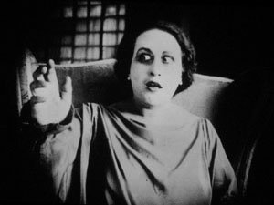
Stylistically it’s a fairly conventional film for its day, though the black background of the doctor’s office, with its stylized youth machine and satyr-like bust, gives a hint of Expressionism to come. (See our topmost image.) Inevitably near the end there comes the moment beloved of historians of pre-World War II German cinema. The real daughter, released from her imprisonment in the statuette, confronts her double in the doctor’s waiting room. The Doppelgänger motif strikes again.
I wonder if German films actually have more Doppelgängers in them than appear in other national cinemas. Do they really reflect the disturbed soul of the nation? Or did the possibilities of filmic special effects draw moviemakers to try and multiply single figures? Georges Méliès and Buster Keaton used in-camera techniques to multiple their own figures in virtuoso displays. I recall being impressed by The Parent Trap‘s duplication of Hayley Mills when I saw it as a kid, and the whole notion of a single actor playing twins and other lookalike relations is a common enough convention. In Doktor Satanssohn, the doubled figure appears only in this one shot, and it’s the leering Lubitsch, delighted with his own nastiness, who walks off with the picture.
The 1910s, again, and still
DB again:
We saw Doktor Satansohn while I was studying staging and cutting strategies of the 1910s, thanks to the remarkable holdings of the Royal Film Archive of Belgium, also known as the Cinematek. My comments on last summer’s visit are here.
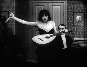
Another German film, in a choppy Russian print, vouchsafed a new glimpse of Asta Nielsen. In Totentanz (Urban Gad, 1912), she plays a guitarist-dancer who must take to the stage to support her infirm husband. She attracts the devotion of a composer, and soon she feels attracted to him. Torn between desire and duty, she snaps during a rehearsal of his latest piece, “Totentanz.” In a chilling gesture, she uses his dagger to slice her lute strings.
Soon the two are locked in a violent erotic struggle, and a stabbing ensues. In all, melodrama as ripe as one could want.
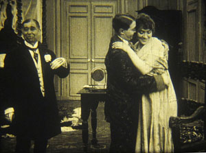
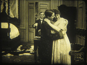
As ever, I was happy to have my hypotheses about tableau staging confirmed by several of the titles I saw. A minor French bedroom farce, Le Paradis (M. G. Leprieur, 1914 or 1915), had a brief passage of the sort of blocking and revealing we find in many films of the period. The painter Raphael Delacroix (no kidding) is pretending to be the lover of Claire Taupin to deflect the advances of randy M. Pontbichot. But Claire is actually the mistress of M. Grésillon. . . .
First, very frontal staging strings out Pontbichot, Raphael, and Claire. The older man relents in his pursuit of her.
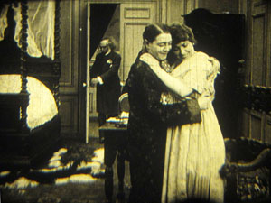
In the vivid depth characteristic of the tableau tradition, Pontbichot withdraws. But his position accentuates that central door, which starts to open.
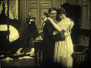
Most remarkably, Pontbichot ducks almost entirely behind the couple, giving pride of place to M. Grésillon’s arrival in the center of the shot.
Pontbichot slides out in time to register Grésillon’s outraged reaction to finding his mistress in another man’s arms.
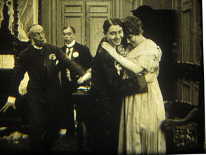
Grésillon rushes to the frontal plane, furious. As ever, a thrust to the foreground creates a major spatial/ dramatic event.
Although the Le Paradis passage is ABC compared to the emotionally powerful patterns of staging we find in Ingeborg Holm (1913), it illustrates how even average films could resort to the blocking/ revealing tactic within the deep-space geometry of the tableau.
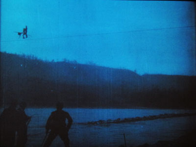
More flamboyant was Il Jockey della Morte (1915), an Italian circus film made by the Dane Alfred Lind. Its bold lighting and varied angles on the Big Top recalled the Danish films of a few years before. Halfway through, Lind launches a dazzling chase that features leaps from a tall bridge and bicycling stunts on a cable stretched across a river.
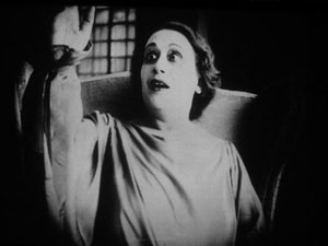
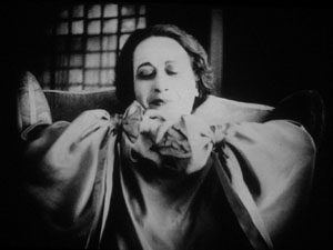
Another Italian film, this time a diva vehicle, suggests that by 1917 1923 (see below) the tableau style was already giving way had given way to scenes organized around close shots. (See below.) L’Ombra (Mario Almirante) starred Italia Almirante Manzini as a lively, trusting wife who becomes paralyzed. While her husband betrays her with her younger protégée, she gradually recovers bodily movement. Yes, a paralyzed diva seems a contradiction in terms, but one small-scale scene shows a remarkable range of emotions. Berta’s hands start twitching, one lifts up, and she stares wildly, as if it were an alien being.
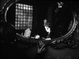
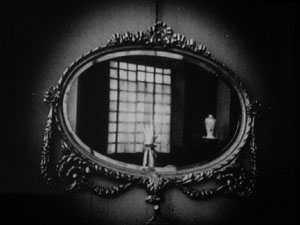
In an earlier scene, Berta had asked that a mirror facing her be tipped upward so that she would never see herself sitting immobile. This shot pays off now, when the hand ascends almost magically into the bit of reflection she can see.
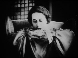
When the hand descends, her astonishment turns into joy. She experimentally shoves the hands together, as if asserting her control.
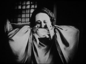
In the end, she kisses her hands as if they were pampered children.
Manzini runs through many more micro-emotions than I’ve indicated here, but this sample is typical of the ways in which L’Ombra avoides the long-shot choreography of only a few years before and builds a performance out of face, body, and arms in a close framing. The mirror-shot motif shows that fairly careful filmic construction was emerging at this point too.
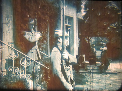
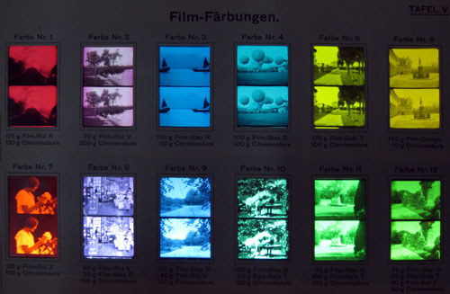
During my stay, I learned more about tinting and toning from the ever-helpful Noël Desmet. On the seldom-seen World War I drama L’Empreinte de la patrie (M. Dumeny, 1915), some images had curious oscillating patches of rusty brown. Noël explained that when Prussian Blue toning was combined with rose tinting, the chemicals eventually reacted to alter the pink cast. An example is shown at the top of this section, though the blue is more saturated in the original.
Once we get back to Madison, I’ll have to sort out all that I’ve learned from these movies. Onward and upward with the 1910s!
For more on Jacobs’ Nervous Magic Lantern, see Scott Foundas’ interview here. The Youtube clip doesn’t do the spectacle justice. If you must know something of Jacobs’ tools, the Dailymotion video from the performance I saw offers some clues. My notions about 1910s staging are laid out in On the History of Film Style and Figures Traced in Light. You can also find several discussions in earlier entries on this site. Just execute a search on tableau.
Now is a good time to thank Noël Desmet and Marianne Winderickx, both of whom are retiring from the archive in March. The research that Kristin and I have done over the years owes an enormous lot to them, and of course to the Director of the Cinematek Gabrielle Claes.
P.S. 15 November 2013: Ivo Blom has pointed out that the version of L’Ombra I saw wasn’t from 1917 but rather from 1923. Hence the corrections above. Thanks very much to Ivo! Go here for his blog and information about his newest publication on silent Italian cinema.
A tinting and toning sample card from the early 1920s. Courtesy Noël Desmet.
2-4-6-8, whose lipdub do we appreciate?
DB here:
“There is really no such thing as Art. There are only artists.” I tend to interpret the disarming opening of Ernst Gombrich’s Story of Art as a protest against the idea that art has an essence that unfolds through history. Those of us in film studies can spot the heritage of this Hegelian idea in one standard story that is told about how editing came to be a dominant technique. According to the formula, editing is “essentially cinematic,” but this essence didn’t reveal itself immediately. It emerged in phases, thanks to the insights of brilliant creators (Méliès, Porter, Griffith, the Russians). Understanding cinema’s history, according to this view, means tracking how film revealed its inherent nature.
In saying that Art doesn’t exist, Gombrich isn’t trying for an elaborate philosophical argument. He’s suggesting a way of understanding art history. His abrupt two sentences suggest that the historian shouldn’t presume that any art has an essence, a secret core that dictates how its history unfolds. He proposes seeing continuity and change in what we call the arts as springing from concrete activities of individuals and groups. Cinema’s history then becomes an account of the creative decisions of filmmakers faced with particular demands and problems. Some of those decisions can converge across the community. The results are trends, such as the increased use of editing, which have real consequences but which are aren’t the result of some secret, essential process.
Once we try to analyze art in terms of what creative communities have sought and achieved, we can ask how artists tend to behave. Across his career, Gombrich stressed that artists are sensitive to their circumstances. What tasks are assigned to the artists? What are the traditions and current fashions? What are the tastes of patrons? What constraints are put on the art-maker? How is art taught? How can the ambitious artist achieve distinction? (“What is there for me to do?”) What are the tricks of the trade at any moment? How do artists borrow from one another? And how might they compete with one another?
We often underrate competition as a stimulus to creativity. Gombrich notes that “the Dutch masters vied with each other, trying to outdo their rivals in certain accomplishments.”
Stressing the relevance of traditions not only implies an attention to the way art feeds on art; it should also make us aware of the cumulative nature of any such skill. What happens in such a hothouse atmosphere is that ambition leads to competition and frequently also to specialization, as it notoriously did in Holland.
In cinema, we might profitably consider competition as one source of the diversity within a tradition. I suspect that the great Soviet directors of the 1920s not only shared ideas but also competed by testing ever farther-out ideas about cutting. They also specialized in the manner Gombrich suggests by cultivating particular effects or genres: Pudovkin’s character-driven pathos, Eisenstein’s dynamic crowd effects, Kuleshov’s exploration of popular genres, Dovzhenko’s boldly elliptical storytelling. I’ve often thought that the Warner Bros. cartoonists probably walked out of the first screenings of Disney’s Snow White and the Seven Dwarfs (1937) with heavy hearts. How could they match that? They didn’t try. Instead, they cultivated something quite different: raucous, cynical, high-speed farce. And today, doesn’t it seem likely that Avatar took its final form as an effort to go beyond the CGI efforts of earlier directors—to prove that the director of Terminator II and The Abyss was still the King of the World of SPFX?
Boys and their long-take toys
One of the most visible arenas of cinematic competition is the sustained tracking shot following several characters. It requires a sort of virtuosity, or at least logistical skill, in coordinating everything—the speed and consistency of the movement, the passage of people in and out of the shot, the consistency of framing and focus, the timing of new information. Once somebody has executed such a shot, the challenge is thrown down to others. Can you make yours longer or fancier?
In The Way Hollywood Tells It, I noted that Brian De Palma saw just such a challenge in Raging Bull’s famous tracking shot from the dressing room to the prizefight ring. “I thought I was pretty good at doing those kind of shots, but when I saw that I said, ‘Whoa!’ And that’s when I started using those very complicated shots with the Steadicam.” This sort of schoolyard one-upsmanship is probably what Christine Vachon had in mind when she called the single-take scene a “macho” choice.
There are some longer-term trends as well. Elaborate takes used at the start of a film can be found in the 1930s and 1940s (e.g., Ride the Pink Horse, 1947), but Welles laid down a clear marker in the opening of Touch of Evil (1957). Thereafter, starting a movie with an intricate, sustained camera movement became something of an emblem of directorial ambition.
Already, however, Dreyer, Ophuls, and Mizoguchi had used long takes, usually with camera movement, as building blocks of a film’s overall design. With Rope (1948) Hitchcock raised the possibility of making an entire film out of even fewer such shots, an initiative continued by the Hungarian Miklós Jancsó, who developed the choreography of such shots to a new level by incorporating crowds, zooms, and rack-focus passages. Béla Tarr and Gus van Sant have been modern exponents of the technique.
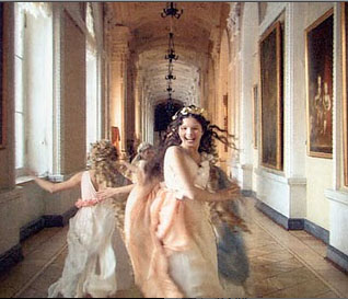
It was probably inevitable that somebody would try to make a feature-length film consisting of a single moving shot. Josh Becker’s Running Time (1997) renders a heist in what purports to be one take; there are cuts, but they’re pretty well disguised. Sokurov’s Russian Ark (2002; above) uses video technology to create a feature out of one genuine take, “a single breath” as he called it. At the same time, Sokurov added the condition that the shot would be an exploration of a labyrinthine space, in this case the Hermitage, and a trip through different eras of Russian history.
My lipdub can lick your lipdub
Perhaps it was Russian Ark, or maybe just TV walk-and-talks, that inspired the recent cycle of single-take video lipdubs. In these the camera moves through a locale and picks up one person after another, all lip-synching the soundtrack. September’s massively popular lipdub from l’Université de Quebec à Montréal may have furnished the prototype. In the US, a pair of current examples neatly illustrates how borrowing and competition among moviemakers can yield intriguing results.
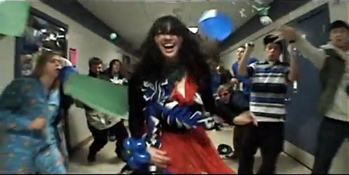
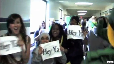
As you probably know, Shorecrest High School in Shoreline, Washington, mounted a very complicated lipdub—one take coasting through the school, picking up dozens of teens lipsynching to Outkast’s “Hey Ya!” before they all assemble in a theatre for a final shout-out. There are some somersaults too, which make any movie better. It is here.
But high school rivalries resurfaced. Shorewood High School, traditionally at odds with Shorecrest in sports and band, struck back with a lipdub of Hall and Oates’ “You Make My Dreams Come True.” The new entry raised the stakes by shooting the action backward, somersaults included. Here it is.
There’s no shortage of backwards videos, but the Shorewood clip plays in clever ways with our biases in perceiving movement. Because we’re wired to grasp motion as advancing in time, we can’t easily reconstruct the actual movement that the figures executed. After seeing the film many times, I still found it hard to visualize the actual progression of the shoot, starting from the assembled crowd and ending on the young woman running backward to the vehicle that pulls away. (A forward version is here.) Moreover, both forward and backward motion have an uncanny symmetry, so that it’s hard to detect the latter except through subtle cues like the way garments fall or a gait with a special snap. Even the moments that flaunt the reverse-motion device, such as things originally tossed down into the frame, seem instead to fly up and into the hands of bystanders.
The stakes have been raised. What will Shorecrest come up with? A radical change of angle? (An entire lipdub done from a very high or low vantage point?) Or maybe a more demanding location? (With spring coming, I’d vote for a miniature-golf course.) Anyhow, my imagination is more limited than the filmmakers’. All that matters for my purposes is that the very fact of competition gave birth to a pair of ingenious and sprightly movies.
If you’re thinking that I wrote this simply to give everyone who Googles “Gombrich lipdup” at least one result, you miss my point. Just as Gombrich was never shy about using advertising imagery and children’s drawings to illustrate some basic principles of visual psychology, so we ought to notice any examples that vividly show how artists strategize in order to create something new within a tradition. Which is to say: Yes, I consider the young filmmakers of Shorecrest and Shorewood artists. Why not?
Gombrich’s essay on Dutch painting first appeared as “Mysteries of Dutch Painting,” New York Review of Books 30, 17 (10 November 1983), 13-17. It is reprinted in his Reflections on the History of Art (London: Phaidon, 1987). Shorewood has supplied a sort of making-of bonus here, with some more challenges to Shorecrest thrown in. To see the genre coopted by politicians (who apparently can’t get all their cohorts together in the same space), go here (thanks to Camilla Lugan). Maybe US politicos could get some more support if they tried bopping like this? They could hardly look sillier than they do already.
PS 31 January: Jason Mittell of Middlebury College has alerted me to his students’ lively long-take lipdub on the virtues of recycling.
PPS 1 February: Yogesh Raut writes that another historical precedent for the dueling lipdubs would be one older than the Quebec one I cited.
In your recent entry on lipdub videos you cite a video made in 2009 by students in Quebec as “the prototype.” I think a more likely candidate is this video made by a company called Connected Ventures and first uploaded in April 2007:
While there have obviously been a ton of similar videos made since then, I think the folks at CV (who I have no connection with) probably deserve a little hat tip as innovators. Of course, it’s possible that they were copying someone else, but in general they seem to be recognized as the starters of the craze (see here, for example).
It’s good to learn this. There are probably other precedents as well. I’d just say that a prototype need not be the first work in a genre tradition; rather, it’s a fully developed, typical instance. We take Little Caesar as a prototypical gangster film, but it’s not the first. The Connected Ventures project is indeed a single take, and it follows various people lip-synching. But it doesn’t explore a building in a targeted way, making the revelation of new space add visual variety, and the walking characters seldom pass us from group to group in tight choreography (it relies more on loose pans). Like other early efforts in a genre, it seems simpler and rougher than later entries. I suppose that supports my point that competition can spur filmmakers to surpass their peers; it seems that later lipdub adepts took up the challenge to make the single take more intricate. Still, I should probably have called the Canadian video “a prototype” rather than “the prototype.” Many thanks to Yogesh for calling my attention to a particularly early work in the genre.
2 May 2010: Tonight’s Simpsons episode, “To Surveille, with Love,” opens with a single-take lipdub pastiche/ parody showing Springfield’s citizens moving to Ke$ha’s Tik Tok video. Next morning: It’s here.
(50) Days of summer (movies), Part 2
DB here:
How I spent part of my summer vacation: notes on three more films.
Gangbusters
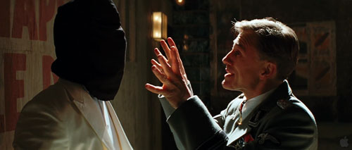
Two major directors–one an emblem of goofy bravado, the other emerging as a contemporary master–gave us movies this summer, and both let me down. I have cautiously championed Tony Scott’s recent work because at least he’s willing to go all the way, however misguided the direction. From Spy Games on, he has stuck to the credo that too much is never enough. His technique is swaggering and undisciplined, mannered to the nth degree. Yet I find his fevered visuals more genuinely arresting than the safe noodlings of most of today’s mainstream cinema. Man on Fire and Déja Vu reheat their genre leftovers into something spicy, if not nourishing, while Domino, the cinematic equivalent of hophead graffiti, wraps its sleazy characters in a visual design apparently inspired by the glowing interior of a peepshow booth.
So it’s with a chagrin that I report that The Taking of Pelham 123 is utterly square. The violence isn’t reveled in, the color scheme isn’t garish, the story has a florid villain played by scenery-masticating Travolta, and Denzel Washington has never seemed more passive and drab. In Scott’s DVD commentaries, he insists that art-school training led him to approach cinema with a painterly eye. But this project has the feel of a commissioned magazine illustration, not the delirious wall-size outrage that he could make if given his head.
I’ve respected Michael Mann since I saw Thief on its initial run. Heat seems to me on the whole his best work, though I admire many qualities of Manhunter, The Last of the Mohicans, The Insider, and Collateral. Ali and Miami Vice seem to me lesser achievements, and with Public Enemies he has gone somewhere I can’t follow.
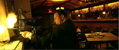
I found it a surprisingly flat exercise, skimming over familiar territory–the charming bandit vs. the square-jawed cop, the struggle of the freebooter vs. the mob, the cynical politics of law enforcement vs. the authentic impulses of the outlaw. The plot is unusually straightforward for Mann, and the last shot, which ought to be a corker, is wasted. Too many scenes are nakedly expository, relying on fussy period detail to carry them. At the same time, more basic exposition seemed to me botched at the outset. In the opening scene, shouldn’t we get a clearer sense of what Dillinger’s sidekicks look and act like? A classically constructed film would dwell on them, characterize them, give them bits of behavior that develop in the course of the film. Mann treats them as part of the scenery setting off his handsome hero. Later, when one of Dillinger’s hired pistoleros goes kill-crazy, shouldn’t we have been set up to see him as a possible risk?
Typically Mann romanticizes, even sentimentalizes, his hard cases in that tough-guy way we know from fiction. But I couldn’t discern any vivid attitude toward his parallel protagonists Dillinger and Purvis. After Heat, where crook and cop both show a willingness to abandon women who want them, it’s probably significant that Dillinger is characterized by his fidelity to Billie. Yet while she’s in jail he’s back to an insouciant night on the town with his familiar floozies. In all, I can’t figure out why Mann made this movie about these people, or why we should care.
Collateral was already veering toward a certain obviousness of construction, when Vincent talks initially about how in impersonal L. A. a dead guy can ride the subway without anyone noticing. In Public Enemies the final line returns to the film’s most underscored motif in a distressingly on-the-nose way. Similarly, one thing I admire about Heat is that it acts as if no other gangster movie has ever been made. Its scenes offer plenty of opportunities for cute citations of old crime movies, especially when Vincent (a different Vincent) catches his wife’s lover watching TV. Instead, Mann treats the material as cut off from cinema, and this saves him from the coyness of so much genre work today.
Is he then a realist? His interviews and DVD commentaries indicate that he thinks of himself this way. Yet he strikes me instead as a genre purist. Each film is sui generis because it aims to recover the authentic dramatic core of the policier, the social comment film, or the wilderness adventure. But in Public Enemies, Dillinger’s visit to the movie house to watch Manhattan Melodrama (1934), even though the event is historically accurate, hits the parallel chords hard. Dillinger, who’s about to be cut down in a few moments, smiles in fascination when Gable says: “Die the way you lived–all of a sudden.” In such scenes, Mann seems to me to have retreated into being a more ordinary filmmaker. The worst thing I can say about Public Enemies is that it risks becoming academic.
Mann’s claims to realism are partly his efforts to deny being a self-conscious stylist. For many of his admirers, me included, his pictorial sense is a large part of what makes his work distinctive. There’s plenty of controversy about the look of Public Enemies, and I have to come down on the side of the nay-sayers. I saw it twice, once in 2K digital projection in a superb multiplex in Europe. My second viewing was on 35mm, in a reliable Madison, Wisconsin venue. The digital version too often teemed with artifacts, blown-out bright areas, and disconcerting shifts in tonal values within scenes. The next two images are successive shots in the HD trailer, and I haven’t adjusted them. The disparities between them reflect the sort of mismatches that struck me in the digital screening.
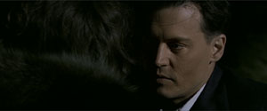
On film, the faces lost the edge enhancement and the mushy textures I saw in the digital version, and the tommygun fire was less tinged with yellow, pink, and orange. On the whole, I thought that the images benefited from the mercies of emulsion.
The chance to take high-definition video all the way, especially in low-light situations, seems to have invigorated Mann creatively, but it may have distracted him from basic craft. Investing wholly in a new look, he belabors even the simplest action through staccato cutting; getting people in and out of cars should not take such effort. Action scenes occasionally succumb to the jittery camera. I consider the climactic bank robbery in Heat somewhat awkwardly staged (though the dazzling sound work there compensates somewhat), and similar short-cuts can be found in the Wisconsin shootout here.
If you find my tone tentative, you’re right. I didn’t care for The Insider on first viewing; it took me a second visit to grasp what I now take as its virtues. That’s why I saw Public Enemies twice. I expect as well that Mann’s eloquent defenders, such as Matt Zoller Seitz, who has done a passionate series of shorts on Mann, will find fault with my evaluation. For the film’s admirers, what I find sketchily indicated they could see as daringly elliptical; what I see as inconsistent they might consider calculatedly ambiguous. The incompatibilities of color and light could be part of Mann’s experimentation too. I see his oeuvre as largely updating cinematic classicism, while others tend to see it as a daring leap beyond it. Maybe I’ll come around eventually. For now, I have to consider Public Enemies the biggest disappointment of my fifty days.
A welcome basterdization
It’s a measure of the changes wrought by the Internets that Inglourious Basterds has in about a month amassed a daunting volume of serious commentary. Without benefit of DVD (let’s be charitable and assume no BitTorrenting), dozens of online writers have dug deep into this movie. As if to demonstrate the virtues of crowdsourcing, this flurry of critical discussion has shown that most professional movie reviewers have tired ideas, know little about film history, and are constrained by the physical format and looming deadlines of print publication. At this point, I’m very glad I’m not writing a book on Tarantino; the sort of secondary sources that normally take years to accrete have piled up in a few weeks, and the pile can only grow bigger, faster.
So what is there left for me to say? A little, though I can’t be sure every point isn’t made somewhere else. In any case, surely you’ve seen it, so I don’t have to warn you about spoilers, do I?
Since I thought Death Proof offered merely proof of the director’s creative death, I went to Inglourious Basterds with low expectations. I came out thinking that it was the most audacious and ambitious American movie I saw in my fifty days of summer viewing.
To deal with the current controversy immediately: I didn’t think its counter-history was intrinsically offensive or immoral, since I remembered those what-if-Germany-had-won counterfactuals in Deighton’s novel SS-GB and Brownlow’s film It Happened Here (1966). Did those express defeatism or an inability to counter the Nazi threat? So why not have a band of vindictive Jews seeking to match the Nazis in ruthlessness (except that their targets, so far as we see, are only soldiers and collaborationists)? We call it fiction.
You can quarrel about whether a revenge plot should carry some signals of the cost to the avenger, but I’m sufficiently convinced that tit-for-tat is embedded in human nature and will always be perceived, however recklessly, as virtuous. In any case, the movie’s emblem of revenge, the powerful image of Shosanna laughing mockingly as she goes up in flames along with the audience, carries the strategic ambiguity of a lot of cunning popular art. It’s at once a glorying in payback, a Jeanne d’Arc martyrdom, and a reminder of the fate of Jews elsewhere at that moment. It doesn’t permit a single easy reading.
Granted, there are some low-jinks, like the misspelled title and heroine’s name; are these jokes on Tarantino’s notorious spelling malfunctions? Yet the movie seemed to me Tarantino’s most mature (to use a term of praise that he hates) since Jackie Brown. I say that not because his other work is juvenile, which it’s not (except for Death Proof). I call Inglourious Basterds mature because it exploits his strengths in fresh but recognizable ways.
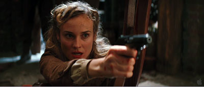
First, strengths of structure. Tarantino’s conception of storytelling owes at least as much to popular literature, particularly policiers, as it does to current conventions of screenwriting.
Take his penchant for repeating scenes from different viewpoints. In Elmore Leonard’s novel Get Shorty, Chapter 2 ends with Harry, seeing Chili at his desk, exclaiming, “Jesus Christ!” Chapter 3 consists of the first stretch of their conversation. Chapter 4 starts with Karen approaching Harry’s office and hearing him say, “Jesus Christ!” This overlapping-scene strategy, sketched in Reservoir Dogs, gets elaborated in Pulp Fiction and Jackie Brown.
Likewise, thrillers and crime novels commonly play on showing how distant lines of action unexpectedly intersect. In Peter Abrahams’ Hard Rain the agent who becomes the hero tells the story of two coal miners, Bazak and Vaclav, who meet after tunneling from two ends of the field. Needless to say, Hard Rain’s own plot enacts the same pattern. Charles Willeford’s chance-driven, parallel-action novel Sideswipe could be a model for the structure of Pulp Fiction. So it should be no surprise that Inglourious Basterds, labeling its long sequences “chapters,” should rely on the stepwise convergence of Shosanna’s plotline and the Basterds’ guerrilla operations, with the UK Operation Kino serving as the first sign of a merger.
So the film is built on large-scale alternation of the principal forces: Shosanna (Chapter 1), the Basterds (2), Shosanna again (3), the Basterds again (4), and finally the two strands knotting at the screening of National Pride (5). Landa also knits the two strands together, of course, starting when he investigates the tavern shootout at the end of (4). In Chapter 5 the alternation gets carried by classic crosscutting. We shift to and fro among Shosanna’s plot, the capture of Raine and Utivich, the conflagration in the auditorium, and the deal struck between Landa and the US command. Yet right to the end both Shosanna and the Basterds have no awareness of each other’s plan: only we grasp the double dose of Jewish vengeance. More than in most films, but typical for Tarantino, we’re aware of the plot’s abstract architecture.
Then there are strengths of texture—the moment-by-moment unfolding of the action. Again pulp fiction offers some models.
In Get Shorty, Leonard develops the scene I mentioned above in an extraordinary way. Chili, Harry, and Karen talk through the night about Chili’s purpose and about the ways of the movie industry. Their conversation runs for a remarkable seven chapters and sixty pages, interrupted only by a brief flashback. When I met Leonard at a book-signing event, I asked him why he took up a fifth of the novel with a single scene. He said that he hadn’t realized it consumed so much space, because it was “fun to write.”
Tarantino can lay bare his chapter-block architecture because his scenes are devoted to this sort of prolongation. You may remember the bursts of violence, but what he fashions most lovingly is buildup. Here the spirit of Leone hovers over our director. In each entry of the Dollars trilogy, you can see the rituals of the Western getting more and more stretched out, filled with microscopic gestures and eye-flicks. Eastwood’s lips stick slightly together and must peel apart when he speaks: This becomes a major event. I’m a primary-document witness to the fact that 1969 cinephiles were stunned by the long opening scene of Once Upon a Time in the West, which after painstakingly establishing the tics of several characters ends by eliminating them. Later, John Woo gained fame by dwelling on Homeric preparations for combat and endlessly extended bouts of gunplay. From these masters Tarantino evidently learned the power of the slow crescendo and the sustained aria.
Leone and Woo’s amped-up passages rely chiefly on imagery and music. Tarantino is no slouch in either department, but he relies, like his beloved pulp writers, on talk. As everyone has noticed, the conversations in Basterds go on a very long time. In an era when scenes are supposed to run two to three minutes on average, Tarantino has only a couple this brief. The introduction at LaPadite’s farm runs over eighteen minutes, by my count, and the more complicated Chapter 2, with intercut flashbacks and flash-forwards, runs about the same length. Thereafter scenes last anywhere between four and twenty-four minutes, and Chapter 5’s crosscut climax consumes a stunning thirty-seven minutes. All but the last depend completely on dialogue. Leonard would probably consider them to have been fun to write.
Talk in Tarantino comes in two main varieties: banter and intimidation. At the coffee shop the Reservoir Dogs squabble and soliloquize; later exchanges will be conducted at gunpoint. En route to the preppies’ apartment, Jules and Vincent chat casually; when they arrive, the talk turns threatening. If Death Proof lets banter dominate, Inglourious Basterds goes to the other extreme. Here talk is a struggle between the powerful and the powerless.
As Jim Emerson points out, nearly every scene is an interrogation. This entails that someone in authority (Landa, Aldo, Hitler, the Germans who question Archie’s accent in the tavern, Zoller) is trying to pry information out of someone else. Intimidation through interrogation gives every scene an urgent shape. Now Tarantino’s digressions (three daughters, rats and squirrels, a card game, the correct pronunciation of Italian) don’t read as self-indulgence, but rather as feints in a confidence game. Here Tarantino’s tendency to write endless scenes, something he confesses in his recent Creative Screenwriting interview on the film, is fully harnessed to more classic, albeit unusually extended, scene structure.
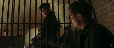
To keep us focused on the lines and the actors delivering them, Tarantino has adopted a classical approach to style. He shoots with a single camera, so every composition is calculated. “I’m not Mr. Coverage,” he remarked in 1994, “. . . . I shoot one thing specifically and that’s all I get.” He foreswears handheld grab-and-go. In Basterds he locks his camera down, or puts it on a dolly or crane. Cinematographer Robert Richardson says that there is only one Steadicam shot in the film.
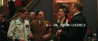
We don’t usually call Tarantino tactful, but his technique can be surprisingly discreet. He has the confidence to let key dialogue play offscreen: in the café when Landa arrives at Goebbels’ lunch, we stay fastened on Shosanna, a good old Hitchcockian ploy that ratchets up the tenson. Although Tarantino cuts rapidly throughout each chapter (on average every 5.6 seconds), he repeats setups quite a bit. This permits a simple change of angle or scale to mark a beat or shift the drama to a new level.
He can bury details on the fringes of the shot, as when the cut to the tight close-up of LaPadite shows him tossing his match into an ashtray sitting beside Landa’s cap, which bears the insignia of a skull and crossbones. It’s out of focus and on the edge of the screen, but the glimpse of it increases our fear that LaPadite is indeed harboring a Jewish family. As in Jackie Brown, another film that extends its scenes through detailing of performance, lighting, and setting, there seems no doubt that Tarantino, for all his PoMo reputation, appreciates some traditional Hollywood virtues.
He can inflect them, however. Richardson finds that Tarantino has an unusual approach to the anamorphic format.
I naturally move [the framing of characters] to one side or the other, especially when shooting anamorphic, whereas Quentin enjoys dead-center framing. For singles in particular, we’re just cutting dead-center framing from one side to the other, with the actors looking just past the barrel of the lens.
I noticed this tendency most in the reverse angles. Tarantino’s two-shots tend to be simple and symmetrical, shooting the characters in profile, as in the image surmounting this entry. But in over-the-shoulder shots, about half the frame is unoccupied—as if Tarantino were compensating, like his 1970s mentors, for an eventual TV pan-and-scan version of the scene.
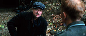
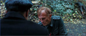
Or take the cliché of arcing the camera around a group of chatting people, picking up one after the other. Tarantino didn’t invent this, but the opening scene of Reservoir Dogs probably helped popularize it. In Chapter 5 he uses the technique in the lobby of the Le Gamaar cinema, only to break its momentum by having the camera trail Landa when he breaks out of the circle and retreats, in a paroxysm of giggles, after Bridget says she broke her leg while mountain climbing.
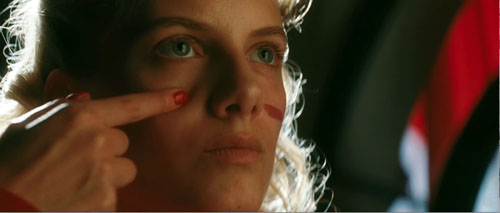
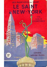 There are many other intriguing touches, like the mixed typography of the opening credits, all of which seem to use fonts derived from 1970s paperback novels. Or the reference to The Saint in New York, perhaps less important for its plot parallels than for the fact that author Leslie Charteris’ later Saint novel, Prelude to War (1938), was banned in Germany and Italy for its attacks on fascism (even warning about the camps). So is reading a Saint novel a covert act of defiance on Shosanna’s part? Later, she applies make-up in fierce strokes, like an American Indian, reminding us that Raine’s Basterds model their tactics on the Apache.
Perhaps most striking is the dairy motif, from the glass of milk in Chapter 1 to Landa’s ordering a glass for Shosanna in Chapter 3. Is this a hint that he suspects her of being the girl who fled the massacre? Or is it a test he offers to any French national he meets? In the restaurant scene, the extreme close-ups of the crème fraiche may underscore the possibility that Landa is looking for signs that she won’t eat dairy products not prepared according to Orthodox dietary rules. Few filmmakers today would trust audiences to imagine this possibility on their own; instead we’d get an explanation to an underling. (“So here’s a quick way to find out if we have a Jew ….”)
Another nest of details involves the film-within-the-film, Nation’s Pride. Many online critics have noticed that it provides the sort of film that Basterds refuses to be: We never see our squad in the sort of Merrill’s Marauders skirmishes we probably expected going in. What I find intriguing about the movie, purportedly directed by Eli Roth, is that despite some anachronisms it exemplifies the sort of confrontational cinema we find in the silent Soviet pictures. Surprisingly, this was a tradition that Goebbels admired. Eisenstein’s Battleship Potemkin, he claimed, “was so well made that it could make a Bolshevist out of anyone without a firm philosophical footing.” So in Nation’s Pride Roth and Tarantino have provided a Nazified homage to Eisenstein: a baby carriage rolls away from a mother, a soldier suffers an assault to the eye reminiscent of the wounding of the schoolteacher on the Odessa Steps, and even Soviet-style axial cut-ins are used for kinetic impact.
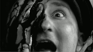
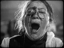
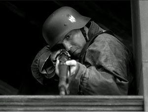
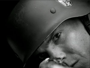
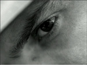
This pastiche of agitprop culminates in the sort of to-camera address we find in Dovzhenko. Zoller shouts, “Who wants to send a message to Germany?” But this is followed by Shosanna’s spliced-in close-up addressing the audience in her theatre.
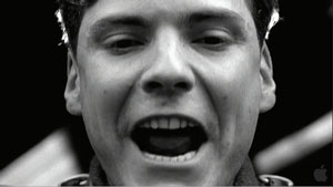
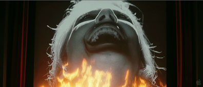
She makes her own confrontational cinema.
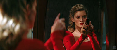
Several years ago the film theorist Noël Carroll speculated that the Movie Brats of the 1970s sought to create a shared culture of media savvy that would replace the traditional culture based on religion, classical mythology, and official history. For the baby boomers, knowledge of the Christian Bible and iconography of American history would be replaced by deep familiarity with movies, pop music, and TV. This secular sacred would bind the audience in a new set of traditions. On this path, Scorsese, Spielberg, and Lucas didn’t go as far as Tarantino has. In his films every situation or character name or line of dialogue feels like a citation, a link in a web of pop-culture associations. (Aldo Raine = Aldo Ray = Bruce Willis, whom Tarantino once compared to Aldo Ray.) The only other filmmaker I know who has achieved this supersaturated cross-referencing is Godard, another exponent of the vivid-moments model (though he uses it to create a more fragmentary whole). Tarantino is the most visible evidence of what Carroll called “The future of allusion.”
But it’s too limiting to see Tarantino’s films as merely anthologies of references. I think he wants more.
Many viewers seem to assume that Tarantino’s film is somewhat cold. The Basterds are grotesques, parodies of men on a mission; Shosanna, though in a sympathetic position, must maintain a frosty demeanor. Even revenge, so central to films that Tarantino admires, is served frigid here, a purely formal postulate, like the urge for vengeance animating classic kung-fu films.
There is cinema that asks you to empathize with its characters. Then there is cinema that aims to thrill you with a cascade of vivid moments. There is How Green Was My Valley (1941) and Citizen Kane (1941). I think that Tarantino’s films mostly tilt to the vivid-moment pole, seeking to win us through their immediate verve, the way film noir and the musical and the action movie often do. The young man arrested by great bits from blaxploitation and biker movies sees cinema not as merely piling up cinephiliac references—though that’s surely part of it—but as a flow of tingle-inducing gestures, turns of phrase, shot changes, musical entrances. There can be pure pleasure in having time to see how actors move, or savor their lines, or simply fill up physical space by being centered in the anamorphic frame. Our fascination with Landa comes, I suspect, from the spectacle of a man who is utterly enjoying himself every second.
We might be tempted to claim that this effort to create what Jim Emerson calls “movie-movie moments” actually breaks the film’s overall unity. But Tarantino keeps nearly everything in check by the architectural clarity of his plot. The carving of the swastika on Landa’s brow sets you squirming, but it reveals itself as the culmination of a process we have seen piecemeal up to now. It’s the last in a string of firecracker bursts that have kept the film humming along.
So I’m not convinced that Inglourious Basterds lacks emotion. The emotions Tarantino aims for will arise not from character “identification” but from the overall structure and texture of the work. We are to be stirred, enraptured, astonished by a procession of splendors big and small. It’s the tradition (again) of Eisenstein, particularly in the Ivan films, but also of Leone and, in another register, Greenaway. Formal virtuosity isn’t necessarily soulless; it can yield aesthetic rapture.
The most sophisticated analyses and interpretations I’ve found online are led off by the indefatigable Jim Emerson (start here to track his many entries on the subject), along with his knowedgeable readers, who furnished a book’s worth of commentary and critique. Jim provides links to many other writers’ work (here, for example), not all of which I’ve been able to absorb. For exhaustive, not to say exhausting, coverage of things Tarantino, visit The Archives.
On Tarantino’s time-shuffling and its relation to crime fiction, see my Way Hollywood Tells It, 90-91. In Chapter 7 of Film Art Kristin and I provide an analysis of the replayed scene in Jackie Brown. Tarantino’s comments on writing the Basterds script are in Jeff Goldsmith’s article, “Glorious,” in Creative Screenwriting 16, 4 (July/ August 2009), 20-29. His comments on coverage come from Gavin Smith, “When You Know You’re in Good Hands,” in Quentin Tarantino Interviews, ed. Gerry Peary (Jackson: University Press of Mississippi, 1998), 102. In the same interview he has illuminating comments on the role of the axis of action. Robert Richardson discusses filming Basterds in Benjamin Bergery, “A Nazi’s Worst Nightmare,” American Cinematographer 90, 9 (September 2009); the quotation here is from p. 47. This feature is available online here.
Goebbels’ remark on Battleship Potemkin is quoted in Klaus Kreimeier, The UFA Story: A History of Germany’s Greatest Film Company, trans. Robert and Rita Kimber (New York: Hill and Wang, 1996), 207. For background on Goebbels’ agenda for German cinema, summed up by Lt. Archie Hicox, see Eric Rentschler, The Ministry of Illusion: Nazi Cinema and Its Afterlife (Cambridge: Harvard University Press, 1996). I talk about axial cutting in Eisenstein and other Soviet directors at various points in The Cinema of Eisenstein.
Noël Carroll’s comments about popular entertainment as a secular alternative to shared religious culture are in his essay, “The Future of Allusion: Hollywood in the Seventies (and Beyond),” in Interpreting the Moving Image (Cambridge: Cambridge University Press, 1998), 244, 261-63. On the idea of an emotionally arousing cinema that doesn’t rely on attachment to character psychology, see my Cinema of Eisenstein.
PS 20 Sept 2009: Curt Purcell, at The Groovy Age of Horror, finds a similar plot architecture emerging in the comic-book series Blackest Night.
Now leaving from platform 1
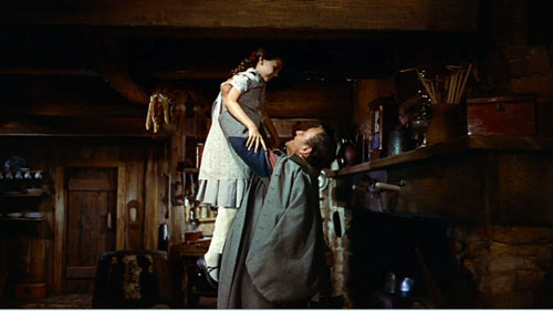
From a Facebook post by Tahereh
To all my friends:
What can I reply to Hossein? He’s pursuing me so avidly, but you know he isnt really a prime catch. No education, no house. If it werent for the earthquake, I wouldnt give him a second look. But he does interest me a little—he’s made me lose track of my lines so many times!
Oh no, now he’s chasing me across the field. What can I tell him? BRB!
DB here:
Many people in the film industry hold media studies in disdain, and often the feeling is mutual. Filmmakers recoil from the abstrusities of Big Theory, and academics often consider filmmakers gearheads (just before wagging their fingers and warning us about the Intentional Fallacy). But scholars like Rick Altman, John Caldwell, Janet Staiger, Kristin, and me, and younger folks like Patrick Keating and Ben Wright have been trying to study filmmakers’ creative choices in concrete ways. Some of us even ask filmmakers what they were trying to do.
So it’s heartening to see movement in the other direction. For quite a while academically trained filmmakers like James Schamus and Todd Haynes have brought ideas from their university studies into their films. Recently Reid Rosefelt composed an enlightening blog entry on Kathryn Bigelow’s intellectual side. Now some terms and ideas are being spread even more widely across the industry.
For example, in a recent Entertainment Weekly story about why women viewers like horror, we read:
One of the most consistent tropes of the genre is the character whom filmmakers call ”the final girl” — the survivor.
Actually, it was Carol Clover, scholar of horror movies and Scandinavian epics, who came up with the “final girl” nickname in her book Men, Women, and Chainsaws. Going back to the EW sentence, you notice that academics helped popularize the term genre too, which you seldom find in Hollywood’s patter before the 1970s. And the very word trope smells of classrooms and chalkdust.
Even more striking is a recent Variety article entitled, “Transmedia Storytelling Is Future of Biz.” Peter Caranicas explains that it involves “developing a piece of intellectual property across multiple media platforms.” The Star Wars franchise is the major modern instance, as Caranicas explains.
What Lucas did went several steps beyond old-style character licensing and brand extensions. He created a unified body of work with an extensive backstory and mythology, and he determinedly guarded its canon [another academic term—DB] while simultaneously opening up peripheral parts of his universe to exploration by other contributors.
One of my former students assures me that Kristin and I used the term “transmedia” back in the 1990s, but we have no memory of doing so. More relevantly, Liz Rosenthal reminds us that Peter Greenaway was pushing the concept in 1993. “If the cinema intends to survive, it has to make a pact and a relationship with concepts of interactivity and it has to see itself as only part of a multimedia cultural adventure.”
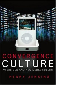
In any case, the person who brought the concept of transmedia storytelling to the forefront of media studies, and thus industry parlance, was another Wisconsin student, Henry Jenkins. Henry has made the concept part of his broader research into how modern media connect with audiences, particularly fan audiences. In his 1992 essay on Twin Peaks, he was already exploring how fans used the still-emerging internet to respond to a range of ancillary texts around Lynch’s TV series. You can get a quick acquaintance with his most recent ideas in this 2007 blog essay. For me, his argument emerged most vividly in a talk he gave at Madison some years ago. The lecture became the chapter “Searching for the Origami Unicorn” in his book Convergence Culture. For his more recent thinking, you can check his current course syllabus, which includes reading and web references, in the 11 August entry here.
The platform-shifting that Caranicas describes is planned and executed at the creative end, moving the story world calculatedly across media. These, dubbed by Jenkins “commercial extensions,” differ from “grassroots extensions,” which are created by audience members without the permission, or even the knowledge, of the creators. The commercial extensions are what I’ll be considering here.
From aggregator Movie MMORPG:
Welcome to a sophisticated world teetering on the edge of decadence. Get hammered on Italian cocktails. Fight your way out of a hospital jammed with nymphos. Cheat on your wife. Seduce a married man. Wander through the streets and stare at gushing water. Have you got what it takes to survive a day in LaNotteCity? You’ll get hooked, since the endgame is always inconclusive!
As it’s currently discussed, transmedia storytelling has two uncontroversial components and one rare but intriguing one.
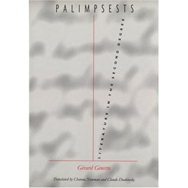 First, the term implies that a story is spread among a series of discrete “texts.” This “hypernarrative” idea was explored with taxonomic zeal by Gérard Genette in his 1982 book Palimpsests. His taxonomy of storytelling is worth considering a little here because he anticipated several possibilities we’re seeing now. Many of his categories have parallels in cinema, but I’ll stick to his domain, literature.
Novels and short stories feed off other novels and short stories. Obvious examples are parodies, pastiches, sequels, and continuations (sequels not written by the original author). Genette also considers what he calls the “transposition,” a very roomy category that’s of particular interest to us.
Transpositions are things like translations, rewritings, and literary adaptations, as when a novel becomes a play. A transposition also occurs when the original text is pruned or compressed, as in abridged versions of Don Quixote or Moby-Dick. At the other quantitative extreme is what Genette calls augmentation. Here, the derivative work expands the original, either in style (three sentences replace one) or narrative material (extra scenes or plots).
Yet another sort of transposition occurs when the story events in the original are rendered through alternative literary techniques. Charles Lamb retells Ulysses’ adventures in a different order than Homer does, and someone could rewrite the events of Madame Bovary in first person, from Charles’ point of view. When Genette was writing, he had to reach for some esoteric examples, but nowadays we have others. Alice Randall’s The Wind Done Gone (2001) retells Gone with the Wind from the point of view of a slave on Tara. The novel Wicked is a large-scale example, as is Tom Stoppard’s Rosenkrantz and Guildenstern Are Dead.
All these examples of hypernarrative operate within a single medium. The second condition of transmedia storytelling is, of course, that it crosses media. Genette considers drama and written literature to be all part of the same medium, but if you don’t, then novels turned into plays, like Les Miserables, would count as transfers across media.
In this sense, transmedia storytelling is very, very old. The Bible, the Homeric epics, the Bhagvad-gita, and many other classic stories have been rendered in plays and the visual arts across centuries. There are paintings portraying episodes in mythology and Shakespeare plays. More recently, film, radio, and television have created their own versions of literary or dramatic or operatic works. The whole area of what we now call adaptation is a matter of stories passed among media.
What makes this traditional idea sexy? I think it’s a third, less common component that Henry has spotlighted. Some transmedia narratives create a more complex overall experience than that provided by any text alone. This can be accomplished by spreading characters and plot twists among the different texts. If you haven’t tracked the story world on different platforms, you have an imperfect grasp of it.
I can follow Conan Doyle’s Sherlock Holmes stories well without seeing The Seven Percent Solution or The Private Life of Sherlock Holmes. These pastiches/continuations are clearly side excursions, enjoyable or not in themselves and perhaps illuminating some aspects of the original tales. But according to Henry, we can’t appreciate the Matrix trilogy unless we understand that key story events have taken place in the videogame, the comic books, and the short films gathered in The Animatrix. The Kid in The Matrix Reloaded makes cryptic reference to finding Neo by fate, but only those who have watched the short devoted to him knows what that means. If Sherlock pastiches are parasites, the texts around The Matrix exist in symbiosis, giving as much as they take.
This strategy differentiates the new transmedia storytelling from your typical franchise. In most film franchises, the same characters play out their fixed roles in different movies, or comic books, or TV shows. You need not consume all to understand one. But Henry envisages the possibility of creating a whole that is greater than its parts, a vast narrative experience that doesn’t end when the book’s last page is turned or the theatre lights come up. His idea seems to be echoed in Will Wright’s suggestion:
It’s a fractal deployment of intellectual property. Instead of picking one format, you’re designing for one mega-platform. . . . We’ve been talking about this kind of synergy for years, but it’s finally happening.
Stimulating as this prospect is, it remains rare. The Matrix is perhaps the best example, but Henry suggests that it’s also an extreme instance: “For the casual consumer, The Matrix asked too much. For the hard-core fan, it provided too little” (p. 126). More common is a Genette-style transposition, in which the core text—usually the movie—is given offshoots and roundabouts that lead back to it. As I understand it, the Star Wars novels operate under the injunction that although they can take a story situation as the basis for a new plot, in the end that plot has to leave the films’ story arc unchanged. Similarly, websites with puzzles, games, clues, and other supplementary material tend to be subordinate to the film, planting hints and foreshadowings (The Blair Witch Project, Memento). Alternatively, the A. I. website provided a largely independent story world that impinged on the movie’s action only slightly.
The “immersive” ancillaries seem on the whole designed less to complete or complicate the film than to cement loyalty to the property, and even recruit fans to participate in marketing. It’s enhanced synergy, upgraded brand loyalty.
For the most part Hollywood is thinking pragmatically, adopting Lucas’ strategy of spinning off ancillaries in ways that respect the hardcore fans’ appreciation of the esoterica in the property. Caranicas quotes Jeff Gomez, an entrepreneur in transmedia storytelling, saying that for most of his clients “we make sure the universe of the film maintains its integrity as it’s expanded and implemented across multiple platforms.” It would seem to be a strategy of expanding and enriching fan following, and consequent purchases.
As best I can tell, then, in borrowing this academic idea, the industry is taking the radical edge off. But is that surprising?
Excerpt from www.ballsup.net
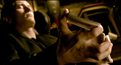
What a bloody week. Just now had a chance to update things. Fact is, it’s me last post. Luckily I let that cellphone drop and grabbed the satchel just before it fell into the Thames. Me and the crew are now packing for Bimini, ready for living large but in a rush becuz Big Chris may be looking for us. Hang on, must upload now, someone’s knocking at me d
Henry’s chapter in Convergence Culture grants that “relatively few, if any, franchises achieve the full aesthetic potential of transmedia storytelling—yet” (p. 97). Perhaps that hopeful “yet” will be fulfilled outside Hollywood? In the realm of the avant-garde, Matthew Barney has elaborated his own private mythology, dispersed among artifacts and hard-to-see films. In this he followed Joseph Beuys and Salvador Dalí. But you could argue that these artists really weren’t telling an overarching story. They were creating secular cults, full of arcana that only the pious initiates of Gallery Culture could grasp.
What about something more accessible? This month in Filmmaker magazine, Lance Weiler has suggested that indie filmmakers embrace the concept of transmedia storytelling (though he doesn’t use the term). Weiler argues that the explosion of digital technology has so transformed narrative that the filmmaker has to keep up. Instead of creating a script, with its genre formulas and three-act layout, the filmmaker should generate a bible, which plots an ensemble of characters and events that spills across film, websites, mobile communication, Twitter, gaming, and other platforms. The filmmaker designs “timelines, interaction trees, and flow charts” as well as “story bridges that provide seamless flow across devices and screens.”
Weiler doesn’t offer any specific examples apart from his Head Trauma, a horror feature accompanied by an alternate reality game that involved mobile and online access. You can watch his account of the “evolution of storytelling” here, where he and Ted Hope speculate about transmedia storytelling as offering economic help to filmmakers, reclaiming authorship from corporations, and promoting new relations with the audience.
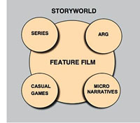 Hope and Weiler raise many fascinating questions about the prospects for multiplatform storytelling. At times, though, it seems that they accept the studio strategy of putting the film at the center of a multimedia ensemble. The diagram accompanying Weiler’s article illustrates that. It’s hard to think outside the franchise model, even if we want to denounce Hollywood for being stuck in an outdated commitment to the theatrical feature as foundational “content.”
We should welcome experimentation, so I wish Hope, Weiler, and other creators well. But I think we ought to recognize some problems with expanding story worlds in these directions.
For one thing, most Hollywood and indie films aren’t particularly good. Perhaps it’s best to let most storyworlds molder away. Does every horror movie need a zigzag trail of web pages? Do you want a diary of Daredevil’s down time? Do you want to look at the Flickr page of the family in Little Miss Sunshine? Do you want to receive Tweets from Juno? Pursued to the max, transmedia storytelling could be as alternately dull and maddening as your own life.
Sure, somebody might go for it. Kristin points out, though, that people who would be motivated to follow up on all the transmedia bits of a spreadeagled narrative are people who would identify themselves as part of a fandom. There aren’t that many films/franchises that generate profoundly devoted fans on a large scale: The Matrix, Twilight, Harry Potter, The Lord of the Rings, Star Wars, Star Trek, maybe The Prisoner. These items are a tiny portion of the total number of films and TV series produced. It’s hard to imagine an ordinary feature, let alone an independent film, being able to motivate people to track down all these tributary narratives. There could be a lot of expensive flops if people tried to promote such things.
Consider a deeper point. Transmedia storytelling in the radical sense is posited as an active, participatory experience. Henry suggests that fans will race home from the multiplex to study up on iconography in The Matrix. Weiler’s article is accompanied by a hierarchy that lists “layers of interactivity.” The most superficial is “Passive Viewing,” defined as “Sit back and watch.” (Here Weiler parts company with Henry, who doesn’t consider ordinary viewing passive.) Further along are layers involving social networking, playing games, discussing or interacting with characters, finding hidden content, and even creating elements of the story world.
But it seems to me that film viewing is already an active, participatory experience. It requires attention, a degree of concentration, memory, anticipation, and a host of story-understanding skills. Even the simplest story gears up our minds. We may not notice this happening because our skills are so well-practiced; but skills they are. More complicated stories demand that we play a sort of mental game with the film. Trying to guess Hitchcock or Buñuel’s next twist can engross you deeply. And the very genre of puzzle films trades on brain strain, demanding that the film be watched many times (buy the DVD) for its narrational stratagems to be exposed. Films are interactive in the way a board game is: each move blocks certain possibilities, another anticipates what you’re going to do (mentally).
Moreover, how the ancillary texts add to the film is a crucial matter. No narrative is absolutely complete; the whole of any tale is never told. At the least, some intervals of time go missing, characters drift in and out of our ken, and things happen offscreen. Henry Jenkins suggests that gaps in the core text can be filled by the ancillary texts generated by fan fiction or the creators. But many films thrive by virtue of their gaps. In Psycho, just when did Marion decide to steal the bank’s money? There are the open endings, which leave the story action suspended. There are the uncertainties about motivation. In Anatomy of a Murder, did Lieutenant Manion kill his wife’s rapist in cold blood? Likewise, being locked to a certain character’s range of knowledge is the source of powerful emotional effects. We want to make the discoveries along with the character, be he Philip Marlowe or Travis Bickle.
The human imagination abhors a vacuum, I suppose, but many art works exploit that impulse by letting us play with alternative hypotheses about causes and outcomes. We don’t need the creators to close those hypotheses down. Indeed, you can argue that one of the contributions of independent film has been the possibility of pushing the audience toward accepting plots that don’t fit clear-cut norms. That innovation shrinks if we can run home to get background material online. By following the franchise logic, indie films risk giving up mystery.
At this point someone usually says that interactive storytelling allows the filmmaker to surrender some control to the viewer, who is empowered to choose her own adventure. This notion is worth a long blog entry in itself, so I’ll simply assert without proof: Storytelling is crucially all about control. It sometimes obliges the viewer to take adventures she could not imagine. Storytelling is artistic tyranny, and not always benevolent.
 Another drawback to shifting a story among platforms: art works gain strength by having firm boundaries. A movie’s opening deserves to be treated as a distinct portal, a privileged point of access, a punctual moment at which we can take a breath and plunge into the story world. Likewise, the closing ought to be palpable, even if it’s a diminuendo or an unresolved chord. The special thrill of beginning and ending can be vitiated if we come to see the first shots as just continuations of the webisode, and closing images as something to be stitched to more stuff unfolding online. There’s a reason that pictures have frames.
In between opening and closing, the order in which we get story information is crucial to our experience of the story world. Suspense, curiosity, surprise, and concern for characters—all are created by the sequencing of story action programmed into the movie. It’s significant, I think, that proponents of hardcore multiplatform storytelling don’t tend to describe the ups and downs of that experience across the narrative. The meanderings of multimedia browsing can’t be described with the confidence we can ascribe to a film’s developing organization. Facing multiple points of access, no two consumers are likely to encounter story information in the same order. If I start a novel at chapter one, and you start it at chapter ten, we simply haven’t experienced the art work the same way. This isn’t to say, of course, that each of us has an identical experience of a movie. It’s just that our individual experiences of the film overlap to an extent that allows us to talk about the patterning of the story under our eyes.
In correspondence with me, Henry suggests that transmedia storytelling may work best with television because of the serialized format; different people hop aboard at different points. I’d add that television’s installment-based storytelling, operating in the lived time of the audience, allows time for viewers to explore or create media offshoots. The installment-based nature of serial TV poses intriguing aesthetic problems of continuity, coherence, and memory. (See Jason Mittell’s essay on this matter.) For films, however, which are typically designed to be consumed in one sitting, multiple points of entry will tend to make plot patterns less clearly profiled.
If transmedia storytelling is difficult to apprehend for the viewer, it also makes critical analysis and evaluation much more difficult. How might we analyze overarching patterns of multiplatform plotting in The Matrix? True, one can itemize the inputs and decipher the citations, but it’s very hard to show how they work together, how they unfold, what it all adds up to—except to note that different people will encounter information bits at different times and with different states of knowledge.
Gap-filling isn’t the only rationale for spreading the story across platforms, of course. Parallel worlds can be built, secondary characters can be promoted, the story can be presented through a minor character’s eyes. If these ancillary stories become not parasitic but symbiotic, we expect them to engage us on their own terms, and this requires creativity of an extraordinarily high order.
Henry Jenkins suggests that for big-budget projects, this means finding unusually gifted collaborators. In the indie sector, the obstacles are even more considerable. Whether the result is Wendy and Lucy or Goodbye Solo, creating a first-rate feature-length movie takes tremendous talent, sweat, and resourcefulness. It is immensely harder to create a story universe that sustains the same intensity and quality across platforms. True, you can sprinkle clues and cryptic references among websites and YouTube shorts. The formulas of genre (horror, mystery) help you generate shock effects and mystification in teaser trailers. Appeal to stock characterization helps you mount a “realistic” Second Life life. But building a vast, sturdy world teeming with distinctive characters, unpredictable plotting, and human resonance is an immense task.
We await our multimedia Balzac. In the meantime, maybe indie filmmakers should settle for trying to be Chekhov.
http://tinyurl.com/scarkiller
Debbie, sorry 2 hav left SOOOO suddenlike. am @ Gila flats = cactus + varmnts. LOL with Blankethead!!! :-/
Uncl Ethan

Thanks to Henry Jenkins for comments on this entry. He recommends that interested readers have a look at Geoffrey Long’s 2007 MA thesis on the Jim Henson company, available, along with many other MIT projects, here. Thanks also to Kristin and Jeff Smith for suggestions, and to Janet Staiger for correcting my memory and calling attention to Dennis Bound’s book on “transmedia poetics” as applied to Perry Mason.
PS 11 Sept: Henry Jenkins has responded to my entry, with the first of three installments starting here.


