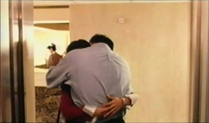
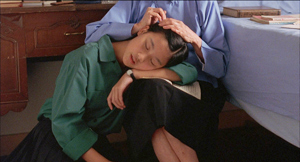
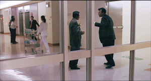
Archive for the 'Readers’ Favorite Entries' Category
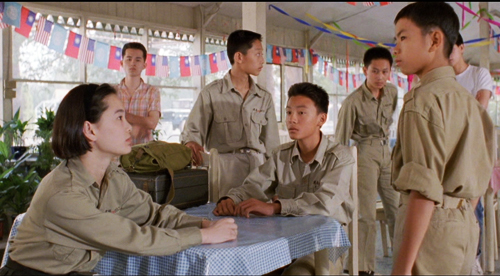
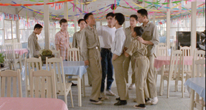
A BRIGHTER SUMMER DAY: Yang and his gangs
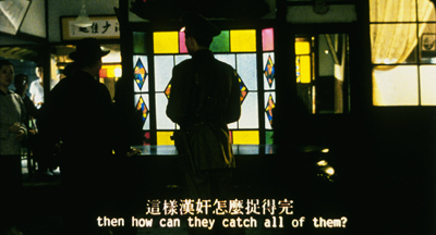
A Brighter Summer Day (1991).
If you care at all about the art of cinema, your task is simple.
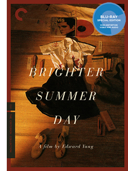 1. Purchase, from whatever vendor you prefer, the new Criterion edition of Edward Yang’s A Brighter Summer Day. Don’t rent or borrow or stream it. Forego a couple days of designer coffee and obtain the physical item. (Disclosure: I bought our copy, gladly.) If you can, go for the Blu-ray. This is a stupendously fine transfer. (Disclosure: I’ve seen the film several times on 35mm.)
2. Find the biggest screen you can. Ideally, use a public-access auditorium, a classroom, or an obliging arthouse venue. Don’t even think of watching it on a computer monitor.
3. Read Godfrey Cheshire’s helpful liner notes.
4. Watch the film (on the big screen, remember). It will take four hours.
5. After a decent interval, watch it again on a convenient screen, this time listening to Tony Rayns’ audio commentary. This is the most illuminating, subtle, and far-ranging audio commentary I’ve ever heard.
6. Explore the supplements: The touching documentary on Yang’s work with the young actors (An Actor’s Destiny: Chang Chen); Our Time, Our Story (a two-hour 2002 doc on New Taiwanese Cinema); and the 1992 Yang play Likely Consequence.
7. After a decent interval, watch the film again.
8. Entertain the prospect that you have seen one of the very great films of the 1990s, made available to us on one of the finest DVD editions ever mounted.
I could stop there, but you know I won’t.
Are you lonesome tonight? Who isn’t?
In my lead-in entry, I complained that film culture had been lamentably poky in making the films of Taiwanese directors Hou Hsiao-hsien and Edward Yang Dechang available on video. A Brighter Summer Day is a flagrant example. It arrives on commercial DVD twenty-five years after its initial release. Fortunately, it looks fresh and crisp as paint. As a movie experience, it’s more gorgeous and engrossing than any new release I’ve seen this year.
A Brighter Summer Day began as an independent production. Eventually, as Yang’s world expanded, outside funding was necessary to keep the production going. Over half the cast and crew had never worked on a film before, and the project took three years to complete. At a period when the Taiwanese film industry was virtually dead, Yang managed to mount a film of stunning ambition.
Although it was shot as a theatrical feature, it fits surprisingly well into today’s taste for long-form TV narratives. With over eighty speaking parts, it’s a very thick slice of life from 1960 Taipei. Indeed, Tony Rayns’ commentary reports that Yang said he had developed enough story material for three hundred TV episodes. If you like soaking in a richly realized world, here’s a movie made for you.
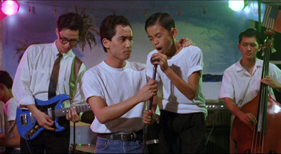
At the center stands Xiao Si’r, a fourteen-year-old boy having trouble in school. He tries to keep his distance from street-gang culture, but he becomes involved with turf wars while hanging out with his buddies. Si’r also attaches himself to the enigmatic schoolgirl Ming, who is pledged to a gang leader in hiding. A couple of his friends want to sing covers of rock-and-roll hits (most memorably Elvis’ “Are you lonesome tonight?,” the source of the English title). Yang has said that Americans don’t realize the subversive force of pop music in Taiwanese culture. “These songs made us think of freedom.”
To an extent, A Brighter Summer Day can be seen as an alienated-youth, juvenile-delinquent movie, complete with rumbles, tests of loyalty, and confrontations in pool halls and pop concerts. But Yang spreads his canvas in all directions. In the film’s second half, Si’r’s father, a nondescript bureaucrat, falls under suspicion as a political undesirable. That enables Yang to develop parallels between father and son, both stubbornly resisting authority. Meanwhile, the Zhang mother and older sister try to keep the family going in the face of overwhelming problems of school, home life, and political repression.
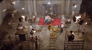
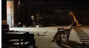
Widening the lens still further, Yang shows their neighborhood torn by tensions of class, job status, and ethnic identity. Jammed side by side are native Taiwanese families, mainland Chinese of long standing, and recent mainland arrivals who have fled the Civil War of 1946-49. Some families are quite poor, others lower middle-class, and others, such as those of military lineage, fairly well-to-do. The gang rivalries and the adult cliques replicate in miniature these splits and resentments. And the neighborhood plays host to a film studio, which the high-school boys invade in their off hours.
Across the months that the action consumes, the film depicts dozens of character vignettes and social encounters. As the scenes accumulate and the tension rises (the pacing is maniacally steady without being monotonous), gang warfare and political persecution culminate in a heedless, pointless knifing. I spoil you no spoiler, as the film’s Chinese title translates as “The Youth Killing Incident on Guling Street.” In the course of the action, the film becomes an elegy to the ideals and errors of adolescence, a probing of the vanities of the male ego, a reflection on the pain of emigration, and a critique of social repression.
Starting from an actual incident doubtless recalled by some of the 1991 audience, A Brighter Summer Day builds out into what Yang called “a picture of an age.” The whole film, a magnificent piece of plot architecture, balances concrete individuality, as each character comes to vivid life, with a sense of how all fit into larger socio-political dynamics of one historical moment. Yet the characters aren’t mere place-holders or mouthpieces; they can surprise us by not behaving according to type. The well-off son of a general protects other boys from bullying, while the gang leader Honey, on the run for murder, turns from violence after reading War and Peace.
With this film Yang asserted himself as the equal to Hou Hsiao-hsien. Together, they lifted their nation’s filmmaking to world stature. You need only watch Criterion’s bonus documentary on Taiwanese New Cinema to see how, in about ten years, a sincere but somewhat patchwork local trend gained force, polish, and precision. In Hou’s films of the 1980s, from The Boys from Fengkuei (1983) and Summer at Grandfather’s (1984) to the masterpiece City of Sadness (1989), a modest regional realism grew into a monumental effort at historical understanding and cinematic innovation. Yang was doing the same in his own way, and A Brighter Summer Day became his response to Hou’s lyrical epic.
Two ways, at least, to be modern
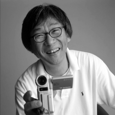
Edward Yang Dechang.
The new generation of Taiwanese directors faced a local cinema divided between commercial genres (action, melodrama, romantic comedy) and government-sponsored “healthy realism” promoting a bucolic, idealized rural life. Like the Italian Neorealists, the New Taiwanese Cinema sought a more humanistic realism. The new films told humdrum but heartfelt stories using non-actors and deglamorized locations.
In this context, the ambitions of Edward Yang stood out sharply. While in America to work as a computer engineer, he dropped in and out of film schools. Returning to Taiwan to make a successful TV film, he began to explore contemporary life in his country through the forms made famous by Resnais, Antonioni, and their successors. He became Taiwan’s most Europeanized modernist.
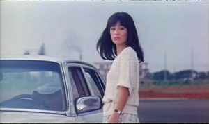
The intricacies of That Day, on the Beach (1983) make other New Taiwanese Cinema films look rough-hewn. A concert pianist on tour meets her old school friend, and they talk over their lives. The pianist turns out to be a secondary character in a three-hour exploration of growing up and finding a career in contemporary society. There’s a mystery—the friend’s husband has vanished, perhaps by suicide—but, as in L’Avventura, the disappearance sends out ripples that reveal social pressures and psychological states. There are flashbacks, both fragmentary and extended; there are flashbacks within flashbacks; there are multiple narrators, replays of key events, and floating voice-overs—all in the service of probing the ways in which patriarchal authority stunts young people’s lives.
That Day, on the Beach is an essential film of its period and place, but unavailable in good video copies, as far as I know. Its revival is another task for Film Culture, Inc. to take up.
Taipei Story (1985) is more focused, but it reiterates Yang’s interest in parallel lives and parental control. The milieu would become Yang’s distinctive territory: modern corporate culture and its wearing away of local traditions and family ties. A couple are torn apart by the man’s loyalty to the woman’s profligate father, while she falls into a perfunctory round of flirtations. The couple talk of marrying and starting over in America, but the man, an inarticulate loser steeped in old-school business practices, can’t cope with the new world of clever executives, discos, and hooking up.
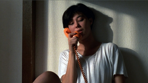
Yang came to festival attention with The Terrorizers (1986), one of the most experimental films of the New Cinema. It’s a network narrative, in which jerky coincidences connect a Eurasian girl, a doctor, a photographer, a policeman, and a novelist starting her new project. The nearly opaque opening presents a police raid in a jagged montage capped by a voice-over: “It was the first day of spring.” Thereafter it’s up to us to sort out the tangled connections, provoked by the Eurasian girl randomly phoning strangers to stir up trouble.
Once more Yang takes on male inadequacy, as the novelist’s husband becomes estranged from her and she launches an affair with a coworker. And once more Yang shows the individual succumbing to demands of the business world—not only the novelist’s office work but also the husband’s scramble to win a higher post in his hospital. Two final bloodbaths, one imaginary, counterbalance the opening.
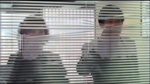
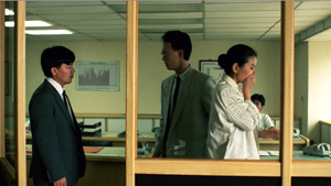
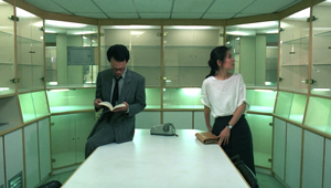
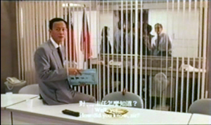
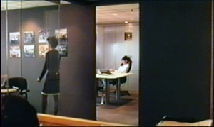
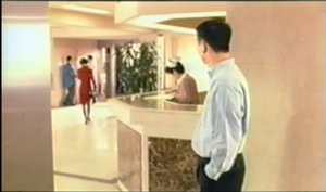
Across these three features, Yang’s technique grew ever more polished. In filming company offices, he adroitly used windows and partitions to emphasize mistrust (Taipei Story, below left) and bureaucratic ennui (The Terrorizers, below right).
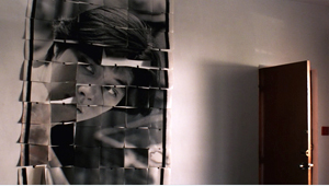
The novelist’s office break-room in The Terrorizers is a sleek pod, while the photographer’s studio is rendered as a wraparound photomontage. In an echo of Blow-Up, his obsession with the Eurasian girl is presented in an outsize mosaic of stills.
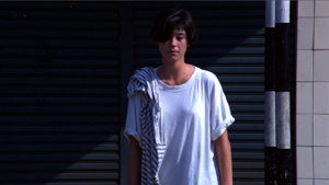
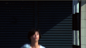
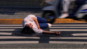
Along with his compositional skill, Yang showed himself an editing-oriented director. When the Eurasian girl limps out of the gun battle, she collapses on the sidewalk in three planimetric shots. The staccato images could almost be comic-book panels; Yang was an adept cartoonist.
A later pair of shots recalls the sequence. Yang often relies on stylistic repetitions to bind up an elliptical, degrees-of-separation plot.
In all these respects, Yang became something of a counterweight to Hou. Both were social realists, but they worked in competing domains. Hou tended to concentrate on life in the countryside, or on rural characters transplanted, bewilderingly, to the city. His tranquil style favored a reflective mood and muted emotion. His reliance on long takes, telephoto framings, static camera, and simple editing patterns (the axial cut-in being a favorite) made him appear in harmony with other New Cinema directors. By contrast, Yang probed yuppie life in cinematic terms that seemed more sophisticated and up-to-date.
Actually, Hou was forging an innovative style that owed little to 60s modernism. He relied on minute changes in lighting and staging within the distant, packed, fixed long take. We find this style emerging in his early commercial features, becoming refined in his New Cinema projects, and, in Dust in the Wind (1986) and Daughter of the Nile (1987), constituting a rich continuation of cinema’s tableau tradition. Hou’s work became a prime example of what came to be considered “contemplative cinema” and “Asian minimalism.” City of Sadness (1989) made this “neoprimitivism” (the phrase is Tony Rayns’) starkly apparent, as it blended with network-narrative plotting and an exceptionally oblique approach to exposition. Filmmaking has not been the same since.
Hou and Yang were exact contemporaries, both born (like me) in 1947. They had been friends and collaborators; Hou played the protagonist of Taipei Story, while Yang helped Hou with the score of The Boys from Fengkuei and took a role in Summer at Grandfather’s. They separated, as Yang did from nearly all his New Cinema comrades.
Given the importance of competition in artistic milieus, it’s not too much to suggest, as Tony Rayns does in the Criterion commentary, that the commercial and critical success of City of Sadness prodded Yang to boost his game. He too would launch a critical probing of his roots and of Taiwan’s past; he too would create a vast ensemble film. He would shift from office politics to real politics. And he would absorb and rework aspects of Hou’s style.
Backing off, stepping aside
A while back I distinguished between “stubborn stylists” like Bresson and Tati, who cling to their preferred techniques through thick and thin, and adaptable ones who modify their approach as broader norms change. The early films of Bergman and Fellini and Antonioni were indebted to a deep-focus style, but late in their careers they began to rely on the pan-and-zoom techniques that became widespread in the 1960s and 1970s.
There’s another possibility, though. You the filmmaker can try out your rival’s methods, but then push them in directions that extend your own inclinations. The result can refresh your films and become part of your creative toolkit for future projects. This is what I think Yang did in A Brighter Summer Day.
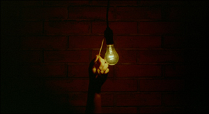
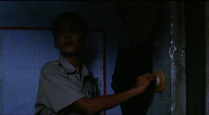
Begin at the beginning. The opening moments introduce the rules, the intrinsic norms, of Yang’s film. During the credits, a hanging lightbulb is switched on.
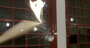
Pulsating light becomes a multivalent motif throughout the film, carried via a flashlight, abrupt power cuts, and in a climax some hours later, a lightbulb smashed by a baseball bat.
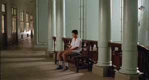
As the credits continue, a flagrantly uninformative extreme long shot shows a man pleading with an unseen educator. He’s complaining about his son’s grades and asking about the boy’s transfer to a night school. Who is he? In probably the most unemphatic introduction of a protagonist in Taiwanese cinema, we get another extreme long shot of the boy we’ll come to call Si’r, waiting outside.
It’s Kuleshov constructive editing at work. There’s no long shot establishing the two spaces, nor can we assume that the first shot is, retrospectively, Si’r’s optical POV. But Kuleshov, who cared about punchy clarity, could hardly have approved of the far-off, information-stingy framings. Throughout the film we’ll see doorways block off parts of the action, extremely distant views frame a few scrubby figures, and shots dwelling on empty zones. This opening teaches us how to watch the movie.
Another rule: what Emilie Yueh-Yuh Yeh and Darrell William Davis call the tunnel-vision composition. This template is introduced in a perspective shot that waits ninety seconds for father and son to come to the foreground.
This first pair of scenes sets the task: We must suspend our craving for backstory and let the filmic narration slowly parcel out what we need to know—while still leaving a good deal to inference and imagination. Even more than Yang’s elliptical 1980s films, this is observational cinema, but with characters set at more than arm’s length.
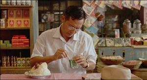
Immediately, again with no establishing shot, we finally get a look at Mr. Zhang and Si’r seated at a food stall. Characterization is starting already, as we see the fretful father snuff out his cigarette and carefully save the butt. Much later he’ll quit smoking to save money.
Throughout, Yang will occasionally embed medium shots and closer views like these into his wide framings, anchoring his characters enough for recognition and revelation but not enough for the heated-up empathy encouraged by mainstream filmmaking. At various points, he will resort to shot/reverse shot as an accent within a more opaquely filmed scene.
These first few moments show how Yang has modified Hou’s signature devices. The shots seem poised between Yang’s earlier work and Hou’s tableau frames. Here the long shots tend to be either more distant or closer than Hou’s; Hou seldom uses the steep central-perspective imagery we see throughout Yang’s film; nor does Hou rely on the simple, straightforward medium shots we see in the food stall. Yang is, I think, blending his own inclinations with some tendencies revealed to him by City of Sadness and other films.
As if to push Hou’s preferences further, Yang stages many scenes with the camera set very far off. And instead of using a long lens to supply a frieze effect, with packed-in bodies shifting slightly this way and that, Yang’s frames are open and porous, though pocked with holes and streaked with shadow regions.
He will hold on frames devoid of human presence; as with Antonioni, a scene begins a bit before it begins and ends a bit after it ends.
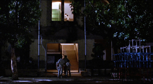
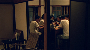
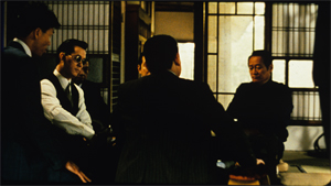
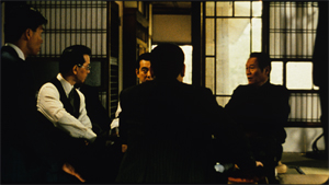
One result is that “dedramatization” so prominent in postwar European art cinema. Even gang fights and deadly chases are observed with a dryness and detachment that allows us to appraise the action coolly. Yang’s shadowy, distant shots are the main reason you need to see this film on the biggest screen you can wangle. The first gang rumble and our initial sight of the family at dinner need scale to be legible. (Sorry I must post them so small.)
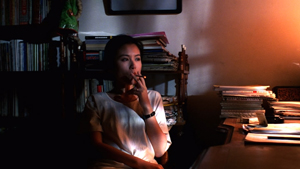
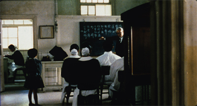
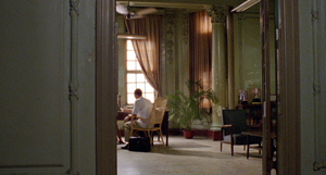
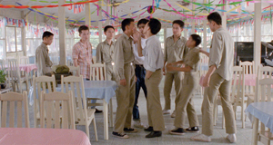
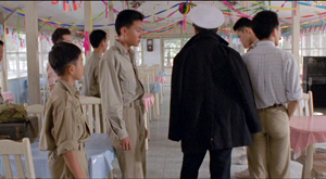
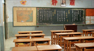
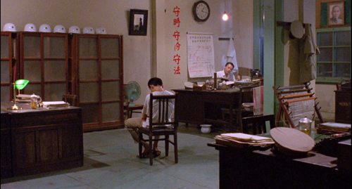
A major benefit of Hou’s dense staging is an emphasis on what I call his “just-noticeable differences.” Tiny shifts in character position reveal a detail to us, or pry open a view of something further back. Yang’s more open frames don’t exploit this as much. The frame at the top of today’s entry is a good example, with the heads spotted in the frame as a good cartoonist would.
In Hou’s City of Sadness, a scene of a gang confrontation is handled through tight timing and JND head-shifting that teasingly reveals facial expressions.
In A Brighter Summer Day, the wonderful scene of Honey’s return and Sly’s attempt to take over the gang is staged in a free lateral flow, with Cat scrambling into the frame again and again to break up the fight. Yang orchestrates bodies and faces for maximum clarity, moment by moment.
That horizontal staging is nicely broken by crucial movements along the lens axis, as first Ming and finally her boyfriend Honey come out from the area behind the camera and plunge into depth. The camera tracks gravely forward following him as he asserts his command.
There’s almost none of the blocking-and-revealing tactic that Hou relies upon. Yang’s framings are grave and spacious. More pragmatic than Hou, he’s willing to build the drama in a clear-cut fashion–as befits a director who sought to train a new generation of actors and who staged plays between his film projects. In this movie, I think, Yang found a middle way between his more disjunctive early style and Hou’s dense, blocklike tableaus.
Further evidence of this middle way is Yang’s revised attitude toward editing. Each of his 1980s films, while not subscribing to Hollywood’s frantic intensified-continuity principles, is built out of a great many shots. By contrast, the four hours of A Brighter Summer Day consist of only about 520 shots, averaging about 28 seconds each. The film contains several long takes and many single-shot scenes, so here we find him trying out the Hou approach. But as in the opening school sequence and the stall meal, editing does come into play during some tense conversations, notably when Si’r’s father is undergoing police interrogation.
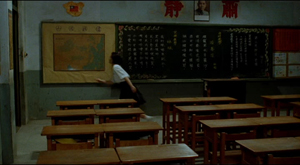
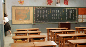
As at the start of Terrorizers, editing can occlude one crucial bit of action. What happened in that schoolroom during the gang raid? Yang’s choppy cuts respect the mere glimpse that Si’r gets of the boy and the girl who fled the room when he switched on the light.
In such passages, Yang’s abrupt cutting creates accents that break the attenuated, adagio rhythm of long, usually static shots. Here it adds to a central mystery of the film as well.
The elusive implications of the compositions and cuts are writ large in the film’s narrative rhythm. Here Tony Rayns’ magnificent commentary illuminates Yang’s artistry. Much of the story relies on local knowledge of Taiwanese culture, and Yang does not provide it in any direct way. Tony shows that every scene carries a historical and social subtext.
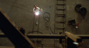
Just as important, story premises aren’t always spelled out; we’re expected to connect many dots. For example, nobody explains that Si’r’s eyesight is failing, and that he swipes the film studio’s flashlight so he can read more easily in his cramped bedroom. But because of his imperfect vision, he is getting injections of medicine, which take him to the school clinic and then to encounters with Ming and the doctor treating her. And Si’r’s father eventually toys with the possibility of buying him glasses on the installment plan (though then he’d have to economize by giving up cigarettes). Another film would have made a dramatic issue of Si’r’s vision problem; here, these story elements enter on the fringe of other dramatic action, mingle with other elements, and must be linked together by the alert viewer.
The result is that story motifs—the light bulb, the flashlight, the mother’s watch, a samurai sword, a vagrant snapshot, rock-and-roll tunes, baseball bats—don’t simply repeat across the film but rather mingle and overlap. Tony speaks of “resonances”; we could as easily talk of “ramifications.” Each prop or incident radiates in several directions, becoming a node in several plot lines. The dots we connect fuse in a multidimensional space. The strategy has affinities to Yang’s earlier films, but in none of them do we have this spacious dramatic density.
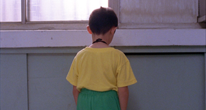
The film needs its four hours to develop all these motifs and to render events and milieus as gradually changing. The strongest example of this stepped development is Si’r’s “character arc,” which is rendered in a host of small moments, often treated indirectly or elliptically. Characteristically for Yang, as the climax approaches, our protagonist slips away from us—seen from the rear, kept offscreen, and ultimately as alone in a vast long shot as he had been at the beginning, but now turned steadfastly from us, as if defying us to understand and sympathize.
A Brighter Summer Day enabled Yang to absorb some stylistic extremes that were initially alien to him. He could find his versions of the distant, hard-to-read shot, without abandoning his commitment to more direct access to character reaction. Over-neat as it sounds, I’d argue that after trying out the Hou-ish options, he arrived at a new synthesis in his last three features. Two more social satires, A Confucian Confusion (1994) and Mahjong (1996), return to the cosmopolitan terrain of the early features. Now, however, there’s nothing so off-puttingly remote as many scenes in A Brighter Summer Day.
Chaplin said that comedy demands long-shot while tragedy lives in close-up. Yang begs to differ somewhat. A Brighter Summer Day gives us pathos in extreme long shot, but A Confucian Confusion yields comedy in mid-shot. Admittedly, however, those oblique doorways do their bit in mocking yuppie pretensions.
A Confucian Confusion closes with a nifty elevator shot displaying an easy command of classical staging.
Yang’s most widely-seen film Yi Yi (A One and a Two, 2000) shows the same synthesis at work for dramatic rather than comic purposes. Again, recurring locales and threaded motifs sustain a network tale anchored in family, neighborhood, and workplace. The familiar Yang clash of personal impulse and corporate corruption plays out in the cozy spaces of a household and the gridded confines of business hotels, company headquarters, and hospitals.
If Yi Yi seems to me a less daring film than A Brighter Summer Day, perhaps it’s because Yang has decided to work in a more traditional arthouse vein. For the first time in a Yang film, a child enters the mix. In the wake of Neorealism, many filmmakers realized that kids in movies can not only “defamiliarize” petty adult concerns; they can also attract audiences. But the presence of an unforgettable little boy shouldn’t be taken as a concession to international tastes. Little Yang’s camera-hound alertness adds a perspective that evokes the forbidding, oblique setups of A Brighter Summer Day: people with heads turned from us.
Edward brings his namesake into the plot comparatively late, to serve as a kind of observer and spokesman. “I want to tell people things they don’t know,” Yang Yang says at his grandmother’s funeral. “Show them things they haven’t seen.” It could be an epigraph for A Brighter Summer Day.
Thanks to Tony Rayns, as well as Curtis Tsui, Kim Hendrickson, and Peter Becker of Criterion. The best sustained discussion of Yang’s films I know is in the third chapter of Emilie Yueh-Yuh Yeh and Darrell William Davis’ Taiwan Film Directors: A Treasure Island (Columbia University Press, 2005).
Since its second edition of 2003, our textbook Film History: An Introduction has included extensive discussions of Hou, Yang, and New Taiwanese Cinema. I’m proud that we gave attention to these filmmakers when other world cinema surveys ignored them. I discuss Hou’s style at length in Figures Traced in Light: On Cinematic Staging and in these web entries. There’s a sidebar on A Brighter Summer Day in the book as well.
I met Edward a couple of times in the 1990s, most memorably at the Kyoto Film Festival. I’ll always remember him pedaling his rented bike around town but always ready to have a meal and talk about the films he loved.
I wrote a valedictory on Edward’s death here. Today’s entry picks up a couple of points made there.
P. S. 28 June 2016: Thanks to Carman Tse for correction of my spelling of the family’s name. Carman points out that the protagonist’s proper name is Chang Chen, the same as the actor’s own name. (“Chang” is a common Westernization for “Zhang,” the family’s name.) Carman adds, as I should have, that Xiao Si’r means “Little Fourth Son,” a point also made in Tony Rayns’ commentary and Godfrey Cheshire’s liner essay. Because the subtitles, Tony’s commentary, Godfrey’s essay, and much critical writing on the film refer to the boy as Xiao Si’r, for the sake of consistency that’s the one I’ve retained in the piece.
A Brighter Summer Day.
FILM ART: The eleventh edition arrives!
DB here:
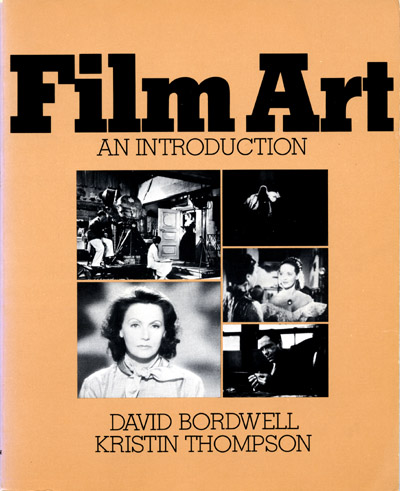
Forty years ago, Kristin and I signed a contract with Addison-Wesley publishers to write Film Art: An Introduction. The first edition, a squarish item with a butterscotch-brown cover, was published in 1979. Like most textbook authors, we had to assign all rights to the publisher. Addison-Wesley sold our book to Knopf, which produced a second edition in 1985. Then the book was acquired by McGraw-Hill. McGraw-Hill published the subsequent nine editions, from 1990 onward.
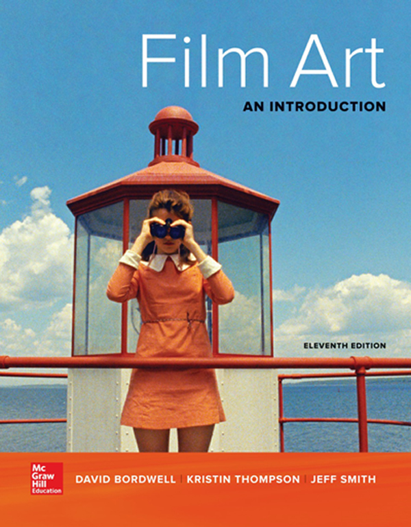
Last week, Kristin and I and our new collaborator Jeff Smith received our copies of the eleventh edition. It looks very good and we think it’s our best effort yet. By chance, we learned at the same time that Film Art, in all its editions, currently ranks as 153 in books assigned in American college courses (based on a sample of nearly a million syllabi). No other film textbook appears in the top 400 titles. Back in the 1970s we never imagined such success.
FA 11e contains many new features, which I’ll talk about shortly. But I’d also like to say some things about the book’s perspective on cinema. I’ve discussed the conceptual side of our approach in an entry devoted to the previous edition.
But since concepts don’t arise from nothing, I thought I’d wax a little personal and talk about how Film Art has reflected my developing ideas about movies. Readers wanting the meat-and-potato information about the new edition can skip down to the section, “Humblebragging, minus the humble part.”
A bookish movie wonk
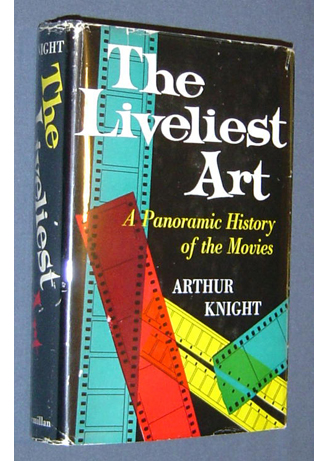 I came to movies through books. I must have been fourteen or fifteen when I read Arthur Knight’s The Liveliest Art (1957). It was the first grown-up book that I thought I completely understood. Soon after I read Rudolf Arnheim’s Film As Art (1957), which I knew I did not completely understand. But those two books became my guides to what films to see and what ideas to think about.
Living on a farm, I was somewhat isolated, but I did see Hollywood classics on television, and I could occasionally catch current releases at theatres in nearby towns, notably Rochester, NY. With the aid of Andrew Sarris’s “American Directors” issue of Film Culture and some issues of Movie (UK), my high-school years became devoted, in part, to film.
During the 1960s, interest in film exploded. Europe’s “young cinemas” like the French New Wave came to prominence. Hollywood films became edgier. High-tone magazines began to pay attention. This was the era in which James Agee, Parker Tyler, and Manny Farber gained somewhat delayed fame as critics. (I talk about this development in my Rhapsodes book.) Cahiers du cinema became known outside France, and American critics like Sarris and Pauline Kael became artworld celebrities.
In the same era there came a burst of film-appreciation books. They weren’t textbooks per se, but they were often used in the film courses that were springing up across the country. Among those books were Ernest Lindgren’s The Art of the Film (rev. ed., 1963), Ivor Montagu’s Film World (1964), and Ralph Stephenson and J. R. Debrix’s The Cinema as Art (1965). I was drawn to the idea of a general account of the possibilities of film as an art form, so these books, followed by V. F. Perkins’ contrarian Film as Film (1972), appealed to me. I later realized that they belonged to a genre that stretched back to the 1920s and included extraordinary contributions like Renato May’s Linguaggio del Film (1947). Still further back, they, like all texts, owe a debt to Aristotle’s Poetics and Renaissance treatises on the visual arts.
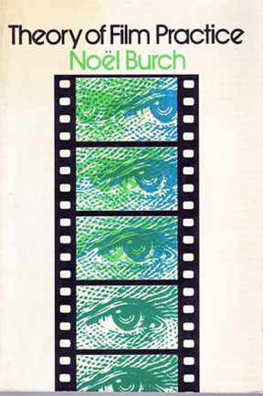 Throughout my college years, I thought that the core activity of film culture was criticism: the effort to know a movie as intimately as possible. That’s still a widely-held view. In graduate school at the University of Iowa, my horizons expanded, as I was exposed to film history, though not through much primary research, and film theory, which was just starting to be a major wing of academic cinema studies. My dissertation was on French Impressionist silent cinema, what’s come to be called the “commercial avant-garde.” I wrote it because I wanted, ultimately, to understand the context around Dreyer’s La Passion de Jeanne d’Arc, but for the project I concentrated on directors like Gance, L’Herbier, Epstein, Dulac, and Delluc. The thesis had three parts: one on the historical context, one on Impressionist theory, and one analyzing the films. This mixed approach has become a common one for me. I still think that a movie will sit at the center of my interest, but I’m attracted to questions that cut across criticism/history/theory boundaries.
Before the 1970s, most college film courses were organized historically, running from Lumière/Méliès/Porter to Neorealism. (Arthur Knight again.) But there was emerging a different sort of course, one that surveyed “the language of film” conceptually. Just as an introduction to music would lay out basic categories like melody, harmony, rhythm, and form, so film courses—in the manner of the aesthetics surveys I mentioned—would try to isolate the basic elements of cinema. This new orientation was probably also inflected by semiotics, then becoming a hot topic in grad-school circles.
When I came to UW—Madison in 1973, ABD and eager to work, I was given the basic survey course, Introduction to Film. It enrolled about 400 students a semester and was held in a gigantic classroom; from the stage I could barely see the students in the back. (There were a lot of them back there, for reasons we now understand.) I had four stalwart teaching assistants: James Benning, Douglas Gomery, Brian Rose, and Frank Scheide, all of whom have gone on to fame. Learning as much from them as they did from me, I organized the course as a survey of film form and style. That overall structure was the first rough cast of Film Art.
By this time there were several books designed as textbooks for such an appreciation course. After reading a few I decided not to use any. I relied on Perkins’ Film as Film, Noël Burch’s Theory of Film Practice, Jim Naremore’s excellent monograph on Psycho, and photocopies of essays by Bazin and others. After teaching the course for three years, I decided, at the suggestion of the Addison-Wesley editor Pokey Gardner, to propose it as a textbook. Kristin had by then taught the Intro course with me, had published some articles, and was working on stylistic analysis for her dissertation on Ivan the Terrible. She became my coauthor, beginning what some have called America’s longest study date.
From treatise to textbook—and back again?
Although we wrote it for the textbook market, I didn’t think of it as a textbook. With the hubris of a twentysomething, I thought of it as my treatise on film aesthetics. I wanted it to be as comprehensive as I could make it.
As Perkins pointed out, most books on film aesthetics were tied to the idea of the silent film as the pinnacle of film art. Editing was conceived as the supreme film technique, and Griffith and Eisenstein were presented as paragons. Admiring both of them and silent film as a whole, Kristin and I wanted nonetheless to give decent weight to “the Bazinian alternative”: long takes, camera movements, staging, and cinematography in depth were no less significant artistic resources. Color, sound, widescreen, and other resources were often ignored by the older tradition, but they had to be given their due. (At this point Play Time became a touchstone for us. It still is.) Burch’s book was particularly important as a quasi-structuralist revision of Bazinian ideas; I found, and still find, this book inspiring.
Just as important, I thought, was a need to situate techniques of the medium in a holistic context. While I was pursuing DIY film studies down on the farm, I was also reading modern literature and the New Criticism that then dominated literary life. For me, The Context Of The Work was everything. The whole would always nourish whatever technical tactic or local effect we might pick out.
Many textbooks still insist that techniques have localized meanings: a high angle means that the subject is diminished and powerless. Yeah, except when it doesn’t, as we insisted about this shot from North by Northwest in the first edition and since. (“I think that this is a matter best disposed of from a great height.”)
Because I was interested in the whole film, I was attracted to philosophers of art who balanced a recognition of style with a recognition of overall form. Thomas H. Munro’s Form and Style in the Arts (1970) helped me with this, but the major influence was Monroe Beardsley’s Aesthetics (1958), with its distinction between texture and structure. That distinction meant realizing that films displayed large-scale formal principles, like sonata form in music. What were those principles?
Hence a chapter on narrative and non-narrative forms. We developed ideas of narrative out of formalist and structuralist theories. In the first edition, there was a lot more on narrative than on other sorts. In later editions, we tried to flesh out some genuine non-narrative options: abstract form (Ballet Mécanique and many experimental films); categorical form (e.g., Gap-Toothed Women, The Falls); rhetorical form (e.g., The River, Why We Fight); and associational form (e.g., A Movie, Koyaanisqatsi, and many “film lyrics”).
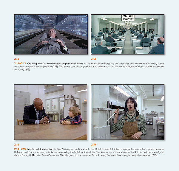
In teaching Introduction to Film, I noticed that many students hadn’t been exposed to basic aesthetic concepts like form, style, theme, subject matter, motifs, parallels, and the like. The old New Critic in me rose up. I thought these ideas and terms, being central to the aesthetics of any medium, needed to be in the book too. Hence a chapter “The Significance of Film Form.” (Above is a page illustrating visual motifs: perspective design, props set up to be used later.) Some have taken this chapter as a manifesto of a “formalist” perspective, but actually the ideas in the chapter are ingredient to any aesthetic position whatsoever. Every analyst will trace patterns of development in a film, or weight the opening strongly, or notice thematic parallels. These are basic tools for thinking and talking about any art.
But I wasn’t a New Critic 100%. I’ve always been interested in going beyond the artwork itself to look at the artistic traditions and institutions behind it. Because a film results from a concrete process of production, I thought it important to include a chapter on how a movie gets made. That topic was the first one in our introductory course; the reading was Truffaut’s “Journal of Fahrenheit 451.” Starting Film Art with a chapter on production served to introduce film techniques in a concrete context, and it showed how what appeared on the screen was the result of choices among alternatives. We thought, and still think, that this chapter might engage students who want to pursue filmmaking themselves. It’s been gratifying to learn that some production courses use the book.
The concern for practice led us to specify, for the first time in an introductory studies text, the 180-degree system of editing, the four basic dimensions of film editing, a layout of what you can do with sound in relation to space and time, and other practice-based concepts. We tried to systematize what filmmakers do, however intuitively. Sometimes we popularized terms that were already specialized (e.g., “diegesis” for the world of a story). Sometimes we had to invent terms for things that didn’t have names (e.g., the graphic match in editing). Sometimes we had to pick one usage of a term that was used in several ways (e.g., jump cut). Sometimes we had to make distinctions that weren’t explicit in the literature, such as the difference between story and plot, or deep-space staging and deep-focus cinematography.
Creating such labels may seem pedantic, but once we have a name for something we can notice it. Kristin and I believed that a study of film aesthetics has to be alive to all creative possibilities we can imagine. For example, in probably the toughest part of the book, we sought to account for all the possible creative choices involved in relating sound to narrative time. Maybe some options are rare, but they do exist as part of cinema, and they may yield powerful effects.
Aesthetics in history
Beetlejuice.
Other features of the book flowed from these central ideas. Because of the emphasis on holism, we added sample analyses as well—studies of single films that showed how the various techniques worked together with overall form. The urge to be comprehensive led us to devote more space to experimental, documentary, and animated film than was common in introductory textbooks. And, since this was a period in which academic film studies was making important discoveries, Kristin and I thought it important to discuss the concept of the “classical Hollywood cinema,” a powerful tradition of story and style that students would have often encountered. By the time Film Art 1e was published, we were planning what would become The Classical Hollywood Cinema, written with Janet Staiger.
So Film Art became a treatise. Was it a textbook? I wasn’t sure. I thought the publisher might turn it down. Even though it incorporated examples that were student-friendly, it had a daunting infrastructure. I thought faculty might find it too complex for most classes. Had it been rejected, I would probably have tried to publish it as a free-standing book like those 1960s treatises.
Surprisingly, all these features of the book were acceptable to the readers to whom Addison-Wesley sent the manuscript. Still, many had a big objection: There was no chapter on film history, and that would kill it for them.
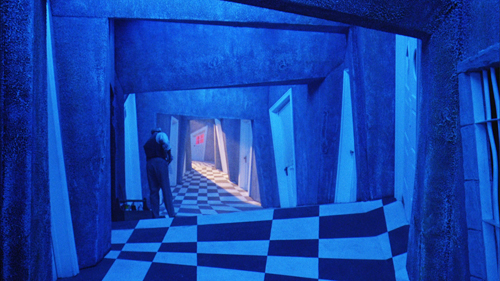
I hadn’t included a historical unit in my introductory course because there wasn’t time. Besides, our department had a parallel course surveying film history. But Kristin and I were happy to accede to the readers’ request. We took as the chapter’s motto a line from art historian Heinrich Wölfflin: “Not everything is possible at all times.” (You see what I mean about complexity; what film textbook quotes Wölfflin?) The sentence simply means that the artist, in this case the filmmaker, inherits a limited set of possibilities of form and style, to which she can respond in a wide but not infinite variety of ways. We (mostly Kristin) used the concepts we’d developed in the book to trace a series of major traditions and schools, from early cinema through to the French New Wave. We’ve since enhanced that account, bringing it up to date with the New Hollywood and Hong Kong film, and accentuating the continuing importance of older trends–signalling, for instance, German Expressionism’s legacy in horror comedies like Beetlejuice, above.
We know that we owe a lot to luck of timing—to being at the start of academic film studies—and to the many, many teachers who have offered us suggestions for improving the book. One advantage of doing a textbook is that you can improve it incrementally, something not possible with a scholarly book that will probably see only one edition.
We’re gratified that the result has continued to be useful. We continue to meet teachers and students who tell us they’ve benefited from it. Filmmakers, too, from Pixar artists to experimentalists. The book has been given a couple of dozen translations. Other textbook writers have found our concepts, organization, terms, and examples persuasive. (When I see how closely some hew to our book, I don’t know whether to feel gratified or depressed.) We take this wide acceptance as a sign that we contributed something fresh and valid to our understanding of cinema. Maybe we did write a general aesthetic treatise after all—not the first, not the last, but one that remains illuminating and in some respects foundational.
Humblebragging, minus the humble part
From edition to edition our basic framework has been retained, but it’s flexible enough to be revised and fleshed out. Changes in film technology (digital cinema, prosthetic makeup, performance capture, 3-D) have prompted us to trace their effects on style. New developments demanded new concepts and names (“network narratives,” “intensified continuity”). Our research for other writing projects gave us deeper awareness of Asian film, early cinema, ensemble staging, and other subjects we’ve incorporated into our general perspective. Tough subjects to talk about, like acting, have challenged us to come up with some new ways of thinking about them. We’ve found old films that we want people to see; we think that we should also be educating taste and getting students acquainted with things beyond recent releases and cult classics. And of course new films have been made that demand attention—not only because students are aware of them but because the art of cinema continues to grow before our eyes.
The eleventh edition has changes small and big. Of course we’ve rewritten stretches to make them clearer or sharper. We’ve added new examples from about fifty films, from Nightcrawler and Brave to Zorns Lemma, Searching for Sugarman, The Act of Killing, and Beasts of the Southern Wild. The biggest changes involve a recast section on 3D, with discussion of House of Wax and The Life of Pi; a new section, “Film Style in the Digital Age,” with concentration on Gravity; a new section on genre devoted to the sports film (with Offside as a key example); and, as the cover tips you off, an extended analysis of Moonrise Kingdom, a favorite on the blog as well (here and here).
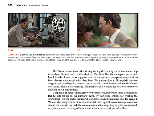
 Jeff Smith (right, grinning) is responsible for many of these new attractions, and he has overhauled the entire sound chapter, with examples and analyses of Blow-Out, Norma Rae, Breakfast at Tiffany’s, The Nutty Professor (Jerry Lewis version), and The Conversation. In addition, Jeff has written a whole new chapter, number 13, on Film Adaptation. It is brilliant. It’s available as an add-on to the print edition for faculty who want to include it, and it comes along free on the electronic edition.
Under Kristin’s direction, with the kind cooperation of Criterion, we have added new video examples to the Connect online platform. Those include sequences from L’Avventura, Ivan the Terrible, I Vitelloni, and other major films, with voice-over commentary by one of us. In addition, our production guru Erik Gunneson has made a marvelous demo explaining sound mixing techniques.
In all, we’re very happy with the way the book has turned out. The pictures are vibrant, the design is crisp, and there are new marginal quotes and links to blog entries. As ever, the blog offers annual suggestions for integrating it with courses. We’ve also put up some video lectures on this site, listed on the left of this page, and of course people are free to use them in classes. A couple weeks ago we gathered some key blog entries around a central topic in Film Art, the nature of classical film narrative. Finally, as we’ve proceeded through many editions, we’ve had to cut several analyses of particular films. But those are still available as pdfs online; most recently,we posted our in-depth study of sound and narrative in The Prestige.
All these supplementary materials are attempts to illustrate and develop the ideas we’re proposing in Film Art–and to do so in a clear, concrete way. As we say in our introduction to the edition:
In surveying film art through such concepts as form, style, and genre, we aren’t trying to wrap movies in abstractions. We’re trying to show that there are principles that can shed light on a variety of films. We’d be happy if our ideas can help you understand the films that you enjoy. And we hope that you’ll seek out films that stimulate your mind, your feelings, and your intelligence in unpredictable ways. For us, this is what education is all about.
We remain grateful to the colleagues, instructors, students, and general readers who have supported what we’ve tried to do.
As part of McGraw-Hill Education’s multimedia publishing program, Film Art 11e is available in many formats, including a print edition and digital editions that meet the needs of entire film courses or independent readers.
*As always, instructors, students, and general readers can get a print copy of the new Film Art. It is available in bound or binder-ready form. Instructors who wish to order a custom print edition may include the bonus chapter on film adaptation.
*If you teach a course using Film Art, you can choose the digital option: Connect. Connect is a course-oranization tool that enables faculty to assign reading, submit writing, take assessments, and more. Connect gives students access to a subscription-based digital version of the book called SmartBook. SmartBook has the Criterion video tutorials embedded, plus the ability to assign all of the pre-built quizzes, practice activities, and other features. SmartBook includes the new chapter on film adaptation, along with additional material including our suggestions on writing a critical analysis of a film, and additional bibliographic and online resources.
Connect can integrate with your school’s learning management system, making it easy to assign and manage grades throughout the semester. Students will get access to SmartBook for 6 months; an instructor account does not expire, so you can reuse your Connect course semester-after-semester. Instructors may contact their local McGraw-Hill Higher Education representative for more information at http://shop.mheducation.com/store/paris/user/findltr.html. (Enter your state and school to find your rep’s name and email address.)
*If you want to read the book independently in digital form, you may choose standalone SmartBook. This version does not contain Connect’s course-administration supplements. The Criterion Collection video examples are embedded in the SmartBook for you to access any time throughout the subscription period. Students can opt for the SmartBook in place of a printed text, even if their instructor is not requiring Connect.
For more information: The buying options are explained here in general and the choices pertaining to Film Art are listed here.
We’re grateful to our editor Sarah Remington, as well as to Susan Messer, Sandy Wille, Dawn Groundwater, and Christina Grimm, for all their help on this edition!
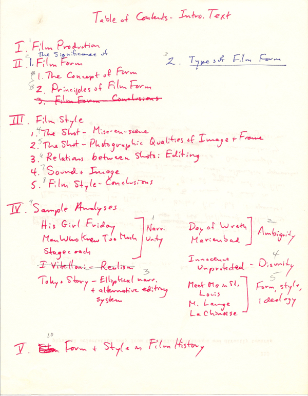
Kristin’s 1977 chapter outline for the first edition of Film Art.
Open secrets of classical storytelling: Narrative analysis 101
Premium Rush (David Koepp, 2012).
DB here:
After nine years, over 700 entries, and many essays and other stuff, this contraption of a website has started to intimidate us.
If we’re intimidated, you might be flabbergasted. Although a set of categories sits on the right to guide your exploration of this tangled databank, those too loom large and discouraging. So we’ve decided to tidy up by–how else?–adding another entry.
We’ll occasionally offer a stripped-down guide to our writing on certain topics. We’ll steer you to entries that we think represent the core of our thinking on a problem, and then add some that probe more deeply, for those who want to go beyond the basics. Since one of our areas is narrative theory and analysis, a good first effort, we thought, would be to produce a sort of DIY syllabus that systematically surveys the topic as we’ve explored it. And since we’ve often written about classical Hollywood storytelling, and since many of our readers are interested in that…well, the syllabus sort of wrote itself.
We call these ideas open secrets of storytelling because by and large they aren’t acknowledged in the screenplay manuals that aspiring writers read. In most cases, we’ve had to devise our own concepts and terms, based on watching hundreds of movies. Yet these observations are wide open, available in our books and on this site.
Now comes our chance to pull them together. The result isn’t an utterly comprehensive theory of classical Hollywood narrative, but it does give a fair sampling of the range of questions we’ve tried to answer about it. The topics, linked to essays and blog entries, are arranged in three layers.
The most basic layer is an array of key ideas about story worlds, plot structures, and strategies of narration. These ideas are introduced in the first entry, “Understanding film narrative: The trailer.” Discussions of other basic concepts follow. Just reading the entries pegged to those topics, you could get a solid sense of what we’re aiming at. For most of those, we also propose a film you might view to test how the ideas work.
At a second level, for some topics we include some entries that dig deeper. They’re either more complex and advanced, or they provide some historical background.
Finally, after we’ve reviewed the key topics, we add a batch of case studies that use several of the tools we’ve laid out. These are usually very deep dives into particular films. They aim to show how the analytical ideas can bring out distinctive features of particular movies. The case studies are pretty wide-ranging, but they tend to hover around specific problems, such as adaptation or the creation of fantasy worlds.
How could you use this resource? A teacher in high school or college could draw on it as a partial syllabus or just a thumbnail list of supplementary material for a course. Teachers using Film Art: An Introduction could treat it as a supplement to our section of Chapter 3 on classical narrative. Or a student might find an idea for a paper in this vicinity.
Since we’ve always tried to link film studies and filmmaking, we hope that practitioners might be interested too. For example, an aspiring screenwriter could take this as a weekly reading/viewing agenda, treating it as a free course in story analysis. General readers who simply want to know more about the mechanics of cinematic storytelling should find something provocative here too. For everybody: Feel free to use it as Narrative Analysis 101.
We thank our many loyal readers of this blog, as well as the many more who have just dropped by once or twice. Your continued interest has helped us keep going.
Open Secrets of Hollywood Storytelling
The basics
Understanding film narrative: The trailer. Suggested viewing: The Wolf of Wall Street.
Advanced: Three Dimensions of Film Narrative: Narration, plot structure, and story worlds. Suggested viewings: The Godfather, Jezebel.
Advanced: Stories beget stories. Suggested viewing: American Hustle.
Actions and agents
Introduction to classical plot structure. Suggested viewing: Many possibilities listed.
Historical background: Is there a 3-act structure?
Action films: Did spectacle kill classical plotting? Suggested viewing: Mission: Impossible 3.
Advanced: Block construction. Suggested viewing: Kill Bill, Pulp Fiction.
How many protagonists? Suggested viewing: The Big Short.
The importance of coincidence. Suggested viewing: Serendipity.
Narrative parallels among characters and periods. Suggested viewing: Julie and Julia, Enchantment.
Advanced: Fine-grained parallels between scenes. Suggested viewing: The Prestige.
Time shifts: How flashbacks work. Suggested viewing: The Power and the Glory.
Advanced: Time shifts without flashbacks. Suggested viewing: Exodus.
Advanced: Nested flashbacks. Suggested viewing: Passage to Marseille, The Locket.
Historical background: Flashbacks and plot problems. Suggested viewing: The Great Moment, All about Eve.
Replays. Suggested viewing: Mildred Pierce.
Advanced: The auditory replay. Suggested viewing: Sudden Fear.
Network narratives. Suggested viewing: Grand Hotel.
Forking-path plotting. Suggested viewing: Source Code.
Advanced: Film Futures. Suggested viewing: Sliding Doors.
Historical background: What-if narratives. Suggested viewing: Dangerous Corner
Beginnings and endings: Molly Wanted More. Suggested viewing: Snow White and the Seven Dwarfs, The Silence of the Lambs.
Telling more or less
Visual storytelling. Suggested viewing: Mission: Impossible.
The hook between scenes. Suggested viewing: Dr. Mabuse, The Gambler; National Treasure.
Narration: omniscient versus restricted. Suggested viewing: Cloverfield.
Historical background: Hitchcock, suspense, and surprise.
Alignment and allegiance. Suggested viewing: House by the River.
Character subjectivity, optical and mental. Suggested viewing: The Silence of the Lambs.
Historical background: Subjectivity and sound. Suggested viewing: Nightmare Alley, The Fallen Sparrow.
Voice-over narration. Suggested viewing: All about Eve.
Advanced: Dead narrators. Suggested viewing: Laura, Confidence.
Historical background: Inner monologue. Suggested viewing: Strange Interlude.
Case studies in narrative analysis
These are exercises in film criticism that utilize several of the tools laid out above.
Boyhood and Harry Potter: The actors’ lives as part of the narrative.
Eastern Promises: Thematic echoes in an auteur’s narratives.
Gone Girl: Suspense and thriller conventions in fiction and film.
Gravity: Narrative innovation within mainstream cinema.
Inception: Goals and parallel construction; managing multiple plotlines.
Moonrise Kingdom: How to make a modern fairy tale (with some help from merchandising); furnishing alternative worlds.
Premium Rush: How goals and deadlines create tight construction.
Side Effects and Safe Haven: Fragmentary flashbacks and patterns of suspense.
Slumdog Millionaire: Adapting a novel to classical norms.
The Bourne Ultimatum: Plotting across franchise installments.
The Girl with the Dragon Tattoo and The Ghost Writer: Classical structure in genre fiction.
The Hobbit: Adaptation and length; adaptation and change.
The Magnificent Ambersons: How to manipulate time without flashbacks.
The Prestige: Using sound to enrich flashback construction.
The Walk: Each act a different genre.
Tinker Tailor Soldier Spy: Elliptical narration: The viewer’s responsibility.
As we write more entries relevant to narrative, we’ll revisit this DIY syllabus.
Needless to say, we consider these matters more closely in several of our books. See The Classical Hollywood Cinema: Film Style and Mode of Production to 1960, by Kristin, Janet Staiger, and me, and Kristin’s Storytelling in the New Hollywood and Storytelling in Film and Television. For my part, there’s Narration in the Fiction Film and The Way Hollywood Tells It: Story and Style in Modern Movies. I’m at work on a book on narrative innovations in 1940s Hollywood, the central source of much that we encounter in today’s films.
The waning thrills of CGI
Kristin here:
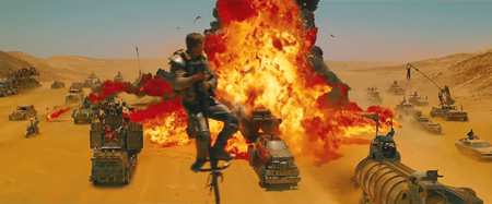
There have been rumblings lately about the surfeit of CGI-heavy films, especially superhero movies, and about a certain monotony in the results. Critics and fans are hailing Mad Max: Fury Road, in no little part because George Miller did stage much of the action, with real fantasy vehicles and hair-raising stunts, and employed CGI only when necessary. Among the diehard Peter Jackson fans over on TheOneRing.net, many argue that the emphasis on practical effects over digital in the Lord of the Rings trilogy should have been carried over to the Hobbit trilogy, despite the advances in CGI technology in the nine-year gap between them.
Earlier this month, Variety‘s Brian Lowry published an editorial laying out the problem. He concentrated on the superhero movies that have increasingly come to dominate the tentpole level of big-studio filmmaking:
The ability to mount enormous battles featuring multiple super-powered characters, however, has become its own trap. And while the results can be visually astounding, the movies regularly feel as lifeless and mechanized as the technology responsible for bringing those visions to fruition.
The why of it remains something of a mystery, but the outcome is frequently a hugely expensive–if often enough quite lucrative–tentpole release that certainly puts the money onscreen, yet nevertheless proves more numbing than exciting, even during what should be the show-stopping sequences.
The original “Avengers” was mostly a happy exception, even with its prolonged alien-invasion climax. “Age of Ultron,” while ambitious in exploring relationships among characters, becomes drearily repetitive as the heroes mow down another CGI horde, this time consisting of artificially intelligent robots.
[…]
The pattern has become predictable. “Iron Man,” a terrific movie overall — particularly in capturing the origin story — degenerated into a mundane brawl between two armor-clad characters. Ditto the “Hulk” reboot with Edward Norton, which culminated with the title character’s ho-hum showdown with another green behemoth, the Abomination.
One can argue, in fact, that the much-maligned second “Star Wars” trilogy sacrificed an element of its humanity in George Lucas’ embrace of a wholly digital filmmaking approach. At a certain point, watching droid armies being whacked to pieces begins to yield diminishing returns.
Put more simply, just because CGI wizardry allows you to do something, whether hoisting an entire city into the air or leveling skyscrapers willy-nilly, doesn’t always mean you should. Because while the box office figures might suggest otherwise, there is an audience out there that’s weary of these movies precisely because of the hollow quality to the inevitable final 30 minutes of unrelenting mayhem.
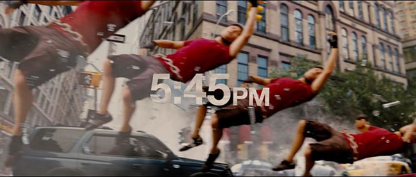
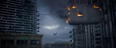
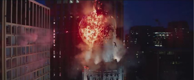
This struck a chord with me, because since the beginning of the year I have seen trailers for several CGI-heavy films. (How many of them begin with an ominous “helicopter shot” high over a CGI city, usually at night?) Most of them melt into each other in my memory, but I do recall that they included Insurgent (the teaser, below left) and Jupiter Ascending (trailer #3, below right).
My reactions to the Insurgent and Jupiter Ascending images were: 1) another burning cityscape with a CGI person flying through the air, and 2) wild horses couldn’t drag me to these.
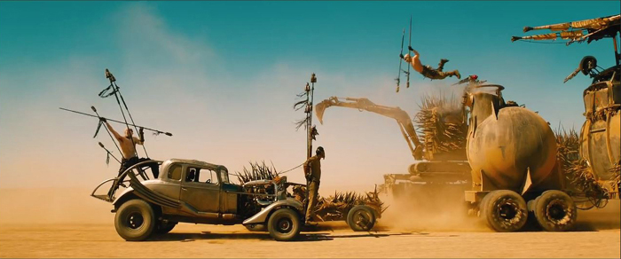
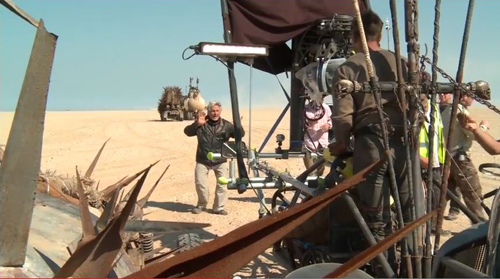
Compare these two frames with the image at the top of this entry. My reactions to the Mad Max: Fury Road teaser, which I only saw in HD on my computer, were: 1) what a gorgeous shot, 2) why is that guy doing that–he’s crazy, 3) George Miller and all these other people are crazy, and 4) I must see this film ASAP. The same qualities attracted me to The Road Warrior, but this time Miller had a far bigger budget, allowing him to create more vehicles and make them more elaborate.
The increasingly same old-same old quality about superhero films extends to science-fiction films and dystopian future ones.
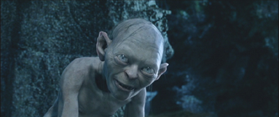
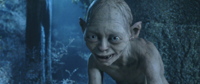
CGI is a marvelous technology and has been used to create wonderful films, scenes, and characters. Gollum remains one of its most successful and memorable creations. I suspect that many, like me, remember that initial jolt of amazement in the scene in The Two Towers when the mild “Smeagol” and villainous “Gollum” sides of his nature talked to each other, and a sudden switch to shot/reverse shot made his split visible, as if he had two bodies:
It was a brilliant way to handle the scene, but it also depended on us accepting Gollum as a character on the same plane of existence as Frodo and Sam. Yes, the technology for Gollum was improved for his reappearance in The Hobbit, but it wasn’t dramatically better, and the first trilogy was the real breakthrough.
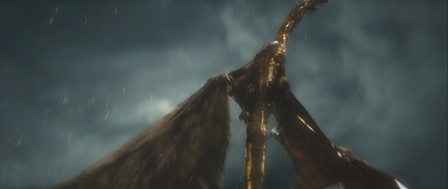
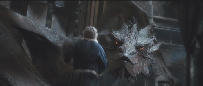
Smaug was another creation where one could hardly deny that CGI was used with astonishing complexity and skill (see bottom). The same is true for The Dawn of the Planet of the Apes and The Rise of the Planet of the Apes (also with effects by Weta Digital, which also managed to fill in scenes involving the late Paul Walker in Furious 7 without barely anyone noticing).
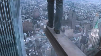
Lest all this become too Weta-centric, I also have seen the teaser for Robert Zemickis’ The Walk a few times. Again there’s a computer-generated cityscape, as in Insurgent and Jupiter Ascending, but the effect is quite different. It’s an attempt to create realism in a story based on actual events; the actor obviously can’t be placed high above New York, and the Trade Towers are gone. The effect is anything but clichéd. That I was to see, too.
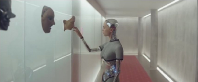
Another well-reviewed current science-fiction film, Ex Machina, uses CGI in an original way. David liked it less well than I did, but whatever one thinks of the film as a whole, the robot character Ava is not something we’ve seen on the screen before–at least, not done this way.
Historically, any art form goes through cycles. Hugely successful films will give rise to many imitators, and imitation eventually leads to cliché. The question is, will the filmmakers called upon to make big effects-heavy films make the effort to use CGI in an imaginative way? With sequel after sequel in the largest franchises already planned by the studios for years into the future, will the apparent assumption that flashy CGI is enough to attract the action-movie crowd prove wrong?
The madness of Mad Max
Despite the critics’ emphasis on the practical effects and real locations in Fury Road, it should be pointed out that Miller used quite a bit of CGI in the film. Indeed, he was no stranger to digital effects. For Babe (1995), his team used CGI to achieve the most realistic talking animals in films to that time. (Miller produced and wrote the script, with Chris Noonan directing; he directed Babe: Pig in the City.) Previously talking animals were usually done with puppets and animatronics, but Miller’s team used 3D scans of animals snouts and muzzles and manipulated the results. Babe won the 1996 Oscar for best visual effects. There were no exploding cities, giant armies, or battling superheroes, but experts recognized those moving animal mouths as cutting-edge stuff.
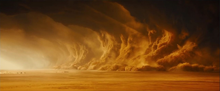
In Fury Road, CGI is used for effects that would be difficult, impossible, or prohibitively expensive otherwise. Furiosa’s missing left wrist and hand are an obvious example, as is the massive sandstorm that hits the fugitives and pursuers.
The blue night scene was shot day for night and then enhanced digitally, presumably with tinting and the addition of stars. The city which is the Citadel’s source of gasoline and is supposedly Furiosa’s goal as her truck sets out early in the film, is shown on the distant horizon but clearly was not built, since none of the action takes place there. The Citadel scenes were done in Australia, while most of the desert material was shot in Namibia. Some parts of the Citadel were built full-scale (e.g., the winch room), while green-screen replaced by digital set extensions supplied the rest. I think I spotted some digital matte paintings in some of the landscapes. But on the whole, Miller stuck to real locations, and most of the scenes of the chases were done with real vehicles and actors, chasing each other around the Namibian desert.
Miller commented, “We don’t defy the laws of physics–there are no flying human beings, no spacecraft–so it doesn’t make sense to do it as CGI. We’ve got real vehicles and real humans in a real desert, and you hope that all that texture will be up there on the screen.” Miller had in fact assumed that he would have to create the “pole cat” sequence, which has men perched on long, swaying poles atop speeding vehicles (above). Action unit director Guy Norris, however, shot a test scene on video, with no CGI. Miller was thrilled: “There were 10 pole cats swaying, coming down the road at speed, all of them on cars, and Guy was on one of the poles filming them. I choked up. I thought, ‘Wow, it’s real. It’s absolutely real.”
According to Simon Gray’s “Max Intensity” in the latest American Cinematographer (not yet online), “Months of rehearsals enabled the stunt crew to perform their choreographed sequences while the vehicles traveled at speeds up to 50 miles an hour.” (AC, June 2015, p. 42)
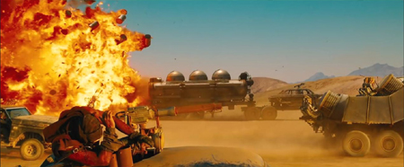
The reality of it comes through, as in this scene of one of many explosions. The stunt man flinching in the foreground is not the sort of thing you’d see if this were all being faked.
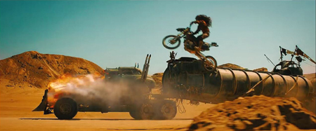
And some of the stunts are not all that different from what we saw in The Road Warrior or Beyond Thunderdome, both made in the pre-CGI days. This scene, for example, among the best in the film, where a motorcycle gang chases Furiosa’s rig.
One reason why Fury Road looks so good is results from Miller’s and and his cinematographer’s decision to avoid the look of most post-apocalyptic movies. Anne Thompson describes their approach: “The cliches of the genre were to desaturate the cinematography. So he and great Australian cinematographer John Seale (dragged out of retirement), saturated the color. ‘We were able to change the skies, and go against the idea that because it’s the apocalypse, there’s no longer any beauty in the world.'” (AC, June 2015, p. 48)
There are desert areas of Africa where the sand is the rich, peachy color that appears in the film. The Namibian desert, however, is not so colorful.
(George Miller, in the official Warner Bros. making-of publicity short)
The film’s senior colorist, Eric Whipp, describes the challenge of differentiating the largely brown, beige, and grey colors of the costumes and vehicles from such backgrounds: “The desert sand in Namibia is, in reality, closer to be gray color, but pushing it toward rich gold colors complemented the characters and vehicles, providing a strong, graphic look. The only other dominant color in the film was blue sky, which we embraced.”
The transformation of the desert into rich yellow and orange tones was done with what was obviously aggressive digital color grading. It runs marvelously counter to the dull blues, browns, and grays that form the dominant look of so many action films.
[May 31: On fxguide, Ian Failes has posted an excellent piece that lays out the practical vs. the digital effects in Fury Road.]
LOTR vs. The Hobbit
Reading Lowry’s comments made me think of Andrew Lesnie, who died recently at the young age of 59. Lesnie had unintentionally played a small but pivotal role in my attempts back in 2002-2003 to get permission to interview the Lord of the Rings filmmakers for my book, The Frodo Franchise. I needed to contact someone high in the production who could be a sort of sponsor for me, helping to gain New Line’s cooperation. The only people I figured could do that would be producer Barrie Osborne or Peter Jackson or Fran Walsh.
In November 2002, I was at a conference in Adelaide, Australia and met Annabelle Sheehan, who at that time was an administrator at the Australian School of Film, Radio and Television. When I told her of my potential project, she offered to put me in touch with Lesnie. I hesitated before responding. I knew that it would be wonderful to interview him, but my subject didn’t relate to cinematography at all. Moreover, he wasn’t in a position to sponsor such a project. Then Annabelle offered to introduce me to Barrie Osborne, which subsequently happened via email. The project became real at that point.
I’ve always regretted that I had no excuse to interview Lesnie. From interviews and his appearances in the supplements for the extended DVD editions of LOTR, he seems a genial man. I also admire the cinematography for LOTR. There’s a great variety in the lighting schemes, and he contributed some very striking moments to the film.
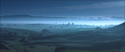
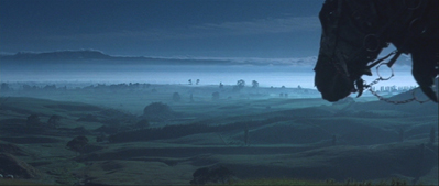
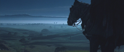
It’s of course very difficult to pin down exactly what Lesnie’s contributions to LOTR were in many scenes, given the considerable dependence on CGI. Still, I think he probably had more affect on the final look of LOTR than he did on The Hobbit. As the three parts of The Hobbit came out, it became increasingly clear that there were no shots or sequences that could stand comparison with the best things in LOTR. I think of well-conceived, dramatic shots like the one in The Fellowship of the Ring where a scene begins with a bucolic view out over a misty morning in the Shire, which is suddenly interrupted by ominous music and the entry from offscreen of one of the Black Riders’ horses.
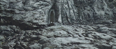
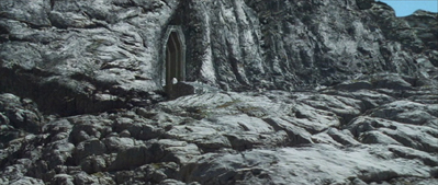
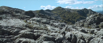
Another shot I admire is the first exterior after the long sequence of the passage through the Mines of Moria in Fellowship. Gandalf has just fallen into the abyss with the Balrog, and the others flee. The cut to an extreme long shot of the rocky terrain (filmed on Mt. Owen) outside the eastern gate to the Mines is jolting, seemingly switching from a color film to a black-and-white one. A trace of green plants at the lower left is virtually unnoticeable, and only as the camera arcs around to follow the remaining Fellowship’s movements away from the gate (which was added digitally) does a bit of blue sky appear at the upper right and eventually the green of the landscapes in the distance.
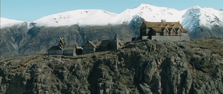
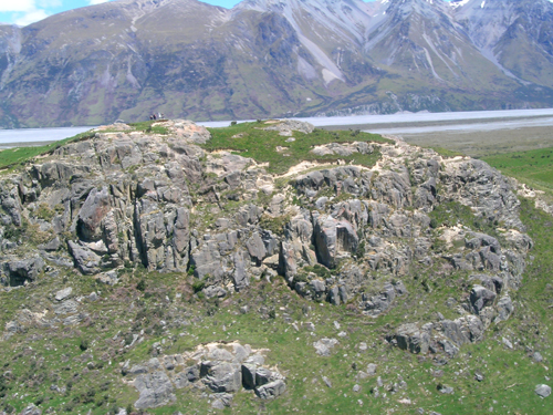
Although there are plenty of New Zealand locations in The Hobbit, I can’t think of any that are used as effectively as some of the ones in LOTR–most memorably the Edoras set, which was built full-size on Mount Sunday on the South Island. The swooping helicopter shots around the rocky promontory, with the snowy mountains revolving slowly around it, became iconic moments in the film.
Viewers might think that those background mountains were added digitally, and certainly some scenes, including the ones set at Orthanc, did have backgrounds built up of mountains from a variety of places. The extreme long shots of Rivendell are a patchwork of elements. Not so for Edoras, however. David and I were privileged to fly around Mount Sunday in a small plane–after the Edoras set had been removed–and we saw more or less what one sees in the film.
It was a different time of year, November (the Southern Hemisphere’s equivalent of May), but the mountains are clearly the same ones.
There was a helicopter camera team, so Lesnie might have had nothing to do with these circling shots, nor with the mountain photography for the magnificent Beacons Sequence in The Return of the King (to which the fires were added digitally).
Again, there is nothing to compare with this in The Hobbit, which, I would say, suffers from having so many sequences with CGI-created landscapes.
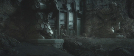
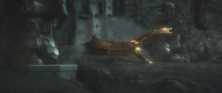
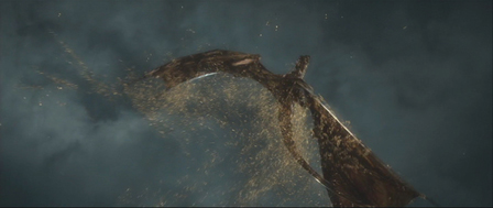
The only really memorable shot I can think of from The Hobbit is entirely digital, the emergence of Smaug from Erebor, covered in gold, at the end of The Desolation of Smaug. He bursts through the door and soars up away from the camera, shaking the gold off in sparkling droplets.
The shot of the dragon’s death is nearly as impressive, as Smaug falls slowly downward away from the camera.
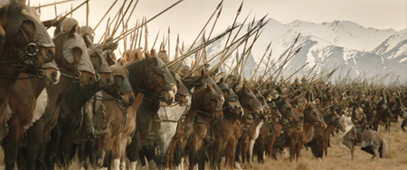
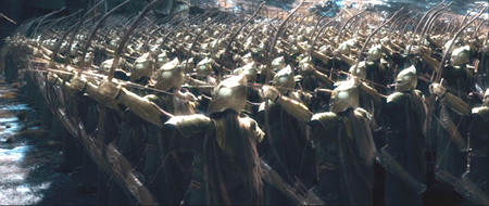
The problems with The Hobbit arise, I think, because so much of it, especially in the third part, has been conceived as almost entirely digital. Compare these two pre-battle moments from The Return of the King and The Battle of the Five Armies.
As Théoden addresses his troops before their charge during the Battle of the Pelennor, we are clearly watching real riders on real horses, their spears held at various angles. To be sure, the MASSIVE program was used to multiply horses and riders, but primarily in the extreme long shots. Hundreds of real ones were used in the scene. In the background we again see impressive non-CGI snow-covered mountains. There are four characters here about whom we care: Théoden, Éowyn, Merry, and Éomer. The Battle of the Five Armies shot of Thranduil’s troops, in contrast, involves perfect ranks of anonymous Elves, moving in synchronization. There is no actual landscape behind them, just vague patches of blue, brown, and white.
MASSIVE was used here as well, but for far more figures. Wasn’t the program devised to allow digital “extras” to move independently of each other rather than replicating a very limited number of gestures? It’s ironic, since in the film’s endless battle, characters moving in synchronization seem to be the rule. See the moment when the dwarves assemble their shields into a wall against the orcs, with Elves leaping effortlessly over them.
Which brings up the matter of seemingly weightless characters and creatures. There has been much discussion of the fact that Legolas and Tauriel leap about, stand on other characters’ heads while fighting, and bound up collapsing stone staircases. Admittedly, Tolkien says in the blizzard scene of The Fellowship of the Ring that Legolas’ “feet made little imprint in the snow.” But even assuming that Elves are very light, some of the antics in The Hobbit look plain silly.
And it’s not just Elves that zip about in this fashion. Partway through the Battle of the Five Armies, large rams appear out of nowhere. (I gather that their presence will be explained in the extended edition.)
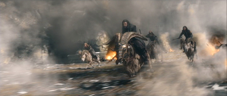
Thorin, Kili, Fili, and Dwalin ride the rams up the sheer pinnacle to reach Azog’s command post. The rams bounce weightlessly and effortlessly up the steep cliffs, looking more like ping-pong balls than heavy animals. Indeed, gravity seems to be defied quite a bit in the films–even putting aside from the fact that the characters are able to survive impossibly long falls without a scratch. I can’t think of cases in LOTR where such things happen.
Much has been made of the fact that The Hobbit contains many echoes of LOTR, in terms of characters, scenes, and even specific repeated lines. I’ve complained about that myself. Yet there are many fans who prefer The Hobbit to LOTR–many of them fangirls obsessing over Richard Armitage (Thorin), Aidan Turner (Kili), Dean O’Gorman (Fili), and/or Lee Pace (Thranduil). Such fans proudly point to the “fact” that the second trilogy had higher box-office totals than did LOTR. In unadjusted dollars, yes. In adjusted dollars, LOTR made considerably more, and that without the benefit of 3D surcharges. I suspect this disparity arose from the fact that LOTR was so extraordinarily original, and because it balanced CGI and practical effects so effectively. The Hobbit tipped far in the direction of CGI, and it shows.
Many studios and filmmakers will continue to rely on the standard look of action/sci-fi/fantasy CGI, at least until it becomes so obviously repetitive that audiences lose interest. But films like Fury Road and LOTR offer models of how CGI and practical effects can be balanced for a much livelier film.
[April 18, 2016: Ex Machina, to the surprise of many, won the Academy Award for best special effects. This was probably because it was so original in its use of effects. After all, most special effects doesn’t equal best special effects.]


