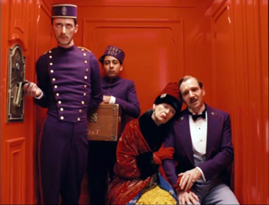
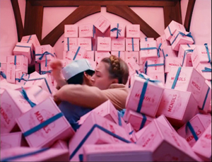
Archive for the 'Readers’ Favorite Entries' Category
ADIEU AU LANGAGE: 2 + 2 x 3D
Adieu au langage (2014).
DB here:
Godard’s Adieu au Langage is the best new film I’ve seen this year, and the best 3D film I’ve ever seen. As a Godardolater for fifty years, I’m biased, of course. And I might feel that I have to justify taking a train from Brussels to Paris to watch it (twice). But the film seems to me superb, and it gets better after several more (2D) viewings.
People complain that Godard’s movies are hard to understand. That’s true. I think they provide two different sorts of difficulty. He lards his dialogue and intertitles with so many abstract (some would say pretentious) thoughts, quotations, and puns that we’re tempted to ask what he is implying about us and our world. That is, he poses problems of interpretation—taking that to mean teasing out general meanings. What is he saying?
I think that this type of difficulty is well worth tackling, and critics haven’t been slow to do it. Scholars have diligently tracked the sources of this image or that barely-heard phrase. Adieu au langage provides another field day; there are movie clips, some quite obscure, and citations (maybe some made-up ones) to thinkers from Plato and Sartre to Luc Ferry and A. E. van Vogt. Ted Fendt has discovered a massive list of works cited in the film, and even his list, he acknowledges, is incomplete.
I confess myself less interested in interpretive difficulties. I don’t go so far as my friend who says, “Godard is a poet who thinks he’s a philosopher.” But I do think that he uses his citations opportunistically, scraping them against one another in collage fashion. In particular, I think that by having characters quote, quite improbably, deep thinkers, he’s trying for a certain dissonance between the abstract idea and the concrete situation.
What situation? That brings us to the second sort of difficulty. It’s often rather hard to say just what happens, at the level of plot, in a Godard film. From his “second first film,” Sauve qui peut (la vie) (1980), “late Godard” (which has lasted over thirty years, much longer than “early Godard”) has made the story action quite hard to grasp. Oddly enough, most reviewers pass over these difficulties, suggesting that story actions and situations that we scarcely see are fairly obvious. (Reviewers do have the advantage of presskits.)
The brute fact is that these movies are, moment by moment, awfully opaque. Not only do characters act mysteriously, implausibly, farcically, irrationally. It’s hard to assign them particular wants, needs, and personalities. They come into conflict, but we’re not always sure why. In addition, we aren’t often told, at least explicitly, how the characters connect with one another. The plots are highly elliptical, leaving out big chunks of action and merely suggesting them, often by a single close-up or an offscreen sound. Godard’s narratives pose not only problems of interpretation but problems of comprehension—building a coherent story world and the actions and agents in it.
We ought to find problems of comprehension fascinating. They remind us of storytelling conventions we take for granted, and they push toward other ways of spinning yarns, or unraveling them.
Case in point: Adieu au langage.
Since the film will be appearing in the US this fall, under the title Goodbye to Language, I want to encourage people to see this extraordinary work. But I’m also eager to talk about it in detail. So here’s my compromise, a four-layered entry.
I’ll start general, with some sketchy comments on some of Late Godard’s narrative strategies. In a second section I make some speculative comments on Godard’s use of 3D. No real spoilers here.
Then I’ll offer an account of the opening fifteen minutes. If you haven’t yet seen the film, this section might be good preparation. But part of experiencing the film is feeling a bit at sea from the start, so this section might make the film more linear than it would appear on unaided viewing. You decide how much of a preview you want.
The last section briefly surveys the overall structure of the film, and it is littered with spoilers. Best read it after viewing.
Spoilers notwithstanding, nothing stops you from eyeing the pictures.
Ecstasy of the image
Film Socialisme (2010).
Much in Adieu au langage is familiar from other Godard films. There are his nature images–wind in trees, trembling flowers, turbulent water, rainy nights seen through a windshield–and his urban shots of milling crowds. All of these may pop in at any point, often accompanied by fragments of classical or modern music. Again he returns to ideas about politics and history, particularly World War II and recent outbreaks of violence in developing countries. His standard techniques are here too. The film begins before, and during, the credits, which appear in brusque slates often too brief to read. Music rises, often just enough to cue an emotional response, before being snapped off by silence or an abrasive noise.
In his narrative films, as opposed to the collage essays like Histoire(s) du cinéma, we get scenes, but those are handled in unusual ways. He tends to avoid giving us an establishing shot, if we mean by that a shot which includes all the relevant dramatic elements. He often has recourse to constructive editing, which gives us pieces of the space that we are expected to assemble. Although Godard’s early films relied on this a fair amount, it became pronounced in his later work, where he tweaks constructive cutting in unusual ways. I discuss one example here.
Often we get an image of one character but hear the dialogue of an offscreen character. And the shot of the lone character may hang on quite a while, so that we wait to see who’s speaking. By delaying what most directors would show immediately, Godard creates, we might say, a stylistic suspense. I can’t prove it, but I suspect the influence of Bresson, who said to never use an image if a sound will suffice.
When Godard doesn’t give us unanchored close-ups or medium-shots, he may do something more drastic. A signature device of his later work is the shot which stages its action in ways that make the characters hard to identify. He may shoot in silhouette (Notre musique, 2003).
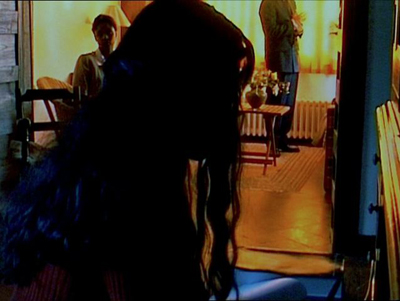
More outrageously, he may frame people from the neck or shoulders down (Bresson again?) and make us wait to discover who they are (Éloge de l’amour).
Such decapitated framings are disconcering, since orthodox cinema highlights faces above all other body areas. When we can’t access facial expressions, then the dialogue, gestures, postures, and clothes become very important. Godard can, of course, combine these strategies (below, Éloge de l’amour; also the Film Socialisme image above). In this shot, the man standing in the background is an important character but we never see him clearly.
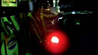
Godard’s opaque “establishing” shots may be very condensed and laconic; he jams in a lot of information, partial though it is. In one shot of Adieu au langage, a dog approaches a couple on a rainy night and the woman urges her partner to take him in. All we see, however, is the man gassing up the car (and we don’t see him all that clearly).
We hear (dimly) the dog’s whimpering and the woman’s plea, but we see neither one.
Godard frets and frays his scenes in other ways. He creates ellipses, time gaps between shots that may leave us uncertain. What happened in the interval? How much time has passed? He also interrupts the scene through cutaways to black frames, objects in the scene, or landscapes; the scene’s dialogue may continue over these images, or something else may be heard.
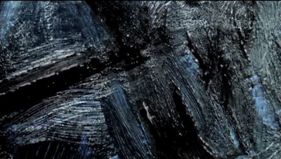
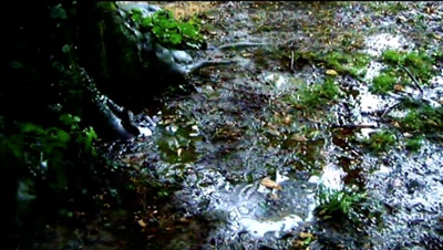
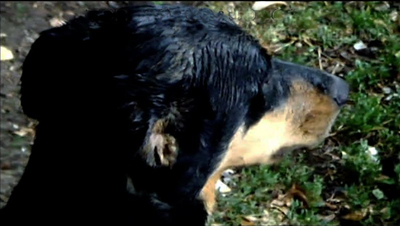
At greater length, the scene can open up onto a digression, a collage of found footage, intertitles, or other material that seems triggered by something mentioned in the scene. In Film Art: An Introduction, we argued that one alternative to narrative form is associational form, a common resource of lyrical films or essay films. Godard embeds associational passages in his narratives, the way John Dos Passos embedded newspaper reports in the fictional story of his USA trilogy. Sometimes, though, the associations are textural or pictorial. At one point in Adieu au langage, Godard associates licked black brushstrokes on a painting with churned mud and the damp streaks on the coat of the dog Roxy.
By fragmenting his scenes, Godard gets a double benefit. We get just enough information to tie the action together somewhat, and our curiosity about what’s happening can carry our narrative interest. But the opaque compositions and the bits and pieces wedged in call attention to themselves in their own right. Blocking or troubling our story-making process serves to re-weight the individual image and sound. When we can’t easily tie what we see and hear to an ongoing plot, we’re coaxed to savor each moment as a micro-event in itself, like a word in a poem or a patch of color in a painting.
But those images and sounds can’t be just any image or sound; they hook together in larger patterns that sometimes float free of the plot, and sometimes work indirectly upon it. The best analogy might be to a poem that hints at a story, so that our engagement with the poetic form overlaps at moments with our interest in the half-hidden story.
Where, some will ask, is the emotion? We want to be moved by our movies. I suggest that with Late Godard, we are mostly not moved by the plot or the characters, though that can happen. What seizes me most forcefully is the virtuoso display of cinematic possibilities. The narrative is both a pretext and a source of words and sounds, forms and textures, like the landscape motifs that painters have used for centuries. From the simplest elements, even the clichés of sunsets and rainy reflections, the film’s composition, color, voices, and music wring out something ravishing.
We are moved, to put it plainly, by beauty–sometimes exhilarating, sometimes melancholy, often fragmentary and fleeting. Instead of feeling with the characters, we feel with the film. For all his exasperating perversities, Godard seeks cinematic rapture.
3D on a budget
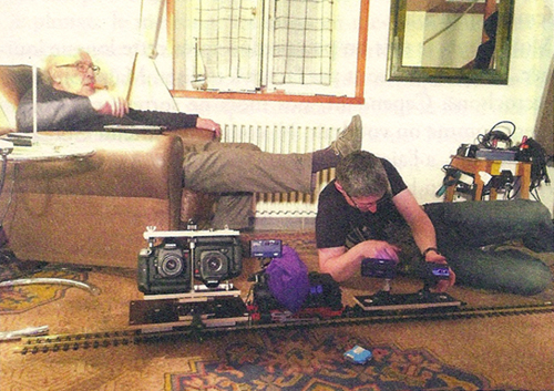
The smallest set of electric trains a boy ever had to play with? Photo: Zoé Bruneau.
Most of the 3D films I’ve seen strike me as having two problems.
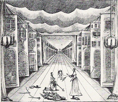
First, there is the “coulisse effect.” Our ordinary visual world has not only planes (foreground, background, middle ground) but volumes: things have solidity and heft. But in a 3D film, as in those View-Master toys, or the old stereoscopes, the planes we see look like like cardboard cutouts or the fake sections of theatre sets we call flats or wings (coulisses). They lack volume and seem to be two-dimensional planes stacked up and overlapping. Here’s an example from a German stage setting of 1655, with the flats painted to resemble building facades.
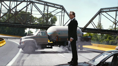
In cinema, the thin-slicing of planes seems to me more apparent with digital images that are rather hard-edged to begin with. (3D film was more forgiving in this respect.) Sometimes the flat look can be quite nice, as in Drive Angry (2011). In this action sequence, the planes prettily drift away from one another, with no attempt to suggest realistic space.
Apart from the coulisse effect, there’s the problem that the 3D impression wanes as the film goes along. I’ve long thought it was just me, but other viewers report perceiving the depth quite strongly at the start of the movie and then sensing it less after a while, and maybe not even noticing it unless some very striking effect pops up. Part of this is probably due to habituation, one of the best-supported findings in psychology. Maybe, as we get accustomed to this fairly peculiar 2.5D moving image, it becomes less vivid.
More than our perceptual habituation might be at stake. Filmmakers may reduce depth during certain scenes to save money on postrproduction effects. Some gags in A Very Harold and Kumar 3D Christmas (2011) rely on old-school, smack-in-the-eye, paddle-ball depth, but much of the middle of the film doesn’t employ it. By tipping up the glasses and checking how much displacement is in the image, I’ve been surprised to find that remarkably long stretches of 3D films have little or no stereoscopy.
My impression is that Adieu au langage has overcome the problems I mentioned. Granted, many of the shots have sharply-etched images that emphasize the thinness of each plane. But other shots have unusual volume. Several factors may contribute to this. Unusual angles sometimes give foreground elements a greater roundness. This happens in the low-angle tracking shots created by the toy-train rig shown above.
In addition, the relatively low resolution of some of the images avoids creating hard contours.The wavering blown-out softness may enhance volume.
Perhaps as well the slight tremors of the handheld camera mimic one of the factors that yield volume for our normal vision: the very slight movements of our head and body. Such shots shift the aspect enough to suggest the thickness of things.
Godard maintains the sense of depth in a tiny ways. For instance, he discovers that the crackling snow on a TV monitor can yield shimmering depth in the manner of Béla Julesz’s random-dot stereograms. Julesz sought to show that 3D vision wasn’t wedded to perspective cues or the identification of recognizable objects–a conclusion that ought to appeal to the painterly side of Godard.
Production stills indicate that Godard shot the film with parallel lenses. Instead of creating convergence by “toeing in” the lenses during filming, he and his crew played with the images in postproduction to control planes and convergence points. What they did exactly, I don’t know, but the results yield, for me at least, some strong volumes and a continual impression of depth that doesn’t wane.
I wish I could analyze the film’s 3D technique more exactly, but I don’t know enough about the craft of stereoscopic cinema or Godard’s creative process. What this film shows, however, is that 3D is a legitimate creative frontier. In the credits, as usual Godard brusquely lists his equipment, from the high-end Canon 5D Mark II (and Canon is proud to be associated with him) to small rigs like GoPro (in 3D) and Lumix. What is clear is that filming in 3D can be pictorially adventurous with cameras costing a few hundred dollars.
Nature, the ultimate metaphor
Now I’ll concentrate on the first few minutes, at the risk of potential spoilers.
The narrative in Adieu au langage is sketchy even by Godardian standards. Normally he gives us some characters in a defined situation (though it takes a while for us to grasp what that situation is), and a series of more or less developed dramatic scenes that advance a sort of plot. In Passion (1982) a movie director recreates famous paintings on film while a factory owner, his wife, and a worker get embroiled in his project. Detective (1985) carries us through a stay of several people at a luxury hotel. Je vous salue Marie (1985) gives us not one but two plots (Adam and Eve, Joseph and Mary). Éloge de l’amour follows a young writer in his exploration of art dealing and commercial filmmaking.
Adieu au langage doesn’t give us a plot even as skimpy as these. Instead, Godard builds his film out of a bold use of ellipsis and a strict patterning of story incidents. The ellipses are exceptionally cryptic. We must, for instance, eventually infer, on slight cues, that a couple has been together for at least four years, and that the man has stabbed the woman. We learn, with almost no emphasis, that both of the women have ties to Africa–hence the footage of street violence and the recurring question of how to understand that continent.
These very vague plot elements are arranged in a rigorous pattern. This patterning will seem very schematic in my retelling. But it’s not obvious when you see the film. Godard wraps his film’s grid in digressions, sumptuous imagery, and, of course, striking 3D effects.
To get a sense of both the firm architecture and the wayward surface, let’s look at the opening. The first fifteen minutes of Adieu au langage introduce in miniature what the rest of the film will be doing.
A montage of citations before the credits is followed by a fuzzy image of a neon sign. Now we get a sort of overture. Frantic video shots of a crowd under attack and running to a fire are followed by a clip from Only Angels Have Wings and a close-up of the dog identified in the credits as Roxy. That’s followed by a black frame dotted with points of white light. That image will become a little clearer later (stylistic suspense again). Then a title superimposes the numeral one in red with the word, “La Nature.”
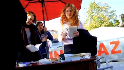
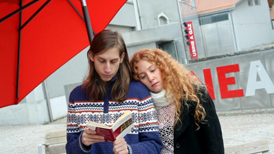
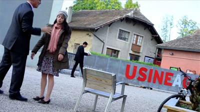
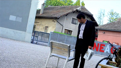
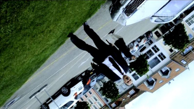
What ensues, after a shot of a ferry approaching a pier, is a fairly disjunctive scene. A booksellers’ table stands across the street from the Usine a Gaz, a cultural center in Nyon, Switzerland. People casually gather there: a redheaded woman (Marie), a young man in a sweater who seems to be the bookseller, a woman on a bicycle (Isabelle), and the older man Davidson (later identified as a professor), here seen from the rear.
The cockeyed low-angle framing might make you think that this is Godard’s Mr. Arkadin, but it suggests footage from a camera or cellphone simply left tipped on some surface behind the table. In that respect it would make manifest the line in Éloge de l’amour: “The image, alone capable of denying nothingness, is also the gaze of nothingness upon us.”
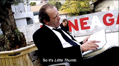
Soon Davidson is sitting in the street commenting on Solzenitsyn’s Gulag Archipelago as a “literary investigation.”
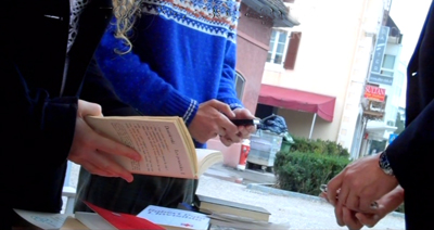
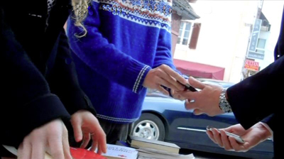
A question he asks Isabelle behind him leads to a punning exchange about the thumb (pouce) that we use on our phones, which leads to a question about Tom Thumb (Poucette), a pun on “push” (pousser), and the suggestion that digital icons are like Tom’s trail of pebbles to the giant’s castle. The little skein of associations knots in a remarkable shot of two pairs of hands tickling their mobiles while another person’s hands examine books.
As the men swap phones, a car coasts through the shot in the background.
This scenic fragment, suppressing faces that would help us identify characters, is characteristic of Godard’s approach in the whole film. He isolates gestures and surroundings, letting sound suggest the scenic action; and often the most important narrative action—here, the arrival of the car carrying a gunman—is a minor element in the frame.
So far, we’ve seen one of Godard’s strategies for hiding his story action: ellipsis. Time is skipped over (Davidson behind the table/ in a chair/ then perhaps behind the table), and bits of scenic action are omitted. There is also the opaque framing that impedes character recognition. What about digression? ? We’ve had one example in the Tom Thumb dialogue, but digression can be more overt. Godard can insert shots that have only a tangential narrative connection to the action.
The Godardian digression usually develops in a spreading web of associations that takes us on a detour. Here, one trigger seems to be the mention of Tom Thumb’s Ogre; another is the video display on the phones. These bits lead to a montage about Hitler, who, a woman’s voice reflects, left behind the belief that the state should handle everything. In a polyphony with the woman’s voice reflecting on Hitler, we get Davidson reflecting on how Jacques Ellul foresaw a good deal of the contemporary world. The associational links spread further, to images of the French revolution, crowds hailing Hitler, crowds at the Tour de France, and finally flowers and a voice reiterating a question at the scene’s start: How to produce a concept of Africa?
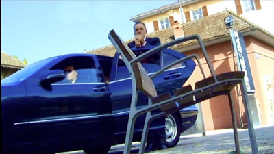
Now we’re back to the street, with the car pulling up. A chair that may have been Davidson’s is now empty. A man in a suit, the husband, emerges and lights a cigarette, looking off left. A woman, Josette, is in close-up—evidently the target of his look.
Since a black-and-white shot of Josette, head bent, was inserted in the Hitler montage, it’s possible that hers was the voice reciting the argument about the enduring trust in state authority. Perhaps she is reading? In any case, no sooner has a drama of sorts started than we get another digression. Marie reads aloud to us from a book held by the sweater boy. Again, the subject is state power and its inability to acknowledge its violence.
Domestic, not state-sponsored, violence is next on the agenda. A long shot shows the husband stalking up to Josette and berating her in German. The Usine sign is a big help in anchoring the action in the space we’ve seen, and Isabelle’s bike is visible on screen right.
Josette hangs stiffly on his arm, passively resisting and saying, “I don’t care.” He rushes out left. Gunshots are heard, and she jerks in spasmodic response. People rush through the frame. (We’ll never learn exactly what happened offscreen, though later there’s a hint that someone was shot.)
After the car has turned around and left in the way it came, Josette walks stiffly out of the frame. The man in the background who was startled by the husband’s abuse walks to the empty chair and pauses for a time to stare at it.
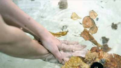
Cut to leaves floating on water, with hands washing and a man’s voice off saying: “I am at your command.”
So far, so Godardian. The narrative gist is that a woman has fled her husband, refused to return to him, and been approached by a different man who offers to join her. But the flow of images and sounds has made that gist very obscure, obliging us to absorb some fairly ravishing images and to listen to words, noises, and music as they form jagged, interruptive patterns.
And now something very unusual happens. Godard re-plays the events of “1-Nature” in a different location and time of year, using some new characters and some old ones.
A new section, “2” supered on “Metaphor,” appears. Its opening images run parallel to the overture that led up to “1.” After a shot of a swimmer (echoing the previous image of water), we get newsreel footage of combat and fire, and another film extract, this one from Les Enfants Terribles. A shot of Roxy along a river bank is followed by one of a hand opening and closing as a woman’s voice speaks of the “return” of language and a title repeats her insistence that she has made an image.
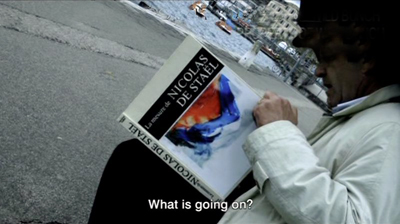
As at the start of “1,” the ferry comes toward the pier. And now we’re back with Davidson, now sitting along the edge of the water, again reading. His position and the tipped angle suggest a mirror-image of the earlier shot of him near the book table.
A link to the previous scene is provided when Marie and the sweater boy come to Davidson and say they’re going to America. The boy will study philosophy (obligatory quote from Being and Nothingness follows). Their conversation is interrupted by the arrival of the husband again, who shouts and fires his pistol. The shot announcing him is another skewed mirroring: his earlier entrance is inverted–again, as if a mobile phone’s camera had fallen.
The young couple flee and a woman, Ivitch, steps in to talk with Davidson. She shouts at the husband in German, “There is no why here!” ( a line that gets explained later in the film) and tells Davidson to ignore him. This moment offers a variant of the close shot of Josette when the husband had approached.
Ivitch asks Davidson, who evidently has been her professor during the previous term, questions about fighting unemployment by killing workers and about the difference between an idea and a metaphor.
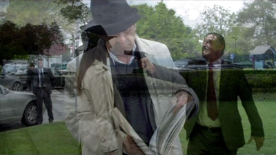
In a new angle, Davidson meditates about images. As if to confirm the professor’s hunch that images murder the present, the husband lunges into the frame and yanks Ivitch out. We now get a shot in which the two cameras diverge: the left eye stays on Davidson, the right one pans over to Ivitch and the husband overlooking the lake. This offers a dense composition akin to that of the book-table shot, with figures piled on one another. The superimposition below is somewhat faithful to what we see, but it can’t convey your temptation to close one eye, then the other, in creating your own shot/reverse-shot editing.
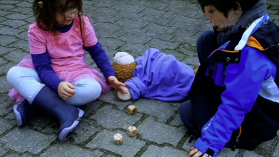
The husband paces around Ivitch, points the pistol, and hollers in German that she’s a dirty whore. She replies as Josette had: “I don’t care.” She walks back to Davidson on the bench, and shortly the husband strides back to the car waiting in the background. Davidson returns to Ivitch’s question about metaphor and then points out two kids playing with dice. These exemplify “the metaphor of reality.” Cut to the kids rolling three dice.
The image echoes Godard’s segment of 3 x 3D, where he puns on “D” as dés, or dice. The kiddies’ shot literalizes the metaphor: trois dés, 3D.
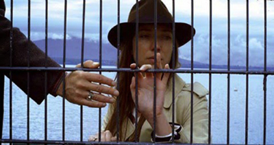
Finally we see Ivitch behind a grille, looking up, then down as we hear the ferry’s horn off. A man’s hand comes in from the left, voice off: “I’m at your command.”
This action repeats the end of the “1” section, but differently: There we saw Gédéon when he inspected Josette’s chair, and heard him say the same words over the leafy water shot. Here both the words and the face of the speaker, Marcus, are offscreen.
Again a woman is threatened by her violent husband and a man emerges to replace him. Again that action is occulted by verbal digressions, dislocated framings, and major characters–here, Marcus–not introduced in a normal fashion. Once more the separate pieces of the scene, straining to cohere, are pulled apart just enough to register as individual instants of beauty, shock, puns, metaphors, or just peculiarity.
Godard’s prospectus for Adieu au langage indicated: “A second film begins. The same as the first.” This describes, laconically, what we’ve seen in the first fifteen minutes. That parallel structure is laid out again with astonishing, yet mostly hidden, rigor in the film as a whole.
Two plus two
Maximal spoilers here.
Over the last thirty years or so, we’ve had plenty of films that replay sections of their stories. Sometimes that dynamic is motivated as time travel, as in Source Code or Edge of Tomorrow—“multiple draft” narratives that let characters, as in Groundhog Day, revisit situations until they master them. Sometimes the repetition has been motivated through varying point of view, so that we see the same action again, but from a different character’s perspective. Examples would be Go, Lucas Delvaux’s Trilogy, and Ned Benson’s recent Disappearance of Eleanor Rigby. Once in a while we get films that present the events as repeated but significantly and mysteriously different. This is what happens in some Hong Sang-soo films, such as The Virgin Stripped Bare by Her Bachelors, as well as in Lee Kwangkuk’s Romance Joe.
In all, this is a minor but important convention of modern screenplays. The replay plot is common enough for screenwriting guru Linda Aronson to consider it separately in her book The 21st Century Screenplay. Trust Godard to take this emerging norm and fracture it.
The opening I’ve just considered invites us to see the film as split into two storylines. Godard has explored duplex construction before, in Éloge de l’amour (with the second part in color video) and Film Socialisme (with its third “movement” appended to two long sections). Yet Adieu au langage offers something different.
Here we have multiples of two: a prologue bookended by an epilogue, the two opening parts that are mirrors of each other, and then two long sections that are uncannily symmetrical. Those sections continue the stories sketched out in the opening section. Each plotline bears the same title as before, but now presented in different graphics (the number and the words are not superimposed, but presented in separate title cards). What’s remarkable is the precise parallels and echoes set up between the pair of tales.
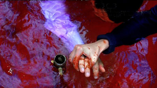
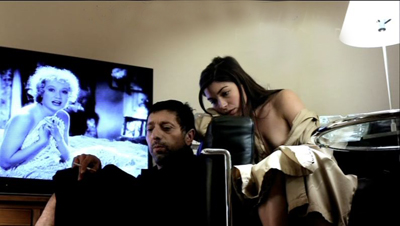
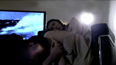
The couples were cast with resemblances in mind, and this affinity is expanded through rather precise doubling. Nearly every scene in the plotline of Josette and Gédéon has its counterpart in the one featuring Ivitch and Marcus. Two nude scenes, two toilet scenes, two bloody-sink scenes, two mirror scenes, two movie-on-TV scenes. There are parallel sequences of driving in the rain, of a woman fleeing into a forest, of Roxy wandering in the woods, of helicopters crashing, of men dying in fountains. As we saw in the early 1/2 segments, the shots’ framings often echo one another.
Godard has laid bare the device in the second story, when Marcus and Ivitch and Marcus talk in front of a mirror.
Marcus: Look in the mirror, Ivitch. There are both of them.
Ivitch: You mean the four of them.
Rather than exact repetitions, we get repetition with variation. One couple takes Roxy in, the other (perhaps) does not. The first couple abandons Roxy on a pier in summer; in the second part, the pier in winter stands empty.
Most remarkably, the parallel scenes of the long section “2/Metaphor” proceed in almost exactly the same order as in “1/Nature”. Evidently Godard shot the bulk of the first story well before he shot the second. It’s as if the first film became the script for the second. In any event, the two long parts mirror one another with unusual precision. This geometrical structure recalls the “grid” organization of Vivre sa vie, but it’s not announced as boldly. Godard refuses to mark the parallel scenes in normal ways–with titles, or musical motifs. The labeling of the sections, 1 and 2 in the intro, 1 and 2 in the longer stretches, are sufficient for this laconic filmmaker.
Just as Godard blurs the shape of individual scenes through digression and opacity, so he hides the tabular structure of the film behind interruptions, landscape shots, and above all the charmed wanderings of Roxy, who more or less takes over the last portion of the second part. In addition, certain images from the second part echo or condense images we’ve seen before. The blood-filled fountain at the end of the second tale echoes both the bloody sink of the first one and the floating-leaf fountain in the prelude, while the clasping hands seem to consummate the gesture begun in the grille shot. These hybrid images can only make the strict double-column scene lineup more difficult to notice.
The fact that the exceptionally exact parallels and orderings of the two parts aren’t remarked upon by critics (I began to sense them a little during my second pass) is a measure of how successfully Godard has camouflaged the film’s anatomy. What shall we call this tactic? Distant counterpoint? Barely discernible rhymes?
Second film, or two films (short and long) times two: We’re free to see the characters as couples running uncannily in synchronization, or as the same couple in two guises, or as two stories in parallel universes. More likely, though, Godard is distressing and disheveling the emerging conventions of replay plotting.
And yet the ending of “the second film, same as the first” isn’t quite the whole story either. Godard has always enjoyed setting up rigid structures and then spoiling them–cutting off the arc of a melody or chopping a shot that could have been breathtaking. So he cracks his elegant 2 + 2 structure by giving us an epilogue and a third couple.
Images recur: crowds on the streets, Roxy snuggling on a sofa, a TV (but this time with two empty chairs). We glimpse a man reading, but mostly we see one hand painting with water colors while another is writing in a journal. Godard’s familiar dichotomy between image and word is here tied to the harmony of an unseen, but clearly heard, man and woman making art in tandem. The male voice seems to be Godard’s; I can’t say whether the female voice belongs to his partner Anne-Marie Miéville, but the woman seems to understand Roxy best. She can even access his thoughts. (“He’s dreaming of the Marquesa Islands.”) Yet this couple has another parallel, shown a little earlier: Percy and Mary Shelley, a poet and a novelist, the latter seen finishing Frankenstein in the forest. This is at least one farewell to language, but it also implies that creativity binds a couple together.
Roxy Miéville, as he’s called in the credits, haunts the film. He checks out streams, train platforms, and tree roots. He is never seen in the same shot with the main characters; his link to them is tenuous. His ramblings suggest freedom, sensory alertness, and a trust in immediate experience that perhaps the people can’t attain. The final images after the credits show Roxy wandering off in the distance and then bounding eagerly back to someone who stands, of course, offscreen.
Godard: The youngest filmmaker at work today.
Many thanks to Robert Sweeney and Richard Lorber of Kino Lorber, a bold company that still believes in art films. It will be releasing Goodbye to Language on 29 October (not September as I erroneously stated in an earlier version of the entry.) Later the film will appear on Blu-Ray 3D. Thanks also to Marc Silberman for help with German translation and to Ben Brewster for advice on stage wings.
For an interesting memoir of the filming of Adieu au langage, see Zoé Bruneau’s En Attendant Godard (Paris, 2014). The photo of the camera train is drawn from p. 93 of her book.
An excellent evocation of the fizz of word and image in Adieu au langage is offered by James Quandt in Artforum (also in the September print edition). Some other stimulating appreciations of the film are Scott Foundas in Variety, Daniel Kasman for MUBI, and Blake Williams in Cinema Scope. A useful description of the film is by Jean-Luc Lacuve on the site of the Ciné-club de Caen.
Too bad the GoPro Fetch, a harnessed camera for dogs, wasn’t available for Roxy to use.
To get a sense of how complex Late Godard is at the level of narrative comprehension, see Kristin’s essay “Godard’s Unknown Country: Sauve qui peut (la vie),” in Breaking the Glass Armor: Neoformalist Film Analysis. I analyze strategies of storytelling in Godard’s 1960s films in Chapter 13 of Narration in the Fiction Film. She wrote about Film Socialisme on the blog here. For a discussion of Godard’s very fussy compositions, try this entry. I consider multiple-draft narratives more generally in the essay
“Film Futures” in Poetics of Cinema.
P.S. 30 Sept: Since Adieu au langage screened at TIFF, VIFF, and elsewhere, a great many critical responses have accumulated. Thanks to the assiduous passion of David Hudson, you can track them all at Fandor. My initial posting should have mentioned two more enlightening discussions of the film: Kent Jones’s Cannes thoughts and the heroic display of Godardiana assembled by Craig Keller at Cinemasparagus.
P.P.S. 15 October: The beat goes on. Ted Fendt’s astonishing list of “Works Cited” in the film, which I added to the body of the above entry, deserves another link here. And the ever-expandig Mubi deserves our thanks for making it available.
P.P.P.S. 29 October: And more, of course. Background on the production process from Fabrice Aragno for Filmmaker; David Ehrlich’s sensitive discussion on The Dissolve; and a story on NPR, with interviews with Héloïse Godet, Vincent Maraval, and (gulp) me. Thanks to Pat Dowell for asking me to participate.
P.P.P.P.S. 2 November: If you haven’t had enough, I posted another entry on the film.
P.P.S. 13 November 2014: Geoffrey O’Brien’s enthusiastic appreciation of the film not only illuminates it but conveys the excitement of seeing it.
MOONRISE KINGDOM: Wes in Wonderland
DB here:
“An auteur is not a brand,” argues Richard Brody. Not always, I’d suggest; but it can happen. And it’s not necessarily a bad thing.
Wes Anderson has found a way to make films that project a unique sensibility while also fitting fairly smoothly into the modern American industry. He has his detractors (“I detest these films,” a friend tells me), but there’s no arguing with his distinctiveness. The Grand Budapest Hotel is perhaps the most vivid example of Andersonian whimsy as signature style.
In any case, before summer’s end I want to look at the auteurish aspects of another Anderson film. Whether you admire him, abominate him, or have mixed feelings, I think that studying this film can show us some interesting things about authorship in today’s film culture.
Toy worlds
When I’m making a movie, what I have in mind, first for the visuals, is how we can stage the scenes to bring them more to life in the most interesting way, and then how we can make a world for the story that the audience hasn’t quite been in before.
A film auteur is often described as having a characteristic tone, an attitude, and recurring themes. But we also find more tangible marks of authorship. One is a tendency to create distinctive story worlds. Hawks gives us milieus filled with stoic, sometimes grimly resigned professionals. Scorsese presents manic, sometimes vicious worlds that encourage his protagonists to go too far.
If the auteur’s story world is the what, plot patterning and cinematic narration give us the how. How are the actions arranged to create an arc of engagement? How are the events rendered in film style—the texture of images and sounds?
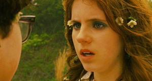
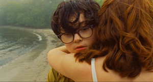
It seems clear that no auteur can be absolutely unique; each one works with norms and conventions given by tradition. For instance, a great many US independent films subscribe to the Hollywood convention of the goal-driven protagonist. Moonrise Kingdom accepts it too: Sam and Suzy want to be together, and their aims propel the action. Anderson and co-screenwriter Roman Coppola even give us the classic formula of lovers, kept apart by society, who escape to freedom in the wilderness. Likewise, the film maintains the convention of multiple lines of action: it creates parallels between the idealistic Suzy-Sam romance and the pallid routine of her parents’ marriage, as well as the hint of emerging affection between the phone operator Becky and Scoutmaster Ward.
Like a mainstream film, Moonrise Kingdom is at pains to build the plot toward a crisis—the second elopement of the couple and the massive storm that hits the region. The film turns the storm into a deadline: It will hit, says Bob Balaban’s narrator, “in three days’ time.” And as in a classical Hollywood film, the couple’s problems are solved and we get an epilogue showing their happy, if somewhat covert union.
Anderson has absorbed some lessons from mainstream cinema in more specific ways, I think. Since the Star Wars series (1977-on), we’ve seen Hollywood ever more eager to try “world-making”—adapting the traditions of fantasy, science-fiction, and comic books to creating fairly separate realms governed by their own rules. Batman and Superman adaptations of the 1980s and after followed this line, with Lord of the Rings proving that world-making could sustain long-running franchises (Harry Potter, the Marvel universe).
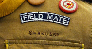
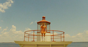
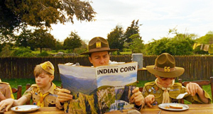
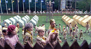
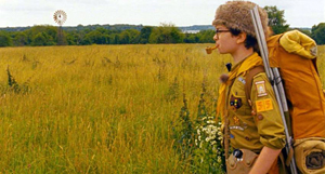
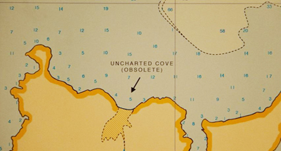
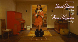
Anderson follows Lucas in creating his own worlds, but outside the conventions of space opera. We can find more or less parallel worlds in The Royal Tennenbaums and The Life Aquatic with Steve Zissou, but Moonrise Kingdom may be the most elaborate example. It takes place in terra incognita, a cluster of imaginary islands presumably on the upper Atlantic coast. The name of the primary island, “New Penzance,” reminds us of the fantasy-worlds of Gilbert and Sullivan. There are make-believe Amerindians (Chickchaws) and the Khaki Scouts are parallel to the Boy Scouts, with Accomplishment Buttons instead of Merit Badges. The Scout regalia are given us in the sort of fussy detail that Anderson has long enjoyed.
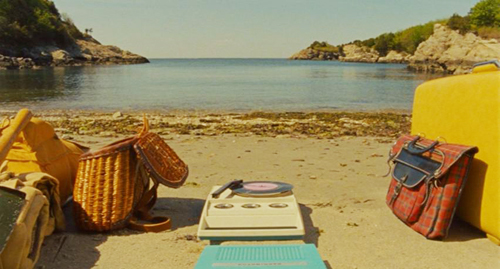
Parts of the story are relayed by a gnome-like Narrator whose range of knowledge includes past, present, and future. He suggests a fairy-tale wizard or bard. An ancillary film tells us that he’s the librarian of New Penzance—the tribal chronicler as small-town administrator. (The existence of this short film serves to reinforce the pretense that New Penzance exists.) Then there are the young-adult books that Suzy carries with her. They’re fictitious but they get strongly tagged to aspects of the action. The books and the scouting gear take on the same solidity as retro details like Suzy’s battery-powered phonograph and Sam’s jar of Tang: 1965 stuff is recruited to flesh out Anderson’s miniature world.
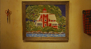
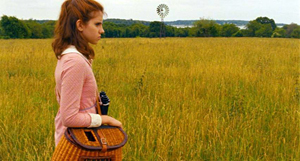
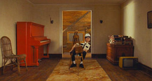
Suzy’s books remind us that New Penzance, like other Anderson story worlds, is redolent of childhood. The film’s opening presents a family’s home as a dollhouse filled with toys and games. Once we’ve seen the fabric pictures rushing past on the walls, the landscapes they preview retain a miniaturized quality.
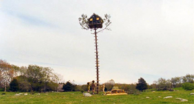
Those landscapes themselves have a childish defiance of gravity, as when we’re introduced to the poles at the tidal canals and when the Scouts build their tree house improbably high. This motif of top-heaviness eventually yields a sight gag when we learn the implausible fate of Redford’s motorcycle.
Childhood is everywhere. The music we hear in the opening is Britten’s Young Person’s Guide to the Orchestra, played by three little brothers on a phonograph and narrated by a child for one of Leonard Bernstein’s Young People’s Concerts. Throughout the film we hear grownup music designed for kids, such as bits of Bernstein’s rendition of Saint-Saens’ Carnival of the Animals.
Benjamin Britten’s music is central to the film’s soundtrack, from his juvenilia (Simple Symphony, songs from Friday Afternoons) to his later opera A Midsummer Night’s Dream and its chorus of child fairies. A performance of Britten’s church parable Noye’s Fludde is the occasion of Sam’s first encounter with Suzy, and it prophesies the devastating storm of a year later. Carrying this kid-friendly ethos further, Anderson designs his closing credits so that Sam’s voice-over can anatomize Alexandre Desplat’s score, instrument by instrument.
If Britten suggests childhood vitality, the mournful Hank Williams tunes evoke adult disappointment. They’re associated from the start with the lonely, not-overbright Captain Sharp. When Sam’s canoe odyssey is accompanied by the fantasy Williams song “Kaw-Liga,” about a wooden Indian yearning for the carved woman across the street, Anderson suggests a parallel between two lonely, yearning males, and tagging it to Sam prefigures his eventual alliance with his surrogate father.
A tradition of twee
The density of this childish New Penzance, like that of other DIY cinematic worlds, supports a tendency I talked about in The Way Hollywood Tells It. For some time now, filmmakers have been filling their films with details that can be discovered on re-viewing, particularly on the DVD format, which allows us to stop and study a frame. The musical citations I just mentioned can be researched after an initial viewing, and perhaps cinephiles will notice that the therapy book’s cover is a riff on Saul Bass’s credit sequence for Bonjour Tristesse (like Françoise Hardy, a link to Left Bank pop culture).
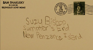
Still, on the first pass we’re unlikely to notice that the stamp on Sam’s postcard to Suzy bears the likeness of Commander Pierce.
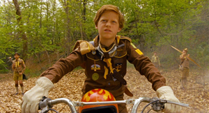
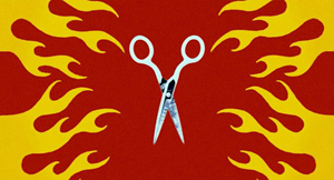
Likewise, only after many viewings did I notice that the peculiar flaming-scissors abstraction during the skirmish in the woods is given the same design as that on the motorcycle and helmet of the despicable, and rightfully lacerated, Redford.
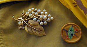
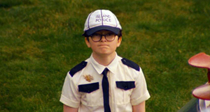
And in the epilogue, we might spot that Sam, having cast off his Accomplishment Buttons, has kept his mother’s pin on his new Island Police uniform.
Art and commerce again: What exec could object to loading every rift with ore when it supports ancillary sales to the fan faithful?
Some people find an inward-turned world like this to be fey, coy, twee, infantile, precious, or self-indulgent. It seems to me, though, that Anderson’s work from The Life Aquatic onward links up with a literary tradition we associate with J. M. Barrie and G. K. Chesterton. These writers employed childhood fantasy in an effort to imagine a richer, livelier realm behind prosaic reality. Another kindred spirit would be Winsor McCay, like Anderson an obsessively meticulous stylist who gives heft and lilt to dream worlds. In cinema we might recall Greenaway’s The Falls (1980), as obsessive and precious a project as can be imagined.
Indeed, why not mention the most famous figure of all? There is a trace of Lewis Carroll in Moonrise Kingdom’s looking-glass world—its strangely safe tree house, its deadpan absurdity, the habit of lawyers talking as if always in court. Like Carroll, Anderson doesn’t shrink from cruelty; the death of Snoopy is as perfunctory as that of the oysters on which the Walrus and the Carpenter tearfully dine.
Significantly, modern efforts to reenchant the world are often framed by loss. Wendy comes back from Neverland, Little Nemo awakes with a thump, Alice must return to lazy and boring afternoons. Anderson too evokes the fading of enchantment. Moonrise Kingdom takes place at the onset of autumn, and Suzy’s family lives at Summer’s End. Unlike other modern explorations of faerie, however, this one lets its characters wake up in something approximating their dream life.
Day by day, with interruptions
In accord with the child-based story world, the plot of Moonrise Kingdom provides something of a modern fairy tale. A runaway orphan who retains a token of his parentage heads out for the wilderness. A princess imprisoned in a tower scans the horizon for her rescuer. Lovers exchange messages before they escape into a realm of danger and death. They are rescued by a beneficent authority who will allow them to stay together.
Of course it’s a meta-exercise, since its authors and audiences are self-consciously deploying fairy-tale conventions. But as Barrie and Chesterton and Carroll show, enjoyment of artifice is central to art. Anderson accordingly stylizes both his plot structure and his narration.
He has long been drawn to block construction, building his plots out of big chunks that are often signaled explicitly. In Moonrise Kingdom, the chunks divide up in unusual ways—part, again, of this auteur’s cinematic signature.
At first we might think we can just track the adventure day by day. On 2 September 1965 Sam goes AWOL from scout camp and Suzy sets out with her belongings. On 3 September the couple fend off their pursuers—the battle of arrow, BB gun, and scissors—and make camp on Mile 3.25 Tidal Inlet. There they swim, dance, and spend the night. On 4 September they’re captured and separated.
But that night the scouts help them escape again, and all head for New Lebanon. The “marriage” of Sam and Suzy on the 5th leads to their flight to Saint Jack Wood Island just as the storm hits. Before they can make a lovers’ leap from the church steeple, Captain Sharp rescues them and arranges to be Sam’s foster parent. These four days are sporadically marked by changes from day to night and some remarks, as when Scoutmaster Ward dictates into his tape recorder. An epilogue is reserved for 10 October.
Running athwart the day-by-day divisions are other blocks. Actually, the first day is shown us three times, via shifts in narrational attachment. First we’re with Scoutmaster Ward, his charges, and Captain Sharp, all of whom are searching for Sam. After Ward dolefully ends his audio diary entry (“Let’s hope tomorrow is better”), Anderson cuts to Sam in the stolen canoe.
You might think this scene of Sam paddling is taking place the next day, but actually it skips back to the morning of the 2nd, when he sneaked off. Thereafter we’re attached to him when he meets Suzy in the meadow and they share their first day on the run. Then the plot skips back again to earlier that night, when Mrs. Bishop calls Suzy to dinner and discovers that she’s gone.
The 2 September section is even more complicated than I’ve suggested. When Suzy and Sam rendezvous in the meadow, their encounter is interrupted by a flashback to their first meeting a year earlier (signaled by a title). Later, the Bishop-centered evening section is interrupted by another block, a flashback montage triggered by Mrs. Bishop’s discovery of the couple’s love letters.
Here Anderson provides important backstory paralleling the two kids’ reasons for running away. Sam is bullied by the older boys in the foster-family-compound run by the Billingsleys, and Suzy blows up at her parents and schoolmates. By the end of the third iteration of 2 September, all the major forces in the drama have been delineated.
The two expository flashbacks give us more reason to care about Sam and Suzy in the following scenes, particularly during their skirmish with the Khaki Scouts squadron. Redford’s bullying ways, ignoring Ward’s orders to avoid violence, earn him a lumbar thrust from Suzy’s scissors, and it’s a mis-aimed arrow that wipes out poor Snoopy.
The couple’s idyll, presented as more or less another block, becomes the center of the film. It ends, at the midpoint of the running time, with Suzy reading: “Part Two.”
After they’re captured, Mr. Bishop vows to keep Suzy from Sam. Worse, Captain Sharp learns that Sam is headed for an orphanage and maybe shock therapy. This will encourage Sharp to defend and rescue the two kids at the climax.
With this crisis looming, the plot gives us a sort of nocturne on the evening of September fourth and the dawn of the fifth. In the night, all the players mull over what has happened: Suzy and her mother, Sam and Captain Sharp, Mr. and Mrs. Bishop, and Scoutmaster Ward. But this isn’t merely downtime. The Scouts in their treehouse decide they’ve treated Sam unjustly and set out to help the couple. This decision propels the climax.
By the morning of the final day, Sam and Suzy are reunited and ready for their mock marriage. All that remains is for the storm to disrupt things (even giving Sam some shock therapy by lightning), but also to set things right. The epilogue shows the new stable state of the story world, tying together the plot action neatly. Scoutmaster Ward, reinstated from disgrace, has replaced Captain Pierce’s picture with Becky’s. Sam has a foster father, and he can covertly see Suzy every day.
The magic power of binoculars
Narration involves the moment-by-moment flow of story information, organized around the key question: Who knows what, when?
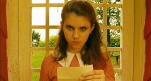
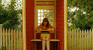
A simple example: Early in the film Suzy finds a letter in the family mailbox. She takes it to the bus shelter and reads it. When she’s done, she looks up resolutely at us and slips the letter into a shoe box.
What was in the letter? The narration has suppressed that information, stirring up curiosity and preparing us for what, many scenes later, Mrs. Bishop will reveal when she finds it: Sam’s final message about their rendezvous. Moreover, the narration flaunts its suppressiveness: She looks at us as if insisting that the message is private.
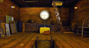
Unlike the letter scene, which suppresses information, the opening tours of the house give us a fair amount, but we’re not yet in a position to understand it. This applies to our glimpses of the scissors and the New Penzance locations, but there’s also the vertically rising shot showing Suzy’s suitcase in the attic along with her cat peeping out of the fishing creel.
This becomes significant only later, when we realize that Suzy is preparing to bolt.
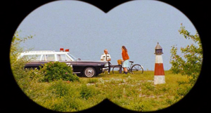
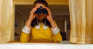
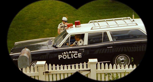
The narrational process mobilizes film style, both visual and auditory, to engage us in a constant process of expectations—stated, prolonged, fulfilled, or cheated. Consider Suzy’s binoculars. Early in the film we see her looking through them, but we don’t see what she sees. What is she looking at? Or looking for? Soon enough we’ll see that she manages to learn of her mother’s affair with Captain Sharp.
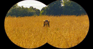
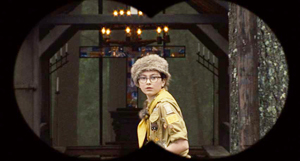
Once we’re set up for the binoculars device, Anderson can use it elliptically. In the meadow we see Sam through binoculars, so we’ll assume that Suzy is looking at him, even if Anderson doesn’t show the customary head-on reverse shot of her.
In effect, this image of Sam is the answering POV shot that has been missing in the early sequences.
But at the climax, when Sam rushes back to camp to fetch Suzy’s binoculars, he’s again caught in their field of view. This immediately leads us to ask: Who’s watching him? Anderson has stuck to Sam in the scene, so we get a gratifying surprise when we learn that the odious Redford has grabbed the glasses and is watching Sam’s search.
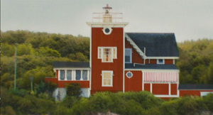
Or consider the film’s opening as a narrational gesture. The toy world that the tracking shots present is packed with story information. The very first image shows a fabric version of the Bishops’ house, flanked by Suzy’s left-handed scissors; the picture will soon be echoed by an establishing shot.
Shot by shot, the film channels information in order to set up expectations, to prolong them, to confirm them, or to deflate them. This is how cinematic narration can engage us.
The gnome-like narrator is another source of information. Anderson has compared him to the Stage Manager in Our Town, who can address the audience but also interact with other characters. His opening explanation supplies factoids about this imaginary landscape, while foreshadowing things explicitly (the storm) and implicitly, as with this image that looks forward to Sam and Suzy’s interlude at Mile 3.25 Tidal Inlet.
Narration doesn’t just pass along information; sometimes it suppresses it. It can point out when it’s hiding something, as when the film refuses to show us Suzy’s letter. Sometimes information is noticeably incomplete, as when only bits of Suzy’s and Sam’s correspondence are relayed to us. Another instance is the elliptical handling of the Khaki bullies’ attack on the couple, with a glimpse of an arrow and Paul-Sharits-ish flashes of scissors. Only quite a bit after the assault do we see the damage.
At other moments a film’s narration can create an informational gap that it doesn’t fill, only to do so later. During the central idyll Moonrise Kingdom omits a crucial piece of information and puts it in place only at the very end.
Down the aisle and face to face
Cinematic narration involves stylistic choices as well, and here again Anderson has sought an identifiable look and feel. In an earlier entry on The Grand Budapest Hotel, I talked about his adherence to planimetric images, the tendency to fix the camera at right angles to a background plane and then arrange figures either horizontally, like clothes on a line, or in profile.
Likewise, Anderseon employs what I’ve called compass-point editing. He usually puts the camera between the characters so that they face us in shot/ reverse-shot.
Or he films the action from straight-on, straight-back, or at a right angle. This geometry can be extended to camera movements: moving lateral and parallel to the planes of the shot, or panning at right angles, or zooming along the lens axis. Another extension is the straight-down angle, which is another variant of shooting at a different right angle to the action.
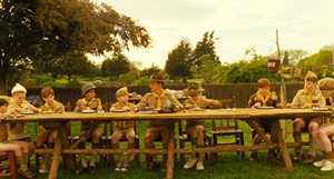
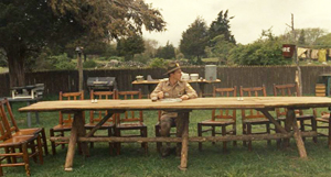
Planimetric shots and compass-point editing aren’t absolutely new with Anderson, but he uses them more thoroughly than most other filmmakers do. They govern his staging to the extent of pushing him away from realism. How plausible is it that all the Khaki scouts would line up on one side of the picnic table? Or that Ward wouldn’t notice, in a later scene, that all of them are gone?
Anderson’s use of such imagery evokes silent-film comedy, especially the compositions of Keaton, but these shots also suit a fairy-tale world. The stylized naivete of these compositions recalls children’s drawings, which tend to spread figures out against a flat background. (This was prefigured in the squashed perspective of the Bishop house as portrayed in the fabric picture.)
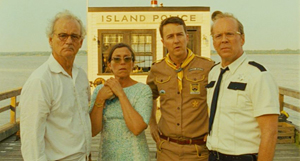
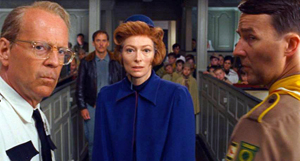
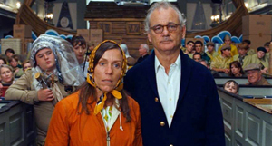
When a director commits to a particular style, he or she may have limited choices on other fronts. A good example is the climactic confrontation of all the adults in the St. Jack Wood church. Anderson might have staged this in many ways, but his stylistic preferences make the central aisle the most feasible arena. So we get the groups facing one another, in reverse-angle depth, moving from one planimetric composition to another, the cutting being either 180-degree reverses or simple axial cuts (zero-degree changes of angle). Sometimes the actors pivot to provide foreground profiles and frontal faces in the distance.
Once you the filmmaker embrace such a marked style so thoroughly, how can you signal special moments? In Moonrise Kingdom, Anderson does this by reverting to more commonplace technical choices.
When Suzy and Sam meet in the dressing room in 1964, we get straightforward 180-degree reversals.
And when they re-meet in the meadow, we get a mixture of profile and head-on shots.
But then Anderson starts to exempt them from the usual spatial strictures. The correspondence montage, for instance, retains the perpendicular framing but decenters his protagonists in mirror-image fashion.
As they get to know one another on their camping trip, the facing-front staging becomes less severe, more modulated.
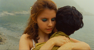
And finally, when they admit their love to each other, Anderson gives us conventional ¾ views of faces and over-the-shoulder angles. These setups are reiterated when they embrace and dance.
At an emotional peak, Anderson sharply violates the film’s intrinsic norm by bringing in a common technique—which now gains a force it doesn’t customarily have.
Summer’s end
The epilogue recapitulates both narrative and stylistic features. There’s another lateral tracking shot of the Bishop house, but now Sam is painting in a space that was empty at the start.
Again Suzy is using her binoculars, but now, dressed in cheery yellow, she has something worth seeing.
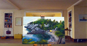
On the soundtrack we hear Britten’s “Cuckoo” song, a reiteration of the summer’s-end motif. The cuckoo, born in spring, enjoys the summer but must eventually fly. As we hear this over Sam’s departure through the window, Anderson’s camera slides down to reveal that Sam’s picture presents a landscape that has now vanished.
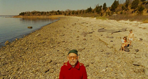
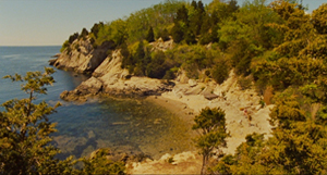
Here is the big ellipsis that Anderson didn’t flag in the central idyll. When Sam was painting a stretched-out Suzy at Mile 3.25 Tidal Inlet, they had agreed that the name of the place was insipid. She says she’ll think of a new name. But we’re told no more about the matter. In the epilogue, when we see Sam’s picture, we realize that they have given the place a better name: Moonrise Kingdom, inscribed in white on the shore.
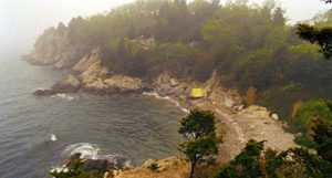
“This is our land!” Sam had shouted when they looked out at the inlet. Like Anderson’s imagining of a parallel world of childhood, Sam has recreated, in the manner of modern fairy tales, something that is gone. As if in sympathy with the gesture, the film’s closing shot updates one that was given us during the scenes on the shore, with the yellow pup tent now pitched as the mist rolls in.
Did the couple really write MOONRISE KINGDOM on the shore during their stay? Hard to say. What matters is that, provoked by Sam’s picture, the film’s narration concludes by asserting the power of imaginative artifice.
Selling directors
Floating Real Scarab Beetle Earrings.
Thinking about auteurs has always obliged us to focus on the interchange between industrial demands and artistic aims.
In general, I don’t see an inevitable conflict between market demands and artistic expression. (I argue for this here and elsewhere.) True, often producers and executives and censors mangle creators’ efforts. But some directors know how to do what they want with what they have. For example, Hitchcock’s artistry benefited from his status as a celebrity director. He won substantial budgets and greater control of his work. And sometimes the suits’ demands improve a film (as I suggest here).
Historically, it isn’t easy to separate auteurs from their brands. Let’s assume that a branded auteur is one who is known to a broad public for certain qualities of his or her films. A simple measure would be an ordinary viewer saying “I like X movies,” where X is the name of the director.
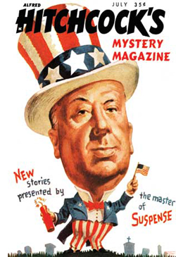 Hitchcock is nearly everybody’s clear-cut example of an auteur, but by the time the Cahiers du cinéma critics were forging their conception of cinematic artistry, Hitch was a brand too. How else to explain the 1940s-1950s book collections bearing his name, or The Alfred Hitchcock Mystery Magazine, or the tag, “The master of suspense”? Hitchcock participated in this image-building with his jokey interviews, his walk-on appearances in his movies, and his reputation as a bland-faced prankster. Few directors today foster such shameless self-promotion. Also branded were Chaplin, Disney, Welles, and Cecil B. DeMille. Among the cinephilic public there was recognition of Huston, Sturges, and a few other hands.
Of course many of the auteurs discovered by the Cahiers critics were unknown to the public at large, and they didn’t make profitable pictures. In 1940s Hollywood, the successful Lang was Walter, not Fritz. But as the film industry developed, and as auteur criticism became prominent, directorial distinctiveness became a marketing angle. By the 1970s, the movie brats, along with older hands like Altman, were presenting themselves as having “personal visions” carried by their films.
More recently, US independent cinema has come to depend on several appeals (sex, social comment, and the like), but surely authorship is a central one. The indie scene exploits the signatures of directors as different as Lynch, Jarmusch, and Paul Thomas Anderson. The emergence of younger talent like Nicholas Winding Refn and Kelly Reichardt conforms to a similar pattern; people follow and support emerging directors, and distributors publicize the films that way. No wonder James Schamus, founder of Good Machine and late of Focus Features, once remarked: “I’m in the business of selling directors.”
This is just a fact of life for ambitious independent filmmakers. Wes Anderson’s cultivation of a distinct style is probably partly a genuine reflection of his personality and partly a matter of willed self-presentation. But of course we’re all indulging in self-presentation, using Goffman’s “impression management,” every time we interact with others.
 Like an indie band, Anderson has created a marque unusual enough to let the fans feel they’re in on something keyed to their nonconformist tastes. He has provided the usual panoply of ancillary items, like soundtracks and bonus DVD tracks, but he has allowed others to participate in his world. Amateur videos comment on his style; graphic artists render their own versions of his posters. There are dozens of unlicensed Moonrise Kingdom tchotchkes. Anderson’s willingness to permit all manner of “tribute” memorabilia fits the handmade quality evoked by his films.
Call it Geek Chic if you want, but it exemplifies an important and potentially valuable part of modern popular culture. For such reasons, I don’t see anything inherently bad about being an auteur with marketing possibilities. People don’t seem to object to David Lynch’s coffee and his nightclub. With eccentricity, spontaneous or willed, all is permitted.
My argument assumes that the term “auteur” picks out something neutral. For some people, though, it’s not a description but a compliment; there can be no bad auteurs. But I think we can have both weak auteurs—filmmakers distinguished only by technique or tone or narrative strategy—and downright bad ones as well. I have my own list.
This piece is based on a talk I gave earlier in July at the Hochschule für Fernsehen und Film in Munich. Thanks to Andreas Rost and Michaela Krützen for arranging my visit.
In the New Yorker column I mention, Richard Brody develops an argument along a different line than mine. As I understand it, he’s replying to critics who claim that the auteur approach overrates individual creativity at the expense of collaborators. He’s also objecting to the expanding search for ever more auteurs, who turn out to be minor artisans at best. My remarks are focused on different issues.
For much more on Moonrise Kingdom consult Matthew Zoller Seitz’s indispensable The Wes Anderson Collection. Michael Newman’s Indie: An American Film Culture examines Anderson’s cinema as a development of the “Quirky Indie.” The fan-generated merchandise exemplifies what Henry Jenkins, in his book Textual Poachers, called “participatory culture.”
The three-part anatomy of film narrative I use here is explained in greater detail in this chapter from Poetics of Cinema and this blog entry.
My stills showing Sam’s painting and the extreme long shots of the shore can’t do justice to the originals; I tried bigger proportions, but the MOONRISE KINGDOM inscription remains hard to see. I have to assume that most readers have seen the movie, or will. The image below will have to do.
P.S. 21 July 2014: One sign of a distinctive authorial approach is that it can be parodied. James Fiumara writes to recommend the Saturday Night Live parody of Anderson, applying his style to domestic horror. “I frequently show this to students in discussions of both auteurism and genre conventions. The students all laugh at the parody and then I get them to try to recognize what the parody depends on (namely, their recognizing recurring styles and patterns distinct to Anderson films, recognizing the conventions of the horror home-invasion subgenre, and of course seeing the incongruity between Anderson’s films and the horror genre).” Thanks to James for the link.
P.P.S. 12 September 2014: Guillaume Campeau-Dupras writes to point me toward his 2012 blog on the film, which looks at the film from a perspective related to what Kristin and I have written about (but with many original ideas of his own). I think readers interested in Anderson would benefit from his entry.
P.P.P.S. 2 October 2020: The branding continues! See this story about Anderson-style buildings around the world. Here is a filmmaker who has truly changed how people see their environment.
THE GRAND BUDAPEST HOTEL: Wes Anderson takes the 4:3 challenge
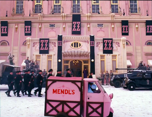
The Grand Budapest Hotel (2014).
DB here:
Be shot-conscious! I urged in a blog entry some years ago. I illustrated the point with a tradition of staging and shooting that seemed simple and modest but was actually quite flashy, and even fashionable. Although many filmmakers resorted to it, either often or occasionally, critics hadn’t attended to it. Wes Anderson’s work yielded one of many examples of what I called (swiping from art historian Heinrich Wölfflin) a “planimetric” style.
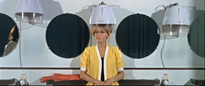
Ideally, you should look at that entry before reading this one. (To encourage you, I link it again. Not for the last time.) Very briefly, this style involves a frontal presentation of the action. You frame people against a perpendicular background, as if they were in a police line-up. Usually you face them to camera, as in this shot from Godard’s Made in USA.
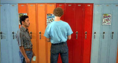
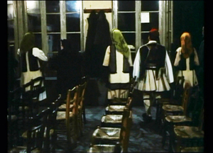
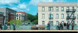
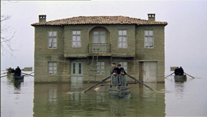
As we’ll see, sometimes you can frame the characters at right angles to the camera, or turned directly away from the camera. Here are examples from Napoleon Dynamite and from Angelopoulos’ The Traveling Players. (Is this the first time these two movies have been mentioned together?)
The key idea is that the people and the setting aren’t observed from an oblique angle; if the background is perpendicular, the people will stand or sit at 90 or 180 degrees to that.
You can arrange them in some depth too, but again, they are stacked in perpendicular fashion, making each area a pretty strict plane. Here’s an example from Pulp Fiction.
One point of my earlier entry is that this is a surprisingly old strategy; Keaton used it occasionally, and Godard was using it heavily fifty years ago. Here are two shots from Contempt (Le Mépris, 1963).
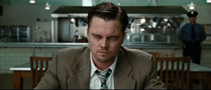
It has endured in some surprising places. It’s now a go-to option for one-off effects in mainstream cinema. Here are examples from Shutter Island and The Secret Life of Walter Mitty (2013 version).
A few filmmakers make it the basis of an entire film, as I indicate in this entry on Oliveira’s Gebo and the Shadow. And since I wrote the original entry, I’ve drawn on other examples from time to time, particularly from directors who are pastiching Ozu to some degree or another.
Still, Anderson is today the most widely visible example of the style, partly because while others use it sporadically, he is single-minded about it. He has made people shot-conscious (at least when they watch his movies). So after seeing his newest film, I thought it would be fun to think about what distinguishes his approach.
Playing with planes
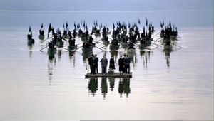
With the release of The Grand Budapest Hotel, several bloggers have pointed to recurring compositional features, most obviously bilateral symmetry. I’d just add that such symmetry is often used by practitioners of the planimetric approach, with results that sometimes exceed Anderson’s. Here are two shots from Angelopoulos’ Weeping Meadow.
When you think about it, it takes a brave filmmaker (e.g., Godard) to use this approach and not deploy symmetry.
Anderson has used the planimetric approach more extensively in recent years, and he modifies it some distinctive ways. I think particularly of his habit of crowding people together in layers rather than stretching them along a single line. He makes some images look like group portraits or over-posed highschool yearbook shots (The Royal Tenenbaums; Fantastic Mr. Fox).
By employing the planimetric strategy, Anderson gains a somewhat awkward formality, a sense that we are looking from a distance into an enclosed world that sometimes looks back at us. There are as well the sort of comic possibilities that Keaton recognized in Neighbors and The General. A rigid perpendicular angle can endow action with an absurd geometry.
These apparently simple framings often evoke a world of childhood. Just as Kitano Takeshi shows us gangsters behaving like little boys, Anderson’s dollhouse-room frames make adults seem to be toy people arranged just so–like items laid out in a Joseph Cornell box. It’s a style suitable for magical-realist premises like The Life Aquatic with Steve Zissou, and in Moonrise Kingdom it finds its echo in children’s illustrated books.
All in all, then, I have to salute an American filmmaker who thinks about his images carefully and has incited sensitive viewers to notice them. I think we should go further, though. We can ask: How does Anderson, staying loyal to this tradition, vary the look of the shots? And how does he cut them together?
Cutting around
Consider the editing option first. Unless every scene is to consist of only one shot, the question comes up: How do you maintain the style while cutting? Either you make all your cuts axial, straight in or straight back.; or you create a sort of compass-point editing. This can involve cutting 180 degrees, to what’s “behind” the camera in the initial shot. So if characters are confronting one another, the camera is in effect sitting between them as each looks over or through the lens at the other (Ozu’s Late Autumn).
In effect, this option respects the classic 180-degree line, or axis of action, between the characters. It’s just that the camera sits right on that line. Parking the camera on the axis is a common tactic for subjective cutting, showing us first a person looking, more or less at the camera, then what she or he sees from their vantage point. Our example in Film Art: An Introduction comes from Rear Window.
Ozu used this 180-degree reversal often, but not absolutely; he had a more complicated way of conceiving space, and the 180-degree frontal cuts were only part of it. Kitano made a simpler variant central to his early films.
When I asked Kitano why he did it, he explained that it was exactly the way people saw each other in ordinary life. We face each other. He then added that he was such a naive director when he started that it was the only way he knew to set up scenes. We get kindred images in Terence Davies’ work; his frontality may owe something to the Hollywood musical.
Compass-point editing offers another possibility, that of cutting at 90-degree angles to the background plane or the figures’ position. Chantal Akerman does it throughout Jeanne Dielman 23 Quai du Commerce 1080 Bruxelles (1975).
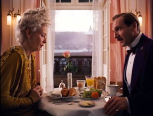
Anderson exercises all these cutting options inThe Grand Budapest Hotel. Here a planimetric profile 2-shot yields two frontal shots; we shift 90 degrees and then 180 degrees.
Now here’s a 90-degree shift for the reverse shot.
In the passage below, the first cut rotates 90 degrees, and the second cuts in right on the lens axis. In this tradition, an axial cut respects the perpendicular layout of the space.
In such cutting patterns, the compositions keep the action in the same upper zone of the frame from shot to shot. As a result, our eye doesn’t wander much. In long shots, Anderson sometimes follows the classic Hollywood practice of allowing some decentering, as long as the cuts balance one off-center composition against another. Here the changing angles obey the compass-point principle across three shots, and they crisply shift the emphasis from the right side of the frame to the center to the left.
Someone who wanted to deflate Anderson’s visual ambitions could say that his shots are monotonous. Having imposed a big constraint on himself, he’s now obliged to show us that this approach can be varied–in obvious or subtle ways.
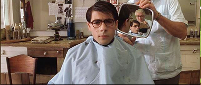
One way is through lens length. Most planimetric filmmakers use long lenses, which flatten the space even more. The figures can look like clothes hanging on a line. But Anderson favors quite wide-angle lenses (often 40mm). These make horizontal lines bulge, as in early CinemaScope films (Rushmore, The Life Aquatic).
You can see similar distortions in the straight-on shots of the hotel desk in Grand Budapest, above.
Another way Anderson varies his images is by departing from straight-on angles. As long as the framing maintains a planimetric geometry, we can look down or up at the action. In this passage, again the camera makes 180-degree reverses. This contrasts with the more orthodox shot/reverse shot framings in a comparable scene in The Little Foxes.
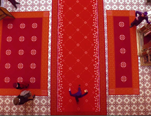
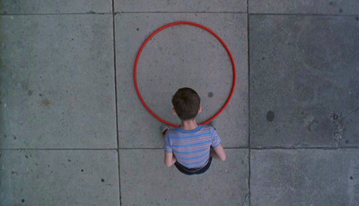
In this spirit, Anderson can give us bird’s-eye views, as Matt Zoller Seitz points out in his sumptuous book-length interview with the director. It’s rare, but there are precedents, as in the work of the Coens. In one shot of The Hudsucker Proxy, a movie with an inordinate number of straight-down angles, the inflexible framing creates a joke.
Grand Budapest Hotel has room for some classically funny framings. If you want somebody to look lonely, common practice says, frame the figure off center in a long shot. Here Anderson seems to be having a joke on the convention. He presents it as a POV, although presumably if the Writer were looking at the mysterious man he would put the object of attention in the center of his field of vision.
I think that Anderson’s earliest films weren’t quite so strict in obeying the planimetric and compass-point strategies. Those options were often slipped in as alternatives to more orthodox framing and cutting. But as he’s become more rigorous about using them, he has found ways to put his stamp on some common techniques. Like Ozu incorporating devices of classical continuity into his unique stylistic system, Anderson can recruit certain conventions while staying faithful to his basic approach.
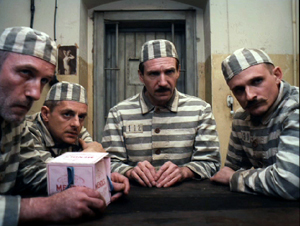
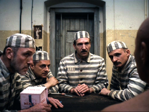
For instance, Anderson sneakily brings in the OTS–the over-the-shoulder framing standard in shot/ reverse-shot dialogue scenes. In one prison scene, Harvey Keitel’s Ludwig is granted an OTS that varies subtly from the more purely straight-on views.
Much the same thing happens with in the punching scene at the reading of the will, when frontal characters are assaulted by fists coming in as if in reverse angles.
Anderson has figured out another way to vary his compositions. I learned this before I saw the movie, thanks to some comments by the cinematographer Robert Yeoman (great name).
High or wide, and handsome
Rushmore (1998).
To get the criticky part of this entry out of the way: The Grand Budapest Hotel has all the charm, fussiness, and intricate whimsy typical of Anderson’s work. As often in his films, it cuts its preciosity with moments of offhand brutality (sliced-off fingers) and flashes of naughty sexuality (fellatio, the lesbian painting). With its ensemble cast, sometimes deployed in cameos, it suggests a PoMo remake of those sprawling, self-congratulatory spoofs of the 1960s like The Great Race, Those Magnificent Men in Their Flying Machines, and It’s a Mad, Mad, Mad, Mad World. (The film’s title evokes those all-star films set in hotels, like Grand Hotel and Hotel Berlin.) It’s much better than those, partly because it engages in an oblique way with history, creating a comic-pathetic alternative account of Nazi imperialism. It imagines the collapse of Europe in operetta terms, filtered through Anderson’s pawky humor and distinctive style. I admired the film but don’t feel able to analyze it much after only one viewing. Fortunately for me if not you, its stylistic aspects fit today’s sermonette.
The Grand Budapest Hotel is set in several time periods, and they’re presented via The Blog’s old friend, the device of flashbacks within flashbacks. One character recalls the past or tells a story, and inside that line of action another character recalls or recounts a story, and so on. In Grand Budapest Hotel we move from the present, more or less, to events in the 1980s, then the 1960s, and eventually the 1930s, which constitute the central episodes.
Anderson has shot the frame stories in different aspect ratios. It’s 1.85 for the near present and the 1980s, when the Author recounts meeting the hotel owner. That meeting, set in the 1960s, is shown in 2.40, the anamorphic aspect ratio. The central story, taking place in the 1930s, is presented in classic 1.37, or 4:3 imagery. With typical Anderson butterfly-collector wit, each era gets a ratio that could have been used in a movie at the time. It’s remarkable that Anderson could persuade Fox Searchlight to let him do this.
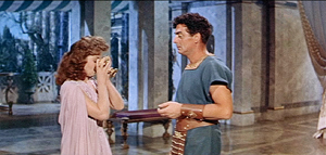
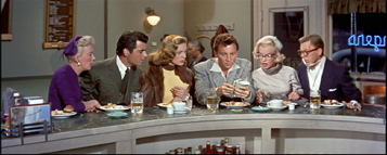
Most commercial releases in the 1950s and afterward were filmed in some widescreen ratio. In the early days, a popular option was a sort of clothesline staging, centering a single character or balancing others around the central axis: two side by side, three across, four as a pair of pairs, and so on. These shots are from Demetrius and the Gladiators and How to Marry a Millionaire.
Thanks to the widening of the frame, there is less air above the characters and less ground below them. The empty spaces are typically on the sides, particularly in the anamorphic 2.40 ratio. The problem of filling that up was solved, at least for some directors, by moving the camera very close to the actors. Spielberg remarked that he began shooting more close-ups when he filmed in anamorphic.
If you’re inclined to the planimetric approach, it fits the wider format nicely. Anderson wasn’t worried by the extra acreage; he just used the set or empty areas to balance one side against the other. Shots of only one character could be centered, as if posed, and shots of groups could be arranged more or less symmetrically, as in this passage from Moonrise Kingdom. Central perspective helps drive your eye to the main items.
In Grand Budapest, Anderson’s signature framings fit snugly into the scenes shot in 1.85 and 2.40. (The latter has been his favored ratio over the years.) But what about the 1.37 scenes? This brings me to Mr. Yeoman’s remark.
Explaining why he and Anderson watched a lot of films from the 1930s, especially by Lubitsch, Yeoman notes:
We looked at those more to familiarize ourselves with the 1.37:1 aspect ratio, which Wes wanted to use for the 1930s sequences. This aspect ratio opens up some interesting compositional possibilities; we often gave people a lot more headroom than is customary. A two-shot tends to be a little wider than the same shot in anamorphic. It was a format I’d never used before on a movie, and it was a fun departure. You can get accustomed to 1.85 or 2.40 to the point that the shots become more predictable.
Put it another way: Anderson’s penchant for centering and symmetry inclines him toward widescreen compositions that could be simply cropped right and left to fit the 1.37 ratio. His single characters and huddled groups could remain much as before. But in more distant framings you might get a lot of extra space at top and bottom–areas that simply aren’t there in the wide ratios. In other words, Anderson’s multi-format strategy gave him a new problem in maintaining his signature style.
How did he solve it? Many Budapest Hotel shots do leave considerable headroom, as you see in most of the 1.37 examples above. But other shots show Anderson filling his 4:3 frame in varied and engaging ways.
As Ozu showed, for instance, the planimetric option can fill the frame’s upper area when the camera height is below eye level. During the conversation in the car, above, Anderson gets the head of M. Ivan (Bill Murray) in the top of the frame thanks to a low angle. Here are two more examples of filling the upper reaches of the format by use of a lowish camera position.
In the elevator shot, the headroom becomes comic, with M. Gustave and Madame D. seated on the right, the morose bellboy filling the vertical area on the left, and Zero in the middle. The empty space above the couple creates a lively imbalance emphasizing them in a way different from the very balanced framing that centers Henckel among his men.
The set can cooperate. In the first shot below, Zero’s and Agatha’s centered embrace leaves lots of headroom, but the slightly disheveled stack of pastry boxes in the upper background contributes to the sense that they’re engulfed. In the second shot below, part of its humor comes from the rigid geometry of the grid and the way M. Gustave and his colleagues fill in the matrix with their intent faces and busy hands.
In all, Anderson seems to me to find intringuing ways to create visual interest in the 4:3 format. But as with any severe style, you wonder about what’s been lost.
Most obviously, Anderson loses some of the intimacy that comes with more angular and less strict approaches to the classic ratio. We like to see people from 3/4 views too. We also like depth shots that plunge us into a dynamic, diagonal playing space. Here’s a shot from John Huston’s In This Our Life, as precious in its own way as Anderson’s imagery.
As Hogarth pointed out, with the serpentine line in painting and drawing, such shots can lead our eye on “a wanton kind of chase.”
Because directors of the 1920s-1940s accepted a wider range of compositional options than Anderson embraces, headroom simply wasn’t an important problem, as in the Huston shot. Even in simpler shots, classical uses of the 4:3 ratio permitted a flexible organization of figures.
Centered symmetry against a flat ground is a fairly easy compositional strategy, after all. It wasn’t used much in the mainstream tradition because it looks artificial; perhaps only with the rise of art cinema was this sort of self-conscious composition welcomed. In any case, sticking with symmetry sacrifices the more delicate spotting of figures and faces around the frame.
A lot of visual art tries for more supple and subtle twists, torsions, and counterbalancing. Apart from organizing your space along the horizontal and vertical axes, you can try to set figures in delicate array along diagonals. This is why some old-time cinematographers argued that the 4:3 ratio was the best suited to the human body: it can flatter it from any angle.
To get a sense of these possibilities, I’ve compiled a little collection of images from a film that doesn’t boast any outrageously pretty shots: Otto Preminger’s Angel Face (1953). It’s typical of the unassertive approach we find in Preminger’s work of the 1940s and 1950s. He avoids the flashy depth of the post-Kane directors and offers something less aggressive but no less fascinating. Composition and staging integrate expressions, posture, glances, and gestures to create a smooth flow of action. My samples also indicate how rare straight-on views of faces and bodies are in American studio cinema. The 3/4 angle rules.
As with the American films of Lang, Preminger’s work displays a style that’s tough to analyze because the technique isn’t obvious. There’s a marvelous variety in the ways that the 4:3 ratio can render a single figure or two figures, or three, shifting them not around the perfect center of the picture format but around curves and diagonal axes–that yield interest in their own right.
This last comparison isn’t a slam on Anderson. I think well of many of his films, particularly the most recent ones, and I appreciate anyone who takes on a challenge of narrowing his range of creative choices. Once you narrow that range, it turns out there’s a host of new possibilities that pop out. Call it the Ozu strategy: refine your means and you discover nuances nobody else notices.
Still, in art as in life, every choice is a trade-off. It’s worth remembering what one loses by pursuing a particular path. By sticking to his signature look in working with 4:3, Anderson gave himself a problem that didn’t exist for directors of an earlier time, the problem of maintaining a frontal style in a squarish format. I’m glad he faced it and solved it. But I’m also glad that classical filmmakers, quite intuitively, showed how much you could do with an alternative option.
Without any conspiring between us, Matt Zoller Seitz, top expert on Wes Anderson, has just urged critics to write more about film form–to be, among other things, shot-conscious.
Iain Stasukevich’s American Cinematographer article on the making of The Grand Budapest Hotel is well worth your attention beyond the technical matter I latched onto.
The Huston image came to hand because of the previous entry. Go there for more instances of the sort of framing and staging that Anderson and his planimetric colleagues don’t aim at.
I survey the planimetric style in On the History of Film Style and in Figures Traced in Light. A search of this blog’s archive will bring other instances to light. I analyze Ozu’s style in Ozu and the Poetics of Cinema, available as a pdf here. For more on CinemaScope, you can visit my online lecture.
P.S. 27 March (Hong Kong time): Jonah Horwitz writes with a useful point:
One thing I would add to your summary is that as early as Rushmore, most notably in The Darjeeling Limited, Anderson purposely inserts into his limited stylistic palette selected, isolated “foreign” devices like loose framings, handheld camera, and relatively aimless zooms (as opposed to his more common precise shock-zooms). In some cases, as in the drama-club staging of “Serpico” in Rushmore, these devices serve as citations, in that case to “realist” New Hollywood cinematography. But they also feel very much like the exceptions that prove the rule: they stand out from his usual stylistic register so much that they effectively reinforce the latter. I’m looking forward to seeing Grand Budapest to see if this continues, or if he emphasizes instead a further refinement of his typical gestures.
I agree with Jonah that importing foreign devices often throws into relief a filmmaker’s signature style–a matter of a film’s intrinsic norm getting reinforced by some marked deviation from it. I think of Ozu’s pans or tracking shots, which occur in all his black and white films, and which often just remind us how narrow the style is in the rest of the movie. And sometimes, as in The Flavor of Green Tea over Rice, those camera movements are hybrids or compromises with with his static style. Thanks to Jonah for corresponding.
P.P.S. 27 March: This entry has been revised to eliminate an error. Originally I had said that the play with aspect ratios in the film wouldn’t have been possible before digital projection. Bryce Utting wrote to point out that it was indeed possible on film, since Peter Greenaway’s Pillow Book used both 1.85 and anamorphic widescreen. I had even seen the film and forgotten that! Thanks to Bryce for the correction.
P.P.P.S. 30 March (Hong Kong time): Jim Healy, impresario of our Wisconsin Cinematheque, writes to point out several other films that mix aspect ratios:
The first hour of Redford’s The Horse Whisperer, the urban-set part, is in 1.85. When the characters make it to the open horse country, the image widens to ‘scope. . . . The 2002 Disney animated feature Brother Bear (which isn’t so bad) is 1.85 for about the first 20 minutes and when the principal Inuit character (voiced by Joaquin Phoenix) is transformed into a bear, the picture goes to Scope.
The Grand Budapest Hotel (2014).
Understanding film narrative: The trailer
The Wolf of Wall Street.
DB here:
At many points in The Wolf of Wall Street, we hear the voice of Jordan Belfort chronicling his exploits in building up a rapacious investment company. A few times he even addresses the camera.
What’s he doing? Well, he’s telling us a story, obviously. Stories are what many (not all) films present to us. But how, exactly, can we understand the storytelling process in film? What do the filmmakers do, and what do we do?
For my book Poetics of Cinema, I wrote a chapter called “Three Dimensions of Film Narrative.” This 2007 essay tries to come to grips with several questions. Some are pretty general. What makes a film a narrative? How does a narrative film shape our response? What roles do visual and auditory techniques play? What are the roles of emotional responses and broad cultural factors? How does characterization work in a movie?
Other questions are narrower. How revelatory is Hollywood’s three-act model of plot? How do we pick out a story’s protagonist? Do literary concepts like “narrator” and “implied author” apply to films?
Since the chapter is part of a larger book, some of these matters are dealt with at greater length in other chapters. Some are developed in other books, notably Narration in the Fiction Film, and elsewhere on this site. This essay was my attempt to boil down my thinking about filmic storytelling into one convenient, if sometimes sketchy, form.
Today I’m posting a corrected, slightly revised version of that chapter as a downloadable pdf file. Thanks to our web tsarina Meg Hamel, it has links as well. Students, teachers, researchers, and casual or ardent cinephiles: Make use of this as you like.
The essay is here.
This blog entry is a guide to the essay, or maybe just a trailer. As with a trailer, my use of The Wolf of Wall Street is illustrative; I’m not offering anything like a full analysis or even a review. And like most trailers, mine has spoilers.
The three dimensions I explore in the essay are narration, plot structure, and story world.
Dimension 1: Pushy narration
A film’s narration I take to be unfolding and organization of story information as the viewer encounters it, moment by moment. . (This is distinct from the term “voice-over narration,” like Jordan’s in The Wolf of Wall Street, though voice-over commentary is part of the overall narration.) Narration is designed to shape our itinerary through the film. It’s a complex array of cues that guide us in building up the story.
In The Wolf of Wall Street, the first dose of information we get is a TV commercial for the Stratton Oakmont investment company. We see busy, efficient brokers bent over their desks in a vast office as a lion paces the aisles. But then we get another view of the office, as partying staff prepare to launch a little man in a Velcro suit toward a target. The man is hurled, and one of the men who tosses him identifies himself as Jordan Belfort. We’re then launched into a sequence laying out Jordan’s lifestyle.
One thing this portion of the narration does is to peel back the staid, solid image of the brokering house and show the orgiastic self-indulgence behind it. What if Scorsese and his screenwriter Terrence Winter hadn’t included the commercial? Our sense of the contrast between public image and internal debauchery wouldn’t be so strong.
The quick scenes of Jordan’s lifestyle, driven by drugs, sex, and high living constitute a block of concentrated exposition. The narration could have introduced Jordan’s debauchery gradually through hints, but instead we’re told of it bluntly and swiftly. Jordan boasts that at age 26 he made nearly fifty million dollars a year. We’re coaxed to ask: How did he get so far?
This is, we might say, a curiosity question—a question about what in the past led up to the present. A film’s narration is often prodding us to ask just this question. A piece of narration may also provoke effects of surprise, as when the Velcro-target episode undercuts the corporate image. Surprise is central to narrative because knowledge is distributed unequally among characters and spectators; any character may have a secret.
There’s also suspense, which we can consider broadly as a sharpened anticipation of what might happen next. In The Wolf, I’d argue that there’s some suspense when Jordan, zonked on Quaaludes, must save Donnie from choking on a piece of ham. Curiosity, surprise, and suspense aren’t of course the only effects of storytelling, but they function as “master-effects,” in Meir Sternberg’s phrase. They are central to our comprehension of the story.
Style as narration
At the same time, narration is shaping our experience through film style. The staid tracking shot along the desks in the commercial, with the firm’s trademark lion prowling the aisles, clashes with the abrupt editing and freeze-frame that introduces Jordan. The actors’ performances, centrally the swaggering performance of DiCaprio, are part of narration as well. The soundtrack’s stylistic texture contributes a lot too, with Jordan’s voice-over and the music and effects creating a rousing, exhilarating effect. The narration’s use of film technique, I think, aims to summon up a shocked but fascinated and amused awareness of the decadent world that Jordan rules.
Throughout Wolf, Scorese’s stylistic choices serve narrational purposes. There are rapid montage sequences, commenting musical tunes, and dialogue hooks (“I won’t call him”/shot of Denham, called, approaching Jordan’s yacht). Scorsese’s fondness for rendering psychological states—here, druggy ones—is presented through classic “impressionist” techniques. As the film goes on, he starts to take us into characters’ minds through inner monologues and misperceptions (the smashed Ferarri). Stylistic patterning also contributes to the film’s tone of grotesque comedy, not just through the dialogue, delivery, and music but through editing. The potentially dramatic moment of Jordan rescuing Donnie with CPR is intercut with a Popeye cartoon: Jordan’s miraculous spinach is coke.
By shaping our knowledge, the narration also throttles the film’s emotional appeal up or down. For example, in one scene Jordan punches his second wife Naomi. Scorsese presents the action in a distant shot, in which a doorway allows us merely to glimpse the violence.
This choice lessens the impact of Jordan’s aggression. It gives us important information about the story action, but not nearly as forcefully as the tight close-ups of sexual and drug-fueled escapades in other scenes do. You could argue that closer and more visceral views (of the sort we get during Raging Bull’s domestic violence, as above) would make it harder to treat Jordan’s bad-boy high-jinks as entertaining.
A more detailed analysis would trace the overall development of the film’s narration. We’d consider, for instance, how it restricts our information at key points. Although the narration breaks with its attachment to Jordan to show Denham’s investigation, it doesn’t reveal Naomi’s scheme to divorce him. We learn of that only when he does. As we indicate in Film Art: An Introduction, “Who knows what when?” is a central question for understanding film narration.
Narration as inference-making
More generally, the essay develops in some detail a notion that’s central to understanding narration. I offer a mentalistic account of narrative understanding.
I think that a storytelling movie, through its narration, impels us to draw inferences. To follow a movie story is to turn the images and sounds into characters, actions, events, causes, and the like. This happens partly through fast, automatic inferences of the kind we make constantly in perceiving the world, and partly and more evidently through the inferences we make in building up that construct we call the movie’s story.
Everything I’ve been describing so far asks us to fill in, extrapolate, and draw conclusions at the level of comprehension. We take the Stratton Oakmont commercial as indicating trustworthiness. We’re encouraged to see the little-person-tossing scene as outrageous and boisterous but cruel, the amusement of people charged with a reckless energy. Jordan’s bragging montage sequence invites us see him as powerful, arrogant, and materialistic.
By saying that narration pushes us to make inferences I’m not suggesting that the inferences are models of deep thinking. They are, we say, commonsensical. In the multiplex, we’re not logicians. Understanding and responding to a story are processes based largely on folk psychology. In that respect, the chapter argues a point I’ve made elsewhere on the site.
Of course not all our inferences will be correct. It would be possible to knock down our first impressions of Jordan with information suggesting that beneath the sharkskin is a likable idealist. (That happens in Jerry Maguire.) Here, other sorts of moments steer our inferences astray. We’re led to think that Jordan drives his Lamborghini home safely, but that impression gets recalibrated the next morning. Earlier, when Denham visits Jordan on his yacht, the rather long, tense scene leads us to consider the possibility that the FBI agent is susceptible to bribery. His questions and facial expressions suggest that he’s weighing Jordan’s offer to help him with some investments. This interchange is conveyed in fairly tight shot/ reverse shots.
Only when Denham asks Jordan to repeat his offer does Scorsese cut to an angle showing that Denham’s colleague has, offscreen, quietly stepped close enough to bear witness to the bribe Jordan might offer.
Scorsese has choked off some information about the scene in order to yield a surprise, one that corrects the impression we were building up. One of cinema’s great pleasures is catching up with a narration that has been designed to lead us astray. Hitchcock fans, take note.
Dimension 2: Plot as pattern
You can also think about the narrative as having a more abstract, geometrical structure: that’s given to us as the plot. Narration creates on-line, moment-by-moment pickup; as viewers we go with the flow. The plot is more architectural, a sort of static anatomy of the film as a whole. We can think of it in a couple of ways.
As a map of a particular film, the plot consists of the overall arrangement of incidents. It lays out the story actions in time. It can proceed chronologically, as plots do most of the time, or it can rearrange incidents out of linear order. The Wolf of Wall Street follows the Stratton Oakmont commercial with the Velcro-target scene, and then presents Jordan at the height of his powers. But after the quick exposition of his lifestyle, the plot flashes back to his first day on Wall Street in 1987.
Now the film presents a mostly chronological layout. Jordan gets his broker’s license, loses his job, picks up a low-end one, and then rises to the spot running his company. This trajectory is sometimes interrupted by quick flashbacks filling in background on a character or a situation; we even get flashbacks within flashbacks. The overall time scheme is hazy, since we’re never shown exactly what point in time is “now.” There’s the suggestion that the initial flashback is rounded off when Jordan’s cohorts meet to plan the Velcro-tossing stunt, but that opening scene isn’t replayed, so we can’t be sure exactly when the opening flashback ends. The flashback must be finished at some indeterminate time late in the film, when Jordan’s fortunes decline and Naomi is alienated from him. But the narration whisks us along without establishing the firm framing devices of traditional flashback plotting.
From this perspective, every film establishes its own plot structure, based on the overall “geometry” of its scenes and sequences. There’d be a lot to say about this in The Wolf, such as the introduction of Denham (and the brief alternating scenes of his investigation) and the various lines of action that fill out the plot: Jordan’s addictions, his plan for an IPO, his two marriages, the SEC inquiry, his Swiss money-laundering schemes, and the like. The craft of screenwriting consists in large part of developing and braiding lines of action in this way. Several entries on this site, as well as many chapters of Narration in the Fiction Film and Poetics of Cinema, analyze how such plot patterns work in tandem with the narration’s unfolding.
Caught in the act(s)
Another way to think about plot structure is to consider how the particular film obeys broader principles of construction. Tragedy, comedy, melodrama, mystery stories, and other genres have distinct, widely-known conventions of plot geometry. There are as well traditions of plotting that cross genres.
In modern commercial cinema, the most famous structural convention is the three-act pattern. Kristin has proposed that Hollywood feature filmmaking is better thought of as adhering to a multiple-part principle based on characters’ goals. The film might have two, three, four, or more parts, depending on its running time and the ways it shows character goals created, reformulated, blocked, delayed, and fulfilled (or not). We’ve tested Kristin’s proposal in books (Storytelling in the New Hollywood, The Way Hollywood Tells it) and on this site (here and here and here and here).
The essay considers the matter more theoretically, but just to illustrate, I’ll hazard a layout of The Wolf of Wall Street’s plot structure. It’s nothing but spoilers, so I’ve flagged it all in olive green if you want to skip it.
Since Wolf runs about 173 minutes without credits, I think it can be usefully laid out in five large-scale parts. These are framed by a brief prologue (the commercial and the Velcro-target scene) and an epilogue summing up Jordan’s court sentence, his stay in a country-club prison, and his new career as “the World’s Greatest Sales Trainer.”
The Setup shifts from Jordan’s life at the pinnacle to his beginnings in the business and his rise as an entrepreneur. In the course of this portion he meets Donnie and the two assemble their team of eccentric, grotesque staff. After establishing Stratton Oakmont, Jordan demonstrates his sales technique and the script his salespeople will follow. This section consumes the first thirty-five minutes of the film.
What Kristin calls the Complicating Action, which resets the protagonist’s goals, centers on Jordan’s plan for an IPO and his affair with Naomi. Around the hour mark, Jordan is divorced and free to pursue the IPO, but now Denham of the FBI is following the company and the SEC is getting curious.
The Development section, which typically expands and delays the fulfillment of the goals set earlier, shows Jordan marrying Naomi, the firm’s frenzied launch of the IPO, and Jordan’s botched effort to bribe Denham. By about 96 minutes into the film, the two antagonists, Jordan and Denham, have faced off in a preliminary conflict. What remains is to see how Jordan will evade capture.
I’m inclined to see the fourth part as a second Complicating Action, because Jordan recalibrates his goal. Stratton Oakmont is making so much money he needs to find an offshore place for it. He decides on Switzerland, and the bulk of this section of Wolf focuses on whether he’ll be successful. But the SEC is breathing down his neck, and he momentarily considers quitting his firm. During a pep talk to his staff, his resolve weakens (he’s sold by his own rhetoric), and he decides to fight the regulatory battle. This is a turning point: now both the SEC and the FBI are on his tail with renewed vigor.
This section, a bit longer than the others, runs about forty minutes. I attribute that mostly to a wedged-in scene that’s almost pure delay: Jordan’s and Donnie’s wild night on Quaaludes, which ends with Jordan crawling toward his car, smashing it up, and saving Donnie from choking. Nearly all of this has no effect on the plot’s forward movement; Donnie survives and Jordan isn’t charged for the road mishaps. The only plot causality here is the fact that a wacked-out Donnie makes an incriminating call on Jordan’s home phone, which is tapped. This bit of action could have been handled much more briefly, but the Quaalude gluttony is so inherently funny, and forms such a plausible topper to the ‘lude motif throughout the film, that it’s expanded to a remarkable twelve minutes. This sort of delay is usually seen in Development sections, but because Jordan resets his goals in this section I’m considering it a Complicating Action.
The Climax (25 minutes) arrives when Jordan, hiding in Italy with Donnie and their wives, learns that Aunt Emma, his front for the Swiss money-laundering, has died. He must race back to Zurich to shift the money to a new account, and in the process the yacht is wrecked in a storm. He’s arrested and agrees to rat on his friends. Naomi divorces him. He tries to protect Donnie but fails and is sent to jail. In the epilogue he’s shown bouncing back, playing to an audience of suckers who share his dream of getting very rich.
Winter’s screenplay, with its parallelled and intertwined lines of goal-driven action and its reiteration of one large-scale component, a second Complicating Action, shows how the classical pattern can be expanded to fill out a longer-than-average running time.
Dimension 3: The story and its world
There’s a tendency to think of the story action as existing virtually before it becomes a plot and is presented through narration. It’s as if the story was already there, waiting to be turned into a film. To some extent, this can happen with documentary narratives and adaptations of novels, plays, and comic books. Nonetheless, as viewers we access a movie’s world only through narration and plot structures. In fact, “access” isn’t quite right. As I’ve indicated, I think that we construct the story inferentially, on the basis of the cues given by those other dimensions.
If every viewer has to build up the story herself, shouldn’t we have widely different senses of what happens? To some extent we do. People might fill in certain gaps differently, or draw divergent conclusions about what made something happen. Certain films, not typically Hollywood ones, do encourage more open explorations of the story situations. Here plot construction and narration may follow other conventions, such as those I’ve tried to chart in Narration in the Fiction Film and elsewhere.
Mostly, though, even in “independent films,” there’s a great deal of convergence among viewers’ inference-making. Sooner or later, we arrive at a common understanding of most of what happened and why. As we leave the shared realms of perception and comprehension, of course, viewers’ construals can diverge a lot. Once we get to abstract interpretations—such as whether The Wolf of Wall Street celebrates or condemns the anything-for-a-buck culture—we should expect a lot of variations. (I try to explain why this happens elsewhere in the book, in the essay “Poetics of Cinema.”)
“Three Dimensions of Film Narrative” considers the story and its world broadly, in terms of cues for causation and characterization. It focuses particularly on characters and how we understand them. Again I argue for an inferential model. This means that, as in real life, we’re practicing “mind-reading”—trying to figure out characters’ traits and temperaments on the basis of their behavior, trying to grasp their motives and goals. We build them up as persons on the basis of cues, and we ascribe to them many of the qualities we expect persons in the real world to exhibit. Again, folk psychology provides the ground: the film is likely to streamline and simplify the complexities of real-world personhood.
As viewers we don’t understand a character in isolation. Characters interact, and the narration and plot structure prompt us to compare them, rank them, sort them in different ways. In The Wolf, Jordan is handsome, brazen, and suave; Donnie, a classic weak friend, is awkward and homely, but he has a primal energy that matches Jordan’s slick élan.
Jordan’s father and most of his elders are more prudent and cautious than his crew, who are uninhibited. The guys are a bevy of misfits, distinguished from one another by looks and one or two tricks of demeanor.
Jordan’s first wife is a brunette hair stylist who voices doubts about his schemes; his second wife is a gorgeous blonde party girl who happily plunges into his lifestyle. In each case, the narration and the plot structure give us the necessary cues, usually redundantly. Jordan’s voice-over commentary reinforces the character information we get from the actors’ appearance and performance.
The essay also considers how films present character change. Sometimes characters come to learn more; they may not vary their distinguishing traits but they realize they have made a mistake. More deeply, characters may decide to get in touch with a suppressed side of themselves. That’s what happens, I think, in Jerry Maguire; he becomes the man his wife thinks he could be.
But very often characters don’t change. Jordan, in The Wolf of Wall Street, has an opportunity to confess, return the money he fleeced from his clients, and take his punishment. Instead, he insists that everything he’s done has been for his friends—the staff of the firm—and they deserve to succeed as he has. (Even though he is deceiving them too; he buys shares in his own IPO and orders the salespeople to push that stock.) What shocks many viewers about the film, I suspect, is that Jordan doesn’t become a better person in the course of his adventures. His punishment is light, he learns nothing, and by the end of the film he’s as amoral as he was when he started the company. (“Sell me this pen.”) As sometimes happens, the interest of the plot comes from watching a gifted, resourceful scoundrel adapt his techniques to changing situations.
But wait, there’s more
Okay, you may be asking impatiently. But why? Why offer these categories, carve things up, make supersubtle distinctions, concoct new terminology? Why not just do film criticism?
Well, partly because I want to articulate more than my response to a particular movie. I want to understand the more general ways in which films work and work upon us. I think we can usefully look for explanations of movies’ functions and effects, and these are things that ordinary film criticism doesn’t typically offer. For example, noticing how a film’s elements function with respect to narration, plot, style, and story world can do more than sensitize us to this or that movie. This sort of analysis can make us aware of broad norms of moviemaking and how particular films relate to those norms, currently and historically.
At the same time, the line of thinking I’m proposing casts light on the skills we deploy, mostly unawares, in experiencing films. No matter how simple-minded the movie, I think that we do things in following it; we exercise our narrative competence. On the other side, sorting things out this way can explain the range of choice and control open to the filmmaker. I think that the poetics of cinema I propose can help filmmakers become aware of the tools they are using–and perhaps encourage them to try other ones. My categories are derived from filmmaking craft, and perhaps they can in turn illuminate the practical tasks facing filmmakers.
A couple of final points. In the chapter I draw examples from a variety of films, many American (Cellular, Boyz N the Hood, You’ve Got Mail, etc.). Despite my consideration of Ashes of Time, Claire Dolan, Memento, and other films, some readers will ask why I don’t consider more non-Hollywood examples. The choice was strategic: Hollywood films throw the areas I’m charting into sharp relief. They provide clear-cut (not necessarily simple) examples of my points. And historically, the dominance of Hollywood film in the world’s theatrical market have given them a lot of influence. Much of what we think of as non-Hollywood is based on attempts to revise or reject those norms.
At the same time, I’m counting on readers cutting me some slack because I’ve written a lot about alternatives to Hollywood. My books on Eisenstein, Ozu, Dreyer, and Hong Kong cinema try to analyze diverse storytelling options. Elsewhere in Poetics of Cinema I discuss various narrative traditions, including varieties of network narratives and forking-path plots. Narration in the Fiction Film explores still other storytelling modes. And on this site I’ve had a lot to say about non-Hollywood constructive principles (for example, here and here).
The last section of the essay considers what is probably inside-baseball for many readers. Yet the underlying question is important. How adequately can film narrative can be understood on a model of literary narrative? Some theorists think that the basic principles of narrative are to be found in verbal storytelling, and narratives in other media must find equivalents for them. My own view is that narrative as a phenomenon gets mapped onto different media in varying ways. There may not be a single model that will be valid for plays, novels, dance, comic strips, radio drama, film, digital fiction, and so on.
For example, if Jordan Belfort were a character in a novel, certain weird things wouldn’t be happening onscreen. A first-person narrator in the novel can tell us only things that she or he knows about. But “inside” Jordan’s tale we get all kinds of scenes that he didn’t witness. True, he knew that FBI agent Denham was on his trail, but he couldn’t know the color of Denham’s office, or what Denham said to his colleagues. Nor could Jordan know exactly how the quarrel between his partner Donnie Azoff and his ally Brad Bodnik went down, even though we see the entire scene embedded in “his” telling.
Of course we can say that these scenes are just movie conventions. We accept that in film, first-person voice-over often includes scenes that the speaker didn’t witness, or maybe didn’t even know about. But that convention points to the limits of importing models of storytelling from literature to the study of cinema. A novel can’t wedge those things in without raising the question of how the narrator knows this. We just don’t ask such a question about Jordan.
By a path too winding to summarize here, these and other observations lead me to a counterintuitive conclusion: Narrative, at least in film, isn’t best understood as an act of communication from an author-like entity to a reader-like one. Why do I say that? How can film not be communication? Answer, too brief: What most people call communication I call converging inferences.
And to end my trailer, I suggest that we think of narrative in all media, most especially film, as inherently promiscuous. It will pull in anything that gets the immediate job done. That includes grabbing one element of ordinary conversation–a guy telling a story–without keeping the other bits of the communicative chain, such as feedback from a listener. Jordan is talking to us, but he doesn’t know we’re here, and we can’t interrupt him.
One more time: You can get the essay here. Thanks for reading!
In a way this post is a sequel to the previous entry; background on Meir Sternberg’s account of curiosity, suspense, and surprise can be found there. For more on the subject, see our category “Narrative strategies” and the essay “Common Sense + Film Theory = Common-Sense Film Theory?”
Many of the everyday terms we apply to stories are ambiguous or vague, so sometimes we need to define our terms or invent new ones. Take “narration.” In ordinary talk, can mean “voice-over commentary,” such as Jordan Belfort’s in The Wolf of Wall Street. But if we restrict our usage to just this form of sound, we don’t have a good term for the general flow of narrative presentation in the film, let alone films that don’t have voice-overs. So it’s useful to reserve “narration” for that general process and use “voice-over” in some form to describe the soundtrack’s role in that.
The same problem comes up with the term “point of view,” which has many different meanings. It might refer to first-person reportage, or what a character thinks and feels, or what she believes. (Obama is a good president from her point of view.) If we want to be precise in talking about these qualities of storytelling, we need to explain the terms we’re using.
And sometimes it’s just easier to introduce new terms. In the essay, I’ll sometimes call the plot the syuzhet and the story the fabula. Why the fancy terminology? Won’t “plot” and “story” do? Well, yes, up to a point. In this entry I did use those terms, and our textbook Film Art: An Introduction has done that ever since its first edition of 1979. Still, when we’re working within a research community, it helps to have terms, even unusual ones, which say exactly what we mean. The original readership for the “Three Dimensions” chapter knows that “plot” and “story” have different meanings in our culture, and so I tried to use terms that were less ambiguous. Not incidentally, I wanted as well to signal my debt to the Russian Formalist literary critics, perhaps our first modern narratologists.
Other chapters of Poetics of Cinema are posted online here.
P.S. 14 January 2014: Thanks to Steve Hilby for correcting me: I originally mis-identified Jordan’s car as a Ferrari.
P.S.S. 14 January 2014: My old friend Brian Rose signals his Academy interview with the filmmakers, in which Scorsese and Schoonmaker declare a lack of interest in “plot.” Pfui, says I.


