Archive for the 'Silent film' Category
Murnau before NOSFERATU
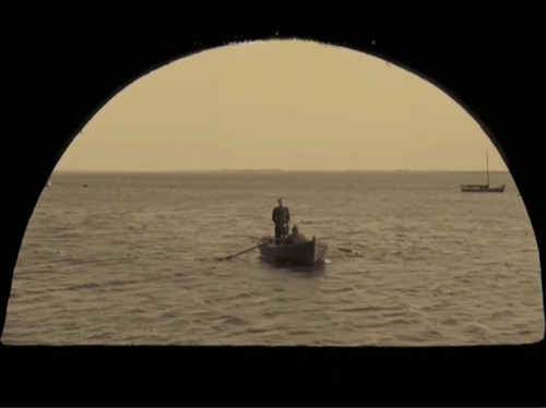
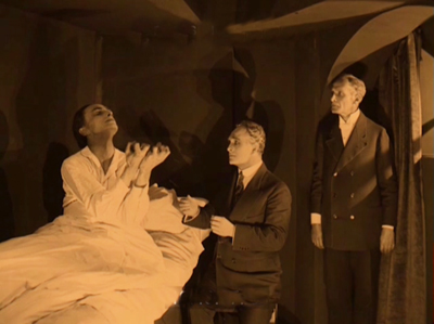
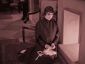
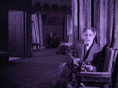
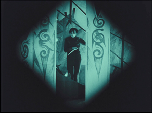
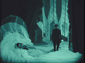
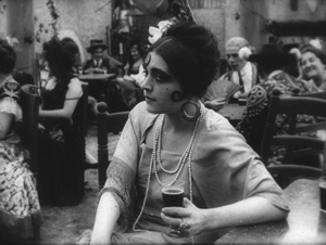
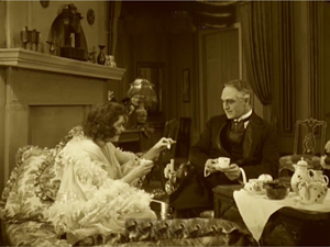
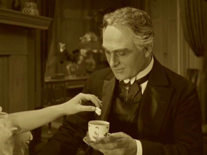
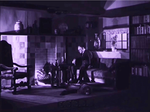
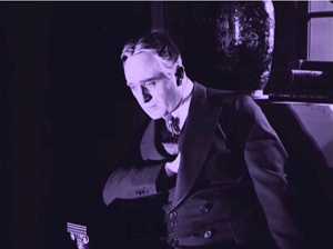
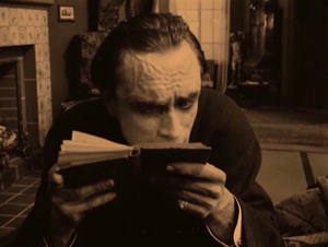
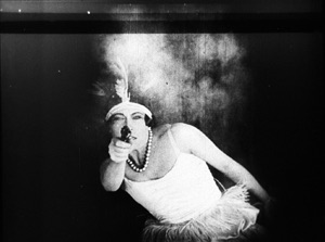
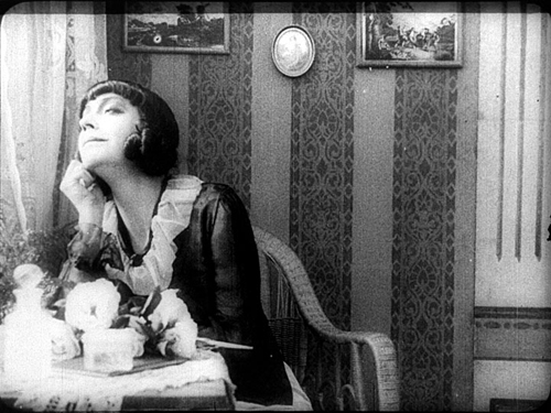
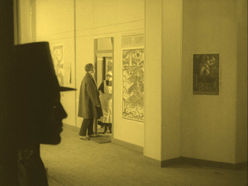
Der Gang in die Nacht (The Dark Road, 1921).
DB here:
For many decades, The Last Laugh (Der Letze Mann,1924) was the F. W. Murnau film. If you were a film buff in the fifties or sixties, that staple of film societies and college courses was probably the first Murnau you saw. Eventually you got to those French favorites, Sunrise (1927) and Tabu (1931). Nosferatu (1922) and Faust (19226) came along in there somewhere. Tartuffe (1926), great as it is, has always seemed a specialized taste.
Today, I think, Nosferatu is probably the one everyone sees first. It fits the modern taste for horror movies, and it is genuinely scary. It popped up in music videos, got remade by Herzog, and will be forever remembered for the vampire’s spindly, ratlike silhouette and the wholly fitting name of the performer, Max Schreck.
Eventually Murnau aficionados caught up with lesser-known Burning Soil (Der brennende Acker, 1922), Phantom (1922), and The Finances of the Grand Duke (Die Finanzen des Grossherzogs, 1923), the latter two available on good DVD versions. But what about Murnau’s very earliest films?
Of the nine films he made before Nosferatu, only two survive more or less complete. They circulated in unsatisfactory condition for many years, but Schloss Vogelöd (The Haunted Castle, 1921), which Murnau made just before Nosferatu, eventually emerged in a splendid restoration based on original negative material. Now we have a digital restoration of Murnau’s earliest surviving film, his seventh: Der Gang in die Nacht (The Dark Road, or “Path into Darkness,” 1921).
And what a restoration it is! The Munich Film Museum’s team has created one of the most beautiful editions of a silent film I’ve ever seen. They started with four reels of camera negative, then carefully integrated material from other sources. Thanks to digital manipulation, I couldn’t tell where the alien footage was.
You look at these shots and realize that most versions of silent films are deeply unfaithful to what early audiences saw. Compare a shot from the lamentable YouTube bootleg and a shot from this version. The smallness of the YouTube image here improves it; blow it up on a big monitor and it goes horribly blotchy.
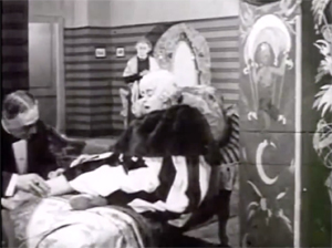
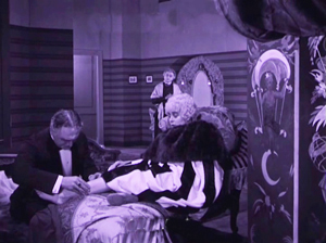
In those days, the camera negative was usually the printing negative, so what was recorded got onto the screen. The new Munich restoration allows you to see everything in the frame, with a marvelous translucence and density of detail. It will project fine big. Forget High Frame Rate: This is hypnotic, immersive cinema.
Der Gang in die Nacht will be shown in the Museum of Modern Art’s “To Save and Protect” series on 13 and 14 November. If you can get there, you should go! If not, we can hope that the film will soon appear on DVD. Remember DVDs?
Silents, golden
The canonized classics of Expressionist cinema, from The Cabinet of Dr. Caligari onward, are superb films, no doubt. But there are lots of other major movies from the period. The German industry flourished during World War I, and even the postwar inflation encouraged a burst of moviemaking. Hundreds of films were produced every year. I’m no expert, but of the seventy or so I’ve seen nearly all are fascinating and surprising. From the brute force of Der Tunnel (1915) and the demented monumentality of Homunculus (1916) to the weirdness of Algol and I.N.R.I. (both 1920), the peculiar pleasures of Sappho (1921) and the splendors of The Nibelungen (1924), I’ve been captivated by this cinema. Caligari is merely the dark and spiky tip of a mighty iceberg.
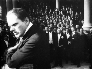
Der Gang in die Nacht is derived from a screenplay by the Danish scenarist Harriet Bloch. It’s an example of the “nobility film,” a genre cultivated by the Nordisk studio where Bloch worked. In these stories, an upper-class man becomes obsessed with a working-class woman, and she leads him to disaster. The most famous “nobility film” of the era is Dreyer’s The President (1919), when the genre was already somewhat old hat.
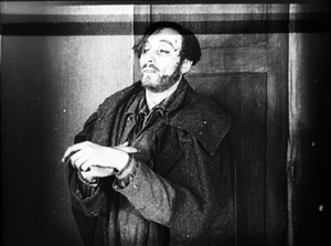
In Murnau’s film, the well-to-do protagonist is Dr. Eigil Börne. Uneasy with his courtship of his wispy fiancée Helene, he plunges into an affair with the dancer Lily. They move to a seaside cottage, where their idyll is interrupted by the spectral figure of a blind artist. (Regrettably, we never get a glimpse of his paintings.) The Painter is played in nearly full Cesare mode by Conrad Veidt: drifting through the landscape and clutching at the air. After Dr. Börne restores the Painter’s sight, Lily falls in love with him and leaves Börne. Unhappiness ensues for all, and yes, suicide is involved.
With only four delineated characters, the plot’s emphasis falls on their reactions to each others’ changing feelings. It’s a surprisingly unsensational melodrama, with no blackmail, threats of murder, or guilty secrets. It’s just about people’s emotional attachments waning, often for reasons they don’t understand. The drama of shifting, elusive moods looks fairly modern.
The playing is deliberate, with a range of acting styles. The drooping Helene, the skittish Lily, the somnambulistic Painter, and the raging Börne may seem to come in from four different movies. But Börne is on a knife-edge from the start, when he nervously leaves Helene. He broods fiercely during his night at the theatre, well before he succumbs to Lily’s charm. Like Scotty in Vertigo, he’s ready to fall. And as a complacent bourgeois, he doesn’t grasp the romantic fascination projected by the passive, wraithlike Painter. Nor is Lily merely flighty and treacherous. The Painter seems to stir her to a genuine love very different from her flirty seduction of the doctor. Helene, mournful throughout all this, is last seen in her sickbed stroking a newspaper photograph of Börne.
The concentration on four characters, each trembling with uncertainty, and the meshing of their moods with the stormy seaside, suggested to one observer an analogy with current stagecraft.
Here for the first time filmmakers try to incorporate the Kammerspiel [chamber play] into a film play. A strong, affecting plot with only a handful of characters has been developed through the smallest psychological details, the unity of locale and characters, the intimate interweaving of the atmospheric mood and the characters’ emotional life. All this has been achieved with the most sophisticated use of facial expression and cinematic direction.
1921 is usually taken as the year that the Kammerspiel genre began, with Scherben (Shattered) and Hintertreppe (Backstairs). Der Gang in die Nacht, which came out before either of these, isn’t usually considered an example. It’s interesting that the review I quoted, based on a December 1920 press screening, sees Murnau’s film as anticipating the trend. Perhaps the more rigorous concentration of time and space in the later films made critics take them for purer prototypes of the genre.
Knowing this background, I think, makes Der Gang in die Nacht more intriguing than it might at first seem. But another context is important too. The film shows Murnau’s debt to an important stylistic tradition. What he did with it is in sync with other filmmakers learning their craft at the same time. (Some spoilers ahead.)
Tableau + insert = proto-continuity
During the years 1908-1920, many filmmakers relied a “tableau” style of filmmaking. The used long shots and long takes, with the actors shifting in expressive patterns around the setting. The tableau might be broken up with titles or close-ups of letters or diaries, but the drama is developed through action played out in the distant framing.
Early historians, and many still today, portray this approach as merely “theatrical.” In fact, because of the way the camera lens creates a pyramidal playing space (the tip resting on the lens), the tableau approach is very different from proscenium theatre, which has a wide, lateral playing space. The result is a choreography of figure movement in breadth and depth that is no less “cinematic”—that is, specific to the film medium—than editing.
Want clarification? There’s a video lecture here, and more discussion in these entries.
In the course of the 1910s, however, filmmakers started to alter this approach. For one thing, they started to cut up the tableau more. American filmmakers were most radical, often abandoning the long shot altogether and building scenes out of several partial views—medium-shots and close-ups. But most European filmmakers were more conservative. They began to use what researchers have come to call the scene-insert method.
The tableau (the “scene”) would be interrupted by one or two closer views of a face or gesture, before returning to the main framing. Almost always the inserted shot is taken from the same camera position as the long shot. The cut is “axial,” along the lens axis of the camera. It enlarges a slice of space given in the wider view, then usually cuts back along the axis to reestablish the tableau.
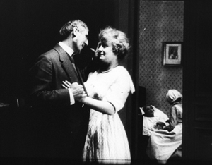
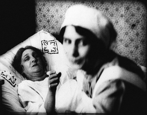
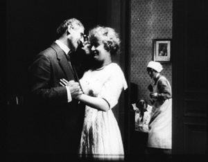
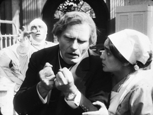
Here’s a simple example from Joe May’s delightful serial Die Herrin der Welt (Mistress of the World, 1919-1920), when a nurse in the room in the background rises.
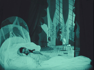
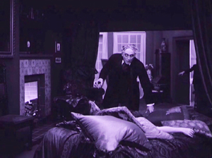
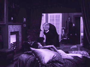
The axial approach is used throughout Caligari too. When Cesare invades Jane’s bedroom, we cut straight in and then cut back as he approaches.
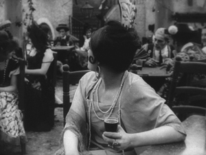
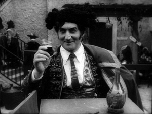
In Kristin’s book Herr Lubitsch Goes to Hollywood (available as a pdf) she traces several instances in other German films, as in this passage from Carmen (1919), with Don José way back at the rear of the tavern–but still on the lens axis.
Der Gang follows the scene-insert method often. The only closer view during Lily’s tea flirtation with Börne emphasizes her teasing gesture and his reaction.
The result is a minimal version of analytical editing, a sort of rough, proto-continuity approach to breaking up a scene into details. It can be thought of as a transitional phase toward a fully “classical” style of staging and cutting, and indeed in the 1920s more and more European filmmakers adopt versions of the Hollywood method.
Already, we can see some filmmakers thinking in terms of an establishing shot rather than a tableau. Murnau’s long shot below is probably too far distant to permit a complex play of depth of the sort we see in Caligari and Carmen. It’s designed, we might say, to be cut into.
During this transitional period, we find films exploring the scene-insert method in intriguing ways. The most evident is the tendency to make the cut-in shot very close.
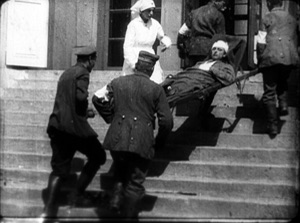
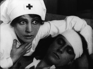
In Paul Leni’s Dr. Hart’s Diary (Das Tagebuch des Dr. Hart, 1918), for instance, we get a rather distant shot showing the wounded Count Bronislaw carried out of the ambulance, followed by a very tight medium-close-up of him and Jadwiga, the Red Cross nurse.
An American director would have been more likely to soften this sudden enlargement with a mid-range two-shot of the couple before providing the intense close-up of their faces.
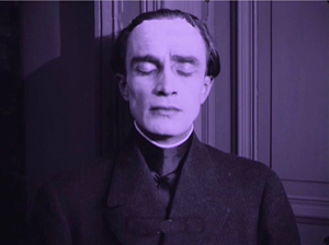
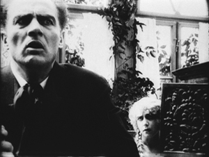
This abrupt jump into a surprisingly close view isn’t uncommon in European cinema of the period, and it’s particularly salient in German films. The insert is often taken with a wide-angle lens, which can accentuate the curves and edges of a face. Murnau’s fondness for the wide-angle lens is a constant throughout his career. A fragment from his first, lost film The Blue Boy shows a wide-angle depth composition, and there’s an astonishing wide-angle close-up of the distraught painter in Der Gang.
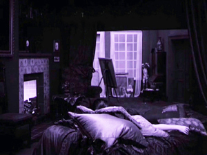
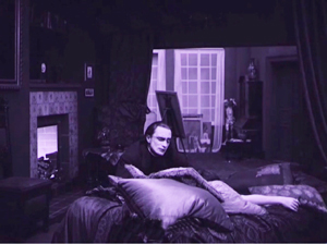
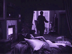
Like many directors working in this line, Murnau balances the power of the sustained long shot with the momentary spike of the closer view. A good example comes in the beautiful passage when Börne discovers that Lily is dead. The setup is given in a classic tableau framing, with only her arm extending out from cushions on the divan. Then the Painter’s head lifts into center frame from behind the pillows, a slow revelation of his pain.
After alternating cuts to Börne hammering at the door, the Painter rises and floats to the door in the back wall. (The rear door is a fixture of the tableau tradition, as it allows for dynamic movement in depth within the visual pyramid.) Once the doctor is admitted, he rushes forward and pauses as the Painter glides into the background.
As Börne wails, Murnau pushes us into the parlor to the Painter, standing in the distant corner like an upright corpse—an alternative version of grief.
Like many films of the period, not only German but also French and Italian ones, Der Gang in die Nacht exploits the resources of the tableau—the graceful, expressive coordination of actors who perform with their whole bodies—while saving the blunt force of the isolated face for a climactic accent. No wonder that film theorists of the late ‘teens and early 1920s were fascinated by close-ups; they were seeing a great many vivid ones.
Not haunted, just mysterious
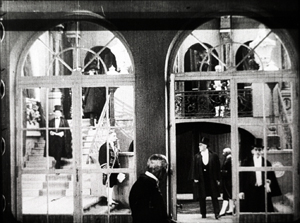
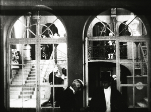
There were a lot of variants on these techniques. As if to give us the tableau and the wide-angle insert in a single frame, Robert Reinert cultivated a looming deep-focus style that suggests a Citizen Kane of the 1910s. The first frame is from Opium, the last two from Nerven (both 1919).
And the extraordinary Weisse Pfau (The White Peacock, 1920) of E. A, Dupont comfortably switches from a dizzying gridded tableau (two men arriving at a theatre lobby, caught in an architectural Advent calendar) to a violent climax using highly fragmented editing.
By 1921 the simplest version of the tableau-plus-insert method was rapidly going out of favor. To get a sense of how techniques were changing at the time, you should watch Murnau’s Schloss Vogelöd (1921) immediately after seeing Der Gang in die Nacht.
The plot is a bit friendlier to our pulpy tastes, involving a past murder that is brought to light during a country house party. (No spooks haunt the castle, just the lingering effects of mysterious death.) Again, there’s a chamber-play aspect to it. Virtually all the action is confined to the mansion of the host, von Vogelschrey, and plays out in a couple of days and nights.
Schloss Vogelöd was released only three months after Der Gang in die Nacht. In the sparkling restoration provided by the Murnau Stiftung, Schloss runs almost exactly as long as the earlier film. But what a difference! I count 231 shots in Der Gang, with 163 of those being images, not titles. I count 511 shots in Schloss, with 356 of those being images. Assuming a common projection speed, the later film is cut over twice as fast.
The sheer number of shots is important, but the crucial factor is that many of the shots in Der Gang retain one particular framing, interrupted by titles or a diary or letter insert. Not only does Schloss have more shots, it has more varied setups. Murnau is shifting his camera positions more often, as were his peers Lang and Dupont, along with other Europeans and of course the Americans.
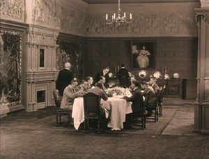
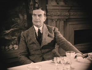
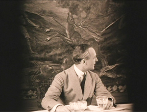
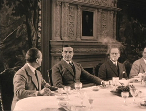
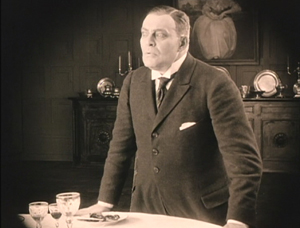
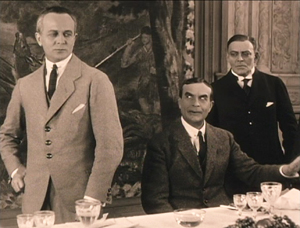
Here’s an example. At a meal, the vengeful Count Oetsch hints that Baron Safferstädt is the murderer. The scene runs about three minutes and contains 16 shots and five titles, played out across six distinct setups. I sample them here.
In a loose sense, the cuts are axial, enlarging or de-enlarging parts of the table as observed from one general orientation. (The judge who stands up and looks left is at the foot of the table.) But within this overall orientation, there’s a variety of setups we don’t find in Der Gang. We aren’t far from that spatial ubiquity and adherence to an axis of action that was pioneered in 1910s Hollywood and would become increasingly common in Europe during the 1920s. The downside: The development of more finely broken-down scenes led to a loss of the complex choreography within a single shot that was common in the early 1910s.
Der Gang in die Nacht was filmed in August-September of 1920; Schloss Vogelöd was shot in February and March of 1921. In between Murnau made Marizza, genannt die Schmuggler Madonna (Marizza, called the Smuggler’s Madonna, not shown until 1922). The fragments of this that have survived are very rudimentary filmmaking, much simpler than anything in either of the other two films.
The faster cutting and more varied setups of Schloss may, as Kristin has suggested, owe something to the arrival of American films. Banned until January 1921, they may have inspired German directors to push further toward analytical editing. She has also mentioned in Exporting Entertainment that some American films did slip through the ban and get screened during the war years, so directors could have had an inkling of what Hollywood was up to.
In any event, Der Gang in die Nacht admirably lays out one set of directorial options that emerged as filmmakers of the first “movie generation” (Murnau, Dreyer, Gance, Lang, Dupont et al.) shifted away from the pure tableau style. All became virtuosos of editing, but they never forgot the power of the sustained long take.
Thanks to Stefan Drössler of the Munich Filmmuseum for information on the restored Der Gang in die Nacht. Thanks as well to Sabine Gross for her translation of German material. As ever, I owe an enormous debt to Gabrielle Claes and Nicola Mazzanti of the Cinematek in Brussels.
The review citing Der Gang as a Kammerspielfilm is reprinted in Film-Kurier (30 December 1920), 2. I was led to this by Lotte Eisner’s Murnau (University of California Press, 1964), 92. Although it’s long been out of print, her book remains a very useful source. Also helpful are Los Proverbios chinos de F. W. Murnau, vol. 1, ed. Luciano Berriatúa (Filmoteca Española, 1990) and Friedrich Wilhelm Murnau: Ein Melancholiker des Films, ed. Hans Helmut Prinzler (Deutsche Kinemathek, 2003).
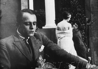
Schloss Vogelöd is available on two DVD editions, one from Kino and the other from Masters of Cinema. My frames come from the Kino edition, chiefly because they’re brighter than the higher-contrast MoC edition, and thus more legible on the Net. Both editions have their strong points, as DVDBeaver indicates. Surviving frames of Murnau’s first film are available on the Lost Films website.
Many issues of tableau style and its relation to editing technique are discussed in my On the History of Film Style, Figures Traced in Light: On Cinematic Staging, and Poetics of Cinema. On this site, among entries on the tableau tradition, the entry most relevant to today’s piece is “Not quite lost shadows.” I discuss Danish approaches to the tableau in the essay “Nordisk and the Tableau Aesthetic” and the case of Dreyer’s relation to his peers in “The Dreyer Generation,” on the Danish Film Institute website.
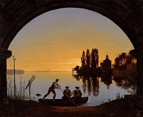
Karl Friedrich Schinkel, The Banks of the Spree Near Stralau (1817).
Picturing performance: THEATRE TO CINEMA comes to the Net
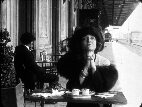
Ma l’amor mio non muore! (aka Love Everlasting, 1913). Lyda Borelli.
DB here:
The core of cinematic expression is editing. Since the 1920s, that view has been part of the lore of film aesthetics. Editing, people said, is what distinguishes film from other media. After all, the single shot is both a picture (like a painting) and a dramatization (like a scene in a stage play). But put one shot with another and you’ve got a technique impossible to parallel in other media.
But if we look closely, we find that the film image is as “uniquely cinematic” as editing. After all, a film is an image, but it’s a moving image, which is sharply different from a painting. And although a shot is a dramatization, it’s two-dimensional (unlike a stage scene) and the space it captures is quite different from that of the theatre. Anyhow, maybe editing isn’t uniquely cinematic. Comic strips juxtapose discrete images, and some forms of theatre (such as pageants, or turntable stages) can shift rapidly between scenes. Once we start to compare adjacent media, we find many overlaps in their expressive resources.
Why did early film theorists make editing so important? They were often defending the view that film was a new art, in the teeth of opponents who claimed that it was simply photographed theatre. Accordingly, film’s defenders looked for features of films that seemed to have no counterpart in theatre, such as the close-up and, more pervasively, editing.
Since then, we’ve come a long way in our understanding of film’s artistic capabilities. Filmmakers, particularly those in the early sound era (Renoir, Ophuls, Dreyer, Mizoguchi), showed the expressive power of the single shot. This tendency was amplified in the 1950s and 1960s with Antonioni, Jancso, Andy Warhol, and many other directors. Now nobody blinks if a filmmaker like Hou or Yang presents a lengthy, unedited sequence.
Informed by what’s possible in the single shot, we ought to find the earliest filmmakers using the resources of staging, composition, and performance in felicitous ways. So we do. Once we foreswear the cult of the cut, we can see that early cinema made extensive use of cinematography and mise-en-scene for powerful artistic effects. And conceding that, we suddenly find ourselves back in the lap of the other arts–painting and theatre.
Living pictures
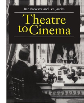 No one has done more to clarify the debt of early cinema to theatre than our colleagues Ben Brewster and Lea Jacobs. In the spirit of Wisconsin Revisionism, they have embraced early film’s stagy side. They’ve taught us to appreciate the ways in which dramaturgy and performance of 1910s cinema derive, in unexpected ways, from the theatre. Their trailblazing book Theatre to Cinema: Stage Pictorialism and the Early Feature Film (Oxford, 1997) showed how to appreciate early films in a whole new way: by seeing them as borrowing and modifying conventions of the stage. What may look artificial or backward to us were actually tools of subtle, supple expression.
Here’s the authors’ statement of the book’s argument:
While previous accounts of the relationship between cinema and theatre have tended to assume that early filmmakers had to break away from the stage in order to establish a specific aesthetic for the new medium, Theatre to Cinema argues that the cinema turned to the pictorial, spectacular tradition of the theatre in the 1910s to establish a model for feature filmmaking. The book traces this influence in the adaptation and transformation of the theatrical tableau, acting styles, and staging techniques, examining such films as Caserini’s Ma ľamor mio non muore!, Tourneur’s Alias Jimmy Valentine and The Whip, Sjöström’s Ingmarssönerna, and various adaptations of Uncle Tom’s Cabin.
The twist here is that turn-of-the-century artistic culture had already blurred the boundaries between theatre and painting. Painters drew upon the stock gestures and poses of the stage, while plays presented vivid visual effects that were indebted to painting. The term “tableau,” referring at once to a picture and a poised stage image, captures this convergence between the media. That’s why Ben and Lea refer to “stage pictorialism” as the nexus of their inquiry.
Thanks to their research, we can see the unbroken long- or medium-shot of early features as permitting a complex choreography of facial expressions and bodily attitudes, which were in turn indebted to both pictorial and dramatic traditions. Standard gestures were summoned up and reworked to suit dramatic situations–as, for example, clutching.
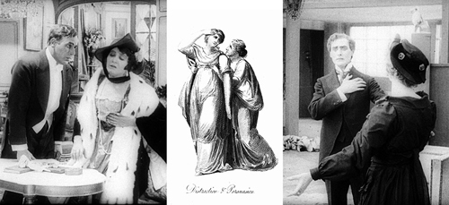
When we do find editing or camera movements in these films, they’re often at the service of the performance style. Ben and Lea powerfully make the case that the expressive human body was at the center of storytelling in the first years of silent cinema. (If nothing else, the book is an in-depth analysis of diva acting from the likes of Lyda Borelli and Asta Nielsen.) By studying the history of theatre, we can learn to appreciate aspects of acting that might otherwise escape our notice.
Theatre to cinema to pixels
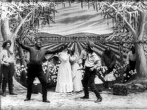
Uncle Tom’s Cabin; or, Slavery Days (Edison, 1903).
How, you’re asking, can you gain access to the ideas and information and images in this fine book? It’s now criminally easy.
When Theatre to Cinema was published, all the illustrations came from 35mm film prints. Those originals were gorgeous. But in some printings of the book the stills came out badly, and when the book moved to print-on-demand status, the images suffered even more. A couple years ago, Ben and Lea rescued their book and took the opportunity to make a digital version. It’s unrevised, largely because updating a twenty-year-old volume would be a major overhaul, but errors have been corrected and–very important–the stills have been much improved.
Start here, with the introduction to the project. You can download the new edition of the whole book, section by section, here.
Naturally, Kristin and I are sympathetic to this effort. Since we started our website back in 2000, we have explored ways to amplify and extend our ideas by means of the web. In the beginning, and inspired by Philip Steadman’s Net-based supplements to his excellent Vermeer’s Camera, I added material that would enhance arguments I made in Figures Traced in Light. Then we set up our blog, now in its tenth year. Over the same period, we posted web essays, as you can see in serried ranks page left. We also used the site to preserve older material, such as film analyses dropped from editions of Film Art: An Introduction and even entire books, as in Kristin’s 1985 monograph Exporting Entertainment. We’ve mounted video lectures. And we’ve produced a new edition of an older book, Planet Hong Kong 2.0, and original e-books such as Pandora’s Digital Box and Christopher Nolan: A Labyrinth of Linkages.
Ben and Lea have found another way to expand a book’s Web life. They have put Theatre to Cinema at the heart of a digital collection sponsored by the University of Wisconsin–Madison Libraries. Here’s what they offer:
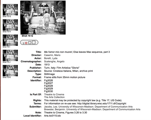
In this collection, we try to supplement the description and illustration that accompanied the book in a way that makes it easier for readers to appropriate our work—both to understand it, and to make use of it in research and teaching. What were illustrations in the pages of the book are also presented here as better-quality downloadable images.
For example, you can pick a still, find its mates in a single display, and blow it up for scrutiny. If you want import it into your own files, you may choose among four different file sizes.
The provenance of each still is provided, so scholars can compare prints from different sources. In addition, there’s a master index of the visual documentation, in sequential groupings across the book.
Finally, Ben and Lea plan to add video extracts from some of the films they discuss. When those go up, we’ll announce it here.
Every admirer of silent film, and everyone who studies the interrelationship of the arts, should read this book. Hard copies are still being sold online, but they’re apt to be versions with weakly reproduced stills. Get one if you want, because a book is a good object to have in hand. In addition, for free, you can own a beautiful, searchable edition with superb stills. I think you need both.
The digital collections set up by UW Libraries are breathtaking. Check them out here.
Some entries on our site intersect with Ben and Lea’s research. See the category Tableau staging.
Weisse Rosen (White Roses, 1915). Asta Nielsen.
L’INHUMAINE: Modern art, modern cinema
Kristin here:
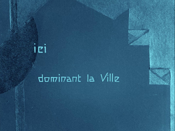
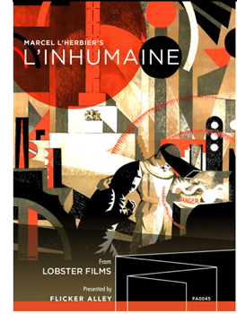
Flicker Alley continues its relationship with Lobster Films of Paris, bringing out beautifully restored versions of French silent films, and in particular the work of the French Impressionist filmmakers. The recent release of Marcel L’Herbier’s L’Inhumaine (1924) is stunning visually. L’Herbier produced the film himself with his new Cinégraphic company, and hence he preserved the negative. With the original art-deco intertitles (below) and the colors as chosen by L’Herbier, this is as close as one can get to a version that is identical to the original release prints.
We’ve described earlier Flicker Alley releases of classic French silents in restorations: the extraordinary output of the Russian emigré firm Albatros, the long-lost serial La Maison de mystère, and Abel Gance’s La roue. L’Herbier’s Feu Mathias Pascal (1926), made directly after L’Inhumaine, was in the Albatros set but also released separately.
Although I’ll be mentioning most of the major plot points of L’Inhumaine, I’m not posting a spoiler alert. The action does involve some nominally suspenseful situations, but L’Herbier signals what’s going to happen so far in advance that I suspect few people watching the film would be surprised by the “twists” in the story.
The film’s plot is, to put it bluntly, weak. The “inhuman one” of the title is Claire Lescot, an opera singer who delights in frustrating the powerful suitors and would-be seducers who gather at banquets that she stages in the spectacularly designed rooms of her lavish home. In the opening dinner scene, she is particularly cool to Einar Norsen, a brilliant but naive young inventor who is in love with her. When he seemingly threatens suicide, she laughingly remarks that his life cannot mean much if he can throw it away.
 Shortly after, word comes that Norsen’s car has plunged over a cliff into a river. The news makes Lescot realize that she loves him. Grieving, she nevertheless performs at a scheduled concert, after which she is visited by a mysterious man who requests that she act as a witness in identifying Norsen’s newly discovered and mutilated body.
The mysterious man, as is obvious from the start, is Norsen in disguise, preparing an ordeal that will lead Lescot to renounce her cruelty and embrace humanity. (The plot of a man who takes the opportunity afforded by a false report of his death to adopt a new identity apparently fascinated L’Herbier. It would become the core of Feu Mathias Pascal, an adaptation of Luigi Pirandello’s 1904 novel.)
Once Norsen reveals himself to Lescot, he shows her his remarkable laboratory, including a machine that may be able to restore the dead to life.
Lescot’s interest in Norsen has enraged one of her suitors, Djohar de Nopur, and he kills her using a poisonous snake in a bouquet. Norsent rushes her to his laboratory and uses his new invention to revive her.
We learn very little about these characters. They are basically stock figures enacting a familiar melodrama. Georgette Leblance, who plays Lescot, was an opera singer who contributed half of the financing in exchange for playing the role. She employs the florid style associated with the great divas of the 1910s, emoting intensely and striking dramatic poses.
If one embarks upon watching L’Inhumaine as a compelling story, one is likely to be disappointed. Its fascination lies rather in the fact that this simple narrative is considerably embellished with flashy design and the novel depiction of scientific experiment.
A leisurely stroll through some remarkable sets
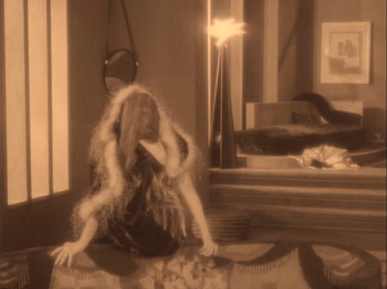
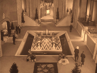
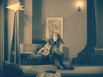
“Flashy design” here means a great deal. L’Herbier had many prominent friends and contacts within the world of arts and crafts in 1920s Paris. The assemblage of collaborators who worked on the look of L’Inhumaine is quite overwhelming. The heroine’s clothes were by one of the leading fashion designers of the day, Paul Poiret, whose interior design department contributed some of the furniture in her apartment (below). The sculptures in her home are by Joseph Csaky, a Hungarian-born Cubist.
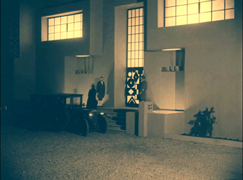
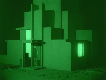
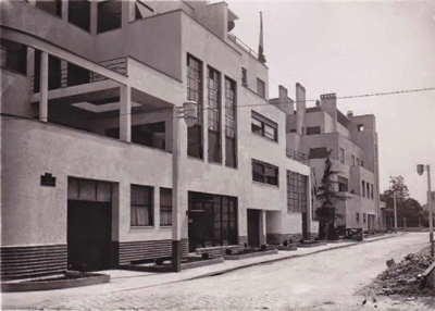
There were four main set designers, with contributions by others. Modernist architect Robert Mallet Stevens created the exteriors of Lescot’s house (left) and Norsen’s (right).
By the way, one can still almost walk into a 1920s film today by visiting the Rue Mallet Stevens in Paris, here seen at the time of its inauguration in 1927.
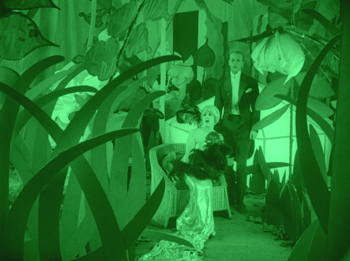
Other designers included Alberto Cavalcanti, who designed the interiors of Lescot’s mansion, notably the huge dining and entertainment hall at the top of this section and a Caligaresque conservatory.
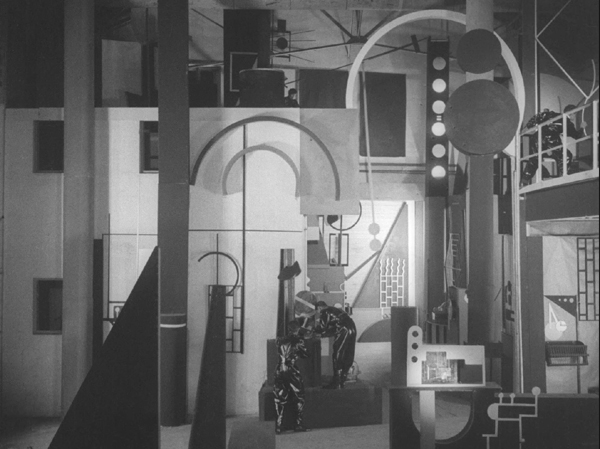
Perhaps most memorably, painter Fernand Léger planned and built the interior of Norsen’s lab (see bottom). More on this below.
The bare bones of the plot are so simple that L’Herbier can proceed at a remarkably leisurely pace through individual decors. In a period when most films consisted of long strings of short scenes, Claire’s opening banquet for her gentlemen guests lasts a remarkable 45 minutes. This includes cutaways to Einar driving rapidly to her house, dithering about whether he should appear late at the party, and finally, after her callous treatment of him, driving away to his apparent suicide. The second sequence, with Claire deciding to perform her song recital despite her grief over Einar’s death, lasts 25 minutes. The primary action here is simply a near-riot in the theatre between her supporters and those indignant about her part in the causing the young scientist’s death.
The lengthy final section of the film visits the laboratory three times, allowing us to get a good look at one of the great sets of the era.
Cinematic touches
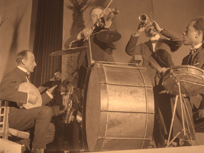
L’Herbier did not entirely depend on his designers to carry the visual interest of the film. He was precocious in his use of wide-angle lenses, a technique that would become more prominent in his 1928 masterpiece, L’Argent. Here the lenses used give a less obvious effect, as in the shots of the jazz band that entertains during the opening banquet (above).
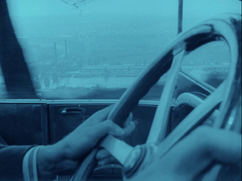
He also achieves some impressive compositions using considerable depth of field, most notably a close-up of the hero’s steering wheel as he tears along a road overlooking a deep valley with a city in the distance. It is here where his supposedly suicide takes place. Another striking shot has the jealous villain in the dark foreground, watching as the disguised Norsen enters Lescot’s dressing room.
Très moderne
Although the combined work of such a group of designers is the film’s primary attraction, L’Inhumaine is also notable as an early example of the science-fiction genre. Norsen’s technical genius is represented as going beyond the technology of the age. We see two instances of what he has invented.
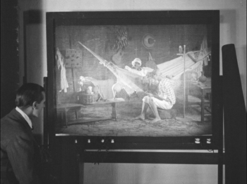
The first marvel of Norsen’s laboratory that he demonstrates to Lescot is a television set (so named in the intertitle). Is this the first reference to television in the cinema? Possibly, though the script in quite an illogical way reverses the technology of how actual television would eventually function. Lescot performs a song into a microphone. Instead of a camera beaming her image out to viewers around the world, a screen in Norsen’s lab shows her images of various listeners reacting in delight to her performance–as if somehow cameras could be placed in every spot where someone, whether Arabs, a young black woman in an African field, or a family group in a tropical setting (below) is listening to her over a radio speaker.
The telephone system in Metropolis (1927) that includes screens upon which the speakers view each other reflects more reasonably what actual inventions were later to follow. One can’t help wonder, however, whether that device was inspired by L’Herbier’s film.
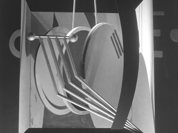
More spectacularly, the giant machines that Norsen uses to restore Lescot to life provide the climax of the film. When Norsen tours Lescot around his lab in an earlier scene, he shows her a huge apparatus, including three large, round components that swing through space like a moving Gabo sculpture (see top). He remarks that he believes the machine could restore a dead person to life, but he has not yet had the opportunity to test it.
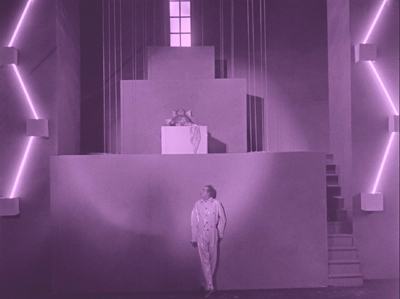
Rather than trying to suggest how the machine works, the film keeps the set where Lescot lies dead simple and abstract. In perhaps the most famous image from the film, a ziggurat-shaped platform and some simple diagonal lighting tubes shape the composition, with Norsen nervously peering up to gauge the effectiveness of his invention (see top of this section).
The scene of Lescot’s revival consists of rapid, accelerated editing that had become a major trait of the French Impressionist movement by this time in the wake of La roue and Jean Epstein’s Cœur fidèle. There is no way to convey this remarkable sequence with frames from individual shots; the effect is achieved more by the rhythm of the cutting than by the composition of the individual shots.
The Flicker Alley Blu-ray comes with two alternative musical accompaniments, one by the Alloy Orchestra and an adaptation of the original Darius Milhaud score by Aidje Tafial. We listened to the latter, which worked very well with the film. There is also a helpful booklet of notes.
Sometimes a production still…
Frisco Sally Levy (MGM, 1927; dir. William Beaudine).
….makes you say, Jeepers.
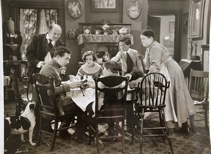
Henry Sapoznik is an outstanding performer and producer of music, a many-times Grammy nominee, and my colleague here at UW, where he heads the Mayrent Institute for Yiddish Culture. He’s also the grand-nephew of character actor Tenen Holtz. When Henry showed me this still from his collection, it gave me a buzz in many ways. Let me count them.
The Buzz Topical. Open-carry at the family table. It’s not just for breakfast any more. Joey, do you like movies with guns?
The Buzz Narrative. Here’s the plot, courtesy of the American Film Institute:
Sally Colleen Lapidowitz, the daughter of an orthodox Jewish father and an intensely Irish mother, is the steady girl of Patrick Sweeney, a motorcycle cop. Sally becomes infatuated with Stuart Gold, a Jewish dandy, who, though he is approved by her father, soon proves himself to be a worthless cad. Patrick rescues her from the dandy, and all ends happily in the Hebrew-Irish family.
Alas, no mention of this intimate scene.
The Buzz Ethnic-Shtick. Frisco Sally Levy belongs to a cycle of comedies centering on Irish and Jewish families. The most famous are Abie’s Irish Rose (stage play, 1922; film, 1928) and The Cohens and the Kellys (1926 film). Variety thought the movie a hoot, “averaging a dozen laughs to the minute.” Special praise was reserved for the Lapidowitz boys: “as a team of juvenile comedians these two youngsters are unsurpassed.”
Then there’s the gag involving a St. Patrick’s Day parade, evidently in a color sequence. Ma and Pa call out from the sidewalk, “Hello, Pat!” “And immediately every one of the carefully tailored, frock-coated, top-hatted gentlemen turn about with military precision and raise their hats in unison.” “Then,” the critic adds, “there are laughs with the close-ups of an ambulance and a German band leading the Irish patriots.” We’re told that Tenen Holtz puts across his role of paterfamilias well, rising above the caricatured Jewish tailor, which is all too often “obnoxious if over-drawn and too Jewish for comfort.” Ouch.
The Buzz Compositional: Would that today’s production stills were as nifty. The grouping, the eyelines, and Patrick’s gesture all drive our attention to the pistol. But space is left for us to notice Sally’s fixed stare at Patrick (mute devotion? apprehension at the gunplay?). And there are centrifugal attractions. There’s the younger daughter with her head slumped in her plate. Scared? Asleep? Bored? Sick? Doped? And of course the pooch, intent on table scraps, is missing the point. Nice apartment too, with both a phone and a writing desk. A symmetrical room for a symmetrical shot.
Alas, the film has not yet been found (a nice way of saying “lost”). Is there a collector out there with a copy? In the meantime, with stills like these we can make up our own stories.
Thanks to Henry for the still and permission to post it. The review is “Frisco Sally Levy,” Variety (13 April 1927), 13. See also “‘Sally Levy’ Takes Frisco for $26,200,” Variety (27 April 1927), 7.
Other entries in the “Sometimes…” series are: “Sometimes a shot . . .” and “Sometimes two shots . . .” and “Sometimes a jump cut…” and “Sometimes a reframing…”
Exhibitors Herald and Moving Picture World (12 May 1928).


