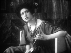
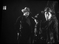
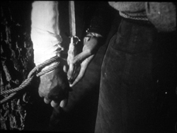
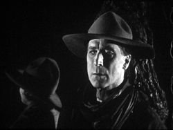
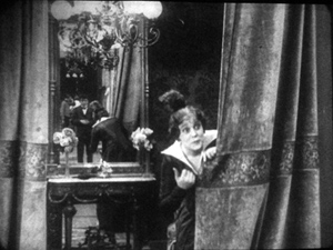
Archive for the 'Silent film' Category
Not-quite-lost shadows
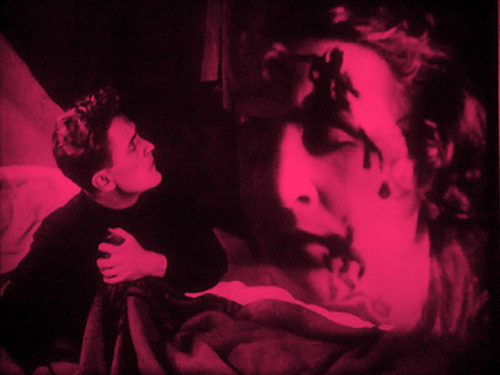
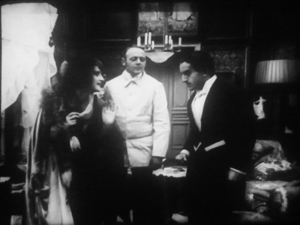
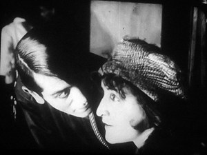
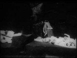
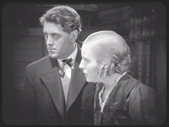
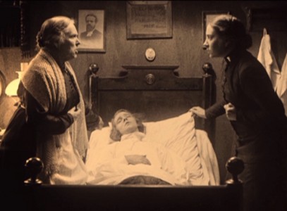
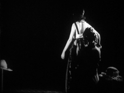
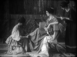
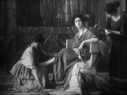
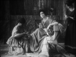
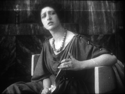
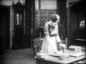
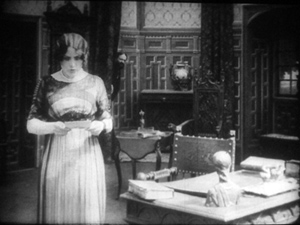
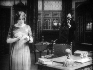
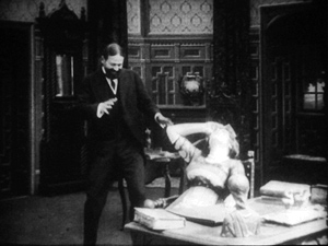
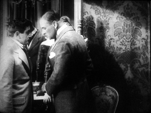
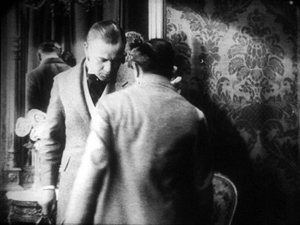
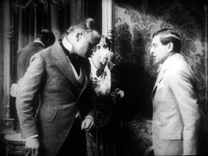
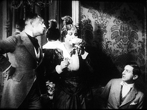
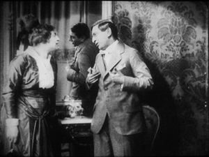
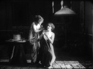
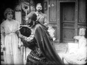
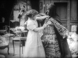
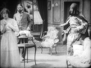
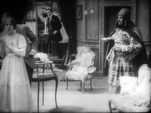
I.N.R.I.: The Catastrophe of the People (1920).
DB here:
One way to write the history of film as an art is to chart firsts. When was the first close-up, the first moving camera, the first use of cutting? Asking such questions was a common strategy of the earliest film historians, and it has persisted to this day in pop histories. Civilian readers can be excused for thinking that Griffith invented the close-up and Welles originated ceilings on sets. These myths have been recycled for decades.
The “revisionist” historians of the 1970s, mostly academics who aimed to do primary research, pointed out that talking about first times is risky. Too often the official account is wrong, and earlier instances can be found. In most cases, we can’t really know about first times. Too many films have vanished, and nobody can see everything that has survived. Innovation is always worth studying, but, the revisionists argued, it’s best understood within a context.
So they set themselves to figuring out not when certain cinematic techniques began but when they became common practice–when most filmmakers in a given time or place adopted them. That way we can discover innovations more reliably; they’ll stand out against the background of more orthodox choices. But of course, to build up a sense of these norms, it’s not enough to focus on the masterpieces cited in the official histories. You need bulk viewing.
Studying norms of storytelling and visual style is a large part of what Kristin and I have done since the 1970s. One section of our 1985 book The Classical Hollywood Cinema tried to chart when certain fundamental techniques of Hollywood storytelling coalesced into common practice. Kristin argued that the late 1910s are the key years, with 1917 as a plausible tipping point. By then, continuity editing and goal-oriented plotting, among other creative options, became dominant practices in American features. If you’re interested in blog posts touching on this, see the codicil.
Yet it’s reasonable to ask: But what happened in other countries? Was Hollywood unique, or were there comparable norms emerging in Russia, France, Germany, Denmark, Sweden, and elsewhere?
Several years ago, I began trying to watch as many US and overseas features from the period 1908-1920 just to see what I might find. Doing this led me to make arguments about the development of staging-driven cinema (often, but not only, European), as opposed to editing-driven cinema (usually, but not invariably, American).
A vast resource for my bulk viewing of 1910s cinema has been the Royal Film Archive here in Brussels. While the collection houses virtually every classic, it also includes films that haven’t been discussed by many historians–obscurities, if not downright rarities. Films from many countries passed through Brussels, and the archive was able to acquire copies from many distributors going back to the 1910s. Although I had watched several German films in the collection on earlier visits, this year I had a pretty concentrated dose. So as in previous years (see that codicil again), I offer you some chips from the workbench.
Cinematic scarcity
I.N.R.I.
German films of this period are of special interest for my research questions because of an unusual situation. From 1916, films from the US and nearly all of Europe were banned from Germany, and this ban held good until 31 December 1920. As Kristin puts it in her book Herr Lubitsch Goes to Hollywood (available as a pdf here):
Foreign films appeared only gradually on the German market. In 1921, German cinema emerged from years of artificially created isolation. . . .Because of the ban on imports, German filmmakers had missed the crucial period when Hollywood’s film style was changing rapidly and becoming standard practice. . . . The continuity editing system, with its efficient methods of laying out a clear space for the action, had already been formulated by 1917. The three-point system of lighting was also taking shape. In contrast, German film style had developed relatively little during this era.
Kristin was again exploring craft norms, the creative choices favored by Lubitsch’s contemporaries. She drew some of her evidence from films she saw here at the Cinematheque, but I wanted to revisit those and see some others. What exactly did German films look like at this point? Not the official classics like Caligari and Nosferatu, but more ordinary, maybe even bad movies?
The basic assumption: Since the German directors weren’t seeing American movies, they’d be less likely to imitate them. Some hypotheses follow from this. German directors would presumably rely less on cutting, especially within scenes, than Americans did. They might incline toward staging complicated action in a single shot. The cutting is likely to be what Kristin calls “rough continuity” or “proto-continuity”–essentially, long shots of the whole action broken by occasional axial cuts that enlarge something for emphasis. We wouldn’t expect to find sustained passages of close-up or medium-shot framings.
To give myself some reference points, on each visit I’ve watched European films in conjunction with American films of the same era. This mental trick helped differences pop out more easily.
Fortunately for peace in our household, I’ve found Kristin’s claims about German cinema well-founded. As in other years, I also stumbled across some gratifyingly strange movies.
Blocking, tackled
Throughout the period 1908-1920, we find many scenes staged in a single fixed shot. In many other blog entries, and in books like On the History of Film Style and Figures Traced in Light, I’ve tried to show that this wasn’t simply a passive recording of a “theatrical” scene. Drawing on capacities specific to the film medium, directors used composition, lighting, setting, and figure movement to shape the perceptual and emotional flow of the scene.
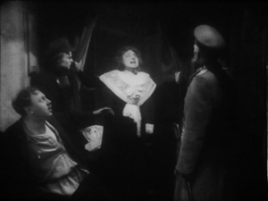
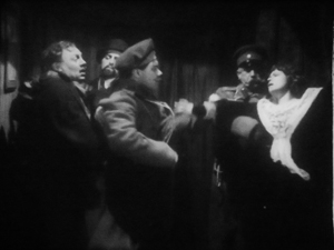
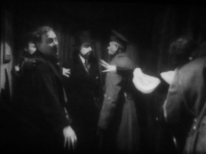
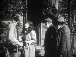
Here’s a late example from The Brothers Karamazov (1920) directed by Carl Froelich and Dmitri Buchowetzki. Starring Fritz Kortner, Emil Jannings, Werner Krauss, and other heavyweights, it has perhaps more ham per square inch than any other film I saw on this pass. Yet its tableau moments subordinate the performers’ charisma to an overall expressive dynamic.
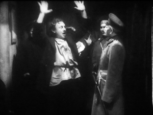
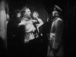
Old Fyodor Karamazov has been murdered, and his son Dmitri is accused of the crime. Protesting his innocence, he’s about to be arrested when Grushenka bursts out. “I’m the guilty one!”
In the tableau tradition, “blocking” takes on a double meaning–not only arranging actors in the shot, but also judiciously using them to mask or reveal areas of space. Thus Dmitri at first blocks Grushenka, but when he lowers his hands, she pops into visibility–frontal and centered, so we can’t miss her. Dmitri sinks to the lower half of the shot when her dialogue title comes up, leaving her to command the frame. Meanwhile the police official has pivoted slightly, making sure that we pay attention to her outburst. Not incidentally, he blocks another policeman behind him, keeping the frame dominated by Grushenka.
This scene goes on quite a bit longer, with some careful balancing and rebalancing of points of interest in the lower part of the frame. The action ends with a nice touch: the embracing Dmitri and Grushenka are separated, and she’s pulled away, one arm flailing.
Without benefit of cutting, then, techniques of tableau construction guide our attention smoothly in the frame by using movement, centering, advance to the camera, character looks, blocking and revealing, and other tactics.
The Germans had embraced this tableau option in the earliest 1910s. The films of Franz Hofer and others show how an entire scene could be covered in a single camera position, with staging providing a continuous flow of interest. Go here for an amusing example from The Boss of the Firm, a 1914 comedy starring Lubitsch.
The commitment persisted into later years. The earliest film I watched in this cycle, Hilde Warren and Death (1917), by the quite interesting director Joe May, had several passages of tableau staging. In the most elaborate one, the mistress of Hilde’s dissolute son tells him that now he’s out of money, she has switched her affections to a rival. It plays out without a cut or intertitle for about a minute at 18 frames per second. When Fernande spurns him, he grovels, just as the salon door opens. (Whenever there’s a rear door like this, we’re likely to get a tableau scene.) His rival shows up to take her to the opera.
Fernande asks him to stay outside, but the son demands that he stay, waving his hand. In a staging tactic that should be familiar to us now, the son rises, blocking the rival for an instant.
The rival rebalances the composition, and makes himself visible, by moving to the right background. This switching of characters’ position in the frame is known as the Cross. But when the son gets angry, the rival crosses again, easing himself toward the area of conflict. Note that the son’s bodily attitude, tensing up, actually shifts him rightward a little, opening up a space for the other actor to be seen.
Now the rival steps to the forefront and wedges himself in between Fernande and the son. He invites the young man to leave, with a gesture that occupies the dead center of the frame: Who could miss its assured insolence? And now the maid, previously in the background and blocked by Fernande, makes herself known. Seeing how things are developing, she fetches the son’s hat.
The son gets off one last grimace, front and center, before departing. As he walks back, the rival swivels to blot him out, leading the ladies in mocking laughter. (It’s clear the rival belongs to the 1%.)
One good Cross deserves another: Now the rival settles in where the son was at the start of the scene, and the son is retreating in shame along the rival’s path.
This tableau technique, constantly calculating points of interest from the standpoint of monocular projection–that is, what the camera lens takes in–is far from theatrical. Well-timed blocking and revealing wouldn’t work given the multiple sightlines of a theatre stage. The action is staged for the only eye that matters: the camera’s.
Once we grant that theatrical playing space is quite different from that provided by the camera, we can see more exactly what the tableau tradition owes to the stage. Silent cinema’s “precision staging,” as Yuri Tsivian has called it, is close to choreography. If we want to appreciate what directors of this period accomplished we need to look at the scenes as varieties of pictorialized dance, designed around the axis of the camera lens.
Along the lens axis
To return to the first question: Yes, German films seem to have clung to the tableau tradition after 1917, when Americans had abandoned it. Yet shots like those in The Brothers Karamazov and Hilde Warren are fairly rare; most scenes in most German films of the period use a fair amount of editing. What do we make of that?
The trend is fairly general. Some staging-driven films, like Ingeborg Holm (1913) and the early serials of Feuillade, are built entirely out of one setup per scene, occasionally broken by cut-ins of printed matter or other details. This period constituted a brief golden age of this “tableau” tradition–visible in American cinema, but more pervasive in European cinema. But by the late 1910s, most directors around the world were cutting up their dialogue scenes at least a little. Gradually, the tight choreography of the tableau gave way to the easier method of using close-ups to pick out key instants.
The European default seems to have been what Americans called the “scene-insert” method. A long shot (called the “scene”) is interrupted by a cut to some part of it (the “insert”). Then we go back to the orienting view. The cuts are typically straight in and back along the lens axis.
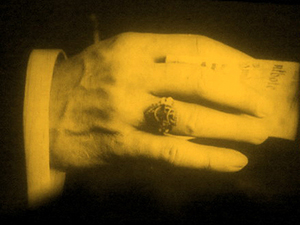
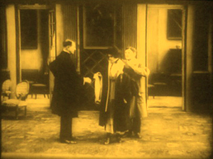
Here’s a straightforward German example from The Devil’s Marionettes (Marionetten des Teufels, 1920). A fake medium has been brought to a rich man’s home to read the fortune of his daughter. As she leaves he pays her, and from his ring she’s able to identify him as a Duke.
Note that the first setup is much farther back than the tableau scenes in Brothers Karamazov and Hilde Warren. There’s not much to be done with such a distant shot except cut in.
The Devil’s Marionettes scene has two inserts, but it’s conservative by American standards. By 1917, Hollywood directors were increasing the number of “inserts” considerably and making them the dominant source of the ongoing action. Some European directors took this option; notable instances are Abel Gance and Victor Sjöström. Others, though, relied on the scene-insert approach, not building the action out of a lot of closer views. The post-1917 German films I’ve seen, most recently and on other occasions, favor a moderate scene-insert approach like the one in Marionettes. Accordingly, the “pure” tableau option waned.
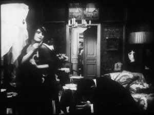
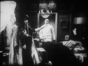
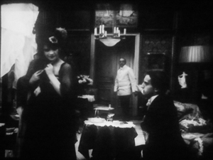
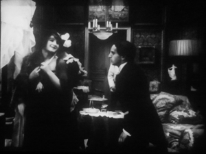
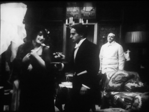
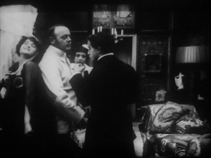
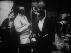
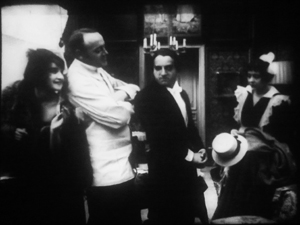
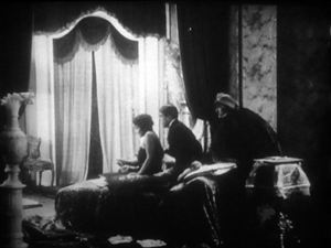
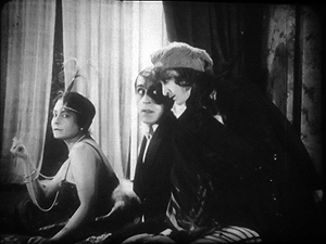
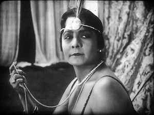
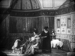
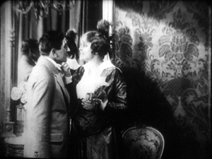
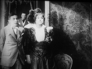
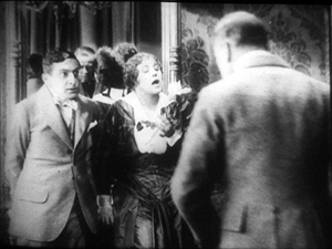
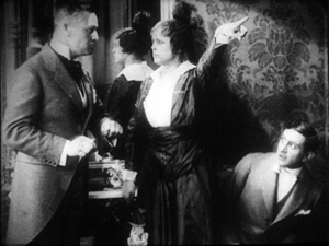
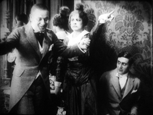
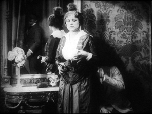
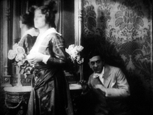
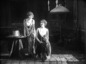
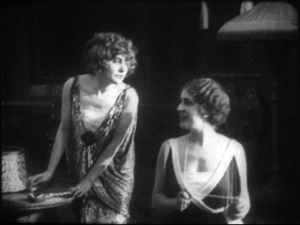
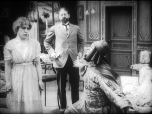
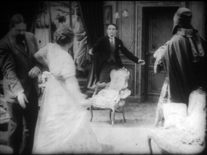
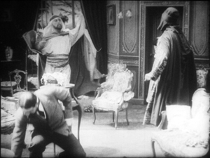
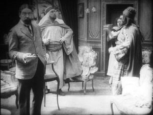
Yet one basic idea of the tableau strategy persisted. We can see this in directors’ use of the axial cut, which provides a constant orientation to the setting. While American directors were often building up a scene from many angles, German directors seemed reluctant to show the action, at least in interior sets, from distinctly varied viewpoints. So when they broke a dialogue scene into many shots, they stuck to the camera axis, cutting in and out along that. You can see that in the Marionettes scene. Consider as well this moment in I.N.R.I.: The Catastrophe of the People (1920). Within a single overall orientation, the editing enlarges or de-enlarges the three characters in the boudoir.
Even with the drastic enlargement from the first shot to the second, or from the third to the fourth, our orientation is basically the same. The staging cooperates with this strategy, making sure that all three players’ faces turn to the camera, even if their bodies are angled away from it. They’re playing to the lens axis, we might say.
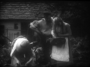
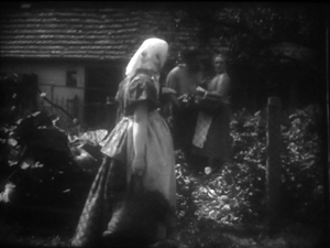
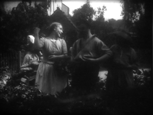
When directors try to shift the angle more drastically, the consequences can be strange. In Rose Bernd (1919), an adaptation of a famous Gerhardt Hauptmann play, an axial cut has brought the bullying Streckmann striding toward the camera to meet his wife and Rose, chatting in his garden.
As he flirts with Rose, director Alfred Halm provides another axial cut, from farther back, as a neighbor woman passes in the foreground. Rose turns to look.
The print is missing dialogue titles, but there evidently was one here, as Rose comments on the woman passing. The dialogue title provides some cover for the extraordinary cut to the next shot.
The time is clearly continuous, as the woman is still walking past the garden gate, now in the distance. But Rose, Streckmann, and his wife have been completely rearranged in the frame. They’re positioned frontally, as in the I.N.R.I. boudoir example, and they create the sort of foreground/ background dynamic characteristic of 1910s cinema generally. Halm could have shown Rose’s comment and the others’ reaction by cutting back in along the axis, to a closer shot of the group in the garden (like the second one above). Instead, he shifted his camera position sharply. The new shot does highlight Rose and her gesture, but at the price of spatial coherence.
Aliens, missing shadows, and lustful monks
Tötet nicht Mehr!: Misericordia (To Kill No More!: Misericordia, 1919).
So some of our hypotheses seem borne out. Many German directors apparently adopted a conservative position toward American-style analytical editing until the ban relaxed in 1921. After that, as Kristin documents in her Lubitsch book, films by Murnau, Lang, and others employ more varied angles and less frontal staging. It seems likely that the Germans learned about this approach from the new availability of films from America and European countries (some of which were adopting the American approach).
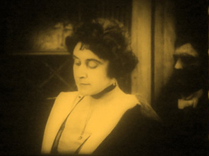
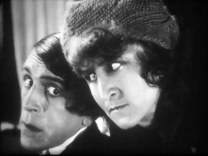
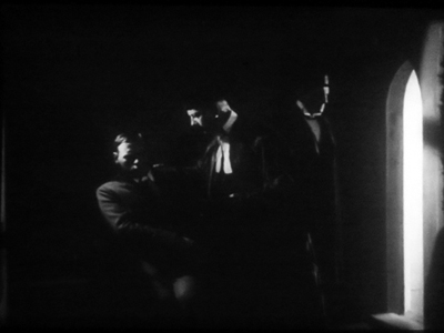
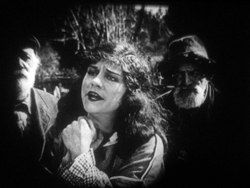
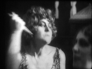
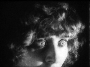
My latest plunge into Weimar cinema yielded other enjoyments. It’s commonly said, for instance, that Germans experimented with expressive lighting effects. So did directors in many other countries, but I did find some striking uses of sparse, stark illumination. One example is the prison cell from Tötet nicht Mehr!: Misericordia (1919), above. Even more daring is this double close-up from I.N.R.I.
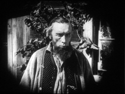
Harvey Dent has nothing on the conniving Russian student Alexei, half of whose face seems just scooped away by shadow. The faint shadow cast on the wall tempts us, in a weird Gestalt illusion, to see his head as partly transparent.
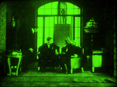
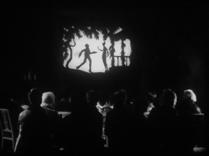
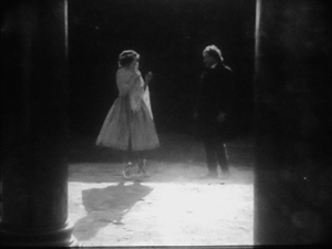
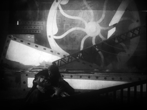
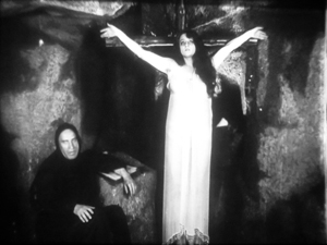
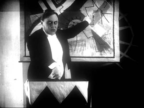
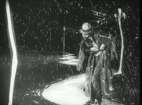
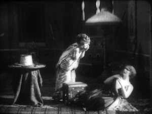
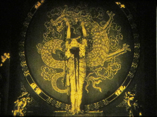
Another area of German expertise was special effects, and I saw plenty of sophisticated double exposures, matte shots, and split-screen tricks. As you’d expect, some of these were used to suggest hallucinations or the supernatural. At the very top of today’s entry is another image from I.N.R.I., which presents the student Dmitri’s fever dream. Below are a couple of nice ones from Lost Shadows (Verlorene Schatten, 1921). A Satanic traveling showman puts on shadow plays, but his cast is drawn from real life: He bargains with people for their shadows, and eventually leaves the hero without one.
What, finally, about what we all yearn for: an extravagantly nutty film? Nothing in this foray matches the work of Robert Reinert (Opium, Nerven), about which I’ve written in Poetics of Cinema and on the DVD restoration of Nerven. Reinert is on another plane of delirium, as mentioned in an earlier entry. Nonetheless, apart from moments in many of those movies already discussed, I found two pervasively peculiar items.
The more well-known is Algol (1920), directed by Hans Werckmeister. The sets, although designed by Walter Reimann of Caligari fame, aren’t cramped and contorted but are instead vast, geometrical, and a bit reminiscent of the Monster-Machine aesthetic of Expressionist theatre.
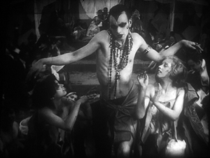
The plot is your everyday visit from another planet. An alien from Algol visits a coal mine and gives a loutish miner a machine that generates endless energy. (Today the Algolian could take a bribe from an oil company to head back home.) The miner becomes a tycoon controlling the world’s energy supply. This monumental fantasy (big sets, big crowds) is enacted with maniacal gusto by Emil Jannings, who spends his wealth, like all good plutocrats, on bacchanals featuring crazy dancing.
Algol is forthcoming in the Filmmuseum DVD series.
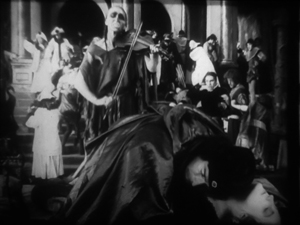
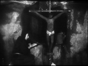
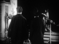
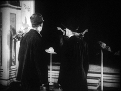
The Plague in Florence (Die Pest in Florenz, 1919) is less famous, although the script is by Fritz Lang. Directed by Otto Rippert (Homunculus, 1916; Totentanz, 1919), this tells of Julia, a woman whose all-powerful sexuality wreaks havoc on the city. Even churchmen lust for her, and eventually Florence sinks into debauchery. What redeems, if that’s the right word, the city is the appearance of a plague that strikes citizens dead in their tracks. Personified as a gaunt woman rising up from the marshes and mournfully playing a violin, the plague eventually kills Julia and her umpteenth lover.
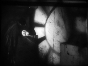
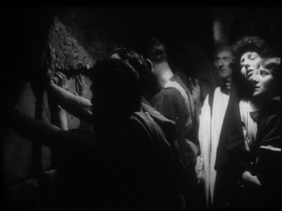
Before this, we’ve had everything I’ve mentioned and more: a couple of fancy tableau sequences, axial cuts, wild mismatches between shots, spectacular lighting effects (e.g., catacombs, below), and hallucinatory sequences. At one point, the mad monk vouchsafes Julia a glimpse of the horrors to come by showing her a river of corpses calmly flowing underground.
Of course the monk isn’t invulnerable to Julia’s charms. Trying to pray away the impulses she arouses in him, he sees her as his Savior. Herr Rippert, Señor Buñuel is on the other line.
Who knew film history could be so surprising? You don’t get this stuff in your usual pop history. But maybe it’s better we don’t share this with the civilians.
My usual heartfelt thanks to the Royal Film Archive of Belgium, its staff (particularly Francis, Bruno, and Vico), and especially its Director, Nicola Mazzanti. Thanks also to Sabine Gross for a translation.
My previous Brussels research visits are chronicled in this blog over the years. A 2007 entry talks about my viewing method and concentrates on Yevgenii Bauer. The following year’s entry is devoted to William S. Hart. An eclectic 2009 one surveys films from Germany, France, Denmark, and even Belgium. In 2010 I went twice, once in January (watching mostly Italian diva films) and as usual in July (but no entry for that visit, consumed as I was with writing about Tintin). The 2011 entry is diverse, covering many national cinemas, and, implausibly, runs even longer than the others.
We have many other entries on film style in the 1910s. One considers how the Hollywood style coalesced in 1917; another talks about Doug Fairbanks. There’s also an entry on 1913, which discusses both Suspense and Ingeborg Holm, and there are discussions of Sjostrom as a master of both the tableau approach and continuity editing. And of course there’s plenty on Feuillade’s staging; you might start here, and perhaps pause over the mini-essay here, which talks about the director’s eventual experiments with editing. Elsewhere on the site there’s an essay on Danish cinema that echoes some points made in today’s entry. (Unlike other countries, neutral Denmark was able to send its films to Germany during the war, so there may have been some influence there.) Broader comparative arguments about this material have been sketched in a lecture I’ve given in various places, “How Motion Pictures Became the Movies.”
Interest in German cinema of the period grew after Pordenone’s Giornate del cinema muto held its trailblazing program published as Before Caligari, ed. Paolo Cherchi Usai and Lorenzo Codelli (University of Wisconsin Press, 1991; now, alas, very rare). See also the valuable collection edited by Thomas Elsaesser, A Second Life: German Cinema’s First Decades (Amsterdam University Press, 1996). Kristin has an essay here on Die Landstrasse (1913), a remarkable instance of the tableau style.
As my research on the 1910s draws to a close, I’m thinking of how to synthesize and present my arguments. Originally I was considering a book, but the number of stills, and the specialized nature of the project, would probably make publishers shudder. At the moment, I’m thinking about creating a series of PowerPoint lectures, with voice-over. These would be freely available for people to use in courses if they wanted. That initiative would be another experiment in using the Web to get information and ideas out there to interested readers.
Professor Bordwell illustrates his views on visual storytelling (Algol).
The ten best films of … 1921
The Four Horsemen of the Apocalypse.
Kristin here:
To end the year, we’re continuing our tradition of picking the ten best films not of the current year but of ninety years ago. Our purpose is twofold. We want to provide guidance for those who may not be particularly familiar with silent cinema but who want to do a bit of exploring. We also want to throw in occasional unfamiliar films to shake up the canon of classics a bit.
Like last year, it was strangely difficult to come up with ten equally great films. There were some obvious choices, but beyond them there were a lot of slightly less wonderful items jostling for the other places on the list. The problem had several causes. Some master directors who routinely figure in our year-end ten choices had off-years. In 1921 D. W. Griffith released only one film, Dream Street, a notably weak item. (What I have to say about it can be found on pp. 108-113 of the British Film Institute’s The Griffith Project, Vol. 10.) Ernst Lubitsch released two films that seem like less interesting attempts to repeat earlier successes: Anna Boleyn (a pale imitation of Madame Dubarry) and Die Bergkatze (nice, and I was tempted to include it, but it’s less amusing than the Ossi Oswalda comedies, here and here). Cecil B. DeMille’s The Affairs of Anatol is not nearly as well structured as his earlier sophisticated rom-coms.
In other cases, films simply don’t survive. John Ford released seven films in 1921, all of which are lost.
Death comes calling, twice
Probably the easiest decision was to include The Phantom Carriage (also known as The Phantom Chariot), by Victor Sjöström. As I noted recently, the Criterion Collection has recently issued a beautiful restoration of it (DVD and Blu-ray).
When I first saw The Phantom Carriage, I was probably still an undergraduate. Given its reputation as a great classic, I was somewhat disappointed. No doubt it was partly the battered 16mm copy I watched, but the film is a bit formidable for someone not accustomed to the aesthetic of silent cinema–and especially of the great Swedish directors of the era. Its protagonist, played by Sjöström himself, is a thoroughly, determinedly unlikeable fellow, and the complex flashback structure can be a bit disconcerting on first viewing. But the effort to watch until one “gets” Sjöström is well worth it, since he’s undoubtedly one of the half dozen greatest silent directors.
The story opens on New Year’s Eve with Edit, a young Salvation Army volunteer, on her deathbed. She unexpectedly begs her colleague and mother to fetch the town drunk, David Holm, to her bedside. At the same time, Holm sits drinking in a graveyard as midnight approache. He tells two fellow inebriates the legend of the phantom carriage, the vehicle that picks up the souls of the 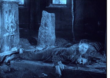 newly dead; it is driven each year by the last person to die at the end of the previous year. Holm then dies, and the carriage arrives, with its current driver ready to turn over the job to him. Flashbacks enact both the circumstances of how the heroine met Holm and the happy family whom Holm had alienated through his drunkenness.
It’s a deeply affecting story, wonderfully acted and staged. In most scenes the lighting and staging are impeccable, and the famous superimpositions that portray the carriage and the dead are highly ambitious for the period and impressively executed. The filmmakers have managed to make the carriage, superimposed on real landscapes, appear to pass behind rocks and other large objects. In short, a film that has everything going for it.
Death himself appears in Der müde Tod (literally “The Tired Death,” often called Destiny, or occasionally in the old days, The Three Candles). Here the great German director Fritz Lang hits his stride, and you can expect him to figure on most of our lists from now on.
In Destiny (available on DVD from Image Entertainment) a young woman’s fiancé is killed early on. Death, a sympathetic figure who regrets what he must do, gives her three chances to find another person whose demise can substitute for her lover’s. The three episodes in which she tries take place in Arabian-Nights Baghdad, Renaissance Venice, and ancient China; each story casts her as the heroine and her lover as the hero.Things don’t go well, and Death actually gives her a fourth chance when she returns to the present.
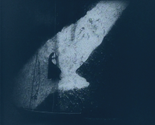
This was Lang’s first venture into the young German Expressionist movement, which had been launched the year before with Das Cabinet des Dr. Caligari. The style shows up only intermittently, perhaps most dramatically in the Venetian episode when the lover shinnies up a rope along a wall painted with a gigantic splash of light. (See bottom.)
Each film has a “happy ending.” I leave it to you to determine which is grimmer.
I’m turning over the keyboard to David now, to describe a film he knows better than I do.
More Northern European drama
Mauritz Stiller alternated urban comedies (Thomas Graal’s Best Film, 1917; Thomas Graal’s Best Child, 1918; Erotikon, 1920) with more lyrical dramas and romances set in the countryside (Song of the Red Flower, 1919; Sir Arne’s Treasure, 1919). Johan (1921) is in the pastoral vein. Its integration of landscape into the drama suggests it was an effort to recapture the production values that overseas critics had praised in Sjöström’s Terje Vigen (1917) and The Outlaw and His Wife (1918). Like the Sjöström films, however, Johan offers more than splendid spectacle; it’s the study of the undercurrents of a marriage.
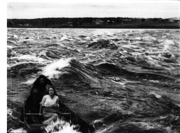 At the core is a love triangle. The fisherman Johan is the somewhat thick-headed son of a domineering mother. He is fond of the girl Merit, whom he and his mother rescued as a waif and brought into their household. But this synopsis is actually skewed, because Stiller and the scriptwriter Arthur Norden have told the story in an unusual way.
We’re introduced to the couple by following the rogue Vallavan’s entry into the town; Johan seems almost a secondary character until Vallavan leaves. When Johan breaks his leg, Merit agrees to be his wife. Now we’re attached to her standoint and see her life of drudgery under the petty tyranny of Johan’s mother. Vallavan returns, and Merit falls under his spell. Taking her hand, he says, “I want to rescue you.” After she has fled with him, Johan clumsily wanders the rocky shore. “Will I ever see Merit again in this life?” The narrational weight passes to him as he decides to pursue the runaways.
Like Sjöström’s Sons of Ingmar (1918-1919), Johan presents marriage as a trap for unwary women. Our shifting attachment, from Vallavan to Merit and eventually to Johan, allows us to see the situation in many dimensions. As a sort of parallel, Stiller makes fluid use of the now solidly-established conventions of continuity editing. Vallavan’s seduction of Merit is played out in tense shot/ reverse-shot, and there’s an engrossing moment involving delicate shifts in point of view. When the bedridden Johan sees Merit leaving, after his mother has cast her out of the house, he must smash a window pane with his elbow in order to call to her. Stiller’s dynamic eyelines, direction of movement, and precise changes of camera setup here show that he had mastered the American style.
Alongside this finesse, there is still plenty of outdoor action, highlighted when Vallavan rows Merit away in the tumultuous river. Filmed from another boat, the actors are all but engulfed by the waves. It was presumably scenes like this that the parent company, Svensk Filmindustri, hoped would attract international attention. At this period Svensk, dominant in the local industry, was hoping to sell its films on a global scale. That ambitious plan failed, but it left us with many outstanding movies and soon brought Stiller, along with Sjöström, to Hollywood.
Johan is available on a Region 2 PAL DVD, coupled with Kaurismaki’s Juha, another adaptation of the Juhani Aho story.
The joys of small-town life
Last year I included two films by William C. deMille, the considerably less famous brother of Cecil B. The year 1921 saw the release of what is today his best-known film, Miss Lulu Bett. It was based 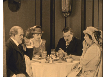 on the popular novel and play by Wisconsin author Zona Gale, who received her MA here at the University of Wisconsin-Madison and in 1921 became the first woman to win a Pulitzer Prize for drama. The story centers around the heroine, a spinster who lives with her sister’s family, including her niece, nephew, and brother-in-law, Dwight Deacon. Dwight is a tyrant who delights in taunting Lulu over her unwed status, and the rest of the family treats her as a servant.
The return of the husband’s globetrotting younger brother Ninian after a twenty-year absence injects some life into the situation. Taking the family out to dinner, he realizes just how boring the family is (right), and to liven things up, suggests that he and Lulu perform mock marriage vows. Dwight realizes that the ceremony is legally binding, and, already attracted to Lulu, Ninian suggests that they treat it as a real marriage. Desperate to escape her dreary situation, Lulu agrees. The relationship proves agreeable, and Lulu declares that she will learn to love Ninian–when he reveals that he had previously been married, though he doesn’t know whether his first wife is dead (in which case he and Lulu are married) or alive (in which case they aren’t). Unwilling to take a chance, Lulu returns to the Deacons, who consider her disgraced and treat her even worse.
The film avoids melodrama. Ninian is not a villain; he’s kind to Lulu and sorry for the position he’s placed her in. It remains to Lulu to summon the gumption to leave the family and find her own happiness.The whole thing is told with restraint and little touches of humor that draw the viewer into a deep sympathy with Lulu’s plight.
Lois Wilson’s performance as Lulu is crucial in this. She is at once plain enough that we can believe she is in danger of becoming an old maid and pretty enough to plausibly attract the attention of the handsome local schoolteacher. Wilson’s most prominent role came two years later, when she starred as the heroine in James Cruze’s The Covered Wagon.
Miss Lulu Bett is the only one of William’s films available on DVD, paired with Cecil’s Why Change Your Wife? As so often happened, William seems to take a back seat to his famous brother, but the pairing is a logical one, in that William wrote the script for Why Change Your Wife?
Another small-town drama of the same year is Lois Weber’s The Blot. In 1981, when I was teaching a course on American silent film at the University of Iowa, I wanted to quickly demonstrate to the students that the silent period was not an era of exaggerated acting and naively melodramatic plots. I showed a double feature of The Blot and King Vidor’s Wine of Youth (1924). The latter portrays changing sexual mores through the story of three generations of the same family, with a young woman of the Roaring Twenties questions the necessity of marriage when she discovers that her mother is contemplating divorce. I think Wine of Youth (unfortunately not available on video) and The Blot convinced my class that silent films could be both sophisticated and subtly acted.
The “blot” of Weber’s title refers to the notion that people in professions depending on intelligence and education are poorly paid, while tradespeople and children from rich families are well off. The representatives of the underpaid are a college teacher, Prof. Griggs, and a young, idealistic minister. The parallels to recent events are striking. College professors may not be so badly paid as in the 1920s, but the move toward institutions of higher learning depending on adjunct lecturers has created a similar issue. In general, the income gap is familiar: the rich young wastrels taking Prof. Griggs’s course represent what we now call the one percent, while the professor and minister live on a much lower plane.
Weber’s drama is not quite this bald, however. Various levels of prosperity are represented. The professor’s family lives in shabby gentility, his wife grimly struggling to keep food on the table and his daughter Amelia, in delicate health due to a lack of nourishing food, working in the local library. Their neighbors are the family of a successful shoemaker, who live well but lack education. The shoemaker’s wife in particular resents what she perceives as intellectual snobbishness in the professor’s family and takes every opportunity she can to flaunt her comparative wealth.
Her son, however, has a crush on Amelia, as does the poor minister. Into this situation comes Phil West, the professor’s rich but indolent and mischievous student. Also attracted to Amelia, Phil for the first time encounters real poverty and is 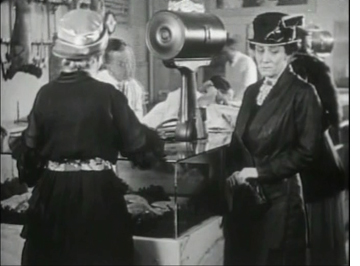 shocked by it. As the plot develops, Amelia falls ill, and her mother’s increasingly desperate efforts to obtain the food necessary to nurse her to health become one of the main threads of the drama. To say that a large part of the action in the second half of the film centers on Mrs. Griggs’s temptation to steal a chicken from her neighbors might make the situation seem a trifle comic, but Margaret McWade’s remarkable performance vividly conveys the wife’s struggle in the face of real lack and her humiliations in the eyes of the shoemaker’s gloating wife. When Mrs. Griggs succumbs to temptation, the result is a brief but wrenching scene.
The plot is remarkably dense and unpredictable. Every scene involves glances that lead to new knowledge or serious misunderstanding, deflecting the plot into new directions. Early on it is impossible to say which of the three young men Amelia will end up with, and even by the late scenes, when only two plausible romantic candidates remain, we have no idea which she will pick. As in many of Weber’s films, she does a bit of preaching about the social problem involved, but in The Blot she leaves this until near the end and gets it over quickly and fairly believably. The considerable but gradual change in Phil’s attitude toward education and the problems of poverty is also made believable. The prosperous neighbor’s change of attitude may seem a bit sudden, though it is somewhat motivated by a line early on.
But on the whole, even more than with Miss Lulu Bett, this is an absorbing story with characters for whom we care. Weber uses motifs as skillfully as any director in the early phase of the classical Hollywood cinema. Watch in particular how many different ways she uses the Griggs family’s cat and her two kittens: to demonstrate the family’s poverty, to be the main means of the neighbor lady’s spite, to introduce some comedy, and so on. Even more pervasive is the way that shoes become tokens of characters’ various social positions.
The Blot is available on DVD from Image. Those interested in Weber as a director should note that next summer’s Il Cinema Ritrovato festival in Bologna plans a retrospective of her work.
Which is best? Damfino.
In past year-end lists, we’ve watched Harold Lloyd, Charles Chaplin, and Buster Keaton creeping toward their great features of the 1920s. This year two of them move cautiously into longer films, and the other releases two more terrific one-reelers.
The Boat is one of Keaton’s most admired shorts. In it, he, his wife, and their two young sons build a boat, the Damfino, and unwisely launch it on the open ocean. Everything that can go wrong does: the life-preserver sinks, the anchor floats, and naturally a storm hits. The wife’s pancakes aren’t edible, but one temporarily patches a leak. Throughout the intrepid band carries on against all obstacles.
Less perfect but more dazzling and (perhaps) funnier is The Playhouse. The premise of a small variety theater creates an episodic, messy narrative, but it allows Keaton to play out a series of four “acts.” Initially we see Keaton buy a ticket and enter an auditorium where the audience, the orchestra, and all the performers are played by “Buster Keaton.” As one of the audience members remarks, “This fellow Keaton seems to be the whole show,” which is true in more way than one. The multiple images of Keaton were accomplished entirely in the camera, by cranking back the film with precise timing and uncovering a different part of the lens at each pass. The precision when one Keaton figure talks to or dances with another is amazing.
This all turns out to be a stagehand’s dream. (Keaton being the stagehand.) The multiplication motif returns as an act involving two pretty girls who happen to be twins–something Buster 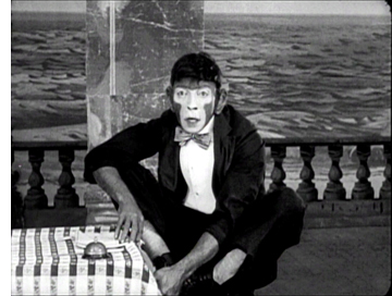 doesn’t know, making his encounters with them ever more baffling. Later an orangutan escapes, and Buster dons make-up and costume to replace him. All hilarious stuff, though unfortunately the final act, a Zouave Guard drill, is the least funny one. Still, it’s a terrific film with a big dose of the surrealist quality that will run through the later shorts and the features.
The Boat is included on Kino’s disc of The Navigator and The Playhouse with their out-of-print DVD of The General. Still in print, however, is Kino’s eleven-disc set of the features and shorts. For those in the UK and other region-2 countries, Eureka! has a “Masters of Cinema” three-disc set, “Buster Keaton: The Complete Short Films 1917-1923,” which includes many of his earlier films with Fatty Arbuckle.
The year saw Lloyd and Chaplin make their first feature films, though both releases were still fairly short. I’m not really counting A Sailor-Made Man as one of the top ten of the year, since it’s a delightful but decidedly light item. Just another reminder that Lloyd is inching toward greatness.
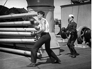 Lloyd presents his “glasses” character as a brash young man who impulsively proposes to a rich man’s daughter. When the father demands that he get a job to prove his worth, Harold enlists in the navy. Highjinks ensure, culminating in a lively chase-and-rescue scene when the heroine gets kidnapped by a lecherous Arabian sheik.
The shipboard scenes allow Harold to get in some funny bits, mainly involving him trying to be tough and succeeding at first by sheer accident. Later, however, he is inspired by the heroine’s danger to become a real rescuer. It’s a sign of bigger things to come.
New Line’s Harold Lloyd boxed set is out of print, but you can still get the volumes separately. A Sailor-Made Man is in Volume 3, along with such delights as Hot Water and For Heaven’s Sake.
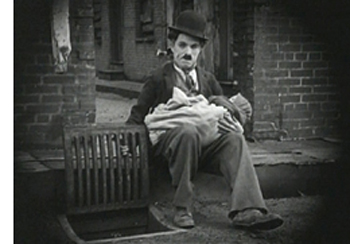 Chaplin’s first feature, The Kid, is a skillful blend of the rough-and-tumble slapstick that had characterized his early shorts and the sentimentality that would gradually become a more prominent trait of his films. A unmarried woman (played by Edna Purviance, the elegant beauty who made such a contrast with the Little Tramp in many of his films) abandons her infant in an expensive car which happens to get stolen moments later. Charlie finds the baby, and after numerous attempts to get rid of it–including a brief contemplation of an open storm-sewer grate–decides to raise it. The baby grows into the adorable and amusing Jackie Coogan.
In the meantime, the mother has become a rich singer, and coincidentally she comes to the slums doing charitable work. The authorities eventually try to remove the Kid to an orphanage, and later a flop-house proprietor turns him in to receive a reward. Still, Chaplin doesn’t milk the pathos, and a happy ending duly arrives.
The Kid is available in a decent print along with A Day’s Pleasure and Sunnyside on the “Charlie Chaplin Special” DVD. Our recording off Turner Classic Movies strikes me as being slightly better quality, so you might keep an open to see if they reshow it. It was also announced this week that The Kid has been added to the National Film Registry of the Library of Congress.
Fuzzy movies, big and small
Soft-style cinematography had been tried in some films of the late 1910s, most notably in Griffith’s Broken Blossoms. But in the 1920s it spread. In Hollywood, it was mainly a technique for making beautiful images and especially for creating glamorous close-ups of actresses. In France, it was a way of tracking a character’s inner life.
Vicente Blasco Ibáñez’s 1918 novel, The Four Horsemen of the Apocalypse was a huge bestseller, and the first film adaptation in 1921, directed by Rex Ingram, was equally successful. To many, it is remembered for having made a super-star of its main actor, Rudolph Valentino. Anyone who has seen him as the caricatured Latin Lover of his later films will be pleasantly surprised to discover that the man could act, as could his leading lady, the lovely Alice Terry.
Ingram was the quintessential middlebrow director of the 1920s, doing big-budget, respectable adaptations of popular literature (e.g., Scaramouche, The Prisoner of Zenda). To me, Four Horsemen escapes the stodginess of the later films, at least to some extent (as does his other 1921 film, The Conquering Power). It and the other film in this section were borderline cases, chosen as much for their historical importance as their quality, perhaps, but definitely worth watching.
One of Four Horsemen‘s greatest strengths is its photography. Ingram worked consistently with one of the greatest cinematographers of the 1920s, John F. Seitz, who created glowing images of 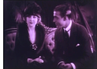 sets and actors with selective lighting and all sort of means of softening the image. This film, more than Broken Blossoms, brought the soft style into vogue. It eventually culminated in the Dietrich films of Josef von Sternberg before a more hard-edged look came to dominate the 1940s.
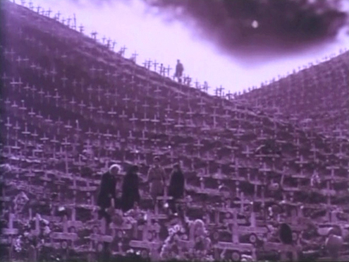
Four Horsemen was also an early entry in the anti-World War I genre of the 1920s and 1930s. Its final scene in a vast military cemetery of identical white crosses remains a powerful one. (See above.) Here, however, the Germans are still stereotypes, militaristic puppets with no redeeming features. Even that notion would gradually change, however, until nine years later All Quiet on the Western Front could recount the war from the German point of view.
Four Horsemen is available on DVD on demand from Amazon, supplied on DVD-R. In the same format, one can order it on a set with a documentary on Valentino. The reviews of the latter suggest that the visual quality is good.
(For more on this photographic style, see my “The soft style of cinematography,” in The Classical Hollywood Cinema, pp. 287-293.)
I’m not a huge fan of Marcel L’Herbier, and I’m not entirely sure that El Dorado is a full-fledged 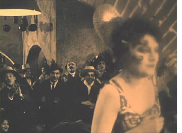 masterpiece. But it has many virtues, and arguably it’s historically important as the first film of the French Impressionist movement to thoroughly explore ways in which camera techniques could convey perceptual and psychological states. It focuses largely on Sibilla, a singer-dancer who is the main attraction in a tawdry Spanish bar. She and some other women are performing as the story begins, but Sibilla is distracted by worries about her sick son. L’Herbier experimented with tracing her attention by placing gauzy filters over her face when she starts thinking of the boy. In the frame at the left, for example, she is in sharp focus when onstage, but as she passes into the backstage area, she goes fuzzy.
In a way this is a somewhat silly, literal notion, and yet it’s exciting to see filmmakers exploring new devices relatively early in film history. Gauzy filters, distorting mirrors, slow-motion superimpositions, rhythmic cutting, and subjective moving camera were soon to be in common use by a small group of French directors. El Dorado was also the first film to be filmed within the Alhambra, which lends it considerable visual interest.
If we’re still writing this blog in 2019, our list will probably include the culminating film of the movement, and arguably L’Herbier’s best silent film, L’Argent.
Not many French Impressionist films are available in the U.S. If you have a multi-region player, El Dorado is paired with L’Herbier’s earlier L’homme du large (1920) on a French DVD.
Tigers and lepers and a mysterious yogi
We tend to think of serials as having many episodes and being low-budget additions to programs. That’s the American model, but in Europe things were different. Louis Feuillade’s serials are among the gems of the 1910s. In Germany, serials tended to have fewer episodes but bigger budgets–much bigger. Many were only two parts, most famously Dr. Mabuse, der Spieler (coming next year to our top-ten list) and Die Nibelungen (coming in 2014). Lang had launched into serials with Die Spinnen (1919 and 1920). The two parts have terrific things in them, but Lang never went on to finish it.
He was, however, still collaborating on screenplays for director Joe May, who specialized in epic serials set in exotic countries and starring his wife, Mia May. Highly entertaining though these films are, they are largely forgotten, even by most lovers of silent cinema. Das indische Grabmal is the exception, though even now few have had a chance to see it. In 1996 it was shown at “Il Gionate del Cinema Muto” festival in Pordenone and was all too briefly available on an Image DVD (as The Indian Tomb) now out of print. Track it down if you can.
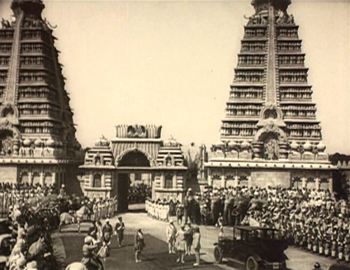
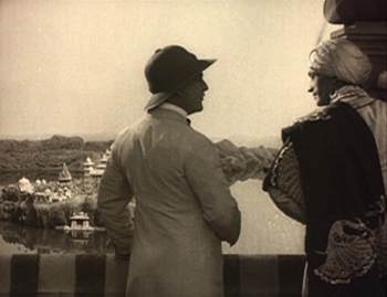
Full of the stars of its day, Das indische Grabmal is set largely in India, and its plot was inspired by the Taj Mahal. A ruthless maharajah (played with relish by Conrad Veidt) cloaks his cruelty under a veneer of European courtesy. He plots to shut his unfaithful princess (Erna Morena) in a beautiful tomb along with her lover (Paul Richter, better known to modern audiences as Siegfried). He calls in a famous European architect (Danish star Olaf Fønss) to build it, and the architect’s fiancée (Mia May), rightly fearing dirty work afoot, follows. One pit full of tigers and one of lepers lie waiting to endanger the visitors. The sets are beautiful. The Germans by this point could do them at full scale (above left) and as marvelously deceptive miniatures (above right). Das indische Grabmal is constantly entertaining and perhaps the best of its type, at least of the films we have access to.
Lang directed a two-part remake of this film in 1959. Both are good, but I prefer the silent one.
Some runners-up
As I mentioned, we had trouble narrowing down our list this year. Here are some others that could have replaced some of our prime choices. The German stage director Leopold Jessner adapted the play Hintertreppe (Backstairs). It’s a Kammerspiel, set in two apartments and the courtyard between them, and concerns a simple love triangle among a maid, her absent lover, and the postman who loves the maid so much that he forges letters from her sweetheart to keep her happy. Antti Alanen kindly reprinted my notes on the film here.
Carl Dreyer’s third feature, Leaves from Satan’s Book, remains one of the most widely-admired variants on the Intolerance formula of presenting thematically linked historical episodes. The dynamic final last-minute non-rescue shows that Dreyer learned a good deal from Griffith’s crosscutting too. Leaves is available on a Danish DVD with English subtitles and an alternate ending. Murata Minoru’s Japanese feature Souls on the Road, another exercise in complex crosscutting, and Feuillade’s polished L’Orphéline are solid runners-up as well. Neither is available on commercial DVD, as far as we know.
Destiny.
Silents nights: DVD stocking-stuffers for those long winter evenings
Von Morgens bis Mitternachts
Kristin here:
The year 2011 has been a good year for silent cinema on DVD. In time for the holiday shopping season, here’s an overview of some of the highlights.
One-stop shopping for the latest restorations
In the past we have recommended films released on DVD through the Munich Film Museum’s Edition Filmmuseum. We haven’t really emphasized enough, however, what a major resource this site is for film enthusiasts interested in restorations of older films and new editions of hard-to-see modern films (like the work of James Benning). Edition Filmmuseum sells not only its own impressive series of releases but also DVD editions of restorations by other major national European archives. Its website is available in German and English versions, and it is as easy to sign up and order DVDs there as it is through Amazon. The DVDs on offer can be browsed via a number of different categories, such as “Silent films,” “German movies,” and “Danish classics.” Releases from Lobster Films and Flicker Alley are also available through Edition Filmmuseum. Have a look at its forthcoming releases here. North American educational institutions seeking public performance rights for many of these and other titles should contact Gartenberg Media Entertainment.
Scandinavia comes on strong
Danish and Swedish films show up fairly regularly on DVD these days, but Norwegian films are rarities. This year, though, there are two of them.
The Danish Film Institute continues to release the films of Carl Theodor Dreyer. This time it’s a pairing of Elsker Hverandre (Love One Another, 1922) and Glomdalsbruden (The Bride of Glomdal, 1926), also available in Blu-ray. (See below.) I have to admit that these are not among my favorite Dreyer films, and I don’t think many would put them alongside his best works. Still, Dreyer is one of the great masters of world cinema, and anyone seriously interested in film history will want to see these. Back when David was working on his book on Dreyer, we went to Copenhagen and saw these at the Film Institute. They were incredibly rare, and it was a privilege to see them. Now, they’re available to all. Check out the Institute’s entire list of restored Danish classics on DVD here.
[Dec. 16: Archivist Jan-Christopher Horak has recently blogged about Elsker Hverandre.]
The Bride of Glomdal is the first of our two Norwegian features. Dreyer worked outside Denmark a number of times. In the summer of 1925 he shot this film in Norway. His next film was to be La Passion de Jeanne d’Arc.
The second is Laila, a 1929 Norwegian feature, also with a Dreyer connection. Its director, George Schéevoigt, had been Dreyer’s 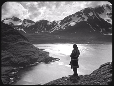 cinematographer for some of his early films: Leaves from Satan’s Book, The Parson’s Widow, Once Upon a Time, and Master of the House. Laila bears no sign of Dreyer’s influence, but its images, shot in the snowy mountains and valleys of the arctic regions of Norway, are gorgeous.
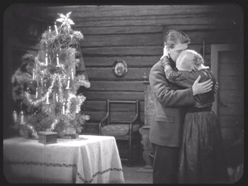
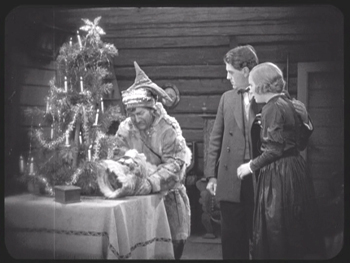
Like many features made in countries with no real established film industry (Laila’s footage had to be processed and edited in Copenhagen), Laila exploits both national literature and landscapes to distinguish itself from the Hollywood films that dominated European theaters. It was based on an 1881 novel by J. A Friis, Fra Minmarken, Skildringer. Friis strove to promote the rights of the indigenous Sami people (sometimes known as Lapps). The story follows the heroine, Laila, from infancy to adulthood. The first half of the film succeeds in giving a distinctly non-classical feel to the story. Laila is lost in the snowy wastes when wolves attack her family as they travel on sleds. She is found and nurtured by a childless Sami couple who come to love her but return her to her parents when they learn her background. The scene of the return is handled in a subtle and moving fashion. As the grieving parents console each other on Christmas Eve, Aslag, the baby’s foster father, enters at the left, with the tree blocking the door. He crosses to appear at the center and puts the child beside the presents under the tree:
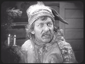
A cut-in to Aslag shows him struggling with his emotions before turning to the parents and declaring, “Tonight all should be happy.” The mystified parents stare at him uncomprehendingly before he explains that he had found their daughter:
Once Laila grows up, the film turns into the more typical romantic triangle. Still, its epic landscapes and focus on a little-known ethnic group make it quite appealing, and the print itself is gorgeous. Flicker Alley has provided a rare opportunity to step outside the more familiar filmmaking countries and explore a bit. Our friend, the fine Danish film historian Casper Tyberg, has provided a helpful text in the accompanying booklet.
Casper also provides a commentary for The Criterion Collection’s release of the restored version of Victor Sjöström’s The Phantom Chariot. (It’s number 579 for you Criterion completists–but you already know about this disc anyway.) I won’t say much about it, since it will inevitably show up in our year-end list of the ten best films of 1921. Here I’ll just note that it’s also a beautiful print, with impeccable tinting and toning that don’t darken the images to the point where the composition is obscured–something I’ve seen too often in recent DVD releases of silent films. The frame above shows the opening scene, with its masterful control of lighting. I was disappointed that the supplements stress Sjöström’s influence on Ingmar Bergman. It may sound heretical, but Sjöström seems to me the better director, and I wish there had been more on his career.
One of the most obscure of German Expressionist films
Von Morgens bis Mitternachts (“From Morning to Midnight”) is an early Expressionist film. It came out the same year as Das Cabinet des Dr. Caligari. It’s based on a play by one of the major Expressionist dramatists, Georg Kaiser, and directed by one of the major Expressionist stage directors, Karlheinz Martin. The problem is, it never got released in Germany.
Most of the classic Expressionist films are, like Caligari, horror films that motivate their stylization through genre. Von Morgens bis Mitternachts adheres to the subject matter of Expressionist theater, which was vehemently critical of modern society. It centers around a downtrodden bank clerk who suddenly rebels against his apparently happy family life and good job, stealing a huge sum from the bank and trying to run off with a glamorous rich woman who visits the bank. Rejected by her, he wanders away to spend the money in frivolous pursuits.
It’s no wonder that German distribution companies shied away from releasing the film. Its only known theatrical screenings were in Japan, where one nitrate positive print survived. I saw an archival copy years ago. It was an impressive film, more extreme in its stylization than Caligari or even Robert Wiene’s second Expressionist film, Genuine. (All three films were released in 1920.) Unfortunately it had no intertitles, which made it seem all the more radical.
In 1987 censorship records were discovered that allowed the Munich Filmmuseum to reconstruct the intertitles and create the restored version that now has been released on DVD. It’s a significant film, not only as an artistic achievement but as a record of stage 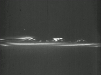 Expressionism of the 1910s. Few plays of the era were filmed, most importantly this one and Jeopold Jessner’s 1923 film Erdgeist, adapted from the play by Frank Wedekind and starring Asta Nielsen and Albert Bassermann. (The play was adapted again by G. W. Pabst as Pandora’s Box, starring Louise Brooks, in 1929; wonderful though that version is, it retains little of the radical Expressionism of the original.)
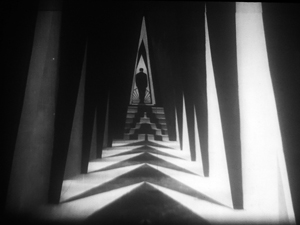
Von Morgens bis Mitternachts has some of the most avant-garde set designs of the era. Jagged white sets are smeared across back voids, as in the scene at the top where the protagonist flees down an endlessly winding road after being rebuffed by the woman for whom he impetuously stole money. It records another performance by one of the leading Expressionist actors of the era, Ernst Deutsch, whom I mentioned in my entry on Der Golem. Apart from its jagged sets, the film features a remarkable scene at a bicycle race, with the contestants being filmed in a distorting mirror. It was a technique that the French Impressionists would soon popularize, but Martin may have used it first (see left).
Despite the film’s lack of impact at the time it was made, it belongs squarely within the German Expressionist movement. This release at last allows it to take its place. (The forthcoming issue of the restored Expressionist science-fiction film Algol, also from 1920, will give an even broader picture of the movement.)
Eureka! Ford is found
The British company Eureka! continues to bring out classic films of all sorts. Its “Masters of Cinema” series has released John Ford’s 1924 western,  The Iron Horse. By this point in his career, Ford has made many western features, only a few of which survive. They were lively low-budget films, but by the early 1920s the western became a prestige genre with the success of James Cruze’s The Covered Wagon in 1923. The Iron Horse was Ford’s move into the high-budget western, and what it lacks in high-spirited energy it makes up for in impressive landscapes and careful dramatic staging. The Indian attack on the train, revealed by shadows (right) is one of the film’s high points.
This Eureka! release is the same version and has the same extras as the DVD in the American series “Ford at Fox.” The two-disc set includes both the 150-minute version released in the U.S. and a 133-minute version, with alternate takes, distributed abroad. Anyone in European Region 2 area who doesn’t want to buy the immense “Ford at Fox” set of 21 discs might want instead to pick up The Iron Horse, one of its highlights, separately. It has plenty of extras as well.
I’ll sneak in an early sound film by recommending another Eureka! release of just about a year ago, Max Ophuls’ La signora di tutti (Everybody’s Lady). Made in italy in 1934, it was Ophuls’ first film after fleeing the Nazi regime. It’s a flashback tale, with the heroine recalling her life after a failed suicide attempt. It’s a new transfer and comes with a video essay by Tag Gallagher and a booklet.
Do yourself, your family, and your friends a favor
The 1994 edition of the “Giornate del Cinema Muto” in Pordenone, Italy, was as memorable as usual. There was the magical presentation of all the surviving Indian films (apart from a few short scraps), accompanied by a delightful and inventive chamber group of three Indian musicians. There were the silent westerns of William Wyler and the sophisticated 1920s features of Monte Bell. The main thread, though, was “Forgotten Laughter,” a celebration of known, little known, and unknown comedians. Their films were mainly shorts, and they provided us with a great deal of laughter.
Then came Wednesday, October 12, when we all witnessed history. A program entitled “Max Davidson” unspooled five two-reelers starring a short, middle-aged guy doing a beleaguered-Jewish-father shtick as well as such a thing has ever been done. We enjoyed four films before the program culminated with the immortal Pass the Gravy. I don’t think I’ve ever heard an audience laugh so loudly and continuously. Don’t assume this is anti-Jewish humor. This is pure Jewish humor, injected for just a few years into mainstream American slapstick filmmaking.
For some reason that year there was a poll taken to determine a film which would be encored at the end of the final evening. Pass the Gravy inevitably won, and we laughed just as hard the second time through. Mere words cannot convey why this film is so funny. It involves Max’s 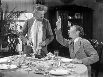 daughter being engaged to a young man who lives next door with his father, proud owner of a prize rooster which ends up the main dish in a meal shared by both families. The running gag involves the young people trying to convey to Max what has happened without the young man’s father realizing what has happened. But no, you have to see it for yourself, preferably with friends and family about you. Like so many comedies, this one works best with an audience.
It has taken 18 years for the surviving Max Davidson shorts, most of them supervised by Leo McCarey, to appear on video, a two-disc set, “Max Davidson Comedies.” Fortunately the job has been done well. The Munich Filmmuseum has assembled 13 shorts, 12 silent and one sound. Not all are as funny as Pass the Gravy, and Max plays only a supporting role in the earliest one. (The less said of the sound short, the better.) A booklet, in German and English, includes historical background and complete credits, including descriptions of the lost films. Davidson, by the way, had a long career playing bit parts, often uncredited. Often he played tailors, as in The Idle Class and The Extra Girl; during the sound era he appeared in The Plainsman and The Great Dictator, among many others. But for a short stretch at the Hal Roach studios he was the star.
At this year’s Il Cinema Ritrovato festival, “Max Davidson Comedies” shared the DVD prize for “Best Rediscovery of a Forgotten Film” with a parallel set put out by the Filmmuseum, “Female Comedy Teams.” The latter included more films shown in Pordenone in 1994.
Of course, the Davidson films were not forgotten by those of us lucky enough to have been in the Cinema Verdi in 1994. Two of them, including Pass the Gravy, were shown on Turner Classic Movies at 6 am a few years later, and we long treasured our VHS tape of that. But now everyone can share in this rediscovery.
A modestly pioneering early American film company
The Kalem company was one of those firms that cropped up during the early years of the American film industry, made shorts and short features for less than ten years, and disappeared without growing into one of the important Hollywood studios. Today it is perhaps best remembered for its 1913 biblical feature, From the Manger to the Cross, which was shot in Egypt and “the Holy Lands” at a time when filming abroad was unusual for 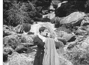 American film companies.
Kalem had pioneered the tactic of filming abroad earlier, however. Its series of films shot in Ireland, beginning with The Lad from Old Ireland (1910), are claimed to be the first American films shot outside North America. Eight of these survive, though often with missing sections. The Irish Film Institute has released a two-disc set including all of them, along with a feature-length documentary, Blazing the Trail: The O’Kalems in Ireland, directed by Peter Flynn.
The films were shot in the region of the Lakes of Killarney, taking advantage of famous locales like the Gap of Dunloe and Torc Waterfall (seen in Rory O’More, right). Intertitles include passages emphasizing that the scenes were shot in the very places where their historical and literary sources were set.
Unfortunately even the surviving films are not in good condition. Some are lacking their endings, and all are worn. The transfer has unfortunately cropped the edges, even though the accompanying documentary stresses that director Sidney Olcott’s main strength was his eye for compositions. Still, this set of films provides a rare example of fairly standard American films of the transitional period between the primitive and classical eras. Most classes in cinema history represent this transitional period mainly through the Biograph shorts of D. W. Griffith. This DVD provides a chance to show the more mainstream filmmaking of the early 1910s.
The accompanying documentary, Blazing the Trail, takes its title from the memoirs of Gene Gauntier, Kalem’s main scenario-writer and leading lady in its early period, including most of the Irish-based films. The film is perhaps a bit over-long for the topic, but it provides a rare in-depth look at a small company of the early era. The DVD set is available only from the Irish Film Institute’s website.
Looking different today?
Johan (1921).
DB here:
Earlier this month Manohla Dargis wrote a New York Times article on how we watch, or should watch, films that some audiences consider slow and boring. She suggested that appreciating such films requires us to cultivate fresh ways of seeing. Her article and my interests coincide on this matter, so I wrote an entry developing some ideas about viewing strategies and skills. This piece also, happily, brought new readers to Tim Smith’s experiment in tracking viewers’ scanning of a scene in There Will Be Blood.
Today I explore another angle on the problem of how to watch movies that aren’t the normal fare. But this time what’s abnormal for us was once normal for everybody. I look at the pictorial possibilities that emerged in the 1910s. Those possibilities are of interest if we want to fully understand film history, but they offer some mysteries as well. If viewing movies involves skills, did people a century ago have the ones we have? Or did they employ different viewing habits, ones that we have to learn?
Editing, your imaginary friend
I write from my annual research trip to the Royal Film Archive of Belgium, now known as the Cinematek. For some years, I’ve been looking into feature filmmaking of the 1910s. On every visit I’ve found rich material, movies off the beaten path that give me a sense of the immense creativity of that early period. (See the bottom of this post for links.) The official classics of these years, by Chaplin and Griffith and Fairbanks and Bauer and Gance and Sjõström and Feuillade, remain remarkable, and Kristin’s latest entry makes a case that Alberto Capellani belongs among this heroic company. But you can also find extraordinary moments in ordinary movies. Even the most banal film has something to teach me about what choices faced the era’s filmmakers.
One of those teachable elements involves the ways in which directors guide our attention. We know that editing serves to shift our attention from one part of a scene to another, but so does judicious staging. This is one of the great lessons of the cinema of the 1910s. Watching films from that period convinced me that the craftsmanship of Anderson in There Will Be Blood, and of other directors reliant on long-take ensemble staging, has deep roots in filmmaking tradition. But the golden age of cinematic staging was relatively brief, and it was eclipsed by an approach based largely on editing. That approach is, essentially, still with us.
Let’s start by appreciating the technique that became most prominent. By the late 1910s, Hollywood filmmakers had more or less perfected what we’ve come to call the classic continuity editing system. The camera could penetrate the most intimate exchange, breaking it up into intelligible bits. Here, in a minor Metro film called False Evidence (1919), Madelon tries to persuade her father that she, not her boyfriend, is responsible for a crime.
After giving us father and daughter close together in profile, the camera has somehow squirmed in between them, showing each one in a tight 3/4 view. Or rather, the cutting has forced the staging to pull the characters a bit apart so that each one can have a frame to him- or herself. Spatial plausibility gives way to dramatic urgency; what we care about are clear views of their emotional responses. As long as the spatial relations remain clear, they can be just approximately consistent.
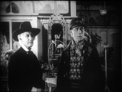
For a little more finesse, we can look–as usual–to Rio Jim. William S. Hart’s films are among the most visually elegant and ambitious of this period, and even his less-known items seldom disappoint. John Petticoats (1919) gives us “Hardwood” John Haynes, a rough-edged logger who finds he has inherited a New Orleans dressmaking shop. His comic introduction to the place, in the company of a new friend he’s made, uses editing to tease us. The two gents come in, with John bewildered by a feminine world he’s never known. They pause before a model sashaying on the stage, and when she pauses, she’s blocked by the Judge’s body.
We’re left without the revelation of her appearance, but when her dresser comes forward to peel off her wrap, we cut, in effect, “through” the Judge to get a clear view of the disrobing. The blocked shot teased us, but the cut pays us off.
Now that the model bares a lot more than before, the biggest tease begins. How will John react? The answer is given in the next shot, a nearly 180-degree shift from the earlier framing of the men that incorporates a mirror in the background to keep the model onscreen.
Thanks to a cut, action and reaction are given in the same shot–in fact in the same zone of the frame, the center.
A pass, a pat, a squeeze
Fabiola (1918).
Many European directors were moving in the same direction as Lambert Hillyer in John Petticoats. Although they might not use as many shots or as many different angles as their American counterparts, they were confidently breaking their scenes up into closer views, often through axial cuts that take us straight into or out of the action, along the lens axis.
Take Enrico Guazzoni’s Fabiola (1918), henceforth known to me as Fabulosa. Normally I consider the Roman oppression of Christianity one of the least fertile topics for a good movie, but Fabiola proves me wrong. For one thing, the title names a rather unpleasant woman who barely figures in the action until the climax. For another, Guazzoni proves an adept filmmaker. I was struck by those immense sets that distinguish the Italian costume drama, the dazzling lighting (see above), and the skilful editing.
Our introduction to Fabiola comes as she sits disdainfully in her household, attended by servants. After a long shot showing off the set, an axial cut takes us closer to her.
She turns as her tardy servant Sira comes in. Having stretched her elegant neck, Fabiola tips her head forward slightly, in a bob of disdain.
Another axial cut takes us still closer to her. And in a few frames her gesture, at once haughty and angry, is repeated. (The streak across the first image below is the splice, so this is the very first frame of the next shot.)
This, I think, is no mistake. The matches on action elsewhere in the film are quite precise, and indeed earlier Italian films have shown that directors used this device skilfully. Guazzoni wanted to stress Fabiola’s head movement, and he used the same tactic, the overlapped action match, that some Americans would use and that many Soviet directors drew on later. This slight accentuation of Fabiola’s gesture is a vivid way to introduce the character, caught in a characteristically scowling moment. Very soon, in a fit of pique she’ll jab Sira with a hatpin.
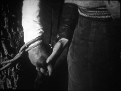
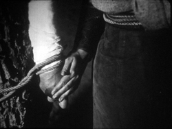
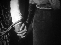
On the whole, keeping the setups close to the camera axis is the default value in Fabiola. For the Americans, though, cutting made the camera almost ubiquitous. A year after John Petticoats, O’Malley of the Mounted (1920), lets Lambert Hillyer again resort to intelligible shifts of setups. O’Malley, played by Hart, has gone undercover to track a killer. Posing as a robber, he has joined an outlaw gang, but they’ve discovered he’s betrayed them and plan to hang him at sunup. He’s lashed to a tree and guarded by his enemy, the brutal Big Judson. But Rose Lanier, who has drifted along with the gang, is going to help O’Malley escape. The cutting will show us exactly how she does it, and why.
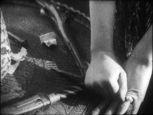
Rose interposes herself between Big and O’Malley, chatting up the thug. A cut of about 180 degrees takes us to the opposite side of the tree and shows her slipping a knife toward O’Malley’s hand. We’re so familiar with this sort of insert that we’re likely to forget that once it was fresh.
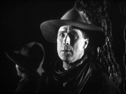
O’Malley starts, then shifts his gaze toward Big.
Then comes a simple, remarkable shot. Rose slips the knife to O’Malley. Then she pats his hand. Then she gives it a squeeze.
Mystery and charm of the American cinema, as Godard would say: a single cut-in of hands can give us a lot. First there’s the narrative information (I’m passing you the knife), then Rose’s expression of support (Good luck!), capped by a burst of affection (I love you). The whole thing takes less time than I’ve used to tell it. Surely this ability to invest plot-driven detail shots with heartfelt emotion helped American cinema conquer the world. I’m tempted to say that we could sum up of the power of Hollywood, in its laconic prime, with that formula: the pass, the pat, the squeeze.
This shot is as compact in its expression as the previous one. It’s impossible to capture here all the emotions that flit across O’Malley’s face: hope of eluding death, realization that Rose loves him, anxiety that surviving will make him choose between love and duty. Rose’s brother is the killer he’s been tracking, and in a perversely honorable way O’Malley had looked forward to being hanged. That would have spared him arresting the boy. Now he must live, enforce the law, and lose the woman who has saved him.
I saw some European films that absorbed such continuity tactics quite deeply. Above all, Mauritz Stiller’s Song of the Scarlet Flower (Sangen om den Eldroda Blomman, 1919) and Johan (1921) relied heavily on analytical editing in the American fashion, including angled shot/ reverse shot. As in Fabiola, some of the discontinuous cuts have their own logic. I wish I had time to explore those Stiller films in more detail–particularly their use of turbulent rivers as dynamic plot elements, not mere landscapes. Maybe in some future entry….
Four-quadrant style
Before they adopted the analytical editing characteristic of American cinema, directors were still able to guide our attention. The so-called “tableau” style, about which I’ve waxed enthusiastic on this site before, became a rich tradition in the 1910s. Editing within the scene is minimized. (Apparently most European directors didn’t consider it a creative option in its own right until later in the decade.) The drama is carried by performance and ensemble staging. Relying on movement, acting, and composition, the director controls where we look and when we look at it
To take a straightforward example, consider the rather ordinary melodrama Le Calvaire de Mignon (Mignon’s Calvary, 1917). The scheming and dissolute Dénis de Kerouan wants to wreak misery on his brother Robert. While Robert is out of the country, Dénis hires a forger to fabricate a letter indicating that Robert has a mistress. Dénis leaves the letter on the desk for Robert’s wife to find.
Dénis has exited through the central entryway, and into the empty study comes Robert’s wife. She discovers the letter.
She moves to the left foreground and starts examining it. At this point Dénis’ face peeps out from behind the central curtain. The director makes it easy for us to notice him because nothing else is happening in the set, and Denis’ face is rather close to the wife’s. It’s almost as if he’s looking over her shoulder.
Once we register Dénis’ presence, the director can proceed to balance the shot. All that empty real estate on the right of the frame asks to be filled, and that’s what happens.
When the wife reads the damning letter, she collapses rightward into the chair, just as Dénis rushes forward to take charge of the situation.
This move exemplifies the staging technique known as the Cross, which motivates the switching of characters’ positions in the frame.
Simple as it is, this portion of the prologue of Le Calvaire de Mignon shows how, without cutting, a director can steer us to one or another zone of the shot through such cues as faces, centering, proximity to points of emphasis, and movement. Something similar happens in one, more striking moment of another fairly unexceptional movie from the period.
Nobody will claim Der Stoltz der Firma (The Boss of the Firm, 1914) is a masterpiece, or its director Carl Wilhelm is a master. It’s one of the many comedies in which Ernst Lubitsch starred before becoming a director. Here he’s Siegismund, a bumbling young provincial with more aspirations than abilities, who simply lucks into marrying the boss’s daughter. On the way to the happy ending, he wins the patronage of a fashion designer, Lilly, whose husband finds her flirtation with the young parvenu none too innocent.
Wilhelm’s use of the tableau approach isn’t especially dynamic in most of the film, but there’s one flashy scene. Wilhelm gets us to watch a very small, tight area of the frame and then gently swings our attention to a wider swath of action. As usual, everything depends on a sort of task-commitment on our part: Watch what’s likely to forward or enrich the ongoing narrative.
Lilly lures Siegismund into a changing room, with the composition showing him reflected in a mirror behind her. This sets up an item of setting that will be central to the scene.
Once inside, he coyly presents her with a flower and they draw close together. Since we tend to concentrate on faces, the small area encompassing their two profiles is likely to draw our attention. Nonetheless, the shot is notably unbalanced, as if anticipating something coming in from the right side.
Abruptly Siegismund and Lilly draw apart, and the space between them, in the mirror, is filled by the face of Lilly’s husband, coming through the curtain.
I’d bet that a Tim Smith experiment would find that nearly every spectator is already watching this small zone in the upper left quadrant of the shot. Faces, especially frontally positioned ones, command our notice, and thanks to the mirror we here have three of them. Moreover, movement is an attention-getter too, and all three faces are in motion. Mr. Maas’s face, in fact, gets notably bigger and clearer. His wrathful expression is another reason to watch him.
The husband’s body enters to fill the frame, then presses into the center of the shot, blotting out Lilly as he faces down Siegismund.
Now the director controls the speed of our gaze quite precisely. Maas slowly rotates, forcing Siegismund to swing from left to right, as if he were attached to the bigger man by a rod. This yields, again, that nice sense of refreshing the frame that we always get from a Cross.
Siegismund collapses into the lower right of the frame, flinching from the fight that’s about to start. Lilly soon shoves aside her husband’s chastisement and melodramatically tells him to leave. “We’re divorcing!” the following intertitle says.
Mr. Maas takes it in stride, shrugging and spreading his arms. He leaves, and thanks to the helpful mirror we can see him chortling as he glances back and passes through the curtain.
If we hadn’t already noticed Siegismund cowering behind Lilly in the lower right quadrant, we will now. Lilly angrily flounces to our left (the Cross again). Siegismund rises to explain he hadn’t meant to cause a rift in the marriage.
We’re back to something like the initial setup, but now with Siegismund centered, the couple further apart, and a less unbalanced frame. The drama, which now consists of Lilly inviting him to tea tomorrow, can proceed from here.
A different way of seeing?
Tom Tom the Piper’s Son (1905).
We’ve become used to editing-driven storytelling, and I’m convinced that we can learn to notice the staging niceties of the tableau alternative. But what if early filmmakers explored some other ways of looking that are far more unfamiliar to us today?
Noël Burch, in his 1990 book Life to Those Shadows, argued that in the first dozen years or so of cinema, movies solicited viewing skills that we lack today. He suggested that early filmmakers often refused to center figures and crammed their frames with so much activity that to our eyes the shots look confused and disorganized. In Tom, Tom, the Piper’s Son (1905), Burch notes, the bustle of the fair, the reliance on an extreme long shot, and the absence of any cutting make the central event, Tom’s swiping of the pig, difficult to catch. In the frame surmounting this section, Tom is making off with the pig in an area just right of center, but the antics of the clown and the response of the crowd may well distract us from the main action.
The result, says Burch, is a mode of filmmaking that demanded
a topographical reading by the spectator, a reading that could gather signs from all corners of the screen in their quasi-simultaneity, often without very clear or distinctive indices immediately appearing to hierarchise them, to bring to the fore “what counts,” to relegate to the background “what doesn’t count” (p. 154).
Later developments linearized this field of competing attractions, creating a smooth narrative flow “harnessing the spectator’s eye.” Among these developments were the presence of a lecturer at many screenings (telling people what to watch) and, of course, the growth of the continuity editing system. But Burch suggests that the “primitive mode” hung on until about 1914.
A famous example is a shot from Griffith’s Musketeers of Pig Alley (1912). The gangster has lured the Little Lady (Lillian Gish) into a back room and distracts her with a photograph while he tries to dope her drink, in a precursor of date-rape drugging. But the Snapper Kid, another gangster, has been keeping an eye on her and follows. As the gangster starts to pour the drug out, the Kid’s entry is presaged by a whiff of cigarette smoke.
At the crucial moment, we have three things to notice: the Little Lady’s obliviousness, the gangster’s pouring the drug, and the full entrance of the Snapper Kid.
Today’s director would likely resort to editing that shows the doping, then the Kid arriving, then the doping again, and leaving us to infer a vague sense that they’re happening at the same time. Griffith’s choice gives us genuine simultaneity, but at a cost. Two cues compete for our attention: central composition for the drink, major motion on the edge for the Kid’s entry. In my experience, viewers tend to notice the appearance of the Kid, but to miss the business with the drink. (Another passage for Tim Smith to test!) By today’s standards, Griffith has failed as a director, but Burch’s view suggests that 1912 viewers, more sensitive to “all-over” composition, could have registered both actions, perhaps by rapidly scanning back and forth.
During my trip I found a fascinating example of this issue, as well as an apt counterexample. Both involve daggers.
In Maman Poupée (1919), a remarkable Italian film directed by Carmine Gallone, a devoted, somewhat infantile wife learns of her husband’s affair with a society woman. Susetta confronts the mistress and begs her to break off the affair. The woman laughs in her face. What happens next is given in several shots, mostly through axial cuts.
The linear editing, as Burch indicates, lays everything out for us step by step. The close-ups accentuate what is important at each moment: Susetta seizing the dagger, stabbing her rival, and–in a remarkably modern-looking extreme close-up–registering her horror at what she has done.
Two years before, Marcel Simon, the (Belgian!) director of Calvaire de Mignon, handled a similar situation rather differently. The diabolical Dénis, whom we met earlier, has succeeded in destroying his brother’s life. It remains only for him to force Robert’s niece Mignon to marry the Algerian Emir Kalid. Kalid is at first humble, beseeching Mignon to become his bride, but then he gets rough. We might note already that Mignon, while fairly near the camera, hovers close to the left frame edge.
In their tussle, Mignon snatches something from Kalid’s waistband and flings him far away to the right.
What’s up? Mignon has grabbed the Emir’s dagger and stands poised with it pressed to her heart. But we haven’t been able to see that dagger very clearly (no cut-in close-up here, as in Maman Poupée) and she’s returned to her position far off-center. It’s likely that a viewer today wouldn’t understand that she’s holding the men at bay by threatening suicide. Would a 1917 viewer be as uncertain? Would the situation, plus her posture and the men’s hesitation, be enough to get the point across?
Moreover, this moment goes by very quickly. Scarcely has Mignon struck her pose when her true love, René, bursts in behind her–frontal, fairly centered, and moving fast. Meanwhile, Dénis is sneaking up on her, hugging the left frame. Mignon makes a break for René, dropping the still almost indiscernible dagger.
While Mignon and Rene embrace in the right rear doorway, blocked from our view by Kalid, Dénis stoops over. It’s a timely adjustment, giving us full view of the benevolent Le Maire sweeping into the room.
As the two men confront one another–the climax of the scene–director Simon has the effrontery to let Dénis steal the show. He picks up the dagger, which now can be seen more or less plainly, weighs it in his hand, and looks out for a brief, pondering moment.
We seem to have a late example of the Snapper Kid Effect, in which important actions compete for our attention. Is it clumsy direction to perch Mignon on the frame edge as René rushes in, and to let Dénis recover the dagger while we’re supposed to concentrate on the face-off between the two powerful men? Or would audiences have tracked all the strands of action and enjoyed their simultaneity?
On this site and elsewhere, I’ve assumed that directors in the 1910s structured their compositions for what Charles Barr calls “gradation of emphasis,” a fluid pattern of primary and secondary points of attention. I’ve argued as well that Burch exaggerates the decentered, nonlinear compositions of even the earliest years. Many of the films staged by Lumière cameramen are designed cogently, and so are many films from the 1900s. (Tom, Tom might be the exception rather than the norm.) Yet every so often, you get a later case, like Musketeers of Pig Alley or Le Calvaire de Mignon, that suggests that some viewers might have been more adept at tracking simultaneous events than we are.
A still broader question remains. Let’s assume that people were able to follow and enjoy films in the tableau style, even when that style pushed toward illegibility. What enabled people to adapt, and so quickly, to continuity-based movies? Some scholars and filmmakers argue that continuity editing achieved its power and worldwide acceptance because it mimics our natural mode of perception. At any moment, we’re concentrating on just a small portion of our surroundings, and this is like what editing does for us in a scene. On the other side, Burch and others would argue that continuity filmmaking is only one style among others, with no special purchase on our normal proclivities. On this view, classical continuity’s apparent naturalness hides all the artifice that goes into it, and this concealment makes its work somewhat insidious. I’ve offered some thoughts on this problem elsewhere, but I bet I tackle it again on this site some time.
In any case, we need to study films that seem odd or difficult, whether they’re recent or from the distant past. We’re guaranteed to find some striking and unpredictable things that provoke us into thinking. That’s one of the pleasures of exploring the history of film as an art.
For earlier studies of the tableau style on this site, see this entry on Bauer, this one on 1913 films, this one on Feuillade, and this one on Danish classics. This entry discusses the emergence of Hollywood-style continuity, and this one explores the exemplary editing in William S. Hart films. I go into more detail in two books, On the History of Film Style (chapters four and six) and Figures Traced in Light (chapter two) and in the essay, “Convention, Construction, and Cinematic Vision” in Poetics of Cinema. The last-named piece tries to stake out a middle position on the “naturalness” of continuity editing. Kristin has analyzed Alberto Capellani’s films as instances of the tableau trend, last year here and just last week here. She also weighs in on the debate about whether viewers of his time were better prepared to grasp the action than we are. More generally, Capellani’s career exemplifies the major and swift stylistic changes of the 1910s. When he went to America, he became pretty adept at the emerging continuity style, as the Nazimova vehicle The Red Lantern (1919) indicates. Of course that’s got some striking single images too.
The Red Lantern (1919).


