Archive for the 'Silent film' Category
Dreyer re-reconsidered
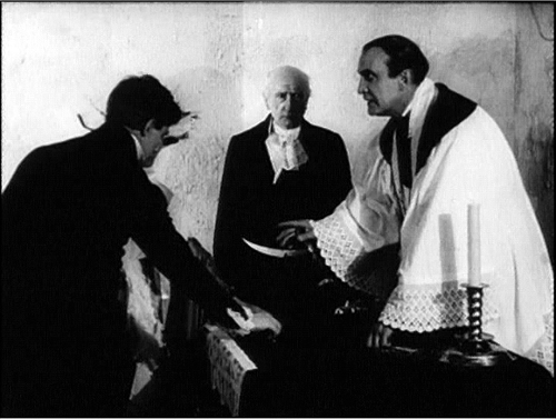
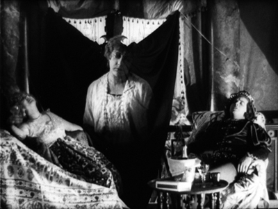
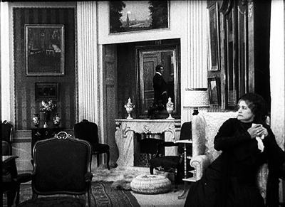
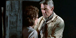
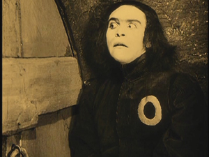
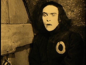
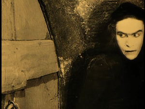
The President (1920).
DB here:
I was late to the feast, but my contribution to the Dreyer site is now up, thanks to Lisbeth Richter Larsen‘s quick work. You can read it here.
Danish cinema was the first national cinema I studied, and Dreyer was my point of entry. I went to Copenhagen in 1970 to see his films for a little book I wrote in the Movie/ Studio Vista series. The manuscript was finished but never published because the series ceased. Good thing for me. I’d be embarrassed today if that book was still floating out there.
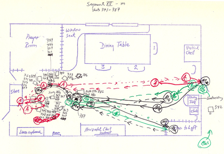
Kristin and I went back to Copenhagen in 1976 to re-watch the Dreyer oeuvre, and I saw the films with new eyes. I had learned a lot more about film analysis and film history, so I was able to see different things in his movies. Now obsessed with how films construct space and time, I drew up elaborate and clumsy plans of actor blocking, camera setups, and camera movements.
What? You don’t recognize this as a string of shots from Day of Wrath? I even notated actor movements offscreen (with dotted lines).
The result of all this fussbudgetry was a 1981 book on Dreyer. I think that some of the ideas there still hold up. But as I learned more about film history in the 1990s, I came to believe that some of my conclusions were off-base.
In particular, my treatment of Gertrud as a radical, deliberately “empty” film seemed tenuous. Influenced by minimalist cinema of the 1970s, especially that of Straub and Huillet (huge admirers of Dreyer), I pushed the case that at the end of his life Dreyer dared to make a movie that was by all ordinary standards simply boring.
Steadier heads tried to talk me out of it, but I clung to the idea. What can I say? I was young and stubborn.
As I studied more cinema of the 1910s, I began to see Dreyer’s career, and particularly his silent films, as tied in complicated ways to other films of that period–not least Danish cinema. For, as I’ve sketched here, Danish cinema of the 1910s was one of the richest traditions of “tableau” staging in Europe. I was able to put my ideas about the Danes’ achievements into clearer form in the last chapter of On the History of Film Style and in an invited essay on the Nordisk company published in a collection at the Danish Film Institute.
Like their peers in other countries, the Danes often stuffed their shots with furniture and props, in a riot of patterns and textures. Here is an example from Den Frelsende Film (The Woman Tempted Me, 1916). It survives only in fragments, but those fragments are in fine shape.
In addition, the Danes developed elaborate lighting patterns and complex, somewhat Gothic special effects. You can see these options in Ekspressens Mysterium (Alone with the Devil, 1914) and Doktor Voluntas (1915).
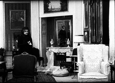
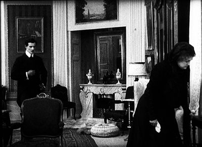
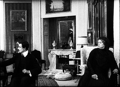
Above all there was the intricate staging in depth, often using mirrors. Here’s a seldom-seen example. In Under Blinkfyrets Straaler (Under the Lighthouse Beam, 1913), the father has died, and his wife and son meet in the parlor. A mirror catches them entering, in phases.
The mirror shows Hugo entering the room by moving straight and forward, but when he gets into the shot he comes in somewhat diagonally from the left.
After a moment of sitting in silence, mother and son turn as a maid enters. They look off left, but because we’ve seen Hugo enter in the mirror, we look to the center and see her reflection as she shuts the door.
The maid brings the widow a letter from her other son, Robert. Hugo, fretful, departs and in the mirror we see him look back at his mother.
Or does he? The angle of his glance makes sense compositionally: In reflection Hugo seems to be meeting his mother’s eyes, left to right. But in my first frame, he advanced into the room by looking straight ahead. If he looked straight into the room again now, he’d be looking more or less at us, not at his mother. So I suspect that in my last frame, the actor is actually not looking directly at the actress but off at an angle. He has been directed to this position to allow the mirror to create an artificial, but highly readable, image.
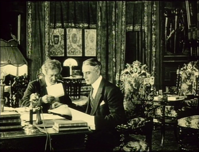
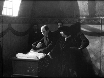
The novice Dreyer, I realized, didn’t indulge in such tableau trickery. His first two films, The President (made in 1918) and Leaves from Satan’s Book (made in 1919), are quite different from the norms that ruled his local cinema. By the time he came to directing, he was more oriented toward analytical editing and fairly flat staging than were the old guard. In this regard he was closer to a younger group of filmmakers emerging at the same time in other countries: Gance, Lang, Murnau, Joe May, and many others, along with Americans like Ford, Walsh, et al. So my newest take is that Dreyer is part of a generation of directors moving toward an editing-driven cinema and away from the tableau style. This idea in turn helped me see Gertrud in a more convincing light.
If you want the argument in full, you can check it on the Dreyer site. The lesson for me is twofold. (A) Dreyer is inexhaustible. (B) The more you learn about cinema (and about life), the more you can see in films that you think you have already understood.
The only book in English surveying the cinema of Dreyer’s elders is Ron Mottram’s indispensable The Danish Cinema before Dreyer (Metuchen, NJ: Scarecrow, 1988). It doesn’t consider the dual traditions of staging and editing, but it offers a very thorough history of studios, directors, and genres, and mentions some stylistic patterns. The article I referred to is “Nordisk and the Tableau Aesthetic” in Lisbeth Richter Larsen and Dan Nissen, eds., 100 Years of Nordisk Film (Copenhagen: Danish Film Institute, 2006), 80-95. This gorgeous book can be ordered from the DFI shop;I’ll be adding my essay here some time this summer.
For more on the tableau tradition, go to other blog entries here and here and here and here. On the emergence of continuity editing, chiefly in the US, try here and here and here. More detailed treatments are in The Classical Hollywood Cinema, On the History of Film Style, and Figures Traced in Light: On Cinematic Staging.
I’m grateful as ever to Marguerite Engberg, Dan Nissen, Thomas Christensen, and Mikael Brae for their help in my research on Danish silent film.
PS 16 June: Jonathan Rosenbaum has republished on his site his detailed and engrossing 1985 study of Gertrud, which includes discussion of the play from which Dreyer adapted his film. Thanks to Jonathan for making his essay available.
The President (1920).
The Cross
The Puffy Chair (2005).
Mark: [The actors] need to improvise. They need to find the moments, and we don’t let them lean on the script too much. We want them to try to reinvent some of the dialogue and make it fresh.
Jay: We don’t do any blocking. Our whole goal is just to set up a room and basically foster an interaction that we feel is interesting and real.
Mark: And spontaneous.
Jay: And spontaneous.
Jay and Mark Duplass, talking of their new film Cyrus.
DB here:
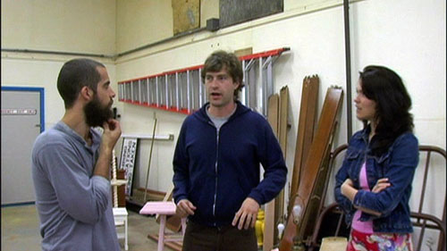
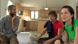
We don’t do any blocking. Dude, we noticed. In The Puffy Chair, the Duplass brothers typically settle the actors into one spot and pan or cut between them.
Seldom do the characters move around the setting. When they do, it’s usually by means of a walk-and-talk traveling shot that transitions to the next static layout of actors.
We are talking about filmmakers who refuse the challenge of staging.
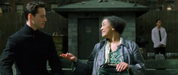
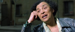
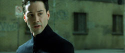
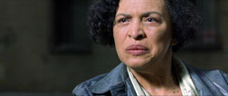
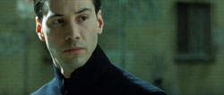
At the other extreme of budget and commercial clout, consider another film by two brothers. In The Matrix Reloaded, Neo meets the Oracle in the virtual courtyard and sits on a bench with her.
The whole scene, which runs nearly seven minutes, contains 94 remarkably static shots. After Neo settles on the bench beside her, we get simple reverse shots—lots of them, mostly one per line of dialogue. The setups are maniacally repeated. There are thirty-one iterations of the first framing below and eighteen of the second.
The only variation is a slightly tighter framing on each character, creating another brace of single setups during Neo’s acknowledgement of his dream of Trinity’s death. Each of these gets nine iterations.
Sustained two-shots would have let the actors do more with their upper bodies, but in this string of singles, faces and dialogue have to present Neo’s reactions to his new mission to save Zion. Granted, there are seven shots showing both Neo and the Oracle in the same frame, but these are very brief and seem to be there simply to provide beats and add some variety to the load of exposition the scene must carry.
Breaking the scene up so much has interesting rhythmic implications. Paradoxically, our movies are cut very fast but they feel rather slow (and run very long). When we need a cut to see a character’s reaction, a scene plays out more slowly than if the characters were held in the same frame for a significant period. Then we might see Neo’s reactions while the Oracle is speaking, rather than having to wait for them afterward.
But my main point is that the actors are planted in one spot. Like the Duplasses, the Wachowski brothers have felt no need to imagine the characters’ interaction through blocking. Indeed, when shooting a conversation, most of today’s filmmakers seem happiest if the actors stay riveted in place—standing, seated, riding in a car, typing at a computer terminal. Improvised cinema or storyboard cinema: Both camps are refusing the challenge of staging.
In some books and some web entries (most recently, here and here and here and here), I’ve tried to trace the rich tradition of ensemble staging. From almost the start of cinema, filmmakers have explored creative ways of moving actors around the set, aiming at both engaging storytelling and pictorial impact. Since the 1960s, on the whole, this tradition has been waning. Now, I fear, it has nearly disappeared.
I’m not going to reiterate those earlier arguments. Instead I want to talk about one simple staging tactic that directors almost never employ today. I offer it at no cost to young directors. Try it! You might get a taste for a range of cinematic expression that is nowadays neglected.
Cross and double cross
Assume you have two characters in a set. At a crucial moment, you invent some business that lets them exchange places, so that the one on the left winds up on the right, and vice-versa. At a minimum, this gives you visual variety; it keeps the viewer’s attention engaged by refreshing the composition. It can of course also heighten dramatic impact.
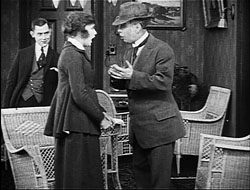
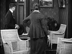
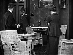
Naturally, we expect to find the Cross in the first golden age of cinematic staging, the 1910s. Here’s a case that combines the cross with depth staging, from the Doug Fairbanks picture The Matrimaniac (1916).
Marna and the Court officer have switched places in the frame. Note especially that her movement to the right, clearing our view of the officer at the door, is motivated by her hesitation at following him. Actually such moments probably don’t need much motivation; the flow of the action is so quick that no viewer will ask why she moved to the right, since our attention is on what her action reveals.
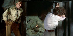
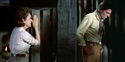
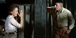
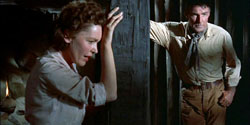
One way to motivate the Cross is to have A turn sharply away from B but keep talking. This is a bit of actor’s business that seems far more common in the classical era of moviemaking. Here is an excerpt from a single-shot scene in Budd Boetticher’s The Tall T (1957). Brennan tries to console Mrs. Mrs. Mims, who has realized that her husband betrayed her. He enters the shack and then walks past her, as if considering exactly how to calm her.
This has been the prelude to a more intense confrontation. She comes closer to the camera, and Brennan joins her, forcing her to look at him as he says they must concentrate on staying alive.
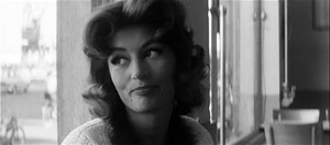
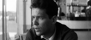
In Demy’s Lola (1961) the Cross is motivated by the urge to offer another emphatic view of the protagonist. Roland has been talking to the two mother-figures who run the café he frequents. He’s dragging himself off to work as Jeanne fetches her radio from the bar and goes into the back room. We get two Crosses.
The shot’s climax comes when Roland pauses in the foreground and says: “One day I’ll go away too.” Again, a key character is turned from the other but continues to speak.
No need to cut in to a close-up because Roland’s face is perfectly visible. Just as important, while his face shows a certain reverie, his nervousness is conveyed by the way he waggles the novel in his hand. The actor is given a chance to act, not just with line reading and facial expression but with his slumped posture and his arms—one casual, the other in anxious motion. Taken together, the body and the face present Roland’s confusion.
Crossfire
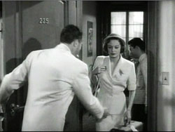
Don Siegel’s The Big Steal (1949) yields many offhand instances of the Cross, indicating how taken for granted the technique was in studio films. When the slippery Fiske invites Joan in, she comes to the left foreground and he moves to the right side of the frame to shut the door.
Approaching her by stepping into medium shot, he tries to warm her up, but she slaps him. Cut in to underscore her reaction. “What did you expect—kisses?”
In a return to the earlier setup, she turns away and executes another Cross, settling on the sofa.
Simple and concise; some would say banal. But compared to The Puffy Chair and The Matrix Reloaded, it looks brisk. The characters move easily through the frame without camera arabesques, and the medium shot is saved for the slap. The single of Joan adds another spike to the drama. Close-ups no longer rule but are used for momentary emphasis.
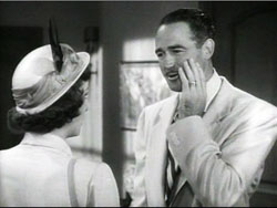
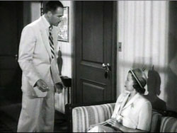
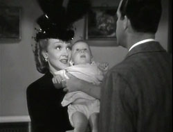
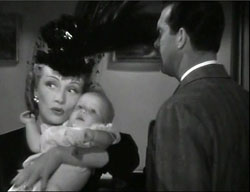
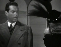
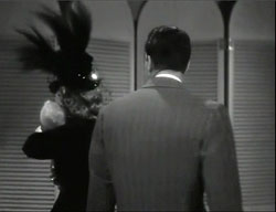
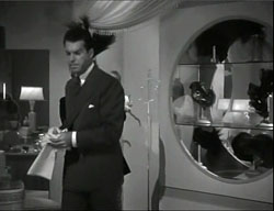
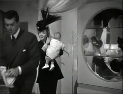
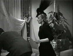
So the Cross can be sustained by cutting and camera movement. In The Lady Is Willing, Liza has found a baby and called a pediatrician. Director Mitchell Leisen gives us an over-the-shoulder shot of her and at the close of it she walks around Dr. McBain’s arm, with her feathery hat brushing his face.
If the shot were sustained with a pan, we’d have a Cross, but instead there’s a cut to Liza continuing the movement. McBain turns to watch her.
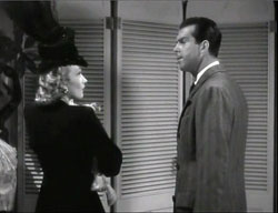
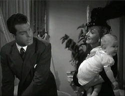
He starts to follow her diagonally. When she pauses to face him, the Cross is completed.
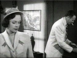
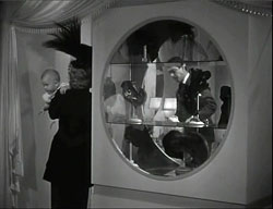
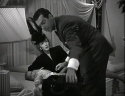
They leave the room. After a cutaway shot showing Liza’s secretary, the camera pans to follow McBain into depth washing his hands. When he comes through the door past Liza, we get another Cross.
With positions switched, the camera travels with her as she catches up with him in a medium shot. He is opening his medical bag.
This pause enables Leisen to underscore a key line of dialogue. “I detest children of all ages. I detest infants particularly.”
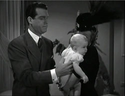
One more Cross and the shot is done. The camera pans again to follow McBain bending over the child, and Liza slips into the shot behind him, remonstrating with him. “A man who dislikes children simply can’t be a baby specialist.”
As so often, the Cross is used to present one character turning from another, or one trying to catch up with another who for dramatic reasons plows ahead. And the Cross favors a moderate depth, not the eye-smiting foregrounds of Welles but something less aggressive. In these ways, the simple device can participate in a broader pattern of fluid craftsmanship. The action can unfold in a clean rhythm, consistent with what Charles Barr calls “gradation of emphasis.” Story points arise smoothly out of the flow of behavior. Actors get a chance to use their whole bodies, to create character through posture or stance, or even the angle of the elbows. Imagine if Dietrich, in the left shot just above, had sauntered to McBain with her hand on her hip as she does in so many other movies; the scene would take on a different tint.
When thinking about staging, we usually invoke Renoir or Ophuls or Jancsó, directors who integrate complex choreography with complicated tracking shots. (They also use the Cross a lot.) My examples try to show that even simple camerawork can enhance the performers’ grace. Nor do they have to execute the calisthenics on display in the office scenes of His Girl Friday. The modest moves we see in The Big Steal and The Lady Is Willing are within the grasp of eager filmmakers and game actors.
Cross purposes
I don’t have a good explanation for why such simple staging tactics have gone out of fashion. It’s too easy to cite laziness or lack of imagination, though they may play a role. I wonder as well if complicated staging is much taught in film schools. More specifically, improvisational methods may actually inhibit creative blocking. An actor who’s winging it may be reluctant to shift around the set, for fear that this creates new problems for framing or lighting or the other performances. Better, the actor may think, to concentrate on line readings, expressions, and other things that she can control while staying rooted to the spot. And maybe our directors don’t want to work their actors too hard, especially when the actors are beginners or nonprofessionals, as we find in indie filmmaking. Yet some masters of supple, intricate staging, such as Hou Hsiao-hsien, employ untrained performers.
Contemporary directors may have a more principled objection to the older staging style: It’s too artificial. In real life, people mostly chat with each other when they’re sitting down, or walking, or riding in a car. Static staging, some might say, captures the passive nature of everyday interactions.
But dramatic narrative typically doesn’t consist of ordinary life. A film offers heightened, focused, pointed encounters, shot through with meaning and feeling. The actors and the filmmaker have a chance to sharpen the viewer’s perception of the situation and pass along the moment-by-moment play of thought, emotion, and action. There are both loud and quiet ways of doing this. Antonioni’s famously “dedramatized” scenes are staged as dynamically as the more florid moments of Visconti or Fellini. Emotionally subdued action can be shaped just as precisely as passionate outbursts, and it can carry its own impact.
I should make it clear that I’m not asking anybody to embrace a single style. Sometimes stand-and-deliver and intensified continuity editing work very well. Directors will always seek specific solutions to the problems of a scene. But I don’t see much variety in the solutions many people now pursue. I don’t see evidence that most young filmmakers around the world are aware that traditions furnish lots of alternatives.
In earlier periods, some directors were as editing-oriented as today’s mainstream ones, while other directors adopted more staging-driven approaches. But either sort had a broader palette than what we see today. Any accomplished director could stage a conversation in a variety of ways. Just to take Demy, some scenes in Lola are handled in full shots like the one highlighting Roland in the café. Other scenes are broken up into tight singles, and still others are treated in two-shots.
All the classical films I’ve mentioned are pluralistic in their technical choices. Today, though, we see more uniformity, or rather conformity.
Cinephile conversation on the internet is currently rippling around a controversy about “slow cinema.” Whatever that rough category covers, it surely includes those festival films that put the camera in one spot per scene and simply observe. I’d argue that many of these minimalist movies are also AWOL when it comes to staging. After watching a long-take, flatly shot film with me, a Hong Kong filmmaker friend remarked, “This sort of thing is just too easy.” One difference between a solid “slow film” and an empty one, I suspect, lies in the extent to which the filmmakers explore the resources of staging. How do we know? We have to analyze the films. (More on this matter here.) Absent that analysis, critics’ appeals to realism or meditative restfulness or “time flowing through the shot” risk becoming alibis for inert moviemaking.
Many young directors want to be innovative. They want to shake things up. This is a good impulse. The way things are going, the ambitious way forward is obvious: Go backward. Avoid stand-and-deliver. Avoid walk-and-talk. Get your actors on their feet and move them around the setting. Invent bits of business that let them crisscross the frame, laterally and in depth. Dynamize all areas of the shot. In the process you may discover new dimensions of creativity.
The Cross is only one tactic, but I think it’s useful as a way to sensitize ourselves to staging. The best way to understand staging is to watch, really watch, a lot of classic cinema from Hollywood and elsewhere. When you’re ready for the hard stuff, Mizoguchi is waiting.
I expect disagreements with my criticisms of contemporary film technique, so I hope skeptics will consider my more extensive arguments in On the History of Film Style, Figures Traced in Light, and The Way Hollywood Tells It.
I haven’t found references to what I call the Cross in manuals of direction. The closest technique, and the one that called my attention to the possibilities of the technique, is what Mike Crisp in his valuable book The Practical Director (first ed., 1993) calls the “rise and cross.” This refers to actors getting up from sit-down conversations in one spot and moving to another sit-down area, while switching position in the frame. I’ve expanded the idea to cover a broader variety of situations.
As far as I can tell, my term doesn’t have much in common with the stage direction “Cross,” which you’ll find in play scripts. Janie Jones provides definitions here. While staging in film is in many respects different from that in theatre, I think that moviemakers can find intriguing practical ideas in Terry John Converse, Directing for the Stage.
Alicia Van Couvering’s interview with the Duplass brothers, “Don’t you want me?”, is published in Filmmaker 18, 3 (Spring 2010; not yet available online); my quotation is from p. 43. In his essay Slow Cinema Backlash, Vadim Rizov argues that lesser attempts at “slow cinema” have led to a somewhat predictable style.
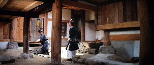
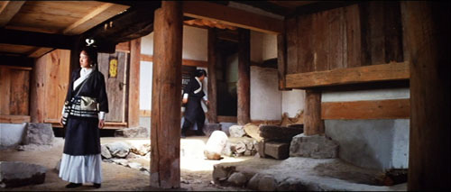
Raining in the Mountain (King Hu, 1979).
DER GOLEM: Revisiting a classic
Kristin here:
In 2009, Il Giornate del Cinema Muto, the silent-film festival held each year in Pordenone, Italy, launched a new series. “Il canone rivisitato/The Canon Revisited” addressed the fact that many rare and often obscure silent films are made available through restoration each year, and yet many young enthusiasts who have started attending the festival have seldom had the chance to see the classics on the big screen with musical accompaniment. The opening group of films proved highly successful, and “Il canone rivisitato 2” will be presented this year, when Il Giornate will run October 2 to 9.
Part of the point of the series is to have historians re-evaluate these classics and examine how well they live up to their status as part of the film canon. Last year I contributed a program note on Paul Wegener and Karl Boese’s 1920 German Expressionist film Der Golem. This year I’ve written about Danish director Benjamin Christensen’s 1916 thriller Hævnens Nat (Night of Revenge, released in the U.S. in 1917 as Blind Justice), which will be shown this year, and rightly so.
When I went back and reread my Golem notes to remind myself what sort of coverage is needed, I decided that the text I wrote then might be of wider interest to those who weren’t at the festival last year. Thanks to Paolo Cherchi Usai, one of the festival’s founders and organizers, for permission to revise my brief essay as a blog entry. I’ve changed it minimally and taken the opportunity to add illustrations. Here’s what I said at the time:
Der Golem is a classic film—doubly so.
First, it has long nestled comfortably within the list of titles that make up the German Expressionist movement of the 1920s. Teachers of survey history courses are more likely to show Das Cabinet des Dr. Caligari (which premiered in early 1920) but a serious enthusiast will make it a point to see Der Golem (which appeared later the same year) as well.
From the start, reviewers recognized Der Golem as Expressionist. In 1921 the New York Times’ critic wrote, “Resembling somewhat the curious constructions of THE CABINET OF DR. CALIGARI, the settings may be called expressionistic, but to the common man they are best described as expressive, for it is their eloquence that characterizes them” (George Pratt’s Spellbound in Darkness, p. 362). In 1930, Paul Rotha’s The Film Till Now, the most ambitious world history of cinema in English to date, appeared. Highly influential in establishing the canon of classics, Rotha adored Weimar cinema, including Der Golem.
In 1936, the Museum of Modern Art obtained a large number of notable European films. The core collection of the young archive contained such prestigious titles as Caligari, Battleship Potemkin, Metropolis, and Der Golem. These films soon became part of the museum’s 35mm and 16mm circulating programs. With MOMA’s sanction as historically important classics, they remained the most widely accessible older films available to researchers and students alike for many decades.
There is, however, a second, largely separate audience: monster-movie fans. Starting in the 1950s, German Expressionist films were promoted as horror fare by Forrest J. Ackerman in his magazine Famous Monsters of Filmland. In 1967 Carlos Clarens included Der Golem in his An Illustrated History of the Horror Film. Really dedicated horror devotees pride themselves on their expertise across a wide variety of films, including foreign and silent ones. Der Golem became a certified horror classic.
In the 1950s and 1960s, companies offering public-domain 8mm and 16mm copies for sale enabled both film-studies departments and movie buffs to start their own film libraries. Ultimately home video made previously rare silent classics easily obtainable—including a restored Golem from the Friedrich Wilhelm Murnau-Stiftung, with new tinting and a musical score, on DVD. Such a presentation reconfirms the film’s status as a classic.
But what sort of classic is it? An undying masterpiece that one must see immediately? A film one should definitely watch someday if the chance arises? On the occasion of Der Golem being presented on the big screen with live musical accompaniment, we have a chance to specify what distinguishes it from its fellow exemplars of Expressionism.
I suspect that horror-film fans won’t feel that a reevaluation is necessary. Der Golem is a forerunner of Frankenstein and hence an important early contribution to the genre. It’s a striking film to look at and obscure enough to impress one’s friends during a late-night program in the home theater.
But for film historians returning to Der Golem in the early twenty-first century, after nearly ninety years of taking it for granted, what is there to say?
 Some would deny that Der Golem is truly Expressionistic. If one has a very narrow view of the style, insisting that only films with flat, jagged, Caligari-style sets qualify for membership in the movement, then Der Golem doesn’t pass muster. Neither do Nosferatu, Die Nibelungen, Waxworks, and a lot of other films typically put into the Expressionist category.
It’s a subject susceptible to endless debate. To avoid that, it’s helpful to accept historian Jean Mitry’s simple, useful distinction between graphic expressionism, with flat, jagged sets, and plastic expressionism, with a more volumetric, architectural stylization. If Caligari introduced us to graphic Expressionism in 1920, Der Golem did the same for plastic Expressionism later that year.
For me, seeing Der Golem again doesn’t much affect its status as an historically important component of the German Expressionist movement. It’s not the most likeable or entertaining of the group. Caligari has more suspense and daring and black humor. Die Nibelungen has a stately blend of ornamental richness with a modernist austerity of overall composition, as well as a narrative that sinks gradually into nihilism in a peculiarly Weimarian way.
Moreover, Der Golem’s narrative has its problems. None of the characters is particularly sympathetic. Petty deceits and jealousies ultimately are what allow the Golem to run amok. The narrative momentum built up in the first half of 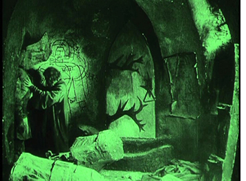 the film is inexplicably vitiated for a stretch. Initially the emperor’s threat to expel Prague’s Jews from the ghetto drives Rabbi Löw to his dangerous scheme of creating the Golem to save his people. Yet after the creation scene, the dramatic highpoint that ends the first half, we see the magically animated statue chopping wood and performing other household tasks that make his presence seem almost inconsequential. The imperial threat has to be revved up again to get the Golem-as-savior plot going again.
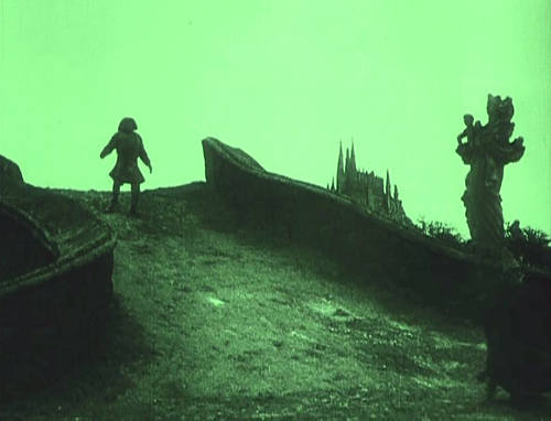
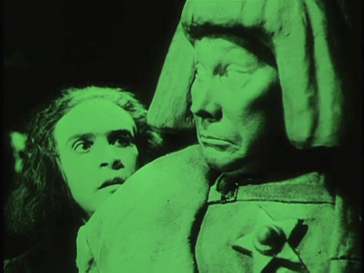
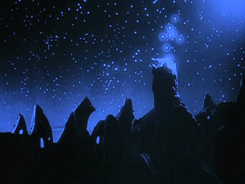
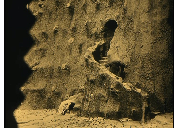
But putting aside Der Golem’s minor weaknesses, it has marvelous moments that summon up what cinematic Expressionism could be: the opening shot, which instantly signals the film’s style (below); the black, jagged hinges that meander crazily across the door of the room where Löw sculpts the Golem; the juxtaposition of the Golem with a Christian statue as he stomps across the crooked little bridge returning from the palace (at top).
Hans Poelzig was perhaps the greatest architect to design Expressionist film sets. He designed only three films, and Der 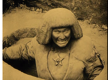 Golem is the most important of them. Once the monster has been created, Poelzig visually equates the lumpy, writhing towers and walls of the ghetto and the clay from which the Golem is fashioned. The sense that sets and actors’ performances constitute a formal, even material whole became one of the basic tactics of Expressionism in cinema.
Speaking of performances: A lot of the actors in German Expressionist films were movie or stage stars who didn’t specialize in Expressionism. There were, however, occasional roles that preserve the techniques the great actors of the Expressionist theater. There’s Fritz Kortner in Hintertreppe and Schatten. There’s Ernst Deutsch, who acted in only two Expressionist films, as the protagonist in the stylistically radical Von morgens bis Mitternacht (out this month on DVD) and as the rabbi’s assistant in Der Golem.
Just watching his eyes and brows during his scenes in this film conveys something of the experimental edge that Expressionism had when it was fresh—before its films had become canonized classics.
A hundred years, plus a few thousand more, in a day
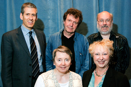
Charlie Keil, Yuri Tsivian, Henry Jenkins, Kristin Thompson, and Janet Staiger. Photo by Joel Ninmann.
Last Saturday we held the symposium “Movies, Media, and Methods” in honor of Kristin’s arrival at age sixty. Four distinguished scholars, all professors from major universities, presented top-flight talks. As a bonus, Kristin gave The Film People a glimpse into her Egyptological work. I report on this very full day in the hope of giving a sense of how stimulating we found it.
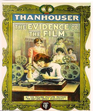
Thanhouser was an American film company that flourished between 1909 and 1917. It has been overshadowed by Biograph because that firm put out more films and, not incidentally, employed D. W. Griffith. But Ned Thanhouser has been diligently gathering his family company’s output from archives around the world and releasing it in informative DVD editions. The most famous Thanhouser production is probably Cry of the Children (1912), a powerful attack on child labor. You could also try the thriller The Woman in White (1917), adapted from Wilkie Collins’ masterful novel. A study in sadism, and more subtle than The Girl with the Dragon Tattoo.
Charlie Keil, an expert in 1910s US film from the University of Toronto, examined Thanhouser’s films with two questions in mind. Did the studio have a “distinctive personality” in its products? And does its output reflect the development of film style across the crucial transitional years of the early 1910s? Borrowing a method that Kristin had applied to Vitagraph films in an essay, Charlie took one film from 1911, one from 1912, and one from 1913. Charlie wasn’t ready to conclude that these specimens displayed a unique studio style, but it was clear that across just three years, big changes in storytelling were taking place.
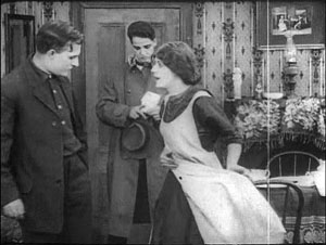
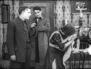
The plot of Get Rich Quick (1911) involves a man who joins a business that is scamming innocent investors. The film uses only five locales and plays scenes in long takes. The Little Girl Next Door (1912) has a more complex plot, with two distinct lines of action that converge on a child’s drowning. It uses many more locales and an ellipsis of a year to trace the changes in a family’s fortunes. It also incorporates cut-in close views and point-of-view editing. The Elusive Diamond (1913) is less psychology-driven than The Little Girl Next Door, but its intrigue relies almost completely on dialogue titles and it includes many close-ups and variation of camera setups.
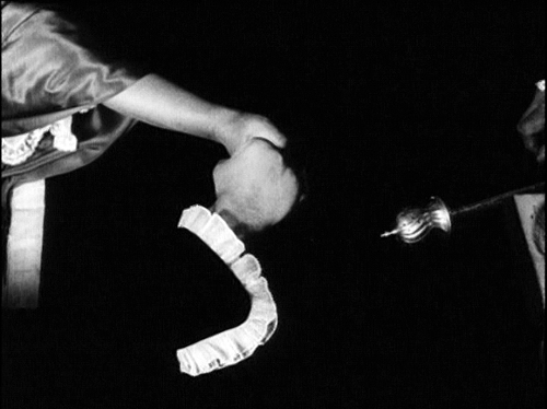
Three films and three years: A vivid cross-section of the rapid development of what soon became classical visual storytelling. Moving from 18 shots to 53 shots to 74 shots, the films became less dependent on staging and more dependent on editing. At the same time, Charlie didn’t fail to notice how the long takes in Get Rich Quick allow some felicities of performance, particularly the way that the wife’s handling of her apron charts her psychological states. She brushes it aside to show how poor they are, then she uses it as a giant hankie.
Like all good papers, Charlie’s left a lot to be discussed. People asked about how much pre-planning was done at Thanhouser, about the directors and screenwriters on staff, about the division of labor. We were left with a sense that here was another mostly unknown region that would reward further study.
Fernand Léger, Cubist Charlot (1923).
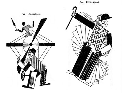
Yuri Tsivian of the University of Chicago carried us into the twenties with an in-depth examination of early Russian reactions to Charlie Chaplin. The paper held many surprises. Chaplin was popular in many countries from 1915 onward, and very soon after he was celebrated by European intellectuals. But Russia lagged behind; there’s no concrete evidence that any Chaplin films were shown there until 1922. Yet the Soviet avant-garde embraced him. How and why?
Instead of looking for a dual relationship—Chaplin directly influencing Russian artists—Yuri postulated a “triangular” relationship, in which Chaplin’s image was mediated through other European sources. For instance, Léger’s numerous images of a fragmented Chaplin led Futurists and Constructivists to declare Charlie “one of us.” They loved the idea of man as a machine executing precisely articulated movement, and what they heard of Chaplin’s pantomime and gags led them to praise him. Chaplin, said Lev Kuleshov, is “our first teacher” because he knows bio-mechanical premises better than anyone. According to the photographer and graphic designer Rodchenko Chaplin instructs viewers in how to walk or put on a hat in the most perfect manner.
So strong was this “virtual” image that artists could read Chaplin into the slapstick comedians they did see. Yuri showed that Varvara Stepanova’s striking rendition of Chaplin as an airplane propeller derived from a film he wasn’t in!
Perhaps she didn’t care: Nikolai Foregger suggested that Chaplin himself was unimportant, that the crucial fact was that he created a whole school of comedians within what Yuri called “a collaborative research community”—that is, Hollywood!
Yuri’s paper, in homage to the Russian Formalists, invoked the “law of fortuity” in art. This refers to the possibility that artistic borrowings, blendings, and crossovers are not determined by any broader social processes, as the Marxists were arguing, but are merely contingent. “Life interferes with art from below.” Accidents and unforeseen intersections, such as the Chaplin craze meeting the Constructivist movement, allow artists to seize on whatever is around them for new material. Yuri’s reference was to Kristin’s revival of Formalist methods in her “neoformalist” studies of Eisenstein, Tati, and other filmmakers.
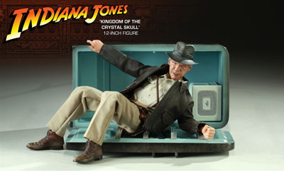
Janet Staiger of the University of Texas at Austin collaborated with us on The Classical Hollywood Cinema, and she has for several years been the leading scholar of reception studies in film and television. In looking at the Indiana Jones series, her paper nodded to Kristin’s work on the Lord of the Rings franchise and her study of fans’ responses to the films.
“Nuking the fridge,” Janet explained, has become fan jargon for an outrageous plot twist. The phrase comes from a notorious moment in Indiana Jones and the Kingdom of the Crystal Skull (2008), in which Professor Jones escapes an atomic blast by diving into a lead-lined refrigerator. The moment becomes a crux for clashing fan judgments: This is totally unrealistic vs. Realism doesn’t matter. Janet went on to show how these and other fan responses, entwined in IMDB commentary threads, utilized several different interpretive frames.
One was authorship. Like academics and journalists, fan are auteurists. They assign the director responsibility for major aspects of the film. But this doesn’t mean that they agree in how to use this frame. In the case of Crystal Skull, a certain Kid Mogul asked if Spielberg’s willingness to reinvigorate the franchise was purely mercenary: “Is it just about the money?” Others took a more career-survey approach, noting that after prestige pictures like Schindler’s List Spielberg recalibrated his popcorn movies, particularly by handling violence more gingerly.
Another frame was story-based “lit talk.” Fans disparaging the film found it clumsily plotted and lacking in character development. Several were quite sensitive to narrative coherence, one-off gags (such as nuking the fridge), and pacing. Those defending the film appealed to the emotional burst of the final chase scenes.
Janet’s third frame of reference was what she called “formula dissonance.” She sought to capture what seeing the film would be like for those who knew Indy’s story only through the TV series or video versions of the earlier installments in the franchise. She suggested that the formula was by 2008 quite abstracted and idealized for many fans. Their sense of the franchise was thus tested by the extraterrestrial twist that resolved the Crystal Skull plot. Does it reframe the whole series in a cosmic context, or is it a violation of the premises of the Indy universe?
Janet’s survey of these types of responses made me notice that the assumptions of academic film studies and of journalistic criticism overlap with fan conversation. Fans who liked the film tried to make everything fit by appeal to organic unity, technical proficiency, emotional intensity, and other familiar criteria. It made me suspect yet another reason why “amateur” and “professional” film criticism seem to be merging: Perhaps their conceptual frames of reference aren’t so far apart. But their tastes and their degrees of commitment surely are.
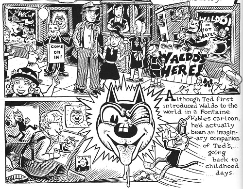
You might have expected Henry Jenkins of the Annenberg School at the University of Southern California to talk about fans too. After all, he practically invented the modern study of media fandom with his book Textual Poachers, and his work influenced Kristin’s study of fan promotion of The Lord of the Rings. Instead he turned to a survey of an artist’s oeuvre. He showed how Kim Deitch’s vast output of stories appropriate imagery from nineteenth and twentieth century mass media and present highly personal versions of the history of popular culture.
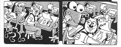
In a way, though, Henry’s talk involved fandom because Deitch is himself a prototypical fanman. He’s an obsessive collector, likely to turn his search for a rare toy or drawing into a Byzantine odyssey on the page. Fascinated by Hollywood scandal, he has constructed a phantasmagoric history of mass media through fictional characters (e.g., fake movie stars) who confront real people (e.g., Fatty Arbuckle). He’s particularly concerned about what he takes to be the warping of animated film by the influences of the mass market, epitomized by the Disney empire. The emblematic moment in Boulevard of Broken Dreams comes when Deitch’s Winsor McKay stand-in addresses torpid animators at a tribute dinner and denounces them for selling out.
Deitch’s most famous character is Waldo the cat, and Henry traced the powerful connotations of this emblematic figure. Waldo recalls Felix, the most heavily merchandised comics figure before Mickey, as well as the black cat as a figure of deception, witchcraft, and even African-American minstrelsy. Through Waldo, Deitch could hop across the history of film and comics, from McKay to Mighty Mouse and 1940s abstract films. In Alias the Cat!, Deitch finds in the 1910s everything that we associate with media today: serial narrative, stories shifting across different media platforms, an uncertain line between publicity and self-expression, and a mixing of news and sensational fiction.
Henry situated Deitch in a broader trend of comic artists trying to find a new history of their medium, one that dislodges superheroes from a central role. Deitch’s themes of old-fashioned craftsmanship, lovably antiquated technology, adult dread and degeneracy lurking behind children’s stories, and the commodity demands of comic art link him to contemporaries like Chris Ware and Art Spigelman.
Henry’s talk spurred a lot of discussion, including the question of whether we can treat an artist as offering a history that is comparable to academic research. Can Deitch’s hallucinatory vision of American media be a plausible basis for understanding what really happened? On the whole we don’t expect an artist to offer rigorous arguments. An artwork appropriates history for its own end. (Not all the Greek philosophers actually gathered together in the way Raphael depicts them in the School of Athens painting.) How cogent you find Deitch’s critique probably also depends on whether you share his disdain for Disney. His floppy-limbed denizens fuse headcomix grotesquerie with the 1930s animation that most prestige studios abandoned. As in Sally Cruikshank’s sprightly cartoon Quasi at the Quackadero, Deitch’s rubbery frames revive a style in which everything seems to throb and shimmy.
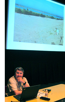
Kristin’s talk, “How I Spend My Winter Vacations: The Amarna Statuary Project and Techniques of Visual Analysis,” had two parts. In the second part, she reviewed her recent work in assembling statues out of tiny bits that had been dumped by archaeologists decades ago. You can read some of this story here. The side of her work most intriguing to students of film, I think, involves her attraction to Egyptian art in the first place.
Egyptian art is often thought of as unrealistic, but during his reign in the fourteenth century BCE the pharaoh Akhenaten introduced a peculiar sort of stylization into it. When he instituted a monotheistic religion centered on the sun god Ra (embodied in the Aten), he also demanded a new pictorial style. Thus the Aten is depicted as a disc shedding rays, a symbol of life and dominion. In addition, the royal family displays biggish hips and thighs, which fit the fecundity theme. More strikingly to our eye, Akhenaten’s family were represented as somewhat distorted, with long and narrow faces, hands, and feet. The ruler’s crown is elongated as well. Several aspects of the new style are present in Kristin’s favorite scene, a beautiful relief carving known as the Berlin family stela.
You can see the Aten’s rays ending in little hands holding ankh signs to the royal couple’s noses. But just as important is the human dimension of the scene, and two sorts of action displayed there: swiveled shoulders and pointing hands.
Unlike the flat, frontal portrayal we associate with Egyptian art, the family members are caught in twisting postures that bring one shoulder forward. Kristin explained:
Akhenaten is lifting his daughter, his foreground arm moving backward to hold her legs, the other moving forward to support her body as he kisses her. She reaches with her rear arm to chuck him affectionately under the chin, while her other arm moves backward in a pointing gesture. On the opposite site, Nefertiti’s foreground arm is held bent and backward to steady the youngest daughter of the three present, who is standing on her thigh and reaching up rather precariously to grab a golden decoration hanging from her mother’s crown. Nefertiti’s rear hand goes forward to steady the second daughter, who is also pointing, this time with her rear arm as she twists to look at her mother. These kinds of gestures can be found again and again in such scenes.
The twisting movement wasn’t unknown among images of workers and private individuals; Amarna artists, presumably encouraged by Akhenaten, applied the device to portraying the royal family.
Just as significant are the pointing gestures we find in the stela. Some scholars have interpreted them as protective gestures, which are found in other images. But Kristin points out:
 In those cases, the protecting figures hold their arms straight, they stare in the direction of the thing to be protected (as one presumably would in reciting a spell), and there is something dangerous present. None of this applies in the scene in the stela.
After pondering this scene quite a lot, it occurred to me that it looked like a really early film, a short scene, perhaps 30 seconds long, that we were to interpret as a tiny narrative. The pointing gestures seemed comparable to pantomime, where one has to interpret movements in the absence of intertitles.
Given that so much Amarna art is about displaying the royal couple as having created life by giving birth to their daughters and as sustaining that life, it seems to me that this stela is full of indications of nurturing. The columns and roof indicate that the parents have their kids in a little shelter to keep them out of the hot sun. The rows of pots behind Akhenaten’s stool are no doubt filled with cool drinks for them. Nefertiti carefully holds onto the two children on her lap while Akhenaten kisses the eldest. My interpretation is that the eldest is saying something like, why don’t you kiss sister, too?” and the one opposite is pointing out the kiss to her mother and saying something like, “Look, daddy’s kissing sister; I want a kiss too.”
This may not sound like the sort of thing kids would say, but the circulation of affectionate gestures among the family members in these casual scenes is nearly universal. The chucking under the chin gesture used by Meretaten here shows up again and again, as do embraces and kisses.
Despite all the stylization, then, Kristin concludes that the stela depicts a scene of intimate affection, complete with a child toying with a mother’s ornament. This homely realism chimes with other realistic tendencies in Amarna art, such as the differentiation of right and left feet and the presentation of plants and animals in non-stereotyped ways. In sum, Kristin’s ability to look closely at film style helped her make discoveries about visual narrative in a completely different domain.
So our Saturday talks included cinema-related material from 1911 to about 2010, and with Kristin’s lecture we flashed back about 3300 years. Every talk was crisp and lucid. We were spared the juggling of empty abstractions, the free-associative rambling, and the self-congratulatory cleverness that plague the humanities. We got knowledge and opinion presented with enthusiasm, modesty, and good humor.
Kristin and I are grateful to our presenters, as well to all the friends old and new who showed up: Leslie Midkiff Debauche from Stevens Point, Carl Plantinga from Michigan, Peter Rist from Montreal, Brenda Benthien from Cleveland, Virginia Wright Wexman from Chicago, Vicente José Benet from Spain (via Chicago) and many others. In all, a day to remember.
For more information on Kristin’s research see my earlier entry. For other cinematic implications of the Berlin stela of Akhenaten’s family , see Kristin’s blog entry here. Her article, “Frontal Shoulders in Amarna Royal Reliefs: Solutions to an Aesthetic Problem,” is available in The Journal of the Society for the Study of Egyptian Antiquities 27 (1997, published 2000).
All of our speakers are represented on the Web: Henry here, Charlie here, Janet here, and Yuri here (and of course on Cinemetrics). For more on Janet’s study of online critics and the frames they inherit, see her essay, “The Revenge of the Film Education Movement.”
Kim Deitch, Boulevard of Broken Dreams.


