Archive for the 'Silent film' Category
Scorsese, ‘pressionist
Shutter Island.
I was interested in the way she presented herself at that moment. Later on I figured out that as she gets up from the chair we should do it in three cuts, three separate close-ups, because I think he’ll never forget that moment the rest of his life. He’ll play it back many times. . . . It’s just his perception, his memory of what it’s going to be like. . . . We shot it very quickly, two takes each, one at 24 frames, one at 36, and one 48.
Martin Scorsese, on filming The Age of Innocence.
DB here:
Few directors think so carefully about how a film looks and sounds. Sensitive to technique in the work of classic filmmakers, Martin Scorsese has always tried to give each picture a vivid visual and auditory profile. Although he’s often praised for his realism (usually prefaced by the adjective “gritty”), Scorsese is often a subjectively oriented director. This quality goes beyond the justly celebrated performances of his actors. He is unafraid to use unusual cinematic techniques to thrust us boldly into the characters’ minds and emotions. In this effort he joins some great cinematic traditions. No surprise there: He has an immediate sense that film history hovers over every choice a director makes.
Spoilers loom out of the mist ahead.
Inside out, outside in
Raskolnikov.
Once American filmmakers developed a model of visual storytelling in the late 1910s, filmmakers elsewhere were surprisingly quick to push it in more subjective directions. There emerged something like an international division of techniques.
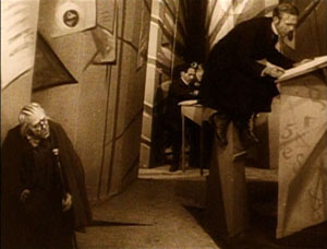
To convey inner experience, German directors of the 1910s and 1920s worked principally on aspects of mise-en-scene—performance, staging, setting, lighting, costume, make-up, and the like. The classic example is The Cabinet of Dr. Caligari (1920), in which the cutting and camerawork are fairly conservative, but the setting and acting seek to convey a madman’s vision of the world.
Caligari “subjectivizes” the characters’ surroundings, a process signaled through warped perspectives and fantastically distorted settings.
This brand of visual contortion became the hallmark of what was called German Expressionist cinema. Scholars argue about exactly what films belong under that rubric, but Caligari, along with From Morn to Midnight (1920) and Raskolnikov (1923, above), are pretty uncontroversial examples of making the external world reflect the characters’ psychic turmoil.
At the same period, French directors were also experimenting with subjective cinema. But they tended to concentrate less on mise-en-scene and more on what the camera could do to suggest both optical and mental point of view. In the so-called “French Impressionist” school, we find framings, angles, distorting lenses, changes of focus, slow-motion, and other cinematographic techniques used to suggest characters’ mental states. Thus in Germaine Dulac’s Smiling Madam Beudet (1923), the downtrodden wife sees her husband as monstrous.
In El Dorado (1921) Marcel L’Herbier uses a gauzy filter to suggest that his heroine is distracted, before pulling it aside and letting her face come into focus.
A little later, leading Soviet filmmakers made editing, not mise-en-scene or camerawork, their most salient technique. They experimented with graphic and rhythmic montage, as well as cuts that sacrificed spatial and temporal continuity to eye-smiting impact.
Of course this three-way division of technical labor is too neat. You find some camera experimentation in German Expressionism, as with the fast motion in Nosferatu (1922). The French were using rapid cutting even before the Soviets, as Gance’s La Roue (1923) shows. And some Soviets, such as Eisenstein and the FEKS directors, explored unusual lighting and camera angles. It should be said, though, that these shared techniques often serve different purposes. Fast cutting in Impressionist films tends to suggest the heightened experience of the characters, rather than serving, as in the Soviet case, to dynamize a historical situation for the viewer. The quick cutting in the carnival ride in Jean Epstein’s Coeur fidèle (1923) simulates the chaotic burst of “impressions” felt by the characters, but the quick cutting in the street riot of Strike (1925) doesn’t mimic the characters’ states but aims to arouse shock and suspense in us.
In any case, my technical division remains only a first approximation toward understanding pretty complicated historical trends. The main point is that both the German Expressionist and the French Impressionist filmmakers of the 1920s were seeking to use particular film techniques to give the audience a deeper sense of the characters’ sensory experience and emotional states.
American cinema selectively adopted some of these tactics of lighting and set design. In a blog entry and a web essay, I’ve written about William Cameron Menzies as one importer of the German approach. You can see Expressionist touches in Fox’s Mr. Moto movies. Likewise, 1940s films particularly enjoyed mimicking Impressionist camera tricks to signal drunkenness, delirium, hallucination, and other altered states. Hitchcock’s Spellbound (1945) and Wilder’s Lost Weekend (1945) are famous examples. Typically such Expressionist and Impressionist touches were associated with crime, craziness, or genre stylization. Much of this flagrant irrealism went out of A-pictures in the 1950s, but it survived in horror and, interestingly, in the US avant-garde cinema of Deren, Markopoulos, and others.
One of Scorsese’s contributions to the 1970s, I think, was to revive and consolidate this legacy. While we were celebrating his films as victories for urban realism and neo-Method acting, many of the movies were also charged exercises in subjective cinema.
Making streets mean, and meaningful
Taxi Driver.
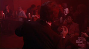
From Mean Streets (1973) everyone remembers the aura of street-punk camaraderie, the harsh turns of mood (usually triggered by Johnny Boy’s recklessness), and the vibrancy of the neighborhood, with its social hierarchy and rituals of bullying and bluff and negotiation. Alongside these tokens of realism we find breathless grace notes, as when Charlie glides through the club, a visual equivalent of his joy in being among pals and sexy women. (The shot was made by having Keitel ride the dolly instead of walking in front of it.)
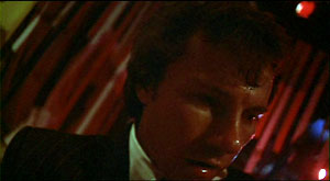
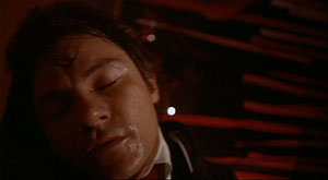
This euphoria of this neo-Impressionist shot is counterbalanced later by the Rubber Biscuit song, with Charlie now thoroughly drunk and floating in grotesque frontal close-up before the floor rises up to kiss his head.
Charlie has come in to the club announcing himself as Jesus, a pious man to create order. Now this shot charts his fall from drunken exuberance into queasiness and mounting anxiety about Johnny Boy’s debt.
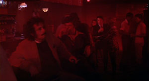
More generally, Tony’s club is given heavily unrealistic treatment through slow-motion and faked slow-motion, along with character movement synchronized with the music. If the camerawork mimics Charlie’s mental states in Impressionist fashion, the ruby-red club lighting suggests his erotic inflammation in a mildly Expressionist one.
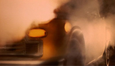
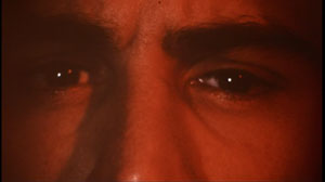
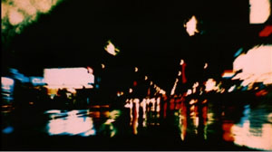
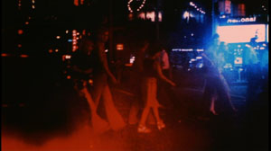
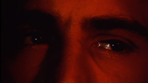
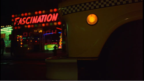
Taxi Driver (1976) is Scorsese’s most famous venture into subjectivity. From the first shot of the cab heaving through wafting vapor—steam? smoke? sulfur fumes?—we cut to a man’s eyes, and then to dissolving views of the city through a rainy windshield.
From the start Scorsese announces one of his most basic strategies: a realistic motivation for expressionist effects. It’s only rain, but shooting it through the windshield and adding slow motion gives the streets an otherworldly shimmer. As the neon dribbles down the glass, and we see pedestrians moving through tinted clouds like hesitant ghosts, the man’s face becomes bathed in a red glow—vaguely motivated as reflected from the traffic light, but unrealistically saturated, as in the Mean Streets club.
We see the real New York, but filtered through the eyes of a man who considers it an open sewer. The plot will soon lock us into his consciousness more explicitly, through restricted point of view and voice-over diary extracts and crisp montages of the cruising cab. In addition, the motifs introduced here, particularly purifying water and blips of light, will become elaborated in the course of the movie. The general point, however, is that Scorsese has updated Impressionist and Expressionist tactics in order to reveal a man’s mind through images.
Qui tollis peccata mundi
Bringing Out the Dead.
In some films Scorsese plays things straighter, invoking subjectivity only briefly. There are the prizefights and the visions of Vicki in Raging Bull (1980), and the slipperier passages of fantasy in The King of Comedy (1982). But other films plunge us deeply into subjectivity, forcing the world through the filter of a driven character’s sensibility.
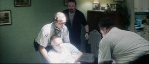
For thoroughgoing efforts in this direction we can look to Bringing Out the Dead (1999). In this movie about a paramedic haunted by spirits of those unfortunates he might have saved, Scorsese along with cinematographer Robert Richardson and production designer Dante Ferretti reinvoke the nightmarish qualities of Taxi Driver. The exhilaration Frank Pierce gets from saving lives is offset by his despair at gambling with death every night. The result is another exercise in neo-Impressionism and –Expressionism.
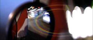
Once again rain and light, objectively out there in the urban world, become projections of the character’s tormented psyche, thanks to camera angle and framing. The windshield gives Frank’s face phantom tears.
Once again concrete shapes and colors, filtered through a moving vehicle, are distorted to suggest the protagonist’s anxieties.
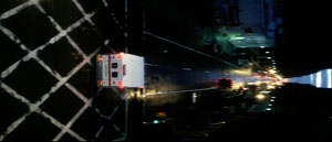
To measure Frank’s descent into desperation, the camera even follows the ambulance upside down, or sideways.
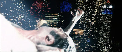
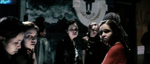
Scorsese ventures into full-blown Expressionism as well. There are naturally dream sequences, but we also get the unforgettable image of the drug dealer Sy, impaled on a fence rail and reaching toward skyscrapers as fireworks (real fireworks?) consecrate his gesture. Later, hurtling through the city and moving closer to mental breakdown, Frank starts to see every woman on the street as Rosa, the woman he could not rescue. How the Germans would have loved having CGI available for such a hallucination.
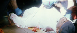
Perhaps the subtlest touches are the patches of blown-out white. At first they seem a signal of death, gleaming off the bodies of Mary’s father and the young man found on the street.
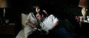
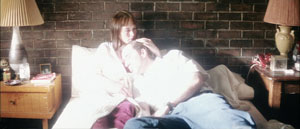
In the final scene, Frank tells Mary of her father’s death (and sees her as Rosa). She invites him in and eventually he falls asleep in her arms. The final shot quietly shifts from a normal, rather dark texture, to one endowing his shirt with a blinding glow.
This change in lighting and exposure, unmotivated by any realistic source, suggests that Frank feels he has found a bit of peace, while also hinting that a spiritual radiance has entered this unhappy world through a tortured secular saint.
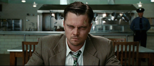
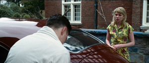
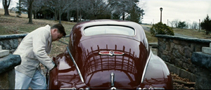
Shutter Island caters to the ‘pressionist side of Scorsese’s vision. It hovers between realism and subjectivity: parts of what we see are really happening in the fiction, while other parts are wholly in Teddy/ Edward’s mind. The difference is that here the balance tips strongly toward expressionism. Apart from the dream sequences, certain hallucinations are rendered in undistorted terms. So, for instance, scenes like the cave conversation with the second Rachel Solando are wholly Teddy’s mental projections. Other scenes oscillate between subjectivity and objectivity, as when Teddy is preparing to set fire to Cawley’s car and talks with his wife Dolores–although the next shot confirms she’s not really there.
I find all this less resourceful than the virtuosic ways in which Scorsese subjectivizes the neighborhoods of New York. The Gothic trappings of the hospital, the cagelike wards, and the rainswept island offer less opportunity for novel stylization than an urban landscape. Moreover, I think that the creaky gimmick ruling the plot of Shutter Island relies on farfetched explanations and leaves too many loose ends. If the storm didn’t really occur, as Dr. Cawley tells us, then did the storm-tossed dialogues with Chuck not occur either? Why are the doctors talking about the prospects of a (nonexistent) flood before Teddy even comes into the room? And could the inmates be relied upon to execute the physicians’ complex role-playing game? A second viewing left me in the dark about matters that a Shyamalan would have tidied up.
But I did have to admire the way in which Scorsese uses Teddy’s breakdown as an alibi for the mismatched cuts I’ve objected to before. (Some legerdemain with a water glass is particularly clever.) And the ending supplies one further twist that somewhat ennobles the whole loopy contraption.
Cranking it up
Crank 2: High Voltage.
You can argue that Scorsese’s talent was well suited to this project: We don’t notice the plot problems because his stylistic assurance carries us along smoothly. That assurance allows me to raise my final point.
I’ve argued elsewhere, in books and on this site, that Hollywood storytelling techniques have been overhauled in recent decades. Over the last forty years or so, filmmakers have amped up the “continuity style” forged in the 1910s. They have cut faster, sometimes averaging 2-3 seconds per shot across a film. They have relied more heavily on singles (shots of one character), and these singles are often fairly large close-ups. Directors have also embraced extremes in lens lengths—very long lenses (for that perspective-flattening effect) and very wide-angle ones (often yielding flagrant distortions). Filmmakers have also relied a great deal on camera movement, frequently tracking in or out or even circling around the characters as they speak. The basic premises of continuity cinema aren’t violated, but the result is more aggressive visuals. Hence my label “intensified continuity.”
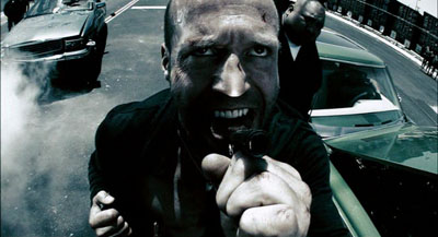
I think that intensified continuity became the new baseline for popular filmmaking both in the US and overseas. Over this style, however, some filmmakers have laid lots of fancy filigree. Many flashy techniques fill our movies. We get slow-motion, fast-motion, reverse-motion, ramping, and freeze-frames. There are brutal jump cuts, ragged shifts between color and monochrome, deliberately awkward framings, abrupt overhead compositions, slippery focus, and jerky handheld shooting. On the soundtrack we get ominous rumblings, metallic crashes, and noisy transitions. The Bourne films and The Hurt Locker (2009) offer moderate examples, but edging toward the extreme you have Crank 2: High Voltage (2009). Here intensified continuity has itself been intensified to a height of frenzied artifice. “Over the top” doesn’t capture it. There is, it seems, no longer a top to go over.
This swaggering style takes classical space and time as its basis—we still have analytical cutting, over-the-shoulder shots, and the like—but it pushes beyond the modest demands of simply laying out dramatic elements for easy comprehension. The intensified approach, itself trying for punch, has been raised to a new level of shock and awe. This trend, I’d speculate, is an escalation of tendencies seen in 1970s-1980s filmmakers like Brian De Palma, Ken Russell, Nicholas Roeg, Ridley Scott, and Scorsese.
Scorsese’s stylistic élan proved enormously influential, I think; Mean Streets is virtually a compendium of the new techniques. But unlike some others, he explored the emerging style in order to probe characters’ feelings and moods. Many of today’s amped-up techniques come off as merely eye candy, or prods for visual arousal, or pieces of narrational subterfuge (as often in De Palma). Scorsese has sought to make these decorative techniques more operatic—perhaps in the tradition of Visconti, Michael Powell, and other filmmakers he admires. The images (and of course the music) swirl around the action, providing cadenzas that bring out feelings which his men often can’t articulate. Sometimes the stylistic accompaniment becomes bombastic, as I think Shutter Island largely is. Yet the finest of Scorsese’s pictures contribute to a rich tradition in which the cinema, normally committed to objective realism, makes palpable what goes on inside us.
Scorsese’s remarks on The Age of Innocence come from a Film Comment interview with Gavin Smith reprinted in Martin Scorsese Interviews, ed. Peter Brunette (Jackson: University Press of Mississippi, 1999), 200. For more on Expressionist and Impressionist silent cinema, see our Film History: An Introduction, Chapters 4 and 5. By the end of the 1920s, these tendencies and Soviet Montage were blending into a sort of international style, a development considered in Chapter 8.
Taxi Driver.
PS 24 April: Filmmaker Max Jacoby writes:
I just read your blog entry on Scorsese’s style. You point out the glowing light which appears in some scenes of Bringing out the Dead. That is actually a signature lighting effect of cinematographer Bob Richardson. He has used this before he came into contact with Scorsese. You can already see it in some of the Oliver Stone films that he shot, such as JFK. This glowing effect is achieved by combining an overexposed toplight (several stops over key) with a diffusion filter (such as a White Pro Mist) in front of the lens or a net behind the lens. You can actually see the pattern of the net in question on the close-up of Nic Cage that you picked; it clearly stands out from the out-of-focus highlights in the background.
The net is more than likely a Christian Dior Denier 10 stocking, made of silk. They are very sought after and hard to find nowadays, because Dior stopped making these some years ago and switched to nylon instead. Once that became known, you had plenty of cinematographers invading women’s underwear stores to buy up the last remaining stock!
Max’s point helpfully indicates how a director can give a DP’s preferred choice a particular function. It seems to me that Scorsese’s patterned usage of the glowing white patches creates a significant motif in the movie–especially when it dominates the last shot, always a crucial moment. Thanks to Max for this, and for a followup reference to Eric Rudolph’s article, “Urban Gothic” in American Cinematographer 80, 11 (November 1999), 30-41; available here. In it Richardson discusses the flaring whites I mention in the blog entry.
Paris-Berlin-Brussels express
Doktor Satansohn.
Our trip to Europe has come to an end, and so we finish with a post scanning some highlights.
The magic lantern learns new tricks
DB here:
What am I seeing? Many avant-garde films pose this question. Mainstream fiction film and documentary cinema have mostly relied on the idea that the image should be recognizable as “what it is.” But one strain of experimental film has worked to delay or even prevent us from making out what’s in front of the camera.
Sometimes we lose our bearings only briefly, as when we eventually identify pot lids in Ballet Mécanique or bits of sunlit linoleum in Brakhage films. Sometimes language points out what’s really there. The titles of Joris Ivens’ Rain and the Eames’ Blacktop: The Washing of a School Play Yard allow us to enjoy the ways that ordinary sights can yield unexpected abstraction. Sometimes we toggle back and forth, as when in Ken Jacobs’ Tom, Tom, the Piper’s Son recognizable human figures, however grainy, jump into sheer blotchiness and then back into something like legibility. But other times we can’t ever tell what we’re seeing. Brakhage’s Fire of Waters offers one of the best examples I know, with its jagged bursts of light in a smoky void.
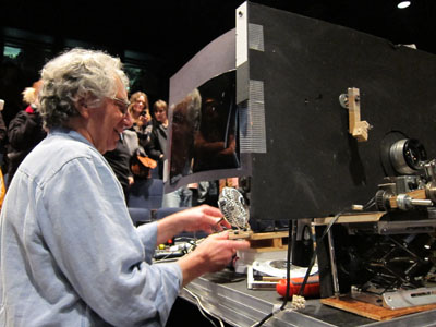
What am I seeing? The uncertainty was doubled during my visit to Ken Jacobs’ Nervous Magic Lantern performance at the Cinémathèque Française. I say “doubled” because at least with Fire of Waters and Tom, Tom I knew I was watching a film. With this display, What am I seeing? started as a question about the format itself. Was it a film, a video, or something else?
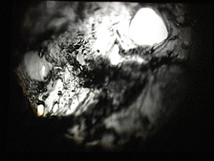
Then the question became the customary one. Off-white textures—pebbly, dribbly, stalagmite-like—swim in and out of focus. Some are viscous and globular, some are like tangled foliage. They seem to spiral, but actually (I put up a finger to measure) they barely move. The effect of movement is given by pulsations of pure black, breaking the lyrical effect of the surfaces with a harshness that becomes aggressive. Aggressive as well is the soundtrack, blocks of sound from subway platforms and traffic and kitsch Latin percussion, all played at high volume. The surfaces just keep shifting and not shifting, sort of rotating while jabbing out at us, lovely and anxiety-inducing at the same time.
At the end of the performance, people crowded around the cardboard booth in the middle of the theatre. As Ken and Flo Jacobs packed up, they showed how they had generated the effects. What had I been seeing? Neither a film nor a video but a true magic-lantern display, assembled on the spot. But what had I been seeing? Something created with home-made equipment of a startling simplicity. (Strapping tape was involved.) Our magicians explained their tricks, like magic-lantern operators of earlier centuries explaining the science behind their shows. But I think it’s best that you not know until after you have a chance to see what they create.
In earlier entries (here and here) Kristin and I have praised Jacobs’ films for showing how very slight adjustments in technique or technology can create disturbing cinematic illusions. In this vein, the first item on the Cinémathèque program, a video called Gift of Fire, turned Louis Le Prince’s brief 1888 street scene into a 3D movie. (The homage was appropriate because Le Prince experimented with multiple-lens cameras.) The Nervous Magic Lantern performance generated a different sort of illusion, one conjuring up micro-landscapes and otherworldly vortices. In all, Jacobs makes us realize how many evocative effects are still to be discovered by tinkering with images thrown on a screen.
Detour to Berlin
KT here:
As David mentioned in last week’s entry, I took a week in the middle of our visit to Europe for research at the Ägyptisches Museum in Berlin. The staff there welcomed me into their storerooms, and I spent the days looking at fragments and the records of their discovery and the nights downloading and backing up my photos. No time for filmgoing. The most I managed was a trip to the well-stocked arts bookshop Bücherbogen, which has one of the best selections of film books to be found in Germany. Our old friend, experimental filmmaker Carlos Bustamente, met me there, and we had a quick cup of tea–most welcome on a cold morning when the results of the biggest snowfall in decades were still blanketing many sidewalks and roads.
I did note one film-related phenomenon, however. Every day I took the S-Bahn from Savignyplatz to Friedrichstrasse. The tracks pass directly across the street from the Theater des Westens (that is, the western part of Berlin). It was playing Der Schuh des Manitu, a musical version of the 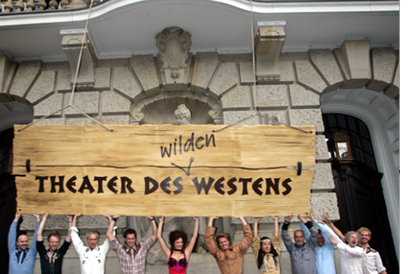 highly successful 2001 German film of the same name. (I hope the publicity photo at the left was taken in warmer weather than I experienced.) I mentioned the film here, in reference to the fact that every major producing country, and some minor ones as well, turn out their own local comedies, films that don’t travel well but are very popular locally.
By now it’s a familiar phenomenon in the U.S. for successful Hollywood films to be turned into stage musicals. It wasn’t always so. Back in the 1950s and 1960s, films were made of popular musicals, sometimes successfully, as with My Fair Lady, and sometimes not, as with Mame. But now the trend is the other way, with everything from Shrek to Hairspray getting the Broadway treatment.
It’s interesting to know that the same thing goes on abroad, though I’m not sure how prevalent such adaptations are. Der Schuh des Manitu, directed by Michael “Bully” Herbig, remains the highest grossing German film. Herbig doesn’t act in the stage play, as he did in the film, but he served as a creative advisor. The musical is a hit, having premiered on December 7, 2008 and it is expected to continue until at least the autumn of this year. There are several clips from both the film and the musical on YouTube. This one, at 8 minutes, gives a generous dose of the show. There are no subtitles.
I had only a couple of days back in Paris before we headed for Brussels for the final week of our trip. The German theme continued, since a few of the 1910s films David needed to see at the Cinematek here were German. The one I most wanted to see was Edmund Edel’s 1916 feature, Doktor Satansohn. Its main claim to fame is probably the fact that Ernst Lubitsch plays the title role. My book with Lubitsch started with his 1918 move to features, when he began to concentrate more on directing and less on acting. By 1920, with Sumurun, he appeared onscreen for the last time; being discontented with his performance as the tragic clown, he decided it was time to move behind the camera for good.
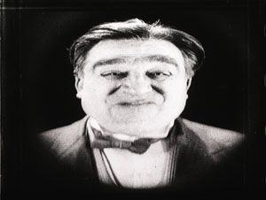
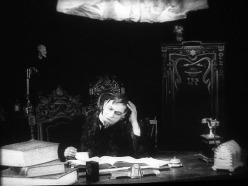
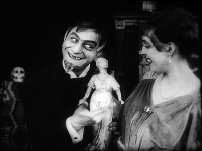
In the short films he starred in before 1918, Lubitsch often played a brash, ambitious Jewish youth, as in Der Stoltz der Firma (“The Pride of the Firm,” 1914). In Doktor Satansohn he’s a physician with a magical machine that transforms older women into beautiful young ones. We’re first introduced to a couple and the wife’s mother. When the latter makes a pass at her son-in-law and is rejected, she seeks the doctor’s help. His machine works by capturing the wife’s essence in a statuette and making the mother look like her daughter. Problem is, every time she’s about to kiss the husband, the doctor pops up with his devilish leer, visible only to the “wife.” David and I decided that the film is a comedy, though perhaps one only Germans of the day would find truly amusing. For one thing, the title character is clearly a Jewish caricature, one played to the hilt by Lubitsch. He decorates his machine with the Star of David and a Hebrew inscription (not to mention vipers and an image of Saturn).
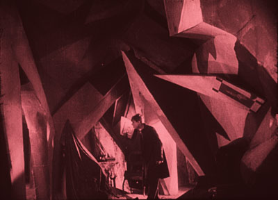
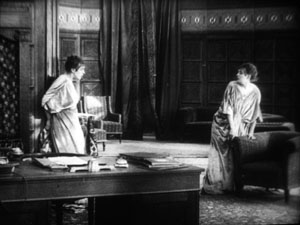
Stylistically it’s a fairly conventional film for its day, though the black background of the doctor’s office, with its stylized youth machine and satyr-like bust, gives a hint of Expressionism to come. (See our topmost image.) Inevitably near the end there comes the moment beloved of historians of pre-World War II German cinema. The real daughter, released from her imprisonment in the statuette, confronts her double in the doctor’s waiting room. The Doppelgänger motif strikes again.
I wonder if German films actually have more Doppelgängers in them than appear in other national cinemas. Do they really reflect the disturbed soul of the nation? Or did the possibilities of filmic special effects draw moviemakers to try and multiply single figures? Georges Méliès and Buster Keaton used in-camera techniques to multiple their own figures in virtuoso displays. I recall being impressed by The Parent Trap‘s duplication of Hayley Mills when I saw it as a kid, and the whole notion of a single actor playing twins and other lookalike relations is a common enough convention. In Doktor Satanssohn, the doubled figure appears only in this one shot, and it’s the leering Lubitsch, delighted with his own nastiness, who walks off with the picture.
The 1910s, again, and still
DB again:
We saw Doktor Satansohn while I was studying staging and cutting strategies of the 1910s, thanks to the remarkable holdings of the Royal Film Archive of Belgium, also known as the Cinematek. My comments on last summer’s visit are here.
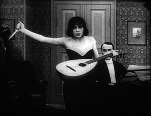
Another German film, in a choppy Russian print, vouchsafed a new glimpse of Asta Nielsen. In Totentanz (Urban Gad, 1912), she plays a guitarist-dancer who must take to the stage to support her infirm husband. She attracts the devotion of a composer, and soon she feels attracted to him. Torn between desire and duty, she snaps during a rehearsal of his latest piece, “Totentanz.” In a chilling gesture, she uses his dagger to slice her lute strings.
Soon the two are locked in a violent erotic struggle, and a stabbing ensues. In all, melodrama as ripe as one could want.
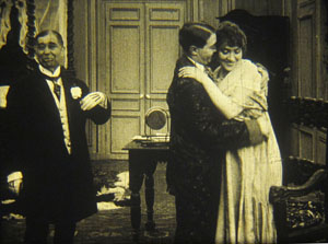
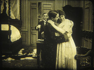
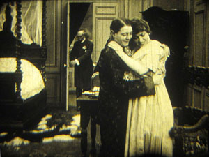
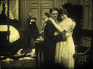
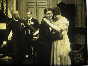
As ever, I was happy to have my hypotheses about tableau staging confirmed by several of the titles I saw. A minor French bedroom farce, Le Paradis (M. G. Leprieur, 1914 or 1915), had a brief passage of the sort of blocking and revealing we find in many films of the period. The painter Raphael Delacroix (no kidding) is pretending to be the lover of Claire Taupin to deflect the advances of randy M. Pontbichot. But Claire is actually the mistress of M. Grésillon. . . .
First, very frontal staging strings out Pontbichot, Raphael, and Claire. The older man relents in his pursuit of her.
In the vivid depth characteristic of the tableau tradition, Pontbichot withdraws. But his position accentuates that central door, which starts to open.
Most remarkably, Pontbichot ducks almost entirely behind the couple, giving pride of place to M. Grésillon’s arrival in the center of the shot.
Pontbichot slides out in time to register Grésillon’s outraged reaction to finding his mistress in another man’s arms.
Grésillon rushes to the frontal plane, furious. As ever, a thrust to the foreground creates a major spatial/ dramatic event.
Although the Le Paradis passage is ABC compared to the emotionally powerful patterns of staging we find in Ingeborg Holm (1913), it illustrates how even average films could resort to the blocking/ revealing tactic within the deep-space geometry of the tableau.
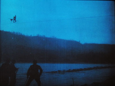
More flamboyant was Il Jockey della Morte (1915), an Italian circus film made by the Dane Alfred Lind. Its bold lighting and varied angles on the Big Top recalled the Danish films of a few years before. Halfway through, Lind launches a dazzling chase that features leaps from a tall bridge and bicycling stunts on a cable stretched across a river.
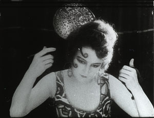
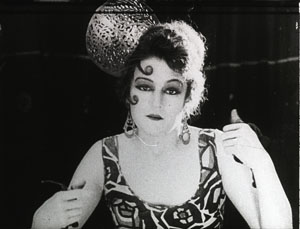
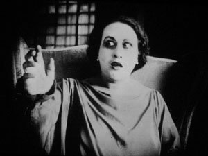
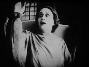
Another Italian film, this time a diva vehicle, suggests that by 1917 1923 (see below) the tableau style was already giving way had given way to scenes organized around close shots. (See below.) L’Ombra (Mario Almirante) starred Italia Almirante Manzini as a lively, trusting wife who becomes paralyzed. While her husband betrays her with her younger protégée, she gradually recovers bodily movement. Yes, a paralyzed diva seems a contradiction in terms, but one small-scale scene shows a remarkable range of emotions. Berta’s hands start twitching, one lifts up, and she stares wildly, as if it were an alien being.
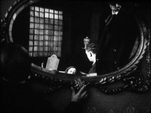
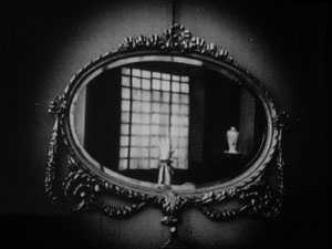
In an earlier scene, Berta had asked that a mirror facing her be tipped upward so that she would never see herself sitting immobile. This shot pays off now, when the hand ascends almost magically into the bit of reflection she can see.
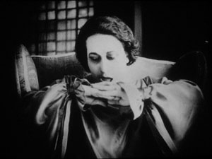
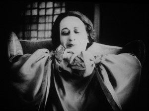
When the hand descends, her astonishment turns into joy. She experimentally shoves the hands together, as if asserting her control.
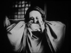
In the end, she kisses her hands as if they were pampered children.
Manzini runs through many more micro-emotions than I’ve indicated here, but this sample is typical of the ways in which L’Ombra avoides the long-shot choreography of only a few years before and builds a performance out of face, body, and arms in a close framing. The mirror-shot motif shows that fairly careful filmic construction was emerging at this point too.
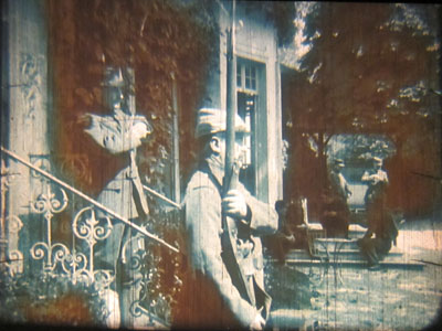
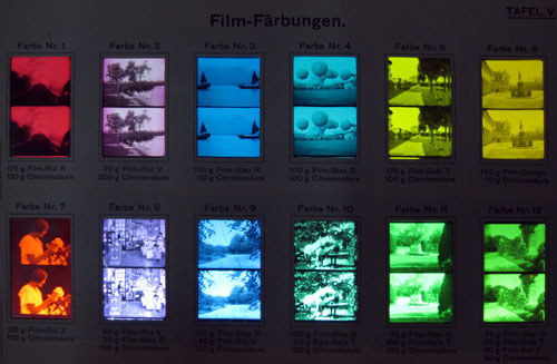
During my stay, I learned more about tinting and toning from the ever-helpful Noël Desmet. On the seldom-seen World War I drama L’Empreinte de la patrie (M. Dumeny, 1915), some images had curious oscillating patches of rusty brown. Noël explained that when Prussian Blue toning was combined with rose tinting, the chemicals eventually reacted to alter the pink cast. An example is shown at the top of this section, though the blue is more saturated in the original.
Once we get back to Madison, I’ll have to sort out all that I’ve learned from these movies. Onward and upward with the 1910s!
For more on Jacobs’ Nervous Magic Lantern, see Scott Foundas’ interview here. The Youtube clip doesn’t do the spectacle justice. If you must know something of Jacobs’ tools, the Dailymotion video from the performance I saw offers some clues. My notions about 1910s staging are laid out in On the History of Film Style and Figures Traced in Light. You can also find several discussions in earlier entries on this site. Just execute a search on tableau.
Now is a good time to thank Noël Desmet and Marianne Winderickx, both of whom are retiring from the archive in March. The research that Kristin and I have done over the years owes an enormous lot to them, and of course to the Director of the Cinematek Gabrielle Claes.
P.S. 15 November 2013: Ivo Blom has pointed out that the version of L’Ombra I saw wasn’t from 1917 but rather from 1923. Hence the corrections above. Thanks very much to Ivo! Go here for his blog and information about his newest publication on silent Italian cinema.
A tinting and toning sample card from the early 1920s. Courtesy Noël Desmet.
The ten-plus best films of … 1919
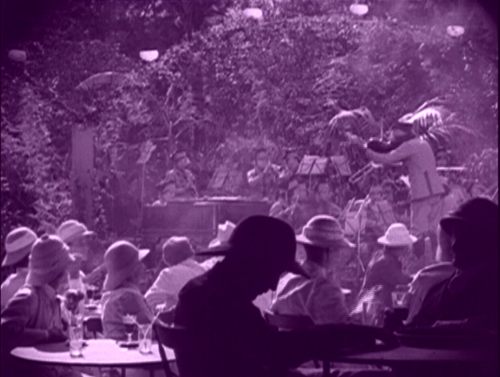
KT here, with some help from DB:
Two entries are enough to create a tradition. Once again, at a time of year when critics are picking their 10-best lists for 2009, we jump back ninety years and give our choices for 1919.
(For our 1917 list, see here, and here for 1918.)
I remarked in last year’s post that it was a bit difficult to come up with ten films, a result perhaps of accidents of preservation or slackening of activity by certain major filmmakers. There was no such problem for 1919, and films had to be bumped off the initial list to keep it to ten. (In fact, you’ll notice we didn’t quite manage to keep it to ten.) Since some people may take these lists as a guide to exploring the cinema of the teens, we’re adding some also-rans at the end, all very much worth watching.
With 1919, we’re approaching the decade when many of the most widely known silent classics were made. Some titles on this year’s list will be very familiar. Erich von Stroheim’s first film came out in 1919, as did Carl Dreyer’s. Ernst Lubitsch, always a prolific director, was particularly busy that year. Other titles are less well-known, still being largely the province of silent-film festivals and archival research.
Three, sadly, are not available on DVD, and some others have to be ordered from sources in their countries of origin. In this day of internet sales around the world, such orders are not difficult. You need, however, a multi-region DVD player.
Charles Chaplin had long since left his knockabout comedy behind and was making more controlled, poetic films by 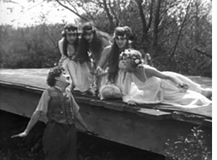 this point. The Little Tramp was beloved around the world, and numerous impersonators were turning out films to cash in on his popularity. Sunnyside is his most highly regarded film of 1919, in large part because of a dream sequence in which the Tramp wakes up by a little bridge to find himself welcomed by a bevy of wispily dressed young ladies. The subsequent open-air dance displays Chaplin’s extraordinary ability to inject humor into such a scene without marring its lyricism. (The only DVD version currently available in the U.S. is a fuzzy copy.)
Cecil B. De Mille had begun his series of high-society battle-of-the-sexes films by this point. Male and Female differs from the others in that it is based on a prominent literary source, The Admirable Crichton, J. M. Barrie’s successful 1902 play. The plot involved the butler of a wealthy British family. He becomes their leader when the pampered group is cast away on an unpopulated island. A romance develops between the spoiled daughter, Lady Mary (Gloria Swanson), and Crichton (Thomas Meighan).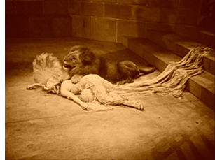
De Mille spiced up the story with a fantasy scene based on William Ernest Henley’s popular poem of 1888, “I was a King in Babylon.” It dealt with reincarnation, one of several spiritualist fads of the period, which also included psychic contact with the dead and the fairy photographs that deluded Sir Arthur Conan Doyle. Crichton refers to the poem, leading into a scene of him as king in a Babylon. When a Christian slave girl rejects his advances, he orders her thrown to the lions. The scene providesa glimpse of the costume-epic style that De Mille would increasingly turn to as his career advanced.
Henley, by the way, is largely forgotten today, but another of his poems, “Invictus,” inspired Nelson Mandela and lends its name to the latest Clint Eastwood film.
D. W. Griffith released an impressive lineup of features in 1919, despite the fact that he was also acting as the producer for other directors. His output includes a charming set of pastoral stories A Romance of Happy Valley, True Heart Susie, and The Greatest Question; a belated war film, The Girl Who Stayed at Home; a Western, Scarlet Days; and a melodrama that ranks among his most admired films, Broken Blossoms. Griffith’s status within the industry was 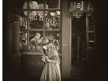 reflected by the fact that this same year same the formation of United Artists as a company to distribute films by him and the other founders, Chaplin, Mary Pickford, and Douglas Fairbanks.
Broken Blossoms owes its simplicity to the fact that Griffith was then making a series of films based on short stories. The title of Thomas Burke’s “The Chink and the Child” sounds offensive today, but it was an ironic reference to the epithet forced upon an idealistic young Chinese man who comes to London’s grim Limehouse district and becomes disillusioned. He falls in love with the delicate Lucy, abused by her violent, drunken father. These three form the main characters. Another Chinese man lusts after Lucy, but for once in Griffith’s work, the sexual threat to the innocent heroine takes second place to her abuse by her father. Lillian Gish and Richard Barthelmess convey the quiet resignation that at intervals gives way to Donald Crisp’s vicious outbursts.
Apart from the strong performances from the three leads, the film was perhaps the first to consistently use the “soft style” of cinematography, an approach that borrowed from a recently established trend in still photography. The hazy views of the Chinese setting in the opening and of the Limehouse docks later on would be enormously influential on films of the 1920s.
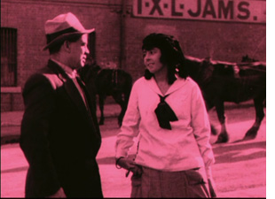 Raymond Longford is far and away the least known of the directors in this list. Films were increasingly being made in countries outside the U.S. and Europe, but few have survived. Longford’s The Sentimental Bloke is widely held to be the first major Australian film and perhaps the best of the silent era. Based on a verse poem using vernacular language and serialized from 1909 to 1915, it was set among working-class characters and filmed on location in an inner-city district of Sydney. It follows the reformation of the Bloke, a drinking, gambling man reformed by his love for Doreen. The film’s original intertitles, based on the poem and told in first person by the hero, were too colloquial for Americans to comprehend, and the film failed there, even after a new set of intertitles were substituted.
The Sentimental Bloke was restored in 2004 and this past April appeared in a DVD set prepared by the Australian National Film & Sound Archive. A supplementary disc includes historical material, information on the new musical accompaniment, and an interview with Longford. A book of historical essays is also included in the box, which is available directly from the DVD company Madman. (Note that although there is no region coding, it is in the PAL format.)
When I was studying film in graduate school, Ernst Lubitsch’s German period was known mainly for the 1919 historical epic Madame Dubarry. There was little known about the two comedies that came out that year, perhaps the most amusing and delightful of all his German films in this genre: Die Austernprinzessin (“The Oyster Princess,” though seldom called by that title) and Die Puppe (“The Doll,” also a little-used name).
It’s hard to choose which of these three is Lubitsch’s best for the year. Ironically Madame Dubarry isn’t watched much any more, and it’s not on the recent DVD set “Lubitsch in Berlin,” though the two comedies are. Complete prints are rare, due in part to censorship. (If the print you see ends with a close-up of the heroine’s head held up after she is executed, you’ve probably been watching a reasonably complete version.) It may seem a bit stodgy upon first viewing, but I warmed up to it during repeated screenings while researching my book on Lubitsch’s silent films. There are many excellent moments: the extended series of eyeline matches when Louis XV first sees Jeanne, the masterfully timed and staged long take when Choiseul refuses to let Jeanne accompany Louis’s coffin, and a meeting among the revolutionaries that ends as Jeanne reacts in horror to their bloodthirsty plans, backing dramatically into shadow in the background (below).
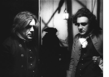
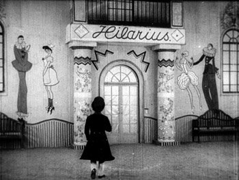
Given how different these films are, I’m going to declare a tie between Madame Dubarry and one of the comedies. Wonderful though The Oyster Princess is, I’m opting for Die Puppe (above). Its story-book opening and stylization are charming. The hilarious scenes in the doll workshop and the monastery full of greedy monks fill out the plot, making it considerably denser than that of Die Austernprinzessin.
As with Lubitsch, when I was first studying film and for many years thereafter, Swedish director Mauritz Stiller was known mainly for one film, Sir Arne’s Treasure (Herr Arnes Pengar), though an abridged version of The Saga of Gösta Berling also circulated. Sir Arne’s Treasure was assumed to be his masterpiece. The gradual rediscovery and restoration of other Stiller films from the 1910s has considerably broadened our view of him. Perhaps Sir Arne’s Treasure is not the solitary, towering masterpiece it was long thought to be. Still, it holds up well upon revisiting.
It is a period piece set in a small seaside community. A group of foreign men massacre most of a family, in search of their mythical riches. They are forced to remain in the village when the ship in which they are to sail becomes 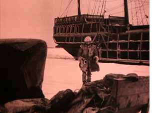 icebound. The surviving daughter of the family unwittingly falls in love with one of the killers.
Sir Arne’s Treasure was one of the films which gained the Swedish cinema of the 1910s the reputation for brilliantly exploiting natural landscapes. Few silent films have exploited actual winter settings so well. The actors are clearly working in genuine snow; one can sometimes see their breath fog as they speak. Atmospheric shots show the wind sweeping snow across the ice. Stiller uses the blank backgrounds created by the snow to create stark, simple compositions of dark figures and objects.
Kino’s DVD release uses a print from Svensk Filmindustri’s own archives. To my eye, the tinting used is too dark, especially since much of the action naturally takes place in the dark of the northern winter days. Deep blues somewhat obscure parts of the action. Still, the darkness adds to the brooding tone that pervades the story.
Erich von Stroheim’s first film, Blind Husbands, is the only one he completed that has come down to us in more or less its original version. As the director’s artistic ambitions expanded, his studios’ willingness to accommodate the growing 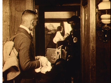 length and scope of his films diminished. His features of the 1920s were re-edited without his consent, most notoriously when the eight-hour naturalistic film Greed (1924) was released in a version that ran little more than two hours. For many the original remains at the top of the wish list for lost films to be recovered someday. (Number one on my list is Lubitsch’s Kiss Me Again, released in 1925 just before his masterpiece, Lady Windermere’s Fan.)
Blind Husbands is my favorite among von Stroheim’s films. It tells its story of sin and punishment with a lighter touch than his later films would. The director plays a would-be seducer of a neglected wife when the group converges in a village for a mountain-climbing vacation. Von Stroheim’s eye for striking compositions against the snow-clad landscapes and his skillful use of the inn’s hallways and doors to convey the characters’ shifting relationships show an already mature grasp of the art form. (See right, where the villain eyes the heroine in her room but is himself watched by the protective guide in the hallway between the rooms.)
Maurice Tourneur’s Victory runs a mere 63 minutes in its current version, but the original footage count suggests that what we have is substantially complete. That’s somewhat short for a feature by a major director at this point in history, but the simple, intense plot, based on a Joseph Conrad short story, benefits from the compression. The protagonist is a man who has escaped his past and lives as a virtual hermit on a South Seas island. Attracted despite himself, he befriends a young woman playing in a visiting orchestra and rescues her from the abuse of the orchestra’s owner and the lustful advances of the local hotel owner. Returning with the woman to his lonely island, he faces the intrusion of three thugs deceived by the vengeful hotel owner into thinking that the hero has riches hidden on his island.
By this point Tourneur has fully mastered the “rules” of classical continuity style and of three-point lighting. Many of the compositions in Victory look like they could have been made in the 1930s. When I first saw the film about thirty years ago, I found the earliest case of true over-the-shoulder shot/reverse shot that I had ever seen:
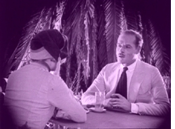
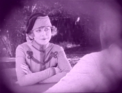
Since then, David has found an earlier one that sort of qualifies (maybe more on this in an upcoming entry), but this is a purer case.
Tourneur had also developed a distinctive approach to filming settings in long shot with framing elements within the mise-en-scene and figures silhouetted in the foreground (see top). In general the lighting is superb. Few Hollywood directors had reached this level of sophistication by 1919.
Victory has been released on DVD largely because it features Lon Chaney as one of the thugs. Image offers it paired it with another Chaney film. For some reason the titles are out of focus, but the rest of the film fortunately is in good condition and presents Tourneur’s visual style well.
DB’s picks:
Carl Theodor Dreyer began his film career writing scripts at the powerful Danish studio Nordisk. When he started directing, however, World War I had destroyed Nordisk’s markets, and the American cinema was on the rise. Dreyer’s generation was the first to register the impact of the emerging Hollywood cinema, and he displayed his understanding of Griffithian technique in The President (Praesidenten).
The English title should probably be something like “The Head Magistrate” or “The Presiding Judge,” and the plot appropriately sets up a tension between justice and personal obligation. One of Nordisk’s favored genres was the “nobility film,” in which illicit passion plunges a wealthy man or woman into the lower depths of society. Dreyer gave the studio a nobility film squared, using flashbacks to show how two generations of men in a family have seduced working-class women. The present-day drama displays the crisis that ensues when a respected judge realizes that the woman to be tried for infanticide is his illegitimate daughter. Dreyer’s abiding concern for the exploitation of women under patriarchy begins in his very first film.
From the early 1910s, Danish films displayed a mastery of tableau staging and careful pacing. But The President bears the mark of American technique in its bold close-ups and reliance on editing to build up its scenes. (There are nearly 600 shots in the film, yielding a rate of about 8.8 seconds per shot—quite swift for a European film of the era.) Perhaps more important are Dreyer’s efforts to shove aside the heavy furnishings of bourgeois melodrama. Compare the overstuffed set of Hard-Bought Glitter (Dyrekobt Glimmer, 1911) to this daringly bare one, with its sweep of cameos.
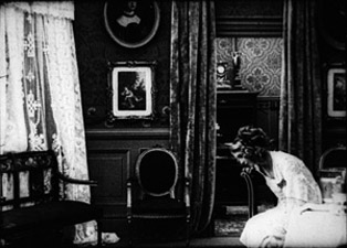
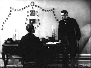
In the late teens, other Danish directors were moving toward simpler settings, but The President carries this tendency to geometrical extremes. Dreyer’s walls, bare or starkly patterned, isolate the players’ gestures and heighten moments of stasis. The result is one of the most adventurously designed film of its time, and if some of its experiments do not quite come off, already we can see that impulse toward abstraction that would be given full rein ten years later in La Passion de Jeanne d’Arc. The all-region DVD from the Danish Film Institute provides a somewhat dark tinted copy with original intertitles and English translations.
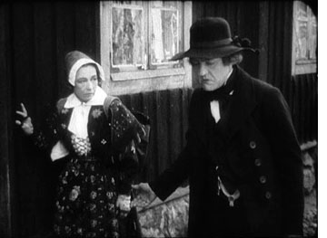 Dreyer deeply admired Victor Sjöström, who had already given Swedish cinema some of its enduring masterpieces: Ingeborg Holm (1913), Terje Vigen (1917), The Girl from Stormycroft (1917), and The Outlaw and His Wife (1918). Sjöström would go on to make The Phantom Carriage (1921), The Scarlet Letter (1926), and The Wind (1928). Several other outstanding movies he signed remain little known; worth watching for are The Girl from Stormycroft (1917), Karin Ingmarsdotter (1920), and the deeply moving Mästerman (1920; look for this on our list next year). Among these unofficial classics Sons of Ingmar (Ingmarssönerna, 1919) stands out especially.
A prologue shows lumbering, somewhat thick-headed Ingmar climbing a ladder to heaven, where generations of Ingmars sit in dignity around a massive meeting-room (see below). There his father tells him that he must find a wife. But Ingmar then explains that he once took a wife, with unhappy results. Some long flashbacks ensue, showing Ingmar forcing a young woman to marry him. The plot takes some doleful turns, with the result that the woman is sent to prison.
Running over two hours (and initially released in two parts), Sons of Ingmar has a fittingly lengthy climax that portrays the pains of reconciliation between a sensitive woman and an inarticulate man. In the film’s final scenes, Sjöström risks a delicate emotional modulation that would daunt a director today. Using Hollywood continuity cutting with a casual assurance, he relies on subtly timed cuts and changes of shot scale to trace the couple’s wavering guilts and hopes. These last scenes have a human-scale gravity that balances the weighty paternal authority of the heavenly sequences. In Theatre to Cinema our colleagues Lea Jacobs and Ben Brewster have written a penetrating analysis of the performances of Sjöström as Ingmar and Harriet Bossa as Brita.
Unhappily, we know of no video version of this wonderful film. It should be a top priority for DVD companies specializing in silent cinema.
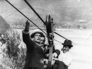
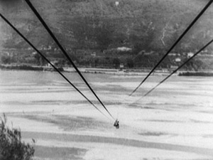
Another 1919 candidate for ambitious DVD purveyors is Louis Feuillade’s great serial Tih Minh. It has been overshadowed by Fantômas (1913-1914), Les Vampires (1915-1916), and Judex (1917), but it has a playful charm of its own. It is, in a way, the anti-Vampires. Instead of chronicling the triumphs of an all-powerful secret society, this six-hour saga gives us a few ill-assorted conspirators who inevitably fail at every scheme they try. The plot is no less far-fetched than that of the earlier serial, but the twists are more comic than thrilling. (Which is not to say that we’re denied some astonishing real-time stunt work performed by the actors, as above.) The film’s genial tone assures us that nothing bad will happen to the poor girl Tih Minh, but the villains will get enjoyably harsh punishment. In the course of the adventure three couples are formed, the routines of provincial life are filled in with leisurely detail, and the whole thing ends with a big wedding.
Unlike the Paris-bound serials, Tih Minh allowed Feuillade to apply his elegant staging skills to natural landscapes. By now he was filming in Nice, and the chases and fistfights are enhanced by gorgeous mountains, vistas of water, and hairpin roads. More than one connoisseur has confessed to me that this is their favorite Feuillade serial, and it’s hard to disagree. I always find that viewers are carried away by its zestful tale of good people who come to a good end.
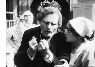 DB’s runner-ups: Perhaps not as fine as the above, but definitely of bizarre interest, are two Robert Reinert films from 1919. The title of Opium pretty much sums up this fevered movie. It includes sinister Asians, drug-addled doctors, a lions’ den, and Conrad Veidt in a suicide-haunted performance that makes his Cesare role in Caligari look underplayed (see right). Later in the same year Reinert gave us an even more overwrought tale, Nerven. This is a movie about collapse–the collapse of a community, of a business, and of the tormented minds of buttoned-up citizens. Reinert renders melodrama in images of controlled frenzy unlike any others I know from the period. Had his films been as widely seen as the official Expressionist classics, I think he would be much admired today. I analyze these two movies in Poetics of Cinema, and say a bit about them in this entry. A DVD of Nerven is available from the Munich Film Archive.
KT’s runners-up: I suppose that there will be some tongue-clicking over the fact that Abel Gance’s J’accuse! is not present in our list. There’s no doubt it’s historically important and influential, but it’s also heavy-handed and doesn’t add the leavening of humor to its melodrama, as some of the above films do. But it does deserve a mention in an overview of 1919. (I’ve posted about what I see as Gance’s limitations here.)
Last year I put Marshall Neilan’s Mary Pickford vehicle, Stella Maris, in the top ten. I’d be tempted to do the same with his (and her) Daddy-Long-Legs, but this year there’s a lot more competition. But it’s a charming film, and the great cinematographer Charles Rosher provides another series of beautiful images using the new three-point lighting system. It was the first Pickford film into Germany after the war and considerably influenced Lubitsch and other German directors.
Similarly, in a year with fewer major films, Victor Fleming’s When the Clouds Roll By, a wacky, inventive tale of superstition and psychological manipulation starring Douglas Fairbanks, would make the main list. David illustrated some of that inventiveness in his epic entry on Fairbanks.
Within a few years, compiling our 90-year picks will become increasingly difficult. Experimental cinema will blossom, as will animation. The Soviet Montage and German Expressionist movements will get started, and French Impressionism, still a minor trend in the late teens, will expand. Filmmakers like Murnau, Lang, Vidor, and Borzage will gain a higher profile, and more films by veteran directors like Ford will survive. Maybe we’ll have to expand the annual list even further. . . .
A very happy New Year to all our readers! Assuming we make it through the security lines, we shall be celebrating New Year’s Eve on a plane bound for Paris, where David will be doing a lecture series over the first few weeks of January. Paris is the world capital of cinema, at least as far as the diversity of films on offer goes, so we shall no doubt find occasion to blog while there.
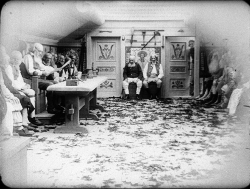
Sons of Ingmar.
Kurosawa’s early spring
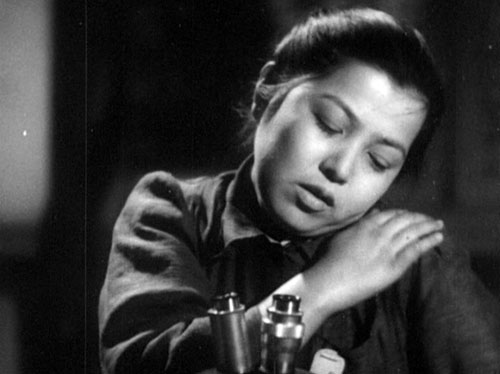
The Most Beautiful (1944).
For Donald Richie
DB here:
Cinephile communities aren’t free of peer pressure. Sometimes you must choose or be thought a waffler. In postwar France, the debate within the Cahiers du cinéma camp often came down to big dualities. Ford or Wyler? German Lang or American Lang? British Hitchcock or American Hitchcock? In the America of the 1960s and 1970s, we had our own forced choices, most notably Chaplin or Keaton?
This maneuver assumed that a simple pair of alternatives could profile your entire range of tastes. If you liked Chaplin, you probably favored sentiment, extroverted performance, and direction that was straightforward (“theatrical,” even crude). If you liked Keaton, you favored athleticism, the subordination of figure to landscape, cool detachment, and geometrically elegant compositions. One director risked bathos, the other coldness. The question wasn’t framed neutrally. My generation prided itself on having “discovered” the enigmatic Keaton, in the process demoting that self-congratulatory Tramp. Keaton never begged for our love.
Of course it was unfair. The forced duality ignored other important figures—Harold Lloyd most notably—and it asked for an unnatural rectitude of taste. Surely, a sensible soul would say, one can admire both, or all. But we weren’t sensible souls. Drawing up lists, defining in-groups and out-groups, expressing disdain for those who could not see: it was all a game cinephiles played, and it put personal taste squarely at the center of film conversation.
In the 1950s another big duality slipped into Paris-influenced film talk. Virtually nobody knew about Ozu, Shimizu, Gosho, Naruse, Shimazu, Yamanaka, et al., so two filmmakers had to stand in for the whole of Japanese cinema. Mizoguchi or Kurosawa?
A problematic auteur
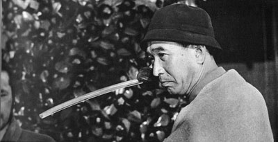
For Cahiers the choice was clear. Mizoguchi was master of subtly shaping drama through the body’s relation to space, thanks to quiet depth compositions and modulations of the long take. In Japan, land of exquisite nuance, the dream of infinitely expressive mise-en-scene seemed to have come true.
There seemed to be nothing nuanced about Kurosawa, whose brash technique, overripe performances, and propulsive stories seemed disconcertingly “Western.” Sold, like Satyajit Ray, as a humanist from an exotic culture, he played into critics’ eternal admiration for significance. This director wanted to make profound statements about the bomb (I Live in Fear), the relativity of truth (Rashomon), the impersonality of modern society (Ikiru), and the complacency of power (High and Low, The Bad Sleep Well). Even his swordplay movies seemed moralizing, with the last line of Seven Samurai (“The victory belongs to these peasants. Not to us.”) summoning up a cheer for the little people. Kurosawa could thus be assigned to Sarris’s category of Strained Seriousness. “He’s the Japanese Huston,” said a friend at the time.
But there was no overlooking his cinematic gusto. He made “movie movies.” He flaunted deep-focus compositions, cunningly choppy editing, sinuous tracking shots (through forests, no less), dappled lighting, and abrupt addresses to the viewer, by a voice-over narrator or even a character in the story. He exploited long lenses and multiple-camera shooting at a period when such techniques were very rare, and he may have been the first director to use slow-motion for action scenes. Bergman, Fellini, and other international festival filmmakers of the 1950s didn’t display such delight in telling a story visually. If you liked this side of his work, you overlooked the weak philosophy. On the other hand, if you found the style too aggressive, it could seem mere calculation on the part of a man with something Important to say.
The case for the defense was made harder by the fact that he was a controversial figure at home as well. Japanese critics I met over the years expressed puzzlement about Western admiration for the director’s style. I was once on a panel in which an esteemed critic blamed Kurosawa for influencing Western directors like Leone and Peckinpah. His violence and showy slow-motion had helped turn modern cinema into a blunt spectacle. No wonder Lucas, Spielberg, Coppola, and Walter Hill have loved this macho filmmaker.
Today passions seem to have cooled, but I should confess that my own tastes remain rooted in my salad days (1960s-1970s). I could live happily on a desert island with only the films of Ozu and Mizoguchi. I’d argue forever that Japanese cinema of the 1920s through the 1960s is rivaled for sheer excellence only by the parallel output of the US and France. (For more on this matter, see my blog entry on Shimizu.) On Kurosawa, however, my feelings are mixed. I still find most of his official classics overbearing, and the last films seem to me flabby exercises. But there are remarkable moments in every movie. Overall, I’ve responded best to his swordplay adventures; Seven Samurai was the first film that showed me the power of the Asian action aesthetic. I think as well that his earliest work up through No Regrets for Our Youth (1946), along with the later High and Low and Red Beard, are extraordinary films. And, like Hitchcock and Welles, he is wonderfully teachable.
We don’t live on desert islands, and gradually we’re gaining easy access to the range of Japanese filmmaking of its great era. We can start to see beyond the fortified battlements set up by generations of critics. With so many points of entry into Japanese cinema, mighty opposites lose their starkness; polarities dissolve into the long tail. Nevertheless, personal tastes take you only so far, and objectively Kurosawa still looms large. Whatever your preferences, it’s important to study his place in film history and film art.
Gauging that place involves thinking outside some traditional conceptions of how films work. Like most ambitious Japanese directors, Kurosawa provides bursts of cinematic swagger. This six-shot passage from Rashomon revels in its own strangeness.
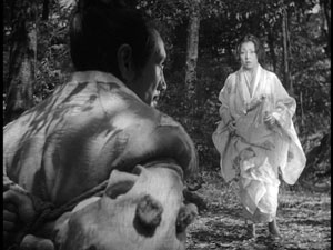
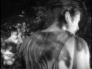
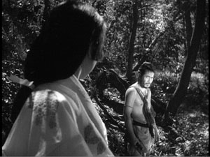
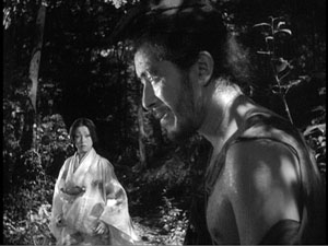
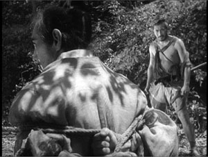
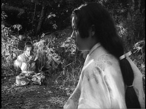
Here traditional over-the-shoulder shots submit to a brazen geometry. Out of an ABC film-school technique Kurosawa creates a cascade of visual rhymes and staccato swiveled glances. Yes, an ingenious critic could thematize this bravura passage. (“The symmetries put the central characters, each of whom asserts a different version of what happened, on the same visual and moral plane.”) Instead I’m inclined to think that the shots constitute a little thrust of “pure cinema,” a brusque cadenza that keeps our eyes, if not our hearts or minds, locked to the screen. From this angle, Kurosawa claims some attention as an inventor of, or at least tinkerer with, the disjunctive possibilities of film form.
His centenary arrives in 2010, and the occasion is celebrated by Criterion with a set of twenty-five DVDs. Most of these titles have already been available singly, and the discs lack all the bonus features we have come to admire from the company. Yet the crimson and jet-black box, the discreet rainbow array of slip cases, and the subtly varied design of the menus add up to a good object, like the latest iPod—something you want even if it means re-buying things you already have. There’s also a handsome picture book with notes by Stephen Prince on each film.
To viewers who need the assurance of cultural importance, this behemoth announces: You must know Kurosawa to be filmically literate. And that’s more or less true. Just as important, the inclusion of four rarities from his early years gives the collection a claim on every film enthusiast’s attention. One hopes that those titles will eventually appear separately, perhaps in an Eclipse edition. [See 15 May 2010 update at the end.] For now these copies of the wartime features are far better than the imports I’ve seen.
The Big Box makes it tempting to mount a career retrospective on this site, but that’s far beyond my capacity. Future blog entries may talk more of this complicated filmmaker, but for now I’ll confine my remarks to these early works. They offer plenty for us to enjoy.
Audacious propaganda
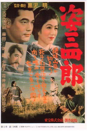
Although Kurosawa was only seven years younger than Ozu, he belongs to a distinctly different generation. Ozu directed his first film in 1927, at the ripe age of twenty-four. He grew up with the silent cinema and made masterful films in the early 1930s, during the long twilight of Japanese silent filmmaking. Kurosawa became an assistant director in the late 1930s. Although he evidently directed large stretches of Yamamoto Kajiro’s Horse (1941), he didn’t sign a feature as director until he was thirty-three. His closest contemporary, and a director whom some Japanese critics consider his superior, is Kinoshita Keisuke. Kinoshita was born in 1912 and his first feature, The Blossoming Port, was released in the same year as Kurosawa’s debut.
Kurosawa and Kinoshita began their careers making wartime propaganda. Their task was to display Japanese self-sacrifice and spiritual purity in stories of both the past and the present. In the Sanshiro Sugata films (1943, 1945), Kurosawa presents judo as an integral part of Japanese tradition and a path to enlightenment. Much of the external conflict is devoted to uniting martial arts (ju-jitsu, karate) under the rubric of the less aggressive but more powerful judo, and to showing how it can defeat American-style boxing. But the internal dimension is also important. Judo is a means of tempering character and accepting one’s proper place. Humble, unflagging devotion to one’s vocation becomes heroic.
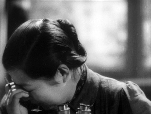
The same quality can be found in The Most Beautiful (1944), a story of teenage girls working in a factory manufacturing lenses for binoculars and gunsights. Vignettes from the girls’ lives dramatize the need for cooperation and sacrifice, even as wartime demands for output threaten the girls’ health.
A more detached conception of the Japanese spirit underlies The Men Who Tread on the Tiger’s Tail (1945). This adaptation of a plot from Noh and Kabuki theatre shows officers escorting a general through enemy territory. Disguised as monks, the bodyguards are forced to bluff their way through a checkpoint. The situation is one of hieratic suspense, made more tonally complex by Kurosawa’s addition of the movie comedian Enoken. Enoken plays a dimwitted porter reacting to the charade played out by his betters. By dramatizing one of the most famous episodes in Japanese literature, Kurosawa was reasserting the tradition of devotion to duty and honor. The Men Who Tread on the Tiger’s Tail was released the same month that the atomic bomb fell on Hiroshima.
During earlier decades, Japanese cinema had created a complex tradition. In part, it conducted a sustained dialogue with Western cinema. Tokyo had access to a wide range of Hollywood movies, and directors studied American technique closely. Just as Ozu would not be Ozu without his early fondness for Lubitsch and Harold Lloyd, Mizoguchi learned a good deal from von Sternberg. Between 1938 and 1942, alongside German imports Tokyo theatres screened Fury, Only Angels Have Wings, The Sea Hawk, The Awful Truth, Angels with Dirty Faces, Boys Town, Young Tom Edison, Only Angels Have Wings, and many French titles. In 1942, with Hollywood films now banned, one could still see René Clair’s Le Million and À Nous la liberté—films that had been circulating in Japan since the early 1930s and could have served as models of flashy sound technique. It’s misleading to talk of Ozu as “purely Japanese” and Kurosawa as “Western”: All Japanese directors of the 1920s and 1930s were deeply acquainted with Western cinema, and American cinema in particular furnished a foundation for most local filmmaking.
Yet there are crucial differences. Japanese cinema welcomed extremes of stylistic experimentation that would have been rare in Western cinema. The 1920s swordplay films (chambara) pioneered rapid editing, handheld camerawork, and abstract pictorial design. (I supply some examples here.) Directors working in the contemporary-life mode (the gendai-geki) experimented similarly, often achieving remarkable visual effects and bold stylization. Mizoguchi and Ozu have become our emblems of this creative rigor and richness, but they are the peaks of what was a collective approach to filmic expression. Not every film was an experiment—indeed, most behave like Hollywood or European productions—but many ordinary movies, signed by unheralded directors, exhibit flashes of unpredictable imagination. This was the tradition of permanent innovation that directors of the Kurosawa-Kinoshita generation inherited.
As the war dragged on, however, Japanese studio productions lost much of their audacity. Production fell from over 400 films in 1939 to fewer than 100 in 1943. Censorship may have made filmmakers cautious about style as well as subject and theme. Most of the fifty-plus films I’ve been able to see from the period 1940-1945 are quite conservative aesthetically. Several of these seem to me quite good, but they rely on fairly standard Hollywood technique sprinkled with touches that had become markers of Japanese cinema (sustaining scenes in rather distant shots, using cuts rather than dissolves to shift scenes, and so on). Swordplay films become more severe and monumental. Even Mizoguchi’s Genroku Chushingura (1941-42) and Ozu’s There Was a Father (1942), superb as they are, are more elevated in tone than the directors’ earlier works.
Against this backdrop, Kurosawa’s films stand out; they are the most extroverted works I know in this period. Their innovations remain vivid; Sanshiro Sugata, for one, with its hierarchy of competitors, its rivalry among schools, and its visceral technique, may have invented the modern martial arts film. But we should also realize that these early films build upon the traditions already firmly established in Japanese cinema.
Playing with the passing moment
Consider transitions. Kurosawa is famous for his elaborate links between sequences, from the hard-edged wipes to swift imagistic associations. But we should recall that transitional passages offer moments of flashy style in American and European cinema of the 1920s and 1930s, and indeed right up to this day. (For examples, go here and here.) In the same year as Sanshiro, Kinoshita gave us this moment in Blossoming Port. A con artist is trying to bilk money from a town. He bows, leaving an empty frame.
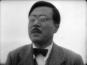

Without a discernible cut, heads pop into the empty frame, rocking to and fro.
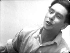
Another cut reveals that the people we see are in a boat tossing on the waves, and the conman’s partner is enjoying an outing with the locals. Kurosawa’s scene-changes—sites of what Stephen Prince has called “formal excess”—can be seen as prolonged, imaginative reworkings of this tricky-transition convention.
Japanese filmmakers were more willing to play with the expressive and “decorative” side of filmmaking than most of their Western peers. Directors created not only flashy transitions but moments of stylistic playfulness within scenes. Sometimes this just adds to the overall tone of comedy, as in this pretty passage in Heiroku’s Dream Story, another 1943 release. The hero, played by Enoken, is squatting and talking to a charming girl (Takamine Hideko). She twirls her parasol between them, and we get a straight-on cut that creates a moment of abstraction as the parasol glides across the frame in contrary directions. (The vertical pair of frames shows the cut.)
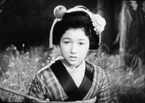
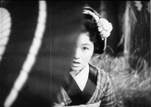
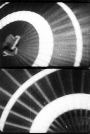
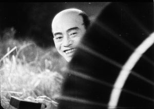
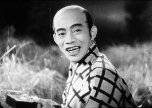
This decorative symmetry would be rare in Hollywood outside a Busby Berkeley number, but it enlivens the characters’ exchange in a way similar to the more dramatic Rashomon sequence. To borrow a phrase that Kepler applied to nature’s way with snowflakes, a filmmaker may seek to ornament a scene by “playing with the passing moment.”
Likewise, in The Blossoming Port, as an older woman recalls a romance of her youth, the natural sound fades out and the back-projection behind the carriage shifts from the seaside to urban imagery of the period she’s remembering.
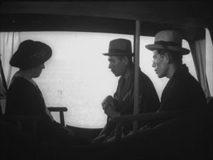
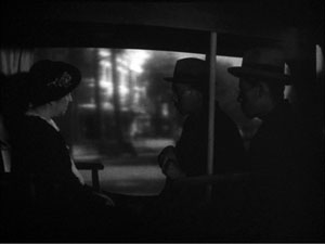
The frank artifice of this shot shows that Japanese filmmakers were eager to let us enjoy the forms with which they were working.
A similar explicitness about style can be seen in one of Kurosawa’s signature devices, the axial cut. This technique shifts the framings toward or away from the subject along the lens axis. If the shots are short enough, we sense a bump at the abrupt change of shot scale.
Kurosawa often uses this cutting to stress a momentary gesture or to prolong a moment of stasis. But it can structure a simple dialogue scene as well. In Sanshiro Sugata, the hero’s first conversation with Sayo takes place as they descend a stair toward a gateway. Kurosawa uses axial cuts to keep up with them as they move away from us down the steps. Illustrated with stills, this technique looks like a forward camera movement, but in fact these images come from separate shots.
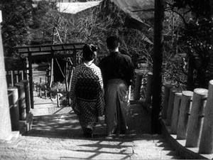
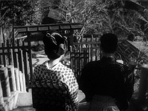
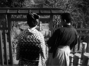
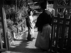
The crux of the scene is Sayo’s revelation that the man Sanshiro must fight is her father, and instead of big close-ups to underscore his reaction, Kurosawa simply lets his hero halt while Sayo continues down the steps. The steady pattern of cut-ins to the characters’ backs makes Sayo’s sudden turn to the camera more vivid, and Sanshiro’s reaction is underplayed by not giving us direct access to his face.
An earlier entry traces theaxial cut back to silent film, when its jolting possibilities were exploited in Soviet montage cinema. Japanese directors also used the device often. Yamanaka Sadao, one of the most-praised directors of the 1930s, used axial cuts prominently in an early dialogue scene of Humanity and Paper Balloons (1937). The cuts are accentuated by low-height compositions that maintain the steep perspective of the street.
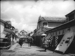
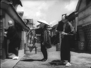
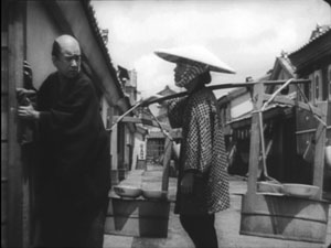
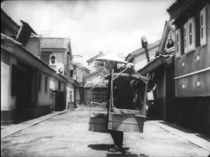
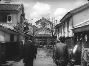
The technique gains more punch in Japanese swordplay films. Here is a percussive instance from Faithful Servant Naosuke (1939), four short shots yanking us inward in a way that Kurosawa would make his own.
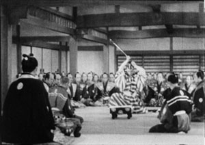
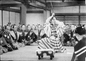
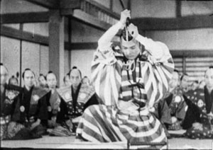
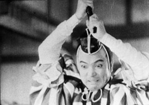
Tom Paulus reminds me that Capra films sometimes make use of this technique, as in this string of concentration cuts from Mr. Smith Goes to Washington (1939).
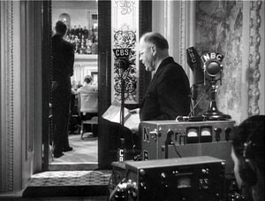
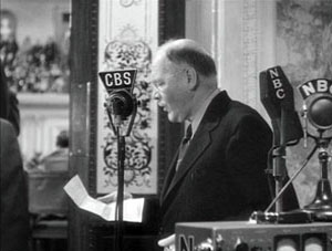
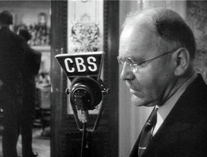
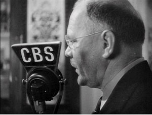
Interestingly, Mr. Smith ran on several Tokyo screens in October 1941; it may have been the last Hollywood feature to receive theatrical distribution before the attack on Pearl Harbor.
To say that Kurosawa adapts traditional devices doesn’t take away from his accomplishment. No artist starts from zero, and in commercial cinema, filmmakers commonly revise schemas already in circulation. So Kurosawa puts his own spin on the axial cut, not only by using it frequently, but also by varying it in the course of a film. Sanshiro Sugata 2 makes the axial shot-change a sort of internal norm, but then varies it: inward or outward, cuts or dissolves, how great a variation of scale? When Sanshiro leaves Sayo, the three phases of his departure are marked by simple repetition: each time he halts and looks back, she responds by bowing.
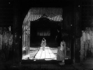
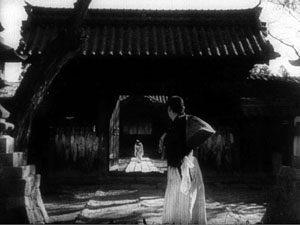
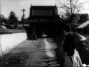
Like the Rashomon sequence, this shows Kurosawa’s fondness for permuting simple patterns. But there’s an expressive payoff too. The framings that make Sayo dwindle to a speck give the axial cuts the forlorn, lingering quality we usually associate with dissolves. In addition, for viewers who know Sanshiro 1, the scene calls to mind the staircase passage we’ve already seen. Their first extended encounter is paralleled by their last one.
Axial cuts are easier to handle when the subject is unmoving, or moving straight toward or away from the camera. What about other vectors of motion? In The Men Who Tread on the Tiger’s Tail, as the general’s bodyguards file out of the compound, they pass a line of soldiers in the foreground. Kurosawa combines concentration cuts with lateral cutting, so our men stalk leftward through the frame once, then again, then again, each time both closer to us and further along the row of soldiers.
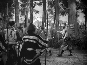
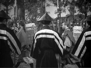
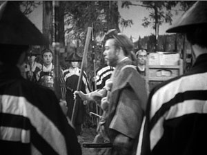
Kurosawa revises other traditional techniques. You can find moments of extended stasis in swordplay films of earlier decades, and the technique surely owes something to the prolonged mie poses in Kabuki. But Kurosawa’s early films turn long pauses into living freeze-frames. Instead of using an optical effect, he simply asks his actors not to move! One combat in Sanshiro shows the audience caught in absolute stillness, staring at the result of Sanshiro’s throw. In Sanshiro 2, our hero and the boxer stand like statues in the prizefight ring until the American collapses. And in The Men Who Tread on the Tiger’s Tail, the groups gathered at the checkpoint are absolutely unmoving for nearly fifty seconds as Benkei leads them in prayer.
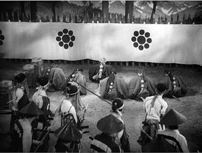
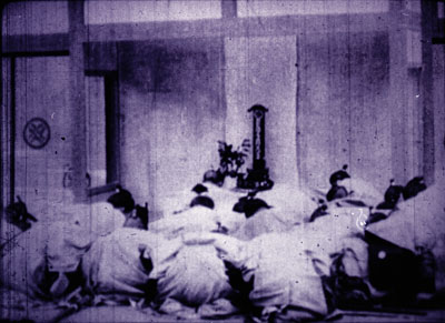
This shot’s tactful, reverential composition echoes a fairly standard image for showing loyal retainers; here’s an example from a 1910s version of Chushingura.
In sum, I think that for his “manly movies” Kurosawa sifted through the Japanese film tradition and pulled out the most vigorous techniques he could find, all the while recognizing that rapid pacing needs the foil of extreme immobility. He compiled a digest of many arresting visual schemas available to him, and then pushed them in fresh directions. He realized as well that he could apply this sharp-edged style to genres dealing with modern life.
A most stubborn young woman
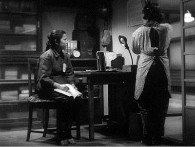
Although we think of Kurosawa as a “masculine” director, two of his finest films center on women. The Most Beautiful and No Regrets for Our Youth can be thought of as propaganda, but this label shouldn’t put us off. Propaganda works partly because it taps deep-seated emotions, and I’d argue that the formulaic nature of a “social command” can allow filmmakers a chance at emotional and formal richness. Because the message can be taken for granted or read off the surface, an ambitious director can go to town—nuancing the presentation, complicating its implications, taking the clichéd message as an occasion for pushing formal experiment. (Which is one aspect of what the Soviet montage filmmakers did.)
The Most Beautiful, probably the best movie ever made about child labor, starts off as a doctrinaire effort. Before even the Toho logo fades in, a title declares: “Attack and Destroy the Enemy.” The first fifteen minutes are filled with pledges to help the war effort, work to meet an emergency quota, obey orders, display filial devotion, build noble character, and think constantly of how making flawless lenses saves soldiers’ lives. The rest of the movie focuses on the pain of doing all this. This story of patriotic affirmation is steeped in tears.
The film’s structure looks forward to the ensemble-based, threaded plotlines employed in Red Beard and Dodes’kaden. We follow various stories, if only briefly, as the teenage girls push themselves beyond the limits proposed by their overseers. The factory directors and the dormitory mother are barely characterized, so that the focus falls on the girls who have left their homes to serve their country. One looks out the window when a train passes; another walks sobbing across a garden made of heaps of earth from each girl’s native village. When one girl falls from a roof, she promises to keep working on crutches. Another hides the fact that she has a fever. In this movie, workers cry out “Mother!” in their sleep.
Sanshiro Sugata pulses with the exuberance of a young man’s body itching for constant movement. Kurosawa’s second film applies his muscular techniques to a static situation: Girls bent over machines. True, there are interludes of a marching and volleyball, the latter calling forth a standardized stretch of montage, but the director’s central task is to dynamize conversations. He finds a remarkable array of options. We get good old axial cutting, but there are also jump cuts (as if the action were too urgent to wait for dissolves), resourcefully simple staging (see this entry), abrupt close-ups, quick flashbacks, and judicious long takes jammed with actors.
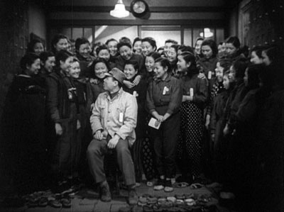
Off on the right stand two tall girls frowning and looking down; their quarrel will burst out in a later scene.
The virtuosity here is quieter than in Sanshiro, largely because of the insistent threat of shame. A Hollywood film of the period might play up the triumphant achievement of the quota, but here this goal fades away. Instead, the plot is driven by a nearly desperate fear of failure. The men in charge offer bluff reassurance, but in a reprise of high-school nerves, the girls fret constantly about doing less than their mates. Their anxiety is translated into gesture-based performance—not through Western hysteria but through gestures of lowering the eyes, bowing the head, turning one’s back. The Most Beautiful has some of the greatest back-to-the-camera scenes in film history, and Kurosawa doesn’t hesitate to insert some of these moments in wide shots, creating a delicate emotional counterpoint. At one moment the girls are distracted by a passing airplane but their leader is sunk in thought; at another moment the girls challenge the leader while her accuser can’t face her.
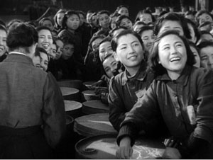
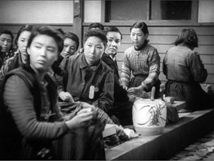
The girls’ stories are woven around Watanabe, the section leader. Somewhat older than the others and nowhere near as spontaneous or joyous, she’s the emblem of unremitting self-sacrifice. If Sanshiro matures in the course of his films, learning the humbling responsibilities of becoming a supreme fighter, she comes to her more mundane task already grown up. Noël Burch has pointed out that Kurosawa’s protagonists are notably stubborn, and Watanabe offers a prime instance.
At the climax she has to search through thousands of lenses for a flawed one that she accidentally let through. Kurosawa forces us to watch her, exhausted from hours of work, hunched over her microscope and keeping awake by singing a patriotic song. One shot holds on her groggy efforts for over ninety seconds, so we register both the enormity of her task and her obstinate refusal to quit. This shot will be paralleled by the film’s final one, which lasts almost exactly as long, when she returns to her workbench. Now her concentration is broken, again and again, by quiet weeping. Kurosawa claims that when he made the film he knew Japan would lose the war.
The ending of The Most Beautiful calls to mind a moment in another Kinoshita film, again one released in the same year as Kurosawa’s. Army (1944) ends on a similarly ambivalent note, with a frantic mother pushing through a crowd cheering recruits marching off to war. Through cries of “Banzai!” she stumbles along to get a last glimpse of him, but soon her trembling figure is lost in the excitement. It isn’t exactly an exalted note on which to close a patriotic film.
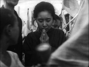
A mother is central to Watanabe’s sacrifice in The Most Beautiful as well, and her plight reminds me of historian John Dower’s telling me that Japanese soldiers may have charged into battle shouting the name of the emperor, but many died murmuring, “Mother.”
Like other filmmakers, Kurosawa had to execute an about-face when the Americans came to occupy Japan. Along with Mizoguchi, Kinoshita, and most others, he began to make films that condemned the “feudal” forces that had led Japan to war and affirmed the need for liberalizing the society, not least with respect to women’s roles. Kurosawa’s contribution was No Regrets for Our Youth (1946), a survey of the 1930s and 1940s through the experience of a daughter of the middle class. At first she’s oblivious to the authoritarian threat and then, awakened to her social mission, she plunges into what we would now call the politics of everyday life. With the same verve that Kurosawa dramatized sacrifice for the motherland, he quickens a liberal fable of emerging political consciousness. Again, he finds ways of making propaganda deeply moving, while leaving his unique stamp on the project.
I hope to write about No Regrets and other Kurosawa titles in the future. But one implication should already be clear. Kurosawa remains on our agenda through his commitment to a mode of storytelling that pursues vigor without lapsing into the diffuse busyness of today’s spectacles. He stretches our senses through staccato action, yet he drills into other moments so implacably that we are forced to see deeper. He lifts certain Japanese and imported traditions to a new pitch, in the process often creating something indelible and enduring.
The point of departure for all things Kurosawa is Donald Richie’s Films of Akira Kurosawa, first published in 1965 and updated since. It was a trailblazing auteur study, written from deep knowledge of the films and many encounters with the director. Another indispensible source is Kurosawa’s Something Like an Autobiography (Knopf, 1982). Although it stops after the success of Rashomon, the book offers fascinating information about Kurosawa’s early life and first films. (“The Most Beautiful is not a major picture, but it is the one dearest to me.”) Information on the later films is collected in Bert Cardullo, Akira Kurosawa: Interviews (University Press of Mississippi, 2008). A biographical overview, with details on each film’s production, is provided in Stuart Galbraith IV, The Emperor and the Wolf (Faber, 2001).
For background on Japan’s wartime cinema, the central work is Peter B. High’s The Imperial Screen (University of Wisconsin Press, 2003). See also John Dower’s magnificent surveys of the war and the postwar period, War without Mercy (Pantheon, 1987) and Embracing Defeat (Norton, 2000).
Noël Burch argues that Kurosawa is best understood as working within a tradition of indigenous Japanese art; his pioneering To the Distant Observer (University of California Press, 1979) is available online here. Linking formal preoccupations to changing subjects and themes, Stephen Prince’s The Warrior’s Camera (Princeton University Press, 1999) argues that Kurosawa was forging heroic figures appropriate to developments in Japanese society. In Kurosawa: Film Studies and Japanese Cinema (Duke University Press, 2000), Mitsuhiro Yoshimoto puts the films in political contexts, while also considering how Kurosawa has been understood within the Western academy.
Critics have long recognized that Kurosawa’s formal inventiveness came with an impulse toward large statement. Brad Darrach reconciled the two tendencies in an overheated specimen of Timespeak:
Not since Sergei Eisenstein has a moviemaker set loose such a bedlam of elemental energies. He works with three cameras at once, makes telling use of telescopic lenses that drill deep into a scene, suck up all the action in sight and then spew it violently into the viewer’s face. But Kurosawa is far more than a master of movement. He is an ironist who knows how to pity. He is a moralist with a sense of humor. He is a realist who curses the darkness—and then lights a blowtorch.
This comes from “A Religion of Film,” a remarkable primer on the art cinema in its American spring. It was published in Time of 20 September 1963 and is available here. The same antinomy of stylist vs. moralist persists, with less complimentary results, in Tony Rayns’ obituary in Sight and Sound (October 1998), p. 3 and in Dave Kehr’s recent review of the Criterion boxed set.
I wrote about Kurosawa’s work in our textbook Film History: An Introduction (third edition, McGraw-Hill, 2009), pp. 234-235 and 388-390. My larger arguments about classic Japanese film can be found in Ozu and the Poetics of Cinema (online here) and in two articles in Poetics of Cinema (Routledge, 2008), “A Cinema of Flourishes: Decorative Style in 1920s and 1930s Japanese Film” and “Visual Style in Japanese Cinema, 1925-1945,” which analyzes some of the films I’ve considered here. I talk a little more about editing in Seven Samurai in this entry. In another I discuss how Kurosawa’s “humanism” fits into one 1950s ideological framework.
Yamanaka’s Humanity and Paper Balloons is available on DVD in the Eureka! series. For a cinematic homage to early Kurosawa, see Johnnie To’s Throw Down.
Thanks to Komatsu Hiroshi for supplying the date of Faithful Servant Naosuke. And as a PS, thanks to Luo Jin for pointing out a “slip of the finger”: the original post had Kurosawa older than Ozu!
PPS: 9 December: The Criterion site has just posted a reminiscence of Kurosawa by Donald Richie.
PPPS: 15 May 2010: Criterion has just announced that the four films discussed in this entry will be released as a separate collection on the Eclipse label.
