Archive for the 'Silent film' Category
Hollywood starts here, or hereabouts
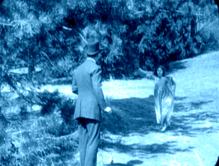
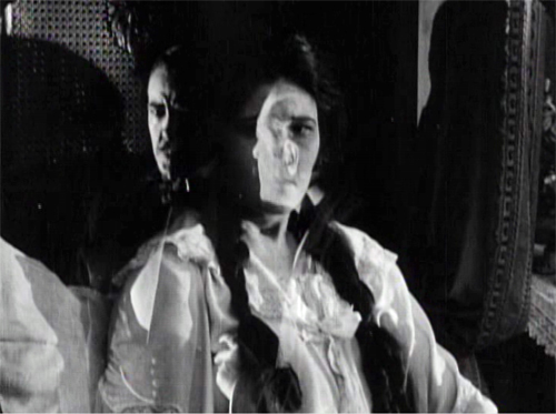
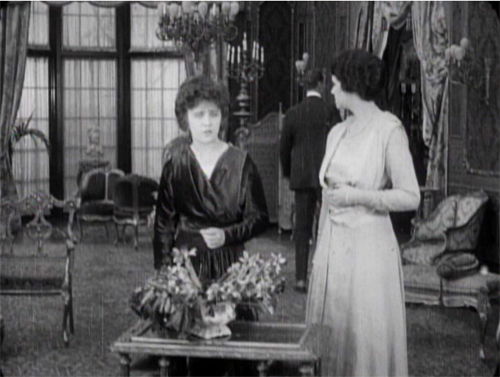
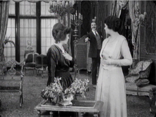
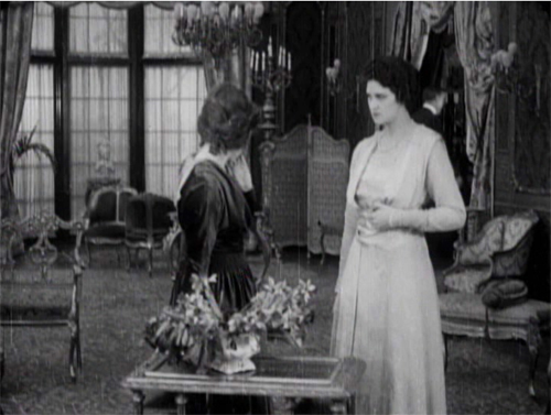
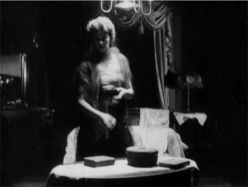
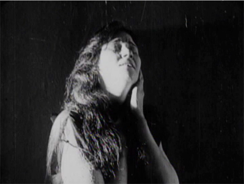
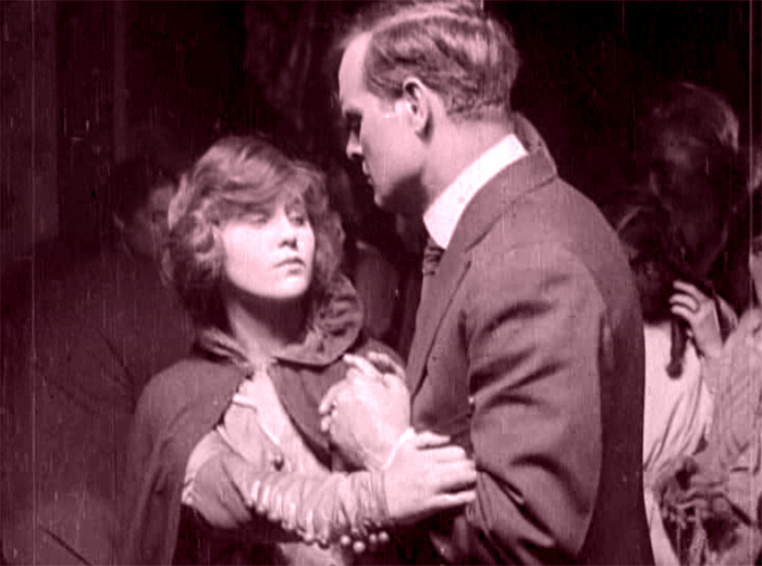
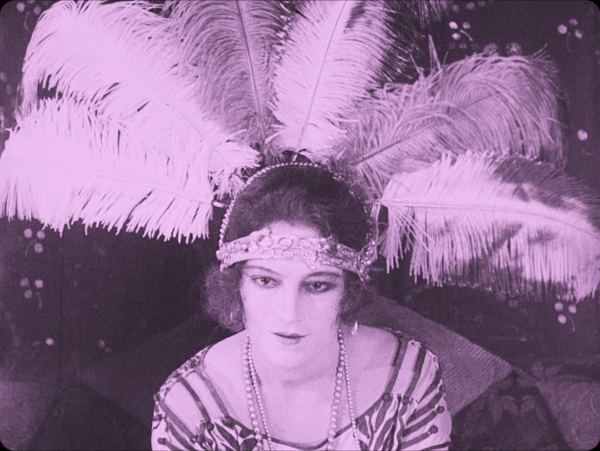
The Woman in White (1917). Toning by DB.
DB here:
Do you know Wilkie Collins’ The Woman in White? I hope so.
The traps set by this novel of mystery and suspense–a prototype of what was called “sensation fiction”–are still ensnaring audiences. Serialized in 1859-1860, it became one of the best-selling books of the nineteenth century. Merchandisers pounced on it, offering Woman in White cloaks, bonnets, perfumes, and songs. Stage and film adaptations followed. The Brits, always eager to mine classics, have created no fewer than three TV versions (1982, 1997, and 2018). There’s a pretty good Warners “nervous A” picture from 1948, with Sydney Greenstreet as the deadly, jovial Count Fosco.
The 1917 version from the Thanhouser studio is, lucky us, currently streaming on Vimeo for free. It’s also available on DVD, as part of the excellent series of Thanhouser films. The print is a 1920 re-release, but nothing significant seems missing or altered.
Apart from its entertainment value, the Thanhouser Woman in White can teach us a lot about film history. Why? Because it sums up very forcefully what American narrative cinema could do in that crucial year 1917. Forget your Griffith, leave aside (regretfully, just a moment) your Webers and Harts and Fords and Fairbankses. The mostly unheralded team of screenwriter Lloyd Lonergan and director Ernest C. Warde have given us a concise demonstration of the power harbored by classical Hollywood from the start. The storytelling tools assembled in that era remain with us still.
Women in peril
The novel’s plot is a tale of–well, plots. Counterplots too.
Collins’ book is hugely complicated, swirling together secrets, hidden identities, abduction, impersonations, illegitimate birth, bigamy, insanity, forged records, fake tombstones, assorted hugger-mugger, and timetables that even the author had trouble keeping straight. The intricacy is magnified by Collins’ decision to adopt a “casebook” structure, in which participants and onlookers write up their accounts of what they witnessed. Each piece of testimony is restricted wholly to one character’s viewpoint, and the writers are forbidden to fill in material they learned later. “As the Judge might once have heard it, so the Reader shall hear it now.” This stricture isn’t fully observed, though, because at least one witness sneaks looks at what counterparts have written.
The book’s key image is, of course, the apparition that greets Walter Hartright on the road one sultry night.
There, in the middle of the broad, bright high-road–there, as if it had that moment sprung out of the earth or dropped from the heaven–stood the figure of a solitary Woman, dressed from head to foot in white garments; her face bent in grave inquiry on mine, her hand pointing to the dark cloud over London as I faced her.
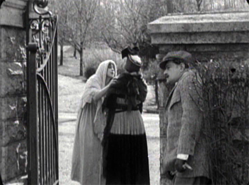
Recovering his senses (“It was like a dream”), Hartright listens to her gap-filled story and helps her find a cab. But soon he sees two bravos halt their carriage and hail a policeman. They ask: Has he seen a woman in white? No. Why does it matter? What has she done?
“Done! She has escaped from my Asylum. Don’t forget: a woman in white. Drive on.”
The first installment ends here, and the adolescent window opens a little wider.
The main plot centers on Laura Fairlie and her half-sister Marian. Hartright is engaged as Laura’s drawing teacher and they fall in love. But Laura’s father has promised her to Sir Perceval Glyde, an apparently upright aristo. (Collins was opposed to marriage as an institution. His class hatred comes out as well, though perhaps not as scathingly as it does in his other masterpiece, The Moonstone.) Once the marriage takes place, Glyde introduces into the household Count Fosco, a suave “doctor” with the habit of letting his pet mice scamper around his waistcoat. It doesn’t take long for Marian to realize that Glyde has a Secret, and she must turn detective to protect Laura from him.
Without pressing into spoilers, you can already tell that this lays down a template for the sort of story Hollywood would later love to tell. The Woman in White is a prototype for the woman-in-peril plot that we’ll find in Suspicion (1941), Shadow of a Doubt (1943), The Spiral Staircase (1946), The Two Mrs. Carrolls (1947), Sleep My Love (1948), and many 1940s classics. These in turn rely on literary works in Collins’ wake by Mary Roberts Rinehart, Mignon Eberhart, and other women authors who updated Gothic and sensation-fiction conventions for the twentieth century.
Lloyd Lonergan was said to have suggested reducing the eight-reel cut of The Woman in White to only six. It’s indeed a tightly coiled presentation of Collins’ sprawling plot. Swathes of backstory are dropped. Instead of Collins’ multiple narrators we get an omniscient narration that shifts freely across various intrigues. Fairly quickly we learn that Glyde and Dr. Cumeo (the Fosco of the novel) are scheming to switch Laura with her lookalike Anne, the woman in white. We also realize that Marian, as an obstacle to the plan, is in mortal danger. Thanks to crosscutting, we’re aware of several lines of action unfolding at once, and in a film full of spying and eavesdropping, compositions tell us who’s snooping on whom.
Still, some revelations are saved for the end, notably one that looks forward to the flashback-heavy 1940s. When Laura and Marian discover Glyde’s secret, their informant gives them the crucial information in a flashback, which precipitates a fiery climax. The flashback device was previewed when Marian, recovering from her collapse, recalled the plans she heard on the patio between Glyde and Cumeo; a nearly Surrealist dissolve superimposes that earlier scene.
In preferring to give us a lot of information, favoring suspense over surprise, this Woman in White is typical of Hollywood scriptwriting of the classical years. In particular, the film employs strategies later elaborated by Hitchcock (discussed here and here and here). One scene in particular displays the Hitchcock touch, years before Sir Alfred took up filmmaking. Even more specifically, let’s note that the basic situation looks forward to Notorious: a woman imprisoned by her husband and a confederate is slowly softened up for disposal.
Choreography, cutting, and showing us the door
Anyone who has viewed films with critical attention must be aware that in a film we are constantly, and without knowing it, being directed what to look at. In a stage play you may be looking at one moment at the actor who is speaking; at another moment watching the face of the person addressed, or observing the behaviour of other characters on the stage. If you go repeatedly to the same play, you may choose to look at different actors in a different order, for you certainly cannot observe everybody and everything simultaneously. But in a film, the lens of the camera is constantly telling you wha to look at–it may be a close-up of the actor’s hand, by the movement of which he betrays the emotion not visible in his face.
T. S. Eliot, 1951
The 1910s were an exciting era in cinema because, as I try to show in this video lecture, the foundations of “our cinema” were laid then. The film business, movie culture, and mass audiences settled into patterns that would hold for over a hundred years.
Just as important, the forms and styles of film craft were put in place. Among those changes was a transition from a style that relied on performance and staging to an approach more reliant on editing, on breaking scenes into many shots. The dominance of editing as a principle of guiding attention is evident from the Eliot quotation; he can’t conceive that staging, lighting, and other “theatrical” techniques could steer us to the important parts of the action.
The earlier, “tableau” approach to scenes was perfectly capable of funneling attention too, but editing had many advantages, both economic and aesthetic. By 1917, as Kristin and Janet Staiger and I argued in The Classical Hollywood Cinema, the editing-based approach had coalesced into the dominant style. The Woman in White is a nifty illustration of what an ordinary film from that year could accomplish with cutting–while still retaining vestiges of the tableau style.
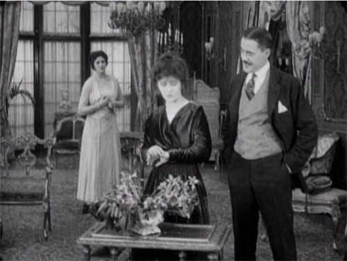
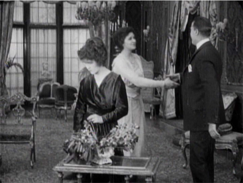
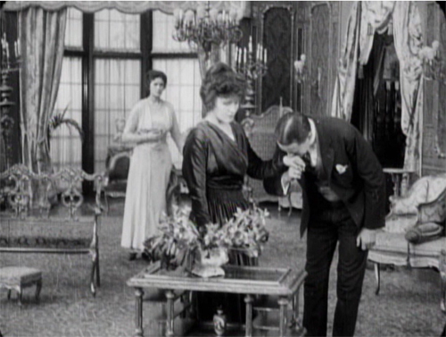
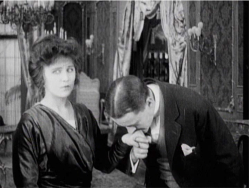
A simple example of the tableau technique comes when Sir Perceval Glyde calls on Laura and Marian. He has just kissed Laura’s unwilling hand, and Marian comes up from the rear of the shot to him. As she moves forward, Laura shifts aside slightly to clear our view of the others. This choreography doesn’t seem stilted because it expresses Laura’s withdrawal from her fiancé.
This is an example of the Cross, the staging technique that coordinates actors’ switching positions in the frame. Marian moves from frame left to frame right as Laura shifts to the left.
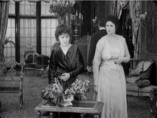
The tableau approach often plays between a lateral arrangement of characters in the foreground and a more diagonal array of figures packed into depth. As the shot unfolds, Marian is given a beat to take notice of Laura’s reaction as Glyde retreats to the background. She conveniently blocks his departure as she looks warily back at him.
But Glyde steps back into visibility in the distance as he says goodbye, with the women turning away from us so that we’re sure to concentrate on him. Then as the women turn back to react, he can be glimpsed leaving on the far right.
Doorways in the distance, characters advancing to and retreating from the camera, figures spreading themselves out horizontally but also blocking our view of things behind them, only to reveal them at the right moment–these tactics of the tableau became supple and subtle during the late 1900s and throughout the 1910s.
Eliot need not have worried that our attention would stray. Centering, frontality, movement vs. stasis, lighting, gesture, and other creative choices push us to notice the important elements of the scene. And these factors aren’t equivalent to what we see on the theatre stage; the optical properties of the camera lens create a very different playing space. (See here and here.)
Tableau staging hung on in editing-driven cinema, but it tended to be relegated to the role of an establishing shot. The first part of this scene consists of another tableau setup broken by a cut when the slimy Glyde kisses Laura’s hand.
Here the closer view underscores his gesture while isolating Laura’s concern.
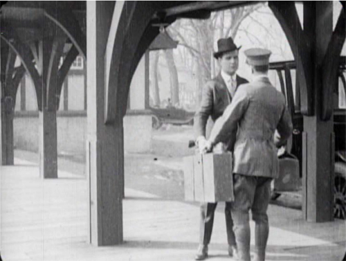
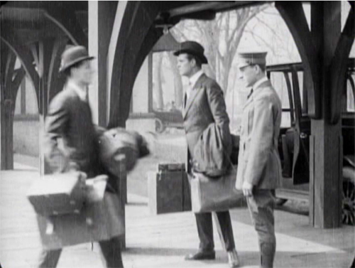
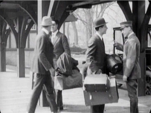
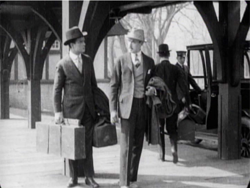
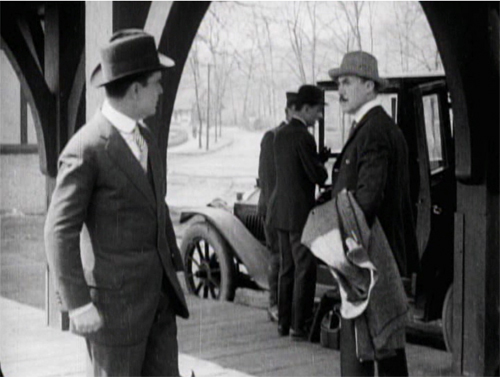
The coordination of staging and cutting is nicely shown when Walter Hartright, having resigned from his post as Laura’s teacher, accidentallly encounters Glyde at the train station. Glyde is coming to arrange his marriage to Laura, so the plot needs to establish the friction between the two men early on. As they confront each other, Glyde’s assistant loads his luggage into the cab in the background.
The first phase of the scene choreographs the men’s encounter through the Cross.
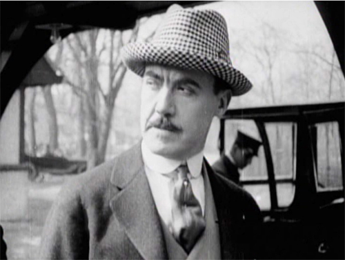
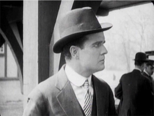
Then close views underscore the significance of the encounter.
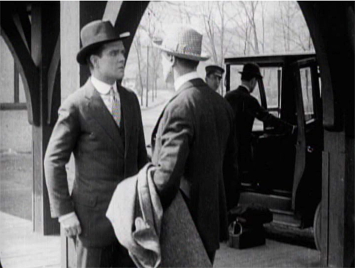
Cut back to a two-shot that reorients us.
The fact that it’s not the same framing as we saw at the start indicates the reliance of the style on editing; even the full view is re-calibrated in light of changing shot scales. And during the shot of Walter, Glyde’s position has changed from his orientation in his medium shot. That’s the sort of flexibility editing gives you. The new arrangement heightens the clash of the two men. (Typical of the 1910s emphasis on depth, Glyde’s assistant and the driver continue to load the cab in the background.)
Glyde’s enlarged hand kiss and the inserts of the two men in the station scene exemplify the axial cut. This is a cut made along the lens axis of the camera–a straightforward enlargement of a chunk of space. It’s very common in 1910s cinema, and it’s still around, though it’s not as common as it was. Editors came to prefer analytical cuts that were more angular, yielding less the sense of a sudden enlargement. Sometimes you’ll see claims that cut-ins or cut-backs should shift the angle by 30 degrees. Yet Kurosawa and Eisenstein made powerful use of the axial cut, and it’s sometimes used as a self-conscious device. During the 1910s, some directors began using the over-the-shoulder (OTS) framing as a way to assure distinct angle changes.
The cut to Glyde’s creepy kiss is also a match on action, smoothly linking Glyde’s gesture across the shot change. This too emerged in the 1910s and became a mainstay of classic editing technique, to this day. (See my earlier post on Watchmen for contemporary examples.)
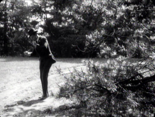
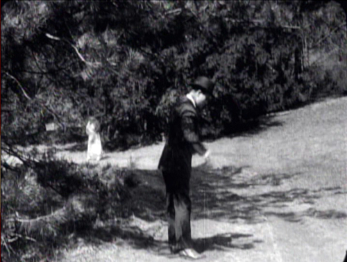
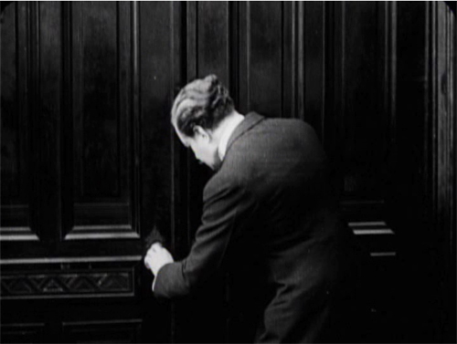
The Woman in White has several adroit matches on action, which shows that the learning curve among directors was more or less complete by 1917. When Walter first encounters the mysterious woman on the road, his striking a match is carried across a cut, with the second shot introducing her coming toward in him n the distance.
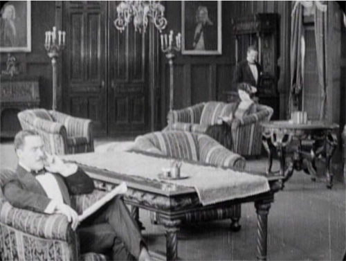
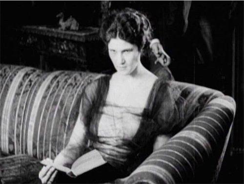
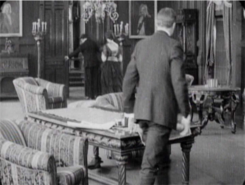
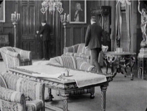
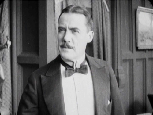
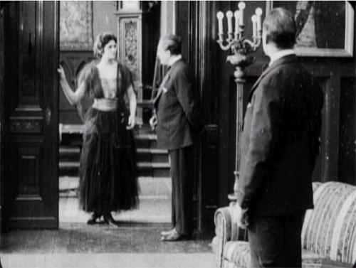
One of the most common editing devices of classical continuity is the eyeline match, and filmmakers were mastering this from quite early on. By 1917, it was part of every director’s tool kit. We can see how it works together with the other techniques in a fine, smooth scene that leads up to a crucial turning point in the action. Glyde and Dr. Cuneo are in the library, where Marian is uneasily reading a novel. Cuneo moseys over behind her, softly threatening, and an axial cut matching his movement lets us know she notices.
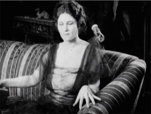
Another match on action brings her off the sofa. Love those delicately splayed fingers.
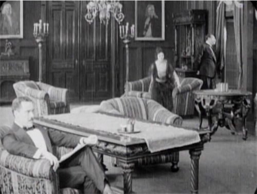
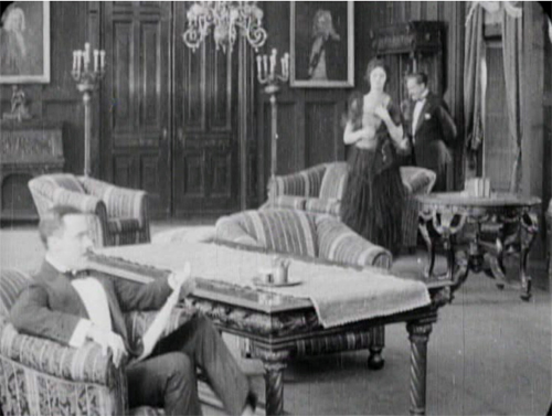
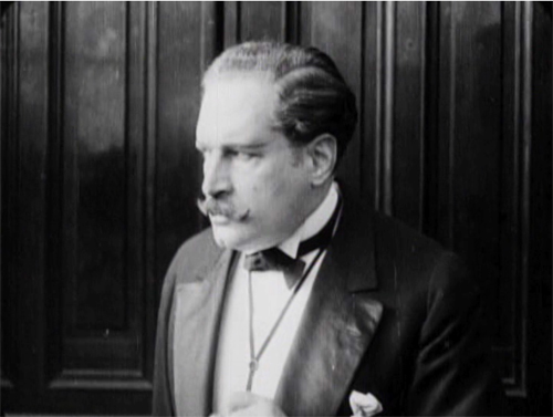
As she starts to leave, we get the Cross, as Glyde rises from his armchair and goes frame right. We now get the start of a major piece of business: Cuneo’s byplay with the sliding doors.
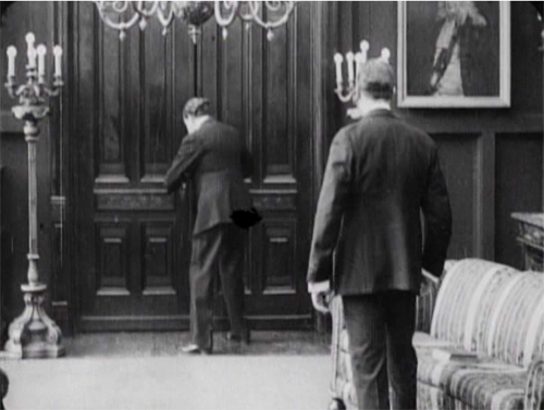
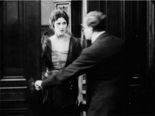
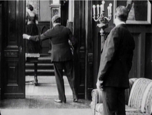
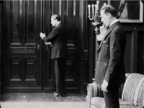
Securing their privacy, Cuneo prepares to consult with Glyde about their skulduggery. But a match on action, carried by a powerful axial cut–a huge enlargement from the extreme long shot setup–alerts us. He’s listening.
Another match on action as he busies himself with the door. A new diagonal composition prepares us for a shot of Glyde to come shortly. And yet again Cuneo is matched as he opens the door.
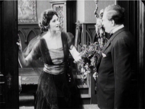
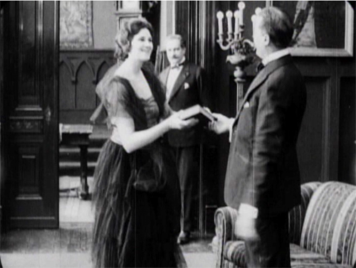
The payoff: Cuneo has detected Marian outside listening. She bluffs, saying she left her novel behind.
Now comes the shot that was prepared for by the over-the-shoulder long shot above. It’s not an axial cut, but a genuine reverse angle on Glyde, who’s suspicious about Marian’s return.
This is a killer shot because the camera can assume a drastically new position. It has put us in between the characters in a way we weren’t in the station scene. In effect, there’s an axis of action running from Glyde to the doctor and Marian at the door. The reverse angle is a one-off technique at this moment, but the possibility of penetrating the dramatic space in this way will be central to continuity cutting.
Now tableau principles can kick in. Marian comes forward and gets the book while Cuneo watches warily in the background.
In the course of the shot, Marian leaves, and this time, thanks to deep staging, we and the plotters can see she’s not eavesdropping. As she goes upstairs, Cuneo closes the door and the men can settle down to scheming.
Five matches on action, a striking eyeline match, restrained but pointed performances, and a cogent staging of the action have yielded a vigorous, engaging scene. By 1917, classical screen storytelling is well established in even a run-of-the-mill production. But there’s nothing run-of-the-mill about the suspense that follows this trim tension-builder.
1910s noir rides again
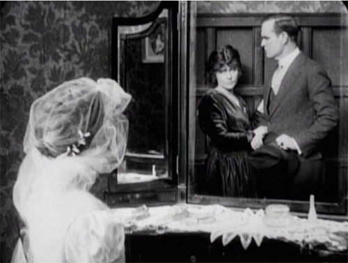
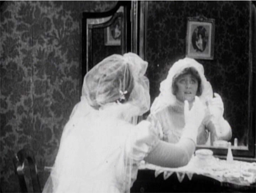
The Woman in White illustrates a lot of other 1910s innovations in pictorial storytelling. There are, for instance, some concise special effects, as when on Laura’s wedding day she sees herself and Walter in her vanity mirror.
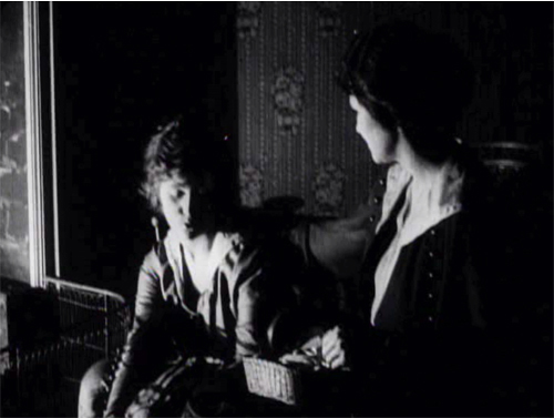
There are also dramatic lighting effects, motivated by firelight, single lamps, and eventually lightning flashes.
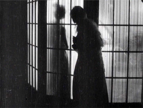
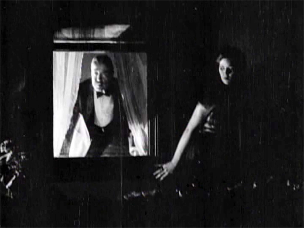
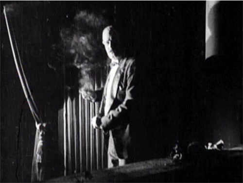
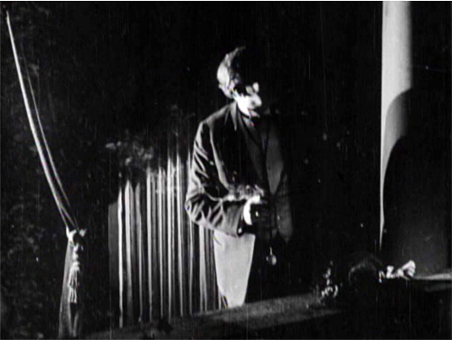
But more audacious is a sustained experiment in “1910s noir.” At that period filmmakers began associating crime and mystery with shadows and stark lighting. (See this entry.) When Glyde and Dr. Cuneo adjourn to the terrace to discuss their scheme, we get a remarkable instance. I won’t indulge my impulse to shower you with images, but I’ll try to suggest why you should try to see the sequence for yourself.
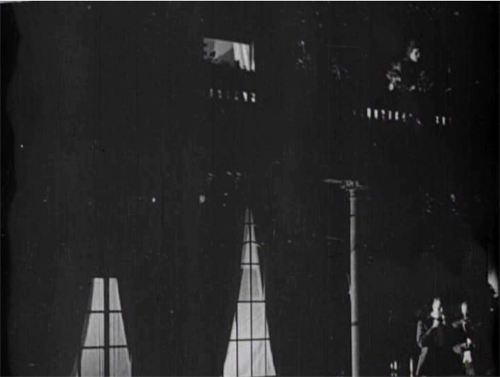
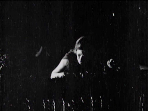
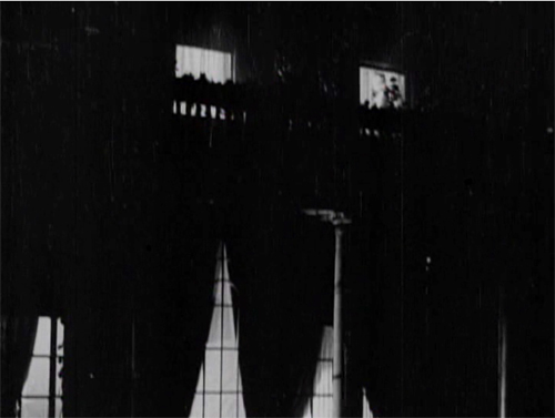
While the men smoke and talk outside, Marian has seen to the sleeping Laura before going to her own bedroom. (A sign of the film’s tidiness is the way it establishes the main characters’ rooms in the upstairs hallway. This geography becomes important when Glyde and Cuneo exchange Anne for Laura.) Opening her window, Marian hears the men outside and ventures onto the balcony above them. This yields a remarkable extreme long shot: She eavesdrops from above.
It’s a difficult shot by later standards. The main action is wildly decentered, set off on the right. But at least this framing has the virtue of preparing us for the later development of the scene, which will involve Marian sneaking along the balcony back to her room, where the light comes from.
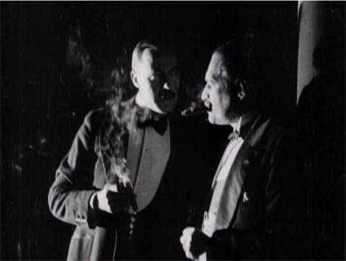
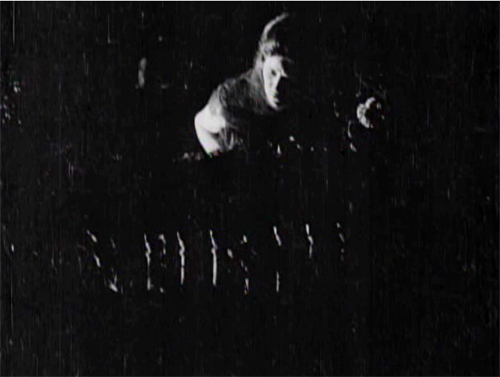
The vertical layout of the action is immediately clarified by two closer shots, a lovely chiaroscuro image of the men and the other of Marian listening.
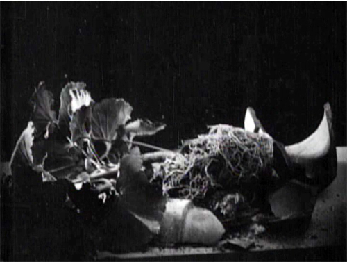
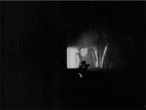
She hears just enough to suggest the men’s scheme before complications ensue. Glyde goes inside and upstairs, where he might discover her. Meanwhile, a rainstorm starts, and Marian dislodges a potted plant. Cuneo turns, in a new setup that emphasizes the railing in the right foreground, so that we can see the fallen plant. The shattered pot is given a close-up more or less from Cuneo’s viewpoint. His reaction supplies a moment of suspicion.
Marian, now drenched by rain, seems trapped between her two adversaries. Will one or both discover her?
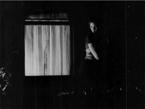
Glyde who has gone to Laura’s window and is looking around outside. We’re reoriented through a new master shot of the house, a framing that varies from the original setup. The shot shows both Laura’s and Marian’s windows lit. There follows a dark passage in which Marian creeps up to Laura’s window. That action takes place in the shot I’ve put up above.
An extra twist: Glyde looks out, but then pulls the shade. Little things mean a lot. A soaked Marian manages to crawl back through her window.
Apart from its virtuosity in handling cutting and lighting, the sequence is crucial for the plot. Marian collapses from her exposure to the storm, and her illness provides a pretext for Cuneo to isolate her while he and Glyde proceed with their plan.
I invoke Hitchcock because this long passage of suspense depends on our knowing all the relevant factors in the situation, and the possibility of a giveaway–the smashed plant–drives up the tension. What I’m really saying, I guess, is that Hitchcock expanded and deepened story mechanics that were already in place in the silent era. Apart from refining them, he managed to brand them as his own.
No film from 1917 or thereabouts is faultless in executing the new editing-based style. The Woman in White has its share of mismatches. Then again, so do movies from the 1920s to the present. (Don’t get me started on the mismatched cuts in The Irishman, 2019.) The crucial point is that the system of Hollywood storytelling and style is in place, and not in a crude form. Talk all you want about post-classical cinema, chaos cinema, post-cinema–whatever. The variations we detect today arise against a background of stable norms that remain a lingua franca of world filmmaking, and they’re headed well into their next century.
Thanks to Ned Thanhouser for years of faithful service to the studio’s legacy. Now is an ideal time to visit his site for background on this remarkable company and the efforts to preserve its output. A staggering 132 Thanouser films are available for streaming on Ned’s Vimeo channel.
To find out more about what preceded this crystallization of techniques, see Charlie Keil’s Early American Cinema in Transition: Story, Style, and Filmmaking 1907-1913 (University of Wisconsin Press, 2002).
An excellent survey of Collins’ place in the history of dossier novels is A. B. Emrys, Wilkie Collins, Vera Caspary and the Evolution of the Casebook Novel (McFarland, 2011). Her treatment of Caspary and Laura, both favorites of this blog, is just as valuable. My quotation from T. S. Eliot comes from “Poetry and Film: Mr. T. S. Eliot’s Views,” in The Complete Prose of T. S. Eliot: The Critical Edition, vol. 4: A European Society, 1947-1953, ed. Iman Javadi and Ronald Schuchard (Johns Hopkins University Press, 2018), 581.
For lots more on 1910s storytelling, see the categories 1910s Cinema and Tableau Staging. Flashbacks, the woman-in-peril plot, and other conventions that coalesce in the 1940s are discussed in my Reinventing Hollywood: How 1940s Filmmakers Changed Movie Storytelling.
The Woman in White (1917). Toning by DB.
Flicker Alley fills the Pudovkin gap
The End of St. Petersburg (1927)
Kristin here:
Flicker Alley continues its editions of classic silent films previously unavailable on disc or available only in inferior copies. Vsevolod Pudovkin’s three great silent features, Mother (1926), The End of St. Petersburg (1927), and The Heir of Genghis Khan (commonly known in English as Storm over Asia, 1928), are packaged here as “The Bolshevik Trilogy.” (As of now, the discounted price at Flicker Alley’s own site is considerably cheaper than what Amazon is charging.) All three films have appeared in my annual survey of the ten best films of ninety years ago; see the entries for 1926, 1927, and 1928.
The only restoration in the set is Storm over Asia, done in connection with Lobster Film in Paris.
Mother
Pudovkin’s trilogy is a sort of survey of key events in Russia’s move toward becoming the Soviet Union. Mother, based on Maxim Gorki’s novel of the same name, deals with the failed Revolution of 1905. That revolt was viewed as an important precursor to the Communist Revolution of 1917. Sergei Eisenstein’s Battleship Potemkin (1925) was an anniversary film for the same struggle.
Pudovkin is known for centering his films around individual protagonists rather than the group protagonists favored by Eisenstein in his first three silent features. Here the hero is Pavel, a young worker and clandestine revolutionary who lives with his drunken father and downtrodden mother. When guns that Pavel has hidden in the house are discovered, the mother naively betrays her son to the police. He is imprisoned. After a prison break, Pavel joins a protest march, and his mother, now converted to the rebellion, sees him mowed down but carries the flag onward.
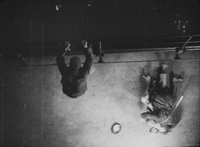
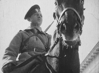
Pudovkin’s style is already fully formed here. It’s very flashy, employing the usual fast cutting and depending on highly unconventional ways of framing shots. Pavel’s escape from prison, for example, contains a bird’s eye view as he climbs down some railings to help his comrade put a guard out of commission (above) and a shot during Pavel’s trial uses one of the director’s favorite compositions, shots of police or soldiers seen past their horses heads.
Pudovkin also tends to use imagery of nature to symbolize the revolutionary impulse, as in the famous breaking up of ice on a river during the prison break and protest march. Rivers and lonely trees against low horizons appear in all three films, and the escape over ice floes returns in Storm over Asia (see bottom image). Such techniques perhaps help explain why Pudovkin was the most popular of the major Montage directors.
Given the importance of having these three films available, I hate to find fault. This print of Mother is simply the old Blackhawk/Image. It’s certainly acceptable, but a restoration of Mother, and as we shall see below, The End of St. Petersburg remains to be done. That better prints exist is shown by the illustrations I used in the 1926 entry linked above, which were taken from a 35mm archival copy.
The End of St. Petersburg
For many film fans, The End of St. Petersburg is perhaps the least emotionally involving of these three films. Pavel in Mother and the unnamed Mongolian hunter in Storm over Asia are appealing characters, friendly, brave, and ready to stand up to imperialists, soldiers, and police–and both the victims of flagrant injustices. The unnamed peasant who is at the center of The End of St. Petersburg is initially an ignorant, selfish young man. In a time of famine shortly before World War I, he goes to the city in search of work and becomes a scab, working at a large factory during a strike.
The peasant is friends with one of the workers who fomented the strike, and, echoing the actions of the mother in the earlier film, naively betrays the man to the management of the factory. Once the war breaks out, the peasant stolidly suffers through the entire conflict at the front. Only late in the film does he realize his folly and join the Bolsheviks in the 1917 attack on the Winter Palace. This ends the period when the city was named St. Petersburg.
The peasant is also not in the film nearly as much as the central characters of the two other films. Instead of a compact dramatic narrative, Pudovkin takes us from an era in which the stock market rules society through the war–also waged for the benefit of capitalists–to the Winter Palace attack of October, 1917. The peasant weaves through this, but there is no real point-of-view figure.
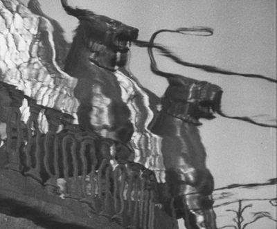
The End of St. Petersburg is a marvelous film nonetheless. In his survey of revolutionary progress, Pudovkin’s flashy style is even more self-assured. In a sense, the city becomes the central symbolic source, with the statues for which St. Petersburg (as it is now again known) is famous representing the power against which the Bolsheviks revolt. The opening scene includes a remarkable series of shots, not of the famous landmarks, but of their reflections in the city’s canals, filmed and then shown upside down, as if the city is shimmering with the weakness that will soon bring down its rulers. The image above shows the griffins holding the cables for the well-known suspension pedestrian bridge, the Bank Bridge.
There are fascinating parallels to Eisenstein’s October, which came out a year later. Both films were among three made to celebrate the tenth anniversary of the Revolution. The End of St. Petersburg and Boris Barnet’s Moscow in October were finished and released in the anniversary year, but Eisenstein’s was not. Pudovkin and Eisenstein shared a fascination for the rich Tsarist trappings of the Winter Palace, which were, according to them, enjoyed by the short-lived Provisional Government and its supporters. Certainly The End of St. Petersburg contains some beautifully composed and lit shots of decadent luxuries surprisingly similar to those Eisenstein filmed. (See top.)
The print shares the cropping problems that I pointed out in my 1927 post including The End of St. Petersburg. Since this version is, like earlier releases, based on a 1960s Gosfilmofond “restoration” that sliced off the left of the frame to make room for a recorded soundtrack, all of the shots are too square. I was frequently aware that the frame was simply too close, eliminating part of the image. (The lady in the image at the top was originally more centered in the composition.)
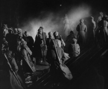
As if to compensate for this problem, the visual quality of this print is startlingly good, as the images immediately above and at the top show. The clarity of the images is actually better than that of the restoration of Storm over Asia. I cannot resist showing another example. Here, in the final attack on the Winter Palace, there is an amazing precision of the lighting in picking out each member of the group of soldiers waiting for the signal to launch the offensive.
We still need a restoration of this film with the full width of the original. In the meantime, however, this version is a substantial improvement over earlier video releases.
Storm over Asia
Pudovkin completed his survey of the creation of the revolutionary struggle with an unusual choice: to set his story in one of the countries that would become close allies of the USSR. It takes place in the early 1920s in Mongolia, where White Russian forces were battling the Chinese for domination. The Bolsheviks formed an army in Mongolia and ultimately helped the country win its freedom. (Pudovkin distorts history by making the imperialist government British.)
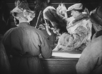
The Mongolian hunter is played by Valerii Inkhizinov, a Mongolian citizen who had studied under Lev Kuleshov alongside Pudovkin. His character is cheated by British agents who cheat him out of the fair price for a rare, valuable fox fur (above). His retaliatory attack makes him a fugitive, and he joins a partisan group of Bolsheviks in the mountains simply in order to survive. He is eventually arrested and shot, but a document he carries seems to identify him as the heir of Genghis Khan. Nursing him back to health, the British officials exploit this connection to their own advantage. Ultimately he rebels. A final fantasy sequence has him leading at attack by partisans as a huge tempest symbolically sweeps away the British army
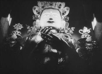
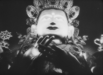
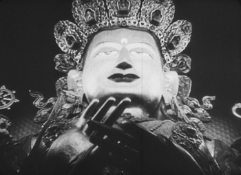
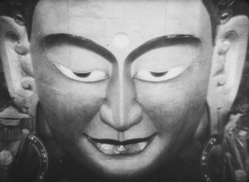
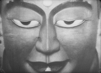
There are virtuoso passages of editing. One comes when he rebels against being cheated over the price of his rare fox fur. Another comes at the end, during the symbolic tempest. In between, Pudovkin often follows a convention of Montage filmmaking, breaking scenes into multiple shots. When a British official and his wife visit a local temple, Pudovkin strings together five increasingly close views of the face of a large statue.
Although the three films have no overlapping characters or social situations, they play very well as a trilogy.
This Blu-ray pair of discs is not a perfect restoration of the three films, but it is so much better than what was available before that this becomes a vital addition to any collection that purports to covers the basic historical classics of the silent cinema.
The set includes several informative extras, including a booklet essay by Amy Sargeant, author of two books on Pudovkin, and two commentaries by present and past curators at George Eastman House: Peter Bagrov on Mother and Jan-Christopher Horak on Storm over Asia. Some short videos analyzing Pudovkin’s editing and showing 1920s footage of St. Petersburg are also included.
Our friend and colleague Vance Kepley authored an in-depth book-length study, The End of St. Petersburg (I. B. Tauris, 2003).
Storm over Asia (1928)
THE LIGHTHOUSE: A period film with period style
Kristin here:
David and I first saw Robert Eggers’ The Lighthouse at the Vancouver International Film Festival, and he wrote briefly about it at the time. About halfway through the screening or less, I realized that what I was watching was a modern combination of two important historical trends of 1920s German cinema: Expressionism and the Kammerspiel.
I am partial to German silent cinema, particularly Expressionist films, for their daring stylization. The movement gave rise to some great films by two masters, F. W. Murnau and Fritz Lang. I’m even fond of the leisurely pacing that characterizes so many Expressionist and Kammerspiel films. At times some scenes resemble the slow cinema of recent decades.
Kammerspiel was a larger trend in the theater of the day, and it has its equivalent in English and American drama, the chamber play. Most of the Kammerspiel films in Germany were written by the great scenarist Carl Mayer, also responsible for many of the Expressionist classics from Das Cabinet des Dr. Caligari on. Kammerspiel films include most notably Hintertreppe (Backstairs, Leopold Jessner, 1921), Sylvester (1923) and Scherben (1923). Some would consider Murnau’s The Last Laugh (1924) to be a Kammerspiel. Carl Dreyer also made one in Germany, Michael (1924, with a scenario by Thea von Harbou) and one in Denmark, The Master of the House (1925). Such films typically involve a small cast of characters who come into conflict in various ways, invariably ending badly, typically with death, suicide, murder, and/or imprisonment. The Lighthouse clearly qualifies.
The Lighthouse is also a horror film, or at least a lot of critics think so. Thus it fits cozily into the Expressionist movement, of which several Expressionist films are now considered early classics of the horror genre: Caligari, Nosferatu, Der Golem, Warning Shadows, Die müde Tod and other less well-known films.
Critics did not fail to notice The Lighthouse‘s links to silent cinema, and in particular Expressionism. Richard Newby’s review in The Hollywood Reporter remarks on: “The filmmaker’s decision to shoot the film in black-and-white and in the aspect ratio of 1.19:1, giving The Lighthouse the appearance of a silent film born of German Expressionism.” He also calls it, “Equal parts Lovecraftian horror story and existential chamber piece in the vein of Jean-Paul Sartre’s No Exit.”
Screen Daily reviewer Lee Marshall caught both the Expressionist and Kammerspiel aspects:
Shot in an expressionist black and white that harks back to cinema’s earliest years, The Lighthouse provides a marvellous chamber-drama platform for two actors, Robert Pattinson and Willem Dafoe, who seize the opportunity with gusto.
[…]
Referencing everything from German expressionist cinema of the 1920s to US silent comedy, the photography of Edward Weston and the from-the-ground-up perspective in the paintings of Andrew Wyeth, Jarin Blaschke’s photography is starkly compelling.
Manohla Dargis’ review in The New York Times explicitly notes German Expressionist cinema:
With control and precision, expressionist lighting and an old-fashioned square film frame that adds to the claustrophobia, Eggers seamlessly blurs the lines between physical space and head space.
The film’s more sustained pleasures, though, are its form and style, its presumptive influences (von Stroheim’s “Greed,” German Expressionism), the frowning curve of Winslow’s mustache, the whites of eyes rolled back in terror.
One might add that the dreams and hallucinations, shown from Winslow’s viewpoint, reflect the innovations of French Impressionist cinema of the 1920s. This sort of stylistic subjectivity, however, was highly influential and has been widely used ever since. It was quickly picked up in German cinema of the 1920s, and some of the classics of the day, especially The Last Laugh (1924) and Variety (1925), are more noted for their subjective camerawork than are the earlier French films that originated the practice. Overall, The Lighthouse has the flavor of a German film from the 1920s.
Lots of filmmakers have attempted to imitate silent cinema, and often they succeed to a degree. They shoot in black-and-white (but don’t add tinting and toning), put just music and maybe some sound effects on the track, and have some exaggerated acting. Perhaps they set the story in the past, as Michel Hazanavicius does with The Artist (2011). A more careful attempt is Blancanieves (2013).
No matter how careful the combination of such elements is, the result usually doesn’t really look like an old film. The Lighthouse really does look like a silent film, in the sense that it looks as if it were shot using the film stock available in that era. It does not, however, pretend to be a silent film, as The Artist does. The Lighthouse doesn’t eliminate the dialogue. Its narrative and tone bear distinct resemblances to those of German and French films of the 1920s, but its story is presented with more overt sexual content and extreme violence than mainstream silent movies would have included.
It helps that Eggers is clearly a cinephile and has watched a wide variety of films from many periods. Cinematographer Jarin Blaschke has also worked as a still photographer and also knows a great deal about older film stocks and lenses. They both knew a lot about films of all periods.
When asked in an interview for American Cinematographer what were the team’s “references” (films shown to crew members as models), Blaschke responded:
A bit of Béla Tarr for tonal dreariness and patient use of camera. Bergman’s camera language, as always. [Eggers’ liked the strong night lighting of In Cold Blood. There were some nautical silent films, including Flaherty’s Man of Aran, [which was shot] on orthochromatic stock with strong, direct close-ups. [The influence of] Eisenstein was there for montage, and bold, hard cuts. Optically, the films we watched from the ‘20s and ‘30s were very appealing in their subtle fringe distortions and the way highlights would shimmer. [p. 63]
In the end, the most influential references were M—an inspirational and modern film in terms of visual language—and Bresson’s Pickpocket, which influenced [our] use of close-ups, especially actions with hands. These helped steer The Lighthouse away from the purist confines of the turn of the century, and more toward early modernism.” [pp. 63-64]
M seems rather an odd choice, but Blaschke describes its inspiration in an interview for Kodak:
Watching that, I found a very modern film with surprising camera movement but more importantly: a modern, creative mastery in how visual information was withheld from the audience, how information was rewarded, and when,” says Blaschke. “With this new inspiration, I felt there was a highly-effective framework for me to express myself visually. Stepping away from a mere 19th-century emulation, we were on to something more surprising and layered.
In a DGA podcast interview, Eggers discusses the nearly-square aspect ratio:
And then, the boxy aspect ratio, we were shooting in 1:19.1, early-sound aspect ratio. There’s a Pabst film, Kamaradschaft, that takes place in a mine, which is probably the only other film that makes sense to use this aspect ratio, because Pabst is shooting vertical objects, like the smokestacks, and we have our lighthouse tower, and then the cramped mineshafts, and then the cramped interiors of this thing. Because we’re using spherical lenses, it’s actually taller, so it’s a great aspect ratio for these close-ups. You don’t need flab on the side. You just have Robert Pattison’s cheekbones, Willem Dafoe’s cheekbones in all their glory on these old lenses.
Who knows what other films are these two are familiar with? But one can assume that they watched some of the classic German films of the 1920s, both Expressionist and Kammerspiel.
The Lighthouse and German Silents
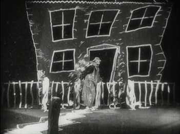
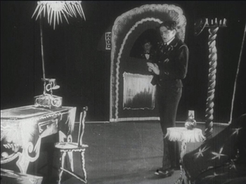
Early German Expressionist films often used jagged, abstract sets, more like paintings than like actual buildings or landscapes. Caligari is the most familiar instance, but here are a couple of examples from Von Morgens bis Mitternachts (1921, Karlheinz Martin).
The second image demonstrates particularly well how light was often represented by streaks of paint. The overhead hanging lamp at the upper left is a fringe of spikes, and the flames on the huge candlestick at the left are five wisps of paint. Highlights from these “lights” are painted on the desk and chair at the lower left.
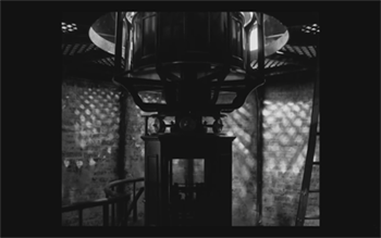
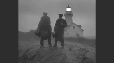
Hollywood films have seldom used distorted sets of this kind. They appear occasionally, as in Son of Frankenstein (1939, Rowland V. Lee) and Beetlejuice (1988, Tim Burton). Most of the time, though, when people speak of expressionist style in films noir or horror films, they’re talking about graphic effects created by lighting. That lighting is not created by streaks of paint but by fancy lighting effects. That’s mostly the case in The Lighthouse. The lighthouse tower and the service buildings around it were designed to be authentic copies of features in real historical lighthouses. The distorted stylization comes from lighting effects, from simple underlighting to patterns created by patterned holes in the lighthouse interior.
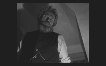
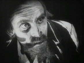
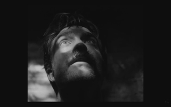
The same is true of acting. In German Expressionist films, actors’ faces were often painted, especially with dark patches around the eyes and pasty white skin. Compare this close-up of Ernst Deutsch’s face, as the Cashier in Von Morgens bis Mitternachts, with that of Robert Pattinson, where the distortions are created by light and shadow.
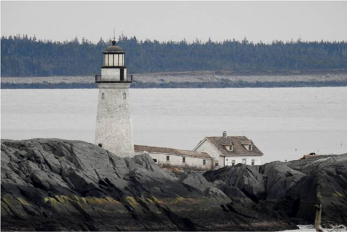
Most of the classic German Expressionist and Kammerspiel films were studio-created. Sets were built either in studios or on extensive backlots. In contrast, Eggers wanted to use an authentic lighthouse. Scouting failed to turn up one with adequate access roads, so the lighthouse and service buildings were built, with faithful adherence to period locales, near the tip of the Cape Forchu Lighthouse peninsula (down the road from a modern lighthouse).
This location is far from from isolated, but the film manages to create a sense of loneliness and dread nonetheless. The huge crashing waves and storms were not generated digitally but were practical effects. According to the Kodak story, “Most of the water work was shot in a large, emergency-responder’s training pool, capable of generating waves in varying sizes and patterns, located near Halifax.” The film contains a few digital effects, mainly to turn the peninsula into an island.
Eggers seems to share the sensibility of the German silent directors: “In a perfect world, I would have liked to have built every single building, for control, control, control, control, control.” (From the DGA interview)
As to Kammerspiel films, The Lighthouse reminds me most of Scherben, which deals with a man who works as a linesman for a railroad. He, his wife, and their daughter live in isolation in some woods and live a stultifyingly dull existence. The intrusion of a railroad inspector who seduces the daughter leads to drama as the linesman gradually becomes enraged and kills him. The style of the film is quite different from that of The Lighthouse, but the dynamics of conflict and gradual deterioration of the central character are somewhat similar–if more restrained in his slow burn and stolid demeanor.
Scherben only became generally available earlier this year, when I wrote about its Filmmuseum Edition DVD release. I have no idea whether Eggers ever saw it at an archive screening or in somewhere else. He more likely saw Hintertreppe, which has long been the only one of the classic Kammerspiele commonly accessible.
Bringing back orthochromatic, sort of
In the DGA interview, Eggers discusses the choice of film stocks:
We thought orthochromatic film stock would really be the way to go, which, among other things, the main thing about orthochromatic film stock is that it’s not sensitive to red, so red is rendered black. So the rosy skin tones on a Caucasian renders darker. So Eisenstein, that’s why all those Russian faces look so tan, and in Hollywood they’re wearing white pancake makeup to compensate for the orthochromatic stock [….] So we liked Double-X negative. The blacks bottom out suddenly in a way that’s very satisfying, as we remember it from watching old movies.
Apparently Eggers and Blaschke investigated having orthochromatic 35mm stock custom-manufactured for them, but the expense was too great. A cheaper way had to be found.
In the American Cinematographer interview, Blaschke describes testing Kodak’s Double-X 5222 35mm film, color 35mm negative film, and digital capture with an Arri Alexa: “In addition to much larger grain, the Double-X has more ‘tooth.’ Even if you match the overall contrast in the DI [digital intermediate], the Double-X had more ‘local’ or ‘micro’ contrast, which emphasizes texture and better differentiates similar tones” [p. 61]. (Double-X 5222 was introduced in 1959 and has been used on such films as Raging Bull [1980] and Schindler’s List [1993].)
Despite these advantages, however, Double-X is a panchromatic stock, with sensitivity to the entire visible spectrum. To solve this “problem,” Blaschke ordered a custom-made filter that would eliminate the red-to-mid-yellow end of the spectrum, thus simulating orthochromatic film effectively [AC, pp. 66-7].
The choice of lenses was also done with an eye to maintaining the artificial orthochromatic look. Blaschke tested many vintage lenses and settled on Baltars, designed in 1930s. The two used in the film were made in 1941 and 1944. In the Kodak interview, he says, “The vintage Baltars were the most shimmery of the bunch I tested, and really were the most stunning portrait lenses I have ever seen,” he says. “The highlights really glowed, but stopped just short of heavy-handedness. Optics like these could add a layer of complexity on top of our hard, orthochromatic look to pull people into the world of the film.” A rehoused 1905 50mm lens was used for some flashback images, and some replicas of 1840 Petzval lens designs were used in flashbacks and “heightened moments”[AC, p. 64]. Blaschke describes the effect in an interview on the Motion Picture Association website: “Blaschke says that for those more “out there sequences,” he had a special lens designed—called a petzval—that contains a lot of aberrations. “It creates a very squirrely look. The background almost falls out of focus, like a globe, and you get this very swirly effect.”
Lighting The Lighthouse
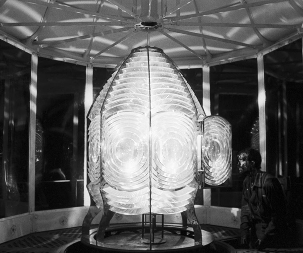
Those swirling light patterns you see on Pattinson’s face in the movie are a real phenomenon—we found ourselves just wanting to gaze into the Fresnel lens. We could have stayed all night staring into the light.
Robert Eggers, Cannes Press Release
Apparently the decision to set the film in the 1890s arose during the search for the ideal lighthouse. In an interview with Eggers in Architectural Digest, he remarks, “‘I wanted there to be a mystery in the light. Inside the beacon. So we knew we needed to set it in a period where we would have a Fresnel lens,’ he explains. Not many lighthouses still have functional ones today. ‘They look like Art Deco spaceships, and they are very magical and jewel-like. So we knew that was going to place us in the second half of the 19th century.'” (See the bottom for an image of the film’s custom-made Fresnel lens mesmerizing Winslow in the climactic scene.)
The decision to imitate orthochromatic film had a considerable impact on the lighting used. Ironically, it meant that a great deal of light from modern lamps, had to be used. Eggers admits as much in the DGA interview.
Obviously we weren’t lighting it like an old movie. We were lighting it using our practical fixtures, but of course, if this were an old movie, you would see the flame of the kerosene lamp and there would be a movie light lighting the scene. But what we did was we had a 600W halogen bulb on a flicker dimmer in all those scenes. And it was really, coming from Alexa and fast film stock, it was so bright. People were wearing sunglasses when we were doing night interiors.
Double-X is slow, even slower than color negative stocks. Modern digital cameras can typically shoot with less light than shooting on film requires. Putting together slow film stock, a filter (albeit one that cut down the light availability by less than one stop), and older, slower lenses meant that the cinematography crew had to use huge amounts of light, as a Variety interview with Blaschke explains:
Blaschke says he prefers to model his lighting in a real-life way, which was tricky on “The Lighthouse.” He and gaffer Ken Leblanc worked with Kodak Double-X stock — Blaschke calls it the only practical black-and-white film left after Plus-X was discontinued in 2011 — which is much less sensitive to light than even color film stock. Between the optics, the film stock and the filtration, Blaschke and Leblanc had to use about 15 to 20 times more light on set to get the look they wanted than on “The Witch,” which was shot on an Alexa.
“Even though it’s a very dark movie, the sets were actually blindingly bright,” says Blaschke. “We’d put 500- to 800-watt halogen bulbs in the lanterns that would flicker and were only a few feet from an actor’s face. The way we make movies now, people have gotten used to a very low light level; it’s trendy to shoot wide open, digitally at 800 or even 2,000 ASA. Our actors talked about how they couldn’t see each other sometimes, which I felt bad about.”
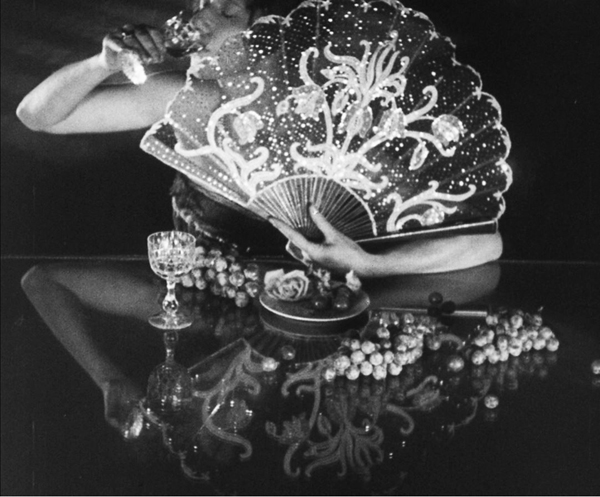
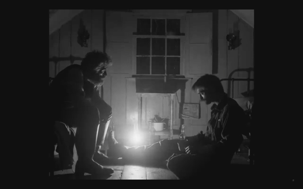
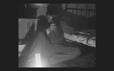
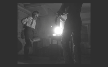
This halogen light is used in the night interiors, such as the scene of the drunken dance, below, and the later scene of the pair drinking in their shared bedroom, at the top of this section and the entry.
This combination of a very bright lamp with slow film and a filter cutting down part of the spectrum of light entering the lens meant that the light fell off very quickly away from the lantern. That effect is also very evident in these scenes. Backgrounds are dimly visible, and the actors often become silhouettes.
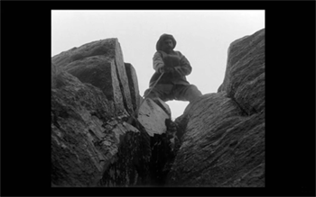
The result is a heightened sense of the two main characters being trapped together in small islands of light surrounded by blackness. We have no sense of how many lanterns the house contains, but we never see more than one at a time. At one point Winslow is seen in bed with a book, and the dim light from the window above him makes it hard to believe that he can see well enough to read. Even the daytime scenes are gloomy and gray. A low angle with the blank, light sky as rendered by the “orthochromatic” film makes Winslow and the dark rocks around him look nearly black.
Few silent films shot on orthochromatic film look this consistently dark, and it’s clear that the filmmakers were not simply trying to replicate the look of an old film. Blaschke admits as much in yet another of the many interviews on the film’s techniques: “It wasn’t about trying to make it look like older films but rather choosing a frame that lends itself to the tall and narrow sets and helps you visually withhold information from the audience. It also had a secondary effect of evoking compositions of 20th century modernist photography,”
In the DGA interview, after describing the various technical details of design, setting, and cinematography, Eggers explains:
This is fussy and it’s nerdy and it’s fun to talk about in this forum, but why do this? One, it says the movie’s old; it takes place in a time when black-and-white photography existed. But two, this is a bleak, austere story, and I feel like black-and-white is the best way to tell this story, and color is only going to mar things. Again, with this orthochromatic filter, it knocks our blue skies, which if we have them—which we really did—into something white and bleak and stark and harsh.
To get really nerdy about it, panchromatic film stock had largely replaced orthochromatic by the late 1920s and early 1930s, the only period in which a nearly square aspect ratio was standardly used. Moreover, the Baltar lenses were invented in the 1930s. Halogen lamps are a comparatively recent innovation in film lighting. So the combination of the ortho and the boxy look and the rest of it aren’t “authentic” in any strict sense. The filmmakers were not using lighting equipment of the 1920s or any modern equivalent. In short, they weren’t trying to replicate the look of any one specific type of old film. As a way of creating the illusion of an old film, as well as an appropriately grim tone, it works better than anything else I’ve seen.
A few final notes
First, I have seen The Lighthouse’s budget given as $4 million. That’s in the film’s Wikipedia entry, which cites an AP release from May 2019 that says only that the film’s budget was larger than that of The Witch but still modest. The New York Times ran a story about the film’s trailer in July, noting that the budget for The Witch had been $4 million, which Box Office Mojo also gives as the cost of the earlier film.
I have not been able to find a reliable figure for The Lighthouse’s budget, but clearly it was distinctly more than $4 million.
Second, according to Eggers in the DGA interview linked above, that’s real dirt (sifted to rid it of the odd pebble) that Winslow shovels down onto Wake in the climactic scene–not some namby-pamby ground chocolate. Not to mention that the puddle he’s lying in was frigid. Even the Expressionist actors didn’t go so far. The Academy should give Dafoe his Oscar already.
Third, watching The Lighthouse with a sell-out crowd in the biggest venue at the Vancouver International Film Festival, The Centre for the Performing Arts, was one thing. There people were eager to see this film, which had premiered in the Directors’ Fortnight thread at Cannes in May. It won the International Federation of Film Critics (FIPRESCI)’s prize for best film. It was quite another thing to watch it by myself during its run at a local multiplex.
The Lighthouse played at three multiplexes in Madison, with full-day schedules at each. It’s still playing at one of them, twice a day. I was alone when I saw it a few days ago at a 10:25 am screening. After being in a crowded festival audience, the second experience made me wonder how in the world such a challenging film made it into such wide release and how a more mainstream audience would react to it. (It maxed out at 958 theaters November 1-6 and has been falling since. Its gross through November 10 is $8,915,216 domestically; Box Office Mojo so far has no figures for foreign markets.)
The frames from The Lighthouse have mostly been taken from trailers. I have not cropped the frames reproduced above to their 1.19:1 format, since on theatrical screens, the audience sees the image as window-boxed, with black stretches on either side. (The exception is the bottom image, a press image released by distributor A24; it is either a frame with the black sides cropped or possibly a production still.) Perhaps Eggers and Blaschke’s idea would have been for theaters to move the screen’s masking to the edges of their images. Given the realities of modern exhibition, however, such versatility is not part of the screening technology. I found that the window-boxing on the big screen was a constant, subtle way to call attention to the unusual compositional results. What The Lighthouse will look like on various formats for streaming is hard to imagine.
Speaking of the aspect ratio, a number of critics have called 1.19:1 a silent-film format. In fact it was only used in the early sound era, when room had to be made on the filmstrip for the optical soundtrack; later the image was shrunk slightly into the classic Academy ratio of roughly 4:3. During the silent period there was no absolute standard ratio, though the image was in usually not far from the Academy ratio.
The American Cinematographer article cited is Patricia Thomson, “Stormy Isle,” AC (Nov 2019): 60-67.
In one of the quotations above, Blaschke says that Man of Aran (1934) was shot on orthochromatic film. This seems unlikely, given that Flaherty had made one of the first American features to use the new panchromatic film stock, Moana (1926). Kodak stopped making ortho in 1930. Possibly Flaherty, who started work on the film in 1931, did revert to ortho for it, but it seems unlikely.
Ernst Deutsch, who plays the Cashier in Von Morgens bis Mitternachts, was one of the great Expressionist actors of stage and screen. I have mentioned him before, for his role in Der Golem; when Von Morgens bis Mitternachts was released on DVD; and for his role in the non-Expressionist Das alte Gesetz, released on Blu-ray by Flicker Alley last year.
On horror and fantasy in German silent films, see my “Im Angang war …: Some Links between German Fantasy Films of the Teens and the Twenties,” in Paolo Cherchi Usai and Lorenzo Codelli, eds., Before Caligari: German Cinema, 1895-1920 (Pordenone: Edizioni Biblioteca dell-Immagine, 1990), pp. 138-161.
Baschke mentions Eisenstein as an influence in the editing, but presumably neither he nor Eggers had read Eisenstein’s essay arguing in favor of a square aspect ratio. His belief was that such a frame would give equal compositional weight to the horizontal and vertical dimensions of the screen. (“The Dynamic Square,” Jay Leyda, ed., Film Essays and a Lecture [New York: Praeger, 1970], pp. 48-65.
The photograph of the lighthouse set on Cape Forchu is by Dan Robichaud and appears in Carla Allen’s story on the filming in the local Digby Courier. A search for “Cape Forchu Lighthouse” on Google Maps yields many photos of the area and reveals the very rocky terrain over which Winslow pushed his wheelbarrow. The modern lighthouse is a popular tourist attraction, in case you ever visit Yarmouth in Nova Scotia. There is even a restaurant inside it. (Appropriately enough, “The grilled lobster and cheese sandwich was amazing,” according to one visitor.)
[January 13, 2020. Blaschke has been nominated for an Oscar in the Best Cinematography category. Unfortunately the film was not nominated in any other category, as it deserved to be.
February 8, 2020. Blaschke has won a number of awards for the film, most notably the American Society of Cinematographers Spotlight Award, and, just today, the Film Independent Spirit Award for best cinematography.]
Two more classics from Flicker Alley
Fragment of an Empire (1928).
Kristin here:
Our friends at Flicker Alley have once again provided access to major works of silent cinema with two Blu-ray releases: Marcel L’Herbier’s L’Argent (1928) and Fridrikh Ermler’s Fragment of an Empire (1929).
Fragment of an Empire
When I was in graduate school, back in the 1970s, Ermler’s Fragment of an Empire (more accurately translated as “Remnant of an Empire”) was considered one of the major examples of Soviet Montage cinema. Its place in the canon seems to have faded since then, but this Blu-ray should restore its reputation.
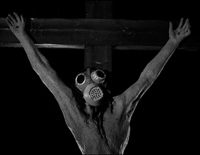
Earlier prints of its were dicey. Its most famous scene was one in which the protagonist approaches a life-size crucifix at night on a battlefield and discovers that the head has been fitted with a gas-mask. David remembers seeing a print in which this image was present. I remember watching the film, expecting to see this image and being disappointed that it was not there. (I expected it because most histories of cinema that mentioned Fragment would use a production still of the crucifix.) Why the shots of the crucifix were removed is not clear, though presumably in countries where religious groups had some say in censorship matters, they were removed as blasphemous.
Peter Bagrov, formerly of the Gosfilmofond archive in Russia and now Curator of the Moving Image Department at George Eastman Museum, was centrally involved in the film’s restoration and provides the essays in the accompanying booklet. According to him, nine prints of the film from archives around the world were examined for this restoration. Only two of them contained the gas-mask Christ shots, one of them being the Museum of Modern Art’s distribution print. David probably saw that. I saw another version; I don’t recall when or where. Bagrov suggests that some prints that circulated as the “canonical” version of the film were in fact an abridged, simplified version made at the time for circulation to the uneducated rural population. Now we can all see something very close to the full original 1929 copies.
The film’s title refers to Filimonov, who is initially suffering from amnesia and working as a hired hand for a peasant woman at a remote stop on a rail line. Seeing a woman on a passing train triggers his memory, and he realizes that she is his wife and that he was a non-commissioned officer during the World War I. Going home to St. Petersburg, now Leningrad, he is shocked by the modern architecture and short skirts, as well as the fact that the owner of the textile factory where he had worked is no longer the master there. He gets a job at the same factory. Who, he repeatedly asks his fellow workers, is the master?
Fragment of an Empire falls into the common Soviet plot pattern of following a character who at first resists or ignores the revolutionary changes in the USSR but comes to understand and support them by the end. It also falls into the “Rip Van Winkle” pattern of a character who, either through amnesia or some fantastical time warp, is thrown into a society that has moved ahead without him or her. It’s a convenient way of defamiliarizing, as the Russian Formalists would say, that new society.
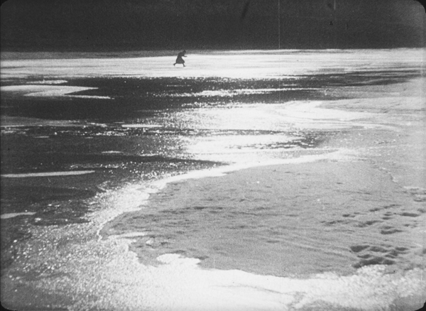
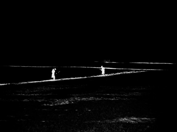
The opening third or so of the film is its most impressive portion. Several early segments take place at night on the bleak, flat land around the train tracks. Ermler makes impressive use of the new arc searchlights that had been developed for surveillance during the war. These intensely bright lamps made shooting in exteriors at night practical for the first time. Ermler created stark, white strips of light against pitch black, picking out individuals from a great distance (see top). The effect at times resembles some of the abstract experimental shorts of the 1920s.
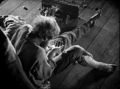
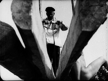
In the opening scene, the bodies of soldiers who have died of typhus are heaped on a train platform to be buried. The peasant woman orders Filimonov to strip them of their boots, but while doing so he finds one wounded soldier still barely alive and saves him. The second sequence has Filimonov spotting his wife and beginning to piece together his memories. Back at home, more reminders trigger a series of quick flashbacks: a sewing-machine’s crank leads to a machine-gun firing, a rolling spool recalls wheels of trains and tanks. A somewhat more extended flashback involves a tank advancing on a soldier as he prays and begs for help from the gas-mask-outfitted crucifix before being crushed–a traumatic scene presumably witnessed by Filimonov, though he is not shown. Through much of the extended recovery Ermler employs the extremely short shots, graphic conflict, and dynamic angles (below) typical of Soviet Montage filmmaking.
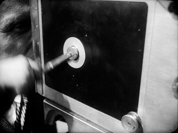
Perhaps inevitably, once Filimonov has fully regained his memory and gone to Leningrad, the film becomes more conventional. For a while he wanders about, simply staring and commenting in confusion and disbelief at the modern buildings and people he sees. His hiring at the factory and misunderstanding about who is master there generates some humor as the other workers tease him–in a comradely way, of course. As they explain the new egalitarian society to him, Ermler launches the longest and most varied “work is glorious” montage sequence I have ever seen in a Soviet film of the era, with joyous workers wielding everything from saws to microscopes and, yes, movie cameras.
There is also a brief but amusing scene in which Filimonov takes his old tzarist war medal to donate it to a collection of theatrical props. The bizarre objects in this little warehouse recall the decadent ones Eisenstein uses to characterize the tsar’s quarters in the previous year’s October. This scene, along with much of the motif of Filimonov’s medal, was also eliminated from the “village” version. The intertitles restored in Russian with the original graphic layouts of the original, so that when Filimonov’s repeatedly cries “Who?” when he asks who the master of the factory is, the word changes size and position on the black background from title to title. (There are English subtitles throughout.)
One praiseworthy decision made by the restorers was to leave in the lines of the splices.
These splice-lines are of use to the historian and analyst. Watching a 35mm print on an editing machine, one can examine these directly on the filmstrip. The temptation to “clean up” the images to look pure and attractive, however, too often leads to their elimination. They are part of the original film and should always be left as is.
The Flicker Alley disc is NTSC but without region coding.
L’Argent
Marcel L’Herbier, though not one of my favorite directors, even of the silent period, was a major French director and has appeared on this blog a number of times. I included films by him in my annual list of the ten best films of ninety years ago: El Dorado for 1921 and L’Argent itself for 1928. Flicker Alley has been particularly kind to L’Herbier, and I have discussed their releases of his L’Inhumaine and Feu Mathias Pascal. Having summarized the importance and style of L’Argent in the 1928 post, I’ll concentrate here on the restorations and supplements of the existing discs.
This is the third restoration of L’Argent. The original negative and a finegrain positive made from it survive. In 1971 a restoration was done from this material, but someone made the unwise decision to step-print the new version to simulate the 16 frames-per-second shooting/projection speed of silent cinema. In fact, by the early 1920s the speed of the majority of films was up to around 20 fps, and by the late 1920s, it had reached nearly the same as sound films, around 24 fps. The resulting print of L’Argent, already quite a long film for its day, was off-putting indeed.
A 1994 restoration removed the step-printing and produced a version of excellent visual quality; it provided the basis for the “Masters of Cinema” two-disc DVD set from British company Eureka!, released in 2008. My discussion of L’Argent in the ten best of 1928 included frames from that version, which is no longer in print. It has not been released in a Blu-ray edition.
The third restoration, done by Lobster Films in 2018, forms the basis for the new Flicker Alley Blu-ray disc. (The ongoing cooperation between the two companies has made possible many of Flicker Alley’s discs of splendid copies of hitherto rare or inaccessible silent films.) The original camera negative was scanned in 4K for this new version.
Those who do not own the Eureka! set should welcome the renewed availability of this major film, perhaps L’Herbier’s finest.
Although there is some overlap between the supplements on these two releases, there are also significant differences. Both Eureka! and Flicker Alley include include a 40-minute documentary, Jean Dréville’s Autour de L’Argent (“About L’Argent,” 1928), an elaborate early “making-of” docmentary. Eureka! also offered a 54-minute 2007 documentary, Marcel L’Herbier: Poet of the silent cinema, not in the Flicker Alley release.
Flicker Alley, however, has two items not in the earlier Eureka! set. One is a five-minute short in which Serge Bromberg discusses “The Two Restorations of Auteur de L’Argent“, the Dréville documentary. More importantly, the other is a previously unavailable film, Prometheus Banker (Prométhée banquier). L’Herbier made this 16-minute short in 1921, apparently based very loosely on Zola’s novel, L’Argent. In retrospect, it looks like a brief sketch for the feature-length L’Argent, though it works as a one-reeler. It features L’Herbier’s familiar actors of the early 1920s: Eve Francis as the banker’s lover who longs to return to her happier, humbler beginnings (see below), Jacqe Catelain as the banker’s secretary, and Marcelle Pradot as the jealous typist. Apart from being an interesting early Impressionist film in itself, it provides a useful contrast in styles between similar stories told in 1921 and 1928 by the same director.
Neither the Eureka! release nor the Flicker Alley one has a commentary track. The Eureka! booklet is 78 pages long, with a lengthy essay by Richard Abel and a 1968 interview with L’Herbier, as well as some 1929 reviews of L’Argent. The Flicker Alley booklet is 23 pages, with essays by Mirielle Beaulieu.
According to the box and the film’s webpage, L’Argent is A/B/C, i.e., all regions (though the disc itself is marked A). It is presumably NTSC.
Many blog entries have discussed the Soviet Montage style; see this category. For more on French Impressionist cinema, see Scorsese, ‘pressionist and An old-fashioned, sentimental avant-garde film. We provide background on the two movements in Chapters 4 and 6 of Film History: An Introduction.
September 1, 2020: The Fragment of an Empire release has won The Peter von Bagh Award at the 2020 Il Cinema Ritrovato DVD Publishing Awards.
Prométhée banquier (1921)


