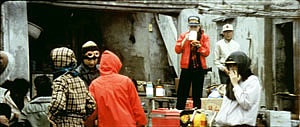
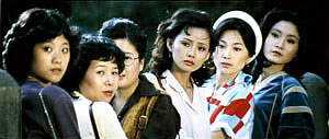
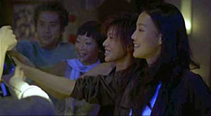
Archive for the 'Tableau staging' Category
Early Hou Hsiao-hsien: Film culture finally comes through (a repost)
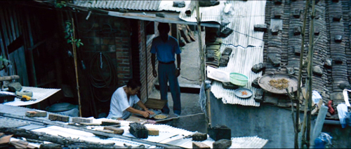
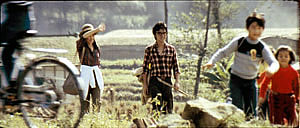
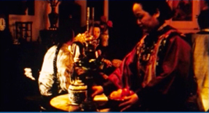
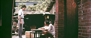
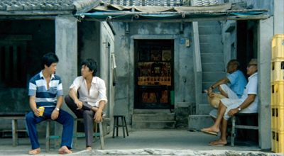
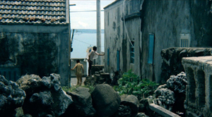
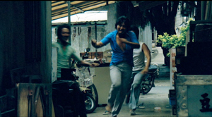
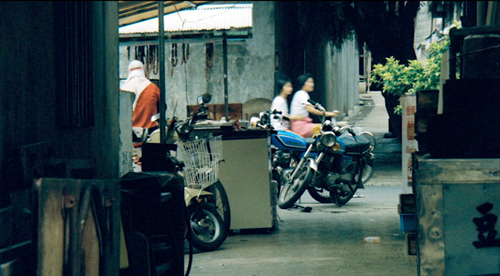
The Green, Green Grass of Home (1982).
David’s health situation has made it difficult for our household to maintain this blog. We don’t want it to fade away, though, so we’ve decided to select previous entries from our backlist to republish. These are items that chime with current developments or that we think might languish undiscovered among our 1094 entries over now 17 years (!). We hope that we will introduce new readers to our efforts and remind loyal readers of entries they may have once enjoyed.
DB here:
In March, the Criterion Channel will be featuring a selection of early films by the great Taiwanese director Hou Hsiao-hsien. These have been very hard to see in the West; I went to Brussels and Taipei to watch prints back in the 1990s. For those who admire his later works, they are absolutely necessary, and for the casual viewer they’re great fun. Two of them, Cute Girl and Green, Green Grass of Home are lilting musicals, while The Boys from Fengkuei is a wandering-youth story with affinities to coming-of-age films like Fellini’s I Vitelloni. (Too bad the series couldn’t include his second feature, Cheerful Wind.) My effort tries to show how a basic technical choice that Hou made created powerful effects on his visual style.
Because the frames are so dense with information, you may want to enlarge them as you go. For a fuller examination of Hou’s work across his career, there’s a chapter in Figures Traced in Light and a video here. The original blog, posted on June 6, 2016, was an attempt to fill in areas I didn’t have room to include in the book. If you’re unfamiliar with Hou’s major works, you should probably watch the video before reading the recycled entry.
For today, let’s call “film culture” that loose agglomeration of institutions around non-mainstream cinema. Film culture includes art house screening venues, festivals, magazines like Film Comment, Cinema Scope, and Cineaste, distribution companies (Janus/Criterion, Milestone, Kino Lorber et al.), critical websites, and not least the new channels of distribution and exhibition like Fandor, Mubi, and the impending FilmStruck.
Although the system is decentralized, there’s usually a fairly predictable flow of films through it. A film is shown at festivals, written up by critics, and picked up by distributors. Then it gains some exposure in theatres or more festivals, and it eventually becomes available on DVD, cable, and streaming services. And now we expect the process to move fairly quickly. Mustang played Cannes and many festivals through summer of 2015; it moved to theatres in the US and elsewhere in the fall. Only a year after its premiere, you can buy it on disc.
We’ve also been aided by the emergence of multi-standard video players and the willingness of some disc-publishing companies to release versions with subtitles in several languages. All too often, though, “film culture” displays gaps and delays. It took six years for Asgar Farhadi’s wonderful About Elly (2009) to make its way to minimal visibility in the US. Fans of Godard have been prepared to wait years to see his many films that didn’t get even video release in English-speaking territories. (Soigne ta droite! played Toronto in 1987, never got a theatrical release in America, and showed up on US DVD in 2002; the Blu-ray came out eleven years after that.) Two of the most egregious examples of this time lag involve the works of the outstanding Taiwanese filmmakers of the 1980s and 1990s: Hou Hsiao-hsien and Edward Yang.
 Most of Hou’s films had no proper US release. When they were available for booking, as from Wendy Lidell’s heroic International Film Circuit, they circulated for one-off screenings. Some of his major films, such as City of Sadness (1989), still remain difficult to see. Edward Yang’s work was similarly obscure. When we ran a retrospective at our UW Cinematheque in 1998, we had to borrow prints from his family.
Both of these extraordinary filmmakers had to wait many years for the exposure that is standard for European arthouse releases. After six features in seventeen years, Yang found a Western audience with Yi Yi (2000). Hou took even longer; twenty-seven years after his first feature, he gained some recognition with The Flight of the Red Balloon (2007) and last year, The Assassin. Meanwhile, many of these directors’ early films remain largely unknown, prey to ancient distribution contracts and the belief that the films would cost too much to revive and market.
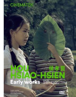
Today’s entry and the next one celebrate the welcome news that important works by these two filmmakers are at last available on the disc format. Today I’ll concentrate on the three early Hou films from the Cinematek of Belgium: Cute Girl (1980), The Green, Green Grass of Home (1982), and The Boys from Fengkei (1983). Next time, I’ll consider Criterion’s release of Edward Yang’s masterpiece A Brighter Summer Day (1992).
Hou, early and late
Hou’s films are no stranger to this site. Among the first things I posted, back in 2005, was one of a batch of supplemental essays to my book, Figures Traced in Light: On Cinematic Staging (2005). That book devoted a chapter to Hou’s staging principles, with background on what I took to be the evolution of his technique. It was, I think, the first sustained view of Hou’s style, and it included discussion of his earliest films. These were scarcely known in the West and not considered in relation to his more famous work.
The online essay expanded my treatment of those titles. Because that essay is more or less buried elsewhere on the site, and it’s somewhat clunkily laid out by today’s standards, I’m reprinting it, with revisions, here, along with some bits from Figures. But first some background on these early works.
Hou began in the commercial, mainstream Taiwanese-language industry. Most local films had a strong genre identity: martial-arts movies, romantic comedies, or melodramas of family crises. Hou’s first directorial effort, Cute Girl, centered on a romance between two city dwellers who re-meet when the man is called to a surveying task in the countryside. Cheerful Wind (1981) reunites the two stars, Kenny Bee and Feng Fei-fe, in a more serious story of how he, a blind man, wins her love. In the pastorale The Green, Green Grass of Home, Kenny plays a schoolteacher brought to a village, where he meets another teacher and a romance blossoms. This film, however, expands to include dramas, big and small, involving several families; it also incorporates an ecological theme by encourage safe fishing policies.
In making these early films Hou discovered techniques that not only suited the stories he had to tell but also suggested more unusual possibilities of staging. He pushed those techniques further in his later films, with powerful results. The charming early films show him developing, in almost casual ways, techniques of staging and shooting that will become his artistic hallmarks. One basis of his approach, I argue, is his adoption of the telephoto lens.
How long is your lens?
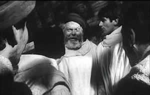
Around the world, from the late 1930s through the 1960s, many films relied on wide-angle lenses—those short focal-length lenses that allowed filmmakers to stage action in vivid depth. One figure or object might be quite close to the camera, while another could be placed much further in the recesses of the shot. The wide-angle lens allowed filmmakers to keep several planes in more or less sharp focus throughout, and this led to compact, sharply diagonal compositions, as in Welles’ Chimes at Midnight (1966).
Although Citizen Kane (1941) probably drew the most attention to this technique, it was occasionally used in several 1920s and 1930s films made throughout the world. The great French critic André Bazin was the most eloquent analyst of the wide-angle aesthetic, and his discussion of Kane, The Magnificent Ambersons (1942), The Little Foxes (1941), and The Best Years of Our Lives (1946) has strongly shaped our understanding of this technique.
The 1960s saw the development of an alternative approach, what we might call the telephoto aesthetic. Improvements in long focal-length lenses, encouraged by the growing use of location shooting, led to a very different sort of imagery. Instead of exaggerating the distances between foreground and background, long lenses tend to reduce them, making figures quite far apart seem close in size.
In shooting a baseball game for television, the telephoto lens positioned behind the catcher presents catcher, batter, and pitcher as oddly close to one another. Planes seem to be stacked or pushed together in a way that seems to make the space “flatter,” the objects and figures more like cardboard cutouts. The style was popularized by films like A Man and a Woman (1966).
The telephoto look quickly spread, employed by directors as diverse as Sam Peckinpah and Robert Altman, whose 1970s films also use the long lens, controlled by zooming, to squeeze a crowd of characters (M*A*S*H, 1972; Nashville, 1975) into the fresco of the anamorphic frame.
Hou Hsiao‑hsien came to filmmaking via the romance films so common in Taiwan in the 1970s, and this genre employed the long lens extensively. Working with low budgets, most filmmakers relied on location shooting. The telephoto allowed the camera to be set far off and to cover characters in conversation for fairly lengthy shots (as in Diary of Didi, 1978, below). In this respect, the directors were not so far from their Hollywood contemporaries; Love Story (1970) employs these techniques on a bigger budget.
Indeed, Love Story (a big hit in Taiwan) may have pushed local filmmakers toward using this technique in their own romantic melodramas; sometime the influence seems quite direct (Love Story and Love Love Love, 1974)
With these norms in place, Hou’s inclination toward location shooting and the use of nonactors, along with his attention to the concrete details of everyday life, allowed him to see the power of a technique that put character and context, action and milieu, on the same plane. His crowded compositions are organized with great finesse in order to highlight, successively, small aspects of behavior or setting, and these enrich the unfolding story, as Figures tries to show in his masterpieces of the 1980s and 1990s. Using a long lens (usually 75mm–150mm) he began to exploit some “just-noticeable differences” that the lens creates as byproducts.
Hou saw unusual pictorial and dramatic possibilities of the telephoto lens, and they became central to his distinctive way of handling scenes. A current norm of production practice yielded artistic prospects which he could explore in nuanced ways. Figures provides the detailed argument, but let me highlight three points here.
Exploiting the flaws
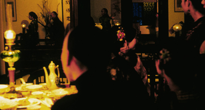
Flowers of Shanghai (1998).
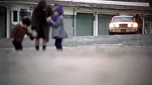
One byproduct of the long lens is a shallow focus, as we can see in the examples above. Because the lens has little depth of field, one step forward or backward can carry a character out of focus. Hou stages in depth–and at a distance–but allows the layers to slip out of focus gradually.
Savoring the effects of gently graded focus is a common feature of Hou’s later work. The masher at the train station in Dust in the Wind (1987) moves eerily in and out of focus in the distance. In Daughter of the Nile (1988), there’s an astonishing shot showing gangsters approaching a victim’s SUV outside a nightclub: at first they’re only barely discernible blobs (seen through the vehicle’s narrow windows) but then they gradually come into ominously sharp focus in the foreground, preparing to attack one of the boys inside. The slight changes of focus train us to watch tiny compositional elements for what they may contribute to the drama. More recent examples abound in Flowers of Shanghai (1998), above, where it’s the foreground planes that dissolve.
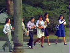
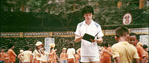
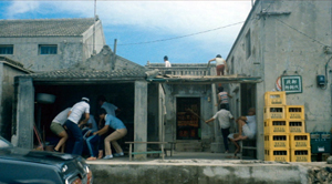
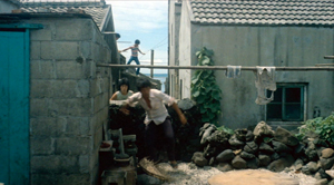
Hou’s three first films don’t use the option quite so daringly; here the degrees of focus concentrate on the principal players but still allow us to register the teeming life around them (Cute Girl; Green, Green Grass).
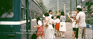
Hou can put sharply different dramatic situations on different layers. In Green, Green Grass, the departure of the little girl, saying farewell to her host family, plays out slightly closer to the camera than the departure of the eccentric teacher.
This principle operates as well in the creatively distracting street and train-platform scenes of Café Lumière (2004).
Secondly, the long lens yields a flatter-looking space. It has depth, but the cues for depth that it employs are things like focus, placement in the picture format (higher tends to be further away), and what psychologists call “familiar size”—our knowledge that, say, children are smaller than adults, even if the image makes them both of equal size. One favorite Hou image schema is the characters stretched in rows perpendicular to the camera, and the telephoto lens, by compressing space, creates this “clothesline” look more vividly. We can find the clothesline staging schema in the early Hou films (Cute Girl, Cheerful Wind).
Another favorite schema is the “stacking” of several faces lined up along a diagonal (Cute Girl). This can be seen as a refinement of a schema that was in wider use, as an example from Love Story indicates.
But Hou uses this sort of image more subtly. The telephoto lens lets him stack faces in ways that encourage us to catch a cascade of slight differences (Millennium Mambo (2000)). In many scenes of Flowers of Shanghai (1998) this principle is carried to a degree of exquisite refinement without parallel in any other cinema I know. In one shot, the faces are stacked in the distance, behind a lantern, and a slightly shifting camera reveals slivers of them.
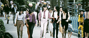
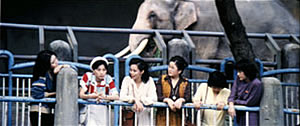
In general, because Hou is committed to a great density of information in the shot, the compression yielded by the long lens tends to equalize everything we see. Minor characters, or just passing strangers, become slightly more prominent, while details of environment can get pushed forward as well. The zoo scenes of Cute Girl enjoy showing us our characters in relation to the creatures around them.
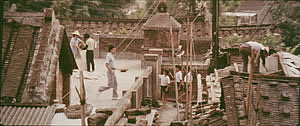
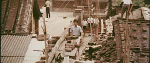
In the shot surmounting today’s entry, the tile rooftops of The Green, Green Grass of Home, secured by bricks and pails and tires and baskets, become just as important as the figures below them.
In Green, Green Grass, Hou develops the equalized-environment option in one particular scene. A long-lens distant view catches the teacher coming to the father’s house along a corridor of rooftops.
When the teacher confronts the father, instead of tight framings on each man, Hou cuts to another angle that activates yet another range of environmental elements—principally the train passing in the background, prefiguring the trip that the man’s son and daughter will take in an effort to find their mother.
Because the long lens has a very narrow angle of view (the opposite of a “wide-angle” lens), it affects the image in a third major way. If you use a long lens in a space containing several moving figures, people passing in the foreground will block the main figures: they pass between the camera and the lens. Hou elevates this blocking-and-revealing tendency to a level of high art.
In Figures Traced in Light, I argue that many great directors, from the silent era forward, have staged action in the shot so as to block and reveal key pieces of information, calling items to our attention at just the right moment with unobtrusive changes of figure position. The possibility of blocking and revealing arises from the “optical pyramid” created by any camera lens. (Lots more on that pyramid in Figures and in this video lecture.)
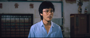
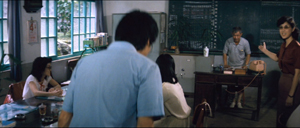
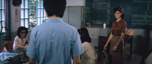
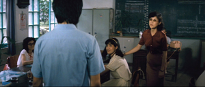
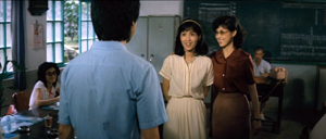
Hou showed himself capable of using the blocking-and-revealing tactic in traditional ways. Take this simple encounter in Green, Green Grass, when the new teacher Da-nian meets Su-yun, the young teacher with whom he’ll fall in love. The scene begins on him, then cuts to a reverse angle as he’s introduced to the principal.
The others are turned toward the principal in the background; the whole composition pushes our eye toward him. Then the teacher steps left to judiciously block the principal. The woman on the far left turns her head and we’re nudged to look at her. Da-nian swivels slightly too.
Then the key introduction: Da-nian shifts aside a little, the teacher continues to block the principal, and the central woman turns toward us.
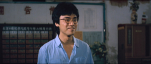
The climax (quiet, nifty) of this shot comes when Su-yun rises to meet Da-nian. She commands the center of the frame, frontal and radiant. Like any good classical director, Hou then gives us a reaction shot mirroring the first shot of this “simple” sequence: Da-nian is more than happy to meet her.
Imagine how a contemporary Hollywood director would handle this–lots of cuts, everybody in singles and close-ups, transfixing track-in to Su-yun, maybe a boingo music track–and count yourself lucky to have encountered, for once, an unfussy craftsman.
Hide and seek
The Green, Green Grass introduction scene involves a wide-angle lens, but Hou’s skill with slight character movement shows up in long-lens images too. In fact, I suspect that using the telephoto lens on location made him sensitive to the resources of masking and unmasking bits of the shot.
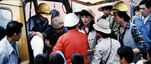
The loveliest example I know in the early films is the Cute Girl shot I analyze in Figures, when Fei‑Fei confronts the surveyors and the man in the red shirt serves as a pivot for our attention; the staging shifts our eye back and forth across the frame, according to small changes of character glance.
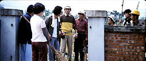
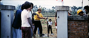
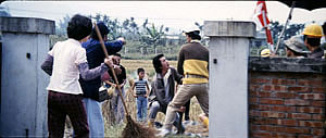
A less drastic example occurs when the surveying team starts quarrelling with the locals around a walled gate: The team’s blocking of the gate gives way to movement into depth and a struggle there between them and the townsfolk.
In all, it seems to me that these three resources of the long lens—the shallow focus, the compressed space, and the narrow angle of view—supplied artistic premises for Hou’s shooting and staging in the later films. This is not to ignore his use of the wide-angle lens on occasion, particularly interiors, as in the schoolteachers’ introduction scene. Once the lessons of the long lens had been absorbed, Hou could apply the staging principles that he’d developed to other kinds of shots and story situations. Sometimes he kept his style smooth and limpid, but at other times he offered the viewer some unusual challenges.
Peekaboo pictures
The Boys from Fengkuei (1983).
Presumably Hou could have kept making good-natured, crowd-pleasing movies for many years, but changes in his professional milieu gave him new opportunities. In the early 1980s Taiwan film attendance declined sharply, and Hong Kong films began to command more attention than the local product. The rash of independent companies had concentrated on speculation, not long-term investment, so only the government’s Central Motion Picture Company could initiate recovery. Ambitious government officials launched a “newcomer” program that offered support for cheap films by fresh talents. Even if the new films could not win back the local audience, they might gain renown at foreign film festivals. At the same period, a local film culture began to emerge, relying upon critics who were sympathetic to the creation of a New Taiwanese Cinema.
Hou was no newcomer, but working within the New Cinema framework he could reconceive his practice. The key question for all directors, he recalls, was: What is it to be Taiwanese? His New Cinema films would focus on political and cultural identity, and they did it through an approach to cinematic storytelling that in many respects ran against the conventions of his earlier films. His first New Cinema feature, The Boys from Fengkuei (1983; included in the Cinematek set) reminds us of how “young cinemas” have often represented a return to Neorealism.
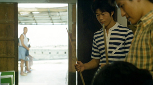
Instead of introducing us to clear-cut protagonists and a dramatic situation, the film immerses us in a milieu, that of the small town of Fengkuei. The first fifteen minutes are episodic, casually showing a gang of teenage boys playing pool, lounging about, playing pranks, and above all getting in fights. Initially, the one who’ll become the main figure is minimally characterized; the emphasis, as the title indicates, is really on the group. The boys drift to the big city, where they try to get by and meet others their age. Throughout, local color and everyday routines drive the action more than character goals and traditional drama do.
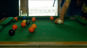
This somewhat diffuse approach to narrative, in various countries, has proven well-suited for filmmakers who want to explore psychological development and social-cultural commentary. So it accords with the impulse toward understanding national identities that animated New Taiwanese Cinema. In addition, I think that this looser conception of storytelling allowed Hou to refine some of the stylistic options he had already explored. Now the extended, fixed telephoto shot with varying planes of focus appears as a more indeterminate pictorial field, as in our rather oblique introduction to the boys–partial framed figures drifting in and out of the frame–and their poolroom hangout. Emphasizing incomplete views and vague figures outside the door, Hou gives us a more precise array of balls on the table than he does of his characters in space.
Likewise, even though Hou has surrendered his very wide anamorphic frame, he finds ways to balance human action and tangible surroundings in the ways he did with city landscapes and village rooftops in the earlier films. The bullying of a motorcyclist and a pursuit by a rival gang aren’t rendered with the aggressive cuts and angles we’d expect in violent scenes in the Hong Kong action pictures then ruling Taiwanese screens. It’s as if Hou, along with his colleagues, is rejecting that other Chinese-language tradition.
Which is to say that when conflict comes, Hou turns to “dedramatization,” that tendency (again related to Italian Neorealism and its successors) of tamping down peaks of action. Now his characteristic long lens creates detached shots, sometimes with planimetric flatness, sometimes with tunnel vision. These images play out chases and fights in a way that minimizes their physical impact but reminds us of the design and details of the characters’ world.
Hou’s insistence on the fixed, distant telephoto take is now put in the service of obscured vision. The people who passed through the frame in the earlier films, blocking and revealing the action judiciously, may become more salient than the action itself–which is itself often offscreen, or swathed in shadow, or shielded by aspects of setting. The early films’ fixed long take enabled us to see story action fully, but, now, in its refusal to cut away, the camera can suppress story information.
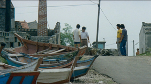
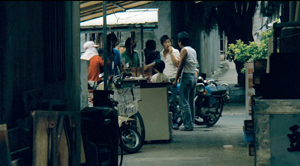
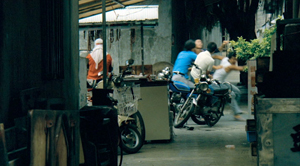
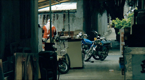
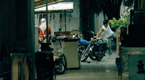
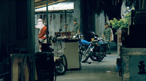
Early in the film, a street fight passes in and out of a far-off intersection among stalls. The dust-up stirs only slight interest from passersby, before bursting back into the alleyway and coming to the camera.
The masking of the fight by the setting can be seen as an extension of the way the walls in the Cute Girl surveying quarrel intermittently cut off our vision, but here it’s far more drastic and sustained.
I’ve drawn my examples from the early stretches of The Boys from Fengkuei, so as not to preempt your own discoveries as the plot carries the gang to the big city. In these scenes Hou in effect teaches us how to watch his movie. But I think I’ve said enough to suggest how Hou’s fresh conception of narrative, born of a renewed interest in local culture (already present in another register in the first three films), allowed him to carry his stylistic explorations to new levels.
Hou saw certain pictorial possibilities in the long lens, and after developing them to a certain point in popular musicals, he recast them when he took up another kind of storytelling. He realized that leisurely, contemplative narratives permitted him to refine these visual possibilities, and they could become powerful, nuanced stylistic devices. And he didn’t stop, as the films following his New Cinema works vividly show. His visual imagination seems unlimited.
A more general lesson follows from this. Norms of form and style are resources for artists. Some artists follow the schemas that they inherit, while others probe them for fresh possibilities. A few can even make a handful of schemas the basis of a rich, comprehensive style. Ozu did this with the techniques of classical Hollywood editing; Mizoguchi did it with depth staging in the long shot. Like these other Asian masters, Hou reveals how much nuance a few techniques can yield, even when deployed in crowd-pleasing, mass-market movies. And now, thanks to the vagaries of film culture, more viewers can come to appreciate his achievement.
The frames from Diary of Didi and Love, Love, Love are, alas, cropped video versions, but that condition doesn’t keep us from recognizing the telephoto lensing in the originals.
The Cinematek collection also includes sensitive English-language introductions to the films by Tom Paulus and enlightening audiovideo essays by Cristina Álvarez López and Adrian Martin.
The indispensable English-language sources on Hou are James Udden’s in-depth career survey, Richard Suchenski’s monumental anthology, Emilie Yeh and Darryl Davis’ study of New Taiwanese Cinema, and two monographs on City of Sadness, one by Bérénice Reynaud, the other by Abe Markus Nornes and Emilie Yeh.
The fullest account I’ve offered of Hou’s style are in Figures Traced in Light and in a video lecture, “Hou Hsiao-hsien: Constraints, traditions, and trends.” See also the several blog entries touching on his work. A broader account of the historical tradition to which he belongs can be found in both Figures and On the History of Film Style, as well as in entries under Tableau staging and in the video lecture mentioned already.
The Boys from Fengkuei.
Manual labors
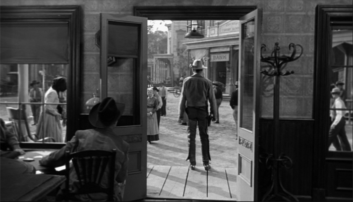
The Tin Star (1957).
DB here:
Type “screenplay writing” into Amazon and you’ll get over 6000 hits. Some of those books will be biographies of writers or screenplays of released films. But there’s still a huge number of DIY books with titles like How to Write a Movie in 21 Days and Writing Screenplays That Sell. A lot of people are apparently only one manual away from a finished script.
Screenplay manuals trigger suspicion. Can it really be that easy? Wouldn’t this be a paradise for grifters? A successful writer would hardly share trade secrets, so most of these books would be written by losers and wannabes. And if you read enough of the manuals, you’ll see the inevitable repetition of banalities. Make your protagonist “relatable.” Keep the conflicts going. Try for a twist.
Reading through them can be mind-numbing, but if you’re interested in how filmmakers tell stories, sometimes they can open up your thinking. Or so I’ll argue.
DIY scripting
The tide of manuals rose during the 1910s, when the emerging American studio system was seeking talent. The tide subsided between the 1930s and the 1960s, when screenwriting was contract labor in that system. But as filmmaking turned “independent,” ambitious people outside the industry could break in with an original script. Manuals, most famously Syd Field’s Screenplay (1979), began to pop up, and the market for how-to books expanded. Field’s book remains in vigorous circulation today, among many competitors.
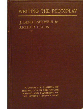 What should film researchers do with the manuals? Skepticism is warranted. Literary scholars don’t typically consider advice books and columns in The Writer to be significant bodies of evidence. But in other fields, manuals are valuable documents. Art historians study manuals devoted to composition, color preparation, and other techniques. Musicologists find evidence in primers on sonatas and fugues. At bottom, when we want to study craft practices, we look for any evidence we can find about the range of choices available within a tradition.
If your research touches on matters of style, you may find it illuminating to study the way practitioners pick solutions to practical problems. Which is to say that the manuals can point us toward norms. Norms are, I’ve argued, like a menu of more and less preferred options for treating the material. We developed this angle of inquiry in our Classical Hollywood Cinema, and now it seems well-established that the manuals can sometimes point us toward tacit norms of construction or visual style. For examples of how this can work, see Kristin’s Storytelling in the New Hollywood, my The Way Hollywood Tells It, and Patrick Keating’s Hollywood Lighting from the Silent Era to Film Noir. Many of our blog entries have also explored these paths. With screenplay manuals, we just have to be particularly careful to distinguish valuable data from bilge–which means checking the manual’s precept against many films.
And we shouldn’t expect the manuals or professional journals to identify every normalized device. For example, screenwriters now love to start scenes with friends greeting one another with “Hey” and “Hey,” but I doubt that there’s an explicit decision to avoid “Hi.” Similarly, I’ve never found anyone writing in the classic era who mentions the common Hollywood device of the double plot, with one line of action devoted to a goal-oriented activity and another, interdependent one devoted to heterosexual romance. Even the rather elaborate 180-degree classical editing system wasn’t apparently spelled out anywhere; it was learned by imitation and reinforced because it was economical and efficient. People can learn and follow rules that are simply taken for granted as “the way we do things.”
I think my soft spot for the manuals owes a good deal to my long-term affection for one item I saw in a 1913 guide. J. Berg Esinwein and Arthur Leeds’ Writing the Photoplay contains a lot of hints about standard practices of the period, but one of their diagrams changed my basic attitude about silent film technique.
The cinematic stage
In the late 1990s I became interested in the norms of scene staging in early film. I assumed that filmmakers had to call attention to story action without benefit of cutting to closer views, so I tried itemizing in a straightforward way the staging choices that could guide the viewer’s eye.
Many of the choices could be called “theatrical.” Lighting and setting could emphasize an actor’s gesture or facial expression. Performance factors operated as well, especially since actors were typically facing the viewer. Filmmakers’ reliance on these cues seemed to confirm the standard impression that early film was less “cinematic” than what came later.
Yet there were purely pictorial factors in play as well–notably, the placement of figures in the overall image. Composition of the frame, as in painting (and theatre) played a crucial role in guiding our attention.
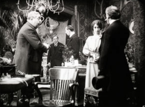
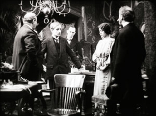
There was something else. I was fascinated, for reasons sketched here, with the depth that many scenes in “tableau cinema” displayed. Here’s a quick example from Alfred Machin’s Le Diamant noir (1913). The entire film is available from the Belgian Cinematek.
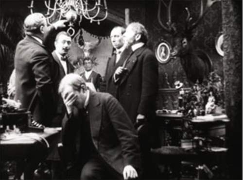
The young secretary Luc is accused of stealing the missing diamond. He protests his innocence, but the accusation will force him to leave the country.
All the cues I’ve mentioned are at work here: centered figure placement, frontally facing characters, attention-grabbing gesture, favorable setting (the rear doorway and curtains highlight Luc’s arrival), and so on. In addition, a tunnel of information bores through the frame, leading from the distance and culminating in action in the foreground.
But this tunnel couldn’t fairly be considered “theatrical,” since if the action were played on a stage, not all viewers would have the optimal view presented in the shot. Most of the audience simply couldn’t see this alignment of players. Theatrical staging tends to be lateral and fairly shallow, so that people sitting in different seats can all see the scene. A good part of planning a stage production is calculating sightlines. But in film, there’s only one sightline, that of the camera lens.
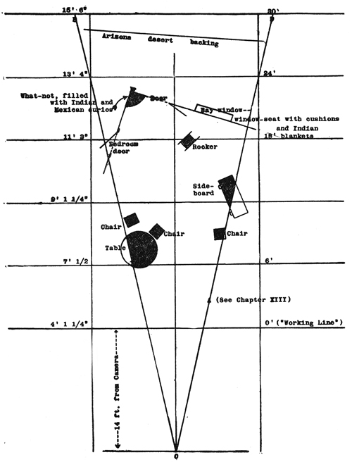
We tend to see film space as cubical, a room with a missing fourth wall. Actually, the playing space–what Esenwein and Leeds call “the photoplay stage”–is a tapering pyramid whose point touches the lens. Because the film image captures an optical projection, the space is narrow but deep. The authors provide a diagram of a scene to explain. (For the sake of clarity, I’ve removed some of their annotations; the full version is on p. 160 of their book.) The effect is of wedge shape that carves into what would be the wide space of a theatre scene.
In 1910s cinema, the camera lens (at point 0) is assumed to be some distance from the “working line,” the layer of maximal attention. For some filmmakers this line was nine or eleven feet from the camera, rather than the 14 feet assumed here. The rest of the space falls away in the distance, and depending on the lens and lighting used, these areas can be in more or less sharp focus. Filmmakers of the period often marked out the pyramid on the studio floor so that actors would know when they were out of shot.
This diagram makes explicit many of our taken-for-granted notions about film space. Someone moving closer to the camera gets larger, of course; but the figure also blocks out more and more of the background as the pyramid narrows. An actor’s forward movement on the stage inevitably takes up a small part of the overall area, but in cinema forward-thrusting action can dominate the frame.
Just as important, the fixity of the lens makes it possible to choreograph actors with a precision impossible in theatre. Luc’s confrontation with his employer in my second frame gives him pride of place, but once he’s slumped at the foreground desk, he can move his head and clear the central zone for us to see a servant waiting in the distance. In tableau cinema, staging isn’t just “blocking.” It’s blocking and revealing, a constant flow of information presented through shifting arrays of figures. I provide several examples in the lecture “How Motion Pictures Became the Movies.”
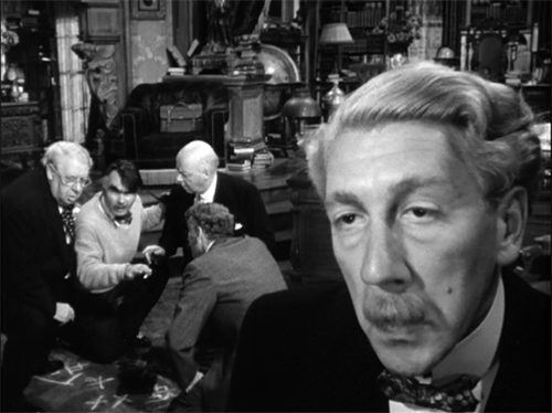
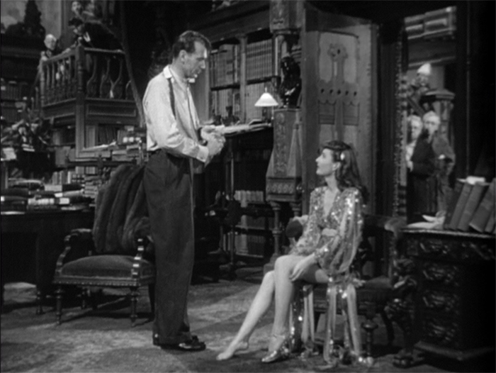
My heightened awareness of the visual pyramid made me more sensitive to staging in all periods of cinema. We might think that after the tableau cinema period, when filmmakers became more dependent on editing, their reliance on the “photoplay stage” vanished. But of course every shot, close or distant, presents us with the visual pyramid, and some filmmakers relied upon it to provide the graduated layers of space in an edited sequence. Specifically, the “deep focus” that became a favored technique of 1940s cinema around the world would seem a modernization of the principles of the 1910s recognition of wedge-shaped playing space. Here’s an outrageous example from Hawks’ Ball of Fire (1941), shot by Gregg Toland after Citizen Kane.
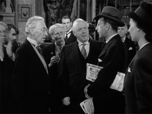
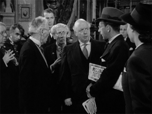
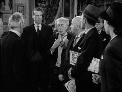
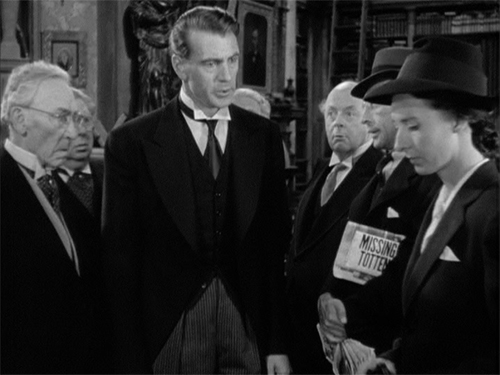
Less punchy imagery than this suggest that the skills of 1910s staging were never really lost. Another passage from Ball of Fire brings Professor Potts to the foreground in a way reminiscent of Machin’s film. Of course it helps when Gary Cooper is the tallest galoot in the scene.
Cinema’s visual pyramid becomes almost sadistic at the climax of Anthony Mann’s Tin Star (1957). The young sheriff stops a lynching by shaming the town bully. The bully responds as you’d expect, but not in the sort of shot you’d expect.
Mann’s earlier films had experimented with foregrounds thrusting out at the viewer, but this sequence carries the idea to a limit. The actor collapses against the camera, inadvertently proving how lines of cinematic sight converge at the lens–that is, at our viewpoint. Try doing this on the stage!
This entry is more a piece of intellectual autobiography than anything else. I doubt many other people were opened up to the intricacies of staging thanks to a diagram in an old book. I mean it just as an example of how reading manuals can set you thinking about the expressive possibilities of film, and taking you in directions that you couldn’t predict.
More recently, in writing Perplexing Plots, I poked into manuals for would-be fiction writers, an area that literary historians seem to have neglected. These manuals yielded a lot of principles of what people thought went into good storytelling. In particular, I found that while Henry James and Joseph Conrad were making arguments about viewpoint and chronology, so too were people writing how-to manuals. The books indicated a new awareness of these techniques among writers aiming at mass audiences.
Terry Bailey surveys and analyzes early manuals in “Normatizing the silent drama: Photoplay manuals of the 1910s and early 1920s,” Journal of Screenwriting 5, 2 (Jun 2014), p. 209 – 224. For a comprehensive overview, see Steven Price, A History of the Screenplay.
The main argument here is developed in On the History of Film Style and Figures Traced in Light: On Cinematic Staging.
Ball of Fire (1941).
How the world ended in 1916
The End of the World (1916).
DB here:
The pull-quote might be “Gripping entertainment and a vivid introduction to storytelling strategies characteristic of Danish silent cinema!” (Too long for a poster, though.) It appears in my essay on a remarkable silent film you may not know. I bet you’d like it.
Danish cinema has gripped my interest for about fifty years. Like most cinéphiles, I started with Dreyer, moved on to Christensen, and then just tried to keep up with trends leading to Scherfig, Vinterberg, Winding Refn, Anders Thomas Jensen, and Dogme. There always seemed to be a new comedy or noir or psychological drama or just weird-ass experiment to keep my loyalty (most recently, the well-crafted Another Round).
One of our first blog entries, on 20 October 2006, was devoted to an anthology on the great film company Nordisk. Soon I was chattering about von Trier’s editing in The Boss of It All and surveying a big batch of recent releases.
Now this national cinema’s silent-era history is coming steadily online. The Danes are too modest to brag about the enormous accomplishment of making so many beautifully restored classics available for anyone to watch. But here they are, accompanied by thematic essays from critics and historians.
Like other Little Cinemas That Could (Hong Kong, Taiwan. Iran), Denmark attracts me because it has shown what can be done a lot of imagination on smallish budgets. Or sometimes, biggish budgets. That’s an impulse that emerged in the 1910s when Nordisk was struggling to keep a foothold in the international market during the Great War. One result was a pair of remarkable spectacles.
A Trip to Mars (Himmelskibet, 1918) is a massive, nutty plea for peace and international—make that interplanetary—understanding. The Martians are more or less like us, except they don’t kill other creatures, which leaves them time to assemble in carefully picturesque crowds and invest in ambitious infrastructure projects.
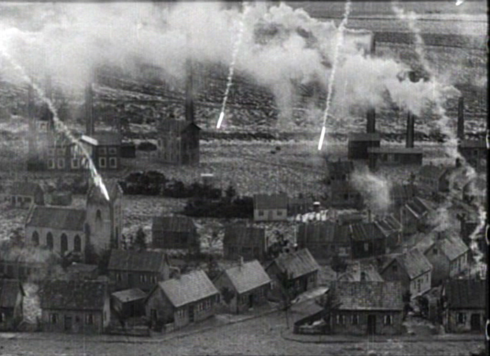
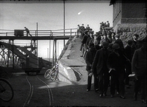
The other big Nordisk production was The End of the World (Verdens Undergang, 1916). A comet is plunging toward earth. Can we avoid collision? Or at least survive?
All the conventions of the cosmic disaster movie (Armageddon, Independence Day, 2012) are already in place. We have the innocent family, the corrupt capitalist squeezing money out of catastrophe, the scientists trying to calm the public, and of course the separated lovers who must find one another in the midst of chaos.
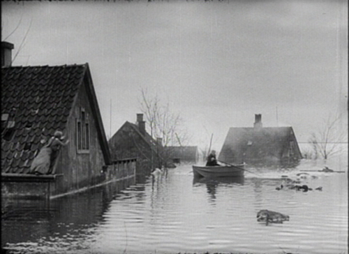
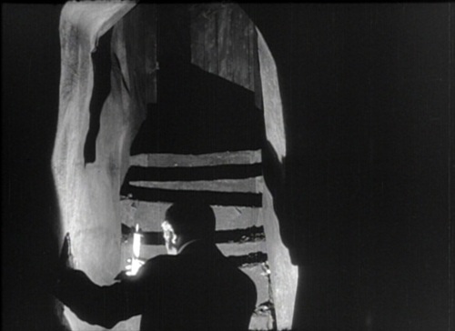
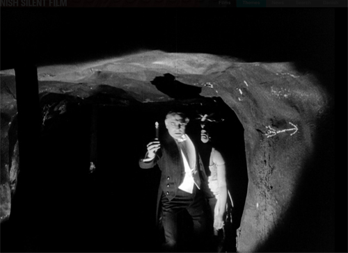
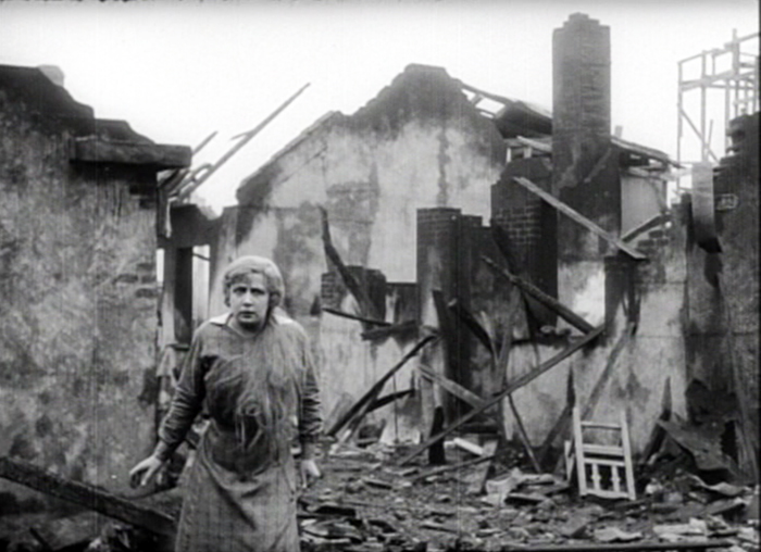
The special effects range from passable to truly impressive, as in the model of the village under fiery bombardment, surmounting today’s entry. The comet’s approach is cleverly suggested as a blip in the sky, and the shots of the heroine’s drowned neighborhood are splendid.
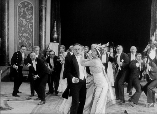
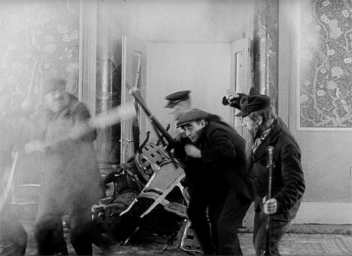
Just as remarkable are other technical achievements. The lighting in the underground passages of the capitalist’s mansion, with its Caligariesque steps, could teach the Germans a few tricks, and the miners’ fierce assault on the plutocrats is cut with rowdy, immersive vigor.
August Blom had made his reputation with Asta Nielsen dramas and another would-be blockbuster (Atlantis, 1913). He’s often considered a stolid director, but The End of the World seems to me an underrated achievement. Dismissed by many critics as over-produced, its ambitious spectacle is probably more to our current taste for overwhelming scale. For us, it seems, too much is never enough.
So I recommend to your attention this remarkable movie. As usual, I throw in a case for the 1910s as one of the great and glorious eras of film history. You can handily sample further evidence in the film links alongside the essay.
Thanks to Thomas Christensen and his colleagues at the Danish Film Archive. It was fun!
There’s always more to say about the Danes. Outside our blog entries, I’ve written about Nordisk and the “tableau aesthetic” and on early Dreyer in another essay on the Danish Film Institute site.
The End of the World (1916).
Hollywood starts here, or hereabouts
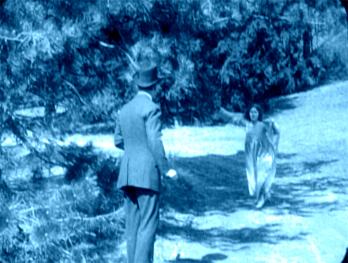
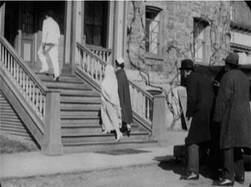
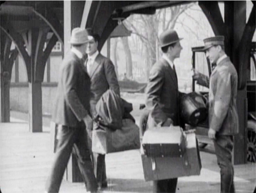
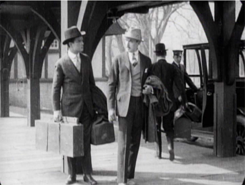
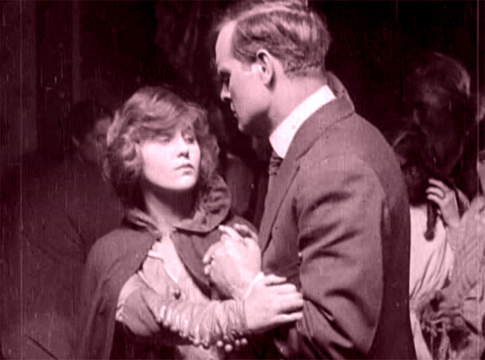
The Woman in White (1917). Toning by DB.
DB here:
Do you know Wilkie Collins’ The Woman in White? I hope so.
The traps set by this novel of mystery and suspense–a prototype of what was called “sensation fiction”–are still ensnaring audiences. Serialized in 1859-1860, it became one of the best-selling books of the nineteenth century. Merchandisers pounced on it, offering Woman in White cloaks, bonnets, perfumes, and songs. Stage and film adaptations followed. The Brits, always eager to mine classics, have created no fewer than three TV versions (1982, 1997, and 2018). There’s a pretty good Warners “nervous A” picture from 1948, with Sydney Greenstreet as the deadly, jovial Count Fosco.
The 1917 version from the Thanhouser studio is, lucky us, currently streaming on Vimeo for free. It’s also available on DVD, as part of the excellent series of Thanhouser films. The print is a 1920 re-release, but nothing significant seems missing or altered.
Apart from its entertainment value, the Thanhouser Woman in White can teach us a lot about film history. Why? Because it sums up very forcefully what American narrative cinema could do in that crucial year 1917. Forget your Griffith, leave aside (regretfully, just a moment) your Webers and Harts and Fords and Fairbankses. The mostly unheralded team of screenwriter Lloyd Lonergan and director Ernest C. Warde have given us a concise demonstration of the power harbored by classical Hollywood from the start. The storytelling tools assembled in that era remain with us still.
Women in peril
The novel’s plot is a tale of–well, plots. Counterplots too.
Collins’ book is hugely complicated, swirling together secrets, hidden identities, abduction, impersonations, illegitimate birth, bigamy, insanity, forged records, fake tombstones, assorted hugger-mugger, and timetables that even the author had trouble keeping straight. The intricacy is magnified by Collins’ decision to adopt a “casebook” structure, in which participants and onlookers write up their accounts of what they witnessed. Each piece of testimony is restricted wholly to one character’s viewpoint, and the writers are forbidden to fill in material they learned later. “As the Judge might once have heard it, so the Reader shall hear it now.” This stricture isn’t fully observed, though, because at least one witness sneaks looks at what counterparts have written.
The book’s key image is, of course, the apparition that greets Walter Hartright on the road one sultry night.
There, in the middle of the broad, bright high-road–there, as if it had that moment sprung out of the earth or dropped from the heaven–stood the figure of a solitary Woman, dressed from head to foot in white garments; her face bent in grave inquiry on mine, her hand pointing to the dark cloud over London as I faced her.
Recovering his senses (“It was like a dream”), Hartright listens to her gap-filled story and helps her find a cab. But soon he sees two bravos halt their carriage and hail a policeman. They ask: Has he seen a woman in white? No. Why does it matter? What has she done?
“Done! She has escaped from my Asylum. Don’t forget: a woman in white. Drive on.”
The first installment ends here, and the adolescent window opens a little wider.
The main plot centers on Laura Fairlie and her half-sister Marian. Hartright is engaged as Laura’s drawing teacher and they fall in love. But Laura’s father has promised her to Sir Perceval Glyde, an apparently upright aristo. (Collins was opposed to marriage as an institution. His class hatred comes out as well, though perhaps not as scathingly as it does in his other masterpiece, The Moonstone.) Once the marriage takes place, Glyde introduces into the household Count Fosco, a suave “doctor” with the habit of letting his pet mice scamper around his waistcoat. It doesn’t take long for Marian to realize that Glyde has a Secret, and she must turn detective to protect Laura from him.
Without pressing into spoilers, you can already tell that this lays down a template for the sort of story Hollywood would later love to tell. The Woman in White is a prototype for the woman-in-peril plot that we’ll find in Suspicion (1941), Shadow of a Doubt (1943), The Spiral Staircase (1946), The Two Mrs. Carrolls (1947), Sleep My Love (1948), and many 1940s classics. These in turn rely on literary works in Collins’ wake by Mary Roberts Rinehart, Mignon Eberhart, and other women authors who updated Gothic and sensation-fiction conventions for the twentieth century.
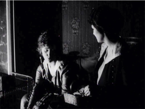
Lloyd Lonergan was said to have suggested reducing the eight-reel cut of The Woman in White to only six. It’s indeed a tightly coiled presentation of Collins’ sprawling plot. Swathes of backstory are dropped. Instead of Collins’ multiple narrators we get an omniscient narration that shifts freely across various intrigues. Fairly quickly we learn that Glyde and Dr. Cumeo (the Fosco of the novel) are scheming to switch Laura with her lookalike Anne, the woman in white. We also realize that Marian, as an obstacle to the plan, is in mortal danger. Thanks to crosscutting, we’re aware of several lines of action unfolding at once, and in a film full of spying and eavesdropping, compositions tell us who’s snooping on whom.
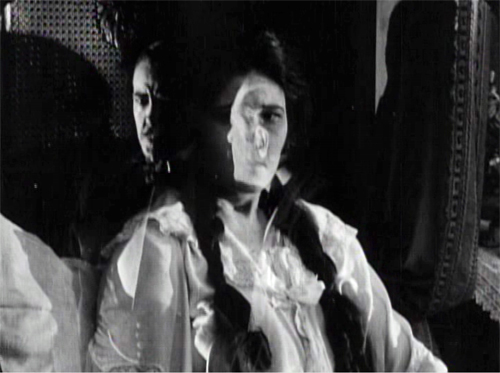
Still, some revelations are saved for the end, notably one that looks forward to the flashback-heavy 1940s. When Laura and Marian discover Glyde’s secret, their informant gives them the crucial information in a flashback, which precipitates a fiery climax. The flashback device was previewed when Marian, recovering from her collapse, recalled the plans she heard on the patio between Glyde and Cumeo; a nearly Surrealist dissolve superimposes that earlier scene.
In preferring to give us a lot of information, favoring suspense over surprise, this Woman in White is typical of Hollywood scriptwriting of the classical years. In particular, the film employs strategies later elaborated by Hitchcock (discussed here and here and here). One scene in particular displays the Hitchcock touch, years before Sir Alfred took up filmmaking. Even more specifically, let’s note that the basic situation looks forward to Notorious: a woman imprisoned by her husband and a confederate is slowly softened up for disposal.
Choreography, cutting, and showing us the door
Anyone who has viewed films with critical attention must be aware that in a film we are constantly, and without knowing it, being directed what to look at. In a stage play you may be looking at one moment at the actor who is speaking; at another moment watching the face of the person addressed, or observing the behaviour of other characters on the stage. If you go repeatedly to the same play, you may choose to look at different actors in a different order, for you certainly cannot observe everybody and everything simultaneously. But in a film, the lens of the camera is constantly telling you wha to look at–it may be a close-up of the actor’s hand, by the movement of which he betrays the emotion not visible in his face.
T. S. Eliot, 1951
The 1910s were an exciting era in cinema because, as I try to show in this video lecture, the foundations of “our cinema” were laid then. The film business, movie culture, and mass audiences settled into patterns that would hold for over a hundred years.
Just as important, the forms and styles of film craft were put in place. Among those changes was a transition from a style that relied on performance and staging to an approach more reliant on editing, on breaking scenes into many shots. The dominance of editing as a principle of guiding attention is evident from the Eliot quotation; he can’t conceive that staging, lighting, and other “theatrical” techniques could steer us to the important parts of the action.
The earlier, “tableau” approach to scenes was perfectly capable of funneling attention too, but editing had many advantages, both economic and aesthetic. By 1917, as Kristin and Janet Staiger and I argued in The Classical Hollywood Cinema, the editing-based approach had coalesced into the dominant style. The Woman in White is a nifty illustration of what an ordinary film from that year could accomplish with cutting–while still retaining vestiges of the tableau style.
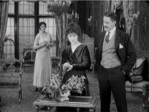
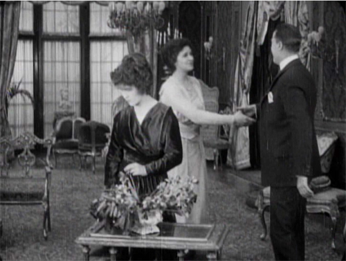
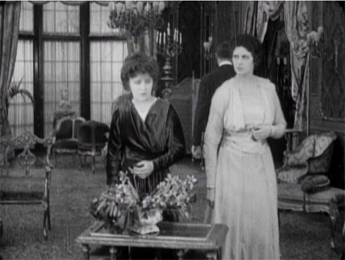
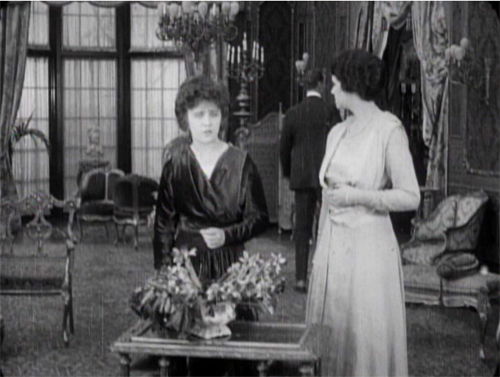
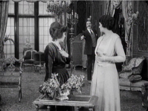
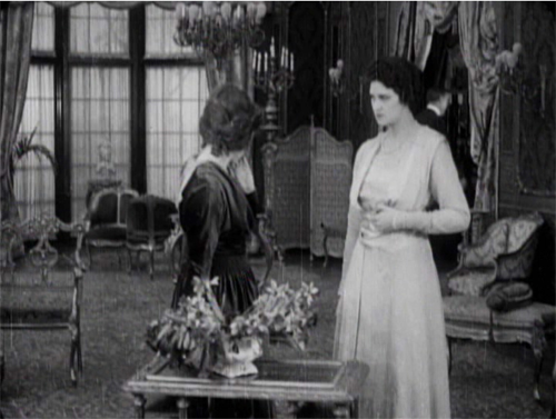
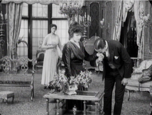
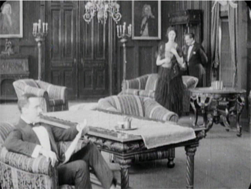
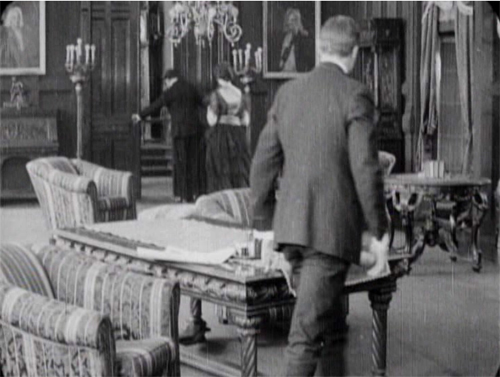
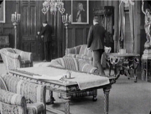
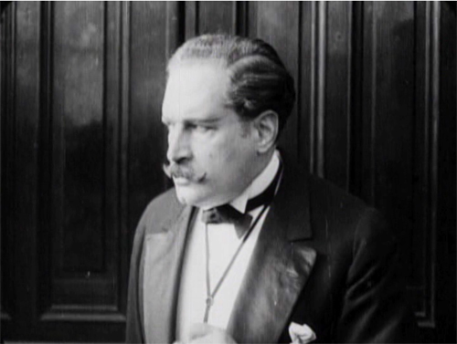
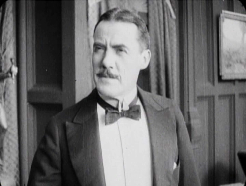
A simple example of the tableau technique comes when Sir Perceval Glyde calls on Laura and Marian. He has just kissed Laura’s unwilling hand, and Marian comes up from the rear of the shot to him. As she moves forward, Laura shifts aside slightly to clear our view of the others. This choreography doesn’t seem stilted because it expresses Laura’s withdrawal from her fiancé.
This is an example of the Cross, the staging technique that coordinates actors’ switching positions in the frame. Marian moves from frame left to frame right as Laura shifts to the left.
The tableau approach often plays between a lateral arrangement of characters in the foreground and a more diagonal array of figures packed into depth. As the shot unfolds, Marian is given a beat to take notice of Laura’s reaction as Glyde retreats to the background. She conveniently blocks his departure as she looks warily back at him.
But Glyde steps back into visibility in the distance as he says goodbye, with the women turning away from us so that we’re sure to concentrate on him. Then as the women turn back to react, he can be glimpsed leaving on the far right.
Doorways in the distance, characters advancing to and retreating from the camera, figures spreading themselves out horizontally but also blocking our view of things behind them, only to reveal them at the right moment–these tactics of the tableau became supple and subtle during the late 1900s and throughout the 1910s.
Eliot need not have worried that our attention would stray. Centering, frontality, movement vs. stasis, lighting, gesture, and other creative choices push us to notice the important elements of the scene. And these factors aren’t equivalent to what we see on the theatre stage; the optical properties of the camera lens create a very different playing space. (See here and here.)
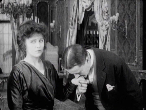
Tableau staging hung on in editing-driven cinema, but it tended to be relegated to the role of an establishing shot. The first part of this scene consists of another tableau setup broken by a cut when the slimy Glyde kisses Laura’s hand.
Here the closer view underscores his gesture while isolating Laura’s concern.
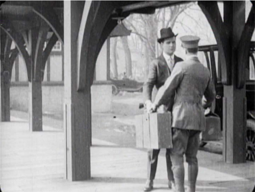
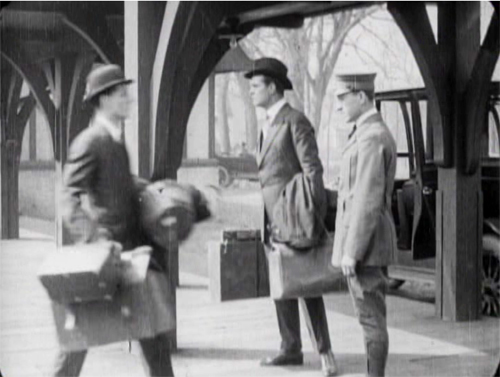
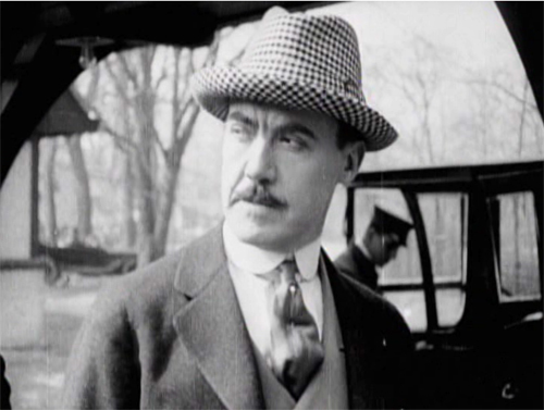
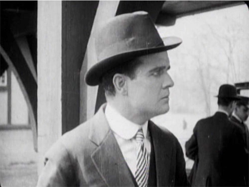
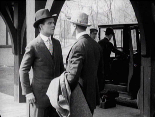
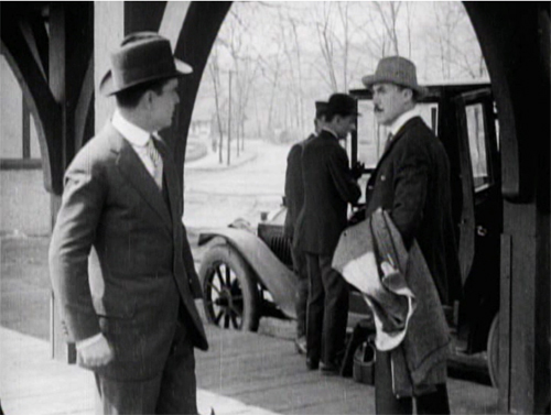
The coordination of staging and cutting is nicely shown when Walter Hartright, having resigned from his post as Laura’s teacher, accidentallly encounters Glyde at the train station. Glyde is coming to arrange his marriage to Laura, so the plot needs to establish the friction between the two men early on. As they confront each other, Glyde’s assistant loads his luggage into the cab in the background.
The first phase of the scene choreographs the men’s encounter through the Cross.
Then close views underscore the significance of the encounter.
Cut back to a two-shot that reorients us.
The fact that it’s not the same framing as we saw at the start indicates the reliance of the style on editing; even the full view is re-calibrated in light of changing shot scales. And during the shot of Walter, Glyde’s position has changed from his orientation in his medium shot. That’s the sort of flexibility editing gives you. The new arrangement heightens the clash of the two men. (Typical of the 1910s emphasis on depth, Glyde’s assistant and the driver continue to load the cab in the background.)
Glyde’s enlarged hand kiss and the inserts of the two men in the station scene exemplify the axial cut. This is a cut made along the lens axis of the camera–a straightforward enlargement of a chunk of space. It’s very common in 1910s cinema, and it’s still around, though it’s not as common as it was. Editors came to prefer analytical cuts that were more angular, yielding less the sense of a sudden enlargement. Sometimes you’ll see claims that cut-ins or cut-backs should shift the angle by 30 degrees. Yet Kurosawa and Eisenstein made powerful use of the axial cut, and it’s sometimes used as a self-conscious device. During the 1910s, some directors began using the over-the-shoulder (OTS) framing as a way to assure distinct angle changes.
The cut to Glyde’s creepy kiss is also a match on action, smoothly linking Glyde’s gesture across the shot change. This too emerged in the 1910s and became a mainstay of classic editing technique, to this day. (See my earlier post on Watchmen for contemporary examples.)
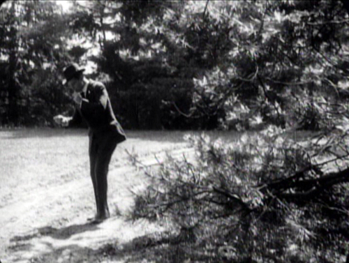
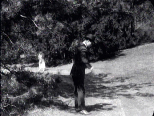
The Woman in White has several adroit matches on action, which shows that the learning curve among directors was more or less complete by 1917. When Walter first encounters the mysterious woman on the road, his striking a match is carried across a cut, with the second shot introducing her coming toward in him n the distance.
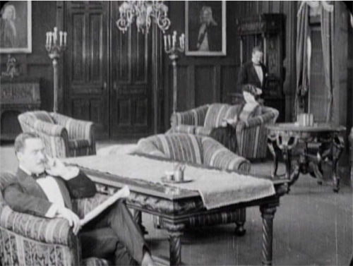
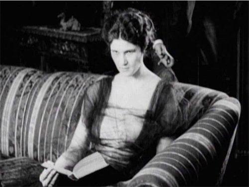
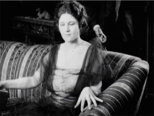
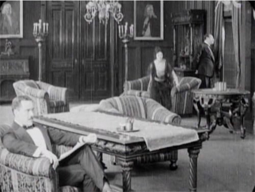
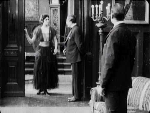
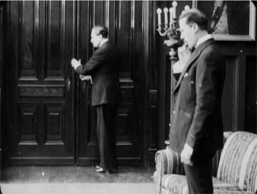
One of the most common editing devices of classical continuity is the eyeline match, and filmmakers were mastering this from quite early on. By 1917, it was part of every director’s tool kit. We can see how it works together with the other techniques in a fine, smooth scene that leads up to a crucial turning point in the action. Glyde and Dr. Cuneo are in the library, where Marian is uneasily reading a novel. Cuneo moseys over behind her, softly threatening, and an axial cut matching his movement lets us know she notices.
Another match on action brings her off the sofa. Love those delicately splayed fingers.
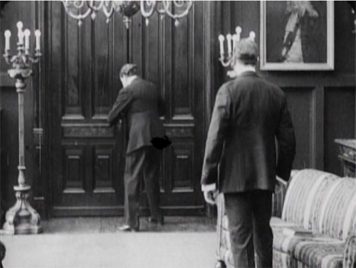
As she starts to leave, we get the Cross, as Glyde rises from his armchair and goes frame right. We now get the start of a major piece of business: Cuneo’s byplay with the sliding doors.
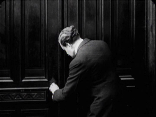
Securing their privacy, Cuneo prepares to consult with Glyde about their skulduggery. But a match on action, carried by a powerful axial cut–a huge enlargement from the extreme long shot setup–alerts us. He’s listening.
Another match on action as he busies himself with the door. A new diagonal composition prepares us for a shot of Glyde to come shortly. And yet again Cuneo is matched as he opens the door.
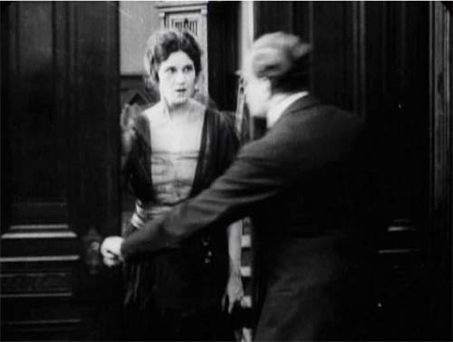
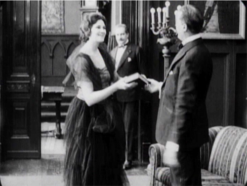
The payoff: Cuneo has detected Marian outside listening. She bluffs, saying she left her novel behind.
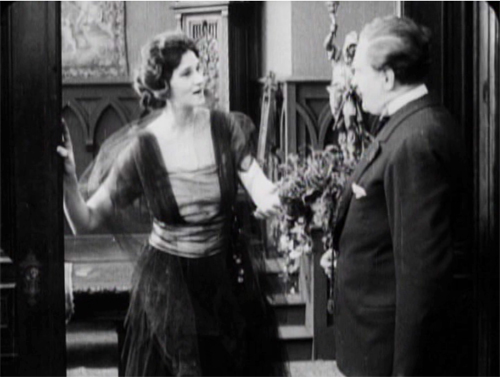
Now comes the shot that was prepared for by the over-the-shoulder long shot above. It’s not an axial cut, but a genuine reverse angle on Glyde, who’s suspicious about Marian’s return.
This is a killer shot because the camera can assume a drastically new position. It has put us in between the characters in a way we weren’t in the station scene. In effect, there’s an axis of action running from Glyde to the doctor and Marian at the door. The reverse angle is a one-off technique at this moment, but the possibility of penetrating the dramatic space in this way will be central to continuity cutting.
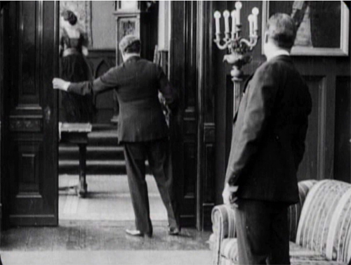
Now tableau principles can kick in. Marian comes forward and gets the book while Cuneo watches warily in the background.
In the course of the shot, Marian leaves, and this time, thanks to deep staging, we and the plotters can see she’s not eavesdropping. As she goes upstairs, Cuneo closes the door and the men can settle down to scheming.
Five matches on action, a striking eyeline match, restrained but pointed performances, and a cogent staging of the action have yielded a vigorous, engaging scene. By 1917, classical screen storytelling is well established in even a run-of-the-mill production. But there’s nothing run-of-the-mill about the suspense that follows this trim tension-builder.
1910s noir rides again
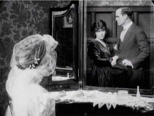
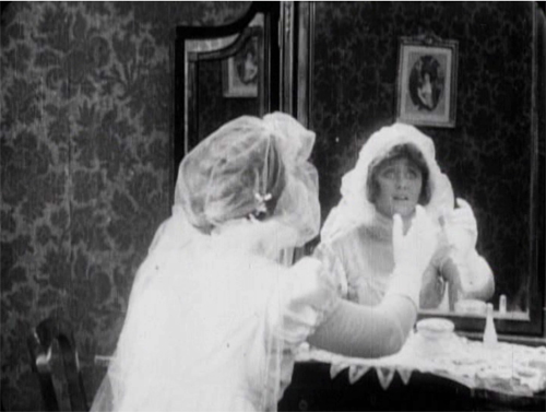
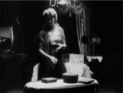
The Woman in White illustrates a lot of other 1910s innovations in pictorial storytelling. There are, for instance, some concise special effects, as when on Laura’s wedding day she sees herself and Walter in her vanity mirror.
There are also dramatic lighting effects, motivated by firelight, single lamps, and eventually lightning flashes.
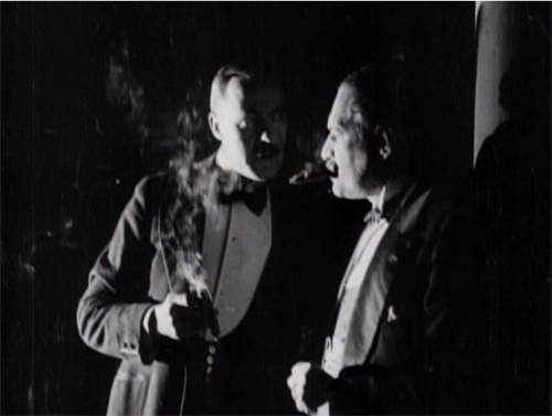
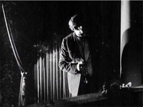
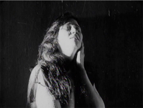
But more audacious is a sustained experiment in “1910s noir.” At that period filmmakers began associating crime and mystery with shadows and stark lighting. (See this entry.) When Glyde and Dr. Cuneo adjourn to the terrace to discuss their scheme, we get a remarkable instance. I won’t indulge my impulse to shower you with images, but I’ll try to suggest why you should try to see the sequence for yourself.
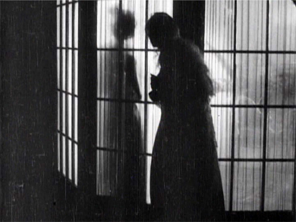
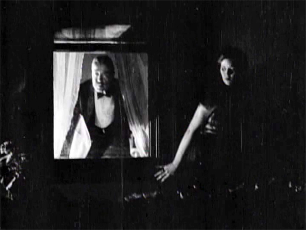
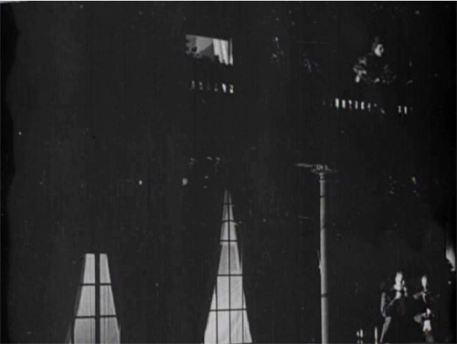
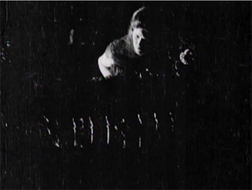
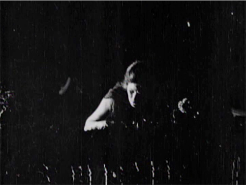
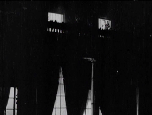
While the men smoke and talk outside, Marian has seen to the sleeping Laura before going to her own bedroom. (A sign of the film’s tidiness is the way it establishes the main characters’ rooms in the upstairs hallway. This geography becomes important when Glyde and Cuneo exchange Anne for Laura.) Opening her window, Marian hears the men outside and ventures onto the balcony above them. This yields a remarkable extreme long shot: She eavesdrops from above.
It’s a difficult shot by later standards. The main action is wildly decentered, set off on the right. But at least this framing has the virtue of preparing us for the later development of the scene, which will involve Marian sneaking along the balcony back to her room, where the light comes from.
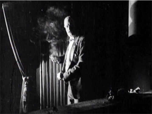
The vertical layout of the action is immediately clarified by two closer shots, a lovely chiaroscuro image of the men and the other of Marian listening.
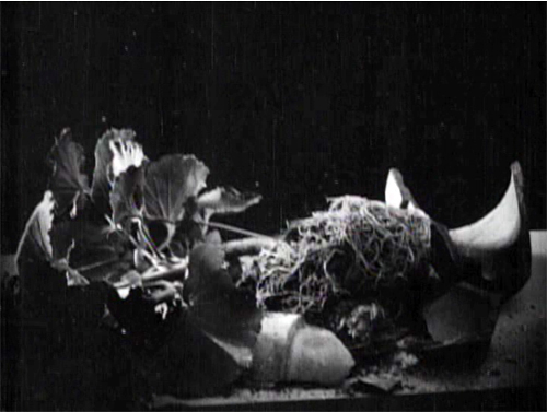
She hears just enough to suggest the men’s scheme before complications ensue. Glyde goes inside and upstairs, where he might discover her. Meanwhile, a rainstorm starts, and Marian dislodges a potted plant. Cuneo turns, in a new setup that emphasizes the railing in the right foreground, so that we can see the fallen plant. The shattered pot is given a close-up more or less from Cuneo’s viewpoint. His reaction supplies a moment of suspicion.
Marian, now drenched by rain, seems trapped between her two adversaries. Will one or both discover her?
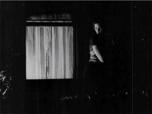
Glyde who has gone to Laura’s window and is looking around outside. We’re reoriented through a new master shot of the house, a framing that varies from the original setup. The shot shows both Laura’s and Marian’s windows lit. There follows a dark passage in which Marian creeps up to Laura’s window. That action takes place in the shot I’ve put up above.
An extra twist: Glyde looks out, but then pulls the shade. Little things mean a lot. A soaked Marian manages to crawl back through her window.
Apart from its virtuosity in handling cutting and lighting, the sequence is crucial for the plot. Marian collapses from her exposure to the storm, and her illness provides a pretext for Cuneo to isolate her while he and Glyde proceed with their plan.
I invoke Hitchcock because this long passage of suspense depends on our knowing all the relevant factors in the situation, and the possibility of a giveaway–the smashed plant–drives up the tension. What I’m really saying, I guess, is that Hitchcock expanded and deepened story mechanics that were already in place in the silent era. Apart from refining them, he managed to brand them as his own.
No film from 1917 or thereabouts is faultless in executing the new editing-based style. The Woman in White has its share of mismatches. Then again, so do movies from the 1920s to the present. (Don’t get me started on the mismatched cuts in The Irishman, 2019.) The crucial point is that the system of Hollywood storytelling and style is in place, and not in a crude form. Talk all you want about post-classical cinema, chaos cinema, post-cinema–whatever. The variations we detect today arise against a background of stable norms that remain a lingua franca of world filmmaking, and they’re headed well into their next century.
Thanks to Ned Thanhouser for years of faithful service to the studio’s legacy. Now is an ideal time to visit his site for background on this remarkable company and the efforts to preserve its output. A staggering 132 Thanouser films are available for streaming on Ned’s Vimeo channel.
To find out more about what preceded this crystallization of techniques, see Charlie Keil’s Early American Cinema in Transition: Story, Style, and Filmmaking 1907-1913 (University of Wisconsin Press, 2002).
An excellent survey of Collins’ place in the history of dossier novels is A. B. Emrys, Wilkie Collins, Vera Caspary and the Evolution of the Casebook Novel (McFarland, 2011). Her treatment of Caspary and Laura, both favorites of this blog, is just as valuable. My quotation from T. S. Eliot comes from “Poetry and Film: Mr. T. S. Eliot’s Views,” in The Complete Prose of T. S. Eliot: The Critical Edition, vol. 4: A European Society, 1947-1953, ed. Iman Javadi and Ronald Schuchard (Johns Hopkins University Press, 2018), 581.
For lots more on 1910s storytelling, see the categories 1910s Cinema and Tableau Staging. Flashbacks, the woman-in-peril plot, and other conventions that coalesce in the 1940s are discussed in my Reinventing Hollywood: How 1940s Filmmakers Changed Movie Storytelling.
The Woman in White (1917). Toning by DB.


