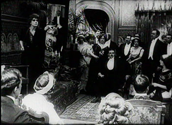
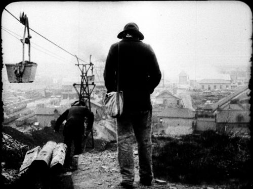
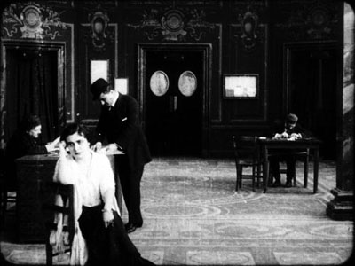
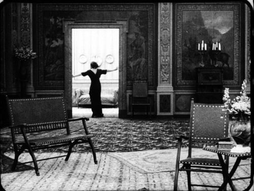
Archive for the 'Tableau staging' Category
Cinema in the world’s happiest place
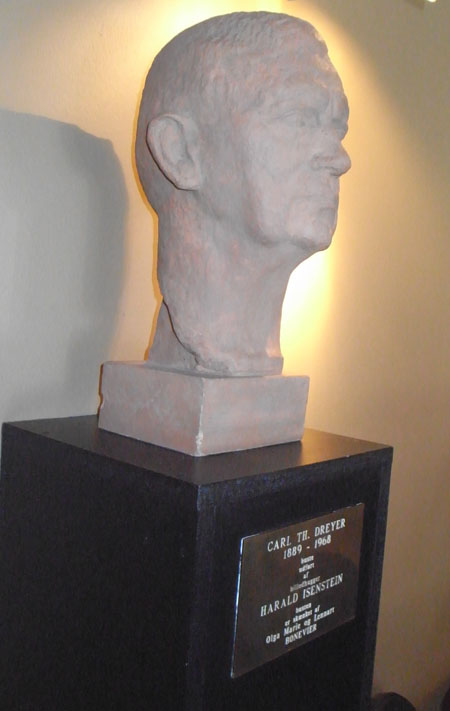
Bust of Carl Theodor Dreyer in the Dagmar Bio, the film theatre he once managed.
DB here:
Denmark was the first foreign country I ever visited. Having never been to Canada or Mexico, I took off in the early summer of 1970. Technically, I touched down in Reykjavik first because I was flying Icelandic Airlines, the Ryanair of its day. You flew Icelandic to get to Europe as cheaply as possible. Although a few people got off at Reykjavik, most of us sat patiently on the tarmac before heading off to Copenhagen.
Ever since that summer, when blinding light invaded my basement room at 4:00 AM, I’ve had a soft spot for Denmark. Ib Monty, then head of the Danish Film Archive, kindly screened for me all the Dreyers I hadn’t seen, and in spare moments I learned the joys of Copenhagen’s canals and restaurants. Six years later I would spend nearly another whole summer there watching the same Dreyer films on a flatbed viewer in the archive vaults, a somewhat renovated army fort. Many visits later, including a couple to the charming city of Aarhus, I’m still a fan of the Danes. They manage to be modest yet accomplished, hard-working yet hard-partying. They put cultural figures like composer Carl Nielsen on their currency. We’re told that they are the happiest people in the world. I don’t doubt it.
So it was with special pleasure that I returned to Copenhagen for two weeks in June. The second week was consumed by a day of talks and seminars at the University of Copenhagen and then by the convention of the Society for Cognitive Studies of the Moving Image. I’ve given two long-winded previews of the latter event, and I hope to have more coverage of it in a later entry. Today, a smorgasbord of other things Danish–without, alas, mention of H. C. Andersen, Vilhelm Hammershøi, or Victor Borge.
Chaos reigns, more or less
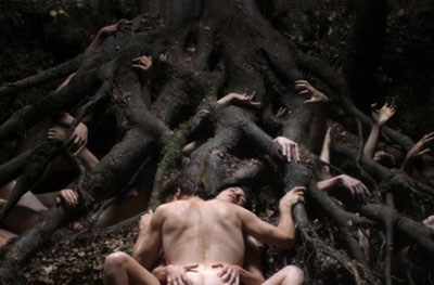
The organizers of our SCSMI event pulled off a coup: Not only were we shown Antichrist in Asta, one of the Danish Film Institute‘s fine theatres, but along came Lars von Trier to spend an hour talking about it afterward.
The film struck me as mid-level von Trier, not as good as The Idiots, The Kingdom, Dancer in the Dark, and The Boss of It All (though others would call me out for admiring this last). It lacks the element of game-playing that I enjoy in what von Trier calls his “mathematical” works, most famously The Five Obstructions. Instead, Antichrist provides perhaps the most unadulterated surge of emotion and mystical/ mythical implication to be found in all his work. It tries to be an intellectual horror film somewhat in the David Lynch mode, with a plaintive, roiling soundtrack and unearthly visions, including a fox snarling, “Chaos reigns!”
I was surprised that the elements so sensationalized by the press are pretty brief; snip out four brief shots and you’d have a ferocious but much less controversial movie. It starts as your basic two-handed psychodrama, with a couple tearing at each other. As in those other duologues Strindberg’s The Stronger and Bergman’s Persona, the film presents a fluctuating power struggle–the man trying to rule through cool rationality, the woman tapping depths of grief and repressed anger.
Yet the film goes beyond psychodrama into realms of history and myth. The grieving mother rises into demonic fury by getting in touch with witchcraft, the subject of her unfinished university thesis. Antichrist could thus be read as an exercise in misogyny or as a celebration of woman’s primal energies. (For what it’s worth, several women in our audience said they liked the film a lot.) Of course the whole thing looks very fine, with a stylized black-and-white prologue (some shots taken at 1000 frames per second), and the rest rendered in that dodging, wandering camera style von Trier and the brilliant cinematographer Antony Dod Mantle have made their own.
The entire Q & A with von Trier, moderated by Peter Schepelern, is available as an audio file on the SCSMI conference website, perhaps to be followed by a video record. Some excerpts:
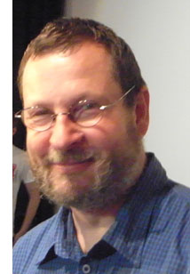 Von Trier explained that the film came out of a period of prolonged depression. “I used this project to get out of bed [every day].” Yet it’s less personal than his other works, he thinks, because it lacks his usual interest in rules, obstacles, and formal play–“a little more messy.” And he feels that by not operating the camera, he lost some intimacy with actors.
The Antichrist project seems to have brought out a mystical side of von Trier that hasn’t been so prominent in his public image. Years ago he conceived a film in which Satan created the earth, but that dissolved. Certain elements of the film, especially the emblematic forest creatures–blackbird, deer, and fox–come from his interest in shamanism. He has, he claims, traveled in alternative worlds with animal guides. “Never trust the first fox you meet.”
Is it a horror film? At least it has sources in the genre. Uncharacteristically, von Trier prepared for the project by revisiting not only classic horror films he admired, The Exorcist, The Shining, and Carrie, but also The Ring and Dark Water. He was particularly influenced in his youth by Altered States, another venture into “fantasy travels.”
He commented on how his free-camera technique imposed certain constraints in sound work. If you execute a “time cut”–that is, cutting directly to a new scene starting on a shot of a character–you must alter the sound somehow; otherwise the audience is likely to think that the action is continuous. This got me thinking about how The Boss of It All violated that convention, when each continuity cut actually yields a different sound ambience because each of the many cameras is miked separately.
Why is the film dedicated to Tarkovsky? “It was a way of getting rid of psychology.”
“I do not work with the audience in mind. I make films I would like to see myself.”
The Last is not least
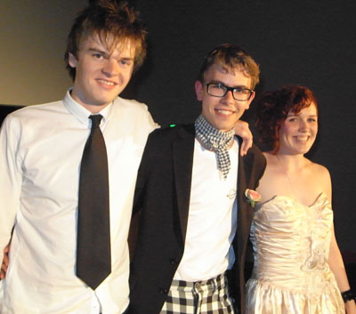
Last Friday night the filmmaking program at the University of Copenhagen gave out its student film awards. The crowd was large and boisterous, the atmosphere festive and tipsy. I was honored to present the prize for the best fiction film, which went to desidst (punning on De sidst, “The Last”). The three winning filmmakers, pictured above, were Sissel Marie tonn-Petersen, Niels Holst-Jensen, and Toke Westmark Steensen.
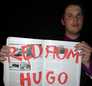
Before I read the result, though, I was confronted with some damaging evidence in a copy of Film History: An Introduction.
Peaking in the 1910s
During my first week in Copenhagen, I was viewing Danish films from 1911 to 1915. As long-time readers of this blog know, I’m fascinated by the films of the 1910s, and Denmark boasts some of the most sophisticated works of the time. Thomas Christensen and Mikael Brae of the Danish Film Archive kindly let me watch several films, mostly from the once-mighty Nordisk film company.
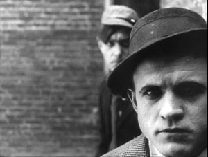
The most remarkable films I saw were Ekspeditricen (1911), Dyrekøbt Aere (“Hard-Won Honor,” 1911), and Under Blinkfyrets Straaler (“Under the Beam of the Lighthouse,” 1913). All three of these offer sophisticated examples of the dominant storytelling technique of that period, what has been called the tableau style.
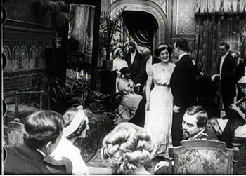
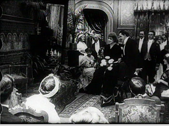
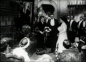
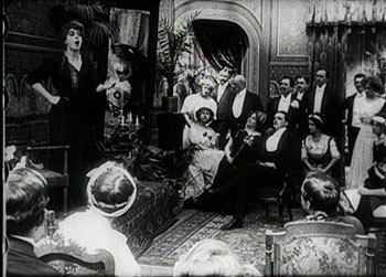
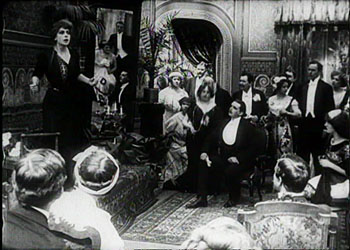
I can’t offer any visual analyses here, as I don’t have frame stills available in digital form, but here’s an example of the kind of thing I’m studying, taken from August Blom’s The Ballet Dancer (1911). Camilla (Asta Nielsen) has been seduced by Jean, a man-about-town, and she has come to sing for a society soirée at which Jean is present. But Jean is also carrying on an affair with the host’s wife.
The scene starts with the host Simon walking with his wife to the middle of the salon. Note the mirror in the upper area of the frame, just left of center.
She goes out frame right, and the host welcomes Camilla, bringing her to the central zone of the shot.
The hostess returns from off right to greet Camilla. Now we can see Camilla’s lover Jean in the mirror.
The hostess leaves the frame again, her husband settles into a chair, and Camilla starts to sing. But in the mirror we can see Jean bending over to kiss the hostess.
Soon Camilla notices Jean’s flirtation, and he straightens up.
Camilla interrupts her song, shouting and thrusting an accusing finger at the couple across the room.
I especially like the way in which Camilla’s finger points both at the offscreen couple and directly at her guilty lover’s reflection. If we haven’t noticed Jean’s infidelity yet, we certainly should now.
Today the same scene would be handled with lots of cutting and point-of-view framings, but the mirror allows Blom to pack a single long shot with simultaneous actions. (Mirrors were something of a signature device in Danish films of the period.) It’s a nice example of Charles Barr’s notion of gradation of emphasis, a principle that was at the heart of the intricate, sometimes exquisite ensemble staging we find so often in the 1910s.
Far from being a static, “theatrical” rendering of the action, the tableau technique looks forward to the deep-space stagings we associate with Welles and Wyler, as well as the distant long-take style of Theo Angelopoulos and Hou Hsiao-hsien. Studying film history is often our best way to understand the cinema of our moment, and perhaps of our future. At a more primal level, a week of prime examples of the tableau tradition gave me a fine dose of Danish happiness.
For background on the Society for Cognitive Studies of the Moving Image conference this year, try here and here. Earlier blog entries on this site have dealt with other aspects of 1910s cinema: director Yevgenii Bauer, tight staging in De Mille’s Kindling (1915), the emergence of classical film style around 1917, editing in William S. Hart movies, the years 1913 and 1918, and the triumph of Doug Fairbanks. I’ve proposed more complete accounts of 1910s staging strategies, and their impact on film history, in On the History of Film Style and Figures Traced in Light: On Cinematic Staging.
An excellent introduction to Danish cinema of this period is Ron Mottram’s 1988 Danish Cinema before Dreyer, a book which deserves to be reissued or put online. You can sample Danish 1910s films at the DFI archive database, where several clips are posted. Try these fragments: København ved nat (1910), Den frelsende Film (1916), and Kaerlighedsvalsen (1920). DVD versions of some 1910s classics, including The Ballet Dancer, can be ordered from the DFI Cinemateket shop; in the US, the titles are available for institutional purchase from Gartenberg Media. Everyone interested in silent cinema should own the Dreyer, Christensen, Psilander, and Asta Nielsen discs.
Acting up
Germinal (1913).
DB here:
Film performance is notoriously difficult to analyze. We don’t lack zesty celebrations of actors; I think especially of Richard Schickel on Doug Fairbanks and Gary Giddins on Jack Benny and Bob Hope (praised in an earlier entry). But we have long found it difficult to penetrate actors’ secrets with the same precision that we bring to editing or framing or a film’s musical score.
Actors’ performances don’t offer themselves in neat slices, the way that shots come to us. There isn’t a firm notational system that lets us capture performances the way that scores can pick out important patterns in music.
Moreover, it’s hard to dissect something that seems so evanescent, so direct, and so natural. When we see someone smile on the bus or at a party, we react immediately and without any apparent thought. When someone smiles in a movie, we’re tempted to say that we respond just as directly. But then, what is acting? Just doing what comes naturally?
Acting is clearly an art and a craft. Not everyone can do it, and comparatively few do it well. So if there is a skill or a technique involved, surely acting goes beyond ordinary behavior. And if as in other arts there are creative choices involved, there is likely to be a menu of options to be chosen from. Some of those options are likely to be conventions sanctioned by tradition. How strongly, then, is acting conventionalized? If it’s conventionalized to some degree, we should be able to analyze it.
A small-scale debate has gone on for some years in film studies about whether film acting is heavily conventionalized, even coded. Advocates of the coding view point to the fact that acting styles vary in different places and change across time. What does Kabuki performance have in common with Method acting? It’s hard to claim that there is a universally realistic acting style that naturally represents human behavior. Against this, others have argued that even if there is no absolute and unchanging standard of realism, we can speak of more or less realistic aspects of performance. Some styles, like Method are just less artificial than others, like Kabuki—even if both are somewhat stylized with respect to realistic behavior.
My own view, explored in Poetics of Cinema, is that performance traditions streamline or stylize a common core of widely shared human behaviors. In everyday life, smiling expresses happiness and/or serves as a social signal of openness. We’re unlikely to find a distant culture in which smiling expresses rage. (Of course we can have an instance of smiling concealing rage, but that would acknowledge the difference between the two states.) Some acting traditions, like Kabuki, retain certain common behaviors like weeping or proud walking, but make them more dancelike. Other acting traditions stylize core behaviors in different ways–the mumble of the Method, or the comic double-take. The differences lie in what aspects of facial expressions, gestures, gait, and the like are on the tradition’s menu, and how they become “streamlined” for expressive purposes and spectatorial uptake.
In short, I’m a moderate constructivist about such matters. I agree that we have to learn to comprehend performances in different traditions. But our learning is fast and spontaneous, not at all like learning Morse code or English, because we already have strong hunches about what a frown or a wail might express. Frowning or wailing are likely to be contingent universals of human behavior. An intuition about the meaning of the performance guides us to recognize the more stylized aspects of the presentation. When Cesare coasts along walls in The Cabinet of Dr. Caligari, we take that to be a stylized representation of the act of stalking. That construal relies on the hunch that he’s doing something we already understand–stalking–in an unusual way. Although sometimes we might have to revise our intuitions about the meaning, those intuitions serve as a point of departure. (Where do our intuitions ultimately come from? Short answer: The evolution of humans as a social species.) E. H. Gombrich put it well: “It is the meaning which leads us to the convention and not the convention which leads us to the meaning.”
Assunta Spina (1915).
The faculty and alumni of the Film Studies program here at Wisconsin keep in touch through a (closed) listserv, and thanks to Jonathan Frome we also have a wiki, to be found here. It’s just starting to fill up, mostly with ideas for teaching and examples of sample sequences to illustrate film techniques. But now the wiki has gained striking essays on acting from two scholars of early cinema.
Ben Brewster and Lea Jacobs’ book, Theatre to Cinema, took on the problem of what early feature films owed to the stage, and they concluded: Quite a lot. But instead of condemning this tradition as “uncinematic,” as most historians have, they showed that a highly engaging form of cinema arose by reshaping theatrical traditions. Specifically, Ben and Lea examined how “situational” plotting principles were carried into film, and they discussed film’s debt to the “pictorialist” drama of the nineteenth century. Many scholars had argued that melodramatic theatre was replaced by the Naturalist theatre, derived from the literary movement associated with Émile Zola. But Lea and Ben argued that a pictorialist conception of theatre and its modified form in early feature films cut across this distinction. A film that was avowedly Naturalist in plot or theme could maintain conventions of earlier forms.
Consequently, they argued that film acting of the period, even when it seemed to be moving toward greater realism, was still building on the stereotyped expressions, gestures, and attitudes of pictorialist theatre. Actors were called upon to execute vivid stage tableaus. Standard gestures had to be imbued with fresh emotional intensity, and actors were expected to move gracefully from one expressive picture to another.
Now Ben and Lea have extended their book’s argument in two in-depth studies posted on the UW wiki. Ben’s essay examines that great Capellani film Germinal (1913) and shows that it often perpetuates the poses and expressions of pictorialism, while also scaling them down. Lea tackles the work of the diva Francesca Bertini, including an analysis of the wonderful Assunta Spina (1915). Her piece is a companion to Ben’s. She writes:
While I do not doubt that the plot of Assunta Spina fits under the rubric of naturalism, and that the acting and staging of some scenes in the film also show the influence of naturalism in the theatre, it seems to me that Bertini’s technique (and incidentally that of [Asta] Nielsen as well) is more reminiscent of Bernhardt than it is of the Duse, and that the blocking and use of gesture in the film is largely governed by what Brewster and I have discussed in terms of “pictorialism” in acting.
By considering 1910s performance as a modification of theatrical poses, attitudes, and staging conventions, Jacobs and Brewster are led to remarkably detailed analyses. They have studied the conventions of acting at that period, and because they are alert to standard bits of business, so they are able to show fine points of performance that we would ordinarily miss.
They’re also able to hold the realism/ artifice dispute in suspension by concentrating on particular historical traditions. They shrewdly note that as acting styles change, the newer one is likely to be praised as more realistic than the styles it supplants. In turn, that style will be considered artificial when a still newer one comes along. For this reason, Method acting may seem less realistic and more artfully contrived today than it did in the 1950s.
Apart from the subtle discussion of acting styles, one merit of these essays is that they recognize how films can take bits and pieces of different traditions and modify them for particular ends. I’m sympathetic to this perspective. For instance, I still think that many of today’s Hollywood films, despite their contemporary look and feel, draw on principles of narration and plot structure that we can find in classic American studio cinema.
In addition, you ought to visit the site to see how detailed their analyses are and how extensively they draw on frame stills. Indeed, one reason they published these pieces online was that no academic film journal could have accommodated so many illustrations. So much the better for us. The frames, taken from 35mm prints with a Nikon lens and negative film, are among the most beautiful you’ll find on the Internets. I swiped some here.
Sangue bleu (1914).
The quotation from E. H. Gombrich comes from his essay “Image and Code: Scope and Limits of Conventionalism in Pictorial Representation,” in The Image and the Eye: Further Studies in the Psychology of Pictorial Representation (Ithaca: Cornell University Press, 1982), 289.
Kristin has written a couple of blog entries concentrating on performance, here and here.
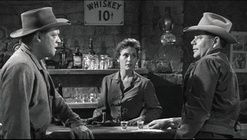
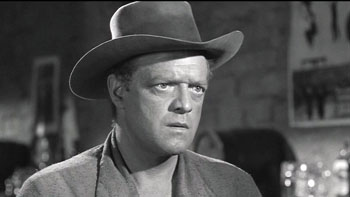
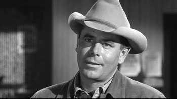
Gradation of emphasis, starring Glenn Ford
DB here:
Charles Barr’s 1963 essay “CinemaScope: Before and After” has become a classic of English-language film criticism. (1) It proffers a lot of intriguing ideas about widescreen film, but one idea that Barr floated has more general relevance. I’ve found it a useful critical tool, and maybe you will too.
Grading on a curve
Barr called the idea gradation of emphasis. Here’s what he says:
The advantage of Scope [the 2.35:1 ratio] over even the wide screen of Hatari! [shot in 1.85:1] is that it enables complex scenes to be covered even more naturally: detail can be integrated, and therefore perceived, in a still more realistic way. If I had to sum up its implications I would say that it gives a greater range for gradation of emphasis. . . The 1:1.33 screen is too much of an abstraction, compared with the way we normally see things, to admit easily the detail which can only be really effective if it is perceived qua casual detail.
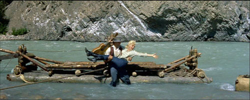
The locus classicus exemplifying this idea comes in River of No Return (1954). When Kay is lifted off the raft, she loses her grip on her wickerwork bag and it’s carried off by the current. (See the frame surmounting this entry.) Kay and her boyfriend Harry are rescued by the farmer Matt. As all three talk in the foreground, the camera catches the bundle drifting off to the right.
Even when the men turn to walk to the cabin, Preminger gives us a chance to see the bundle still drifting downstream, centered in the frame.
The point of this shot, Barr and V. F. Perkins argued, is thematic. As Kay moves from the mining camp to the wilderness, she will lose more and more of her dance-hall trappings and be ready to accept a new life with Matt and Mark. The last shot of the film shows her final traces of her old life cast away.
Cutting in to Kay’s floating bag would have been heavy-handed; if you stress a secondary element too much, it becomes primary. Barr reminds us that any film shot can include the most important information, as well as information of lesser significance. A film can achieve subtle effects by incorporating details in ways that make them subordinate as details and yet noticeable to the viewer. Or at least the alert viewer.
In Poetics of Cinema, I wrote an essay on staging options in early CinemaScope, and Barr’s idea helped me illuminate some of the strategies I discuss. (For earlier comments on Barr on Scope and River of No Return, see my article elsewhere on this site.) Today I want to consider how the notion of gradation of emphasis has a more general usefulness.
Barr contrasts the open, fluid possibilities of CinemaScope with two other stylistic approaches, both found in the squarer 1.33 format. The first approach is the editing-driven one he finds in silent film. This tends to make each shot into a single “word,” and meaning arises only when shots are assembled. Barr associates this approach with Griffith and Eisenstein. The second approach, only alluded to, is that of depth staging and deep-focus shooting, typically associated with sound cinema of the late 1930s and into the 1950s.
Both of these approaches, montage and single-take depth, lack the subtle simplicity of Scope’s gradation of emphasis.
There are innumerable applications of this [technique] (the whole question of significant imagery is affected by it): one quite common one is the scene where two people talk, and a third watches, or just appears in the background unobtrusively—he might be a person who is relevant to the others in some way, or who is affected by what they say, and it is useful for us to be “reminded” of his presence. The simple cutaway shot coarsens the effect by being too obvious a directorial aside (Look who’s watching) and on the smaller [1.33] screen it’s difficult to play off foreground and background within the frame: the detail tends to look too obviously planted. The frame is so closed-in that any detail which is placed there must be deliberate—at some level we both feel this and know it intellectually.
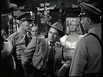
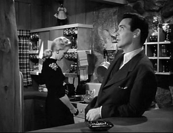
To see Barr’s point, consider a shot like this one from Framed (1947).
The shot, rather typical of 1940s depth staging, displays an almost fussy precision about fitting foreground and background together. That bartender, for instance, stands squeezed into just the right spot. (2) Barr claims that we sense a certain contrivance when primary and secondary centers of interest are jammed into the 1.33 frame like this.
We don’t sense the same contrivance in the widescreen format, he suggests. Barr assumes, I think, that the sheer breadth of any Scope frame will include areas of little consequence, whereas that’s comparatively rare in a 1.33 composition. This is an intriguing hunch, but uninformative patches of the frame may not be intrinsic to the Scope technology. Perhaps the fairly neutral and inexpressive uses of Scope that dominate the early 1950s, the sense of empty and insignificant acreage stretching out on all sides, make us expect that little of importance will be found there. Accordingly, directors can create a sense of discovery when we spot a significant detail in this stretch of real estate.
Anyhow, Barr indicates that if static deep-space staging made the frame too constrained, 1930s and 1940s directors who combined depth with camera movement created more spacious and fluid framings. He suggests that Mizoguchi, Renoir, and others anticipated the possibilities of Scope.
Greater flexibility was achieved long before Scope by certain directors using depth of focus and the moving camera (one of whose main advantages, as Dai Vaughan pointed out in Definition 1, is that it allows points to be made literally “in passing”). Scope as always does not create a new method, it encourages, and refines, an old one (pp. 18-19).
Barr believes that Scope positively encouraged gradation of emphasis, and that widescreen directors of the 1950s and 1960s have made the most fruitful use of the strategy. But he allows directors of all periods utilized gradation of emphasis, even in the standard 1.33 format. This is, I believe, a powerful idea.
Before Scope: Making the grade
Barr’s discussion of silent cinema, relying on notions of editing associated with Griffith and Soviet directors like Eisenstein, is done with a broad brush, but it’s typical of the period in which he was writing. We didn’t know much about silent filmmaking until archivists started to exhume important work in the 1970s. It’s no exaggeration to say that we haven’t really begun to understand the first twenty-five years of cinema until fairly recently.
In a way, the staging-driven tradition of the 1910s, which I’ve often mentioned on this site (here and here and here), exemplifies some things that Barr would approve of. Directors of that period made extraordinary use of the frame and compositional patterning. They staged action laterally, in depth, or both. They let shots ripen slowly or burst with new information. This approach to using the full frame (with only occasionally cut-in elements) has come to be called the tableau style, emphasizing its similarity to composition of a painting—although we shouldn’t forget that these films are moving paintings, and the compositions are constantly changing. The result is that emphasis tends to be modulated and distributed among several points of interest.
Central to this strategy, I think, was camera distance. American directors tended to set the camera moderately close, cutting figures off at the knees or hips, and by taking up more frame space, the foreground actors tended to limit the area available for depth arrangement or for significant detail.
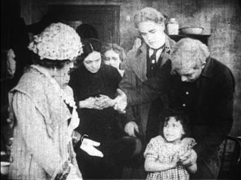
This shot from Thanhouser’s The Cry of the Children (1912) is a rough 1910s equivalent of the crammed shot from Framed above. (See also the tightly composed shots from DeMille’s Kindling (1915) here.)
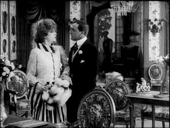
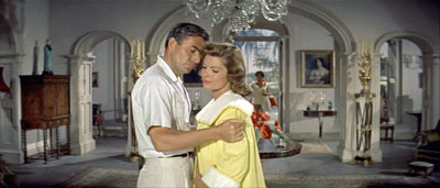
The European directors, by contrast, tended to let the scene play out in more distant shots, creating spacious framings of a sort that would be reinstituted in early CinemaScope. Consider this shot from Holger-Madsen’s Towards the Light (Mod Lyset, 1919) and another from Island in the Sun (1957).
Both, it seems to me, have the type of open composition and the foreground/ background interplay that Barr praises in his article.
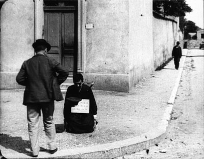
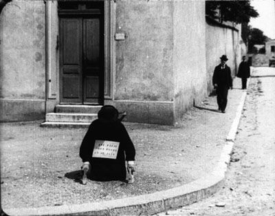
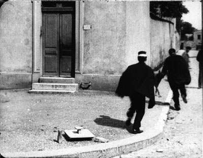
We can go back further. The Lumière brothers’ cameramen made fiction films as well as documentaries, and we occasionally find moments that suggest early efforts at gradation of emphasis. In Le Faux cul-de-jatte (1897), an apparent amputee is begging in the foreground while in the distance a man is walking down the street.
A cop crosses the street from off right and follows the pedestrian.
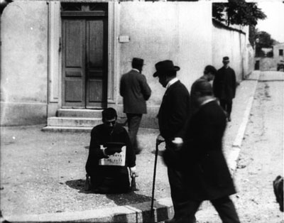
As the foreground fills up, the man we’ve seen in the distance gives the beggar some money.
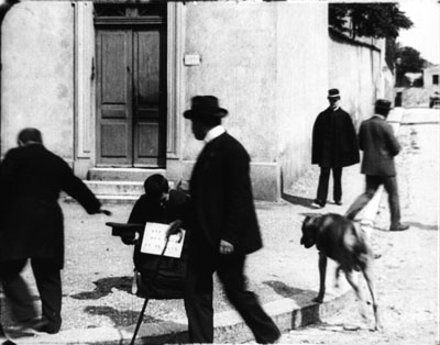
As he goes out left, the cop is still approaching, and a vagrant dog appears.
The cop comes to the beggar, partially blocking the dog, who takes care of other business. (Not everything in this movie is staged.)
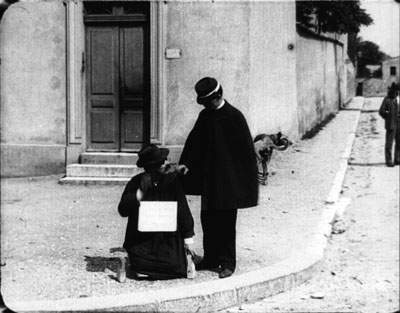
The cop checks the beggar’s papers and finds them to be suspect. The fake amputee jumps up and races off in the distance, with the cop pursuing.
As with many staged Lumière shorts, several figures converge in the foreground in order to create a culminating piece of action. Here the distant man and the cop, both secondary centers of interest, serve as a kind of timer, assuring us that something will happen when they meet at the beggar.
These are just some quick examples. We should continue to study the ways in which, with minimal use of editing, early filmmakers found ingenious ways to create gradation of emphasis. (2)
Some uses of grading
Barr, like most critics writing for the British journal Movie, was sensitive to the ways in which technique has implications for character psychology and broader thematic meanings. Kay’s bundle is one point along a series of changes in her character and her situation. But gradation of emphasis can serve more straightforward narrative purposes as well.
Consider our old friends, surprise and suspense. In the original 3:10 to Yuma (1957) Dan Evans is confronting the ruthless outlaw Ben Wade.
We get a string of reverse shots.
Then in one shot of Wade, without warning, a shadowy figure emerges out of focus in the left background.
Now we realize that Evans has been diverting Wade from the fact that the sheriff’s posse is surrounding him. Now we wait for Wade to discover it; how will he react?
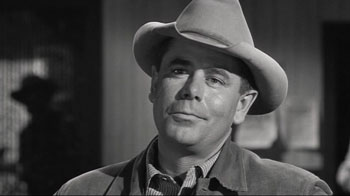
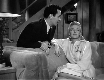
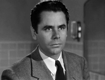
While we’re on Glenn Ford, another nice example occurs in Framed. Mike Lambert has been romancing a woman named Paula, but we know that she and her lover Steve are plotting to fake Steve’s death and substitute Mike’s body.
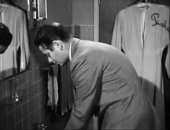
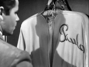
She brings Mike to Steve’s elegant country house, having presented Steve as someone she knows only slightly. When Mike goes into the bathroom to wash up, we notice something important behind him.
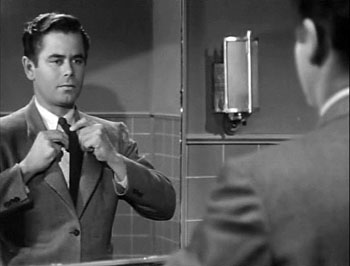
With Mike at the sink, we have plenty of time to recognize Paula’s robe. Director Richard Wallace prolongs the suspense by giving us a new shot of Mike in the mirror, with the robe no longer visible.
But when Mike turns to leave, a pan following him brings him face to face with what we saw, accentuated by a track forward.
We get Mike’s reaction shot, followed by a cut to Steve and Paula downstairs, suspecting nothing. “So far, so good,” says Steve, looking upward at the bathroom.
The rest of the scene will play out with Mike aware that they’re deceiving him. As often happens with suspense, we know more than any one character: We know the couple’s scheme and Mike doesn’t, but they don’t (yet) know that Mike is now on his guard.
This isn’t as subtle a case as River of No Return, but I suspect that it’s more typical of the way Hollywood filmmakers use gradation of emphasis. Paula’s bathrobe is a good example of what I called in The Classical Hollywood Cinema the strategy of priming: planting a subsidiary element in the frame that will take on a major role, even if initially its presence isn’t registered strongly. My example in CHC was a coat rack in the Dean Martin/ Jerry Lewis comedy The Caddy (1953). In effect, the distant pedestrian in the Lumière film is an early example of priming.
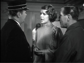
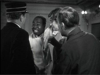
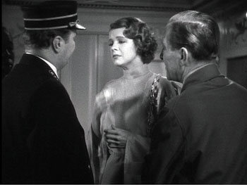
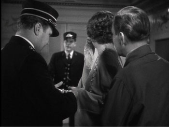
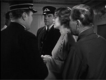
Howard Hawks adopts the Lumière technique in order to sustain a flow of dialogue in Twentieth Century (1934). Here the foreground conversation is accompanied by a procession of people emerging in the distance and stepping up to take part.
The shot concludes, as does the shot of Faux cul-de-jattes, with a retreat from the camera.
The priming of secondary elements here, the summoning of the train attendant and the conductor, obeys Alexander Mackendrick’s dictum that the director ought to construct each shot so as to prepare for what will come next.
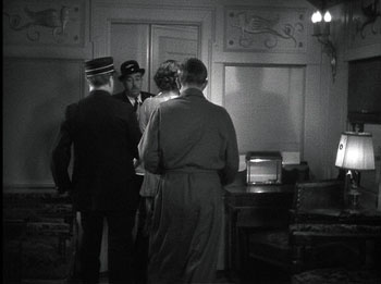
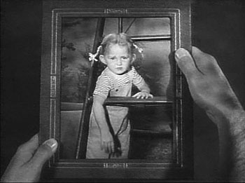
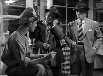
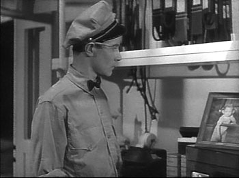
As Barr indicates, the idea of gradation shades insensibly off into general matters of cinematic expression. In The Devil Thumbs a Ride (1947), the bank robber has hitched a ride with an unassuming civilian, and they stop for gas. When the attendant shows a picture of his little girl, the robber gratuitously insults her. (“With those ears she’ll probably fly before she can walk.”)
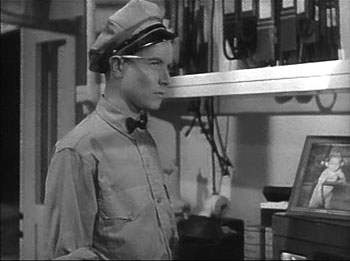
Later, the station attendant hears a radio broadcast describing the fugitive. First he has his head cocked as he listens attentively, but then his gaze drifts to the picture of his little girl.
The attendant is the center of dramatic interest, but when he looks at the picture, so do we (primed by the view of it earlier). Instantly we understand that the attendant’s resolve to call the police springs partly from an urge to get even with the man who insulted his daughter. A minor instance, surely, but it illustrates Barr’s point that the notion of gradation of emphasis leads us to consider “the whole question of significant imagery.”
The more the merrier
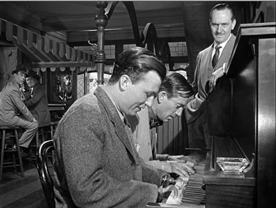
Barr seems to favor a plain style; he prefers Preminger’s quiet framings to the rococo imagery of Aldrich’s Vera Cruz (1954). Presumably the famous shot above from Wyler’s Best Years of Our Lives (1946) would be too obviously composed for Barr’s taste.
But there is merit in considering how a secondary center of interest can vie for supremacy. André Bazin declared Wyler’s shot a bold stroke exactly because its self-conscious precision created a tension between what was primary and what was subordinate. (3) The action in the foreground is of dramatic interest because Homer has learned to play the piano, and this represents a phase of his coming to terms with his wartime disability. Yet the most consequential action is taking place in the distant phone booth, where Fred breaks up with Al’s daughter Peggy. The gradation of emphasis is inverted, and we wait in suspense to find out what happens. Bazin taught us to recognize that what appears to be primary may actually be creatively distracting us from the scene’s principal action. (4)
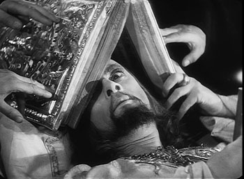
A director can also turn a primary center of interest into something secondary, but powerful. In one sequence of Eisenstein’s Ivan the Terrible I (1944), the apparently dying tsar is being prayed over by churchmen. Ever suspicious, he peers out from under the book, using only one eye.
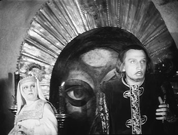
As the scene develops, Prince Kurbsky meets Ivan’s wife and tries to seduce her. In the background an icon’s eye glares out, as if Ivan is watching them.
The single eye, which is a motif we find in other Eisenstein films, becomes a significant one throughout both parts of Ivan. More generally, this device manifests Eisenstein’s conception of polyphonic montage, which explored how the filmmaker can control all the various aspects of his images and make them weave throughout the film—promoting one at one moment, demoting it at another. (5)
Barr’s essay assumes that Eisenstein’s montage stripped each image down to a single meaning. In fact, though, Eisenstein wanted to multiply the sensuous and intellectual implications of each shot by weaving objects, gestures, body parts, musical motifs, and the like into an ongoing stylistic fabric. Each shot’s gradation of emphasis can suggest thematic parallels, deepen the drama, or heighten emotional expression, just as a complex score enhances an operatic scene.
Tati as well likes to create an interplay between primary and subsidiary centers of interest. Or rather, he sometimes abolishes our sense of what is primary and what isn’t. The crowded compositions of Play Time (1967) often bury their gags in a welter of inessential details. During the lengthy scene in the Royal Garden restaurant, a minor running gag involves the dyspeptic manager. He has just mixed some headache medicine with mineral water, but the action is easily lost within the tumultuous image. Even the soundtrack cues us only slightly, with a bit of fizz among the music and crowd noise.
As the manager lowers the glass, Hulot thinks it’s pink champagne being offered to him.
Rolling the stuff in his mouth, Hulot realizes his mistake as he earns a stare from the manager.
There is so much competing sound and activity in the shot that some viewers simply don’t notice this bit at all. In Play Time, gradation of emphasis is often flattened out, leaving us to rummage around the composition for the gag.
Some final notes
Barr was not particularly interested in the mechanics of how we come to notice something in the shot, be it primary or secondary in value. In On the History of Film Style, I suggested that many aspects of technique work to call attention to any element in the field. The filmmaker can put a something in motion, turn it to face us, light it more brightly, make it a vivid color, center it in the frame, have it advance to the foreground, have other characters look at it, and so on. These tactics can work together in a complex choreography. In Figures Traced in Light, I argued that they depend on the fact that we scan the frame actively; the techniques guide our visual exploration. (6)
You can see this guidance at work in most of the examples I’ve mentioned. In River of No Return, we are coaxed into noticing Kay’s bundle because we’re cued by movement (the bundle falls and drifts off), performance (she shouts, “My Things!” and stretches out her arm), music (we hear a chord as the bundle splashes), and framing (Preminger’s camera pans slightly as the trunk drifts away). The critic can refine our sense of the effects that a film arouses, but it’s one task of a poetics of cinema, as I conceive it, to examine the principles and processes that filmmakers activate in achieving those effects.
Finally, we might ask: To what extent do we find gradation of emphasis in current filmmaking? Today’s American cinema relies heavily on editing, using a style I’ve called intensified continuity. Each shot tends to mean just one thing, and once we get it we’re rushed on to the next. The unforced openness of the wide frame that Barr celebrated has been largely banned, in favor of tight singles—even in the 2.40 anamorphic format. It seems that most filmmakers are no longer concerned with gradation of emphasis within their shots.
To find this strategy surviving at its richest, I think we have to look overseas. If you want names: Angelopoulos, Tarr, Kore-eda, Jia, Hou. (7)
(1) It was published in Film Quarterly, vol. 16, no. 4 (Summer, 1963), 4-24. Unfortunately, it’s not available free online, nor is a complete version available in anthologies, so far as I know. If you have access to online journal databases, you can find it. Otherwise, off to the library w’ye!
(2) In the Poetics of Cinema piece (pp. 303-307), I argue that some early uses of Scope tried to approximate such tightly organized composition, despite technological barriers to focusing several planes of action.
(3) See André Bazin, “William Wyler, or the Jansenist of Directing,” in Bazin at Work: Major Essays and Reviews from the Forties and Fifties, ed. Bert Cardullo, trans. Cardullo and Alain Piette (New York: Routledge, 1997), 14-16.
(4) Actually the phone booth is primed for our notice by earlier shots in Butch’s tavern. See On the History of Film Style, 225-228.
(5) For more on Eisenstein’s idea of polyphonic montage, see my Cinema of Eisenstein (New York: Routledge, 2005) and Kristin’s Eisenstein’s Ivan the Terrible: A Neoformalist Analysis (Princeton: Princeton University Press, 1981).
(6) For some empirical evidence of this guided scanning, see the work of Tim Smith at his website and in this entry on this site.
(7) I discuss some of these alternatives in On the History of Film Style and the last chapter of Figures Traced in Light.
Eternity and a Day.
PS 15 Nov. Two more items. First, if the ideas floated here intrigue you, you might want to take a look at an earlier entry on this site, called “Sleeves.”
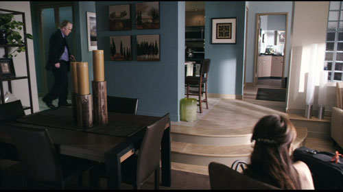
Second, I had planned to include one more example, but forgot it. In Lumet’s Before the Devil Knows You’re Dead, Andy Hanson’s life is unraveling. We follow him back to his apartment, and as he enters on the extreme left, his wife Gina is visible sitting on the extreme right, her back to us.
Gina forms a secondary center of attention, but the key to the upcoming action is revealed in a third point of interest: the black suitcase pressed against the right frame edge. The shot tells us, more obliquely than one showing her leaving the bedroom with the case, that she is planning to leave him. Lumet’s image, reminiscent of the framing of the trunk in River of No Return, shows that gradation of emphasis isn’t completely dead in American cinema. The orange scrap of yarn, knotted to the handle for baggage identification, is a nice touch of realism as well as a welcome color accent that further draws the suitcase to our notice.
Lucky ’13
The Mysterious X (1913).
Each film is interlocked with so many other films. You can’t get away. Whatever you do now that you think is new was already done in 1913.
Martin Scorsese, quoted in Scorsese by Ebert (University of Chicago Press, 2008), 219.
DB here:
Most historical events don’t abide by clocks and calendars. Seldom does a trend begin neatly on one date and end, full stop, on another. Changes have vague origins and diffuse destinies. When Kristin and I, along with others, argued for 1917 as the best point to date the consolidation of the Hollywood style of storytelling, we realized that it’s a useful approximation but not as exact as a Tokyo subway timetable.
It’s just as hard to argue that a year constitutes a meaningful unit in itself. Who expects anything but tax laws to change drastically at midnight on 31 December? Yet evidently our minds need benchmarks. Film historians, while being aware that trends are slippery and dating is approximate, have long spotlighted certain years as particularly significant.
Take 1939, which has become a sort of emblem of the peak achievements of Hollywood’s Golden Age. We had Gone with the Wind, The Wizard of Oz, Only Angels Have Wings, Stagecoach, Gunga Din, Wuthering Heights, Dark Victory, Young Mr. Lincoln, Beau Geste, Mr. Smith Goes to Washington, Ninotchka, The Roaring ‘20s, and Destry Rides Again. I’d watch any of those, except Gone with the Wind, right now—something I find it hard to say about most Hollywood movies I’ve seen in 2008.
Another strong year is 1960, with La Dolce Vita, L’Avventura, Rocco and His Brothers, The Apartment, Elmer Gantry, Spartacus, Psycho, Exodus, The Magnificent Seven, Shadows, Late Autumn (Ozu), and The Bad Sleep Well (Kurosawa). Arguably, 1960 was owned by the French, who gave us Breathless, Shoot the Piano Player, Paris nous appartient, Les Bonnes femmes, Le Trou (Becker), Moi un noir (Rouch), and Letter from Siberia (Marker). (See Postscript.)
Let’s go back still further. Researchers sometimes split the silent-film period in two, with the first stretch, usually called “early cinema,” running up to 1915 or so. (1) The second phase then runs roughly from 1915 to 1928. (2) So for many historians the year 1915 functions as a tacit pivot-point, and it is remembered not only for The Birth of a Nation but also for Regeneration, The Tramp, Kindling, The Cheat, Les Vampires, Daydreams (Yevgenii Bauer), and several William S. Hart films. But another year holds a special place in the minds of silent film aficionados.
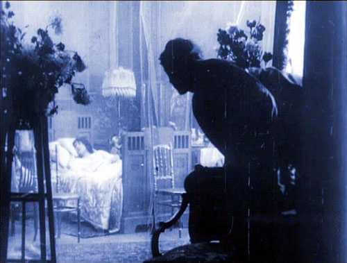
Over a decade ago, the annual Days of the Silent Cinema festival (Il Giornate del cinema muto), took 1913 as its focus. (3) It was an extraordinary year. Denmark produced Atlantis (August Blom) and The Mysterious X (Benjamin Christensen). From France we had L’Enfant de Paris (Leonce Perret), Germinal (Albert Capellani), and Louis Feuillade’s Fantomas series. Germany gave us Urban Gad’s Engelein and Filmprimadonna and Franz Hofer’s obsessively symmetrical The Black Ball. The staggering set of Italy’s Love Everlasting (Ma l’amor mio non muore!, Mario Caserini) was matched by the breadth of Enrico Guazzoni’s Quo vadis? In Russia Bauer released Twilight of a Woman’s Soul. American audiences saw Traffic in Souls (George Loane Tucker) and Death’s Marathon and The Mothering Heart, from a guy named Griffith. Several historians would argue that 1913 marked the first major achievements of film as an artform.
Two outstanding films of that annus mirabilis have recently been issued on US DVD. One is a striking accomplishment, the other a flat-out masterpiece. Both discs belong in the collections of everyone who’s serious about cinema.
Your call is important to us
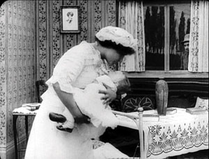
A wife and her baby are alone in an isolated house when a tramp breaks in. As the wife tries to keep the invader at bay, her husband happens to telephone and learn what’s happening. He scrambles to return home. He steals an idle car, and its owner, accompanied by police, race after him. We cut rapidly between the besieged mother and the husband’s frantic drive, as he is in turn pursued. Just as the tramp is about to attack the wife, the husband bursts in, followed by the police. The family is saved.
This is the story of the 1913 one-reel film, Suspense, co-directed by Lois Weber and Phillips Smalley. If the plot sounds familiar, it’s probably because you know that one of D. W. Griffith’s most famous films, The Lonely Villa (1909) tells the same basic tale.There are still earlier versions, including one, The Physician of the Castle (Le Médécin du chateau, 1908), which may have inspired Griffith. The ultimate source seems to be a 1902 play by André de Lord, Au téléphone (translated here).
So Weber and Smalley are reviving an old idea. Their task is to make it fresh. How they do so has been studied in depth by Charlie Keil in his book Early American Cinema in Transition: Story, Style, and Filmmaking, 1907-1913.I can’t match Keil’s subtlety, and it’s better that you see the film first, so I’ll drop only some hints, pointers, and comments.
We’re inclined to say that The Lonely Villa influenced Suspense. But maybe we can capture the situation in a more illuminating way. The art historian E. H. Gombrich has suggested that we can often trace the relationship between artworks in terms of schema and revision. (4) A schema is a pattern that we find in an artwork, one that a later artist can borrow. Most often, later artists copy the schema straightforwardly. This is the usual way we think of influence. But instead of replicating the schema, the next artist can revise it. She can elaborate on it, strip it to its essence, drop parts and add others, whatever—in order to achieve new purposes or evoke fresh responses.
In The Lonely Villa, Griffith uses crosscutting to build suspense. He cuts among the thuggish vagrants trying to break in, the wife and daughters trying to hold them off, and the father learning by phone of the situation and then plunging after them with a policeman. The obvious pattern here is the principle of alternation between different lines of action, all taking place at the same time and converging in a last-minute rescue.
So Smalley and Weber inherit the crosscutting schema, but they go beyond simply copying it. They find ways to revise it, some quite surprising. These revisions aim to create more tension and to dynamize the situation.
The obvious option, at least to us today, would be to use more shots than Griffith does; we think that increasing the cutting pace builds up excitement. Interestingly, however, Suspense uses only a couple of more shots than The Lonely Villa within a comparable running time. (5) We usually expect that American films become more rapidly cut as the 1910s go on, but this isn’t the case here. Shortly, I’ll suggest why.
Smalley and Weber recast Griffith’s parallel editing in several ways. For instance, The Lonely Villa prolongs the phone conversation between husband and wife, building suspense through the husband’s instruction to use his revolver on the thugs. Suspense, by contrast, doesn’t dwell on the telephone conversation but devotes more time (and shots) to the chase along the highway. That’s because Weber and Smalley have complicated the chase by having the husband pursued by the irate motorist and the police, something that doesn’t happen in the Griffith film.
Just as important, Smalley and Weber revise the crosscutting schema through framings that are quite bold for 1913. For example, Griffith’s tramps break into the house in long shot, and they move laterally across the frame.
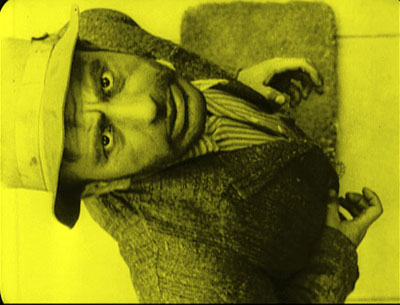
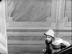
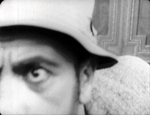
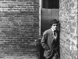
But Weber and Smalley’s tramp sneaks steadily up the stairs, into a menacing extreme close-up.
Elsewhere, Suspense gives us close views of the wife and of the door as the tramp breaks in. There are oblique angles on the back door of the house, and virtually Hitchcockian point-of-view shots when the wife sees the tramp breaking in and he looks straight up at her.
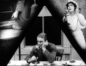
What struck me most forcibly on watching the film again was the way in which Weber and Smalley’s daring framings serve as equivalents for parallel editing. In effect, they revise the crosscutting schema by putting several actions into a single frame. The most evident, and the most famous, instances are the triangulated split-screen shots. They cram together three lines of action: the wife on the phone, the husband on the phone, and the tramp’s efforts to break into the house (here, finding the key under the mat). (6)
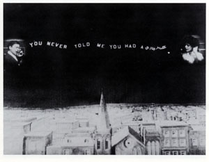
Split-screen effects like this were common enough in early cinema, especially for rendering telephone conversations. Eileen Bowser points out that the three-frame division was one variant, with a landscape separating the two callers. (7) Her example is from College Chums (1907).
But my sense is that in early cinema the split-screen effect was used principally for exposition or comedy, not for suspense. Smalley and Weber have made this framing substitute for crosscutting: instead of giving us three shots, we get one, showing the plot advancing along different lines of action. These splintered frames function much like Brian De Palma’s multiple-frame imagery in Sisters, Blow-Out, and other films. There’s also the nice touch of the conical lampshade over the husband’s head, providing a fulcrum for the composition.
Earlier in the film, instead of crosscutting between the tramp outside and the wife indoors, Suspense gives us both in the same shot, with the tramp peeking in behind her.
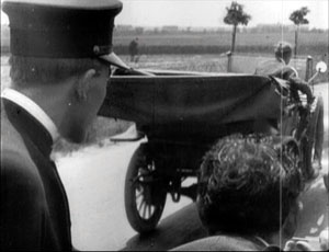
A more ingenious revision of the crosscutting schema comes during the shots on the road. Instead of cutting between the father in the stolen car and the police pursuing him, Suspense packs them into the same frame. This is done not only in long shot but also in striking depth compositions.
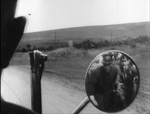
Flashiest of all are the shots showing the pursuers reflected in the rear-view mirror of the father’s car as he races ahead of them.
Again, a single framing has done duty for two shots, one of the father looking back and another showing the cops coming closer to him. By compressing several lines of action into a single frame, our 1913 film doesn’t need to use significantly more shots than the 1909 one.
These are just a few of the imaginative ways in which Weber and Smalley have recast their standard situation. I could have considered as well the unobtrusive use of the knife as a multi-purpose prop, the echoed shots of mirrors, and the shrewd employment of repetitions in the intertitles.
It would take an early-cinema specialist like Keil to trace out all the connections between Suspense and other films of its era. One among many would be the fact that Griffith wasn’t exactly standing still between 1909, the year of The Lonely Villa, and 1913. For instance, his Battle at Elderbush Gulch, made about the same time as Suspense (though released in 1914), displays far more rapid cutting than Weber and Smalley attempt. Griffith also employed a swelling advance to the foreground, like that of the tramp shot I showed above, in The Musketeers of Pig Alley (1912).
Here, Smalley and Weber seem to have replicated a schema that was believed to ratchet up tension, the so-called looming effect.
The very title of the film exhibits self-consciousness about its artistic purpose. By 1913, it seems, American filmmakers were confident enough in their skills to announce their aims. We want, the title seems to say, to arouse you, to make you wait, hanging there, for the resolution. We know how to tell a twelve-minute story cinematically. The film seems uncannily to anticipate all those one-word titles that Hitchcock invoked to unsettle us–Suspicion, Spellbound, Psycho, Frenzy. As in a Hitchcock movie, the fact that we are pretty certain how Suspense will turn out doesn’t seem to dissipate our anxiety. (For more on this paradox of suspense, see this entry.)
Tunnel vision
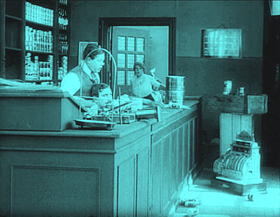
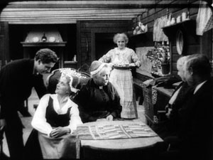
It was during the Pordenone 1913 season that the full brilliance of Victor Sjöström’s Ingeborg Holm hit me. I had seen the film a couple of times before and found it deeply moving in its restrained treatment of a poignant situation. The film traces the dissolution of a family. Sven Holm is doing a brisk retail business, but his health problems, along with a thieving clerk, plunge the family into poverty. When Holm dies, his wife Ingeborg must take the children into the poorhouse, and from there they are boarded out to foster families. Her plight worsens over the years, and its sorrowful depths are revealed when her son, now grown, returns to visit her.
Ingeborg Holm has long been recognized as a milestone in European film, not least for its effect on improving Sweden’s treatment of the poor. (8) The acting style is muted and delicate, with no mugging or arm-waving. For long periods, the main actors turn from the audience. (9) Just as impressive are the poised compositions, sustained in unhurried long takes. These give what is essentially a bourgeois tragedy a kind of majestic relentlessness. Watching, I remembered what Dreyer had admired in Sjöström’s Ingmar’s Sons (1918):
The film people here at home shook their heads because Sjöström had really a boldness to let his farmers walk heavily and soberly as farmers do. Yes, they used up an eternity to come from one end of the room to the other. (10)
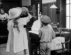
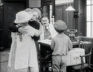
But sitting in the Cinema Verdi in 1993, I spotted yet another level of artistry. Knowing the story of Ingeborg Holm, I was able to watch the shots unfold. I could study how Sjöström was unobtrusively moving characters so that they became shifting centers of interest. Although he didn’t cut in to close-ups, he harmonized his actors’ movements so that at one point you noticed Ingeborg, at another her husband. Performers spread themselves across the frame, arrayed themselves in depth, turned from or toward the camera. Most subtly of all, one actor might mask another one, driving our attention to other parts of the frame. Sjöström could sustain this intricate play of blocking and revealing for minutes on end.
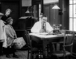
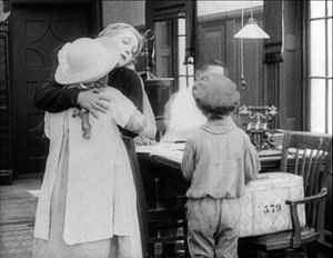
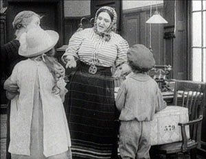
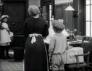
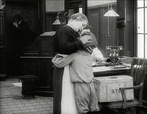
My favorite example of this tactic is the three-minute passage showing Ingeborg’s daughter and son taken away by new mothers. You can read the whole discussion on pp. 191-195 in On the History of Film Style (1997), but here is an excerpt, with stills intercalated. (These stills, grabbed from the DVD, lack a little on the left. The film has been printed and reprinted so many times, and now fitted to the TV monitor, that it has lost some information along that edge.)
Ingeborg’s entry with her children from the rear doorway establishes the trajectory that will be followed during the scene, as foster mothers come in and take away the children. (Again, the scene is built around movements toward and away from the camera.) In a brilliant stroke, Sjöström immediately plants the young son in the foreground, back to us. The boy will stand there immobile for this first phase of the scene, occasionally serving to block the superintendent.
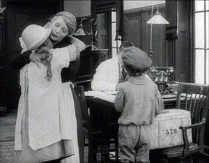
Ingeborg buries her face in her daughter’s shoulder at the precise moment the foster mother enters from the rear left. She passes behind Ingeborg, and as she is momentarily blocked, the superintendent twitches into visibility, handing the woman a document to sign.
During the signing, when the woman is briefly obscured, the superintendent shifts position again and Ingeborg lifts her face once more. Then Ingeborg and her daughter move slightly leftward as the foster mother comes forward.
This phase of the scene concludes with the departure of the daughter and the embrace of Ingeborg and her son in the foreground, once more concealing the superintendent.
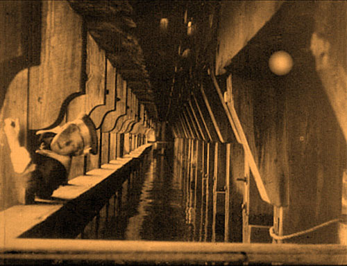
Granted, I picked one of the film’s most exactingly staged scenes, but there are several other examples. Consider the climax, when the adult son comes to visit Ingeborg: the camera position and staging ask us to recall the scene I’ve just mentioned. Or take a look at the handling of the space behind the counter in the various scenes in the Holms’ shop. One instance surmounts this section.
This choreography is hard to catch on the fly: by the time you notice a change, what prepared for it has gone. To understand the overall dynamic, we must reverse-engineer the effects, moving backward from the result to the conditions. As I studied the film, it became clear that creating shifting centers of interest was basic to the scenes’ effects. All the finesse of acting, both solo and ensemble, would come to little if we weren’t primed to watch the most important area of the shot. Directors of the 1910s became supremely skilful in guiding our eye from one major story point to another within the fixed frame.
Some of the tactics of guiding our attention could be borrowed from other arts. Painting and theatre supplied certain schemas, like placing an item in the center of the picture format and turning faces toward the viewer. But some tactics for directing our eye relied on capacities that were as “specifically cinematic” as cutting was argued to be. Theatre is staged for many sightlines, but cinema is staged for a single one, that of the camera lens. That fact allowed directors to organize the unfolding action in depth, prompting the viewer to notice things at many distances from the camera.
It also allowed a precise blocking and revealing of information that would not work on the stage. In a live theatre performance, the slight shifts we detect in the Ingeborg Holm scene would be apparent to only very few viewers; people sitting in other vantage points wouldn’t see them. For another example of this phenomenon, go elsewhere on this blogsite.
There’s a more basic explanation of what’s going on. Cinematic space is a result of optical perspective, like the space of classic painting. The actors may seem to be standing in a cubical space, but in fact they move within a tipped-over pyramid, with the tip resting at the camera lens. They work inside a ground area that’s the shape of a slice of pie. Here’s a reminder from The Black Ball.
When there are figures close to the camera, as here, they fill up more of the frame, indicating that the field of view has narrowed. Filmmakers of the 1910s had discussed this property of their “cinematic stage,” so as researchers we can confirm that the control of position and timing we observe on screen results from the firm intentions of the makers. They might have echoed Uccello, the Renaissance artist who bent over his drawings late at night and exclaimed: “How sweet a thing is this perspective!”
Suddenly the tableau tradition made sense to me. Directors had to organize both the two-dimensional composition and the tapering three-dimensional playing space in front of the camera. The purpose was to create ever-changing centers of interest, laterally and in depth, flowing along with the key moments in the unfolding action.
By studying the same tactics in Feuillade, Bauer, and others, I found that these principles offered a fruitful way to understand much of what was happening in the films of the tableau era. The dynamic of schema and repetition/revision was at work as well, since I found earlier, more rudimentary uses of these principles; these were then refined during the 1910s. Moreover, the idea helped me generalize beyond that era and analyze later directors, including Mizoguchi Kenji and Hou Hsiao-hsien, who also used staging to shape the viewer’s experience. The results can be found in On the History of Film Style and Figures Traced in Light. Those books largely owe their existence to that flash of awareness kindled by Ingeborg Holm. (11)
We can’t reconstruct Sjöström’s stylistic development with much confidence. (12) His first directed film, The Gardener (Trädgärdsmästaren, 1912) survives, but I saw it before I knew how to watch 1910s movies in this way, so I can’t comment on it. Of the twenty-six films he made from 1912 to 1917, nearly all have been lost. Apart from Ingeborg, I have managed to see Havsagamar (The Sea Vultures, 1916). This retains aspects of the tableau tradition, but virtually no scenes display the intricate staging of his 1913 masterpiece.
In the late 1910s, judging by the films we have, Sjöström seems to have moved quickly toward continuity editing in the American vein. (13) The Girl from Stormycroft (Tösen frän Stormyrtorpet, 1917) contains extended passages of analytical editing, and the scenes display a freedom of camera setup one seldom sees in European cinema of the period. Sjöström clearly understands the principles of continuity down to the smallest detail. For instance, he not only uses the frame-edge cut (the cut that lets a character exit one shot and enter another, as the body crosses the frameline); he accelerates it. Our heroine leaves the kitchen, and in the shot’s final frame she hits the right edge. Another director would have had her exit the frame entirely and held the kitchen shot a little longer, to give her time to get to the next room. But Sjöström simply cuts to her already in another room, completing her trajectory.
Sjöström presumes that the constant pace of her approach and the vector of her movement will smooth the shot-change. It does, but few directors of that day would had such confidence that our mind would create continuity of motion.
During this summer’s archive viewing, I spent some time studying Sjöström’s cutting in The Girl from Stormycroft and subsequent films. I may offer some more thoughts later. For now I’ll just say that in these early years we seldom encounter such a versatile director, one who mastered the tableau tradition and then moved, with apparently little effort, to nuanced continuity editing. More generally, examining his technique isn’t a dry exercise. We never lose by studying craftsmanship. Sjöström’s films succeed because his style carefully guides our moment-by-moment apprehension of the heart-rending stories he has chosen to tell.
Have I convinced you to surrender your credit-card number? Suspense is available in a dazzling Flicker Alley collection, Saved from the Flames, compiled from the French series Retour de flame. Ingeborg Holm comes with a tinted print of the estimable Terje Vigen (A Man There Was) on a DVD from Kino. The latter disc includes vibrant scores from Donald Sosin and David Drazin.
(1) For the purposes of the outstanding Encyclopedia of Early Cinema (New York: Routledge, 2005), the editor Richard Abel considers that the early cinema constitutes the period from film’s invention ca. 1894 to the mid-1910s.
(2) Silent films were still made into the 1930s, notably in Russia and Japan—a situation that shows the rough-and-ready quality of period divisions.
(3) For an informative series of articles around the 1913 theme, see Griffithiana no. 50 (May 1994).
(4) Gombrich proposes these ideas at various points in Art and Illusion: A Study in the Psychology of Pictorial Representation, new ed. (Princeton: Princeton University Press, 2000). The book is a milestone in twentieth-century humanistic inquiry.
(5) The Lonely Villa (1909) has, in the version I’ve seen, 54 shots in a 750-foot reel (that is, about twelve and a half minutes at 16 frames per second). Suspense has nearly the same number of shots, 56, in about the same running time.
(6) Sharp-eyed readers will recognize one of these shots as Fig. 5.82 in Film Art: An Introduction, 8th ed. (New York: McGraw-Hill, 2008), 187.
(7) Eileen Bowser, The Transformation of Cinema 1907-1915, vol. 2 of History of the American Cinema (New York: Scribners, 1990), 65.
(8) For more background on the film, see Jan Olsson, “‘Classical’ vs. ‘Pre-Classical’: Ingeborg Holm and Swedish Cinema in 1913,” Griffithiana no. 50 (May 1994), 113-123.
(9) Kristin wrote about this technique in “The International Exploration of Cinematic Expressivity,” in Film and the First World War, ed. Karel Dibbets and Bert Hogenkamp (Amsterdam: Amsterdam University Press, 1995), 65-85. She also discusses it in our Film History: An Introduction, 2d ed. (New York: McGraw-Hill, 2002), 67.
(10) Carl Dreyer, “A Little on Film Style,” Dreyer in Double Reflection, ed. and trans. Donald Skoller (New York: Dutton, 1973), 133.
(11) I was probably primed for this by lectures presented by Yuri Tsivian, who has long been studying mirrors in 1910s cinema and calculating how they revealed offscreen space.
(12) Detailed information on Sjöström’s relation to the film industry in these years can be found in John Fullerton’s epic Ph. D. thesis, The Development of a System of Representation in Swedish Film, 1912-1920 (University of East Anglia, 1994). See also Fullerton, “Contextualising the Innovation of Deep Staging in Swedish Film,” Film and the First World War, ed. Dibbets and Hogenkamp, 86-96.
(13) Several people have analyzed Sjöström’s editing. Ben Brewster and Lea Jacobs’ Theatre to Cinema: Stage Pictorialism and the Early Feature Film (Oxford: Oxford University Press, 1997), 133-136 shows how cutting supports the acting in a crucial scene of Ingmar’s Sons. Tom Gunning’s essay “‘A Dangerous Pledge’: Victor Sjöström’s Unknown Masterpiece, Mästerman,” in John Fullerton and Jan Olsson’s anthology Nordic Explorations: Film before 1930(Sydney: John Libbey, 1999), 204-231, argues that Sjöström’s cutting gives his characters a degree of psychological opacity. Most recently, in an unpublished paper Jonah Horwitz discusses patterns of performance, composition, and editing in Terje Vigen (1917).
Twilight of a Woman’s Soul (1913).
PS 31 August: Some corrections. David Cairns writes to point out that the triangle at the top of the frame in the Suspense split-screen isn’t a lamp but simply the shade behind the father’s head, cropped by the masking. Wishful thinking on my part, I’m afraid. By the way, David has an intriguing movie giveaway going on his site.
Roland-François Lack corrects dates on two of my Greatest French Hits from 1960: “The great Marker from that year is Description d’un combat, not Lettre de Sibérie (1958), and likewise Rouch’s Moi un noir is from 1958.” Thanks to him and David. To my original list, I should probably have added Cocteau’s Testament d’Orphée, released in 1960.


