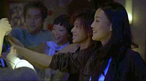
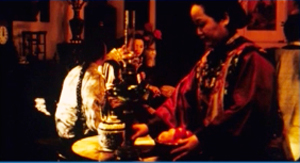
Archive for the 'Tableau staging' Category
Murnau before NOSFERATU
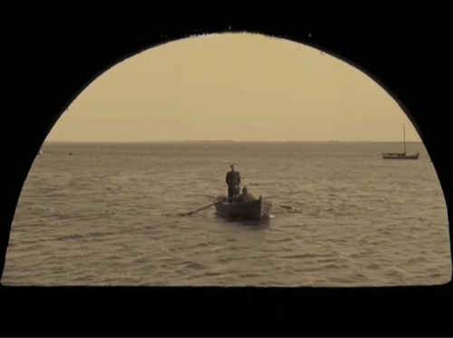
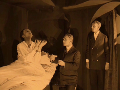
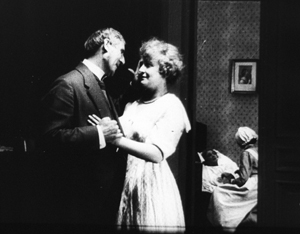
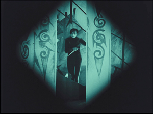
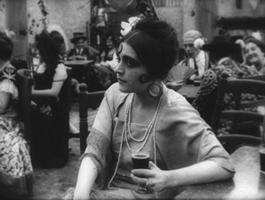
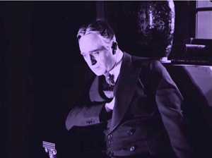
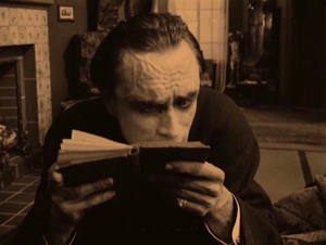
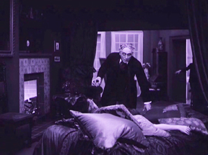
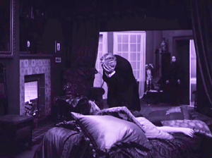
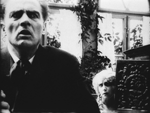
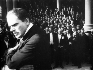
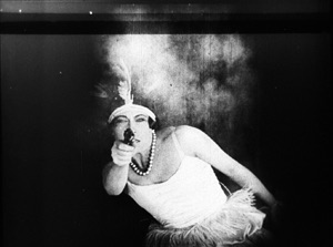
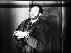
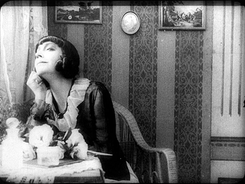
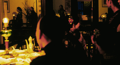
Der Gang in die Nacht (The Dark Road, 1921).
DB here:
For many decades, The Last Laugh (Der Letze Mann,1924) was the F. W. Murnau film. If you were a film buff in the fifties or sixties, that staple of film societies and college courses was probably the first Murnau you saw. Eventually you got to those French favorites, Sunrise (1927) and Tabu (1931). Nosferatu (1922) and Faust (19226) came along in there somewhere. Tartuffe (1926), great as it is, has always seemed a specialized taste.
Today, I think, Nosferatu is probably the one everyone sees first. It fits the modern taste for horror movies, and it is genuinely scary. It popped up in music videos, got remade by Herzog, and will be forever remembered for the vampire’s spindly, ratlike silhouette and the wholly fitting name of the performer, Max Schreck.
Eventually Murnau aficionados caught up with lesser-known Burning Soil (Der brennende Acker, 1922), Phantom (1922), and The Finances of the Grand Duke (Die Finanzen des Grossherzogs, 1923), the latter two available on good DVD versions. But what about Murnau’s very earliest films?
Of the nine films he made before Nosferatu, only two survive more or less complete. They circulated in unsatisfactory condition for many years, but Schloss Vogelöd (The Haunted Castle, 1921), which Murnau made just before Nosferatu, eventually emerged in a splendid restoration based on original negative material. Now we have a digital restoration of Murnau’s earliest surviving film, his seventh: Der Gang in die Nacht (The Dark Road, or “Path into Darkness,” 1921).
And what a restoration it is! The Munich Film Museum’s team has created one of the most beautiful editions of a silent film I’ve ever seen. They started with four reels of camera negative, then carefully integrated material from other sources. Thanks to digital manipulation, I couldn’t tell where the alien footage was.
You look at these shots and realize that most versions of silent films are deeply unfaithful to what early audiences saw. Compare a shot from the lamentable YouTube bootleg and a shot from this version. The smallness of the YouTube image here improves it; blow it up on a big monitor and it goes horribly blotchy.
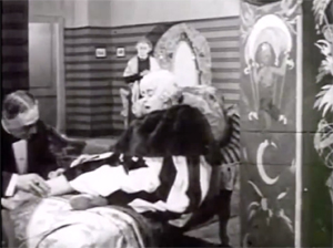
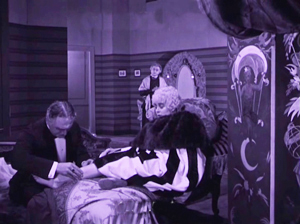
In those days, the camera negative was usually the printing negative, so what was recorded got onto the screen. The new Munich restoration allows you to see everything in the frame, with a marvelous translucence and density of detail. It will project fine big. Forget High Frame Rate: This is hypnotic, immersive cinema.
Der Gang in die Nacht will be shown in the Museum of Modern Art’s “To Save and Protect” series on 13 and 14 November. If you can get there, you should go! If not, we can hope that the film will soon appear on DVD. Remember DVDs?
Silents, golden
The canonized classics of Expressionist cinema, from The Cabinet of Dr. Caligari onward, are superb films, no doubt. But there are lots of other major movies from the period. The German industry flourished during World War I, and even the postwar inflation encouraged a burst of moviemaking. Hundreds of films were produced every year. I’m no expert, but of the seventy or so I’ve seen nearly all are fascinating and surprising. From the brute force of Der Tunnel (1915) and the demented monumentality of Homunculus (1916) to the weirdness of Algol and I.N.R.I. (both 1920), the peculiar pleasures of Sappho (1921) and the splendors of The Nibelungen (1924), I’ve been captivated by this cinema. Caligari is merely the dark and spiky tip of a mighty iceberg.
Der Gang in die Nacht is derived from a screenplay by the Danish scenarist Harriet Bloch. It’s an example of the “nobility film,” a genre cultivated by the Nordisk studio where Bloch worked. In these stories, an upper-class man becomes obsessed with a working-class woman, and she leads him to disaster. The most famous “nobility film” of the era is Dreyer’s The President (1919), when the genre was already somewhat old hat.
In Murnau’s film, the well-to-do protagonist is Dr. Eigil Börne. Uneasy with his courtship of his wispy fiancée Helene, he plunges into an affair with the dancer Lily. They move to a seaside cottage, where their idyll is interrupted by the spectral figure of a blind artist. (Regrettably, we never get a glimpse of his paintings.) The Painter is played in nearly full Cesare mode by Conrad Veidt: drifting through the landscape and clutching at the air. After Dr. Börne restores the Painter’s sight, Lily falls in love with him and leaves Börne. Unhappiness ensues for all, and yes, suicide is involved.
With only four delineated characters, the plot’s emphasis falls on their reactions to each others’ changing feelings. It’s a surprisingly unsensational melodrama, with no blackmail, threats of murder, or guilty secrets. It’s just about people’s emotional attachments waning, often for reasons they don’t understand. The drama of shifting, elusive moods looks fairly modern.
The playing is deliberate, with a range of acting styles. The drooping Helene, the skittish Lily, the somnambulistic Painter, and the raging Börne may seem to come in from four different movies. But Börne is on a knife-edge from the start, when he nervously leaves Helene. He broods fiercely during his night at the theatre, well before he succumbs to Lily’s charm. Like Scotty in Vertigo, he’s ready to fall. And as a complacent bourgeois, he doesn’t grasp the romantic fascination projected by the passive, wraithlike Painter. Nor is Lily merely flighty and treacherous. The Painter seems to stir her to a genuine love very different from her flirty seduction of the doctor. Helene, mournful throughout all this, is last seen in her sickbed stroking a newspaper photograph of Börne.
The concentration on four characters, each trembling with uncertainty, and the meshing of their moods with the stormy seaside, suggested to one observer an analogy with current stagecraft.
Here for the first time filmmakers try to incorporate the Kammerspiel [chamber play] into a film play. A strong, affecting plot with only a handful of characters has been developed through the smallest psychological details, the unity of locale and characters, the intimate interweaving of the atmospheric mood and the characters’ emotional life. All this has been achieved with the most sophisticated use of facial expression and cinematic direction.
1921 is usually taken as the year that the Kammerspiel genre began, with Scherben (Shattered) and Hintertreppe (Backstairs). Der Gang in die Nacht, which came out before either of these, isn’t usually considered an example. It’s interesting that the review I quoted, based on a December 1920 press screening, sees Murnau’s film as anticipating the trend. Perhaps the more rigorous concentration of time and space in the later films made critics take them for purer prototypes of the genre.
Knowing this background, I think, makes Der Gang in die Nacht more intriguing than it might at first seem. But another context is important too. The film shows Murnau’s debt to an important stylistic tradition. What he did with it is in sync with other filmmakers learning their craft at the same time. (Some spoilers ahead.)
Tableau + insert = proto-continuity
During the years 1908-1920, many filmmakers relied a “tableau” style of filmmaking. The used long shots and long takes, with the actors shifting in expressive patterns around the setting. The tableau might be broken up with titles or close-ups of letters or diaries, but the drama is developed through action played out in the distant framing.
Early historians, and many still today, portray this approach as merely “theatrical.” In fact, because of the way the camera lens creates a pyramidal playing space (the tip resting on the lens), the tableau approach is very different from proscenium theatre, which has a wide, lateral playing space. The result is a choreography of figure movement in breadth and depth that is no less “cinematic”—that is, specific to the film medium—than editing.
Want clarification? There’s a video lecture here, and more discussion in these entries.
In the course of the 1910s, however, filmmakers started to alter this approach. For one thing, they started to cut up the tableau more. American filmmakers were most radical, often abandoning the long shot altogether and building scenes out of several partial views—medium-shots and close-ups. But most European filmmakers were more conservative. They began to use what researchers have come to call the scene-insert method.
The tableau (the “scene”) would be interrupted by one or two closer views of a face or gesture, before returning to the main framing. Almost always the inserted shot is taken from the same camera position as the long shot. The cut is “axial,” along the lens axis of the camera. It enlarges a slice of space given in the wider view, then usually cuts back along the axis to reestablish the tableau.
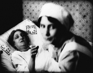
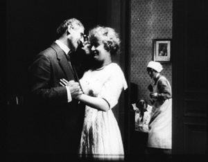
Here’s a simple example from Joe May’s delightful serial Die Herrin der Welt (Mistress of the World, 1919-1920), when a nurse in the room in the background rises.
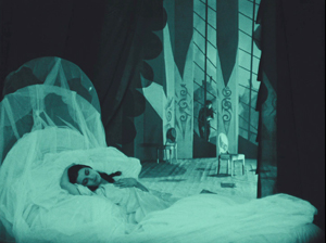
The axial approach is used throughout Caligari too. When Cesare invades Jane’s bedroom, we cut straight in and then cut back as he approaches.
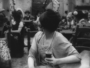
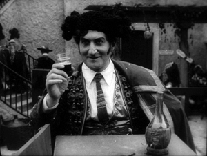
In Kristin’s book Herr Lubitsch Goes to Hollywood (available as a pdf) she traces several instances in other German films, as in this passage from Carmen (1919), with Don José way back at the rear of the tavern–but still on the lens axis.
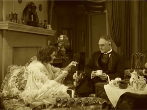
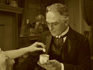
Der Gang follows the scene-insert method often. The only closer view during Lily’s tea flirtation with Börne emphasizes her teasing gesture and his reaction.
The result is a minimal version of analytical editing, a sort of rough, proto-continuity approach to breaking up a scene into details. It can be thought of as a transitional phase toward a fully “classical” style of staging and cutting, and indeed in the 1920s more and more European filmmakers adopt versions of the Hollywood method.
Already, we can see some filmmakers thinking in terms of an establishing shot rather than a tableau. Murnau’s long shot below is probably too far distant to permit a complex play of depth of the sort we see in Caligari and Carmen. It’s designed, we might say, to be cut into.
During this transitional period, we find films exploring the scene-insert method in intriguing ways. The most evident is the tendency to make the cut-in shot very close.
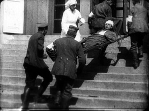
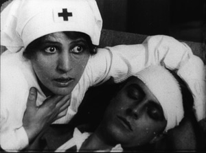
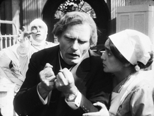
In Paul Leni’s Dr. Hart’s Diary (Das Tagebuch des Dr. Hart, 1918), for instance, we get a rather distant shot showing the wounded Count Bronislaw carried out of the ambulance, followed by a very tight medium-close-up of him and Jadwiga, the Red Cross nurse.
An American director would have been more likely to soften this sudden enlargement with a mid-range two-shot of the couple before providing the intense close-up of their faces.
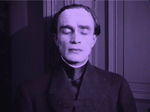
This abrupt jump into a surprisingly close view isn’t uncommon in European cinema of the period, and it’s particularly salient in German films. The insert is often taken with a wide-angle lens, which can accentuate the curves and edges of a face. Murnau’s fondness for the wide-angle lens is a constant throughout his career. A fragment from his first, lost film The Blue Boy shows a wide-angle depth composition, and there’s an astonishing wide-angle close-up of the distraught painter in Der Gang.
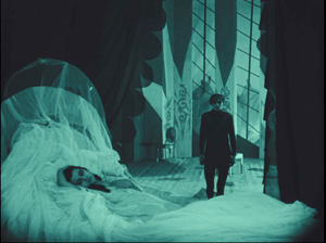
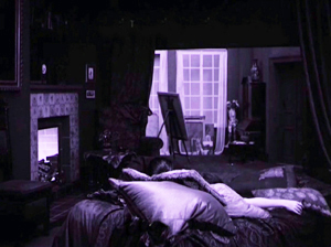
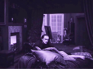
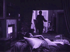
Like many directors working in this line, Murnau balances the power of the sustained long shot with the momentary spike of the closer view. A good example comes in the beautiful passage when Börne discovers that Lily is dead. The setup is given in a classic tableau framing, with only her arm extending out from cushions on the divan. Then the Painter’s head lifts into center frame from behind the pillows, a slow revelation of his pain.
After alternating cuts to Börne hammering at the door, the Painter rises and floats to the door in the back wall. (The rear door is a fixture of the tableau tradition, as it allows for dynamic movement in depth within the visual pyramid.) Once the doctor is admitted, he rushes forward and pauses as the Painter glides into the background.
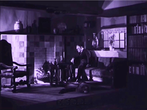
As Börne wails, Murnau pushes us into the parlor to the Painter, standing in the distant corner like an upright corpse—an alternative version of grief.
Like many films of the period, not only German but also French and Italian ones, Der Gang in die Nacht exploits the resources of the tableau—the graceful, expressive coordination of actors who perform with their whole bodies—while saving the blunt force of the isolated face for a climactic accent. No wonder that film theorists of the late ‘teens and early 1920s were fascinated by close-ups; they were seeing a great many vivid ones.
Not haunted, just mysterious
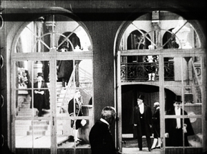
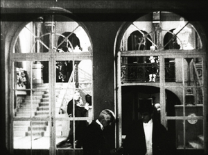
There were a lot of variants on these techniques. As if to give us the tableau and the wide-angle insert in a single frame, Robert Reinert cultivated a looming deep-focus style that suggests a Citizen Kane of the 1910s. The first frame is from Opium, the last two from Nerven (both 1919).
And the extraordinary Weisse Pfau (The White Peacock, 1920) of E. A, Dupont comfortably switches from a dizzying gridded tableau (two men arriving at a theatre lobby, caught in an architectural Advent calendar) to a violent climax using highly fragmented editing.
By 1921 the simplest version of the tableau-plus-insert method was rapidly going out of favor. To get a sense of how techniques were changing at the time, you should watch Murnau’s Schloss Vogelöd (1921) immediately after seeing Der Gang in die Nacht.
The plot is a bit friendlier to our pulpy tastes, involving a past murder that is brought to light during a country house party. (No spooks haunt the castle, just the lingering effects of mysterious death.) Again, there’s a chamber-play aspect to it. Virtually all the action is confined to the mansion of the host, von Vogelschrey, and plays out in a couple of days and nights.
Schloss Vogelöd was released only three months after Der Gang in die Nacht. In the sparkling restoration provided by the Murnau Stiftung, Schloss runs almost exactly as long as the earlier film. But what a difference! I count 231 shots in Der Gang, with 163 of those being images, not titles. I count 511 shots in Schloss, with 356 of those being images. Assuming a common projection speed, the later film is cut over twice as fast.
The sheer number of shots is important, but the crucial factor is that many of the shots in Der Gang retain one particular framing, interrupted by titles or a diary or letter insert. Not only does Schloss have more shots, it has more varied setups. Murnau is shifting his camera positions more often, as were his peers Lang and Dupont, along with other Europeans and of course the Americans.
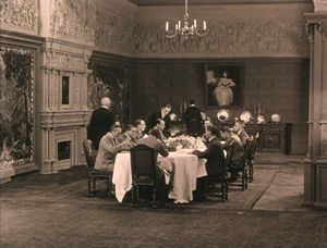
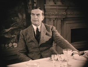
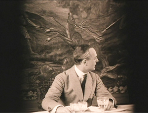
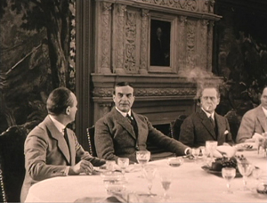
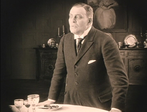
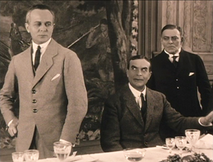
Here’s an example. At a meal, the vengeful Count Oetsch hints that Baron Safferstädt is the murderer. The scene runs about three minutes and contains 16 shots and five titles, played out across six distinct setups. I sample them here.
In a loose sense, the cuts are axial, enlarging or de-enlarging parts of the table as observed from one general orientation. (The judge who stands up and looks left is at the foot of the table.) But within this overall orientation, there’s a variety of setups we don’t find in Der Gang. We aren’t far from that spatial ubiquity and adherence to an axis of action that was pioneered in 1910s Hollywood and would become increasingly common in Europe during the 1920s. The downside: The development of more finely broken-down scenes led to a loss of the complex choreography within a single shot that was common in the early 1910s.
Der Gang in die Nacht was filmed in August-September of 1920; Schloss Vogelöd was shot in February and March of 1921. In between Murnau made Marizza, genannt die Schmuggler Madonna (Marizza, called the Smuggler’s Madonna, not shown until 1922). The fragments of this that have survived are very rudimentary filmmaking, much simpler than anything in either of the other two films.
The faster cutting and more varied setups of Schloss may, as Kristin has suggested, owe something to the arrival of American films. Banned until January 1921, they may have inspired German directors to push further toward analytical editing. She has also mentioned in Exporting Entertainment that some American films did slip through the ban and get screened during the war years, so directors could have had an inkling of what Hollywood was up to.
In any event, Der Gang in die Nacht admirably lays out one set of directorial options that emerged as filmmakers of the first “movie generation” (Murnau, Dreyer, Gance, Lang, Dupont et al.) shifted away from the pure tableau style. All became virtuosos of editing, but they never forgot the power of the sustained long take.
Thanks to Stefan Drössler of the Munich Filmmuseum for information on the restored Der Gang in die Nacht. Thanks as well to Sabine Gross for her translation of German material. As ever, I owe an enormous debt to Gabrielle Claes and Nicola Mazzanti of the Cinematek in Brussels.
The review citing Der Gang as a Kammerspielfilm is reprinted in Film-Kurier (30 December 1920), 2. I was led to this by Lotte Eisner’s Murnau (University of California Press, 1964), 92. Although it’s long been out of print, her book remains a very useful source. Also helpful are Los Proverbios chinos de F. W. Murnau, vol. 1, ed. Luciano Berriatúa (Filmoteca Española, 1990) and Friedrich Wilhelm Murnau: Ein Melancholiker des Films, ed. Hans Helmut Prinzler (Deutsche Kinemathek, 2003).
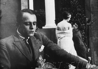
Schloss Vogelöd is available on two DVD editions, one from Kino and the other from Masters of Cinema. My frames come from the Kino edition, chiefly because they’re brighter than the higher-contrast MoC edition, and thus more legible on the Net. Both editions have their strong points, as DVDBeaver indicates. Surviving frames of Murnau’s first film are available on the Lost Films website.
Many issues of tableau style and its relation to editing technique are discussed in my On the History of Film Style, Figures Traced in Light: On Cinematic Staging, and Poetics of Cinema. On this site, among entries on the tableau tradition, the entry most relevant to today’s piece is “Not quite lost shadows.” I discuss Danish approaches to the tableau in the essay “Nordisk and the Tableau Aesthetic” and the case of Dreyer’s relation to his peers in “The Dreyer Generation,” on the Danish Film Institute website.
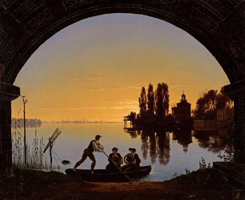
Karl Friedrich Schinkel, The Banks of the Spree Near Stralau (1817).
Picturing performance: THEATRE TO CINEMA comes to the Net
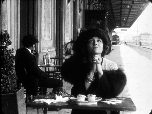
Ma l’amor mio non muore! (aka Love Everlasting, 1913). Lyda Borelli.
DB here:
The core of cinematic expression is editing. Since the 1920s, that view has been part of the lore of film aesthetics. Editing, people said, is what distinguishes film from other media. After all, the single shot is both a picture (like a painting) and a dramatization (like a scene in a stage play). But put one shot with another and you’ve got a technique impossible to parallel in other media.
But if we look closely, we find that the film image is as “uniquely cinematic” as editing. After all, a film is an image, but it’s a moving image, which is sharply different from a painting. And although a shot is a dramatization, it’s two-dimensional (unlike a stage scene) and the space it captures is quite different from that of the theatre. Anyhow, maybe editing isn’t uniquely cinematic. Comic strips juxtapose discrete images, and some forms of theatre (such as pageants, or turntable stages) can shift rapidly between scenes. Once we start to compare adjacent media, we find many overlaps in their expressive resources.
Why did early film theorists make editing so important? They were often defending the view that film was a new art, in the teeth of opponents who claimed that it was simply photographed theatre. Accordingly, film’s defenders looked for features of films that seemed to have no counterpart in theatre, such as the close-up and, more pervasively, editing.
Since then, we’ve come a long way in our understanding of film’s artistic capabilities. Filmmakers, particularly those in the early sound era (Renoir, Ophuls, Dreyer, Mizoguchi), showed the expressive power of the single shot. This tendency was amplified in the 1950s and 1960s with Antonioni, Jancso, Andy Warhol, and many other directors. Now nobody blinks if a filmmaker like Hou or Yang presents a lengthy, unedited sequence.
Informed by what’s possible in the single shot, we ought to find the earliest filmmakers using the resources of staging, composition, and performance in felicitous ways. So we do. Once we foreswear the cult of the cut, we can see that early cinema made extensive use of cinematography and mise-en-scene for powerful artistic effects. And conceding that, we suddenly find ourselves back in the lap of the other arts–painting and theatre.
Living pictures
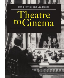 No one has done more to clarify the debt of early cinema to theatre than our colleagues Ben Brewster and Lea Jacobs. In the spirit of Wisconsin Revisionism, they have embraced early film’s stagy side. They’ve taught us to appreciate the ways in which dramaturgy and performance of 1910s cinema derive, in unexpected ways, from the theatre. Their trailblazing book Theatre to Cinema: Stage Pictorialism and the Early Feature Film (Oxford, 1997) showed how to appreciate early films in a whole new way: by seeing them as borrowing and modifying conventions of the stage. What may look artificial or backward to us were actually tools of subtle, supple expression.
Here’s the authors’ statement of the book’s argument:
While previous accounts of the relationship between cinema and theatre have tended to assume that early filmmakers had to break away from the stage in order to establish a specific aesthetic for the new medium, Theatre to Cinema argues that the cinema turned to the pictorial, spectacular tradition of the theatre in the 1910s to establish a model for feature filmmaking. The book traces this influence in the adaptation and transformation of the theatrical tableau, acting styles, and staging techniques, examining such films as Caserini’s Ma ľamor mio non muore!, Tourneur’s Alias Jimmy Valentine and The Whip, Sjöström’s Ingmarssönerna, and various adaptations of Uncle Tom’s Cabin.
The twist here is that turn-of-the-century artistic culture had already blurred the boundaries between theatre and painting. Painters drew upon the stock gestures and poses of the stage, while plays presented vivid visual effects that were indebted to painting. The term “tableau,” referring at once to a picture and a poised stage image, captures this convergence between the media. That’s why Ben and Lea refer to “stage pictorialism” as the nexus of their inquiry.
Thanks to their research, we can see the unbroken long- or medium-shot of early features as permitting a complex choreography of facial expressions and bodily attitudes, which were in turn indebted to both pictorial and dramatic traditions. Standard gestures were summoned up and reworked to suit dramatic situations–as, for example, clutching.
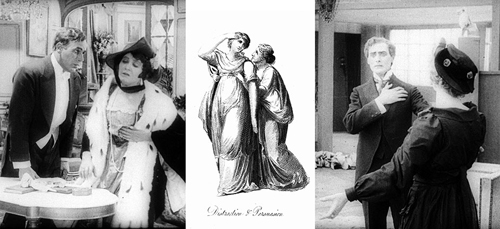
When we do find editing or camera movements in these films, they’re often at the service of the performance style. Ben and Lea powerfully make the case that the expressive human body was at the center of storytelling in the first years of silent cinema. (If nothing else, the book is an in-depth analysis of diva acting from the likes of Lyda Borelli and Asta Nielsen.) By studying the history of theatre, we can learn to appreciate aspects of acting that might otherwise escape our notice.
Theatre to cinema to pixels
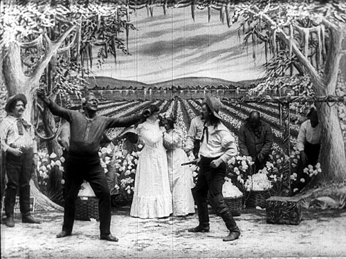
Uncle Tom’s Cabin; or, Slavery Days (Edison, 1903).
How, you’re asking, can you gain access to the ideas and information and images in this fine book? It’s now criminally easy.
When Theatre to Cinema was published, all the illustrations came from 35mm film prints. Those originals were gorgeous. But in some printings of the book the stills came out badly, and when the book moved to print-on-demand status, the images suffered even more. A couple years ago, Ben and Lea rescued their book and took the opportunity to make a digital version. It’s unrevised, largely because updating a twenty-year-old volume would be a major overhaul, but errors have been corrected and–very important–the stills have been much improved.
Start here, with the introduction to the project. You can download the new edition of the whole book, section by section, here.
Naturally, Kristin and I are sympathetic to this effort. Since we started our website back in 2000, we have explored ways to amplify and extend our ideas by means of the web. In the beginning, and inspired by Philip Steadman’s Net-based supplements to his excellent Vermeer’s Camera, I added material that would enhance arguments I made in Figures Traced in Light. Then we set up our blog, now in its tenth year. Over the same period, we posted web essays, as you can see in serried ranks page left. We also used the site to preserve older material, such as film analyses dropped from editions of Film Art: An Introduction and even entire books, as in Kristin’s 1985 monograph Exporting Entertainment. We’ve mounted video lectures. And we’ve produced a new edition of an older book, Planet Hong Kong 2.0, and original e-books such as Pandora’s Digital Box and Christopher Nolan: A Labyrinth of Linkages.
Ben and Lea have found another way to expand a book’s Web life. They have put Theatre to Cinema at the heart of a digital collection sponsored by the University of Wisconsin–Madison Libraries. Here’s what they offer:
In this collection, we try to supplement the description and illustration that accompanied the book in a way that makes it easier for readers to appropriate our work—both to understand it, and to make use of it in research and teaching. What were illustrations in the pages of the book are also presented here as better-quality downloadable images.
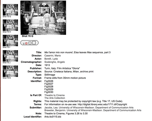
For example, you can pick a still, find its mates in a single display, and blow it up for scrutiny. If you want import it into your own files, you may choose among four different file sizes.
The provenance of each still is provided, so scholars can compare prints from different sources. In addition, there’s a master index of the visual documentation, in sequential groupings across the book.
Finally, Ben and Lea plan to add video extracts from some of the films they discuss. When those go up, we’ll announce it here.
Every admirer of silent film, and everyone who studies the interrelationship of the arts, should read this book. Hard copies are still being sold online, but they’re apt to be versions with weakly reproduced stills. Get one if you want, because a book is a good object to have in hand. In addition, for free, you can own a beautiful, searchable edition with superb stills. I think you need both.
The digital collections set up by UW Libraries are breathtaking. Check them out here.
Some entries on our site intersect with Ben and Lea’s research. See the category Tableau staging.
Weisse Rosen (White Roses, 1915). Asta Nielsen.
Hou Hsiao-hsien: Film culture finally comes through
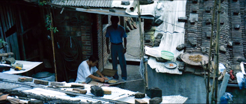
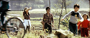
The Green, Green Grass of Home (1982).
For today, let’s call “film culture” that loose agglomeration of institutions around non-mainstream cinema. Film culture includes art house screening venues, festivals, magazines like Film Comment, Cinema Scope, and Cineaste, distribution companies (Janus/Criterion, Milestone, Kino Lorber et al.), critical websites, and not least the new channels of distribution and exhibition like Fandor, Mubi, and the impending FilmStruck.
Although the system is decentralized, there’s usually a fairly predictable flow of films through it. A film is shown at festivals, written up by critics, and picked up by distributors. Then it gains some exposure in theatres or more festivals, and it eventually becomes available on DVD, cable, and streaming services. And now we expect the process to move fairly quickly. Mustang played Cannes and many festivals through summer of 2015; it moved to theatres in the US and elsewhere in the fall. Only a year after its premiere, you can buy it on disc.
We’ve also been aided by the emergence of multi-standard video players and the willingness of some disc-publishing companies to release versions with subtitles in several languages. All too often, though, “film culture” displays gaps and delays. It took six years for Asgar Farhadi’s wonderful About Elly (2009) to make its way to minimal visibility in the US. Fans of Godard have been prepared to wait years to see his many films that didn’t get even video release in English-speaking territories. (Soigne ta droite! played Toronto in 1987, never got a theatrical release in America, and showed up on US DVD in 2002; the Blu-ray came out eleven years after that.) Two of the most egregious examples of this time lag involve the works of the outstanding Taiwanese filmmakers of the 1980s and 1990s: Hou Hsiao-hsien and Edward Yang.
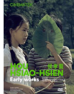 Most of Hou’s films had no proper US release. When they were available for booking, as from Wendy Lidell’s heroic International Film Circuit, they circulated for one-off screenings. Some of his major films, such as City of Sadness (1989), still remain difficult to see. Edward Yang’s work was similarly obscure. When we ran a retrospective at our UW Cinematheque in 1998, we had to borrow prints from his family.
Both of these extraordinary filmmakers had to wait many years for the exposure that is standard for European arthouse releases. After six features in seventeen years, Yang found a Western audience with Yi Yi (2000). Hou took even longer; twenty-seven years after his first feature, he gained some recognition with The Flight of the Red Balloon (2007) and last year, The Assassin. Meanwhile, many of these directors’ early films remain largely unknown, prey to ancient distribution contracts and the belief that the films would cost too much to revive and market.
Today’s entry and the next one celebrate the welcome news that important works by these two filmmakers are at last available on the disc format. Today I’ll concentrate on the three early Hou films from the Cinematek of Belgium: Cute Girl (1980), The Green, Green Grass of Home (1982), and The Boys from Fengkei (1983). Next time, I’ll consider Criterion’s release of Edward Yang’s masterpiece A Brighter Summer Day (1992).
Hou, early and late
Hou’s films are no stranger to this site. Among the first things I posted, back in 2005, was one of a batch of supplemental essays to my book, Figures Traced in Light: On Cinematic Staging (2005). That book devoted a chapter to Hou’s staging principles, with background on what I took to be the evolution of his technique. It was, I think, the first sustained view of Hou’s style, and it included discussion of his earliest films. These were scarcely known in the West and not considered in relation to his more famous work.
The online essay expanded my treatment of those titles. Because that essay is more or less buried elsewhere on the site, and it’s somewhat clunkily laid out by today’s standards, I’m reprinting it, with revisions, here, along with some bits from Figures. But first some background on these early works.
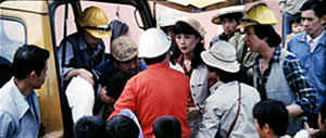
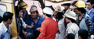
Hou began in the commercial, mainstream Taiwanese-language industry. Most local films had a strong genre identity: martial-arts movies, romantic comedies, or melodramas of family crises. Hou’s first directorial effort, Cute Girl, centered on a romance between two city dwellers who re-meet when the man is called to a surveying task in the countryside. Cheerful Wind (1981) reunites the two stars, Kenny Bee and Feng Fei-fe, in a more serious story of how he, a blind man, wins her love. In the pastorale The Green, Green Grass of Home, Kenny plays a schoolteacher brought to a village, where he meets another teacher and a romance blossoms. This film, however, expands to include dramas, big and small, involving several families; it also incorporates an ecological theme by encourage safe fishing policies.
In making these early films Hou discovered techniques that not only suited the stories he had to tell but also suggested more unusual possibilities of staging. He pushed those techniques further in his later films, with powerful results. The charming early films show him developing, in almost casual ways, techniques of staging and shooting that will become his artistic hallmarks. One basis of his approach, I argue, is his adoption of the telephoto lens.
How long is your lens?
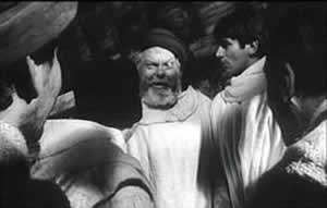
Around the world, from the late 1930s through the 1960s, many films relied on wide-angle lenses—those short focal-length lenses that allowed filmmakers to stage action in vivid depth. One figure or object might be quite close to the camera, while another could be placed much further in the recesses of the shot. The wide-angle lens allowed filmmakers to keep several planes in more or less sharp focus throughout, and this led to compact, sharply diagonal compositions, as in Welles’ Chimes at Midnight (1966).
Although Citizen Kane (1941) probably drew the most attention to this technique, it was occasionally used in several 1920s and 1930s films made throughout the world. The great French critic André Bazin was the most eloquent analyst of the wide-angle aesthetic, and his discussion of Kane, The Magnificent Ambersons (1942), The Little Foxes (1941), and The Best Years of Our Lives (1946) has strongly shaped our understanding of this technique.
The 1960s saw the development of an alternative approach, what we might call the telephoto aesthetic. Improvements in long focal-length lenses, encouraged by the growing use of location shooting, led to a very different sort of imagery. Instead of exaggerating the distances between foreground and background, long lenses tend to reduce them, making figures quite far apart seem close in size.
In shooting a baseball game for television, the telephoto lens positioned behind the catcher presents catcher, batter, and pitcher as oddly close to one another. Planes seem to be stacked or pushed together in a way that seems to make the space “flatter,” the objects and figures more like cardboard cutouts. The style was popularized by films like A Man and a Woman (1966).
The telephoto look quickly spread, employed by directors as diverse as Sam Peckinpah and Robert Altman, whose 1970s films also use the long lens, controlled by zooming, to squeeze a crowd of characters (M*A*S*H, 1972; Nashville, 1975) into the fresco of the anamorphic frame.
Hou Hsiao‑hsien came to filmmaking via the romance films so common in Taiwan in the 1970s, and this genre employed the long lens extensively. Working with low budgets, most filmmakers relied on location shooting. The telephoto allowed the camera to be set far off and to cover characters in conversation for fairly lengthy shots (as in Diary of Didi, 1978, below). In this respect, the directors were not so far from their Hollywood contemporaries; Love Story (1970) employs these techniques on a bigger budget.
Indeed, Love Story (a big hit in Taiwan) may have pushed local filmmakers toward using this technique in their own romantic melodramas; sometime the influence seems quite direct (Love Story and Love Love Love, 1974)
With these norms in place, Hou’s inclination toward location shooting and the use of nonactors, along with his attention to the concrete details of everyday life, allowed him to see the power of a technique that put character and context, action and milieu, on the same plane. His crowded compositions are organized with great finesse in order to highlight, successively, small aspects of behavior or setting, and these enrich the unfolding story, as Figures tries to show in his masterpieces of the 1980s and 1990s. Using a long lens (usually 75mm–150mm) he began to exploit some “just-noticeable differences” that the lens creates as byproducts.
Hou saw unusual pictorial and dramatic possibilities of the telephoto lens, and they became central to his distinctive way of handling scenes. A current norm of production practice yielded artistic prospects which he could explore in nuanced ways. Figures provides the detailed argument, but let me highlight three points here.
Exploiting the flaws
Flowers of Shanghai (1998).
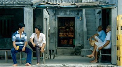
One byproduct of the long lens is a shallow focus, as we can see in the examples above. Because the lens has little depth of field, one step forward or backward can carry a character out of focus. Hou stages in depth–and at a distance–but allows the layers to slip out of focus gradually.
Savoring the effects of gently graded focus is a common feature of Hou’s later work. The masher at the train station in Dust in the Wind (1987) moves eerily in and out of focus in the distance. In Daughter of the Nile (1988), there’s an astonishing shot showing gangsters approaching a victim’s SUV outside a nightclub: at first they’re only barely discernible blobs (seen through the vehicle’s narrow windows) but then they gradually come into ominously sharp focus in the foreground, preparing to attack one of the boys inside. The slight changes of focus train us to watch tiny compositional elements for what they may contribute to the drama. More recent examples abound in Flowers of Shanghai (1998), above, where it’s the foreground planes that dissolve.
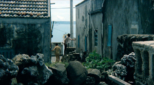
Hou’s three first films don’t use the option quite so daringly; here the degrees of focus concentrate on the principal players but still allow us to register the teeming life around them (Cute Girl; Green, Green Grass).
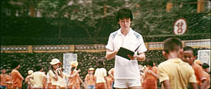
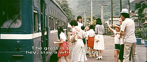
Hou can put sharply different dramatic situations on different layers. In Green, Green Grass, the departure of the little girl, saying farewell to her host family, plays out slightly closer to the camera than the departure of the eccentric teacher.
This principle operates as well in the creatively distracting street and train-platform scenes of Café Lumière (2004).
Secondly, the long lens yields a flatter-looking space. It has depth, but the cues for depth that it employs are things like focus, placement in the picture format (higher tends to be further away), and what psychologists call “familiar size”—our knowledge that, say, children are smaller than adults, even if the image makes them both of equal size. One favorite Hou image schema is the characters stretched in rows perpendicular to the camera, and the telephoto lens, by compressing space, creates this “clothesline” look more vividly. We can find the clothesline staging schema in the early Hou films (Cute Girl, Cheerful Wind).
Another favorite schema is the “stacking” of several faces lined up along a diagonal (Cute Girl). This can be seen as a refinement of a schema that was in wider use, as an example from Love Story indicates.
But Hou uses this sort of image more subtly. The telephoto lens lets him stack faces in ways that encourage us to catch a cascade of slight differences (Millennium Mambo (2000)). In many scenes of Flowers of Shanghai (1998) this principle is carried to a degree of exquisite refinement without parallel in any other cinema I know. In one shot, the faces are stacked in the distance, behind a lantern, and a slightly shifting camera reveals slivers of them.
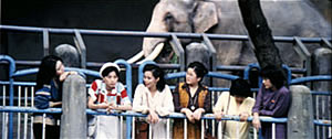
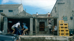
In general, because Hou is committed to a great density of information in the shot, the compression yielded by the long lens tends to equalize everything we see. Minor characters, or just passing strangers, become slightly more prominent, while details of environment can get pushed forward as well. The zoo scenes of Cute Girl enjoy showing us our characters in relation to the creatures around them.
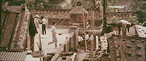
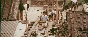
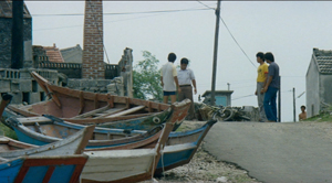
In the shot surmounting today’s entry, the tile rooftops of The Green, Green Grass of Home, secured by bricks and pails and tires and baskets, become just as important as the figures below them.
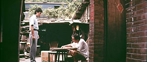
In Green, Green Grass, Hou develops the equalized-environment option in one particular scene. A long-lens distant view catches the teacher coming to the father’s house along a corridor of rooftops.
When the teacher confronts the father, instead of tight framings on each man, Hou cuts to another angle that activates yet another range of environmental elements—principally the train passing in the background, prefiguring the trip that the man’s son and daughter will take in an effort to find their mother.
Because the long lens has a very narrow angle of view (the opposite of a “wide-angle” lens), it affects the image in a third major way. If you use a long lens in a space containing several moving figures, people passing in the foreground will block the main figures: they pass between the camera and the lens. Hou elevates this blocking-and-revealing tendency to a level of high art.
In Figures Traced in Light, I argue that many great directors, from the silent era forward, have staged action in the shot so as to block and reveal key pieces of information, calling items to our attention at just the right moment with unobtrusive changes of figure position. The possibility of blocking and revealing arises from the “optical pyramid” created by any camera lens. (Lots more on that pyramid in Figures and in this video lecture.)
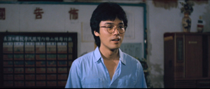
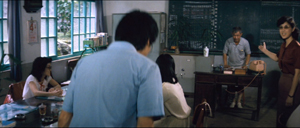
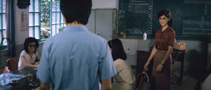
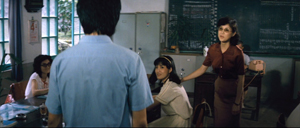
Hou showed himself capable of using the blocking-and-revealing tactic in traditional ways. Take this simple encounter in Green, Green Grass, when the new teacher Da-nian meets Su-yun, the young teacher with whom he’ll fall in love. The scene begins on him, then cuts to a reverse angle as he’s introduced to the principal.
The others are turned toward the principal in the background; the whole composition pushes our eye toward him. Then the teacher steps left to judiciously block the principal. The woman on the far left turns her head and we’re nudged to look at her. Da-nian swivels slightly too.
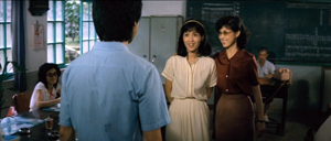
Then the key introduction: Da-nian shifts aside a little, the teacher continues to block the principal, and the central woman turns toward us.
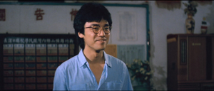
The climax (quiet, nifty) of this shot comes when Su-yun rises to meet Da-nian. She commands the center of the frame, frontal and radiant. Like any good classical director, Hou then gives us a reaction shot mirroring the first shot of this “simple” sequence: Da-nian is more than happy to meet her.
Imagine how a contemporary Hollywood director would handle this–lots of cuts, everybody in singles and close-ups, transfixing track-in to Su-yun, maybe a boingo music track–and count yourself lucky to have encountered, for once, an unfussy craftsman.
Hide and seek
The Green, Green Grass introduction scene involves a wide-angle lens, but Hou’s skill with slight character movement shows up in long-lens images too. In fact, I suspect that using the telephoto lens on location made him sensitive to the resources of masking and unmasking bits of the shot.
The loveliest example I know in the early films is the Cute Girl shot I analyze in Figures, when Fei‑Fei confronts the surveyors and the man in the red shirt serves as a pivot for our attention; the staging shifts our eye back and forth across the frame, according to small changes of character glance.
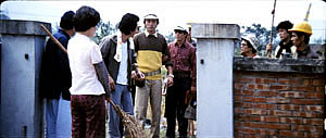
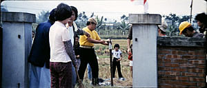
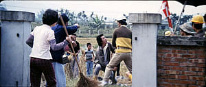
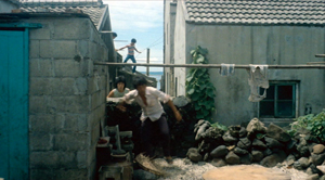
A less drastic example occurs when the surveying team starts quarrelling with the locals around a walled gate: The team’s blocking of the gate gives way to movement into depth and a struggle there between them and the townsfolk.
In all, it seems to me that these three resources of the long lens—the shallow focus, the compressed space, and the narrow angle of view—supplied artistic premises for Hou’s shooting and staging in the later films. This is not to ignore his use of the wide-angle lens on occasion, particularly interiors, as in the schoolteachers’ introduction scene. Once the lessons of the long lens had been absorbed, Hou could apply the staging principles that he’d developed to other kinds of shots and story situations. Sometimes he kept his style smooth and limpid, but at other times he offered the viewer some unusual challenges.
Peekaboo pictures
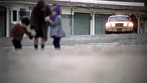
The Boys from Fengkuei (1983).
Presumably Hou could have kept making good-natured, crowd-pleasing movies for many years, but changes in his professional milieu gave him new opportunities. In the early 1980s Taiwan film attendance declined sharply, and Hong Kong films began to command more attention than the local product. The rash of independent companies had concentrated on speculation, not long-term investment, so only the government’s Central Motion Picture Company could initiate recovery. Ambitious government officials launched a “newcomer” program that offered support for cheap films by fresh talents. Even if the new films could not win back the local audience, they might gain renown at foreign film festivals. At the same period, a local film culture began to emerge, relying upon critics who were sympathetic to the creation of a New Taiwanese Cinema.
Hou was no newcomer, but working within the New Cinema framework he could reconceive his practice. The key question for all directors, he recalls, was: What is it to be Taiwanese? His New Cinema films would focus on political and cultural identity, and they did it through an approach to cinematic storytelling that in many respects ran against the conventions of his earlier films. His first New Cinema feature, The Boys from Fengkuei (1983; included in the Cinematek set) reminds us of how “young cinemas” have often represented a return to Neorealism.
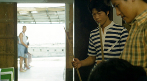
Instead of introducing us to clear-cut protagonists and a dramatic situation, the film immerses us in a milieu, that of the small town of Fengkuei. The first fifteen minutes are episodic, casually showing a gang of teenage boys playing pool, lounging about, playing pranks, and above all getting in fights. Initially, the one who’ll become the main figure is minimally characterized; the emphasis, as the title indicates, is really on the group. The boys drift to the big city, where they try to get by and meet others their age. Throughout, local color and everyday routines drive the action more than character goals and traditional drama do.
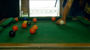
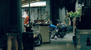
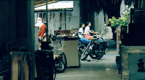
This somewhat diffuse approach to narrative, in various countries, has proven well-suited for filmmakers who want to explore psychological development and social-cultural commentary. So it accords with the impulse toward understanding national identities that animated New Taiwanese Cinema. In addition, I think that this looser conception of storytelling allowed Hou to refine some of the stylistic options he had already explored. Now the extended, fixed telephoto shot with varying planes of focus appears as a more indeterminate pictorial field, as in our rather oblique introduction to the boys–partial framed figures drifting in and out of the frame–and their poolroom hangout. Emphasizing incomplete views and vague figures outside the door, Hou gives us a more precise array of balls on the table than he does of his characters in space.
Likewise, even though Hou has surrendered his very wide anamorphic frame, he finds ways to balance human action and tangible surroundings in the ways he did with city landscapes and village rooftops in the earlier films. The bullying of a motorcyclist and a pursuit by a rival gang aren’t rendered with the aggressive cuts and angles we’d expect in violent scenes in the Hong Kong action pictures then ruling Taiwanese screens. It’s as if Hou, along with his colleagues, is rejecting that other Chinese-language tradition.
Which is to say that when conflict comes, Hou turns to “dedramatization,” that tendency (again related to Italian Neorealism and its successors) of tamping down peaks of action. Now his characteristic long lens creates detached shots, sometimes with planimetric flatness, sometimes with tunnel vision. These images play out chases and fights in a way that minimizes their physical impact but reminds us of the design and details of the characters’ world.
Hou’s insistence on the fixed, distant telephoto take is now put in the service of obscured vision. The people who passed through the frame in the earlier films, blocking and revealing the action judiciously, may become more salient than the action itself–which is itself often offscreen, or swathed in shadow, or shielded by aspects of setting. The early films’ fixed long take enabled us to see story action fully, but, now, in its refusal to cut away, the camera can suppress story information.
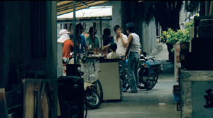
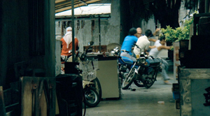
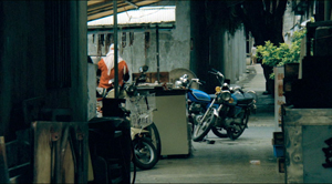
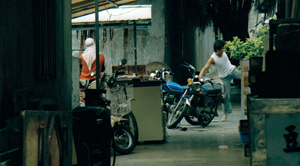
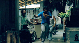
Early in the film, a street fight passes in and out of a far-off intersection among stalls. The dust-up stirs only slight interest from passersby, before bursting back into the alleyway and coming to the camera.
The masking of the fight by the setting can be seen as an extension of the way the walls in the Cute Girl surveying quarrel intermittently cut off our vision, but here it’s far more drastic and sustained.
I’ve drawn my examples from the early stretches of The Boys from Fengkuei, so as not to preempt your own discoveries as the plot carries the gang to the big city. In these scenes Hou in effect teaches us how to watch his movie. But I think I’ve said enough to suggest how Hou’s fresh conception of narrative, born of a renewed interest in local culture (already present in another register in the first three films), allowed him to carry his stylistic explorations to new levels.
Hou saw certain pictorial possibilities in the long lens, and after developing them to a certain point in popular musicals, he recast them when he took up another kind of storytelling. He realized that leisurely, contemplative narratives permitted him to refine these visual possibilities, and they could become powerful, nuanced stylistic devices. And he didn’t stop, as the films following his New Cinema works vividly show. His visual imagination seems unlimited.
A more general lesson follows from this. Norms of form and style are resources for artists. Some artists follow the schemas that they inherit, while others probe them for fresh possibilities. A few can even make a handful of schemas the basis of a rich, comprehensive style. Ozu did this with the techniques of classical Hollywood editing; Mizoguchi did it with depth staging in the long shot. Like these other Asian masters, Hou reveals how much nuance a few techniques can yield, even when deployed in crowd-pleasing, mass-market movies. And now, thanks to the vagaries of film culture, more viewers can come to appreciate his achievement.
The frames from Diary of Didi and Love, Love, Love are, alas, cropped video versions, but that condition doesn’t keep us from recognizing the telephoto lensing in the originals.
The Cinematek collection also includes sensitive English-language introductions to the films by Tom Paulus and enlightening audiovideo essays by Cristina Álvarez López and Adrian Martin.
The indispensable English-language sources on Hou are James Udden’s in-depth career survey, Richard Suchenski’s monumental anthology, Emilie Yeh and Darryl Davis’ study of New Taiwanese Cinema, and two monographs on City of Sadness, one by Bérénice Reynaud, the other by Abe Markus Nornes and Emilie Yeh.
The fullest account I’ve offered of Hou’s style are in Figures Traced in Light and in a video lecture, “Hou Hsiao-hsien: Constraints, traditions, and trends.” See also the several blog entries touching on his work. A broader account of the historical tradition to which he belongs can be found in both Figures and On the History of Film Style, as well as in entries under Tableau staging and in the video lecture mentioned already.
The Boys from Fengkuei.
Terence Davies: Sunset songs
Sunset Song (2015).
DB here:
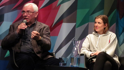
A career retrospective brought director Terence Davies to Astoria’s always enterprising Museum of the Moving Image. On Sunday MoMI ran a handsome 35mm copy of The Long Day Closes (1992), introduced by Sony Pictures Classics Co-President Michael Barker (who originally distributed the movie). The film was followed by Davies’ informative discussion with Michael Koresky, author of a fine critical study of Davies. On Tuesday, there was an avant-premiere of Sunset Song (2015) with Agyness Deyn, the principal player, joining Davies and Koresky. The first screening featured one of the greatest films of the 1990s, while the second showcased the literary adaptation that Davies had sought to make for several years.
The two evenings left me with renewed respect for the power of this audiovisual art we call cinema. They also set me thinking about Davies’ unique contributions to that art, particularly in his first two features.
MGM in Liverpool
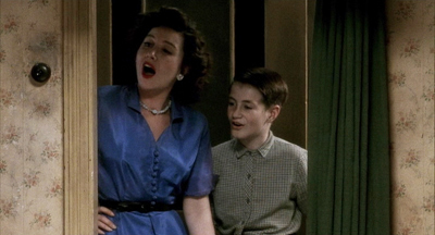
The Long Day Closes.
If you needed proof of the unpredictable, zigzag influence of Hollywood cinema, look no farther than the films of Terence Davies. When he saw his first film, Singin’ in the Rain (1952), he knew utter rapture, and his early years were illuminated by visits to the local movie house. But unlike other cinephile directors, he didn’t turn retro. His first two masterpieces, Distant Voices, Still Lives (1988) and The Long Day Closes (1992), decant the splendors of American musicals into vessels more severe and melancholy. The brooding lyricism of these films, presented in a stringently geometrical pictorial style, makes them almost unrecognizable cousins of the 1950s films that nourished him.
Davies understood, as so many postwar critics of mass culture didn’t, that Hollywood, for all its formulas and conventions, captured genuine feeling; indeed, those very formulas and conventions released that feeling. In Davies’ hands, however, the feelings gain a rougher texture. In tales of patriarchal power and everyday betrayals, echoes of the yearning of Judy Garland and the vibrato of Doris Day seem distant and distorted. Davies finds the evanescence hidden in Yankee exuberance, and he takes it very personally.
That’s partly because popular song is filtered through a sensibility deeply committed to classical musical expression. Nobody but Davies would accompany an image of urban squalor with the arching final melody of Vaughan Williams’ Pastoral symphony, or the soft run of George Butterworth’s “Shropshire Lad” tune over the tan rug in The Long Day Closes. The soaring Barber violin concerto accompanies, for an astonishing eleven minutes, the opening images of The Deep Blue Sea (2011); it’s practically a cinematic tone poem. One of those directors who’s unthinkable outside the sound cinema, Davies dissolves any barrier between popular song and art music. The American Song Book, he says, is the country’s greatest gift to the world, and Stephen Sondheim is our Schubert.
Music is tied, in intricate ways, to family. These films are openly autobiographical. The first part of Distant Voices is a terrifying portrait of domestic life with a madman; the second part treats the radiant moments without him. The father is absent in The Long Day Closes, and so life in the household, with Mum and brothers and sister and visiting chums, is blissful. (Surely Davies is the great filmmaker of sibling devotion.) Now the threat lies beyond the threshold; school bullies, sadistic teachers, and a Church that seems indifferent to the suffering of a boy vaguely sensing his homosexuality.
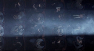
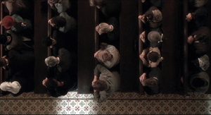
Yet by a kind of benevolent contagion, the joy of American cinema transfigures the grubby side of daily life–through communal singsongs in parlor or pub, through impromptu performances at parties, through hit-parade tunes hummed during daily routines. There are line-readings too; in The Long Day Closes the Boccherini minuet from the ball in The Magnificent Ambersons is matched by quick borrowings from Welles’ voice-over narrator. In one of the great sequences of modern cinema, a survey of the boy Bud’s world is shot from straight-down framings that roll by like scenes in a picture scroll. Birds’-eye views of street, cinema, church, and school are wrapped in the throbbing voice of Debbie Reynolds singing “Tammy.”
Cinema wins on the soundtrack. Take away the music and the snippet from Kind Hearts and Coronets and you have a grim topography. With movies, life’s miseries become bearable.
Chamber pieces
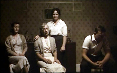
Distant Voices, Still Lives.
Distant Voices and The Long Day Closes balance social realism with a first-person quality shot through with feeling. Davies remembers everything about his childhood, and he can present unsentimentally the gray-brown wallpaper and the bulky furnishings. (He remarked that period films always forget that people didn’t have the most up-to-date things; nobody in 1950 Liverpool owned 1950 furniture.) Even realistic detail is saturated with memory and expression. Similarly, Davies’ reliance on planimetric shooting, dominant in Distant Voices and still strong in The Long Day Closes, creates at once rigid formality and a curious intimacy, as if we were looking at family portraits.
When capturing moments of serenity, the perpendicular shots evoke utter honesty; characters face us frankly, hiding nothing. But confronted with a schoolyard beating or a psychopath thrashing his wife, this curiously impassive camera–no wild handheld bursts or jagged cutting–only accentuates the pain. The camera’s unearthly calm takes on a kind of ruthlessness, as if nothing awful that happens in this world can make it flinch, just as nothing rapturous can make it go giddy. Davies seems fairly Wordsworthian: his poetry is “a spontaneous overflow of powerful feeling,” but the overflow is “recollected in tranquility.” The scene’s situation and the music, we might say, supply the feeling, while the framing supplies the tranquility and suggests the distance of memory.
These tableaus remind us that Davies is one of the few masters of cinematic chamber art. The exteriors, very few in these two features, are treated in the same rectilinear framings as the rooms are, as if one could never escape the carpentered contours of a house. More often, we’re indoors, and the human figures in are caught, nearly frozen, in a parlor or kitchen or hallway or schoolroom. No wonder his favorite painter is Vermeer.
Like Dreyer, Davies finds drama in the nearly closed room, the space slashed by light and opening onto somewhere else: in Davies’ case the doorway and the stoop and the street. These are the little theatres of human relaxation, of sharing, good times, and of course song. All the more jolting, then, when the father in Distant Voices turns up at the door, released from the hospital, or when Bud in The Long Day Closes sees his pal Albie go off to the pictures without him. As Michael Koresky notes in his book, the face at the windowpane looking out at the world is a recurring image for Davies: the edge between two arenas of experience, both harboring pain and exaltation.
 Davies is famous for laying out each film with a draftsman’s precision: shot by shot, line by line, musical extract by musical extract. These films are absolutely through-composed. Their strict rhymes channel the feelings of the characters–or rather, the feeling of a scene as a whole–into determinate shapes that we can grasp. The sound is as important as the images; Hollywood musicals taught him the tight coordination of image and phrasing that pattern his song sequences and pictorial cadenzas.
No surprise, then, that Davies loves music and poetry, to which he constantly compares cinema. And no wonder he admires T. S. Eliot’s Four Quartets, that poem that takes its title from chamber music. In both music and verse, powerful feelings flow through rigorous forms. The chock-a-block construction of Distant Voices sets up poetic parallels and contrasts between the two parts. More boldly, The Long Day Closes offers a narrative that’s barely there: a suite of situations, a flow of anecdotes that gathers symphonic force. It recalls Pather Panchali and other films about a child coming to understand that whatever happens, painful or exhilarating, is transitory when seen against the backdrop of eternity.
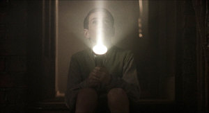
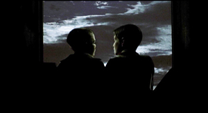
Davies is after, he said in conversation, “the intensity of the moment,” and what happens before or after may seem of little account. Sound, light, color, movement: all become focused on the poignancy of the felt instant. Yet in another echo of Romanticism, that instant isn’t trivial when it’s seen in a cosmic context. Left alone by his brothers and sister, Bud thrusts his flashlight to the sky, creating a movie-projector’s beam as a demonstration that light goes on forever.
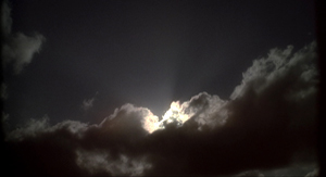
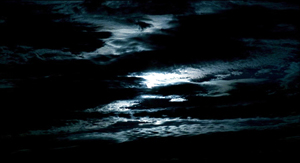
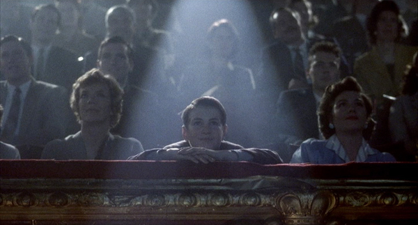
In an echo of this moment, Bud’s long days close with a merger of the momentary and the infinite. Two boys sit (in the balcony?) poised against the sky. Their movie becomes a majestic sunset, wrapped in the plangent song that gives the film its title. The light from the stars dates from Jesus’ day, Bud tells Albie, as the sacred chambers of his world open onto the universe.
Daughter of the earth
Terence Davies and Agyness Deyn.
A sadistic, baleful father; a mother bearing the brunt of his demands; a brother and sister as tender with one another as sweethearts; gentle friends who sustain the household with music–with Sunset Song we seem to be back in the world of Davies’ early films. But instead of the grubby city streets we’re in a glorious green-gold landscape of rolling fields, and instead of postwar London we’re in Scotland on the eve of World War I.
Sunset Song, drawn from the 1932 novel by Lewis Grassic Gibbon, exemplifies Davies’ later interest in adapting literary works (The Neon Bible, 1995; The House of Mirth, 2000; The Deep Blue Sea). In all of these, Davies tries to respect the spirit of the original while finding affinities with his own sensibility.
Sunset Song centers on Chris Guthrie, the dutiful daughter of a farm household. For the early stretches of the film she’s a cautious observer, but her voice-over, presented in the third person and past tense, prepares for her to take over the action. At first she’s inclined to run away with her brother, but duty keeps her home. When she comes into ownership of the farm, she realizes that she is rooted in the place. The earth, more eternally solid than sea or sky, gives her strength. If she cannot forgive what her father has done, she can learn to understand and forgive another man’s betrayal.
At first glance, we might seem to be snugly settled in British Cinema of Quality. But Davies has always made “costume pictures,” and his take isn’t in tune with Masterpiece-Theatre fashion shows. The clothes, as Davies always demands, look lived in, worked in, slept in. Agyness Deyn explained that for wardrobe they gladly took the worn leftovers of tonier productions.
Despite the eye-filling landscapes shot in 65mm, Davies hasn’t played false to his intimate aesthetic; this remains a chamber drama, with few primary characters. Like Bud in The Long Day Closes, Chris is our focal consciousness; apart from a substantial flashback to war-torn France, we’re confined chiefly to what happens around her. A few years of history unfold in a rhythm tuned to her growing awareness of her options and decisions, good and bad.
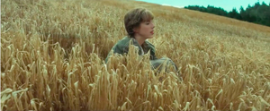
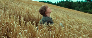
The style is far more mainstream than in the first two features. We get continuity editing (often in its constructive vein), smooth reframings as actors move around sets, and not many images recalling the tableau-vivant look of the earlier work. Chris is introduced in one of those twirling camera movements that are de rigueur nowadays, though Davies refreshes the convention by the visual metaphor of her rising up from the wheat, as if from sprung from the soil, and tipping her face to the sun, like a flower.
But Davies insisted on both evenings that for him, form springs from content. I take that to mean that the brick-by-brick shot assemblage of the first films suits the episodic, memory-driven nature of those tales. Here we have a novelistic saga (the original book is part of a trilogy), and so we must stay engaged with a chronologically unfolding plot. Davies has opted for less stylization, the better to rivet us to the powerful story of his protagonist’s blossoming to maturity.
Again, music yields a model. He urges young filmmakers to study symphonic cycles, like those of Bruckner and Sibelius, in order to appreciate scale and balance and variety in a large-scale structure. The relaxed flow of Sunset Song–and what power the title must have had for him–is like that of a full-scale orchestral essay. If Distant Voices, with its shifting, decentered viewpoint, is a chamber piece and The Long Day Closes is something like a song cycle for voice and quartet, this latest work is perhaps a concerto, with Chris’s sturdy presence an instrument of commanding range set against the massive landscape and a choir of family, friends, and neighbors.
Normally we must wait years between Davies’ films, but A Quiet Passion, his biography of Emily Dickinson, is beginning its career in worldwide distribution now. One feature in 2015, another in 2016. “I’m in danger of becoming prolific.”
Back in 2001, Kristin and I met Terence and his assistant John Taylor (loyal Packers fan) at Belgium’s summer film college. They were good company then, and still are. The MoMI screenings provided a wonderful occasion to see them and the films once more. If you’re in the vicinity, start queueing now for the follow-up items in the series. And Sunset Song opens this Friday at Film Forum, with Terence present. From there it will make its way across the US. You couldn’t spend your time more fruitfully. These movies will last a very long time.
Thanks to David Schwartz and his colleagues at MoMI. The Long Day Closes is available on DVD and Blu-ray from the Criterion Collection; thanks to Kim Hendrickson for her assistance. And thanks to George Nicholis of Magnolia Pictures, which is releasing Sunset Song.
For more on the stylistic tradition that early Davies films work within, you can consult Chapter Six of On the History of Film Style and these entries.
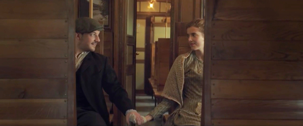
The Long Day Closes (1992).


