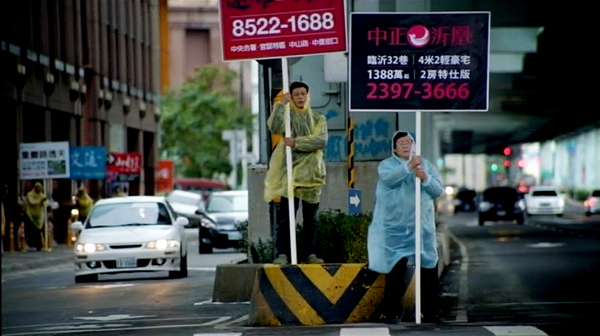
Archive for the 'Tableau staging' Category
Modest virtuosity: A plea to filmmakers, old and young
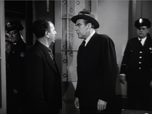
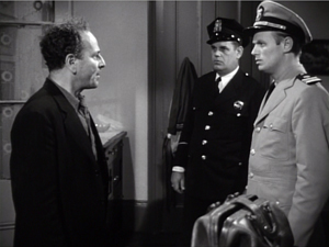
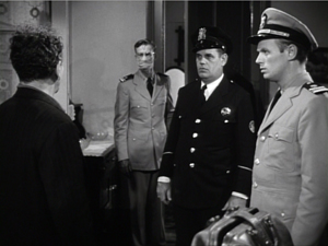
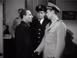
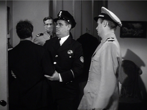
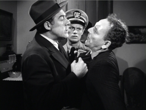
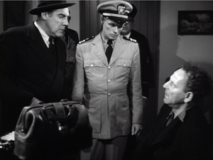
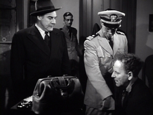
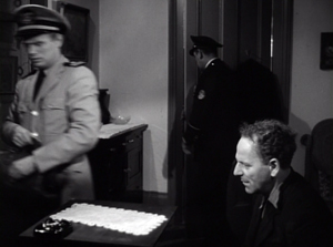
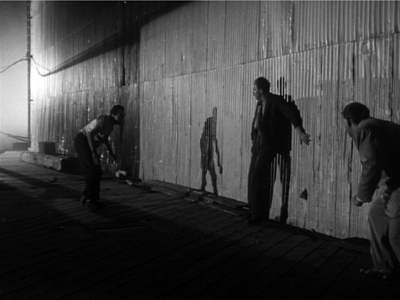
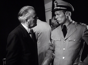
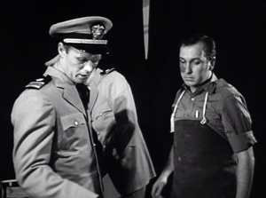
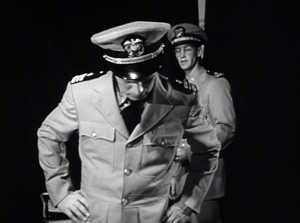
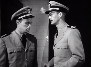
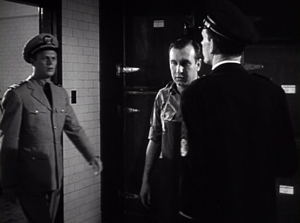
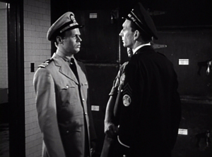
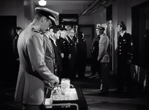
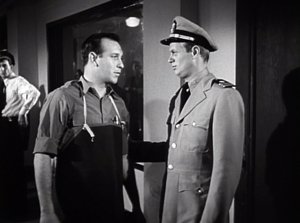
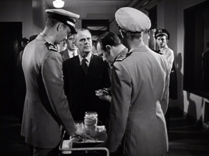
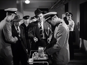
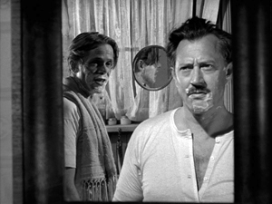
Panic in the Streets (1950).
“It’s where you put the camera and what’s in front of you [that’s important],” Deakins said. “There’s too much obsession these days about digital film…it’s becoming so technically-orientated, and that’s just distracting from what’s actually being put in front of the lens.”
DB here:
Every now and then I get worried by the repetitive look of recent films. I want to beg filmmakers (young ones especially) to try something else.
What could they do? Start with what to avoid. They could suspend the walk-and-talk, the tendency to rely on singles, the bumpy handheld takes, the swoopy crane shots, and the urge to cut on every line of dialogue. They could back off, in other words, from intensified continuity and go for something more daring and original.
More positively, there are some relatively unexplored areas of film style that yield results that are forceful and graceful. Today’s example: ensemble staging that minimizes camera movement and cutting. Minor spoilers.
Some basics
It’s a demanding technique. Essentially the filmmaker has to shape a scene among several actors in ways that guide our attention to the key pieces of information. That guidance is done through performance, framing, lighting, and other tactics. Beyond highlighting the major points of the scene, staging can create what critic Charles Barr called “gradation of emphasis.” Because several elements of the action are all visible at once, some can become primary, some secondary; and this interplay enriches our understanding of the scene.
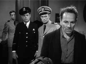
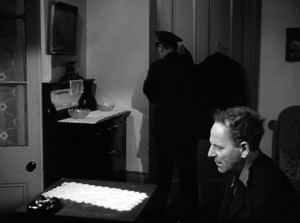
So take this scene from Elia Kazan’s Panic in the Streets (1950). A dead man has been found to carry the Bubonic plague virus, and Dr. Clinton Reed is investigating people who have come in contact with him. A restaurant owner and his wife have denied knowing the victim, but now Reed and Police Captain Warren have learned that the wife has come down with the plague. They visit the apartment, too late to save her. Her husband Mefaris comes in and learns that she has died—and that she might have lived had the couple told the truth.
The two-minute scene plays out in just two shots, both with slight panning movements. The scene’s impact owes a lot to the performances: the line readings, facial expressions, and gestures, including the wonderful way that Richard Widmark rips off his surgical mask in angry frustration. But the scene also benefits from small but significant rearrangements of the actors in the frame. This staging ties together the performance elements in a smoothly rising flow.
Here’s the scene. I’ll try to indicate some practical directing principles at work.
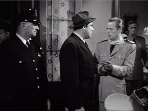
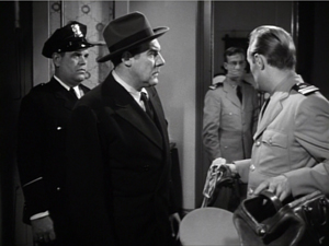
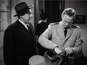
After Captain Warren has sent his men to find the husband, we have our principal players in the middle ground in a framing from the knees up (the plan-américain). As is common in 1940s dramas, the scene will be given added depth, not only by the patrolman behind Warren but by the junior officer Paul behind Reed, coming out of the sickroom. That depth is activated when Reed comes forward to pack his briefcase and orders Paul to burn the bedding, and Warren orders the patrolman to close the bedroom door.
The opening and closing of the door becomes an important pictorial element, but for now it simply clears the background for the two-shot involving Warren and Reed talking of the death certificate. Noise from offscreen motivates the camera’s pan left to follow Warren as he meets the husband, Mefaris, coming in.
Mefaris confronts Reed and demands to know what’s happening. When he calls his wife, Paul steps out, guiding our attention to him as a sign of death. Mefaris begins to guess. The phlegmatic patrolman, who’ll feature throughout the scene, is there to keep Mefaris under control.
The risk is that we’ll watch that centrally place cop and miss something else, so Kazan takes care to make him impassive. Later, he’ll be more distant, in shadow, and out of focus. More generally, such ancillary characters need to keep still and stare at what we’re supposed to be watching.
Mefaris comes closer to Reed, blocking our view of Paul. Reed tells him his wife is dead. Mefaris tries to go to her room, but the patrolman shows his value by restraining him—and opening up a slot for us to see Paul, who confirms Reed: “She’s dead, mister.”
This sort of unnoticeable blocking and revealing through slight shifts in actors’ position goes back to 1910s cinema but is seldom used today.
Finally accepting the grim news, Mefaris ponders and comes forward. Without cutting, Kazan has brought him and Reed into closer visibility. As ever, a Cross refreshes the composition. And as Reed asks questions, his head blocks the patrolman so that we can concentrate on Mefaris’ indignant reaction.
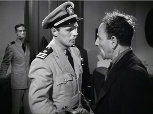
Mefaris’ refusal to talk is the climax of the shot. We cut to Warren at the door and the camera pans with him to confront Mefaris angrily.
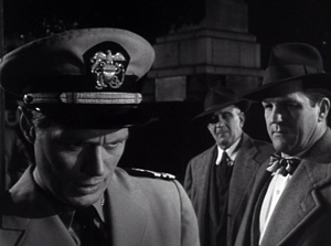
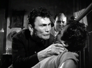
Now only Reed is visible in the background, squeezed between the two faces. Mefaris finally identifies Poldi as the man they need to find. Warren shoves him down and the space, quite clenched just a moment before, opens up. As gradation of emphasis, we get Reed brushing at Mefaris’ lapel after Warren’s meaty hands have crumpled it. After Warren’s outburst, Reed’s anger at Mefaris seems to have turned into a flicker of compassion.
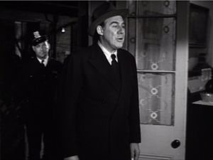
Warren and Reed depart, just as Paul returns to the death room and the patrolman closes the door. The final framing leaves nothing to distract us from Mefaris, brought low by grief and his fatal failure to cooperate.
Kazan is, we might say, a “post-Welles” director in that he, like many others, adopted the vigorous use of depth staging and wide-angle cinematography made famous in Citizen Kane. It’s not hard to find elsewhere in Panic in the Streets some more flagrant instances of in-your-face deep focus, with big heads and exaggerated distant points.
In the scene above, the depth is nothing like so aggressive. It is, we might say, modestly virtuoso—a clean, unnoticeable, but well-calibrated piece of staging that unfolds the action so that we always know where to look.
Why not?
I anticipate some objections from a skeptical filmmaker.
“This scene isn’t cinematic. There isn’t enough cutting and it’s lacking close-ups.”
Today, though, everybody acknowledges that cutting isn’t the be-all and end-all of cinema. Directors get lots of credit for sustaining their shots, if it’s done with a self-congratulatory virtuosity. (See Gravity, Birdman, the opening sequence of Spectre.) In particular, a lengthy walk-and-talk shot is greeted as a bold stroke. So clearly the absence of cutting is okay if you make a big deal of it.
Close-ups are important, but maybe not as much as we think. Today’s style often relies too much on close-ups, partly because people think they won’t read well on small monitors and other displays. But those displays are getting bigger and sharper. I suspect that you’d find the Blu-ray edition of Panic in the Streets plenty okay for home viewing.
“Put it another way. This is too theatrical.”
Too reliant on actors, then? But what mainstream cinema isn’t? And isn’t today’s standard style, bombarding us with facial close-ups, quite “theatrical” in making the actor—and not even the body, just the face—the center of our attention?
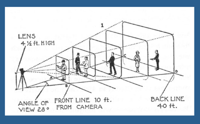
Moreover, as I’ve argued here and elsewhere, the space of a shot is the opposite of the space onstage. Theatrical space is wide and rectangular, and actors tend to arrange themselves laterally, across the stage. Cinematic space–the space captured by the camera–constitutes a pyramid, extending narrowly away from the lens, and so it favors depth. (See the diagram above.) Theatrical space is calculated for the sightlines throughout the auditorium; cinematic space is calculated for one sightline, that of the camera. Accordingly, a film can have staging in depth that wouldn’t work onstage. You couldn’t arrange the Panic scene this way in live theatre; some people couldn’t see the background action clearly, because the foreground figures would mask it.
If “theatrical” also means “too tied to the proscenium,” that objection fails too. Granted, this is a scene that suggests a missing fourth wall. The camera doesn’t penetrate the space enough to suggest the entire room. Shortly, though, I’ll show you that this approach can be more immersive, activating areas behind the camera (and so behind us).
“It’s not realistic. People don’t stand and talk that way.”
Cinema ≠ reality.
“It’s too risky. Too much can go wrong with all that shifting in one shot.”
You need skillful actors who can time their lines, hit their marks, and coordinate with one another. If one thing goes wrong, you have to start again. Shrinking from this, directors opt for plenty of coverage to adjust pacing and select the best performances during editing. “The important thing for the editor is coverage,” notes Ridley Scott. “That’s why I always have multiple cameras, so I can shorten the scene.”
So, yes, it’s risky. But risk is celebrated in the noisy virtuosity of the flamboyant long takes. Why not take risks in this more unusual way?
“It’s too hard! I never learned how to do these things.”
Once upon a time, every director knew how to stage scenes like this. The “tableau cinema” of the 1910s cultivated a rich set of creative choices about staging, and directors proved very versatile in exploring them. With the arrival of continuity editing in the 1910s, a degree of de-skilling took place, but directors still retained some sense of dynamic staging. We see it in 1930s and 1940s films too.
Now, much later, this sense is all but gone. Is ensemble staging taught in film schools? Could even our best directors of today—Wes Anderson, Paul Thomas Anderson, Quentin Tarantino, et al.—pull off a scene in this manner? Soderbergh couldn’t do it when he tried in The Good German. (I look forward to seeing if Todd Haynes makes the effort in Carol.)
On the whole, though, I agree: It’s hard today. Neither directors nor actors nor DPs are, I think, well-versed in what’s necessary to stage scenes this way. Most directors, and nearly all viewers, have simply forgotten that this rich menu of expressive techniques ever existed. So why not revive it?
Post-grad work
One other objection occurs to me.
“Ensemble staging of this sort is too modest. In an age of directorial bravura, where every filmmaker tries to punch above his weight, nobody will notice if I direct scenes this way. And getting the next job demands that my contribution get noticed. I’m competing with a lot of eye candy out there.”
I’d agree. But there is a lot of leeway in this approach for more self-conscious effects. Maybe most viewers and even filmmakers wouldn’t notice the robust delicacy of the scene above. But how about offering something more audacious that stays within the parameters of this style?
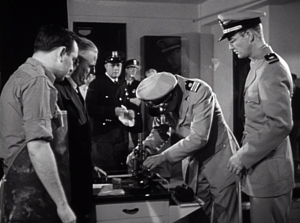
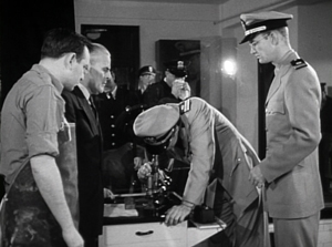
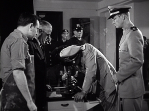
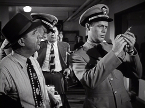
Try this earlier scene from Panic in the Streets. Reed, his assistant Paul, and local officials are now identifying the plague virus and are beginning to figure out how to deal with it. I hope I’ve primed you to notice the less-quiet virtuosity on display here.
A director today might have shown us the body, the reporters photographing it, and the medical team in one vast shot, perhaps from a high angle that craned in. Or perhaps we’d have gotten a long walk-and-talk taking Reed through a hospital corridor as he snaps out orders to all the staff involved.
Instead, Kazan leaves a lot of this material offscreen, to be inferred through details. The plaguey corpse lies just outside the lower frame line, but we won’t realize this for a while. And the reporters are offscreen, “behind us.” So we’re inside the proscenium. Part of the interest of the scene is not just following the ongoing drama but figuring out what’s going around us.
In this more complex scene, Kazan threads characters through the space, making some more prominent and then letting them fall back. He obeys Alexander Mackendrick’s dictum:
Composing in depth isn’t simply a matter of pictorial richness. It has value in the narrative of the action, the pacing of the scene. Within the same frame, the director can organize the action so that preparation for what will happen next is seen in the background of what is happening now.
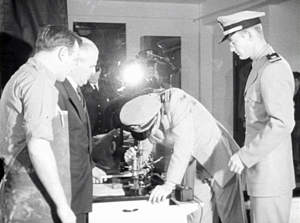
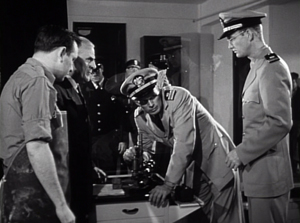
We start with Reed and his team bent over the microscope. In the background a patrolman passes. For an instant the frame flares up.
Reed looks up, slightly annoyed, but when it happens again we can see that it’s the result of a photographer’s flash. In the distance, after Reed bends over, we can see the patrolman blowing his nose. Because we know that the plague is loose, that simple gesture becomes a warning. And on the big screen you can now notice the vague reflection of the photographer in the window between Reed and Paul. The second fading flashbulb tells us where to find this man’s phantom image.
So the action develops in three zones.: the cops in the distance, the team at the microscope, and the offscreen police photographers behind us. Two of these zones get closed off when the photographers leave and Reed orders the curtains drawn.
The space goes shallow as we get a succession of two-shots, the first with the health officer who comes forward and learns that he must cremate the corpse, the second with the morgue supervisor.
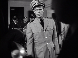
Now we get a pause. Reed, isolated against the curtains, stares down at the corpse, trying to work out a plan. As in the earlier scene, a simple pan brings Paul to him for a final two-shot. The serum has arrived, and this sets up the second phase of the scene.
The scene has developed around two nodes: the microscope bench in the middle ground and the still-unseen corpse in the foreground. This use of depth has fulfilled Mackendrick’s dictum, as the action around the ‘scope has prepared us for the series of one-on-one instructions Reed issues to his team. As in the earlier scene, this shot ends with the figures closer to the camera than they were at the start.
As in the earlier example, we get a cut. (Critics have often talked about single-shot scenes. What about studying two-shot scenes? I suggest we start with Mizoguchi.) Reed heads outside for another encounter, this time with a police official, who gets emphasized not through cutting but by letting his head block that of the morgue supervisor.
We pan with Reed as he goes to the corridor and the gathering group. More blocking and revealing: As Reed asks the cop about people who’ve been in contact with the corpse, he pivots and the composition frames the sniffling cop in the vanishing point.
Today a filmmaker might give us a big close-up of this poor guy, playing up his misery. But that would suggest that he’ll become an important story factor. He’s actually not in danger, so his minor status in the frame is completely appropriate.
For similar reasons, no need to cut in to Reed addressing the assemblage of men; none will prove significant. Instead, the action moves back to the foreground. First, Reed thanks the morgue attendant.
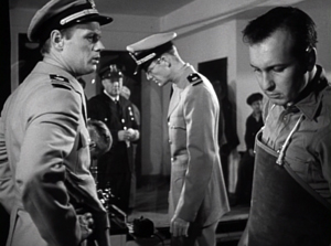
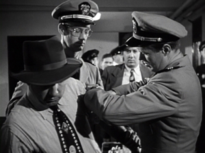
More important, and more virtuoso, is the way that the key dramatic elements in what follows are framed in a tight space between Paul and Reed in the foreground. First it’s the official in charge of cremation, then it’s the two skeptics.
Once more a shot ends in the closest framings so far. As a complaining civilian quarrels with Reed, both advance to the camera and Reed obliges him to take his medicine. The shot ends with the man wincing and lowering his head as the needle goes in; not such a tough guy after all.
Far from being simply of casual interest, these reluctant ne’er-do-wells anticipate the stubbornness and stupidity that Reed will encounter when he ventures into the city among the populace.
It seems to me that this sequence, with the flashbulbs and the curtain and the line-up for the vaccine, provides a self-assured command of craft that is as exuberant as anything in today’s flashy direction. If you can be flashy in a quiet way, this scene manages it.
This kind of staging can give cuts extra force. In the first scene, the cut to Warren ratcheted up the tension: Reed’s persuasion failed to win over Mefaris, so brute force is the next step. In the mortuary scene, the cut to the corridor as Reed passes through is more perfunctory, but it at least maintains the fluidity of the action.
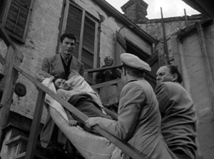
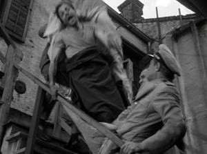
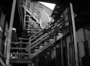
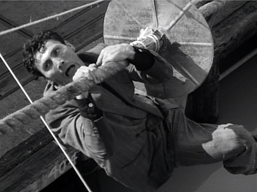
A more dramatic instance of saving your cut for maximum impact comes near the climax, when Poldi is carried down a precarious staircase and his crooked boss Blackie flings his body over the railing. The cut to the extreme long-shot shocks you with how far he must fall.
There is much else to admire in Panic in the Streets; it’s a fine instance of Joe MacDonald’s location cinematography as well. I use it as simply an example of how much classical cinema has to teach us. It’s a pity that our filmmakers have unlearned some of its lessons, but it’s not too late—especially for brave young filmmakers—to relearn them.
For an example of lateral, rather than depth-based, ensemble staging, see our most popular entry, “Watching you watch There Will Be Blood.” Use the category tableau staging to access entries on the principles I’ve mentioned. The whole subject is discussed in more detail in Chapter Six of On the History of Film Style and in Figures Traced in Light: On Cinematic Staging. It’s also treated in my video lectures How Motion Pictures Became the Movies and CinemaScope: The Modern Miracle You See without Glasses. The diagram of the visual pyramid is from Ben Brewster and Lea Jacobs, Theatre to Cinema: Stage Pictorialism and the Early Feature Film (Oxford University Press, 1997), 170.
Panic in the Streets.
Homunculus and his friends
Sappho (1921).
DB here:
Of the big-ass explosion movies, only two items in this summer’s spate of them have intrigued me. I liked Mad Max: Fury Road well enough, but not as much as MM2 and 3. I look forward to Mission: Impossible—Rogue Nation, in a series for which I have much affection. As for the arthouse releases, the ones I’ve already seen are A Pigeon Sat… (good but not as sardonically bizarre as earlier Andersson, methinks) and About Elly. That one is a masterpiece.
I have stronger reasons than indifference for missing so much, and for tardy blogging besides. I’ve been on my annual trip to Belgium for research and lecturing in the Summer Film College. As a result, your recent movie experiences and mine have been divergent, perhaps even insurgent.
Apart from two screenings in the Brussels Cinematek’s Hou series (their restoration of Green, Green Grass of Home, gorgeous vintage print of City of Sadness), I spent the last four weeks watching 35mm prints of movies by Godard, movies starring Burt Lancaster, and assorted silent films from the 1910s and 1920s. I also re-met one of the most charming directors I know of, and in general had a hell of a time.
Today’s entry focuses on my archive work. Next up, a report on the Summer Film College.
Conrad’s many moods, mostly unhappy
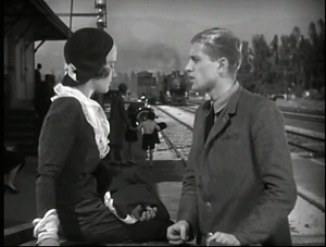
Landstrasse und Grosstadt.
The archive stuff was recherché. I’ve been trying to see as many 1910s and early 1920s features as I could, but this time around I didn’t catch anything as mind-bending as Jasset’s Au pays de ténébres (1911) or Doktor Satansohn (1916) or Fabiola (1919) or I.N.R.I (1920), encountered on earlier visits to the Cinematek. I did get further confirmation that in Germany the “tableau style” exploited so vigorously in Europe and somewhat in America in the 1910s, was pretty much replaced by Hollywood-style editing by 1920. And I got some welcome doses of Conrad Veidt, another favorite in this vicinity.
In Die Liebschaften des Hektor Dalmore (“The Liaisons of Hektor Dalmore,” 1921), Veidt plays a callous playboy who keeps on retainer a man who looks very much like him. It’s a lifestyle choice. When a compromised woman’s father demands that Hektor do the right thing, he sends out his double to marry her. Surprisingly, the double isn’t rendered through trick photography. Richard Oswald, always a fast man with a gimmick, found a pretty good Veidt lookalike, which can’t be easy to do.
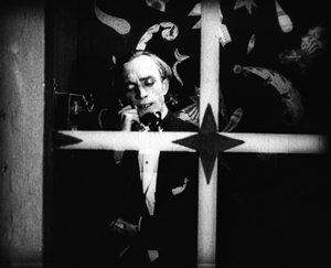
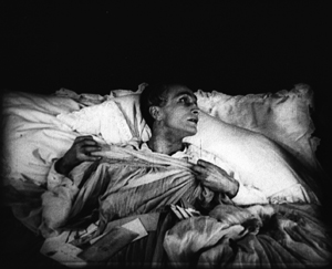
The hero’s Casanova complex carries him from dalliance to dalliance, and as you’d expect in a twins situation, there are confusions between the real and the fake Hektor. Fights and abductions liven things up. The climax is a duel in which the real Hektor, overconfident, learns to his grief that an outraged husband is a better marksman. The scene is handled through brisk shot and reverse-shot, garnished with an over-the-shoulder shot as Hektor aims his pistol. And there are dashes of mildly Expressionist set design (furnished by Hans Dreier). Veidt in a phone booth does the décor proud. But he doesn’t need fancy sets to project a feeling: on his deathbed, his expression and his clutching fingers show a man bereft of erotic illusions.
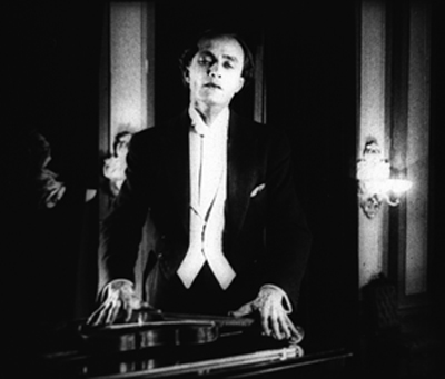
The other Veidt vehicle lacked doubles but not ambition. Landstrasse und Grosstadt (“Village and City,” 1921) casts him as Raphael, a wandering violinist who teams up with Migal, an organ grinder. They become a popular act in the big city, and as Raphael’s playing improves, Migal becomes his manager. Nadia, a woman who joins them, falls for Raphael and shares his success. But in an accident he suffers a hand wound and his career slumps. Migal sees his chance to move in on Nadia. Perhaps this shot gives you a hint of his designs.
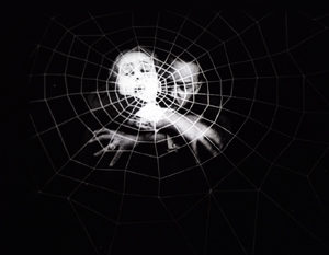
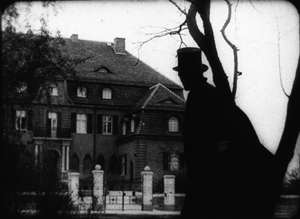
Actually, most of Landstrasse and Grosstadt isn’t as hammy as this. A very nice shot shows Raphael in silhouette approaching a mansion to hear his rival Cerlutti give a salon concert. And of course Conrad gives the blind violinist a delicate, spectral pathos, as shown above.
Artificial man lurks in the shadows, destroys humanity
Sappho.
All the films I saw broke down scenes into many close shots, reminding us that Caligari (released 1920) probably wasn’t typical of German staging or cutting of that moment. It now seems to me almost consciously anachronistic, rejecting the reverse angles and precise scene breakdown that were becoming common. In Die Ehe der Fürstin Demidoff (“The Marriage of Fürstin Demidoff,” 1921), when a governess drags a recalcitrant girl back to her bedroom, the action is split up into four shots, all of different scales from close-up to long-shot.
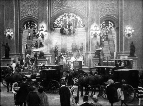
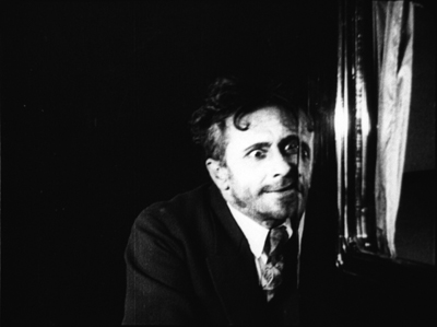
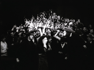
Although I saw a fragmentary print of Sappho (1921), it’s clear that in parts it has the audacious monumentality of a Joe May production. The most staggering shot is that of the Opera surmounting today’s entry, but there’s no shortage of striking images. Above I include a shot of a madman that, thanks to window reflections, suggests his split-up psyche.
Sappho also doesn’t shirk editing effects either. During a frantic automobile ride, there are glimpses of hands on a steering wheel, a foot on brakes, panicked passengers, and POV shots through the windshield. Forty-nine shots rush by in a flurry, anticipating similar sequences in French Impressionist films like L’Inhumaine (1924). Feuillade was experimenting with rapid cutting of action at about the same time.
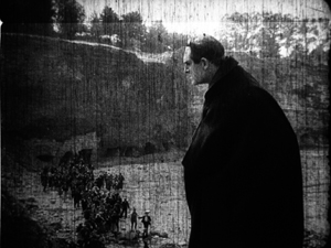
The most impressive, and nutty, film in this batch came from Homunculus, the largely lost German serial released through 1916 and into early 1917. The script was written by one of the blog’s favorite peculiar directors, Robert Reinert. The plot involves an artifical man created in the lab, à la Frankenstein’s monster. He’s a superman, in both strength and ambitions. The only surviving episode of the serial is Die Rache des Homunculus (“The Revenge of Homunculus,” 1916). (But see the codicil.) In this installment, posing as Professor Ortmann, Homunculus decides to drive humanity to destroy itself. He assumes a disguise to rouse the rabble, even inducing them to turn against himself in his Ortmann guise.
As in Expressionist drama, this overachiever is pitted against a crowd that, in the end, pursues him maniacally.
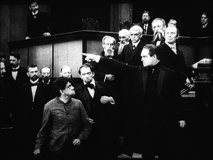
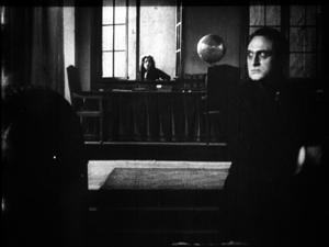
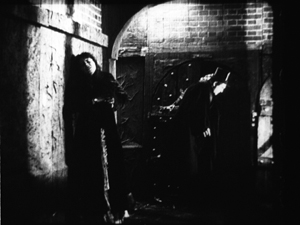
Director Otto Rippert gives us splendid mass effects in a quarry and along a beach, but there are also deep tableau images and sustained chiaroscuro, particularly in a showing the heroine Margot shrinking from Homunculus as he locks his rival in a dungeon.
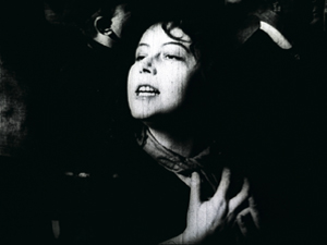
Fans of Metropolis will notice that Rippert anticipates Lang’s unison choreography of crowds, as well suggesting that mob frenzy can create a sort of ecstasy in the woman who’s swept along.
In her book The Haunted Screen Lotte Eisner traces the films’ mass spectacle back to the stage work of Max Reinhardt and other theatre directors of the era. On the basis of this episode alone, Homunculus ranks with Algol and May’s Herrin der Welt as an example of big-scale fantasy in German silent cinema. Who needs Ant-Man when we have Homunculus?
Next time: Burt and Jean-Luc, together again for almost the first time.
Thanks to Nicola Mazzanti, Francis Malfliet, Bruno Mestdagh, and Vico de Vocht for their assistance during my visit to the Cinematek.
Kristin analyzes stylistic conventions of German cinema of this period in her Herr Lubitsch Goes to Hollywood (available for download here). She’s written on Caligari here and here.
A so-so copy of Sappho is on YouTube.
On Homunculus, Leonardo Querisima offers a wide-ranging discussion in “Homunculus: A Project for a Modern Cinema,” in A Second Life: German Cinema’s First Decades, ed. Thomas Elsaesser and Michael Weidel, pp. 160-167. Substantial excerpts can be found here.
Munich archivist Stefan Drössler has recovered a mass of Homunculus footage and has assembled a version of the serial, which premiered last year in Bonn. Nitrateville has the story.
The Brussels Cinematek will release its Hou restorations on DVD early next year: Cute Girl, The Boys from Fengkui, and Green, Green Grass of Home. As a reminder, my video lecture on Hou is here.
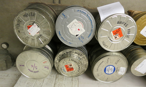
The still below, taken as the prints were readied for the Summer Film College, points ahead to our next entry–number 701, as it turns out.
Addio Bologna 2014
Okoto and Sasuke (1935).
DB here:
Some final notes on this year’s Cinema Ritrovato. Kristin has more when I’ve finished.
Poland, very wide
The First Day of Freedom (1964); production still.
Revisiting a couple of the Polish widescreen classics Kristin mentioned earlier, I’d just add that The First Day of Freedom struck me as merging that heaviness often ascribed to Polish cinema with casual shock effects, as much visual as dramatic. It’s not just the opening shot, with the camera descending implacably to reveal layers of activity in a POW camp before settling on barbed wire in the foreground, made as big as the chains on an ocean liner’s anchor. A symmetrical vertical lift ends the film, rising through floors of a nearly destroyed church tower, revealing a half-shattered Madonna and a looming bell, to float back up to the sky.
As in Wajda’s Ashes and Diamonds, gunfire not only cuts you down but sets you on fire. A Nazi dead-ender, holed up in the steeple and dying from his wounds, orders his girlfriend (“Whore!”) to take over his machine-gun nest. Since she’s been raped by wandering refugees early in the film, she has every reason to fire on the Poles, which she does with animal abandon. A Polish bullet cuts short her shooting spree, and then the camera launches on its remorseless movement heavenward. The primal force of this movie, especially the climax, suggests that Alexander Ford and Samuel Fuller have more in common than I’d suspected.
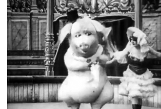 Kristin pointed out the efforts of Lenin in Poland (1965) to humanize the Great Man, and indeed there are many charming scenes showing him sliding down a banister, taking innocent walks with a Polish maiden, and generally being avuncular. But Sergei Yutkevich also doesn’t spare us the enraged Lenin, ranting in his cell when he learns of mistakes in party strategy. We also get a bit of the puritanical leader. He goes to the cinema for reportage on the political-military situation but walks out when a stupid melodrama comes on. To be fair, though, he does stick around to enjoy a comic short, Le cochon danseur (1907), with a lady cavorting with a man-sized pig. But the ex- (or maybe not so ex-) formalist Yutkevich recycles this image in a return to 1920s montage, when the pig shot reappears in a newsreel sequence showing the march to war.
Yutkevich seems to be keeping up with the Young Cinemas of his day. The film is plotted as a series of flashbacks, alternating the present (Lenin in prison) with pieces of the past, sometimes out of chronological order. He imagines himself striding across a battlefield, conveyed by him walking in place against a blatant back-projection. Late in the film, newsreel footage gets stretched and distorted to fill the ‘Scope format, as in Truffaut’s Jules et Jim (1962). The experimentation with the soundtrack seems likewise rather modern. The noises are filtered nearly as strictly as in Miguel Gomes’ Tabu, so that sometimes we hear only Lenin’s footsteps in a city street.
Lenin not only narrates the film but “quotes” the whole dialogue of the scenes; we never hear any voice but his. Reminiscent of passages of The Power and the Glory (1933) and the entirety of Guitry’s Roman d’un Tricheur (1936), this device blankets the movie with Lenin’s thoughts, feelings, and political analyses. It’s scarily evocative of that booming voice-over narrator that Soviet cinema imposed on imported films. Denied subtitles and dubbing, audiences were obliged to listen to an impersonal voice drowning out the actors with its sovereign interpretation of the action. I wouldn’t put it past Yutkevich to be slyly alluding to this Orwellian voice of authority.
1914 fashionistas and 1940s fakers
Maison Fifi (1914).
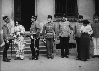
For sheer dirty fun I have to recommend Maison Fifi by Viggo Larsen, a Danish director working in Germany. Here situation comedy meets notably horizontal sight gags. A young couturier cozies up to the officers stationed in her town, hoping that their wives will buy her wares. Her first encounter takes place outside the officers’ quarters, as each man, from private up to general, spots her and starts to flirt before being ordered aside by a higher-up. Part of the humor comes from the strict adherence to the table of ranks, part from the fact that each dislodged officer enjoys watching his superior get taken down.
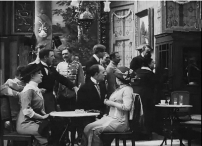
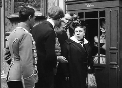
Later, on a lark, some officers swipe one of Fifi’s dummies and take it to a tavern. When their wives surprise them there, they stow the mannequin in a distant phone booth. As they expostulate with their wives in the foreground, the dummy sits unmoving in the window of the booth far on frame right. Meanwhile, increasingly annoyed customers line up outside the booth. The dummy is more visible in projection than in my still, but Larsen also obliges with a cut-in.
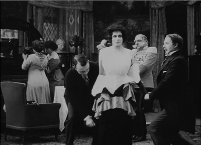
In a very logical reversal, Fifi is at the climax caught in a boudoir and must pretend to be one of her own mannequins. This affords the officers an excellent pretext to undress her. Today the scene yields a vivid sense of the hooks, buttons, and stays that women, and men, of 1914 had to contend with.
Faked identity was a motif of the festival’s Hitler strand. The Strange Death of Adolf Hitler (1943) centers on a man with a knack for mimicking his Fuhrer and accidentally becomes his double. In a series of twists, both he and others try to kill the original, but confusion ensues and leads to a very downbeat ending.
The same premise gets a different workout in The Magic Face (1951), a film as puzzling as its title. Luther Adler delivers a performance at once peculiar and virtuoso. A stage impersonator’s wife is stolen away from him by Hitler. Escaping from prison, he decides to get his vengeance by posing as a servant and gaining access to the dictator. He kills Hitler and takes over his identity. Thereafter he cunningly fouls up the prosecution of the war by an ill-timed invasion of Russia, etc. His general staff are baffled and even try to kill him, but he represses all resistance.
The weirdness of this speaks for itself. In addition, the film doesn’t explain how Hitler’s new mistress fails to realize that her paramour has been replaced by her husband. Perhaps more striking, we wonder whether the impersonator might have taken a little trouble to alter other Nazi policies, e.g., the Final Solution. No less odd is the frame story, narrated by celebrated war correspondent William L. Shirer. There he maintains that this account was relayed to him by the wayward wife, who survived the fire in Hitler’s bunker. An independent production directed by Frank Tuttle (recently under HUAC pressure for his Communist affiliations), The Magic Face was judged by Variety to provide “a dramatic and suspenseful story which would have had far greater audience impact five or more years ago.”
Talking, in and out of sleep
The Bride Talks in Her Sleep (Hanayome no negoto, 1933); production still.
The Japanese cinema of the 1930s through the 1960s has been one of the very greatest national film traditions. I once characterized it as the Western cinephile’s dream cinema: a relentlessly commercial industry that has given us dozens of indisputable masterworks. Yet it seems that every few years it’s necessary to remind western publics of this nation’s titanic accomplishments. Packages circulated by the Japan Film Library Council in the 1970s have been followed by retrospectives and one-off touring programs at rather long intervals; the Mizoguchi series is a recent example.
Another effort to draw Japanese cinema to the spotlight, “Japan Speaks Out!” has become a high point of Cinema Ritrovato over the last three years. Curators Alexander Jacoby and Johan Nordström deserve credit for assembling new prints of early talkies, grouped by studio. As in previous years, some of the titles were familiar to specialists, and a few to generalists (Ozu’s The Only Son being this year’s example). But there have been several new discoveries, and the Ritrovato audience has responded enthusiastically. This year the films were screened twice, often to jam-packed halls. The sessions were introduced with brevity and point by Alexander, Johan, and Tochigi Akira of the National Film Center of Tokyo.
This year’s batch focused on the Shochiku studio, more or less the MGM of Japan. Shochiku enjoyed financial stability because of its theatre holdings (both cinemas and live-performance venues) and its address to a modernizing, western-leaning urban audience. Its policies, overseen by Kido Shiro, aimed to provide movies mixing tears and laughter. Kido urged that Shochiku comedy have a melancholy cast, and that Shochiku melodrama indulge in lighter moments. This blend is familiar to us in Ozu’s 1930s works; even as sad a film as The Only Son displays a comic side when the mother falls asleep during a German talkie.
Perhaps the purest example of Kido-ism in this year’s package was one of Shimazu Yasujiro’s best films, Our Neighbor Miss Yae (Tonari no Yae-chan, 1934). Two brothers are introduced practicing baseball, and soon we learn that one has considerable affection for the girl next door. The neighboring families are thrown into quiet turmoil when Yaeko’s sister returns home, having left her husband.
Stylistically, Shimazu is less rigorous than either Ozu or Shimizu Hiroshi, but he is very skilful. Our Neighbor Miss Yae has the real Kido flavor, mixing comedy and drama and throwing in cinephile references that the studio’s young directors enjoyed: one boy is compared to Fredric March, the young people watch a cartoon featuring Betty Boop and Koko the Clown. Just as important, Shimazu enjoys throwing in a stylistic flourish every now and again–a striking, even eccentric shot that arrests our attention. As the four young people are eating in a restaurant, a very straightforward shot of them gives way to a bold composition full of peekaboo apertures. The shot enlivens the fairly routine act of waitresses delivering food; at the end, one pair stands and switches positions.
Not all Shochiku films displayed a mixed tone; we saw some fairly pure comedies and melodramas. Three self-consciously modern films showed an amused, slightly sexy concern with young marriage. Happy Times (Ureshii koro, 1933) by Nomura Hiromasa, begins with a pair of teenage boys practicing pitching and catching to the strains of “There’s No Place Like Home.” Soon they’re spying on newlyweds who are so infatuated with one another that the husband skips work to stay at home and lounge around. He’s mocked by his fellow employees and upbraided by his boss, but his wife is relentless in her sweet-talking ways. The marital bliss is disrupted by an obstreperous visiting uncle, and the couple must turn to one of the man’s old girlfriends, a tough singing teacher, to dislodge him—without sacrificing the inheritance he may leave them. Awkwardly shot and rather too prolonged, the film exemplified how loose-limbed Shochiku comedy could get.
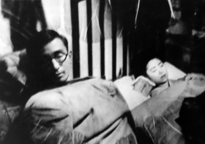
A brace of films by Shochiku stalwart Gosho Heinosuke, The Bride Talks in Her Sleep (1935) and The Groom Talks in His Sleep (Hanamuko no negoto, 1935), showed other newlyweds with comic problems. Again the motif of spying plays a role. (Naughty voyeurism was essential to that strain in popular culture called Ero-guru-nansensu, “erotic-grotesque nonsense.”) Salaryman Komura’s pals have learned that his wife talks in her sleep, and so they drop by to hear for themselves. Unfortunately they drink so much that they fall asleep and miss the big revelation. Plot complications include a burglar, the couple’s decision to sleep elsewhere, and the revelation of what keeps the bride “sleep-talking.”
Only a little less slight is The Groom Talks in His Sleep. Here the title probably gives away too much, because the initial puzzle is why the young wife naps during the day. This scandalous dereliction of housewifely duty leads eventually to a demand for divorce until the cause, the husband’s sleep-talking that keeps her awake all night, is revealed. The family brings in a self-styled hypnotist, played with relish by Ozu regular Saito Tatsuo, to cure the groom.
Gosho is said to be the fastest cutter among classic Japanese directors, but I’m not sure that he goes much beyond what was fairly standard at Shochiku. Most of the studio’s directors working in the contemporary-life genre (gendai-geki) employed what I called in my book on Ozu “piecemeal découpage,” a breakdown of action and dialogue akin to that seen in late US silent films. What Gosho does have in abundance is different camera positions. In The Bride, our introduction to Komura’s drinking buddies takes place at a bar, and I didn’t spot any repeated setups. Throughout the two films, each composition is calibrated to a specific item of information—a line of dialogue, a reaction shot, or a change in the staging. This makes for a tidy visual texture, which is an advantage in the rather loose plotting that’s characteristic of Shochiku comedy (Ozu, always, excepted).
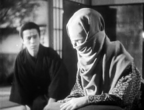
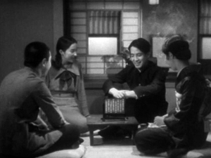
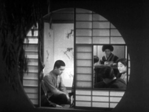
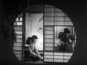
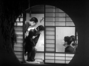
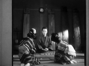
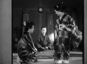
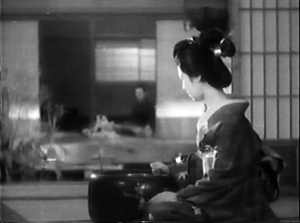
At the other extreme were some very serious drama, such as Mizoguchi’s relatively well-known Poppies (Gubinjinso, 1935) and the more obscure Mizoguchi-supervised Ojo Okichi (1935). There was as well Okoto and Sasuke (Shunkinsho: Okoto to Sasuke, 1935), another Shimazu work. It’s based on a Tanizaki Junichiro tale of male devotion passing into love and masochism. Okoto is blind, but her family can afford to pamper her. She takes up the koto and the family’s young servant Sasuke faithfully escorts her to her music lessons. She often treats him disdainfully, but she insists on his company, and so gossip grows up around them. Sasuke’s loyalty is tested when Okoto is wooed by a vacuous but persistent suitor. Spurned, he arranges an attack on her, which triggers Sasuke’s ultimate sacrifice.
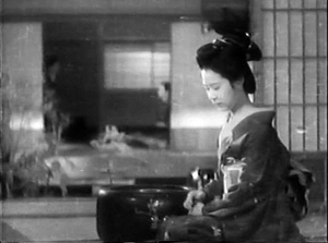
Shimazu treats this story with a calmness that builds up tension between the often wilful Okoto and the simple-hearted Sasuke. The discreet simplicity of the film’s technique, excepting the violent climax, can be seen in an almost throwaway moment. Sasuke as been assigned to tutor two of Okoto’s students, and they laugh at his efforts. As they rise, Shimazu cuts to a new angle, putting them the background and showing Okoto is shown growing anxious in the foreground.
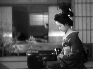
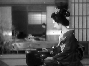
Keeping Sasuke out of focus and far back allows Shimazu to stress a micro-movement in the foreground: Okoto’s shift from sympathy for Sasuke to her usual imperious annoyance. After unfolding her hands, she clenches her right hand and softly strikes it on the edge of the brazier.
As Okoto turns to summon him for a mild dressing-down, still keeping her little fist extended, Sasuke has shifted his position slightly so that he is a more active responder to her.
This sort of directorial discretion, so characteristic of classic Japanese cinema, seems today to come from another world.
Probably the greatest revelation of the Shochiku show was another masterwork by the ever-more-impressive Shimizu Hiroshi. A Woman Crying in Spring (Nakinureta haru no onna yo, 1933), Shimizu’s first sound film, was given its western premier. It was chosen to exemplify his experiments with sound–experiments that induced Ozu to try his own hand at talkies.
Mining work in Hokkaido brings day laborers by ship, along with women who wind up serving them drinks and perhaps something more. Most of the action takes place in a tavern with a bar downstairs, women’s rooms on the next story, and a small upstairs where the mysterious, somewhat cynical Chuko keeps her daughter. Kenji and his boss become rivals for Chuko, and a young woman drawn into prostitution further complicates the situation.
After only a single viewing, I’m pressed to say much more than noting that Shimizu sacrifices some of his geometrical precision (discussed here) to a more naturalistic treatment of the bar’s space and more experiments with chiaroscuro lighting. A somewhat flamboyant scene, in which our view of a fistfight is mostly blocked by a high wall, shows how Shimazu was trying to let sound do duty for the image. The title has multiple implications: the woman we see crying at the outset is Fuji, the girl initiated into the trade; but at the end, Chuko is weeping. Moreover, as Alexander Jacoby pointed out, the scenes we see are all set in winter, although the ending suggests that the couple that is created will find spring elsewhere. Long unavailable in its Japanese VHS edition, A Woman Crying in Spring is ripe for Western distribution.
Last notes from Kristin
Despite my commitment to the Polish, Indian, and Japanese threads, I was able to fit in a film or selection of shorts now and then.
On the afternoon of the opening day, the first “Cento Anni Fa” program for 1914 included a couple of interesting items. One was La guerre du feu, a French film directed by George Deonola. It dealt with a tribe of fur-clad cavemen who have captured fire but lack the knowledge to create it themselves. Thus they must tend their fire constantly and protect it from a rival tribe. In the course of the action the hero learns the secret to using tinder and flint to generate a blaze. This, it has to be said, was more interesting as an historical curiosity than as entertainment.
Not so the final film of this group, Amor di Regina (Guido Volante, 1913). Its unusual story dealt with a queen of an unnamed country who is having a secret affair with a young soldier. When the latter gets wind of a rebellious group’s plans to assassinate the king, the hero and the queen manage to spirit him out of the palace and away to exile. It struck me that in a more conventional film, the lovers would use the assassination of the king to allow them to marry. Instead they take care of the king in exile and watch for a chance to reinstate him.
Stylistically there were some impressive shots. In one, we see a close-up of the back of the hero’s head, looking out from a terrace at a group of conspirators in the distance sneaking toward the palace, and the camera racks focus from him to them–for 1913, a highly unusual way to handle a very deep composition. If anyone is contemplating a DVD/BD release of some Italian short features of this era, Amor di Regina would be a good choice.
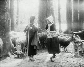
Another 1914 program included the lovely La fille de Delft, which, along with Maudite soit la guerre (which was shown at one of the Piazza Maggiore screenings), is one of Alfred Machin’s best-known films. Its plot concerns a little country boy and girl who are dear friends; a variety-theater owner sees them dancing at a country celebration and takes the girl off to the city to become a star. Seeing it again, I was struck at how marvelously natural the performances of the two child actors (above) was, something that goes a long way to making this film so very affecting.
Despite the fact that all of Tati’s early short films are on the new French boxed Blu-ray set, I decided to see the Tati program on the big screen. Seen again, Gai dimanche (1935) seemed a bit labored in its humor, dealing with two layabouts who hire an old car and persuade several people to purchase day trips to the country. The situation seems more the sort of thing that René Clair could have made work, but director Jacques Berr makes it somewhat leaden.
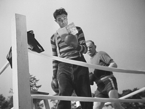
Soigne ton gauche centers on a gawky farmhand who is mistaken for a boxer by a promoter and ends up in a practice ring with a tough opponent. Tati creates a very Keatonesque situation as the naive young man finds a book on boxing on his stool and proceeds to consult it at intervals (below). As he assumes classic boxing poses, the experienced boxer uses brute force to knock him silly.
The opening and closing of Soigne ton gauche contains a comic, bicycle-riding postman, and clearly Tati recognized the comic potential of the character. In his first directorial effort, L’école des facteurs (School for Postmen, 1946), Tati himself played the postman François, who tries to please his teacher by finding ways to deliver the mail more swiftly. The idea proved so fruitful that the film was remade as Tati’s first feature, Jour de fête. The bouncy music and many of the gags were retained, and the longer film’s success established Tati as a major director and star.
To all our friends and the coordinators of Cinema Ritrovato: Thanks for another wonderful year!
You can watch The Eye’s tinted copy of Maison Fifi here.
Miriam Silverberg’s Erotic Grotesque Nonsense offers a thorough discussion of Japanese popular culture of the 1930s. For more on Kido Shiro’s influence on Kamata cinema, see Mark Schilling’s Kindle book Shiro Kido: Cinema Shogun. I discuss trends in 1930s Japanese film style in Chapters 12 and 13 of Poetics of Cinema. For more on the restoration of Machin’s films, see our entry here.
Soigne ton gauche (1936).
Where did the two-shot go? Here.
Our Sunhi (Hong Sangsoo, 2013).
DB here:
I’ve complained here and there about the rudimentary staging of scenes in mainstream American movies. (Short version of common practice: Cut a lot and move the camera instead of moving the actors.) But just as rare as complex staging, in the age of intensified continuity cutting, is the sustained and stable two-shot.
Two actors exchanging lines in a continuous, unmoving take was one building block of mature sound cinema. Today’s directors almost never resort to it. Their face-offs are “given energy” by a drifting or arcing camera, or lots of cuts, or, if they feel like moving the actors around, the Steadicam walk-and-talk.
But the prolonged, balanced two-shot can yield remarkable results. A medium-shot or medium-long-shot framing can work to a human dimension, giving prominence to the actors’ bodies. It doesn’t let their surroundings swamp them, and it doesn’t reduce them merely to faces. It lets the actors act with not just facial expression but with their posture and their upper bodies. And it nicely balances dialogue with the flow of pictorial information. We can watch both actors, with one reacting to the other, as in The Marrying Kind (1951).
Sometimes the two-shot is played with the faces in profile, as in early sound pictures like The Criminal Code (1931).
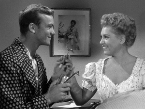
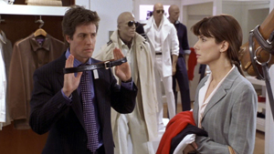
But directors quickly understood that if you prefer, you can angle the actors so that we get a 3/4 view of one or both. The tactic sacrifices realism (who stands in such ways in real life?) but it’s a piece of artifice we gladly accept. It’s visible in my Marrying Kind example, as well as here in Two Weeks Notice (2002).
Of course two-shots are still with us, but they usually serve to set up passages of shot/ reverse-shot cutting. The sustained two-shot carrying long stretches of dialogue is increasingly rare in Hollywood cinema. It surfaces more often, I think, in indie works (Jarmusch, Linklater, and Hartley, for instance), European films (Garrel, for instance), and perhaps most notably some Asian films.
For reasons not yet well understood, during the 1980s stylistically ambitious directors in Japan, Taiwan, and China began building scenes out of long, static takes. Sometimes those are distant framings, unfolding in elaborate blocking; to my mind Hou Hsiao-hsien is the great master of this. But no less prominent are those films that present simply staged shots of two or more characters in which action and reaction are captured by a fixed camera. Often these shots avoid 3/4 views. That is, we may get two characters in profile, or two characters facing the camera directly. The result is a more abstract, even ceremonial look and feel.
I was remembering this tendency while watching several of the films on display here at the Vancouver International Film Festival. I saw one film very largely made of two-shots. I saw a couple in which the two-shots serve mostly as points of punctuation, breathing space between scenes that are cut up in more orthodox ways. And I saw one film that climaxed in a two-shot showing the actors holding their ground for about fourteen minutes. All were from Asia.
Both visual and plot-based information follows; in other words, as often happens hereabouts, there are spoilers.
The Return of Kids Return
Kids Return: The Reunion, directed by Shimizu Hiroshi, is a sequel to Kitano Takeshi’s 1996 film. The disaffected high-school buddies Shinji and Masaru were last seen riding a bike and declaring that they would show the world what they’ve got. Now, many years later, they haven’t shown much. Masaru is a low-level gangster who has lost the use of his left arm in a jailhouse brawl. Shinji holds a boring job as a security guard, and he’s about to give up boxing. The two meet by accident and resume a more distant version of their friendship. Masaru gets more deeply embroiled in the yakuza world, but he does convince Shinji to stick with prizefighting. As Shinji struggles to improve his skill, Masaru sets out to avenge his betrayed boss, with murderous results.
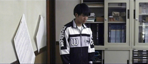
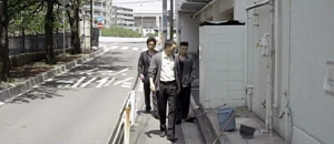
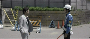
The new version doesn’t have the dry, laconic quality of Kids Return, and the film doesn’t employ Kitano’s characteristic planimetric framing and compass-point editing. But the incessant over-the-shoulder framings of most movies are avoided; when we cut to a character, he or she is usually isolated in the frame. And some moments recall the cartoon-panel cutting of Kitano. One scene shifts from the yakuza boss, Masaru, and the thug Yuji in a coffee shop to a soundless shot of their young subordinate at the office simply staring off into space. Cut to the three men strolling back to the office, with Yuji commenting that the kid never keeps the sidewalk clean.
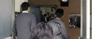
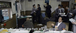
A pan following the men into their building shows the office open and men inside. Yuji bolts past his boss and flings himself at a policeman, who is one of several ransacking the place for evidence.
Most directors wouldn’t include the enigmatic shot of the functionary, but it yields a little question–what is he reacting to?–that the next shots gradually answer.
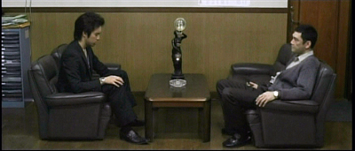
So cutting plays an important part in building up many scenes. But occasionally Shimizu pauses to draw a moment out. When Murasu and Shinji meet after many years, a nearly thirty-second shot squares them off.
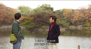
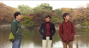
Instead of embracing and pounding each other’s back in the American fashion, they stand awkwardly opposite each other, and the anamorphic widescreen image stresses the tentativeness of their reunion. Later, when Murasu’s boss suggests he leave town and work for another boss, a poised two-shot (at the top of this section) lets us watch the interplay between them across two minutes. Again, the ‘Scope ratio helps, and the fixed frame adds a comic touch by setting at frame center the hideous, ticking clock that Yuji has bought the boss.
I don’t want to suggest that there’s anything particularly radical about Shimizu’s two-shots. Kids Return: The Reunion simply reminds us that a two-shot can usefully vary the film’s pace and lend gravity to moments of character reflection.
Absurdist anatomy
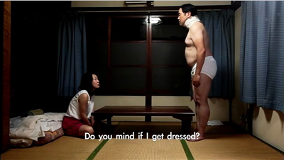
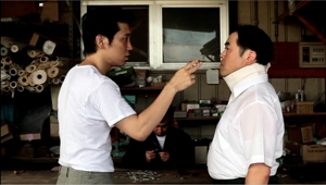
Something stranger goes on in Anatomy of a Paperclip, the winner of the Dragons and Tigers Award here at VIFF. The story is an exercise in grotesque nonsense, a sort of Japanese Theatre of the Absurd.
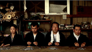
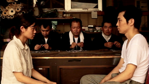
In an undefined town outside time (no cars, videos, or cellphones), a harsh boss rules over a crude cottage industry. Three, sometimes four, workers sit along a bench and make paper clips by snipping and twisting wire. The most hapless is Kogure, a lumpish loser wearing a neck brace. Bullied by two outlaws who constantly make him surrender his money and take off his clothes, eating with painstaking regularity in the same cheap restaurant, he returns home every night to sleep. A butterfly visits him and apparently leaves a pupa behind. As Kogure trudges through his days of petty humiliations, the pupa swells to human size, even bigger than the pods in Invasion of the Body Snatchers.
Director Ikeda Akira shot the film in fifteen days over weekends and holidays. It’s partly in the planimetric mode, with the camera lined up perpendicular to a back wall or lines in the setting.
Even more than Kids Return, the mug-shot and police-lineup staging recall linear, minimalist manga. A great deal of the film’s feel, that of a frozen, almost robotic world, derives from this deliberately “flat” look.
In Anatomy of a Paperclip, the profiled two-shot functions as part of the overall visual pattern. Although some conversations show 3/4 views of the characters, and even yield occasional OTS (over-the-shoulder) framings, many two-shots preserve the geometrical right angles of the master shots.
Another function of our two-shot, then: To play its part in a film’s overall pictorial design, suggesting expressive qualities like rigidity, automatism, and deadpan humor.
Two’s company, four’s a crowd
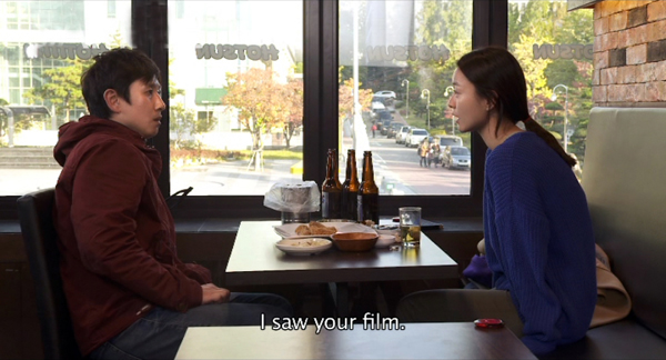
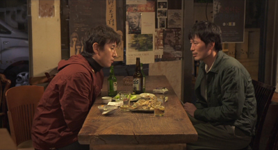
Hong Sangsoo has made the two-shot–usually profiled and showing characters drinking heavily at a restaurant table–into a central formal device. His films are conversation-driven, and he has rung an ingenious series of variations on duologues. They are typically presented in ways that stress similarities and contrasts among characters, often to mildly satiric effect. We see A and B in one setting, then perhaps B and C in another setting, then A and C in the first setting, and so on. For examples, see this entry.
In the more formally complex Hong films, these variants may be played out as intermingled points of view (The Power of Kangwon Province) or as alternative versions of the same events (The Virgin Stripped Bare by Her Bachelors) or just weird déja-vu (Turning Gate). In an earlier entry, I suggested that Hong exploits our inability to remember certain things precisely, so that we may forget when we first heard a recurring line of dialogue or saw a shot that is echoed by the shot we’re now seeing.
Our Sunhi is about a hugely momentous event that hasn’t, to my knowledge, been dramatized on film before: a professor writing a grad-school recommendation. Sunhi approaches Professor Choi for a reference that will help her study in the States. As she coaxes him into revising his initially cool letter, he becomes attracted to her, as does another university employee Jaehak. Meanwhile Sunhi meets her old lover Munsu, and he becomes attracted to her all over again.
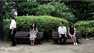
Here the formal rondelay that mocks male vanity–a Hong specialty–doesn’t involve fancy tricks with time or parallel viewpoints.Instead, what circulates are comments about Sunhi, pulled from the professor’s letter (“She has artistic sense,” “She’s honest and brave”) and passed from man to man. The points of circulation come in eleven duologues, each shot in one or two symmetrical long takes. Sunhi meets Jaehak, then Choi, then Jaehak again, then Munsu. Soon Munsu is going out drinking with Jaehak, with whom the prof has coffee before having a rendezvous with Sunhi. Connecting these nodal scenes are brief shots of characters walking through streets, meeting one another by accident, and at the finale, converging in a palace park. As you’d expect, these connecting bits are typically made parallel to each other through framing, situation, music, or other devices.
The two-shots are very long; the longest runs over eleven minutes. It presents a sort of climax, in which a drunken Sunhi reaches out to clutch Jaehak–a gesture of greater intimacy than she has shown any other man.
But soon enough she is meeting the professor for a date in the park. In the very last scene, when she goes off to the toilet, Hong gives us a tiny joke. All three of the men finally meet, waiting for her, and at last a two-shot becomes a three-shot.
This sheerly formal gag is pretty esoteric, I grant you, but it’s typical of Hong’s urge to tweak the simplest materials. In his hands, the lowly two-shot becomes a structuring constraint, a way of deliberately limiting his choices to show us what he can do with it–not least, comic variation.
Two heads, better than one?
During the 1940s, directors in various countries began to rethink the layout of their two-shots. Instead of giving us matching profiled or 3/4 views, they began to arrange their players so that one figure was significantly closer to the camera, yielding what I’ve called a big-foreground composition. In America, the most flamboyant early versions came from Orson Welles (Citizen Kane and The Magnificent Ambersons) and William Wyler (The Little Foxes, below). This strategy encouraged staging in depth and even letting players turn their backs to one another.
Tsai Ming-liang’s Stray Dogs is the most elliptical and visually variegated film of this VIFF bunch. It’s less a story than a situation: A father, mother, and two children try to survive on the streets. The father picks up odd jobs, while the mother finds work in a supermarket. They wash in public restrooms and scrounge castoff food, sometimes thanks to the mother’s rescuing market goods past their sell-by date. At night, the father and the kids huddle in a makeshift hut, until the mother finds a somewhat better squat in a ruined office building.
Every scene except one consists of a single take, but the connections between scenes are far more oblique than in the other films in this entry. For instance, the mother is seen weeping beside her sleeping children in the opening shot, but then she vanishes from the plot for a while before reappearing in the supermarket, now with her hair cut shorter. The clear and continuous duration of the scenes is offset by a narrative organization that skips over a lot of time and refuses to explain everything that happens in the interim.
Tsai’s visual strategies are quite diverse. Unlike Hong Sangsoo and others in this trend, he doesn’t always keep his camera within a mid-range zone. A scene’s single take can be a striking extreme long-shot or a tight close-up, often of the father (played by the still remarkably waif-like Lee kang-sheng) eating, drinking, or just reciting a poem.
Stray Dogs makes little use of two-shots, and his “clothesline” layouts aren’t quite as frieze-like as those in Anatomy of a Paper Clip.
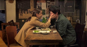
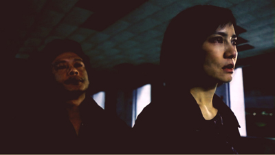
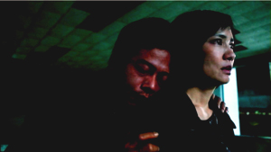
He saves his devastating two-shot for what is, in this quiet and melancholy drama, as close as we get to an intimate climax. The image at the top of this section shows the husband and wife, her face looming in the foreground while he stands behind her.
Why is this shot, only three minutes longer than one in Our Sunhi, so fiercely hard to take? Hong Sangsoo fills his restaurant shot with gab and plot development. Tsai’s shot, reminiscent of the big-foreground compositions of Welles and Wyler and many afterward, is almost completely unchanging. Neither husband nor wife speaks for fourteen minutes; the only action we see in most of the shot consists of him occasionally swigging alcohol from the bottles he’s stolen and some tears running down her cheek. And we have no idea of when the shot will end because there’s no obvious trajectory set up for it. Like the fixed close-up of a weeping face that ends Tsai’s Vive l’amour, this shot could go on forever.
About thirteen minutes in, the husband grasps his wife’s shoulders and leans his head wearily against her neck.
In a context scoured of what we normally think of as drama, such tiny movements become major events. The father seems at once apologizing for his drinking and trying for a reconciliation.
Tsai has reserved his two-shot for his climax. Instead of becoming a resource judiciously salted through the film (Kids Return: The Reunion) or a stylized extension of a cartoonish world (Anatomy of a Paper Clip) or a core schema for the film’s visual design (Our Sunhi), the two-shot here, rendered as an aggressive image of faces close to the camera, becomes the marker of a mysterious turning point in two lives.
All the films are very much worth seeing for their own reasons. Treating them together, though, reminded me of the power lurking within one very basic cinematic resource.
Last year I considered long-take shooting and staging techniques in that edition of Dragons and Tigers, with comments on Tsai Ming-liang’s Walker.
Just in case this occurred to you: No, Wes Anderson didn’t invent these techniques. This entry and some others explain.
For more on varieties of staging, see On the History of Film Style and Figures Traced in Light: On Cinematic Staging. On this site, you can visit the supplement to Figures here, and the categories Film Technique: Staging and Tableau Staging.
Stray Dogs.


