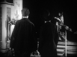
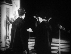
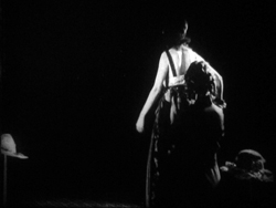
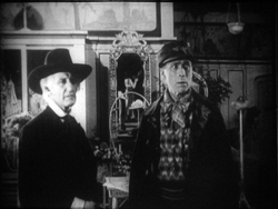
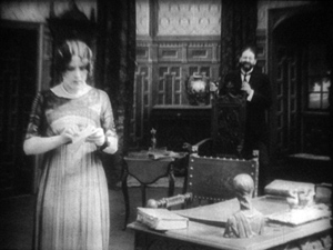
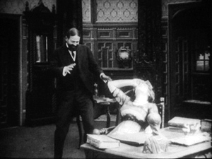
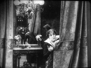
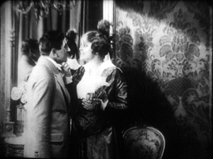
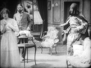
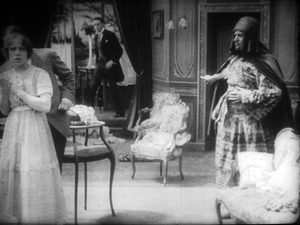
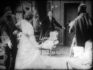
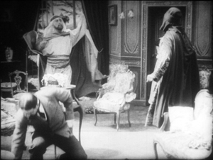
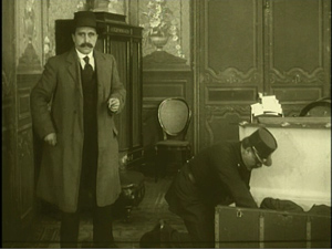
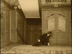
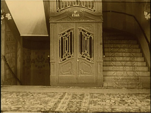
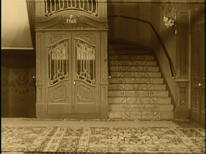
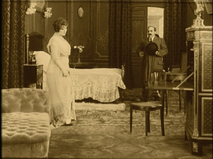
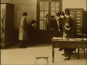
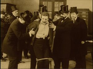
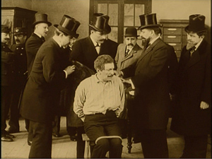
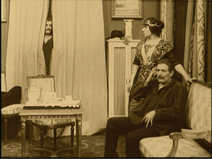
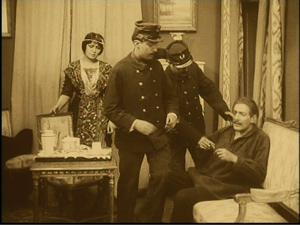
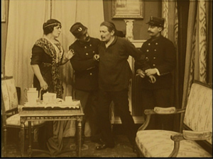
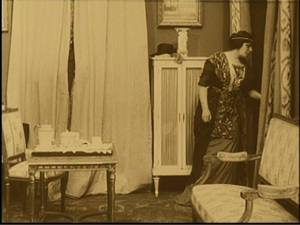
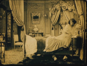
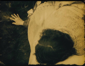
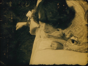
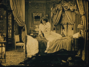
Archive for the 'Tableau staging' Category
Not-quite-lost shadows
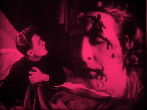
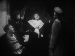
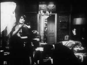
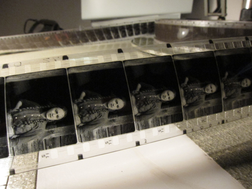
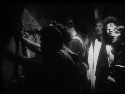
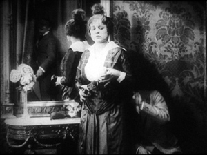
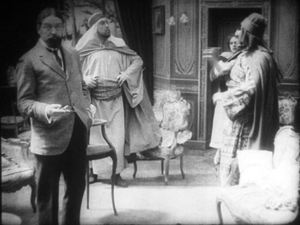
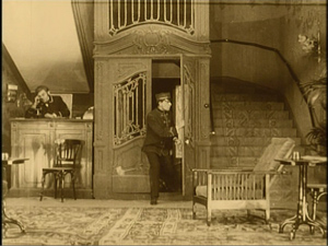
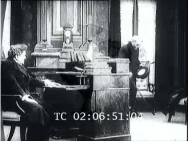
I.N.R.I.: The Catastrophe of the People (1920).
DB here:
One way to write the history of film as an art is to chart firsts. When was the first close-up, the first moving camera, the first use of cutting? Asking such questions was a common strategy of the earliest film historians, and it has persisted to this day in pop histories. Civilian readers can be excused for thinking that Griffith invented the close-up and Welles originated ceilings on sets. These myths have been recycled for decades.
The “revisionist” historians of the 1970s, mostly academics who aimed to do primary research, pointed out that talking about first times is risky. Too often the official account is wrong, and earlier instances can be found. In most cases, we can’t really know about first times. Too many films have vanished, and nobody can see everything that has survived. Innovation is always worth studying, but, the revisionists argued, it’s best understood within a context.
So they set themselves to figuring out not when certain cinematic techniques began but when they became common practice–when most filmmakers in a given time or place adopted them. That way we can discover innovations more reliably; they’ll stand out against the background of more orthodox choices. But of course, to build up a sense of these norms, it’s not enough to focus on the masterpieces cited in the official histories. You need bulk viewing.
Studying norms of storytelling and visual style is a large part of what Kristin and I have done since the 1970s. One section of our 1985 book The Classical Hollywood Cinema tried to chart when certain fundamental techniques of Hollywood storytelling coalesced into common practice. Kristin argued that the late 1910s are the key years, with 1917 as a plausible tipping point. By then, continuity editing and goal-oriented plotting, among other creative options, became dominant practices in American features. If you’re interested in blog posts touching on this, see the codicil.
Yet it’s reasonable to ask: But what happened in other countries? Was Hollywood unique, or were there comparable norms emerging in Russia, France, Germany, Denmark, Sweden, and elsewhere?
Several years ago, I began trying to watch as many US and overseas features from the period 1908-1920 just to see what I might find. Doing this led me to make arguments about the development of staging-driven cinema (often, but not only, European), as opposed to editing-driven cinema (usually, but not invariably, American).
A vast resource for my bulk viewing of 1910s cinema has been the Royal Film Archive here in Brussels. While the collection houses virtually every classic, it also includes films that haven’t been discussed by many historians–obscurities, if not downright rarities. Films from many countries passed through Brussels, and the archive was able to acquire copies from many distributors going back to the 1910s. Although I had watched several German films in the collection on earlier visits, this year I had a pretty concentrated dose. So as in previous years (see that codicil again), I offer you some chips from the workbench.
Cinematic scarcity
I.N.R.I.
German films of this period are of special interest for my research questions because of an unusual situation. From 1916, films from the US and nearly all of Europe were banned from Germany, and this ban held good until 31 December 1920. As Kristin puts it in her book Herr Lubitsch Goes to Hollywood (available as a pdf here):
Foreign films appeared only gradually on the German market. In 1921, German cinema emerged from years of artificially created isolation. . . .Because of the ban on imports, German filmmakers had missed the crucial period when Hollywood’s film style was changing rapidly and becoming standard practice. . . . The continuity editing system, with its efficient methods of laying out a clear space for the action, had already been formulated by 1917. The three-point system of lighting was also taking shape. In contrast, German film style had developed relatively little during this era.
Kristin was again exploring craft norms, the creative choices favored by Lubitsch’s contemporaries. She drew some of her evidence from films she saw here at the Cinematheque, but I wanted to revisit those and see some others. What exactly did German films look like at this point? Not the official classics like Caligari and Nosferatu, but more ordinary, maybe even bad movies?
The basic assumption: Since the German directors weren’t seeing American movies, they’d be less likely to imitate them. Some hypotheses follow from this. German directors would presumably rely less on cutting, especially within scenes, than Americans did. They might incline toward staging complicated action in a single shot. The cutting is likely to be what Kristin calls “rough continuity” or “proto-continuity”–essentially, long shots of the whole action broken by occasional axial cuts that enlarge something for emphasis. We wouldn’t expect to find sustained passages of close-up or medium-shot framings.
To give myself some reference points, on each visit I’ve watched European films in conjunction with American films of the same era. This mental trick helped differences pop out more easily.
Fortunately for peace in our household, I’ve found Kristin’s claims about German cinema well-founded. As in other years, I also stumbled across some gratifyingly strange movies.
Blocking, tackled
Throughout the period 1908-1920, we find many scenes staged in a single fixed shot. In many other blog entries, and in books like On the History of Film Style and Figures Traced in Light, I’ve tried to show that this wasn’t simply a passive recording of a “theatrical” scene. Drawing on capacities specific to the film medium, directors used composition, lighting, setting, and figure movement to shape the perceptual and emotional flow of the scene.
Here’s a late example from The Brothers Karamazov (1920) directed by Carl Froelich and Dmitri Buchowetzki. Starring Fritz Kortner, Emil Jannings, Werner Krauss, and other heavyweights, it has perhaps more ham per square inch than any other film I saw on this pass. Yet its tableau moments subordinate the performers’ charisma to an overall expressive dynamic.
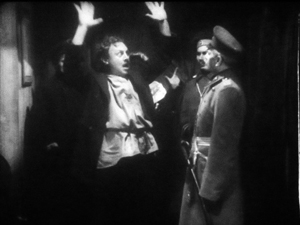
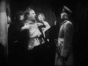
Old Fyodor Karamazov has been murdered, and his son Dmitri is accused of the crime. Protesting his innocence, he’s about to be arrested when Grushenka bursts out. “I’m the guilty one!”
In the tableau tradition, “blocking” takes on a double meaning–not only arranging actors in the shot, but also judiciously using them to mask or reveal areas of space. Thus Dmitri at first blocks Grushenka, but when he lowers his hands, she pops into visibility–frontal and centered, so we can’t miss her. Dmitri sinks to the lower half of the shot when her dialogue title comes up, leaving her to command the frame. Meanwhile the police official has pivoted slightly, making sure that we pay attention to her outburst. Not incidentally, he blocks another policeman behind him, keeping the frame dominated by Grushenka.
This scene goes on quite a bit longer, with some careful balancing and rebalancing of points of interest in the lower part of the frame. The action ends with a nice touch: the embracing Dmitri and Grushenka are separated, and she’s pulled away, one arm flailing.
Without benefit of cutting, then, techniques of tableau construction guide our attention smoothly in the frame by using movement, centering, advance to the camera, character looks, blocking and revealing, and other tactics.
The Germans had embraced this tableau option in the earliest 1910s. The films of Franz Hofer and others show how an entire scene could be covered in a single camera position, with staging providing a continuous flow of interest. Go here for an amusing example from The Boss of the Firm, a 1914 comedy starring Lubitsch.
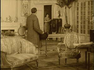
The commitment persisted into later years. The earliest film I watched in this cycle, Hilde Warren and Death (1917), by the quite interesting director Joe May, had several passages of tableau staging. In the most elaborate one, the mistress of Hilde’s dissolute son tells him that now he’s out of money, she has switched her affections to a rival. It plays out without a cut or intertitle for about a minute at 18 frames per second. When Fernande spurns him, he grovels, just as the salon door opens. (Whenever there’s a rear door like this, we’re likely to get a tableau scene.) His rival shows up to take her to the opera.
Fernande asks him to stay outside, but the son demands that he stay, waving his hand. In a staging tactic that should be familiar to us now, the son rises, blocking the rival for an instant.
The rival rebalances the composition, and makes himself visible, by moving to the right background. This switching of characters’ position in the frame is known as the Cross. But when the son gets angry, the rival crosses again, easing himself toward the area of conflict. Note that the son’s bodily attitude, tensing up, actually shifts him rightward a little, opening up a space for the other actor to be seen.
Now the rival steps to the forefront and wedges himself in between Fernande and the son. He invites the young man to leave, with a gesture that occupies the dead center of the frame: Who could miss its assured insolence? And now the maid, previously in the background and blocked by Fernande, makes herself known. Seeing how things are developing, she fetches the son’s hat.
The son gets off one last grimace, front and center, before departing. As he walks back, the rival swivels to blot him out, leading the ladies in mocking laughter. (It’s clear the rival belongs to the 1%.)
One good Cross deserves another: Now the rival settles in where the son was at the start of the scene, and the son is retreating in shame along the rival’s path.
This tableau technique, constantly calculating points of interest from the standpoint of monocular projection–that is, what the camera lens takes in–is far from theatrical. Well-timed blocking and revealing wouldn’t work given the multiple sightlines of a theatre stage. The action is staged for the only eye that matters: the camera’s.
Once we grant that theatrical playing space is quite different from that provided by the camera, we can see more exactly what the tableau tradition owes to the stage. Silent cinema’s “precision staging,” as Yuri Tsivian has called it, is close to choreography. If we want to appreciate what directors of this period accomplished we need to look at the scenes as varieties of pictorialized dance, designed around the axis of the camera lens.
Along the lens axis
To return to the first question: Yes, German films seem to have clung to the tableau tradition after 1917, when Americans had abandoned it. Yet shots like those in The Brothers Karamazov and Hilde Warren are fairly rare; most scenes in most German films of the period use a fair amount of editing. What do we make of that?
The trend is fairly general. Some staging-driven films, like Ingeborg Holm (1913) and the early serials of Feuillade, are built entirely out of one setup per scene, occasionally broken by cut-ins of printed matter or other details. This period constituted a brief golden age of this “tableau” tradition–visible in American cinema, but more pervasive in European cinema. But by the late 1910s, most directors around the world were cutting up their dialogue scenes at least a little. Gradually, the tight choreography of the tableau gave way to the easier method of using close-ups to pick out key instants.
The European default seems to have been what Americans called the “scene-insert” method. A long shot (called the “scene”) is interrupted by a cut to some part of it (the “insert”). Then we go back to the orienting view. The cuts are typically straight in and back along the lens axis.
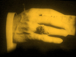
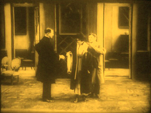
Here’s a straightforward German example from The Devil’s Marionettes (Marionetten des Teufels, 1920). A fake medium has been brought to a rich man’s home to read the fortune of his daughter. As she leaves he pays her, and from his ring she’s able to identify him as a Duke.
Note that the first setup is much farther back than the tableau scenes in Brothers Karamazov and Hilde Warren. There’s not much to be done with such a distant shot except cut in.
The Devil’s Marionettes scene has two inserts, but it’s conservative by American standards. By 1917, Hollywood directors were increasing the number of “inserts” considerably and making them the dominant source of the ongoing action. Some European directors took this option; notable instances are Abel Gance and Victor Sjöström. Others, though, relied on the scene-insert approach, not building the action out of a lot of closer views. The post-1917 German films I’ve seen, most recently and on other occasions, favor a moderate scene-insert approach like the one in Marionettes. Accordingly, the “pure” tableau option waned.
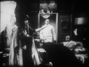
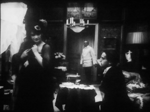
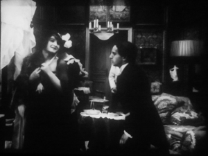
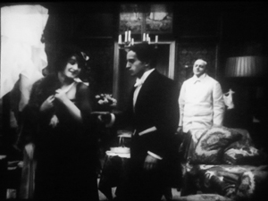
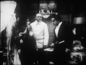
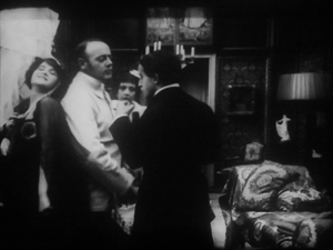
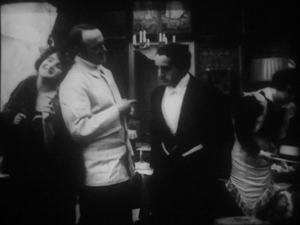
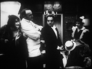
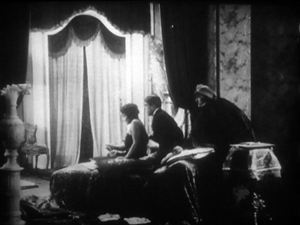
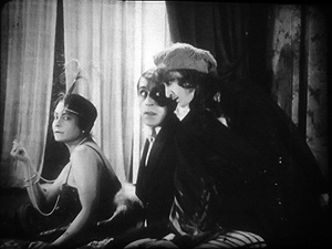
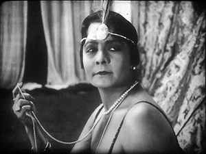
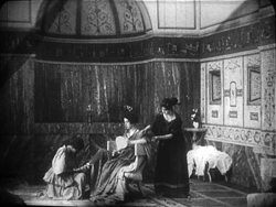
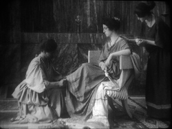
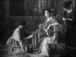
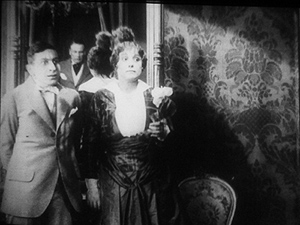
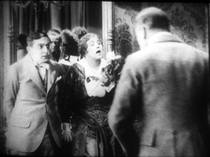
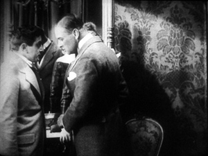
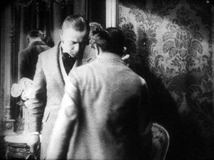
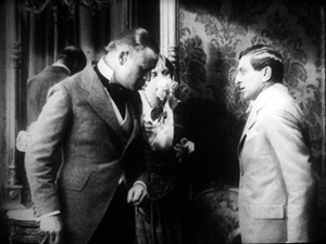
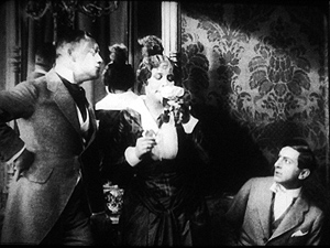
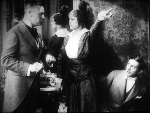
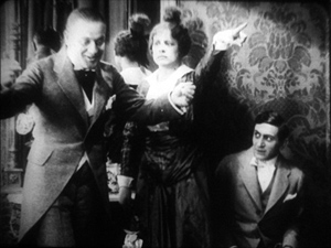
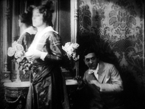
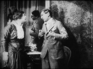
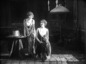
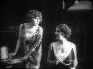
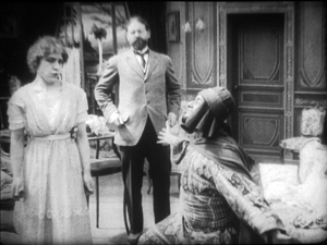
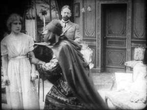
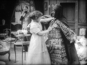
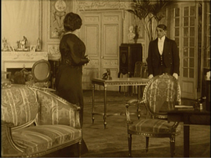
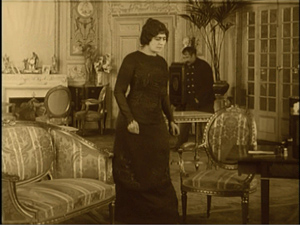
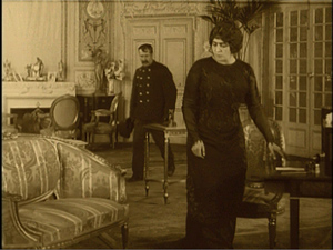
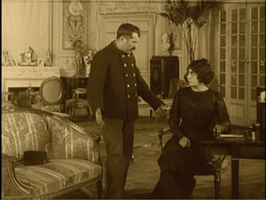
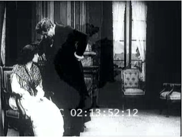
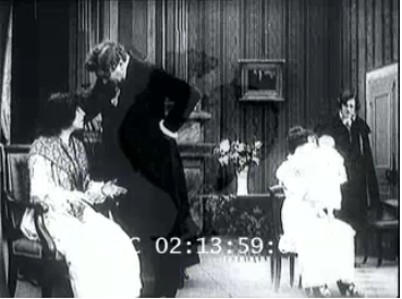
Yet one basic idea of the tableau strategy persisted. We can see this in directors’ use of the axial cut, which provides a constant orientation to the setting. While American directors were often building up a scene from many angles, German directors seemed reluctant to show the action, at least in interior sets, from distinctly varied viewpoints. So when they broke a dialogue scene into many shots, they stuck to the camera axis, cutting in and out along that. You can see that in the Marionettes scene. Consider as well this moment in I.N.R.I.: The Catastrophe of the People (1920). Within a single overall orientation, the editing enlarges or de-enlarges the three characters in the boudoir.
Even with the drastic enlargement from the first shot to the second, or from the third to the fourth, our orientation is basically the same. The staging cooperates with this strategy, making sure that all three players’ faces turn to the camera, even if their bodies are angled away from it. They’re playing to the lens axis, we might say.
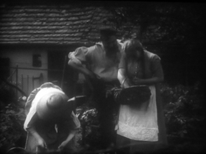
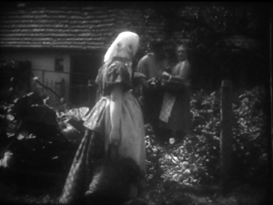
When directors try to shift the angle more drastically, the consequences can be strange. In Rose Bernd (1919), an adaptation of a famous Gerhardt Hauptmann play, an axial cut has brought the bullying Streckmann striding toward the camera to meet his wife and Rose, chatting in his garden.
As he flirts with Rose, director Alfred Halm provides another axial cut, from farther back, as a neighbor woman passes in the foreground. Rose turns to look.
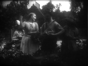
The print is missing dialogue titles, but there evidently was one here, as Rose comments on the woman passing. The dialogue title provides some cover for the extraordinary cut to the next shot.
The time is clearly continuous, as the woman is still walking past the garden gate, now in the distance. But Rose, Streckmann, and his wife have been completely rearranged in the frame. They’re positioned frontally, as in the I.N.R.I. boudoir example, and they create the sort of foreground/ background dynamic characteristic of 1910s cinema generally. Halm could have shown Rose’s comment and the others’ reaction by cutting back in along the axis, to a closer shot of the group in the garden (like the second one above). Instead, he shifted his camera position sharply. The new shot does highlight Rose and her gesture, but at the price of spatial coherence.
Aliens, missing shadows, and lustful monks
Tötet nicht Mehr!: Misericordia (To Kill No More!: Misericordia, 1919).
So some of our hypotheses seem borne out. Many German directors apparently adopted a conservative position toward American-style analytical editing until the ban relaxed in 1921. After that, as Kristin documents in her Lubitsch book, films by Murnau, Lang, and others employ more varied angles and less frontal staging. It seems likely that the Germans learned about this approach from the new availability of films from America and European countries (some of which were adopting the American approach).
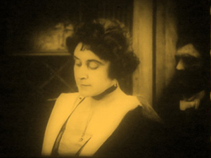
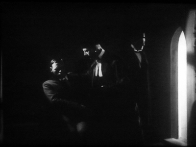
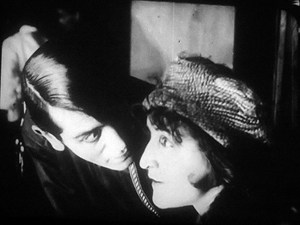
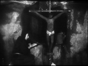
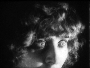
My latest plunge into Weimar cinema yielded other enjoyments. It’s commonly said, for instance, that Germans experimented with expressive lighting effects. So did directors in many other countries, but I did find some striking uses of sparse, stark illumination. One example is the prison cell from Tötet nicht Mehr!: Misericordia (1919), above. Even more daring is this double close-up from I.N.R.I.
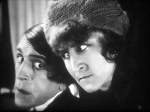
Harvey Dent has nothing on the conniving Russian student Alexei, half of whose face seems just scooped away by shadow. The faint shadow cast on the wall tempts us, in a weird Gestalt illusion, to see his head as partly transparent.
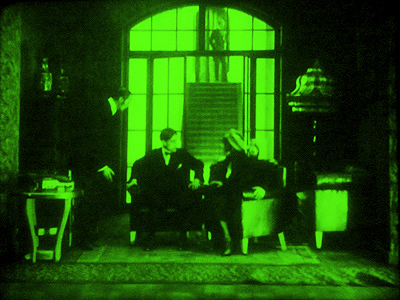
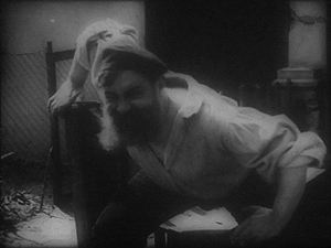
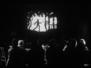
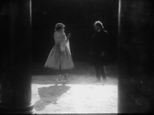
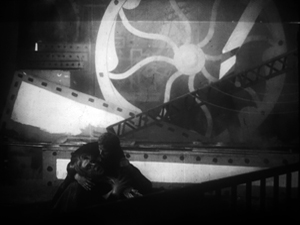
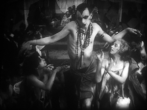
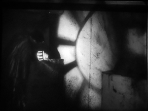
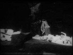
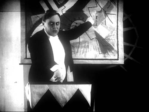
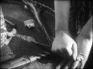
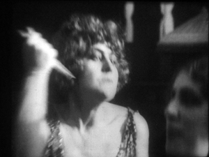
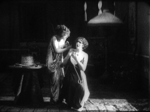
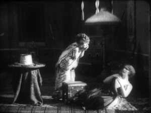
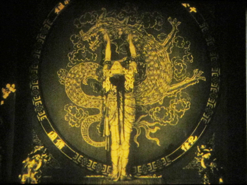
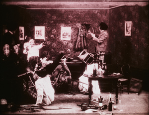
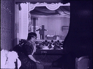
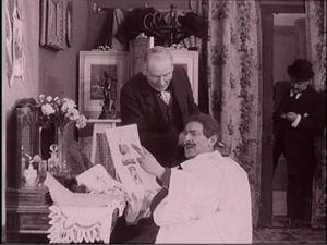
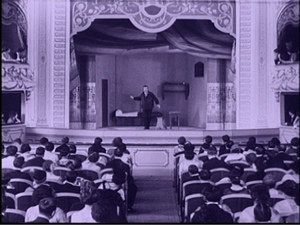
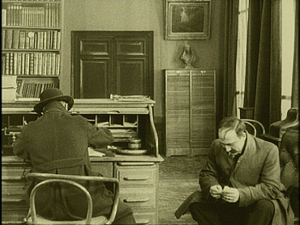
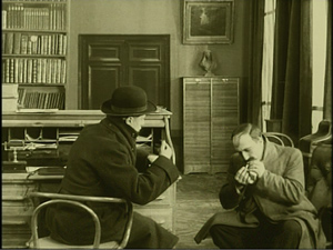
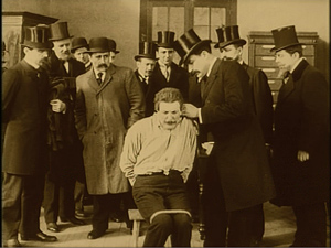
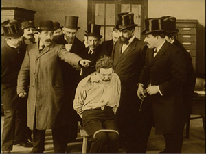
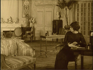
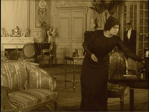
Another area of German expertise was special effects, and I saw plenty of sophisticated double exposures, matte shots, and split-screen tricks. As you’d expect, some of these were used to suggest hallucinations or the supernatural. At the very top of today’s entry is another image from I.N.R.I., which presents the student Dmitri’s fever dream. Below are a couple of nice ones from Lost Shadows (Verlorene Schatten, 1921). A Satanic traveling showman puts on shadow plays, but his cast is drawn from real life: He bargains with people for their shadows, and eventually leaves the hero without one.
What, finally, about what we all yearn for: an extravagantly nutty film? Nothing in this foray matches the work of Robert Reinert (Opium, Nerven), about which I’ve written in Poetics of Cinema and on the DVD restoration of Nerven. Reinert is on another plane of delirium, as mentioned in an earlier entry. Nonetheless, apart from moments in many of those movies already discussed, I found two pervasively peculiar items.
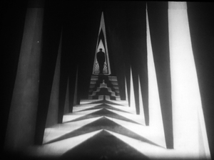
The more well-known is Algol (1920), directed by Hans Werckmeister. The sets, although designed by Walter Reimann of Caligari fame, aren’t cramped and contorted but are instead vast, geometrical, and a bit reminiscent of the Monster-Machine aesthetic of Expressionist theatre.
The plot is your everyday visit from another planet. An alien from Algol visits a coal mine and gives a loutish miner a machine that generates endless energy. (Today the Algolian could take a bribe from an oil company to head back home.) The miner becomes a tycoon controlling the world’s energy supply. This monumental fantasy (big sets, big crowds) is enacted with maniacal gusto by Emil Jannings, who spends his wealth, like all good plutocrats, on bacchanals featuring crazy dancing.
Algol is forthcoming in the Filmmuseum DVD series.
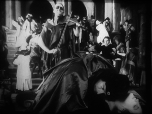
The Plague in Florence (Die Pest in Florenz, 1919) is less famous, although the script is by Fritz Lang. Directed by Otto Rippert (Homunculus, 1916; Totentanz, 1919), this tells of Julia, a woman whose all-powerful sexuality wreaks havoc on the city. Even churchmen lust for her, and eventually Florence sinks into debauchery. What redeems, if that’s the right word, the city is the appearance of a plague that strikes citizens dead in their tracks. Personified as a gaunt woman rising up from the marshes and mournfully playing a violin, the plague eventually kills Julia and her umpteenth lover.
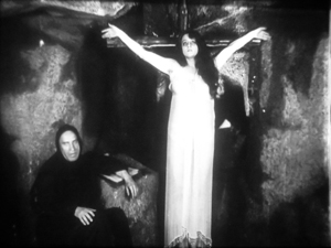
Before this, we’ve had everything I’ve mentioned and more: a couple of fancy tableau sequences, axial cuts, wild mismatches between shots, spectacular lighting effects (e.g., catacombs, below), and hallucinatory sequences. At one point, the mad monk vouchsafes Julia a glimpse of the horrors to come by showing her a river of corpses calmly flowing underground.
Of course the monk isn’t invulnerable to Julia’s charms. Trying to pray away the impulses she arouses in him, he sees her as his Savior. Herr Rippert, Señor Buñuel is on the other line.
Who knew film history could be so surprising? You don’t get this stuff in your usual pop history. But maybe it’s better we don’t share this with the civilians.
My usual heartfelt thanks to the Royal Film Archive of Belgium, its staff (particularly Francis, Bruno, and Vico), and especially its Director, Nicola Mazzanti. Thanks also to Sabine Gross for a translation.
My previous Brussels research visits are chronicled in this blog over the years. A 2007 entry talks about my viewing method and concentrates on Yevgenii Bauer. The following year’s entry is devoted to William S. Hart. An eclectic 2009 one surveys films from Germany, France, Denmark, and even Belgium. In 2010 I went twice, once in January (watching mostly Italian diva films) and as usual in July (but no entry for that visit, consumed as I was with writing about Tintin). The 2011 entry is diverse, covering many national cinemas, and, implausibly, runs even longer than the others.
We have many other entries on film style in the 1910s. One considers how the Hollywood style coalesced in 1917; another talks about Doug Fairbanks. There’s also an entry on 1913, which discusses both Suspense and Ingeborg Holm, and there are discussions of Sjostrom as a master of both the tableau approach and continuity editing. And of course there’s plenty on Feuillade’s staging; you might start here, and perhaps pause over the mini-essay here, which talks about the director’s eventual experiments with editing. Elsewhere on the site there’s an essay on Danish cinema that echoes some points made in today’s entry. (Unlike other countries, neutral Denmark was able to send its films to Germany during the war, so there may have been some influence there.) Broader comparative arguments about this material have been sketched in a lecture I’ve given in various places, “How Motion Pictures Became the Movies.”
Interest in German cinema of the period grew after Pordenone’s Giornate del cinema muto held its trailblazing program published as Before Caligari, ed. Paolo Cherchi Usai and Lorenzo Codelli (University of Wisconsin Press, 1991; now, alas, very rare). See also the valuable collection edited by Thomas Elsaesser, A Second Life: German Cinema’s First Decades (Amsterdam University Press, 1996). Kristin has an essay here on Die Landstrasse (1913), a remarkable instance of the tableau style.
As my research on the 1910s draws to a close, I’m thinking of how to synthesize and present my arguments. Originally I was considering a book, but the number of stills, and the specialized nature of the project, would probably make publishers shudder. At the moment, I’m thinking about creating a series of PowerPoint lectures, with voice-over. These would be freely available for people to use in courses if they wanted. That initiative would be another experiment in using the Web to get information and ideas out there to interested readers.
Professor Bordwell illustrates his views on visual storytelling (Algol).
Looking different today?
Johan (1921).
DB here:
Earlier this month Manohla Dargis wrote a New York Times article on how we watch, or should watch, films that some audiences consider slow and boring. She suggested that appreciating such films requires us to cultivate fresh ways of seeing. Her article and my interests coincide on this matter, so I wrote an entry developing some ideas about viewing strategies and skills. This piece also, happily, brought new readers to Tim Smith’s experiment in tracking viewers’ scanning of a scene in There Will Be Blood.
Today I explore another angle on the problem of how to watch movies that aren’t the normal fare. But this time what’s abnormal for us was once normal for everybody. I look at the pictorial possibilities that emerged in the 1910s. Those possibilities are of interest if we want to fully understand film history, but they offer some mysteries as well. If viewing movies involves skills, did people a century ago have the ones we have? Or did they employ different viewing habits, ones that we have to learn?
Editing, your imaginary friend
I write from my annual research trip to the Royal Film Archive of Belgium, now known as the Cinematek. For some years, I’ve been looking into feature filmmaking of the 1910s. On every visit I’ve found rich material, movies off the beaten path that give me a sense of the immense creativity of that early period. (See the bottom of this post for links.) The official classics of these years, by Chaplin and Griffith and Fairbanks and Bauer and Gance and Sjõström and Feuillade, remain remarkable, and Kristin’s latest entry makes a case that Alberto Capellani belongs among this heroic company. But you can also find extraordinary moments in ordinary movies. Even the most banal film has something to teach me about what choices faced the era’s filmmakers.
One of those teachable elements involves the ways in which directors guide our attention. We know that editing serves to shift our attention from one part of a scene to another, but so does judicious staging. This is one of the great lessons of the cinema of the 1910s. Watching films from that period convinced me that the craftsmanship of Anderson in There Will Be Blood, and of other directors reliant on long-take ensemble staging, has deep roots in filmmaking tradition. But the golden age of cinematic staging was relatively brief, and it was eclipsed by an approach based largely on editing. That approach is, essentially, still with us.
Let’s start by appreciating the technique that became most prominent. By the late 1910s, Hollywood filmmakers had more or less perfected what we’ve come to call the classic continuity editing system. The camera could penetrate the most intimate exchange, breaking it up into intelligible bits. Here, in a minor Metro film called False Evidence (1919), Madelon tries to persuade her father that she, not her boyfriend, is responsible for a crime.
After giving us father and daughter close together in profile, the camera has somehow squirmed in between them, showing each one in a tight 3/4 view. Or rather, the cutting has forced the staging to pull the characters a bit apart so that each one can have a frame to him- or herself. Spatial plausibility gives way to dramatic urgency; what we care about are clear views of their emotional responses. As long as the spatial relations remain clear, they can be just approximately consistent.
For a little more finesse, we can look–as usual–to Rio Jim. William S. Hart’s films are among the most visually elegant and ambitious of this period, and even his less-known items seldom disappoint. John Petticoats (1919) gives us “Hardwood” John Haynes, a rough-edged logger who finds he has inherited a New Orleans dressmaking shop. His comic introduction to the place, in the company of a new friend he’s made, uses editing to tease us. The two gents come in, with John bewildered by a feminine world he’s never known. They pause before a model sashaying on the stage, and when she pauses, she’s blocked by the Judge’s body.
We’re left without the revelation of her appearance, but when her dresser comes forward to peel off her wrap, we cut, in effect, “through” the Judge to get a clear view of the disrobing. The blocked shot teased us, but the cut pays us off.
Now that the model bares a lot more than before, the biggest tease begins. How will John react? The answer is given in the next shot, a nearly 180-degree shift from the earlier framing of the men that incorporates a mirror in the background to keep the model onscreen.
Thanks to a cut, action and reaction are given in the same shot–in fact in the same zone of the frame, the center.
A pass, a pat, a squeeze
Fabiola (1918).
Many European directors were moving in the same direction as Lambert Hillyer in John Petticoats. Although they might not use as many shots or as many different angles as their American counterparts, they were confidently breaking their scenes up into closer views, often through axial cuts that take us straight into or out of the action, along the lens axis.
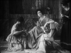
Take Enrico Guazzoni’s Fabiola (1918), henceforth known to me as Fabulosa. Normally I consider the Roman oppression of Christianity one of the least fertile topics for a good movie, but Fabiola proves me wrong. For one thing, the title names a rather unpleasant woman who barely figures in the action until the climax. For another, Guazzoni proves an adept filmmaker. I was struck by those immense sets that distinguish the Italian costume drama, the dazzling lighting (see above), and the skilful editing.
Our introduction to Fabiola comes as she sits disdainfully in her household, attended by servants. After a long shot showing off the set, an axial cut takes us closer to her.
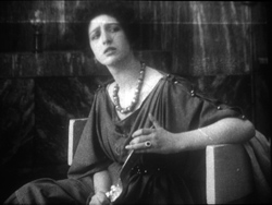
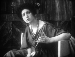
She turns as her tardy servant Sira comes in. Having stretched her elegant neck, Fabiola tips her head forward slightly, in a bob of disdain.
Another axial cut takes us still closer to her. And in a few frames her gesture, at once haughty and angry, is repeated. (The streak across the first image below is the splice, so this is the very first frame of the next shot.)
This, I think, is no mistake. The matches on action elsewhere in the film are quite precise, and indeed earlier Italian films have shown that directors used this device skilfully. Guazzoni wanted to stress Fabiola’s head movement, and he used the same tactic, the overlapped action match, that some Americans would use and that many Soviet directors drew on later. This slight accentuation of Fabiola’s gesture is a vivid way to introduce the character, caught in a characteristically scowling moment. Very soon, in a fit of pique she’ll jab Sira with a hatpin.
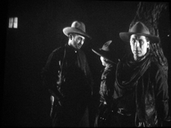
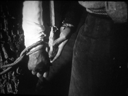
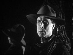
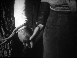
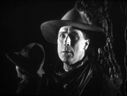
On the whole, keeping the setups close to the camera axis is the default value in Fabiola. For the Americans, though, cutting made the camera almost ubiquitous. A year after John Petticoats, O’Malley of the Mounted (1920), lets Lambert Hillyer again resort to intelligible shifts of setups. O’Malley, played by Hart, has gone undercover to track a killer. Posing as a robber, he has joined an outlaw gang, but they’ve discovered he’s betrayed them and plan to hang him at sunup. He’s lashed to a tree and guarded by his enemy, the brutal Big Judson. But Rose Lanier, who has drifted along with the gang, is going to help O’Malley escape. The cutting will show us exactly how she does it, and why.
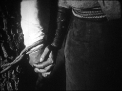
Rose interposes herself between Big and O’Malley, chatting up the thug. A cut of about 180 degrees takes us to the opposite side of the tree and shows her slipping a knife toward O’Malley’s hand. We’re so familiar with this sort of insert that we’re likely to forget that once it was fresh.
O’Malley starts, then shifts his gaze toward Big.
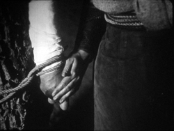
Then comes a simple, remarkable shot. Rose slips the knife to O’Malley. Then she pats his hand. Then she gives it a squeeze.
Mystery and charm of the American cinema, as Godard would say: a single cut-in of hands can give us a lot. First there’s the narrative information (I’m passing you the knife), then Rose’s expression of support (Good luck!), capped by a burst of affection (I love you). The whole thing takes less time than I’ve used to tell it. Surely this ability to invest plot-driven detail shots with heartfelt emotion helped American cinema conquer the world. I’m tempted to say that we could sum up of the power of Hollywood, in its laconic prime, with that formula: the pass, the pat, the squeeze.
This shot is as compact in its expression as the previous one. It’s impossible to capture here all the emotions that flit across O’Malley’s face: hope of eluding death, realization that Rose loves him, anxiety that surviving will make him choose between love and duty. Rose’s brother is the killer he’s been tracking, and in a perversely honorable way O’Malley had looked forward to being hanged. That would have spared him arresting the boy. Now he must live, enforce the law, and lose the woman who has saved him.
I saw some European films that absorbed such continuity tactics quite deeply. Above all, Mauritz Stiller’s Song of the Scarlet Flower (Sangen om den Eldroda Blomman, 1919) and Johan (1921) relied heavily on analytical editing in the American fashion, including angled shot/ reverse shot. As in Fabiola, some of the discontinuous cuts have their own logic. I wish I had time to explore those Stiller films in more detail–particularly their use of turbulent rivers as dynamic plot elements, not mere landscapes. Maybe in some future entry….
Four-quadrant style
Before they adopted the analytical editing characteristic of American cinema, directors were still able to guide our attention. The so-called “tableau” style, about which I’ve waxed enthusiastic on this site before, became a rich tradition in the 1910s. Editing within the scene is minimized. (Apparently most European directors didn’t consider it a creative option in its own right until later in the decade.) The drama is carried by performance and ensemble staging. Relying on movement, acting, and composition, the director controls where we look and when we look at it
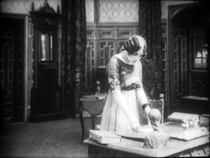
To take a straightforward example, consider the rather ordinary melodrama Le Calvaire de Mignon (Mignon’s Calvary, 1917). The scheming and dissolute Dénis de Kerouan wants to wreak misery on his brother Robert. While Robert is out of the country, Dénis hires a forger to fabricate a letter indicating that Robert has a mistress. Dénis leaves the letter on the desk for Robert’s wife to find.
Dénis has exited through the central entryway, and into the empty study comes Robert’s wife. She discovers the letter.
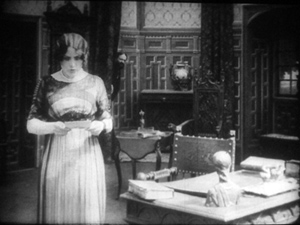
She moves to the left foreground and starts examining it. At this point Dénis’ face peeps out from behind the central curtain. The director makes it easy for us to notice him because nothing else is happening in the set, and Denis’ face is rather close to the wife’s. It’s almost as if he’s looking over her shoulder.
Once we register Dénis’ presence, the director can proceed to balance the shot. All that empty real estate on the right of the frame asks to be filled, and that’s what happens.
When the wife reads the damning letter, she collapses rightward into the chair, just as Dénis rushes forward to take charge of the situation.
This move exemplifies the staging technique known as the Cross, which motivates the switching of characters’ positions in the frame.
Simple as it is, this portion of the prologue of Le Calvaire de Mignon shows how, without cutting, a director can steer us to one or another zone of the shot through such cues as faces, centering, proximity to points of emphasis, and movement. Something similar happens in one, more striking moment of another fairly unexceptional movie from the period.
Nobody will claim Der Stoltz der Firma (The Boss of the Firm, 1914) is a masterpiece, or its director Carl Wilhelm is a master. It’s one of the many comedies in which Ernst Lubitsch starred before becoming a director. Here he’s Siegismund, a bumbling young provincial with more aspirations than abilities, who simply lucks into marrying the boss’s daughter. On the way to the happy ending, he wins the patronage of a fashion designer, Lilly, whose husband finds her flirtation with the young parvenu none too innocent.
Wilhelm’s use of the tableau approach isn’t especially dynamic in most of the film, but there’s one flashy scene. Wilhelm gets us to watch a very small, tight area of the frame and then gently swings our attention to a wider swath of action. As usual, everything depends on a sort of task-commitment on our part: Watch what’s likely to forward or enrich the ongoing narrative.
Lilly lures Siegismund into a changing room, with the composition showing him reflected in a mirror behind her. This sets up an item of setting that will be central to the scene.
Once inside, he coyly presents her with a flower and they draw close together. Since we tend to concentrate on faces, the small area encompassing their two profiles is likely to draw our attention. Nonetheless, the shot is notably unbalanced, as if anticipating something coming in from the right side.
Abruptly Siegismund and Lilly draw apart, and the space between them, in the mirror, is filled by the face of Lilly’s husband, coming through the curtain.
I’d bet that a Tim Smith experiment would find that nearly every spectator is already watching this small zone in the upper left quadrant of the shot. Faces, especially frontally positioned ones, command our notice, and thanks to the mirror we here have three of them. Moreover, movement is an attention-getter too, and all three faces are in motion. Mr. Maas’s face, in fact, gets notably bigger and clearer. His wrathful expression is another reason to watch him.
The husband’s body enters to fill the frame, then presses into the center of the shot, blotting out Lilly as he faces down Siegismund.
Now the director controls the speed of our gaze quite precisely. Maas slowly rotates, forcing Siegismund to swing from left to right, as if he were attached to the bigger man by a rod. This yields, again, that nice sense of refreshing the frame that we always get from a Cross.
Siegismund collapses into the lower right of the frame, flinching from the fight that’s about to start. Lilly soon shoves aside her husband’s chastisement and melodramatically tells him to leave. “We’re divorcing!” the following intertitle says.
Mr. Maas takes it in stride, shrugging and spreading his arms. He leaves, and thanks to the helpful mirror we can see him chortling as he glances back and passes through the curtain.
If we hadn’t already noticed Siegismund cowering behind Lilly in the lower right quadrant, we will now. Lilly angrily flounces to our left (the Cross again). Siegismund rises to explain he hadn’t meant to cause a rift in the marriage.
We’re back to something like the initial setup, but now with Siegismund centered, the couple further apart, and a less unbalanced frame. The drama, which now consists of Lilly inviting him to tea tomorrow, can proceed from here.
A different way of seeing?
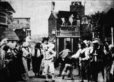
Tom Tom the Piper’s Son (1905).
We’ve become used to editing-driven storytelling, and I’m convinced that we can learn to notice the staging niceties of the tableau alternative. But what if early filmmakers explored some other ways of looking that are far more unfamiliar to us today?
Noël Burch, in his 1990 book Life to Those Shadows, argued that in the first dozen years or so of cinema, movies solicited viewing skills that we lack today. He suggested that early filmmakers often refused to center figures and crammed their frames with so much activity that to our eyes the shots look confused and disorganized. In Tom, Tom, the Piper’s Son (1905), Burch notes, the bustle of the fair, the reliance on an extreme long shot, and the absence of any cutting make the central event, Tom’s swiping of the pig, difficult to catch. In the frame surmounting this section, Tom is making off with the pig in an area just right of center, but the antics of the clown and the response of the crowd may well distract us from the main action.
The result, says Burch, is a mode of filmmaking that demanded
a topographical reading by the spectator, a reading that could gather signs from all corners of the screen in their quasi-simultaneity, often without very clear or distinctive indices immediately appearing to hierarchise them, to bring to the fore “what counts,” to relegate to the background “what doesn’t count” (p. 154).
Later developments linearized this field of competing attractions, creating a smooth narrative flow “harnessing the spectator’s eye.” Among these developments were the presence of a lecturer at many screenings (telling people what to watch) and, of course, the growth of the continuity editing system. But Burch suggests that the “primitive mode” hung on until about 1914.
A famous example is a shot from Griffith’s Musketeers of Pig Alley (1912). The gangster has lured the Little Lady (Lillian Gish) into a back room and distracts her with a photograph while he tries to dope her drink, in a precursor of date-rape drugging. But the Snapper Kid, another gangster, has been keeping an eye on her and follows. As the gangster starts to pour the drug out, the Kid’s entry is presaged by a whiff of cigarette smoke.
At the crucial moment, we have three things to notice: the Little Lady’s obliviousness, the gangster’s pouring the drug, and the full entrance of the Snapper Kid.
Today’s director would likely resort to editing that shows the doping, then the Kid arriving, then the doping again, and leaving us to infer a vague sense that they’re happening at the same time. Griffith’s choice gives us genuine simultaneity, but at a cost. Two cues compete for our attention: central composition for the drink, major motion on the edge for the Kid’s entry. In my experience, viewers tend to notice the appearance of the Kid, but to miss the business with the drink. (Another passage for Tim Smith to test!) By today’s standards, Griffith has failed as a director, but Burch’s view suggests that 1912 viewers, more sensitive to “all-over” composition, could have registered both actions, perhaps by rapidly scanning back and forth.
During my trip I found a fascinating example of this issue, as well as an apt counterexample. Both involve daggers.
In Maman Poupée (1919), a remarkable Italian film directed by Carmine Gallone, a devoted, somewhat infantile wife learns of her husband’s affair with a society woman. Susetta confronts the mistress and begs her to break off the affair. The woman laughs in her face. What happens next is given in several shots, mostly through axial cuts.
The linear editing, as Burch indicates, lays everything out for us step by step. The close-ups accentuate what is important at each moment: Susetta seizing the dagger, stabbing her rival, and–in a remarkably modern-looking extreme close-up–registering her horror at what she has done.
Two years before, Marcel Simon, the (Belgian!) director of Calvaire de Mignon, handled a similar situation rather differently. The diabolical Dénis, whom we met earlier, has succeeded in destroying his brother’s life. It remains only for him to force Robert’s niece Mignon to marry the Algerian Emir Kalid. Kalid is at first humble, beseeching Mignon to become his bride, but then he gets rough. We might note already that Mignon, while fairly near the camera, hovers close to the left frame edge.
In their tussle, Mignon snatches something from Kalid’s waistband and flings him far away to the right.
What’s up? Mignon has grabbed the Emir’s dagger and stands poised with it pressed to her heart. But we haven’t been able to see that dagger very clearly (no cut-in close-up here, as in Maman Poupée) and she’s returned to her position far off-center. It’s likely that a viewer today wouldn’t understand that she’s holding the men at bay by threatening suicide. Would a 1917 viewer be as uncertain? Would the situation, plus her posture and the men’s hesitation, be enough to get the point across?
Moreover, this moment goes by very quickly. Scarcely has Mignon struck her pose when her true love, René, bursts in behind her–frontal, fairly centered, and moving fast. Meanwhile, Dénis is sneaking up on her, hugging the left frame. Mignon makes a break for René, dropping the still almost indiscernible dagger.
While Mignon and Rene embrace in the right rear doorway, blocked from our view by Kalid, Dénis stoops over. It’s a timely adjustment, giving us full view of the benevolent Le Maire sweeping into the room.
As the two men confront one another–the climax of the scene–director Simon has the effrontery to let Dénis steal the show. He picks up the dagger, which now can be seen more or less plainly, weighs it in his hand, and looks out for a brief, pondering moment.
We seem to have a late example of the Snapper Kid Effect, in which important actions compete for our attention. Is it clumsy direction to perch Mignon on the frame edge as René rushes in, and to let Dénis recover the dagger while we’re supposed to concentrate on the face-off between the two powerful men? Or would audiences have tracked all the strands of action and enjoyed their simultaneity?
On this site and elsewhere, I’ve assumed that directors in the 1910s structured their compositions for what Charles Barr calls “gradation of emphasis,” a fluid pattern of primary and secondary points of attention. I’ve argued as well that Burch exaggerates the decentered, nonlinear compositions of even the earliest years. Many of the films staged by Lumière cameramen are designed cogently, and so are many films from the 1900s. (Tom, Tom might be the exception rather than the norm.) Yet every so often, you get a later case, like Musketeers of Pig Alley or Le Calvaire de Mignon, that suggests that some viewers might have been more adept at tracking simultaneous events than we are.
A still broader question remains. Let’s assume that people were able to follow and enjoy films in the tableau style, even when that style pushed toward illegibility. What enabled people to adapt, and so quickly, to continuity-based movies? Some scholars and filmmakers argue that continuity editing achieved its power and worldwide acceptance because it mimics our natural mode of perception. At any moment, we’re concentrating on just a small portion of our surroundings, and this is like what editing does for us in a scene. On the other side, Burch and others would argue that continuity filmmaking is only one style among others, with no special purchase on our normal proclivities. On this view, classical continuity’s apparent naturalness hides all the artifice that goes into it, and this concealment makes its work somewhat insidious. I’ve offered some thoughts on this problem elsewhere, but I bet I tackle it again on this site some time.
In any case, we need to study films that seem odd or difficult, whether they’re recent or from the distant past. We’re guaranteed to find some striking and unpredictable things that provoke us into thinking. That’s one of the pleasures of exploring the history of film as an art.
For earlier studies of the tableau style on this site, see this entry on Bauer, this one on 1913 films, this one on Feuillade, and this one on Danish classics. This entry discusses the emergence of Hollywood-style continuity, and this one explores the exemplary editing in William S. Hart films. I go into more detail in two books, On the History of Film Style (chapters four and six) and Figures Traced in Light (chapter two) and in the essay, “Convention, Construction, and Cinematic Vision” in Poetics of Cinema. The last-named piece tries to stake out a middle position on the “naturalness” of continuity editing. Kristin has analyzed Alberto Capellani’s films as instances of the tableau trend, last year here and just last week here. She also weighs in on the debate about whether viewers of his time were better prepared to grasp the action than we are. More generally, Capellani’s career exemplifies the major and swift stylistic changes of the 1910s. When he went to America, he became pretty adept at the emerging continuity style, as the Nazimova vehicle The Red Lantern (1919) indicates. Of course that’s got some striking single images too.
The Red Lantern (1919).
How to watch FANTÔMAS, and why
DB here:
He is, we’re told in the opening of the first volume, “The Genius of Crime.” Not a genius, the genius. And he doesn’t play nice.
“Fantômas.”
“What did you say?”
“I said: Fantômas.”
“And what does that mean?”
“Nothing. . . . Everything!”
“But what is it?”
“Nobody. . . . And yet it is somebody!”
“And what does the somebody do?”
“Spread terror!”
In the standard English translation, the last line sounds exceptionally scary, especially today. The original French, “Il fait peur,” is closer to “He creates fear,” but that sounds tamer in English than in French.
In whatever language, for a hundred years this catechism has proven bone-chilling. Cinephiles, crime fans, avant-garde artists, and mass audiences have found the tales anxiety-provoking, even hallucinatory. The delirious imagery and plot twists are felt to harbor a demented poetry. So the first reason to celebrate the arrival of a U. S. DVD version of Louis Feuillade’s great installment-film Fantômas (1913-1914) is that we can all have a look at what made Apollinaire and Magritte and Resnais and Robert Desnos tremble.
I confess myself of the other party. I enjoy tales of Fantômas and Dr. Gar-el-Hama (the Danish equivalent in movies of the era) and Dr. Mabuse and Haghi (of Lang’s magnificent Spione, 1928) but they don’t give me an existential frisson, or unmoor me from rationality, or make me feel the secret currents swirling through the modern city. Call me cold-blooded.
On second thought, don’t. The best-made efforts in the master-mind genre do heat my blood—but because they arouse my love of narrative invention and dazzle me with flourishes of cinematic style. The conventions of the genre, all the disguises and elaborate schemes and surprising revelations engineered by the Genius behind the scenes, the cascades of coincidence and the hairbreadth escapes, aren’t merely enjoyable in themselves. They show how little plausibility matters to storytelling. (People may say they like realism, but they’re suckers for far-fetched stories.) And in order to make the whole farrago of traps and conspiracies flow along, you need filmmakers who can hold our interest with swift pacing and ingenious narration. On many occasions, depicting virtuosity of crime has called forth virtuoso cinematic technique.
 So let Fantômas make your flesh creep, if your flesh is creepward inclined. But even if it’s not, we should celebrate Louis Feuillade’s triumph in creating, in the first great era of filmmaking 1908-1918, a fine piece of cinematic storytelling. To appreciate it, we need to watch—really watch—what he’s doing.
Thirty-two Fantômas novels by Marcel Allain and Pierre Souvestre were published from 1911 through 1913. By the time Feuillade launched the film version in May of 1913, the book cycle was winding down; in La Fin du Fantômas (1913), the master criminal dies, at least for a while. Souvestre died in 1914, but the prodigious Allain revived the series and the villain during the 1920s.
When the films were made, Feuillade was working for Gaumont, one of the two most powerful French studios. He was head of production, overseeing other directors while turning out his own movies at a rapid clip. He signed over fifty films, mostly one-reel shorts, in 1913 alone. The Fantômas films are often thought of as a serial, but they are really long installments in a series, somewhat like our Bond and Bourne franchises. A “feature” film at the period might run fifty to seventy-five minutes. As with our franchises, there are recurring characters. The films pit police inspector Juve and the journalist Fandor against Fantômas and his accomplices, notably the treacherous but passionate Lady Beltham.
Feuillade was one of the great directors. He had a fine comic touch, not only in the shorts featuring child players like Bébé and Bout de Zan but also in farcical two-reelers like Les Millions de la bonne (The Maid’s Millions, 1913). His dramas could be powerful too, epitomized for me in the two-part feature Vendemiaire (1919) and sentimental melodramas like Les Deux Gamines (1921) and Parisette (1922). Still, he’ll probably always be most famous for his crime films like Les Vampires (1915-1916), Judex (1917), Tih Minh (1919), and of course the first of them, Fantômas.
The new video edition, which comes to us from Kino, is the third DVD release I’ve seen. The first was a French set from Gaumont in 1998, the first full year of the DVD format. The box contains a handsome booklet with background material, pictures, and an interview with Feuillade, but the intertitles aren’t translated. All subsequent releases seem to be based on the Gaumont copy used in this collection. That results in so-so picture quality, a rather haphazard score pasted together from classical pieces, and occasional distracting sounds, like birds tweeting in outdoor scenes. The UK Artificial Eye PAL release of 2006 includes a brief introduction by Kim Newman but no booklet. The original Gaumont titles are preserved, with English subtitles added.
Kino’s version unfortunately eliminates the French titles altogether, substituting English translations. Visually, however, I prefer the Kino version to the others, which on my monitors is less contrasty and heavily saturated in its tinting. Still, the Gaumont master was made in the early days of DVD authoring and could stand a complete redo. In fact, Gaumont should release many more Feuillade titles, starting of course with Tih Minh.
How best to persuade you that these movies are worth watching? I decided to concentrate on just the first episode, Fantômas (aka The Shadow of the Guillotine) as a sample of Feuillade’s artistry. Everything I analyze here is on display in later installments, sometimes more flamboyantly. The creative principles at work are explored in greater detail in my books On the History of Film Style and Figures Traced in Light (which has a long chapter on Feuillade), as well as in several items on this site.
1. Get ready for preposterousness. The film, based on the first book in the series, rearranges the novel’s plot order considerably and simply excises the first half’s major line of action, a hideous murder. Even with cuts, though, the film asks us to believe that after Fantômas, disguised as one Gurn, is put into prison, he can get his wealthy mistress to bribe a guard to let him out for a while. And that during their rendezvous, the couple can replace the murderer with an actor who happens to be playing Gurn in a stage show based on the case. And that the actor, having been drugged, can’t recall his identity.
There’s at least one glaring plot gap in the film. Juve solves the mystery of the disappearance of Lord Beltham when he discovers his body in a steamer trunk about to be sent overseas. The novel explains his rather tenuous line of reasoning (Chapter 11), but the film simply shows him arriving at Gurn’s apartment and examining the fatal trunk. Presumably, though, Feuillade could afford to be elliptical. Some of the audience would have known the novels and could fill in bits that seem enigmatic to us.
The film’s climax is in fact less implausible than the novel’s, perhaps out of considerations of good taste. In the novel, the actor substituted for Gurn actually dies at the guillotine; the authorities realize their mistake only when they see the head smeared with greasepaint. In the film, Juve interrogates the dazed Valgrand and astounds other officials by revealing that he isn’t the prisoner they had locked up. Even then, it seems unlikely that nobody but Juve would have noticed the prisoner’s wig and false mustache.
Far-fetchedness is built into the genre, so the problem is handling. Craziness must be treated matter-of-factly, and Feuillade’s sober technique takes all the wild developments in its stride. Nothing fazes Fantômas, or our director.
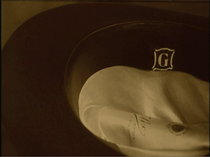
2. Accept the conventions of “pre-classical” cinema. Film historians often consider the years from 1907 to 1917 as leading up to the sort of cinematic storytelling we know, replete with lots of cutting, close-ups, and camera movements. A film like Fantômas exemplifies some tendencies of French cinema in this period. There is relatively little crosscutting among lines of action. The film uses no shot/ reverse-shot or extended passages of close-ups. Typically a cut is used to enlarge printed matter, like a news story or a business card, or to emphasize crucial details. Here is Juve discovering a clue, Gurn’s hat, in Lady Beltham’s parlor.
Interior sets were usually designed to be seen from only one camera orientation. In exteriors, we get somewhat freer cutting, presumably because real surroundings don’t confine the camera as much as a fake set does.
In this transitional era, some habits of earlier years hang on: the fairly distant framings, the fairly obvious sets, and the occasional glances at the audience.
You can almost sense stylistic change happening during such moments. In earlier films, characters constantly looked at the audience, but in Fantômas a character’s eyes pause fractionally on us before drifting away, as if the look to the camera simply signified thinking, not an effort to share a response.
Similarly, Feuillade seems to be sensing the need for varying his camera positions in a way that we’d find in later cinema. Consider his handling of the Royal-Palace Hotel.
To show the elevator entry on different floors he reuses the same set. This is motivated realistically, since hotels look more or less the same on different floors. But if the camera were framing every elevator shot exactly the same way, we would have weird jump cuts when cutting from floor to floor, and the use of the same set would be more apparent. So Feuillade not only re-labels each landing at the top of the frame, but he shifts his camera position slightly, moving the framing rightward in the string of shots showing the elevator descending to the ground floor.
The slight shifts in framing reinforce the sense that we’re on different floors.
3. Watch the back door. Deep space is common in exteriors from the beginning of cinema, even in Lumière shorts, but by the early 1910s filmmakers were starting to replace relatively flat interior sets with ones that give their actors more playing space in depth. Here, for example, is a Bohemian party from Feuillade’s Une Nuit agitée of 1908. The parlor and the action are shot in a flat, lateral way, and people enter the room from the right or left.
Compare the depth in the interiors of many scenes in Fantômas of five years later.
Once sets become deeper, the rear door becomes very handy for entrances and exits, and Feuillade is a master of using it. It’s usually fairly close to the center, but in the actor Valgrand’s dressing room, it’s off to the side.
The rear door prepares us for upcoming action and provides another center of compositional interest—advantages that don’t come up when actors enter from the sides of the frame. The door also allows people to be shown overhearing what is going on in the foreground.
4. It isn’t theatre! There’s a common belief that the cinema of this period simply records performances as if on a stage. But that’s not true. As most of these shots show, the camera is usually closer than any spectator would be to a stage play. Feuillade reminds us of what a real stage performance would look like when Lady Beltham sees the actor Valgrand in the dramatization of Gurn’s capture. (It’s reminiscent of the stage-like set in Une Nuit agitée above.)
Valgrand’s gestures are broad ones, suitable to being seen from a great distance. But in the surrounding story, the performances are much more subdued. Feuillade demanded dry, quick acting from his players, and their gestures aren’t extravagant. (Juve usually jams his hands in his overcoat pockets.) Instead, Feuillade keeps his actors busy with small props. Here, as Fandor writes a story, Juve is brooding on his failure to capture his adversary. Before he’s finished one cigarette he’s already rolling another, and he lights up the new one end to end.
Crucially, theatrical space is geometrically very different from cinematic space, as I’ve argued in several other entries. A shot like this wouldn’t work onstage because spectators sitting to the right or the left would have their sightlines blocked by furniture.
Because the camera slices out a wedge of space in depth, actors can be carefully arranged in dynamically developing compositions that would not be visible on the stage. When the doped-up Valgrand is brought to be questioned by the police officials, we first see him through the rear doorway–a view that wouldn’t be shared by many spectators in a theatre performance.
The dazed actor is questioned, with Juve emerging slowly out of the welter of authorities behind him.
Needless to say, the earliest phases of this shot would be unintelligible on a stage; for most members of the audience, the other actors would block Juve. Recall as well that this was accomplished in an era when directors and cinematographers could not look through the lens to see exactly how the configuration would appear onscreen.
5. Develop an appreciation of complex staging. In a cinema relying on analytical editing, our attention is driven to one item or another through cutting and closer views. By contrast, the director of “tableau cinema,” as this 1910s style is sometimes called, must shift the actors around the sets in ways that call our attention to what’s important at each moment. In the course of the scene, the director must also try to maintain some pictorial harmony on the two-dimensional plane of the screen. Shots are subtly balanced, then unbalanced, then rebalanced, all in the service of story intelligibility.
As we’d expect, depth can play a key role here. Take the simple moment when Lady Beltham’s butler announces the arrival of Nibet, the prison guard whom she bribes. Lady Beltham turns at the sound, rises, and moves to the settee.
As Nibet enters, Lady Beltham returns to her writing desk. This is our old friend the Cross, refreshing the image by having the actors trade placement in the frame.
The same choreography of balancing, unbalancing, and rebalancing can be found when the characters aren’t arranged in depth. The scene of Lady Beltham and Gurn drugging Valgrand plays out laterally. Gurn hides behind a curtain, and our awareness of his presence there colors the whole scene. But because Valgrand will be on the settee, for some while Lady Beltham’s position at her tea table would make an appearance by Gurn compositionally clumsy.
As the drug takes effect, Lady Beltham moves to Valgrand’s side. This gesture of concern unbalances the composition–until Gurn peeps out to rebalance it.
Lady Beltham’s stare at him makes sure we notice his presence. Soon the police arrive to return “Gurn” to his cell.
Again Lady Beltham moves to the right, and again it’s motivated: She wants to make sure the cops have gone. But that movement clears a space for Gurn, i.e. Fantômas, to reveal himself in triumph just as Lady Beltham relaxes in relief.
The synchronization demanded of the actors, in pacing and placement, is considerable, and of course the director has to coordinate everything. Feuillade, directing with shouts and a drillmaster’s whistle, drove his actors through each long-take scene. Turn off the music occasionally and imagine him calling out instructions to them.
These examples, and many others, gainsay David Kalat’s curious claim in the Kino commentary that Feuillade’s work exhibits an “anti-style” that doesn’t present stories “cinematically”–because he doesn’t exploit cutting and changes of camera position.
The camera has been plopped down perfunctorily in front of a set in which the actors meander around within the frame without any sense of composition. In several scenes the actors nonchalantly turn their backs on the audience completely. Only rarely does a shot appear in which the actors seem positioned in front of the camera for any specific pictorial effect. The shots ramble on with hardly any change of point of view until the scene ends and a new one takes its place (Disc 1, 11:54-12:20).
Actually, here and in other works, Feuillade’s staging is quite precise. I doubt that many directors today could block fixed shots as fluidly as he does; sustained, intricate staging in this sense is an almost lost art. Hou Hsiao-hsien, in his films up through Flowers of Shanghai, might be the last great exponent of this technique.
We find the same principles at work in later Fantômas episodes. Some scenes have greater pictorial splendor than the ones I’ve considered; many aficionados believe that the essence of the series is on display in the second installment, Juve contre Fantômas. Certainly it has crazier plot twists. (I got through a whole blog without mentioning Juve’s python-repelling suit, below.)
Granted, it’s hard to study the films as they’re unfolding. That’s partly because Feuillade guides our eye so subtly that we get caught up in the plot. Still, re-viewing can help us spot the fine points. With this DVD set, you have at least five and a half hours of fun before you.
In the lurid tales of Allain and Souvestre, Feuillade found sensational material. He had fine actors. He had luminous prewar Paris as a backdrop. And he had at his fingertips all the resources of tableau cinema. The whole mixture creates a lively cinematic experience. Watching films like Fantômas and Ingeborg Holm and The Mysterious X and many others from 1913, we can still be bowled over by their exquisitely modulated storytelling. If Feuillade is less baroque than Bauer and less poignant than Sjöström, he’s also more brisk, laconic, and playful. Call him the Hawks of the tableau tradition. Thanks to this new release, more Americans will have a chance to enjoy his exuberant creativity.
And they can have all the frissons they want.
Searching “tableau” in our blog entries will offer many further examples of what I’m discussing here. Our 1913 entryoffers an overview of what Feuillade’s contemporaries were up to.
The Kino set includes two other Feuillade films, The Nativity (1910) and The Dwarf (1912). These are better transfers than the main attractions, and make for some interesting comparisons with his artistic strategies in Fantômas. There’s also a short documentary on Feuillade’s career, adapted from the Gaumont box set Le Cinéma premier, which contains many Feuillade titles. Other Feuillade films are available on US DVD: Les Vampires, in an out-of-print Image set; Judex, from Flicker Alley; and various items in the Kino package Gaumont Treasures, 1897-1913. That set, a selection from the Gaumont box, includes The Agonie of Byzance, made the same year as the first installments of Fantômas.
As times changed, Feuillade adopted editing, sometimes in rather flashy forms. For examples, go to my chapter on Feuillade in Figures and here. Essays by Ben Brewster and Lea Jacobs show how performance style adjusted to the tableau tradition. Charlie Keil’s Early American Cinema in Transition traces the somewhat differing developments in U. S. cinema of the period.
For all things Fantômas, visit the Fantômas Lives website. There’s also the very helpful Encyclopédie de Fantômas (1981), self-published by the mysterious ALFU. If you want to know the percentage of deaths by defenestration in the oeuvre (6.8 %), this is the book for you. David Kalat offers a wide-ranging survey of Fantômas’ influence on modern art and popular culture in “The Long Arm of Fantômas,” in Third Person: Authoring and Exploring Vast Narratives, ed. Pat Harrigan and Noah Wardrip-Fruin (MIT Press, 2009), 211-224.
Francis Lacassin has written prolifically on both Fantômas and Feuillade. The arch criminal earns a chapter in Lacassin’s À la recherche de l’empire caché (Julliard, 1991), while his Louis Feuillade: Maître des lions et des vampires (Bordas, 1995) remains the essential work on the director.
Juve contre Fantômas.
Capellani ritrovato
Aladin ou la lampe merveilleuse.
Kristin here–
[Note, July 11, 2011. The release of a considerable number of Capellani films on DVD since the 2010 festival has allowed me to add some frames to my examples below. The frames from L’Arlésienne, L’Épouvante, and Pauvre mère are new, and the one from Cendrillon has been replaced by a better copy. For more on the DVD, see the entry on the second half of the retrospective.]
Back in the 1980s and early 1990s, researchers into silent cinema became used to the discovery of little-known auteurs. The 1910s proved an exceptionally rich source of directors beyond the familiar names of Griffith, Ince, Chaplin, Feuillade, Lubitsch, Stiller, and Sjöström.
In 1986 Le Giornate del Cinema Muto’s epic retrospective of pre-1919 Scandinavian cinema revealed the Swedish master Georg af Klercker. In 1989, a similarly ambitious presentation of pre-Revolutionary Russian films brought the work of Evgeni Bauer to light. In 1990, the “Before Caligari” year added Franz Hofer to the list of obscure directors at last receiving their due. After that quick series of revelations, there has been a dearth of such significant revelations until, some would argue, now.
This year Bologna’s Il Cinema Ritrovato presented 24 films directed by Albert Capellani (1874-1931), previously known mainly to specialists for two films, his magisterial adaptations of Hugo in the four-part serial Les Misérables (1912) and of Zola in Germinal (1913). The retrospective has been  arranged by Mariann Lewinsky, who, as in previous years, has also been responsible for this year’s “Cento anni fa” program, covering the output of 1910. (The “Cento anni fa” series began in 2003, with Tom Gunning as programmer, and Mariann took over that duty in 2004.)
A gradual rediscovery
When Georges Sadoul wrote his multi-volume Histoire général du cinéma, the second part (1948) mentioned Capellani a few times. With the lack of available prints of the films, however, he was limited to treating the director primarily as the head of S.C.A.G.L., the prestige production unit launched by Pathé in 1908. Richard Abel’s The Ciné Goes to Town: French Cinema 1896-1914 (1994) devotes considerably more space to Capellani. Dick was able to view and analyze seven of the shorts and four features but was hampered by the incompleteness of some of these and the lack of such key films as L’Arlésienne (1908). As Mariann points out in her program notes, Capellani’s significance has been commented on by several scholars, including our colleagues Ben Brewster and Lea Jacobs. (Ben’s detailed analysis of the acting in Germinal is here, including a citation to a 1993 article on the film by Michel Marie).
Mariann, however, has recently been instrumental in bringing Capellani’s films to broader attention. The decision to mount retrospectives of his work has spurred archives to restore several which had been unavailable or lost, and more prints will presumably be ready for next year.
Capellani has actually been creeping up on us in Bologna for some time now. In 2006, Mariann’s programs from 100 years ago had reached 1906–the year when Capellani’s career really got started, though at least one of his films appeared in 1905. We saw only one from 1906, La Fille du sonneur. I can’t say that I remember anything about it. In the 1907 program, Les Deux soeurs, Le Pied de mouton, and Amour d’esclave. Again, I probably would have to say that I don’t recall these films, except that I vaguely recognized Le Pied de mouton, a fairy tale about a young man who receives a magic object in the form of a large sheep’s foot, when it was shown again this year.
By 2008, however, a pattern had started to emerge, and Mariann showed seven Capellani films, with six of them forming one program devoted solely to the director’s work, “Albert Capellani and the Politics of Quality”: La Vestale, Mortelle idylle, Corso tragique, Samson, L’Homme aux gants blancs, and Marie Stuart. The seventh, Don Juan, appeared in the “Men of 1908” program.In visiting archives and choosing films Mariann often saw prints without credits and from unknown directors, so the pattern only gradually became clear. In the 2008 catalogue she reflected on her realization that Capellani was showing up regularly in her choices for the annual centennial celebrations: “When organising the 1907 programme, however, in the light of Amour d’esclave, a gorgeous mise-en-scène of classical antiquity, I asked myself for the first time, ‘Who made this sophisticated film?'”
She speculated that the relative neglect of Capellani perhaps came from the Surrealists’ campaign against highbrow filmmaking during the 1910s and 1920s:
From his very first film on–the memorable Le chemineau of 1905, based on an episode from Victor Hugo’s Les Misérables–Albert Capellani transports the contents and qualities of bourgeois culture to the cinema. He films Zola, Hugo and Daudet–his Arlésienne of 1908 has unfortunately been lost. His many fairy tale films (scène des contes), biblical and historical scenes reveal him as a great art director, who also adopted the latest developments in modern dance and worked with its stars Stacia Napierkowska and Mistinguiette. Highly versatile, he had an unerring sense of the best approach to a given genre.
Fortunately, L’Arlésienne has subsequently been discovered by Lobster Films, just in time to be presented this year.
The 2009 program contained only two Capellani films, but one was the extraordinary Zola adaptation L’Assommoir. This had been known only from fragments until a complete copy was found in Belgium. It displays an unusual degree of realism that fits the naturalist subject matter and also contains complex and deft staging that moves numerous characters around a scene in a way that shifts the spectator’s attention among them exactly as the flow of the narrative requires. The other, La Mort du Duc d’Enghien, was shown again this year. It’s a rare case of an historical drama of the period that manages to arouse a genuine sympathy for its main character, a young nobleman unjustly arrested and executed upon Napoleon Bonaparte’s orders. More on it later. The 2009 catalogue announced that in the following year, Capellani would graduate from the annual “Cento anni fa” programs to his own retrospective.
This year’s films
This first full-fledged Capellani retrospective gave a generous though not complete overview of his surviving films from early 1906 to 1914—a few bearing 2010 restoration dates. Capellani also worked in the United States from 1915 to 1922, and the program included The Red Lantern, a 1919 feature starring Nazimova. This, Mariann’s notes assure us, is “a taster for next year’s festival,” which will include further restorations from the French period, as well as more features from his American career. (It would be good to see the other Capellani films shown in previous years repeated, now that we have a sense of his work more generally.)
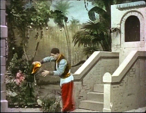
Ideally our examples here should include frames from the films shown at this year’s festival, but none of them is out on DVD. The Brewster article linked above has a generous selection of well-reproduced frames from a 35mm print of Germinal. As far as I know, the only Capellani film available on DVD is Aladin ou la lampe merveilleuse, on the third volume of Kino International’s “The Movies Begin” set. I’m sure it was included there not because it was a Capellani but because it survives in beautiful condition and is an epic with elaborate hand-coloring. I’ve included frames at the top and bottom of this entry, despite the fact that it has not been shown at Bologna. The smaller frames illustrating a few of films shown at Il Cinema Ritrovato come from the Gaumont Pathé Archives website (registration required). This site is the best online source of information on the director’s films, including complete video versions in a few cases. These are, however, quite small screens, and they display the double branding of a prominent timer and a bug of a Pathé rooster superimposed over much of the frame.
Capellani had worked in the theater as a director and actor until Pathé recruited him in 1905. In a sense, he became a specialist in literary adaptations, especially after his appointment in 1908 as artistic director of S.C.A.G.L. Yet the films being shown this year include pure melodrama (such as Pauvre mère, “Poor mother,” 1906), crime-suspense films (L’Épouvante, “The Terror,” 1911), classic fairy-tales (Cendrillon, 1907), and historical/biblical costume pictures (Samson, 1908).
With his theatrical background, it is not surprising that Capellani was able to cast many old colleagues in his films, notably Henry Krauss, who played Quasimodo in Notre-Dame de Paris (1911) and Jean Valjean in Les Misérables (1912). Wherever his actors came from, however, Capellani was a master at directing performances. In many cases the acting makes characters who would seem completely conventional figures in most films of the day into people with whom the audience can empathize.
The staging in Capellani’s shots is inevitably impeccable. The progression of the story is clear even in shots with numerous characters on camera. More of his stage experience coming out, one might say, but he also adapts his technique to the visual pyramid of space tapering toward the camera’s lens.
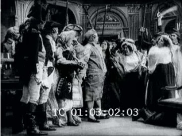
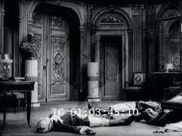
L’Évadé des Tuileries (1910), for example, deals with the Count du Champcenetz, the governor of the Tuileries during the French Revolution, who initially tries to alert the royal family to their impending arrest and subsequently flees for his life from the revolutionary forces that invade the palace. In the most spectacular shot, he rushes in, exhausted and wounded, to speak to the king as the members of the royal family gradually enter and guards surround them. Champcenetz collapses and slides partway under a chair at the foreground right as the revolutionaries burst into the room. The business of the ensuing struggle, the departure of the combatants with the royals under arrest, and a short burst of looting leaves a still scene with the dead and wounded on the floor. Suddenly an arm moves at the far lower right corner of the frame, and we become aware that Champcenetz has survived.
David has praised the sustained tableau staging in depth of the 1910s, in the films of Feuillade, Sjöström, Hofer, and others, but here is Capellani doing it all in 1910—and this is not the first of his films to display such control of the complex arrangement of actors in space.
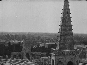
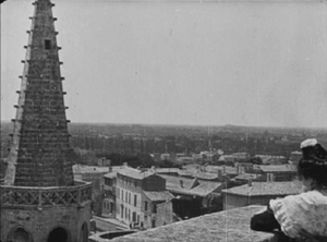
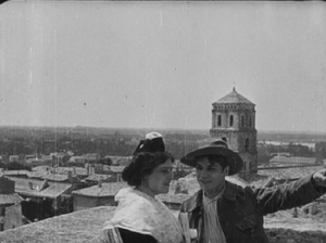
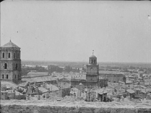
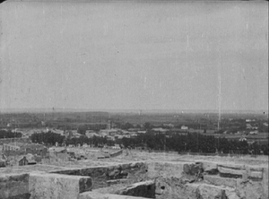
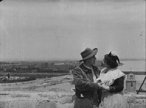
None of this is to suggest that Capellani’s films are “stagey.” He is quite capable of a cinematic flourish for purposes of dramatic effectiveness. L’Arlésienne, shot largely on location in the old town of Arles, includes a shot of the young couple atop a tower that looks over the cityscape. The camera begins on the spire, panning right until the couple appear in medium shot, with the town beyond them and the parapet. They wander out right, and the camera pans around the parapet, only catching up with the couple when they are roughly 180 degrees opposite to where the camera started:
It is hard to believe that in London L’Arlésienne played on the same program as L’assassinat du Duc de Guise, which, sophisticated as it is in some ways, seems seems downright old-fashioned when contrasted with Capellani’s film.
Even flashier is L’Épouvante, which seems at first a simple story of a young woman in danger as she retires for the night, unaware that a burglar had stolen her jewelry just before she came in and is now hiding under the bed. She lights a cigarette and carelessly tosses the match on the floor. The camera tracks slowly back from the bed to bring the burglar into view; he registers fear that the match is still alight and might set the rug on fire. He reaches to snuff it out, and a sudden cut places us at a high angle above the heroine as she looks down and sees the hand appearing from beneath her bed. A return to the long shot displays her reaction:
Up to this point our sympathy has been entirely with the heroine. But once she escapes the room and locks the burglar in, his struggle to escape before the police find him takes up much of the remaining action and gradually gains him our sympathy as well. Trapped multiple stories up, he climbs to the roof, only to have to retreat as the pursuers rush up and search there. Moving downward, the burglar ends up hanging by an ominously bending gutter.
Only the heroine is left in her flat to discover his plight, and she lowers some drapes for him to climb up. In a touchingly awkward scene, the man is relieved but unable to express his gratitude except by returning the stolen jewelry and silently exiting, while she makes no attempt to stop him. In a way, L’Épouvante reminded us of Suspense, Lois Weber and Phillips Smalley’s remarkable 1913 film of a woman besieged in her house by a burglar, but the unexpected shift of emotional dynamics between the two characters in Capelanni’s film makes it equally memorable.
Capellani’s pictorial sense in real locations has been widely remarked upon. Even in La Mariée du château maudit (1910), a relatively slight tale of spooky doings in a deserted castle where a wedding party plays hide-and-seek, becomes impressive in part because of its use of an extensive set of actual ruins. There’s also a remarkable moment after the bride accidentally becomes locked in a room with a skeleton dressed in a bridal gown. She reads an old book telling of the young woman’s fate, and two successive bits of the story appear as matte shots on the right and left leaves of the open book. (Working at Pathé, Capellani could use impressive special effects, as the dream image in the Aladin frame at the top demonstrates.)
The sets are masterful as well. I was particularly struck by Jean Valjean’s desk in the second episode of Les Misérables (1912). It creates an effect of forced perspective that is like German Expressionist eight years ahead of its time. Valjean has escaped from prison and become a mayor and successful small-factory owner. Javert, formerly a guard at the prison and now a local police officer, suspects Valjean of being the fugitive. Now he comes to Valjean’s office to introduce himself.
Valjean sits at the left behind an enormous desk which dominates the left and center of the screen; its size is exaggerated by rows and stacks of thick volumes ranged across its top. About a third of the screen is empty at the right, where Javert enters at the rear and walks only partway forward. The effect is to make Javert appear smaller than he really is, with the low camera height that Pathé films were using by this point exaggerating the effect; during part of the scene he is also partially blocked by the desk. The suggestion is that he has no ability to follow up his suspicions of such a powerful man.
In a subsequent scene, when Valjean brings the ailing worker Fantine to his office, the desk has been moved away from the camera, which frames the scene from further to the right. The result is a far more open space at the right, while Valjean brings forward a chair for Fantine that puts her in front of the desk. Unlike Javert, she is not dwarfed by the desk, which, once Valjean comes to lean over her, is barely visible. Instead, the right half of the screen is left unoccupied so that a flashback can fill it.
In the scene like the one with Javert, a German Expressionist film would have exaggerated the size of the desk even further and perhaps tilted the floor up at the rear, but the effect is clear and dramatic enough as it is. Again, it is not an effect one would expect to find in a film of the early 1910s. There is also a contrast between the massive desk and the relatively small, insubstantial table that Javert uses as a desk in the setting of the police headquarters
Even the most conventional films receive what I began to recognize as Capellani touches, often to bring a moment of realism into a fantasy or melodramatic setting. In Cendrillon, the gardener who carries in a huge pumpkin to be turned into the heroine’s magic coach exits wiping the sweat from his head with a handkerchief (below left). The little girl who falls out of a window to her death in Pauvre mère leaves a large, dramatic splotch of blood on the sidewalk when her lifeless body is lifted—a realistically gory touch of a sort which I don’t recall seeing in any other film of this era (below right). When the hero finds the magic lamp in Aladin ou la lampe merveilleuse, he blows dust off it and turns it over to shake out further dirt (see bottom).
Another sort of touch appears in La Mort du Duc D’Enghien, a carefully executed motif of a sort one doesn’t often see in films of this type. The hero is arrested while at a hunting lodge, and throughout he wears a distinctive hat that’s probably part of a hunting outfit. He throws it defiantly to the floor during the courtroom scene in which he is unjustly condemned; he throws it down again in his cell, this time to indicate despair and exhaustion; in the final execution scene, he tosses it aside as part of his brave resignation, facing the firing squad with open arms and without a blindfold. These moments aren’t stressed, and one could understand the plot perfectly well without noticing the repetition. Still, the motif helps characterize D’Enghien quickly in this relatively short film and indicates the care with which Capellani was crafting even his one-reelers.
Mariann was somewhat apologetic about La Glu, a 1913 feature, since it centers around a femme fatale who victimizes three men in the course of the narrative. The title is the heroine’s nickname, and it means what it sounds like, “glue,” and particularly sticky substances like bird-lime that are used to ensnare. But the audience thoroughly enjoyed this distinctly absurd but entertaining and fast-paced tale of a heartless, mercenary woman, played with relish by Mistinguett, and the men foolish enough to fall for her. After all, there are plenty of depictions of love-’em-and-leave-’em men from this period, so why not turn the tables? At least one flagrant coincidence brings all of them to the south of France, where the heroine goes for a vacation, and Capellani contrasts the early scenes of high-society Paris with the stark seascapes in and around a fishing village. Though another literary adaptation (from a novel and play by Jean Richepin), this film certainly stands out among the pre-war features and demonstrates once more Capellani’s versatile ability with a range of genres.
After all these treats, the last French feature on offer, Le Chevalier de Maison-Rouge (1914), proved a slight let-down. Capellani had a penchant for substituting letters and other texts for intertitles, but this film pushes the device to the point where sometimes it seemed as if every other shot was an insert. The plot, dealing with a scheme to rescue the imprisoned Marie Antoinette, was also frustratingly complicated and not presented with the admirable clarity that characterizes most of the other films. As I’ve mentioned, Capellani was often able to generate an empathy with the characters which is rare for films of this period, but as a result of the constant plot twists, the Chevalier and his endangered mistress remain rather remote figures. There are some effective moments, though. One exterior view of the protagonist’s home places a door at the upper center, approached by a symmetrical pair of staircases running to the right and left and forming a pyramid shape. A foreground pond elaborates the space still further, so that when a crowd tries to break in, the staging utilizes the frame vertically and horizontally, with intricate movements of individuals to avoid the water.
Ahead of his time–up to a point
As I remarked in an entry on last year’s festival, L’assommoir struck me as looking like it had been made in 1912 or 1913 rather than 1909. Now it becomes clear that many of Capellani’s films give this sense of trying things that other filmmakers would begin doing routinely a few years later. In some cases, like L’Arlésienne, it’s a focus on acting of a sort that we associate with Griffith’s films like The Mothering Heart or The Painted Lady. In others, it’s the motifs or the subtle changes of framing or the eye for landscapes. Although the editing is not usually flashy, Capellani is good at keeping spatial relationships clear, as the series of shots depicting Valjean’s escape from prison in the first part of Les misérables demonstrates. As Mariann wrote, he seemed able to adapt to any genre. I’m not a particular fan of the historical films so common during this period, but Capellani manages to humanize most of his.
It was only with Le Chevalier de Maison-Rouge that the sense of Capellani being ahead of most of the directors of his time largely disappeared, though it seems premature to judge from a single 1914 film. Perhaps during the immediate pre-war era, and especially the creatively fecund year of 1913, the exploration of the cinema by an increasing number of masters created a spurt that he did not participate in. And perhaps more films from 1913 and 1914 will appear in next year’s retrospective and give us a better sense of how his career developed in that crucial period. It will also be interesting to trace his assimilation of the developing classical Hollywood norms once he moved to the U.S. By 1919 and The Red Lantern, he clearly had absorbed the norms thoroughly, and his style had become indistinguishable from that of his American colleagues.
Added July 13: Roland-François Lack has kindly written to point out that another Capellani film exists on DVD. (Thanks, Roland-François!) His 1908 version of the French tale Peau d’âne was included as a supplement on the 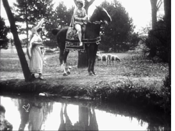 collector’s edition of Jacques Demy’s film of the same name. It is also included in the “Intégrale Jacques Demy” 12-disc set. These DVDs are Region 2 (Europe) and won’t work on other region-coded players.
The source of the print isn’t clear on the disc. (It’s another one that hasn’t been shown at Bologna.) Probably Pathé’s own archive, since there’s a little rooster-shaped bug superimposed at the lower left in every shot.
It’s a fairly contrasty print with replaced intertitles in French only. It also seems to be running at 24 fps or something close to it. The action zips right along, which is a pity. There’s a lot of carefully executed pantomime-style acting. It’s impossible to catch all the gestures, especially since there are often three or four actors going at it at the same time. It would actually be a good film for teaching about the acting styles of this period if one could just slow it down.
I wouldn’t have spotted this as a Capellani film if I hadn’t known its source when I watched it. Still, it has some of the traits we’ve recently come to associate with him. The meeting between the heroine and Prince Charming takes place in a carefully chosen setting with a reflecting pond in the foreground. It looks like the film was shot on a hazy day, but it looks as though the camera may be set up to shoot with the sunlight at the characters’ backs.
The film also has the director’s typical elaborate interior sets juxtaposed with a dramatic use of real exteriors. The frame at the left below shows the fairy appearing for the first time to the princess. It’s not easy to see, but the busy interior includes a deep, diagonal space with several arches decorated with portraits that are painted, frames and all on the square pillars. Once the heroine disguises herself and flees to avoid her suitors, Capellani goes on location, using an impressive château and streets that look like they are in the same vicinity.
I hope that some of the more realistic films will soon appear on DVD. Lobster in particular could make their newly restored L’Arlésienne available.


