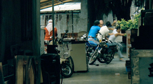
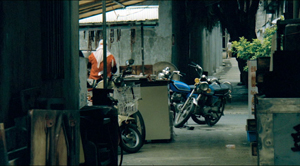
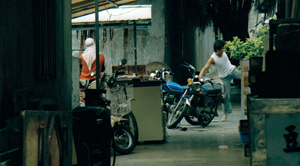
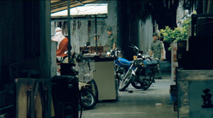
Archive for the 'Film technique: Cinematography' Category
Early Hou Hsiao-hsien: Film culture finally comes through (a repost)
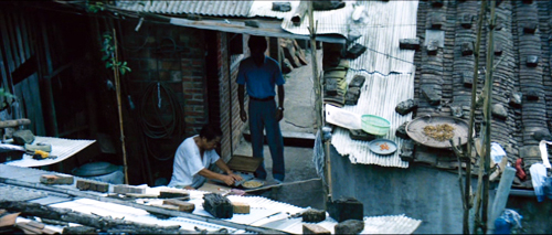
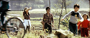
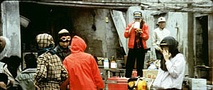
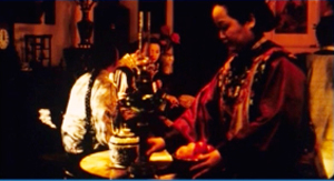
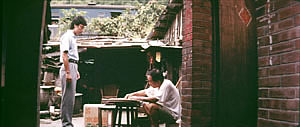
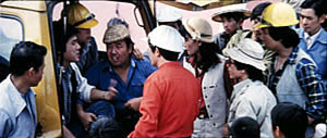
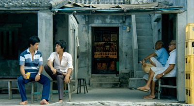
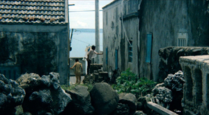
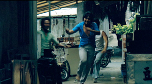
The Green, Green Grass of Home (1982).
David’s health situation has made it difficult for our household to maintain this blog. We don’t want it to fade away, though, so we’ve decided to select previous entries from our backlist to republish. These are items that chime with current developments or that we think might languish undiscovered among our 1094 entries over now 17 years (!). We hope that we will introduce new readers to our efforts and remind loyal readers of entries they may have once enjoyed.
DB here:
In March, the Criterion Channel will be featuring a selection of early films by the great Taiwanese director Hou Hsiao-hsien. These have been very hard to see in the West; I went to Brussels and Taipei to watch prints back in the 1990s. For those who admire his later works, they are absolutely necessary, and for the casual viewer they’re great fun. Two of them, Cute Girl and Green, Green Grass of Home are lilting musicals, while The Boys from Fengkuei is a wandering-youth story with affinities to coming-of-age films like Fellini’s I Vitelloni. (Too bad the series couldn’t include his second feature, Cheerful Wind.) My effort tries to show how a basic technical choice that Hou made created powerful effects on his visual style.
Because the frames are so dense with information, you may want to enlarge them as you go. For a fuller examination of Hou’s work across his career, there’s a chapter in Figures Traced in Light and a video here. The original blog, posted on June 6, 2016, was an attempt to fill in areas I didn’t have room to include in the book. If you’re unfamiliar with Hou’s major works, you should probably watch the video before reading the recycled entry.
For today, let’s call “film culture” that loose agglomeration of institutions around non-mainstream cinema. Film culture includes art house screening venues, festivals, magazines like Film Comment, Cinema Scope, and Cineaste, distribution companies (Janus/Criterion, Milestone, Kino Lorber et al.), critical websites, and not least the new channels of distribution and exhibition like Fandor, Mubi, and the impending FilmStruck.
Although the system is decentralized, there’s usually a fairly predictable flow of films through it. A film is shown at festivals, written up by critics, and picked up by distributors. Then it gains some exposure in theatres or more festivals, and it eventually becomes available on DVD, cable, and streaming services. And now we expect the process to move fairly quickly. Mustang played Cannes and many festivals through summer of 2015; it moved to theatres in the US and elsewhere in the fall. Only a year after its premiere, you can buy it on disc.
We’ve also been aided by the emergence of multi-standard video players and the willingness of some disc-publishing companies to release versions with subtitles in several languages. All too often, though, “film culture” displays gaps and delays. It took six years for Asgar Farhadi’s wonderful About Elly (2009) to make its way to minimal visibility in the US. Fans of Godard have been prepared to wait years to see his many films that didn’t get even video release in English-speaking territories. (Soigne ta droite! played Toronto in 1987, never got a theatrical release in America, and showed up on US DVD in 2002; the Blu-ray came out eleven years after that.) Two of the most egregious examples of this time lag involve the works of the outstanding Taiwanese filmmakers of the 1980s and 1990s: Hou Hsiao-hsien and Edward Yang.
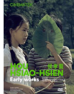 Most of Hou’s films had no proper US release. When they were available for booking, as from Wendy Lidell’s heroic International Film Circuit, they circulated for one-off screenings. Some of his major films, such as City of Sadness (1989), still remain difficult to see. Edward Yang’s work was similarly obscure. When we ran a retrospective at our UW Cinematheque in 1998, we had to borrow prints from his family.
Both of these extraordinary filmmakers had to wait many years for the exposure that is standard for European arthouse releases. After six features in seventeen years, Yang found a Western audience with Yi Yi (2000). Hou took even longer; twenty-seven years after his first feature, he gained some recognition with The Flight of the Red Balloon (2007) and last year, The Assassin. Meanwhile, many of these directors’ early films remain largely unknown, prey to ancient distribution contracts and the belief that the films would cost too much to revive and market.
Today’s entry and the next one celebrate the welcome news that important works by these two filmmakers are at last available on the disc format. Today I’ll concentrate on the three early Hou films from the Cinematek of Belgium: Cute Girl (1980), The Green, Green Grass of Home (1982), and The Boys from Fengkei (1983). Next time, I’ll consider Criterion’s release of Edward Yang’s masterpiece A Brighter Summer Day (1992).
Hou, early and late
Hou’s films are no stranger to this site. Among the first things I posted, back in 2005, was one of a batch of supplemental essays to my book, Figures Traced in Light: On Cinematic Staging (2005). That book devoted a chapter to Hou’s staging principles, with background on what I took to be the evolution of his technique. It was, I think, the first sustained view of Hou’s style, and it included discussion of his earliest films. These were scarcely known in the West and not considered in relation to his more famous work.
The online essay expanded my treatment of those titles. Because that essay is more or less buried elsewhere on the site, and it’s somewhat clunkily laid out by today’s standards, I’m reprinting it, with revisions, here, along with some bits from Figures. But first some background on these early works.
Hou began in the commercial, mainstream Taiwanese-language industry. Most local films had a strong genre identity: martial-arts movies, romantic comedies, or melodramas of family crises. Hou’s first directorial effort, Cute Girl, centered on a romance between two city dwellers who re-meet when the man is called to a surveying task in the countryside. Cheerful Wind (1981) reunites the two stars, Kenny Bee and Feng Fei-fe, in a more serious story of how he, a blind man, wins her love. In the pastorale The Green, Green Grass of Home, Kenny plays a schoolteacher brought to a village, where he meets another teacher and a romance blossoms. This film, however, expands to include dramas, big and small, involving several families; it also incorporates an ecological theme by encourage safe fishing policies.
In making these early films Hou discovered techniques that not only suited the stories he had to tell but also suggested more unusual possibilities of staging. He pushed those techniques further in his later films, with powerful results. The charming early films show him developing, in almost casual ways, techniques of staging and shooting that will become his artistic hallmarks. One basis of his approach, I argue, is his adoption of the telephoto lens.
How long is your lens?
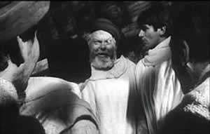
Around the world, from the late 1930s through the 1960s, many films relied on wide-angle lenses—those short focal-length lenses that allowed filmmakers to stage action in vivid depth. One figure or object might be quite close to the camera, while another could be placed much further in the recesses of the shot. The wide-angle lens allowed filmmakers to keep several planes in more or less sharp focus throughout, and this led to compact, sharply diagonal compositions, as in Welles’ Chimes at Midnight (1966).
Although Citizen Kane (1941) probably drew the most attention to this technique, it was occasionally used in several 1920s and 1930s films made throughout the world. The great French critic André Bazin was the most eloquent analyst of the wide-angle aesthetic, and his discussion of Kane, The Magnificent Ambersons (1942), The Little Foxes (1941), and The Best Years of Our Lives (1946) has strongly shaped our understanding of this technique.
The 1960s saw the development of an alternative approach, what we might call the telephoto aesthetic. Improvements in long focal-length lenses, encouraged by the growing use of location shooting, led to a very different sort of imagery. Instead of exaggerating the distances between foreground and background, long lenses tend to reduce them, making figures quite far apart seem close in size.
In shooting a baseball game for television, the telephoto lens positioned behind the catcher presents catcher, batter, and pitcher as oddly close to one another. Planes seem to be stacked or pushed together in a way that seems to make the space “flatter,” the objects and figures more like cardboard cutouts. The style was popularized by films like A Man and a Woman (1966).
The telephoto look quickly spread, employed by directors as diverse as Sam Peckinpah and Robert Altman, whose 1970s films also use the long lens, controlled by zooming, to squeeze a crowd of characters (M*A*S*H, 1972; Nashville, 1975) into the fresco of the anamorphic frame.
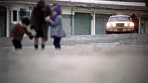
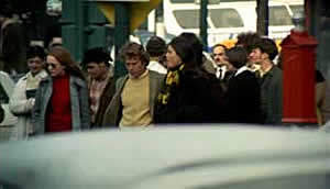
Hou Hsiao‑hsien came to filmmaking via the romance films so common in Taiwan in the 1970s, and this genre employed the long lens extensively. Working with low budgets, most filmmakers relied on location shooting. The telephoto allowed the camera to be set far off and to cover characters in conversation for fairly lengthy shots (as in Diary of Didi, 1978, below). In this respect, the directors were not so far from their Hollywood contemporaries; Love Story (1970) employs these techniques on a bigger budget.
Indeed, Love Story (a big hit in Taiwan) may have pushed local filmmakers toward using this technique in their own romantic melodramas; sometime the influence seems quite direct (Love Story and Love Love Love, 1974)
With these norms in place, Hou’s inclination toward location shooting and the use of nonactors, along with his attention to the concrete details of everyday life, allowed him to see the power of a technique that put character and context, action and milieu, on the same plane. His crowded compositions are organized with great finesse in order to highlight, successively, small aspects of behavior or setting, and these enrich the unfolding story, as Figures tries to show in his masterpieces of the 1980s and 1990s. Using a long lens (usually 75mm–150mm) he began to exploit some “just-noticeable differences” that the lens creates as byproducts.
Hou saw unusual pictorial and dramatic possibilities of the telephoto lens, and they became central to his distinctive way of handling scenes. A current norm of production practice yielded artistic prospects which he could explore in nuanced ways. Figures provides the detailed argument, but let me highlight three points here.
Exploiting the flaws
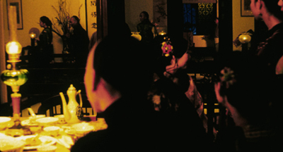
Flowers of Shanghai (1998).
One byproduct of the long lens is a shallow focus, as we can see in the examples above. Because the lens has little depth of field, one step forward or backward can carry a character out of focus. Hou stages in depth–and at a distance–but allows the layers to slip out of focus gradually.
Savoring the effects of gently graded focus is a common feature of Hou’s later work. The masher at the train station in Dust in the Wind (1987) moves eerily in and out of focus in the distance. In Daughter of the Nile (1988), there’s an astonishing shot showing gangsters approaching a victim’s SUV outside a nightclub: at first they’re only barely discernible blobs (seen through the vehicle’s narrow windows) but then they gradually come into ominously sharp focus in the foreground, preparing to attack one of the boys inside. The slight changes of focus train us to watch tiny compositional elements for what they may contribute to the drama. More recent examples abound in Flowers of Shanghai (1998), above, where it’s the foreground planes that dissolve.
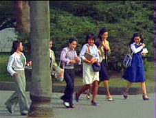
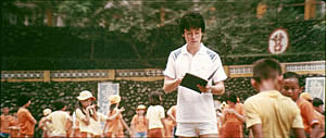
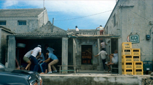
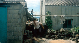
Hou’s three first films don’t use the option quite so daringly; here the degrees of focus concentrate on the principal players but still allow us to register the teeming life around them (Cute Girl; Green, Green Grass).
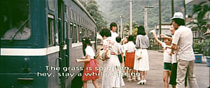
Hou can put sharply different dramatic situations on different layers. In Green, Green Grass, the departure of the little girl, saying farewell to her host family, plays out slightly closer to the camera than the departure of the eccentric teacher.
This principle operates as well in the creatively distracting street and train-platform scenes of Café Lumière (2004).
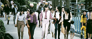
Secondly, the long lens yields a flatter-looking space. It has depth, but the cues for depth that it employs are things like focus, placement in the picture format (higher tends to be further away), and what psychologists call “familiar size”—our knowledge that, say, children are smaller than adults, even if the image makes them both of equal size. One favorite Hou image schema is the characters stretched in rows perpendicular to the camera, and the telephoto lens, by compressing space, creates this “clothesline” look more vividly. We can find the clothesline staging schema in the early Hou films (Cute Girl, Cheerful Wind).
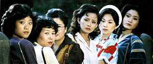
Another favorite schema is the “stacking” of several faces lined up along a diagonal (Cute Girl). This can be seen as a refinement of a schema that was in wider use, as an example from Love Story indicates.
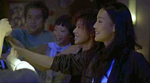
But Hou uses this sort of image more subtly. The telephoto lens lets him stack faces in ways that encourage us to catch a cascade of slight differences (Millennium Mambo (2000)). In many scenes of Flowers of Shanghai (1998) this principle is carried to a degree of exquisite refinement without parallel in any other cinema I know. In one shot, the faces are stacked in the distance, behind a lantern, and a slightly shifting camera reveals slivers of them.
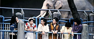
In general, because Hou is committed to a great density of information in the shot, the compression yielded by the long lens tends to equalize everything we see. Minor characters, or just passing strangers, become slightly more prominent, while details of environment can get pushed forward as well. The zoo scenes of Cute Girl enjoy showing us our characters in relation to the creatures around them.
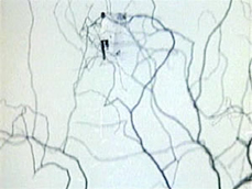
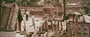
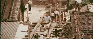
In the shot surmounting today’s entry, the tile rooftops of The Green, Green Grass of Home, secured by bricks and pails and tires and baskets, become just as important as the figures below them.
In Green, Green Grass, Hou develops the equalized-environment option in one particular scene. A long-lens distant view catches the teacher coming to the father’s house along a corridor of rooftops.
When the teacher confronts the father, instead of tight framings on each man, Hou cuts to another angle that activates yet another range of environmental elements—principally the train passing in the background, prefiguring the trip that the man’s son and daughter will take in an effort to find their mother.
Because the long lens has a very narrow angle of view (the opposite of a “wide-angle” lens), it affects the image in a third major way. If you use a long lens in a space containing several moving figures, people passing in the foreground will block the main figures: they pass between the camera and the lens. Hou elevates this blocking-and-revealing tendency to a level of high art.
In Figures Traced in Light, I argue that many great directors, from the silent era forward, have staged action in the shot so as to block and reveal key pieces of information, calling items to our attention at just the right moment with unobtrusive changes of figure position. The possibility of blocking and revealing arises from the “optical pyramid” created by any camera lens. (Lots more on that pyramid in Figures and in this video lecture.)
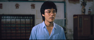
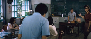
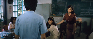
Hou showed himself capable of using the blocking-and-revealing tactic in traditional ways. Take this simple encounter in Green, Green Grass, when the new teacher Da-nian meets Su-yun, the young teacher with whom he’ll fall in love. The scene begins on him, then cuts to a reverse angle as he’s introduced to the principal.
The others are turned toward the principal in the background; the whole composition pushes our eye toward him. Then the teacher steps left to judiciously block the principal. The woman on the far left turns her head and we’re nudged to look at her. Da-nian swivels slightly too.
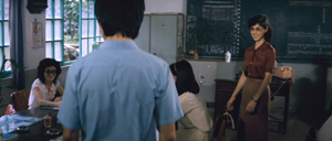
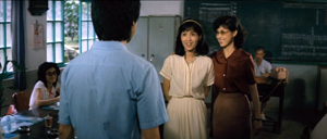
Then the key introduction: Da-nian shifts aside a little, the teacher continues to block the principal, and the central woman turns toward us.
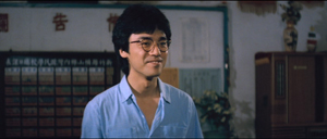
The climax (quiet, nifty) of this shot comes when Su-yun rises to meet Da-nian. She commands the center of the frame, frontal and radiant. Like any good classical director, Hou then gives us a reaction shot mirroring the first shot of this “simple” sequence: Da-nian is more than happy to meet her.
Imagine how a contemporary Hollywood director would handle this–lots of cuts, everybody in singles and close-ups, transfixing track-in to Su-yun, maybe a boingo music track–and count yourself lucky to have encountered, for once, an unfussy craftsman.
Hide and seek
The Green, Green Grass introduction scene involves a wide-angle lens, but Hou’s skill with slight character movement shows up in long-lens images too. In fact, I suspect that using the telephoto lens on location made him sensitive to the resources of masking and unmasking bits of the shot.
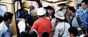
The loveliest example I know in the early films is the Cute Girl shot I analyze in Figures, when Fei‑Fei confronts the surveyors and the man in the red shirt serves as a pivot for our attention; the staging shifts our eye back and forth across the frame, according to small changes of character glance.
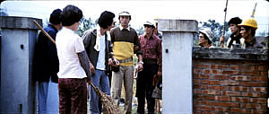
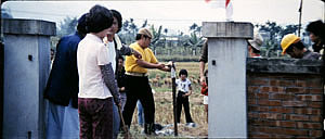
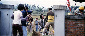
A less drastic example occurs when the surveying team starts quarrelling with the locals around a walled gate: The team’s blocking of the gate gives way to movement into depth and a struggle there between them and the townsfolk.
In all, it seems to me that these three resources of the long lens—the shallow focus, the compressed space, and the narrow angle of view—supplied artistic premises for Hou’s shooting and staging in the later films. This is not to ignore his use of the wide-angle lens on occasion, particularly interiors, as in the schoolteachers’ introduction scene. Once the lessons of the long lens had been absorbed, Hou could apply the staging principles that he’d developed to other kinds of shots and story situations. Sometimes he kept his style smooth and limpid, but at other times he offered the viewer some unusual challenges.
Peekaboo pictures
The Boys from Fengkuei (1983).
Presumably Hou could have kept making good-natured, crowd-pleasing movies for many years, but changes in his professional milieu gave him new opportunities. In the early 1980s Taiwan film attendance declined sharply, and Hong Kong films began to command more attention than the local product. The rash of independent companies had concentrated on speculation, not long-term investment, so only the government’s Central Motion Picture Company could initiate recovery. Ambitious government officials launched a “newcomer” program that offered support for cheap films by fresh talents. Even if the new films could not win back the local audience, they might gain renown at foreign film festivals. At the same period, a local film culture began to emerge, relying upon critics who were sympathetic to the creation of a New Taiwanese Cinema.
Hou was no newcomer, but working within the New Cinema framework he could reconceive his practice. The key question for all directors, he recalls, was: What is it to be Taiwanese? His New Cinema films would focus on political and cultural identity, and they did it through an approach to cinematic storytelling that in many respects ran against the conventions of his earlier films. His first New Cinema feature, The Boys from Fengkuei (1983; included in the Cinematek set) reminds us of how “young cinemas” have often represented a return to Neorealism.
Instead of introducing us to clear-cut protagonists and a dramatic situation, the film immerses us in a milieu, that of the small town of Fengkuei. The first fifteen minutes are episodic, casually showing a gang of teenage boys playing pool, lounging about, playing pranks, and above all getting in fights. Initially, the one who’ll become the main figure is minimally characterized; the emphasis, as the title indicates, is really on the group. The boys drift to the big city, where they try to get by and meet others their age. Throughout, local color and everyday routines drive the action more than character goals and traditional drama do.
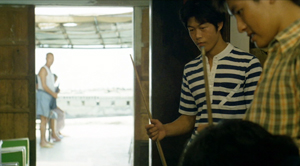
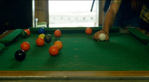
This somewhat diffuse approach to narrative, in various countries, has proven well-suited for filmmakers who want to explore psychological development and social-cultural commentary. So it accords with the impulse toward understanding national identities that animated New Taiwanese Cinema. In addition, I think that this looser conception of storytelling allowed Hou to refine some of the stylistic options he had already explored. Now the extended, fixed telephoto shot with varying planes of focus appears as a more indeterminate pictorial field, as in our rather oblique introduction to the boys–partial framed figures drifting in and out of the frame–and their poolroom hangout. Emphasizing incomplete views and vague figures outside the door, Hou gives us a more precise array of balls on the table than he does of his characters in space.
Likewise, even though Hou has surrendered his very wide anamorphic frame, he finds ways to balance human action and tangible surroundings in the ways he did with city landscapes and village rooftops in the earlier films. The bullying of a motorcyclist and a pursuit by a rival gang aren’t rendered with the aggressive cuts and angles we’d expect in violent scenes in the Hong Kong action pictures then ruling Taiwanese screens. It’s as if Hou, along with his colleagues, is rejecting that other Chinese-language tradition.
Which is to say that when conflict comes, Hou turns to “dedramatization,” that tendency (again related to Italian Neorealism and its successors) of tamping down peaks of action. Now his characteristic long lens creates detached shots, sometimes with planimetric flatness, sometimes with tunnel vision. These images play out chases and fights in a way that minimizes their physical impact but reminds us of the design and details of the characters’ world.
Hou’s insistence on the fixed, distant telephoto take is now put in the service of obscured vision. The people who passed through the frame in the earlier films, blocking and revealing the action judiciously, may become more salient than the action itself–which is itself often offscreen, or swathed in shadow, or shielded by aspects of setting. The early films’ fixed long take enabled us to see story action fully, but, now, in its refusal to cut away, the camera can suppress story information.
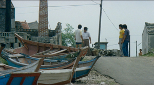
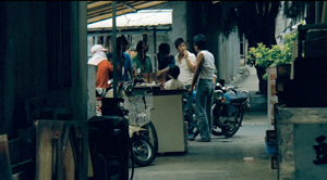
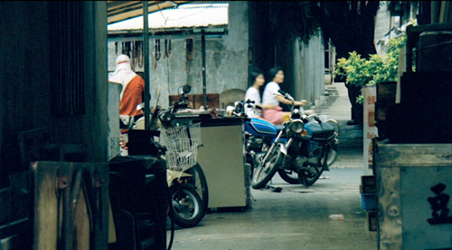
Early in the film, a street fight passes in and out of a far-off intersection among stalls. The dust-up stirs only slight interest from passersby, before bursting back into the alleyway and coming to the camera.
The masking of the fight by the setting can be seen as an extension of the way the walls in the Cute Girl surveying quarrel intermittently cut off our vision, but here it’s far more drastic and sustained.
I’ve drawn my examples from the early stretches of The Boys from Fengkuei, so as not to preempt your own discoveries as the plot carries the gang to the big city. In these scenes Hou in effect teaches us how to watch his movie. But I think I’ve said enough to suggest how Hou’s fresh conception of narrative, born of a renewed interest in local culture (already present in another register in the first three films), allowed him to carry his stylistic explorations to new levels.
Hou saw certain pictorial possibilities in the long lens, and after developing them to a certain point in popular musicals, he recast them when he took up another kind of storytelling. He realized that leisurely, contemplative narratives permitted him to refine these visual possibilities, and they could become powerful, nuanced stylistic devices. And he didn’t stop, as the films following his New Cinema works vividly show. His visual imagination seems unlimited.
A more general lesson follows from this. Norms of form and style are resources for artists. Some artists follow the schemas that they inherit, while others probe them for fresh possibilities. A few can even make a handful of schemas the basis of a rich, comprehensive style. Ozu did this with the techniques of classical Hollywood editing; Mizoguchi did it with depth staging in the long shot. Like these other Asian masters, Hou reveals how much nuance a few techniques can yield, even when deployed in crowd-pleasing, mass-market movies. And now, thanks to the vagaries of film culture, more viewers can come to appreciate his achievement.
The frames from Diary of Didi and Love, Love, Love are, alas, cropped video versions, but that condition doesn’t keep us from recognizing the telephoto lensing in the originals.
The Cinematek collection also includes sensitive English-language introductions to the films by Tom Paulus and enlightening audiovideo essays by Cristina Álvarez López and Adrian Martin.
The indispensable English-language sources on Hou are James Udden’s in-depth career survey, Richard Suchenski’s monumental anthology, Emilie Yeh and Darryl Davis’ study of New Taiwanese Cinema, and two monographs on City of Sadness, one by Bérénice Reynaud, the other by Abe Markus Nornes and Emilie Yeh.
The fullest account I’ve offered of Hou’s style are in Figures Traced in Light and in a video lecture, “Hou Hsiao-hsien: Constraints, traditions, and trends.” See also the several blog entries touching on his work. A broader account of the historical tradition to which he belongs can be found in both Figures and On the History of Film Style, as well as in entries under Tableau staging and in the video lecture mentioned already.
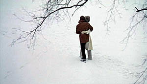
The Boys from Fengkuei.
Calm that camera!
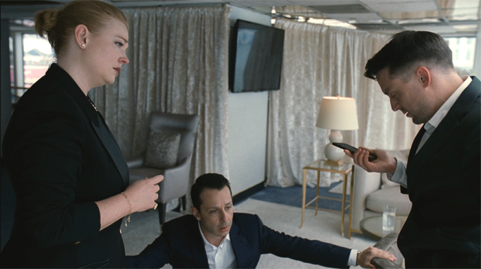
Succession (2023).
DB here:
Thanks to our Wisconsin Film Festival, Ken Kwapis paid us a visit. Director of The Sisterhood of the Traveling Pants and many other features, Ken also has experience directing TV, notably The Office. He’s a generous filmmaker, and he radiates enthusiasm for his vocation. I took the opportunity to talk with him about camera movement in contemporary media. He taught me a lot, and what I’ve come away with I share with you.
Camera ubiquity, with a vengeance
In the early silent era, fiction filmmakers around the world discovered what we might call camera ubiquity—the possibility that the camera could film its subject from any point in space. This resource was more evident in exterior filming than in a studio set, so early films often display a greater freedom of camera placement when the scene is shot on location.
At the same time, filmmakers began realizing the power of editing. This technique offered the possibility of cutting together two shots taken from radically different points in space. Yet an infinity of choices is threatening, and some filmmakers, mostly in the US, constrained their choices by confining the camera to only one side of the “axis of action,” the line connecting the major figures in the scene. Different shots could cut together smoothly if they were all taken from the same side of the 180-degree line. The result was the development of classical continuity editing. The director was expected to provide “coverage” of the basic story action from a variety of angles, but all from the same side of the line. Classical continuity was in force for American films by 1920 and was quickly adopted in other national cinemas.
The one-side-of-the-action constraint was encouraged by the fact that much filming of staged action took place on a set, designed according to the theatrical model. The camera side of the space was behind an invisible fourth wall, like that in proscenium theatre. To some extent directors compensated for the limitation on camera position by fluidly moving actors around the frame, from side to side and into depth or toward the viewer. Still, the “bias” in choosing setups was reinforced by the increasing weight of the camera in the sound era, which made it hard to maneuver within both interior and exterior settings. Camera movement in a more or less wraparound space was possible, but it was usually very difficult. It commonly required a dolly or crane on tracks to prevent bumps.
Technicolor filming, with its monstrously big camera units, reinforced the bias toward proscenium sets, 180-degree space, and a rigid camera. So did the postwar vogue for widescreen cinema. But in the 1950s filmmakers were also exploring the possibility of lighter, more flexible cameras. The body-braced cameras often produced bumpy, slightly disorienting images but yielded a more “immersive” space that gave the story action immediacy and spontaneity. By the early 1960s, handheld camerawork was being seen in both documentaries and fiction films. At the same time, fiction filmmakers were gravitating toward more location filming. In addition shooting on location with portable cameras promised greater savings on budgets, an attractive option for both independent and mainstream directors.
Handheld shooting was becoming more common in the 1970s, when its problems were overcome by the invention of the Steadicam, first displayed to audiences in Bound for Glory (1976). This stabilizer permits the operator to move smoothly through a space.
The new device was more than simply a substitute for a camera on a dolly and tracks. Ken pointed out to me that the Steadicam encouraged the increasing use of the walk-and-talk shot showing two or more characters striding toward a constantly retreating camera. This proved to be an efficient way of covering pages of dialogue. Beyond that, the Steadicam became an all-purpose camera for filming any sort of scene.
Over the same years, directors embraced multiple-camera shooting—originally aimed at handling complex stunts—for every scene, and they recruited A and B cameras, often mounted on Steadicams, for ordinary dialogue scenes. In most cases, the B camera was mounted alongside the A, but with the B camera in other spots there was a certain erosion of the axis of action. Now a conversation may be captured from a greater variety of angles than classical coverage would favor. Filmmakers have replaced 180-degree staging and shooting with what’s called 250-degree coverage. In The Way Hollywood Tells It I drew an example from Homicide: Life on the Streets. A free approach to the axis of action is common today, as in this example from Succession (2023).
A rough sense of the axis of action is maintained, and there are matches on action, but our vantage “jumps the line” as well. Moreover, the camera is constantly moving within the shots. It’s panning to follow or reframe the characters, sometimes circling them or abruptly zooming, and always wavering a bit, as if trembling. What some Europeans call the “free camera” is very common nowadays, and Ken and I talked mostly about this creative option.
Eye candy
By now, many filmmakers have chosen to make nearly every shot display some camera movement independent of following moving characters. This tactic was noted and recommended in a manual by Gil Bettman (First Time Director, 2003). (Readers of The Blog know of my fondness for manuals.) “To make it as a director in today’s film business, you must move your camera” (p. 54). The risk is making the audience more aware of the camerawork than of the story, so Bettman adds:
A good objective for any first time director would be to move his camera as much as possible to look as hip and MTV-wise as he can, right up to the point where the audience would actually take notice and say, ‘Look at that cool camera move.”
Like cinematographers in the classical tradition, Bettman declares that the camerawork should be “invisible” (p. 55). By now, you could argue, the predominance of camera movement has made it somewhat unnoticeable. Ordinary viewers have probably adapted to it.
One factor that aids the “invisibility” of camera moves is the speed of cutting. If the shots are short, the viewer registers the camera movement but probably doesn’t have time to notice whether it’s distracting or not. The effect of this isn’t restricted to action scenes. Even dialogue scenes may catch conversations up in a paroxysm of character reactions, camera movement, and swift editing. Creating these rapid-fire impressions, it seems to me, is what a lot of modern filmmaking seeks to do, at least since the early 2000s. It’s sometimes called “run and gun” shooting. Here’s an instance from The Shield (2003), with sixteen shots in less than a minute.
Arguably, Hill Street Blues (1981-1987) popularized this look for the police procedural genre, when DP Robert Butler urged his team to “Make it look messy.”
This sequence and the Succession passage points up another factor. Knowing that their films would ultimately be displayed on TV, some directors began “shooting for the box” by using tighter shots and closer views. TV directors such as Jack Webb were already working in this vein of “intensified continuity,” and many others had started their careers in broadcast drama and accepted the impulse toward forceful technique. Television has long demanded that the image seize and hold viewers, likely sitting in living rooms and prey to many distractions. Fast cutting and constant camera movements keep the viewer’s eye engaged. No surprise, then, that our TV programs present a fusillade of images that make it hard to look away.
Constant camera movement has another benefit. Many camera movements tease us. The start of a shot suggests that the camera will bring us new information, so we must wait for the end. Filmmakers love a “reveal,” and even a small reframing can suggest the camera is probing for something new to see. By now, however, filmmakers can play with us and use camera movement to flirt with our attention: the shot can begin with a clear image but drift away to conceal the main subject. I first noticed this almost maddening stylistic tic in The Bourne Ultimatum (2007), but it crops up occasionally elsewhere. In one scene of The Shield (2006), the camera slides behind a character, finds nothing to see, and slides back.
The peekaboo reframing would seem to throw the viewer out of the story in just the way that worries Bettman. I’m inclined, though, to think that it is part of a general, and fairly recent, expansion of viewers’ tastes. Self-conscious technical virtuosity has long been an attraction of mainstream filmmaking, and audiences have responded with appreciation. Think of Busby Berkeley or Fred Astaire dance numbers, or the railroad junction scene in Gone with the Wind. I suspect that many members of today’s audiences now happily say, “Look at that cool camera move” and don’t mind being pulled out of the story. (I’d say, though, that they aren’t being pulled out of the film, but that’s matter for another blog entry.)
This tendency would accord with what Bettman calls the taste for eye candy. For him, this seems to consist of bursts of light or color, usually produced by camera movement. More generally, I think audiences would consider impressive sets, striking costumes, and good-looking people to be eye candy. And now, I suspect, flashy camera work counts as eye candy too. The case is obvious with the showboating following shots in Scorsese and De Palma, but I think it applies to the jagged, in-your-face techniques seen in run-and-gun sequences. Advocates of the silent film as a distinct art never tired of insisting that cinema was above all pictorial. “The time of the image has come!” thundered Abel Gance. It took a while, but now that people compete for bigger home screens we have to admit, for better or worse, that everybody acknowledges that film is a visual art.
Many flies on many walls
Most moving shots today don’t utilize the Steadicam, whose usage needs to be budgeted and scheduled separately. The run-and-gun look is well served by modern cameras designed to be handheld. DPs and operators know that a wavering, even rough shot is acceptable to most modern audiences, and filmmakers seem to assume that handheld images lend a documentary “fly-on-the-wall” immediacy to the scene. In addition, wayward pans, swish pans, and abrupt zooms are felt to enhance that sense that we’re seeing something immediate and authentic. (Flies are easily distracted.)
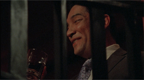
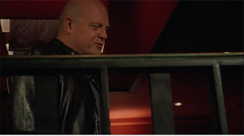
Problem is, this approach is far from what a real documentary film looks like. True, the individual images might be rough, but their relation to one another is quite different from those in a documentary. For one thing, they occupy positions that documentary shots can’t achieve. Shot B may be taken from a spot we’ve just seen to be empty in shot A, as in the sequence from Succession. As Ken put it, “There’s no such thing as a reverse angle in a documentary.” Or shot B may be taken from a very high or low angle, where a camera is unlikely to perch, as in this passage of The Shield (2007) which hangs the camera in space peering through a railing.
Sometimes shot B will represent the optical viewpoint of a character, which is unlikely in an unstaged documentary. Putting it awkwardly, the free-camera style achieves a greater degree of camera ubiquity than we can find in a standard documentary. (Years ago, I made this point in relation to The Office.)
For another thing, the flow of run-and-gun shots always captures the salient story points. A documentarist, with one or two cameras following an action, is still likely to miss something significant (and to cover the omission with elliptical editing and continuous sound). But the modern method offers its own rough-edged equivalent of classical coverage. The action remains comprehensible. Sometimes the camera will even wander off on its own to frame something the characters aren’t aware of, providing a modern equivalent of classical “omniscient” narration.
What we have, I think, is a modern variant of the one-point-per-shot mandate of traditional editing, but featuring shots of that evoke greater “rawness” than studio filming did. And maybe it’s not as modern as we think. Here’s a sequence from Faces (1968), complete with walk-and-talk, or rather stagger-and-talk, as well as camera ubiquity and matches on action that would be difficult in a documentary.
I’d argue that John Cassavetes, much admired by filmmakers who followed, supplied the prototype for today’s run-and-gun look. Admittedly, it’s been stepped up; I suggested in The Way Hollywood Tells It that intensified continuity has been further intensified.
Nervous energy
Intensified how? Apart from all the swishes and zooms and focus changes, some bells and whistles aim to enhance the sense of “energy” attributed to the style. The peekaboo framings I mentioned would be one instance. Here are some others.
The shot, distant or close, which simply trembles. Let’s call it the wobblecam. It suggests the handheld shot, but it’s brief and seems shaky just to evoke a sort of vague tension. Wobblecam shots are so common now that entire scenes are built out of them, as in the Succession clip.
The arc: In filming TV talk shows, how do you keep viewers glued to the screen? One option is what a 1970 manual calls the arc. Here the camera travels in a slow partial circle that refreshes the image gradually. The framing reveals constantly changing aspects of the panelists and is a nice change from master shot/ insert editing. I remember this as common in 1950s programs.
 The “roundy-round” (thanks, Ken): This extends the arc to 360 degrees, circling around one or more characters, urging us to watch for bits of action or dialogue—usually timed for maximum visibility. It’s also used to convey a character at a loss, say mystified by which way to turn, or characters embracing (whoopee). The technique can be found sporadically before the 1990s, when it becomes quite common. Ken pointed out that the roundy-round was extensively used on E. R. to underscore time slipping away during life-and-death surgery.
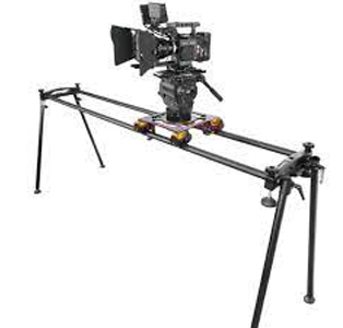
The slider: The enhancement I find most distracting is the camera’s slow leftward or rightward drift while filming static action. Usually it’s a master shot, but it doesn’t have to be, and it can sometimes interrupt a series of close views. Unlike the wobblecam, this is more teasing because we’re used to such a shot revealing something. It doesn’t, but I think it holds out the promise and keeps us watching.
Writing The Classical Hollywood Cinema I came to realize that supply companies created lighting and camera devices designed to meet the developing needs of filmmakers. Thanks to Ken, I learn that this tradition continues. You can buy or rent gear that will enable arcs, roundy-rounds, and the slider (right). Both in technique and technology today’s Hollywood is a continuation of yesterday’s.
If a director constantly relies on camera movement, there’s no reason to object. The elegant moves of Ophuls or Mizoguchi or of McTiernan in Die Hard provide the sort of continuous engagement and ultimate pictorial payoffs that justify the technique. My examples illustrate more gratuitous camera moves, choices that “add energy” but once they’ve become conventional, seem wasteful. Usually, they reveal nothing and end up minimizing the power of a gradual reveal when it comes along.
But who am I to complain? Film styles change under production pressures and artistic inclinations. As a student of film history, I have to study what’s out there. Still, run-and-gun remains only one option. There are still lots of films and shows, like Tär and The Woman King and Barry, that rely on rigid camera setups and discreetly motivated movements. (Ken’s Dunston Checks In (1996), shown to an appreciative crowd at the festival, is a good example.) Another alternative is providing precise shot breakdowns that feature unusual “eye-candy” angles, as in Better Call Saul’s views from inside mailboxes and gas tanks. That trend constitutes another way to expand options within camera ubiquity. There are also the long-take films in which complicated camera moves preserve the patterns and emphases of classic continuity. (See the discussion of Birdman.) And then there’s the effort by Wes Anderson to go in the other direction, to submit to constraints far more severe than classical shooting—an austere refusal of camera ubiquity.
I must ask Ken about all these options too. Next time, I hope.
Thanks to Ken Kwapis, who enormously expanded my sense of the practical choices available to the filmmaker.
The TV production manual discussing the arcing shot is Colby Lewis, The TV Director/Interpreter (New York: Hastings, 1970), 131-132. Other mobile framings are reviewed in the same chapter.
For examples of filmmakers believing that the rough-edged style is like documentary shooting, see remarks on Succession in Zoe Mutter, “Fury in the Family,” British Cinematographer and Jason Hellerman, “How Does the ‘Succession’ Cinematography Accentuate the Story?” at No Film School. Butler’s comments on Hill Street Blues are quoted in Todd Gitlin, “’Make It Look Messy,’” American Film (September 1981) available here.
You can feel the thrill of silent-era creators and critics in realizing the possibility of camera ubiquity. Dziga-Vertov celebrated the power of the Kino-Eye to go anywhere, while Rudolf Arnheim saluted cinema’s ability to provide unusual angles that bring out expressive qualities of the world. What would they make of a shot like this below?
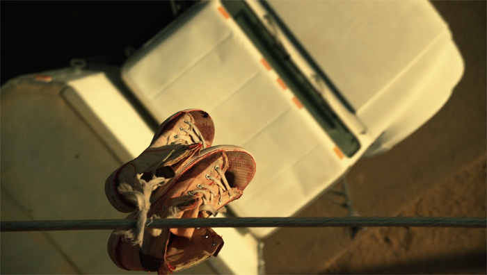
Better Call Saul (2015): Extremes of camera ubiquity.
Five critics, one of them a killer
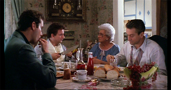
Goodfellas (1990).
DB here:
Fourteen months of being house-bound gave me plenty of chance to catch up on my reading. But the reading was almost all devoted to the book I was writing on mystery plots in fiction, film, and other media. Now that it has been catapulted out to unwary publisher’s readers, it’s time for me to catch up on some 2020 books I like. In this batch, all have a connection to film criticism, and murder, attempted or consummated, creeps into more than one.
Movies for Muggles
Somebody ought to write a history of the one-movie monograph. Early on there were picture books, and roadshow attractions often produced pretty laminated books as souvenirs, filled with PR stories and color images. My vote for the first analytical monograph would be the very ambitious Tu n’as rien vu à Hiroshima! (1962). In the early 1970s, American academic presses began offering critical studies of single films; an early example was the FilmGuide series edited by Harry Geduld and Ron Gottesman. (My favorite entry was Jim Naremore‘s study of Psycho.) Since then many publishers have pursued the format, usually as part of a series.
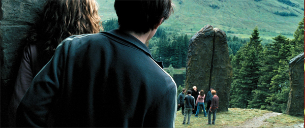
Now we have 21st Century Film Essentials, newly launched at the University of Texas Press. The first two entries are pretty canon-busting. Dana Polan writes on The Lego Movie, and Patrick Keating on Harry Potter and the Prisoner of Azkaban. I haven’t seen Polan’s book, but Keating directly takes up the challenge of the series.
As a franchise film, as a work of digital cinema, as a work of collaborative authorship, and above all as a thoroughly engaging demonstration of the art of storytelling, Harry Potter and the Prisoner of Azkaban is an essential work of twentieth-first century cinema.
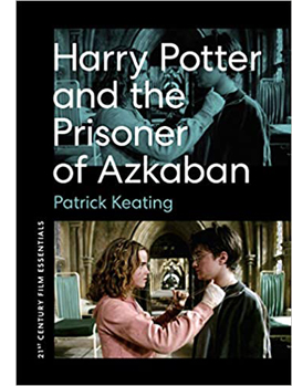 I confess I was skeptical, and still am a little. But Keating’s meticulous analysis and interpretation of the film does convince me that this is a ripe example of modern “hyperclassical” cinema. By that I mean a dense, “through-composed” revision of traditional narrative strategies and film techniques, working smoothly together to create effects at many levels. A hyperclassical film is more thoroughly classical than it “needs to be.” In other words, here’s another counterexample to the notion that “post-classical Hollywood” shows a collapse of traditional norms.
Keating’s argument for the film’s richness, I think, revolves around two central concepts. First is that of narrative viewpoint. Virtually all of Azkaban, unlike the earlier entries in the franchise, is filtered through the consciousness of Harry. We’re attached to him as he experiences the action. That doesn’t, Keating hastens to add, make the film radically subjective; indeed, there are relatively few shots from Harry’s optical viewpoint. Attaching the unfolding plot to a character doesn’t rule out a wider perspective, if only because cinema puts him within a wider frame of a shot or an edited sequence. There’s always the possibility of our registering action or other characters’ reactions. The end of the Quidditch flight is thick with these impacted viewpoints, and elsewhere Cuarón’s constantly moving camera nudges us toward implications that supplement, or sometimes contradict, what Harry is concentrating on.
Keating’s other main concept is connected to the broadening of viewpoint: worldbuilding. This idea is obviously central to Rowling’s achievement, as it has been to franchises since Star Wars. But Keating lifts the idea to a central role in how films engage us. The richly realized world of Potter is only an extreme instance of what every narrative does. Borrowing from critic V. F. Perkins, Keating suggests that any film narrative supplies us with the possibility of many stories that are only hinted at, or merely latent.
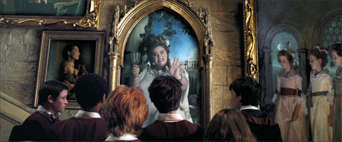
Most movies prune those secondary offshoots, the better to force us to concentrate on our protagonist. But Tom Stoppard showed that Rosencrantz and Guildenstern deserved their own play. Similarly, franchise films, with the ever-present prospect of sequels, crossovers, or reboots, make us aware that any character, even any item of furniture, secretes a new story, or a bunch of them. The Potter films are committed to this spinoff aesthetic, packing in as many suggestions of sidestories as the screen will bear. This principle finds tangible expression in the portraits jammed into the Gryffindor common room and dorms guarded by the Fat Lady.
Overwhelming us with characters and situations, many in motion, this gallery is perfectly in keeping with English traditions of floor-to-ceiling decor. It’s also a groaning feast of other stories that could yet, somehow, intersect with Harry’s fate. Keating’s shrewd commentary on worldmaking is one of the book’s highlights.
Keating ties these ideas to phases of production and division of labor, reviewing how the novel’s viewpoint and worldbuilding strategies are transposed and extended by script, camerawork, editing, performances, set and costume design, and music. Throughout he weaves what he takes to be the film’s binding theme, that of time. Is the future preordained, as Ms. Trelawney insists in her frantic, fumbling lectures? Or is it open, as Hermoine and others tell Harry? This makes the film’s tour de force climax with the Time Turner into a synthesis of restricted viewpoint (we’re with Harry as he witnesses an alternative future) and worldbuilding (the future is what you make it).
I might quarrel with Keating’s suggestion that the impulse driving Harry’s action is a struggle with the dementers. I saw his relation to Sirius Black as more than the subplot Keating considers it. Overall, though, Keating has produced not only a subtle, supple analysis of the film but also a model for how to understand cinematic storytelling in the age of the blockbuster.
Wiseguy’s progress
If Keating’s book is a classical sonata, Glenn Kenny’s Made Men: The Story of Goodfellas is bop. Keating offers a tidy analysis through crisply defined categories. Kenny provides a hardcopy approximation to a packed DVD.
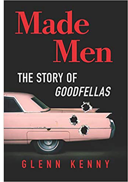 At the center is a 150 page scene-by-scene account of the film: a commentary track in your hands. Alongside that sit chapters that function as bonus materials. They include a brief introduction to the filmmaker just before he started work on the film, chapters on preproduction, the music (Kenny is an expert on pop and rock), the editing, the critical reception, and the ultimate fate of the real-life protagonist Henry Hill. Then, like the narrator of a Criterion video supplement, Kenny surveys Scorsese’s career after Goodfellas. Finally, an epilogue is virtually a monologue: Scorsese talks almost without interruption for twenty-five pages, as if this were the interview rounding off the disc. There’s also a bibliography, a timeline of the production, and the recipe for Henry Hill’s ziti.
It’s overwhelming. Kenny has evidently read everything about the real-life sources of the story, and his interviews turn fan service toward crime reporting. It is no small thing to pursue hard cases who were recruited for bit parts. Kenny has also garnered a lot of information from staff like AD Joseph Reidy, who are seldom given much attention. Keating would probably be happy to see Kenny’s narrative splinter into stories leading to other stories, such as the effects of the film on the careers of Barbara De Fina and Ileanna Douglas.
I compared the book’s central chapter to a DVD commentary. Anybody delivering a voice-over play-by-play regrets that you have to keep up with the film and can’t devote as much time to a big scene as you might like. Thanks to the print format, Kenny is able to pause the film and spiral out from it to fill in backstory or behind-the-scenes dynamics.
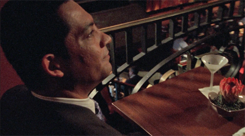
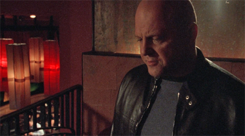
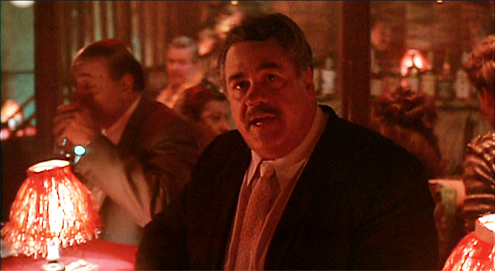
Early on, he can give us three pages on Tuddy, both his original (who died in prison) and Frank DiLeo, the actor playing the role. Kenny explains that DiLeo was a music executive who oversaw Michael Jackson’s “Bad” video, which included a Wanted poster of Scorsese in a subway scene, which ties to a sneaky reference to the “Smooth Criminal” video featuring a character named Frank Lideo, played by Joe Pesci. . . well, you get the idea. Likewise, in an astonishing cadenza, Kenny identifies every actor and wiseguy in the long POV tracking shot in the Bamboo Lounge.
His account of the cast rummages through filmographies and personal histories, and adds the sort of oversharing we welcome: “Behind the placid mook mug seen in the movie was a remorseless killer.”
All these exfoliating tales don’t conceal a sustained performance of film criticism. Kenny’s governing idea is that Goodfellas cons us through a bait and switch. Lured in by a rapid-fire opening that arouses a bemused attraction to these bad boys, we’re gradually forced to a more sober, even horrified, realization of their moral and emotional brutality. I think that this fairly reflects most viewers’ experience. But how does the trap work?
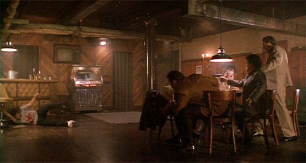
Kenny plots an “arc of disengagement” between the killings of Tommy and Spider. A rise-and-fall pattern links the parallel scenes of the Bamboo Lounge, the Copacabana, and the shabby tavern where the gang meets to whack Morrie. Kenny draws nuanced comparisons with The Godfather and is very detailed on Scorsese’s visual techniques, particularly the freeze-frames and fadeouts, which usually get less attention than the flashy camera moves. One of the book’s main points is that Scorsese, newly aware of how TV commercials trained viewers in quick pickup, deliberately decided to make his fastest-paced movie. And of course the music is central to managing our mood and commenting on the story.
As a seasoned reviewer, Kenny can write. “Frisky newlyweds still hot for each other; you love to see it.” Henry (“a walking appetite”) eventually pulls Karen into his schemes: “The revitalized marriage will find its sense of twisted teamwork.” And digression is welcome when it humanizes the author. Listening to Sid Vicious’ version of “My Way” is comparable to “say, eating the fried chicken from the Kansas City restaurant Stroud’s for the first time.” (The “say” makes the sentence.) A movie about food begs the critic to sample a little synaesthesia, with music evoking mouth-watering chicken. Come to think of it, that linkage of music and food is in Goodfellas too.
I especially enjoyed Kenny’s rebuke to fans who bust this carefully constructed work into “movie moments.” You probably know that one school of criticism thinks that films are more or less loose assemblages of scenes, out of which certain instants become incandescent. Certainly there are such moments in many movies, and sometimes they stand out from a gray pudding. But often strong moments ravish us because they’ve been prepared for by careful craft. So Kenny’s guided tour of Goodfellas shows its affinities with Keating’s holistic approach:
Serrano and his crew reduce movies to anthologies of “cool” or shocking moments, as opposed to fictions whose circumscribed worlds aspire to create beauty or sorrow or horror or joy in some formally coherent whole.
Mon semblable, mon frère.
Dead end at the ocean’s edge
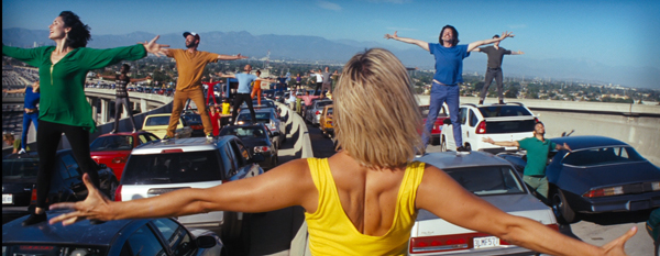
La La Land (2016).
On the other hand, I ought to be out of sympathy with Mick LaSalle’s Dream State: California in the Movies. It’s unabashedly reflectionist, tracing how films project contradictory images of the Golden State. The screen image of California promises pure self-fulfillment, but that leads to loneliness, danger, conformity, and loss of dignity. If Kenny and Keating see movies as made by an army of artisans, LaSalle treats them as springing full-blown from American mythology. There is barely a mention of a director, let alone a sound mixer, in his account.
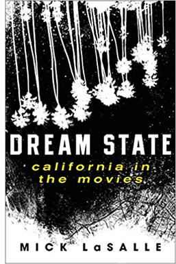 Instead, California-ism makes its way to the screen through a surge of a “collective mentality.” For instance, the blockbusters’ endless images of urban annihilation spring from “a people disseminating and celebrating visions of their own obliteration. . . . Something is seriously wrong with the nation producing such visions.” He suggests that “the fear of extraterrestrials is the disguised fear of illegal aliens. . . . the fear of the apocalypse is the disguised fear of terrorism.” Hollywood takes dictation from mass anxieties.
I’ve explained elsewhere (here and here) why I find such claims unpersuasive. I think that reflectionism is every smart person’s mistaken idea about cinema. But sometimes, as with Susan Sontag’s essay “The Imagination of Disaster,” a reflectionist account of a film can activate some valuable ideas and information along the way, and it can host some entertaining writing. These benefits, I think, emerge throughout Dream State. In kaleidoscopic bursts, LaSalle provides suggestive takes on movies familiar and obscure, and the way they link to one another.
For example, he tracks recurring plot patterns. There’s California’s version of the One Great Night, when individual transformation takes place in a few hours of turbid activity (Superbad, Modern Girls). American Graffiti is the prototype, and in just two pages LaSalle evokes the way audience knowledge races ahead of the characters, far into the future. (Curt winds up in Canada, which probably has to be explained to young viewers today.)He’s very good on the cost-of-stardom plot, from What Price Hollywood to La La Land, this last the only film that faces the fact “that every great advance requires sacrifice, and that even though there is nothing like the joy of first love , there is nothing more important than the fulfillment of one’s inner self.”
 LaSalle considers our willingness to take stars as surrogates for us, and here I was reminded of another critic who tried to pierce the Hollywood Hallucination, the great Parker Tyler. He had, I think, a more meta attitude toward the movies, since he avoided straight reflectionism by treating every film as a charade, a narcissistic exercise in make-believe. For Tyler, Hollywood movies were always primarily about Hollywood, filled with symbolic surrogates for their makers and their viewers. In this respect, LaSalle’s opening chapter is agreeably Tyleresque, positing The Wizard of Oz as a film enacting the flight to a dream city; the Emerald City as Hollywood. Like Tyler as well, LaSalle searches for what he calls a movie’s complex finish, as with a glass of wine. Wizard ends not on a note of ambiguity exactly, but on something like a chord that sets off contrary overtones. Tyler’s books were built on this chord.
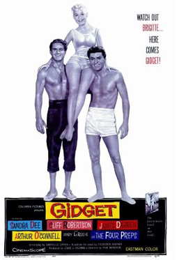
Another critical avenue that LaSalle opened up for me was iconographic: the differences between LA movies and San Francisco movies. He deftly contrasts the ambience and topography of the cities. Noir and disaster films are primarily anchored in LA, while San Franciso movies tend to be steeped in nostalgia (e.g., Jobs, Milk). He keeps finding new angles to comment on. Avoiding the obvious effort to discuss California’s boom during and after the war, he skips back to the months around Pearl Harbor to bring to light films, mostly exploitation quickies like Secret Agent of Japan and Little Tokyo, USA, that rushed to treat Japanese Americans as potential spies. Meanwhile, the unoffending citizens were shipped off to internment. On a lighter note, anybody who’s bold enough to praise Gidget as a more mature film than Easy Rider gets my admiration (and agreement).
LaSalle, who came to California from the east, weaves in bits of memoir that highlight his main theme. And like Kenny, he writes with conversational wit.
“Home is horrible. Oz is horrible, too. . . but at least it’s in color.”
On Saturday Night Fever and Grease: “One seems tough, but it’s soft. (Of course, that’s the New York film.) One seems soft, but it’s hard. (Of course, that’s the Los Angeles film.)”
In Hollywood “integrity is so original it might just work as a strategy.”
In Out of the Past, “sex can kill you, but it’s worth it anyway.”
In San Francisco (1936) “if only to get Jeanette MacDonald to stop singing, the Earth had to intervene.”
Contrasting Monterey Pop to Woodstock‘s utopian fantasy, LaSalle nearly had me on the floor.
This is a model? Hundreds of thousands of intoxicated people, unable to wash, all but sitting in their own slop, cheering for a series of aristocrats that swoop down to entertain them and then leave? Meanwhile, the army flies in food and the slave classes clean out the Port-O-Sans? That’s sustainable as a societal model?
In addition to all this, through engaging appreciation, LaSalle has prompted me to seek out a great many films I hadn’t heard of. That’s another duty of the good critic. After seeing so much–pounding the beat every day–the movie reviewer can steer you to new discoveries.
Cinephile into cineaste and back again
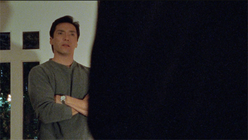
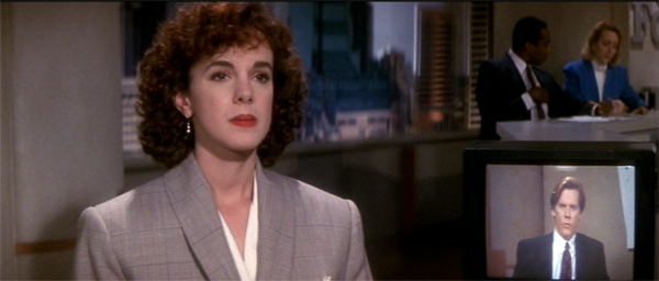
He Said, She Said (1991).
All of these critics have participated in filmmaking. Mick LaSalle has written and produced documentaries. Glenn Kenny has been an actor in several films (including Soderbergh’s Girlfriend Experience). Patrick Keating, who has an MFA in cinematography, has been a DP on independent projects. Reciprocally, director Ken Kwapis started out wanting to be a film critic–in third grade, no less.
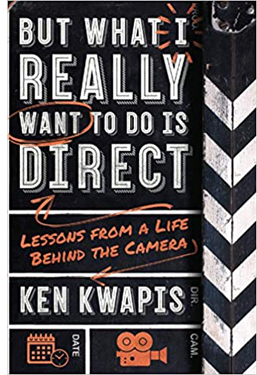 In college he devoured classic movies and gorged on film criticism. Kwapis went on to become a director of consequence, overseeing many features (Sisterhood of the Traveling Pants, He’s Just Not That into You) and TV episodes (The Garry Shandling Show, The Office). Yet he didn’t leave his cinephilia behind. But What I Really Want to Do Is Direct: Lessons from a Life behind the Camera has an intellectual heft rare in career memoirs and moviemaking manuals. It’s at once thoughtful and practical, suffused throughout by an ethic of modesty, tenacity, and what I can only call a desire to remain both a good artist and a decent person. It also contains some first-rate film criticism.
Kwapis intercuts three sorts of chapters. There is the chronological account of the filmmaking process, with advice on taking meetings, establishing rapport on the set, giving actors “playable notes,” and coping with postproduction and marketing. Kwapis insists at every turn that you need to be both firm and flexible, open to every suggestion from the production team but still adhering to your conception of the project.
But this is not auteurism on steroids. If you’re not a Spielberg or a Nolan, the director has to learn tact and strategy. Kwapis emphasizes not abstract technique but the interactive, interpersonal demands of filmmaking, He suggests ways of responding to producers’ notes or actors’ complaints that allow everyone to keep their dignity. Just stepping away from the Video Village, that cluster of people around the monitor, and positioning yourself by the lens is a way of proactively steering the scene. He even gives good advice about bad reviews. His creative process? “I want to stand behind the camera and make sure there’s something alive going on in front of it, something recognizably human.”
A second batch of chapters shows this aesthetic/ethos in action through case studies from Kwapis’ career. Starting with Follow That Bird (1985), the Big Bird movie, and running up to A Walk in the Woods (2015), these chapters are about concrete problem-solving. How do you direct puppets? Or orangutans? Or Rip Torn? How do you support an actor who’s just not physically up to the role? There’s a fascinating account of staging options in The Office, where different situations force choices between developing the action in the “bull pen” or in the conference room.
The 1990s were rife with narrative experiments, and He Said, She Said (1991) was one of them. Unfolding over two days, its first part uses flashbacks to present Dan’s memory of his romance with Lorie, while the second part shifts to her version, with replays and gap-filling scenes that show the biases of his account. Kwapis and his wife Marisa Silver (Permanent Record) decided to divide responsibilities, with him directing the man’s scenes and her directing the woman’s. They also built in stylistic differences.
We pre-visualized each version to create as much contrast between Lorie’s and Dan’s personaities as possible. For example, I often show Dan’s literal point of view of Lorie, while Marisa uses camera movement and choreography to underscore how Lorie feels about herself (i.e., insecure).
They created specific ground rules for shooting the scenes. Kwapis’ portion came first, so that Silver could see it and fine-tune the replay. Kwapis is admirably specific about how their strategy shaped performance and plot, with minor characters in one half becoming major in the second.
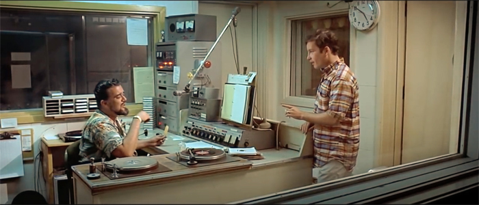
In other words, a cinephiliac idea. (Kwapis prepared for his task by watching Rashomon, The Killing, and Citizen Kane.) The third type of chapter he offers is pure, sharp film criticism, always informed by the demands of craft. His account of American Graffiti is quite different from LaSalle’s, but no less appealing, emphasizing Curt’s visit to Wolfman Jack as an epiphany that needs no formal underlining (“no ham-fisted push-in”).
Other chapters scrutinize 2001, Lawrence of Arabia, The Graduate, I Vitelloni, and other classics. Without being pretentious Kwapis manages to invoke the “objective correlative” (e.g., shoes in Jojo Rabbit) and reflexivity (no big deal). I especially appreciated his detailed analysis of staging in a scene often overlooked in The Magnificent Ambersons: George’s confrontation with a gossipy neighbor, handled in one deftly choreographed close framing.
Kwapis designed the book to explore these three dimensions, but he isn’t puritanical about keeping them apart. Case studies and problem-solving pop up in the general advice sections, and the critical acumen shines through even brief examples of on-set tips (e.g., decisions about a score for Traveling Pants). It all flows together.
The result ranks with Sidney Lumet’s Making Movies and Alexander MacKendrick’s On Film-Making, the most acute personal reflections on Hollywood directing. But like those, it’s more than a testament to the power of craft. It’s also a vision of how, as the first chapter says, to go “beyond success and failure in Hollywood.” You do it, Kwapis maintains, by knowing your plan, respecting your co-workers, inviting discovery through accidents, and staying humane. I like to think that studying films as a critic helped him get there. Not every director, after all, can quote Jean Renoir.
“Only a hack cares about the goddam script”
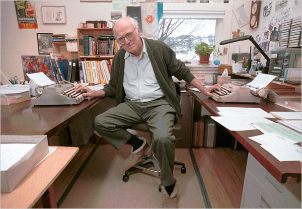
Donald Westlake (David Jennings for the New York Times).
I promised you a murderer, and he arrives in Donald E. Westlake’s Double Feature, a pair of novellas originally published as Enough (1977). The second, Ordo, takes place in Hollywood, when a sailor learns that his first wife has become a movie star and decides to look her up. It’s remarkable in several ways, but the story that grabbed me was A Travesty. On the first page a film critic kills his girlfriend.
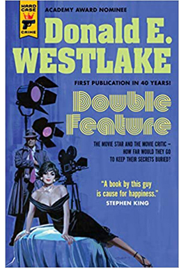 True, it’s an accident, but even then he seems less distressed than he should be. He wipes down the crime scene and slips out. Of course he becomes a suspect. Once he seems to be cleared, the trusting cop lets him mosey along on later investigations. They discover that the critic has a knack for solving crimes, including an old-fashioned locked-room puzzle. He gets caught thanks to a plot twist that owes a good deal to Westlake’s early days writing happily overblown softcore porn.
The plot lives up to its title, being a travesty of whodunits and man-on-the-run thrillers. Westlake invokes mystery conventions like the dying message and the final twist: “As with all Least Likely Suspects, I was in reality the Murderer.” But this guilty protagonist is writing a profound essay on Top Hat and interviewing an over-the-hill director who undermines his belief in the auteur idea that “it’s up to the director to color and shape the material and so on.”
A: Yeah, that’s fine, but you got to have the material to start with. You got to have the story. You got to have the script.
Q: Well. . . . I thought the director was the dominant influence in film.
A: Well, shit, sure the director’s the dominant influence in film. But you still gotta have a script.
Well, that wasn’t any help. What was I supposed to do, go ask three or four screenwriters for suggestions?
A Travesty reveals that Westlake followed East Coast cinephile taste pretty closely. In the passage after this one, the killer regrets placing Brant so high in the Pantheon–a clear reference to Andrew Sarris’s writings. Better to ask a real director like Hawks or Ford or Hitchcock, or even Fuller.
Hip movie references are de rigueur in most mysteries today. (Grudge-reading The Woman in the Window, I thought: Just kill me now.) But how many thrillers in 1977 invoked Marion Davies or Manny Farber’s Negative Space? Our anti-hero argues with a girlfriend about circumstantial evidence in The Wrong Man and Call Northside 777. And as you’d expect, the big clues that reveal the killer to her come from Gaslight.
Westlake has long been one of my heroes; his Richard Stark novels get a chapter in that manuscript I mentioned at the outset. (Go here and here to gauge my dedication.) Like Elmore Leonard, he had a pragmatic approach to movie versions of his work. As far as I know, he complained only of Godard’s handling of The Jugger, which became Made in USA, not that anybody could tell. He wrote screenplays, notably The Stepfather (1987) and The Grifters (1990), and many of his stories have been adapted to the screen (Point Blank, The Outfit).
Nearly all his work I know has a zesty playfulness, and A Travesty is no different. It suggests that, after shooting down movies and destroying reputations, film critics have earned a chance to kill for real. They just turn out to be fairly bad at it.
My stack of reading has barely dwindled. I’ll try to file some more book reports as summer unfolds and the mosquitos discover our shady lawn.
Thanks to Patrick Keating and Mick LaSalle for sending me copies of their books, though I would have bought them anyway. Thanks especially to Patrick Hogan for telling me of his friend Ken Kwapis’s book.
Philip Pullman, a master of the sort of world-building Keating celebrates, argues against dwelling on the story spinoffs harbored by a richly realized milieu. He borrows the scientific idea of “phase space” to suggest that too great a concentration on the indefinitely large possibilities of a story world can freeze a narrative’s progress and distract the reader from the through-line. A story, he says, is a path through a forest and readers are best gripped by sticking to Red Riding Hood’s journey. (Compare Sondheim’s Into the Woods.) Interestingly, he compares this strategy to the cinematic idea of knowing the right spot for the camera, a spot that’s just as valuable for what it excludes as for what it shows. See Daemon Voices: On Stories and Storytelling (Vintage, 2017), 20-24, 122-123.
For more on Parker Tyler, see the chapter in my The Rhapsodes: How 1940s Critics Changed American Film Culture. Avoiding straight reflectionism, Tyler saw the film world as its own sealed-off realm. If the movies reflect anything, it’s not what America thinks but what Hollywood thinks that America thinks. Or rather, what Hollywood imagines that America dreams.
In this entry I write about some of the anti-Japanese films Mick LaSalle discusses.
This entry analyzes the pseudo-documentary style of The Office. I write about 1990s as an era of narrative experimentation in The Way Hollywood Tells It: Story and Style in Modern Movies.
No admirer of Westlake can ignore the addictive Westlake Review or, of course, the official webpage maintained by his son Paul. Westlake’s motto: “My subject is bewilderment. But I could be wrong.”
American Graffiti (1973).
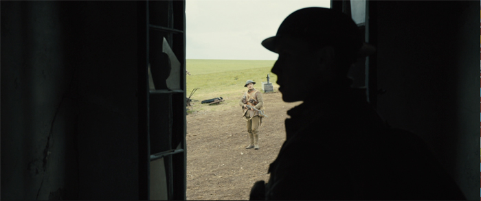
1917 and DUNKIRK: A conversation
1917 (2019).
DB here:
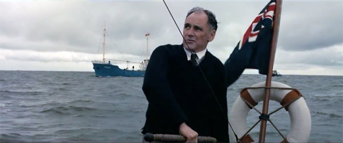
For over twenty years, the Willson Center for Humanities and Arts at the University of Georgia at Athens has hosted Cinema Roundtable, a series of film screenings and discussions. Covid-19 hasn’t stopped them from keeping it going, and they kindly invited Kristin and me to visit, virtually, and talk about two war films. The title is “Wartime Suspense in ‘Dunkirk’ and ‘1917’: A Conversation with Kristin Thompson and David Bordwell.”
We discussed aspects of style and genre. Many participants, notably Professor Tanine Allison of Emory, brought up other points about these two intriguing movies. It was also nice to see some old friends from Wisconsin logging in.
The entire session is on YouTube.
We enjoyed participating and thank our hosts, Dick Neupert and Dave Marr. In preparing for the session, I think it’s fair to say we liked both films better on rewatching them.
And no, we haven’t yet seen Tenet. Health precautions keep us at a distance. But we are keen, and when we can write about it, we will.
In a piece of good timing, Tom Shone’s book The Nolan Variations came out three days before our session. It’s excellent and offers the most comprehensive overview of this director’s achievements.
Our e-book on Christopher Nolan is available for download here. (Thanks to those Willson attenders who picked it up!) There’s some background on the book here. Our various blog entries on Nolan’s work are here.
Dunkirk (2017).


