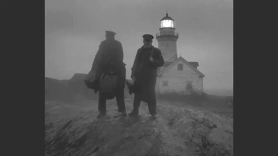
Archive for the 'Film technique: Cinematography' Category
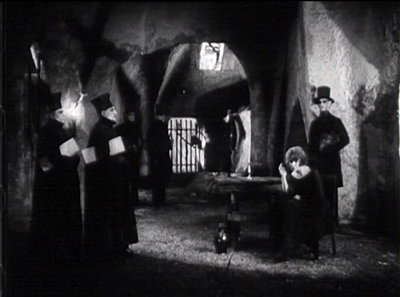
VAMPYR and more on the Criterion Channel
DB here:
Busy times! I’ve gone back to teaching this semester, and we’re revising Film History: An Introduction. So we’ve been kept from posting as often as we’d like. For the moment just let me signal the newest additions to our Observations series on the Criterion Channel.
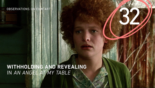
In recent installments, Kristin offers an analysis of how film technique suppresses and reveals story points in Jane Campion’s An Angel at My Table. A free extract is here.
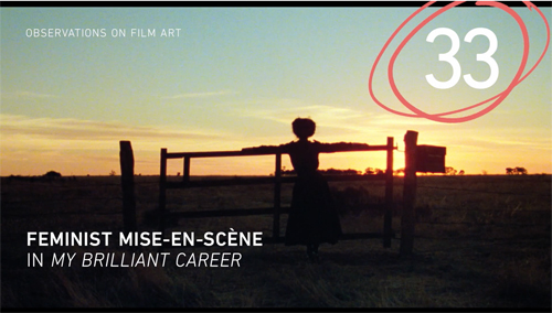
Jeff Smith traces how mise-en-scene techniques, especially settings, yield feminist implications in Gillian Armstrong’s My Brilliant Career. Sample it here.
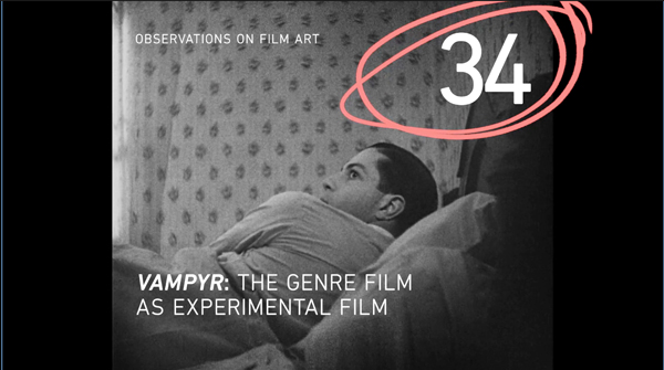
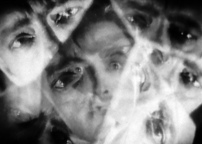
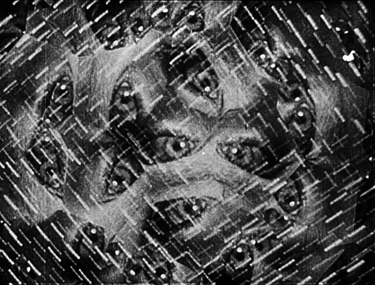
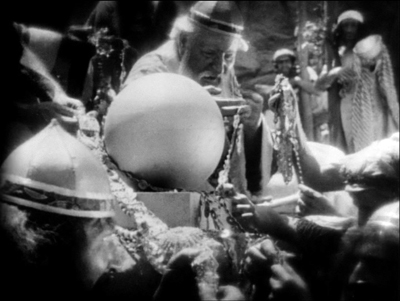
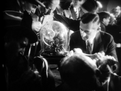
This month, as you see above, I’ve offered a consideration of Vampyr as an experimental film. Again, you can see a clip.
Thanks to the people who’ve told us they enjoy our offerings, now running for nearly three years, longer than Joanie Loves Chachi. Thanks as well as to the group that makes it possible: Peter Becker, Kim Hendrickson, Grant Delin, Erik Gunneson, and the rest of the team in Madison and Manhattan.
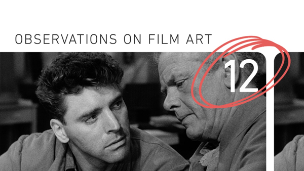
With the Channel sponsoring an ambitious seventeen-film Burt Lancaster series, you might check out this entry on Brute Force.
THE LIGHTHOUSE: A period film with period style
Kristin here:
David and I first saw Robert Eggers’ The Lighthouse at the Vancouver International Film Festival, and he wrote briefly about it at the time. About halfway through the screening or less, I realized that what I was watching was a modern combination of two important historical trends of 1920s German cinema: Expressionism and the Kammerspiel.
I am partial to German silent cinema, particularly Expressionist films, for their daring stylization. The movement gave rise to some great films by two masters, F. W. Murnau and Fritz Lang. I’m even fond of the leisurely pacing that characterizes so many Expressionist and Kammerspiel films. At times some scenes resemble the slow cinema of recent decades.
Kammerspiel was a larger trend in the theater of the day, and it has its equivalent in English and American drama, the chamber play. Most of the Kammerspiel films in Germany were written by the great scenarist Carl Mayer, also responsible for many of the Expressionist classics from Das Cabinet des Dr. Caligari on. Kammerspiel films include most notably Hintertreppe (Backstairs, Leopold Jessner, 1921), Sylvester (1923) and Scherben (1923). Some would consider Murnau’s The Last Laugh (1924) to be a Kammerspiel. Carl Dreyer also made one in Germany, Michael (1924, with a scenario by Thea von Harbou) and one in Denmark, The Master of the House (1925). Such films typically involve a small cast of characters who come into conflict in various ways, invariably ending badly, typically with death, suicide, murder, and/or imprisonment. The Lighthouse clearly qualifies.
The Lighthouse is also a horror film, or at least a lot of critics think so. Thus it fits cozily into the Expressionist movement, of which several Expressionist films are now considered early classics of the horror genre: Caligari, Nosferatu, Der Golem, Warning Shadows, Die müde Tod and other less well-known films.
Critics did not fail to notice The Lighthouse‘s links to silent cinema, and in particular Expressionism. Richard Newby’s review in The Hollywood Reporter remarks on: “The filmmaker’s decision to shoot the film in black-and-white and in the aspect ratio of 1.19:1, giving The Lighthouse the appearance of a silent film born of German Expressionism.” He also calls it, “Equal parts Lovecraftian horror story and existential chamber piece in the vein of Jean-Paul Sartre’s No Exit.”
Screen Daily reviewer Lee Marshall caught both the Expressionist and Kammerspiel aspects:
Shot in an expressionist black and white that harks back to cinema’s earliest years, The Lighthouse provides a marvellous chamber-drama platform for two actors, Robert Pattinson and Willem Dafoe, who seize the opportunity with gusto.
[…]
Referencing everything from German expressionist cinema of the 1920s to US silent comedy, the photography of Edward Weston and the from-the-ground-up perspective in the paintings of Andrew Wyeth, Jarin Blaschke’s photography is starkly compelling.
Manohla Dargis’ review in The New York Times explicitly notes German Expressionist cinema:
With control and precision, expressionist lighting and an old-fashioned square film frame that adds to the claustrophobia, Eggers seamlessly blurs the lines between physical space and head space.
The film’s more sustained pleasures, though, are its form and style, its presumptive influences (von Stroheim’s “Greed,” German Expressionism), the frowning curve of Winslow’s mustache, the whites of eyes rolled back in terror.
One might add that the dreams and hallucinations, shown from Winslow’s viewpoint, reflect the innovations of French Impressionist cinema of the 1920s. This sort of stylistic subjectivity, however, was highly influential and has been widely used ever since. It was quickly picked up in German cinema of the 1920s, and some of the classics of the day, especially The Last Laugh (1924) and Variety (1925), are more noted for their subjective camerawork than are the earlier French films that originated the practice. Overall, The Lighthouse has the flavor of a German film from the 1920s.
Lots of filmmakers have attempted to imitate silent cinema, and often they succeed to a degree. They shoot in black-and-white (but don’t add tinting and toning), put just music and maybe some sound effects on the track, and have some exaggerated acting. Perhaps they set the story in the past, as Michel Hazanavicius does with The Artist (2011). A more careful attempt is Blancanieves (2013).
No matter how careful the combination of such elements is, the result usually doesn’t really look like an old film. The Lighthouse really does look like a silent film, in the sense that it looks as if it were shot using the film stock available in that era. It does not, however, pretend to be a silent film, as The Artist does. The Lighthouse doesn’t eliminate the dialogue. Its narrative and tone bear distinct resemblances to those of German and French films of the 1920s, but its story is presented with more overt sexual content and extreme violence than mainstream silent movies would have included.
It helps that Eggers is clearly a cinephile and has watched a wide variety of films from many periods. Cinematographer Jarin Blaschke has also worked as a still photographer and also knows a great deal about older film stocks and lenses. They both knew a lot about films of all periods.
When asked in an interview for American Cinematographer what were the team’s “references” (films shown to crew members as models), Blaschke responded:
A bit of Béla Tarr for tonal dreariness and patient use of camera. Bergman’s camera language, as always. [Eggers’ liked the strong night lighting of In Cold Blood. There were some nautical silent films, including Flaherty’s Man of Aran, [which was shot] on orthochromatic stock with strong, direct close-ups. [The influence of] Eisenstein was there for montage, and bold, hard cuts. Optically, the films we watched from the ‘20s and ‘30s were very appealing in their subtle fringe distortions and the way highlights would shimmer. [p. 63]
In the end, the most influential references were M—an inspirational and modern film in terms of visual language—and Bresson’s Pickpocket, which influenced [our] use of close-ups, especially actions with hands. These helped steer The Lighthouse away from the purist confines of the turn of the century, and more toward early modernism.” [pp. 63-64]
M seems rather an odd choice, but Blaschke describes its inspiration in an interview for Kodak:
Watching that, I found a very modern film with surprising camera movement but more importantly: a modern, creative mastery in how visual information was withheld from the audience, how information was rewarded, and when,” says Blaschke. “With this new inspiration, I felt there was a highly-effective framework for me to express myself visually. Stepping away from a mere 19th-century emulation, we were on to something more surprising and layered.
In a DGA podcast interview, Eggers discusses the nearly-square aspect ratio:
And then, the boxy aspect ratio, we were shooting in 1:19.1, early-sound aspect ratio. There’s a Pabst film, Kamaradschaft, that takes place in a mine, which is probably the only other film that makes sense to use this aspect ratio, because Pabst is shooting vertical objects, like the smokestacks, and we have our lighthouse tower, and then the cramped mineshafts, and then the cramped interiors of this thing. Because we’re using spherical lenses, it’s actually taller, so it’s a great aspect ratio for these close-ups. You don’t need flab on the side. You just have Robert Pattison’s cheekbones, Willem Dafoe’s cheekbones in all their glory on these old lenses.
Who knows what other films are these two are familiar with? But one can assume that they watched some of the classic German films of the 1920s, both Expressionist and Kammerspiel.
The Lighthouse and German Silents
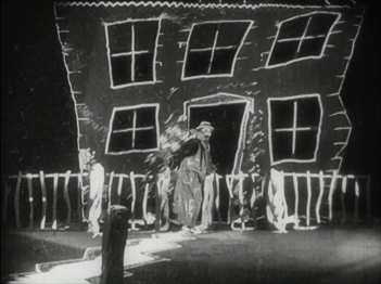
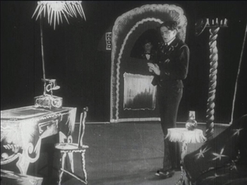
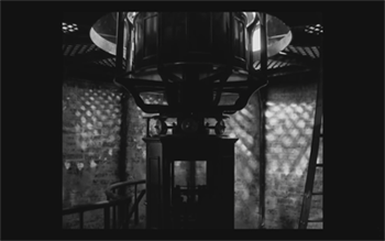
Early German Expressionist films often used jagged, abstract sets, more like paintings than like actual buildings or landscapes. Caligari is the most familiar instance, but here are a couple of examples from Von Morgens bis Mitternachts (1921, Karlheinz Martin).
The second image demonstrates particularly well how light was often represented by streaks of paint. The overhead hanging lamp at the upper left is a fringe of spikes, and the flames on the huge candlestick at the left are five wisps of paint. Highlights from these “lights” are painted on the desk and chair at the lower left.
Hollywood films have seldom used distorted sets of this kind. They appear occasionally, as in Son of Frankenstein (1939, Rowland V. Lee) and Beetlejuice (1988, Tim Burton). Most of the time, though, when people speak of expressionist style in films noir or horror films, they’re talking about graphic effects created by lighting. That lighting is not created by streaks of paint but by fancy lighting effects. That’s mostly the case in The Lighthouse. The lighthouse tower and the service buildings around it were designed to be authentic copies of features in real historical lighthouses. The distorted stylization comes from lighting effects, from simple underlighting to patterns created by patterned holes in the lighthouse interior.
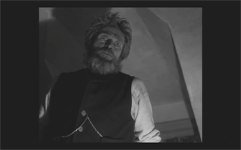
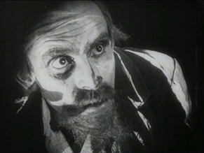
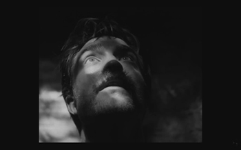
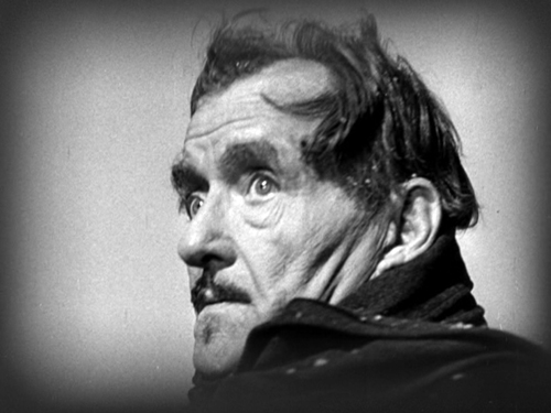
The same is true of acting. In German Expressionist films, actors’ faces were often painted, especially with dark patches around the eyes and pasty white skin. Compare this close-up of Ernst Deutsch’s face, as the Cashier in Von Morgens bis Mitternachts, with that of Robert Pattinson, where the distortions are created by light and shadow.
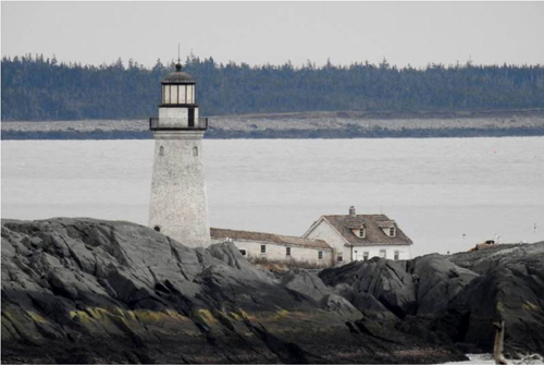
Most of the classic German Expressionist and Kammerspiel films were studio-created. Sets were built either in studios or on extensive backlots. In contrast, Eggers wanted to use an authentic lighthouse. Scouting failed to turn up one with adequate access roads, so the lighthouse and service buildings were built, with faithful adherence to period locales, near the tip of the Cape Forchu Lighthouse peninsula (down the road from a modern lighthouse).
This location is far from from isolated, but the film manages to create a sense of loneliness and dread nonetheless. The huge crashing waves and storms were not generated digitally but were practical effects. According to the Kodak story, “Most of the water work was shot in a large, emergency-responder’s training pool, capable of generating waves in varying sizes and patterns, located near Halifax.” The film contains a few digital effects, mainly to turn the peninsula into an island.
Eggers seems to share the sensibility of the German silent directors: “In a perfect world, I would have liked to have built every single building, for control, control, control, control, control.” (From the DGA interview)
As to Kammerspiel films, The Lighthouse reminds me most of Scherben, which deals with a man who works as a linesman for a railroad. He, his wife, and their daughter live in isolation in some woods and live a stultifyingly dull existence. The intrusion of a railroad inspector who seduces the daughter leads to drama as the linesman gradually becomes enraged and kills him. The style of the film is quite different from that of The Lighthouse, but the dynamics of conflict and gradual deterioration of the central character are somewhat similar–if more restrained in his slow burn and stolid demeanor.
Scherben only became generally available earlier this year, when I wrote about its Filmmuseum Edition DVD release. I have no idea whether Eggers ever saw it at an archive screening or in somewhere else. He more likely saw Hintertreppe, which has long been the only one of the classic Kammerspiele commonly accessible.
Bringing back orthochromatic, sort of
In the DGA interview, Eggers discusses the choice of film stocks:
We thought orthochromatic film stock would really be the way to go, which, among other things, the main thing about orthochromatic film stock is that it’s not sensitive to red, so red is rendered black. So the rosy skin tones on a Caucasian renders darker. So Eisenstein, that’s why all those Russian faces look so tan, and in Hollywood they’re wearing white pancake makeup to compensate for the orthochromatic stock [….] So we liked Double-X negative. The blacks bottom out suddenly in a way that’s very satisfying, as we remember it from watching old movies.
Apparently Eggers and Blaschke investigated having orthochromatic 35mm stock custom-manufactured for them, but the expense was too great. A cheaper way had to be found.
In the American Cinematographer interview, Blaschke describes testing Kodak’s Double-X 5222 35mm film, color 35mm negative film, and digital capture with an Arri Alexa: “In addition to much larger grain, the Double-X has more ‘tooth.’ Even if you match the overall contrast in the DI [digital intermediate], the Double-X had more ‘local’ or ‘micro’ contrast, which emphasizes texture and better differentiates similar tones” [p. 61]. (Double-X 5222 was introduced in 1959 and has been used on such films as Raging Bull [1980] and Schindler’s List [1993].)
Despite these advantages, however, Double-X is a panchromatic stock, with sensitivity to the entire visible spectrum. To solve this “problem,” Blaschke ordered a custom-made filter that would eliminate the red-to-mid-yellow end of the spectrum, thus simulating orthochromatic film effectively [AC, pp. 66-7].
The choice of lenses was also done with an eye to maintaining the artificial orthochromatic look. Blaschke tested many vintage lenses and settled on Baltars, designed in 1930s. The two used in the film were made in 1941 and 1944. In the Kodak interview, he says, “The vintage Baltars were the most shimmery of the bunch I tested, and really were the most stunning portrait lenses I have ever seen,” he says. “The highlights really glowed, but stopped just short of heavy-handedness. Optics like these could add a layer of complexity on top of our hard, orthochromatic look to pull people into the world of the film.” A rehoused 1905 50mm lens was used for some flashback images, and some replicas of 1840 Petzval lens designs were used in flashbacks and “heightened moments”[AC, p. 64]. Blaschke describes the effect in an interview on the Motion Picture Association website: “Blaschke says that for those more “out there sequences,” he had a special lens designed—called a petzval—that contains a lot of aberrations. “It creates a very squirrely look. The background almost falls out of focus, like a globe, and you get this very swirly effect.”
Lighting The Lighthouse
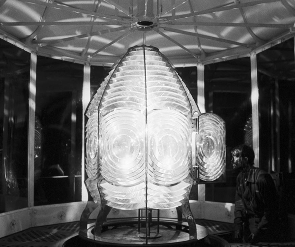
Those swirling light patterns you see on Pattinson’s face in the movie are a real phenomenon—we found ourselves just wanting to gaze into the Fresnel lens. We could have stayed all night staring into the light.
Robert Eggers, Cannes Press Release
Apparently the decision to set the film in the 1890s arose during the search for the ideal lighthouse. In an interview with Eggers in Architectural Digest, he remarks, “‘I wanted there to be a mystery in the light. Inside the beacon. So we knew we needed to set it in a period where we would have a Fresnel lens,’ he explains. Not many lighthouses still have functional ones today. ‘They look like Art Deco spaceships, and they are very magical and jewel-like. So we knew that was going to place us in the second half of the 19th century.'” (See the bottom for an image of the film’s custom-made Fresnel lens mesmerizing Winslow in the climactic scene.)
The decision to imitate orthochromatic film had a considerable impact on the lighting used. Ironically, it meant that a great deal of light from modern lamps, had to be used. Eggers admits as much in the DGA interview.
Obviously we weren’t lighting it like an old movie. We were lighting it using our practical fixtures, but of course, if this were an old movie, you would see the flame of the kerosene lamp and there would be a movie light lighting the scene. But what we did was we had a 600W halogen bulb on a flicker dimmer in all those scenes. And it was really, coming from Alexa and fast film stock, it was so bright. People were wearing sunglasses when we were doing night interiors.
Double-X is slow, even slower than color negative stocks. Modern digital cameras can typically shoot with less light than shooting on film requires. Putting together slow film stock, a filter (albeit one that cut down the light availability by less than one stop), and older, slower lenses meant that the cinematography crew had to use huge amounts of light, as a Variety interview with Blaschke explains:
Blaschke says he prefers to model his lighting in a real-life way, which was tricky on “The Lighthouse.” He and gaffer Ken Leblanc worked with Kodak Double-X stock — Blaschke calls it the only practical black-and-white film left after Plus-X was discontinued in 2011 — which is much less sensitive to light than even color film stock. Between the optics, the film stock and the filtration, Blaschke and Leblanc had to use about 15 to 20 times more light on set to get the look they wanted than on “The Witch,” which was shot on an Alexa.
“Even though it’s a very dark movie, the sets were actually blindingly bright,” says Blaschke. “We’d put 500- to 800-watt halogen bulbs in the lanterns that would flicker and were only a few feet from an actor’s face. The way we make movies now, people have gotten used to a very low light level; it’s trendy to shoot wide open, digitally at 800 or even 2,000 ASA. Our actors talked about how they couldn’t see each other sometimes, which I felt bad about.”
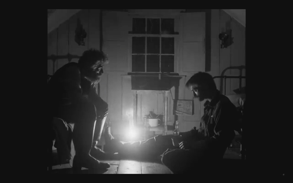
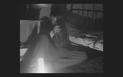
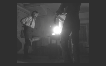
This halogen light is used in the night interiors, such as the scene of the drunken dance, below, and the later scene of the pair drinking in their shared bedroom, at the top of this section and the entry.
This combination of a very bright lamp with slow film and a filter cutting down part of the spectrum of light entering the lens meant that the light fell off very quickly away from the lantern. That effect is also very evident in these scenes. Backgrounds are dimly visible, and the actors often become silhouettes.
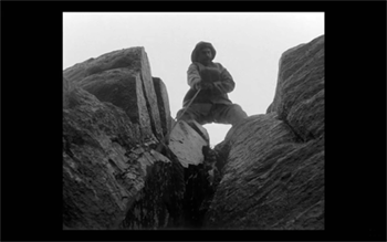
The result is a heightened sense of the two main characters being trapped together in small islands of light surrounded by blackness. We have no sense of how many lanterns the house contains, but we never see more than one at a time. At one point Winslow is seen in bed with a book, and the dim light from the window above him makes it hard to believe that he can see well enough to read. Even the daytime scenes are gloomy and gray. A low angle with the blank, light sky as rendered by the “orthochromatic” film makes Winslow and the dark rocks around him look nearly black.
Few silent films shot on orthochromatic film look this consistently dark, and it’s clear that the filmmakers were not simply trying to replicate the look of an old film. Blaschke admits as much in yet another of the many interviews on the film’s techniques: “It wasn’t about trying to make it look like older films but rather choosing a frame that lends itself to the tall and narrow sets and helps you visually withhold information from the audience. It also had a secondary effect of evoking compositions of 20th century modernist photography,”
In the DGA interview, after describing the various technical details of design, setting, and cinematography, Eggers explains:
This is fussy and it’s nerdy and it’s fun to talk about in this forum, but why do this? One, it says the movie’s old; it takes place in a time when black-and-white photography existed. But two, this is a bleak, austere story, and I feel like black-and-white is the best way to tell this story, and color is only going to mar things. Again, with this orthochromatic filter, it knocks our blue skies, which if we have them—which we really did—into something white and bleak and stark and harsh.
To get really nerdy about it, panchromatic film stock had largely replaced orthochromatic by the late 1920s and early 1930s, the only period in which a nearly square aspect ratio was standardly used. Moreover, the Baltar lenses were invented in the 1930s. Halogen lamps are a comparatively recent innovation in film lighting. So the combination of the ortho and the boxy look and the rest of it aren’t “authentic” in any strict sense. The filmmakers were not using lighting equipment of the 1920s or any modern equivalent. In short, they weren’t trying to replicate the look of any one specific type of old film. As a way of creating the illusion of an old film, as well as an appropriately grim tone, it works better than anything else I’ve seen.
A few final notes
First, I have seen The Lighthouse’s budget given as $4 million. That’s in the film’s Wikipedia entry, which cites an AP release from May 2019 that says only that the film’s budget was larger than that of The Witch but still modest. The New York Times ran a story about the film’s trailer in July, noting that the budget for The Witch had been $4 million, which Box Office Mojo also gives as the cost of the earlier film.
I have not been able to find a reliable figure for The Lighthouse’s budget, but clearly it was distinctly more than $4 million.
Second, according to Eggers in the DGA interview linked above, that’s real dirt (sifted to rid it of the odd pebble) that Winslow shovels down onto Wake in the climactic scene–not some namby-pamby ground chocolate. Not to mention that the puddle he’s lying in was frigid. Even the Expressionist actors didn’t go so far. The Academy should give Dafoe his Oscar already.
Third, watching The Lighthouse with a sell-out crowd in the biggest venue at the Vancouver International Film Festival, The Centre for the Performing Arts, was one thing. There people were eager to see this film, which had premiered in the Directors’ Fortnight thread at Cannes in May. It won the International Federation of Film Critics (FIPRESCI)’s prize for best film. It was quite another thing to watch it by myself during its run at a local multiplex.
The Lighthouse played at three multiplexes in Madison, with full-day schedules at each. It’s still playing at one of them, twice a day. I was alone when I saw it a few days ago at a 10:25 am screening. After being in a crowded festival audience, the second experience made me wonder how in the world such a challenging film made it into such wide release and how a more mainstream audience would react to it. (It maxed out at 958 theaters November 1-6 and has been falling since. Its gross through November 10 is $8,915,216 domestically; Box Office Mojo so far has no figures for foreign markets.)
The frames from The Lighthouse have mostly been taken from trailers. I have not cropped the frames reproduced above to their 1.19:1 format, since on theatrical screens, the audience sees the image as window-boxed, with black stretches on either side. (The exception is the bottom image, a press image released by distributor A24; it is either a frame with the black sides cropped or possibly a production still.) Perhaps Eggers and Blaschke’s idea would have been for theaters to move the screen’s masking to the edges of their images. Given the realities of modern exhibition, however, such versatility is not part of the screening technology. I found that the window-boxing on the big screen was a constant, subtle way to call attention to the unusual compositional results. What The Lighthouse will look like on various formats for streaming is hard to imagine.
Speaking of the aspect ratio, a number of critics have called 1.19:1 a silent-film format. In fact it was only used in the early sound era, when room had to be made on the filmstrip for the optical soundtrack; later the image was shrunk slightly into the classic Academy ratio of roughly 4:3. During the silent period there was no absolute standard ratio, though the image was in usually not far from the Academy ratio.
The American Cinematographer article cited is Patricia Thomson, “Stormy Isle,” AC (Nov 2019): 60-67.
In one of the quotations above, Blaschke says that Man of Aran (1934) was shot on orthochromatic film. This seems unlikely, given that Flaherty had made one of the first American features to use the new panchromatic film stock, Moana (1926). Kodak stopped making ortho in 1930. Possibly Flaherty, who started work on the film in 1931, did revert to ortho for it, but it seems unlikely.
Ernst Deutsch, who plays the Cashier in Von Morgens bis Mitternachts, was one of the great Expressionist actors of stage and screen. I have mentioned him before, for his role in Der Golem; when Von Morgens bis Mitternachts was released on DVD; and for his role in the non-Expressionist Das alte Gesetz, released on Blu-ray by Flicker Alley last year.
On horror and fantasy in German silent films, see my “Im Angang war …: Some Links between German Fantasy Films of the Teens and the Twenties,” in Paolo Cherchi Usai and Lorenzo Codelli, eds., Before Caligari: German Cinema, 1895-1920 (Pordenone: Edizioni Biblioteca dell-Immagine, 1990), pp. 138-161.
Baschke mentions Eisenstein as an influence in the editing, but presumably neither he nor Eggers had read Eisenstein’s essay arguing in favor of a square aspect ratio. His belief was that such a frame would give equal compositional weight to the horizontal and vertical dimensions of the screen. (“The Dynamic Square,” Jay Leyda, ed., Film Essays and a Lecture [New York: Praeger, 1970], pp. 48-65.
The photograph of the lighthouse set on Cape Forchu is by Dan Robichaud and appears in Carla Allen’s story on the filming in the local Digby Courier. A search for “Cape Forchu Lighthouse” on Google Maps yields many photos of the area and reveals the very rocky terrain over which Winslow pushed his wheelbarrow. The modern lighthouse is a popular tourist attraction, in case you ever visit Yarmouth in Nova Scotia. There is even a restaurant inside it. (Appropriately enough, “The grilled lobster and cheese sandwich was amazing,” according to one visitor.)
[January 13, 2020. Blaschke has been nominated for an Oscar in the Best Cinematography category. Unfortunately the film was not nominated in any other category, as it deserved to be.
February 8, 2020. Blaschke has won a number of awards for the film, most notably the American Society of Cinematographers Spotlight Award, and, just today, the Film Independent Spirit Award for best cinematography.]
REINVENTING HOLLYWOOD in paperback: Artisans and artistry
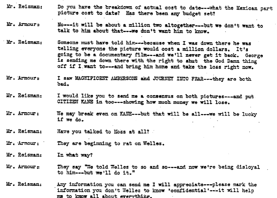
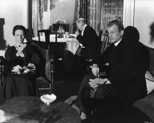
The Magnificent Ambersons (1942). Production still from lost scene.
DB here:
This is the third blog entry amplifying on the paperback edition of Reinventing Hollywood: How 1940s Filmmakers Changed Movie Storytelling. This mini-series tries to enhance the book’s arguments by taking into account books and DVDs that have come out since the hardback publication in 2017. (Previous entries are here and here.) Today I want to talk about what T. S. Eliot called “tradition and the individual talent” in a realm Eliot would disdain: American studio cinema.
Curtiz, pronounced Cur-tess
Noah’s Ark (1928).
Reinventing Hollywood offers itself as an alternative to two major ways of understanding the films of a period. One angle is to see creativity flowing from gifted filmmakers. The story often concentrates on how they have to struggle against the constraints of the film industry. In the Forties, Orson Welles would be a prime instance, though Preston Sturges and others could also be invoked. Without denying the talent and originality of key filmmakers, and without neglecting the stubborn ignorance of many executives, I wanted to show that in many ways creativity can be enabled by the conditions of the industry.
Genre is an obvious instance. Without the Western, where would John Ford be? The musical brought out the gifts of Minnelli and Donen, just as the crime film spurred Huston and Anthony Mann. I wanted to suggest that filmmakers were challenged to work with other normative factors than genre—factors centering on how stories were told. Writers and directors collectively amassed a menu of narrative options, from flashbacks to voice-overs, that got quite refined in the course of a dozen years or so.
Some sympathetic readers have considered the book anti-auteurist because I emphasize those pooled resources that any filmmaker, weak or strong, could draw upon. To some extent, that’s right: stretches of the book resemble “art history without names.” Tony Rayns warned readers that they should read Reinventing Hollywood with Leonard Maltin’s Movie Guide at hand.
Not a bad idea. A single paragraph compares A Child Is Born (1940), One Crowded Night (1940), Busses Roar (1942) and Dial 1119 (1950). None of them is exactly a lustrous classic, and I didn’t mention the directors or the screenwriters. My main point is that these films play out variants of the Grand Hotel plot, and they show how even artisans can take the opportunity to revamp current norms.
 So for my project, creators of whatever rank matter. In the course of my research, it struck me that three “creative producers”–Hal Wallis, David O. Selznick, and Darryl F. Zanuck–are as important as many directors. The same goes for screenwriters, such as Casey Robinson, Vera Caspary, and Ben Hecht. And now that we have biographies of Victor Fleming and William Wellman, we’re starting to understand the importance of skilled directorial artisans. I’ll take even so-so craftsmen (and craftwomen) if they can teach us secrets of Hollywood carpentry. Charles Lang and Walter Lang are no Fritz Lang, but they made more popular films, and we can study the ways they instantiate filmmaking norms.
Then there’s Michael Curtiz.
Andrew Sarris claimed that “Curtiz reflected the strengths and weaknesses of the studio system,” and most writers have agreed. Although Curtiz is mentioned by name only twice in Reinventing Hollywood, I draw examples from ten of his films, from Four Daughters (1938) to Young Man with a Horn (1950). I devote most space to Passage to Marseille (1944). Mildred Pierce (1945) is absolutely central to the book’s arguments, but as I’ve written about it before, both in print and online, I didn’t rehash my argument in the book.
Which is to say, I guess, that Curtiz exemplifies what I was analyzing. He was a master craftsman who has a lot to teach us about norms, both inside and outside Hollywood.
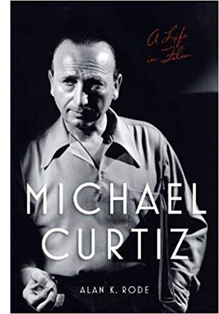
Alan K. Rode’s biography, Michael Curtiz: A Life in Movies, focuses on the man and his accomplishments, and it paints a vivid portrait of a director of intense creative and sexual appetites. He also liked polo. Drawing on memos, production records, and memoirs published and unpublished, Rode provides brisk, telling background on dozens of films. He dwells, as you’d expect on the milestones: Noah’s Ark, the early 30s horror films like Dr. X, Angels with Dirty Faces, Yankee Doodle Dandy, Casablanca, and the Flynn vehicles. But he doesn’t neglect the fleet-footed programmers like The Kennel Murder Case (1933) and The Case of the Curious Bride (1935), projects enlivened with fancy angles, propulsive pace, and bold tracking shots.
On-the-set anecdotes keep things lively. Rode is careful to debunk some of the most famous stories, but he leaves a lot of good ones in. His conversational style is likewise engaging. He compares Peter Lorre to “a sinister kewpie doll” and calls Alexis Smith lissome, using a word I had forgotten exists. Although Rode isn’t as interested in the questions I pursued, his book set me thinking about creativity in the studio system. Specifically, we can broaden our view of Curtiz’s career, which ran from 1912 to 1962, and see it as encapsulating some major trends in commercial entertainment cinema, inside Hollywood and out.
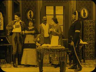
Starting well before DeMille, Ford, Hitchcock, Hawks, Walsh, and other Hollywood auteurs, he was initiated into the standard tableau style of the 1910s. Fairly distant shots in long takes relied on deep sets, staging and performance. Cutting was used principally to shift the scene, show adjacent locales, or occasionally enlarge a detail. The Undesirable of 1914 (available in a stunning restoration distributed by Olive) shows fairly orthodox choreography of figures in depth and across the frame, with foreground figures masking irrelevant background action.
Apart from Lubitsch and DeMille, most of the directors who had long careers in the studio system didn’t come out of tableau cinema. They began by practicing the rapid editing and close-up framings that emerged in America in the mid-1910s. Curtiz was more or less up to speed with them in his stupendous Viennese production Sodom und Gomorrha (1922, available on a well-restored DVD version). He breaks up vast shots with axial cuts, close-ups, and occasional reverse angles. This nutty film, surely one of the biggest productions of the day, used kitschy modern sets for the contemporary story, expressionist ones (with cadaverous jailers) for dreams, and gigantic pseudohistorical ones for Biblical bacchanals.
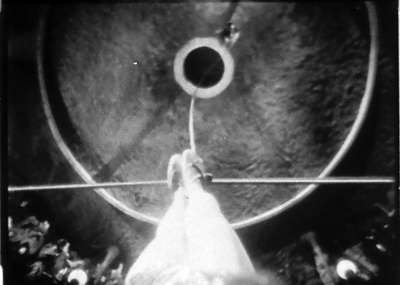
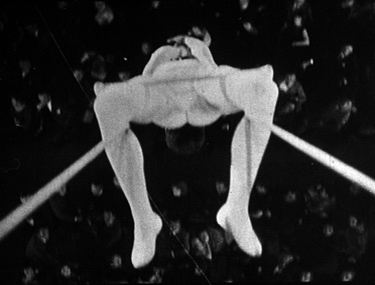
His first American film, The Third Degree (1926), tries to bring into Hollywood some fashionable European stylization. Curtiz showcases flashy camera movements, rapid rack-focusing, swift montage, and distorted subjectivity reminiscent of French Impressionist cinema. The specific reference is Dupont’s Variety (1925). Curtiz’s tightrope shots mimic Dupont’s trapeze angles, and prismatic superimpositions of eyes during the cops’ third degree recall the swirl of the spectators’ eyes in Variety.
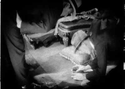
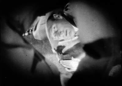
When a detective drops down to investigate a clue, Curtiz doesn’t hesitate to cut to a skewed view framed by the arm and leg of his crouching colleague.
Much of Noah’s Ark (1928) uses standard silent-film continuity style, although Hal Mohr’s lighting sparkles even more than in The Third Degree. Curtiz’s opening montage relies on wide-angle compositionssof a type resembling images in Murnau’s late silent pictures. Here we dissolve from Biblical worshippers of gold to modern stockbrokers, and the dense packing of figures recalls William Cameron Menzies’ work of the same period.
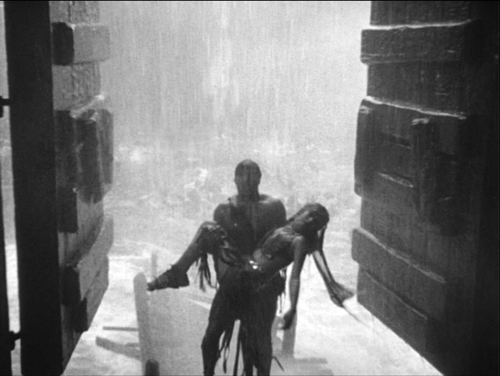
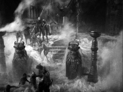
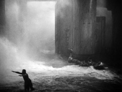
But Curtiz’s most flamboyant effects are reserved for the spectacle, especially in the preposterously vast flood scenes with devastation that recalls the rain of fire in Sodom und Gomorrha.
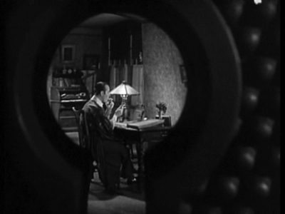
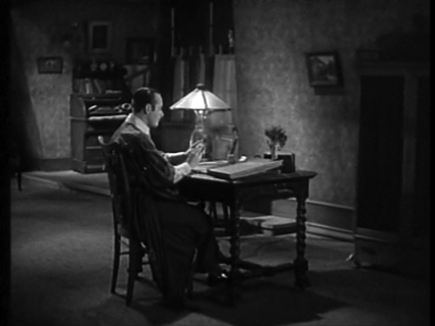
In his sound pictures Curtiz was less outré, but he never lost his taste for momentary flourishes. Anybody who starts a film called The Keyhole (1933) by moving the camera through a keyhole gets points from me.
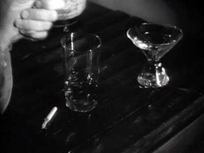
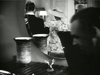
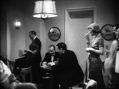
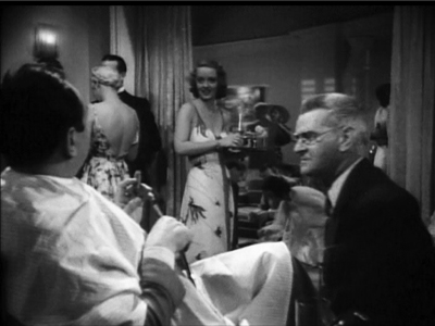
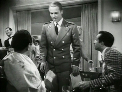
Curtiz made his name as a master of crowd effects, and he didn’t shrink from handling groups in tight interiors. A hotel-suite party in Kid Galahad (1937) runs thirteen minutes and is packed with movement. The first shot starts on a phonograph, two abandoned drinks, and a carelessly smoldering cigarette–details indicating a wild party, and setting up the importance of serving drinks in the scene to come. Tilt up to a mirror that hints at a space we’ll soon visit.
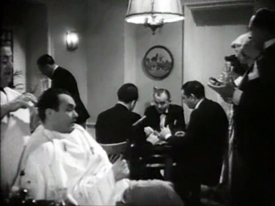
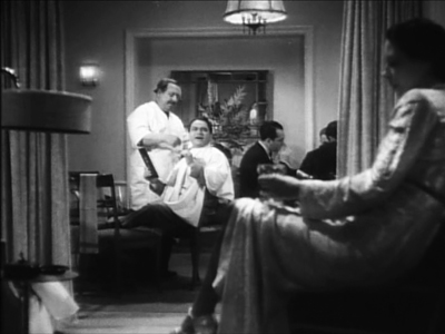
The next shot launches a leftward track across two rooms, motivated by a damsel’s wild shimmying. People are packed into the foreground and distance. In the next room the dancing woman carries us to card players before we settle on the fight promoter played by Edward G. Robinson, who calmly gets a haircut amid all the revelry. (After all, the party has lasted three days.)
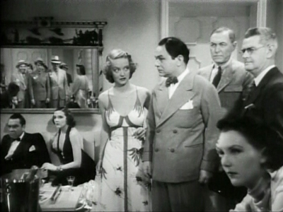
As these Kid Galahad shots show, Curtiz favored low angles and moderately wide-angle lenses to jam his figures together. In the party scene, he multiplies setups freely, almost never repeating one exactly. (Compare the slightly different framings of the second and third image.) The confrontation of two prizefight gangs is played out in a tricky mirror shot.
By comparison, W. S. Van Dyke’s handling of an apartment party in The Thin Man (1934) looks timid.
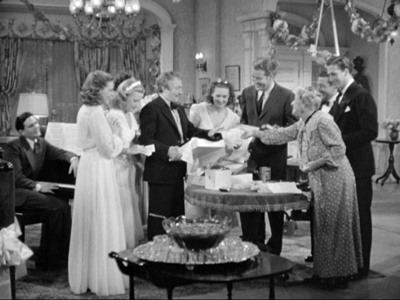
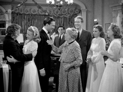
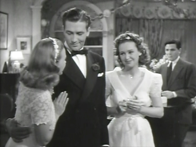
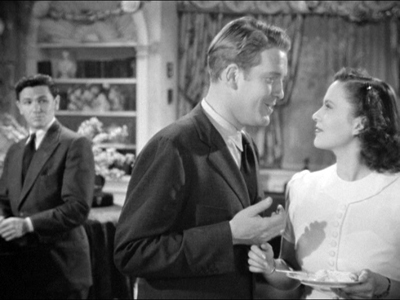
Watch Four Daughters (1938) and Four Wives (1939) to see how adroitly you can choreograph a big bunch of people strewn around a parlor. In the first film, Curtiz never lets us forget the defensive outsider Mickey (John Garfield), disturbed by this loving household and shielding himself behind the piano. Some might say that Curtiz’s use of “distant depth” is less heavy-handed than Welles’ in-your-face foregrounds in Kane, three years later.
Rode shows how Curtiz managed to control his films while shooting. From the start, in The Third Degree, he freely added scenes to the script. Thereafter, producer Hal Wallis railed at his “overshooting” with more angles than most directors would use, and he added props and actors without permission. Hawks, Hitchcock, and Ford would work uncredited on the screenplay, but Curtiz simply changed the script on the fly. As he gained more authority, he prepared new dialogue and business at night with his wife Bess Meredith.
Often over budget and schedule, constantly berated by his bosses, Curtiz got away with it all because the films were usually successful and critically acclaimed. Besides, the complaints usually came too late; he was already at work on the next movie. In some years he turned out six features. He’s a good example of a how a vigorous Hollywood artisan could leverage the system through both craft and craftiness.
Wellesapoppin’
I can’t foreswear auteurs altogether. Reinventing Hollywood does spare some time for Preston Sturges, Mankiewicz, Hitchcock, and a few others.
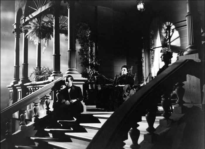
Notable among those is Orson Welles, who threads through my story. Citizen Kane helped popularize flashback narrative for A-pictures, and I argue that its use of the device blended several options that had floated around in the years just before. In the chapter on Hollywood’s efforts to interpret its own traditions, Welles and Sturges come forth as proto-film-geeks citing film history. The Magnificent Ambersons is imbued with a nostalgia for silent films. There’s the edge-vignetting on the early scenes (above), the famous iris that closes the snow idyll, the final credits showing the players more or less addressing the viewer, and the very geeky posters I illustrate in this entry and those leading up to it. The now-lost scene on the veranda with George, Aunt Fanny, and Isabel, shown at the top of today’s entry, included a vision of Lucy appearing to George “in transparency (the shadowy ghost figure from the silents).”
Most extensively, Reinventing discusses Welles and Hitchcock as directors who shaped 1940s storytelling conventions and then had to respond to others’ use of them. I’m again trying to set auteurist claims in a wider context, that of a flourishing ecosystem of creative choices. Just as important, both directors continued using 1940s strategies throughout their later careers. Welles’ importation of Theatricalist stage theory into film, along with his reliance on flashbacks, voice-over, and embedded stories, are central to his later work.
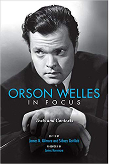 Research on Welles never stops, and so I’m happy to welcome new developments. There’s of course the rehabilitation of The Other Side of the Wind, which features flashback construction, films-within-the-film, voice-over, and other preferred Wellesian tactics. Now we also have Orson Welles in Focus, edited by James N. Gilmore and Sidney Gottlieb, with an introduction by James Naremore.
It’s a set of papers from a 2015 centenary conference on Welles at Indiana University, and they’re all stimulating and wide-ranging. Margaret Rippy reveals the roles of Asadata Dafora and Abdul Assen in collaborating with Welles on the 1936 Macbeth, while Catherine L. Benamou, an expert on It’s All True, shows how the episodes open up different options for transcultural critique in the documentary mode. Welles’ 1946 Broadway musical Around the World gets careful consideration by Vincent Longo, who intriguingly relates it to Bazin’s contemporaneous reflections on theatre and film. François Thomas incisively exposes the financial and legal tangles around Mr. Arkadin (1955).
Welles the fighting liberal gets important attention in two essays. Sidney Gottlieb, who has been assiduously collecting Welles’ writings for years, surveys the director’s journalism for The New York Post. Similarly, James N. Gilmore scrutinizes Welles’s 1946 correspondence, where he continued to denounce racism and antisemitism.
The two essays most relevant to Reinventing Hollywood touch on Welles as cinephile and Welles as storyteller. Matthew Solomon provides a detailed account of Welles’ love of “old-time movies.” Solomon is especially enlightening on Welles’s fondness for citing films made before his birth, as if there he found the most powerful images of “pastnesss.” Shawn Vancour traces how Welles’ use of first-person narration in the 1938 War of the Worlds broadcast develops norms of radio storytelling that were emerging at the moment. Using manuals for radio scriptwriting, Shawn shows that Welles’ shifts between present and past, first-person and third-person narration became common in the years that followed. Both of these essays enrich points I tried to make in my book.
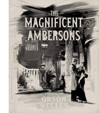
Then there’s that triumph of modern DVD publishing, Criterion’s long-awaited version of The Magnificent Ambersons. A gorgeous transfer is accompanied by a booklet of discerning essays by Molly Haskell, Luc Sante, Geoffrey O’Brien, Welles himself (on his father), and Farran Smith Nehme (on Welles’ speaking voice, which definitely deserves analysis).
 On the AV bonus front, producer Issa Clubb has wisely retained many items that made the company’s pioneering 1986 laserdisc release a demo of what that format could deliver. We get Robert Carringer’s sensitive voice-over commentary, an audio recording of Welles’ radio adaptation of Tarkington’s novel, some interview bits of Welles discussing the film, and the remaining clips from Pampered Youth (1925), an earlier adaptation of the book.
We’ve unfortunately lost Carringer’s visual essay on the film’s style, and Welles’ storyboards and shooting script, rendered in that single-frame technology that made CAV discs clunkily hypnotic. But the new material more than compensates. Clubb has turned a treasure chest into a cornucopia.
We get a second Mercury Theatre radio play, this one based on Tarkington’s Seventeen. A second audio commentary track, featuring James Naremore and Jonathan Rosenbaum, finds illuminating new things to say about this all-but-masterpiece. I also learned an enormous amount from François Thomas’s essay on the mix of cinematography styles in the film, which he tracks through daily production reports. Stanley Cortez, whom Kristin and I once interviewed across two fruitless hours, was only one of several DPs working on the movie.
Christopher Husted shows how the careful parallel scenes of the full-length version received delicate scoring by Bernard Herrmann, who took his name off the film when RKO recut it. A panoply of interviews with Welles, Simon Callow, Peter Bogdanovich, and Joseph McBride is sure to interest old fans and newcomers. The story of Ambersons will never grow old, and we’ve made remarkable progress in understanding its intricacies.
Magnificent ruin
Welles went to Brazil at the behest of the US government, to make a film supporting the “Good Neighbor” policy toward South America. Shooting on Ambersons finished in January 1942, and Welles left his notes with Robert Wise, the film editor who was to oversee postproduction. Wise was to bring a draft result to Welles in Rio, where they would fine-tune it. But wartime travel restrictions, and perhaps RKO’s reluctance, kept Wise at home.
In the trade papers, RKO claimed that Welles was fully engaged in finishing and cutting Ambersons in Rio. “Orson Welles So Tireless, Cuts ‘Ambersons’ by Wireless,” ran a rhyming headline in Hollywood Reporter. The first sneak preview was reported as being 2 1/2 hours, a second around two hours, but Robert Carringer in his authoritative study, The Magnificent Ambersons: A Reconstruction, has suggested on the basis of production correspondence that the first preview version probably ran about 101 minutes, the second around 117.
Reacting to harsh audience criticism, Welles’ associates at RKO decided that film had to be cut and new scenes had to be shot. Joe McBride’s Criterion interview explains that the studio had lost faith in the project and was ignoring the detailed instructions that Welles sent by cable. By this time, because of contract renegotiations after Kane, Welles no longer had right of final cut. But RKO continued to claim, as in this 29 April Variety story, that the director was fully on board.
Actually, two weeks earlier, Carringer tells us, studio head George Schaefer had transferred authority over the final cut to Wise.
The studio announced that changes were being made, though they seem never to have been specified. Press releases built on Hollywood’s continuing dislike of the boy genius. One story was put out that Welles had demanded that Joseph Cotten send him “weekly shipments of Chinese dishes” by air, as if defying wartime privation.
Ambersons had been planned as a “special” alongside other big RKO-distributed titles (The Pride of the Yankees, Bambi), and aiming at an Easter release. Instead, it was eventually absorbed into a block of titles, which was the standard way of packaging A and B pictures together. The recutting pushed the film’s release into the doldrum days of summer, the graveyard for second-tier product. After a July debut in Los Angeles, it didn’t appear in New York until August. Box office was initially good in some venues, but nothing compared to the big hits of 1942: Mrs. Miniver ($5.4 million in rentals), Yankee Doodle Dandy, Random Harvest, Reap the Wild Wind, Holiday Inn, The Road to Morocco, The Pride of the Yankees, and Wake Island.
A quick sampling of newspapers around the country shows that into the fall, the film sometimes appeared alone on a program (even in La Crosse, Wisconsin). Elsewhere it seems to have been the top of a double bill that includes such items as Syncopation, Her Cardboard Lover, Little Tokyo, USA, Ellery Queen’s Desperate Chance, and most notoriously, Mexican Spitfire Sees a Ghost.
Was it Ambersons that sank Welles’ future? Some have said so. According to a 1952 record of RKO profits and losses across the studio’s history, the film was claimed to have lost $620,000. Before that, only Abe Lincoln in Illinois (1940) was registered as a bigger flop for the studio.
McBride’s interview explains that the Amberson debacle was part of a larger effort to undermine Welles. RKO was in turmoil, having lost many key executives. Building off his book What Ever Happened to Orson Welles? A Portrait of an Independent Career, Joe suggests that after the problems with Ambersons and Welles’ departure for Rio, factional fights broke out among the suits. Schaefer, attacked for the disappointing box office of Kane, was caught between defending Welles and trying to save his job by cutting Ambersons.
Executives worked to sabotage Welles’ next project as well. One powerful piece of evidence that Joe discovered shows that RKO lied to Welles about the budget for It’s All True, so they could attack him for imaginary overruns. In his interview and book Joe reveals that Welles was under budget by over $440,000 when he was fired for going over budget.
Joe also cites a damning transcript of an April 1942 conversation between two RKO executives, Phil Reisman and Reginald Armour, who conspired to keep information from Welles.
The reference is to Jack Moss, Welles’ business manager. Reisman and Armour go on to discuss the possibility of getting Welles drafted and speculate what could be salvaged from It’s All True–perhaps a couple of shorts?–and Armour adds: “George will lose his job out of this.” Schaefer was fired from RKO at the end of June.
Soon after the release of Ambersons in July, Welles’ Mercury unit was moved off the RKO lot. Welles returned from Rio still hoping to rescue It’s All True, but soon he would become a director for hire.
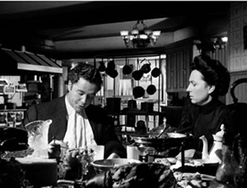
The Criterion disc release reminds us of how original Welles was in his storytelling strategies. Reinventing Hollywood argues that in Ambersons Welles found a fresh way way to treat time shifts. He keeps major action offscreen and prior to the scene we see, so that each character becomes a narrator reporting action to others, without benefit of flashbacks. The famous scene of Fanny and George in the kitchen is a good example, as he tells her that Eugene joined their trip to the college commencement.
There are many other examples; nearly every scene’s dialogue reaches back to the recent or distant past.
This rather literary strategy of replacing showing by telling echoes the narrative strategies of Henry James and Joseph Conrad–the latter a writer whose work influenced Welles strongly. In the 1940s Hollywood context, all this recounting in retrospect constitutes a “knight’s move,” a swerving response to the emerging flashback conventions of the time. I believe that Welles rethought his radio brand, “First Person Singular,” for Ambersons.
Welles’ original ending, which shows Eugene and Fanny reminiscing in her boarding house, was in keeping with this strategy of suppression. Eugene recounts the resolution we haven’t seen: the reunion of George and Lucy, and George’s contrite reconciliation with Eugene. “We shook hands.” Ending with George and Lucy, the new generation, would have been conventionally upbeat, but Welles wanted to linger on the old people–one the automobile pioneer, the harbinger of dubious progress, and the other a castaway of plutocratic pride and self-absorption.
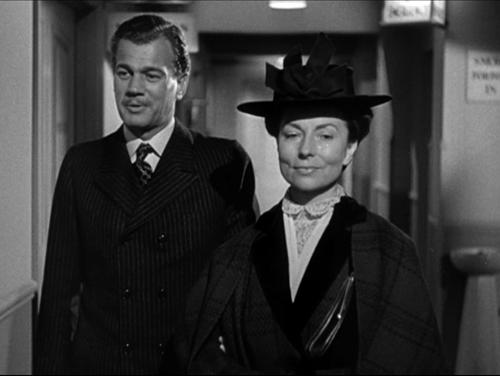
The reshot scene in the hospital corridor exudes a hollow cheerfulness that generations of critics have rightly found a travesty.
This hospital shot lacks the pathos of Welles’ scene, in which a numb, impoverished Fanny is left alone while Eugene drives back into the grimy city. Still, at least the shot preserves much of the original dialogue and it sustains a narration that keeps crucial events (George’s apology and the lovers’ reunion) offscreen and in the past. To the end, action is replaced by reaction–or rather, by reflection.
My title today is a bit misleading. The artist/artisan distinction is fuzzy. Curtiz and Welles are both. The difference might come down to this: The creators we call artisans are adept at solving problems set by tradition or their contemporaries. But those we deem artists think up new problems and solve them with aplomb. They may even set themselves problems that seem ridiculously constraining (such as Ozu’s decision about low camera height). In any case, we need to recognize craft in any medium, because that helps us appreciate achievement of every sort.
I owe a big debt to Joseph McBride for his careful checking of earlier drafts of the Welles section of this entry. His What Ever Happened to Orson Welles is an indispensable guide to the director’s career. Any mistakes or misjudgments that remain in this entry are my doing. Thanks as well to Eric Hoyt for help on RKO financial information.
Joe also points out that Simon Callow’s Criterion interview contradicts other researchers’ findings about Welles’ calls and cables from Brazil. In addition, I wonder whether Rode’s citations of the Curtiz films’ grosses shouldn’t be called their rentals–that is, the chunk of the gross box-office receipts returned to the studio. For example, he lists Casablanca‘s grosses as being $$4.496 million. This is close to Variety‘s figure of $4.145 million for the film’s rentals. See Lawrence Coh, “All-Time Film Rental Champs,” Variety (24 February 1992), 164. Typically a picture’s rentals were about half of its gross.
Patrick Keating’s new book The Dynamic Frame: Camera Movement in Classical Hollywood calls the kind of tracking shot in Kid Galahad the “follow and switch.” He has much to say about Curtiz’s work in his fascinating account of how Hollywood filmmakers thought about and deployed the moving camera.
Curtiz would likely have seen Dupont’s Variety during his stay in Austria, or even in the US in 1926; it played Los Angeles in June and New York in July. Curtiz arrived in the US on 6 June 1926, and The Third Degree was released on 26 December. As Rode points out (p. 77), the trade paper Variety saw an affinity between Curtiz’s film and Dupont’s, though the reviewer scoffed at the “trick camera stuff” and “freak shots” (5 January 1927, p. 17).
I consider Casablanca in this entry, which ties in both to Reinventing and to Pauline Lampert’s podcast Flixwise. My fullest discussion of Ambersons online is here; the section in Reinventing is somewhat different. On Welles the silent-era cinephile, this entry on his centenary is also relevant, as is this later one.
The following errors are in the hardcover version of Reinventing Hollywood but are corrected in the paperback.
p. 9: 12 lines from bottom: “had became” should be “had become”. Horrible.
p. 93: Last sentence of second full paragraph: “The Killers (1956)” should be “The Killing (1956)”. Duh. I try to do the film, and its genre, justice in another entry.
p. 169: last two lines of second full paragraph: Weekend at the Waldorf should be Week-End at the Waldorf.
p. 334: first sentence of third full paragraph: “over two hours” should be “about one hundred minutes.” What was I thinking?
We couldn’t correct this slip, though: p. 524: two endnotes, nos. 30 and 33 citing “New Trend in the Horror Pix,” should cite it as “New Trend in Horror Pix.”
Whenever I find slips like these, I take comfort in this remark by Stephen Sondheim:
Having spent decades of proofing both music and lyrics, I now surrender to the inevitability that no matter how many times you reread what you’ve written, you fail to spot all the typos and oversights.
Sondheim adds, a little snidely, “As do your editors,” but that’s a bridge too far for me. So I thank the blameless Rodney Powell, Melinda Kennedy, Kelly Finefrock-Creed, Maggie Hivnor-Labarbera, and Garrett P. Kiely at the University of Chicago Press for all their help in shepherding Reinventing Hollywood into print.
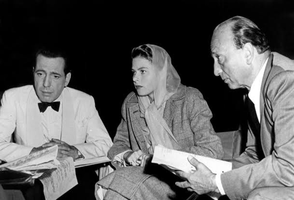
On the set of Casablanca.
Venice 2018: A dazzling second feature
Kristin here:
In my first report from the Venice International Film Festival, I described the excitement of seeing three excellent and quite varied films right in a row, at consecutive early-morning press screenings: First Man, Roma, and The Ballad of Buster Scruggs. We had to wait a whole two days before seeing what may be the masterpiece of this year’s festival–this year’s Zama, as it were.
I’m sure virtually everyone who attended the press/industry screening of László Nemes’s Sunset was wondering whether it would live up to his first feature, Son of Saul (2015), which won, among other prizes, the Oscar for Best Foreign Language film. It’s one of the more deserving winners of that prize in recent memory.
The narration famously concentrates fiercely on the central character, a Hungarian Jew forced to work in a death camp helping to kill and dispose of fellow Jews. The camera follows him from behind or circles to show his face, and keeps most of the horrors occurring around him dimly visible, in the background and on the periphery of the shots, usually out of focus. Mark Kermode praised the technique as a brilliant solution to the problem of not showing those horrors but seeing them reflected in one man’s attention and expressions. We so much admired this rigorous technique that we incorporated Son of Saul into the new fourth edition of Film History: An Introduction.
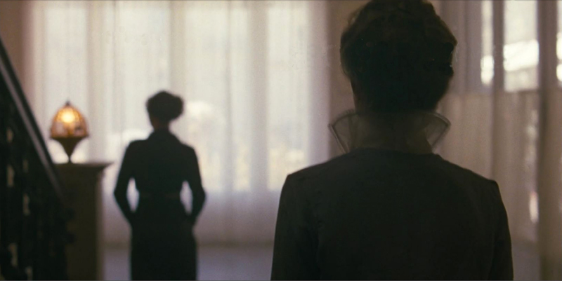
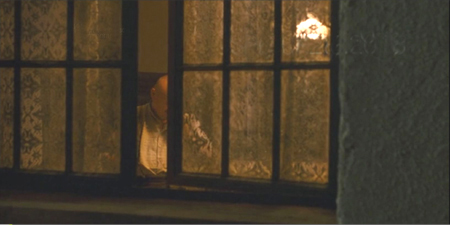
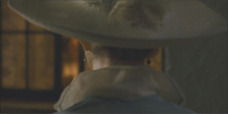
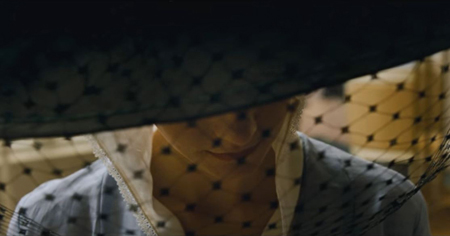
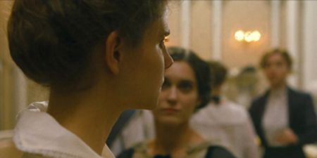
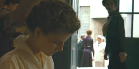
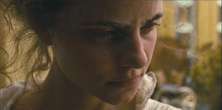
My suspicion is that many present at that first screening of Sunset in Venice were wondering if Nemes could do anything beyond similarly following a single character around, restricting our point of view in a dazzling exhibition of camera choreography centered on a single intense performance. Well, Sunset is based almost entirely on the camera following (below and top) or weaving around the central character, Írisz Leiter, or framing her face in medium close-ups and close-ups.
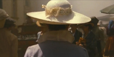
There are a many of these “nape-of-the-neck” framings, as we might call them, with only Írisz in focus–and not always her. Again, the point of view is highly restricted to what she sees, hears, and knows. She is present in virtually every shot, or revealed to be nearby. The apparent point of view shot into which the character steps is occasionally used in Hollywood and elsewhere, but here it becomes an insistent technique.
I suspect further that, seeing virtually the same device being used again, reviewers dismissed Sunset as a far less original work than Son of Saul. It helped that the latter was a tale of the holocaust and fairly simple to follow.
In my opinion, Nemes has done something extraordinary. He has taken the same basic approach but turned it to an entirely different use. Now the restricted point of view functions to slowly dole out clues in a complicated double mystery plot. The result is complex, tantalizing, and absorbing.
Sunset is difficult to compare with other films or artworks, since it so very original. It is thoroughly modern art cinema. (Nemes worked as an assistant director to Béla Tarr, though neither of his features reflects any direct influence of Tarr.) It also, however, has something of the air of Feuillade serials. Fantômas was made in 1913, the same year in which Sunset‘s action takes place. Sunset deals with an anarchist gang, and at one point Írisz disguises herself as a man and escapes captivity through an upper-story window. There’s also a considerable streak of Grand Guignol (the theatre that was then building to its height of popularity between the two world wars), with actual and attempted rapes, rumors of a grisly murder, and torch-lit attacks by the anarchist gang.
At least two reviewers have mentioned Mullholland Drive as a comparison point. I don’t think the two films have much in common, apart from their pleasantly puzzling aspects. It’s interesting, though, that reviewers grasped at such a comparison as a way of trying to convey the nature of a very unusual film.
In fact, Nemes has said that Blue Velvet was one of his inspirations. That actually makes far more sense to me, with an innocent gradually witnessing unimaginable cruelties.
What just happened?
The film depends heavily on our gradually getting clues and information as Írisz does, and to avoid spoilers I’m going to be vague describing the plot.
The heroine is the daughter of two founders and owners of Leiter’s, a high-fashion hat shop in Budapest. Orphaned, she has learned hat-making in Trieste and returns to Budapest, aspiring to work in the shop and regain what little connection she can with her parents’ heritage. Her application for a job there opens the film, but she is turned down by the current owner of Leiter’s, Mr Brill.
She soon learns that she apparently has a brother, hitherto unknown to her, who has committed a heinous murder five years earlier. While trying to track down the truth about him, she begins to suspect that Brill may be involved in equally hideous crimes. She spends most of the film wandering about looking for clues and trying to make sense of them.
Sunset is not as puzzling or opaque or illogical as reviewers seem to think. One reviewer refers to it as “befuddling,” which it certainly is not, if one pays careful attention. Lee Marshall, one of those who evoked Mullholland Drive, complains that:
Sunset begins to crumble, to offer itself up to scorn and absurdity, once we start asking questions like “Doesn’t Irisz have regular work hours?” or “How come she always manages to get a lift in a coach just when she needs one?”
In fact there is nothing mysterious about either point. The film makes it quite clear that Írisz is not hired by Brill, even though she offers to work for free. She has no “regular work hours” because she has no job. Brill offers to let her sleep in the Leiters’ rundown house where the store’s milliners live, but he clearly is trying to control her attempts at investigating the dual mysteries. He assigns her tasks to keep her busy, but Zelma, the store’s manager and possibly Brill’s mistress, pointedly tells her when giving her a little task to do, “It doesn’t mean you’re hired.” Another task that he assigns her ends up having to be executed by the other milliners, as Írisz constantly defies Brill by leaving the store and dorm at every opportunity. When Leiter and Zelma tells her not to leave without permission, she inevitably and defiantly departs on another investigative foray. Brill’s description of her as stubborn is a considerable understatement.
As for coaches, Írisz’s brother seems to control an anarchist gang consisting largely of coachmen, some of them with motives to drive Írisz to various destinations. Brill uses his coach to fetch her back to the store and as a setting for lecturing her about not defying him by trying to find her crazed, violent brother. Coaches become another way to try and control her movements.
Such mechanics of the plot are consistently motivated, whether we catch the motivation or not. The script is extraordinarily unified and tight, despite its complexity.
After two viewings, I was glad to discover that I had understood the basic plot on my initial one, although many subtle points were filled in.
Clues–but to what?
The narrative is structured through a chain of clues, which we learn only as Írisz does. Írisz is told something–initially, that she has a brother Kálmán. She tries to follow up that clue but is thwarted for a time. Eventually, wandering about or while accompanying the milliners of the shop to various celebrations of the store’s 30th anniversary, she bumps into people who provide her with new clues. Coincidental meetings and overheard conversations are rife here, but as David has pointed out, that’s how narratives work. If there’s one tradition that Sunset doesn’t belong to, it’s realism.
The other tradition it doesn’t belong to, of course, is classical filmmaking. In a Hollywood film, one clue would lead the protagonist to another and that to another, building the chain that resolves the mystery. The action would move steadily, even when obstacles that thwart the protagonist must be overcome, creating suspense. In Sunset, a clue may intrigue the heroine, but she finds no way to follow up on it. There is a frustrating pause another clue crops up. The sense of progression is thus sporadic and somewhat random, rather than linear and strictly causal.
The overarching ambiguities of the plot arise from the fact that Írisz frequently receives contradictory clues and is unable to decide whether Kálmán and Brill are heroes or villains. At one stage Írisz thinks her brother is a sadistic murderer, but later she begins to suspect he is a hero–and still later she again believes him to be a monster. A similar series of reversals happens with Brill. Thus we may conclude that we understand where the narrative development is headed, only to have our expectations reversed. It also takes quite a long time before we realize that the Kálmán Leiter mystery and the Brill mystery are connected, at which point we must rethink them both.
In a few cases we must even infer a clue that Írisz has been given in the interval between scenes. I must admit that on first viewing I was puzzled as to how Írisz finds where a key player in past action, Fanni, lives. Seeing it again, I realized that the scene where Írisz asks Andor, a young servant at Leiter’s, where she can find Fanni ends with Andor asking eagerly, “Can you make him come back?” He’s referring to Kálmán, whom Andor secretly idolizes. A cut begins a new scene with Írisz approaching the building where she finds Fanni. When she again sees Andor in the following scene, he asks, “Did you find the girl?” Thus it is clear that Írisz told Andor she would try to bring Kálmán back, as she may intend to at this point, and that he gave her the address. It’s not easy to grasp moments like this on the fly, but it’s far from impossible.
The decision to restrict our state of knowledge so thoroughly to that of Írisz, pushing the story to the edge of comprehensibility, was deliberate. In an interview Nemes, he says, “We had an overall strategy: the viewer should go into the labyrinth of the story with the protagonist, in order fo feel the disorientation and defencelessness the protagonist experiences. This subjective aspect is what connects ‘Sunset’ with ‘Son of Saul.'”
Rory O’Connor, writing on The Film Stage, caught the labyrinthine spirit of the film better than have the other reviewers I have read. He realized and accepted that one must re-watch the film in order to appreciate its complexities:
Sunset is a film awash with such delicious ambiguities, almost to the point of damaging its basic cogency at times (not least in simple geographical terms). That said, however disorientated I became while watching Sunset, I never grew frustrated. I did, however, begin to backtrack and second-guess myself just a little, which somewhat diminished the experience (and from speaking to other critics, I was not the only one). Yet the ambiguous will always face such early criticisms–just look at Mullholand Dr.–and I not only plan on seeing Sunset again; I will relish the challenge.
This is exactly what great art films can do: make us relish the challenge.
Seeing and yet not seeing
The film is easy to relish, given its original, systematic stylistic elements.
The cinematography has been widely admired, even by those who otherwise dislike the film. The long takes with the camera moving smoothly along with Írisz through crowded streets or circuitous interiors are virtuoso shots, justifying the use of consistently handheld camera as few films have done.
Beyond that, though, the tactic of throwing most planes of the scene out of focus is used in nearly every shot, so that we are forced intensely to concentrate on Írisz. This way we actually see even less than Irisz does, but we are not distracted from the dogged obstinacy and reckless courage of her quest.
The minute control of planes of action is masterly (above and below).
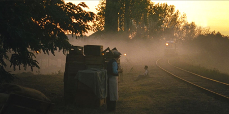
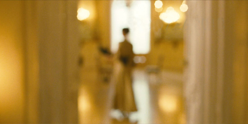
Throwing certain planes out of focus can become a motif (if one watches closely enough). Zelma is often seen out of focus in the backgrounds of scenes. In the frame at the top of this entry, she escorts Írisz to meet with Brill in the opening scene, when Írisz is applying for a job at Leiter’s. Zelma hovers in the middle ground in the frame at the top of the this section; in the frame just above, she’s in the distance, greeting the royalty from Vienna. She is seen for the last time disappearing into a soft, distorting view (bottom of the entry), going to either a posh job attending royalty or a grim fate. As usual, we have no way of knowing which, though we may suspect. The composition hauntingly recalls the early shot of her escorting Írisz, at the top.
I spotted only one shot where Írisz is wholly absent, late in the film, and that is a single tracking movement in the street inserted between two scenes. Nothing is in focus. By following Írisz we may not see everything, but without her we see even less.
Interestingly, Nemes and the cinematographer, Mátyás Erdély, originally intended to try and find an approach quite different from that of Son of Saul:
When we finished ‘Son of Saul’ and began to talk about ‘Sunset,’ we definitely wanted to do something that was very different. For example, if the aspect ratio was 1:1.37 in ‘Son of Saul,’ then it should be anamorphic 1:2.39 in ‘Sunset’; if ‘Son of Saul’ was to be photographed with a handheld camera, then let’s use the dolly for ‘Sunset.’ We made a mood test film, but the camera was in my hands already for the second shot. We realised that the kind of approach that László likes and that matches ‘Sunset’ requires that the camera be hand-held. We decided in advance that there would be dolly and anamorphic, however, in vain–in the end, it was 1:1.85 and a hand-held camera.
The film was shot in 35mm, with the final shot that constitutes the epilogue being set apart by filming on 65mm. Some release prints are available on film, and that’s what we saw in Venice. It was one of only two films shown on 35mm (the other being Vox Lux). See it on film if you possibly can. It’s gorgeous.
I unfortunately haven’t seen Son of Saul on the big screen, but Sunset is clearly a very different sort of film, much more epic in scale. It had a considerably bigger budget and is an historical piece about a beautiful, crowded city. The central set, Leiter’s Hat Store, depicts the luxurious goods that the upper classes and even royalty purchase. The filmmakers built Leiter’s in a vacant lot in a small street in Budapest’s Palace District, behind the National Museum. That way characters could exit the store and be followed by the camera into the bustling street lined with buildings that existed in 1913. As László Rajk, the production designer, says,
The space of ‘Son of Saul’ is an enclosed universe, the strict but also intimate world of the concentration camp. ‘Sunset,’ on the other hand, takes place in an open world, with all the sounds and noises of a big city. This means that in this film we–sound designer and production designer alike–had to create a completely different, open and noisy universe which reflects much less intimacy.
The amazing thing is that the designer took all this trouble and expense even though the lack of focus meant that most of the surroundings, both the built hat store and the real streets, would usually be only dimly visible to the audience. As Rajk adds, however, “those who played–and practically lived–their parts within [the store’s] walls had to believe every single second that they were in the year 1913, in Budapest, at its most elegant hat store full of secrets.”
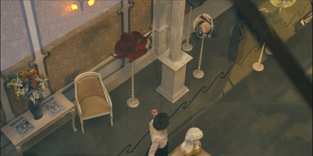
We do occasionally see the store’s interior in focus, as in this, one of the two true point-of-view shots I spotted in the film:
Still, I would be hard put to figure out that layout of Leiter’s Hat Store or guess where the house where Írisz and the other milliners live is in relation to it.
If there’s one thing that reveals the vast difference between Son of Saul and Sunset, it’s that in the former we dread to see the offscreen, out-of-focus, peripheral things that are happening. In the latter, we yearn for a view of the crowded streets of Budapest and the splendid decor of Leiter’s Hat Shop. We are frustrated, channeled into watching Írisz but having a constant sense of the city which we glimpse occasionally in focus and more frequently in an evocative haze.
I look forward to relishing a third viewing.
As always, thanks to Paolo Baratta, Alberto Barbera, Peter Cowie, Michela Lazzarin, and all their colleagues for their warm welcome to this year’s Biennale.
Many thanks also to Michael Barker and Allison Mackie of Sony Pictures Classics for their help in preparation of this entry.
My quotations come from the interviews with the filmmakers in Hungarian Film Magazine (Autumn 2018), pp. 10, 11, 16, 17, 21. Nearly all of this issue is devoted to revealing interviews with the director, star, cinematographer, set designer, costume designers, and sound designer. In Venice, this issue was provided to the press, and it is available in its entirety online here.
Some photos from our Venice jaunt are on our Instagram page.


