Archive for the 'Film technique: Cinematography' Category
Wisconsin Film Festival: Sometimes a camera movement . . . .
A Quiet Passion (2016).
DB here:
. . . . sums up what has happened and hints at what’s to come.
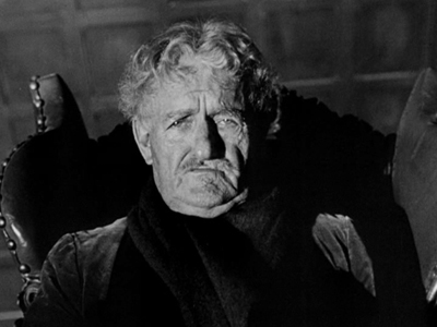
Seeing Terence Davies’ splendid A Quiet Passion again at our Wisconsin Film Festival brought out several subtleties I hadn’t registered on my first pass last year at Vancouver. Among the things I appreciated was a poignant 360-degree-plus tracking shot in the Dickinsons’ parlor.
This poet’s passion isn’t always so quiet. Davies’ earliest films are notably light on dialogue, but this one contains plenty of talk, both bantering and brutal. Perhaps most surprisingly, the supposedly withdrawn Emily Dickinson engages in snappy and snappish exchanges with friends, family, neighbors, and one awkwardly sincere suitor. All the more striking, then, when Davies halts the talk and gives us a suite of images accompanied by discreet sound effects, music, and voice-over portions of Dickinson verse.
Fairly early in the film, we get a spirited exchange between the censorious Aunt Elizabeth and the Dickinson family. After her indignant reply to their mock-heathen teasing, she gulps down some currant wine. Next we see the family quietly sharing an evening. That’s when we get this ripe circular camera movement.
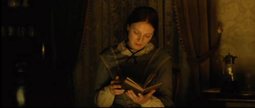
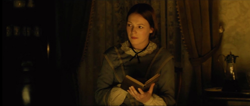
It starts framing Emily, reading by firelight. She looks left.
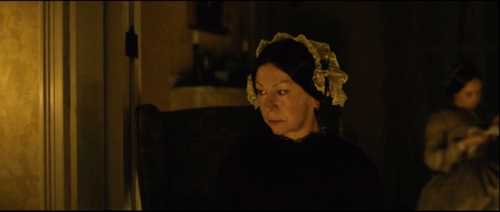
As the camera coasts past Emily we get a glimpse of a fond smile. The moving frame reveals Aunt Elizabeth, struggling to keep her eyes open.
In the course of this movement, over the soft crackling of the fire and a ticking clock, we hear the older Emily’s voice-over reciting.
The heart asks pleasure first,/ And then, excuse from pain;/ And then, those little anodynes/ That deaden suffering.
The poem is a famously puzzling one. Is the speaker suggesting a bargain–if not pleasure, then no pain, please? Or is it a description of the course of a life: youth seeking pleasure, old age willing to accept absence of pain, and in the end a plea for something that simply ends suffering? The juxtaposition of young Emily and aged Elizabeth suggests two phases of woman’s life: Is Emily still pledged to pleasure (of a bookish kind) while her aunt is already seeking an anodyne, like the brandy she greedily gulped and the sleep that seems to be stealing over her?
As the camera passes Aunt Elizabeth, the poem is completed.
And then, to go to sleep;/ And then, if it should be/ The will of its Inquisitor,/ The liberty to die.
Elizabeth’s drowsiness comes to prefigure the death that will haunt the rest of the film. And the poem’s grim acceptance of physical decline, lifted by the mercies of death, sketches what will be all too vivid in scenes to come.
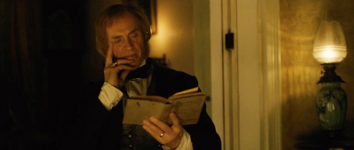
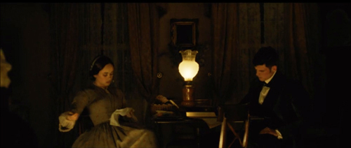
The camera continues its leftward survey of the family circle, settling next on Emily’s father Edward. He’s thoughtfully reading. So is brother Austin, at the rear table. Sister Vinnie, though, is sewing at the same table.
This survey of the immediate family shows Emily, like the men, gone all literary, while good-hearted Vinnie does no reading, instead attending to women’s tasks. The shot identifies Emily as, if not unfeminine by the standards of the day, at least not sunk in domesticity. She may be searching for that literary spark she will so often identify with glimpses of Eternity.
The view of Edward has been accompanied by clock chimes, and under the image of Austin and Vinnie we hear the clock start to strike the hour of nine. As the camera moves leftward, we see the mother, Emily Norcross Dickinson.
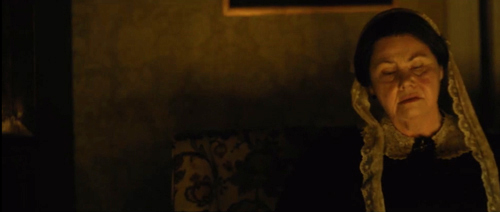
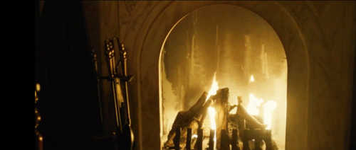
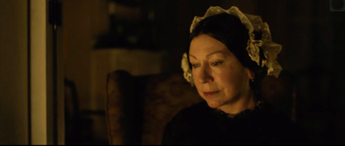
Neither reading nor tending to domestic tasks, Mrs. Dickinson is staring raptly into the fire. Everyone is in a kind of reverie, but hers is inward and melancholy. In the previous scene she has told Aunt Elizabeth “I prefer to listen and remain silent.” Later in the film we’ll learn that she has gradually withdrawn from the family, as if feeling ill-adjusted to these intellectuals, or through some private unhappiness. Later in the scene we’ll get another hint, but after briefly lingering on her, now the camera moves to the fire and then passes beyond.
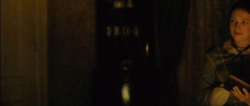
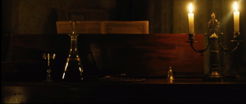
The piano will be the site of a crucial conflict to come, and the wine decanter, already featured in the scene before, will later be one index of the self-righteousness of the new clergyman’s wife. This “empty” stretch becomes a caesura before we get to the simple, devastating final image of the shot.
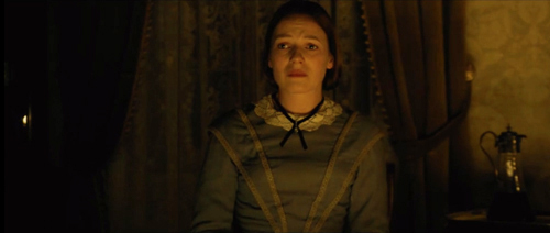
So much for books. Emily’s plaintive look, not clearly fastened on any family member, is ambivalent. Has the camera traced her eyes around the family circle, as her sidewise smile at Aunt Elizabeth suggested earlier? If so, what has moved her? Her mother’s solitude? Her siblings’ and fathers’ obliviousness to the older woman? Or is it something more self-centered? Locked within the family circle, has she surveyed the perimeter of her life to come?
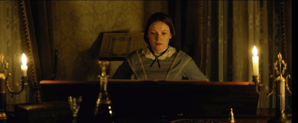
The question is partly, teasingly answered, when we hear the offscreen voice of Mrs. Dickinson. She asks Emily to play one of the old hymns. Emily rises and goes to the piano, and we get a cut to the shot surmounting today’s blog entry. After Emily starts playing, the rest of the family is forgotten, and Davies cuts to a closer view of her mother.
Still staring into the fire, she speaks of hearing the hymn sung by a young man with a beautiful voice. He was only nineteen when he died, she tells us, or maybe just herself. The softly delivered memory carries more than mere nostalgia. Are the others even noticing? We never find out.
Unlike her husband and children and Aunt Elizabeth, the mother ponders the past and its losses. We’re invited to imagine an alternative life for her, perhaps with the beautiful young man. Is he kin to the young woman in white with the parasol recalled by Bernstein in Citizen Kane, as he stands before his roaring fire? At the least, this warm parlor is now haunted by death.
Davies is too tactful to push this moment, leaving the character to keep her own counsel. But I can’t resist another probe. The Magnificent Ambersons is one of Terence’s favorite films, he told us during his visit (“better than Kane“). It’s not a stretch to let the image of Mrs. Dickinson remind us of the somber shot of Major Amberson before another fireplace. Deprived of his fortune, baffled by all around him, he ponders the origins of life as the narrator muses that even an Amberson might not get a leg up in the Hereafter.
Terence pointed out to us that the great American films are often about families, because in that setting passions are both aroused and contained. The Dickinson family, tightly bonded by love and respect, ruled by a tender but iron-willed patriarch, harboring a mother and daughter withdrawn from the world, split by failed marriages and angry reproaches, prey to death and broken pledges, is no perfect haven. Perhaps Emily’s stabbing epiphany is a realization of all of that, and what it might mean for her art. All this takes two minutes and ten seconds.
Nowadays the circling camera is a cliché; characters sitting around a table or even just standing in the street seem to be spinning on a turntable. Davies is far more discreet and precise. Step lightly on this narrow spot, a Dickinson poem advises us, and that’s what his camera has done here.
Thanks to Bianca Costello and Music Box Films, which is distributing A Quiet Passion. Its US rollout starts 14 April. Thanks as ever to the Wisconsin Film Festival and its plucky programmers Jim Healy, Mike King, and Ben Reiser.
And many thanks to Terence Davies for coming to town and providing fine conversation about George Butterworth, Meet Me in St. Louis, and the making of A Quiet Passion. As he told our audience: “I hope you enjoy it, and if you don’t, complain to Mr. Trump.”
Other entries in the intermittent Sometimes. . . . series are here (I Topi Grigi), here (The Mormon’s Victim), here (A Touch of Zen), here (Side Street), and here (Frisco Sally Levy).
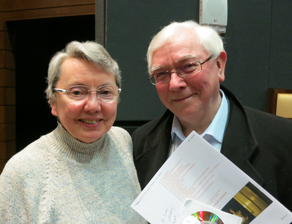
Kristin and Terence Davies.
My girl Friday, and his, and yours
DB here:
Criterion has just released a fine edition showcasing two classics of American cinema: The Front Page (1930) and His Girl Friday (1940). His Girl Friday is in a new HD restoration, and the earlier film, long crawling around in disgraceful public-domain bootlegs, now has a 4K glow–maybe looking better than it did at the time. The extra fillip is that it’s a version that director Lewis Milestone preferred to the familiar one.
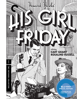 Along with the films comes a host of features: interviews and shorts about Howard Hawks, Rosalind Russell, and the making of HGF, radio adaptations of both the Front Page play and the HGF film, a short about Ben Hecht, trailers, appreciative essays by Michael Sragow and Farran Smith Nehme, and a session with me about HGF.
Needless to say, I’d be plugging this release strenuously even if I weren’t involved. Long-time readers of this blog know that an early entry hereabouts talked about the diverse paths HGF took to becoming the classic it’s now recognized to be. I used the film in many courses I taught during my early days at Madison. Kristin and I have been writing about the film since then as well, first in Film Art (it still retains its place from the 1979 edition), then in Narration in the Fiction Film (1985) and On the History of Film Style (1998). Other references sneak into our entries here from time to time. The Criterion edition offered me another chance to rattle on about a movie I still, after nearly fifty years, love inordinately.
What can be left to say? Plenty, but today I’ll mention just two items. First, what is a Girl Friday? And second, how unobtrusively delicate can film style be?
More slop on the hanging
The phrase “girl Friday” comes, ultimately, from Robinson Crusoe, Defoe’s 1719 novel of how the castaway protagonist turned a cannibal prisoner into his servant: his man, Friday. The hapless convert to Christianity gained his name because Crusoe rescued him on a Friday. An 1867 children’s story, “Will Crusoe and His Girl Friday,” shows a little boy and girl planning to reenact Defoe’s tale, adding gender insult to racial and class injury.
“My Girl Friday” was a spicy 1929 play about flappers who drug tycoons at a party and then convince them that the worst has happened. Consisting largely of scenes with chorus girls in bathing suits, it was dubbed by Variety “out and out smut.” Unsurprisingly, it found success on Broadway. During some weeks its BO take rivaled that of The Front Page, on stage at the same time.
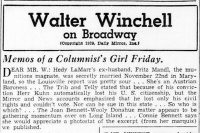
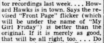
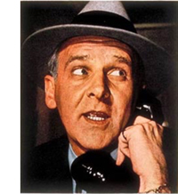 As far as I can tell, the phrase “girl Friday” became more prominent in American slang during the 1930s, thanks chiefly to columnist Walter Winchell (right, from Time 1938). At intervals from 1934 on, Winchell’s daily column carried the title “Memos of a Columnist’s Girl Friday.” The premise was that his secretary was an all-purpose newshound, gathering gossip and tidbits into a weekly memo to her boss. Evidently, Winchell’s secretary Ruth Cambridge (Mrs. Buddy Ebsen) didn’t write it. Under the “Memos” rubric Winchell could boast about his latest triumphs. His Girl Friday could ask innocently if “Mr. W.” saw the new Fortune poll of top columnists (in which he ranked high), or whether he noticed that several more newspapers had signed on to carry the column. Louella Parsons gave Winchell credit for publicizing the Girl Friday phrase.
He started a brief feud when he smelled poaching. In 1937, two aspiring screenwriters sold MGM a story they called “My Girl Friday.” It involved, according to Daily Variety, “adventures of a newspaper circulation rustler.”
With Trumpian self-regard, Winchell asserted that he had popularized many catchphrases that Hollywood had bought as titles: “Blessed Event,” “Orchids to You,” “Is My Face Red?” “Okay, America,” and even “Whoopee.” In addition, he noted that MGM had spent a cool quarter of a million dollars to enhance a scene of The Great Ziegfeld. In the face of such largesse, Winchell felt justified in asking for compensation.
Therefore we think it would be ducky if MGM sent $10,000 to us for the use of “My Girl Friday,” which became better known via this dep’t.
Winchell hastened to add that he would give the money to charity. He pressed his case in several columns and in radio broadcasts. Paramount joined the fray, claiming that it acquired the title when it bought the old play, so MGM couldn’t use it anyway. At which point the Hays Office was consulted.
Using his Girl Friday voice, Winchell responded that he claimed only to have popularized the phrase, and in any case what was $10,000 to Hollywood, especially if the money went to charity? Muttering about how MGM’s song “Your Broadway and Mine” swiped the original title of his column, Winchell subsided, as did the dispute. MGM evidently never adapted the story in question.
Then, on 9 December 1939, Walter ran this.
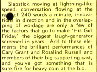
No hard feelings from Winchell, apparently. He may have benefited from the association with the movie. During production and even after release, the film was sometimes called My Girl Friday. And the linkage of a Girl Friday to the newspaper game, be it gossip or circulation rustling, fitted the movie well, as it evoked Winchell’s rat-a-tat radio delivery and his near-prosthetic adhesion to phone receivers.
Yet Winchell mysteriously dropped the “Memos” rubric from his column in 1941. In the decades to come, many businessmen would claim to have a Girl Friday of their own. Maybe the film ultimately popularized the phrase more successfully than Winchell did.
For the waiter
Daily Variety (5 January 1940), 3.
As a theatrical adaptation, His Girl Friday offers a challenge that Hawks accepted with ease. He had worked on films limited to a few interiors before, as with the train scenes of Twentieth Century (1934) and much of the airport action of Only Angels Have Wings (1939). He knew how to enliven situations unfolding in tightly confined settings.
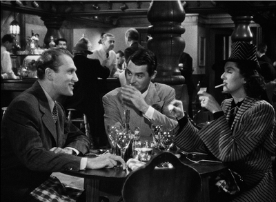
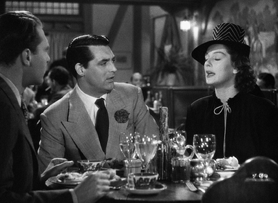
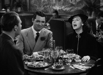
Apart from enjoying the fast-paced comedy, you can learn a lot about film technique from the way Hawks energizes his static, prosaic surroundings. Take his resolutely unflashy staging in depth. It’s most apparent in the pressroom of the Criminal Courts Building, as I suggest in the supplement, but there are plenty of felicities of staging elsewhere. The most apparently unpromising example involves the restaurant where Walter Burns takes his ex-wife Hildy Johnson and her fiancé Bruce Baldwin. What to do with this simple set?
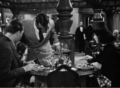
At a late point in the scene Walter will seek the help of the waiter Gus, who’ll call Walter to the phone. It’s a basic problem: How should the director prepare for that phase of the action? Hawks does it by setting up a zone of depth at the start of the scene, priming it quietly throughout, and paying it off when it’s needed.
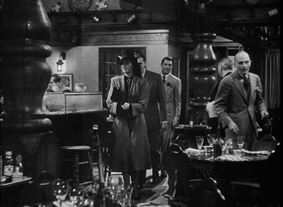
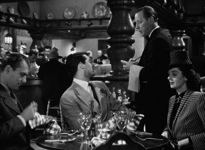
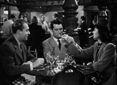
Bruce, Walter, and Hildy enter the restaurant from the background. (Novice directors please note: No need for a sign saying, “Restaurant.”) The group comes to a table in the foreground. After some comic byplay as Walter grabs the chair next to Hildy, the three get seated and chat with Gus.
This framing orients us to the table and the rear area by the bar. We’ll never leave this general orientation on the scene. This commitment, far from being simply “theatrical,” makes for economy as the action develops.
In the course of the scene, Hawks activates the rear zone by having Gus come and go from it. Of course that area isn’t emphasized. Who’s likely to notice Gus giving the sandwich order back there when there’s patter and funny business to watch right in front of us?
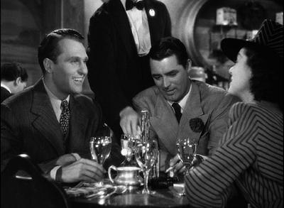
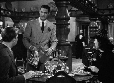
In the course of the scene, Gus will come back to the table, pouring water, delivering sandwiches, and getting kicked in the shin by Hildy, who’s aiming at Walter. Throughout, we’re quietly primed for that alley of space behind Walter to be occupied by Gus.
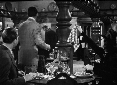
The priming pays off when Walter, realizing that he has to prevent Hildy’s taking the train today, deliberately spills water in his lap.
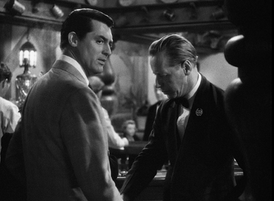
Walter pivots and heads to Gus, who’s back there in his domain, waiting to be pulled into the plot. He’ll summon Walter to the fake phone call.
No big deal–certainly not as eye-catching as the dazzling comedy around the table. But the care for such little things is the mark of a craftsmanship that uses space compactly, without fuss. No need for camera angles that show the fourth wall (or even walls two and three). No need to build more of the set on the side; this is Columbia, after all. Just let reliable Joe Walker light that background enough to keep us aware of it (out of focus for most of the scene) and then activate it when you need it.
Hawks was obeying the advice Alexander MacKendrick would later give:
Within the same frame, the director can organize the action so that preparation for what will happen next is seen in the background of what is happening now.
Or as Hawks put it in 1976:
You know which way the men are going to come in, and then you experiment and see where you’re going to have Wayne sitting at a table, and then you see where the girl sits, and then in a few minutes you’ve got it all worked out, and it’s perfectly simple, as far as I am concerned.
The unstated premise is indeed perfectly simple: You don’t need to show more space than the physical action requires. It’s a rare premise today.
How long is it?
This sort of priming fits neatly into a cinema based in continuity–dramatic, spatial, temporal. Hawks is a master of staging action so that it flows unobtrusively. At times, though, it’s fun to spot some discontinuities, and editing is a good place to look.
Ozu is, to my knowledge, the only director who invariably creates perfect match-cuts on action. Even Hawks has to cheat things a bit to make the editing flow. (Hildy’s pitching of her purse is an example I use in the commentary.) But consider how Hawks can get a spark out of a small, mismatched action.
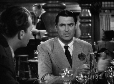
We’re still in the restaurant, and Walter has persuaded Hildy to cover the Earl Williams story in exchange for buying an insurance policy from Bruce. Talking of his upcoming physical, Walter boasts, “Say, I’m as good as I ever was.” Hildy fires back, “That was never anything to brag about,” and Walter reacts and turns his head. As he turns, we get these two shots.
At first Walter is stunned, apparently readying a reply; but at the cut, he’s sporting a grin. It’s partly a grin of triumph, showing that he’s gotten Hildy to do his bidding, but it’s also an appreciation of her wit: a sort of “That’s my girl” pride in her fast comeback. Strictly speaking, the cut’s a mismatch, but the instantaneous switch in reaction gives the scene double value.
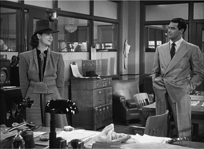
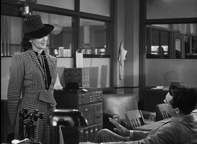
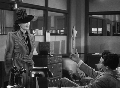
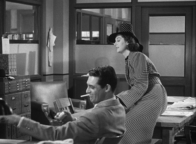
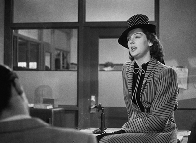
Finally, there’s framing. The rugged outdoor guy Hawks is as delicate as they come when it’s a matter of frame corners and edges, and his sense of pictorial balance is fastidious. Go back to the long opening scene in Walter’s office, when he and Hildy are going through the preliminaries. They size each other up before Walter sits down in his swivel chair.
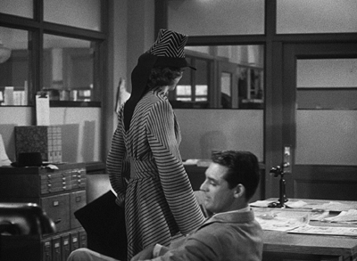
A slight track forward has planted Walter in the lower corner of the frame. A cut in to Hildy’s reaction (not shown) enables a transition to a slightly different framing. That setup allows Walter to invite her onto his knee, which pokes up from the bottom edge.
Joe Walker has obligingly edge-lit that stretch of pant leg, and it’s about the only thing moving in the shot, so we can’t miss Walter’s come-on.
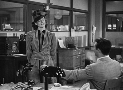
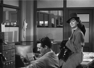
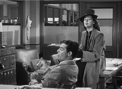
Now Hawks does something very pretty. Hildy moves to the table and perches on it. Hawks reframes with her, but keeps the shot oddly unbalanced, with Walter resolutely facing the area she’s not in.
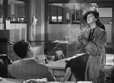
A sort of spatial suspense develops. Hawks sustains this odd framing while Walter picks up a cigarette, tosses one to Hildy, lights up, and tosses her a match. Fairly deliberately too, in what’s supposed to be Hollywood’s fastest movie.
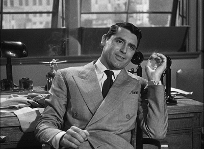
When both are smoking comfortably, Walter swivels his chair to snap his head into the lower left corner, which has been waiting for him all along. The simple movement provides the scene’s new beat, which starts with Walter’s line: “How long is it?” I haven’t yet mentioned that this is a fairly dirty movie, but you knew that.
The shot began with the actor’s head in the lower right, developed with that head poised midway in the frame, and now ends with the head cocked in the lower left. What looks like sterile geometry feels, on the screen, perfectly unforced. And lest we misread the “How long is it?” Walter innocently explains, in a medium shot, that he’s just wondering how long it’s been since they’ve seen each other. That in turn calls up an over-the-shoulder reverse angle, and the next phase of the scene is off and running.
At this point in film history, the cinematographer, while shooting, could not see exactly what the lens was taking in. The careful unbalancing and rebalancing of the shot had to be achieved through a mixture of expertise and intuition. The same thing with keeping Gus in reserve back there by the bar, and letting an incompatible take of Grant’s reaction stay in after a cut. It’s all perfectly simple, as far as I’m concerned.
Thanks to Kim Hendrickson, Grant Delin, and Peter Becker of Criterion for inviting me to spend more time with this splendid movie. Hawks’ quotation about keeping it simple comes from my On the History of Film Style (Harvard University Press, 1997), 149.
You can find background here on the restoration of The Front Page, supplied by Academy archivists Mike Pogorzelski and Heather Linville.
You can get a sampling of Winchell’s radio delivery from the period here, complete with nervous teletype clackings serving as transitions. For more background on HGF, go here. That entry observes the usefulness of the film’s lines in many situations. In this respect it resembles another Hawks film, that repository of worldly wisdom known as Rio Bravo.
Gus the waiter is played by the inimitable Irving Bacon, one of a dozen or so outstanding supporting players. This is another of the film’s triumphs: Regis Toomey, Porter Hall, Gene Lockhart, Abner Biberman, Roscoe Karns, and other memorable character actors all seem to be having fun. And Billy Gilbert as the wayward Pettibone is the friendliest deus ex machina in Hollywood cinema.
Finally, do audiences today know the meaning of Hildy’s flipped hand in response to one of Walter’s catty remarks? Has nose-thumbing gone out of popular culture? Apparently not.
P.S. 4 February 2017: On the Parallax View site, Sean Axmaker has the most in-depth appreciation of this edition of The Front Page I’ve seen online. And he has plenty to say about HGF too.
P.S. 2 February 2018: His Girl Friday is now streaming on FilmStruck, and among the bonus materials is the video essay I mention.
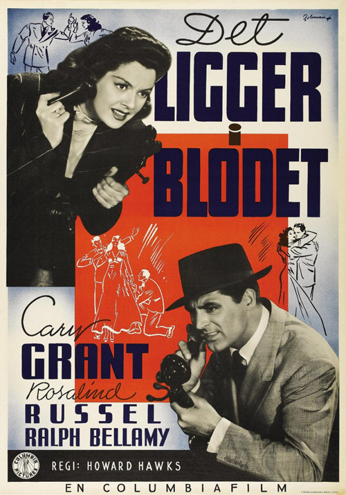
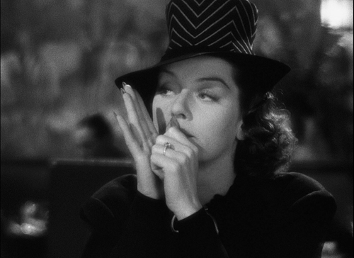
His Girl Friday (1940).
Is there a blog in this class? 2016
A Brighter Summer Day (Edward Yang, 1991).
KT here–
Another year has passed, and Observations on Film Art is approaching its tenth anniversary. The blog was never intended as a formal companion to our textbook Film Art: An Introduction. Basically we write about what interests us. Still, many of our entries use concepts from the book, and we hope that teachers and students might find them useful supplements to it.
As each summer approaches its end and teachers compose or revise their syllabi, we offer a rundown, chapter by chapter, of which posts from the past year might be relevant. (For previous entries, see 2007, 2008, 2009, 2010, 2011, 2012, 2013, 2014, and 2015.) For readers new to the blog, these entries offer a way of navigating through the site.
Chapter 1 Film as Art: Creativity, Technology, and Business
Film projection made the national news in late 2015 when Quentin Tarantino released his new film, The Hateful Eight, on 70mm film. Only 100 theaters in the USA, most of them specially equipped with old, refurbished projectors, could show it that way. We went behind the scenes to see how the theaters coped in THE HATEFUL EIGHT: The boys behind the booth and THE HATEFUL EIGHT: A movie is a really big thing.
This year the studios took tentative steps toward instituting The Screening Room, a system of streaming brand-new theatrical films to people’s homes for $50. Whether or not this service succeeds, it represents one new distribution model that Hollywood is exploring to cope with the increasing delivery of movies via the internet. See Weaponized VOD, at $50 a pop.
Popular film franchises can go on generating new products and influencing other films for years. We examine the lingering impact of The Lord of the Rings thirteen years after the third part was released in Frodo lives! And so do his franchises.
Chapter 3 Narrative Form
In this chapter we put considerable stress on the concept of narration, the methods by which a film conveys story information to the viewer. There is no end to the ways in which narration can be structured. Often one of the characters in a film can to tell us what happened. . . even if that character is dead. This, as we show in Dead Men Talking, is not as rare as one might expect.
The Walk combines narrative and genre in an unusual way. The first part is a romantic comedy, the second a suspense film, and the third a lyrical piece. We suggest why in Talking THE WALK.
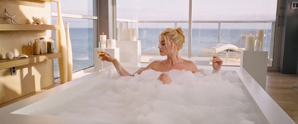
The way a film tells its story can vary considerably depending on whether it has a single protagonist, a dual protagonist, or a multiple protagonist (as in The Big Short, bottom). We examine some of the differences in Pick your protagonist(s).
Looking back over our blog as we passed 700 entries early this year, it occurred to us that several entries discussing principles of storytelling could be arranged to create a pretty good class in classical narrative strategy. We made up an imaginary syllabus in Open secrets of classical storytelling: Narrative analysis 101. No tuition charged.
With the very end of the Lord of the Rings/Hobbit franchise–the release of the extended DVD/Blu-ray version of the third Hobbit film–we discuss the strengths of the film and the plot gaps left unfilled in A Hobbit is chubby, but is he pleasingly plump?
To celebrate Orson Welles’s 101st birthday, we examined some of the sources for some of the techniques used in Citizen Kane, a film we analyze in detail in Chapters 3 and 8. See Welles at 101, KANE at 75 or thereabouts.
In Hollywood it is a common assumption that the protagonist(s) of a film must have a “character arc.” Filmmaker Rory Kelly, who teaches in the Production/Directing Program at UCLA, wrote a guest entry for our site. Rory analyzes the character arc in The Apartment, with examples from Casablanca, Jaws, and About a Boy as supplements. See Rethinking the character arc: A guest post by Rory Kelly.
James Schamus’ Indignation, an adaptation of Philip Roth’s novel, draws on novelistic narrative devices not in the original. In INDIGNATION: Novel into film, novelistic film, we suggest that those devices first became standard in cinema during the 1940s.
Chapter 4 The Shot: Mise-en-Scene
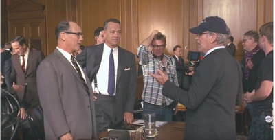
Teachers and students always want to us add more about acting to our book. It’s a hard subject to pin down. We introduce the great stage actor Mark Rylance, who was largely unknown outside the United Kingdom before he won an Oscar for Steven Spielberg’s Bridge of Spies, and discuss how he achieves his expressively reserved performances in that film and the series Wolf Hall. See Mark Rylance, man of mystery. (Above at left, on set with Tom Hanks and Spielberg.)
In an era when most staging of actors in movies follows a few simple conventions, we examine the more imaginative ways of playing a scene on display in Elia Kazan’s Panic in the Streets (1950) in Modest virtuosity: A plea to filmmakers young and old.
Continuing with the theme of acting and staging, our friends and colleagues, Ben Brewster and Lea Jacobs have put a revised version of their in-depth study of silent-cinema acting online for free. Learn about it and the enhancements that internet publishing has allowed in Picturing performance: THEATRE TO CINEMA comes to the Net.
Chapter 5 The Shot: Cinematography
We look at the visual style of Anthony Mann’s Side Street (1949) and show how a simple, seemingly minor technique like a reframing can create a strong reaction in the spectator. See Sometimes a reframing …
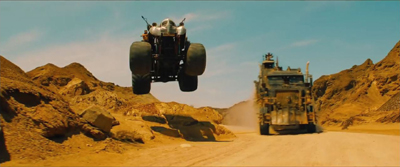
Framing a composition is one of the most basic aspects of cinematography. We discuss centered framing, decentered framing, balanced framing, framing in widescreen movies, and particularly framing in Mad Max: Fury Road (above) in Off-center: MAD MAX’s headroom.
In a follow-up entry, we discuss framing in the classic Academy ratio, 4:3, with emphasis on action at the edges of the frame: Off-center 2: This one in the corner pocket.
Chapter 7 Sound in Cinema
For the new edition of Film Art, we had to eliminate our main example of sound technique, Christopher Nolan’s The Prestige. But we put that section of the earlier editions online. THE PRESTIGE, one way or another takes you to it.
For those who have been looking for examples of internal diegetic sound, we take a close look (listen) at a sneaky one in Nightmare Alley: Do we hear what he hears?
The fact that the protagonist narrates The Walk in an impossible situation, standing on the torch of the Statue of Liberty and talking to the camera, bothered a lot of critics. We suggest some justifications for this decision in Talking THE WALK.
We offer brief analyses of the Oscar-nominated music from 2015 films in Oscar’s siren song 2: Jeff Smith on the music nominations.
Chapter 8 Summary: Style and Film Form
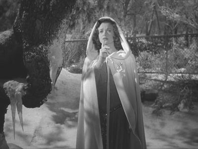
Many different filmic techniques can serve similar functions. Filmmakers of the 1940s had a broad range to choose from when they portrayed dead people, or Afterlifers, on the screen. We look at how their choices affected the impact of the scenes (as in Curse of the Cat People, above) in They see dead people.
Style and form in three films of Terence Davies: Distant Voices, Still Lives; The Long Day Closes; and especially his most recent work, Sunset Song. See Terence Davies: Sunset Songs.
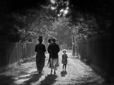
Style and form in Edward Yang’s A Brighter Summer Day, on the occasion of its magnificent release by The Criterion Collection, in A BRIGHTER SUMMER DAY: Yang and his gangs.
Chapter 10 Documentary, Experimental, and Animated
Leo Hurwitz’s little-known documentary, Strange Victory (1948) has recently come out on Milestone’s DVD/Blu-ray. Released shortly after the end of World War II, it suggests that the Nazi atrocities were only an extreme instance of the cruelty of racism. We discuss the film and its relevance to the current political situation in Our daily barbarisms: Leo Hurwitz’s STRANGE VICTORY (1948).
Experimental filmmaker Paolo Gioli makes films without cameras, or at least, he cobbles together pinhole cameras of his own from simple materials. The results are remarkable. We describe his work and link to a recent release of his work on DVD in Paolo Gioli, maximal minimalist.
Chapter 11 Film Criticism: Sample Analyses
The eleventh edition of Film Art contains a new sample analysis of Wes Anderson’s Moonrise Kingdom. We discuss some additional aspects of the film in Wesworld.
Chapter 12 Historical Changes in Film Art: Conventions and Choices, Traditions and Trends
At the end of each year we avoid doing a standard ten-best list by choosing the ten best films of ninety years ago. For 2015, we dealt with The ten best films of … 1925 (including Frank Borzage’s Lazybones, above). It was a very good year.
A rare French Impressionist film, Marcel L’Herbier’s L’inhumaine, has been released on DVD/Blu-ray by Flicker Alley. We discuss the film and its background in L’INHUMAINE: Modern art, modern cinema.
Film Adaptations
Our eleventh edition offers an optional chapter on film adaptations from a wide variety of art forms and even objects.
For thoughts on popular female novelists whose books were adapted into films during the 1940s and 1940s (and who sometimes became screenwriters), see Deadlier than the male (novelist).
Adaptations can be made from nonfiction as well fictional books. We look at how Dalton Trumbo’s life was made into a biopic in Living in the spotlight and the shadows: Jeff Smith on TRUMBO.
In a series of entries, we have commented on the adaptation of J. R. R. Tolkien’s The Hobbit into a three-part film. For an analysis of the extended DVD/Blu-ray version of the third part, see A Hobbit is chubby, but is he pleasingly plump? (Links in that entry lead to earlier posts on this subject.)
As always, we have blogged about some recent books and DVDs/Blu-rays. See here (Vertov, sound technology, 3D), here, (Kelley Conway’s new book on Agnès Varda), here (experimental films, the first Sherlock Holmes, the Little Tramp), here (Tony Rayns on In the Mood for Love), and here (on some older foreign classics that have finally made it to home video in the USA, primarily those of Hou Hsioa-hsien). The publication of the eleventh edition of Film Art led us to look back on how it was written and some of the ideas that went into it. We took the occasion to introduce our new co-author, Jeff Smith. See FILM ART: The eleventh edition arrives!
We were also profiled in Madison’s local free paper, Isthmus, by Laura Jones, reporter and filmmaker. She read Film Art as a student.
The Big Short (2015).
Hou Hsiao-hsien: Film culture finally comes through
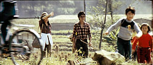
The Green, Green Grass of Home (1982).
For today, let’s call “film culture” that loose agglomeration of institutions around non-mainstream cinema. Film culture includes art house screening venues, festivals, magazines like Film Comment, Cinema Scope, and Cineaste, distribution companies (Janus/Criterion, Milestone, Kino Lorber et al.), critical websites, and not least the new channels of distribution and exhibition like Fandor, Mubi, and the impending FilmStruck.
Although the system is decentralized, there’s usually a fairly predictable flow of films through it. A film is shown at festivals, written up by critics, and picked up by distributors. Then it gains some exposure in theatres or more festivals, and it eventually becomes available on DVD, cable, and streaming services. And now we expect the process to move fairly quickly. Mustang played Cannes and many festivals through summer of 2015; it moved to theatres in the US and elsewhere in the fall. Only a year after its premiere, you can buy it on disc.
We’ve also been aided by the emergence of multi-standard video players and the willingness of some disc-publishing companies to release versions with subtitles in several languages. All too often, though, “film culture” displays gaps and delays. It took six years for Asgar Farhadi’s wonderful About Elly (2009) to make its way to minimal visibility in the US. Fans of Godard have been prepared to wait years to see his many films that didn’t get even video release in English-speaking territories. (Soigne ta droite! played Toronto in 1987, never got a theatrical release in America, and showed up on US DVD in 2002; the Blu-ray came out eleven years after that.) Two of the most egregious examples of this time lag involve the works of the outstanding Taiwanese filmmakers of the 1980s and 1990s: Hou Hsiao-hsien and Edward Yang.
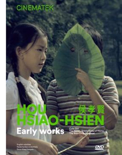 Most of Hou’s films had no proper US release. When they were available for booking, as from Wendy Lidell’s heroic International Film Circuit, they circulated for one-off screenings. Some of his major films, such as City of Sadness (1989), still remain difficult to see. Edward Yang’s work was similarly obscure. When we ran a retrospective at our UW Cinematheque in 1998, we had to borrow prints from his family.
Both of these extraordinary filmmakers had to wait many years for the exposure that is standard for European arthouse releases. After six features in seventeen years, Yang found a Western audience with Yi Yi (2000). Hou took even longer; twenty-seven years after his first feature, he gained some recognition with The Flight of the Red Balloon (2007) and last year, The Assassin. Meanwhile, many of these directors’ early films remain largely unknown, prey to ancient distribution contracts and the belief that the films would cost too much to revive and market.
Today’s entry and the next one celebrate the welcome news that important works by these two filmmakers are at last available on the disc format. Today I’ll concentrate on the three early Hou films from the Cinematek of Belgium: Cute Girl (1980), The Green, Green Grass of Home (1982), and The Boys from Fengkei (1983). Next time, I’ll consider Criterion’s release of Edward Yang’s masterpiece A Brighter Summer Day (1992).
Hou, early and late
Hou’s films are no stranger to this site. Among the first things I posted, back in 2005, was one of a batch of supplemental essays to my book, Figures Traced in Light: On Cinematic Staging (2005). That book devoted a chapter to Hou’s staging principles, with background on what I took to be the evolution of his technique. It was, I think, the first sustained view of Hou’s style, and it included discussion of his earliest films. These were scarcely known in the West and not considered in relation to his more famous work.
The online essay expanded my treatment of those titles. Because that essay is more or less buried elsewhere on the site, and it’s somewhat clunkily laid out by today’s standards, I’m reprinting it, with revisions, here, along with some bits from Figures. But first some background on these early works.
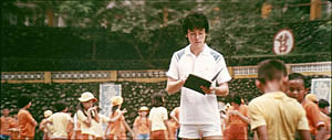
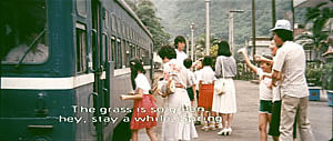
Hou began in the commercial, mainstream Taiwanese-language industry. Most local films had a strong genre identity: martial-arts movies, romantic comedies, or melodramas of family crises. Hou’s first directorial effort, Cute Girl, centered on a romance between two city dwellers who re-meet when the man is called to a surveying task in the countryside. Cheerful Wind (1981) reunites the two stars, Kenny Bee and Feng Fei-fe, in a more serious story of how he, a blind man, wins her love. In the pastorale The Green, Green Grass of Home, Kenny plays a schoolteacher brought to a village, where he meets another teacher and a romance blossoms. This film, however, expands to include dramas, big and small, involving several families; it also incorporates an ecological theme by encourage safe fishing policies.
In making these early films Hou discovered techniques that not only suited the stories he had to tell but also suggested more unusual possibilities of staging. He pushed those techniques further in his later films, with powerful results. The charming early films show him developing, in almost casual ways, techniques of staging and shooting that will become his artistic hallmarks. One basis of his approach, I argue, is his adoption of the telephoto lens.
How long is your lens?
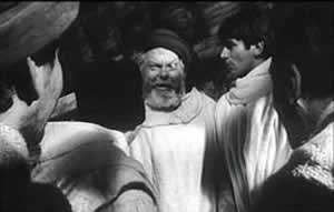
Around the world, from the late 1930s through the 1960s, many films relied on wide-angle lenses—those short focal-length lenses that allowed filmmakers to stage action in vivid depth. One figure or object might be quite close to the camera, while another could be placed much further in the recesses of the shot. The wide-angle lens allowed filmmakers to keep several planes in more or less sharp focus throughout, and this led to compact, sharply diagonal compositions, as in Welles’ Chimes at Midnight (1966).
Although Citizen Kane (1941) probably drew the most attention to this technique, it was occasionally used in several 1920s and 1930s films made throughout the world. The great French critic André Bazin was the most eloquent analyst of the wide-angle aesthetic, and his discussion of Kane, The Magnificent Ambersons (1942), The Little Foxes (1941), and The Best Years of Our Lives (1946) has strongly shaped our understanding of this technique.
The 1960s saw the development of an alternative approach, what we might call the telephoto aesthetic. Improvements in long focal-length lenses, encouraged by the growing use of location shooting, led to a very different sort of imagery. Instead of exaggerating the distances between foreground and background, long lenses tend to reduce them, making figures quite far apart seem close in size.
In shooting a baseball game for television, the telephoto lens positioned behind the catcher presents catcher, batter, and pitcher as oddly close to one another. Planes seem to be stacked or pushed together in a way that seems to make the space “flatter,” the objects and figures more like cardboard cutouts. The style was popularized by films like A Man and a Woman (1966).
The telephoto look quickly spread, employed by directors as diverse as Sam Peckinpah and Robert Altman, whose 1970s films also use the long lens, controlled by zooming, to squeeze a crowd of characters (M*A*S*H, 1972; Nashville, 1975) into the fresco of the anamorphic frame.
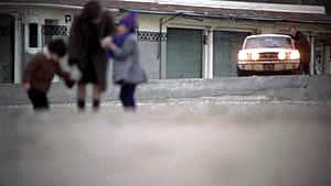
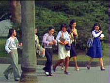
Hou Hsiao‑hsien came to filmmaking via the romance films so common in Taiwan in the 1970s, and this genre employed the long lens extensively. Working with low budgets, most filmmakers relied on location shooting. The telephoto allowed the camera to be set far off and to cover characters in conversation for fairly lengthy shots (as in Diary of Didi, 1978, below). In this respect, the directors were not so far from their Hollywood contemporaries; Love Story (1970) employs these techniques on a bigger budget.
Indeed, Love Story (a big hit in Taiwan) may have pushed local filmmakers toward using this technique in their own romantic melodramas; sometime the influence seems quite direct (Love Story and Love Love Love, 1974)
With these norms in place, Hou’s inclination toward location shooting and the use of nonactors, along with his attention to the concrete details of everyday life, allowed him to see the power of a technique that put character and context, action and milieu, on the same plane. His crowded compositions are organized with great finesse in order to highlight, successively, small aspects of behavior or setting, and these enrich the unfolding story, as Figures tries to show in his masterpieces of the 1980s and 1990s. Using a long lens (usually 75mm–150mm) he began to exploit some “just-noticeable differences” that the lens creates as byproducts.
Hou saw unusual pictorial and dramatic possibilities of the telephoto lens, and they became central to his distinctive way of handling scenes. A current norm of production practice yielded artistic prospects which he could explore in nuanced ways. Figures provides the detailed argument, but let me highlight three points here.
Exploiting the flaws
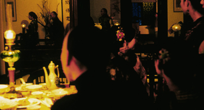
Flowers of Shanghai (1998).
One byproduct of the long lens is a shallow focus, as we can see in the examples above. Because the lens has little depth of field, one step forward or backward can carry a character out of focus. Hou stages in depth–and at a distance–but allows the layers to slip out of focus gradually.
Savoring the effects of gently graded focus is a common feature of Hou’s later work. The masher at the train station in Dust in the Wind (1987) moves eerily in and out of focus in the distance. In Daughter of the Nile (1988), there’s an astonishing shot showing gangsters approaching a victim’s SUV outside a nightclub: at first they’re only barely discernible blobs (seen through the vehicle’s narrow windows) but then they gradually come into ominously sharp focus in the foreground, preparing to attack one of the boys inside. The slight changes of focus train us to watch tiny compositional elements for what they may contribute to the drama. More recent examples abound in Flowers of Shanghai (1998), above, where it’s the foreground planes that dissolve.
Hou’s three first films don’t use the option quite so daringly; here the degrees of focus concentrate on the principal players but still allow us to register the teeming life around them (Cute Girl; Green, Green Grass).
Hou can put sharply different dramatic situations on different layers. In Green, Green Grass, the departure of the little girl, saying farewell to her host family, plays out slightly closer to the camera than the departure of the eccentric teacher.
This principle operates as well in the creatively distracting street and train-platform scenes of Café Lumière (2004).
Secondly, the long lens yields a flatter-looking space. It has depth, but the cues for depth that it employs are things like focus, placement in the picture format (higher tends to be further away), and what psychologists call “familiar size”—our knowledge that, say, children are smaller than adults, even if the image makes them both of equal size. One favorite Hou image schema is the characters stretched in rows perpendicular to the camera, and the telephoto lens, by compressing space, creates this “clothesline” look more vividly. We can find the clothesline staging schema in the early Hou films (Cute Girl, Cheerful Wind).
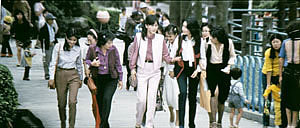
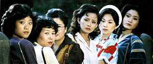
Another favorite schema is the “stacking” of several faces lined up along a diagonal (Cute Girl). This can be seen as a refinement of a schema that was in wider use, as an example from Love Story indicates.
But Hou uses this sort of image more subtly. The telephoto lens lets him stack faces in ways that encourage us to catch a cascade of slight differences (Millennium Mambo (2000)). In many scenes of Flowers of Shanghai (1998) this principle is carried to a degree of exquisite refinement without parallel in any other cinema I know. In one shot, the faces are stacked in the distance, behind a lantern, and a slightly shifting camera reveals slivers of them.
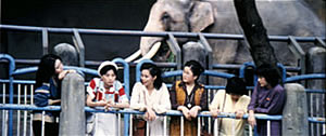
In general, because Hou is committed to a great density of information in the shot, the compression yielded by the long lens tends to equalize everything we see. Minor characters, or just passing strangers, become slightly more prominent, while details of environment can get pushed forward as well. The zoo scenes of Cute Girl enjoy showing us our characters in relation to the creatures around them.
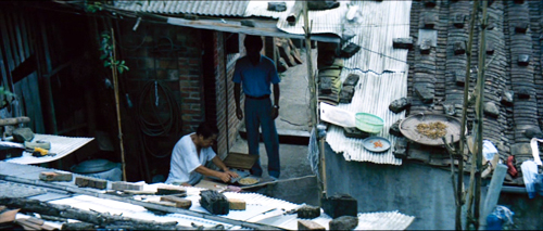
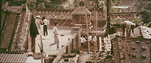
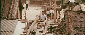
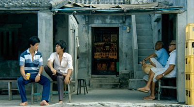
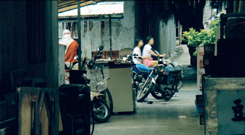
In the shot surmounting today’s entry, the tile rooftops of The Green, Green Grass of Home, secured by bricks and pails and tires and baskets, become just as important as the figures below them.
In Green, Green Grass, Hou develops the equalized-environment option in one particular scene. A long-lens distant view catches the teacher coming to the father’s house along a corridor of rooftops.
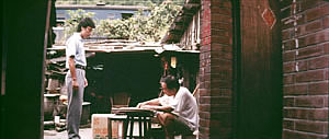
When the teacher confronts the father, instead of tight framings on each man, Hou cuts to another angle that activates yet another range of environmental elements—principally the train passing in the background, prefiguring the trip that the man’s son and daughter will take in an effort to find their mother.
Because the long lens has a very narrow angle of view (the opposite of a “wide-angle” lens), it affects the image in a third major way. If you use a long lens in a space containing several moving figures, people passing in the foreground will block the main figures: they pass between the camera and the lens. Hou elevates this blocking-and-revealing tendency to a level of high art.
In Figures Traced in Light, I argue that many great directors, from the silent era forward, have staged action in the shot so as to block and reveal key pieces of information, calling items to our attention at just the right moment with unobtrusive changes of figure position. The possibility of blocking and revealing arises from the “optical pyramid” created by any camera lens. (Lots more on that pyramid in Figures and in this video lecture.)
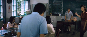
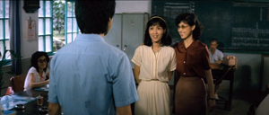
Hou showed himself capable of using the blocking-and-revealing tactic in traditional ways. Take this simple encounter in Green, Green Grass, when the new teacher Da-nian meets Su-yun, the young teacher with whom he’ll fall in love. The scene begins on him, then cuts to a reverse angle as he’s introduced to the principal.
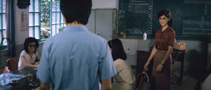
The others are turned toward the principal in the background; the whole composition pushes our eye toward him. Then the teacher steps left to judiciously block the principal. The woman on the far left turns her head and we’re nudged to look at her. Da-nian swivels slightly too.
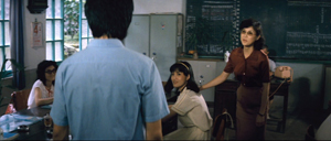
Then the key introduction: Da-nian shifts aside a little, the teacher continues to block the principal, and the central woman turns toward us.
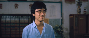
The climax (quiet, nifty) of this shot comes when Su-yun rises to meet Da-nian. She commands the center of the frame, frontal and radiant. Like any good classical director, Hou then gives us a reaction shot mirroring the first shot of this “simple” sequence: Da-nian is more than happy to meet her.
Imagine how a contemporary Hollywood director would handle this–lots of cuts, everybody in singles and close-ups, transfixing track-in to Su-yun, maybe a boingo music track–and count yourself lucky to have encountered, for once, an unfussy craftsman.
Hide and seek
The Green, Green Grass introduction scene involves a wide-angle lens, but Hou’s skill with slight character movement shows up in long-lens images too. In fact, I suspect that using the telephoto lens on location made him sensitive to the resources of masking and unmasking bits of the shot.
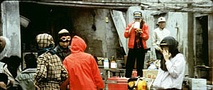
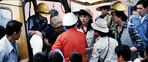
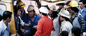
The loveliest example I know in the early films is the Cute Girl shot I analyze in Figures, when Fei‑Fei confronts the surveyors and the man in the red shirt serves as a pivot for our attention; the staging shifts our eye back and forth across the frame, according to small changes of character glance.
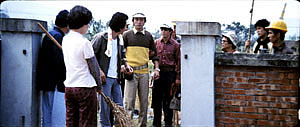
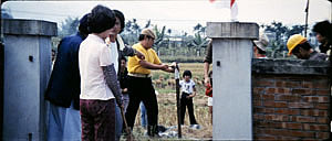
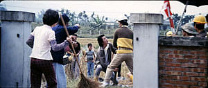
A less drastic example occurs when the surveying team starts quarrelling with the locals around a walled gate: The team’s blocking of the gate gives way to movement into depth and a struggle there between them and the townsfolk.
In all, it seems to me that these three resources of the long lens—the shallow focus, the compressed space, and the narrow angle of view—supplied artistic premises for Hou’s shooting and staging in the later films. This is not to ignore his use of the wide-angle lens on occasion, particularly interiors, as in the schoolteachers’ introduction scene. Once the lessons of the long lens had been absorbed, Hou could apply the staging principles that he’d developed to other kinds of shots and story situations. Sometimes he kept his style smooth and limpid, but at other times he offered the viewer some unusual challenges.
Peekaboo pictures
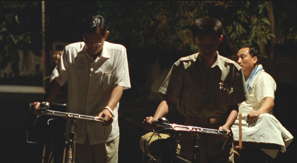
The Boys from Fengkuei (1983).
Presumably Hou could have kept making good-natured, crowd-pleasing movies for many years, but changes in his professional milieu gave him new opportunities. In the early 1980s Taiwan film attendance declined sharply, and Hong Kong films began to command more attention than the local product. The rash of independent companies had concentrated on speculation, not long-term investment, so only the government’s Central Motion Picture Company could initiate recovery. Ambitious government officials launched a “newcomer” program that offered support for cheap films by fresh talents. Even if the new films could not win back the local audience, they might gain renown at foreign film festivals. At the same period, a local film culture began to emerge, relying upon critics who were sympathetic to the creation of a New Taiwanese Cinema.
Hou was no newcomer, but working within the New Cinema framework he could reconceive his practice. The key question for all directors, he recalls, was: What is it to be Taiwanese? His New Cinema films would focus on political and cultural identity, and they did it through an approach to cinematic storytelling that in many respects ran against the conventions of his earlier films. His first New Cinema feature, The Boys from Fengkuei (1983; included in the Cinematek set) reminds us of how “young cinemas” have often represented a return to Neorealism.
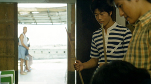
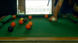
Instead of introducing us to clear-cut protagonists and a dramatic situation, the film immerses us in a milieu, that of the small town of Fengkuei. The first fifteen minutes are episodic, casually showing a gang of teenage boys playing pool, lounging about, playing pranks, and above all getting in fights. Initially, the one who’ll become the main figure is minimally characterized; the emphasis, as the title indicates, is really on the group. The boys drift to the big city, where they try to get by and meet others their age. Throughout, local color and everyday routines drive the action more than character goals and traditional drama do.
This somewhat diffuse approach to narrative, in various countries, has proven well-suited for filmmakers who want to explore psychological development and social-cultural commentary. So it accords with the impulse toward understanding national identities that animated New Taiwanese Cinema. In addition, I think that this looser conception of storytelling allowed Hou to refine some of the stylistic options he had already explored. Now the extended, fixed telephoto shot with varying planes of focus appears as a more indeterminate pictorial field, as in our rather oblique introduction to the boys–partial framed figures drifting in and out of the frame–and their poolroom hangout. Emphasizing incomplete views and vague figures outside the door, Hou gives us a more precise array of balls on the table than he does of his characters in space.
Likewise, even though Hou has surrendered his very wide anamorphic frame, he finds ways to balance human action and tangible surroundings in the ways he did with city landscapes and village rooftops in the earlier films. The bullying of a motorcyclist and a pursuit by a rival gang aren’t rendered with the aggressive cuts and angles we’d expect in violent scenes in the Hong Kong action pictures then ruling Taiwanese screens. It’s as if Hou, along with his colleagues, is rejecting that other Chinese-language tradition.
Which is to say that when conflict comes, Hou turns to “dedramatization,” that tendency (again related to Italian Neorealism and its successors) of tamping down peaks of action. Now his characteristic long lens creates detached shots, sometimes with planimetric flatness, sometimes with tunnel vision. These images play out chases and fights in a way that minimizes their physical impact but reminds us of the design and details of the characters’ world.
Hou’s insistence on the fixed, distant telephoto take is now put in the service of obscured vision. The people who passed through the frame in the earlier films, blocking and revealing the action judiciously, may become more salient than the action itself–which is itself often offscreen, or swathed in shadow, or shielded by aspects of setting. The early films’ fixed long take enabled us to see story action fully, but, now, in its refusal to cut away, the camera can suppress story information.
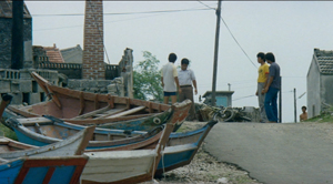
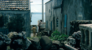
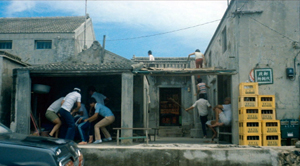
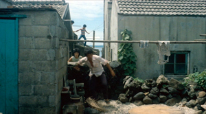
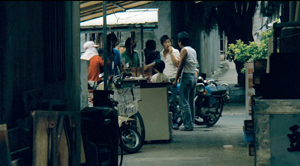
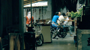
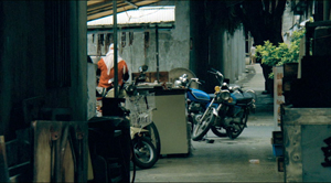
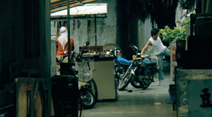
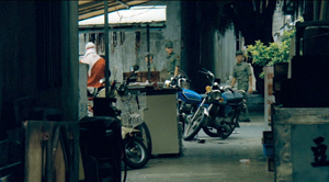
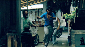
Early in the film, a street fight passes in and out of a far-off intersection among stalls. The dust-up stirs only slight interest from passersby, before bursting back into the alleyway and coming to the camera.
The masking of the fight by the setting can be seen as an extension of the way the walls in the Cute Girl surveying quarrel intermittently cut off our vision, but here it’s far more drastic and sustained.
I’ve drawn my examples from the early stretches of The Boys from Fengkuei, so as not to preempt your own discoveries as the plot carries the gang to the big city. In these scenes Hou in effect teaches us how to watch his movie. But I think I’ve said enough to suggest how Hou’s fresh conception of narrative, born of a renewed interest in local culture (already present in another register in the first three films), allowed him to carry his stylistic explorations to new levels.
Hou saw certain pictorial possibilities in the long lens, and after developing them to a certain point in popular musicals, he recast them when he took up another kind of storytelling. He realized that leisurely, contemplative narratives permitted him to refine these visual possibilities, and they could become powerful, nuanced stylistic devices. And he didn’t stop, as the films following his New Cinema works vividly show. His visual imagination seems unlimited.
A more general lesson follows from this. Norms of form and style are resources for artists. Some artists follow the schemas that they inherit, while others probe them for fresh possibilities. A few can even make a handful of schemas the basis of a rich, comprehensive style. Ozu did this with the techniques of classical Hollywood editing; Mizoguchi did it with depth staging in the long shot. Like these other Asian masters, Hou reveals how much nuance a few techniques can yield, even when deployed in crowd-pleasing, mass-market movies. And now, thanks to the vagaries of film culture, more viewers can come to appreciate his achievement.
The frames from Diary of Didi and Love, Love, Love are, alas, cropped video versions, but that condition doesn’t keep us from recognizing the telephoto lensing in the originals.
The Cinematek collection also includes sensitive English-language introductions to the films by Tom Paulus and enlightening audiovideo essays by Cristina Álvarez López and Adrian Martin.
The indispensable English-language sources on Hou are James Udden’s in-depth career survey, Richard Suchenski’s monumental anthology, Emilie Yeh and Darryl Davis’ study of New Taiwanese Cinema, and two monographs on City of Sadness, one by Bérénice Reynaud, the other by Abe Markus Nornes and Emilie Yeh.
The fullest account I’ve offered of Hou’s style are in Figures Traced in Light and in a video lecture, “Hou Hsiao-hsien: Constraints, traditions, and trends.” See also the several blog entries touching on his work. A broader account of the historical tradition to which he belongs can be found in both Figures and On the History of Film Style, as well as in entries under Tableau staging and in the video lecture mentioned already.
The Boys from Fengkuei.


