Archive for the 'Film technique: Editing' Category
A variation on a sunbeam: Exploring a Griffith Biograph film
Kristin here:
On April 21 a young Spanish film student uploaded his remarkable little film, Variation: The Sunbeam, David W. Griffith, 1912 onto Vimeo. There it languished, like so many contributions to the internet, good and bad. In the first four months of its presence on the site, it attracted 17 views.
Then, on August 17, Variation was viewed twice and earned its first “Like.” (One has to be a member of Vimeo to Like a film, so one cannot assume that none of its viewers to that point had enjoyed it.) That first Like, and perhaps both views were by Kevin B. Lee, best known for his many video essays on classic films. (See here for an index; I contributed the commentary for the La roue entry.) Over the next week and a half there were five additional views, four on August 28. I suspect some or all of these last ones were repeat visits by Kevin, since on August 31 he was the first to post an essay on Variation: The Sunbeam, David W. Griffith, 1912 (hereafter Variation), along with some information on its maker, Aitor Gametxo.
The immediate result was a flurry though not a stampede of views: 33 on August 31, along with a second Like; and 15 on September 1, with a third Like. One of those views and the third Like were mine. On September 2, there were 12 views, dwindling to 2 on September 3 and 1 on September 4.
(Among the viewers after the Fandor entry was Evan Davis, University of Wisconsin-Madison film-studies alumnus, who read Lee’s blog, watched the film, and passed the links along to us. Thanks, Evan!)
It’s a pity that more attention has not been paid to this charming, clever, and informative film. Not only would people enjoy it, but it could easily be used as a tool for those teaching, or indeed researching silent cinema. So here’s my bid to help it go viral.
Variation is a found-footage film based on Griffith’s American Biograph one-reeler The Sunbeam, made in December, 1911, and released on March 18, 1912. It is not among the most famous of the nearly 500 one- and two-reelers Griffith directed at AB between 1908 and 1913, but it’s better known than most. In the opening, a sick mother dies, and her little girl, thinking her mother is asleep, goes out into the hallways of their working-class apartment building. She tries to find someone to play with, but everyone rebuffs her until she manages to charm two lonely people, a bachelor and spinster, who live opposite each other on the floor below the child’s home.
Aitor noticed three key things about the film. First, the action takes place in a very limited space, with the three apartments and hallway all close to each other. Second, the doorways through which the characters pass between these rooms are on the edges of the screen, so that when they exit through the doorway in one shot and after the cut enter the space on the other side of the doorway, there is often a sort of elusive match on action formed (what I termed a “frame cut” in The Classical Hollywood Cinema, p. 205 and figures 16.36 and 37). Third, and perhaps most importantly, Griffith was intercutting actions that were happening simultaneously, so that at many of the cuts, he jumped from the end of an action in one space back in time to catch up with what had been happening in another space. At times he would jump back twice if simultaneous actions were happening in three spaces.
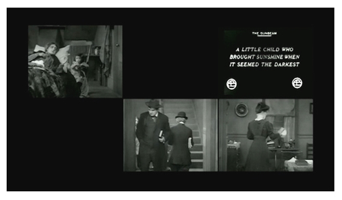
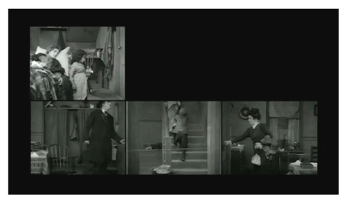
Aitor has taken the individual shots and redone them, putting them into a grid of six small frames, three on the bottom and three at the top. Scenes in the child’s upstairs apartment are shown only in the upper left, the top of the stairway in the upper center, and the two apartments on the ground floor at the sides, with the hallway and bottom of the stairs between them. (See above.) These are roughly the actual positions these spaces occupy in relation to each other in the building represented in the film. The shots run in their true temporal relations, so that there is no jumping back.
I suggest that before reading further, you watch The Sunbeam, especially if you have never seen it before. It would be impossible, I think, to entirely follow the story just from seeing Variation. The shots are so reduced in size to fit into the grid that small but important gestures and details get lost. Here is the original film, from YouTube.
With Aitor’s kind permission, we present his take on Griffith’s one-reeler. (The Sunbeam runs about 15 minutes, but due to the simultaneous presentation of many shots, Variation is only about 10 minutes.) Click on the “Vimeo” logo in the lower right corner for a larger image:
A fascinating film, isn’t it? I think many viewers would reach the end of Variation and wish that the same sort of presentation could be created for other films–at least, early ones that are short enough to make such rearrangement viable. Kevin Lee is enthusiastic about the idea: “Imagine this multi-dimensional, real-time approach being applied to footage from other films, as a way of not just mapping out scenes in a movie, but also gaining insight into filmmaking technique.” It might be possible, but the six-rectangle grid used here would not work for very many films. Aitor has chosen the ideal film for such an approach. Not only are there a limited number of significant characters, but they also live in the same building, with three rooms and a hallway, all viewed from the same direction, making them fit perfectly into a “doll-house” style scene.
Had Griffith not routinely shot directly toward the back wall in all his sets, placing the shots directly side by side across the grid would not work, at least not so neatly. Many other directors of this era were exploring shooting into corners and having doorways for entrances and exits centered at the rear. Perhaps filmmakers like Aitor could still place different shots side by side, but the actors’ movements from one space to another would not be so smooth. One of the attractions of Variation is that those movements are smooth, and as a result the action plays as if it were part of a continuous, “real” film.
Even other Griffith films shot in the style of The Sunbeam would be far more difficult to lay out on a similar grid. Longer rows of more rectangles would need to be added, or the upper row would have to represent actions taking place at a distance and the lower one actions taking place within a building. (I’m thinking here of something like The Lonely Villa, where action in a series of contiguous rooms is intercut with the husband’s race from a distant locale back to his house.) The placement of the bachelor’s room opposite the spinster’s, on either side of the hallway through which all of the minor characters pass, is crucial to Aitor’s project. A complex film with many characters and locales might create a grid with rectangles too small to be grasped by the viewers. Ways of indicating techniques like flashbacks would have to be devised. And of course, not all films contain simultaneous action.
Variation has some technical disadvantages. The titles appear in the upper right corner of the screen, since no locale opposite the child’s apartment is ever shown. The titles are small and difficult to read, and since they pop up simultaneously with the action, it’s almost impossible to read them anyway. One cannot tell where the titles originally came in the flow of shots, though one can always check the original film. Another problem is the cropping of the images on all four sides. The DVD copies are somewhat cropped, and more of the image is eliminated in the Variation frames; the action of the little heroine hiding a hairpiece in the spinster’s home, an important motivation for later action, can barely be grasped because it is so small a detail and happens at the very bottom of the frame; in the DVDs it can be clearly seen.
The Griffith Project and our knowledge of his techniques
I do not intend by any means to diminish what Aitor has accomplished when I say that the three main techniques he works from have been known to Griffith scholars for years. Variation offers a new way of examining and explaining those techniques.
Griffith has, of course, been one of the most closely studied filmmakers in history. A vast summary of and contribution to the research on Griffith was recently compiled by “Il Giornate del Cinema Muto” film festival in Pordenone, Italy. From 1997 to 2008, the festival mounted a nearly complete retrospective of Griffith’s work, hampered only by those films which still exist only as negatives or in other forms that could not be projected. A team of experts divided up the work and wrote extensive program notes for every single film Griffith made, whether it was shown at the festival or not. The notes, some more general essays, and Griffith’s writings were edited into twelve volumes jointly published by the festival and the British Film Institute (1999-2008). I had the privilege of contributing notes to most of the volumes, and although I cannot claim to know Griffith’s entire œuvre intimately, I got to know the films assigned to me quite well and learned a great deal about his methods.
The program notes for The Sunbeam were written by Griffith specialist Russell Merritt (Volume 5, 2001). As these excerpts from his description of the film’s setting indicate, the doll-house arrangement of the sets in The Sunbeam were distinctive, but not atypical of Griffith’s approach:
This was the second of Griffith’s three December tenement films (falling between The Transformation of Mike and The String of Pearls); spatially it is his simplest. Griffith uses only five setups (fewer than half what he works with in The Transformation of Mike and The String of Pearls.), but far from feeling cramped or monotonous, the three rooms and two hallways spaces seem perfectly designed for the playful romps, the practical jokes, and the unfolding of the gentle love story.
By 1911, the Griffith apartment set had developed a personality of its own, or more precisely, had become both distinctive and flexible enough to accommodate a broad range of narratives. Griffith’s planimetric style, with the camera always aimed straight on into the back wall with at least one side of the room aligned to the margin of the frame, had become as much a Biograph signature as the last-minute rescue, the fade-out, parallel editing, and the stock company of actors [….] In The Sunbeam, the familiar hallway and one-room apartments turn into something resembling a row of a child’s wooden blocks or the rooms in a child’s dollhouse, albeit with a dead mother in the garret. In each space, whether the hallway, the spinster’s apartment or the bachelor’s one-room across the hall, there is something to play with or play upon. The prank with the string stretched across the hallway literally links the two apartments and provides the perfect center of a the film–a gag that depends upon the mirror symmetries of the rooms and the tug-of-war actions of the two incipient sweethearts. (p. 196)
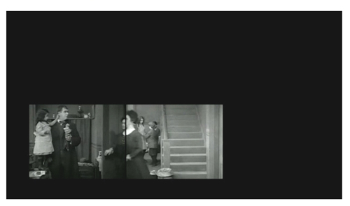
For the prank with the stretched string made symmetrical spatially as well as temporally, see below.
Ben Brewster and Lea Jacobs’ book Theatre to Film (1997) points out that cutting among multiple adjacent interior rooms was typical of Griffith’s work in this period: “By early [1911] a film like Three Sisters has a climactic sequence of 28 shots alternating between three set-ups–long-shot views of three rooms, a kitchen, a hall, and a bedroom, which movements from room to room that coincide with cuts establish as side by side.” (p. 189) My own notes for The Griffith Project volumes discuss adjacent sets and room-to-room movements using frame cuts. (See the end of this entry for a list.)
Griffith’s use of editing to convey simultaneous events, as well as to portray thoughts and flashbacks has been extensively discussed in the literature on the director.
What is remarkable is that a 22-year-old film student has noticed these devices and found a simple, elegant method to demonstrate what we already knew, but with greater precision and vividness than could be done with prose analysis. To experts, that is what should make Aitor’s film so appealing.
For example, the precision of Griffith’s matches on action at the frame cuts is illustrated time and again in Variation:
Were it not for the fact that Griffith’s camera is closer to the action in the smaller hallway set than it is in the two outer rooms, the spinster’s move through the door would almost appear to be a single smooth glide. Unless one freezes the frame, as I have done here, some of these movements look uncannily continuous.
For those teaching or reading Film Art: An Introduction, Variation also provides a clear example of story time versus plot time. Griffith’s The Sunbeam presents us plot time, with its jumps backward to cover all the action in multiple locales. Aitor’s film presents story action as we ordinarily would reconstruct it only in our minds. Usually we describe story action with synopses or outlines. To see it played out in real time is a rare treat.
The filmmaker
Aitor has a blog, which contains primarily many lovely still photographs taken in Spain, Ireland, and the United Kingdom. It offers, however, minimal information about him. Kevin Lee wrote to ask him for information, which is included in the Fandor entry linked above. I also emailed Aitor with some questions to further contextualize Variation, and he provided a short summary of his background and his interest in Griffith.
My name is Aitor Gametxo. I was born in Bilbao in 1989 and have been living in Lekeitio. I started the Communication and Film degree in the University of the Basque Country, but I moved to the University of Barcelona to finish it this year. I’m currently living and working in Barcelona, and I’m going to do a “Creative Documentary” masters degree this upcoming year. I really enjoy taking pictures of everyday things and places, as a way of reporting reality. I also love film, specially documentaries, found footage films and cinema-essay pieces. I honestly believe in the power films have to make us think about things. Not only because of the topic the film is about, but also about the way in which the film is made (a kind of dialectics between Bill Nichols’ expository and reflexive modes). I love watching old (and odd) films and thinking about things that are different from the purpose they were created for. (As I told Kevin) we are able to take some footage which is temporally and geographically unconnected to us and remodel, or refix, or remix… it, giving birth to another work. This is the way I see the found-footage praxis.
About this particular film, The Sunbeam, I watched it for the first time just before doing the variation. I knew other works made by Griffith, such as “Intolerance” (quoted in several film history books). But this was unknown for me, so that the first watching was crucial. While I was enjoying it, I was wondering what the place where it was shot looked like. I suddenly imagined it as a two-floor house, where the characters cross in some moments. Also the doors were essential to fix one part with another. This was the main idea where I worked on. It was great fun doing it.
The result is this variation in real-time action of the classic work where we can see how Griffith worked on. It’s like returning back to Griffith’s mind, to the first idea, as he imagined one hundred years ago (!) how The Sunbeam would look like. This is the magic of cinema.
My contributions to The Griffith Project‘s program notes for the Biograph years are these. In Volume 2, January-June 1909: Those Boys; The Fascinating Mrs. Francis; Those Awful Hats; The Cord of Life; The Brahma Diamond; Politician’s Love Story; Jones and the Lady Book Agent; His Wife’s Mother; The Golden Louis; and His Ward’s Love. In Volume 3, July-December 1909: Lines of White on a Sullen Sea; In the Watches of the Night; What’s Your Hurry?; Nursing a Viper; The Light That Came; The Restoration. In Volume 4, 1910: A Child’s Faith; The Italian Barber; His Trust; His Trust Fulfilled; The Two Paths; and Three Sisters. In Volume 5, 1911: The Lonedale Operator; The Spanish Gypsy; The Broken Cross; The Chief’s Daughter; A Knight of the Road; and Madame Rex. In Volume 6, 1912: The Unwelcome Guest; The New York Hat; My Hero; and The Burglar’s Dilemma. In Volume 7, 1913: The Hero of Little Italy; The Perfidy of Mary; and A Misunderstood Boy.
Like the other contributors, I found myself dealing with a few famous films (e.g., the wonderful Lines of White on a Sullen Sea) and others that were largely unknown. Each little cluster of titles assigned to us consisted of films that had been made sequentially, so that each of us could get an intensive look into Griffith’s work over the course of a few weeks. It proved to be a rewarding way of approaching the study of the director. The general editor for the series was Paulo Cherchi Usai, assisted by Cindi Rowell.
The Sunbeam is also available in the U.S. in two DVD sets: Image’s “D. W. Griffith: Years of Discovery: 1909-1913” and Kino’s “D. W. Griffith’s Biograph Shorts Special Edition.” (The discs can also be bought separately.)
Looking different today?
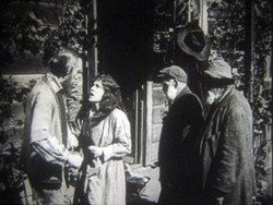
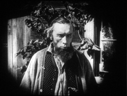
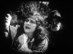
Johan (1921).
DB here:
Earlier this month Manohla Dargis wrote a New York Times article on how we watch, or should watch, films that some audiences consider slow and boring. She suggested that appreciating such films requires us to cultivate fresh ways of seeing. Her article and my interests coincide on this matter, so I wrote an entry developing some ideas about viewing strategies and skills. This piece also, happily, brought new readers to Tim Smith’s experiment in tracking viewers’ scanning of a scene in There Will Be Blood.
Today I explore another angle on the problem of how to watch movies that aren’t the normal fare. But this time what’s abnormal for us was once normal for everybody. I look at the pictorial possibilities that emerged in the 1910s. Those possibilities are of interest if we want to fully understand film history, but they offer some mysteries as well. If viewing movies involves skills, did people a century ago have the ones we have? Or did they employ different viewing habits, ones that we have to learn?
Editing, your imaginary friend
I write from my annual research trip to the Royal Film Archive of Belgium, now known as the Cinematek. For some years, I’ve been looking into feature filmmaking of the 1910s. On every visit I’ve found rich material, movies off the beaten path that give me a sense of the immense creativity of that early period. (See the bottom of this post for links.) The official classics of these years, by Chaplin and Griffith and Fairbanks and Bauer and Gance and Sjõström and Feuillade, remain remarkable, and Kristin’s latest entry makes a case that Alberto Capellani belongs among this heroic company. But you can also find extraordinary moments in ordinary movies. Even the most banal film has something to teach me about what choices faced the era’s filmmakers.
One of those teachable elements involves the ways in which directors guide our attention. We know that editing serves to shift our attention from one part of a scene to another, but so does judicious staging. This is one of the great lessons of the cinema of the 1910s. Watching films from that period convinced me that the craftsmanship of Anderson in There Will Be Blood, and of other directors reliant on long-take ensemble staging, has deep roots in filmmaking tradition. But the golden age of cinematic staging was relatively brief, and it was eclipsed by an approach based largely on editing. That approach is, essentially, still with us.
Let’s start by appreciating the technique that became most prominent. By the late 1910s, Hollywood filmmakers had more or less perfected what we’ve come to call the classic continuity editing system. The camera could penetrate the most intimate exchange, breaking it up into intelligible bits. Here, in a minor Metro film called False Evidence (1919), Madelon tries to persuade her father that she, not her boyfriend, is responsible for a crime.
After giving us father and daughter close together in profile, the camera has somehow squirmed in between them, showing each one in a tight 3/4 view. Or rather, the cutting has forced the staging to pull the characters a bit apart so that each one can have a frame to him- or herself. Spatial plausibility gives way to dramatic urgency; what we care about are clear views of their emotional responses. As long as the spatial relations remain clear, they can be just approximately consistent.
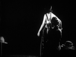
For a little more finesse, we can look–as usual–to Rio Jim. William S. Hart’s films are among the most visually elegant and ambitious of this period, and even his less-known items seldom disappoint. John Petticoats (1919) gives us “Hardwood” John Haynes, a rough-edged logger who finds he has inherited a New Orleans dressmaking shop. His comic introduction to the place, in the company of a new friend he’s made, uses editing to tease us. The two gents come in, with John bewildered by a feminine world he’s never known. They pause before a model sashaying on the stage, and when she pauses, she’s blocked by the Judge’s body.
We’re left without the revelation of her appearance, but when her dresser comes forward to peel off her wrap, we cut, in effect, “through” the Judge to get a clear view of the disrobing. The blocked shot teased us, but the cut pays us off.
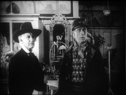
Now that the model bares a lot more than before, the biggest tease begins. How will John react? The answer is given in the next shot, a nearly 180-degree shift from the earlier framing of the men that incorporates a mirror in the background to keep the model onscreen.
Thanks to a cut, action and reaction are given in the same shot–in fact in the same zone of the frame, the center.
A pass, a pat, a squeeze
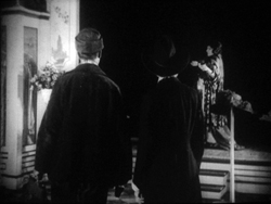
Fabiola (1918).
Many European directors were moving in the same direction as Lambert Hillyer in John Petticoats. Although they might not use as many shots or as many different angles as their American counterparts, they were confidently breaking their scenes up into closer views, often through axial cuts that take us straight into or out of the action, along the lens axis.
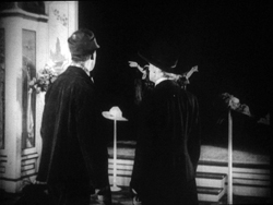
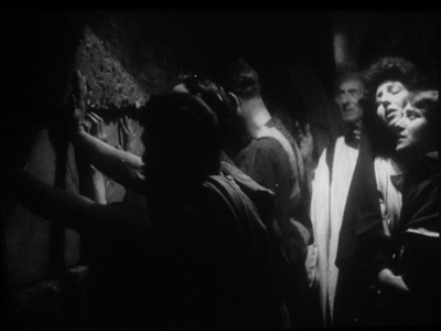
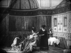
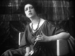
Take Enrico Guazzoni’s Fabiola (1918), henceforth known to me as Fabulosa. Normally I consider the Roman oppression of Christianity one of the least fertile topics for a good movie, but Fabiola proves me wrong. For one thing, the title names a rather unpleasant woman who barely figures in the action until the climax. For another, Guazzoni proves an adept filmmaker. I was struck by those immense sets that distinguish the Italian costume drama, the dazzling lighting (see above), and the skilful editing.
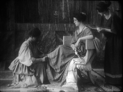
Our introduction to Fabiola comes as she sits disdainfully in her household, attended by servants. After a long shot showing off the set, an axial cut takes us closer to her.
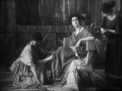
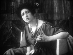
She turns as her tardy servant Sira comes in. Having stretched her elegant neck, Fabiola tips her head forward slightly, in a bob of disdain.
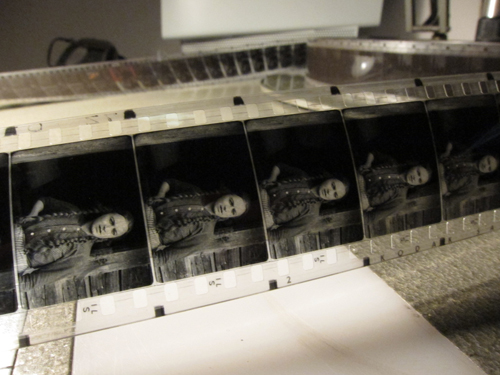
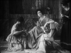
Another axial cut takes us still closer to her. And in a few frames her gesture, at once haughty and angry, is repeated. (The streak across the first image below is the splice, so this is the very first frame of the next shot.)
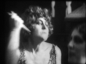
This, I think, is no mistake. The matches on action elsewhere in the film are quite precise, and indeed earlier Italian films have shown that directors used this device skilfully. Guazzoni wanted to stress Fabiola’s head movement, and he used the same tactic, the overlapped action match, that some Americans would use and that many Soviet directors drew on later. This slight accentuation of Fabiola’s gesture is a vivid way to introduce the character, caught in a characteristically scowling moment. Very soon, in a fit of pique she’ll jab Sira with a hatpin.
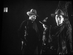
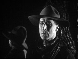
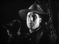
On the whole, keeping the setups close to the camera axis is the default value in Fabiola. For the Americans, though, cutting made the camera almost ubiquitous. A year after John Petticoats, O’Malley of the Mounted (1920), lets Lambert Hillyer again resort to intelligible shifts of setups. O’Malley, played by Hart, has gone undercover to track a killer. Posing as a robber, he has joined an outlaw gang, but they’ve discovered he’s betrayed them and plan to hang him at sunup. He’s lashed to a tree and guarded by his enemy, the brutal Big Judson. But Rose Lanier, who has drifted along with the gang, is going to help O’Malley escape. The cutting will show us exactly how she does it, and why.
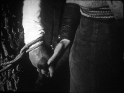
Rose interposes herself between Big and O’Malley, chatting up the thug. A cut of about 180 degrees takes us to the opposite side of the tree and shows her slipping a knife toward O’Malley’s hand. We’re so familiar with this sort of insert that we’re likely to forget that once it was fresh.
O’Malley starts, then shifts his gaze toward Big.
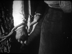
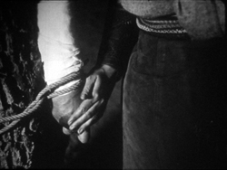
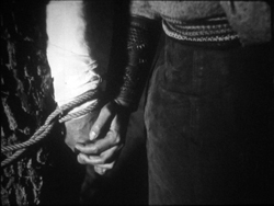
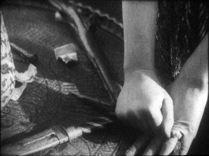
Then comes a simple, remarkable shot. Rose slips the knife to O’Malley. Then she pats his hand. Then she gives it a squeeze.
Mystery and charm of the American cinema, as Godard would say: a single cut-in of hands can give us a lot. First there’s the narrative information (I’m passing you the knife), then Rose’s expression of support (Good luck!), capped by a burst of affection (I love you). The whole thing takes less time than I’ve used to tell it. Surely this ability to invest plot-driven detail shots with heartfelt emotion helped American cinema conquer the world. I’m tempted to say that we could sum up of the power of Hollywood, in its laconic prime, with that formula: the pass, the pat, the squeeze.
This shot is as compact in its expression as the previous one. It’s impossible to capture here all the emotions that flit across O’Malley’s face: hope of eluding death, realization that Rose loves him, anxiety that surviving will make him choose between love and duty. Rose’s brother is the killer he’s been tracking, and in a perversely honorable way O’Malley had looked forward to being hanged. That would have spared him arresting the boy. Now he must live, enforce the law, and lose the woman who has saved him.
I saw some European films that absorbed such continuity tactics quite deeply. Above all, Mauritz Stiller’s Song of the Scarlet Flower (Sangen om den Eldroda Blomman, 1919) and Johan (1921) relied heavily on analytical editing in the American fashion, including angled shot/ reverse shot. As in Fabiola, some of the discontinuous cuts have their own logic. I wish I had time to explore those Stiller films in more detail–particularly their use of turbulent rivers as dynamic plot elements, not mere landscapes. Maybe in some future entry….
Four-quadrant style
Before they adopted the analytical editing characteristic of American cinema, directors were still able to guide our attention. The so-called “tableau” style, about which I’ve waxed enthusiastic on this site before, became a rich tradition in the 1910s. Editing within the scene is minimized. (Apparently most European directors didn’t consider it a creative option in its own right until later in the decade.) The drama is carried by performance and ensemble staging. Relying on movement, acting, and composition, the director controls where we look and when we look at it
To take a straightforward example, consider the rather ordinary melodrama Le Calvaire de Mignon (Mignon’s Calvary, 1917). The scheming and dissolute Dénis de Kerouan wants to wreak misery on his brother Robert. While Robert is out of the country, Dénis hires a forger to fabricate a letter indicating that Robert has a mistress. Dénis leaves the letter on the desk for Robert’s wife to find.
Dénis has exited through the central entryway, and into the empty study comes Robert’s wife. She discovers the letter.
She moves to the left foreground and starts examining it. At this point Dénis’ face peeps out from behind the central curtain. The director makes it easy for us to notice him because nothing else is happening in the set, and Denis’ face is rather close to the wife’s. It’s almost as if he’s looking over her shoulder.
Once we register Dénis’ presence, the director can proceed to balance the shot. All that empty real estate on the right of the frame asks to be filled, and that’s what happens.
When the wife reads the damning letter, she collapses rightward into the chair, just as Dénis rushes forward to take charge of the situation.
This move exemplifies the staging technique known as the Cross, which motivates the switching of characters’ positions in the frame.
Simple as it is, this portion of the prologue of Le Calvaire de Mignon shows how, without cutting, a director can steer us to one or another zone of the shot through such cues as faces, centering, proximity to points of emphasis, and movement. Something similar happens in one, more striking moment of another fairly unexceptional movie from the period.
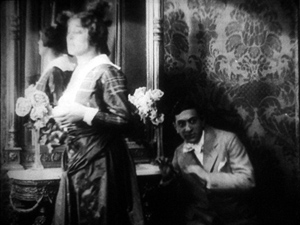
Nobody will claim Der Stoltz der Firma (The Boss of the Firm, 1914) is a masterpiece, or its director Carl Wilhelm is a master. It’s one of the many comedies in which Ernst Lubitsch starred before becoming a director. Here he’s Siegismund, a bumbling young provincial with more aspirations than abilities, who simply lucks into marrying the boss’s daughter. On the way to the happy ending, he wins the patronage of a fashion designer, Lilly, whose husband finds her flirtation with the young parvenu none too innocent.
Wilhelm’s use of the tableau approach isn’t especially dynamic in most of the film, but there’s one flashy scene. Wilhelm gets us to watch a very small, tight area of the frame and then gently swings our attention to a wider swath of action. As usual, everything depends on a sort of task-commitment on our part: Watch what’s likely to forward or enrich the ongoing narrative.
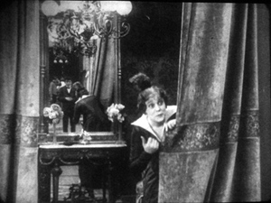
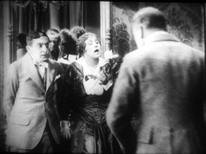
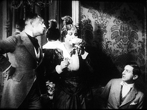
Lilly lures Siegismund into a changing room, with the composition showing him reflected in a mirror behind her. This sets up an item of setting that will be central to the scene.
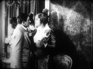
Once inside, he coyly presents her with a flower and they draw close together. Since we tend to concentrate on faces, the small area encompassing their two profiles is likely to draw our attention. Nonetheless, the shot is notably unbalanced, as if anticipating something coming in from the right side.
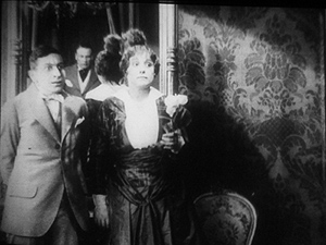
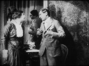
Abruptly Siegismund and Lilly draw apart, and the space between them, in the mirror, is filled by the face of Lilly’s husband, coming through the curtain.
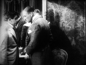
I’d bet that a Tim Smith experiment would find that nearly every spectator is already watching this small zone in the upper left quadrant of the shot. Faces, especially frontally positioned ones, command our notice, and thanks to the mirror we here have three of them. Moreover, movement is an attention-getter too, and all three faces are in motion. Mr. Maas’s face, in fact, gets notably bigger and clearer. His wrathful expression is another reason to watch him.
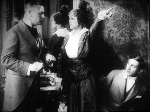
The husband’s body enters to fill the frame, then presses into the center of the shot, blotting out Lilly as he faces down Siegismund.
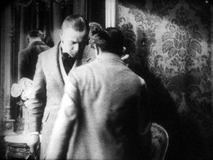
Now the director controls the speed of our gaze quite precisely. Maas slowly rotates, forcing Siegismund to swing from left to right, as if he were attached to the bigger man by a rod. This yields, again, that nice sense of refreshing the frame that we always get from a Cross.
Siegismund collapses into the lower right of the frame, flinching from the fight that’s about to start. Lilly soon shoves aside her husband’s chastisement and melodramatically tells him to leave. “We’re divorcing!” the following intertitle says.
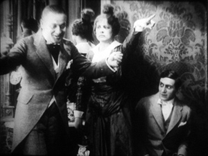
Mr. Maas takes it in stride, shrugging and spreading his arms. He leaves, and thanks to the helpful mirror we can see him chortling as he glances back and passes through the curtain.
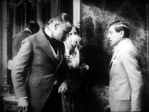
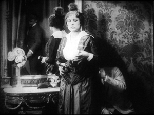
If we hadn’t already noticed Siegismund cowering behind Lilly in the lower right quadrant, we will now. Lilly angrily flounces to our left (the Cross again). Siegismund rises to explain he hadn’t meant to cause a rift in the marriage.
We’re back to something like the initial setup, but now with Siegismund centered, the couple further apart, and a less unbalanced frame. The drama, which now consists of Lilly inviting him to tea tomorrow, can proceed from here.
A different way of seeing?
Tom Tom the Piper’s Son (1905).
We’ve become used to editing-driven storytelling, and I’m convinced that we can learn to notice the staging niceties of the tableau alternative. But what if early filmmakers explored some other ways of looking that are far more unfamiliar to us today?
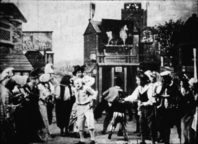
Noël Burch, in his 1990 book Life to Those Shadows, argued that in the first dozen years or so of cinema, movies solicited viewing skills that we lack today. He suggested that early filmmakers often refused to center figures and crammed their frames with so much activity that to our eyes the shots look confused and disorganized. In Tom, Tom, the Piper’s Son (1905), Burch notes, the bustle of the fair, the reliance on an extreme long shot, and the absence of any cutting make the central event, Tom’s swiping of the pig, difficult to catch. In the frame surmounting this section, Tom is making off with the pig in an area just right of center, but the antics of the clown and the response of the crowd may well distract us from the main action.
The result, says Burch, is a mode of filmmaking that demanded
a topographical reading by the spectator, a reading that could gather signs from all corners of the screen in their quasi-simultaneity, often without very clear or distinctive indices immediately appearing to hierarchise them, to bring to the fore “what counts,” to relegate to the background “what doesn’t count” (p. 154).
Later developments linearized this field of competing attractions, creating a smooth narrative flow “harnessing the spectator’s eye.” Among these developments were the presence of a lecturer at many screenings (telling people what to watch) and, of course, the growth of the continuity editing system. But Burch suggests that the “primitive mode” hung on until about 1914.
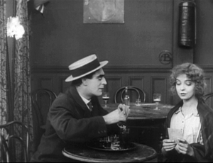
A famous example is a shot from Griffith’s Musketeers of Pig Alley (1912). The gangster has lured the Little Lady (Lillian Gish) into a back room and distracts her with a photograph while he tries to dope her drink, in a precursor of date-rape drugging. But the Snapper Kid, another gangster, has been keeping an eye on her and follows. As the gangster starts to pour the drug out, the Kid’s entry is presaged by a whiff of cigarette smoke.
At the crucial moment, we have three things to notice: the Little Lady’s obliviousness, the gangster’s pouring the drug, and the full entrance of the Snapper Kid.
Today’s director would likely resort to editing that shows the doping, then the Kid arriving, then the doping again, and leaving us to infer a vague sense that they’re happening at the same time. Griffith’s choice gives us genuine simultaneity, but at a cost. Two cues compete for our attention: central composition for the drink, major motion on the edge for the Kid’s entry. In my experience, viewers tend to notice the appearance of the Kid, but to miss the business with the drink. (Another passage for Tim Smith to test!) By today’s standards, Griffith has failed as a director, but Burch’s view suggests that 1912 viewers, more sensitive to “all-over” composition, could have registered both actions, perhaps by rapidly scanning back and forth.
During my trip I found a fascinating example of this issue, as well as an apt counterexample. Both involve daggers.
In Maman Poupée (1919), a remarkable Italian film directed by Carmine Gallone, a devoted, somewhat infantile wife learns of her husband’s affair with a society woman. Susetta confronts the mistress and begs her to break off the affair. The woman laughs in her face. What happens next is given in several shots, mostly through axial cuts.
The linear editing, as Burch indicates, lays everything out for us step by step. The close-ups accentuate what is important at each moment: Susetta seizing the dagger, stabbing her rival, and–in a remarkably modern-looking extreme close-up–registering her horror at what she has done.
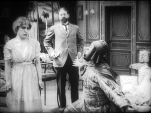
Two years before, Marcel Simon, the (Belgian!) director of Calvaire de Mignon, handled a similar situation rather differently. The diabolical Dénis, whom we met earlier, has succeeded in destroying his brother’s life. It remains only for him to force Robert’s niece Mignon to marry the Algerian Emir Kalid. Kalid is at first humble, beseeching Mignon to become his bride, but then he gets rough. We might note already that Mignon, while fairly near the camera, hovers close to the left frame edge.
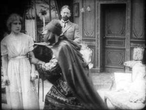
In their tussle, Mignon snatches something from Kalid’s waistband and flings him far away to the right.
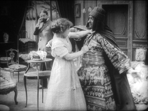
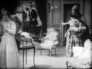
What’s up? Mignon has grabbed the Emir’s dagger and stands poised with it pressed to her heart. But we haven’t been able to see that dagger very clearly (no cut-in close-up here, as in Maman Poupée) and she’s returned to her position far off-center. It’s likely that a viewer today wouldn’t understand that she’s holding the men at bay by threatening suicide. Would a 1917 viewer be as uncertain? Would the situation, plus her posture and the men’s hesitation, be enough to get the point across?
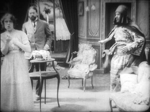
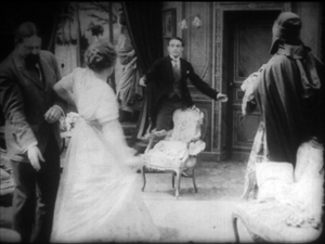
Moreover, this moment goes by very quickly. Scarcely has Mignon struck her pose when her true love, René, bursts in behind her–frontal, fairly centered, and moving fast. Meanwhile, Dénis is sneaking up on her, hugging the left frame. Mignon makes a break for René, dropping the still almost indiscernible dagger.
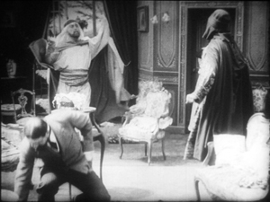
While Mignon and Rene embrace in the right rear doorway, blocked from our view by Kalid, Dénis stoops over. It’s a timely adjustment, giving us full view of the benevolent Le Maire sweeping into the room.
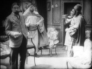
As the two men confront one another–the climax of the scene–director Simon has the effrontery to let Dénis steal the show. He picks up the dagger, which now can be seen more or less plainly, weighs it in his hand, and looks out for a brief, pondering moment.
We seem to have a late example of the Snapper Kid Effect, in which important actions compete for our attention. Is it clumsy direction to perch Mignon on the frame edge as René rushes in, and to let Dénis recover the dagger while we’re supposed to concentrate on the face-off between the two powerful men? Or would audiences have tracked all the strands of action and enjoyed their simultaneity?
On this site and elsewhere, I’ve assumed that directors in the 1910s structured their compositions for what Charles Barr calls “gradation of emphasis,” a fluid pattern of primary and secondary points of attention. I’ve argued as well that Burch exaggerates the decentered, nonlinear compositions of even the earliest years. Many of the films staged by Lumière cameramen are designed cogently, and so are many films from the 1900s. (Tom, Tom might be the exception rather than the norm.) Yet every so often, you get a later case, like Musketeers of Pig Alley or Le Calvaire de Mignon, that suggests that some viewers might have been more adept at tracking simultaneous events than we are.
A still broader question remains. Let’s assume that people were able to follow and enjoy films in the tableau style, even when that style pushed toward illegibility. What enabled people to adapt, and so quickly, to continuity-based movies? Some scholars and filmmakers argue that continuity editing achieved its power and worldwide acceptance because it mimics our natural mode of perception. At any moment, we’re concentrating on just a small portion of our surroundings, and this is like what editing does for us in a scene. On the other side, Burch and others would argue that continuity filmmaking is only one style among others, with no special purchase on our normal proclivities. On this view, classical continuity’s apparent naturalness hides all the artifice that goes into it, and this concealment makes its work somewhat insidious. I’ve offered some thoughts on this problem elsewhere, but I bet I tackle it again on this site some time.
In any case, we need to study films that seem odd or difficult, whether they’re recent or from the distant past. We’re guaranteed to find some striking and unpredictable things that provoke us into thinking. That’s one of the pleasures of exploring the history of film as an art.
For earlier studies of the tableau style on this site, see this entry on Bauer, this one on 1913 films, this one on Feuillade, and this one on Danish classics. This entry discusses the emergence of Hollywood-style continuity, and this one explores the exemplary editing in William S. Hart films. I go into more detail in two books, On the History of Film Style (chapters four and six) and Figures Traced in Light (chapter two) and in the essay, “Convention, Construction, and Cinematic Vision” in Poetics of Cinema. The last-named piece tries to stake out a middle position on the “naturalness” of continuity editing. Kristin has analyzed Alberto Capellani’s films as instances of the tableau trend, last year here and just last week here. She also weighs in on the debate about whether viewers of his time were better prepared to grasp the action than we are. More generally, Capellani’s career exemplifies the major and swift stylistic changes of the 1910s. When he went to America, he became pretty adept at the emerging continuity style, as the Nazimova vehicle The Red Lantern (1919) indicates. Of course that’s got some striking single images too.
The Red Lantern (1919).
Cognitive scientists 1, screenplay gurus 0
Kristin here:
The annual meeting of the Society for the Cognitive Study of the Moving Image is currently taking place at Elte University in Budapest. It runs from June 8 to 11. It must have started off very well. Barbara Flueckiger posted this comment on the opening keynote address on Facebook: “Just attended an absolutely fascinating and inspiring talk by Talma Hendler, a professor of psychiatry and neuroscience: ‘Brain Shows Where the Drama Is. A Call for an Empirical Neurocinematic Agenda.'”
Last week David posted a new web essay on “common-sense film theory” as a way of participating from afar in the work going on in Budapest. Now it’s my turn to post a SCSMI-related item.
The mirage of the second-act desert
Twelve years ago I published Storytelling in the New Hollywood (Harvard University Press). It included a claim that most classical Hollywood feature films have four acts, lasting roughly 25-30 minutes each, adding up to a film of from 100 minutes to two hours. This claim ran counter to the old notion, popularized by Syd (Screenplay) Field, that Hollywood movies (and, according to Field, all feature narrative films) have three acts of 30, 60, and 30 minutes respectively.
My book analyses ten films in detail, dividing them into their four parts: Setup, Complicating Action, Development, and Climax (usually including an epilogue). I also have an appendix listing ninety additional films that I timed by large-scale part, ten for each decade from the 1910s to the 1990s. My conclusion was that most of these films stuck to the four-part structure with each part within five minutes either way of lasting a half-hour. Some of the exceptions were actual three-act films (e.g., Adam’s Rib) and others were longer films. Amadeus, one of my ten main examples, is 160 minutes long and has five large-scale parts. (“Large-scale part” was the rather cumbersome term I employed in the book, trying to avoid the misleading word “act.” I have to admit though, that there’s little chance of people discontinuing “act” and switching to “large-scale part.”)
I also defined the “turning point” that Field says divides acts more concretely than he does, specifying that it usually results from moments when the main characters formulate or modify the goals that drive the narrative forward. (I expand upon the relationship of goal shifts and turning points in a previous entry.)
Unlike Field and other screenwriting “gurus,” I allow for exceptions to my four-part schema. The Pink Panther doesn’t have a turning point until over 52 minutes in; the lengthy early part of the film consists of a bedroom-farce situation of male sexual frustration that makes absolutely no progress toward the putative subject of the film, the theft of a valuable jewel. As far as I can tell, It’s a Mad, Mad, Mad, Mad World has no turning points at all. I remember thinking it was quite funny when I saw it as a child.
Some screenwriters have read the book, and some who teach screenwriting courses assign it as a textbook. At least it’s still in print, which is something to be grateful for at my age.
Since the book was published, it certainly hasn’t knocked out the conventional view that films have three acts. Not infrequently I read a review in Variety or another specialist journal that refers to the last quarter of the film as the “third act.” The idea that films fall into chunks lasting 30 minutes, 60 minutes, and 30 minutes, no matter how counterintuitive or inaccurate, is too entrenched to be dislodged, apparently.
Still, I have the consolation that I’m apparently right. Other people have tried out my claim and found it to work. Creative Screenwriting gave a very kind review to my book (in its March/April 2002 edition, not online). D. K. Holm, the reviewer, was inspired to test out my system on the next three films he saw in theaters. He declared that it worked as predicted for The Shipping News, In the Bedroom, and even Ali, a five-act film. (My claim is that longer films don’t stretch their four acts. They add more, roughly 30 minutes long, for every half hour beyond the standard two-hour feature. Roughly half an hour apparently seems to create a pleasing balance as far as Hollywood practitioners are concerned—whether they’re aware of it or not.)
Real scientists at work
Now James E. Cutting, whom we enjoyed meeting and talking with at last year’s SCSMI conference (David devoted part of his report on the conference to James’s work), has collaborated with two of his graduate students, Kaitlin L. Brunick and Jordan E. DeLong, on a quantitative study related to Storytelling. They set out to test the whether the four large-scale parts of a classical film are reflected on the stylistic level. Specifically, do shot lengths and the use of non-cut shot transitions (fades, dissolves, and the like) vary in a patterned way across or among the parts?
It’s exciting to see cognitive scientists study claims that I’ve made on the basis of close film analysis. David has had his claims about staging and attention in There Will Be Blood confirmed by Tim Smith’s eye-tracking research on the same sequence. Now the results of Cutting, Brunick, and DeLong’s work relating to the four-part structure have been published in Projections (Vol. 5, issue 1, Summer 2011), subscriptions of which are included in SCSMI membership. Luckily I didn’t know this article was on the way, or I might have been in some suspense to find out whether my model worked. (This and other articles on film are also available online, linked from this page that lists the work on film published by James and his colleagues.)
As the authors’ starting point, they accepted my four-part structure. Or as they put it:
We find Thompson’s argument persuasive and her data remarkably clean. Nonetheless, the division into acts is built on a detailed analysis of the narrative, and we work from the physical properties of film. Many observers might agree on act divisions, but these divisions would not necessarily be reflected in any physical measure of a film’s shots and transitions. Thus, without prejudice as to what we might find, we sought data in shot lengths and in shot transitions that might corroborate Thompson’s analysis. (p. 4)
The team used 150 films they had previously studied in their work on editing patterns and their possible correlations to human attention. Of these, some were eliminated because they were too long, so that the statistical work could concentrate on films with four parts. I cannot claim to be able to follow all the statistical manipulations the data from these films were put through—though I can tell from the information in the footnotes that the degree of probability for some of their results indicated an amazingly small chance of error.
The figure at the top is a “scatter plot” of shot lengths for 143 Hollywood films from the period 1935 to 2005. These figures have been statistically adjusted in ways that allow the films to be compared despite their differing lengths. (I have no idea how this sort of thing is done. You’ll have to see the explanation in the article.)
One striking revelation of this chart is that the lengthiest shots in the films occur at the beginning, end, and at the one-quarter, two-quarter, and three-quarter points. Moreover, the “scallop” pattern of rising and falling average shot lengths shows a “tendency toward intensification of films near the middles of acts, where shot lengths become slightly shorter.” The ASLs were found to be as much as 1.1 seconds shorter than in the early and later portions of the acts.
Luckily I was right about the four parts. But beyond that the authors came up with results supporting my claims about the functions of the plot’s third part, the Development. Here’s how.
As part of the study, the authors tackled the question of where non-cut shot changes fall in relation to the quarters of films. Non-cut changes are fades, dissolves, and the like. It turns out, not surprisingly, that quite a few of them come early on, since the exposition may move among time and places setting up the basic premises of the narrative. But the rest tend to come in the third quarter, the Development. That makes sense to me. By my definition, the Development is essentially the stretch of action where most of the major premises, goals, and obstacles have been established. Before the climax can begin, the protagonist usually struggles against obstacles, usually provided by the antagonist. Often relatively little happens in the Development to forward the action, at least in comparison with the other three parts. At the Development’s end, some vital last premise is introduced that allows the action to move into the climax portion, where the plot moves forward relatively quickly and no more major premises are introduced.
The Development might contain extra fades and dissolves for two reasons. First, a surprising number of films have a montage sequence shortly after the middle turning point. The one depicting Michael Dorsey’s rise to fame as Dorothy Michaels in Tootsie is one such. Second, since the Development often is the section where time passes until the point where the climax can begin, one would expect fades or dissolves to cover temporal gaps. I’d have to go back and watch a bunch of films to confirm those hunches, but they seem logical.
My main purpose in writing Storytelling in the New Hollywood was to show that the principles of classical narrative construction formulated in the 1910s and used throughout the studio era are still operative today. Despite film reviewers’ complaints that action and special effects have come to substitute for story appeal in modern mainstream films, the kinds of films they find so shapeless do usually stick to the same four-part structure, contain goals and conflict and the rest of the principles that have been in effect for decades. Cutting, Brunick, and DeLong’s work bolsters this claim about classical narrative’s stability over time. They find that “there are no obvious differences in these patterns for films of different eras.” (p. 8.)
This issue of Projections has other articles applying a cognitive-science approach, and with luck future issues may contain some of the papers we have been unable to attend at this year’s conference.
James, Kaitlin, and Bradford have set up an online overview of their research in progress, “Shot Structure and Visual Activity: The Evolution of Hollywood Film.” The graphics and type are quite small, but right-click on the page and click “Marquee Zoom,” which brings up the little magnifying glass that allows you to enlarge it multiple times.
For online applications of the idea of four-part structure, see David’s essay on Mission: Impossible III and his blog entry on Source Code.
Jordan DeLong, Kaitlin Brunick, and James Cutting at annual convention of SCSMI, Roanoke 2011.
Graphic content ahead
Kristin here:
Recently I received the June issue of Empire magazine. After the shock of realizing that, Ack! It really is almost June, I turned to the letters to the editor. I received an even worse shock when I read this one:
I recently discussed 2001: A Space Odyssey with my Film Studies teacher (I’m an A-level student), and mentioned (what the back of the DVD case says): “One of the most mind-blowing jump cuts ever conceived.” He told me the bone to satellite scene is actually a match cut. I then read issue 262 of Empire, and was very happy to see a Stanley Kubrick special. I noticed you also called it a “stunning jump cut”. After being told what a jump cut and what a match cut is and seeing a few examples (the jump cut at the start of Don’t Look Now, and then the match cut in 2001: A Space Odyssey), I am now confused as to why the DVD and Empire would call it a jump cut when it is a match cut.
Robby Burke, via email
It is a match cut. The offending writer has been put into a small room with only Eisenstein films for company. The moral of this story is always listen to your teachers, kids. And good luck to Owen Robinson on your Kubrick Film Studies unit. This is turning into hospital radio.
No wonder Mr. Burke is confused. His teacher and Empire both gave him answers that I would consider wrong, or at best imprecise to the point of vagueness. This rather surprised me. I enjoy reading Empire, which has somehow managed to keep itself fat and glossy when magazines like Entertainment Weekly have shrunk to the size of brochures. It even has occasional useful articles, like its retrospective section on Back to the Future in the April, 2010 issue. (As far as I can tell, this section has never made its way to the Empire website.)
The term “match cut” is, out of context, virtually meaningless. There are different kinds of match cuts, and not specifying which type one is referring to will leave Mr. Burke and the rest of us clueless as to what the teacher and the unnamed staff member for Empire mean.
Thinking I was missing something about the term “match cut,” I looked it up on Wikipedia and discovered that the teacher and the Empire staff member might have gotten their misinformation from the entry on that phrase. Its definition of a “match cut” is:
A match cut, also called a graphic match, is a cut in film editing between either two different objects, two different spaces, or two different compositions in which an object in the two shots graphically match, often helping to establish a strong continuity of action and linking the two shots metaphorically.
While the Empire use of “match cut” was only vague, this definition is simply inaccurate. The author goes on to say:
Match cuts form the basis for continuity editing, such as the ubiquitous use of match on action. Continuity editing smoothes over the inherent discontinuity of shot changes to establish a logical coherence between shots. Even within continuity editing, though, the match cut is a contrast both with cross-cutting between actions in two different locations that are occurring simultaneously, and with parallel editing, which draws parallels or contrasts between two different time-space locations.
I’ll agree that continuity editing is designed to smooth over the potentially disruptive quality of cuts. Matching anything within a scene is definitely different from cutting from an action in one place to a different action in a different place. But graphic matches are neither synonymous with “match cuts” nor the basis for continuity editing.
I also discovered that the “Further Reading” list at the bottom included two items, one of which was Film Art: An Introduction. One of those good news/bad news situations. The good news is, if you read the book, you will find out what graphic matches, and matches in general, really are. The bad news is, if you don’t, you might blame us for the contents of the Wikipedia entry.
A little detour into history
Most people don’t realize this, but David and I invented the term “graphic match.” As we recall, this happened in 1975. David was teaching a course that involved screening Yasujiro Ozu’s second color film, Ohayu (1959), a wonderful comedy about television, farting, and small talk. We had never seen the film before and were watching a 16mm print of it.
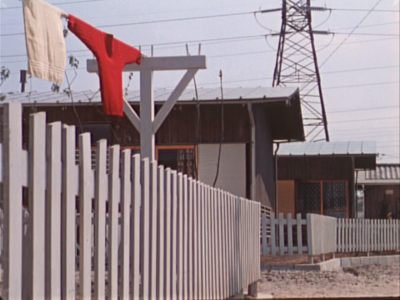
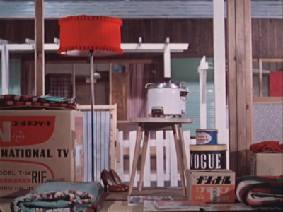
When the two shots below passed before our eyes, we both gasped and lunged for the projector. We ran the film back and watched the cut again. There was no doubt that Ozu had deliberately placed a bright red sweater in the upper left quadrant of the frame in one shot and a bright red lamp in the same basic position in the next shot. We didn’t know what to call this technique, so we dubbed it a “graphic match.” Two years later, when we started writing Film Art: An Introduction, we included the term as one technique of film editing and used Ozu’s match on red as one example. By now “graphic match” has been picked up to the point where we occasionally see it used in print.
If people, however, are tossing that term and “match cut” around so inaccurately–and even equating the two–then some definitions and examples seem in order.
Matcharama
“Match” as applied to editing simply means that some element is carried over from one shot to the next. That doesn’t necessarily mean that this element creates a sense of continuity.
In general, “continuity” means that a coherent space and time are continuing over the cut, so that the spectator’s understanding of a story isn’t disturbed by a sense that bits of time have been left out or that characters have changed positions at the cut. Most people watching a mainstream narrative film probably aren’t even aware of the editing, especially in conventional conversation scenes.
More specifically, “continuity” means a set of guidelines or loose “rules” that American filmmakers devised, mostly during the 1910s, to allow them to help create that clarity of narrative action in time and space. Within a scene, the most basic of these is the 180-degree rule or “axis of action,” the invisible line that runs through the scene perpendicular to the camera. If the camera stays on one side of that line, characters will stay in a consistent spatial relation to each other. Character A will be on the left in every shot, Character B on the right—unless one of them walks to a different part of the setting. In other words, the axis creates consistent screen direction.
The most basic kinds of matches are on appearance, position, action, and eyelines. Everyone knows that if a character is wearing a blue hat, showing her wearing a red one after the cut is a continuity error. Her appearance has not been matched. The same is true if she is resting her cheek on her hand in one shot, but has both hands flat on the table after the cut. If she is walking in one shot, she should not be running or standing still in the next. Even if the shots are made with a single camera and the actress repeats her actions, her position and movement should ideally be repeated so precisely that her action appears continuous. That’s a match on action, one of the most common continuity devices.
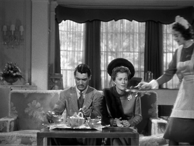
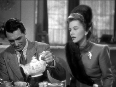
Smooth matches on action are difficult, especially if, as often happened in classic studio filmmaking, the two shots are made hours or even days apart. Even a supreme technician like Hitchcock can err. Here is a flagrantly mismatched passage from Suspicion. In the long shot, Johnnie (Cary Grant) reaches for the teapot with his left hand and starts to pour.
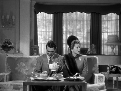
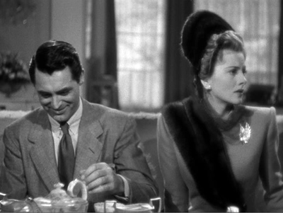
But then Hitchcock cuts in axially, the teapot is back where it was, and Johnnie once more reaches for it. By the time he’s pouring now, Lina has turned to watch him.
Editors traditionally like an overlap of 2-4 frames when they’re matching action on cuts, but this is a much longer overlap, something on the order of four seconds. Why we don’t usually notice such things is a source of considerable discussion in film circles.
The eyeline match is also very common. If a character looks at something offscreen, a cut shows us something in a different space, and we tend to assume that the character is looking at what we now see. Screen direction is important here, since if the character looks off right, when the next shot appears, we assume he is now offscreen left.
Not all continuity devices involve matches of these kinds. Crosscutting and flashbacks may move the action away from the space and even the time of a scene, but there are other cues that help us keep track of the ways in which these new spaces relate to the storyline.
None of this requires what we would consider a graphic match. Of course, if we see the same characters in the same setting from shot to shot, there will be an overall graphic consistency. They’re wearing the same costumes, and the background colors probably won’t shift greatly. But precisely because of that general consistency, we probably won’t notice the graphic qualities of the scene as being that important as elements of the editing. We’re busy following the story.
Graphic matches precise enough to be noticed as such tend to jolt us a little out of our smooth concentration on the story action. They are not the basic of continuity, as the Wikipedia definition claims. On the contrary, they often appear in films outside the continuity tradition. Abstract films often play on the graphic similarities (matches) or contrasts (mismatches) among shapes from shot to shot. Such abstract play is, in effect, their subject, and we pay attention to the pictorial flow as we would pay attention to story in a conventional narrative film.
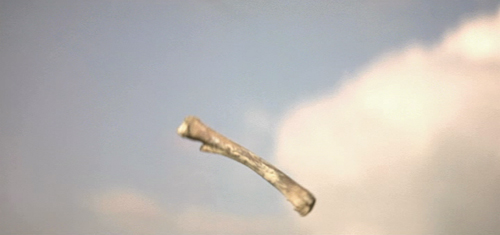
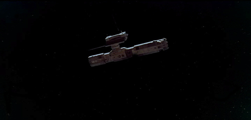
When close graphic matches or jolting graphic contrasts appear in narrative films, they may or may not play a narrative role. The famous bone/spaceship cut in 2001 is a graphic match. It’s not a match on action, since two different objects in completely different times and places are shown. It’s not a jump cut for the same reasons.
Here the graphic match is not really very close. The sky is bright and blue behind the bone, while it is dark behind the spaceship. Similarly, the bone is light in color, while the spaceship is initially dark, though it does brighten slightly as it moves. The only graphic element matched is the general shape and motion of the two objects.
The function, I assume, is to jolt the audience with the dramatic transition across millions of years and from earth into space. Thus here the graphic match has a narrative function, though it does not create the smooth movement from one scene to another that classical films tend to have. It’s more like what is sometimes called a “shock cut,” one which startles the viewer. The cut to the screeching cockatoo in Citizen Kane is one of the most famous examples, though it primarily involves sound and a strong graphic contrast.
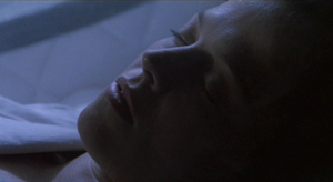
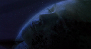
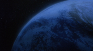
A transition somewhat similar to the one in 2001 occurs early in Aliens, an example which we use in recent editions of Film Art. A dissolve moves from a close-up of Ripley’s sleeping face to a view of part of the earth seen from space. Again there is a passage through time and space, though the interval is presumably only a few months. Here the graphic match is much closer than in the 2001 transition, with the colors as well as the shapes being kept fairly consistent. This graphic similarity and the dissolve that emphasizes it ease us from one scene to another rather than jolting and surprising us.
In the hands of an experimental filmmaker or of an unconventional director like Ozu, who avoids obeying Hollywood’s continuity guidelines, graphic matches don’t necessarily play a narrative role. They are included as an extra layer of engagement for the viewer. We don’t, or at least shouldn’t, expect to be able to interpret them. I would contend that the link between the red sweater and the red lampshade is there for pure pleasure. You can come up with an interpretation of the graphic match if you try hard enough—but if you do, please don’t tell me about it. I suspect it would interfere with my enjoyment of that scene when I next watch Ohayu.
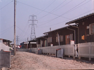
I don’t think the cut serves even so modest a function as establishing space at the beginning of a scene. Here’s the shot that actually begins the scene and leads to the sweater and lampshade shots:
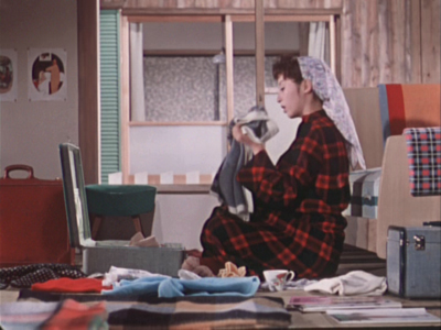
And here’s the one that follows the lampshade shot:
The woman is a minor character. She and her husband live in the suburban housing complex where the much of the action is set. They are more modern in their habits than their neighbors, wearing western clothes rather than kimonos and owning the only TV in the complex. They function primarily to introduce the two young boys in the central family of the story to TV, since they hospitably let the local kids visit them to watch it. The scene following the graphic match shows the wife packing to move. Their absence will precipitate a crisis when the boys demand that their parents buy them a television. The strife among the family members forms the basis for much of the rest of the action.
So the packing scene is important. Yet Ozu uses two shots that he wouldn’t need, thus delaying the scene’s beginning. The extreme long shot of the housing complex doesn’t tell us which house will form the setting for the upcoming scene. The red sweater is in the distance, but barely visible. We certainly wouldn’t notice it or get any clues about the narrative from it. Yet Ozu cuts to a closer view of the sweater and a towel. The houses in the background are all identical, and we don’t know which one belongs to which characters or which we will enter in the next shot.
The first interior view would be a logical establishing shot for the scene. The modern furnishings and especially the television box let us know where we are, and the boxes might hint that the inhabitants are packing to leave. So we are not surprised when we see the modern wife in the subsequent shot. But Ozu puts in the other two as part of his typical series of transitional shots that show the spaces between locales where action occurs.
The graphic match, I would suggest, is simply part of Ozu’s distinctive style. It’s playful and fits in with the general graphic beauty of his films, which includes bright splashes of color, careful compositions using the lines of the sets, and precise placements of props.
Returning to the Wikipedia entry for “match cut,” there is a section that mentions several examples, including the one that inspired Mr. Burke’s letter:
Stanley Kubrick’s 2001: A Space Odyssey contains a famous example of a match cut. After an ape discovers the use of bones as a tool and a weapon, there is a match cut to a spacecraft or satellite in orbit. The match cut helps draw a connection between the two objects as exemplars of primitive and advanced tools respectively.
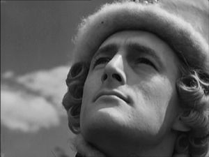
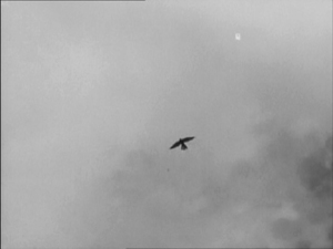
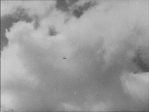
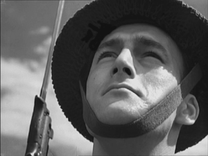
Michael Powell and Emeric Pressburger’s A Canterbury Tale contains the influence for the 2001: A Space Odyssey match cut in which a fourteenth century falcon cuts to a World War II aeroplane. The sense of time passing but nothing changing is emphasised by having the same actor, in different costumes, looking at both the falcon and the aeroplane.
An early example comes from Orson Welles’s Citizen Kane which opens with a series of match dissolves that keeps the lit window of C.F. Kane’s in the same part of the frame while the cuts take us around his dilapidated Xanadu estate, before a final match dissolve takes us from the outside to the inside where Kane is about to die.
Another match cut comes from Lawrence of Arabia (David Lean, 1962) where an edit cuts together Lawrence blowing out a lit match with the desert sun rising from the horizon. Director David Lean credits inspiration for the edit to the experimental French New Wave. The edit was later praised by Steven Spielberg as inspiration for his own work.
How the author knows that A Canterbury Tale (see below) influenced 2001 is not clear. The site footnoted (here) simply says that the cut (below) “anticipated” Kubrick’s scene in 2001. The film was released in the U.S. in early 1949, so possibly Kubrick saw it and remembered the scene nearly twenty years later. By the way, Powell and Pressburger create a double graphic echo, roughly matching the two similar dark objects against a light sky and making the two shots of the men looking upward strongly resemble each other as well.
The Citizen Kane opening, with its precise placements of the one lit window from shot to shot, is a good example of graphic matches. I am not going to touch the question of what a “match dissolve” is.
The cut from the match to the Jordanian desert horizon in Lawrence of Arabia is a trickier case. The match is placed in the left half of the anamorphic widescreen frame, while the sun rises in the right half. Moreover, the match shot is very bright, while the desert scene is fairly dark, with the sun only beginning to glow above the horizon a short way into the shot. Graphically there is not much to link them, though I think the spectator does get a strong sense of a connection between the match and sun. I’d say it’s a conceptual link, not a graphic one. It’s a link that we make on the basis of two bright objects that are not compositionally or spatially matched but simply juxtaposed.
Mr. Burke, your inquiry was perfectly reasonable, and I hope I have helped clear up your confusion.
We supply two flagrant examples of mismatched action, figure placement, and setting in Bringing Up Baby in this blog entry. Interestingly, probably no one but a professional notices them, because the relative positions of the major figures are consistent, as are the overall compositions of the shots. But then, as Dan Levin points out, we are not that sensitive to continuity disruptions in the real world either!
A Canterbury Tale.


