Archive for the 'Film technique: Editing' Category
Beyond praise 3: Yet more DVD supplements that really tell you something
Darby O’Gill and the Little People (1959)
Kristin here–
Every now and then I discuss a few DVD supplements that teachers might find useful for their classes, though they might be of interest to others as well. Previous installments can be read here and here.
Darby O’Gill and the Little People (Walt Disney Video)
Yes, you read that right. I can’t claim credit for having discovered this disc’s excellent supplement, “Little People, Big Effects.” Shortly after the second “Beyond praise” entry, Dan Reynolds, who teaches at the University of California Santa Barbara, wrote to recommend it.
Darby O’Gill was one of the few Disney live-action films I missed when I was growing up in the 1950s. I acquired the disc and started by watching the feature. I must say that this is one weird movie.
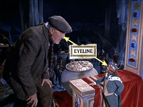
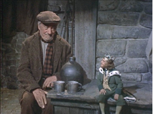
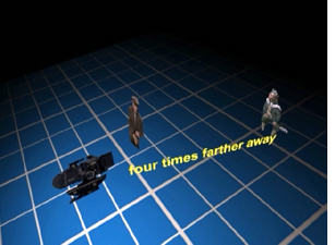
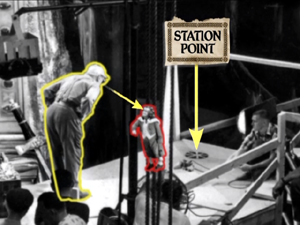
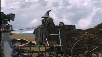
The “little people” of the title are leprechauns, and the special effects used to make them look small are mostly achieved through forced- perspective techniques. In less than eleven minutes, this supplement demonstrates the use of glass paintings, mattes, false perspective, and even a revived Schüfftan process, most famously used for Metropolis, where scale is manipulated by shooting into an angled, partially transparent mirror. Careful calculations allow for over-sized sets in the background to be lined up precisely with normal-scale ones in the foreground, so that the foreground person looks much larger then the background one. Since the two characters, here Darby and King Brian, are supposed to be conversing face-to-face, a manipulation of eyelines, a term we use a lot in Film Art, is necessary. (Despite what my spell-check keeps trying to tell me, “eyeline” is one word in the movie business, as demonstrated above.) In explaining how the actors knew where to look in the shot illustrated at the top, the film shows that “station points” were placed on the floor so that the characters’ eyelines would seem to match up (below). These days actors alone against blue or green screens often have to look at tennis balls to make the direction of their gaze match correctly.)
Clearly some behind-the-scenes footage was made during the production of Darby O’Gill, and this is incorporated into a documentary that includes interviews with master effects expert Peter Ellenshaw, who died in 2007. Ellenshaw worked as a matte painter on half the British classics of the 1930s and 1940s, including Black Narcissus (which has perhaps the greatest matte paintings ever). He then moved to Hollywood in 1950 and began a string of films with Disney that won him an Oscar for Mary Poppins. It’s good to have even these short clips of him demonstrating and discussing his work.
“Little People, Big Effects” should give students (and just about anyone else) a better grasp of perspective and its importance in the representation of depth on a flat screen. I would definitely show it as part of a study of cinematography. If a fifty-year-old film seems a bit out of date, point out to students that, as the narrator mentions, exactly the same techniques were used in many scenes of The Lord of the Rings to make the hobbits and dwarves look small. Similar demonstrations are provided in the supplements to the extended DVD version of The Fellowship of the Ring (Disc 1, “Visual Effects: Scale”).
Elijah Wood sits further from the camera than Ian McKellen in order to make him appear as small as a hobbit
Zodiac (“2-Disc Director’s Cut,” Paramount)
At the end of my first “Beyond praise” entry, I complained about the lack of supplements on the initial DVD release of Zodiac. Then, after the two-disc set with the supplements appeared in early 2008, I forgot to include it in the second entry. Better late than never, so I’m tackling it here. (The supplements are apparently the same for the Blu-ray set.)
As the “DVD Talk” review says. “The self-congratulatory praise is kept to a minimum.”
The main supplement is a 53-minute film called “Deciphering Zodiac.” It’s a good, objective, chronological summary of the film’s production. A lot of talking heads are included, such as the producer, scriptwriter, set decorator. That’s usually a good sign, since it shows that care was taken with the making-of and that enough of the crew members are participating that the account will probably be rounded. There’s a 15-minute making-of specifically on “The Visual Effects of Zodiac.”
Zodiac was primarily shot on professional-level digital cameras, apart from the slow-motion shots, which still need to be done on 35mm due to limitations of the digital technology. Hence there’s a lot of information here on digital techniques. Most of these techniques are used in ways that aren’t necessarily obvious to the viewer. If you want to show students some material on digital effects, this might be a good choice, since it avoids the flashy, obvious effects that so many fantasy and sci-fi DVD supplements concentrate on.
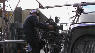
“Deciphering Zodiac” has shots showing the digital camera attached to an elaborate rig around a car, which was used to follow moving cars, including the famous opening tracking shot along a suburban street. The video-assist monitor is often visible in the shots.
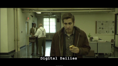
One change that digital filming has made in production has been the frequent use of “digital dailies” rather than dailies on film. (Dailies are the unedited takes just as they come from the camera(s); directors and other key creative people typically watch them at the end of each day.) Several scenes of the “Deciphering” documentary show raw shots and are labeled as digital dailies, something which doesn’t seem to be a common feature of supplements. It’s pretty obvious that the shot of Jake Gyllenhaal below would need to be manipulated in post-production. There’s also informative coverage of the methods used to match location and studio-shot footage, particularly for the scene where the killer shoots a taxi driver.
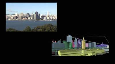
The visual effects documentary has good explanations of the early shot of a rapid move across the bay toward San Francisco as it looked in the period when the film’s action begins, a shot that was done entirely digitally.
Now that so many best-lists for the decade have included Zodiac, it seems to be an official modern classic. Perhaps a somewhat more dignified way of teaching special effects than using a Transformers movie.
The Dark Knight (Two-Disc Special Edition, Warner Home Video)
The supplements for The Dark Knight make a nice contrast with those for Zodiac. Here the makers of a spectacular action movie avoided digital special effects to a surprising extent. Instead they used practical effects, that is, effects accomplished via physical means while shooting rather than those done in post-production via laboratory or digital manipulation. Digital technology was used, of course, but often for rather modest tasks in planning and in erasure of unwanted elements. It’s also interesting as the first 35mm fiction feature to be shot partially on Imax cameras.
The main supplement is “Gotham Uncovered.” It begins by showing how the Imax camera was initially tested on a single action scene shot on location in Chicago. The results led to additional Imax scenes being added to the film. The advantages of Imax—primarily a huge gain in visual quality due to the larger size of the individual frames—are shown to be balanced against the camera’s limitations. The camera is much larger, making handheld shots difficult. It holds only three minutes of film and has a shallower depth of field. While interesting, this first section is surprisingly lacking in actual footage of the filming, often depending on still photos. We tend to assume that in this day and age, the making-of is taken into account from early on in a production. It’s surprising how often that turns out not to be the case.
A five-minute segment, “The Sound of Anarchy,” shows Hans Zimmer sitting at a computer and talking about the modernist, dissonant music for the Joker character. It’s mildly informative.
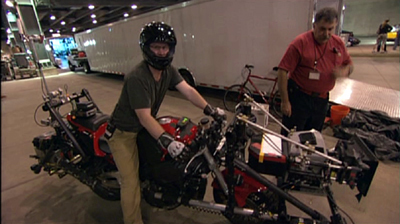
“The Chase” is perhaps the most useful section of the making-of. The decision was made to shoot the scene on Lower Wacker in Chicago. Here digital effects were kept to a minimum, with multiple cameras mounted on vehicles like the motorcycle below. These were special smaller Imax cameras. Only four such cameras existed at the time, though an accident reduced that to three!
One big moment in the chase has the Batmobile crashing into a garbage truck. Again, rather than resorting to digital effects, the crew built miniatures of the two vehicles and the set. The decision was also made to shoot a crash of an 18-wheeler on LaSalle Street using a real truck on location, and the scenes showing the practice sessions for this reveal the kind of planning that goes into the big action scenes that are so common in films these days.
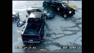
A multi-vehicle crash scene was done with several cameras, which is common practice for unrepeatable actions. (Even on a big-budget film like this, no one would want to crash more than one Lamborghini.) The cameras often show up in each other’s shots, and the supplement shows the resulting footage and how CGI is later used to erase them—again, a very common use of digital tools. Here a camera on a crane is visible at the center left in the original footage of the crash:
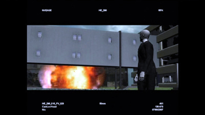
In one scene, the Joker walks out of a hospital, which explodes behind him. A prime candidate for digital effects, one would think. Instead, the filmmakers opted to have a demolition company destroy a real building. CGI was used to plan the scene:
A shorter supplement, “The Evolution of the Knight,” deals mostly with the design process for Batman’s suit and the Batpod. Again the emphasis is on bringing reality into the filming. It’s pointed out that while much of Batman Returns was shot on sound stages, the team decided to try and shoot the sequel in the city streets as much as possible.
Beware of these
I have to admit, one reason that this series appears so rarely is that for every DVD with useful supplements that I find, there are two or three uninformative ones that I have to sit through–or at least sample. In addition to recommendations, let me warn you away from some of the ones I switched off.
I had expected the Slumdog Millionaire DVD extras to be interesting, given the mixture of digital and 35mm shooting, the location work, and so on. But obviously the filmmakers had no idea that the film would be a success, so they seem to have done little behind-the-scenes shooting as they made it. The result is a not terribly informative, bare-bones 18-minute making-of.
Supplements as praise-fests have not gone away. Musicals seem especially to bring them out. “Get Aboard! The Band Wagon” provides 36 minutes of mutual admiration. In “From Stage to Screen: The History of Chicago,” Chita Rivera unintentionally achieves a parody of the gushing movie star who lauds everyone she worked with.
David and I just watched Cloudy with a Chance of Meatballs. I had liked it when I saw it in first run, and predictably, David enjoyed it, too. It’s a clever, well-scripted, well-animated film. We hoped to learn something from its supplements, but the making-of seems to be aimed at children, and young ones at that. The co-directors and some of the other filmmakers look distinctly embarrassed to be participating, partly because a lame comparison of making a film to mashing food together forms a running motif. A pity, since the movie deserves better. As reviewers keep pointing out, the best animated films these days are made for adults as much as for children.
A hundred years, plus a few thousand more, in a day
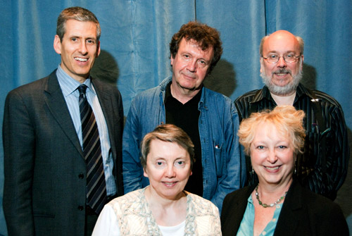
Charlie Keil, Yuri Tsivian, Henry Jenkins, Kristin Thompson, and Janet Staiger. Photo by Joel Ninmann.
Last Saturday we held the symposium “Movies, Media, and Methods” in honor of Kristin’s arrival at age sixty. Four distinguished scholars, all professors from major universities, presented top-flight talks. As a bonus, Kristin gave The Film People a glimpse into her Egyptological work. I report on this very full day in the hope of giving a sense of how stimulating we found it.
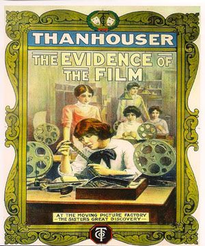
Thanhouser was an American film company that flourished between 1909 and 1917. It has been overshadowed by Biograph because that firm put out more films and, not incidentally, employed D. W. Griffith. But Ned Thanhouser has been diligently gathering his family company’s output from archives around the world and releasing it in informative DVD editions. The most famous Thanhouser production is probably Cry of the Children (1912), a powerful attack on child labor. You could also try the thriller The Woman in White (1917), adapted from Wilkie Collins’ masterful novel. A study in sadism, and more subtle than The Girl with the Dragon Tattoo.
Charlie Keil, an expert in 1910s US film from the University of Toronto, examined Thanhouser’s films with two questions in mind. Did the studio have a “distinctive personality” in its products? And does its output reflect the development of film style across the crucial transitional years of the early 1910s? Borrowing a method that Kristin had applied to Vitagraph films in an essay, Charlie took one film from 1911, one from 1912, and one from 1913. Charlie wasn’t ready to conclude that these specimens displayed a unique studio style, but it was clear that across just three years, big changes in storytelling were taking place.
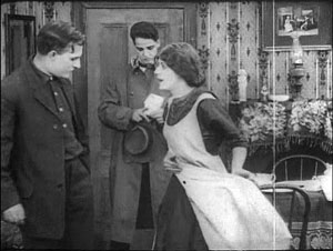
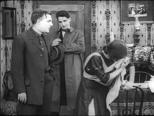
The plot of Get Rich Quick (1911) involves a man who joins a business that is scamming innocent investors. The film uses only five locales and plays scenes in long takes. The Little Girl Next Door (1912) has a more complex plot, with two distinct lines of action that converge on a child’s drowning. It uses many more locales and an ellipsis of a year to trace the changes in a family’s fortunes. It also incorporates cut-in close views and point-of-view editing. The Elusive Diamond (1913) is less psychology-driven than The Little Girl Next Door, but its intrigue relies almost completely on dialogue titles and it includes many close-ups and variation of camera setups.
Three films and three years: A vivid cross-section of the rapid development of what soon became classical visual storytelling. Moving from 18 shots to 53 shots to 74 shots, the films became less dependent on staging and more dependent on editing. At the same time, Charlie didn’t fail to notice how the long takes in Get Rich Quick allow some felicities of performance, particularly the way that the wife’s handling of her apron charts her psychological states. She brushes it aside to show how poor they are, then she uses it as a giant hankie.
Like all good papers, Charlie’s left a lot to be discussed. People asked about how much pre-planning was done at Thanhouser, about the directors and screenwriters on staff, about the division of labor. We were left with a sense that here was another mostly unknown region that would reward further study.
Fernand Léger, Cubist Charlot (1923).
Yuri Tsivian of the University of Chicago carried us into the twenties with an in-depth examination of early Russian reactions to Charlie Chaplin. The paper held many surprises. Chaplin was popular in many countries from 1915 onward, and very soon after he was celebrated by European intellectuals. But Russia lagged behind; there’s no concrete evidence that any Chaplin films were shown there until 1922. Yet the Soviet avant-garde embraced him. How and why?
Instead of looking for a dual relationship—Chaplin directly influencing Russian artists—Yuri postulated a “triangular” relationship, in which Chaplin’s image was mediated through other European sources. For instance, Léger’s numerous images of a fragmented Chaplin led Futurists and Constructivists to declare Charlie “one of us.” They loved the idea of man as a machine executing precisely articulated movement, and what they heard of Chaplin’s pantomime and gags led them to praise him. Chaplin, said Lev Kuleshov, is “our first teacher” because he knows bio-mechanical premises better than anyone. According to the photographer and graphic designer Rodchenko Chaplin instructs viewers in how to walk or put on a hat in the most perfect manner.
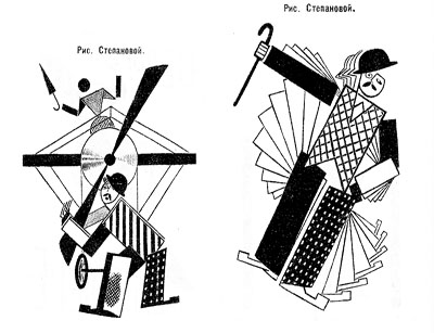
So strong was this “virtual” image that artists could read Chaplin into the slapstick comedians they did see. Yuri showed that Varvara Stepanova’s striking rendition of Chaplin as an airplane propeller derived from a film he wasn’t in!
Perhaps she didn’t care: Nikolai Foregger suggested that Chaplin himself was unimportant, that the crucial fact was that he created a whole school of comedians within what Yuri called “a collaborative research community”—that is, Hollywood!
Yuri’s paper, in homage to the Russian Formalists, invoked the “law of fortuity” in art. This refers to the possibility that artistic borrowings, blendings, and crossovers are not determined by any broader social processes, as the Marxists were arguing, but are merely contingent. “Life interferes with art from below.” Accidents and unforeseen intersections, such as the Chaplin craze meeting the Constructivist movement, allow artists to seize on whatever is around them for new material. Yuri’s reference was to Kristin’s revival of Formalist methods in her “neoformalist” studies of Eisenstein, Tati, and other filmmakers.
Janet Staiger of the University of Texas at Austin collaborated with us on The Classical Hollywood Cinema, and she has for several years been the leading scholar of reception studies in film and television. In looking at the Indiana Jones series, her paper nodded to Kristin’s work on the Lord of the Rings franchise and her study of fans’ responses to the films.
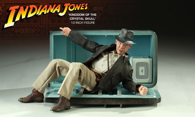
“Nuking the fridge,” Janet explained, has become fan jargon for an outrageous plot twist. The phrase comes from a notorious moment in Indiana Jones and the Kingdom of the Crystal Skull (2008), in which Professor Jones escapes an atomic blast by diving into a lead-lined refrigerator. The moment becomes a crux for clashing fan judgments: This is totally unrealistic vs. Realism doesn’t matter. Janet went on to show how these and other fan responses, entwined in IMDB commentary threads, utilized several different interpretive frames.
One was authorship. Like academics and journalists, fan are auteurists. They assign the director responsibility for major aspects of the film. But this doesn’t mean that they agree in how to use this frame. In the case of Crystal Skull, a certain Kid Mogul asked if Spielberg’s willingness to reinvigorate the franchise was purely mercenary: “Is it just about the money?” Others took a more career-survey approach, noting that after prestige pictures like Schindler’s List Spielberg recalibrated his popcorn movies, particularly by handling violence more gingerly.
Another frame was story-based “lit talk.” Fans disparaging the film found it clumsily plotted and lacking in character development. Several were quite sensitive to narrative coherence, one-off gags (such as nuking the fridge), and pacing. Those defending the film appealed to the emotional burst of the final chase scenes.
Janet’s third frame of reference was what she called “formula dissonance.” She sought to capture what seeing the film would be like for those who knew Indy’s story only through the TV series or video versions of the earlier installments in the franchise. She suggested that the formula was by 2008 quite abstracted and idealized for many fans. Their sense of the franchise was thus tested by the extraterrestrial twist that resolved the Crystal Skull plot. Does it reframe the whole series in a cosmic context, or is it a violation of the premises of the Indy universe?
Janet’s survey of these types of responses made me notice that the assumptions of academic film studies and of journalistic criticism overlap with fan conversation. Fans who liked the film tried to make everything fit by appeal to organic unity, technical proficiency, emotional intensity, and other familiar criteria. It made me suspect yet another reason why “amateur” and “professional” film criticism seem to be merging: Perhaps their conceptual frames of reference aren’t so far apart. But their tastes and their degrees of commitment surely are.
You might have expected Henry Jenkins of the Annenberg School at the University of Southern California to talk about fans too. After all, he practically invented the modern study of media fandom with his book Textual Poachers, and his work influenced Kristin’s study of fan promotion of The Lord of the Rings. Instead he turned to a survey of an artist’s oeuvre. He showed how Kim Deitch’s vast output of stories appropriate imagery from nineteenth and twentieth century mass media and present highly personal versions of the history of popular culture.
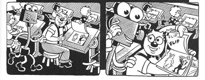
In a way, though, Henry’s talk involved fandom because Deitch is himself a prototypical fanman. He’s an obsessive collector, likely to turn his search for a rare toy or drawing into a Byzantine odyssey on the page. Fascinated by Hollywood scandal, he has constructed a phantasmagoric history of mass media through fictional characters (e.g., fake movie stars) who confront real people (e.g., Fatty Arbuckle). He’s particularly concerned about what he takes to be the warping of animated film by the influences of the mass market, epitomized by the Disney empire. The emblematic moment in Boulevard of Broken Dreams comes when Deitch’s Winsor McKay stand-in addresses torpid animators at a tribute dinner and denounces them for selling out.
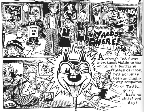
Deitch’s most famous character is Waldo the cat, and Henry traced the powerful connotations of this emblematic figure. Waldo recalls Felix, the most heavily merchandised comics figure before Mickey, as well as the black cat as a figure of deception, witchcraft, and even African-American minstrelsy. Through Waldo, Deitch could hop across the history of film and comics, from McKay to Mighty Mouse and 1940s abstract films. In Alias the Cat!, Deitch finds in the 1910s everything that we associate with media today: serial narrative, stories shifting across different media platforms, an uncertain line between publicity and self-expression, and a mixing of news and sensational fiction.
Henry situated Deitch in a broader trend of comic artists trying to find a new history of their medium, one that dislodges superheroes from a central role. Deitch’s themes of old-fashioned craftsmanship, lovably antiquated technology, adult dread and degeneracy lurking behind children’s stories, and the commodity demands of comic art link him to contemporaries like Chris Ware and Art Spigelman.
Henry’s talk spurred a lot of discussion, including the question of whether we can treat an artist as offering a history that is comparable to academic research. Can Deitch’s hallucinatory vision of American media be a plausible basis for understanding what really happened? On the whole we don’t expect an artist to offer rigorous arguments. An artwork appropriates history for its own end. (Not all the Greek philosophers actually gathered together in the way Raphael depicts them in the School of Athens painting.) How cogent you find Deitch’s critique probably also depends on whether you share his disdain for Disney. His floppy-limbed denizens fuse headcomix grotesquerie with the 1930s animation that most prestige studios abandoned. As in Sally Cruikshank’s sprightly cartoon Quasi at the Quackadero, Deitch’s rubbery frames revive a style in which everything seems to throb and shimmy.
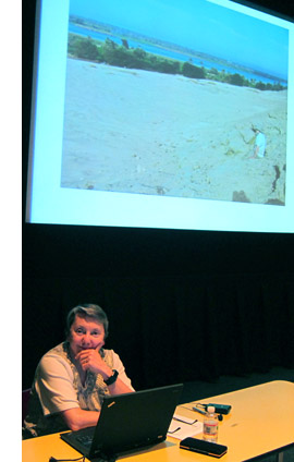
Kristin’s talk, “How I Spend My Winter Vacations: The Amarna Statuary Project and Techniques of Visual Analysis,” had two parts. In the second part, she reviewed her recent work in assembling statues out of tiny bits that had been dumped by archaeologists decades ago. You can read some of this story here. The side of her work most intriguing to students of film, I think, involves her attraction to Egyptian art in the first place.
Egyptian art is often thought of as unrealistic, but during his reign in the fourteenth century BCE the pharaoh Akhenaten introduced a peculiar sort of stylization into it. When he instituted a monotheistic religion centered on the sun god Ra (embodied in the Aten), he also demanded a new pictorial style. Thus the Aten is depicted as a disc shedding rays, a symbol of life and dominion. In addition, the royal family displays biggish hips and thighs, which fit the fecundity theme. More strikingly to our eye, Akhenaten’s family were represented as somewhat distorted, with long and narrow faces, hands, and feet. The ruler’s crown is elongated as well. Several aspects of the new style are present in Kristin’s favorite scene, a beautiful relief carving known as the Berlin family stela.
You can see the Aten’s rays ending in little hands holding ankh signs to the royal couple’s noses. But just as important is the human dimension of the scene, and two sorts of action displayed there: swiveled shoulders and pointing hands.
Unlike the flat, frontal portrayal we associate with Egyptian art, the family members are caught in twisting postures that bring one shoulder forward. Kristin explained:
Akhenaten is lifting his daughter, his foreground arm moving backward to hold her legs, the other moving forward to support her body as he kisses her. She reaches with her rear arm to chuck him affectionately under the chin, while her other arm moves backward in a pointing gesture. On the opposite site, Nefertiti’s foreground arm is held bent and backward to steady the youngest daughter of the three present, who is standing on her thigh and reaching up rather precariously to grab a golden decoration hanging from her mother’s crown. Nefertiti’s rear hand goes forward to steady the second daughter, who is also pointing, this time with her rear arm as she twists to look at her mother. These kinds of gestures can be found again and again in such scenes.
The twisting movement wasn’t unknown among images of workers and private individuals; Amarna artists, presumably encouraged by Akhenaten, applied the device to portraying the royal family.
Just as significant are the pointing gestures we find in the stela. Some scholars have interpreted them as protective gestures, which are found in other images. But Kristin points out:
 In those cases, the protecting figures hold their arms straight, they stare in the direction of the thing to be protected (as one presumably would in reciting a spell), and there is something dangerous present. None of this applies in the scene in the stela.
After pondering this scene quite a lot, it occurred to me that it looked like a really early film, a short scene, perhaps 30 seconds long, that we were to interpret as a tiny narrative. The pointing gestures seemed comparable to pantomime, where one has to interpret movements in the absence of intertitles.
Given that so much Amarna art is about displaying the royal couple as having created life by giving birth to their daughters and as sustaining that life, it seems to me that this stela is full of indications of nurturing. The columns and roof indicate that the parents have their kids in a little shelter to keep them out of the hot sun. The rows of pots behind Akhenaten’s stool are no doubt filled with cool drinks for them. Nefertiti carefully holds onto the two children on her lap while Akhenaten kisses the eldest. My interpretation is that the eldest is saying something like, why don’t you kiss sister, too?” and the one opposite is pointing out the kiss to her mother and saying something like, “Look, daddy’s kissing sister; I want a kiss too.”
This may not sound like the sort of thing kids would say, but the circulation of affectionate gestures among the family members in these casual scenes is nearly universal. The chucking under the chin gesture used by Meretaten here shows up again and again, as do embraces and kisses.
Despite all the stylization, then, Kristin concludes that the stela depicts a scene of intimate affection, complete with a child toying with a mother’s ornament. This homely realism chimes with other realistic tendencies in Amarna art, such as the differentiation of right and left feet and the presentation of plants and animals in non-stereotyped ways. In sum, Kristin’s ability to look closely at film style helped her make discoveries about visual narrative in a completely different domain.
So our Saturday talks included cinema-related material from 1911 to about 2010, and with Kristin’s lecture we flashed back about 3300 years. Every talk was crisp and lucid. We were spared the juggling of empty abstractions, the free-associative rambling, and the self-congratulatory cleverness that plague the humanities. We got knowledge and opinion presented with enthusiasm, modesty, and good humor.
Kristin and I are grateful to our presenters, as well to all the friends old and new who showed up: Leslie Midkiff Debauche from Stevens Point, Carl Plantinga from Michigan, Peter Rist from Montreal, Brenda Benthien from Cleveland, Virginia Wright Wexman from Chicago, Vicente José Benet from Spain (via Chicago) and many others. In all, a day to remember.
For more information on Kristin’s research see my earlier entry. For other cinematic implications of the Berlin stela of Akhenaten’s family , see Kristin’s blog entry here. Her article, “Frontal Shoulders in Amarna Royal Reliefs: Solutions to an Aesthetic Problem,” is available in The Journal of the Society for the Study of Egyptian Antiquities 27 (1997, published 2000).
All of our speakers are represented on the Web: Henry here, Charlie here, Janet here, and Yuri here (and of course on Cinemetrics). For more on Janet’s study of online critics and the frames they inherit, see her essay, “The Revenge of the Film Education Movement.”
Kim Deitch, Boulevard of Broken Dreams.
Scorsese, ‘pressionist
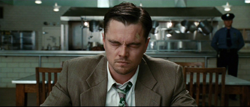
Shutter Island.
I was interested in the way she presented herself at that moment. Later on I figured out that as she gets up from the chair we should do it in three cuts, three separate close-ups, because I think he’ll never forget that moment the rest of his life. He’ll play it back many times. . . . It’s just his perception, his memory of what it’s going to be like. . . . We shot it very quickly, two takes each, one at 24 frames, one at 36, and one 48.
Martin Scorsese, on filming The Age of Innocence.
DB here:
Few directors think so carefully about how a film looks and sounds. Sensitive to technique in the work of classic filmmakers, Martin Scorsese has always tried to give each picture a vivid visual and auditory profile. Although he’s often praised for his realism (usually prefaced by the adjective “gritty”), Scorsese is often a subjectively oriented director. This quality goes beyond the justly celebrated performances of his actors. He is unafraid to use unusual cinematic techniques to thrust us boldly into the characters’ minds and emotions. In this effort he joins some great cinematic traditions. No surprise there: He has an immediate sense that film history hovers over every choice a director makes.
Spoilers loom out of the mist ahead.
Inside out, outside in
Raskolnikov.
Once American filmmakers developed a model of visual storytelling in the late 1910s, filmmakers elsewhere were surprisingly quick to push it in more subjective directions. There emerged something like an international division of techniques.
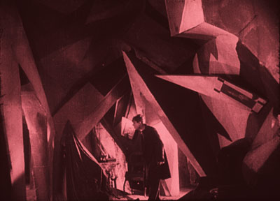
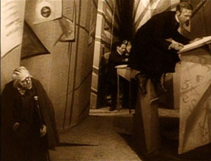
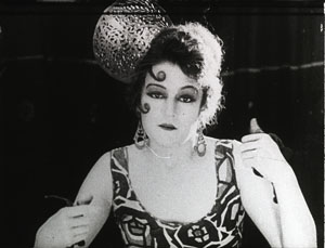
To convey inner experience, German directors of the 1910s and 1920s worked principally on aspects of mise-en-scene—performance, staging, setting, lighting, costume, make-up, and the like. The classic example is The Cabinet of Dr. Caligari (1920), in which the cutting and camerawork are fairly conservative, but the setting and acting seek to convey a madman’s vision of the world.
Caligari “subjectivizes” the characters’ surroundings, a process signaled through warped perspectives and fantastically distorted settings.
This brand of visual contortion became the hallmark of what was called German Expressionist cinema. Scholars argue about exactly what films belong under that rubric, but Caligari, along with From Morn to Midnight (1920) and Raskolnikov (1923, above), are pretty uncontroversial examples of making the external world reflect the characters’ psychic turmoil.
At the same period, French directors were also experimenting with subjective cinema. But they tended to concentrate less on mise-en-scene and more on what the camera could do to suggest both optical and mental point of view. In the so-called “French Impressionist” school, we find framings, angles, distorting lenses, changes of focus, slow-motion, and other cinematographic techniques used to suggest characters’ mental states. Thus in Germaine Dulac’s Smiling Madam Beudet (1923), the downtrodden wife sees her husband as monstrous.
In El Dorado (1921) Marcel L’Herbier uses a gauzy filter to suggest that his heroine is distracted, before pulling it aside and letting her face come into focus.
A little later, leading Soviet filmmakers made editing, not mise-en-scene or camerawork, their most salient technique. They experimented with graphic and rhythmic montage, as well as cuts that sacrificed spatial and temporal continuity to eye-smiting impact.
Of course this three-way division of technical labor is too neat. You find some camera experimentation in German Expressionism, as with the fast motion in Nosferatu (1922). The French were using rapid cutting even before the Soviets, as Gance’s La Roue (1923) shows. And some Soviets, such as Eisenstein and the FEKS directors, explored unusual lighting and camera angles. It should be said, though, that these shared techniques often serve different purposes. Fast cutting in Impressionist films tends to suggest the heightened experience of the characters, rather than serving, as in the Soviet case, to dynamize a historical situation for the viewer. The quick cutting in the carnival ride in Jean Epstein’s Coeur fidèle (1923) simulates the chaotic burst of “impressions” felt by the characters, but the quick cutting in the street riot of Strike (1925) doesn’t mimic the characters’ states but aims to arouse shock and suspense in us.
In any case, my technical division remains only a first approximation toward understanding pretty complicated historical trends. The main point is that both the German Expressionist and the French Impressionist filmmakers of the 1920s were seeking to use particular film techniques to give the audience a deeper sense of the characters’ sensory experience and emotional states.
American cinema selectively adopted some of these tactics of lighting and set design. In a blog entry and a web essay, I’ve written about William Cameron Menzies as one importer of the German approach. You can see Expressionist touches in Fox’s Mr. Moto movies. Likewise, 1940s films particularly enjoyed mimicking Impressionist camera tricks to signal drunkenness, delirium, hallucination, and other altered states. Hitchcock’s Spellbound (1945) and Wilder’s Lost Weekend (1945) are famous examples. Typically such Expressionist and Impressionist touches were associated with crime, craziness, or genre stylization. Much of this flagrant irrealism went out of A-pictures in the 1950s, but it survived in horror and, interestingly, in the US avant-garde cinema of Deren, Markopoulos, and others.
One of Scorsese’s contributions to the 1970s, I think, was to revive and consolidate this legacy. While we were celebrating his films as victories for urban realism and neo-Method acting, many of the movies were also charged exercises in subjective cinema.
Making streets mean, and meaningful
Taxi Driver.
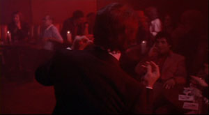
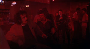
From Mean Streets (1973) everyone remembers the aura of street-punk camaraderie, the harsh turns of mood (usually triggered by Johnny Boy’s recklessness), and the vibrancy of the neighborhood, with its social hierarchy and rituals of bullying and bluff and negotiation. Alongside these tokens of realism we find breathless grace notes, as when Charlie glides through the club, a visual equivalent of his joy in being among pals and sexy women. (The shot was made by having Keitel ride the dolly instead of walking in front of it.)
This euphoria of this neo-Impressionist shot is counterbalanced later by the Rubber Biscuit song, with Charlie now thoroughly drunk and floating in grotesque frontal close-up before the floor rises up to kiss his head.
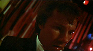
Charlie has come in to the club announcing himself as Jesus, a pious man to create order. Now this shot charts his fall from drunken exuberance into queasiness and mounting anxiety about Johnny Boy’s debt.
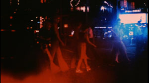
More generally, Tony’s club is given heavily unrealistic treatment through slow-motion and faked slow-motion, along with character movement synchronized with the music. If the camerawork mimics Charlie’s mental states in Impressionist fashion, the ruby-red club lighting suggests his erotic inflammation in a mildly Expressionist one.
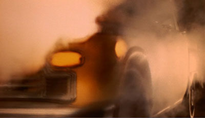
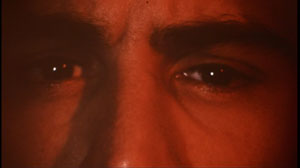
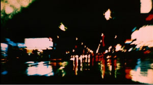
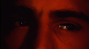
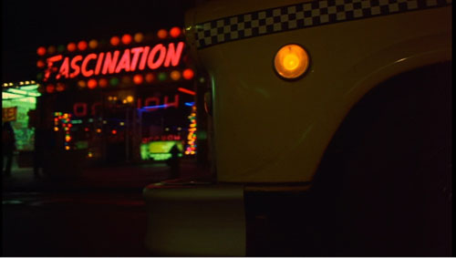
Taxi Driver (1976) is Scorsese’s most famous venture into subjectivity. From the first shot of the cab heaving through wafting vapor—steam? smoke? sulfur fumes?—we cut to a man’s eyes, and then to dissolving views of the city through a rainy windshield.
From the start Scorsese announces one of his most basic strategies: a realistic motivation for expressionist effects. It’s only rain, but shooting it through the windshield and adding slow motion gives the streets an otherworldly shimmer. As the neon dribbles down the glass, and we see pedestrians moving through tinted clouds like hesitant ghosts, the man’s face becomes bathed in a red glow—vaguely motivated as reflected from the traffic light, but unrealistically saturated, as in the Mean Streets club.
We see the real New York, but filtered through the eyes of a man who considers it an open sewer. The plot will soon lock us into his consciousness more explicitly, through restricted point of view and voice-over diary extracts and crisp montages of the cruising cab. In addition, the motifs introduced here, particularly purifying water and blips of light, will become elaborated in the course of the movie. The general point, however, is that Scorsese has updated Impressionist and Expressionist tactics in order to reveal a man’s mind through images.
Qui tollis peccata mundi
Bringing Out the Dead.
In some films Scorsese plays things straighter, invoking subjectivity only briefly. There are the prizefights and the visions of Vicki in Raging Bull (1980), and the slipperier passages of fantasy in The King of Comedy (1982). But other films plunge us deeply into subjectivity, forcing the world through the filter of a driven character’s sensibility.
For thoroughgoing efforts in this direction we can look to Bringing Out the Dead (1999). In this movie about a paramedic haunted by spirits of those unfortunates he might have saved, Scorsese along with cinematographer Robert Richardson and production designer Dante Ferretti reinvoke the nightmarish qualities of Taxi Driver. The exhilaration Frank Pierce gets from saving lives is offset by his despair at gambling with death every night. The result is another exercise in neo-Impressionism and –Expressionism.
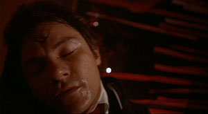
Once again rain and light, objectively out there in the urban world, become projections of the character’s tormented psyche, thanks to camera angle and framing. The windshield gives Frank’s face phantom tears.
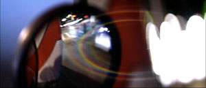
Once again concrete shapes and colors, filtered through a moving vehicle, are distorted to suggest the protagonist’s anxieties.
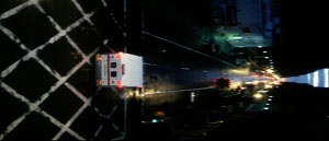
To measure Frank’s descent into desperation, the camera even follows the ambulance upside down, or sideways.
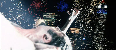
Scorsese ventures into full-blown Expressionism as well. There are naturally dream sequences, but we also get the unforgettable image of the drug dealer Sy, impaled on a fence rail and reaching toward skyscrapers as fireworks (real fireworks?) consecrate his gesture. Later, hurtling through the city and moving closer to mental breakdown, Frank starts to see every woman on the street as Rosa, the woman he could not rescue. How the Germans would have loved having CGI available for such a hallucination.
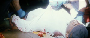
Perhaps the subtlest touches are the patches of blown-out white. At first they seem a signal of death, gleaming off the bodies of Mary’s father and the young man found on the street.
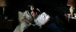
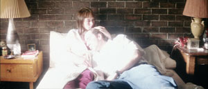
In the final scene, Frank tells Mary of her father’s death (and sees her as Rosa). She invites him in and eventually he falls asleep in her arms. The final shot quietly shifts from a normal, rather dark texture, to one endowing his shirt with a blinding glow.
This change in lighting and exposure, unmotivated by any realistic source, suggests that Frank feels he has found a bit of peace, while also hinting that a spiritual radiance has entered this unhappy world through a tortured secular saint.
Shutter Island caters to the ‘pressionist side of Scorsese’s vision. It hovers between realism and subjectivity: parts of what we see are really happening in the fiction, while other parts are wholly in Teddy/ Edward’s mind. The difference is that here the balance tips strongly toward expressionism. Apart from the dream sequences, certain hallucinations are rendered in undistorted terms. So, for instance, scenes like the cave conversation with the second Rachel Solando are wholly Teddy’s mental projections. Other scenes oscillate between subjectivity and objectivity, as when Teddy is preparing to set fire to Cawley’s car and talks with his wife Dolores–although the next shot confirms she’s not really there.
I find all this less resourceful than the virtuosic ways in which Scorsese subjectivizes the neighborhoods of New York. The Gothic trappings of the hospital, the cagelike wards, and the rainswept island offer less opportunity for novel stylization than an urban landscape. Moreover, I think that the creaky gimmick ruling the plot of Shutter Island relies on farfetched explanations and leaves too many loose ends. If the storm didn’t really occur, as Dr. Cawley tells us, then did the storm-tossed dialogues with Chuck not occur either? Why are the doctors talking about the prospects of a (nonexistent) flood before Teddy even comes into the room? And could the inmates be relied upon to execute the physicians’ complex role-playing game? A second viewing left me in the dark about matters that a Shyamalan would have tidied up.
But I did have to admire the way in which Scorsese uses Teddy’s breakdown as an alibi for the mismatched cuts I’ve objected to before. (Some legerdemain with a water glass is particularly clever.) And the ending supplies one further twist that somewhat ennobles the whole loopy contraption.
Cranking it up
Crank 2: High Voltage.
You can argue that Scorsese’s talent was well suited to this project: We don’t notice the plot problems because his stylistic assurance carries us along smoothly. That assurance allows me to raise my final point.
I’ve argued elsewhere, in books and on this site, that Hollywood storytelling techniques have been overhauled in recent decades. Over the last forty years or so, filmmakers have amped up the “continuity style” forged in the 1910s. They have cut faster, sometimes averaging 2-3 seconds per shot across a film. They have relied more heavily on singles (shots of one character), and these singles are often fairly large close-ups. Directors have also embraced extremes in lens lengths—very long lenses (for that perspective-flattening effect) and very wide-angle ones (often yielding flagrant distortions). Filmmakers have also relied a great deal on camera movement, frequently tracking in or out or even circling around the characters as they speak. The basic premises of continuity cinema aren’t violated, but the result is more aggressive visuals. Hence my label “intensified continuity.”
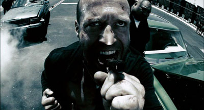
I think that intensified continuity became the new baseline for popular filmmaking both in the US and overseas. Over this style, however, some filmmakers have laid lots of fancy filigree. Many flashy techniques fill our movies. We get slow-motion, fast-motion, reverse-motion, ramping, and freeze-frames. There are brutal jump cuts, ragged shifts between color and monochrome, deliberately awkward framings, abrupt overhead compositions, slippery focus, and jerky handheld shooting. On the soundtrack we get ominous rumblings, metallic crashes, and noisy transitions. The Bourne films and The Hurt Locker (2009) offer moderate examples, but edging toward the extreme you have Crank 2: High Voltage (2009). Here intensified continuity has itself been intensified to a height of frenzied artifice. “Over the top” doesn’t capture it. There is, it seems, no longer a top to go over.
This swaggering style takes classical space and time as its basis—we still have analytical cutting, over-the-shoulder shots, and the like—but it pushes beyond the modest demands of simply laying out dramatic elements for easy comprehension. The intensified approach, itself trying for punch, has been raised to a new level of shock and awe. This trend, I’d speculate, is an escalation of tendencies seen in 1970s-1980s filmmakers like Brian De Palma, Ken Russell, Nicholas Roeg, Ridley Scott, and Scorsese.
Scorsese’s stylistic élan proved enormously influential, I think; Mean Streets is virtually a compendium of the new techniques. But unlike some others, he explored the emerging style in order to probe characters’ feelings and moods. Many of today’s amped-up techniques come off as merely eye candy, or prods for visual arousal, or pieces of narrational subterfuge (as often in De Palma). Scorsese has sought to make these decorative techniques more operatic—perhaps in the tradition of Visconti, Michael Powell, and other filmmakers he admires. The images (and of course the music) swirl around the action, providing cadenzas that bring out feelings which his men often can’t articulate. Sometimes the stylistic accompaniment becomes bombastic, as I think Shutter Island largely is. Yet the finest of Scorsese’s pictures contribute to a rich tradition in which the cinema, normally committed to objective realism, makes palpable what goes on inside us.
Scorsese’s remarks on The Age of Innocence come from a Film Comment interview with Gavin Smith reprinted in Martin Scorsese Interviews, ed. Peter Brunette (Jackson: University Press of Mississippi, 1999), 200. For more on Expressionist and Impressionist silent cinema, see our Film History: An Introduction, Chapters 4 and 5. By the end of the 1920s, these tendencies and Soviet Montage were blending into a sort of international style, a development considered in Chapter 8.
Taxi Driver.
PS 24 April: Filmmaker Max Jacoby writes:
I just read your blog entry on Scorsese’s style. You point out the glowing light which appears in some scenes of Bringing out the Dead. That is actually a signature lighting effect of cinematographer Bob Richardson. He has used this before he came into contact with Scorsese. You can already see it in some of the Oliver Stone films that he shot, such as JFK. This glowing effect is achieved by combining an overexposed toplight (several stops over key) with a diffusion filter (such as a White Pro Mist) in front of the lens or a net behind the lens. You can actually see the pattern of the net in question on the close-up of Nic Cage that you picked; it clearly stands out from the out-of-focus highlights in the background.
The net is more than likely a Christian Dior Denier 10 stocking, made of silk. They are very sought after and hard to find nowadays, because Dior stopped making these some years ago and switched to nylon instead. Once that became known, you had plenty of cinematographers invading women’s underwear stores to buy up the last remaining stock!
Max’s point helpfully indicates how a director can give a DP’s preferred choice a particular function. It seems to me that Scorsese’s patterned usage of the glowing white patches creates a significant motif in the movie–especially when it dominates the last shot, always a crucial moment. Thanks to Max for this, and for a followup reference to Eric Rudolph’s article, “Urban Gothic” in American Cinematographer 80, 11 (November 1999), 30-41; available here. In it Richardson discusses the flaring whites I mention in the blog entry.
METROPOLIS unbound
Fritz Lang has created a lot of pretty pictures and has discovered the astonishing talent of Brigitte Helm. I cannot blame him for not being able to cut the quantity of ideas in individual scenes mercilessly enough (the water catastrophe, the duel), but instead repeatedly trying out new lighting and angles. This time the film’s qualities lie precisely in these efforts: and if the viewer knows how to make the best of something, he will derive pleasure from these images.
Rudolf Arnheim, review of Metropolis, 1927.
Along with La Roue and The Battleship Potemkin, Metropolis (1927) is one of the great sacred monsters of the cinema. Many versions circulate, and restorations never seem to stop. A beautifully restored, though incomplete, version was premiered in Berlin in 2001. This is the basis of the most authoritative DVD releases. By now, however, everybody has heard about the 2008 discovery of a significantly longer version in Argentina, a 16mm preservation copy drawn from a scratch-infested 35 nitrate original.
Since 2008 a team at the Friedrich-Wilhelm-Murnau-Stiftung has been at work adding material from the Argentine version to the earlier one. Kristin and I have written earlier entries (here and here) tracing the progress of the restoration, and the team have produced a detailed website explaining their work. The result made its world premiere at the Berlin Film Festival earlier this year, and an exhaustive exhibition about the film has been running at the Deutsche Kinematek in Berlin.
Now I’ve seen it, at a screening during the Hong Kong International Film Festival. Frank Strobel, a member of the restoration team, conducted the Hong Kong Sinfonietta, and another collaborator, Martin Koerber, curator at the Deutsche Kinematek, was present to discuss the restoration process. A handsome booklet, cosponsored by the Goethe-Institut of Hong Kong, provided a lot of background. The film was projected digitally, but at very high resolution and looking quite crisp. I had a front-row center seat. I had a swell time.
Metropolis has never been my favorite Lang of the period, but this version makes the strongest possible case for the film. It’s hard to dislike its shameless, preposterous ambitions, its stew of biblical and modern ingredients, its bold architectural vistas, and its trancelike characterizations. Also, people running crazily about in gargantuan spaces can usually hold your interest.
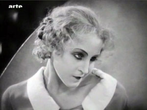
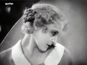
I just met a girl named Maria
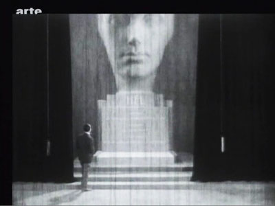
All [the American editors] were trying to do was to bring out the real thought that was manifestly back of the production and which the Germans had simply “muffed.” I am willing to wager that “Metropolis” as it is seen at the Rialto now is nearer Fritz Lang’s idea than the version he himself released in Germany. . . . There was originally a very beautiful statue of a woman’s head, and on the base was her name–and that name was “Hel.” Now the German word for “hell” is “hoelle” so they were quite innocent of the fact that this name would create a guffaw in an English speaking audience. So it was necessary to cut this beautiful bit out of the picture . . . .
Randolph Bartlett, The New York Times, 13 March 1927
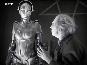
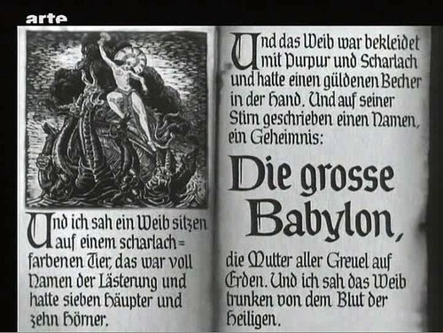
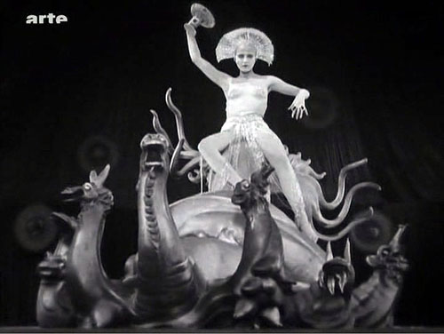
The new version gives the film a better narrative balance. Somewhat surprisingly, the plot hinges on one of the oldest and simplest narrative devices: mistaken identities. The overlord Fredersen engages the crazed scientist Rotwang to create a mechanical Maria who will lead the workers astray. Rotwang takes the occasion to avenge himself on Fredersen by having his robot urge the workers to destroy the machines. Two Marias, then–actually more, if you count the robot Maria’s incarnation as the Whore of Babylon in the Yoshiwara Club.
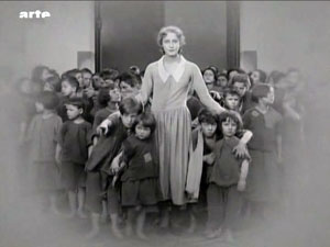
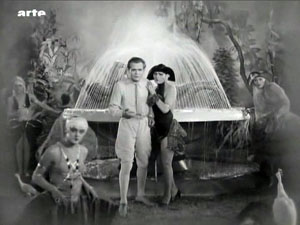
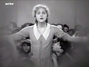
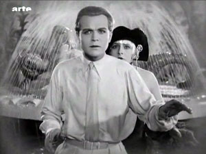
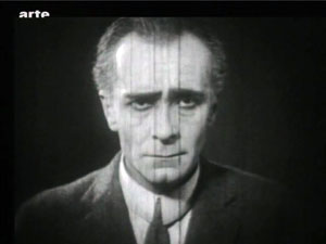
Thanks to the Argentine footage, we now know that another major character doubling involves Freder. At the start of the version we all know, Freder is visited by Maria and a flock of children. Upon seeing her radiant charity, he becomes suddenly convinced that he must join the oppressed workers, his “brothers and sisters.” Helping them has become his destiny. He gains an ally in Josaphat, an employee whom his father has brusquely fired. Descending to the cavernous machine halls, Freder switches identities with Georgy, a worker who returns aboveground to live Freder’s life. Freder wants him to go to Josaphat’s apartment, where they will meet. But the Thin Man, a long, leering hireling of Freder’s father, is charged with trailing Freder.
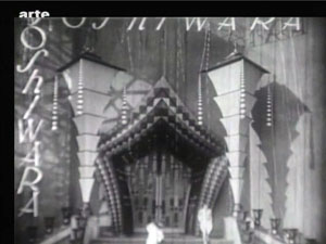
Stretches of the Thin Man subplot are missing from the previous version, but now we can see that Georgy/ Freder is a sort of early counterweight to the Maria/ Maria parallels. As in the latter case, the switch leads to misunderstanding, with the Thin Man following Georgy to the club and eventually to Josaphat. The Georgy substitution also allows Harbou and Lang to introduce the Yoshiwara Club early, but teasingly, in a rapidly dissolving montage. Only later will we get a good look at the delicious degeneracy inside.
As Martin Koerber indicated in several remarks, the older, most common version of Metropolis turns it into a science-fiction film, since it puts the robot Maria at the center of the plot. Just as important, though, is Freder’s plan for overturning class oppression, something fleshed out in the Georgy/ Josaphat material. Other new footage puts the relationship between Fredersen and Rotwang in a new light. We now see that Rotwang was in love with Fredersen’s wife Hel, and he has constructed not only a huge bust of her but also a “mechanical man,” outfitted with a distinctly female anatomy, as a sort of Hel substitute.
Fredersen diverts Rotwang’s plan to the purpose of mimicking Maria. So we get another doubling: Freder’s mother Hel becomes the firmware for the robot Maria through the machinations of two father figures. (Freder will kill one and redeem the other.) In all, the new footage yields a play of eerie Freudian substitutions.
The 2010 restoration also establishes the film as consisting of three large-scale movements. The first section, “Prelude” (Auftakt), runs a bit more than an hour. It shows Freder joining the workers and his father planning to have the Thin Man follow him. This part also introduces Rotwang, establishes Fredersen’s order to make a robot Maria, and ends with Rotwang’s capture of Maria. A second part, called “Intermezzo” and lasting about thirty minutes, is devoted to intertwining the Freder/ Josaphat plot with the creation of the robot Maria. The section more or less climaxes with a demo of the new Maria, dancing sexily at the Yoshiwara.
In “Furioso,” everything builds to a climax across a remarkable fifty minutes. The cloned Maria leads the workers to destroy the machines, fulfilling Rotwang’s plan to avenge himself on Fredersen, while the real Maria escapes from Rotwang’s compound during a fight between Rotwang and Fredersen. (We’re still lacking some of this footage.) At the same time, Freder and Josaphat converge on the underground city. The workers’ smashing of the machines triggers a flood from which the children must be saved. At the finale, during a hand-to-hand struggle with Freder, Rotwang falls to his death. There follows the famous epilogue in which Freder, “the Mediator,” must bring together hands (the foreman Grot) and head (the capitalist Fredersen).
Fluidity and freedom
This delirious fable is rendered with unrelenting zest. Lang has now perfected his breathless version of silent-film narration. He relies on simple, immediately graspable compositions, rapid crosscutting among different plotlines, and a dynamic approach to analytical editing.
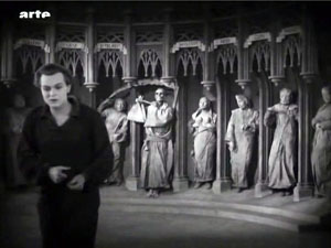
In the late 1920s, many American films became more heavily dependent on intertitles; it’s as if directors were anticipating talkies. But of Metropolis’s over 1800 shots, I counted only 26 expository titles and 156 dialogue titles—in a film running nearly 2 ½ hours. Lang plunges us into each scene with no fuss, and once we’re there, a smooth continuity carries us from shot to shot. Confronting the seven deadly sins in the cathedral, Freder turns away, twisting Georgy’s cap in his hands as he exits the frame.
Cut to the main area of the cathedral, and Freder is still twisting the cap as he enters the frame. (Like other shots from the Argentine version, this is slightly reduced because of the 16mm source.)
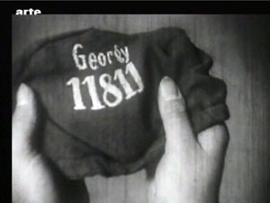
He lifts the cap, and we get his point of view on Georgy’s name and number.
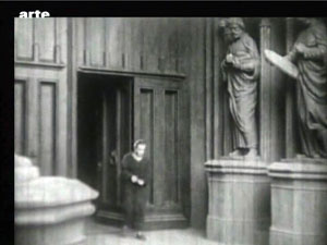
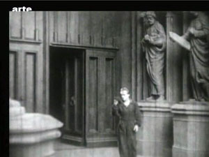
Cut to the Yoshiwara nightclub closing, as Georgy steps groggily into the street.
Here the new footage lets us see that Lang is exploiting the sort of verbal and imagistic hooks he had developed in earlier films: from Georgy’s cap to Georgy himself, with no need of an intertitle to take us to the new scene.
Lang’s freedom of camera position is typical of late silent cinema, but he deploys his angles with characteristic precision. As usual in Europe, Hollywood-style continuity isn’t completely adhered to—there are some crossings of the 180-degree line—but Lang is careful to keep us oriented to the action through eyelines. This allows great flexibility in camera placement.
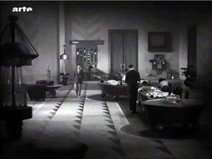
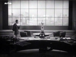
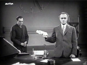
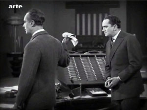
Fredersen is dictating to his secretaries while Josaphat is monitoring prices. A vast establishing shot shows all of them.
Fredersen’s pacing around his office allows Lang to introduce a new area around the window and the desk.
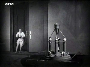
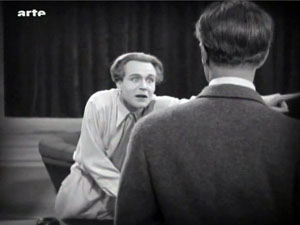
Now pacing in the center of the office, Fredersen pauses in his dictation and Freder bursts in behind him.
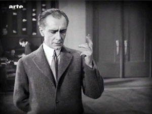
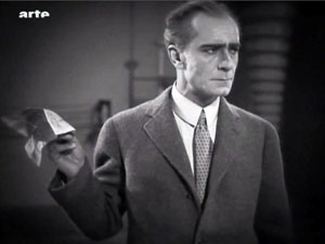
But Fredersen, who’s already holding up one hand as he speaks, simply twists his wrist, and this silences his son.
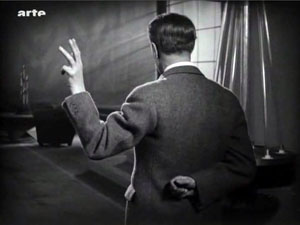
The shot approximates Freder’s point of view, but Lang gets a bonus from it. The sharp change of angle makes the imperious hand (and not, say, Fredersen’s expression) the compositional focus of the shot. In fact, this sort of hovering hand will become part of the characterization of Fredersen, and Lang will stress it through, once more, energetic changes of angle.
And still later, the framing will spotlight Freder’s pointing finger by pushing it to one zone on the far right of the shot.
Lang’s concise handling of such small actions forms a delicate counterbalance to the mass movements elsewhere in the film. Perhaps for him, both gestures and crowd scenes are merely two ways of creating a geometry that can activate every area of the screen.
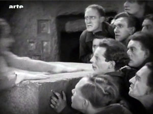
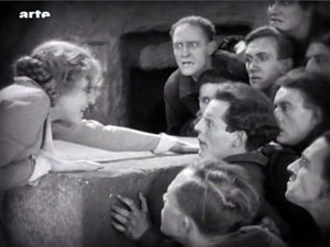
The carefully controlled freedom of spatial construction is facilitated by one of Lang’s favorite tactics: shooting from directly on the axis of character interaction. (No, Wes Anderson didn’t invent this.) Lang in effect sets the camera between the two characters so that they stare out at us, as if mesmerized. The technique is most memorable in the scene in which Freder is confronted by Maria and the children.
Again, though, the Argentine material brings more instances to our attention.
Putting the camera on the axis allows Lang leeway in changing his angles. From a shot on the center line, you can cut to pretty much any other area of space.
Lang’s crisp visual narration comes to a climax in the well-named Furioso section. As the action ramps up, the characters rush from spot to spot, hurling themselves into the frame and then abruptly halting to hold the composition.
The extreme case is the robot Maria, whose head and limbs jerk puppetlike from one position to another.
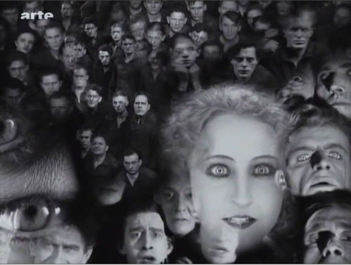
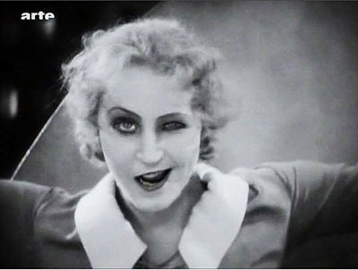
In all, Lang’s precise, almost diagrammatic visual style rushes us through the film’s wild plot and dazzling architecture. An emblem of precision in the service of slightly demented material might be that memorable close-up of the robot Maria: One eye staring out normally, the other half-closed, and the mouth half-twisted in a leer, as if the circuitry in the skull was failing.
A little encyclopedia
Martin Kroeber, Togichi Akira, Winnie Fu, Sam Ho, and Wong Ain-ling discuss preservation and restoration at the Hong Kong Film Archive.
In a Q & A after the screening, Martin Koerber and Frank Strobel shared information about the version. They and their colleague Anke Wilkening could publish a whole book about the restoration, but here are some highlights, drawn as well from Martin’s comments at a lengthy seminar at the Hong Kong Film Archive.
*Sources for information about the premiere version include a copy of the script (helpfully marked with reel ends and calculations about running time), censorship cards recording the credits and intertitles reel by reel, Gottfried Huppertz’s musical score, and thousands of production stills.
*Using these materials, earlier researchers were able to create a sort of mosaic of the version that premiered in Berlin in January 1927. The resulting study film embedded long swathes of blank footage as place-holders. The fact that the Argentine shots fitted in neatly proved the validity of that edition. This study film may be ordered on DVD at nominal cost by educational and research institutions.
*What’s still missing? Some shots in the Argentine version may have been censored; we’re missing a bit in which Georgy, at liberty in a cab, sees a woman baring her body. Also lacking is nearly all the fight between Rotwang and Fredersen, which enables Maria’s escape. In addition, the Argentine print lacks a scene showing a monk preaching in the cathedral, which yields some apocalyptic images.
*If the film plays fast for contemporary tastes, don’t blame the restorers. This version runs at 24 frames per second. Actually, for the 1927 premiere the film was run even faster. The score includes passages accompanying missing footage as well as over a thousand synch-points for specific onscreen action. On the basis of this evidence, it seems that the film was designed to run at about 28 frames per second. This reminds us that silent-film running speeds were far from standardized, and they sometimes exceeded the 24 fps that would be established for sound film. (For more on this matter, go here and scroll down a bit.) In addition, Frank mentioned that in theatres with orchestras, the conductor could regulate the speed of the film with a dial set into the podium.
*Why insert the cropped 16mm footage in such obvious fashion? Couldn’t the framelines be adjusted to match the surrounding 35mm material? Yes, but this slight blowup of the footage would falsify the shot scale of the original footage and not match comparable shots in the 35mm footage. Moreover, Martin pointed out that because not all the scratches and fuzziness of the 16mm material could be purged, it’s better to let these stand stand out somewhat as evidence of the vagaries of film history–like leaving some damage visible in historic buildings.
*Why is the restoration in black and white, since most silent film restorations are in color? Lang was opposed to tinting and toning, so Metropolis premiered in black and white. This caused a debate among critics, some of whom considered it a promising departure from contemporary practices of coloring scenes. The tinted versions that one can occasionally see are likely export versions colored at the request of distributors in particular markets.
*Although future screenings of the 2010 version are to be accompanied by other ensembles devising their own music, there’s a powerful case for retaining Huppertz’s original score. It reflects the filmmakers’ intentions, and its Wagnerian romanticism and modern rhythms are enjoyable simply as music. Just as important, Huppertz designed his score around leitmotifs that, as in opera, can call to mind characters who aren’t onscreen at the moment.
*Metropolis, Martin argued, is too often considered simply a late Expressionist film or an early science-fiction effort. Now we can see that it’s much more: “a compendium of everything in the air in 1927 Germany.” It brings together political ideas, debates about class society and urban life, current trends in the fine arts, acting styles, and cinematic experiments. It owes a great deal to the “monumental” films of the late 1910s, such as Joe May’s Herrin der Welt (1919), but it’s also a synthesis of what filmmaking had become since then. “It’s a little encyclopedia of 1927 cinema. . . . There’s something in it for everybody.”
To see the restoration with the stirring score, vigorously conducted by Frank, was a high point of my Hong Kong trip and indeed of my filmgoing year.
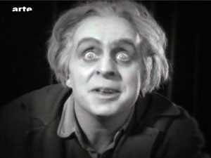
This version of Metropolis was simulcast, if that’s the right word, on 12 February by Arte during the premiere at the Berlin International Film Festival. My frames are taken from that broadcast version; hence the bug. The restoration will be screened on Turner Classic Movies in the fall, and then released on DVD in the US by Kino International.
The epigraph quotation from Arnheim comes from Film Essays and Criticism, trans. Brenda Benthien (Madison: University of Wisconsin Press, 1997), 119. The article about the US cut of the film, which became widely seen around the world, is Randolph Bartlett, “German Film Revision Upheld as Needed Here,” New York Times (13 March 1927), X3.
Thanks to Martin Koerber for an abundance of information. For further reading, he recommends Erich Kettelhut’s memoirs on designing and filming the project, Der Schatten des Architekten (Munich: Belleville, 2009), ed. Werner Sudendorf, with many documents from sketches and photos; and the Deutschen Kinemathek exhibition catalogue, Fritz Langs Metropolis, ed. Franziska Latell and Werner Sudendorf (Munich: Belleville, 2010). You can get a sense of the tangled history of the versions of the film from Martin’s article in the latter volume, which includes a detailed account of the digital restoration. An earlier version of his piece, keyed to the 2001 version, is available as “Notes on the Proliferation of Metropolis,” in Preserve Then Show (Copenhagen: Danish Film Institute, 2002), 128-137. The Metropolis exhibition runs through 25 April.
A special thanks to Lee Tsiantis, Langian extraordinaire.


