Archive for the 'Film technique: Editing' Category
Godard comes in many shapes and sizes
DB here:
James Quandt started it.
The indefatigable Senior Programmer of the Cinémathèque Ontario emailed me in early 2004 to ask if I had any thoughts on the aspect ratios of Godard films. He attached an essay which eventually appeared in the gorgeous anthology, For Ever Godard. Reading a Quandt essay is like eating a ripe nectarine, tangy and nourishing. So you should find the original and indulge yourself. (1)
You might be asking what the term aspect ratio means. It refers to the ratio of the width to the height of the film image. The image was fairly square in the early silent era, then became roughly standardized at 4 x 3, or as the pros say, 1.33:1. Sound filming made the format a tad more horizontal, at 1.37. Anamorphic widescreen (CinemaScope and its brethren) was more or less standardized at 2.35 (more recently 2.40). Various non-anamorphic, or “flat” aspect ratios have appeared since the early 1950s. The US has favored 1.85, Europe has been known to use the squarer 1.66, and some films, like E. T., are designed for 1.75. Widescreen TVs are set at 16:9, or about 1.78:1, so that’s likely to be a common proportion in the future. We discuss aspect ratios at more length in Film Art: An Introduction (pp. 183-185 in the newest edition).
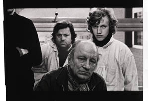
Filmies care about aspect ratios because shot composition matters. Sometimes the print is “hard-matted,” with the correct proportions given as black bars at the top and bottom of the frame, like video letterboxing. Here’s an example, from a 16mm print of Godard’s 1972 Tout va bien. It is hard-matted to 1.66. (The original film is in color.)
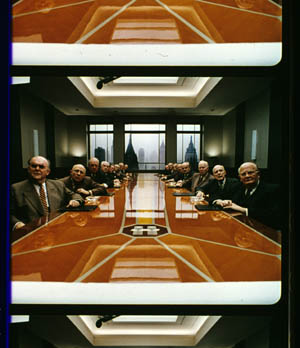
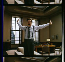
If the image isn’t hard-matted, the projectionist must insert an aperture plate that will mask the image properly. But what plate? Should she set it for 1.37? That’s a very rare option nowadays, and many theatres aren’t really designed to show it. Typically, if the print doesn’t indicate, the US projectionist will fall back on 1.85. Nowadays, if a Hollywood film isn’t in Scope, the projectionist is expected to use that ratio. Some shots will be problematic if the projectionist includes more than the 1.85 format allows. Here’s a full-frame film strip from The Hudsucker Proxy, where you can see that a chunk of the set is blocked or missing in the bottom area, and a microphone peeks into the frame from the top. (2)
Like many other movies, the films made by Godard since the mid-1970s show up at the projection booth without hard matteing. So at what ratio do we show them?
A great many careful viewers have voiced their views on the Internets, and I’ve learned a lot from the discussions here and here. In part this blog entry is an effort to introduce readers to this debate.
Moreover, this apparently film-wonkish question has wider implications. It can teach us a fair amount about how film images work, and the implications of any masking, matteing, or cropping of an image—especially on DVD. So if you’re interested in Godard, keep reading. If not, skip to the final section, “Relationships: The fundamental question,” where I talk about some artistic effects of cropping any film image.
It’s a just image, not just an image
James Q was mounting one of his typically ambitious retrospectives, this time on JLG, and so his essay posed a question that had long been ignored.
A disturbing discovery of the retrospective was how frequently the full-frame compositions of Godard’s late films have been ignored and overruled. Many of the prints are clearly marked by the lab with the widescreen ratios of 1.66 or (the almost standard) 1.85, and their subtitles are printed in the frame at the height indicated by those standards. Our meticulous projectionist Kate Mackay experimented with whole reels of films, showing them first in 1.33 and then in the prescribed wider screen ratio, revealing the violence done to the compositions when shown the latter way.
James found that several films, including Passion, Je vous salue Marie (Hail Mary), Nouvelle Vague, Hélas pour moi, and For Ever Mozart, looked “abjectly constricted” in 1.85. So James wrote the man himself.
Disturbed by some oddly cropped compositions in Éloge de l’amour, which result in seemingly unintentional beheadings and concretions, I consulted Godard by fax about the aspect ratio and he confirmed that it was indeed, as stated, 1.66 (rather old-fashioned in its own way). That he occasionally still seems to be jamming a 1.33 composition into a frame that cannot accommodate it suggests his instinctual preference for the open image.
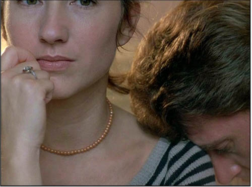
I couldn’t help James much at the time, but I did send him a couple of frames that favored squareish compositions and that came from 35mm prints. Other frames we reproduced, at 1.37, in both editions of Film History: An Introduction. The still that pretty much settles the matter for me is the gorgeous shot of Nathalie Baye and Johnny Hallyday at the top of this entry. Here’s the image as it is on a 35mm print.
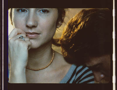
Downsize that to 1.66 without losing those eyes!
Later I sent James another killer example, drawn also from a 35mm print of Detective. (It’s in the new Film Art, p. 46.)
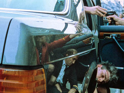
Here’s what it would look like in one try at 1.66 matteing.
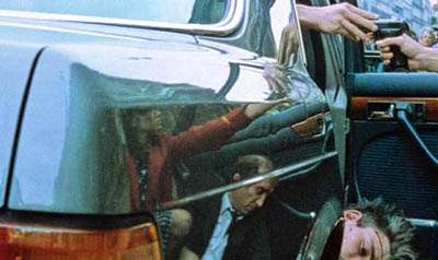
I say “one try” at a matted version because I didn’t take as much off the top as a normal aperture plate would; I didn’t want to slice into the hands and the gun. Not only is the 1.37 image preferable (we get to see Claude Brasseur’s slumping posture) but 1.66 looks, as James says, jammed. The 1.37 ratio lets Godard load information in the very top of the shot, as we’ll see often in the examples to come. And, needless to say, at 1.85 the shot would make no sense.
Soon after James and I had our exchange, Godard—perhaps prodded by James’ query—sent a diagram to Cahiers du cinéma. (3) (Thank you, Craig Keller, aka evillights, who called attention to it on this thread.) The Cahiers editors report that Godard has asked that Notre musique be shown in 1.37. His photomontage lines up two shots from the film and arranges them according to the three major “flat” ratios, and for each one he supplies a tart annotation.
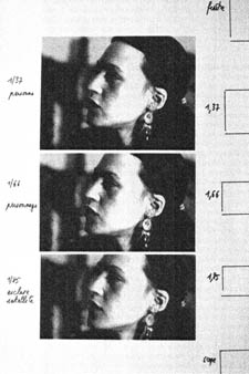
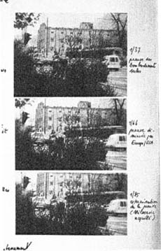
For the close-up of the woman, the captions translate as: 1.37 person. 1.66 character. 1.85 satellite slave. For the long shot of the street, we get: 1.37 Proof of Serbian bombing. 1.66 Proof diminished by Europe/ USA. 1.85 Extermination of proof (Milosovec acquitted).
Pretty strong evidence that JLG doesn’t like cropping the classic format. But these remarks are about Notre musique. What about the other films? Apart from the evidence onscreen and on the film strip, we can add one thing. Evidently he shoots at 1.37, but there’s also evidence that in the late stages of postproduction he seems to preserve that ratio. Here, for example, is a sheet of color timing instructions for Nouvelle Vague. (4) Godard has pasted in a frame for each shot in the sequence, and alongside he notes how much red, green, and blue he wants. The frames he mounted are 1.37.
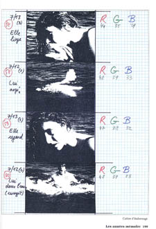
Recently our Cinematheque has been holding a Godard retrospective, and I’ve taken the opportunity to revisit the aspect ratio issue. As an archival venue, we can screen at any ratio, even the squarish silent and early-sound ones. Our projectionist Jared Lewis has run the Godards at 1.37. They look fine.
Jared pointed out to me that one other factor leans toward screening them in the 1.37 format: the thickness of the spaces between frames. In a modern “full-frame” film like Hudsucker Proxy, there is very little space between the frames. The line separating one from another is quite thin. That tends to make the frames squarer, closer to 1: 1.2, as I mention in endnote 2.
In a classic sound film, there is often more space between the frames. Usually that space is black, but I can’t resist showing what it looked like in Technicolor.
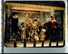
This frame, from Renoir’s Golden Coach, shows the characteristic silver frame surround (and silver soundtrack) of a true Tech print. Nifty, huh?
Anyhow, the sort of thick spacing between frames that we get usually find in Godard prints, and that’s visible in the Baye/Hallyday frame above, favors the classic ratio. The thickness of these spacers is similar to what we find in a modern film that was explicitly designed for 1.37 screening, Hans-Jürgen Syberberg’s Parsifal (1982).
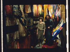
This array, Jared points out, gives different frame proportions than one would find in a print hard-matted to 1.66 or 1.85.
One more wrinkle. On the film strip, Godard’s frames aren’t all the same dimensions. Here are two from Je vous salue Marie; note that the first is taller, with narrower spacers, than the second.
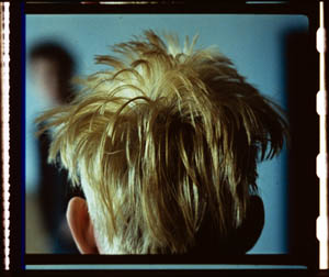
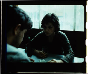
Both, however, would be appropriately shown at 1.37.
How then are we to explain Godard’s saying the films should run at 1.66? Perhaps, as one of the online commentators has suggested, Godard assumed that 1.66 is the closest that most commercial venues can come to 1.37. Perhaps too he was just being contrary–that is, just being Godard.
Fortunately, some DVD producers seem to recognize his full-frame aesthetic. The UK version of Detective is full-frame and preserves my nifty shots. Also, the Cahiers du cinéma discs for Prénom Carmen, Hélas, and so on are at 1.37. Bowing to Godard’s wishes, Wellspring’s version of Notre Musique announces that it is presented “in its original theatrical aspect ratio of 1.33.” Although purists may say that virtually no theatres showed it that way, we should appreciate the gesture.
Relationships: The fundamental question
Even if you’re not that interested in Godard, everybody should be aware of what video cropping can do to the film image. I’m not talking about panning and scanning, that process which begins with a widescreen film, typically one of an aspect ratio 1:2.40, and extracts a 1.37 frame out of it for video purposes. This is deplorable, but most of us are alert to it. What’s more interesting is the sort of thing that happened when a film is cropped inaccurately, either in projection or for DVD.
My example will be from the first reel of Godard’s Éloge de l’amour/ In Praise of Love, which is available on DVD in a full frame version from Optimum in the UK and in a cropped version from New Yorker in the US. I won’t be focusing on the quality of each transfer, though the Optimum one looks superior to me.
Nor will I do a detailed narrative account, because I find the characters and their interactions still fairly baffling. I’m always amazed that critics can praise a Godard film without ever getting down to explicating what’s literally happening in a scene. They write as if these films were telling their stories straightforwardly. Without help from the presskits, could journalists discern even the sketchy plots they refer to? A great deal of the fascination of Godard’s late works comes from his refusal of the most elementary forms of exposition–picking out characters, explaining their relations, and the like. There is always a story, but it’s about three-quarters hidden, and this seems to me to require a lot more analysis than people tend to give it.
Anyhow, in studying Éloge de l’amour‘s video versions, I learned that there can be a big difference between tiny numbers. For instance, the Optimum version is prepared at 1.35:1. No big deal between this and 1.37:1, surely? Except that the New Yorker version seems to have started from a 1.37 frame. Even though it’s cropped on the top and bottom, it consistently supplies a tad more information on the right and left edges, and these extra bits are visible in side-by-side comparison. First, a 35mm frame.
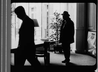
Needless to say, the projector’s aperture plate won’t preserve everything in the physical frame; at a minimum it masks off the curved corners. But if we look at the two video versions, there are some surprises.
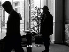
The 1.37 version of this shot is of course much closer to the overall composition of the original. But more areas of the window frame (on the left) and the painting (on the right) are visible in the widescreen version than in the full-frame one. Did going for 1.35 shave off those areas? Moreover, New Yorker’s cropping is at 1.77, for all intents and purposes the same as 1.75. But to achieve this wide frame, the transfer of some shots seems to have been optically stretched a little. In some upcoming examples the faces are a bit plumper and the surroundings a bit more horizontally spacious.
Okay, maybe I’m splitting hairs. So let me assume that the UK DVD preserves a reasonable amount of the 35mm original. I want to consider some effects of the cropping we get in the US DVD. Some are obvious, some more subtle, and all go beyond this individual case to suggest the results of overcropping any movie.
(1) Of course we lose the top and bottom. In the full-frame shots from Hudsucker Proxy, no problem; the filmmakers are counting on the projectionist to mask the frame. But in Godard the cropping makes us lose stuff. Godard likes to frame heads pretty high in the shot, and this means that we often lose part of them.
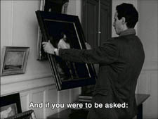
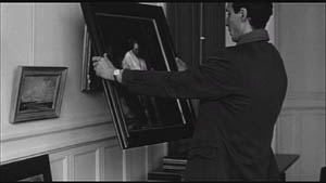
Heads are trimmed in movies all the time, and it doesn’t much matter in close views. But in Éloge, Godard is composing long shots with heads quite high up. He will even daringly chop off heads himself. This is partly a strategy to conceal who is present, to block our recognizing characters by their faces. It also has the effect of activating areas of the frame that aren’t usually so important. We have to strain to see partially visible things, tucked away in bits of the shot.
In the example below, I submit, the original composition creates a tension among three centers of interest: the two very visible paintings and the almost indiscernible face of the art dealer standing by the rear window. That tension is lost when the 1.77 cropping lops off the head in the background. Significantly, the man offscreen left is talking about how classic painting displayed “relationships” (rapports)–presumably both personal and pictorial. “That’s the fundamental question.”
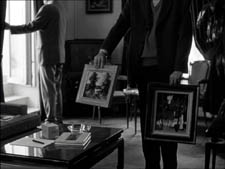
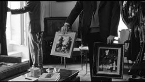
The framing of the assistant in the foreground, incidentally, shows that spotting a decapitation in a video version doesn’t necessarily mean that Godard wanted every head to be seen.
In a later scene, we strain to see the older man’s face as he bends over Bruno. As he speaks Picasso’s immortal line, his profile scrapes the very top of the shot, but not in the cropped version.
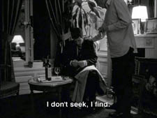
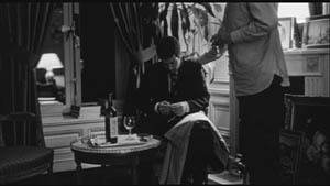
In most film shots, the upper half of the frame harbors what we look at first, so we’re probably most likely to notice when something goes missing there. But actually, the area at the bottom of the frame is important too, especially as part of Godard’s all-over approach to composition.
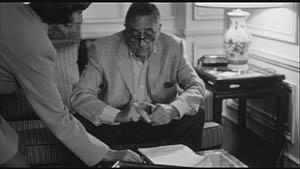
Throughout early scenes of the film, Godard’s compositions favor the art works and minimize the humans trafficking in them. So the picture (by Delacroix? Matisse?) on the coffee table is foregrounded when the art collector signs the papers proffered by a mostly unseen woman, but it vanishes in the cropped version.
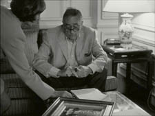
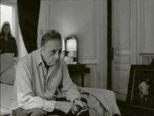
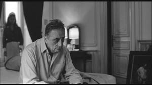
Likewise, the old man on the bed can rub his glasses fretfully at the very bottom of the 1.37 format, but that performance detail goes for naught in the 1.77 format.
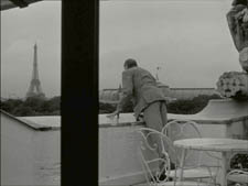
More generally, even when we scan the top half of the frame for major information, we tend to take for granted that people are anchored to a ground plane, the earth or the floor or whatever. Often, of course, film shots don’t show us this ground. But the material at the bottom of a distant view can weight the shot, providing a sense of gravity. Here, the dealer peering over his balcony is minimally tied to the patio ground (as minimally as he was visible in the earlier shots when his head grazed the upper edge, I suppose). But in the 1.77 version he floats free.
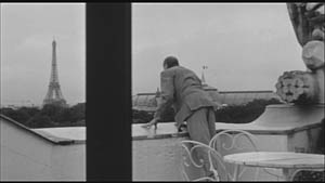
(2) The top and bottom zones include the corners of the frame as well, but I single them out for special mention because I like them so much. Again, we don’t expect key information to be tucked there, but it can happen—in Godard, in Tati (a big influence on the late Godard), and even in one remarkable shot in Lumet’s recent Before the Devil Knows You’re Dead. In the first reel of Éloge de l’amour, the best example I can find comes with the long-shot of the woman, turned from us, standing at the window. In the lower right corner of the shot sits a woman’s photograph on a table. The 1.77 frameline chops it off and makes it less segregated for our notice: we lose the spacing that separates it from the other objects on the table. Since the voice-over is meditating on memory, the photo adds an overtone to the shot, but less clearly in the cropped version.
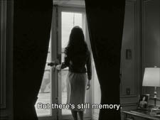
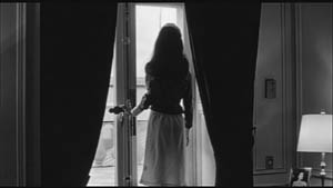
Maybe it matters, maybe not; but it’s a lot harder to see in 1.77 than in the 1.37 transfer. Something similar happens with the businessman’s hand in the lower left of this shot.
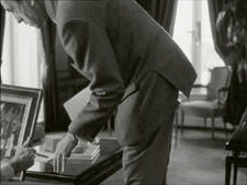
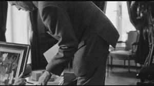
(3) Cutting off top and bottom alters the shot scale. All other things being equal, cropping not only eliminates; it enlarges. Figures come closer to us. A medium shot becomes a medium close-up. All of the examples so far indicate this to some degree, but it comes across clearly in these variants.
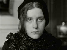
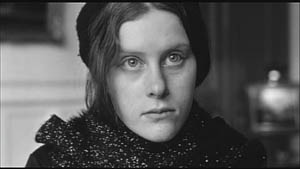
Again, note the stretching. It seems that someone decided that the image had to be 1.75 and instead of cropping it, stretched the 1.66 one. Yikes!
(4) Overambitious cropping changes the compositional dynamics. In reducing information, it reorganizes the composition. Rudolf Arnheim (I blogged about his achievements here) suggested that we consider a picture as a field of vectors and forces, pushes and pulls, balance and imbalance, rival centers of attention. By changing the framing we change the relation of the figures to the edges, and this can alter the composition.
The clearest examples come from the sort of reframings we find when a Super-35mm film is rendered in home video versions in both 2.40 and 1.37.
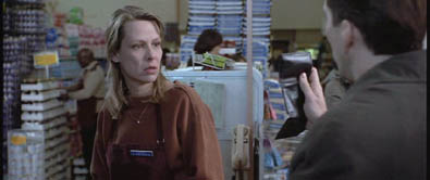
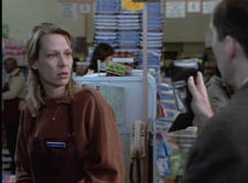
In this shot from 8mm (the movie, not the gauge), the cashier questioned by Cage looks more isolated in the Scope framing, while in the full frame they seem closer together and he seems to press in on her. Cropping can change a lot.
Now consider this comparison.
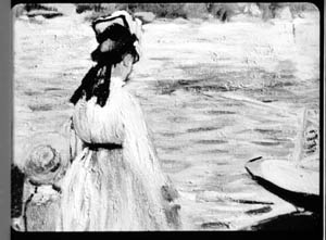
Godard’s original shot (here from 35mm) keeps the painting’s upper horizon, the darker, frothy waterline as a kind of backboard, halting the water’s recession into the distance. Graphically, the water on the right center becomes a negative space for the two figures, with the boy counterbalanced by the tip of the skiff.
But the cropped version loses the distant waterline, creating an infinite stretch of space top to bottom, and the boy’s head seems to float more freely. Most starkly, the skiff, by losing its shadow, seems to have swung more toward us.
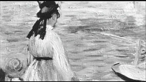
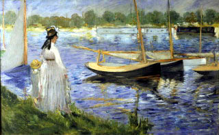
It’s worth noting that Godard himself is a mean hand at radical cropping. I’ll forebear from rambling on about what his original framing above does to the original, Manet’s Seine at Argenteuil (1874), but it could constitute a lesson in how framing changes effect and meaning.
Several factors come into play when we look at this shot from the two DVD versions.
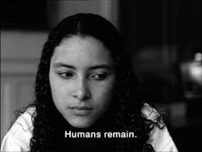
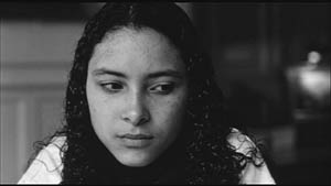
The woman’s face is off-center in both images, but it looks more off-center in the 1.77 transfer. In fact, despite the extra bits on left and right, it is measurably more off-center, because of this transfer’s optical stretching. Yet I’d argue in addition that the cropping of the frame has squeezed the pictorial elements into a stronger horizontal to-and-fro, giving a sense that she has been pushed more out of the middle. You can see it more markedly if we crop it more drastically, and it may help to hide the others when you look at this.
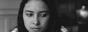
This effect is akin to what happens in the cropping of the 8mm example: the spatial relations have reorganized in relation to the frame edges. Rapports again.
(5) Overcropping can affect the way we experience the time of the shot. Before you call the men in the white coats, I hasten to say that cropping is purely a spatial effect, but in cinema space is bound up with time.
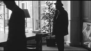
We’ve seen that Godard manipulates the vertical dimension of the frame to an unusual degree, and the effect on time becomes apparent in one scene of Éloge in which Bruno talks with an older man, in a sort of casting session for his project. First we see Bruno alone, and as he walks to the window the old man comes in, his back to us. We presume it’s a man by the bulk, the gait, and the fedora, making its appearance in the upper right corner.
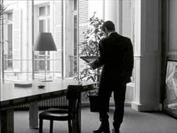
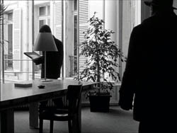
Or does a man come in? In the 1.77 version, at the corresponding point in the shot, we can’t tell it’s a man until the figure comes further into the room.
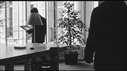
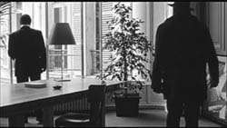
Godard’s reliance on the upper part of the frame allows us to discern the caller sooner in the 1.35 version. Seconds, even split-seconds, matter in cinema. Insofar as cropping affects the timing of a shot’s unfolding, it affects our experience.
( 6) Cropping affects perspective, the perceived distances and volumes of objects in the visual array. Blowing up the center of an image creates a flatter, more friezelike space than we discern in the original. This becomes evident in a later phase of the scene I just mentioned. After Bruno leaves the shot, the old man is left standing in the office.
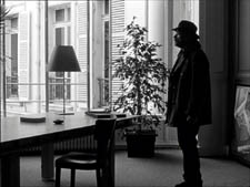
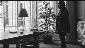
The 1.77 image looks more like it was shot with a long lens than does the full-frame version. The result recalls the sort of perpendicular telephoto framings so common in the 1970s, in films like The Parallax View and The Conversation (below).
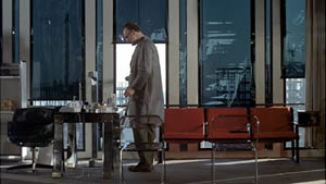
Godard has said that he preferred 30-40mm lenses for much of Sauve qui peut (la vie) because a focal length of 50mm (and presumably one longer than that) will “destroy perspective.” (5)
Many of these differences wouldn’t matter in most films, which aren’t composed as meticulously or as daringly. Hollywood images aren’t typically as dense as those in late Godard. (I must do a blog some day on fussbudget filmmakers like him.) But even if these niceties seem negligible, I think you’ll grant that the film would be much more compromised by being shown in a 1.85 ratio, the squarest option available in most commercial theatres today.
Critical discussions of Godard’s late films have treated them as poetic meditations, and that seems partly right to me. Yet few critics ask how they manage to create their lyrical, associative quality. I think, as I hope to show in a future blog, this has to do with his treatment of narrative (naturally) and his layout of scenes. But even before we get there, I think that we find in the very texture of his images (let alone his sounds) a daring decentering of faces and bodies—the usual nodes of our attention. If he often blocks the flow of our glance, it’s in order to rechannel it to unexpected areas and textures, crannies and gaps, within the image. And so we want all those areas and textures, along with the crannies and gaps, available to our eyes and minds.
(1) James Quandt, “Here and Elsewhere: Projecting Godard,” in For Ever Godard, ed. Michael Temple, James S. Williams, and Michael Witt (London: Black Dog, 2004), 126-139.
(2) Geek note: You may notice that this “full-frame” image isn’t itself in the 1.37 ratio. It’s very square. The reason is that many 1.85 frames will be exposed in the camera at a ratio of 1: 1.2! I believe this was standardized for the Panavision cameras of the 1970s and afterward, though I’d appreciate more information about this. See the entry on Panavision cameras in American Cinematographer Manual, fifth ed., ed. Charles G. Clarke (Hollywood: American Society of Cinematographers, 1980), 104. See also Rob Hummel, “Comparison of 1.85, Anamorphic and Super 35 Film Formats,” American Cinematographer Manual, eighth ed., ed. Rob Hummel (Hollywood: ASC Press, 2001), 24-29.
(3) Jean-Luc Godard, “Formats,” Cahiers du cinéma no. 591 (May 2004), 78.
(4) This image is taken from Jean-Luc Godard par Jean-Luc Godard, vol. 2: 1984-1998, ed. Alain Bergala (Paris: Cahiers du cinéma, 1998), 199.
(5) Jean-Luc Godard, “Propos rompus,” in Godard par Godard vol. 2, 466.
Thanks to Suzy Buenger and Nancy Marshall for identifying the Manet painting for me.
PS 15 Dec: And thanks to James Quandt, Michael Kerpan, and Yogesh Raut for a name correction I’m too embarrassed to specify further.
PS 7 April 2008: The issue is raised anew with Gus van Sant’s Paranoid Park. It’s designed to be shown at 1.37, with more than a few shots reminiscent of Godard. Joe Beres explains here.
PPS 25 January 2009: Ranjit Sandhu provides a lively and detailed discussion of aspect ratios and matteing strategies, along with remarks on Godard’s frames.
PPPS 21 Sept 2009: Thanks to editor John Olivio for a correction on the 1.78 aspect ratio.
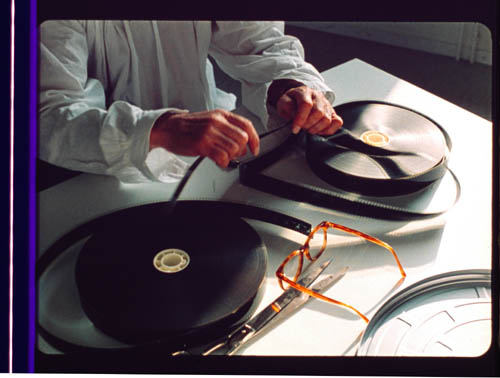
JLG par JLG (1995).
Bwana Beowulf
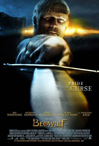
KT: I do not understand Beowulf. I don’t understand why the director who made one of the great modern Hollywood films, Back to the Future, and several very good ones, including Who Framed Roger Rabbit? and Cast Away, now has this fixation with creating nearly photo-realistic 3D digital images.
DB: I think that on the whole Zemeckis’ films have become weaker since Bob Gale stopped working with him. I like the sentiment of I Wanna Hold Your Hand and the crass misanthropy of Used Cars, and I think the Back to the Future trilogy mixes both in clever ways. But now almost every Zemeckis film seems to be less about telling a story than solving a technical problem. How to best merge cartoons and humans (Roger Rabbit)? How to push the edge of spfx (Death Becomes Her, Forrest Gump, Contact)? How to make half a movie showing only one character (Cast Away)? There’s a stunting aspect to this line of work, though I grant that it can lead to technical breakthroughs, as in Gump.
KT: I also don’t understand why most of the supposedly state-of-the-art effects technology looks distinctly cruder than the CGI in The Lord of the Rings, the first part of which came out six years ago. I don’t understand why studios that are trying to push 3D to a broad audience make a film with silly action aimed at teenage boys. That’s an OK strategy when you’ve got a $30 million horror film, but a budget of $150 million demands a lot broader appeal.
DB: And the evidence so far indicates Beowulf doesn’t have that appeal. The obvious comparison is 300, from earlier this year. According to Box Office Mojo it cost about $65 million to make, but it reaped $70 million domestically in its first weekend and wound up with $450 million theatrically worldwide. Beowulf grossed $27.5 million in its first US weekend and currently sits at about $146 million worldwide. I’d think that this has to be a disappointment. Recall too that the Imax screenings have higher ticket prices, so there are fewer eyeballs taking in Angelina Jolie’s pumps, braid, and upper respiratory area.
In addition, sources suggest that a 3-D version of Beowulf will not be available on DVD, so the sell-through takings—the real source of studio profit—may be significantly smaller than average.
KT: It seems to me that the people who are pushing 3-D so hard and hoping for it to become standard in filmmaking are forcing it on the public too soon. It’s still fiendishly difficult and expensive to shoot live action material in digital 3-D, so most projects are animated. One approach, taken in Beowulf, is to motion-capture real people and animate the characters to make them appear as much like the real people as possible. The problem is that they still have a weird look about them, like moving dolls. People have complained about the dead-eyed gaze of the characters in The Polar Express, and though there’s apparently been an improvement between the two films, the eyes don’t always look as though they’re focusing on anything. It can be done, though; the extended-edition Lord of the Rings DVD supplements about Gollum show how much effort went into making his eyes have a realistic sheen and flicker.
I was also struck by how clunky some of the animation looked. Beowulf is supposedly state of the art, and it certainly had the budget of a major CGI film. Yet some of the rendering and motion-capture was distractingly crude. I noticed that particularly on the horses. Their coats looked pre-Monsters, Inc., and their movements at times reminded me of kids rocking plastic toys back and forth. I suspect this effect had something to do with a lack of believable musculature. If you look at the way the cave troll was done in The Lord of the Rings: The Fellowship of the Ring (again, demonstrated in the DVD supplements), there was a specific program to simulate the way muscles move on skeletons, even the skeletons of imaginary creatures. Now, six years later, we see these things that look like hobby-horses—and that all run alike.
The backgrounds were often strange as well, simple and flat-looking, like painted backdrops. There were some exceptions, with the seascapes and rocky crags pretty realistically done. But just plain hillsides and groups of tents and so on looked almost sketchy in comparison with the moving figures, and I noticed that at times some fog would be put in, presumably to cover that problem up. There certainly was some very good animation as well, most notably the dragon, but there was no consistency of visual style.
DB: I’d go farther and say that 3-D hasn’t improved significantly since the 1950s. It ought to work: just replicate the eyes’ binocular disparity by setting two cameras at the proper interval or, now, by manipulating perspective with software. Yet in films 3-D has always looked weirdly wrong. It creates a cardboardy effect, capturing surfaces but not volumes. Real objects in depth have bulk, but in these movies, objects are just thin planes, slices of space set at different distances from us. If our ancestors had seen the world the way it looks in these movies, they probably wouldn’t have left many descendants.
It would take a perceptual psychologist to explain why 3-D looks fake. Whatever the cause, I’d speculate that good old 2-D cinema is better at suggesting volumes exactly because the cues to depth are less specific and so we can fill in the somewhat ambiguous array.
By the way, in watching a 3-D movie I seem to go through stages. First, there’s some adjustment to this very weird stimulus: I can’t easily focus on the whole image and movement seems excessively fuzzy. Then adaptation settles in and I can see the 2 ¼-D image pretty well. But adaptation carries me further and by the end of the movie I seem to see the image as less dimensional and more simply 2-D; the effects aren’t as striking. But maybe this is just me.
Back to the Future, or at least 1954
DB: I’d like to think about it from a historical perspective for a while. The industry seems to be repeating a cycle of efforts that took place in 1952-1954. The American box office plunged after 1947 as people strayed to other entertainments, including TV, and so the industry tried to woo them back with some new technology. Today, as viewers migrate to videogames, the Internet, and movies on portable devices, how can theatres woo their customers? Answer: Offer spectacle they can’t get at home.
Beowulf brings together at least three factors that eerily remind me of the early 1950s.
(1) Obviously, 3-D. The first successful 3-D feature era was Bwana Devil, released in November of 1952. It was an uninspired B movie, but it launched the brief 3-D craze. Columbia, Warners, and other studios made major pictures in the format, most notably House of Wax (1953). But costs of shooting and screening 3-D were high, with many technical glitches, and apart from novelty value, the process didn’t guarantee a big audience. The fad ended in spring of 1954, when all studios stopped making films in the format.
The process has been sporadically revived, notably in the 1980s (Comin’ at Ya, Jaws 3-D) and once more it fizzled. So, ignoring the lessons of history and chanting the mantra that Digital Changes Everything, we try it again.
(2) Big, big screens. In September of 1952, Cinerama burst on the scene with its huge tripartite screen and multitrack sound. It attracted plenty of viewers, but it could be used only in purpose-built venues. Like 3-D, its technology could never replace ordinary 35mm as the industry standard. The contemporary parallel is Imax, which though very impressive will not replace orthodox multiplex screens—too expensive to install and maintain, pricy tickets. Like 3-D, it’s a novelty. (1)
(3) The sword-and-sandal costume epic. It’s a long-running genre, but it got significantly revived in the late 1940s. It was a logical input for the new technologies of widescreen—not Cinerama but more practical offshoots that gained more general usage.
From the standard-format Samson and Delilah (1949), David and Bathsheba (1951), and Quo Vadis (1951) it was a short step to The Robe (1953) and The Egyptian (1954) in CinemaScope, The Ten Commandments (1956) in VistaVision, The Vikings (1958) in Technirama, Hercules (1959) in Dyaliscope, Solomon and Sheba (1959) and Spartacus (1960) in Super Technirama 70, and Ben-Hur (1959) in anamorphic 70mm Panavision. It is, incidentally, a pretty dire genre; the peplum might be the only genre that has given us no great films since Cabiria (1914) and Intolerance (1916).
In parallel fashion, the revival of the beefcake warrior film with Gladiator (2000) coincided with innovations in CGI and thus furnished new forms of spectacle for Troy (2004), Kingdom of Heaven (2005), and 300 (2007). This trend paved the way for Beowulf. When screens get bigger, Hollywood hankers for crowds, oiled biceps, big swords, and nubile ladies in filmy clothes. Not to mention soundtracks with pounding drums, wailing sopranos, and choirs chanting dead or made-up languages. And the conviction that Greeks, Romans, and those other ancient folks spoke with British accents. The innovation of Beowulf is to turn a Nordic hero into a Cockney pub brawler.
In other words, it’s 1954 again. So if we ask, Will it all last? I’m inclined to answer, Did 1954?
KT: Yes, the studios see the new technology as one more way to lure people away from their computers and game consoles and into the theaters. Maybe that will work to some extent. There’s no doubt that a lot of the people who have seen Beowulf have praised it as a fun experience and as having effectively immersive 3-D effects. I’m surprised at how many positive comments there are on Rotten Tomatoes, where the average score from both amateur and professional reviewers is 6.5 out of 10. That’s not exactly dazzling, but it’s a lot higher than I would give it.
Even so, the film hasn’t lured all that many people away from their other activities. You’ve mentioned that Beowulf hasn’t done all that well at the box-office. It did much better in theaters that showed it in 3-D. If it hadn’t been for the 3-D gimmickry, it would probably have been dead in the water from the start. And if 3-D effects remain on the level of gimmickry, they will soon wear out their welcome. Presumably the people who have been going to Beowulf are to a considerable extent those who are already interested in 3-D, and I can’t believe there are huge numbers of people really passionate about the idea of someday being able to watch lots of films in 3-D. If more films like Beowulf come out—ludicrous, bombastic action with distracting animation problems—they’re not likely to make the prospect any more attractive.
Eventually somebody—James Cameron or Peter Jackson, perhaps—will make the first great 3D film, and then maybe the passion will spread.
3-D in 2-D
DB: I’m doubtful that there will ever be a great 3-D film, and especially from those directors. But one last historical note.
I think that ordinary mainstream cinema has been setting us up for the flashiest 3-D flourishes for some time. One of the goals of the Speilberg-Lucas spearhead was to amp up physical action, to make it more kinetic, and this often showed up as in-your-face depth. Spielberg used a lot of deep-focus effects to create a punchy, almost comic-book look, and who can forget the opening shot of Star Wars, with that spacecraft arousing gasps by simply going on into depth forever? Seeing the movie in 70mm on release, I was struck by how the last sequence of Luke’s attack mission was maniacally concerned with driving our eye along the fast track of central perspective. Did it foreshadow the tunnel vision of videogame action?
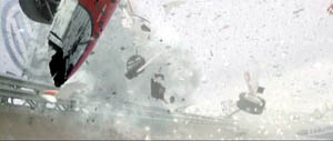
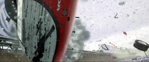
In any case, I think that aggressive thrusting in and out of the frame was integral to the style of the new blockbuster. Since then, our eyes have been assaulted by plenty of would-be 3-D effects in 2-D. In Rennie Harlan’s Driven (2001), the crashing race cars spray us with fragments.
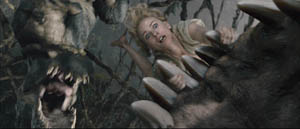
Jackson is definitely in the Spielberg line, favoring steep depth and big foreground elements. In King Kong, the primeval creatures lunge out at us, heave violently across the frame, and fling their victims into our laps.
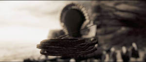
Such shock-and-awe shots recall American comic-book graphics. These affinities are at the center of 300, as we’d expect. For example, a cracking whip curls out at us in slow motion, like a two-panel series.
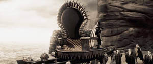
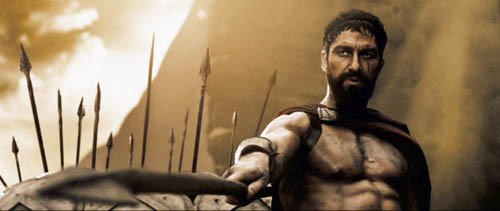
Beowulf draws on this thrusting imagery, but inevitably it doesn’t seem fresh because so many 2-D films have already used it. Maybe the most original device is having the camera pull swiftly back and back and back, letting new layers of foreground pop in and shrink away. This is viscerally arousing in 3-D, but aren’t there precedents for it—in the Rings, in animated films, or some such?
Zemeckis tries to transpose into 3-D the style of what I’ve called, in The Way Hollywood Tells It, intensified continuity. This style favors rapid cutting, many close views, extreme lens lengths, and lots of camera movement. I found Zemeckis’ restless camerawork even more distracting than in 2-D. So I’m wondering if current stylistic conventions can simply be transposed to 3-D, or do directors have to be more imaginative and make fresher choices?
KT: That pull-back effect may be viscerally arousing, but in Beowulf it was usually pretty gratuitous and, for me at least, it called attention to itself in a way that was often risible. I don’t think there’s anything in Rings as crude as the shots in Beowulf that you’re talking about. In the opening scene of the latter, in the mead-hall, the camera zips into the upper part of the room, with rafters, chains, torches, and even rats whizzing in from the sides of the frame. None of that contributes to the narrative.
The flashiest backward camera movement, or simulated camera movement, I can think of in Rings is the one in the Two Towers scene where Saruman exhorts his army of ten thousand Uruk-hai to battle. The final shot is a rapid track backward through the ranks of soldiers holding flag poles. The point is to stress the enormous numbers of soldiers. There’s no gratuitous thrusting-in of set elements from the sides, just the cumulative effect of so many similar figures. The simulated camera also at one point “bumps” one of the flagpoles, causing it to wobble, but I take it that that’s an attempt to add a certain odd realism to the “camera” movement, not a knowing nudge to the audience. In Rings, the virtual camera usually follows action rather than moving independently through space. It tends to go forward or obliquely rather than backward.
As to transferring classical Hollywood style to 3-D or finding a whole new set of conventions to fit 3-D, Beowulf offers an object lesson. It uses a combination of the two. At times we have conventional conversations using shot/reverse shot, and at other times we have the swoopy-glidey style you described, with the camera zipping around the space and trying to see it from every angle within a few seconds.
The odd thing is, neither one works. The very close shot/reverse shot views of the digital characters make them look unnatural and emphasizes the not infrequent failure of their eyes to connect with each other. The swoop-glidey camera movements are silly and don’t stick to the narrative.
I’m not optimistic enough to think that directors can come up with a whole set of “fresher stylistic choices” to make 3-D work. Maybe Sergei Eisenstein, with his meticulous attention to every aspect of such topics, could have thought the issue through, but his solution would probably not be viable for the Hollywood studios. My own thought is that directors working in 3-D should probably stick to classical Hollywood style and avoid flashy stylistic effects. So far, the more blatantly 3-D something looks on the screen, the less it makes 3-D seem like something we want to watch on a regular basis. Think of the best films of this year: Zodiac, The Assassination of Jesse James by the Coward Robert Ford, Ratatouille, Across the Universe, and so on. Would any of them be better in 3-D? Probably not.
Plus, I don’t like watching movies through something. Movies should just be the screen and you. The 3-D glasses are definitely better now than in the earliest days of the cardboard, red/green versions. Still, the Imax glasses we used in watching Beowulf were heavy enough to leave a groove on my nose. Make the mistake of touching the lenses, and you’ve got a blur on one half of your vision of the film. In short, I think that 3-D still has to prove itself, and Beowulf didn’t add any evidence.
(1) PS 9 December: DB: I originally added in regard to Imax: “It’s actually waning in popularity, except in newly emerging markets like China.” This disparaging comment was misleading. Yesterday I learned from Screen International that Imax recently signed a deal with AMC to install 100 systems in 33 US cities. Oops! Today Paul Alvarado Dykstra of Austin’s Villa Muse Studios kindly wrote to point out the Hollywood Reporter‘s coverage, which gives background on the costs of installing and maintaining an Imax facility.
I was, obscurely, thinking of the traditional Imax programming of travelogues and documentaries. I failed to register that these have been largely displaced by screenings of blockbuster features, catching fire in 2003 with The Matrix Reloaded and proving successful with The Polar Express and other titles. Imax is now largely an alternative venue for megapictures, and its seesawing financial performance may have been steadied by moving into the features market.
PS 26 December: Travel has delayed our timely linking, but we couldn’t neglect Mike Barrier’s in-depth critique of Beowulf here.
PPS 5 January 2008: Harvey Deneroff has a comprehensive and judicious discussion of the 3D situation here.
Three nights of a dreamer
DB here:
The close-up blogathon launched by Matt Zoller Seitz is over, but it contains enough specimens and analyses for a hefty book. It also inspired Jim Emerson to devote a cine-lyric to the close-up. I missed the deadline, so I suppose that this constitutes my sideways contribution to Matt’s enterprise.
Sideways, because a full-blown analysis of In the City of Sylvia (En la ciudad de Sylvia; Dans la ville de Sylvie) would be a breach of decorum. Most people haven’t heard of this new film by José Luis Guerin, let alone seen it. I saw it at the Vancouver festival in September, and it will make its way through the festival circuit over the coming months and should show up on cable or DVD thereafter. But apart from calling attention to it as a remarkable film, I want to look at one of its most absorbing sequences and suggest some of its originality. Lee Marshall has already pointed out one of Sylvia‘s arresting features:
Guerin seems to have created pure drama without recourse to story. We’re always taught that story is the engine of drama. Not here: somehow Guerin has created an almost plotless film that has the dramatic tension of vintage Hitchcock. (1)
Although the story situation is slight, the tension we feel springs partly from vivid stylistic patterns. In other words: Minimal and uncertain story action is heightened by engaging visual narration. This narration in turn derives its power from one of the most traditional devices of filmic storytelling.
Consider the other person’s point of view
The point-of-view shot is a mainstay of cinematic storytelling, and its history is an intriguing one. Many of the earliest examples we have are motivated as views through optical gadgets. Two films by the Englishman G. A. Smith, both from 1900, handily show the options. Grandma’s Reading Glass justifies the point-of-view image as what the boy sees when he peers at granny through her big magnifier.
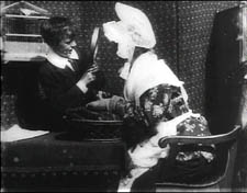
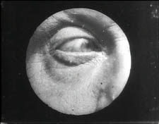
Smith’s As Seen through a Telescope motivates the cut-in POV shot as what our dirty old man in the foreground has an eye for.
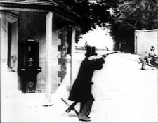
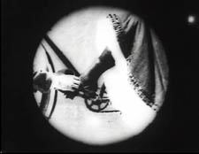
Fairly soon, this use of the magnifying POV shot was mingling with more straightforward ones. In The Birth of a Nation (1915), D. W. Griffith offers a rough-edged example. When the Stoneman brother and sister visit Ford’s Theatre on the night of Lincoln’s assassination, we see Elsie pointing out the famous actor John Wilkes Booth.
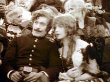
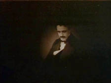
Booth is framed in an iris, which Griffith often uses to underscore an important image. But when Elsie studies Booth through her opera glasses, Griffith, usually not fastidious about such things, supplies the same irised image, now doing duty for the sort of magnifier-masking we get in the Smith films.
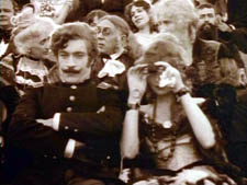
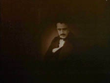
Presumably a more consistent technique would show Booth in long shot first, without the iris, and reserve the optical masking for replicating the view through the opera glasses. This is what happens in Ernst Lubitsch’s Lady Windermere’s Fan (1926), which contains a sequence built entirely around crisscrossed character looks. (1)
The woman of the world Mrs. Erlynne arrives at the racetrack and creates a stir, causing many men to watch her from all over the grandstand.
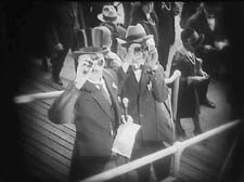
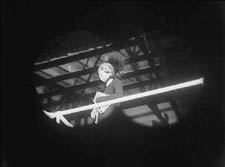
Note that Lubitsch has gone beyond Griffith by fitting the angle of Shot B to the viewer’s orientation, looking up. There are so many POV shots that at one point Lubitsch simply shows her from different angles and deletes the shots of each watching man.
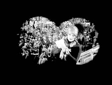
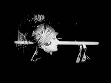
This is a fascinating example of a process we often see in stylistic history. An “overlearned” visual convention can be treated elliptically; the filmmaker can leave out bits and we’ll fill them in. The binocular masking suffices to let us know that Mrs. Erlynne is being studied from afar. Moreover, Lubitsch gets an expressive bonus from being so concise. Now it doesn’t matter who’s watching, just that somebody is—actually, a lot of somebodies.
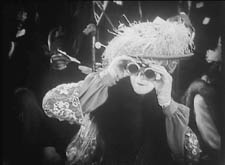
Later, after much more byplay with people looking at one another and misunderstanding what they see, Mrs. Erlynne sits down. Three gossips have been studying her, but now their view is blocked. So one gossip has to twist around to spy on her, and Lubitsch obligingly gives us a slightly tipped point-of-view framing—a full shot, without masking.
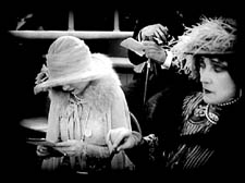
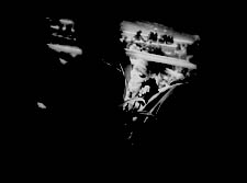
Adjusting her binoculars, the gossip is able to get a bigger view of Mrs. Erlynne, and she racks focus gleefully to catch a gray hair peeping out.
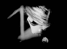
The visual narration in this sequence, already perfectly modulated, supplies the stylistic premise for Hitchcock’s Rear Window and all of its progeny, most recently Disturbia (2007). What might be overlooked is that by the 1920s the view through a device—field glasses, a microscope, a surveillance camera—had become a special, marked case. From then till now, the default POV pattern is the simple shot of a character looking, followed by an unadorned shot of what that person sees, from more or less the correct standpoint. Lubitsch’s sideways shot of the gossip’s view of Mrs. Erlynne, casually introduced, exemplifies the modern norm for presenting a character’s vision, and it’s so common that we seldom notice it.
POV shots: The basics
In his book Point of View in the Cinema, Edward Branigan itemizes the cues that the filmmaker can manipulate in creating a POV construction. (2) To simplify somewhat: Shot A shows a point in space and a character glance from that point. Shot B is taken from a camera position more or less approximating the point in A, and it shows an object. The shot-change presumes temporal continuity between A and B, and we assume as well that the character is aware of the object shown in B.
This seems like a complicated way of stating the obvious, but by teasing these elements apart, Branigan shows that each one can be manipulated in intriguing ways. For example, you can create a disorienting moment by violating the condition of temporal continuity. Ozu does this in Early Summer (1951), when Noriko and Aya decide to peek in at the man Noriko almost married. The two women tiptoe down a hall toward us as the camera tracks slowly backward. Ozu cuts to a forward-tracking shot that momentarily suggests a reverse angle POV on the corridor.
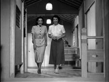
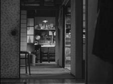
In fact, however, the camera movement is revealed to be the first shot of a new scene, among different characters, and we won’t ever see the man the two women went to spy on.
Here’s another interesting case, not cited by Branigan. In Halloween (1978), John Carpenter shows Laurie looking out a window and seeing Michael Myers in his mask, standing between fluttering washlines.
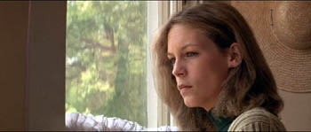
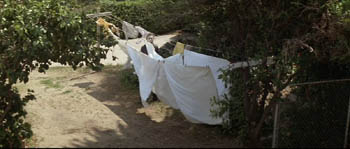
Cut back to Laurie, now frowning slightly.
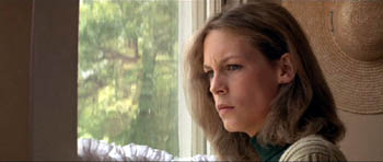
Cut to a second POV shot; but now Michael has vanished.
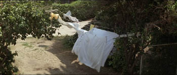
This simple change in shot B’s object, Michael himself, has an uncanny effect. Did Michael just walk away from the washline? If so, this is an odd way to present it. Why not show him walking away? Alternatively, did he just disappear? Surely not; Laurie would be shocked. Carpenter wins twice over. Without obviously violating realism or directly showing that Michael has supernatural powers, he gives Michael the ability to come and go in a ghostly fashion. By the end of the film, when he miraculously disappears after a fall that would kill an ordinary person, we are prepared to believe that he is indeed, as Dr. Sam Loomis says, the Boogyman.
Who is Sylvia? What is she that all the swains commend her?
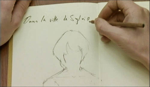
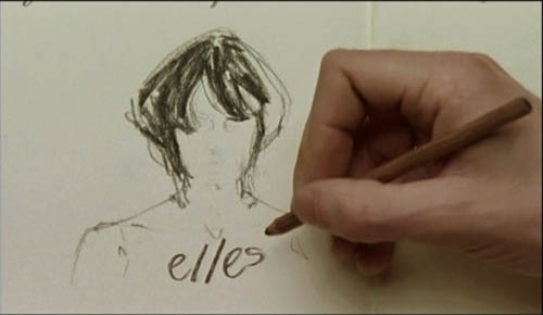
In the City of Sylvia centers on a young man staying at a hotel. We’re given no reason why he’s visiting the city, and no backstory about him. One day he’s sitting at a café. Now, across nearly twenty minutes of screen time he watches women and idly sketches them.
The sequence is a pleasure to watch, partly because of the constant refreshing of the image with faces, nearly all of them gorgeous, most of them female. Either Strasbourg has an extraordinary gene pool, or this café attracts only Ralph Lauren models. Yet the scene builds curiosity and suspense too, thanks to Guerin’s sustained and varied use of optical POV. He gives us an almost dialogue-free exploration of a cinematic space through one character’s optical viewpoint. (Stop reading here if you don’t want to know anything more about the film before you see it.)
The young man, known in Guerin’s companion film Unas fotos en la ciudad del Sylvia as the Dreamer, is almost expressionless as he scans the women’s faces. Slight shifts of his glance are accentuated by his habit of turning his head but keeping his eyes fixed. In over a hundred shots, Guerin uses some ingenious cinematic means to tease us into ever-greater absorption in the Dreamer’s visual grazing.
Fairly far into the sequence, Guerin gives us more or less the orthodox POV construction. The Dreamer looks at one woman at a table, and we see her return his look.
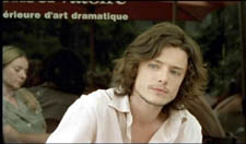
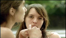
But here shot B isn’t really clean: the hands of the woman on the left sometimes block our view of the principal woman. This obtrusiveness is one of Guerin’s most basic strategies in the sequence. Inevitably, in passages before and after the cut I just showed, what the Dreamer is looking at is partially hidden in layers of faces and body parts.
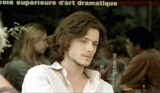
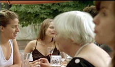
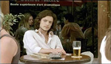
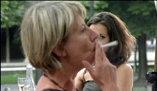
Our prototype of the POV cut presumes a more or less single ‘point’ we are watching in shot B, but throughout this scene Guerin plays with this cue. He tantalizes us with several points to be observed, and he often obscures the most important ones. He also creates some startling juxtapositions. Near the very start we get this shot, which may or may not be the Dreamer’s POV.
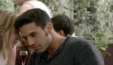
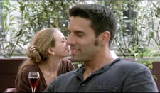
By making the background girl seem to kiss the foreground guy, Guerin, as Eisenstein would say, “christens” his sequence. In effect, the image says: Watch out! Layered space will become important! When I saw this shot, I nearly jumped out of my seat.
The Dreamer is treated no differently, at least at the start. In most movies, the POV construction is set up with a clear, clean framing of our looker in shot A. Here, though, at the start of the scene Guerin peels away layers to get to our man. For the first six shots of the café, we don’t know he’s on the scene. Then he’s shown out of focus, in the background of more prominent action. The woman in the foreground has been primed to be the shot’s subject. At the moment she shifts her gaze and we try to read her expression, a second woman on the distant right shifts aside to reveal the Dreamer behind her.
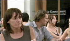
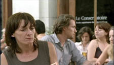
Surely this is the most unemphatic entry of a protagonist we’ve seen in a while! Guerin is able to add planes to block the main ‘point’ of shot B because he’s working with long lenses, a crowded space, and careful choreography. Even focus plays a role, as in this case; our Dreamer is pretty hazy.
One upshot of this strategy is that we’re plunged into a “cubistic” space, in which slightly varied camera angles pick up bits of space we’ve seen in earlier combinations and oblige us to assemble it all in our head. Be thankful for the guy in the blue shirt above, for he plays an anchoring role in several setups that would otherwise float free.
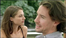
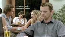
It’s hard to convey in stills how much fascination and frustration that this teasing style creates. Like the Dreamer, we’re given only glimpses of the women, and even though we don’t know his purposes—is he just an artist in search of beauty? a serial killer picking out victims?—the partial views lure us at several levels. We try to complete the faces. We try to infer the women’s state of mind from their expressions and gestures, which are far more animated than our Dreamer’s.
And a search for story plays a part here. We’re primed for some action to start, and we browse through these shots looking for anything that might initiate it. Each face the Dreamer spots promises to kick-start a plot: when the Dreamer gets a full view of one of these women, perhaps things will get going.
Without giving away every detail, I’ll just say that the sequence has a strong visual arc as the Dreamer starts paying more and more attention to certain women. And just as he finally gets a full view of one fabulous face, his attention wanders to . . . another layer, this time one inside the café.
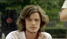
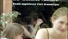
As he gapes at the woman inside, layers pile up, creating a cubistic climax of all the optical obstructions we’ve encountered.
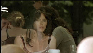
The motif of reflections will take over the rest of the film’s visual design, and eventually we’ll see that some of the Dreamer’s drawings evoke the piled-up and sliced-up faces in the café shots.
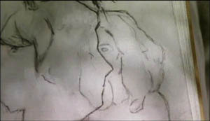
Later in the film, the Dreamer will explain why he’s in the city and why he’s scanning women. We’ll have a tram ride that Guerin compares with Sunrise, and a scene in a music club that not only parallels the café sequence but evokes Manet. We’ll also have occasion to compare this film with Bresson’s Four Nights of a Dreamer, a citation signaled from the outset.
All that is to come. Even if the later scenes weren’t as compelling as they are, this café sequence would make Sylvia one of the most adventurous films I’ve seen this year. By revising the simple, long-lived POV schema, Guerin has made it yield fresh feelings and implications. Like Lubitsch’s racetrack scene, this imaginative sequence provokes the jubilation you feel in the presence of calm, precise artistry.
(1) Lee Marshall, “Past Perfect,” Screen International (19 October 2007): 27. The web version is here, but it may require a subscription.
(2) I analyze the visual narration of Lady Windermere, which I think deserves to be ranked with Potemkin and Sunrise, in Narration in the Fiction Film (Madison: University of Wisconsin Press, 1985), 178-186.
(3) Edward R. Branigan, Point of View in the Cinema: A Theory of Narration and Subjectivity in Classical Film (The Hague: Mouton, 1985), 102-121.
The sarcastic laments of Béla Tarr
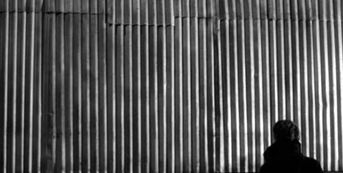
Werckmeister Harmonies.
DB here:
Last weekend, Facets MultiMedia in Chicago held a tribute to Béla Tarr. Milos Stehlik and his colleagues have been long-time champions of Tarr’s work, holding retrospectives and releasing nearly all his features on DVD (with Sátántangó soon to come). Tarr arrived on Saturday, but an emergency sent him back to Hungary sooner than he expected. So instead of discussing his work with a panel, he could only introduce the screening of Werckmeister Harmonies before running off to the airport.
The panel went ahead, with Jonathan Rosenbaum, Scott Foundas, and me chatting with Susan Doll of Facets. It wasn’t as pungent a session as it would have been with Tarr there, but I thought it was still pretty interesting. Jonathan, Scott, and Susan had thoughtful comments, and the questions from the audience were exceptionally good. The whole session was recorded for an online broadcast at some point, so you might want to watch out for that. And I have earlier blog entries on Sátántangó here and here.
In preparation for the panel I spent last week reconsidering Tarr’s work, so I offer a few notions about his films and how we might place them in the history of cinematic form and style. Some of these remarks build on things I said at the session.
Up close and personal
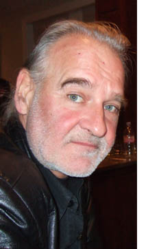 Some directors accommodate critics, accepting or at least tolerating writers’ efforts to probe the work. Not Tarr. Ask about his plots and characters, and he claims that he doesn’t tell stories. Point out what seem allegorical or symbolic touches, and he protests that he doesn’t make allegories and he hates symbols. Mention contemporary cinema, and the reply is abrupt: “For me, when I see something at the cinema it is always full of shit.” And if you tell him that his early films seem quite different from his more recent ones, he vehemently disagrees.
As Scott pointed out in our panel, though, it can be plausible to apply the concept of “period” to filmmakers’ work as we do to painters’ careers. Lars von Trier has been fairly explicit that after mastering a polished style for his work up through Zentropa/ Europa he wanted to try something new, and with The Kingdom he shifted toward a looser, on-the-fly style that pointed toward Dogme 95. Any viewer can be forgiven for thinking that Tarr has moved in the opposite direction of von Trier, from a pseudo-documentary approach toward something much more grave and majestic.
The first three theatrical features focus on the urban working class and their struggles to improve their lot. In Family Nest (1979), a family who can’t afford a flat of their own squeezes in with the husband’s parents. The tight quarters, the ceaseless complaints of the father-in-law, and the husband’s inertia force his wife and child to flee to the streets. The Outsider (1981) follows a young violinist as he drifts among jobs and into a passive marriage before being called up for military service. The family in The Prefab People (1982) has a flat and a decent job, but the wife finds the husband indifferent to her boring routines, and he looks for an escape in a job in another town. The concentration on ordinary people’s lives and the search for drama in the everyday dissatisfactions of city life put the films in the neorealist line of succession.
Stylistically, the films are stripped down in ways that also owe debts to modern traditions. Shot mostly handheld, adjusting the framing to the actors’ performances, they belong to a strain of films from the 1960s on that sought to suggest the immediacy of cinéma-vérité documentary. Unlike many such films, however, Tarr’s buy into a long-take aesthetic. Perhaps surprisingly, these movies’ shots run abnormally long: an average shot length of 32 seconds for Family Nest, 33.5 for The Outsider, 47 seconds for Prefab People. By comparison, Hollywood films of these years were consistently running between 4 and 8 seconds per shot, and comparatively few European and Asian films rely on shots as lengthy as Tarr’s.
Most scenes in these three films are dialogues, and the camera holds intently, if shakily, on faces. This concentration is enhanced by the general absence of establishing shots. A scene opens more or less in the middle of a conversation, and we get a character already challenging another. The visual pattern is that of shot/ reverse-shot, and in most scenes the first face is counterposed to a second one by either a cut or a pan. Shooting on location in cramped rooms, Tarr makes his framings tight; in Family Nest, the jammed frames give us and the characters almost no breathing space.
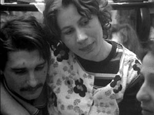
By relying on more or less isolated faces in close-ups, Tarr can absorb us in the intimate drama while sometimes catching us off guard. For instance, when we get a single character without an establishing shot, there is often a momentary uncertainty about where we are, or when the action is taking place. We also can’t be sure of who’s present besides the speaker, so the close view of him or her leaves us hanging: To whom is s/he talking? We’re pushed to pay close attention to what the character is saying, looking for any clues to the dramatic context. Tarr’s tactic also delays the reaction of the listener; he may withhold sight of the conversational partner until s/he speaks. The effect, heightened by the lengthy takes, is to turn many of these scenes into monologues, in which a character pours out his or her reaction to a situation, and we’re forced to take that in more or less pure form.
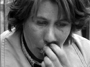
By the end of Family Nest, Tarr is shooting entire scenes concentrated on a single face, and because we don’t know if there is anyone else present, we have to take the talk as virtually a soliloquy.
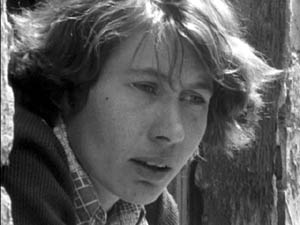
It’s as if Tarr invoked the stylistic schema of shot/ reverse shot and simply postponed or suppressed the reverse shot, leaving only an inexpressive shoulder in the foreground, if that. I’ve discussed the delayed reverse-shot as a convention of European cinema in an earlier blog, and Tarr makes ingenious use of it.
Tarr builds these films out of conversational blocks, punctuated by undramatic routines. The result is that often major plot actions take place offscreen, or rather in between the dialogues. Exposition that other filmmakers would give us up front is long delayed, with bits of information sprinkled through the entire film. In Family Nest, the father claims that he’s seen Iren having an affair with another man. We can’t be sure he’s lying because we haven’t strayed enough out of the household to judge her activities. In The Outsider, one scene ends with the drifter Andras telling Kata, a woman he has recently met, that he has a child by another woman. The scene ends with him smiling in indifference, leaving his sentence unfinished. In the next scene, a band strikes up a tune: Andras and Kata are celebrating their marriage.
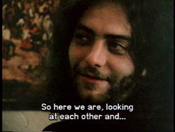
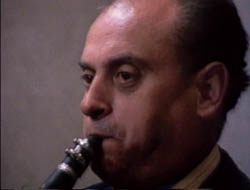
Most filmmakers would show us more of the courtship and a scene of proposal, but Tarr moves directly to the next block, suggesting Andras’ laid-back heedlessness. Agreeing to get married is no big deal. Further, by skipping over the most obviously dramatic incidents, Tarr’s storytelling joins that tradition of ellipsis celebrated by André Bazin in his essays on neorealism. No longer does the filmmaker have to show us every link in the causal chain, and no longer are some scenes peaks and others valleys. By deleting the obviously dramatic moments, the filmmaker forces us to concentrate on more mundane preambles and consequences.
This block construction yields an unusually objective narration. These films lack voice-overs, subjective flashbacks, dreams, and other tactics of psychological penetration. We have to watch the people from the outside, appraising them by what they say and do. It is a behavioral cinema. True, Prefab People opens with a flashback: The husband is packing to leave his wife, and the plot moves back to an anniversary dinner that ends badly. But the flashback to the earlier phase of the marriage isn’t framed as the wife’s memory. When the plot’s chronology brings us back to the moment of the husband’s departure, the replay of the opening allows us to watch the characters with more knowledge of what is driving them apart. Unsurprisingly if you know Tarr’s earlier films, that replay is followed by a long monologue showing the wife expressing her sorrow at his departure, without any visual cues about who, if anyone, is listening.
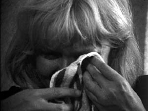
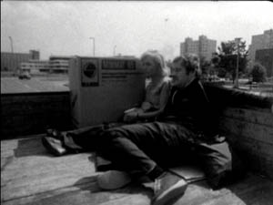
Then, without preparation, we see the couple back together, shopping in an appliance store. How did they reconcile? Have their attitudes changed, or are they simply reconciled to their old life? Like Antonioni and many other modern filmmakers, Tarr doesn’t tell us such things. He simply ends his film on a long take of husband and wife riding expressionless in the back of a truck, as much pieces of cargo as the washing machine beside them.
After the Fall
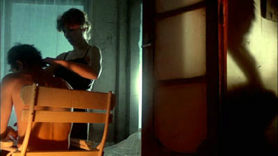
The second-phase films do look and feel rather different. Almanac of Fall (1984), a story of duplicity and spite among people sponging off a well-to-do older woman, offers a wholly elegant mise-en-scene. Characters are often framed from far back, surroundings take on much more importance, the framing is stable—often with windows, doors, and furnishings impeding our view of the action—and the camera moves smoothly, often in arcs around stationary figures. The takes are even longer, averaging just under a minute. The rococo lighting (patches of color seem to follow actors around) and atmosphere of strained upper-class narcissism seem like quite a break from the working-class films. If I had to find an analogy to Almanac of Fall, it would be Fassbinder’s Chinese Roulette (1976), with its camera arabesques and slightly decadent ostentation.
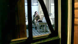
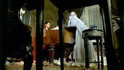
The overripe shots of Almanac of Fall signaled a shift toward a self-consciously formal cinema, but then Tarr stripped his settings and cinematography down. From Damnation (1988) onward, his films feature ruined exteriors, shabby interiors, elaborate chiaroscuro, rhythmic camera movement, and very long takes. (Damnation has an ASL of 2 minutes; Sátántangó, 2 minutes 33 seconds; Werckmeister Harmonies, 3 minutes 48 seconds).
Tarr insisted in conversation with me that there isn’t a sharp break between early and late styles. For one thing, his video piece Macbeth (1982) consists of only two shots across 63 minutes. It was made before The Prefab People, so his shift toward the ambulatory long take was already in the works. Moreover, The Outsider ends with a strained restaurant encounter captured in a virtuoso handheld shot running nearly seven minutes. A nightclub scene in The Prefab People likewise features some sidewinding long takes around a dance floor that wouldn’t be out of place, at least in their repetitive geometry, in Damnation.
If we’re inclined to look for other continuities, we can find them. In the films from Damnation onward, the deferred reverse shot has been put at the service of attached point of view, so that often when Tarr’s protagonists peer around a corner or out of a window, instead of optical pov cutting we have an over-the-shoulder view that conceals their facial reaction. One scene in Damnation starts as a typically Tarrian scrutiny of texture, with the wrinkling wall echoing Karrer’s topcoat. But then the camera arcs and refocuses, showing what Karrer is watching but not how he responds.
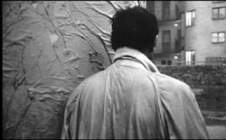
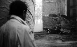
The blocklike construction of scenes in the early films carries on in the later work, but now Tarr minimizes the cuts within a scene, so that it becomes an even more massive hunk of space and time. Tarr refuses as well to use crosscutting, which would show us various characters pursuing their activities at roughly the same time—another strategy that keeps us fastened to one relentlessly unfolding chain of actions and, usually, one character’s range of knowledge. The avoidance of crosscutting will have major structural implications in Sátántangó, which overlaps characters’ individual points of view by replaying certain events and stretches of time.
The long-held facial shots of the early films don’t create a natural arc; the shot will go on as long as the character wants to talk. Similarly, many long takes in the later films don’t present a beginning-middle-end structure. We simply follow a character walking toward or away from us, pushing into a stretch of time whose end isn’t signaled in any way. This becomes especially clear in those extended long shots in which a character walks away toward the horizon and the camera stays put. Traditionally, that signals an end to the scene, but Tarr holds the image, forcing us to watch the character shrink in the distance, until you think that you’ll be waiting forever. Likewise, the diabolical dance shots of Sátántangó, built on a wheezing accordion melody that seems to loop endlessly, are exhausting because no visual rhetoric, such as a track in or out, signals how and when they might conclude. Early and late, Tarr won’t hold out the promise of a visual climax to the shot, as Angelopoulos does; time need not have a stop.
Nonetheless, I do agree with my fellow panelists that the later films have a significantly different look and feel, and it’s on them that Tarr’s place in world film history will chiefly rest. As I indicated at the end of Figures Traced in Light, he stands out as a distinctive creator in a contemporary tradition of ensemble staging. Like Tarkovsky, he shifts our attention from human action toward the touch and smells of the physical world. Like Antonioni and Angelopoulos, he employs “dead time” and landscapes to create a palpable sense of duration and distance. Like Sokurov in Whispering Pages (1993), he takes us into an eerie, Dostoevskian realm where characters are cruel, possessed, mesmerized, humiliated, and prey to false prophets.
Ties to tradition
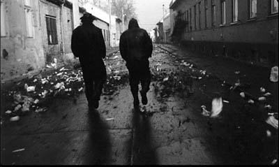
Tarr, however, maintains that his work, early or late, owes little to cinema. He claims not to have been influenced by other directors, and he asserts that he gets his ideas from life, not from films. When pressed, he admits that he knew the films of Miklós Jancsó “and I liked them very much. But I think what he does is absolutely different from what we do.”
It’s not uncommon for strong creators to reject the idea of influence, and many feel that they may sap their originality if they’re exposed to other work. Still, nothing comes from nothing. Any artwork is linked to others through an expanding network of affinity and obligation. Often influence is like influenza; you catch it unawares, despite your efforts to ward it off. And sometimes artists on their own find strategies that other artists have already or simultaneously hit upon.
Whether or not Tarr consciously joined a tradition, his practices do link him to several trends. Tarr has rejected the idea, floated by Jonathan, that his early films are indebted to Cassavetes, but there seems little doubt that by 1979, when Family Nest was released, it contributed to the fictional-vérité tradition, regardless of his intent. Likewise, his late films’ reliance on long takes is part of a broader tendency in European cinema after World War II. The neorealists taught us that you could make a film about a character walking through a city (The Bicycle Thieves, Germany Year Zero), and other directors, such as Resnais in the second half of Hiroshima mon Amour, developed this device. With Antonioni, Dwight Macdonald noted, “the talkies became the walkies.” Jancsó took Antonioni further (acknowledging the influence) in the endless striding and circling figures of The Round-Up, Silence and Cry, and The Red and the White. So even if there wasn’t any direct influence, Antonioni and Jancsó paved the way for Tarr; they made such walkathons as Sátántangó and Werckmeister thinkable as legitimate cinema.
Still more broadly, as Hollywood cinema has become faster-paced, accelerating its action and cutting, art cinema in Asia and Europe has tended toward ever slower rhythms. Visit any festival today, as Scott mentioned in our panel, and you’ll see plenty of films with long takes and fairly static staging. I criticize this fashion a bit in Figures, but it’s undeniably a major option on today’s menu. It’s even been picked up in contemporary American indies, with Gus Van Sant’s work from Elephant on offering prominent examples. He, of course, has been crucially influenced by Tarr, but Hou, Tsai Ming-liang, Sokurov, and other directors haven’t. We seem to have a case of stylistic convergence, with Tarr choosing to explore the long take at the same time others were doing so.
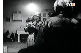 Within recent Hungarian cinema, it would be fruitful to examine Tarr’s relation to his contemporaries. Janós Szasz’s Woyzeck (1994) takes place in a wasteland not unlike those of Damnation and Sátántangó. Even closer to Tarr is the work of György Fehér. I’ve seen only Passion (1998; right) and one scene from Twilight (1990). Here again we get very long takes with a supple camera, grungy settings, and down-at-heel characters wandering in rain and mist or dancing as if possessed by demons. Fehér has worked with Tarr as producer, dialogue writer, and “consultant.” We could also explore Tarr and Fehér’s affinities with Benedek Flieghauf, the younger director of The Forest (2003) and Dealer (2004). Fleghauf builds these films around extensive long takes, and the remarkable Forest carries the idea of the suppressed reverse-shot to an eerie extreme, as characters study mysterious offscreen objects that may never be shown us.
More generally, and more speculatively, we could look to a wider movement in late and post-Soviet art toward mournfulness and lamentation in response to cultural collapse. Tarkovsky’s Nostalghia is one instance, but Larissa Shepitko’s The Ascent (1976) and Elem Klimov’s Come and See (1985) point in this direction too. Vitaly Kanevsky’s Freeze, Die, Come to Life! (1989) offers a rusting, dilapidated world not far from Tarr’s. In the 1970s and 1980s, composers like Arvo Pärt, Henryk Górecki, Giya Kancheli, Vyacheslav Artyomov, and Valentin Silvestrov created austere, threnodic music that sometimes evokes spirituality but just as often suggests a bleak end to everything. The very titles—Symphony of Sorrowful Songs (Górecki), Symphony of Elegies (Artyomov), Postludium (Silvestrov)—evoke something more than the death rattle of Communism. The pieces can be heard as meditations on the ruins of modern history, asking what humankind has accomplished and what can come next. Tarr’s severe parables, grotesque and sarcastic in the manner of Kafka, don’t exude the religiosity we can find in some of this music or filmmaking, but, at least for me, they share the impulse to lament humans’ inability to transcend their brutish ways. “I just think about the quality of human life,” he remarks, “and when I say ‘shit’ I think I’m very close to it.”
I have more ideas about Tarr, especially on Sátántangó and Werckmeister, but I have to stop somewhere. I hope to see his new film The Man from London when I go to the Vancouver International Film Festival next week, and of course I’ll report on it here.
The best piece of writing I know on Tarr’s cinema is András Bálint Kovács’ “The World According to Tarr,” in the catalogue Béla Tarr (Budapest: Filmunio, 2001).
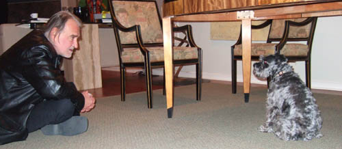
Béla mesmerizes Lola, Chicago 15 September 2007.
Thanks to Milos Stehlik, Susan Doll, Charles Coleman, and Megan Rafferty of Facets, to Béla Tarr for generous conversation, and to András Kovács for enlightening discussions over the years.
PS 20 September: The reports of Tarr’s earlier visit to Minneapolis are emerging; here’s a good link.


