Archive for the 'Film technique: Editing' Category
Off-center: MAD MAX’s headroom
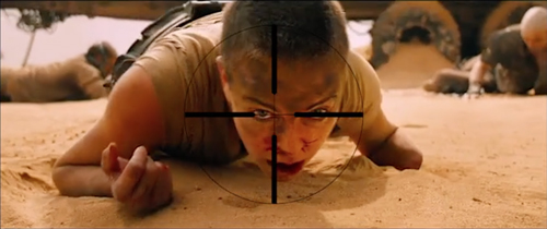
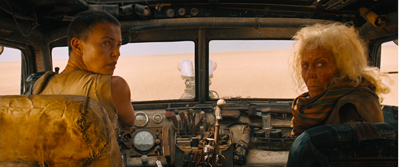
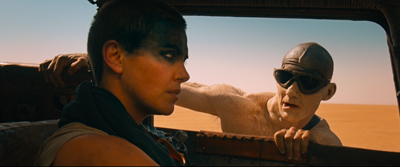
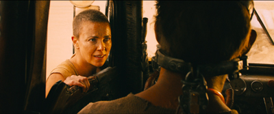
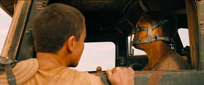
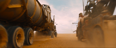
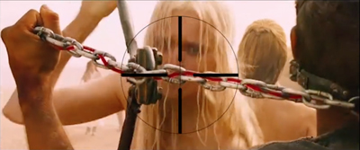
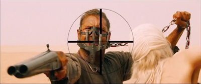
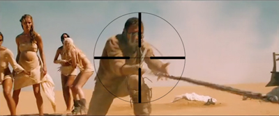
From Mad Max: Center Framed, by Vashi Nedomansky.
DB here:
If you’re a filmmaker, how do you frame the action you’re shooting? Put aside documentary shooting, which doesn’t allow you as many options as staged filming does. A lot of your compositional decisions depend on the aspect ratio of the image.
After the mid-1910s, filmmakers relied heavily on close views—framing typically two or three people, or even just one. These “portrait” framings were well-suited to the 4:3 format that was standardized in the silent era. But what happens when filmmakers must compose in wider frames, especially the 2.35:1 format that became common with CinemaScope?
Too much scope in ‘Scope?
In classic Western painting and other traditions as well, a horizontal format is associated with fairly distant views of groups or landscapes.
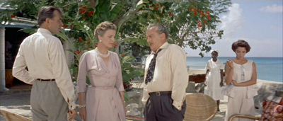
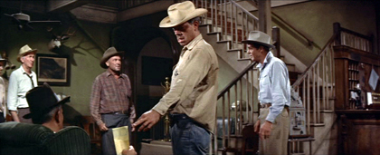
Early ‘Scope filmmakers did sometimes favor distant, spread-out ensemble staging, with greater or less depth. (Below: Island in the Sun; Bad Day at Black Rock.)
I try to track some of those early options in this online lecture.
But as technology improved, filmmakers managed to shoot medium- and close shots in the wide format. They “tamed” ‘Scope to a more traditional continuity. And as there were pressures toward “intensified continuity,” filmmakers adapted those tenets to ‘Scope. They gave us close-ups, fast cutting, and roaming camera movements within the widescreen array.
Like all solutions, this involved trade-offs. The 4:3 format was well-suited to the human body, and even a tight facial close-up could fill it fairly well. But a single or even a two-shot, in anamorphic widescreen, can leave a lot of the frame vacant or relatively unimportant.
Cinematographer Boris Kaufman objected to the extra real estate. In traditional arts, the design should fit snugly into the format, with all areas contributing to the image’s effect:
The space within the frame should be entirely used up in composition.
But close views in widescreen typically leave a lot of dead space. If you put the figure in the center, that dead space can be on the sides.
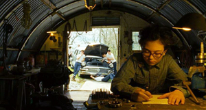
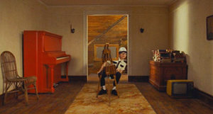
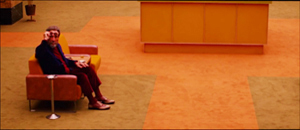
The bilateral symmetry of Wes Anderson’s frames is achieved on the premise that the figure is facing straight out at the viewer, so Anderson has the problem of filling up the flanking areas.
Or the dead space can be bigger on one side of the frame than the other. In that case, the figure, even a close one, is placed off-center in the 2.35/2.40 frame. This can suggest that the object of attention is somewhere beyond the empty zone.
To avoid sheer dead space, you can try to settle something in the background. If it’s dramatically important, you can generate some nice compositional tension, in the manner of the wide-angle, deep-focus look of the 1940s.
So as with most creative options, making a choice involves (a) tradeoffs and (b) further choices, some of them fairly forced. Go with widescreen, and you have to fill the frame somehow. Make one choice, and you have some dead areas, but you can control the viewer’s attention. If you fill the areas with significant action, you need to find some dynamic compositions. But you divide the viewer’s attention. You now have to make people look where you want and when you want.
Cuts for composition
Now add in cutting. How do you cut widescreen shots together, say in a conversation scene?
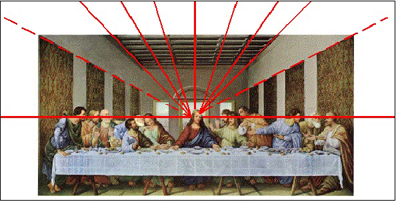
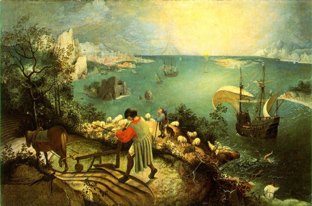
Go back to painting. Sometimes the most important item sits in the geometrical center of the picture format. Rudolf Arnheim points out that often the exact center is vacant and items are grouped around it. The result is a pictorial tension, with elements balanced, either symmetrically or in more complex patterns. In Bruegel’s Fall of Icarus, the major action is split–a dramatic splashdown, a world that doesn’t notice. The fall takes place somewhat off right of center, in a bright but far-offf area. It’s still almost indiscernible. The indifference of the peasants is given in the very composition of the image.
So too with cinema. In a single image, when the main point of interest isn’t dead center, there can be either symmetry, or important items grouped around the center.
Going beyond the single image, we find that editing can create a fairly gentle seesawing around the central area. A common tactic is shot/ reverse-shot, with over-the-shoulder framings. In widescreen, that option tends to make the center fairly empty.
Or you can try “compensatory” shot/ reverse-shot cutting, so that the empty area of the first shot is filled by the corresponding figure or action in the next shot.
This second isn’t a bad solution, since the two shots together satisfy Kaufman’s dictum in a roundabout way. They become a “cinematic” way of filling the horizontal format, but in time rather than purely in space. And in this instance the main characters’ angled eye levels fit together snugly, in the upper center.
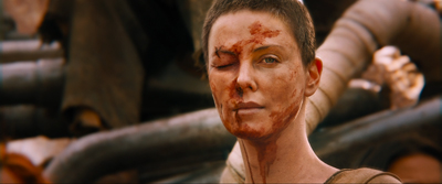
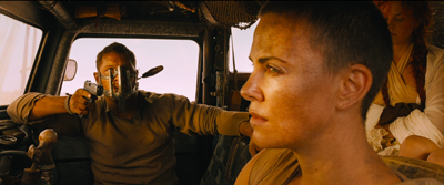
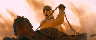
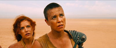
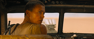
There can be a certain suspense added, as the second frame slowly fills up to reveal the item. When Furiosa looks off right, we cut to a shot of what’s caught her attention–an attack vehicle drawing into the frame on the right.
Assume, as most people do, that our attention fastens on certain aspects of the frame—typically those that attract us perceptually (brightness, movement, color, sound source, etc.) and that provide ongoing story information. So now you have to consider: How closely do you want your second shot to pick up on the crucial area of the first shot? That is, is the smoothest cut the one that starts the next shot with the viewer’s eye in the same part of the frame?
Some editors argue for this sort of continuity. “If the eye is led to one side of the screen,” notes one primer, “the action of character in the next shot might be located on that side also. Again, the purpose of the cut is to allow the eye to follow the movement.”
We’re back with our old friend the guided saccades, the fast, jerky eye movements that sample our environment. We’ve seen saccades at work in a single shot, thanks to staging that guides our attention. (Go here for a first-pass analysis, here for the eye-tracking evidence.) What about the cuts? The research of psychologist Tim Smith suggests that many editors intuitively try to match the point of interest across cuts. This is especially evident in the default zone, the geometrical center.
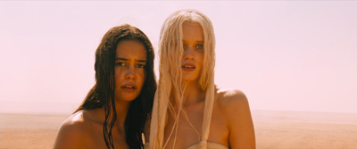
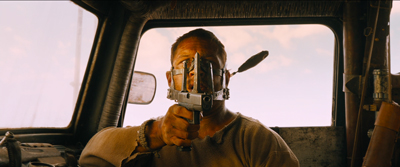
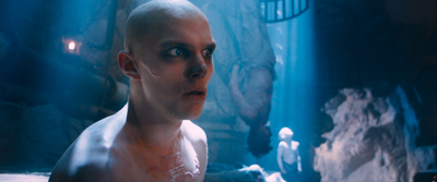
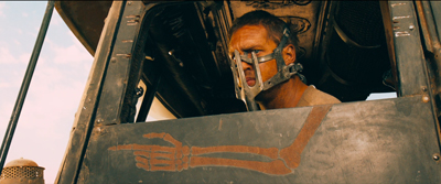
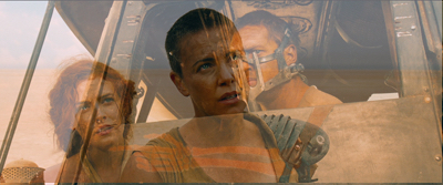
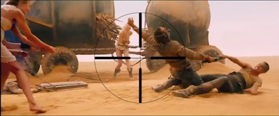
Keeping the viewer’s attention fastened on one area of the screen across the cut could be of great value in fast-cut action scenes. That way the viewer couldn’t miss the most important thing—a face, a gesture, a prop. This was the aim of George Miller in certain scenes of Mad Max: Fury Road. According to cinematographer John Seale, the centered compositions make it easier for the viewer to follow the action.
Your eye won’t have to shift…to find the next subject when you’ve only got 1.8 seconds of time to do that.
Vashi Nedomansky has created a striking video, complete with centered crosshairs, that shows the strictness of framing and composition during one action scene. Both long shots and fairly close ones are center-framed.
Vashi notes that Michael Bay and other directors seem to rely on fast cutting without due concern for where the viewer’s eye lands at the end of each shot. Combined with very short shots, compositional confusion can flummox us. We don’t know where we should be looking.
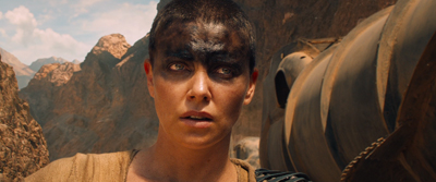
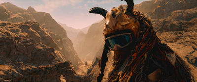
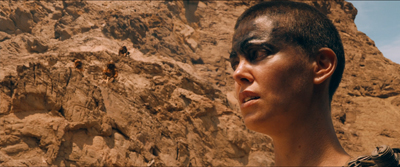
Miller uses a greater variety of compositions in other stretches of the film, as my illustrations above indicate. At times he applies his “matching zone system” to more off-center layouts. Furiosa is shown waiting for the biker gang to complete the deal, and she’s center framed.
We cut to one biker surveying the scene. He (she?) is positioned off-center, so that we get a certain foreground/background dynamic between him (her?) and the truck far in the background. Now cut to Furiosa, who’s now in the same area of her frame; the empty space on the left seems to confirm what her eyeline suggested about the biker’s position above the canyon. (Interestingly, Miller slightly breaks the axis of action to get this smooth graphic cut.)
Still, you can argue that for fast-cut scenes it’s better to adopt a brute-force simplicity of composition, favoring the center. (While of course assuming that ordinary continuity principles, such as matching of movement, screen direction, eyelines, and so on, are obeyed.) Tim Smith’s experiments have shown that all other things being equal, our eyes drift to the center of the format from shot to shot–a point that Arnheim also makes about “the power of the center” in all images. This visual habit is challenged by so-called empty-center painting of the 1960s and 1970s, as seen in Kenneth Noland’s Shadow on the Earth and Larry Zox’s Decorah.
Mad Max: Fury Road seems to me a superbly directed film in its chosen style, but we can find alternatives. What about fast cutting that tries, as a part of an action scene’s kinetic drive, to shuttle or bounce the viewer’s attention more widely across the frame? This option wouldn’t be helter-skelter in the Bay manner; it’s calculated, and engenders its own pictorial excitement.
Not exactly a picture scroll, but kind of
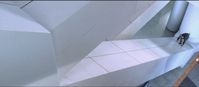
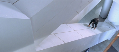
We can find many examples in the Asian action tradition. Take for example one of the extended pursuits in Benny Chan’s New Police Story, a 2004 Jackie Chan vehicle. Jackie is clambering up along an angled beam of the Hong Kong Convention Center, and the framing puts him far to the right, emphasizing the distance and steepness of the climb.
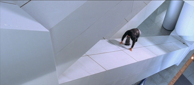
As he scrambles up, he seems not to notice that his pistol falls out of his pocket. But we do, because it stands out against the pale cladding as it slides down to the bottom of the slope. Miller would have given us a separate, centered shot of this crucial action, but here it becomes an instance of that “gradation of emphasis” that widescreen encourages.
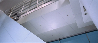
Before Jackie can hit frame center, there’s a cut that reverses the design of the first shot. A low angle puts him at the far left corner of the frame as he reaches the top. We never really see Jackie in the center of the frame in either shot.
The two shots are cut fast (about 3 seconds each), but there’s no problem grasping the action. Hong Kong filmmakers realized that you could cut long shots quickly if the composition and lines of movement were very clear. There is, it turns out, enough time for the eye to catch up to the main point of the composition, but it does ask us to exercise.
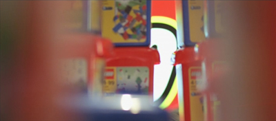
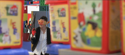
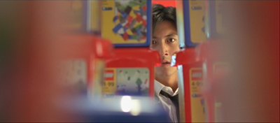
A more percussive cut comes when Frank, also unarmed, searches out Joe, the gang leader, in a toy department. A snap-movement of the kind HK filmmakers love shows an off-center empty slot; Frank pops in from screen right.
Cut to Joe stalking Frank, seen in another slot. It’s an optical POV shot, but it’s also off-center, balancing the composition of the first shot. A cut back to Frank closes the POV pattern. Perhaps the oscillation around the frame center can prime us for the next shot.
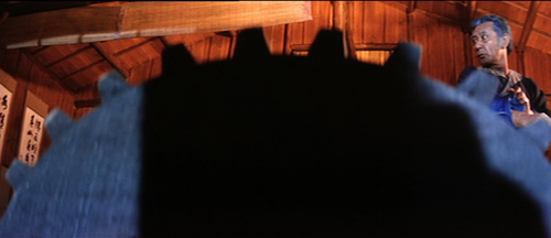
To get a sense of this “all-over” frame composition, have a look at this sequence from Yuen Kwai’s Ninja in the Dragon’s Den (1982). The combat swiftly passes from the center to the sides or to a corner. Thanks partly to the architecture of the cabin and the mill wheel, and partly to the judicious framing, there’s a sense that Kaufman might be satisfied that the space in the frame is “entirely used up”–not in a single shot, but in the totality of shots. (I’ve left in the English dubbing so subtitles don’t distract your eye.)
Hong Kong filmmakers mastered dynamic compositions during fights, but they were seldom as eccentric as their Japanese colleagues. Once anamorphic widescreen became common in Japan, directors pushed points of interest to frame edges and exploited unusual framing.
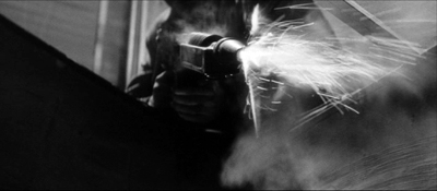
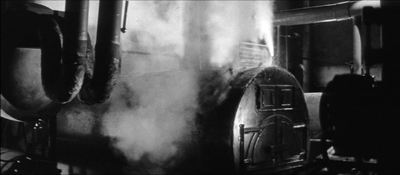
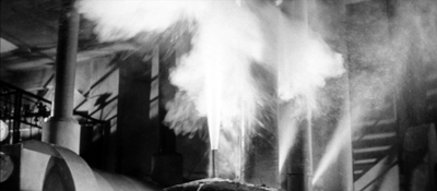
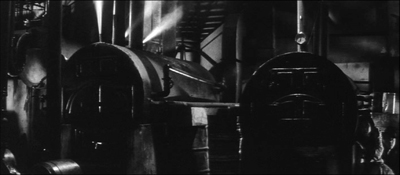
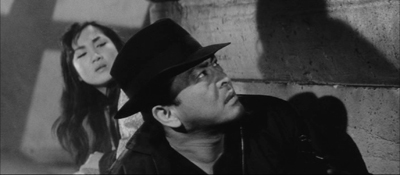
Consider the shootout at the climax of Suzuki Seijin’s Underworld Beauty (1958). A gang has trapped the protagonist Miyamoto and a young woman in a boiler room and is subjecting them to some heavy ordnance. In one series of shots, we see a gunman fire to the right, and as a result of his strafing, one boiler starts to blow.
The progression of boiler shots shifts us more or less rightward across the basement, and the empty area on the far left of shot 3 suggests that the gunman remains offscreen in the upper left. Now we get a sort of establishing shot showing the two boilers of shot 2 more fully.
I think we’re inclined to place the offscreen gunman still in the upper left. The spraying boiler we’ve seen is now on frame left. What’s surprising is that Miyamoto and the woman are crouching way down in the lower right corner. As you watch the shot, you might not notice them at first, but Suzuki has them change position after a moment so their movement attracts our eye. In addition, the shot is fairly prolonged as the boss calls out to his prey, so viewers have time to discover them. This is, I think you’ll agree, a pretty bold use of the anamorphic frame.
Once we’ve noticed them, how does Suzuki cut closer to the couple? Unpredictably.
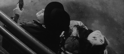
I feel a bump here every time I see it, because it’s hard to read the facial expressions from this angle. Instead, we get an almost abstract composition spread in a diagonal across the frame. Again, the geometrical center is less important than the shapes, edges, and tones that cross it.
At last we get something like an orthodox framing of the couple, eased by a match on action as the woman tips her head.
So the passage ends with a center-framed image. As often happens, decentering registers as an accent, a transitory departure from the baseline, the centered image. Not only will most action pass through the center, but we can be yanked to other regions in confidence that we’ll eventually return to it.
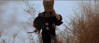
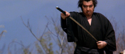
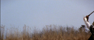
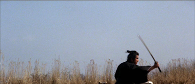
The shots in Underworld Beauty aren’t especially fast-cut, but I’ll close with another extract that is. This is the opening of Baby Cart at the River Styx (in the Lone Wolf and Cub series; dir. Misumi Kenji, 1972). Again, I’ve disabled the subtitles. (NB: Probably not best for children to see this.)
In a burst of shots, we get centered images, off-center ones, and radically off-center ones.
Continuity rules are respected and the camera is angled properly; but the compositions bounce from perfectly readable to perversely indiscernible. Some shots keep us in suspense about what’s about to happen, yet at no point is the action unclear. Again, the impact comes partly from simply composed, but highly varied, images.
George Miller’s strict target-framing is very powerful, but there are other options, even in fast-cut sequences. The idea of leading our attention across areas of the screen goes back to Eisenstein, the theorist-director who enjoyed zigzag graphic designs and the pictorial clatter created by a cut. One lesson: Every bit of the frame can be used, if only to jolt the viewer’s eye. All the action on the screen isn’t just in the story.
My quotation from Boris Kaufman is taken from Edward L. de Laurot and Jonas Mekas, “An Interview With Boris Kaufman,” Film Culture 1, no. 4 (Summer 1955): 5. The quotation about matching screen zones comes from Steven E. Browne, Video Editing: A Postproduction Primer, 3d ed. (Focal Press, 1997), 147. Bruce Block discusses “affinity continuums” from shot to shot in Chapter 7 of The Visual Story: Seeing the Structure of Film, TV and New Media, 2d ed. (Focal Press, 2013).
The Rudolf Arnheim book I’ve mentioned is The Power of the Center: A Study of Composition in the Visual Arts: The New Version (University of California Press, 1988). “Empty-center” painting is discussed by Thomas B. Hess in the essay of that title in New York (2 April 1973), 64-65 and in “Olitsky without Flattery,” New York (1 October 1973), 76-77. Hess describes paintings in which “the picture plane is stretched like a trampoline, with lots of spring action at its quivering edges.”
Tim Smith’s eye-tracking research is relevant to the framing principles I’ve been considering. Although he has yet to consider the more complicated cases of dispersed points of attention, he has found strong evidence that the default area remains the geometrical center of the screen. See his “Watching You Watch Movies: Using Eye Tracking to Inform Cognitive Film Theory,” in Psychocinematics: Exploring Cognition at the Movies, ed. Arthur P. Shimamura (Oxford, 22013), 170-171; the relevant video, with a heatmap of viewers’ attention, is here. Tim’s website is full of other examples from his research. Thanks to Tim for correspondence on this point.
Thanks also to Patrick Keating for email discussion of some of these matters.
I discuss principles of early widescreen shooting and staging in the online chapter “CinemaScope: The Modern Miracle You See Without Glasses.” See also the video lecture of the same name. For another example of radical decentering during a fast-cut combat, though put to different uses than in the Japanese examples here, see my entry on a King Hu jump cut.
Incidentally, we might wonder whether the centered compositions in Mad Max: Fury Road aren’t also acknowledging that on some displays (cable, streaming, airlines) these images will be cropped. To put important material too close to the frame edge risks losing it on downstream platforms. See “Filling the Box: The Never-Ending Pan-and-Scan Story.”
Ninja in the Dragon’s Den.
P.S. 1 March 2016: There’s a sequel to this entry here.
They see dead people
DB here:
Continuity editing was one of the great collective inventions of filmmakers. In the ten years after it crystallized in Hollywood around 1917, it was adopted around the world. The technique has hung on a surprisingly long time, rather like geometrical perspective in pictorial art. It’s so powerful that it’s hard to escape.
It’s powerful partly because it’s adaptable to a lot of narrative situations. It provides filmmakers what we can call a set of stylistic schemas, or routine patterns, that can be adjusted in various ways. Analytical cuts that take us into or back from the action, shot/reverse shots and eyeline matches, over-the-shoulder framings (OTS), and slight camera movements that set up reestablishing shots: these straightforward schemas can be used in an indefinitely large number of ways.
I‘ve been noticing this flexibility while writing (still!) my book on narrative strategies in 1940s Hollywood. In particular, I was looking at fantasy tales and the peculiar problems they pose for filmmakers. First, how do we represent ghosts, angels, and other visitors from the Afterlife? And how do we make sure that audiences understand that what we see isn’t necessarily what some of the characters onscreen are seeing?
Angels unawares
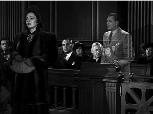
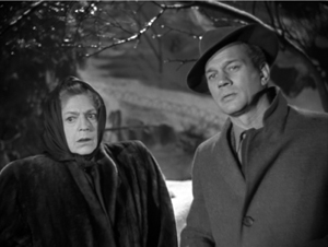
Our Town (1940).
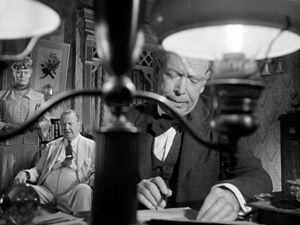
On the first problem: Today we have CGI resources that allow Afterlifers to move freely among the living characters. These effects were much harder to achieve back then. The supernatural-fantasy genre developed its own conventions (yep, schemas). Most films resorted to presenting the Afterlifer in double exposure.
But superimposed characters can’t move easily among the clutter of furniture in a set. A supered ghost can’t go behind a sofa; the sofa will always be visible through it. You might resort to a traveling matte shot, as William Cameron Menzies did in Our Town (1940), when Emily revisits her family after her death. The shot (just above) is particularly flashy because the younger Emily is also in it.
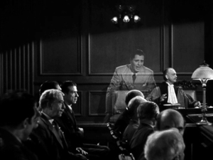
Or you could pull off the remarkable trick in Earthbound (1940). Here a ghostly Warner Baxter settles comfortably into the middle ground and strides around behind furniture and other actors.
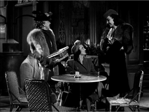
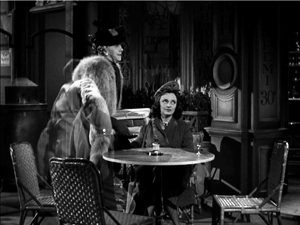
He can even give up his seat to an old lady and shift to another.
These effects were achieved by a technical feat that I don’t fully understand. (See the codicil.) But the trick wasn’t widely adopted, and most filmmakers opted for a simple expedient. Typically the Afterlifer shows up as a superimposition, but he or she gradually materializes and becomes a solid presence like all the other actors. This is from The Canterville Ghost (1945).
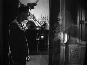
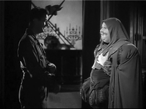
Then comes the second problem. Sometimes the living can see the spectre, but sometimes not. In Here Comes Mr. Jordan, the angel Jordan and Joe the prizefighter arrive from the Beyond and watch the murderous couple from behind. They aren’t visible to the living, but they’re just as tangible.
If a living character seems oblivious to the otherworldly guest, we’re to assume that the guest is invisible. Each film has to inform us of who can see what, and most films do—redundantly. The spook or divine messenger will explain that the living can’t see them, or that only certain characters can. (Sometimes children and animals can see them while grownup humans can’t.)
These conventions can get tweaked. Once we know the Afterlifers aren’t visible to the living, they can comment on the action from the sidelines, as when the dead pilot in A Guy Named Joe (1944) slips in wisecracks while his girlfriend is wooed by a young aviator. In the comic The Man in the Trunk (1942), an all-too-tangible ghost can’t follow a character leaving a room. He explains, “I failed my examination on how to walk through walls.” In The Remarkable Andrew (1941), the ghosts of US founding fathers can ransack offices for evidence in an utterly unconstitutional search and seizure. Most ghosts can pick up objects, but the ones in The Cockeyed Miracle (1946) can’t, a fact redundantly explained to us. This generates suspense when they try to grab a fallen bank check. (Incidentally, this is a long, skillfully directed scene, and it does have recourse to a matte shot when one ghost tries. unsuccessfully, to hide the check by standing on it.)
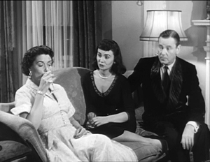
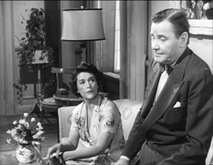
All of these tweaks rely on continuity editing. But in the course of the 1940s, I’ve noticed, filmmakers played a little more ambitiously with the Afterlife conventions, and continuity style allowed them to do it. The results are sometimes provocative.
Ghosts coming and going
Consider the arrival/departure of the Afterlifer. The default is the special-effects twinkling that lets him or her materialize into the scene and fade out of it. But some filmmakers tried more natural options. In Alias Nick Beale, the title character, aka Satan, strolls in from offscreen, or, thanks to John Cromwell’s staging, is masked by other players before being revealed on the scene. He’s presented to all the characters as a real person, but the staging gives him arrivals of relaxed abruptness.
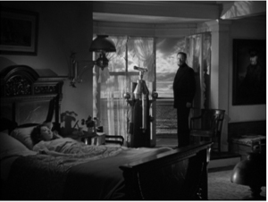
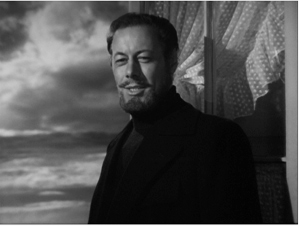
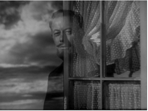
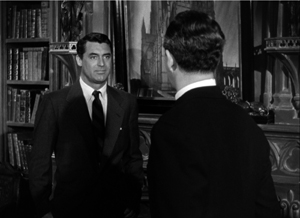
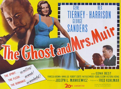
Joseph Mankiewicz’s The Ghost and Mrs. Muir (1947) finds other ways to avoid the hugger-mugger of transparency and melting departures. Captain Gregg assures Mrs. Muir that to her he is “like a blasted lantern slide,” but for us he just steps into the frame and stays on as a solid presence. He disappears just as simply: Mrs. Muir turns away, then a new shot shows that Gregg has gone. Good old shot/reverse shot does the trick.
It’s neat that the second reverse shot on Mrs. Muir reaffirms Gregg’s absence by making her seem more isolated than the earlier mid-shot does. This cut-back to show her isolation after his departure is stressed even more in a later scene, when a medium shot shows her turned slightly away from him; in that interval, he disappears again.
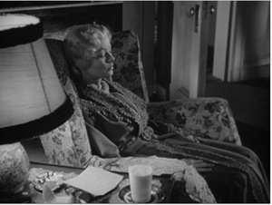
Only after the captain has decided to leave her forever does he resort to the standard spook trick of dissolving away. But in this melancholy context, the familiar device takes on a forbidding finality. He leaves her sleeping and has magically made her forget all about their year together.
In the epilogue, when the elderly Mrs. Muir dies, the captain returns, sturdy as ever, and again the film avoids the cliché. The default schema is to let the dead person’s spirit float up in superimposition from the corpse. Instead, Mankiewicz presents Gregg standing over the lady in a tight shot and simply lifting the now eternally young Mrs. Muir into the frame. Again, all we need is shot/reverse shot, this time with the extra intimacy of an OTS.
These uncommon options take us a little by surprise, refreshing the genre conventions, while also suggesting that the films drive a little deeper into the heart than the usual spook story. The simplicity of presentation helps us take their spectral affair more seriously.
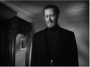
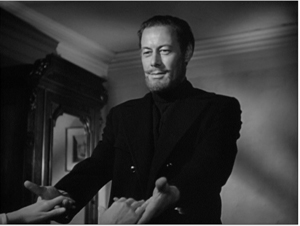
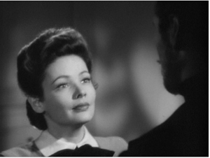
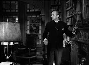
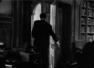
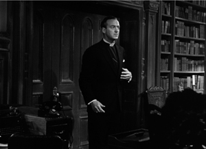
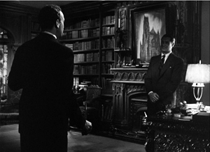
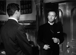
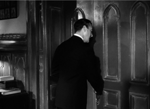
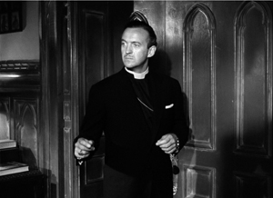
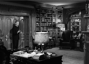
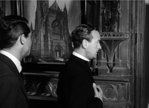
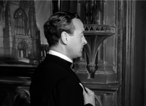
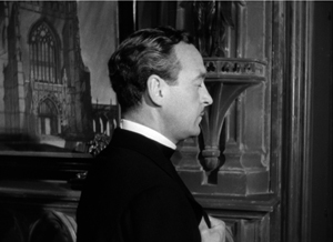
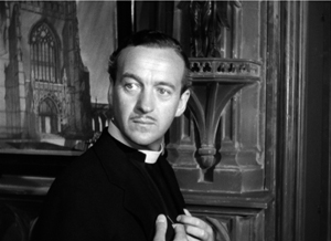
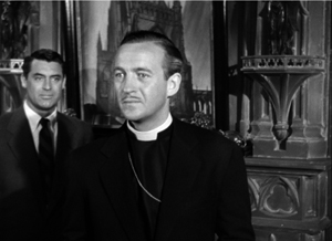
In The Bishop’s Wife (1947) the angel Dudley, like Gregg, comes and goes via offscreen space. A pan follows Henry the bishop, who hears a noise outside his study. The shot pays off with a reverse-angle cut to Dudley, now magically present at the fireplace where Henry was.
At other points, as in The Ghost and Mrs. Muir, the framing excludes Dudley, and when we cut to the long shot Dudley is gone.
Soon, though, there’s a gag on the device. Henry, furious with Dudley, turns away and prays that Dudley will leave him. As earlier, the camera tracks in.
At first it seems that the prayer has been answered, when the camera tracks back from Henry and we see his slightly surprised expression, implying that Dudley has vanished.
But it’s then revealed to us, before Henry knows, that Dudley has changed position and is still in the room.
This quiet revision of the schema is in keeping with the film’s other jabs at Afterlifer conventions. At another point, Henry demands that Dudley execute a miracle. He locks the study door, evidently expecting Dudley to stalk through it in the usual phantom fashion. Instead, Dudley just twists the knob, magically opens it, and exits, closing it behind him and leaving Henry to bang against the relocked door.
Re-turning the screw
In general, supernatural romances play down the magical side of the Afterlifers’ visits. This is partly because they rely on a certain ambiguity about who can see what.
Henry James’ brilliant tale “The Turn of the Screw” provides an instance that people have argued about for generations. The unnamed governess, sent to take care of little Miles and Flora, starts to see dead people: the servant Peter Quint and the governess Miss Jessel. Most of her encounters with the ghosts take place when she’s alone, or with the children. Since the story is narrated from her viewpoint, and in the first person, we have no other testimony about the apparitions. The children seem to spot the spooks, but we can’t be sure. And we can’t be sure that they aren’t simply figments of the governess’s imagination. In the one scene that brings in another witness, the housekeeper Mrs. Grose declares that she can’t see Quint or Miss Jessup. Is the governess mad, or are the children really haunted by the corrupt couple?
The tension exemplifies what narrative theories Tzvetan Todorov called the “fantastic,” the tale of uncertain explanation. The fantastic hovers between scientific, or at least real-world explanations, and supernatural ones. Either the ghosts exist, as in most ghost stories, or they can be explained psychologically, as the narrator’s hallucinations.
Actually, in film, and I think in “The Turn of the Screw,” there’s a third possibility: that the Afterlifers exist as beings who can be seen only by the select few. In “The Turn of the Screw,” Flora definitely seems to see Miss Jessel on one occasion, so perhaps we can posit that the governess sees the ghosts when Mrs. Grose can’t.
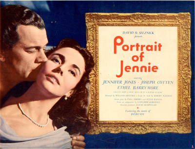
This possibility is of course the premise for The Sixth Sense, and we find it as well in The Ghost and Mrs. Muir, in which Gregg is visible only to Mrs. M. The situation is more equivocal in Portrait of Jennie (1949). In this film, David O. Selznick inflated the fantasy-romance genre as he had pumped up the historical drama (Gone with the Wind), the home-front film (Since You Went Away), and the western (Duel in the Sun).
During the winter and spring of a single year, the luckless painter Eben Adams encounters Jennie at different points in her life: as a little girl, a teenager, a college student, and a mature woman. He falls in love with her. Their penultimate encounter takes place when she comes to his apartment and allows him to paint her portrait. Then she disappears.
Is Jennie a time traveler or a ghost or an illusion, or even a supernatural muse? A bit of each. After each brief visit she withdraws, leaving Eben yearning for her. The art dealer Miss Spinney suggests that in order to paint well, Eben must love someone, so perhaps he has conjured up Jennie to inspire his art. It’s true that he sketches, draws, and paints several Jennies. (The final version, the portrait, won’t be shown us until the film’s last image, in blazing Technicolor.) And it’s true that, in a scene much like that featuring Mrs. Grose in James’ tale, we get a hint that Eben is hallucinating Jennie.
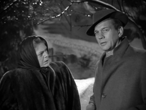
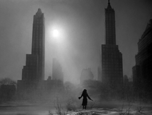
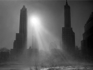
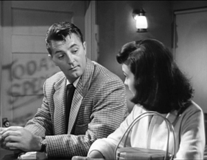
He has just spoken with the adolescent Jennie in Central Park when Spinney comes up to him. He watches Jennie go off, in a standard passage of continuity editing.
But then, thanks again to continuity eyeline technique, Spinney doesn’t see her.
Normally this cutting pattern would suggest that Jennie is purely Eben’s vision. (For a modern example, see Johnnie To’s The Mad Detective.) Yet we will soon learn that Jennie did exist. Playing detective, Eben discovers that she was orphaned, taken care of in a convent, and left for college—all things her apparition told him. Worse, he learns how she died: on a rocky seacoast he has already depicted in some paintings.
Selznick was concerned to make Jennie neither a real person nor a pure product of Eben’s imagination. In an early story conference he remarked that Jennie is both in Eben’s mind and in some really existing realm. “We must convince the audience that this story may be strange and odd, but it’s true. All the other characters may say, “Poor Adams, he must be nuts,’ but we know it is true.” The fact that only Eben can see Jennie doesn’t make her a figment of his imagination. Eben may have conjured her up, but she also chose to visit him, predicting that some day he will paint her portrait. The man has, somehow, met a woman from a spiritual world who has been seeking him. Eurydice-like, she will be pulled back into it.
Too few fancies, one powerful friend
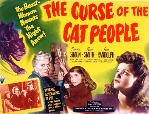
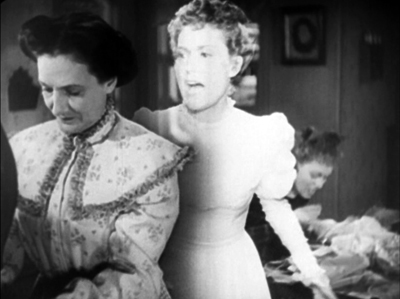
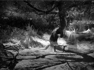
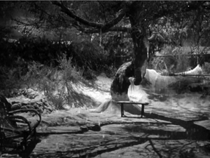
Recognizing that spirits can become selectively visible to the living helps explain the delicate power of another supernatural fantasy of the period. The Curse of the Cat People (1944) uses hyper-judicious framing and editing to create perhaps the most mysterious 1940s Afterlifer.
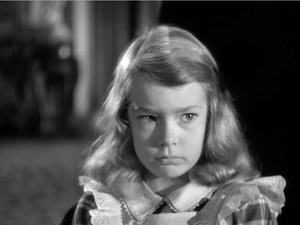
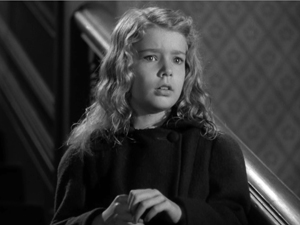
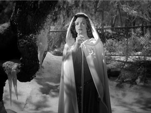
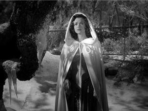
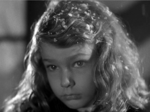
Irena, the woman who can change into a panther, has died in The Cat People (1943). Her widowed husband Oliver has married Alice, and their child Amy, dreamy and unpopular, wishes for a friend. Near the start of the film we’re led to think that Irena is that imaginary friend, wholly a product of Amy’s mind. Irena comes to her in the garb of a traditional princess or fairy godmother, a bit like the fairy of Pinocchio (1940), so we might take her as Amy’s imagining. And the teacher Miss Callahan, who might seem to be playing the raisonneur, says that the little girl has “too many fancies, too few friends.” But that doesn’t seem to me quite right. I don’t think that ultimately Irena is Amy’s projection. Nor are we exactly in the realm of Todorov’s fantastic, hesitating between subjective and objective explanations.
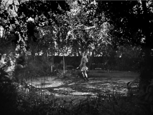
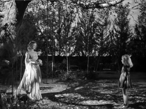
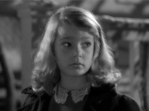
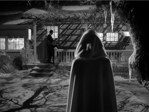
Consider the progression in the film’s depiction of Irena. At first, Amy is shown playing in the garden, purportedly with her friend but alone in the frame.
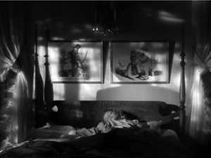
Later she says that her friend taught her a song, but she can’t recall the words. This suggests that that encounter, kept offscreen, is a vague one. That night, as Amy awakes from a nightmare, she is soothed back to sleep by her friend, whom we hear softly singing but see as only a shadow. Her lullaby continues as Amy sleeps.
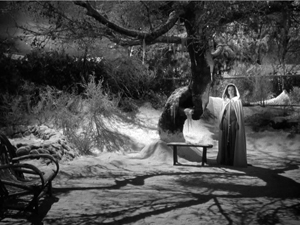
Still later, Irena appears to Amy in the garden only after Amy sees a picture of her. Irena appears un-magically, entering the shot as casually as Dudley or Captain Gregg and holding the ball that Amy has tossed out of frame.
Amy asks her who she is. “I’m your friend.” The fact that Amy doesn’t recognize her from earlier friend-encounters, suggests that the friend wasn’t yet defined in bodily form. She had magical powers, such as darkening or lightening the garden or teaching Amy a song, but she assumed no particular shape. We, however, saw her female silhouette while Amy slept. Now Irena is fully embodied, and we can see her along with Amy.
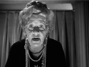
Apart from the Irena scenes, we do get into Amy’s mind. But the techniques used in those scenes are ones that are never applied to Irena. When a deranged neighbor lady recites the tale of the Headless Horseman, we get exaggerated optical POV shots from Amy’s perspective and the subjective sound of wind and horses’ hooves.
The sounds are repeated as auditory flashbacks in Amy’s nightmare and while she is hiding in the forest during the climactic snowstorm. Later, Amy will calm the old woman’s homicidal daughter by envisioning her as Irena (in a superimposition) and embracing her as “My friend.”
From a storytelling standpoint, such images and sounds are sharply distinguished from Irena’s scenes with Amy. Those are treated in quite a neutral, objective manner.
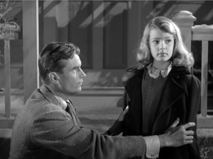
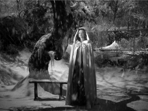
There’s more. At the midpoint of the plot, in a crucial scene, Oliver learns that Amy considers the dead Irena as her playmate. He’s convinced she’s imagining it all. Anxious and angry, he takes her out into the garden and demands to know if Irena is there. Amy sees Irena under the tree, but Oliver doesn’t. As in Portrait of Jennie, reverse-angle cutting conveys each character’s vision.
In cinema, we assume objective (fictional) reality to be the default value. So the incompatible viewpoints of Amy and Oliver in the garden might suggest that Irena exists only in Amy’s mind. But in The Ghost and Mrs. Muir and Portrait of Jennie, the protagonist can see the ghost when no one else can. Nothing in this garden encounter denies the possibility that Irena is a ghost visible only to Amy and us.
We get some immediate backing for this. When Amy looks at Irena a second time, at Oliver’s insistence, Irena puts her finger to her lips, as if urging Amy not to acknowledge her.
This, to put it stiffly, is the action of an independent agent. Amy is unlikely to conjure up an imaginary friend who warns her to keep quiet. And by telling Oliver that of course she sees her friend, she disobeys just as briskly as if Irena were of flesh and blood.
We have a clincher at the very end of the scene. Oliver and Amy go in, turning away. Neither sees the garden, but we get two shots of Irena watching them and reacting unhappily.
Again, it’s hard to reconcile this image with Irena being a pure projection. She’s behaving like an ectoplasmic free agent. In addition, Alice and Oliver, despite their skepticism about Amy’s friend, don’t rule out supernatural goings-on completely. At various points both mention they sense Irena’s presence in the house. Irena has become in the course of the action a full-fledged ghost, but one with benefits.
The epilogue confirms Irena’s otherworldly mission. As Oliver takes Amy into the house, he asks if she can see Irena. She looks and sees her, smiling.
Can Oliver see Irena? Now that he’s decided to trust Amy, he says yes—without even looking.
As in the earlier garden scene, once father and daughter have gone inside, we’re treated to an independent shot of Irena under the tree. And now she melts away, in the conventional disappearing act of an Afterlifer. As with Captain Gregg’s withdrawal from Mrs. Muir, by saving this well-worn option for this moment the filmmakers invest it with an air of permanent departure.
The Curse of the Cat People cleverly invokes the possibility that Irena is purely imaginary, then dispels it. For once, nobody redundantly explains to us who can and who can’t see the ghost; we have to figure things out. Instead, the vague role of imaginary playmate gets gradually defined as Irena, the ghost. Continuity editing is recruited to suggest that Irena is coalescing into the friend Amy wishes for. At first only an atmosphere, then a shadow, and finally a properly solid spirit, Irena is a shape-shifter, more elusive than other apparitions of the period. The plot creates a sympathetic spirit seeking to console a lonely child and correct her father’s harsh, plodding common sense. Perhaps making amends for her effort to destroy Oliver’s romance with Alice in the previous film, the dead cat-woman fills out the role of imaginary playmate and saves a family.
There are other ingenious ways that the conventions of 1940s supernatural films are tweaked by the resources of continuity style, and I’ll be considering them in the book. The general point is that even schemas as commonplace as eyeline matching, or conventions as hoary as having a ghost dissolve out of the scene, can take on new force when filmmakers practice their craft with discreet intelligence.
Earthbound‘s ghost effect derives from a prism set in front of the camera. Warner Baxter is located in an adjacent set, and one face of the prism was silvered to reflect him onto the primary set. The best description I’ve found is here, thanks to good old Lantern. But we need more information. How can Baxter move so precisely around “our” set if he’s offscreen? Presumably, he’s in either a black set or one with furnishings laid out like ours. In that case, the furniture would need to be draped in black, so parts of his body will be blocked to the right extent. But in either case, we need to explain how he manages to synchronize his movements so exactly with the actors in front of the camera. If you know more, please correspond!
My quotation from Selznick comes from “Portrait of Jennie Conference notes (1/20/47),” David O. Selznick collection, Box 1123, file 11, Harry Ransom Research Center. Thanks to Emilio Banda and to Steve Wilson, Curator of Film at the Harry Ransom Center.
I’m using the concept of an artistic schema as E. H. Gombrich does in Art and Illusion (2000). For more about it on this site, see these entries.
You probably know that “The Turn of the Screw” was filmed as The Innocents (1961). It’s also the basis of a strong Benjamin Britten opera.
A vast survey of Afterlifers on screen is provided in James Robert Parish, Ghosts and Angels in Hollywood Films (McFarland, 1994).
For more on my still-in-progress book on 1940s Hollywood, go here and here. If you’re keen on the Forties generally, you might be interested in The Rhapsodes, my study of film criticism of the period, to be published in March by the University of Chicago Press.
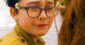
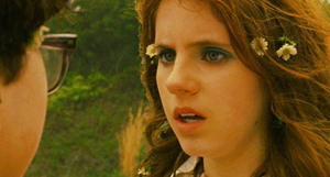
MOONRISE KINGDOM: Wes in Wonderland
DB here:
“An auteur is not a brand,” argues Richard Brody. Not always, I’d suggest; but it can happen. And it’s not necessarily a bad thing.
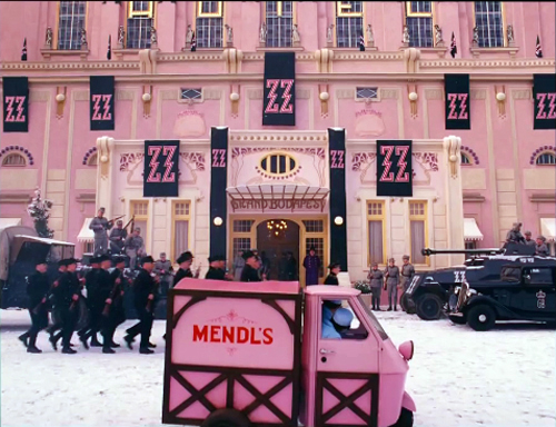
Wes Anderson has found a way to make films that project a unique sensibility while also fitting fairly smoothly into the modern American industry. He has his detractors (“I detest these films,” a friend tells me), but there’s no arguing with his distinctiveness. The Grand Budapest Hotel is perhaps the most vivid example of Andersonian whimsy as signature style.
In any case, before summer’s end I want to look at the auteurish aspects of another Anderson film. Whether you admire him, abominate him, or have mixed feelings, I think that studying this film can show us some interesting things about authorship in today’s film culture.
Toy worlds
When I’m making a movie, what I have in mind, first for the visuals, is how we can stage the scenes to bring them more to life in the most interesting way, and then how we can make a world for the story that the audience hasn’t quite been in before.
A film auteur is often described as having a characteristic tone, an attitude, and recurring themes. But we also find more tangible marks of authorship. One is a tendency to create distinctive story worlds. Hawks gives us milieus filled with stoic, sometimes grimly resigned professionals. Scorsese presents manic, sometimes vicious worlds that encourage his protagonists to go too far.
If the auteur’s story world is the what, plot patterning and cinematic narration give us the how. How are the actions arranged to create an arc of engagement? How are the events rendered in film style—the texture of images and sounds?
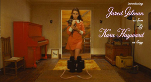
It seems clear that no auteur can be absolutely unique; each one works with norms and conventions given by tradition. For instance, a great many US independent films subscribe to the Hollywood convention of the goal-driven protagonist. Moonrise Kingdom accepts it too: Sam and Suzy want to be together, and their aims propel the action. Anderson and co-screenwriter Roman Coppola even give us the classic formula of lovers, kept apart by society, who escape to freedom in the wilderness. Likewise, the film maintains the convention of multiple lines of action: it creates parallels between the idealistic Suzy-Sam romance and the pallid routine of her parents’ marriage, as well as the hint of emerging affection between the phone operator Becky and Scoutmaster Ward.
Like a mainstream film, Moonrise Kingdom is at pains to build the plot toward a crisis—the second elopement of the couple and the massive storm that hits the region. The film turns the storm into a deadline: It will hit, says Bob Balaban’s narrator, “in three days’ time.” And as in a classical Hollywood film, the couple’s problems are solved and we get an epilogue showing their happy, if somewhat covert union.
Anderson has absorbed some lessons from mainstream cinema in more specific ways, I think. Since the Star Wars series (1977-on), we’ve seen Hollywood ever more eager to try “world-making”—adapting the traditions of fantasy, science-fiction, and comic books to creating fairly separate realms governed by their own rules. Batman and Superman adaptations of the 1980s and after followed this line, with Lord of the Rings proving that world-making could sustain long-running franchises (Harry Potter, the Marvel universe).
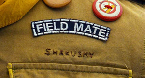
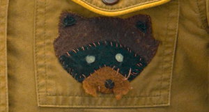
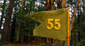
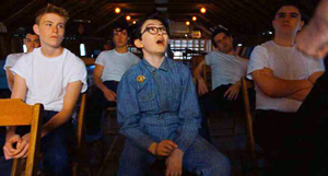
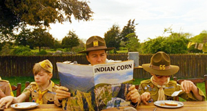
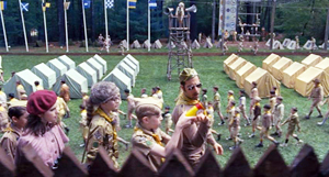
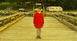
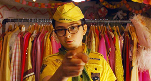
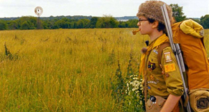
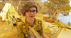
Anderson follows Lucas in creating his own worlds, but outside the conventions of space opera. We can find more or less parallel worlds in The Royal Tennenbaums and The Life Aquatic with Steve Zissou, but Moonrise Kingdom may be the most elaborate example. It takes place in terra incognita, a cluster of imaginary islands presumably on the upper Atlantic coast. The name of the primary island, “New Penzance,” reminds us of the fantasy-worlds of Gilbert and Sullivan. There are make-believe Amerindians (Chickchaws) and the Khaki Scouts are parallel to the Boy Scouts, with Accomplishment Buttons instead of Merit Badges. The Scout regalia are given us in the sort of fussy detail that Anderson has long enjoyed.
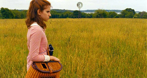
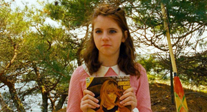
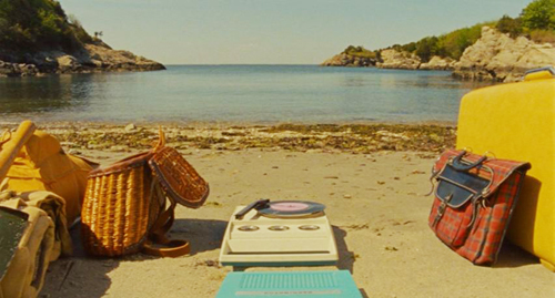
Parts of the story are relayed by a gnome-like Narrator whose range of knowledge includes past, present, and future. He suggests a fairy-tale wizard or bard. An ancillary film tells us that he’s the librarian of New Penzance—the tribal chronicler as small-town administrator. (The existence of this short film serves to reinforce the pretense that New Penzance exists.) Then there are the young-adult books that Suzy carries with her. They’re fictitious but they get strongly tagged to aspects of the action. The books and the scouting gear take on the same solidity as retro details like Suzy’s battery-powered phonograph and Sam’s jar of Tang: 1965 stuff is recruited to flesh out Anderson’s miniature world.
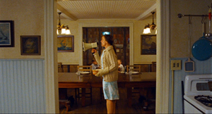
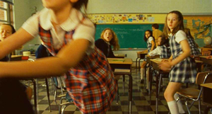
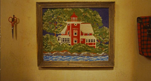
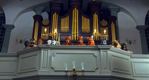
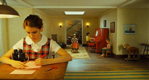
Suzy’s books remind us that New Penzance, like other Anderson story worlds, is redolent of childhood. The film’s opening presents a family’s home as a dollhouse filled with toys and games. Once we’ve seen the fabric pictures rushing past on the walls, the landscapes they preview retain a miniaturized quality.
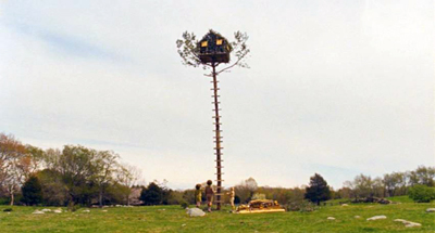
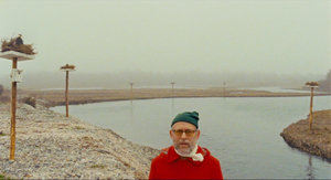
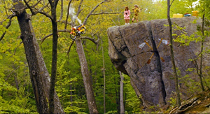
Those landscapes themselves have a childish defiance of gravity, as when we’re introduced to the poles at the tidal canals and when the Scouts build their tree house improbably high. This motif of top-heaviness eventually yields a sight gag when we learn the implausible fate of Redford’s motorcycle.
Childhood is everywhere. The music we hear in the opening is Britten’s Young Person’s Guide to the Orchestra, played by three little brothers on a phonograph and narrated by a child for one of Leonard Bernstein’s Young People’s Concerts. Throughout the film we hear grownup music designed for kids, such as bits of Bernstein’s rendition of Saint-Saens’ Carnival of the Animals.
Benjamin Britten’s music is central to the film’s soundtrack, from his juvenilia (Simple Symphony, songs from Friday Afternoons) to his later opera A Midsummer Night’s Dream and its chorus of child fairies. A performance of Britten’s church parable Noye’s Fludde is the occasion of Sam’s first encounter with Suzy, and it prophesies the devastating storm of a year later. Carrying this kid-friendly ethos further, Anderson designs his closing credits so that Sam’s voice-over can anatomize Alexandre Desplat’s score, instrument by instrument.
If Britten suggests childhood vitality, the mournful Hank Williams tunes evoke adult disappointment. They’re associated from the start with the lonely, not-overbright Captain Sharp. When Sam’s canoe odyssey is accompanied by the fantasy Williams song “Kaw-Liga,” about a wooden Indian yearning for the carved woman across the street, Anderson suggests a parallel between two lonely, yearning males, and tagging it to Sam prefigures his eventual alliance with his surrogate father.
A tradition of twee
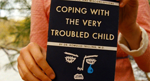
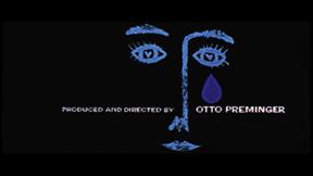
The density of this childish New Penzance, like that of other DIY cinematic worlds, supports a tendency I talked about in The Way Hollywood Tells It. For some time now, filmmakers have been filling their films with details that can be discovered on re-viewing, particularly on the DVD format, which allows us to stop and study a frame. The musical citations I just mentioned can be researched after an initial viewing, and perhaps cinephiles will notice that the therapy book’s cover is a riff on Saul Bass’s credit sequence for Bonjour Tristesse (like Françoise Hardy, a link to Left Bank pop culture).
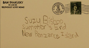
Still, on the first pass we’re unlikely to notice that the stamp on Sam’s postcard to Suzy bears the likeness of Commander Pierce.
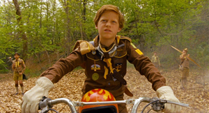
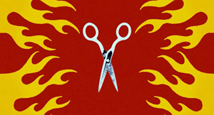
Likewise, only after many viewings did I notice that the peculiar flaming-scissors abstraction during the skirmish in the woods is given the same design as that on the motorcycle and helmet of the despicable, and rightfully lacerated, Redford.
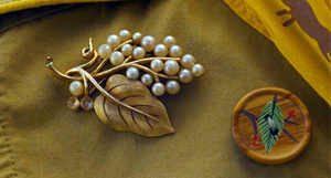
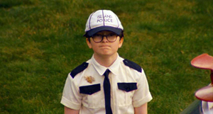
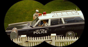
And in the epilogue, we might spot that Sam, having cast off his Accomplishment Buttons, has kept his mother’s pin on his new Island Police uniform.
Art and commerce again: What exec could object to loading every rift with ore when it supports ancillary sales to the fan faithful?
Some people find an inward-turned world like this to be fey, coy, twee, infantile, precious, or self-indulgent. It seems to me, though, that Anderson’s work from The Life Aquatic onward links up with a literary tradition we associate with J. M. Barrie and G. K. Chesterton. These writers employed childhood fantasy in an effort to imagine a richer, livelier realm behind prosaic reality. Another kindred spirit would be Winsor McCay, like Anderson an obsessively meticulous stylist who gives heft and lilt to dream worlds. In cinema we might recall Greenaway’s The Falls (1980), as obsessive and precious a project as can be imagined.
Indeed, why not mention the most famous figure of all? There is a trace of Lewis Carroll in Moonrise Kingdom’s looking-glass world—its strangely safe tree house, its deadpan absurdity, the habit of lawyers talking as if always in court. Like Carroll, Anderson doesn’t shrink from cruelty; the death of Snoopy is as perfunctory as that of the oysters on which the Walrus and the Carpenter tearfully dine.
Significantly, modern efforts to reenchant the world are often framed by loss. Wendy comes back from Neverland, Little Nemo awakes with a thump, Alice must return to lazy and boring afternoons. Anderson too evokes the fading of enchantment. Moonrise Kingdom takes place at the onset of autumn, and Suzy’s family lives at Summer’s End. Unlike other modern explorations of faerie, however, this one lets its characters wake up in something approximating their dream life.
Day by day, with interruptions
In accord with the child-based story world, the plot of Moonrise Kingdom provides something of a modern fairy tale. A runaway orphan who retains a token of his parentage heads out for the wilderness. A princess imprisoned in a tower scans the horizon for her rescuer. Lovers exchange messages before they escape into a realm of danger and death. They are rescued by a beneficent authority who will allow them to stay together.
Of course it’s a meta-exercise, since its authors and audiences are self-consciously deploying fairy-tale conventions. But as Barrie and Chesterton and Carroll show, enjoyment of artifice is central to art. Anderson accordingly stylizes both his plot structure and his narration.
He has long been drawn to block construction, building his plots out of big chunks that are often signaled explicitly. In Moonrise Kingdom, the chunks divide up in unusual ways—part, again, of this auteur’s cinematic signature.
At first we might think we can just track the adventure day by day. On 2 September 1965 Sam goes AWOL from scout camp and Suzy sets out with her belongings. On 3 September the couple fend off their pursuers—the battle of arrow, BB gun, and scissors—and make camp on Mile 3.25 Tidal Inlet. There they swim, dance, and spend the night. On 4 September they’re captured and separated.
But that night the scouts help them escape again, and all head for New Lebanon. The “marriage” of Sam and Suzy on the 5th leads to their flight to Saint Jack Wood Island just as the storm hits. Before they can make a lovers’ leap from the church steeple, Captain Sharp rescues them and arranges to be Sam’s foster parent. These four days are sporadically marked by changes from day to night and some remarks, as when Scoutmaster Ward dictates into his tape recorder. An epilogue is reserved for 10 October.
Running athwart the day-by-day divisions are other blocks. Actually, the first day is shown us three times, via shifts in narrational attachment. First we’re with Scoutmaster Ward, his charges, and Captain Sharp, all of whom are searching for Sam. After Ward dolefully ends his audio diary entry (“Let’s hope tomorrow is better”), Anderson cuts to Sam in the stolen canoe.
You might think this scene of Sam paddling is taking place the next day, but actually it skips back to the morning of the 2nd, when he sneaked off. Thereafter we’re attached to him when he meets Suzy in the meadow and they share their first day on the run. Then the plot skips back again to earlier that night, when Mrs. Bishop calls Suzy to dinner and discovers that she’s gone.
The 2 September section is even more complicated than I’ve suggested. When Suzy and Sam rendezvous in the meadow, their encounter is interrupted by a flashback to their first meeting a year earlier (signaled by a title). Later, the Bishop-centered evening section is interrupted by another block, a flashback montage triggered by Mrs. Bishop’s discovery of the couple’s love letters.
Here Anderson provides important backstory paralleling the two kids’ reasons for running away. Sam is bullied by the older boys in the foster-family-compound run by the Billingsleys, and Suzy blows up at her parents and schoolmates. By the end of the third iteration of 2 September, all the major forces in the drama have been delineated.
The two expository flashbacks give us more reason to care about Sam and Suzy in the following scenes, particularly during their skirmish with the Khaki Scouts squadron. Redford’s bullying ways, ignoring Ward’s orders to avoid violence, earn him a lumbar thrust from Suzy’s scissors, and it’s a mis-aimed arrow that wipes out poor Snoopy.
The couple’s idyll, presented as more or less another block, becomes the center of the film. It ends, at the midpoint of the running time, with Suzy reading: “Part Two.”
After they’re captured, Mr. Bishop vows to keep Suzy from Sam. Worse, Captain Sharp learns that Sam is headed for an orphanage and maybe shock therapy. This will encourage Sharp to defend and rescue the two kids at the climax.
With this crisis looming, the plot gives us a sort of nocturne on the evening of September fourth and the dawn of the fifth. In the night, all the players mull over what has happened: Suzy and her mother, Sam and Captain Sharp, Mr. and Mrs. Bishop, and Scoutmaster Ward. But this isn’t merely downtime. The Scouts in their treehouse decide they’ve treated Sam unjustly and set out to help the couple. This decision propels the climax.
By the morning of the final day, Sam and Suzy are reunited and ready for their mock marriage. All that remains is for the storm to disrupt things (even giving Sam some shock therapy by lightning), but also to set things right. The epilogue shows the new stable state of the story world, tying together the plot action neatly. Scoutmaster Ward, reinstated from disgrace, has replaced Captain Pierce’s picture with Becky’s. Sam has a foster father, and he can covertly see Suzy every day.
The magic power of binoculars
Narration involves the moment-by-moment flow of story information, organized around the key question: Who knows what, when?
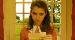
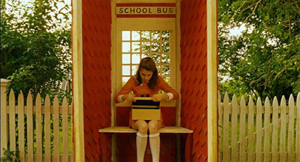
A simple example: Early in the film Suzy finds a letter in the family mailbox. She takes it to the bus shelter and reads it. When she’s done, she looks up resolutely at us and slips the letter into a shoe box.
What was in the letter? The narration has suppressed that information, stirring up curiosity and preparing us for what, many scenes later, Mrs. Bishop will reveal when she finds it: Sam’s final message about their rendezvous. Moreover, the narration flaunts its suppressiveness: She looks at us as if insisting that the message is private.
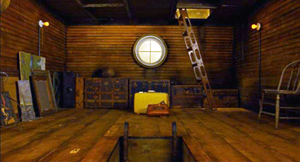
Unlike the letter scene, which suppresses information, the opening tours of the house give us a fair amount, but we’re not yet in a position to understand it. This applies to our glimpses of the scissors and the New Penzance locations, but there’s also the vertically rising shot showing Suzy’s suitcase in the attic along with her cat peeping out of the fishing creel.
This becomes significant only later, when we realize that Suzy is preparing to bolt.
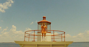
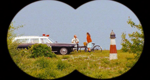
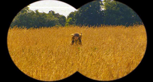
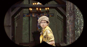
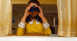
The narrational process mobilizes film style, both visual and auditory, to engage us in a constant process of expectations—stated, prolonged, fulfilled, or cheated. Consider Suzy’s binoculars. Early in the film we see her looking through them, but we don’t see what she sees. What is she looking at? Or looking for? Soon enough we’ll see that she manages to learn of her mother’s affair with Captain Sharp.
Once we’re set up for the binoculars device, Anderson can use it elliptically. In the meadow we see Sam through binoculars, so we’ll assume that Suzy is looking at him, even if Anderson doesn’t show the customary head-on reverse shot of her.
In effect, this image of Sam is the answering POV shot that has been missing in the early sequences.
But at the climax, when Sam rushes back to camp to fetch Suzy’s binoculars, he’s again caught in their field of view. This immediately leads us to ask: Who’s watching him? Anderson has stuck to Sam in the scene, so we get a gratifying surprise when we learn that the odious Redford has grabbed the glasses and is watching Sam’s search.
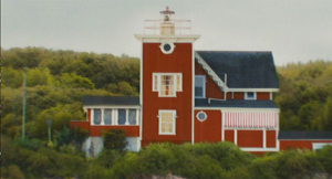
Or consider the film’s opening as a narrational gesture. The toy world that the tracking shots present is packed with story information. The very first image shows a fabric version of the Bishops’ house, flanked by Suzy’s left-handed scissors; the picture will soon be echoed by an establishing shot.
Shot by shot, the film channels information in order to set up expectations, to prolong them, to confirm them, or to deflate them. This is how cinematic narration can engage us.
The gnome-like narrator is another source of information. Anderson has compared him to the Stage Manager in Our Town, who can address the audience but also interact with other characters. His opening explanation supplies factoids about this imaginary landscape, while foreshadowing things explicitly (the storm) and implicitly, as with this image that looks forward to Sam and Suzy’s interlude at Mile 3.25 Tidal Inlet.
Narration doesn’t just pass along information; sometimes it suppresses it. It can point out when it’s hiding something, as when the film refuses to show us Suzy’s letter. Sometimes information is noticeably incomplete, as when only bits of Suzy’s and Sam’s correspondence are relayed to us. Another instance is the elliptical handling of the Khaki bullies’ attack on the couple, with a glimpse of an arrow and Paul-Sharits-ish flashes of scissors. Only quite a bit after the assault do we see the damage.
At other moments a film’s narration can create an informational gap that it doesn’t fill, only to do so later. During the central idyll Moonrise Kingdom omits a crucial piece of information and puts it in place only at the very end.
Down the aisle and face to face
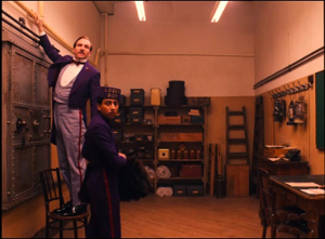
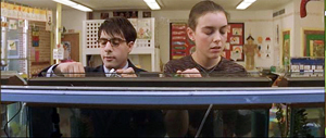
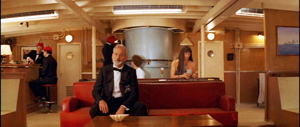
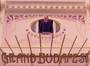
Cinematic narration involves stylistic choices as well, and here again Anderson has sought an identifiable look and feel. In an earlier entry on The Grand Budapest Hotel, I talked about his adherence to planimetric images, the tendency to fix the camera at right angles to a background plane and then arrange figures either horizontally, like clothes on a line, or in profile.
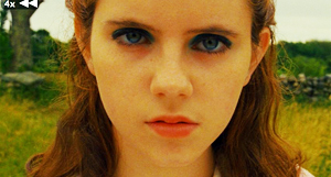
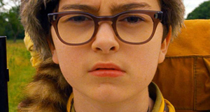
Likewise, Anderseon employs what I’ve called compass-point editing. He usually puts the camera between the characters so that they face us in shot/ reverse-shot.
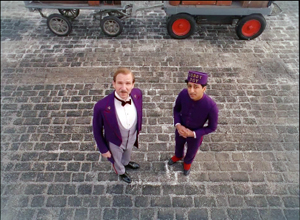
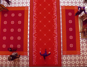
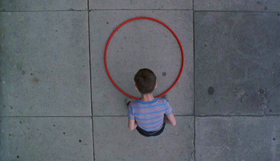
Or he films the action from straight-on, straight-back, or at a right angle. This geometry can be extended to camera movements: moving lateral and parallel to the planes of the shot, or panning at right angles, or zooming along the lens axis. Another extension is the straight-down angle, which is another variant of shooting at a different right angle to the action.
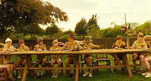
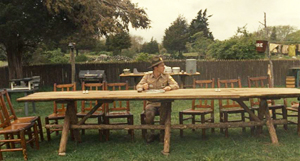
Planimetric shots and compass-point editing aren’t absolutely new with Anderson, but he uses them more thoroughly than most other filmmakers do. They govern his staging to the extent of pushing him away from realism. How plausible is it that all the Khaki scouts would line up on one side of the picnic table? Or that Ward wouldn’t notice, in a later scene, that all of them are gone?
Anderson’s use of such imagery evokes silent-film comedy, especially the compositions of Keaton, but these shots also suit a fairy-tale world. The stylized naivete of these compositions recalls children’s drawings, which tend to spread figures out against a flat background. (This was prefigured in the squashed perspective of the Bishop house as portrayed in the fabric picture.)
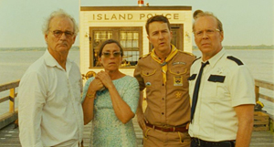
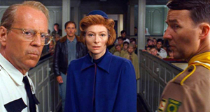
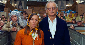
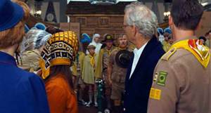
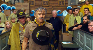
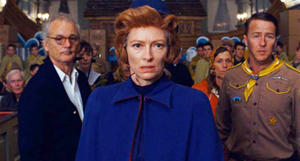
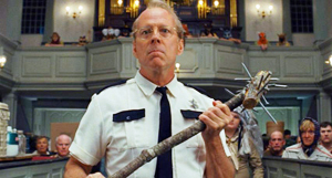
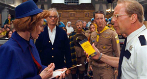
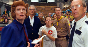
When a director commits to a particular style, he or she may have limited choices on other fronts. A good example is the climactic confrontation of all the adults in the St. Jack Wood church. Anderson might have staged this in many ways, but his stylistic preferences make the central aisle the most feasible arena. So we get the groups facing one another, in reverse-angle depth, moving from one planimetric composition to another, the cutting being either 180-degree reverses or simple axial cuts (zero-degree changes of angle). Sometimes the actors pivot to provide foreground profiles and frontal faces in the distance.
Once you the filmmaker embrace such a marked style so thoroughly, how can you signal special moments? In Moonrise Kingdom, Anderson does this by reverting to more commonplace technical choices.
When Suzy and Sam meet in the dressing room in 1964, we get straightforward 180-degree reversals.
And when they re-meet in the meadow, we get a mixture of profile and head-on shots.
But then Anderson starts to exempt them from the usual spatial strictures. The correspondence montage, for instance, retains the perpendicular framing but decenters his protagonists in mirror-image fashion.
As they get to know one another on their camping trip, the facing-front staging becomes less severe, more modulated.
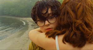
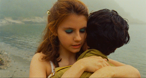
And finally, when they admit their love to each other, Anderson gives us conventional ¾ views of faces and over-the-shoulder angles. These setups are reiterated when they embrace and dance.
At an emotional peak, Anderson sharply violates the film’s intrinsic norm by bringing in a common technique—which now gains a force it doesn’t customarily have.
Summer’s end
The epilogue recapitulates both narrative and stylistic features. There’s another lateral tracking shot of the Bishop house, but now Sam is painting in a space that was empty at the start.
Again Suzy is using her binoculars, but now, dressed in cheery yellow, she has something worth seeing.
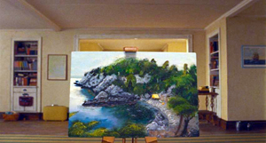
On the soundtrack we hear Britten’s “Cuckoo” song, a reiteration of the summer’s-end motif. The cuckoo, born in spring, enjoys the summer but must eventually fly. As we hear this over Sam’s departure through the window, Anderson’s camera slides down to reveal that Sam’s picture presents a landscape that has now vanished.
Here is the big ellipsis that Anderson didn’t flag in the central idyll. When Sam was painting a stretched-out Suzy at Mile 3.25 Tidal Inlet, they had agreed that the name of the place was insipid. She says she’ll think of a new name. But we’re told no more about the matter. In the epilogue, when we see Sam’s picture, we realize that they have given the place a better name: Moonrise Kingdom, inscribed in white on the shore.
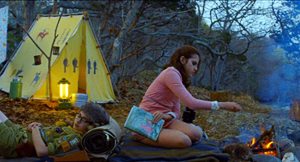
“This is our land!” Sam had shouted when they looked out at the inlet. Like Anderson’s imagining of a parallel world of childhood, Sam has recreated, in the manner of modern fairy tales, something that is gone. As if in sympathy with the gesture, the film’s closing shot updates one that was given us during the scenes on the shore, with the yellow pup tent now pitched as the mist rolls in.
Did the couple really write MOONRISE KINGDOM on the shore during their stay? Hard to say. What matters is that, provoked by Sam’s picture, the film’s narration concludes by asserting the power of imaginative artifice.
Selling directors
Floating Real Scarab Beetle Earrings.
Thinking about auteurs has always obliged us to focus on the interchange between industrial demands and artistic aims.
In general, I don’t see an inevitable conflict between market demands and artistic expression. (I argue for this here and elsewhere.) True, often producers and executives and censors mangle creators’ efforts. But some directors know how to do what they want with what they have. For example, Hitchcock’s artistry benefited from his status as a celebrity director. He won substantial budgets and greater control of his work. And sometimes the suits’ demands improve a film (as I suggest here).
Historically, it isn’t easy to separate auteurs from their brands. Let’s assume that a branded auteur is one who is known to a broad public for certain qualities of his or her films. A simple measure would be an ordinary viewer saying “I like X movies,” where X is the name of the director.
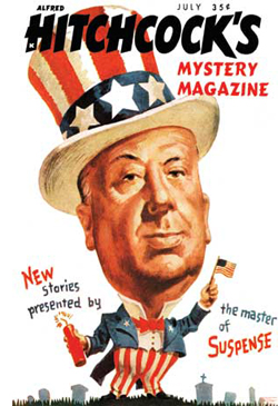 Hitchcock is nearly everybody’s clear-cut example of an auteur, but by the time the Cahiers du cinéma critics were forging their conception of cinematic artistry, Hitch was a brand too. How else to explain the 1940s-1950s book collections bearing his name, or The Alfred Hitchcock Mystery Magazine, or the tag, “The master of suspense”? Hitchcock participated in this image-building with his jokey interviews, his walk-on appearances in his movies, and his reputation as a bland-faced prankster. Few directors today foster such shameless self-promotion. Also branded were Chaplin, Disney, Welles, and Cecil B. DeMille. Among the cinephilic public there was recognition of Huston, Sturges, and a few other hands.
Of course many of the auteurs discovered by the Cahiers critics were unknown to the public at large, and they didn’t make profitable pictures. In 1940s Hollywood, the successful Lang was Walter, not Fritz. But as the film industry developed, and as auteur criticism became prominent, directorial distinctiveness became a marketing angle. By the 1970s, the movie brats, along with older hands like Altman, were presenting themselves as having “personal visions” carried by their films.
More recently, US independent cinema has come to depend on several appeals (sex, social comment, and the like), but surely authorship is a central one. The indie scene exploits the signatures of directors as different as Lynch, Jarmusch, and Paul Thomas Anderson. The emergence of younger talent like Nicholas Winding Refn and Kelly Reichardt conforms to a similar pattern; people follow and support emerging directors, and distributors publicize the films that way. No wonder James Schamus, founder of Good Machine and late of Focus Features, once remarked: “I’m in the business of selling directors.”
This is just a fact of life for ambitious independent filmmakers. Wes Anderson’s cultivation of a distinct style is probably partly a genuine reflection of his personality and partly a matter of willed self-presentation. But of course we’re all indulging in self-presentation, using Goffman’s “impression management,” every time we interact with others.
 Like an indie band, Anderson has created a marque unusual enough to let the fans feel they’re in on something keyed to their nonconformist tastes. He has provided the usual panoply of ancillary items, like soundtracks and bonus DVD tracks, but he has allowed others to participate in his world. Amateur videos comment on his style; graphic artists render their own versions of his posters. There are dozens of unlicensed Moonrise Kingdom tchotchkes. Anderson’s willingness to permit all manner of “tribute” memorabilia fits the handmade quality evoked by his films.
Call it Geek Chic if you want, but it exemplifies an important and potentially valuable part of modern popular culture. For such reasons, I don’t see anything inherently bad about being an auteur with marketing possibilities. People don’t seem to object to David Lynch’s coffee and his nightclub. With eccentricity, spontaneous or willed, all is permitted.
My argument assumes that the term “auteur” picks out something neutral. For some people, though, it’s not a description but a compliment; there can be no bad auteurs. But I think we can have both weak auteurs—filmmakers distinguished only by technique or tone or narrative strategy—and downright bad ones as well. I have my own list.
This piece is based on a talk I gave earlier in July at the Hochschule für Fernsehen und Film in Munich. Thanks to Andreas Rost and Michaela Krützen for arranging my visit.
In the New Yorker column I mention, Richard Brody develops an argument along a different line than mine. As I understand it, he’s replying to critics who claim that the auteur approach overrates individual creativity at the expense of collaborators. He’s also objecting to the expanding search for ever more auteurs, who turn out to be minor artisans at best. My remarks are focused on different issues.
For much more on Moonrise Kingdom consult Matthew Zoller Seitz’s indispensable The Wes Anderson Collection. Michael Newman’s Indie: An American Film Culture examines Anderson’s cinema as a development of the “Quirky Indie.” The fan-generated merchandise exemplifies what Henry Jenkins, in his book Textual Poachers, called “participatory culture.”
The three-part anatomy of film narrative I use here is explained in greater detail in this chapter from Poetics of Cinema and this blog entry.
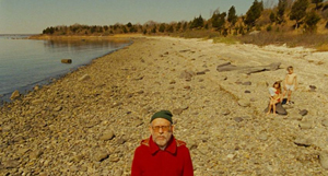
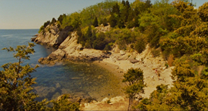
My stills showing Sam’s painting and the extreme long shots of the shore can’t do justice to the originals; I tried bigger proportions, but the MOONRISE KINGDOM inscription remains hard to see. I have to assume that most readers have seen the movie, or will. The image below will have to do.
P.S. 21 July 2014: One sign of a distinctive authorial approach is that it can be parodied. James Fiumara writes to recommend the Saturday Night Live parody of Anderson, applying his style to domestic horror. “I frequently show this to students in discussions of both auteurism and genre conventions. The students all laugh at the parody and then I get them to try to recognize what the parody depends on (namely, their recognizing recurring styles and patterns distinct to Anderson films, recognizing the conventions of the horror home-invasion subgenre, and of course seeing the incongruity between Anderson’s films and the horror genre).” Thanks to James for the link.
P.P.S. 12 September 2014: Guillaume Campeau-Dupras writes to point me toward his 2012 blog on the film, which looks at the film from a perspective related to what Kristin and I have written about (but with many original ideas of his own). I think readers interested in Anderson would benefit from his entry.
P.P.P.S. 2 October 2020: The branding continues! See this story about Anderson-style buildings around the world. Here is a filmmaker who has truly changed how people see their environment.
THE GRAND BUDAPEST HOTEL: Wes Anderson takes the 4:3 challenge
The Grand Budapest Hotel (2014).
DB here:
Be shot-conscious! I urged in a blog entry some years ago. I illustrated the point with a tradition of staging and shooting that seemed simple and modest but was actually quite flashy, and even fashionable. Although many filmmakers resorted to it, either often or occasionally, critics hadn’t attended to it. Wes Anderson’s work yielded one of many examples of what I called (swiping from art historian Heinrich Wölfflin) a “planimetric” style.
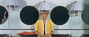
Ideally, you should look at that entry before reading this one. (To encourage you, I link it again. Not for the last time.) Very briefly, this style involves a frontal presentation of the action. You frame people against a perpendicular background, as if they were in a police line-up. Usually you face them to camera, as in this shot from Godard’s Made in USA.
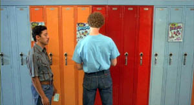
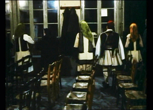
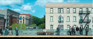
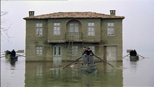
As we’ll see, sometimes you can frame the characters at right angles to the camera, or turned directly away from the camera. Here are examples from Napoleon Dynamite and from Angelopoulos’ The Traveling Players. (Is this the first time these two movies have been mentioned together?)
The key idea is that the people and the setting aren’t observed from an oblique angle; if the background is perpendicular, the people will stand or sit at 90 or 180 degrees to that.
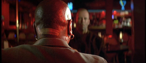
You can arrange them in some depth too, but again, they are stacked in perpendicular fashion, making each area a pretty strict plane. Here’s an example from Pulp Fiction.
One point of my earlier entry is that this is a surprisingly old strategy; Keaton used it occasionally, and Godard was using it heavily fifty years ago. Here are two shots from Contempt (Le Mépris, 1963).
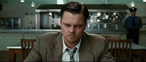
It has endured in some surprising places. It’s now a go-to option for one-off effects in mainstream cinema. Here are examples from Shutter Island and The Secret Life of Walter Mitty (2013 version).
A few filmmakers make it the basis of an entire film, as I indicate in this entry on Oliveira’s Gebo and the Shadow. And since I wrote the original entry, I’ve drawn on other examples from time to time, particularly from directors who are pastiching Ozu to some degree or another.
Still, Anderson is today the most widely visible example of the style, partly because while others use it sporadically, he is single-minded about it. He has made people shot-conscious (at least when they watch his movies). So after seeing his newest film, I thought it would be fun to think about what distinguishes his approach.
Playing with planes
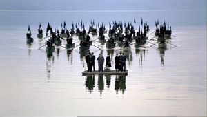
With the release of The Grand Budapest Hotel, several bloggers have pointed to recurring compositional features, most obviously bilateral symmetry. I’d just add that such symmetry is often used by practitioners of the planimetric approach, with results that sometimes exceed Anderson’s. Here are two shots from Angelopoulos’ Weeping Meadow.
When you think about it, it takes a brave filmmaker (e.g., Godard) to use this approach and not deploy symmetry.
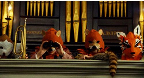
Anderson has used the planimetric approach more extensively in recent years, and he modifies it some distinctive ways. I think particularly of his habit of crowding people together in layers rather than stretching them along a single line. He makes some images look like group portraits or over-posed highschool yearbook shots (The Royal Tenenbaums; Fantastic Mr. Fox).
By employing the planimetric strategy, Anderson gains a somewhat awkward formality, a sense that we are looking from a distance into an enclosed world that sometimes looks back at us. There are as well the sort of comic possibilities that Keaton recognized in Neighbors and The General. A rigid perpendicular angle can endow action with an absurd geometry.
These apparently simple framings often evoke a world of childhood. Just as Kitano Takeshi shows us gangsters behaving like little boys, Anderson’s dollhouse-room frames make adults seem to be toy people arranged just so–like items laid out in a Joseph Cornell box. It’s a style suitable for magical-realist premises like The Life Aquatic with Steve Zissou, and in Moonrise Kingdom it finds its echo in children’s illustrated books.
All in all, then, I have to salute an American filmmaker who thinks about his images carefully and has incited sensitive viewers to notice them. I think we should go further, though. We can ask: How does Anderson, staying loyal to this tradition, vary the look of the shots? And how does he cut them together?
Cutting around
Consider the editing option first. Unless every scene is to consist of only one shot, the question comes up: How do you maintain the style while cutting? Either you make all your cuts axial, straight in or straight back.; or you create a sort of compass-point editing. This can involve cutting 180 degrees, to what’s “behind” the camera in the initial shot. So if characters are confronting one another, the camera is in effect sitting between them as each looks over or through the lens at the other (Ozu’s Late Autumn).
In effect, this option respects the classic 180-degree line, or axis of action, between the characters. It’s just that the camera sits right on that line. Parking the camera on the axis is a common tactic for subjective cutting, showing us first a person looking, more or less at the camera, then what she or he sees from their vantage point. Our example in Film Art: An Introduction comes from Rear Window.
Ozu used this 180-degree reversal often, but not absolutely; he had a more complicated way of conceiving space, and the 180-degree frontal cuts were only part of it. Kitano made a simpler variant central to his early films.
When I asked Kitano why he did it, he explained that it was exactly the way people saw each other in ordinary life. We face each other. He then added that he was such a naive director when he started that it was the only way he knew to set up scenes. We get kindred images in Terence Davies’ work; his frontality may owe something to the Hollywood musical.
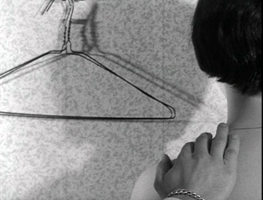
Compass-point editing offers another possibility, that of cutting at 90-degree angles to the background plane or the figures’ position. Chantal Akerman does it throughout Jeanne Dielman 23 Quai du Commerce 1080 Bruxelles (1975).
Anderson exercises all these cutting options inThe Grand Budapest Hotel. Here a planimetric profile 2-shot yields two frontal shots; we shift 90 degrees and then 180 degrees.
Now here’s a 90-degree shift for the reverse shot.
In the passage below, the first cut rotates 90 degrees, and the second cuts in right on the lens axis. In this tradition, an axial cut respects the perpendicular layout of the space.
In such cutting patterns, the compositions keep the action in the same upper zone of the frame from shot to shot. As a result, our eye doesn’t wander much. In long shots, Anderson sometimes follows the classic Hollywood practice of allowing some decentering, as long as the cuts balance one off-center composition against another. Here the changing angles obey the compass-point principle across three shots, and they crisply shift the emphasis from the right side of the frame to the center to the left.
Someone who wanted to deflate Anderson’s visual ambitions could say that his shots are monotonous. Having imposed a big constraint on himself, he’s now obliged to show us that this approach can be varied–in obvious or subtle ways.
One way is through lens length. Most planimetric filmmakers use long lenses, which flatten the space even more. The figures can look like clothes hanging on a line. But Anderson favors quite wide-angle lenses (often 40mm). These make horizontal lines bulge, as in early CinemaScope films (Rushmore, The Life Aquatic).
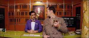
You can see similar distortions in the straight-on shots of the hotel desk in Grand Budapest, above.
Another way Anderson varies his images is by departing from straight-on angles. As long as the framing maintains a planimetric geometry, we can look down or up at the action. In this passage, again the camera makes 180-degree reverses. This contrasts with the more orthodox shot/reverse shot framings in a comparable scene in The Little Foxes.
In this spirit, Anderson can give us bird’s-eye views, as Matt Zoller Seitz points out in his sumptuous book-length interview with the director. It’s rare, but there are precedents, as in the work of the Coens. In one shot of The Hudsucker Proxy, a movie with an inordinate number of straight-down angles, the inflexible framing creates a joke.
Grand Budapest Hotel has room for some classically funny framings. If you want somebody to look lonely, common practice says, frame the figure off center in a long shot. Here Anderson seems to be having a joke on the convention. He presents it as a POV, although presumably if the Writer were looking at the mysterious man he would put the object of attention in the center of his field of vision.
I think that Anderson’s earliest films weren’t quite so strict in obeying the planimetric and compass-point strategies. Those options were often slipped in as alternatives to more orthodox framing and cutting. But as he’s become more rigorous about using them, he has found ways to put his stamp on some common techniques. Like Ozu incorporating devices of classical continuity into his unique stylistic system, Anderson can recruit certain conventions while staying faithful to his basic approach.
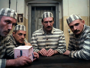
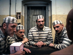
For instance, Anderson sneakily brings in the OTS–the over-the-shoulder framing standard in shot/ reverse-shot dialogue scenes. In one prison scene, Harvey Keitel’s Ludwig is granted an OTS that varies subtly from the more purely straight-on views.
Much the same thing happens with in the punching scene at the reading of the will, when frontal characters are assaulted by fists coming in as if in reverse angles.
Anderson has figured out another way to vary his compositions. I learned this before I saw the movie, thanks to some comments by the cinematographer Robert Yeoman (great name).
High or wide, and handsome
Rushmore (1998).
To get the criticky part of this entry out of the way: The Grand Budapest Hotel has all the charm, fussiness, and intricate whimsy typical of Anderson’s work. As often in his films, it cuts its preciosity with moments of offhand brutality (sliced-off fingers) and flashes of naughty sexuality (fellatio, the lesbian painting). With its ensemble cast, sometimes deployed in cameos, it suggests a PoMo remake of those sprawling, self-congratulatory spoofs of the 1960s like The Great Race, Those Magnificent Men in Their Flying Machines, and It’s a Mad, Mad, Mad, Mad World. (The film’s title evokes those all-star films set in hotels, like Grand Hotel and Hotel Berlin.) It’s much better than those, partly because it engages in an oblique way with history, creating a comic-pathetic alternative account of Nazi imperialism. It imagines the collapse of Europe in operetta terms, filtered through Anderson’s pawky humor and distinctive style. I admired the film but don’t feel able to analyze it much after only one viewing. Fortunately for me if not you, its stylistic aspects fit today’s sermonette.
The Grand Budapest Hotel is set in several time periods, and they’re presented via The Blog’s old friend, the device of flashbacks within flashbacks. One character recalls the past or tells a story, and inside that line of action another character recalls or recounts a story, and so on. In Grand Budapest Hotel we move from the present, more or less, to events in the 1980s, then the 1960s, and eventually the 1930s, which constitute the central episodes.
Anderson has shot the frame stories in different aspect ratios. It’s 1.85 for the near present and the 1980s, when the Author recounts meeting the hotel owner. That meeting, set in the 1960s, is shown in 2.40, the anamorphic aspect ratio. The central story, taking place in the 1930s, is presented in classic 1.37, or 4:3 imagery. With typical Anderson butterfly-collector wit, each era gets a ratio that could have been used in a movie at the time. It’s remarkable that Anderson could persuade Fox Searchlight to let him do this.
Most commercial releases in the 1950s and afterward were filmed in some widescreen ratio. In the early days, a popular option was a sort of clothesline staging, centering a single character or balancing others around the central axis: two side by side, three across, four as a pair of pairs, and so on. These shots are from Demetrius and the Gladiators and How to Marry a Millionaire.
Thanks to the widening of the frame, there is less air above the characters and less ground below them. The empty spaces are typically on the sides, particularly in the anamorphic 2.40 ratio. The problem of filling that up was solved, at least for some directors, by moving the camera very close to the actors. Spielberg remarked that he began shooting more close-ups when he filmed in anamorphic.
If you’re inclined to the planimetric approach, it fits the wider format nicely. Anderson wasn’t worried by the extra acreage; he just used the set or empty areas to balance one side against the other. Shots of only one character could be centered, as if posed, and shots of groups could be arranged more or less symmetrically, as in this passage from Moonrise Kingdom. Central perspective helps drive your eye to the main items.
In Grand Budapest, Anderson’s signature framings fit snugly into the scenes shot in 1.85 and 2.40. (The latter has been his favored ratio over the years.) But what about the 1.37 scenes? This brings me to Mr. Yeoman’s remark.
Explaining why he and Anderson watched a lot of films from the 1930s, especially by Lubitsch, Yeoman notes:
We looked at those more to familiarize ourselves with the 1.37:1 aspect ratio, which Wes wanted to use for the 1930s sequences. This aspect ratio opens up some interesting compositional possibilities; we often gave people a lot more headroom than is customary. A two-shot tends to be a little wider than the same shot in anamorphic. It was a format I’d never used before on a movie, and it was a fun departure. You can get accustomed to 1.85 or 2.40 to the point that the shots become more predictable.
Put it another way: Anderson’s penchant for centering and symmetry inclines him toward widescreen compositions that could be simply cropped right and left to fit the 1.37 ratio. His single characters and huddled groups could remain much as before. But in more distant framings you might get a lot of extra space at top and bottom–areas that simply aren’t there in the wide ratios. In other words, Anderson’s multi-format strategy gave him a new problem in maintaining his signature style.
How did he solve it? Many Budapest Hotel shots do leave considerable headroom, as you see in most of the 1.37 examples above. But other shots show Anderson filling his 4:3 frame in varied and engaging ways.
As Ozu showed, for instance, the planimetric option can fill the frame’s upper area when the camera height is below eye level. During the conversation in the car, above, Anderson gets the head of M. Ivan (Bill Murray) in the top of the frame thanks to a low angle. Here are two more examples of filling the upper reaches of the format by use of a lowish camera position.
In the elevator shot, the headroom becomes comic, with M. Gustave and Madame D. seated on the right, the morose bellboy filling the vertical area on the left, and Zero in the middle. The empty space above the couple creates a lively imbalance emphasizing them in a way different from the very balanced framing that centers Henckel among his men.
The set can cooperate. In the first shot below, Zero’s and Agatha’s centered embrace leaves lots of headroom, but the slightly disheveled stack of pastry boxes in the upper background contributes to the sense that they’re engulfed. In the second shot below, part of its humor comes from the rigid geometry of the grid and the way M. Gustave and his colleagues fill in the matrix with their intent faces and busy hands.
In all, Anderson seems to me to find intringuing ways to create visual interest in the 4:3 format. But as with any severe style, you wonder about what’s been lost.
Most obviously, Anderson loses some of the intimacy that comes with more angular and less strict approaches to the classic ratio. We like to see people from 3/4 views too. We also like depth shots that plunge us into a dynamic, diagonal playing space. Here’s a shot from John Huston’s In This Our Life, as precious in its own way as Anderson’s imagery.
As Hogarth pointed out, with the serpentine line in painting and drawing, such shots can lead our eye on “a wanton kind of chase.”
Because directors of the 1920s-1940s accepted a wider range of compositional options than Anderson embraces, headroom simply wasn’t an important problem, as in the Huston shot. Even in simpler shots, classical uses of the 4:3 ratio permitted a flexible organization of figures.
Centered symmetry against a flat ground is a fairly easy compositional strategy, after all. It wasn’t used much in the mainstream tradition because it looks artificial; perhaps only with the rise of art cinema was this sort of self-conscious composition welcomed. In any case, sticking with symmetry sacrifices the more delicate spotting of figures and faces around the frame.
A lot of visual art tries for more supple and subtle twists, torsions, and counterbalancing. Apart from organizing your space along the horizontal and vertical axes, you can try to set figures in delicate array along diagonals. This is why some old-time cinematographers argued that the 4:3 ratio was the best suited to the human body: it can flatter it from any angle.
To get a sense of these possibilities, I’ve compiled a little collection of images from a film that doesn’t boast any outrageously pretty shots: Otto Preminger’s Angel Face (1953). It’s typical of the unassertive approach we find in Preminger’s work of the 1940s and 1950s. He avoids the flashy depth of the post-Kane directors and offers something less aggressive but no less fascinating. Composition and staging integrate expressions, posture, glances, and gestures to create a smooth flow of action. My samples also indicate how rare straight-on views of faces and bodies are in American studio cinema. The 3/4 angle rules.
As with the American films of Lang, Preminger’s work displays a style that’s tough to analyze because the technique isn’t obvious. There’s a marvelous variety in the ways that the 4:3 ratio can render a single figure or two figures, or three, shifting them not around the perfect center of the picture format but around curves and diagonal axes–that yield interest in their own right.
This last comparison isn’t a slam on Anderson. I think well of many of his films, particularly the most recent ones, and I appreciate anyone who takes on a challenge of narrowing his range of creative choices. Once you narrow that range, it turns out there’s a host of new possibilities that pop out. Call it the Ozu strategy: refine your means and you discover nuances nobody else notices.
Still, in art as in life, every choice is a trade-off. It’s worth remembering what one loses by pursuing a particular path. By sticking to his signature look in working with 4:3, Anderson gave himself a problem that didn’t exist for directors of an earlier time, the problem of maintaining a frontal style in a squarish format. I’m glad he faced it and solved it. But I’m also glad that classical filmmakers, quite intuitively, showed how much you could do with an alternative option.
Without any conspiring between us, Matt Zoller Seitz, top expert on Wes Anderson, has just urged critics to write more about film form–to be, among other things, shot-conscious.
Iain Stasukevich’s American Cinematographer article on the making of The Grand Budapest Hotel is well worth your attention beyond the technical matter I latched onto.
The Huston image came to hand because of the previous entry. Go there for more instances of the sort of framing and staging that Anderson and his planimetric colleagues don’t aim at.
I survey the planimetric style in On the History of Film Style and in Figures Traced in Light. A search of this blog’s archive will bring other instances to light. I analyze Ozu’s style in Ozu and the Poetics of Cinema, available as a pdf here. For more on CinemaScope, you can visit my online lecture.
P.S. 27 March (Hong Kong time): Jonah Horwitz writes with a useful point:
One thing I would add to your summary is that as early as Rushmore, most notably in The Darjeeling Limited, Anderson purposely inserts into his limited stylistic palette selected, isolated “foreign” devices like loose framings, handheld camera, and relatively aimless zooms (as opposed to his more common precise shock-zooms). In some cases, as in the drama-club staging of “Serpico” in Rushmore, these devices serve as citations, in that case to “realist” New Hollywood cinematography. But they also feel very much like the exceptions that prove the rule: they stand out from his usual stylistic register so much that they effectively reinforce the latter. I’m looking forward to seeing Grand Budapest to see if this continues, or if he emphasizes instead a further refinement of his typical gestures.
I agree with Jonah that importing foreign devices often throws into relief a filmmaker’s signature style–a matter of a film’s intrinsic norm getting reinforced by some marked deviation from it. I think of Ozu’s pans or tracking shots, which occur in all his black and white films, and which often just remind us how narrow the style is in the rest of the movie. And sometimes, as in The Flavor of Green Tea over Rice, those camera movements are hybrids or compromises with with his static style. Thanks to Jonah for corresponding.
P.P.S. 27 March: This entry has been revised to eliminate an error. Originally I had said that the play with aspect ratios in the film wouldn’t have been possible before digital projection. Bryce Utting wrote to point out that it was indeed possible on film, since Peter Greenaway’s Pillow Book used both 1.85 and anamorphic widescreen. I had even seen the film and forgotten that! Thanks to Bryce for the correction.
P.P.P.S. 30 March (Hong Kong time): Jim Healy, impresario of our Wisconsin Cinematheque, writes to point out several other films that mix aspect ratios:
The first hour of Redford’s The Horse Whisperer, the urban-set part, is in 1.85. When the characters make it to the open horse country, the image widens to ‘scope. . . . The 2002 Disney animated feature Brother Bear (which isn’t so bad) is 1.85 for about the first 20 minutes and when the principal Inuit character (voiced by Joaquin Phoenix) is transformed into a bear, the picture goes to Scope.
The Grand Budapest Hotel (2014).


