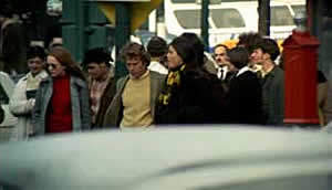
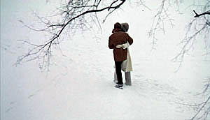
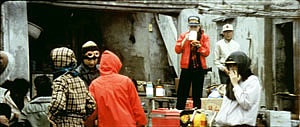
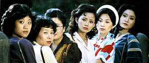
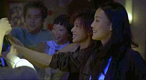
Archive for the 'Film technique: Staging' Category
Early Hou Hsiao-hsien: Film culture finally comes through (a repost)
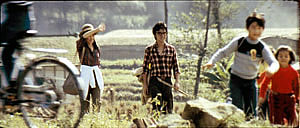
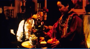
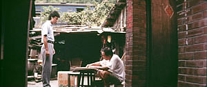
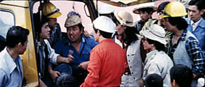
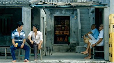
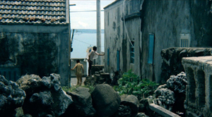
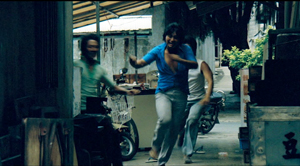
The Green, Green Grass of Home (1982).
David’s health situation has made it difficult for our household to maintain this blog. We don’t want it to fade away, though, so we’ve decided to select previous entries from our backlist to republish. These are items that chime with current developments or that we think might languish undiscovered among our 1094 entries over now 17 years (!). We hope that we will introduce new readers to our efforts and remind loyal readers of entries they may have once enjoyed.
DB here:
In March, the Criterion Channel will be featuring a selection of early films by the great Taiwanese director Hou Hsiao-hsien. These have been very hard to see in the West; I went to Brussels and Taipei to watch prints back in the 1990s. For those who admire his later works, they are absolutely necessary, and for the casual viewer they’re great fun. Two of them, Cute Girl and Green, Green Grass of Home are lilting musicals, while The Boys from Fengkuei is a wandering-youth story with affinities to coming-of-age films like Fellini’s I Vitelloni. (Too bad the series couldn’t include his second feature, Cheerful Wind.) My effort tries to show how a basic technical choice that Hou made created powerful effects on his visual style.
Because the frames are so dense with information, you may want to enlarge them as you go. For a fuller examination of Hou’s work across his career, there’s a chapter in Figures Traced in Light and a video here. The original blog, posted on June 6, 2016, was an attempt to fill in areas I didn’t have room to include in the book. If you’re unfamiliar with Hou’s major works, you should probably watch the video before reading the recycled entry.
For today, let’s call “film culture” that loose agglomeration of institutions around non-mainstream cinema. Film culture includes art house screening venues, festivals, magazines like Film Comment, Cinema Scope, and Cineaste, distribution companies (Janus/Criterion, Milestone, Kino Lorber et al.), critical websites, and not least the new channels of distribution and exhibition like Fandor, Mubi, and the impending FilmStruck.
Although the system is decentralized, there’s usually a fairly predictable flow of films through it. A film is shown at festivals, written up by critics, and picked up by distributors. Then it gains some exposure in theatres or more festivals, and it eventually becomes available on DVD, cable, and streaming services. And now we expect the process to move fairly quickly. Mustang played Cannes and many festivals through summer of 2015; it moved to theatres in the US and elsewhere in the fall. Only a year after its premiere, you can buy it on disc.
We’ve also been aided by the emergence of multi-standard video players and the willingness of some disc-publishing companies to release versions with subtitles in several languages. All too often, though, “film culture” displays gaps and delays. It took six years for Asgar Farhadi’s wonderful About Elly (2009) to make its way to minimal visibility in the US. Fans of Godard have been prepared to wait years to see his many films that didn’t get even video release in English-speaking territories. (Soigne ta droite! played Toronto in 1987, never got a theatrical release in America, and showed up on US DVD in 2002; the Blu-ray came out eleven years after that.) Two of the most egregious examples of this time lag involve the works of the outstanding Taiwanese filmmakers of the 1980s and 1990s: Hou Hsiao-hsien and Edward Yang.
 Most of Hou’s films had no proper US release. When they were available for booking, as from Wendy Lidell’s heroic International Film Circuit, they circulated for one-off screenings. Some of his major films, such as City of Sadness (1989), still remain difficult to see. Edward Yang’s work was similarly obscure. When we ran a retrospective at our UW Cinematheque in 1998, we had to borrow prints from his family.
Both of these extraordinary filmmakers had to wait many years for the exposure that is standard for European arthouse releases. After six features in seventeen years, Yang found a Western audience with Yi Yi (2000). Hou took even longer; twenty-seven years after his first feature, he gained some recognition with The Flight of the Red Balloon (2007) and last year, The Assassin. Meanwhile, many of these directors’ early films remain largely unknown, prey to ancient distribution contracts and the belief that the films would cost too much to revive and market.
Today’s entry and the next one celebrate the welcome news that important works by these two filmmakers are at last available on the disc format. Today I’ll concentrate on the three early Hou films from the Cinematek of Belgium: Cute Girl (1980), The Green, Green Grass of Home (1982), and The Boys from Fengkei (1983). Next time, I’ll consider Criterion’s release of Edward Yang’s masterpiece A Brighter Summer Day (1992).
Hou, early and late
Hou’s films are no stranger to this site. Among the first things I posted, back in 2005, was one of a batch of supplemental essays to my book, Figures Traced in Light: On Cinematic Staging (2005). That book devoted a chapter to Hou’s staging principles, with background on what I took to be the evolution of his technique. It was, I think, the first sustained view of Hou’s style, and it included discussion of his earliest films. These were scarcely known in the West and not considered in relation to his more famous work.
The online essay expanded my treatment of those titles. Because that essay is more or less buried elsewhere on the site, and it’s somewhat clunkily laid out by today’s standards, I’m reprinting it, with revisions, here, along with some bits from Figures. But first some background on these early works.
Hou began in the commercial, mainstream Taiwanese-language industry. Most local films had a strong genre identity: martial-arts movies, romantic comedies, or melodramas of family crises. Hou’s first directorial effort, Cute Girl, centered on a romance between two city dwellers who re-meet when the man is called to a surveying task in the countryside. Cheerful Wind (1981) reunites the two stars, Kenny Bee and Feng Fei-fe, in a more serious story of how he, a blind man, wins her love. In the pastorale The Green, Green Grass of Home, Kenny plays a schoolteacher brought to a village, where he meets another teacher and a romance blossoms. This film, however, expands to include dramas, big and small, involving several families; it also incorporates an ecological theme by encourage safe fishing policies.
In making these early films Hou discovered techniques that not only suited the stories he had to tell but also suggested more unusual possibilities of staging. He pushed those techniques further in his later films, with powerful results. The charming early films show him developing, in almost casual ways, techniques of staging and shooting that will become his artistic hallmarks. One basis of his approach, I argue, is his adoption of the telephoto lens.
How long is your lens?
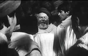
Around the world, from the late 1930s through the 1960s, many films relied on wide-angle lenses—those short focal-length lenses that allowed filmmakers to stage action in vivid depth. One figure or object might be quite close to the camera, while another could be placed much further in the recesses of the shot. The wide-angle lens allowed filmmakers to keep several planes in more or less sharp focus throughout, and this led to compact, sharply diagonal compositions, as in Welles’ Chimes at Midnight (1966).
Although Citizen Kane (1941) probably drew the most attention to this technique, it was occasionally used in several 1920s and 1930s films made throughout the world. The great French critic André Bazin was the most eloquent analyst of the wide-angle aesthetic, and his discussion of Kane, The Magnificent Ambersons (1942), The Little Foxes (1941), and The Best Years of Our Lives (1946) has strongly shaped our understanding of this technique.
The 1960s saw the development of an alternative approach, what we might call the telephoto aesthetic. Improvements in long focal-length lenses, encouraged by the growing use of location shooting, led to a very different sort of imagery. Instead of exaggerating the distances between foreground and background, long lenses tend to reduce them, making figures quite far apart seem close in size.
In shooting a baseball game for television, the telephoto lens positioned behind the catcher presents catcher, batter, and pitcher as oddly close to one another. Planes seem to be stacked or pushed together in a way that seems to make the space “flatter,” the objects and figures more like cardboard cutouts. The style was popularized by films like A Man and a Woman (1966).
The telephoto look quickly spread, employed by directors as diverse as Sam Peckinpah and Robert Altman, whose 1970s films also use the long lens, controlled by zooming, to squeeze a crowd of characters (M*A*S*H, 1972; Nashville, 1975) into the fresco of the anamorphic frame.
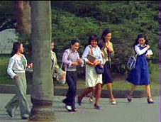
Hou Hsiao‑hsien came to filmmaking via the romance films so common in Taiwan in the 1970s, and this genre employed the long lens extensively. Working with low budgets, most filmmakers relied on location shooting. The telephoto allowed the camera to be set far off and to cover characters in conversation for fairly lengthy shots (as in Diary of Didi, 1978, below). In this respect, the directors were not so far from their Hollywood contemporaries; Love Story (1970) employs these techniques on a bigger budget.
Indeed, Love Story (a big hit in Taiwan) may have pushed local filmmakers toward using this technique in their own romantic melodramas; sometime the influence seems quite direct (Love Story and Love Love Love, 1974)
With these norms in place, Hou’s inclination toward location shooting and the use of nonactors, along with his attention to the concrete details of everyday life, allowed him to see the power of a technique that put character and context, action and milieu, on the same plane. His crowded compositions are organized with great finesse in order to highlight, successively, small aspects of behavior or setting, and these enrich the unfolding story, as Figures tries to show in his masterpieces of the 1980s and 1990s. Using a long lens (usually 75mm–150mm) he began to exploit some “just-noticeable differences” that the lens creates as byproducts.
Hou saw unusual pictorial and dramatic possibilities of the telephoto lens, and they became central to his distinctive way of handling scenes. A current norm of production practice yielded artistic prospects which he could explore in nuanced ways. Figures provides the detailed argument, but let me highlight three points here.
Exploiting the flaws
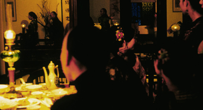
Flowers of Shanghai (1998).
One byproduct of the long lens is a shallow focus, as we can see in the examples above. Because the lens has little depth of field, one step forward or backward can carry a character out of focus. Hou stages in depth–and at a distance–but allows the layers to slip out of focus gradually.
Savoring the effects of gently graded focus is a common feature of Hou’s later work. The masher at the train station in Dust in the Wind (1987) moves eerily in and out of focus in the distance. In Daughter of the Nile (1988), there’s an astonishing shot showing gangsters approaching a victim’s SUV outside a nightclub: at first they’re only barely discernible blobs (seen through the vehicle’s narrow windows) but then they gradually come into ominously sharp focus in the foreground, preparing to attack one of the boys inside. The slight changes of focus train us to watch tiny compositional elements for what they may contribute to the drama. More recent examples abound in Flowers of Shanghai (1998), above, where it’s the foreground planes that dissolve.
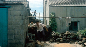
Hou’s three first films don’t use the option quite so daringly; here the degrees of focus concentrate on the principal players but still allow us to register the teeming life around them (Cute Girl; Green, Green Grass).
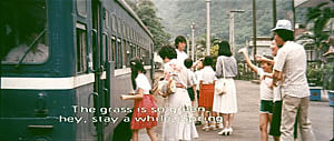
Hou can put sharply different dramatic situations on different layers. In Green, Green Grass, the departure of the little girl, saying farewell to her host family, plays out slightly closer to the camera than the departure of the eccentric teacher.
This principle operates as well in the creatively distracting street and train-platform scenes of Café Lumière (2004).
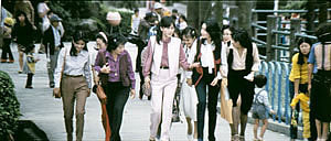
Secondly, the long lens yields a flatter-looking space. It has depth, but the cues for depth that it employs are things like focus, placement in the picture format (higher tends to be further away), and what psychologists call “familiar size”—our knowledge that, say, children are smaller than adults, even if the image makes them both of equal size. One favorite Hou image schema is the characters stretched in rows perpendicular to the camera, and the telephoto lens, by compressing space, creates this “clothesline” look more vividly. We can find the clothesline staging schema in the early Hou films (Cute Girl, Cheerful Wind).
Another favorite schema is the “stacking” of several faces lined up along a diagonal (Cute Girl). This can be seen as a refinement of a schema that was in wider use, as an example from Love Story indicates.
But Hou uses this sort of image more subtly. The telephoto lens lets him stack faces in ways that encourage us to catch a cascade of slight differences (Millennium Mambo (2000)). In many scenes of Flowers of Shanghai (1998) this principle is carried to a degree of exquisite refinement without parallel in any other cinema I know. In one shot, the faces are stacked in the distance, behind a lantern, and a slightly shifting camera reveals slivers of them.
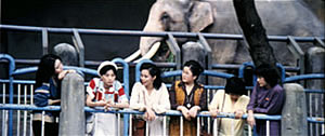
In general, because Hou is committed to a great density of information in the shot, the compression yielded by the long lens tends to equalize everything we see. Minor characters, or just passing strangers, become slightly more prominent, while details of environment can get pushed forward as well. The zoo scenes of Cute Girl enjoy showing us our characters in relation to the creatures around them.
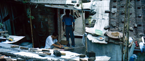
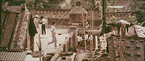
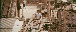
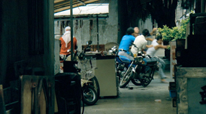
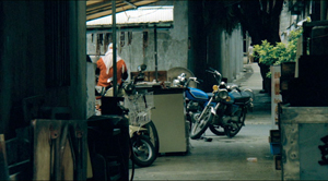
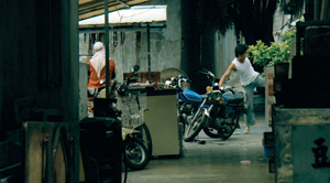
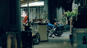
In the shot surmounting today’s entry, the tile rooftops of The Green, Green Grass of Home, secured by bricks and pails and tires and baskets, become just as important as the figures below them.
In Green, Green Grass, Hou develops the equalized-environment option in one particular scene. A long-lens distant view catches the teacher coming to the father’s house along a corridor of rooftops.
When the teacher confronts the father, instead of tight framings on each man, Hou cuts to another angle that activates yet another range of environmental elements—principally the train passing in the background, prefiguring the trip that the man’s son and daughter will take in an effort to find their mother.
Because the long lens has a very narrow angle of view (the opposite of a “wide-angle” lens), it affects the image in a third major way. If you use a long lens in a space containing several moving figures, people passing in the foreground will block the main figures: they pass between the camera and the lens. Hou elevates this blocking-and-revealing tendency to a level of high art.
In Figures Traced in Light, I argue that many great directors, from the silent era forward, have staged action in the shot so as to block and reveal key pieces of information, calling items to our attention at just the right moment with unobtrusive changes of figure position. The possibility of blocking and revealing arises from the “optical pyramid” created by any camera lens. (Lots more on that pyramid in Figures and in this video lecture.)
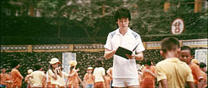
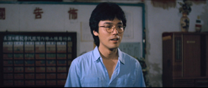
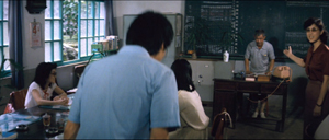
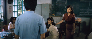
Hou showed himself capable of using the blocking-and-revealing tactic in traditional ways. Take this simple encounter in Green, Green Grass, when the new teacher Da-nian meets Su-yun, the young teacher with whom he’ll fall in love. The scene begins on him, then cuts to a reverse angle as he’s introduced to the principal.
The others are turned toward the principal in the background; the whole composition pushes our eye toward him. Then the teacher steps left to judiciously block the principal. The woman on the far left turns her head and we’re nudged to look at her. Da-nian swivels slightly too.
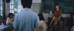
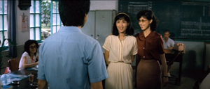
Then the key introduction: Da-nian shifts aside a little, the teacher continues to block the principal, and the central woman turns toward us.
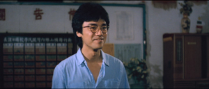
The climax (quiet, nifty) of this shot comes when Su-yun rises to meet Da-nian. She commands the center of the frame, frontal and radiant. Like any good classical director, Hou then gives us a reaction shot mirroring the first shot of this “simple” sequence: Da-nian is more than happy to meet her.
Imagine how a contemporary Hollywood director would handle this–lots of cuts, everybody in singles and close-ups, transfixing track-in to Su-yun, maybe a boingo music track–and count yourself lucky to have encountered, for once, an unfussy craftsman.
Hide and seek
The Green, Green Grass introduction scene involves a wide-angle lens, but Hou’s skill with slight character movement shows up in long-lens images too. In fact, I suspect that using the telephoto lens on location made him sensitive to the resources of masking and unmasking bits of the shot.
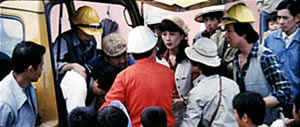
The loveliest example I know in the early films is the Cute Girl shot I analyze in Figures, when Fei‑Fei confronts the surveyors and the man in the red shirt serves as a pivot for our attention; the staging shifts our eye back and forth across the frame, according to small changes of character glance.
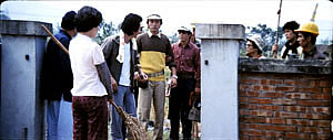
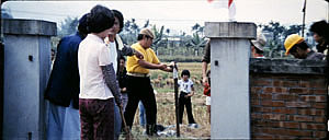
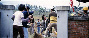
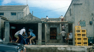
A less drastic example occurs when the surveying team starts quarrelling with the locals around a walled gate: The team’s blocking of the gate gives way to movement into depth and a struggle there between them and the townsfolk.
In all, it seems to me that these three resources of the long lens—the shallow focus, the compressed space, and the narrow angle of view—supplied artistic premises for Hou’s shooting and staging in the later films. This is not to ignore his use of the wide-angle lens on occasion, particularly interiors, as in the schoolteachers’ introduction scene. Once the lessons of the long lens had been absorbed, Hou could apply the staging principles that he’d developed to other kinds of shots and story situations. Sometimes he kept his style smooth and limpid, but at other times he offered the viewer some unusual challenges.
Peekaboo pictures
The Boys from Fengkuei (1983).
Presumably Hou could have kept making good-natured, crowd-pleasing movies for many years, but changes in his professional milieu gave him new opportunities. In the early 1980s Taiwan film attendance declined sharply, and Hong Kong films began to command more attention than the local product. The rash of independent companies had concentrated on speculation, not long-term investment, so only the government’s Central Motion Picture Company could initiate recovery. Ambitious government officials launched a “newcomer” program that offered support for cheap films by fresh talents. Even if the new films could not win back the local audience, they might gain renown at foreign film festivals. At the same period, a local film culture began to emerge, relying upon critics who were sympathetic to the creation of a New Taiwanese Cinema.
Hou was no newcomer, but working within the New Cinema framework he could reconceive his practice. The key question for all directors, he recalls, was: What is it to be Taiwanese? His New Cinema films would focus on political and cultural identity, and they did it through an approach to cinematic storytelling that in many respects ran against the conventions of his earlier films. His first New Cinema feature, The Boys from Fengkuei (1983; included in the Cinematek set) reminds us of how “young cinemas” have often represented a return to Neorealism.
Instead of introducing us to clear-cut protagonists and a dramatic situation, the film immerses us in a milieu, that of the small town of Fengkuei. The first fifteen minutes are episodic, casually showing a gang of teenage boys playing pool, lounging about, playing pranks, and above all getting in fights. Initially, the one who’ll become the main figure is minimally characterized; the emphasis, as the title indicates, is really on the group. The boys drift to the big city, where they try to get by and meet others their age. Throughout, local color and everyday routines drive the action more than character goals and traditional drama do.
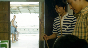
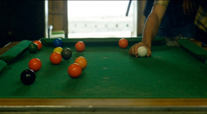
This somewhat diffuse approach to narrative, in various countries, has proven well-suited for filmmakers who want to explore psychological development and social-cultural commentary. So it accords with the impulse toward understanding national identities that animated New Taiwanese Cinema. In addition, I think that this looser conception of storytelling allowed Hou to refine some of the stylistic options he had already explored. Now the extended, fixed telephoto shot with varying planes of focus appears as a more indeterminate pictorial field, as in our rather oblique introduction to the boys–partial framed figures drifting in and out of the frame–and their poolroom hangout. Emphasizing incomplete views and vague figures outside the door, Hou gives us a more precise array of balls on the table than he does of his characters in space.
Likewise, even though Hou has surrendered his very wide anamorphic frame, he finds ways to balance human action and tangible surroundings in the ways he did with city landscapes and village rooftops in the earlier films. The bullying of a motorcyclist and a pursuit by a rival gang aren’t rendered with the aggressive cuts and angles we’d expect in violent scenes in the Hong Kong action pictures then ruling Taiwanese screens. It’s as if Hou, along with his colleagues, is rejecting that other Chinese-language tradition.
Which is to say that when conflict comes, Hou turns to “dedramatization,” that tendency (again related to Italian Neorealism and its successors) of tamping down peaks of action. Now his characteristic long lens creates detached shots, sometimes with planimetric flatness, sometimes with tunnel vision. These images play out chases and fights in a way that minimizes their physical impact but reminds us of the design and details of the characters’ world.
Hou’s insistence on the fixed, distant telephoto take is now put in the service of obscured vision. The people who passed through the frame in the earlier films, blocking and revealing the action judiciously, may become more salient than the action itself–which is itself often offscreen, or swathed in shadow, or shielded by aspects of setting. The early films’ fixed long take enabled us to see story action fully, but, now, in its refusal to cut away, the camera can suppress story information.
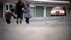
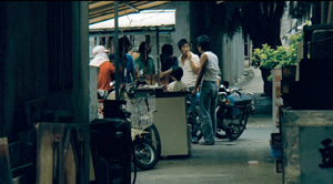
Early in the film, a street fight passes in and out of a far-off intersection among stalls. The dust-up stirs only slight interest from passersby, before bursting back into the alleyway and coming to the camera.
The masking of the fight by the setting can be seen as an extension of the way the walls in the Cute Girl surveying quarrel intermittently cut off our vision, but here it’s far more drastic and sustained.
I’ve drawn my examples from the early stretches of The Boys from Fengkuei, so as not to preempt your own discoveries as the plot carries the gang to the big city. In these scenes Hou in effect teaches us how to watch his movie. But I think I’ve said enough to suggest how Hou’s fresh conception of narrative, born of a renewed interest in local culture (already present in another register in the first three films), allowed him to carry his stylistic explorations to new levels.
Hou saw certain pictorial possibilities in the long lens, and after developing them to a certain point in popular musicals, he recast them when he took up another kind of storytelling. He realized that leisurely, contemplative narratives permitted him to refine these visual possibilities, and they could become powerful, nuanced stylistic devices. And he didn’t stop, as the films following his New Cinema works vividly show. His visual imagination seems unlimited.
A more general lesson follows from this. Norms of form and style are resources for artists. Some artists follow the schemas that they inherit, while others probe them for fresh possibilities. A few can even make a handful of schemas the basis of a rich, comprehensive style. Ozu did this with the techniques of classical Hollywood editing; Mizoguchi did it with depth staging in the long shot. Like these other Asian masters, Hou reveals how much nuance a few techniques can yield, even when deployed in crowd-pleasing, mass-market movies. And now, thanks to the vagaries of film culture, more viewers can come to appreciate his achievement.
The frames from Diary of Didi and Love, Love, Love are, alas, cropped video versions, but that condition doesn’t keep us from recognizing the telephoto lensing in the originals.
The Cinematek collection also includes sensitive English-language introductions to the films by Tom Paulus and enlightening audiovideo essays by Cristina Álvarez López and Adrian Martin.
The indispensable English-language sources on Hou are James Udden’s in-depth career survey, Richard Suchenski’s monumental anthology, Emilie Yeh and Darryl Davis’ study of New Taiwanese Cinema, and two monographs on City of Sadness, one by Bérénice Reynaud, the other by Abe Markus Nornes and Emilie Yeh.
The fullest account I’ve offered of Hou’s style are in Figures Traced in Light and in a video lecture, “Hou Hsiao-hsien: Constraints, traditions, and trends.” See also the several blog entries touching on his work. A broader account of the historical tradition to which he belongs can be found in both Figures and On the History of Film Style, as well as in entries under Tableau staging and in the video lecture mentioned already.
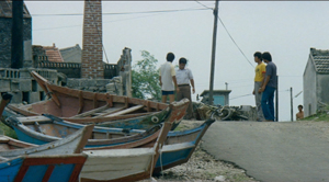
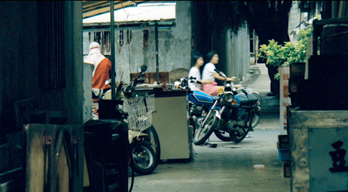
The Boys from Fengkuei.
DIE HARD revived: An entry revisited
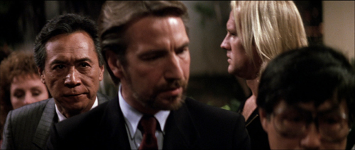
Die Hard (1988).
David’s health situation has made it difficult for our household to maintain this blog. We don’t want it to fade away, though, so we’ve decided to select previous entries from our backlist to republish. These are items that chime with current developments or that we think might languish undiscovered among our 1094 entries over now 17 years (!). We hope that we will introduce new readers to our efforts and remind loyal readers of entries they may have once enjoyed.
Today’s revival responds to the return of Die Hard to theater screens in time for Christmas. Since our original posting in 2019 (“Not just a Christmas movie”), this supreme action picture has further cemented its reputation as a yuletide favorite (although it was originally released in July). Happy holidays from the Nakatomi Corporation!
DB here:
It’s been quite a fall season for UW–Madison film culture. There were visits from avant-garde legend Larry Gottheim, New York Times co-chief film critic Manohla Dargis, Schawn Belston (Senior VP of Mastering at Disney), and Julia Reichert, whose American Factory is now routinely turning up on ten-best lists. The semester’s first screening at our Cinematheque was Kiril Mkhanosvsky’s Give Me Liberty, a Milwaukee movie also gracing year-end best lists. Our programs included restored films by African pioneer Paulin Soumanou Vieyra, retrospectives of Reichert and Kiarostami, a 3D double feature of Revenge of the Creature and Parasite (no, the other one), a program of early women directors in America, a selection of films conserved by the Chicago Film Society, and a miscellany ranging from Olivia and Near Dark to Tropical Malady and Red Rock West.
Travels to festivals, partly covered in our blog entries, forced us to miss too many of these shows. But we couldn’t miss the final one: Die Hard (1988).
It’s a film I’ve admired since I first saw it in summer of 1988. I’ve taught it in many classes, but never written about it. Seeing it again, in a pretty 35mm print from the Chicago Film Society, has made me want to say a few things as my final blog entry for this busy year.
The man between
Think-piece pundits like to say that Hollywood movies are about good guys versus bad guys. But usually things are more complicated. Very often the good guy is an outsider caught between two large-scale forces, good or bad or both–the cattle ranchers versus the townspeople, or the mob versus the cops. Often the protagonist is an outlier, forced to solve the problem using means that respectable social forces can’t.
Call it the problem of the House Democrats. When the lawbreaker can’t be brought to justice, how do you make him pay? The answer is one that William S. Hart movies provided in the 1910s. We need a “good bad man,” a rogue agent who knows the scheme from the inside but is willing to do the right thing. Which means that he has to be flawed too, a little or a lot, and that he can eventually reform.
In Die Hard, the forces of law and order line up as the Los Angeles police and the FBI. The threat is Hans Gruber’s gang, posing as terrorists but actually planning to rob the Nakatomi Corporation of $640 million in bearer bonds and kill lots of hostages in the process. The naive TV broadcasters support both, recycling official scenarios of how hostage-taking works and reinforcing the gang’s masquerade as a terrorist group.
The contrasts are marked. The forces of order are American, in alliance with a Japanese company, while the attackers are Europeans. At the start, we hear American music (the rap played by the limo driver Argyle), but Hans hums Beethoven. The cops’ technology notably fails, as when the assault vehicle and a helicopter are consumed by firepower. But the gang’s hi-tech expert Theo can crack the vault, assisted by Hans’ plan to push the Feds to cut the building power.
Above all, the forces of social order are strikingly inept, while the gang is ruthlessly efficient. Unlike the police, who “run the terrorist playbook,” Hans boasts that he has left nothing to chance. The cops can’t imagine an adversary that exploits the official by-the-book procedures. As for the business types, Takagi’s calm bluff and Ellis’s freewheeling jargon can’t cope with a gang leader who doesn’t get the Art of the Deal.
Clearly, America and Japan need help. That appears in the form of John McClane, the cop from the East Coast trapped in Nakatomi Plaza.
McClane is the man between, spatially and strategically. He witnesses the action from inside the skyscraper, and bit by bit he figures out the gang’s real scenario. And he’s caught between both forces. The gang tries to find and kill him, while the cops refuse to recognize him as an ally. Confronting Karl’s brother early on teaches McClane that he can’t play by procedure. (“There are rules for policemen,” says a thug who doesn’t believe in rules.) The LAPD’s ineptitude shows that McClane can’t expect help on that front. So he must become almost as reckless as his adversary, though in a virtuous cause. This principally means blowing stuff up.
McClane isn’t totally without resources. He has as helpers Al, the desk cop who comes on the scene and sustains his morale, and Argyle, who’s there to play a crucial role at the climax. But mostly he’s alone in facing problems. He needs weapons. He needs shoes. He needs to protect the hostages, most of all his wife Holly, who has climbed up the corporate ladder. (In another movie, she would be the in-between protagonist.) To keep Holly from becoming a bargaining chip, McClane needs to hide his identity. And he needs to figure out the gang’s ultimate plan, of seeding the rooftop with explosives that will destroy the building and cover their escape.
John’s solutions are notably low-tech. While the police and the gang depend on advanced firepower and computer finagling, McClane lashes an explosive to a desk chair and uses a fire hose as a rope. He has to improvise shoes by taping a maxi-pad to a bleeding foot. No holster for your automatic? How about some Christmas wrapping tape? And don’t forget to taunt your adversaries with Yankee wisecracks.
In the course of this drama, the very physical McClane becomes a model for his allies. Holly punches the reporter who revealed John’s identity, and Argyle cold-cocks Theo at the point of getaway. Most dramatically Al kills the revived Karl when he’s about to plug McClane. The people in between take up arms.
McClane and his allies solve the House Democrats’ problem. Law can’t be lawless, even in protecting itself. Business, always aiming at the bottom line, has to give up principles. (“Pearl Harbor didn’t work out, so we got you with tape decks.”) These forces of social order are inefficient, trusting, and superficial. They can’t stand up to sheer brutal onslaught. In a crisis they will fold, or simply choose the nuclear option: agents Johnson and Johnson are ready to lose a big chunk of hostages.
McClane is a mediating figure that permits the film to show you can be strategically lawless for the sake of lawfulness. The fly in the ointment, the monkey in the wrench, screws up plans on both sides, but for the benefit of everyone else.
The Big Dumb Action Picture isn’t so dumb
This thick array of thematic parallels would be interesting in itself, but it gets worked out through precise storytelling. There was a time when critics knocked action movies as simply ragbag assortments of fights, chases, and explosions. Die Hard, I think, changed ideas of just how well-wrought an action picture could be. About 53 minutes of it consist of physical action (including people sneaking around), leaving almost 70 minutes for other stuff: suspense, changing goals, surprise information, attention to parallel plotlines, and little moments like the thief pilfering candy just before an ambush.
The film typifies tidy classical Hollywood construction, beginning with an arrival (the jet) and ending with a departure (the McClanes in a limo). In between we get a big dose of the classic double plotline, romance and work. Holly’s job at Nakatomi threatens their marriage, and John takes on a temp job, that of fighting the gang, which also endangers the couple’s efforts to reconcile.
For every Superman, there’s a Kryptonite, and here the protagonist’s flaws include his fear of heights (set up in the second shot, reiterated throughout) and, more importantly, his resistance to Holly’s independence. By the end, he’s learned a lesson. The film’s streak of male sentimentality allows John to ask his wife’s forgiveness for blocking her career ambition. She’s ready to compromise too, reassuming his last name when she meets Al. The characters we care about change, at least a little. That could be the motto of most classical Hollywood plots.
As usual, we get crosscutting among several lines of action. John’s arrival is crosscut with Holly at work fending off Ellis, and in the rest of the film the gang’s stratagems are intercut with the cops’ plans and McClane’s efforts. At various points, five or six actions are alternating with one another.
All these escalating situations cluster into distinct parts, the four that Kristin has argued for as typical of Hollywood architecture.
The Setup runs about 33 minutes, culminating in the murder of Takagi and Hans’s promise that he can open the vault.
The Complicating Action, a counter-setup, coalesces around John’s goals of communicating with outsiders, avoiding capture, and attacking the thieves when he can. Through many chases and fights, the gang seeks to block all these efforts. The lines converge when John shoots Marco and tosses his body onto Al’s car. He gains the bag with the detonators, giving him the upper hand. Then the TV reporter gets involved, the cops arrive, and John is ordered to wait. Things seem to be stabilized.
After this midpoint, the Development supplies what Kristin calls “action, suspense, and delay.” Officer Dwayne Robinson arrives, pitting himself against Al and McClane. We can regard the police assault, Ellis’s clumsy attempt to broker a deal, and the arrival of the FBI men as a series of delays that endanger the stability of the standoff. At the end of this section, John meets Hans (posing as an escaped hostage): now both men know each other. And in the firefight that follows, John loses the detonators. Hans declares, “We’re back in business,” and the original plan can go forward.
The last twenty-five minutes constitute the Climax, launched by McClane’s “darkest moment.” He seems utterly beaten. Picking glass shards out of his feet, he gives Al a message for Holly over the CB radio. Al tells of his own burden, the accidental shooting of a child. The stakes are now very high.
Rapid crosscutting shows John finding the bombs on the roof and fighting with Karl, while the FBI helicopter attacks the building and Hans discovers that Holly is John’s wife. John stampedes the hostages down the stairs off the roof and escapes the strafing from the chopper before it blows. Argyle dispatches Theo, while John finds the surviving gang members in the atrium and shoots Hans, who falls to his death.
In the Epilogue, Al and John meet, Al dispatches Karl, Holly socks the newsman, and John and Holly drive off with Argyle.
These parts present a tight, logically building plot composed of swiftly changing situations. Along the way we encounter a great many motifs that create echoes or contrasts. Everyone notices the Rolex, at first a symbol of Holly’s talents but also of corporate swagger; only by unfastening it can they let Hans drop from the window. When Argyle floats the possibility that Holly will rush back into John’s arms for a movie ending, John murmurs: “I can live with that.” Agent Johnson speaks the same line, but for him it means an acceptable level of civilian casualties.
Holly’s unmarried name, Gennero, shows how a motif can develop in relation to the drama. At first it’s a sign of pride in her own identity (typical corporation, Nakatomi has misspelled it on the touch screen). Her name-change triggers the couple’s quarrel, but it has another narrative use: It conceals John’s identity from Hans. And at the end he introduces her to Al as Gennero but she reasserts her love by correcting him: “Holly McClane.”
Then there are differences of class and country. Hans reads Forbes, but McClane the US boomer references Roy Rogers and Jeopardy. (Hans is so unplugged from pop culture he thinks John Wayne was in High Noon.) Argyle the former cab driver and Al the cop know the downside of city life, but so does John the New York detective, who adapts Roy’s trademark phrase to the mean streets: “Yippee-ki-yay, motherfucker.”
Even a conventional Hollywood gesture, that of attacking a picture of a loved one, acquires a nifty plot function. Annoyed at John, Holly slaps down the family portrait on her shelf. Good thing too, because otherwise Hans would have seen it during the invasion. We’re reminded of that picture when in a moment of quiet John looks at the same snapshot in his wallet. Only after Hans has encountered John is he able to flip the portrait back up and realize that Holly is the “someone you do care about.”
There are lots more felicities like these–so many that I’d consider Die Hard a “hyperclassical film,” a movie that’s more classically constructed than it needs to be. It spills out all these links and echoes in a fever of virtuosity. Hard to believe that the makers started shooting without a finished script.
Intensified continuity, personalized
Die Hard is a good example of a stylistic approach I’ve called “intensified continuity.” It’s a modification of the classical method of staging, shooting, and cutting scenes. Here director John McTiernan and DP Jan de Bont tweak that approach in distinctive and powerful ways. You can find examples all the way through the movie, but I’ll draw most of my illustrations from the first hour, when the stylistic premises get laid out for us.
Cutting speeds accelerated sharply in Hollywood films from the 1960s onward, and for its time, Die Hard was a rapidly-cut movie. The average shot runs just under five seconds, about what you’d get in a 1920s silent film. By today’s standards, which fall more in the 3-4 second range (even for movies outside the action genre), it’s a bit sedate.
One factor that increases the cutting pace is a greater reliance on singles and close-ups. These are tighter than we’d expect in most studio films of the classic era.
Even in close-up, the shots aren’t snipped free of their surroundings, thanks to the wide frame and layers of focus–both important in the film’s overall style, as we’ll see.
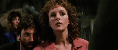
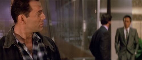
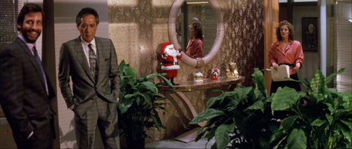
Likewise, intensified continuity exploits a greater range of lens lengths than we’d find in studio films of the classic era. We get wide-angle shots like those above along with telephoto shots throughout. Here the long lens is used to pile up people around Holly, and an even longer lens shows her optical viewpoint on the bandits in the office.
And there’s a free-roaming camera, thanks chiefly to Steadicam technology. But interestingly, Die Hard avoids some of today’s most common camera movements, such as shooting a fixed conversation with a sidewise or circular tracking shot. These would become more common in the 1990s.
McTiernan thought a lot about his camera movements, as he explains in interviews and the commentary track on the DVD. He wanted to shape spectators’ attention, to use camera movement to nudge things into view. “The audience’s eye wants to go with you.” Accordingly, more than in many contemporary films, Die Hard‘s camera movements have a shape: they end on a point of information.
Sometimes it’s just a quick pan, doing duty for a cut. At other times, the reframing is a gentle nudge that prepares for a new scenic element, as when Holly enters her office.
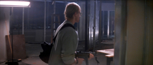
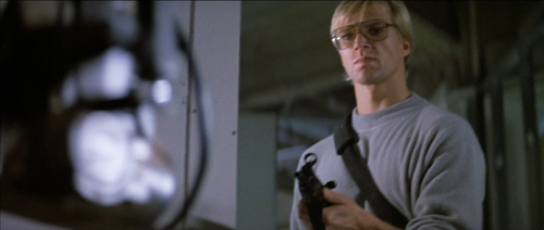
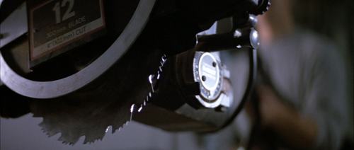
In shooting Predator (1987), McTiernan wanted to cut moving shots together, but his editor resisted. For Die Hard, he refilmed his camera movements at different rates so that two would match. A good example is when Karl’s brother strides carefully into an area under construction. The camera tracks with him, but when he turns to find the source of a whining noise, the arcing movement at the end of one shot is picked up in the next as the framing circles to reveal the saw.
That reveal is given, characteristically, in rack focus. I could have added rack focus as another featured technique of intensified continuity. McTiernan and de Bont take it very far, making Die Hard one of the great rack-focus movies. The image is constantly shifting focus to guide our attention to the changing layers of the scene.
This neat, compact presentation not only preserves the commitment to long-lens close-ups we find in intensified continuity. The technique also gives each rack focus the snapping force of a cut. (And you don’t need to build big sets.) Needless to say, the rack-focusing wouldn’t work if McTiernan hadn’t committed himself to staging his action in depth. More on this below.
Staging in ‘Scope
Die Hard finds ingenious ways to “let the audience’s eye go with you” in the widescreen format. Sometimes it’s a matter of classic edge framing. Thanks to a low angle, John and Holly converse along a wide-angle diagonal.
Sometimes McTiernan reverts to a technique not enough directors use nowadays: blocking and revealing. In classic cinema that was usually a technique reserved for long shots, when actors could move aside as part of ensemble. Die Hard applies blocking and revealing to the tight framings of intensified continuity.
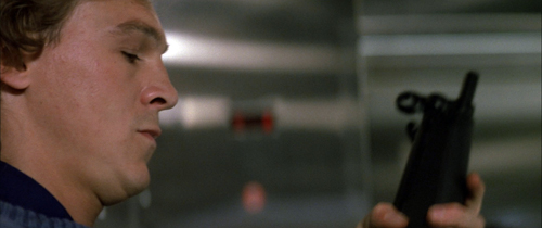
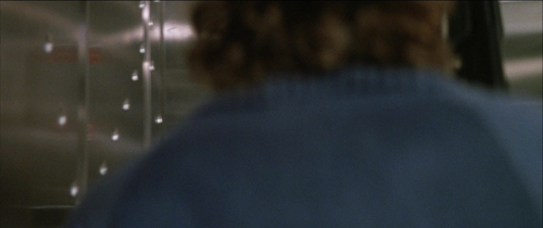
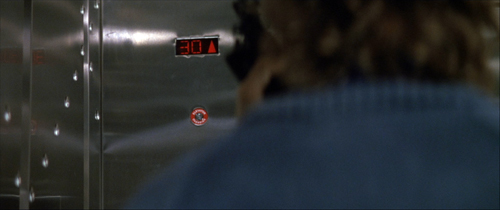
A thug in an elevator checks his weapon, pivots for an instant, and then moves aside to show the elevator arriving at the target floor.
Here again a rack focus helps. The moment reiterates the importance of the thirtieth floor in the skyscraper’s geography.
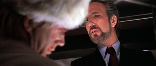
When Hans finds the body of Karl’s brother, we can study his expression. He flips the victim’s head to reveal a gunman, who looks to Hans before he says his line.
In a neat touch, the thug’s mouth isn’t shown. Today a director would probably show his whole face, but, really, who cares? The careful framing keeps him a secondary character, and a future target of McClane. And no need to rack focus on him, which would give him unwonted importance. All we need to remember him is that he’s the thug with long hair.
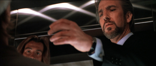
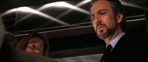
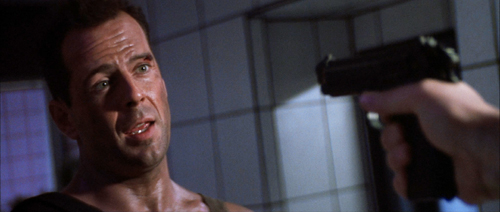
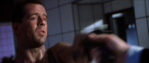
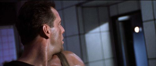
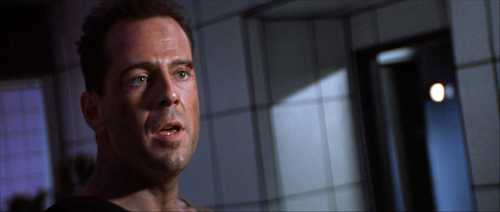
I can’t refrain from using one audacious example from late in the film. John and Hans have met, and Hans has revealed himself by targeting John with the pistol McClane has given him. In reverse shot, John reveals that it has no bullets and grabs it away from Hans.
But the pistol, and that gesture, have concealed the elevator behind them. When the pistol is knocked down, the elevator light pops on in the background. Our attention snaps to it, aided by that characteristic ping we hear throughout the movie (another motif).
The crisp turn of events, given visually and sonically, gets ampified by the acting. McClane’s cockiness turns to panic and Hans gets the upper hand. (“Think I’m fucking stupid, Hans?” Ping. “You vere saying?”)
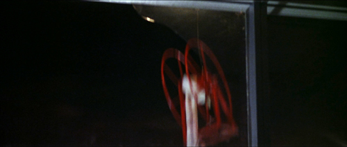
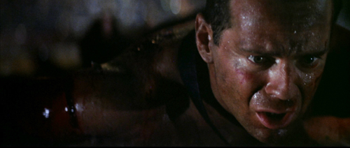
The most bravura rack-focus comes during the climax, when the firehose reel whizzes down behind McClane and he realizes that he’s being dragged through the shattered window.
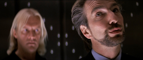
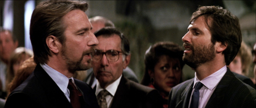
The coordination of the long lens, camera movement, staging, and racking focus is especially rich when Hans drifts among the hostages searching for the man in charge. He recites Takagi’s life history as he passes from one possibility to another (including, comically, Ellis).
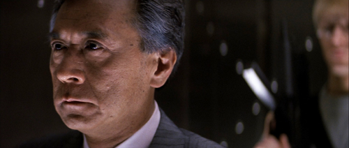
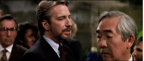
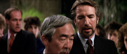
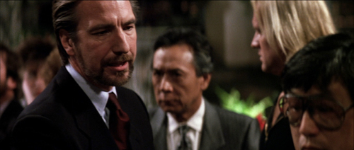
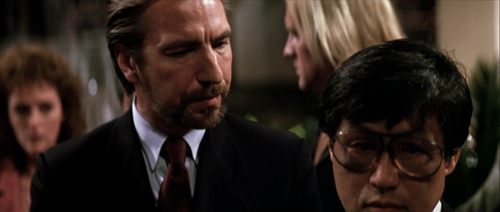
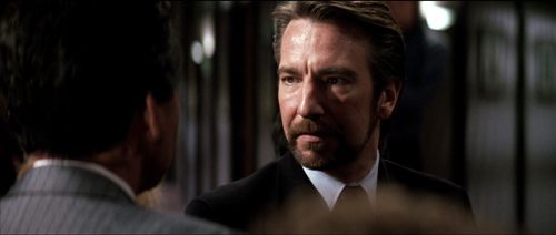
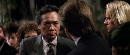
At the climax of the passage, McTiernan’s staging-in-layers sets up Takagi, Karl, and Holly before Takagi takes charge. Briefly blocked by Hans, he admits his identity by stepping out from behind and into focus.
McTiernan isn’t done. A reverse shot of Hans finishing his spiel (“…and father of five”) punctuates the suspense. McTiernan buttons up this passage by returning to his “moving master” shot and having Karl shove Takagi out.
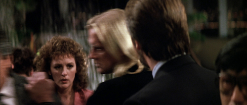
That clears the way for us to see Holly’s reaction. A beat dwells on her as she shifts her eyes to Hans, foreshadowing her conflict with him at the climax.
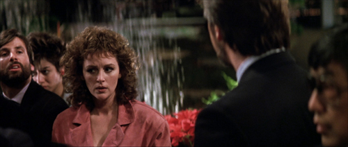
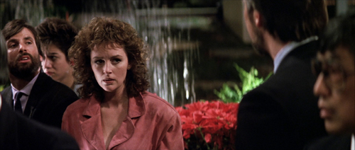
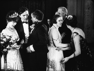
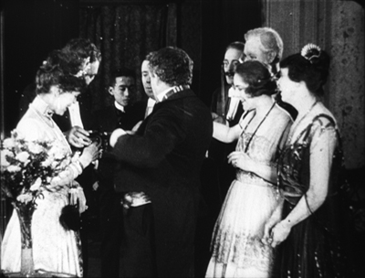
This sort of layering of faces popping in and out of visibility has precedents in earlier cinema, chiefly of the “tableau” period of the 1910s. McTiernan has, I think, spontaneously rediscovered for modern times what William C. de Mille was up to in the party scene in The Heir to the Hoorah (1916). (For more on that, go here.)
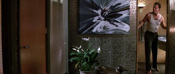
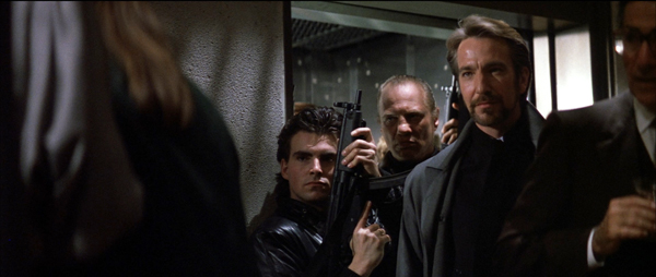
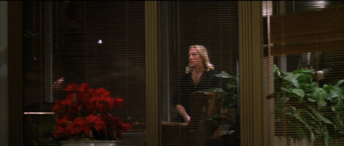
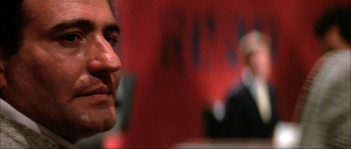
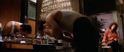
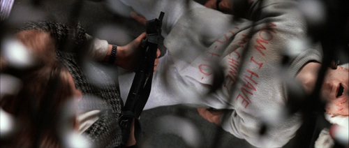
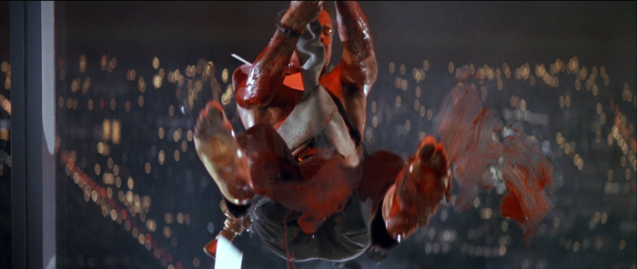
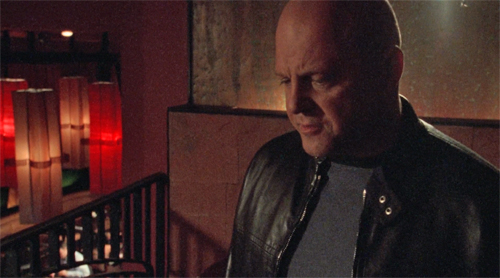
Of course McTiernan also has to work with the 2.35:1 anamorphic format, which enables him to spread his layers out more. That format also allows some remarkable compositions, such as the one surmounting today’s entry. The cut to the shot of John in Holly’s office uses the abstract splash painting (seen here for the first time) as a visual analogy for the explosion of gunfire offscreen at the same time.
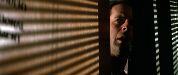
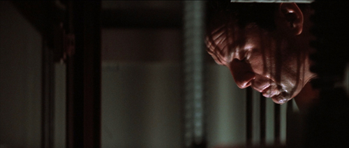
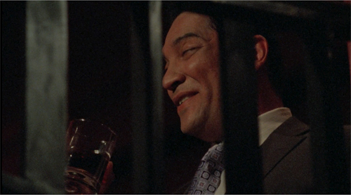
McTiernan and de Bont constantly find striking but cogent images, thanks to lighting as well as color and format. Here’s McClane on top of an elevator peering through the perforated grille; his POV is a striking but still informative composition. the cut between the two provides a little punch of contrasting light and shade.
There are felicities like these feathered all through this remarkable movie, but the momentum of storytelling never flags. This remains a masterpiece of Hollywood filmmaking.
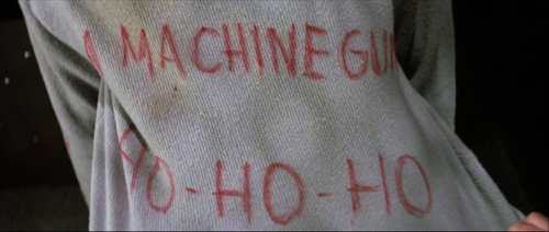
Thanks to our readers for following us this year. Kristin will be weighing in soon with her annual list of best films from ninety years ago. In the meantime, HO-HO-HO.
Madison owes an enormous debt to our Cinematheque team: programmers Jim Healy, Mike King, Ben Reiser, and Zach Zahos, as well as veteran projectionist Roch Gersbach. Santa should reward them. You can too by visiting the Cinematheque’s Podcast, Cinematalk. There you’ll find conversations with Manohla Dargis, Schawn Belston, and James Runde.
For lots of background on the making of this film and the four sequels, there’s Die Hard: The Ultimate Visual History by Ronald Mottram and David S. Cohen. At rogerebert.com, Matt Zoller Seitz has a discerning appreciation on the occasion of the film’s twenty-fifth anniversary.
Jake Tapper has provided the definitive analysis of Die Hard as a bona fide Christmas movie.
McTiernan (with whom I share an alma mater) provides very good DVD commentaries (even for Basic). Prison also seems to have given him some pronounced political views. Alas, the website he created as a platform for them is apparently no longer available. Word is that McTiernan is preparing a new film, Tau Ceti 4, with Uma Thurman. A videogame promo is purportedly signed by him.
Of other McTiernan films, I also much admire The Hunt for Red October (1990). The Thomas Crown Affair (1999) seems to me better directed than the original, and The 13th Warrior (1999), despite being taken out of his hands, remains a pretty interesting film. (Name another Hollywood movie in which a Muslim poet visiting Northern Europe is justly appalled at its barbarism.) Nomads (1986) also has its good points.
I discuss the issues of narrative and style raised here at greater length in The Way Hollywood Tells It: Story and Style in Modern Movies. You can also search “intensified continuity” for blog entries hereabouts. On CinemaScope aesthetics, see this entry and this video.
Die Hard (1988).
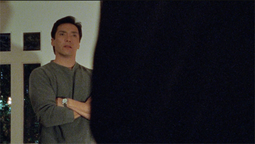
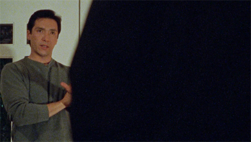
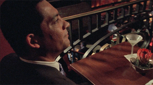
Calm that camera!
Succession (2023).
DB here:
Thanks to our Wisconsin Film Festival, Ken Kwapis paid us a visit. Director of The Sisterhood of the Traveling Pants and many other features, Ken also has experience directing TV, notably The Office. He’s a generous filmmaker, and he radiates enthusiasm for his vocation. I took the opportunity to talk with him about camera movement in contemporary media. He taught me a lot, and what I’ve come away with I share with you.
Camera ubiquity, with a vengeance
In the early silent era, fiction filmmakers around the world discovered what we might call camera ubiquity—the possibility that the camera could film its subject from any point in space. This resource was more evident in exterior filming than in a studio set, so early films often display a greater freedom of camera placement when the scene is shot on location.
At the same time, filmmakers began realizing the power of editing. This technique offered the possibility of cutting together two shots taken from radically different points in space. Yet an infinity of choices is threatening, and some filmmakers, mostly in the US, constrained their choices by confining the camera to only one side of the “axis of action,” the line connecting the major figures in the scene. Different shots could cut together smoothly if they were all taken from the same side of the 180-degree line. The result was the development of classical continuity editing. The director was expected to provide “coverage” of the basic story action from a variety of angles, but all from the same side of the line. Classical continuity was in force for American films by 1920 and was quickly adopted in other national cinemas.
The one-side-of-the-action constraint was encouraged by the fact that much filming of staged action took place on a set, designed according to the theatrical model. The camera side of the space was behind an invisible fourth wall, like that in proscenium theatre. To some extent directors compensated for the limitation on camera position by fluidly moving actors around the frame, from side to side and into depth or toward the viewer. Still, the “bias” in choosing setups was reinforced by the increasing weight of the camera in the sound era, which made it hard to maneuver within both interior and exterior settings. Camera movement in a more or less wraparound space was possible, but it was usually very difficult. It commonly required a dolly or crane on tracks to prevent bumps.
Technicolor filming, with its monstrously big camera units, reinforced the bias toward proscenium sets, 180-degree space, and a rigid camera. So did the postwar vogue for widescreen cinema. But in the 1950s filmmakers were also exploring the possibility of lighter, more flexible cameras. The body-braced cameras often produced bumpy, slightly disorienting images but yielded a more “immersive” space that gave the story action immediacy and spontaneity. By the early 1960s, handheld camerawork was being seen in both documentaries and fiction films. At the same time, fiction filmmakers were gravitating toward more location filming. In addition shooting on location with portable cameras promised greater savings on budgets, an attractive option for both independent and mainstream directors.
Handheld shooting was becoming more common in the 1970s, when its problems were overcome by the invention of the Steadicam, first displayed to audiences in Bound for Glory (1976). This stabilizer permits the operator to move smoothly through a space.
The new device was more than simply a substitute for a camera on a dolly and tracks. Ken pointed out to me that the Steadicam encouraged the increasing use of the walk-and-talk shot showing two or more characters striding toward a constantly retreating camera. This proved to be an efficient way of covering pages of dialogue. Beyond that, the Steadicam became an all-purpose camera for filming any sort of scene.
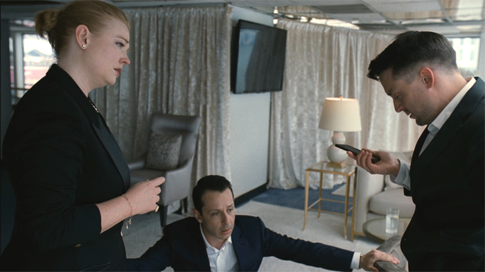
Over the same years, directors embraced multiple-camera shooting—originally aimed at handling complex stunts—for every scene, and they recruited A and B cameras, often mounted on Steadicams, for ordinary dialogue scenes. In most cases, the B camera was mounted alongside the A, but with the B camera in other spots there was a certain erosion of the axis of action. Now a conversation may be captured from a greater variety of angles than classical coverage would favor. Filmmakers have replaced 180-degree staging and shooting with what’s called 250-degree coverage. In The Way Hollywood Tells It I drew an example from Homicide: Life on the Streets. A free approach to the axis of action is common today, as in this example from Succession (2023).
A rough sense of the axis of action is maintained, and there are matches on action, but our vantage “jumps the line” as well. Moreover, the camera is constantly moving within the shots. It’s panning to follow or reframe the characters, sometimes circling them or abruptly zooming, and always wavering a bit, as if trembling. What some Europeans call the “free camera” is very common nowadays, and Ken and I talked mostly about this creative option.
Eye candy
By now, many filmmakers have chosen to make nearly every shot display some camera movement independent of following moving characters. This tactic was noted and recommended in a manual by Gil Bettman (First Time Director, 2003). (Readers of The Blog know of my fondness for manuals.) “To make it as a director in today’s film business, you must move your camera” (p. 54). The risk is making the audience more aware of the camerawork than of the story, so Bettman adds:
A good objective for any first time director would be to move his camera as much as possible to look as hip and MTV-wise as he can, right up to the point where the audience would actually take notice and say, ‘Look at that cool camera move.”
Like cinematographers in the classical tradition, Bettman declares that the camerawork should be “invisible” (p. 55). By now, you could argue, the predominance of camera movement has made it somewhat unnoticeable. Ordinary viewers have probably adapted to it.
One factor that aids the “invisibility” of camera moves is the speed of cutting. If the shots are short, the viewer registers the camera movement but probably doesn’t have time to notice whether it’s distracting or not. The effect of this isn’t restricted to action scenes. Even dialogue scenes may catch conversations up in a paroxysm of character reactions, camera movement, and swift editing. Creating these rapid-fire impressions, it seems to me, is what a lot of modern filmmaking seeks to do, at least since the early 2000s. It’s sometimes called “run and gun” shooting. Here’s an instance from The Shield (2003), with sixteen shots in less than a minute.
Arguably, Hill Street Blues (1981-1987) popularized this look for the police procedural genre, when DP Robert Butler urged his team to “Make it look messy.”
This sequence and the Succession passage points up another factor. Knowing that their films would ultimately be displayed on TV, some directors began “shooting for the box” by using tighter shots and closer views. TV directors such as Jack Webb were already working in this vein of “intensified continuity,” and many others had started their careers in broadcast drama and accepted the impulse toward forceful technique. Television has long demanded that the image seize and hold viewers, likely sitting in living rooms and prey to many distractions. Fast cutting and constant camera movements keep the viewer’s eye engaged. No surprise, then, that our TV programs present a fusillade of images that make it hard to look away.
Constant camera movement has another benefit. Many camera movements tease us. The start of a shot suggests that the camera will bring us new information, so we must wait for the end. Filmmakers love a “reveal,” and even a small reframing can suggest the camera is probing for something new to see. By now, however, filmmakers can play with us and use camera movement to flirt with our attention: the shot can begin with a clear image but drift away to conceal the main subject. I first noticed this almost maddening stylistic tic in The Bourne Ultimatum (2007), but it crops up occasionally elsewhere. In one scene of The Shield (2006), the camera slides behind a character, finds nothing to see, and slides back.
The peekaboo reframing would seem to throw the viewer out of the story in just the way that worries Bettman. I’m inclined, though, to think that it is part of a general, and fairly recent, expansion of viewers’ tastes. Self-conscious technical virtuosity has long been an attraction of mainstream filmmaking, and audiences have responded with appreciation. Think of Busby Berkeley or Fred Astaire dance numbers, or the railroad junction scene in Gone with the Wind. I suspect that many members of today’s audiences now happily say, “Look at that cool camera move” and don’t mind being pulled out of the story. (I’d say, though, that they aren’t being pulled out of the film, but that’s matter for another blog entry.)
This tendency would accord with what Bettman calls the taste for eye candy. For him, this seems to consist of bursts of light or color, usually produced by camera movement. More generally, I think audiences would consider impressive sets, striking costumes, and good-looking people to be eye candy. And now, I suspect, flashy camera work counts as eye candy too. The case is obvious with the showboating following shots in Scorsese and De Palma, but I think it applies to the jagged, in-your-face techniques seen in run-and-gun sequences. Advocates of the silent film as a distinct art never tired of insisting that cinema was above all pictorial. “The time of the image has come!” thundered Abel Gance. It took a while, but now that people compete for bigger home screens we have to admit, for better or worse, that everybody acknowledges that film is a visual art.
Many flies on many walls
Most moving shots today don’t utilize the Steadicam, whose usage needs to be budgeted and scheduled separately. The run-and-gun look is well served by modern cameras designed to be handheld. DPs and operators know that a wavering, even rough shot is acceptable to most modern audiences, and filmmakers seem to assume that handheld images lend a documentary “fly-on-the-wall” immediacy to the scene. In addition, wayward pans, swish pans, and abrupt zooms are felt to enhance that sense that we’re seeing something immediate and authentic. (Flies are easily distracted.)
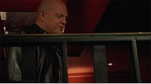
Problem is, this approach is far from what a real documentary film looks like. True, the individual images might be rough, but their relation to one another is quite different from those in a documentary. For one thing, they occupy positions that documentary shots can’t achieve. Shot B may be taken from a spot we’ve just seen to be empty in shot A, as in the sequence from Succession. As Ken put it, “There’s no such thing as a reverse angle in a documentary.” Or shot B may be taken from a very high or low angle, where a camera is unlikely to perch, as in this passage of The Shield (2007) which hangs the camera in space peering through a railing.
Sometimes shot B will represent the optical viewpoint of a character, which is unlikely in an unstaged documentary. Putting it awkwardly, the free-camera style achieves a greater degree of camera ubiquity than we can find in a standard documentary. (Years ago, I made this point in relation to The Office.)
For another thing, the flow of run-and-gun shots always captures the salient story points. A documentarist, with one or two cameras following an action, is still likely to miss something significant (and to cover the omission with elliptical editing and continuous sound). But the modern method offers its own rough-edged equivalent of classical coverage. The action remains comprehensible. Sometimes the camera will even wander off on its own to frame something the characters aren’t aware of, providing a modern equivalent of classical “omniscient” narration.
What we have, I think, is a modern variant of the one-point-per-shot mandate of traditional editing, but featuring shots of that evoke greater “rawness” than studio filming did. And maybe it’s not as modern as we think. Here’s a sequence from Faces (1968), complete with walk-and-talk, or rather stagger-and-talk, as well as camera ubiquity and matches on action that would be difficult in a documentary.
I’d argue that John Cassavetes, much admired by filmmakers who followed, supplied the prototype for today’s run-and-gun look. Admittedly, it’s been stepped up; I suggested in The Way Hollywood Tells It that intensified continuity has been further intensified.
Nervous energy
Intensified how? Apart from all the swishes and zooms and focus changes, some bells and whistles aim to enhance the sense of “energy” attributed to the style. The peekaboo framings I mentioned would be one instance. Here are some others.
The shot, distant or close, which simply trembles. Let’s call it the wobblecam. It suggests the handheld shot, but it’s brief and seems shaky just to evoke a sort of vague tension. Wobblecam shots are so common now that entire scenes are built out of them, as in the Succession clip.
The arc: In filming TV talk shows, how do you keep viewers glued to the screen? One option is what a 1970 manual calls the arc. Here the camera travels in a slow partial circle that refreshes the image gradually. The framing reveals constantly changing aspects of the panelists and is a nice change from master shot/ insert editing. I remember this as common in 1950s programs.
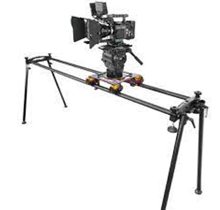 The “roundy-round” (thanks, Ken): This extends the arc to 360 degrees, circling around one or more characters, urging us to watch for bits of action or dialogue—usually timed for maximum visibility. It’s also used to convey a character at a loss, say mystified by which way to turn, or characters embracing (whoopee). The technique can be found sporadically before the 1990s, when it becomes quite common. Ken pointed out that the roundy-round was extensively used on E. R. to underscore time slipping away during life-and-death surgery.
The slider: The enhancement I find most distracting is the camera’s slow leftward or rightward drift while filming static action. Usually it’s a master shot, but it doesn’t have to be, and it can sometimes interrupt a series of close views. Unlike the wobblecam, this is more teasing because we’re used to such a shot revealing something. It doesn’t, but I think it holds out the promise and keeps us watching.
Writing The Classical Hollywood Cinema I came to realize that supply companies created lighting and camera devices designed to meet the developing needs of filmmakers. Thanks to Ken, I learn that this tradition continues. You can buy or rent gear that will enable arcs, roundy-rounds, and the slider (right). Both in technique and technology today’s Hollywood is a continuation of yesterday’s.
If a director constantly relies on camera movement, there’s no reason to object. The elegant moves of Ophuls or Mizoguchi or of McTiernan in Die Hard provide the sort of continuous engagement and ultimate pictorial payoffs that justify the technique. My examples illustrate more gratuitous camera moves, choices that “add energy” but once they’ve become conventional, seem wasteful. Usually, they reveal nothing and end up minimizing the power of a gradual reveal when it comes along.
But who am I to complain? Film styles change under production pressures and artistic inclinations. As a student of film history, I have to study what’s out there. Still, run-and-gun remains only one option. There are still lots of films and shows, like Tär and The Woman King and Barry, that rely on rigid camera setups and discreetly motivated movements. (Ken’s Dunston Checks In (1996), shown to an appreciative crowd at the festival, is a good example.) Another alternative is providing precise shot breakdowns that feature unusual “eye-candy” angles, as in Better Call Saul’s views from inside mailboxes and gas tanks. That trend constitutes another way to expand options within camera ubiquity. There are also the long-take films in which complicated camera moves preserve the patterns and emphases of classic continuity. (See the discussion of Birdman.) And then there’s the effort by Wes Anderson to go in the other direction, to submit to constraints far more severe than classical shooting—an austere refusal of camera ubiquity.
I must ask Ken about all these options too. Next time, I hope.
Thanks to Ken Kwapis, who enormously expanded my sense of the practical choices available to the filmmaker.
The TV production manual discussing the arcing shot is Colby Lewis, The TV Director/Interpreter (New York: Hastings, 1970), 131-132. Other mobile framings are reviewed in the same chapter.
For examples of filmmakers believing that the rough-edged style is like documentary shooting, see remarks on Succession in Zoe Mutter, “Fury in the Family,” British Cinematographer and Jason Hellerman, “How Does the ‘Succession’ Cinematography Accentuate the Story?” at No Film School. Butler’s comments on Hill Street Blues are quoted in Todd Gitlin, “’Make It Look Messy,’” American Film (September 1981) available here.
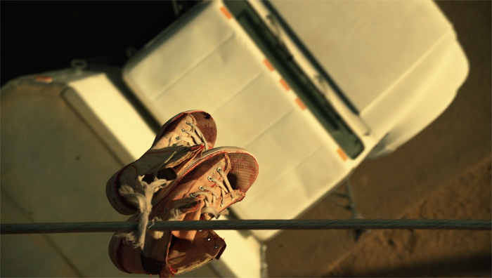
You can feel the thrill of silent-era creators and critics in realizing the possibility of camera ubiquity. Dziga-Vertov celebrated the power of the Kino-Eye to go anywhere, while Rudolf Arnheim saluted cinema’s ability to provide unusual angles that bring out expressive qualities of the world. What would they make of a shot like this below?
Better Call Saul (2015): Extremes of camera ubiquity.
Manual labors
The Tin Star (1957).
DB here:
Type “screenplay writing” into Amazon and you’ll get over 6000 hits. Some of those books will be biographies of writers or screenplays of released films. But there’s still a huge number of DIY books with titles like How to Write a Movie in 21 Days and Writing Screenplays That Sell. A lot of people are apparently only one manual away from a finished script.
Screenplay manuals trigger suspicion. Can it really be that easy? Wouldn’t this be a paradise for grifters? A successful writer would hardly share trade secrets, so most of these books would be written by losers and wannabes. And if you read enough of the manuals, you’ll see the inevitable repetition of banalities. Make your protagonist “relatable.” Keep the conflicts going. Try for a twist.
Reading through them can be mind-numbing, but if you’re interested in how filmmakers tell stories, sometimes they can open up your thinking. Or so I’ll argue.
DIY scripting
The tide of manuals rose during the 1910s, when the emerging American studio system was seeking talent. The tide subsided between the 1930s and the 1960s, when screenwriting was contract labor in that system. But as filmmaking turned “independent,” ambitious people outside the industry could break in with an original script. Manuals, most famously Syd Field’s Screenplay (1979), began to pop up, and the market for how-to books expanded. Field’s book remains in vigorous circulation today, among many competitors.
 What should film researchers do with the manuals? Skepticism is warranted. Literary scholars don’t typically consider advice books and columns in The Writer to be significant bodies of evidence. But in other fields, manuals are valuable documents. Art historians study manuals devoted to composition, color preparation, and other techniques. Musicologists find evidence in primers on sonatas and fugues. At bottom, when we want to study craft practices, we look for any evidence we can find about the range of choices available within a tradition.
If your research touches on matters of style, you may find it illuminating to study the way practitioners pick solutions to practical problems. Which is to say that the manuals can point us toward norms. Norms are, I’ve argued, like a menu of more and less preferred options for treating the material. We developed this angle of inquiry in our Classical Hollywood Cinema, and now it seems well-established that the manuals can sometimes point us toward tacit norms of construction or visual style. For examples of how this can work, see Kristin’s Storytelling in the New Hollywood, my The Way Hollywood Tells It, and Patrick Keating’s Hollywood Lighting from the Silent Era to Film Noir. Many of our blog entries have also explored these paths. With screenplay manuals, we just have to be particularly careful to distinguish valuable data from bilge–which means checking the manual’s precept against many films.
And we shouldn’t expect the manuals or professional journals to identify every normalized device. For example, screenwriters now love to start scenes with friends greeting one another with “Hey” and “Hey,” but I doubt that there’s an explicit decision to avoid “Hi.” Similarly, I’ve never found anyone writing in the classic era who mentions the common Hollywood device of the double plot, with one line of action devoted to a goal-oriented activity and another, interdependent one devoted to heterosexual romance. Even the rather elaborate 180-degree classical editing system wasn’t apparently spelled out anywhere; it was learned by imitation and reinforced because it was economical and efficient. People can learn and follow rules that are simply taken for granted as “the way we do things.”
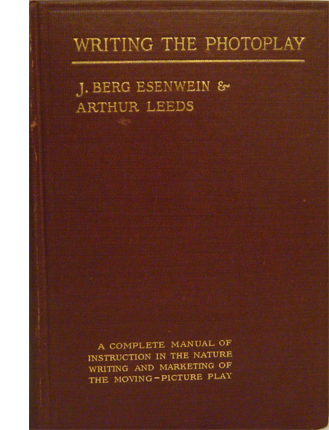
I think my soft spot for the manuals owes a good deal to my long-term affection for one item I saw in a 1913 guide. J. Berg Esinwein and Arthur Leeds’ Writing the Photoplay contains a lot of hints about standard practices of the period, but one of their diagrams changed my basic attitude about silent film technique.
The cinematic stage
In the late 1990s I became interested in the norms of scene staging in early film. I assumed that filmmakers had to call attention to story action without benefit of cutting to closer views, so I tried itemizing in a straightforward way the staging choices that could guide the viewer’s eye.
Many of the choices could be called “theatrical.” Lighting and setting could emphasize an actor’s gesture or facial expression. Performance factors operated as well, especially since actors were typically facing the viewer. Filmmakers’ reliance on these cues seemed to confirm the standard impression that early film was less “cinematic” than what came later.
Yet there were purely pictorial factors in play as well–notably, the placement of figures in the overall image. Composition of the frame, as in painting (and theatre) played a crucial role in guiding our attention.
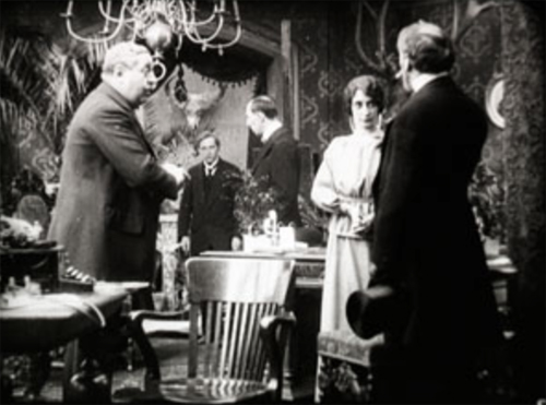
There was something else. I was fascinated, for reasons sketched here, with the depth that many scenes in “tableau cinema” displayed. Here’s a quick example from Alfred Machin’s Le Diamant noir (1913). The entire film is available from the Belgian Cinematek.
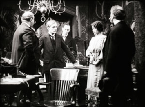
The young secretary Luc is accused of stealing the missing diamond. He protests his innocence, but the accusation will force him to leave the country.
All the cues I’ve mentioned are at work here: centered figure placement, frontally facing characters, attention-grabbing gesture, favorable setting (the rear doorway and curtains highlight Luc’s arrival), and so on. In addition, a tunnel of information bores through the frame, leading from the distance and culminating in action in the foreground.
But this tunnel couldn’t fairly be considered “theatrical,” since if the action were played on a stage, not all viewers would have the optimal view presented in the shot. Most of the audience simply couldn’t see this alignment of players. Theatrical staging tends to be lateral and fairly shallow, so that people sitting in different seats can all see the scene. A good part of planning a stage production is calculating sightlines. But in film, there’s only one sightline, that of the camera lens.
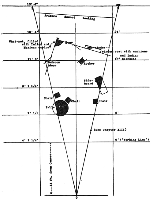
We tend to see film space as cubical, a room with a missing fourth wall. Actually, the playing space–what Esenwein and Leeds call “the photoplay stage”–is a tapering pyramid whose point touches the lens. Because the film image captures an optical projection, the space is narrow but deep. The authors provide a diagram of a scene to explain. (For the sake of clarity, I’ve removed some of their annotations; the full version is on p. 160 of their book.) The effect is of wedge shape that carves into what would be the wide space of a theatre scene.
In 1910s cinema, the camera lens (at point 0) is assumed to be some distance from the “working line,” the layer of maximal attention. For some filmmakers this line was nine or eleven feet from the camera, rather than the 14 feet assumed here. The rest of the space falls away in the distance, and depending on the lens and lighting used, these areas can be in more or less sharp focus. Filmmakers of the period often marked out the pyramid on the studio floor so that actors would know when they were out of shot.
This diagram makes explicit many of our taken-for-granted notions about film space. Someone moving closer to the camera gets larger, of course; but the figure also blocks out more and more of the background as the pyramid narrows. An actor’s forward movement on the stage inevitably takes up a small part of the overall area, but in cinema forward-thrusting action can dominate the frame.
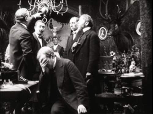
Just as important, the fixity of the lens makes it possible to choreograph actors with a precision impossible in theatre. Luc’s confrontation with his employer in my second frame gives him pride of place, but once he’s slumped at the foreground desk, he can move his head and clear the central zone for us to see a servant waiting in the distance. In tableau cinema, staging isn’t just “blocking.” It’s blocking and revealing, a constant flow of information presented through shifting arrays of figures. I provide several examples in the lecture “How Motion Pictures Became the Movies.”
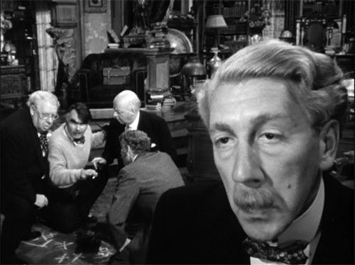
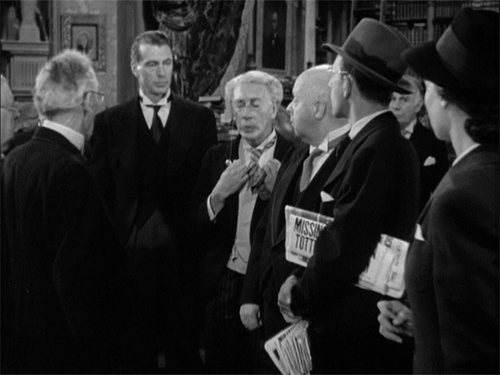
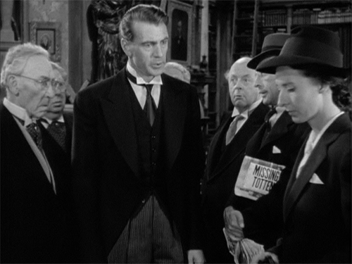
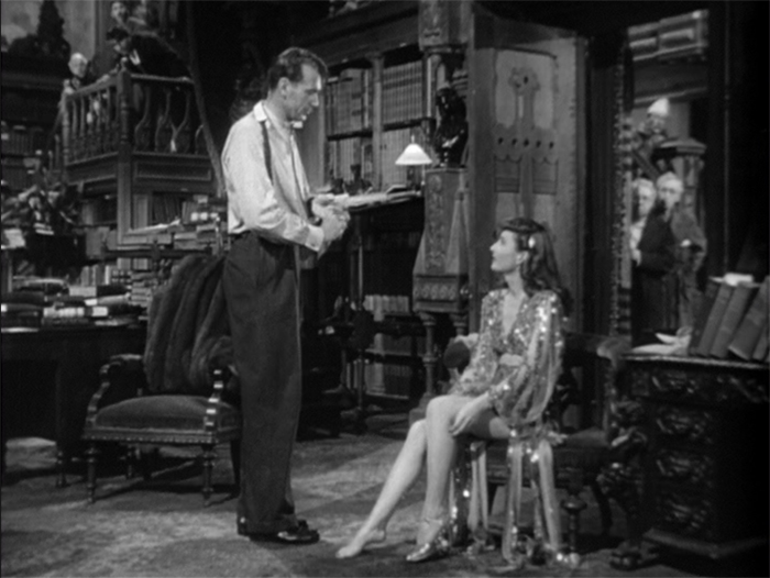
My heightened awareness of the visual pyramid made me more sensitive to staging in all periods of cinema. We might think that after the tableau cinema period, when filmmakers became more dependent on editing, their reliance on the “photoplay stage” vanished. But of course every shot, close or distant, presents us with the visual pyramid, and some filmmakers relied upon it to provide the graduated layers of space in an edited sequence. Specifically, the “deep focus” that became a favored technique of 1940s cinema around the world would seem a modernization of the principles of the 1910s recognition of wedge-shaped playing space. Here’s an outrageous example from Hawks’ Ball of Fire (1941), shot by Gregg Toland after Citizen Kane.
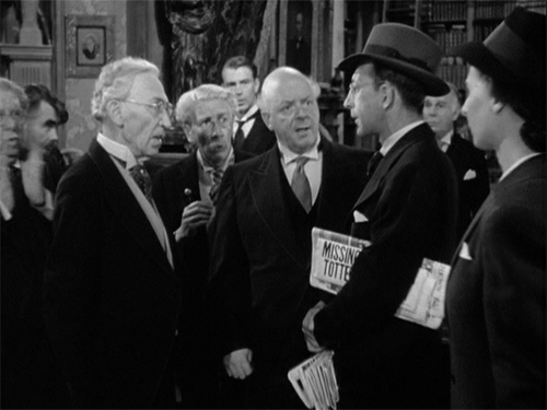
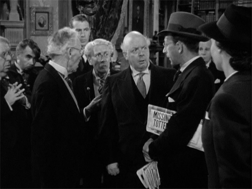
Less punchy imagery than this suggest that the skills of 1910s staging were never really lost. Another passage from Ball of Fire brings Professor Potts to the foreground in a way reminiscent of Machin’s film. Of course it helps when Gary Cooper is the tallest galoot in the scene.
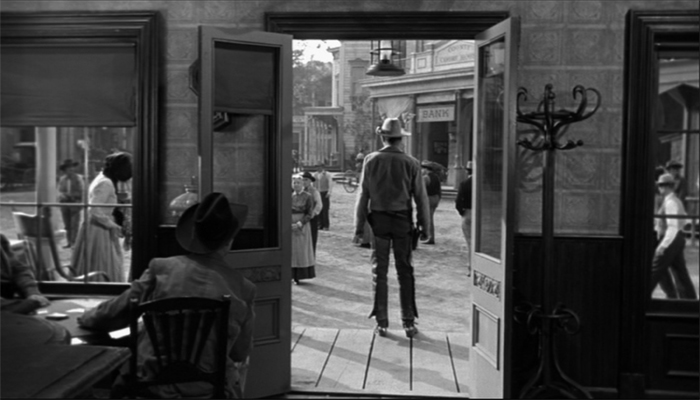
Cinema’s visual pyramid becomes almost sadistic at the climax of Anthony Mann’s Tin Star (1957). The young sheriff stops a lynching by shaming the town bully. The bully responds as you’d expect, but not in the sort of shot you’d expect.
Mann’s earlier films had experimented with foregrounds thrusting out at the viewer, but this sequence carries the idea to a limit. The actor collapses against the camera, inadvertently proving how lines of cinematic sight converge at the lens–that is, at our viewpoint. Try doing this on the stage!
This entry is more a piece of intellectual autobiography than anything else. I doubt many other people were opened up to the intricacies of staging thanks to a diagram in an old book. I mean it just as an example of how reading manuals can set you thinking about the expressive possibilities of film, and taking you in directions that you couldn’t predict.
More recently, in writing Perplexing Plots, I poked into manuals for would-be fiction writers, an area that literary historians seem to have neglected. These manuals yielded a lot of principles of what people thought went into good storytelling. In particular, I found that while Henry James and Joseph Conrad were making arguments about viewpoint and chronology, so too were people writing how-to manuals. The books indicated a new awareness of these techniques among writers aiming at mass audiences.
Terry Bailey surveys and analyzes early manuals in “Normatizing the silent drama: Photoplay manuals of the 1910s and early 1920s,” Journal of Screenwriting 5, 2 (Jun 2014), p. 209 – 224. For a comprehensive overview, see Steven Price, A History of the Screenplay.
The main argument here is developed in On the History of Film Style and Figures Traced in Light: On Cinematic Staging.
Ball of Fire (1941).


