Archive for the 'UW Film Studies' Category
Light is a law
DB here:
What do we see when we look around us? A world teeming with creatures and things. We tend to ignore what enables us to see all that: light. To a great extent, that bias is wired into our perceptual systems. An orange looks the same color to us in sunshine and in shade. But photograph it, and you’ll see that actually it throws off very different wavelengths in the two situations. We evolved, it seems, to mute all the variations in light we encounter. Psychologists call this “the primacy of object perception.”
It takes an artist to shift from the what to the how, to notice how different patterns of illumination can alter the shape and texture of an object. A painter, a photographer, and a cinematographer must learn to see light itself.
This was the core message of Steven Poster, an outstanding Director of Photography who came to visit Madison last weekend. Steven is probably most famous for working with Richard Kelly on Donnie Darko, Southland Tales, and The Box, but he has shot dozens of feature films, shorts, television movies, and pilots. He also has several Madison connections; he hung around the campus in his college years, saw Jules and Jim for the first time in the Memorial Union, and built a production house in Chicago with Mik Derks, who now works for Wisconsin Public Television.
Steven gave a workshop on cinematography that bristled with energy (five hours with only a brief break) and followed that with a screening of The Box, accompanied by a Q & A. Across a single packed Saturday, he took students and faculty on an adventure in seeing.
Seeing the light
Steven started as a still photographer at about age ten, and his ideas of visual design are very much allied with classic image-making. (He carried a Leica with him on his visit, and a display of his photos is currently mounted in a campus gallery.) He has a modernist bent too. He credits his years as a student at Southern Illinois University with introducing him to the ideas of the Bauhaus. He plunged more deeply into Bauhaus ideas at the Illinois Institute of Technology, where Mies van der Rohe and Moholy-Nagy taught.
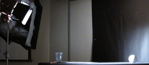
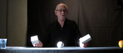
Later in his career, he studied at the Los Angeles Art Center College of Design. A turning point in his understanding came in Charles Potts’ photography course, when Potts began the semester by announcing softly, “Light is a law.” Steven’s talk for us, he explained modestly, was a “profoundly simple subset” of Potts’ course. Put it another way: In the Bauhaus spirit, he showed how simple principles yield subtle results. Armed with only a white ball, a white cube, and a white cylinder, he gave us a tutorial in the delicate modulations of vision.
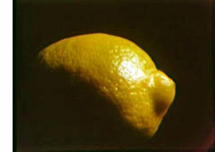 There are, Steven suggested, basically only two kinds of light: direct and indirect (or diffuse). Sunshine yields direct light; a cloudy day yields diffuse light. And when light falls on an object, the encounter has five components. The object gains a highlight, the bright region that suggests the direction of the light source. The object also acquires a shadow area. Between the highlight and the shadow is the boundary, or core—an important hint about the quality of the source light. (If the core has a crisp edge, the light is hard; if the core is a mild transition, the light is softer.) The fourth component is the shadow that the object casts on another surface. Finally, there is the specular or incident highlight, a spot of reflected light within the lit region. A specular highlight is a cue for texture as well as shape and light source. As Steven spoke, I kept thinking about Hollis Frampton’s Lemon (1969), a masterfully simple demonstration of many of these principles: slightly changing light reveals a prototypical shape (what other things have the outline of a lemon?) and a surface that is both shiny and bumpy.
By varying the type of light (direct or indirect) and the angle and distance of the source, Steven showed how these five components can be manipulated to bring out expressive qualities of the object. The cube, for example, can gain sharper contours through sidelong lighting, and illuminating the background can bring out its volume. Likewise, an object’s shadow area can be controlled through fill light—though Steven warned about over-filling, which can work against the precision provided by the key light. Another example is the way in which shooting glass or metal with pinpoint sources yields a scatter of specular reflections. If those aren’t wanted, as in some car commercials, the DP can use broad, diffuse illumination. This “liquid light” brings out contours through a softer gleam.
Of course a shot typically combines many objects, so the task of controlling how light hits them, and how they are arranged in relation to each other, becomes much more complicated. The shapes, textures, and emotional qualities of the elements have to be harmonized. “Elegant” was a word Steven used frequently: the composition, like the light, should be clear and well-defined. Needless to say, the result on screen can be grasped at a glance, but achieving such clarity needs painstaking control.
So seeing the light involves grasping everything around you, from landscapes and furniture to people’s faces and clothing, within the framework of highlights, shadow, core, and the like. This alone is enough to change your visual habits. But there’s more. By and large Steven made his adjustments without checking the monitor displaying what the camera was taking in. Standing almost anywhere, he could shift the light, tune the fill, and “wrap” the object, and on the monitor we could see the effect click into place. That skill demands more than a change in how to look at things. It’s an eye-body coordination that takes years of expert practice, an acquiescence to the law of light.
Behind the scenes
The discussion following this demo ranged across many aspects of cinematography, and Steven filled in abstract points with examples from his experience. My notes run to eleven pages, but this sampling should give you an idea of his stimulating presence.
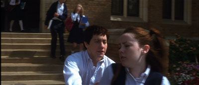
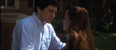
*A problem-solution dynamic emerged in one shot in Donnie Darko, above. We need to see Donnie’s face when he catches up with Gretchen, but the day was sunny and at first the faces display somewhat harsh shadows. But when the couple move toward a kiss, the solution came from their clothes: Donnie’s shirt and Gretchen’s blouse provide softer bounce light on his face.
*Steven stressed the need for complete trust and frankness between director and DP. “I won’t take a job if the director won’t look me in the eye.” Once that bond is established, the DP’s job is to protect the director and work to fulfill his or her vision. “My job is to protect the director.”
*Filmmaking is an intensely physical job, and so two concerns have to be paramount: safety and health. “No film is worth getting somebody hurt,” Steven remarked, so he insists that every crew member is a safety officer, looking out for everyone’s well-being. At the same time, filmmaking demands stamina, discipline, and a clear head, so everyone needs to have a healthy regimen and cultivate a certain “inner life” that keeps job pressures in perspective.
*Steven had much to say about the video assist. He suggested that it has led to directors using more close views, because such shots read better on small monitors. (I made a similar suggestion in The Way Hollywood Tells It.) Steven fights what he calls the “loss of scope” on video displays by presenting the digital dailies in full-size projection, as in the film-based days. “It reminds everybody that we’re making a big movie,” and it encourages directors not to overuse close-ups.
*Steven is happy with the digital intermediate process. As a cinematographer who wants to control all aspects of the image, he welcomes all the adjustments he can make in postproduction, especially thanks to the Lustre grading program. “It’s like being back in the darkroom again.”
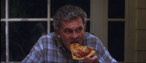
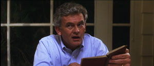
*On Donnie, a low-budget film, Kelly and Steven were forced to shoot the family dinner scenes in a single night. To save time, they used “block shooting.” For each actor, a basic setup was established and all the actor’s lines from both scenes were taken at one time. It was faster to have the actor change clothes for the later scene than to shift the camera position and relight the setups.
*Speaking of table scenes, they pose a lot of problems. Even Steven finds such scenes “the hardest.” “Where’s the [180-degree] line in this situation? I’ve seen fights break out on sets about it.”
*At one point Steven talked about prominent objects in a scene, such as candelabra and ketchup bottles. If you use symmetrical reverse shots, those objects can jump distractingly from one side of the screen to the other. Steven tries to make sure that such eye-catchers appear in only one of the setups, not both. The coffee cup in this scene of Southland Tales is hidden in the reverse angles.
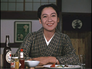
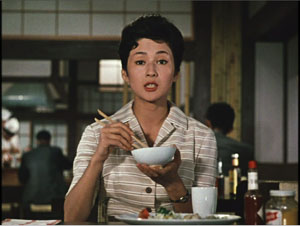
Steven’s point reminded me that Ozu breaks this rule of thumb and playfully lets his objects jump around the frame from cut to cut. Indeed, he often rearranged the props to heighten this peripheral dance. In one scene of Late Autumn, the tabasco sauce bottle pivots consistently, but the French’s mustard jar changes position.
*Steven thinks that 3-D will succeed this time, chiefly because of the push for 3-D television. The technique probably won’t work for all stories, and the format poses some technical problems. But the software is getting better, and filmmakers, such as Cameron in Avatar, are starting to avoid the gimmick of obects thrusting out of the screen. It’s better, Steven thinks, to let the depth recede into the movie’s world, making the screen a window. I recalled that this was the strategy used in Coraline, Up, and other films of last year, so perhaps this will become the dominant way that 3-D will be used.
*Steven urged students to get broad general educations and not become movie nerds. They should study history, political science, art, and literature. He pointed out that Werner Herzog, his friend and neighbor, insists in his Rogue Film School that literary classics are the basis of a film education.
*Steven has long been an advocate of unionization. As President of Local 600 of the International Cinematographers Guild, he explained how the Guild now welcomes members, especially women and people of color. I thought it was salutary to give students a taste of the practicalities of professional life by explaining what the Guild had accomplished.
*Steven did additional photography on Blade Runner, and he learned a great deal while gaining deep respect for Jordan Cronenweth, DP on the movie. Steven rewatches the film often, and each time he finds something new. On the last pass, he saw that in the search of Kowalski’s apartment, flickering streaks of light coming from inside the desk drawer call attention to the newspaper that Deckard finds there.
Back in 1980-1982, when Kristin and I were doing research on The Classical Hollywood Cinema, we found that Charles G. Clarke, Linwood Dunn, William Hornbeck, Stanley Cortez, and other professionals whom we interviewed were intellectuals, eager to explain the ideas informing their creative decisions. Steven Poster’s career is another outstanding example of how theory and practice work together, often unobtrusively, to conjure up the enthralling world on screen. I can’t imagine a film researcher, or just a movie lover, not wanting to know filmmakers’ craft and the principles informing it. Once you’ve visit the kitchen, movies gain a whole new flavor.
This blog has intersected with primary Bauhaus shapes before. I discuss “the dinner-table conundrum” in the first few pages of Figures Traced in Light. One of the best analyses I’ve read on illumination in the visual arts is E. H. Gombrich’s “Light, Form and Texture in Fifteenth-Century Painting North and South of the Alps,” in The Heritage of Apelles: Studies in the Art of the Renaissance (Ithaca: Cornell University Pres, 1976), 19-35. For more on Ozu’s penchant for letting brightly lit objects jump around the composition, see this chapter of my Ozu and the Poetics of Cinema. The Lustre program was devised for The Lord of the Rings, and Kristin discusses its origins and influence in The Frodo Franchise, pp. 280-281.
Special thanks to Steven for his visit, the Wisconsin Union Directorate for arranging it, and Erik Gunneson, Joel Ninmann, Justin Daering, and J. J. Murphy for setting up the workshop.
Blade Runner.
Books, an essential part of any stimulus plan
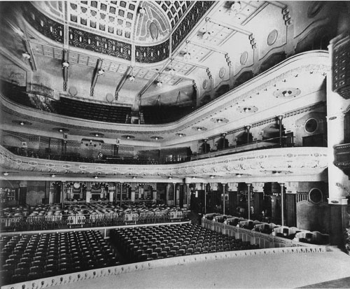
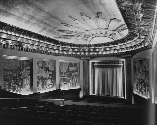
The Pathé Palace theatre, Brussels, designed by Paul Hamesse.
DB here:
Some shamefully brief notes on new publications. Disclaimer: All are by friends. Modified disclaimer: I have excellent taste in friends.
You call me reductive like that’s a bad thing
It’s easy to see why we might tell each other factual stories. We have an appetite for information, and knowing more stuff helps us cope with the social and natural world. We can also imagine why people tell fictitious stories that we think are true. Liars want to gain power by creating false beliefs in others. But now comes the puzzle. Why do we spend so much of our time telling one another stories that neither side believes?
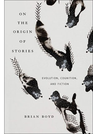 Brian Boyd’s On the Origin of Stories: Evolution, Cognition, and Fiction (Harvard University Press) is the first comprehensive study of how the evolution of humans as a social, adaptively flexible species has shaped our propensity for fictional narrative. The book is a real blockbuster, making use of a huge range of findings in the social and biological sciences. Brian paints a plausible picture, I believe, of the sources of storytelling. Along the way he shows how two specimens of fiction, The Odyssey and Horton Hears a Who, exemplify the richness and value of make-believe stories.
The standard objection to an evolutionary approach to art is that it’s reductive. It supposedly robs an individual artwork of its unique flavor, or it boils art-making down to something it isn’t, something blindly biological. Art is supposed to be really, really special. We want it to be far removed from primate hierarchies, mating behavior, or gossip. For a typical criticism along these lines, see this review of Denis Dutton’s The Art Instinct. Brian has already adroitly responded to this sort of complaint here. See also Joseph Carroll’s examination of reductivism on his site.
It seems to me that all worthwhile explanations are reductive in some way. They simplify and idealize the phenomenon (usually known as “messy reality”) by highlighting certain causes and functions. This doesn’t make such explanations inherently wrong, since some questions can be plausibly answered in such terms. For example, often the literary theorist is asking questions about regularities, those patterns that emerge across a variety of texts. That question already indicates that the researcher isn’t trying to capture reality in all its cacophony. (For me, it’s all about the questions.)
Literary humanists sometimes talk as if they want explanations to be as complex as the thing being explained. But that would be like asking for the map to be as detailed as the territory. In fact, however, humanists tacitly recognize that explanations can’t capture every twitch and bump of the phenomenon. Consider some types of explanations that are common in the humanities: Culture made this happen. Race/ class/ gender / all the above caused that. Whatever the usefulness of these constructs, it’s hard to claim that they’re not “reductive”—that is to say, selective, idealized, and more abstract than the movie or novel being examined. Likewise, when people decry evolutionary aesthetics for its “universalist” impulse, I want to ask: Don’t many academics take culture or the social construction of gender to be universals?
I want to write more about Brian’s remarkable book when I talk about our annual convention of the Society for Cognitive Studies of the Moving Image. For now, I’ll just quote Steven Pinker’s praise for On the Origin of Stories: “This is an insightful, erudite, and thoroughly original work. Aside from illuminating the human love of fiction, it proves that consilience between the humanities and sciences can enrich both fields of knowledge.”
Faded beauties of Belgium
In its day, Brussels played host to some fabulous picture palaces. Now after years of research Isabel Biver has given us a deluxe book, Cinémas de Bruxelles: Portraits et destins. It’s the most comprehensive volume I know on any city’s cinemas.
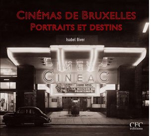 Isabel glides backward from contemporary multiplexes and tiny repertory houses to the grandeur of the picture palaces. The Eldorado was a blend of Art Deco style and quasi-African motifs sculpted in stucco. King Albert graced the opening in 1933. There was the Variétés, a multi-purpose house built in 1937. It had rotating stages, air conditioning, and space for nearly 2000 souls (cut back to a thousand when Cinerama was installed). It was, Isabel claims, the first movie house in the world to be lit entirely by neon.
Then there was the Pathé Palace, shown at the top of this entry. Dating back to 1913, it boasted 2500 places and included cafes and even a garden. This imposing Art Nouveau building was designed by Paul Hamesse, probably the city’s most inspired theatre architect. Hamesse also created the Agora Palace, which opened in 1922. Huge (nearly 3000 seats), the Agora was one of the most luxurious film theatres in Europe.
And we can’t forget the Métropole, the very incarnation of the modern style. Sinuous in its Art Deco lines, it packed in 3000 viewers. When it opened in 1932, it attracted nearly 53,000 spectators during its first week. The neon on the Métropole’s façade lit up the night, and its two-tiered glassed-in mezzanine became as much a spectacle as the films inside. See the still at the bottom of this earlier entry of mine. A ghost of its former self still sits on the Rue Neuve. Local historians consider the failure to preserve the Métropole a scandal in the city’s architectural history.
Cinémas de Bruxelles is a model presentation of local theatres. Not only does it trace the history of the major houses, but it includes a glossary of terms, a large bibliography, and an index of all theatres, both central and suburban. Needless to say, it is gorgeously illustrated. Whether or not you read French, I think you would enjoy this book, for it evokes an age we’re all nostalgic for, even if we didn’t live through it.
A TV interview with Isabel in French is here, with glimpses of what remains of the Métropole. She also gives guided tours of the remaining cinemas in the city center and in the neighborhoods. More information here.
A guy named Joe
Tropical Malady.
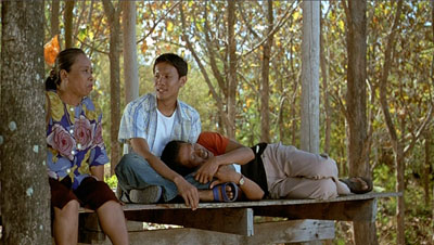
It’s seldom that a young filmmaker gets a hefty book devoted to him. Apichatpong Weerasethakul (aka Joe) will turn forty next year. He comes from Thailand, not a country adept at negotiating world film culture, and he is known chiefly for only four features. Yet he has become one of the most admired filmmakers on the festival circuit. His films are apparently very simple, usually built on parallel narratives. They have a relaxed tempo, exploiting long takes, often shot from a fixed vantage point, and scenes whose story points emerge very gradually. Joe’s movies tease your imagination while captivating your eyes. Each one could earn the title of his first feature: Mysterious Object at Noon.
 It’s appropriate, then, that the tireless Austrian Film Museum has published a lavish collection of critical studies. Edited by James Quandt, the anthology arrives along with a massive retrospective of the director’s work, which includes many short documentaries and occasional pieces.
James’ introductory essay, as evocative and eloquent as usual, is virtually a monograph, discussing all the features in depth. Alongside it are discerning essays by other old hands. Tony Rayns offers his usual incisive observations, focusing largely on Joe’s short films and the recurring imagery of hospitals, while Benedict Anderson surveys the Thai reception of Tropical Malady. Karen Newman offers precious information and judgments about Joe’s installations. The director himself signs several essays and participates in interviews and exchanges. Even Tilda Swinton has something to say.
I remember when Mysterious Object at Noon played the Brussels festival Cinédécouvertes in 2000. I was baffled. Joe’s movies taught me to watch them, and finally with Syndromes and a Century I got in sync. Its austere lyricism, off-center humor, and patiently unfolding echoes win me over every time I see it. (You can search this blogsite for several mentions, but JJ Murphy has a fuller appreciation of Syndromes here.) Thanks to Alexander Horwath and his colleagues for making this wonderful anthology, decked out with color stills and rich bibliography and filmography, available to us—and in English.
Zap goes the Chazen
Zap, Snarf, Subvert, Young Lust, Tits & Clits, Air Pirates Funnies, Slow Death Funnies, Feds ‘n’ Heads, Corn Fed Comics, Dope Comix, Cocaine Comix, Corporate Crime Comics: The names define the era. The sixties didn’t end until the mid-1970s, and these outrageous cartoon books really came into their own after the election of Nixon in 1968.
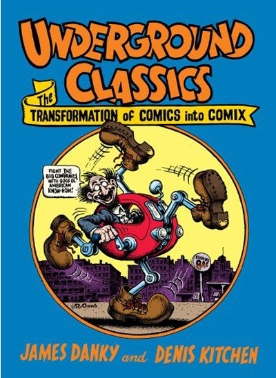
On 2 May, the Chazen Museum on our campus launches its exhibition, Underground Classics: The Transformation of Comics into Comix, 1963-1990. A whirlwind of events, including films and lectures, will revolve around galleries full of imagery from the demented pens of Kim Deitch, Aline Kominsky Crumb, Trina Robbins, Gilbert Shelton, Robert Crumb, Bill Griffith, and many other cartoonists.
 The show was originated by Jim Danky, a scholar of public media from our State Historical Society, and Denis Kitchen, comic artist and the publisher of Kitchen Sink Press here in Wisconsin. Jim has long argued for the archival value of minority and subcultural publications. He started our Center for Print Culture and has been an advocate for gathering print materials by and for children, women, and ethnic minorities. He virtually created the area of “alternative library journalism”—collecting obscure publications from all zones of the political spectrum. I recall his satisfaction in telling me that he had managed to acquire a collection of The War Is Now!, the radical Catholic newsletter published by Hutton Gibson, father of Mel.
For some years Jim has been telling me about his efforts to mount the comix show. It’s no small matter to collect this elusive material and then persuade a museum to show it. Not too many galleries feature talking penises, Jesus visiting a faculty party, or Mickey and Minnie robbed at gunpoint by a dope dealer. Maybe we forget, in the age of the Web and The Onion, just how scabrous these things looked forty years ago. Actually, they still look scabrous. They also look pretty funny, and they’re often well-drawn. As a historical codicil, the exhibition includes 1980s images from artists extending the tradition, such as Drew Friedman and Charles Burns.
The show runs until 12 July 2009. If you can’t get to town, there’s the splendid catalogue. It includes essays by Jim and Denis, Jay Lynch, Patrick Rosenkranz, Trina Robbins, and Paul Buhle. There are free screenings of Fritz the Cat and Crumb at our Cinematheque. And you can read an interview with Jim about the show here.
Remember our motto: Lotsa pictures, lotsa fun.
Up next: Days and nights at Ebertfest.
The Eldorado Cinema, Brussels, designed by Marcel Chabot.
Color, shape, movement . . . and talk
Bonjour Tristesse.
DB here:
Our weekly Film Colloquium is sort of like your old high-school assembly, except that it’s fun. The Film Studies area meets nearly every Thursday afternoon at 4 to hear a paper by a grad student, a faculty member, or a guest. It’s a great forum for ideas and information, and it gives the speaker a chance to try out a talk before taking it to a conference or lecture gig. The local audience is, in my experience, the toughest I’m likely to encounter. And this spring, despite a heavy travel and work schedule, Kristin and I caught two outstanding presentations.
Not in color, but colored
By now we all understand that silent films were most often shown with musical accompaniment, and sometimes sound effects. But we tend to forget that most silent films were in color too.
By the early 1920s, 80% of films were colored in one way or another. There were a few efforts to record the actual colors in a scene, but most often color was added after filming. Areas of the frame might be painted over by stenciling or by freehand. More commonly, the shots were dipped into dyes, yielding images that were tinted (washing over the image and coloring the areas of white, as in the frames below) or toned (coloring the darkest areas and leaving the white areas white). Over the years, film prints were preserved in black and white, partly because color stock was more expensive than today. As a result, even archival prints lost the sense of what audiences actually saw. Today archivists labor to reconstruct what silent films looked like in all their rainbow glory.
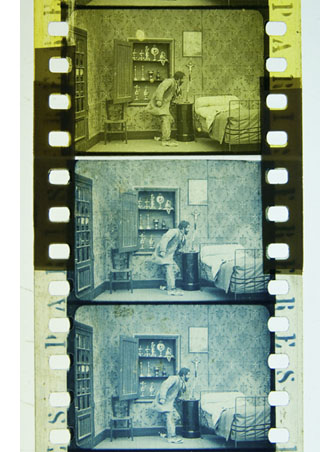 Professor Joshua Yumibe of Oakland University wrote his Ph. D. thesis on early color processes, and his Colloquium talk asked some powerful questions. We know that there was a transition in film artistry from the late 1900s to the early 1910s, a shift toward what Tom Gunning has called the “cinema of narrative integration.” As films became longer and were shown in more or less permanent venues, moviemakers began to tell more complicated stories. How, Josh asks, did this shift away from a cinema of isolated “attractions” affect practices of coloring? Do color processes affect the way stories were told? Do the color processes change how people saw the space on screen? How did the trade press respond to different strategies of coloring?
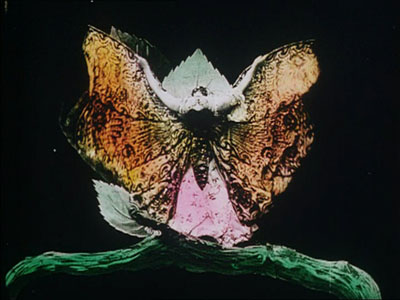
These are fascinating questions, and Josh’s exploration of them was careful and detailed. He has done enormous research on the various color processes, and he was able to trace several lines of development. For instance, he found that writers of the earliest years thought that color enhanced the sensual and emotional effects of the image, even creating an illusion of 3-D. In a shot like that of the butterfly dancer, people seem to have sensed that her multicolored shape was thrusting out of the screen toward them.
Josh argues that with the growing emphasis on narrative, color became more muted. Filmmakers were no longer aiming at momentary stimulation but at ongoing mood. Now tinting and toning came into their own. Color codes developed: blue for night scenes, yellow for sunlight, red for fire, amber for artificial light. Josh also explored the different ways in which European and US companies conceived of color; there seem to have been different color policies at Pathé and at American companies. But this wasn’t the end of change. In the 1920s, with the feature film now at the center of the theatre program, a wide variety of color practices emerged, including those isolated Technicolor sequences we find in films like The Wedding March.
The Q & A was as lively as the talk itself, and afterward, we repaired to a bar and thence to dinner. Josh’s talk was a model of deep, imaginative research and it kept us thinking and talking for a long time afterward. Not to mention his slide show, which regaled us with gorgeous shots that make you realize how much you’re missing when you see an old movie in black and white.
Bass, o profondo!
Another stimulating Colloq session was presided over by our old friend Jan-Christopher Horak, director of the UCLA Film and Television Archive. Chris was in town because our Cinematheque has been showcasing UCLA archival restorations across the semester, and he introduced our screening of The Dark Mirror. But we also got him to give a talk, and that was quite something.
Chris reminded me that we first met thirty years ago, here in Madison, when he came to do research on his dissertation. Since then Chris has been a top-flight scholar and author of many books. His Lovers of Cinema, published by our series at the UW Press, laid the groundwork for the popular film series Unseen Cinema. He’s also been one of the world’s leading film archivists, having supervised collections at Eastman House, the Munich Film Archive, Universal studios, and most recently UCLA.
Chris has long worked at the intersection of film, photography, and the graphic arts. He is one of the world’s experts on the 1920s German avant-garde; one of his early curatorial coups was a 1979 restaging of the pioneering Film und Foto exhibition of 1929. Chris has also long been fascinated by film publicity, having written a book on the subject. So it’s natural that he would gravitate toward studying the film-related work of Saul Bass, one of America’s greatest graphic designers.
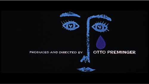
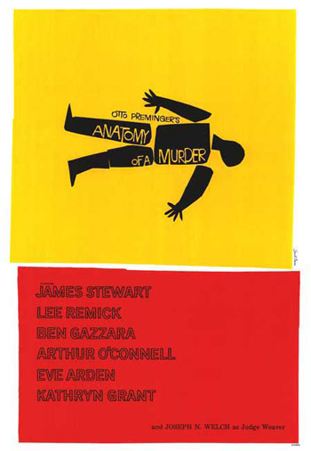
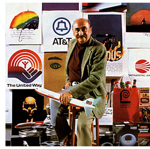 Chris’s talk focused not so much on Bass’s brilliant credit sequences for films by Preminger and Hitchcock as on Bass’s contributions to poster design. Bass turns out to have had a fascinating career, having worked in Manhattan advertising before moving to Los Angeles in 1948. Chris has found at least one early 1950s poster design that Bass probably executed, but he definitely worked for Preminger on publicity for The Moon Is Blue (1953) and Carmen Jones (1954)—the latter yielding to my mind one of the greatest credit sequences in film history. In 1955 Bass founded his own firm.
Throughout, he carried on the ideals of György Kepes, his teacher and a major conduit for Bauhaus ideas into America. Like his European models, Kepes promoted the idea of art as having cognitive value, teaching us to see the world in a new way. Kepes also emphasized that artworks could be of practical utility—an idea that chimed with Bass’s turn toward commercial design.
Chris was able to show that the Bauhaus tradition powerfully influenced Bass’s design principles. Who would have thought that the credits for The Seven Year Itch replayed Paul Klee? Obvious, though, when Chris showed us the images.
Chris emphasized two further points. First, Bass understood what we now call branding. We have to remember that it up to that time, most film publicity featured images of the stars, either in portraits or caught in typical scenes from the film. Bass’s poster design concealed the stars. Instead, he relied on dynamic geometrical design to capture a film’s mood in a powerful, stylized image. The result was an eye-catching logo, instantly recognizable: the flaming rose of Carmen Jones, the Vertigo whirlpool, the dismembered body of Anatomy of a Murder.
The key image could be repeated in newspaper ads, posters, credits, even the production company’s letterhead. When you saw the teaser trailer for Star Trek (“Under Construction”) dominated by that looming boomerang shape, you saw the heritage of Saul Bass. Who cares who’s in the movie? The very image is intriguing. No accident that Bass also designed many corporate logos, like the ATT bell and the United Way hand.
Chris’s second main point was that Bass was able to flourish because of the rise of independent production in the 1950s. Preminger, Hitchcock, and Wilder, acting as their own producers, could control the publicity for their films to a degree not possible for directors working in the classic studio system. Now films were sold as one-offs, and each film needed to pull itself above the clutter. In addition, Bass’s signature designs could set a director apart. In the 1950s, the Bass look was closely identified with his major clients like Hitchcock and Preminger, to the point that other designers for those directors tried to copy his style. I had always thought that Bass did the title design for Hurry Sundown, but Chris showed that it’s another artist’s pastiche of the master.
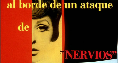
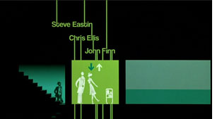 Chris’s talk reminded me that Bass contributed to making the opening credits a major attraction—not merely an overture, but an abstract treatment of the key story idea, a sort of graphic map that teases us into the main story. The opening sequences of Se7en and Catch Me If You Can (left) owe a lot to Bass’s idea that the credits should constitute a little movie, witty or ominous, tantalizing us with sketchy glimpses of what is to come. And Almodóvar’s diverting openings, probably the most sheerly enjoyable credit sequences we have today, are unthinkable without Bass. Synchronized with infectious music, Bass’s credit sequences can be seen as continuing the tradition of Walter Ruttmann and Oskar Fischinger, who back in the 1920s and 1930s made abstract films that advertised consumer goods.
For such reasons, I’m glad I hung around Madison after my retirement. With visiting researchers like Josh and Chris, who wants to go fishing?
Woman on the Verge of a Nervous Breakdown.
Thanks to Joshua Umibe for the silent-film illustrations. The first comes from Gaston Velle, Métamorphoses du Papillon / A Butterfly’s Metamorphosis (Pathé, 1904). Frame enlargement from Discovering Cinema (di. Eric Lange and Serge Bromberg, Lobster Film/Flicker Alley). The second comes from Albert Capellani’s Le Chemineau / The Vagabond (Pathé, 1905; tinted and toned). Frame enlargement Joshua Yumibe, courtesy of the Netherlands Filmmuseum.
Love isn’t all you need
Pat and Mike.
DB still in HK:
Last week the Hong Kong International Film Festival hosted Gerry Peary’s For the Love of Movies: The Story of American Film Criticism. It’s a lively and thoughtful survey, interspersing interviews with contemporary critics with a chronological account that runs from Frank E. Woods to Harry Knowles. It goes into particular depth on the controversies around Pauline Kael and Andrew Sarris, but it even spares some kind words for Bosley Crowther.
Some valuable points are made concisely. Peary indicates that the alternative weeklies of the 1970s and 1980s were seedbeds for critics who moved into more mainstream venues like Entertainment Weekly. I also liked the emphasis on fanzines, which too often get forgotten as precedents for internet writing. In all, For the Love of Movies offers a concise, entertaining account of mass-market movie criticism, and I think a lot of universities would want to use it in film and journalism courses.
 I should declare a personal connection here. I’ve known Gerry since 1973, when I came to teach at the University of Wisconsin—Madison. Like me, he was finishing a dissertation: he was writing a history of the gangster films made before Little Caesar. We spent good lunches together at the Fish Store. Gerry was one of the moving spirits of Madison movie culture—running a film society, writing and editing for the student paper, working with John Davis, Susan Dalton, Tim Onosko, and Tom Flinn on The Velvet Light Trap. I knew I’d come to the right place when somebody would drop by my office to talk about last night’s screening of Underworld or Steamboat ‘Round the Bend.
Like many of our generation, Gerry became a mixture of critic and academic. He taught at several colleges, wrote for The Boston Phoenix, and published books, notably Women and the Cinema: A Critical Anthology (1977) and The Modern American Novel and the Movies (1977). Most recently he’s edited collections of interviews with Tarantino and John Ford. He has moved smoothly into online publishing with a packed and wide-ranging website.
Gerry’s documentary comes along at a parlous time, of course. Most of the footage was taken before the wave of downsizings that lopped reviewers off newspaper staffs, but already tremors were registered in some interviewees’ remarks. Apart from this topical interest, the film set me thinking: Is love of movies enough to make someone a good critic? It’s a necessary condition, surely, but is it sufficient?
Gerry’s film includes the inevitable question: What movie imbued each critic with a passion for cinema? I have to say that I have never found this an interesting question, or at least any more interesting when asked of a professional critic than of an ordinary cinephile. Watching Gerry’s documentary made me think that everybody has such formative experiences, and nearly everybody loves movies. But what sets a critic apart?
Elsewhere, I’ve argued that a piece of critical writing ideally should offer ideas, information, and opinion—served up in decent, preferably absorbing prose. This is a counsel of perfection, but I think the formula ideas + information + opinion + good or great writing isn’t a bad one.
You really can’t write about the arts without having some opinion at the center of your work. Too often, though, a critic’s opinions come down simply to evaluations. Evaluation is important, but it has several facets, as I’ve tried to suggest here. And other sorts of opinions can also drive an argument. You can have an opinion about the film’s place in history, or its contribution to a trend, or its most original moments. Opinions like these allow you to build an argument, drawing on evidence or examples in or around the movie in question. Several of our blog entries on this site are opinion-driven, but not necessarily evaluations of the movies.
Most people think that film criticism is largely a matter of stating evaluations of a film, based either in criteria or personal taste, and putting those evaluations into user-friendly prose. If that’s all a critic does, why not find bloggers who can do the same, and maybe better and surely cheaper than print-based critics? We all judge the movies we see, and the world teems with arresting writers, so with the Internet why do we need professional critics? We all love movies, and many of us want to show our love by writing about them.
In other words, the problem may be that film criticism, in both print and the net, is currently short on information and ideas. Not many writers bother to put films into historical context, to analyze particular sequences, to supply production information that would be relevant to appreciating the movies. Above all, not many have genuine ideas—not statements of judgments, but notions about how movies work, how they achieve artistic value, how they speak to larger concerns. The One Big Idea that most critics have is that movies reflect their times. This, I’ve suggested at painful length, is no idea at all.
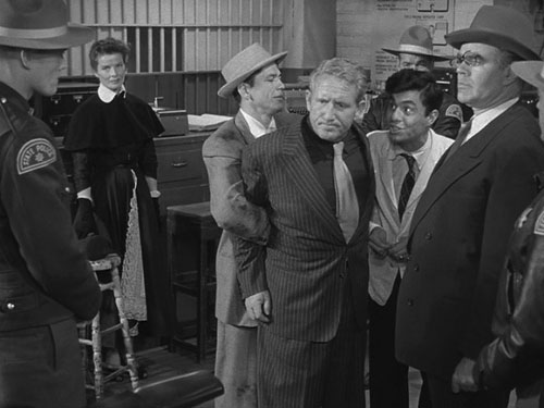
Once upon a time, critics were driven by ideas. The earliest critics, like Frank Woods and Rudolf Arnheim, were struggling to define the particular strengths of this new art form. Later writers like André Bazin and the Cahiers crew tried to answer tough idea-based questions. What is distinctive about sound cinema? How can films creatively adapt novels and plays? What are the dominant “rules” of filmmaking ? (And how might they be broken?) What constitutes a cinematic modernism worthy of that in other arts? You could argue that without Bazin and his younger protégés, we literally couldn’t see the artistry in the elegant staging of a film like George Cukor’s Pat and Mike. Manny Farber, celebrated for his bebop writing style, also floated wider ideas about how the Hollywood industry’s demand for a flow of product could yield unpredictable, febrile results.
One of the reasons that Sarris and Kael mattered, as Gerry’s documentary points out, was that they represented alternative ideas of cinema. Sarris wanted to show, in the vein of Cahiers, that film was an expressive medium comparable in richness and scope to the other arts. One way to do that (not the only way) was to show that artists had mastered said medium. Kael, perhaps anticipating trends in Cultural Studies, argued that cinema’s importance lay in being opposed to high art and part of a raucous, occasionally vulgar popular culture. This dispute isn’t only a matter of taste or jockeying for power: It is genuinely about something bigger than the individual movie.
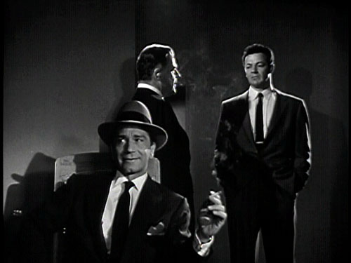
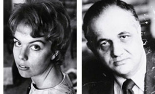 During the Q & A, it emerged that at the same period critics’ ideas had an impact on filmmaking. Sarris’s promotion of the director as prime creator, with a bardic voice and a personal vision, was quickly taken up by Hollywood. Now every film is “a film by….” or “ a … film”: auteur theory shows up in the credits. Similarly, the concept of film noir was constructed by French critics and imported to the US by Paul Schrader. Suddenly, unheralded films like The Big Combo popped up on the radar. Today viewers routinely talk about film noir, and filmmakers produce “neo-noirs.” It seems to me as well that Hollywood became somewhat more sensitive to representation of women after Molly Haskell (here, alongside Sarris) had brought feminist ideas to bear on the American studio tradition, avoiding simple celebration or denunciation. Film criticism had a robust impact on the industry when it trafficked in ideas.
You can argue that these are old examples. What new ideas are forthcoming from mainstream film criticism? In the Q & A Gerry, like the rest of us, couldn’t come up with many. On reflection, I wonder if the rise of academic film studies forced ideas to migrate to the specialized journals and the Routledge monograph. These ideas also had a different ambit—sometimes not particularly focused on cinema, or on aesthetics, or on creative problem-solving.
Of course ideas don’t move on their own. A more concrete way to put this is that bright, conceptually oriented young people who in an earlier era would have become journalistic critics became professors instead. The division of labor, it seems, was to aim Film Studies at an increasingly esoteric elite, and let film reviewers address the masses. It’s an unhappy state of affairs that we still confront: recondite interpretations in the university, snap evaluations in the newspapers. You can also argue that print reviewers, by becoming less idea-driven, paved the way for DIY criticism on the net.
What about information, the other ingredient I mentioned? If we think of film criticism as a part of arts journalism, we have to admit that most of it can’t compare to the educational depth offered by the best criticism of music, dance, or the visual arts. You can learn more from Richard Taruskin on a Rimsky performance or Robert Hughes on a Goya show than you can learn about cinema from almost any critic I can think of. These writers bring a lifetime of study to their work, and they can invoke relevant comparisons, sharp examples, and quick analytical probes that illuminate the work at hand. Even academically trained film reviewers don’t take the occasion to teach.
Most of the print criticism I’ve seen today is remarkably uninformative about the range and depth of the art form, its traditions and capacities. Perhaps editors think that film isn’t worthy of in-depth writing, or perhaps their readers would resist. As if to recall the battles that Woods, Arnheim and others were fighting, cinema is still not taken seriously as an art form by the general public or even, I regret to say, by most academics.
Yet other aspects of information could be relevant. Close analysis offers us information about how the parts work together, how details cohere and motifs get transformed. For an example of how analysis can be brought into a newspaper’s columns, see Manohla Dargis on one scene in Zodiac.
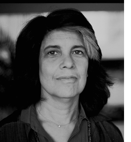 I’d also be inclined to see description—close, detailed, loving or devastating—as providing information. It’s no small thing to capture the sensuous surface of an artwork, as Susan Sontag put it. Good critics seek to evoke the tone or tempo of a film, its atmosphere and center of gravity. We tend to think that this is a matter of literary style, but it’s quite possible that sheer style is overrated. (Yes, I’m thinking of Agee.) Thanks to our old friends adjective and metaphor, even a less-than-great writer can inform us of what a film looks and sounds like.
In any event, I’m coming to the view that the greatest criticism combines all the elements I’ve mentioned. As so often in life, love isn’t always enough.
Gerry’s documentary doesn’t distinguish between critics and reviewers, but we probably should. Reviewers typically give us opinions and a smattering of information (plot situations, or production background culled from presskits), wrapped up in a writing style that aims for quick consumption. Today anybody with a web connection can be a reviewer.
Exemplary critics try for more: analysis and interpretation, ideas and information, lucidity and nuance. Such critics are as rare now as they have ever been. Far from being threatened by the Internet, however, they have more opportunities to nourish film culture than ever before.
The Big Combo.
PS 4 April (HK time): Thanks to Justin Mory for correcting a name error in the original post!


