Thursday | January 9, 2020

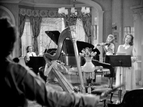
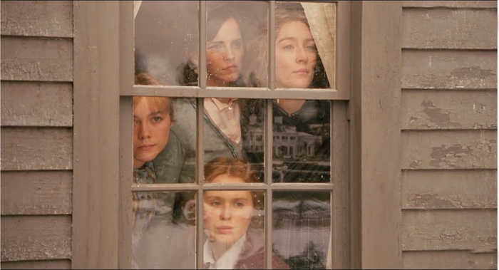
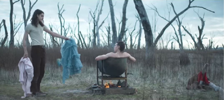
Little Women (2019).
DB here:
For a while The Blog conducted an annual ritual of analyzing storytelling techniques in year-end releases. I wrote entries from early in 2016, in 2017, and in 2018. Last year I muffed it, largely because of time spent revising our Christopher Nolan book. (Yes, we’re also looking forward to Tenet, especially after that hellah trailer.)
This time I’m trying an alternative. Instead of surveying a range of releases, I’ll focus on two that I think encapsulate some robust variants on familiar narrative strategies. Those strategies include choice of protagonist, linearity versus nonlinearity in time, and manipulation of viewpoint. While I’m concentrating on Marriage Story and Little Women, I’ll draw out some comparisons with other films.
Many spoilers follow, but of course you’ve probably seen all the new films. Except maybe Cats.
Protagonists, dual and dueling

Human nature is not given to a protagonist/antagonist three-act structure. Human nature is just one damn thing after another in which the only thing that matters is what went on today because yesterday is gone. And that is contrary to a lot of the business that we’re in, which makes sure that everybody understands the story by page 30 and is involved in the conflict.
Tom Hanks
You’re plotting a film. What sort of options do you face? A basic choice involves protagonists.
You might build the film around one character who pursues a cluster of goals. Examples this season would include Dark Waters, Motherless Brooklyn, Uncut Gems, and Harriet. The protagonist can have helpers, and will certainly have adversaries, but her or his initiatives, decisions, and responses propel the action. In addition, we’re usually attached to the protagonist’s point of view, which limits us to what she or he knows. Judicious widening of the horizon often takes place to enhance tension. In Uncut Gems we’re briefly attached to Arno’s thugs when they’re tailing Howard, and the climax crosscuts Howard in his office with Julia placing his big bet.
You could center the action on two characters, giving us a dual-protagonist plot. Here the goals may be shared or at least compatible. In The Aeronauts, a lady balloonist and a male meteorologist cooperate, with frictions, to break ascension records, while Ford v. Ferrari unites two men working together to win at Le Mans.
More rarely, a dual-protagonist plot can shift the protagonist in the course of the action. Good examples are Red River (1948) and The Killers (1946). I’d argue that Don Corleone functions as protagonist in the early sections of The Godfather (1972), while Michael takes up that role later. Similarly, Waves initially concentrates on Tyler, but he largely drops out of the plot and his sister Emily drives the film’s second half.
Alternatively, the plot can present two protagonists in competition. This season we’ve had The Current War, centering on the struggle between Edison and Morgan to transmit electrical power. The narrational weight is largely with Edison, but I think Morgan is characterized enough and we’re attached to his viewpoint frequently enough to present a counterweight. Morgan isn’t simply an antagonist but rather what Kristin calls a parallel protagonist, like Salieri in Amadeus or Captain Ramius in The Hunt for Red October. As these examples indicate, parallel protagonists, although they’re trying to figure out each one’s aims and stratagems, often become fascinated with each other and recognize their affinities.
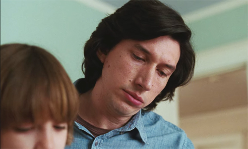
Paired protagonists are common in romantic comedies, which often consist of friction between the couple (due to clashing goals) but end in harmony and union. What’s striking about Marriage Story is that here the end, not the start, of a romantic alliance is treated through the dual-protagonist strategy. Charlie and Nicole struggle over the terms of their divorce, particularly the handling of custody of their son Henry. Unlike Kramer vs. Kramer (1979), which is organized chiefly around the husband’s viewpoint, this gives weight to both spouses.
Director Noah Baumbach achieves this balance through a cunning parallel block construction. The film opens with two montages of roughly equal running time. One surveys Nicole’s habits and accomplishments with Charlie’s voice-over praising her. (“She’s my favorite actress.”) Then we get a montage illustrating what Nicole loves about Charlie, with other incidents stitched together by her voice-over. Both montages weave in scenes of Nicole in rehearsal while Charlie, the director, makes suggestions.
Baumbach has compared these montages to an overture in musical theatre. The film’s score sets out themes associated with each protagonist, and the quirks and routines that rush by establish important motifs, like haircutting, Monopoly games, and Henry’s urge to sleep with his parents. With the he said/she said duality, the montages prepare us for the film’s strategy of parallelism, a compare-and-contrast attitude.
 
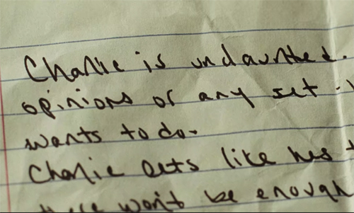
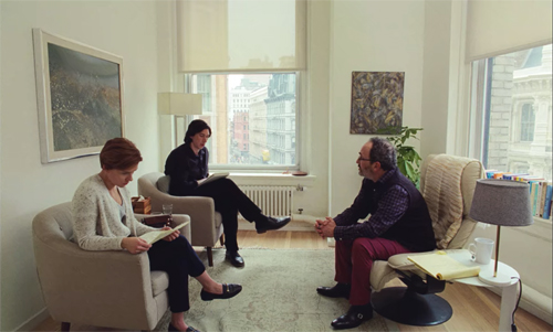
The montages are revealed as visualizations of two memoirs the couple have written for a mediator.
 
They’re planning to divorce, and he’s asked them to recall what they loved about each other. Charlie is willing to share his notes with Nicole, but Nicole won’t show hers. This hints that he’s more reluctant to separate than she is, planting a question about why she seems determined to pursue the divorce.
Just as important, we’ve been given privileged access to both characters’ minds, and this sort of alternating omniscience will proceed throughout the film. There won’t be any more plunges this deep into subjectivity, but we’ll always know more than either does, because after they separate we’ll be attached to one or the other in large stretches.
For a time, though, we’re with both. In the mediator’s office, and then during the play’s performance, in the bar with the troupe after the show, and in the family apartment, they interact as a couple. (True, Charlie sleeps on the sofa.) But once Nicole moves to California, the first block of action ends and we are attached to her and Henry as she launches her new project, a TV pilot.
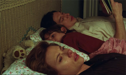
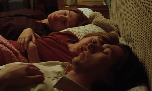
Not until Charlie comes to visit Nicole, her mother, and her sister does the narration bring him back. There he’s officially served the divorce papers. This scene launches a discreet viewpoint pivot from her to him. The family cuddle ends when Henry banishes Charlie from bed, foreshadowing how marginal his father will be to him from now on.
 
 
The film’s next block attaches us to Charlie as he seeks out a lawyer, takes Henry on outings, and clashes with Nicole about how to celebrate Halloween. The couple wind up giving Henry two trick-or-treating trips, in different costumes, which reiterates the duplex structure of action we’ve been presented with since the start.
The alternation between Nicole and Charlie’s viewpoints quickens as their negotiations get more fraught. Their first legal meeting ends with Charlie’s losing faith in his easygoing attorney. The next meeting is an escalating confrontation between Charlie’s new hard-charging lawyer and Nicole’s equally tough Nora. In the courtroom exchange, the he said/she said pattern becomes vicious as each lawyer weaponizes minor incidents from scenes we’ve seen to cast shame on the opposing side.
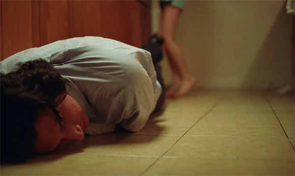
The nastiness of the custody battle comes to a crisis in a ten-minute duologue in Charlie’s apartment, an all-out fight between Nicole and Charlie. They run through a repertoire of reactions, from assurance of mutual admiration to declarations of annoyance, unhappiness, frustration, and complaints. By the end they’re screaming insults. Charlie rages and then, as if aware of how monstrous he’s being, collapses sobbing at Nicole’s feet.
 
Most classically constructed films follow the pattern Kristin identified back when. The plot consists of a setup, a complicating action redefining the setup, a development section consisting largely of delay and backstory, and a climax that resolves the situation. An epilogue asserts a stable, if changed state of affairs. The four main parts are roughly equal in running time, with the climax tending to be a bit shorter and the epilogue being only a few minutes.
Up to a point, Marriage Story conforms to this architecture. The first thirty minutes set up the split in the family before focusing on Nicole’s new life in California. Both Charlie and Nicole had hoped to separate amicably, with no need for lawyers. But thirty minutes in Nicole hires Nora and sets in motion a more severe legal battle than the couple had expected. The complicating action is triggered by serving Charlie the divorce papers.
There’s no turning back, and the new situation centers on figuring out how to handle access to Henry. Charlie wants Henry to spend time in New York (“We’re a New York family”) but Nicole wants him with her, and as he was born in California the law inclines to her side. Hence the triple thrust of the Charlie block: visiting lawyers, trying to keep his Broadway production on track, and winning some loyalty from Henry.
The development section consists of characterizing stretches (Nicole indulges in a quick sexual encounter) and delays: the unsatisfactory first lawyer session, a power outage at Nicole’s house, and the courtroom showdown. What happens next, though, seems to me quite original.
Between theatre and TV

To determine custody, both Nicole and Charlie must let an evaluator visit to observe each one’s treatment of Henry. In a more ordinary film, this stretch would initiate the climax. The visit from the evaluator would furnish a deadline for determining how custody would be handled. Then the film’s peak could be the vicious, trembling argument between Charlie and Nicole. This would be the explosion that reveals both their love and the impossibility of their staying together.
From this angle, Charlie’s guilt-ridden collapse would be the resolution–his realization of how he stunted Nicole’s life. A courtroom finale settling the terms of custody (a little more for Nicole than Charlie) would fill out the climax and lead to an epilogue, perhaps on the courthouse steps.
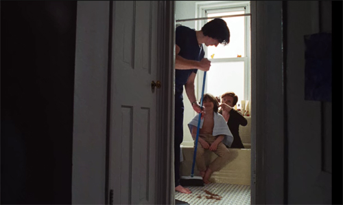
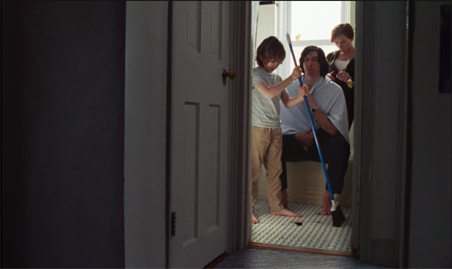
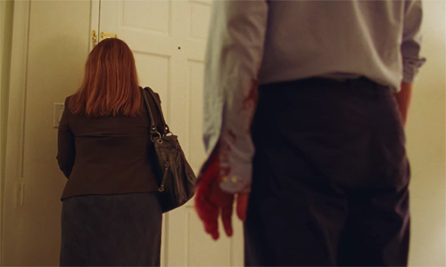
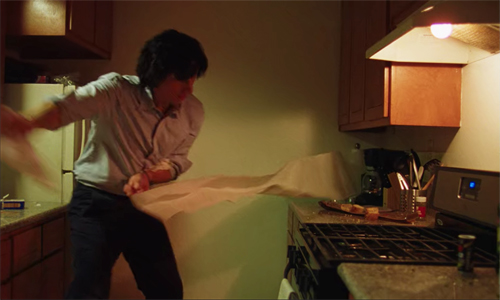
Excuse me for rewriting the film. I do it to show that Baumbach’s script does something daring. The big argument comes before the evaluator’s testing. After that brutal clash, we see Nicole rehearsing her answers in Nora’s office. Moreover, the blundering efforts of Charlie to convince the stiff evaluator he’s a good father play out in a lengthy comic scene with some gory sight gags.
 
A certain amount of suspense remains, I think, but the final cascade of gags works against the emotional pitch of the couple’s quarrel. Baumbach has, in effect, risked using an anticlimax to round out the normal climax section of the film. It also serves as a good-natured punishment for Charlie’s self-centeredness.
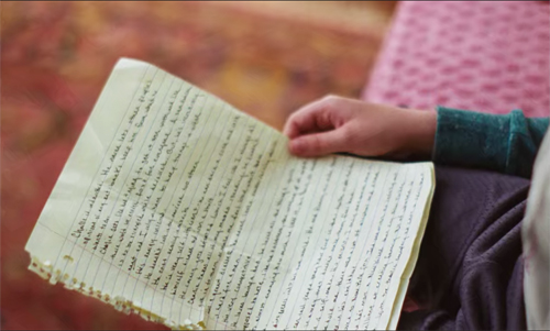
The same daring informs an unusually lengthy epilogue. It’s built out of the sort of modules we’ve seen already. Nicole and her friends and family celebrate her divorce with a party, while Charlie mopes around Manhattan and morosely salutes his play’s closing with his troupe in a bar. We might stop there, but Baumbach again does something original (though highly motivated). Charlie, now relocated for a teaching gig in LA, comes to pick up Henry and discovers the boy reading the note about Charlie that Nicole had prepared for the mediator session.
 
Not only does it reveal the feelings she had suppressed during the session, but the fact that she kept it shows she still harbors affection for that part of her life. Other films surprise us in the epilogue (Citizen Kane, for instance), but Baumbach’s use of the memoir in the film’s final moments remains a pretty bold, and moving, choice. This stretched and packed epilogue shows Charlie how much Nicole loved him, while also suggesting things that contributed to stifling her. Lines like “He’s very competitive” and “He loves being a dad” have a new impact now that we’ve seen his battle for his son.
In telling this story, Baumbach exploits a larger strategy of what theatre people call continuous exposition. Instead of giving the necessary backstory in a lump at the beginning or middle, major information is sprinkled through the ongoing plot. We’re familiar with this device in films that trigger fragmentary flashbacks, filling in backstory bit by bit. Baumbach goes with a more “theatrical” strategy using dialogue to invoke things that happened before the first scenes..
One of the major instances involves Nicole, who breaks down in an embrace with Nora, sobbing that Charlie slept with his assistant. Coming half an hour into the movie, it explains Nicole’s bitterness in the mediation session, as well as her larger reappraisal of her life with Charlie. At other points we learn of big events, like Nicole’s show taking off and Charlie’s long-term settling in LA, in casual conversation, not in extended scenes.
Crucially, in their climactic quarrel, Charlie justifies his affair by accusing Nicole of withholding sex for a year. We can’t appraise the truth of this, but it at least fills in a motive that more conventional exposition would have put into the setup. Resisting the temptation to supply flashbacks for all these revelations, Baumbach trusts our memory. That way the new data can color our ongoing understanding of the characters. The opening montages were generous but one-sided, chunks of incomplete exposition that suppressed important motives and behavior.
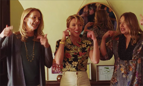
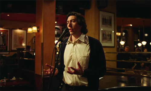
Continuous exposition is associated with Ibsen and playwrights who followed, but the theatrical patron hovering over the film is Stephen Sondheim. Greta Gerwig’s Lady Bird had used Sondheim as a touchstone for ambitious high-school players, but the parallel structure of Marriage Story makes more explicit references, this time to Sondheim’s Company. Nicole’s party features her and her mother and sister performing “You Could Drive a Person Crazy,” a saucy song about dumping a weak man. Soon in the bar Charlie is singing the yearning “Being Alive.”
 
Maybe a little on the nose (like the movie’s title), these citations seem true to the tastes of these show-biz mavens, while suggesting that at least some of Manhattan clings to Nicole in her exile.
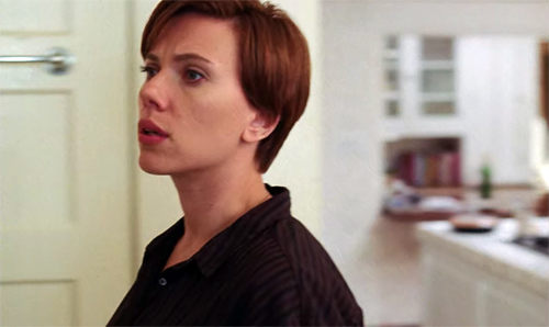
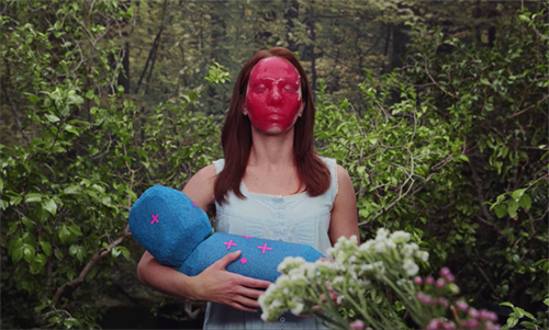
Another parallel reminds us of a perennial Hollywood motif. Nicole began her career in a raunchy teen movie but thanks to Charlie’s stage shows she became a respected performer. Yet to establish her own identity more fully she agrees to shoot a TV pilot. Marriage Story positions itself between theatre (a little pretentious, but nobly struggling) and TV (dumb and superficial, but high-tech and well-financed). Worse, TV literally defaces Nicole.
 
Theatre, TV: what about film?
In this story about show-biz LA, movies and references to them are sparse. (I didn’t spot any.) So maybe we should take this film itself as standing in for righteous cinema, rather than the teenpic trash Nicole was in. Perhaps Marriage Story offers itself as its own example of the subtlety and risk-taking that cinema can embody. Even when streaming on Netflix.
Muses in the family

The family saga is one Hollywood genre that doesn’t get enough respect. We tend nowadays to celebrate the tough, not tender side of studio cinema. The cult of noir, the abundance of hard-edged action pictures, and the idolatry that trails Tarantino all tend to make us prefer force to gentleness. When families gather, we expect big trouble, if not outright murder (Knives Out). We decry weepies of any sort, and family sagas are often felt to be soft, schmaltzy, womanish. A male friend tells me that Little Women is “a movie about hugs.” When NPR devotes a whole show to it, panelists ponder how to convince men to see it. No wonder the family film has migrated to daytime cable TV.
Yet the family saga is one of the nicest things American cinema does. Two of our greatest masterpieces, How Green Was My Valley (1941) and Meet Me in St. Louis (1944), are prime examples. The Forties were rich in such efforts, including Forever and a Day (1943), Life with Father (1947), I Remember Mama (1948), The Human Comedy (1943), and Since You Went Away (1944). We ought to recognize as well the strength of later entries like The Joy Luck Club (1993), How to Make an American Quilt (1995), and Soul Food (1997), all trying out some of the fresh approaches to storytelling that were emerging in the 1990s.
And the sentiments informing domestic sagas seep into other genres. The Fast and Furious team, we’re told, come to be a family, as do the Avengers. The coming-of-age story, that perennial of indie cinema, inherits the aura of cozy warmth that is central to the family saga. I’d add one of my favorites, We Bought a Zoo (2011), which isn’t really a saga but does radiate a comparable warmth.
Although there are probably earlier examples (I think of Vidor’s 1924 Wine of Youth), it seems likely that the 1933 MGM production of Little Women furnished an important template. The four March sisters, each drawn to a different art form, are a model for the musically gifted sisters in the fine Four Daughters (1938).

And surely the fact that Katrin in I Remember Mama chronicles the family’s daily lives owes a lot to the example of Jo March, aspiring novelist.
The family saga poses at least three creative problems for the filmmaker. Since each family member is likely to confront personal problems (romance, finance, school, job) how do you weave and weight multiple storylines? How do you provide conflict to propel the action? And, since the “saga” comparison suggests development over years or even generations, how do you handle long spans of time cinematically?
Greta Gerwig handles all these problems adroitly in her version of Little Women. I’m going to concentrate on the film, but I’m aware that some of the narrative strategies are taken from Louisa May Alcott’s original novel. But much of what’s ingenious about Gerwig’s adaptation is of her own devising.
Start with storylines. In most such films, the trick is to create a group but then produce a scale of emphasis running from minor figures to the most important one typically, the “first among equals.” In How Green, that is Huw, also our narrator; in Meet Me in St. Louis, it’s Esther. But the doings of other characters shape the family’s destiny and the decisions made by the spotlighted figure. So the activities intertwine.

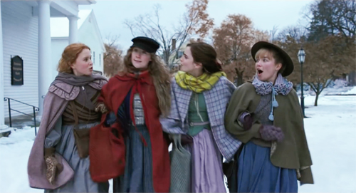
In Little Women, characters shape one another’s development. Jo, the first among equals, is nonconformist and self-reliant. Yet she needs steering–from Friedrich, the professor who tries to turn her away from sensation fiction, and more importantly from Beth, who in her sickness urges her to write “our story.” They give her the strength to persist and trust her sense of what her writing can be.
On the romance front, Jo’s rejection of Laurie’s proposal of marriage opens the field for sister Amy, who has already supplanted Jo in the role of amanuensis to Aunt March. When Jo, out of loneliness, decides to welcome Laurie’s offer, it’s too late: he’s married to Amy. The tangled alliances of melodrama get tightly bound in the family saga.
The other sisters contribute to the causal weave of the plot, with Meg’s decision to abandon the stage reinforcing Jo’s stubborn attachment to her art. More generally, the fates of the sisters dramatize the tension between creative impulse and the social demands of domesticity. Meg wants a family more than fame. Amy, the indifferent painter, can hope only for a good marriage (the same prospect Aunt March makes explicit to Jo).
In family sagas, the siblings are put in parallel. Huw’s brothers leave the household, but he loyally stays, and Rose, the mature sister, has more trouble attracting men than the vivacious Esther. Here, Jo’s kindred spirit is Beth the pianist, whose playing gives solace to Mr. Laurence in his grief. But illness keeps Beth from fulfilling herself either as artist or grown woman. As for Marmee, we’re allowed to catch a glint of Jo’s defiance behind the older woman’s warmth when she confesses that she’s angry every day.
Jo’s main contrast is with Amy. Amy has done nasty things, but she accepts the burden, laid down by Aunt March, of marrying for money, not love, in order to benefit her loved ones. She does this even though, as she reveals in a key scene, she has always loved Laurie and has always felt herself overshadowed by Jo. (Those revelations are also suggested as what leads Laurie to fall in love with her, and not simply as a substitute for Jo.) Even the various suitors get ranged along comparative dimensions of class, strength of will, and temperament.
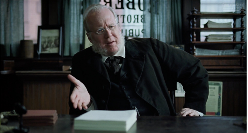
The need to provide a dense social milieu also creates parallels–here, in terms of good deeds. The Marches are lower middle-class, living on a parson’s income, but they share their Christmas dinner with a more deprived family. The primary family is constantly compared to the wealthy Laurences, who are generous and good-hearted. Even Aunt March, who married well and embraced hardheaded principles, wills her mansion to Jo. The contrast with the flinty publishing house and the imperious Dashwood is softened when we learn, surprise, that he has a batch of daughters himself.
What about conflict in the family saga? There’s often an external threat–predatory capitalism in How Green Was My Valley, the war in The Human Comedy–but not always a personified antagonist. Often these films have no straightforward villains. Parental error can move the plot, as when in Meet Me in St. Louis Alonzo Smith announces that he’s taking a job in New York. And crises are created by misunderstandings or happenstance, most commonly illness. Somebody almost always gets hurt (here, Meg’s twisted ankle, Amy’s plunge through the ice) or sick (Beth’s scarlet fever).
By and large, the conflicts come through romance and sibling rivalry. In Little Women, Meg loves John only somewhat more than she loves fine clothes, so their impoverished marriage nags at her heart. Amy, enraged at not going to the theatre, burns Jo’s manuscripts. Jo responds with hatred–until Amy falls through the ice and needs rescuing. Amy later considers marrying a rich nonentity, and instead acknowledges her long love for Laurie–who in turn loves Jo. As in most melodramas, we know more than any one character, so we watch as characters’ hopes rise against forces they don’t yet realize.
Even without a clear-cut antagonist, the family members can have goals. The March girls start out as aspiring artists, and stretches of the plot are devoted to them developing their abilities. As their goals change, swerving two of them to marriage and maternity, Jo keeps striving toward what we see her doing in the film’s very first scene: selling her stories. Her burning desire to write is a major through-line, and it encounters obstacles of many sorts, from the harrumphing Dashwood to the destruction of her manuscripts by Amy. And even Jo, as we’ve seen, recasts her goals: in offering solace to the dying Beth, she will write “all about us.”
That means writing about the family as it changes over time. Our third narrative problem, in other words.
“If I were a girl in a book, this would all be so easy”

Marriage Story‘s avoidance of flashbacks makes it unusual nowadays. It’s hard to find a movie without at least a few flashbacks. As mysteries, Motherless Brooklyn and Knives Out resort to them to replay scenes with new information. Other films make time shifts basic to their architecture. The Aeronauts uses flashbacks to supply the backstory to an unfolding crisis situation, while Hustlers switches between a contemporary interview and stages in the career of the woman questioned.
The Irishman goes for deeper embedding. The overall frame shows elderly Frank Sheeran in the care facility; the next frame is Frank’s trip with Russell Bufalino and their wives to upstate New York, where Frank will kill Hoffa. That trip in turn flashes back to the central story of Frank’s career with the mob. I try to show in Reinventing Hollywood that this sort of Russian-doll structure comes to be a major option in American film during the 1940s.
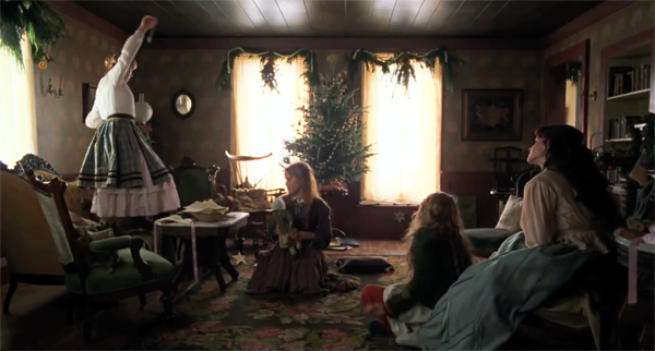
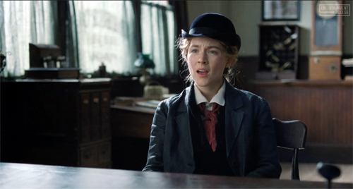
In Little Women, the years of change in the March family are given through alternating blocks. We start in the present, with Jo in New York struggling to get published. She’s summoned back to Concord because Beth is ill. Meg is living in poverty with husband John, and Amy is in Paris with Aunt March. For about eleven minutes, crosscutting carries us among the sisters.
This block of exposition is followed by a title, “7 Years Earlier,” that sets up the time oscillations we’ll get for the rest of the film. In chronological order we follow the sisters growing up. Chunks of scenes from the past, shifting viewpoint among several characters, alternate with briefer scenes of the ongoing present showing Jo’s settling back into the family. Sometimes the cuts break the blocks into smaller, interlocking bits, as when we shuttle quickly between Beth’s childhood illness and her death one year later.
Why split a linear story into two intercut strands? Flashbacks often create a specific sort of anticipation: Not just What will happen next? but What caused the outcome I already more or less know? In the first ten minutes we learn that Laurie proposed to Jo and she refused him; that Amy, not Jo, became Aunt March’s traveling companion; that Meg married John, the impoverished tutor. We’ll witness the development of all these turning points, and more. We must watch the rise and fall of characters’ hopes, knowing they will be dashed. But we also know, from Jo’s initial visit to the publishing house, that she will gain some success. This time-jumping gives us another level of omniscience, one that lets us savor the details of emotional scenes whose outcomes we roughly know. We’re in the theatre, after all, to enjoy the rapture of pathos.
Instead of tagging each time shift with a date, Gerwig expects us to keep track of the double-entry storylines. She assists us by making story motifs visual hooks between past and present. Silk for a dress, a key, Jo seen writing at a window–these link scenes but also carry dramatic weight in the ongoing action. Other echoes are longer-range. We’re invited to remember contrasting dance scenes (tavern, ballroom, porch), scorched dresses, and piano pieces.
Eventually the past scenes catch up with the present. The fusion comes with the burial of Beth and one more clutch of flashbacks, to Meg’s wedding. I take this as the end of the development section. “Childhood is over,” Jo says. Back in the present, Jo vows to abandon writing.
Now the present-time action dominates the climax. Grieving for Beth, distraught at Meg’s leaving the household, and crushed by the marriage of Laurie and Amy, Jo burns her manuscripts–except for the stories she wrote for Beth. She starts to assemble them and write more.

After a glimpse of Dashwood refusing the manuscript, we see Friedrich come to visit the Marches on his way to California. After he’s left for the station, the family claims that Jo obviously loves him.
At this point, in her most daring creative choice, Gerwig retains the crosscutting technique in a way that seems to continue the present/past alternation. Dashwood’s daughters have urged him to publish Jo’s manuscript. In New York, in a scene that rhymes with the opening passage, Jo negotiates with Dashwood.
 
Their conversation is intercut with views of Jo rushing to the station to catch Friedrich and ask him to stay.
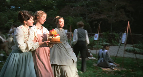
The epilogue consists of more alternations. We see Jo watching Little Women being printed, crosscut with a party at the school Jo has founded in Aunt March’s mansion. There John, Friedrich, and Laurie can be glimpsed as Meg and Amy teach children the arts they had practiced. The celebration ends with a birthday cake presented to Marmee.

But there’s another way to take the final minutes. The alternation isn’t tracking two points in time–Jo’s rush to Friedrich and a later session with Dashwood–but rather a split between fiction and reality.
We’re coaxed to take scene of Jo’s pursuit of Friedrich as representing not her own action but the changes that Dashwood demands in Jo’s novel. “Who does she marry?” he asks, explaining that a book sells only if there’s a marriage. Jo reluctantly agrees. “I suppose marriage has always been an economic proposition, even in fiction.” Cut to Jo racing to the station. After the shots of her embracing Friedrich under an umbrella, we’re back in the office. Dashwood suggests the chapter title, “Under the Umbrella,” and Jo agrees. But in turn she makes demands: “You keep your five hundred dollars and I’ll keep the copyright. . . . I want to own my own book.”
We’ve assumed throughout that Jo’s book is highly autobiographical, but we’ve taken what we see and hear as actual events, the living source of a literary text. Instead, the crosscut climax allows a parallel reality to burst forth, a road not taken. The epilogue yields another ambivalent passage of crosscutting. The school party might be veridical; certainly the family would likely gather for Marmee’s birthday. But the scene could as well serve as the fictional epilogue in Jo’s book (as it does in the Alcott original).
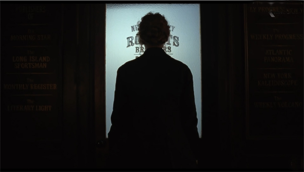
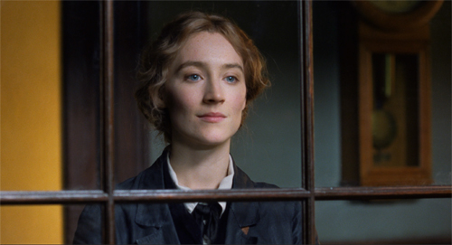
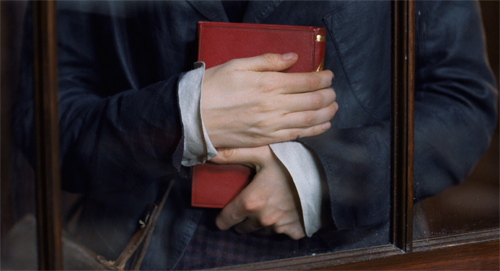
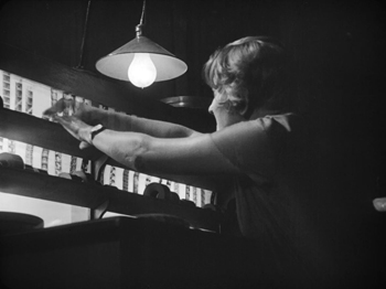
The true epilogue of Jo’s story would then be the moment when she sees her book printed, action that’s crosscut with the celebration. Jo gets the first copy. In the last shot, pleasure, apprehension, and determination play across her features. And she’s framed in a window, an approximate reverse shot to the image that opened the film (see image at the top of this section).

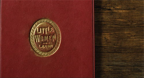
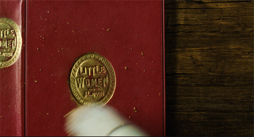
From the start Gerwig has shrewdly foreshadowed the turn to fiction by presenting the film’s title, after Jo has made her first sale, not as an inscription on the screen but as the physical book itself. That book is signed by L. M. Alcott. The apparently identical volume that comes off the printing press at the end bears the name J. L. March. Gerwig has let Jo appropriate Alcott’s story.
 
By giving us a double-voiced ending, Gerwig does something quite bold. Little Women becomes something of a “what-if” movie, positing two paths for her heroine. Alcott’s Jo had given up a literary career, whereas Gerwig’s Jo finds one by writing her own life and adding an optional ending. We’re free to think that Jo and Friedrich married and the family became a harmonious whole, as in Alcott’s book. A happy ending, we might say, for those who want one. But this film about hugs ends with the heroine hugging not a husband but her novel.

Unmarried in life, Jo can marry in fiction, and Gerwig can have it both ways. Narrative lets you do things like that.
I haven’t been able to do justice to the intriguing choices made in other films of the season. I appreciate, for instance, the nonlinearity in Kasi Lemmons’ Harriet, where the interruptions of present-time action offer Harriet’s premonitions of future scenes. This sort of “prophetic” flashforward is rare; usually such passages are presented as omniscient narration, not assigned to characters. But the device does establish Harriet as a sensitive, almost angelic figure, and suggests that her quest to guide slaves to freedom is sustained not just by faith but by holiness.
Still, looking in a little depth at just two major films can make us aware of several choices available to filmmakers at this point in history. As Wölfflin said, “Not everything is possible at all times.” But film researchers can usefully trace the flexible menu of options that filmmakers work with, and film viewers come to master.
Gerwig has kindly made available a version of the screenplay, which I discovered only after I wrote this. (Thanks, Kristin.) The notations for the final sequences are pretty interesting. The most wide-ranging discussion I’ve seen of the ending, with plenty of links, is the conversation between Marissa Martinelli and Heather Schwedel in Slate. Among several perceptive reviews, I’d single out the one in Time by Stephanie Zacharek and Richard Brody’s review in The New Yorker.
I can’t help but think how central crosscutting, that technique pioneered by early filmmakers, is to both of these films. Techniques endure because they open up a lot of expressive possibilities.
Kristin elaborates on arguments for four-part plot structure in Storytelling in the New Hollywood: Understanding Classical Narrative Technique. Extended examples on this site are here and here. I discuss family sagas of the 1940s, along with flashbacks, protagonists, and other narrative techniques in Reinventing Hollywood: How 1940s Filmmakers Changed Movie Storytelling. On 1990s revival of these techniques, see The Way Hollywood Tells It: Story and Style in Modern Movies.

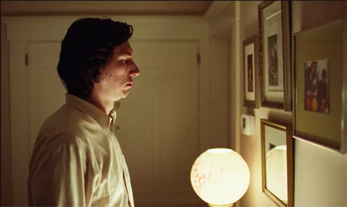
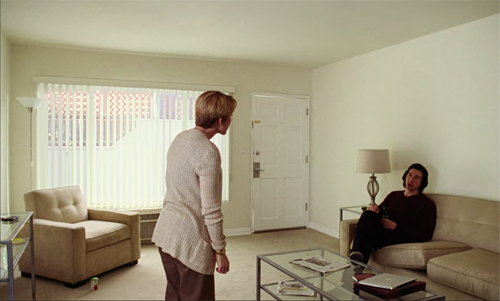
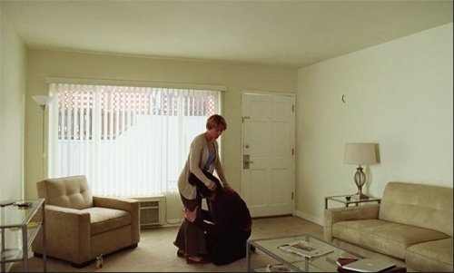
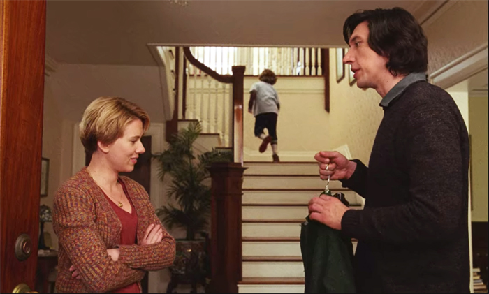
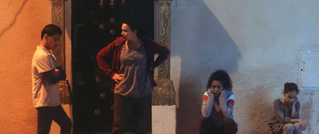
Marriage Story (2019). Is this why the film includes few standing two-shots of Nicole and Charlie?
Posted in 1940s Hollywood, Directors: Baumbach, Directors: Gerwig, Hollywood: Artistic traditions, Independent American film, Narrative strategies |  open printable version
| Comments Off on Un-Marry me a little: MARRIAGE STORY and LITTLE WOMEN open printable version
| Comments Off on Un-Marry me a little: MARRIAGE STORY and LITTLE WOMEN
Thursday | December 26, 2019

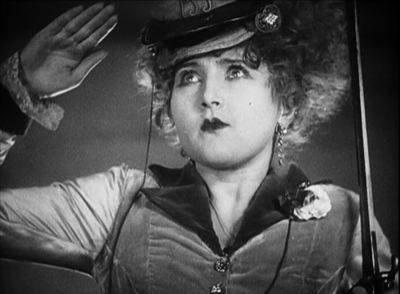
Lucky Star
Kristin here:
As 2019 fades away, it’s time once more to look back ninety years at some great classics. This series started somewhat by accident, when we wanted to celebrate the pivotal year 1917. That was when the stylistics of the Classical Hollywood filmmaking system, which had been slowly explored for several years, finally clicked into place and became the norm in the American studios.
After that, our series became a regular and surprisingly popular feature. The point is partly just to have some fun and partly to call attention to great films that have remained obscure and/or difficult to see.
For past entries, see: 1917, 1918, 1919, 1920, 1921, 1922, 1923, 1924, 1925, 1926, 1927, and 1928.
After the riches of the 1920s silent film, 1929 stands out as an anomalous year. The transition to sound was under way internationally, but different countries proceeded at different paces. The new technology often was not amenable to maintaining the freedom of cinematographic and editorial style achieved during the height of the silent cinema. There are arguably not as many indisputable masterpieces from this year as from previous ones–but there are some.
Oddly enough, truly major films from this year seem to have suffered a great deal from a lack of access, both in distribution of prints and release of good (or even any) copies on home-video formats. In part I want to draw attention to the shocking neglect of some great movies.
The list is dominated by Hollywood and especially the USSR, for opposite reasons. The American studios were well into sound production, and some of the top directors found tactics for using the new technique in imaginative ways.
In the USSR, on the other hand, silents reigned. Moreover, the great directors were not lured away to work in America, as so many European filmmakers were. (For example, Murnau’s career was nearly over, and he released no films in 1929.) Thanks to them, the golden age of silent cinema continued on.
A great year for the Soviet Montage movement
The General Line (aka Old and New, dir. Sergei Eisenstein)

The General Line is probably the least of Eisenstein’s four silent features. The earlier films were all set before or on the very day of the 1917 Soviet Revolution, and they all have a vigor and a sense of political fervor that The General Line can’t quite match. Instead, it’s about policy, specifically the portion of the First Five-Year Plan devoted to the collectivization of private farms. Eisenstein adopts an odd tactic for dramatizing the need for such a drastic overhaul of life in the countryside. He presents a single protagonist for the first time, Marfa, a poor peasant working her land alone and without a horse for the plowing.
She becomes convinced that the answer to her and her neighbors’ plight is to create a cooperative dairy for the village. But throughout, Marfa has few allies and encounters opposition from both the local wealthy Kulaks and the poor peasants, who are portrayed as ignorant, greedy, and even violent in their determination to retain full ownership of their farms and livestock. Marfa is too weak to succeed without the support of the local government agronomist and a few like-minded farmers. The task of collectivization seems too overwhelmingly difficult to ever succeed.
In retrospect, we know about the systematic exile and execution of the Kulak class and the famines that resulted from government tactics over the coming decade. It is unpleasant to see Eisenstein, however unwittingly, providing propaganda for Stalinist policies.
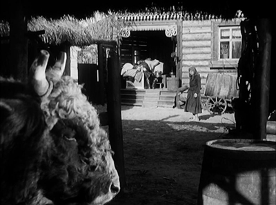
Still, Eisenstein is Eisenstein, and The General Line is as formally daring as his earlier work. Apart from dramatic angles and rapid, jarring cutting, he experiments with extreme contrasts of elements within the frame by using depth compositions. These exploit wide-angle lenses and create impressive deep-focus images. In the shot above, Marfa is dwarfed by a pampered bull in the near foreground, and in a third plane beyond her we see the grotesquely fat Kulak lolling in the sun on his porch.
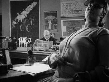
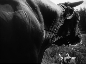
Other compositions create even greater contrasts. On the left, Eisenstein provides an image of bureaucratic indolence, official red-tape being a favorite (and apparently approved) satirical target for Soviet filmmakers. On the right frame, there’s a suggestion of the power of the collective’s new bull, who will sire a generation of calves.
 
Despite the grimness of the situation, Eisenstein manages to slip in an unusual amount of humor, and The General Line is quite entertaining.
The best DVD version I know of is the French one from Films sans frontiers, which is still available from Amazon France. The print in Flicker Alley’s “Landmarks of Early Soviet Film” is somewhat grayed out in comparison. Unfortunately this important set seems to be out of print. Flicker Alley rents The General Line online here.
New Babylon (dir. Grigori Kozintsev and Leonid Trauberg)

This masterpiece by Kozintsev and Trauberg is all too little known. Information on the internet tends to come more often from musicologists, since Dmitri Shostakovich wrote the original musical accompaniment, rather than from film scholars. Many viewers have heard recordings of the score but not seen the film itself.
Kozintsev and Trauberg were the leading members of the FEKS (“Factory of the Eccentric Actor”) filmmaking group, based in Leningrad rather than Moscow. As the name suggests, the practitioners aimed not at realism, but at the grotesque, the comic, and the appeal of popular rather than high art.
New Babylon deals with the Paris Commune of 1871, a brief period when workers took over the French government. It was seen as a forerunner of the Soviet Revolution.
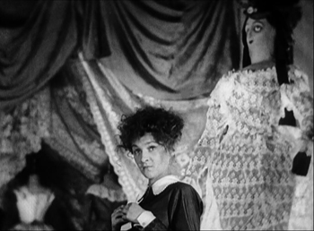
The title refers to a giant Parisian department store, which also seems to be in the business of putting on patriotic operettas about the current war with Germany. The store’s owner and patrons, as well as the performers in the operettas (see above) represent the bourgeoisie, while the workers who staff the store and create its products eventually rebel and run the doomed revolutionary government.
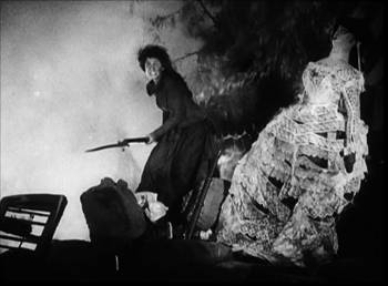
Again there is a heroine who represents the people, though she is unnamed, being known only as the shop assistant. She begins as a naive girl selling lacy clothing at the New Babylon and ends by becoming a militant revolutionary, standing atop a street barricade made up of the contents of the store–with the lace becoming bandages.
 
In keeping with its eccentric nature, the film mixes broad humor in the depiction of the bourgeoisie with grim tragedy as the defenders of the commune are shot in street fighting or tried and executed. The FEKS directors came from experimental theatre, but they also mastered the art of editing. New Babylon contains virtuoso sequences of crosscutting that sharpen the class struggle at the heart of the film.
New Babylon was restored in a joint venture by Dutch and German broadcasting channels and released, with the Shostakovich score, on DVD. There are Dutch and German versions, as Nieuw Babylon and Das neue Babylon respectively, which are out of print. We have the former. These retain the Russian intertitles, and, despite what the covers say, there are English and French optional subtitles as well as Dutch and German ones. (The booklet, however, is only in Dutch or German.) The quality is acceptable, but this film really needs a better restoration and Blu-ray release. It seems evident that the aspect ratio used in the current release crops the image to some extent.
Man with a Movie Camera (dir. Dziga Vertov)

I need say little about this film, since it has been widely seen, praised, and discussed. Back in the 1970s and 1980s, when many academic film scholars were obsessed with “self-reflexive,” or, less redundantly, “reflexive” films, Man with a Movie Camera was the great film. The result was, perhaps, that this admittedly very fine film was over-hyped. Nowadays it is as likely to be studied for the fact that Vertov’s wife, Elizaveta Svilova, created the very flashy Montage-style editing as it is for its reflexivity.
She is even seen doing so. At a number of points brief scenes of her examining, sorting, and splicing shots, which are subsequently seen in motion or in freeze-frames.

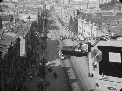
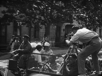
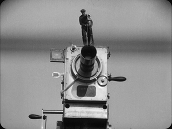
The film is a documentary, showing the filming, assemblage, and projection of a city symphony along the lines of Walter Ruttmann’s Berlin, die Sinfonie der Grossstadt, of two years earlier. Vertov’s version sort of a day in the life of Moscow (and glimpses of other cities), also beginning with the city waking up and going to work. Here, however, we see cinematographer Mikhail Kaufman (Vertov’s brother), with his camera and tripod traveling around the city, climbing factory smokestacks, filming from moving cars, and so on. Although many shots are straightforward documentary images, others use special effects, such as split-screen in the opening shot on the right below.
 
The film is available (as The Man with the Movie Camera) in Flicker Alley’s Blu-ray of Vertov’s main surviving silent and early-sound films.
Arsenal (dir. Aleksandr [or Ukrainian, Oleksandr] Dovzhenko)

Ukrainian director Dovzhenko came somewhat late to the Montage movement, contributing Arsenal in 1929 and Earth in 1930. When I was in graduate school, these were classics that everyone saw, mainly because 16mm prints were circulating. Now I wonder how many students and cinephiles see them. The standard print that has been released on DVD by a number of companies is quite poor: dark, low-contrast, cropped (though not as badly as the End of St. Petersburg version I complained about in our 1927 list).
Arsenal begins with the return of Ukrainian troops from World War I, with an emphasis on the decimation and impoverishment of the rural countryside with the loss and mutilation of many farmers. Only well into the film are we introduced to Timosha, the stalwart young representative of the proletariat who weaves through the film but does not really become a conventional protagonist.
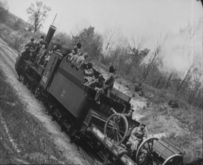
Dovzhenko has come to be viewed as the poet of the Montage movement, and many of the scenes, especially early on, are more grimly lyrical than part of a straightforward causal chain of events. There is also a touch of what we would now call “magical realism,” as in two scenes where horses speak to their masters. Dovzhenko also employs a wide range of Montage techniques: canted shots (as above); very rapid, rhythmic cutting; jump cuts; compositions with very low horizon lines (below); and so on.
 
Given the importance of Arsenal, it is a shame that the old copies have not been replaced by high-quality, restored DVDs and Blu-rays. The images here are taken from the best release I know of, Image Entertainment’s old DVD. I’ve boosted the brightness and contrast, but the result is still not ideal, and the DVD is long out of print. (It’s worth seeking out, since it has a commentary track by our friend and colleague Vance Kepley.) The best version I have found is on YouTube, using the Film Museum Wien print. It’s not cropped and has a brighter, less contrasty image (on the right in the comparison above); the subtitles are in French.
Hollywood on the verge
I presume that some readers will expect to see the two official classics of early sound Hollywood, Ernst Lubitsch’s The Love Parade and Rouben Mamoulian’s Applause. Probably in the days of Arthur Knight’s The Liveliest Art (1957) these were some of the rare films from the period that could be seen. They also were by major directors. Looking at them again, though, I don’t feel that they’re up there with the films below.
The Love Parade has the problem of dire sexual politics, the point being that while wives are naturally subservient to their husbands, a man put in the same position is entitled to be upset. That’s what happens when a court official, played by Maurice Chevalier, marries the queen of the mythical kingdom of Sylvania, played by Jeanette Macdonald in her screen debut. Moreover, we’re expected to find humor in a comic subsidiary plot where the official’s valet does a courtship duet with a maid, slapping her around a bit and apparently sexually abusing her in some fashion offscreen. Beyond that, though, there is a gaping plot hole that undermines the whole thing. The official is portrayed as nothing but a serial seducer, and yet when Sylvania is in financial difficulties, overnight he comes up with a brilliant plan to solve everything. In addition, after seemingly obsessed with sexual matters, he becomes bored with his marital position as the queen’s boy toy.
Applause displays rather clumsy camera movements that gave it cinematic flair in an era of clunky camera booths. But it simply seems to me not a very good film otherwise. Thunderbolt effortlessly runs rings around it.
Thunderbolt (dir. Josef von Sternberg)

Decades ago, when I taught the basic survey film-history course at the University of Wisconsin-Madison, one could still rent Thunderbolt in 16mm. I showed it the week we studied the coming of sound. Returning to it now, I still think it’s the greatest early Hollywood talkie that I’ve seen. Here’s a film that came directly after von Sternberg’s string of silent masterpieces (not counting, unfortunately, the lost The Case of Lena Smith), and before one of his best-known works, The Blue Angel.
I’m baffled by the fact that it has never been available on DVD or Blu-ray. Fans share dreadful copies of the old VHS release or off-air recordings. Fortunately Turner Classic Movies aired it some years ago, and we have a watchable, if occasionally glitchy, homemade DVD.
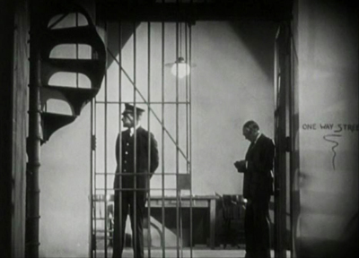
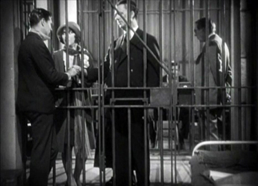
The plot bears a vague resemblance to that of Underworld. A tough crime boss, nicknamed Thunderbolt (again played by George Bancroft), learns that his mistress is secretly seeing a young man and plans to marry him. The resemblance stops there, however. In an attempt to invade the young man’s apartment and murder him, Thunderbolt is finally caught and sentenced to death. Much of the rest of the film takes place in perhaps the strangest death-row prison ever portrayed on film.
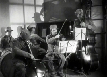
Von Sternberg treats sound as a gift, not an obstacle. He cuts from cell to cell, all beautifully lit and composed, while offscreen a seemingly endless supply of singers and instrumentalists perform everything from “Swing Low, Sweet Chariot” from a black soloist to a group of singers rendering barbershop-quartet style renditions like “Sweet Adeline” to a classical group that seems to be passing through. Sometimes we see the source of the music, sometimes we don’t. The music doesn’t seem to have much to do with the dramatic action but perhaps reflects the eccentricities of the warden–Tully Marshall chewing the scenery even more than usual.
 
Speaking of music, the film also includes an early scene with Thunderbolt and his mistress visiting a Harlem nightclub. The prolific black actress Theresa Harris, in her first known role, sings “Daddy, Won’t You Please Come Home.” Now that’s using early sound well.
Thunderbolt isn’t quite up to the level of Underworld or Docks of New York. Fay Wray and Richard Arlen make a blander couple than Evelyn Brent and Clive Brook in the former film. Still, it’s a major work in von Sternberg’s career. Let’s hope one of the DVD/Blu-ray companies finally makes it available.
Lucky Star (dir. Frank Borzage)

I well remember the astonishment and delight of the audience at Le Giornate del Cinema Muto in 1990 when the previously lost Lucky Star was shown in that year’s Borzage retrospective. A print had recently been discovered at the Nederlands Filmmuseum (now the EYE Film Institute Nederlands).
Lucky Star was originally released in silent and part-talkie versions. The restored print was of the silent version, which was lucky indeed. Having seen how awkward and distracting the recently restored talking sequences in Paul Fejos’s Lonesome are, one can only cringe at the thought of similar scenes being inserted into Borzage’s lovely film.
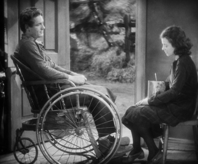
Lucky Star again pairs Charles Farrell and Janet Gaynor, who had been firmly fixed as the ideal romantic couple by 7th Heaven and Street Angel.
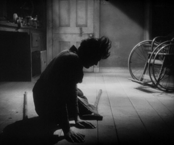
There can be few, if any films of this period where the romantic leading man spends most of the narrative in a wheelchair. Tim has suffered a grievous injury fighting in World War I, and he and Mary, a young farm girl, fall in love. Mary’s mother insists that there’s no future with a disabled man and forces her to agree to marry a sleazy, bullying soldier. Such prejudice against a “cripple” is the main underlying theme of the film.
The development of the plot is surprisingly leisurely. The first half consists largely of Mary’s visits to Tim and his attempts to help her overcome some of the slovenliness and petty dishonesty stemming from her family’s extreme poverty. There is no real goal or conflict until the intrusion of the rival soldier about halfway through. The charm of the two characters and the actors playing them carry the action effortlessly.
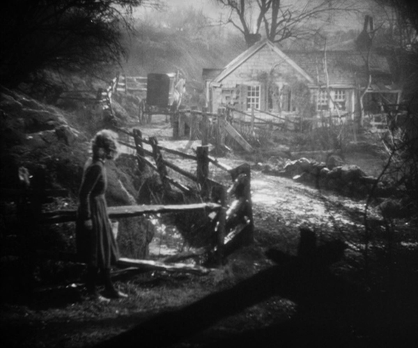
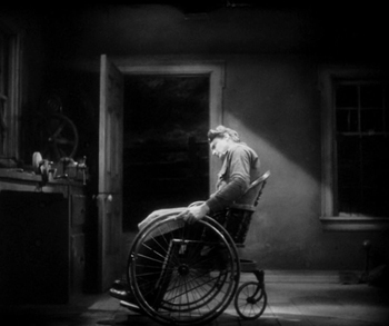
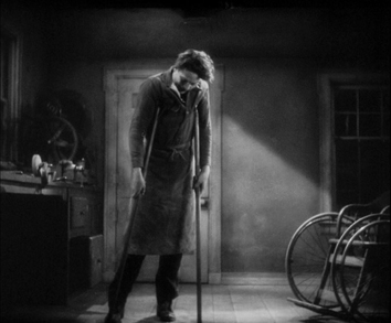
As with 7th Heaven, the studio-built sets are remarkable, in this case representing entire houses set amid rolling woodlands. (See top.) The acting is splendid as well. Farrell in particular is quite convincing as a man who is paralyzed from the waist down. One remarkable shot lasting 2 minutes and 40 seconds has him struggling to leave his wheelchair and use crutches instead before finally falling into the foreground. The framing remains steady until a reframing downward at the end.
  
Lucky Star is one of the films included in the 2008 box, “Murnau, Borzage and Fox.” So far that invaluable set is still available. Otherwise one can find English and French DVDs of it as imports.
Hallelujah (dir. King Vidor)

For the first time, a mainstream director (Vidor was at the top of his game after enjoying a huge hit with The Big Parade in 1925) and MGM, one of the Majors of Hollywood, acknowledged that a gripping melodrama could be just as entertaining with an all-black cast as an all-white cast. That is, entertaining to those outside the deep South, where exhibitors refused to play the film, robbing it of its chance to become profitable.
Well established as a classic of both early sound cinema and African-American cinema, Hallelujah retains its entertaining quality. It is easy from a modern perspective to dismiss it as racist or dependent on stereotypes. But I think that put in the context of 1929, the film was as progressive as one could expect in the day.
Vidor had long cherished the project and gave up his salary to get a greenlight from MGM. The crew was racially mixed, including an assistant director, Harold Garrison, who was black. More importantly, the musical director, responsible for the many musical numbers, was Eva Jessye, the first widely successful black female choral conductor. A few years later she would participate in the premiere of Virgil Thomson and Gertrude Stein’s Four Saints in Three Acts, and alongside George Gershwin, she was musical director for Porgy and Bess.
Vidor shot the exteriors in the Memphis area, hiring local black preachers to consult on the religious scenes, including the river baptism. He accepted changes from his cast when they found their dialogue not ringing true. In short, he struggled to be as authentic as he could.
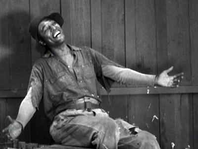
The casting was done with particular care. Zeke was originally to be played by Paul Robeson, the most respected black performer of the day, but he was unavailable. Instead Daniel L. Haynes, a notable stage actor, got the part through having understudied Robeson in the original production of Showboat. Haynes gives Zeke a buoyant appeal that maintains sympathy for him despite his vulnerability to temptation. Nina Mae McKinney, also coming from a stage career, did the same for the seductress Chick.
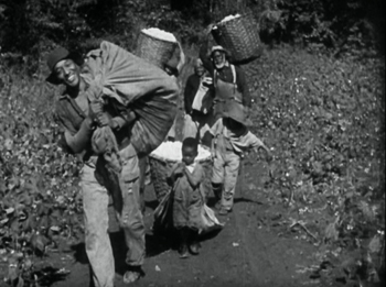
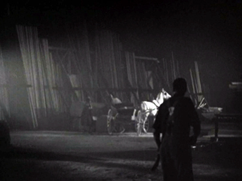
Hallelujah does not have the technical polish of a film like Thunderbolt, to a considerable extent because Vidor chose to shoot so much of it on location. The tracking shots during the opening number, “Oh, Cotton,” are certainly impressive for a 1929 film. There is also some impressive night shooting during Zeke’s chase after the escaping Chick.
 
Hallelujah is available on DVD from the Warner Brothers Archive Collection. Unfortunately the company has chosen to put a boilerplate warning at the beginning that essentially brands Hallelujah as a racist film:
The films you are about to see are a product of their time. They may reflect some of the prejudices that were common in American society, especially when it came to the treatment of racial and ethnic minorities. These depictions were wrong then and they are wrong today. These films are being presented as they were originally created, because to do otherwise would be the same as claiming these prejudices never existed. While the following certainly does not represent Warner Bros.’ opinion in today’s society, these images certainly do accurately reflect a part of our history that cannot and should not be ignored.
I don’t think this description fits Hallelujah, but it certainly sets the viewer up to interpret the film as merely a regrettable document of a dark period of US history. Warner Bros. demeans the work of the filmmakers, including the African-American ones. The actors seem to have been proud of their accomplishment, as well they should be.
Sound and silence
Blackmail (dir. Alfred Hitchcock)

Long ago, when I first saw Blackmail, I thought it was a pretty mediocre, clumsy film. Luckily I have learned quite a bit about cinema since then and can appreciate Hitchcock’s clever use of sound–beyond just the famous “knife … knife … KNIFE” scene.
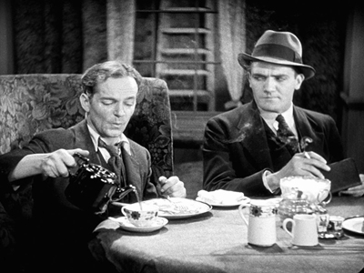
There’s the sequence where the blackmailer saunters into the tobacco store run by the heroine’s parents. He starts forcing her and her policeman boyfriend to pamper him with an expensive cigar and a good English breakfast. As he eats, he whistles “The Best Things in Life Are Free,” successfully annoying the boyfriend even further (above).
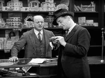
Earlier in this scene, Hitchcock presents a leisurely long take as the blackmailer performs an elaborate examination of said expensive cigar. His byplay generates suspense in us about whether he will get away with his tactic, as well as suspense in the father as to just when he is going to pay for that cigar.

The scene works well enough in the silent version of the film, but the little sound effects and muttered comments of the blackmailer make it a combination of tension and humor that wouldn’t come across without the sound. It also makes a nice contrast with the extended scene of the heroine in the artist’s studio. There the veiled threat of his seduction attempt and her naive reactions create a genuine suspense with no humor.
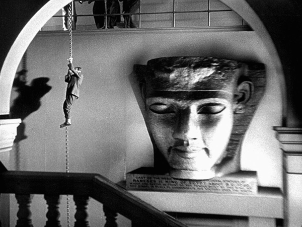
In contrast, there are passages of fast cutting that help avoid the stagey quality of much early sound cinema. The opening police raid and the later chase after the blackmailer through the British Museum’s Egyptian rooms (see bottom) both employ this tactic effectively.
By the way, I always thought that the giant pharaonic head in the shot where the blackmailer slides down a chain must have been a process shot, with a smaller head blow up for effect. Kino Lorber’s Blu-ray disc of the film, though, shows the label under the head well enough to reveal that it’s a cast of one of the giant heads of Rameses II from his temple at Abu Simbel (see bottom). Casts aren’t much in favor in most museums these days, so it’s no longer on display.
Pandora’s Box (dir. G. W. Pabst)

Fritz Lang, who has appeared quite regularly on these lists, released only The Woman in the Moon, his least interesting 1920s film, in 1929. Expressionism was over. In contrast, Pabst filled in with perhaps his most popular film, Pandora’s Box.
The film derives from a pair of Expressionist plays, Earth Spirit and Pandora’s Box, by Frank Wedekind. The first play had been filmed in 1923, as Erdgeist with Asta Nielsen as Lulu, and directed by Leopold Jessner in the Expressionist style. It survives but is among the most difficult Expressionist films to see. Pabst combined the second half of Earth Spirit and the entirety of Pandora’s Box for his version.
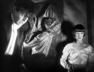
The play and film both depend on the central character being played by someone who can simultaneously Lulu’s conflicting traits: her vivacious joy in living, her strange mix of generosity and selfishness, her egalitarian attitude toward others, and her naive amorality. American star Louise Brooks was perfectly cast, as were the supporting roles, including veteran Expressionist actor Fritz Kortner as the wealthy publisher who is keeping Lulu as his mistress at the film’s beginning.
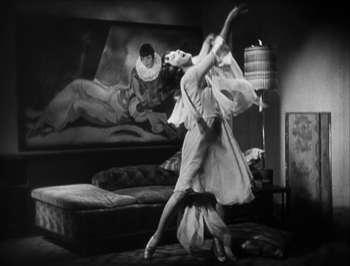
Although the source material would lend itself to Expressionist designs, Pabst went for a more modern, streamlined look, as in Lulu’s apartment (below) and the luxurious home of Dr. Schön.

Pandora’s Box was issued on DVD by The Criterion Collection but is now out of print. We can hope for a Blu-ray version.
Wild and tame surrealism
I’m dividing the tenth slot for two very different short films that were in their own ways experimental masterpieces that had a considerable lasting influence.
Un chien andalou (dir. Luis Buñuel)

Few if any trends in cinema have been so dominated by a single film. Surrealism was still a concentrated movement in the late 1920s, before it diffused out internationally to become a permanent option for experimental filmmaking. With Salvador Dalí as scriptwriter, Buñuel managed to create a loose narrative centered around displaying constant incongruous juxtapositions and inexplicable occurrences. It also aimed to offend, with the opening eye-slitting, the attempted rape, and the cavalier treatment of the clergy.
Un chien andalou, being short and in the public domain, is widely available online and on DVDs issued by small companies. I haven’t seen the BFI’s Blu-ray of L’Age d’or and Un chien andalou, but that would seem to be the best bet for quality.
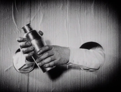
The Skeleton Dance (dir. Walt Disney, animator Ub Iwerks)

The Skeleton Dance is a much tamer film than Un chien andalou, a humorous, entertaining treatment of the disturbing subject of death. (Nevertheless, it was reportedly banned in Denmark as being too macabre.) The subject was apparently suggested to Disney by composer Carl Stalling, whom the director approached to do music for two earlier Disney films. Stalling was interested in creating films based on musical themes, and The Skeleton Dance became the first of Disney’s “Silly Symphonies” series.
Stalling eventually moved on to Warner Bros.’s animation unit, where he composed the music for two series modeled on (and parodies of) the “Silly Symphonies”: the “Merry Melodies” and the “Looney Tunes.” Thus The Skeleton Dance helped inspire three of the great animated series of the 1930s and beyond.
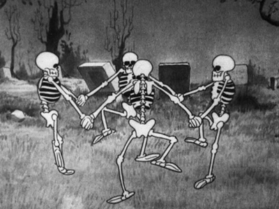
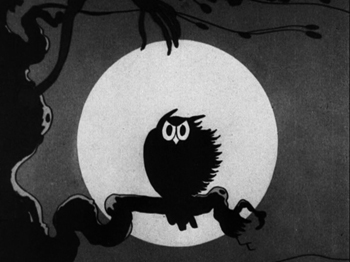
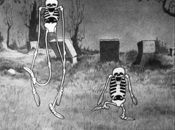
The cartoon has only the loosest of plots, running (much as the “Night on Bald Mountain” episode in Fantasia would) through the eerie events of a night through to the calming effects of dawn. The opening features a frightened owl (below left) and a howling dog, but the main “characters” are four skeletons that leave their graves to dance and cavort. Iwerks showed off his virtuoso skill, with the complex figures of the skeletons moving in circles so that they crossed over each other, as in the circular dance in the image above. He also uses two basic techniques of animation, stretch and squash, to turn the rigid bones into lively, pliable figures (below right).
 
The Skeleton Dance is included in the “Walt Disney Treasures: Silly Symphonies” DVD set, now out of print.
Compilations of Carl Stalling’s brilliantly zany (and surrealistic) music for the “Merry Melodies” and “Looney Tunes” were released on CDs as “The Carl Stalling Project” Volume 1 and Volume 2. Remarkably and deservedly, these are still in print after many years. If you do not already own these, hasten to buy yourself a belated Christmas present.
Conclusion: Acknowledging two notable events
The year saw Buster Keaton, who has figured so prominently in these lists, make his final silent feature, Spite Marriage. A pleasant film, but one which does not reach the heights of his great comedies earlier in the decade. Second, the earliest surviving film of Yasujiro Ozu, Days of Youth, dates from 1929. Although not top-ten material, it already displays his unique style. Assuming we continue this annual list, it will not be long before Ozu begins appearing on it.
There’s an ongoing controversy over versions of New Babylon. Specialist Marek Pytel has noted that a number of scenes were cut from the film after its premiere, thus making the new version impossible to synchronize with Shostakovich’s score. The missing footage having been rediscovered, Pytel has constructed a new print and synced it with a piano version of the score. His website on the restoration of the original version is here. Ian McDonald has written an extensive series (in three parts, here, here, and here) analyzing in complex detail the evidence for and against Pytel’s claims. Among those is Pytel’s statement that Trauberg told him that the initial version is the one that he and Kozintsev would consider definitive, while at other times the director said that the edited version as released is the preferred one.
Pytel also has claimed that Kozintsev and Trauberg wanted the musical score to be recorded and added to the film; he argues that the film should be run at 24 fps and used that running time in the small number of live performances that have so far been the public’s only access to his version. The very low-resolution clip from Pytel’s version that he posted on Youtube, however, shows the action to be distinctly too fast at 24 fps. Perhaps Kozintsev and Trauberg would have accepted this faster action in exchange for a musical track, but it would have been quite distracting.
The standard version on the Dutch/German DVD seems to me to be running at the correct, slower speed, with the music reasonably well synced.
Whether or not the standard version is the preferred one, it has long been the one we have, and it is quite brilliant as it stands. Being episodic, it does not show signs of being incomplete, though obviously one would wish to see the extra footage in the Pytel version to be able to judge.
Our friend and colleague Ian Christie, noted historian of Russian and Soviet cinema, discusses the historical context of New Babylon in a short video essay.

Blackmail.
Posted in Directors: Eisenstein, Directors: Lubitsch, Directors: Vertov, Directors: von Sternberg, Hollywood: Artistic traditions, National cinemas: France, National cinemas: Germany, National cinemas: Russia and USSR, The Ten Best Films of... |  open printable version
| Comments Off on The ten best films of … 1929 open printable version
| Comments Off on The ten best films of … 1929
Tuesday | December 17, 2019

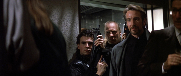
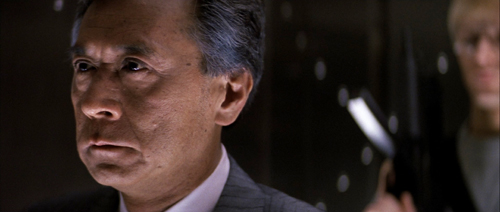
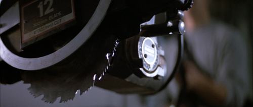
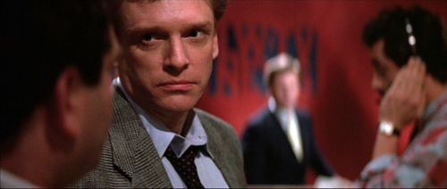
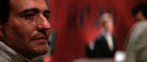
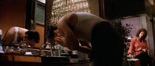
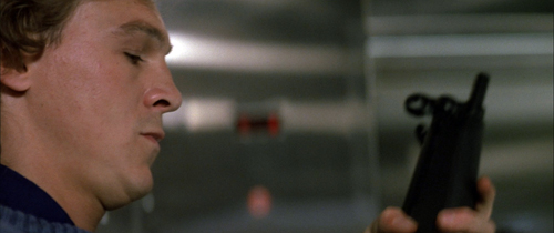
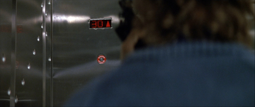
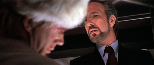
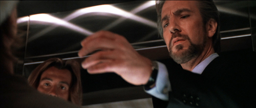
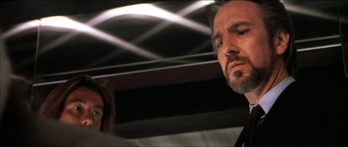
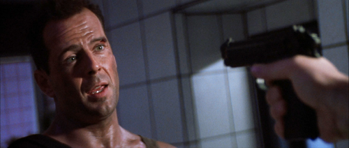
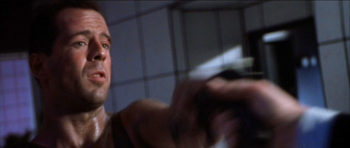
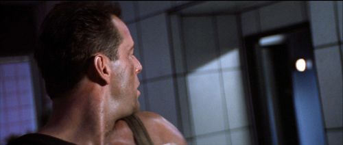
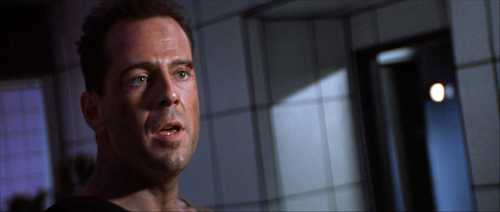
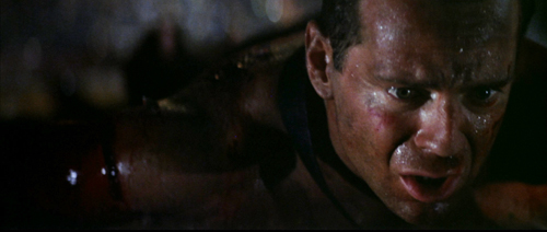
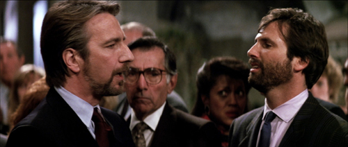
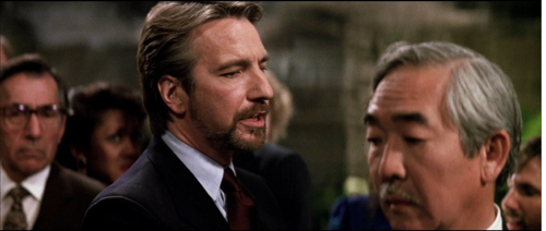
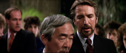
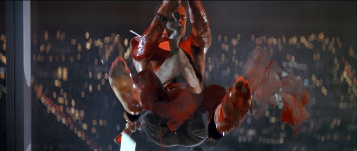
Die Hard (1988).
DB here:
It’s been quite a fall season for UW–Madison film culture. There were visits from avant-garde legend Larry Gottheim, New York Times co-chief film critic Manohla Dargis, Schawn Belston (Senior VP of Mastering at Disney), and Julia Reichert, whose American Factory is now routinely turning up on ten-best lists. The semester’s first screening at our Cinematheque was Kiril Mkhanosvsky’s Give Me Liberty, a Milwaukee movie also gracing year-end best lists. Our programs included restored films by African pioneer Paulin Soumanou Vieyra, retrospectives of Reichert and Kiarostami, a 3D double feature of Revenge of the Creature and Parasite (no, the other one), a program of early women directors in America, a selection of films conserved by the Chicago Film Society, and a miscellany ranging from Olivia and Near Dark to Tropical Malady and Red Rock West.
Travels to festivals, partly covered in our blog entries, forced us to miss too many of these shows. But we couldn’t miss the final one: Die Hard (1988).
It’s a film I’ve admired since I first saw it in summer of 1988. I’ve taught it in many classes, but never written about it. Seeing it again, in a pretty 35mm print from the Chicago Film Society, has made me want to say a few things as my final blog entry for this busy year.
The man between

Think-piece pundits like to say that Hollywood movies are about good guys versus bad guys. But usually things are more complicated. Very often the good guy is an outsider caught between two large-scale forces, good or bad or both–the cattle ranchers versus the townspeople, or the mob versus the cops. Often the protagonist is an outlier, forced to solve the problem using means that respectable social forces can’t.
Call it the problem of the House Democrats. When the lawbreaker can’t be brought to justice, how do you make him pay? The answer is one that William S. Hart movies provided in the 1910s. We need a “good bad man,” a rogue agent who knows the scheme from the inside but is willing to do the right thing. Which means that he has to be flawed too, a little or a lot, and that he can eventually reform.
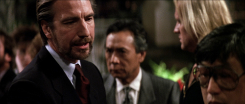
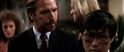
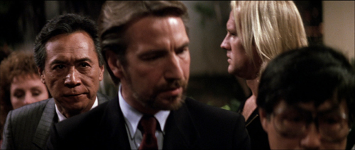
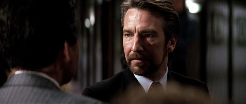
In Die Hard, the forces of law and order line up as the Los Angeles police and the FBI. The threat is Hans Gruber’s gang, posing as terrorists but actually planning to rob the Nakatomi Corporation of $640 million in bearer bonds and kill lots of hostages in the process. The naive TV broadcasters support both, recycling official scenarios of how hostage-taking works and reinforcing the gang’s masquerade as a terrorist group.
The contrasts are marked. The forces of order are American, in alliance with a Japanese company, while the attackers are Europeans. At the start, we hear American music (the rap played by the limo driver Argyle), but Hans hums Beethoven. The cops’ technology notably fails, as when the assault vehicle and a helicopter are consumed by firepower. But the gang’s hi-tech expert Theo can crack the vault, assisted by Hans’ plan to push the Feds to cut the building power.
Above all, the forces of social order are strikingly inept, while the gang is ruthlessly efficient. Unlike the police, who “run the terrorist playbook,” Hans boasts that he has left nothing to chance. The cops can’t imagine an adversary that exploits the official by-the-book procedures. As for the business types, Takagi’s calm bluff and Ellis’s freewheeling jargon can’t cope with a gang leader who doesn’t get the Art of the Deal.
Clearly, America and Japan need help. That appears in the form of John McClane, the cop from the East Coast trapped in Nakatomi Plaza.
McLane is the man between, spatially and strategically. He witnesses the action from inside the skyscraper, and bit by bit he figures out the gang’s real scenario. And he’s caught between both forces. The gang tries to find and kill him, while the cops refuse to recognize him as an ally. Confronting Karl’s brother early on teaches McClane that he can’t play by procedure. (“There are rules for policemen,” says a thug who doesn’t believe in rules.) The LAPD’s ineptitude shows that McClane can’t expect help on that front. So he must become almost as reckless as his adversary, though in a virtuous cause. This principally means blowing stuff up.
McClane isn’t totally without resources. He has as helpers Al, the desk cop who comes on the scene and sustains his morale, and Argyle, who’s there to play a crucial role at the climax. But mostly he’s alone in facing problems. He needs weapons. He needs shoes. He needs to protect the hostages, most of all his wife Holly, who has climbed up the corporate ladder. (In another movie, she would be the in-between protagonist.) To keep Holly from becoming a bargaining chip, McClane needs to hide his identity. And he needs to figure out the gang’s ultimate plan, of seeding the rooftop with explosives that will destroy the building and cover their escape.
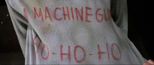
John’s solutions are notably low-tech. While the police and the gang depend on advanced firepower and computer finagling, McClane lashes an explosive to a desk chair and uses a fire hose as a rope. He has to improvise shoes by taping a maxi-pad to a bleeding foot. No holster for your automatic? How about some Christmas wrapping tape? And don’t forget to taunt your adversaries with Yankee wisecracks.

In the course of this drama, the very physical McClane becomes a model for his allies. Holly punches the reporter who revealed John’s identity, and Argyle cold-cocks Theo at the point of getaway. Most dramatically Al kills the revived Karl when he’s about to plug McClane. The people in between take up arms.
McClane and his allies solve the House Democrats’ problem. Law can’t be lawless, even in protecting itself. Business, always aiming at the bottom line, has to give up principles. (“Pearl Harbor didn’t work out, so we got you with tape decks.”) These forces of social order are inefficient, trusting, and superficial. They can’t stand up to sheer brutal onslaught. In a crisis they will fold, or simply choose the nuclear option: agents Johnson and Johnson are ready to lose a big chunk of hostages.
McClane is a mediating figure that permits the film to show you can be strategically lawless for the sake of lawfulness. The fly in the ointment, the monkey in the wrench, screws up plans on both sides, but for the benefit of everyone else.
The Big Dumb Action Picture isn’t so dumb

This thick array of thematic parallels would be interesting in itself, but it gets worked out through precise storytelling. There was a time when critics knocked action movies as simply ragbag assortments of fights, chases, and explosions. Die Hard, I think, changed ideas of just how well-wrought an action picture could be. About 53 minutes of it consist of physical action (including people sneaking around), leaving almost 70 minutes for other stuff: suspense, changing goals, surprise information, attention to parallel plotlines, and little moments like the thief pilfering candy just before an ambush.
The film typifies tidy classical Hollywood construction, beginning with an arrival (the jet) and ending with a departure (the McClanes in a limo). In between we get a big dose of the classic double plotline, romance and work. Holly’s job at Nakatomi threatens their marriage, and John takes on a temp job, that of fighting the gang, which also endangers the couple’s efforts to reconcile.
For every Superman, there’s a Kryptonite, and here the protagonist’s flaws include his fear of heights (set up in the second shot, reiterated throughout) and, more importantly, his resistance to Holly’s independence. By the end, he’s learned a lesson. The film’s streak of male sentimentality allows John to ask his wife’s forgiveness for blocking her career ambition. She’s ready to compromise too, reassuming his last name when she meets Al. The characters we care about change, at least a little. That could be the motto of most classical Hollywood plots.
As usual, we get crosscutting among several lines of action. John’s arrival is crosscut with Holly at work fending off Ellis, and in the rest of the film the gang’s stratagems are intercut with the cops’ plans and McClane’s efforts. At various points, five or six actions are alternating with one another.
All these escalating situations cluster into distinct parts, the four that Kristin has argued for as typical of Hollywood architecture.
The Setup runs about 33 minutes, culminating in the murder of Takagi and Hans’s promise that he can open the vault.
The Complicating Action, a counter-setup, coalesces around John’s goals of communicating with outsiders, avoiding capture, and attacking the thieves when he can. Through many chases and fights, the gang seeks to block all these efforts. The lines converge when John shoots Marco and tosses his body onto Al’s car. He gains the bag with the detonators, giving him the upper hand. Then the TV reporter gets involved, the cops arrive, and John is ordered to wait. Things seem to be stabilized.
After this midpoint, the Development supplies what Kristin calls “action, suspense, and delay.” Officer Dwayne Robinson arrives, pitting himself against Al and McClane. We can regard the police assault, Ellis’s clumsy attempt to broker a deal, and the arrival of the FBI men as a series of delays that endanger the stability of the standoff. At the end of this section, John meets Hans (posing as an escaped hostage): now both men know each other. And in the firefight that follows, John loses the detonators. Hans declares, “We’re back in business,” and the original plan can go forward.
The last twenty-five minutes constitute the Climax, launched by McClane’s “darkest moment.” He seems utterly beaten. Picking glass shards out of his feet, he gives Al a message for Holly over the CB radio. Al tells of his own burden, the accidental shooting of a child. The stakes are now very high.
Rapid crosscutting shows John finding the bombs on the roof and fighting with Karl, while the FBI helicopter attacks the building and Hans discovers that Holly is John’s wife. John stampedes the hostages down the stairs off the roof and escapes the strafing from the chopper before it blows. Argyle dispatches Theo, while John finds the surviving gang members in the atrium and shoots Hans, who falls to his death.
In the Epilogue, Al and John meet, Al dispatches Karl, Holly socks the newsman, and John and Holly drive off with Argyle.
These parts present a tight, logically building plot composed of swiftly changing situations. Along the way we encounter a great many motifs that create echoes or contrasts. Everyone notices the Rolex, at first a symbol of Holly’s talents but also of corporate swagger; only by unfastening it can they let Hans drop from the window. When Argyle floats the possibility that Holly will rush back into John’s arms for a movie ending, John murmurs: “I can live with that.” Agent Johnson speaks the same line, but for him it means an acceptable level of civilian casualties.
Holly’s unmarried name, Gennero, shows how a motif can develop in relation to the drama. At first it’s a sign of pride in her own identity (typical corporation, Nakatomi has misspelled it on the touch screen). Her name-change triggers the couple’s quarrel, but it has another narrative use: It conceals John’s identity from Hans. And at the end he introduces her to Al as Gennero but she reasserts her love by correcting him: “Holly McClane.”
Then there are differences of class and country. Hans reads Forbes, but McClane the US boomer references Roy Rogers and Jeopardy. (Hans is so unplugged from pop culture he thinks John Wayne was in High Noon.) Argyle the former cab driver and Al the cop know the downside of city life, but so does John the New York detective, who adapts Roy’s trademark phrase to the mean streets: “Yippee-ki-yay, motherfucker.”
Even a conventional Hollywood gesture, that of attacking a picture of a loved one, acquires a nifty plot function. Annoyed at John, Holly slaps down the family portrait on her shelf. Good thing too, because otherwise Hans would have seen it during the invasion. We’re reminded of that picture when in a moment of quiet John looks at the same snapshot in his wallet. Only after Hans has encountered John is he able to flip the portrait back up and realize that Holly is the “someone you do care about.”
There are lots more felicities like these–so many that I’d consider Die Hard a “hyperclassical film,” a movie that’s more classically constructed than it needs to be. It spills out all these links and echoes in a fever of virtuosity. Hard to believe that the makers started shooting without a finished script.
Intensified continuity, personalized
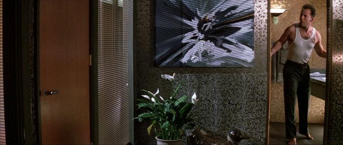
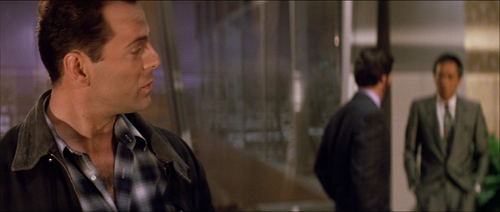
Die Hard is a good example of a stylistic approach I’ve called “intensified continuity.” It’s a modification of the classical method of staging, shooting, and cutting scenes. Here director John McTiernan and DP Jan de Bont tweak that approach in distinctive and powerful ways. You can find examples all the way through the movie, but I’ll draw most of my illustrations from the first hour, when the stylistic premises get laid out for us.
Cutting speeds accelerated sharply in Hollywood films from the 1960s onward, and for its time, Die Hard was a rapidly-cut movie. The average shot runs just under five seconds, about what you’d get in a 1920s silent film. By today’s standards, which fall more in the 3-4 second range (even for movies outside the action genre), it’s a bit sedate.
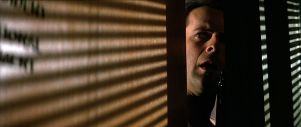
One factor that increases the cutting pace is a greater reliance on singles and close-ups. These are tighter than we’d expect in most studio films of the classic era.
 
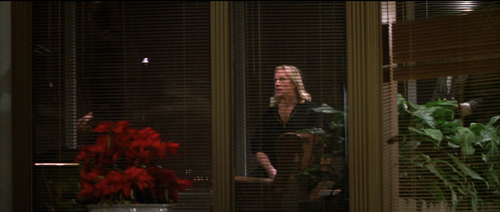
Even in close-up, the shots aren’t snipped free of their surroundings, thanks to the wide frame and layers of focus–both important in the film’s overall style, as we’ll see.
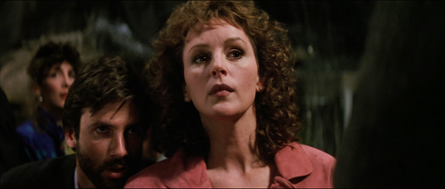
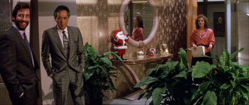
Likewise, intensified continuity exploits a greater range of lens lengths than we’d find in studio films of the classic era. We get wide-angle shots like those above along with telephoto shots throughout. Here the long lens is used to pile up people around Holly, and an even longer lens shows her optical viewpoint on the bandits in the office.
 
And there’s a free-roaming camera, thanks chiefly to Steadicam technology. But interestingly, Die Hard avoids some of today’s most common camera movements, such as shooting a fixed conversation with a sidewise or circular tracking shot. These would become more common in the 1990s.
McTiernan thought a lot about his camera movements, as he explains in interviews and the commentary track on the DVD. He wanted to shape spectators’ attention, to use camera movement to nudge things into view. “The audience’s eye wants to go with you.” Accordingly, more than in many contemporary films, Die Hard‘s camera movements have a shape: they end on a point of information.
Sometimes it’s just a quick pan, doing duty for a cut. At other times, the reframing is a gentle nudge that prepares for a new scenic element, as when Holly enters her office.
 
In shooting Predator (1987), McTiernan wanted to cut moving shots together, but his editor resisted. For Die Hard, he refilmed his camera movements at different rates so that two would match. A good example is when Karl’s brother strides carefully into an area under construction. The camera tracks with him, but when he turns to find the source of a whining noise, the arcing movement at the end of one shot is picked up in the next as the framing circles to reveal the saw.
  
That reveal is given, characteristically, in rack focus. I could have added rack focus as another featured technique of intensified continuity. McTiernan and de Bont take it very far, making Die Hard one of the great rack-focus movies. The image is constantly shifting focus to guide our attention to the changing layers of the scene.
  
This neat, compact presentation not only preserves the commitment to long-lens close-ups we find in intensified continuity. The technique also gives each rack focus the snapping force of a cut. (And you don’t need to build big sets.) Needless to say, the rack-focusing wouldn’t work if McTiernan hadn’t committed himself to staging his action in depth. More on this below.
Staging in ‘Scope
Die Hard finds ingenious ways to “let the audience’s eye go with you” in the widescreen format. Sometimes it’s a matter of classic edge framing. Thanks to a low angle, John and Holly converse along a wide-angle diagonal.

Sometimes McTiernan reverts to a technique not enough directors use nowadays: blocking and revealing. In classic cinema that was usually a technique reserved for long shots, when actors could move aside as part of ensemble. Die Hard applies blocking and revealing to the tight framings of intensified continuity.
A thug in an elevator checks his weapon, pivots for an instant, and then moves aside to show the elevator arriving at the target floor.
  
Here again a rack focus helps. The moment reiterates the importance of the thirtieth floor in the skyscraper’s geography.
When Hans finds the body of Karl’s brother, we can study his expression. He flips the victim’s head to reveal a gunman, who looks to Hans before he says his line.
  
In a neat touch, the thug’s mouth isn’t shown. Today a director would probably show his whole face, but, really, who cares? The careful framing keeps him a secondary character, and a future target of McClane. And no need to rack focus on him, which would give him unwonted importance. All we need to remember him is that he’s the thug with long hair.
I can’t refrain from using one audacious example from late in the film. John and Hans have met, and Hans has revealed himself by targeting John with the pistol McClane has given him. In reverse shot, John reveals that it has no bullets and grabs it away from Hans.
 
But the pistol, and that gesture, have concealed the elevator behind them. When the pistol is knocked down, the elevator light pops on in the background. Our attention snaps to it, aided by that characteristic ping we hear throughout the movie (another motif).
 
The crisp turn of events, given visually and sonically, gets ampified by the acting. McClane’s cockiness turns to panic and Hans gets the upper hand. (“Think I’m fucking stupid, Hans?” Ping. “You vere saying?”)
The most bravura rack-focus comes during the climax, when the firehose reel whizzes down behind McClane and he realizes that he’s being dragged through the shattered window.
  
The coordination of the long lens, camera movement, staging, and racking focus is especially rich when Hans drifts among the hostages searching for the man in charge. He recites Takagi’s life history as he passes from one possibility to another (including, comically, Ellis).
  
At the climax of the passage, McTiernan’s staging-in-layers sets up Takagi, Karl, and Holly before Takagi takes charge. Briefly blocked by Hans, he admits his identity by stepping out from behind and into focus.
  
McTiernan isn’t done. A reverse shot of Hans finishing his spiel (“…and father of five”) punctuates the suspense. McTiernan buttons up this passage by returning to his “moving master” shot and having Karl shove Takagi out.
  
That clears the way for us to see Holly’s reaction. A beat dwells on her as she shifts her eyes to Hans, foreshadowing her conflict with him at the climax.
 
This sort of layering of faces popping in and out of visibility has precedents in earlier cinema, chiefly of the “tableau” period of the 1910s. McTiernan has, I think, spontaneously rediscovered for modern times what William C. de Mille was up to in the party scene in The Heir to the Hoorah (1916). (For more on that, go here.)
 
Of course McTiernan also has to work with the 2.35:1 anamorphic format, which enables him to spread his layers out more. That format also allows some remarkable compositions, such as the one surmounting today’s entry. The cut to the shot of John in Holly’s office uses the abstract splash painting (seen here for the first time) as a visual analogy for the explosion of gunfire offscreen at the same time.
McTiernan and de Bont constantly find striking but cogent images, thanks to lighting as well as color and format. Here’s McClane on top of an elevator peering through the perforated grille; his POV is a striking but still informative composition. the cut between the two provides a little punch of contrasting light and shade.
 
There are felicities like these feathered all through this remarkable movie, but the momentum of storytelling never flags. This remains a masterpiece of Hollywood filmmaking.
Thanks to our readers for following us this year. Kristin will be weighing in soon with her annual list of best films from ninety years ago. In the meantime, HO-HO-HO.
Madison owes an enormous debt to our Cinematheque team: programmers Jim Healy, Mike King, Ben Reiser, and Zach Zahos, as well as veteran projectionist Roch Gersbach. Santa should reward them. You can too by visiting the Cinematheque’s Podcast, Cinematalk. There you’ll find conversations with Manohla Dargis, Schawn Belston, and James Runde.
For lots of background on the making of this film and the four sequels, there’s Die Hard: The Ultimate Visual History by Ronald Mottram and David S. Cohen. At rogerebert.com, Matt Zoller Seitz has a discerning appreciation on the occasion of the film’s twenty-fifth anniversary.
Jake Tapper has provided the definitive analysis of Die Hard as a bona fide Christmas movie.
McTiernan (with whom I share an alma mater) provides very good DVD commentaries (even for Basic). Prison also seems to have given him some pronounced political views. Alas, the website he created as a platform for them is apparently no longer available. Word is that McTiernan is preparing a new film, Tau Ceti 4, with Uma Thurman. A videogame promo is purportedly signed by him.
Of other McTiernan films, I also much admire The Hunt for Red October (1990). The Thomas Crown Affair (1999) seems to me better directed than the original, and The 13th Warrior (1999), despite being taken out of his hands, remains a pretty interesting film. (Name another Hollywood movie in which a Muslim poet visiting Northern Europe is justly appalled at its barbarism.) Nomads (1986) also has its good points.
I discuss the issues of narrative and style raised here at greater length in The Way Hollywood Tells It: Story and Style in Modern Movies. You can also search “intensified continuity” for blog entries hereabouts. On CinemaScope aesthetics, see this entry and this video.

Die Hard (1988).
Posted in Directors: McTiernan, Film comments, Film genres, Film technique: Editing, Film technique: Staging, Film technique: Widescreen, Hollywood: Artistic traditions |  open printable version
| Comments Off on Not just a Christmas movie: DIE HARD on the big screen open printable version
| Comments Off on Not just a Christmas movie: DIE HARD on the big screen
Sunday | December 1, 2019

Synonymes (2019).
Kristin here:
After visiting museums on the one free day we allowed ourselves in Turin before the festival began, we launched into viewing films from around the world. Here are three of the best we’ve seen, to add to the ones David has discussed.
Synonymes (France/Israel/German, dir. Navad Lapid)

Israeli director Navad Lapid has become a familiar figure for us as we have visited past festivals in Vancouver. We blogged about his Policeman in 2011 and The Kindergarten Teacher in 2014. His latest film raises his profile considerably, having won the Golden Bear at Berlin and had its North American premiere at Toronto. (Ozon’s By the Grace of God, which we blogged about from Vancouver, won the Silver Bear.)
Synonymes started with an abrupt chase, with the camera bouncing about as it follows our hero, Yoav, as he dashes through the streets of Paris (above). I was worried that this loose style of shooting would dominate, but Lapid has something more disciplined involved. The unfastened camera is usually used for exteriors, while interiors are made up of static shots.
He arrives at a large empty flat that someone has loaned him, where the heat has apparently been turned off. He proceeds to take a cold shower, and, having neglected to lock the door, he finds his backpack and sleeping bag stolen. He is left naked with no possessions whatsoever. A wealthy young couple from downstairs rescue him from hypothermia and become fascinated with him, taking him in briefly. Émile gives him money, as well as clothes. He holds up a long series of colorful shirts, which he himself apparently never wears, judging from his own muted wardrobe.

Lapid matches these colors to the decor, especially the distinctive, bright mustard-hued overcoat that Yoav wears through much of the film. The coat makes him easy to spot and marks him as an outsider among the more conventionally dressed Parisians around him (see top).
We soon learn that he is fleeing from his oppressive life in Israel and wants to become a Frenchman as soon as possible, refusing to speak anything but French despite his elementary grasp of the language. (The title comes from his habit, when wandering around alone, of muttering a series of words with similar meanings.)
There’s not much of a goal operating here, apart from Yoav’s increasingly strained efforts to turn himself into a Frenchman and abandon the violence inculcated into him by his time in the Israeli army. His one conventional job is as a security guard at the Israeli consulate. His violent outbursts and willfully eccentric behavior increase as the film goes along.
The rather episodic film revolves around the driven performance of Tom Mercier, an Israeli theater student who knew no French and, remarkably, is making his film debut here.
Kino Lorber has released Synonymes (as Synonyms )in North America. For a plot summary and a list of theaters where it has played and will be playing into January of next year, see the company’s webpage.
True History of the Kelly Gang (Australia, dir. Justin Kurzel)

Bushranger films, of which True History of the Kelly Gang is one, are more or less the Australian version of American westerns. The tale of Ned Kelly and his gang is almost a mini-genre in itself, going back to what is claimed to be the world’s first feature film, The Story of the Kelly Gang (1906, dir. Charles Tait, partially surviving).
Justin Kurzel adopts a fresh take on the familiar Kelly tale, which is as much myth as fact. He based his film on Peter Carey’s novel of the same name, which won the Booker Prize and many other awards. By adding “True” to his title, Carey both acknowledged the fact that he was embroidering the national legend as much as adhering to the facts.
Kurzel does the same. A title appears on the screen: “Nothing you are about to see is true.” All of the words besides “true” fade out, and the rest of the film’s title fades in beside it. Those of us not steeped in Australian history and culture will not be able to fill in the inauthentic parts, but it doesn’t really matter. It’s a gripping story nonetheless.
The film opens when Ned is a boy, living with his mother Ellen and siblings in a bleak part of the bush consisting mainly of stubby dead trees (above). Although an honest lad to start with, he is drawn into the family’s long-time opposition to the local constabulary and military forces. Despite her fierce love for her family, Ellen sells him into apprenticeship to a putative merchant and herder (played with not quite too much gusto by Russell Crowe). The man turns out to be a highway robber, and Ned is reluctantly pushed toward a life of crime.
The film follows the novel in using a voiceover narration by Ned, reading from a diary purporting to be for his young daughter after his inevitable demise. (In fact the figures of the wife Mary and the daughter are part of the tale’s embellishment.) Indeed, we are nearly always in his presence and are led to sympathize with him because almost everyone around him except Mary exploits him.
The film is visually impressive, including some shots that leave one wondering how they were accomplished. At intervals there are fast drone shots above the sea of dead trees as Kelly and others ride horses through the landscape. One shot at night features an immense pool of light from above that moves smoothly with the horseman, keeping him visible as the stark gray trees appear from and disappear into the inky surroundings.
The climactic shootout between Kelly’s gang of four men in home-made armor and a large posse approaching from the distant background provides an unforgettable image. The last man standing, Kelly himself, back to camera, fires at a line advancing figures. They appear spread across the screen as tiny white figures–looking distinctly like Ku Klux Klan men in full garb. (See bottom.)
True Story of the Kelly Gang contains considerable strong profanity and violence, which would seem to warrant a risky hard-R rating in the US. Nevertheless, just before the film’s world premiere at Toronto, IFC acquired the North American rights to the film for a reported seven-figure sum, bidding against three other distributors. IFC will evidently release it in 2020. (The first trailer has just been posted on Youtube, but there is currently no mention of the film on the IFC website.)
Noura’s Dream (Tunisia/France/Qatar, dir. Hinde Boujemaa)

Increasingly female directors working in Middle Eastern and North African countries are gaining a foothold in the international film market. Recent notable films have been Saudi director Haifa Al Mansoor’s The Perfect Candidate in competition at Venice and Nadine Labacki’s Lebanese film Capernaum, Jury Prize winner at Cannes in 2018.
Tunisian director Hinde Bujemaa’s Noura’s Dream centers on a woman with three children who is awaiting an imminent divorce from her incarcerated husband, Jamel, so that she can marry her lover, a car-repairman, Lassaad. Meanwhile she is working in a laundry to enhance her government checks and support her family (above).
Though Tunisia is somewhat more liberal than other Muslim countries, Noura still faces traditional prejudices. In the opening scene, an official tries to talk her out of the divorce for the sake of her children–as if living with an abusive criminal for a father is more desirable than having a kinder stepfather.
Jamel is released unexpectedly early, and Noura must live with him for the few days until the divorce is final. She pretends to be considering staying with him, despite the fact that he returns to his criminal activities and abuses his family, at one point throwing them out of the house (above). As Bujemma points out in a Variety interview, however, Jamel is not all bad, not taking the option of betraying to the police Noura’s adultery with Lassaad, still a criminal act in Tunisia.
In a way Noura’s Dream seems to reflect the considerable impact that Asghar Farhadi’s Oscar-winning films have had on other directors in the region. The situation of an impending divorce recalls A Separation, yet Farhadi’s films tend to have quiet, “everyone has his reasons” plot arcs with twist revelations and moral ambituities. Here, telling such a story and eager to display the biases against women in Tunisian society. Bujemma takes a more melodramatic approach. Jamel is an unrepentant criminal and Noura is a brave, determined woman struggling to separate herself and her children from him. Lassaad is a decent fellow nevertheless ultimately driven to reject her when she shows no signs of leaving Jamel.
It’s a film that effectively builds up considerable sympathy for Noura, played by prominent Middle-Eastern star Hind Sabri, and withholds hope, or possible hope, until the last shot.
Noura’s Dream has played several festivals, including Toronto, London, and now Torino and has releases in Europe and its native country, but there is so far no North American distributor.
The Horror Thread
As David mentioned in our previous post, the Torino Film Festival includes a retrospective program each year. This time it was horror films, from Das Cabinet des Dr. Caligari to Roy Ward Baker’s Dr Jekyll & Sister Hyde (1971, UK). I fit some of these into my schedule in between the new films.
There were 35mm prints of I Walked with a Zombie (1943, Jacques Tourneur), The Masque of the Red Death (1964, Roger Corman) and The Devil Doll (1936, Todd Browning), among the films I saw. The DCPs of The Body Snatcher (1945, Robert Wise) and The Innocents (1961, Jack Clayton), the latter shown immediately after the former, offered two gorgeous examples of black-and-white cinematography. In all the retrospective included 36 films, many of them probably being viewed by Italian attendees for the first time in their original languages, rather than dubbed versions.
We wish to thank Jim Healy, Emanuela Martini, Giaime Alonge, Silvia Saitta, Lucrezia Viti, Helleana Grussu, and all their colleagues for their kind help with our visit.
For more Torino images, visit our Instagram page.

True Story of the Kelly Gang (2019).
Posted in Festivals: Torino, Film comments, National cinemas: Africa, National cinemas: Australia, National cinemas: Israel |  open printable version
| Comments Off on Torino tour of world cinema open printable version
| Comments Off on Torino tour of world cinema
|
