Monday | October 2, 2017

Kristin here:
Like just about all kids, I was fascinated by dinosaurs for a while. That’s probably why my mother bought a copy of Sir Arthur Conan Doyle’s 1912 fantasy-adventure novel, The Lost World, at a yard sale and gave it to me to read while I was sick in bed. I must have been about nine. It was a battered photoplay edition, complete with photos of scenes from the 1925 movie. I read other Victorian-Edwardian fantasy-adventure books, mostly Verne and Haggard, at around the same time. I suppose they prepared me for reading The Hobbit and The Lord of the Rings at age 15 and developing a life-long attachment to them. This doesn’t mean that I consider The Lost World a masterpiece, but having come to it so young, I retain a fondness for it. I was interested to find out what the new Flicker Alley release of a new restoration of the film is like.
Doyle’s novel deals with a scholar and explorer, Professor Challenger, who has recently visited a remote site in South America and is ridiculed by all for his claims that dinosaurs survive on an inaccessible plateau there. The hero, Edward Malone, a lovelorn reporter courting a woman who insists she wants a daring, heroic husband, enlists on an expedition to test Challenger’s stories. So does a skeptical rival of Challenger’s, Professor Summerlee, and a hunter-adventurer, Sir John Roxton, who wants to add a stuffed dinosaur to his other trophies. Many adventures follow, including vengeful Spanish guides marooning the expedition atop the plateau, where they encounter dinosaurs, ape-men, and Indians. The team escapes and manages to take a pterodactyl back to London. Challenger’s reputation is restored.
Following on the novel, I saw the 1960 Irwin Allen version of The Lost World. At the age of perhaps ten or eleven I enjoyed it, though I did recognize that Jill St. John’s character was a total and unnecessary fabrication and the “dinosaurs” were lizards with prostheses.
The 1925 version

Naturally when I was a grad student in film studies, I took my first opportunity to see the 1925 version. It was produced by the important studio and distributor First National Pictures three years before it was absorbed by the upstart Warner Bros. In those days the only version available was a 50-minute abridgement made by Kodascope, and it was not, to say the least, impressive.
I cannot say that I paid much attention to the subsequent restorations: the 1998 George Eastman House version, which, while still incomplete, was a distinct improvement, and the the 2000 David Shepard version, which was basically the same but with digital improvements to sound and image.
The 2016 restoration by Serge Bromberg’s Lobster Films as presented now on Blu-ray by Flicker Alley, has added considerable footage. This extends the film to 103 minutes, close to its original running time. The main thing missing is a scene of cannibals attacking the expedition members as they travel upriver to the controversial plateau, as well as a few other brief moments.
As an adaptation, it’s a distinct improvement on the 1960 version. After all, the novel was only 13 years old when it was made. Doyle was still alive; he would not publish his final Sherlock Holmes story until 1927 and his final works of fiction until 1929. Conventions and tastes in popular fiction, whether filmic or literary, had not changed nearly as much as they had by Irwin Allen’s day.
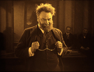
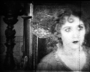
The main casting was impeccable, with Wallace Beery the perfect choice for the powerful, pugnacious Challenger (above) and Lewis Stone for the epitome of British stalwart rectitude. The film even managed to do a good job of concocting a love interest by introducing Paula White (Bessie Love), the daughter of the original discoverer of the lost-in-time plateau and eager to participate in an expedition to rescue her marooned father. Then it gave her little to do. Bessie Love just has to look terrified at intervals, in a series of close-ups surrounded by an iris and with a blank background–clearly shot later with someone telling Love just to glance in all directions and register fear. These moments add up to something a realization of a Kuleshov experiment.
Her presence does, however, allow Stone to give perhaps the most subtle and sympathetic performance in the film. He’s in love with White but nobly gives her up to Malone. As Malone, Lloyd Hughes manages to look suitably handsome and impetuous. Arthur Hoyt, older brother of director Harry O. Hoyt), plays Professor Summerlee. His many “little man” roles later included the hotel owner in It Happened One Night, and he was one of Preston Sturges’ regular actors. (“Looking perpetually befuddled was Hoyt’s stock-in-trade,” as I. S. Mowis puts it in his IMDb biography of Hoyt.) Unfortunately the film exaggerates Summerlee’s somewhat amusing traits, thereby making him a strictly comic character. (One wonders how Claude Rains, so very dissimilar from Beery, could be chosen for the same role in the 1960 version. Casting against type, presumably.)
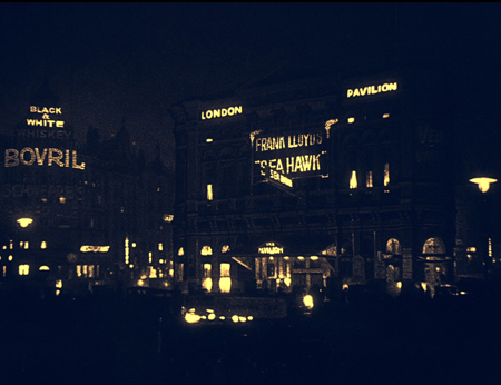
By the way, although the film seems basically to be set in the Edwardian era of the novel’s original publication, the introduction to the final London portion of the story shows Piccadilly Circus at night, including a movie palace show The Sea Hawk (1924), another First National release that included Wallace Beery and Lloyd Hughes (Malone) its cast.

A little synergy that brings the story up to date.
Puppets and people

The main attraction of the film, of course, is its technology. Some of it was quite innovative. It is thought to be the first time when the special effects of a feature film were largely accomplished through puppet animation.
There had been earlier puppet films, including Ladislas Starevich‘s realistic creation of artificial insects apparently acting out conventional melodramas. Accomplished though they were, these did not mix live-action with real actors in the same shots, as do the miniature landscapes with the moving dinosaurs.
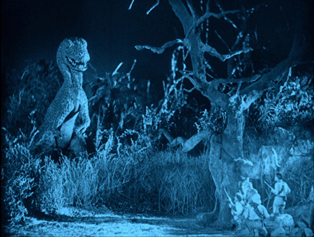
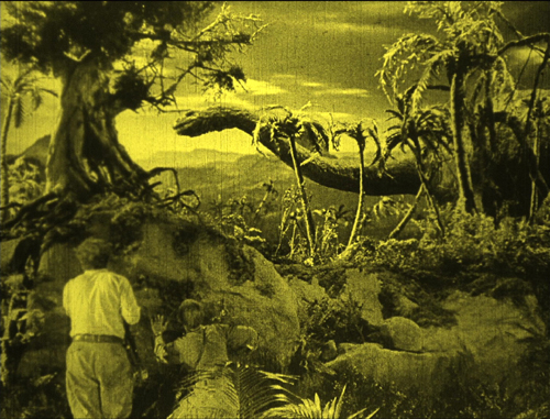
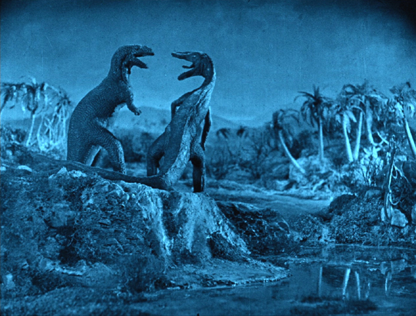
In The Lost World, combinations usually involve the actors placed in the lower foreground, observing the dinosaurs from varying distances. Atop this section, for example, in a very skillfully done shot, an allosaurus approaches the campsite of the expedition members. The place where the live-action at the lower right joins the miniature set at the upper left is difficult to discern, and the careful lighting of both areas aids in the illusion.
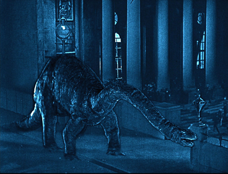
The late scenes of the film, where a brontosaurus escapes into London’s streets and causes panic resorted to a new and complex technology, moving mattes. This device involved using stencils cut for each frame and doubly exposing prints from two negatives. Moving mattes allowed figures filmed separately to be inserted into scenes without the use of superimpositions. The result usually was fairly obvious, betrayed by an evident join line around the added figure. Differences in texture and lighting also caused problems. Still, given the technical limitations of the day, the results are impressive. (The most famous use of moving mattes in this era was probably the reunited couple’s oblivious stroll through traffic in Sunrise.)

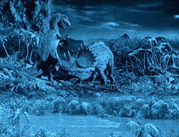
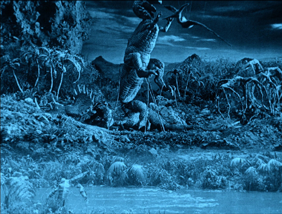
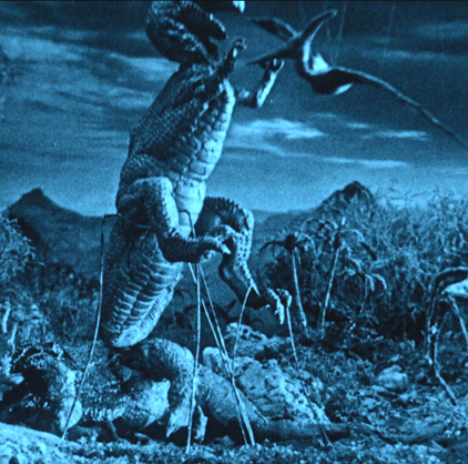
The Lost World drew more heavily on stationary mattes, and for the most part, the technology is pretty convincing. The scene of the allosaurus-triceratops-pterodactyl fight (at the top) contains a stationery matte. The lower part of the frame is a river with plants on the banks swaying in the breeze. About a third of the way up the composition, there is a join to the miniature set in which the action was animated. There the plants are completely stationery, but the movement of the real plants in the lower area gives a degree of verisimilitude to the whole scene. The shot of the team confronting the allosaurus at the top of this section also uses this technique.
Digital copies let us pause and figure out some of O’Brien’s secrets. After the allosaurus has dispatched the unfortunate triceratops seen in the image at the top of this entry, a dramatic moment occurs in a blink-and-you’ll-miss-it flurry of motion as it suddenly snatches a pterodactyl in mid-flight and kills it. Pausing on the action, we can see that O’Brien used wires to support the allosaurus during its leap, as well as nearly invisible wires along which to slide the pterodactyl. I didn’t notice any other scenes in which O’Brien had to resort to visible props.
 
And at least the dinosaurs, unlike King Kong, didn’t have fur that ruffles almost continually, betraying the movements of the animators’ fingers in between exposures of the frames. As a result, the animation in The Lost World almost looks more sophisticated than that of Kong.
Moreover, O’Brien’s puppets, constructions of rubber and foam over metal skeletons, included balloons inside that could have air pumped in and out to simulate breathing. It’s a measure of the man’s inspiration that he realized how much this technique would contribute to the lifelike quality of the dinosaurs.
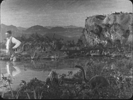
One of the supplements gives another insight. It is listed as “Deleted scenes,” or outtakes, but occasionally O’Brien or perhaps one of his assistants (the footage is too indistinct to tell which) pops into the image for a few frames, incongruously appearing submerged to his waist in a primordial landscape.

Such images give a sense of the considerable scale of the miniature landscapes and the puppets, as well as the labor involved in this novel endeavor.
The new print

This newest restoration, having been cobbled together from many disparate elements, inevitably is variable in its visual quality. Much of it is splendid, as indicated in most of the images reproduced in this entry, especially the one at the top. Others are clearly worn, with light lines, as in the shot above of Challenger and Summerlee watching a brontosaurus pass in the background. Again a matte shot has been used, its joint probably running along the top of the little sandy ridge behind which the men hide.
The rather poignant scene of the dinosaurs fleeing from a volcanic eruption is unfortunately worn as well. Such stretches, however, are in the minority.
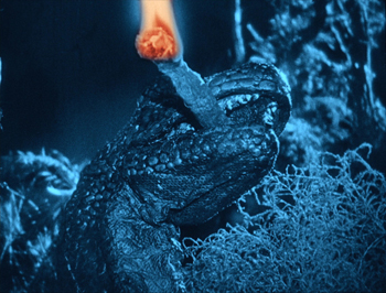
The new version also includes tinting and toning based on recently discovered footage, as well as a brief scene combining red and blue colors when Malone throws a torch into the mouth of an allosaurus to drive it away.

The disc comes with a booklet by Bromberg outlining the extensive restoration work on the versions of The Lost World, as well as the disc’s two musical-track options, one by Robert Israel and one by the Alloy Orchestra. Supplements include a commentary track by Nicolas Ciccone and some short films and clips by O’Brien. The Silent Era website offers a detailed rundown on the many video releases of The Lost World. Once more Lobster Films and Flicker Alley are to be congratulated on another contribution to the retrieval of cinema’s history.

Posted in Animation, Film comments, Film technique, Silent film, Special effects and CGI |  open printable version
| Comments Off on THE LOST WORLD refound, piece by piece open printable version
| Comments Off on THE LOST WORLD refound, piece by piece
Tuesday | September 26, 2017

DB here, boasting about Kristin:
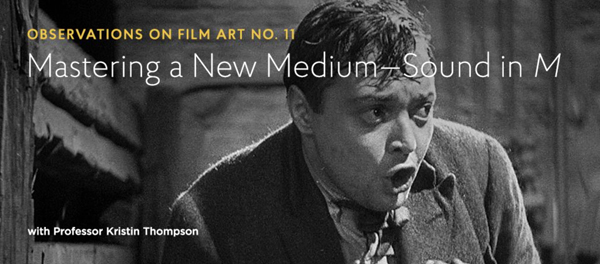
Our series on the Criterion Channel on FilmStruck continues with this month’s entry, Kristin on M as an exceptionally rich sound film. She talks about how Lang adapted silent-film techniques to the demands of sound while also using sound to achieve effects that couldn’t be achieved purely through images.
Watching her discussion and the clips, I was reminded of what a precise director Lang was–a unique mixture of stylistic flamboyance and swift economy. You see that mix in silent masterpieces like the Mabuse films, Metropolis, The Niebelungen, and Spione. In various entries (here and here and here) I’ve dwelt on his poised, meticulous compositions that use the entire frame area. Sound gave him a new set of resources for dynamic expression. Rather than becoming more conventional, Lang’s American films seem to subtly absorb the discoveries of M. Examples are the tapping of the “blind” man’s cane in Ministry of Fear and the ominously croaking frogs in You Only Live Once. And the propulsive sound cuts in his last film, The Thousand Eyes of Dr. Mabuse, show that he never forgot that sound could be edited as freely as images.
You can sample a clip from the episode at On the Channel at Criterion’s site. A complete list of the Observations on Film Art series (eleven already!) is here. Go here for blog entries offering background on those installments.
Thanks as ever to Peter Becker, Kim Hendrickson, Grant Delin, and all their teammates at Criterion.

Posted in Directors: Lang, Film history, Film technique: Sound, FilmStruck, National cinemas: Germany |  open printable version
| Comments Off on Mmm, M good open printable version
| Comments Off on Mmm, M good
Sunday | September 24, 2017
 
DB here:
All artists rely on predecessors in one way or another. True, at any moment the artist may confront a dizzying array of options; there are a lot of models out there. And sometimes artists work against received traditions rather than building on them. (Usually, though, those assaults on tradition borrow from other traditions, often minor ones.)
Anyhow, it’s a good first move to assume that any artwork we encounter owes something to forebears. If we want to understand continuity and change in film history, then, we can try to know something about genes, styles, received habits, work routines, and other ongoing pressures on moviemakers.
Schema and revision

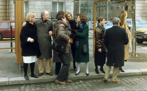
Favorites of the Moon (Iosseliani, 1984).
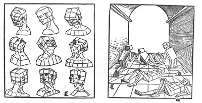
Among the strategies for making sense of a given film or filmmakers, one I’ve found useful I’ve swiped from E. H. Gombrich. In Art and Illusion, he wrote of schema and revision as one way of thinking about an artist’s ties to tradition. A schema is a pattern that has proven reliable for art-making in the past. His examples are the geometrical templates that became part of the training of Western European artists.

Gombrich suggests that artists adapt the schemas to the purposes at hand–new tasks, or the urge to capture aspects of reality that their predecessors missed.
Once a hack has learned how to make the image of a tolerably convincing head, he may be tempted to use this standard formula for the rest of his days, merely adding just such distinguishing features as will mark the admiral or the court beauty. But obviously once he is in possession of a standard head, he can also use it as a starting point for corrections, to measure all individual deviations against it. He may first draw it on his canvas or in his mind, not in order to complete it, but to match it against the sitter’s head and enter the differences onto his schema.
Hence the Gombrichian slogan: Making precedes matching. You render a version of visual reality in and through the forms bequeathed to you by tradition, adjusting them as you may need.
In film, I suggested in On the History of Film Style, we have several stylistic schemas. A prototype would be shot/ reverse-shot staging and cutting. You can replicate the schema, just running it again, as most filmmakers do. (All those damn shoulders.) You can revise it, as Ozu, Bresson, and other filmmakers did. You can adapt it to the long take, as Hitchcock and Iñarritu did. Or you can reject it, as Tati and Iosseliani did with their extreme long-shots. Iosseliani: “As soon as I see a film that begins with a series of shots and reverse shots, with lots of dialogue and well-known actors, I leave the room immediately. That’s not the work of a film artist.”
Stylistic schemas are perhaps the easiest to spot; when they cluster, we get something like a style in a general sense, such as continuity editing, or more recently what I’ve called “intensified continuity.” Even minor genres, like long-take lipdubs, have their own schemas. And revisions are ongoing. In mother! Darren Aronofsky fills the “free-camera,” run-and-gun handheld style, which usually favors medium shots, with extreme close-ups that put menacing, barely identifiable action in out-of-focus backgrounds. The result can be seen as a revision of the blink-and-you’ll-miss-it reframings on display in the Bourne films.
There are schemas for narrative too. At the broadest level, the sacred Three-Act Structure can be thought of as a macro-schema; so too the more fleshed-out Four-Part Structure Kristin has proposed. In my new book Reinventing Hollywood, I invoke the schema/revision idea to talk about more specific narrative strategies of the 1940s. Examples are the flashback plot, with a shuttling between present and past, and the network narrative, which brings friends, kinfolk, and strangers together in a limited time or space.
Watching Ernst Lubitsch’s Rosita (1923) again at the Venice Film Festival reminded me that the schema/revision process can take place not just between the filmmaker and tradition but within the work of a director. Once a director develops a “signature style,” that too can be reworked, refined, stretched, or even repudiated. Griffith recast his characteristic last-minute-rescue crosscutting pattern, once by making the rescue too late (Death’s Marathon), and once by multiplying it by four (Intolerance). Ozu not only revised Hollywood continuity principles, but then tweaked and played games with his customized version. Arguably, Hitchcock did the same with his refined point-of-view structures and man-on-the-run plot patterns.
In the Lubitsch case I’m considering, we have a very tiny piece of schema revision, but one that shows him to be a fastidious creator. Having sculpted a small moment one way, he extracted its principles and remade it, for other purposes in another film.
The grapes
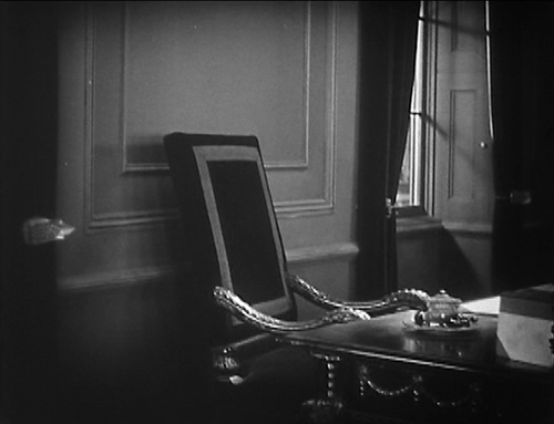
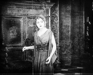
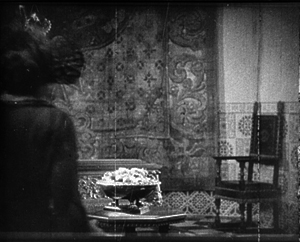
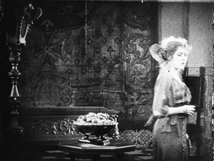
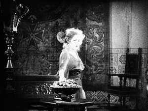
The street singer Rosita is in the palace waiting for the king. At first she’s awed by the scale of the room, but then she spies a bowl of candied fruit on a little table. As often happens in Lubitsch’s American silents., this plays out through eyeline cutting.
 
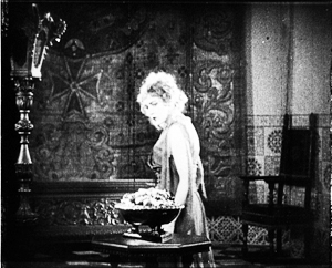
Rosita heads out of her shot and a frame-edge cut brings her to the table. She drifts past the fruit, eyeing it, and now the sequence’s rhythm is established.
  
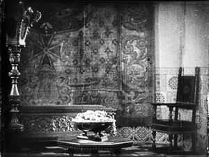
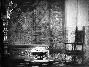
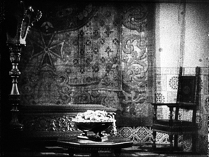
When Rosita leaves the frame, the camera holds on the table and the fruit bowl.

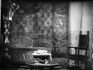
After a beat, she strolls into the frame moving right, pointedly ignoring the fruit. She goes out of frame and Lubitsch holds on the bowl.
 
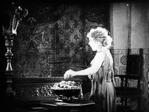
Then Rosita comes in from offscreen right and plucks a grape as she passes through the frame. Lubitsch holds the empty shot.
 
Rosita comes in again from the left, snags another grape, and walks out frame right.
 
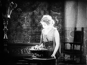
After another beat, she thrusts back into the frame and starts to dig into the fruit.

She’s hungry but afraid of being caught, so she swipes the food as casually as she can. Once she thinks she’s not being watched, she can take what she wants.
Instead of cutting the action up, Lubitsch holds the shot and makes a sort of contract with the viewer. The gag depends on simple spatial continuity; we know where Rosita is when she’s out of frame, so we can anticipate her coming back in and wonder what she’ll do on the next pass. By holding on the table, the camera “knows” she’s coming back and waits for her; the bowl draws her like a magnet. We enjoy the game of expectation Lubitsch has set up.
Simple as it is, this passage shows the patterned nature of a stylistic schema. You could plug different things into that pattern—a bed rather than a table, a gun on a counter, a detective casually looking for clues—but as long as you set up the pause holding on the “empty” frame as the actor passed through to and fro, we’d have a recognizable schema. It’s one that other filmmakers could use.
Or one that Lubitsch himself could cleverly revise. If the Rosita version builds a mild sort of suspense, what if we added a dose of surprise? That’s what happens in Lady Windermere’s Fan (1925).
The drawer
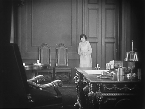
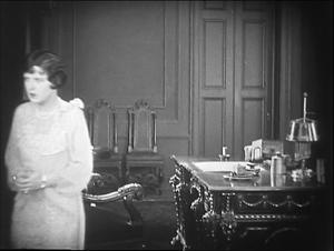
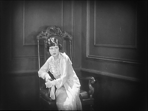
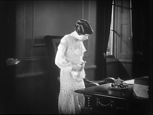
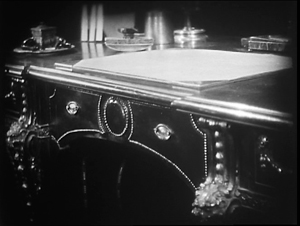
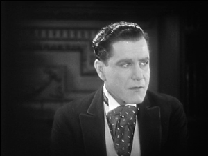
Lord Darlington, hoping to drive a wedge between Lady Windermere and her husband, suggests that she look for a check Lord W wrote to the mysterious Mrs. Erlynne. Lady W walks into the study and pauses at her husband’s desk, then goes to sit in a chair nearby.
 
Like Rosita studying the fruitbowl, she eyes the desk drawer holding the check.
 
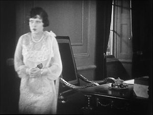
She rises and, thanks to another frame-edge cut, walks to the desk. But thinking the better of it, she leaves the frame, going out left.
  
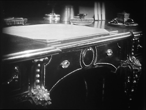
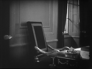
The camera stays on the desk. Pause.

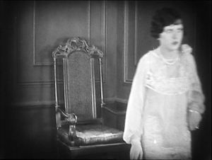
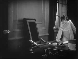
Suddenly Lady W bursts into the frame, but from the right side.

Lubitsch, who understood the rules of continuity better than almost anybody, knew perfectly well that she should have come back in from the left. The actor had to go around behind the camera in order to come in from this “impossible” angle. We’d be startled to some extent if Lady W had suddenly burst in from the left, but now the effect is amplified by the unpredictable entrance from the right. To spatial suspense, holding on the desk, Lubitsch has added spatial surprise.
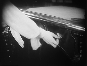
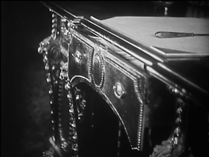
Interestingly, there’s another anomaly here: the early POV shot of the drawer. It represents what Lady W sees, but from the opposite angle, from the “other side” of the desk. A shot respecting her vantage point would have looked like this.

Since this is a silent film, even if Lubitsch had made a mistake during filming, the shot could have been flipped in postproduction to look correct. It’s just possible that this “wrong” POV shot is another schema revision–one that anticipates Lady W’s “wrong” reentry into the desk shot. This possibility is strengthened soon afterward when Lady W tries to open the drawer, in a framing that shows the “correct” angle.

And soon afterward, when Lord Windermere joins his wife, he will look at the drawer from the “correct” angle as well.
 
A spare take of his POV shot could have replaced Lady W’s mismatched one. (Though the fastidious Lubitsch gives us a slightly different angle from Lady W’s, one corresponding to the position of Lord W). It seems likely, then, that Lubitsch simply wanted Lady W’s odd POV shot. Perhaps he saw it as a cryptic hint that something important was about to happen on the other side of the desk, where Lady W will pop in.
With Lubitsch, we’re always getting into such pictorial niceties. In any case, having tried out the “waiting camera” schema in Rosita, garnished it with predictable frame entrances and exits, Lubitsch revised the schema to create a different effect. He knew that audiences would expect Lady W to reenter the way Rosita did, and he exploited our expectations to yield a bump of surprise–one that increases the expressive effect of her pouncing on her husband’s secret.
More generally, the concept of schema/revision seems to me a useful tool for studying a filmmaker’s ties to tradition, as well as his or her developing personal style. This is not to mention the role of rivalry, another important pressure for continuity and change in film craft. Once a schema is out there, people can compete for ways to revise it. But that’s a topic for another day.
My frames from Rosita are from the standard, rather bad surviving print. It has recently been restored by the Museum of Modern Art under the auspices of Dave Kehr, and the new version looks very fine. More information here.
The illustration of heads comes from Erhard Schön’s manual of 1538, reproduced in Gombrich’s Art and Illusion (Princeton University Press, 1960), p. 159; my quotation comes from p. 172.
The quotation from Iosseliani comes from “Iosseliani on Iosseliani,” in The 24th Hong Kong International Film Festival Catalogue (Hong Kong: Urban Council, 2000), p. 138.
Kristin provides close analysis of Lubitsch’s silent film style in Herr Lubitsch Goes to Hollywood: German and American Film after World War I, available online here. I discuss this sequence from Lady Windermere in more detail in Chapter 9 of Narration in the Fiction Film. But when I wrote that, I hadn’t seen Rosita. I consider how Ozu varied his bespoke version of continuity editing in Chapters 5 and 6 of Ozu and the Poetics of Cinema, available online here.

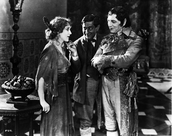
Fruitbowl, Mary Pickford, Ernst Lubitsch, and Holbrook Blinn on the set of Rosita.
Posted in Directors: Lubitsch, Festivals: Venice, Film technique: Editing, Film technique: Staging, Silent film |  open printable version
| Comments Off on Lubitsch redoes Lubitsch open printable version
| Comments Off on Lubitsch redoes Lubitsch
Wednesday | September 13, 2017

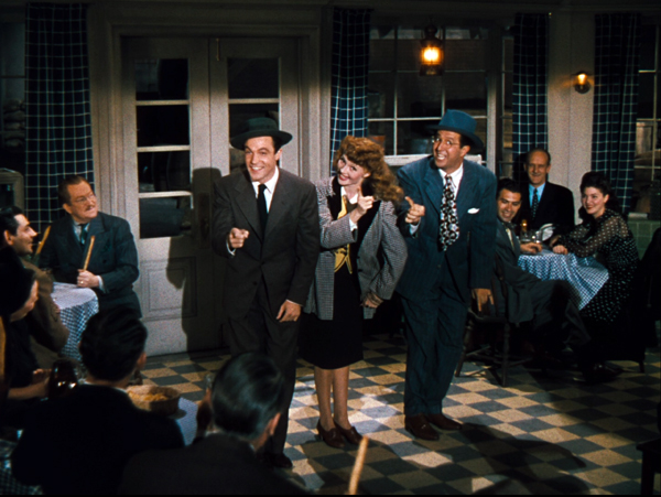
Cover Girl (1944).
DB here:
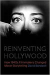
I just got my first copy of Reinventing Hollywood: How 1940s Filmmakers Changed Movie Storytelling. I’m always scared to look at a published piece because I expect my eye to light on (a) a misprint; or (b) a sentence of unusual clumsiness or simplemindedness. Other writers have told me they have similar qualms. But I did look, and on this fat volume: so far, so good. It even has black, slightly corrugated endpapers, like the paper inside a box of chocolates.
This was a personal project for me, for reasons I’ve sketched elsewhere on this site. I grew up watching 1940s films on TV and have always had a fondness for what James Naremore has called “the beating heart of Hollywood.” In my teen years, watching Welles and Hitchcock movies along with B films and minor musicals fed my interest in studio cinema.
When I started teaching in the 1970s, I was keen to catch up with all those nifty movies sitting comfortably in our Wisconsin Center for Film and Theater Research. My classes screened His Girl Friday (in a pirate copy) and Meet Me in St. Louis and Possessed and The Locket and White Heat and The Ministry of Fear and many more. Students working with me studied Gothics, war films, and I Remember Mama. It was then I started to realize just how creative this period was.
One piece of boilerplate for the book puts it more melodramatically.
In the 1940s American movies changed. Flashbacks began to be used in outrageous, unpredictable ways. Viewers were plunged into characters’ memories, dreams, and hallucinations. Some films didn’t have protagonists. Others centered on anti-heroes or psychopaths. Women might be on the verge of madness, and neurotic heroes were lurching into violent confrontations.
Films were exploring parallel universes and supernatural dimensions. Characters switched bodies or intuited the future. Combining many of these ingredients, there emerged a new genre—the psychological thriller, populated by murderous spouses and witnesses who became targets of violence.
If this sounds like our cinema of today, that’s because it is. In Reinventing Hollywood: How 1940s Filmmakers Changed Movie Storytelling, David Bordwell examines for the first time the range and depth of the 1940s trends. Those trends crystallized into traditions. The Christopher Nolans and Quentin Tarantinos of today owe an immense debt to the dynamic, occasionally delirious narrative experiments of the 1940s.
Bordwell shows that the booming movie market at the start of the Forties allowed ambitious writers and directors to push narrative boundaries. He traces how Orson Welles, Preston Sturges, Alfred Hitchcock, Otto Preminger, and dozens of lesser-known creators built models of intricate plotting and psychological complexity.
Those experiments are usually credited to the influence of Citizen Kane, but Bordwell shows that the experimental impulse had begun in the late 1930s, in radio, fiction, and theatre before migrating to cinema. And even with the late 1940s recession in the industry, the momentum for innovation could not be stopped. Some of the boldest films of the era came in the late forties and early fifties, when filmmakers sought to outdo their peers.
Through in-depth analysis of films both famous and virtually unknown, from Our Town and All About Eve to Swell Guy and The Guilt of Janet Ames, Bordwell analyzes the era’s unique ambitious and its legacy for future filmmakers.
Today I’d like to give you some background on the book and flag a new page on this site you might find of interest. (If you can’t wait, you have permission to go there now.)
Questions, questions

Kitty Foyle (1940).
Reinventing Hollywood turned my enthusiasm for the 1940s into a set of questions.
The enthusiasm was based on a hunch that Hollywood cinema between 1939 and 1952 saw a burst of innovative storytelling. The innovations weren’t utterly new, but they differed from what was seen in the 1930s by virtue of their range, number, and complexity. The more I looked, the more I realized that the Forties recaptured the narrative range and fluidity of silent cinema, extending and nuancing it with sound. In essence, a new set of norms emerged, forged by many filmmakers.
Several questions followed. How to describe those innovations? How to chart their range and variations? How to analyze their effects—on the sort of stories told, on how viewers understood them? How did the innovations alter genres, or create new ones? How might we explain the rise and expansion of these new norms? And finally, what sort of legacy did this process of changing conventions leave to the filmmakers that followed? In all, how did various trends coalesce into a tradition?
This plan, ridiculously ambitious, at least has the virtue of originality. Most books about the 1940s concentrate on major figures—stars, producers, directors, the Hollywood Ten. Other books explain how studios or censorship or labor disputes worked. Others focus on genres such as the musical or the melodrama or the combat film. A popular option is devoted to that not-quite-a-genre film noir. These are all worthy subjects. And there’s no shortage of books seeing 40s film as a reflection of wartime or postwar America, or the geopolitics of the Cold War.
Studying narrative norms cuts across many of these common perspectives. Individuals matter, particularly ambitious screenwriters, producers, and directors striving to tell stories in unusual ways. But institutions matter too, as studio culture and writers’ associations prized a degree of originality in plotting or point of view. And narrative devices cut across genres to a considerable degree. Although flashbacks have come to be associated with film noir, they actually appear in all genres, and take on different roles accordingly.
So, 621 films later, my project has become an effort to contribute to a history of film form—the various storytelling methods that filmmakers have developed in different times and places. (In other words, a poetics of cinema.) In effect, I’m asking that the kind of appreciation people show for genres, actors, and auteurs be stretched to narrative strategies as well.
Darryl F. Zanuck, with his shrewd narrative instinct, gave me my epigraph.
It is not enough just to tell an interesting story. Half the battle depends on how you tell the story. As a matter of fact, the most important half depends on how you tell the story.
The book in between

Daisy Kenyon (1947).
The project blended in with earlier work I’d done, particularly in The Classical Hollywood Cinema and The Way Hollywood Tells It. In a sense, Reinventing Hollywood is a bridge between those two books.
CHC, written with Kristin and Janet Staiger, traced continuity and change in the studio storytelling tradition from its inception to 1960. It analyzed how conventions of story, style, and work practices were established and maintained over the decades. The Way Hollywood Tells It suggested that after 1960, the broad conventions remained in place but were modified in particular ways.
In passing, I suggested that innovations of “contemporary Hollywood” owed a lot to experiments launched in the 1940s. The new book tries to pay off that IOU. Reinventing Hollywood asks how, within the broad conventions of classical Hollywood, particular innovations could emerge in the boom-and-bust 1940s. Many standard devices of our films today, from voice-over and fragmentary flashbacks to block construction and tricks with point of view, can be traced back to the Forties, when they were consolidated and refined.
The two earlier books also considered film technique—staging, shooting, editing, and the like. Reinventing Hollywood doesn’t tackle visual style, for two reasons. It would have doubled the book’s length, and I’ve said my say on 40s style in other work. Style shapes story, of course, and I’ve tried to take this factor into account. But I concentrate on the principles of story world, plot construction, and narration—the three dimensions of narrative I’ve outlined elsewhere.
None of these books is auteurist in basic orientation, but they aren’t anti-auteurist either. Surveying techniques in a systematic way helps call attention to adepts, middling talents, and innovators. In Reinventing, I think the interludes on Mankiewicz, Sturges, Welles, and Hitchcock show how skillful filmmakers mobilized emerging conventions in powerful ways. In effect, we reconstruct a menu of options to sense the values in picking and mixing them. For example, Citizen Kane‘s investigation plot, adorned with a dying message and a bevy of flashbacks, was a vigorous synthesis of devices that were circulating through film and other media in the late 1930s. The boldness of the effort made it influential on what followed. We get a better sense of directors’ (and writers’ and producers’) idiosyncratic strengths when we know the norms they’re working with, and sometimes against.
Reinventing Hollywood, running nearly 600 pages, makes The Rhapsodes look scrawny. But it isn’t the behemoth that CHC is. CHC could give this book noogies.
The big and the small

The Bishop’s Wife (1947).
It was hard to discuss broad trends and still probe particular cases in detail. So the chapters move from generalities to specifics in steps. Some films are merely mentioned, others described briefly, others considered at greater length, and some analyzed in depth. After a conceptual introduction and a historical panorama of Hollywood as a creative community (Chapter 1), there are chapters on flashbacks, plot construction, woven versus chaptered plots, manipulation of viewpoint, voice-over, character subjectivity, psychoanalytic plots, realism and fantasy, mystery plots, and self-conscious artifice. The conclusion looks at the impact of the period on later filmmakers.
I try to go beyond obvious observations to study the mechanics of familiar devices. So I come up with terms and concepts to pick out finer-grained tactics: the breadcrumb trail that sets up many flashbacks, block construction, hooks, switcheroos, and the like.
The chapters on particular techniques are broken by “interludes” devoted to particular movies or moviemakers. Some of these interludes involve well-known films and figures, but others look at obscure items. (Yes, The Chase is involved.) Even the treatment of Big Names tries to offer something original, as when I argue that Hitchcock and Welles pushed 40s innovations very far and sustained them throughout their later careers.
Here’s the table of contents, with small annotations
Introduction: The Way Hollywood Told It
Chapter 1: The Frenzy of Five Fat Years (Hollywood as an ecosystem)
Interlude: Spring 1940: Lessons from Our Town
Chapter 2: Time and Time Again (flashbacks)
Interlude: Kitty and Lydia, Julia and Nancy
Chapter 3: Plots: The Menu (conventions of plot structure)
Interlude: Schema and Revision, between Rounds
Chapter 4: Slices, Strands, and Chunks (alternative structural options)
Interlude: Mankiewicz: Modularity and Polyphony
Chapter 5: What They Didn’t Know Was (managing narrative information)
Interlude: Identity Thieves and Tangled Networks
Chapter 6: Voices out of the Dark (voice-over)
Interlude: Remaking Middlebrow Modernism
Chapter 7: Into the Depths (subjectivity)
Chapter 8: Call It Psychology (psychoanalytic films)
Interlude: Innovation by Misadventure
Chapter 9: From the Naked City to Bedford Falls (realism, fantasy, and in-between)
Chapter 10: I Love a Mystery (thrillers and mystery-based plotting)
Interlude: Sturges, or Showing the Puppet Strings
Chapter 11: Artifice in Excelsis (self-conscious display of conventions)
Interlude: Hitchcock and Welles: The Lessons of the Masters
Conclusion: The Way Hollywood Keeps Telling It (legacy of the 1940s)
To keep things specific, I’ve prepared eleven film clips keyed to particular analyses. Just playing the clips might give you a sense of the book’s range. They’re also fun in their own right.
No zeitgeists, please

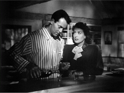
Blues in the Night (1941).
Two last points. One bears on preferred explanations. How do we explain why cinematic innovation burst out at this particular time? Again, the book tries to pursue an uncommon path.
Many writers look to a zeitgeist—the anxieties of war, the anxieties of postwar adjustment, the anxieties of the anti-Communist crusade, any anxiety you can imagine. Instead I try to look for institutional factors shaping the films’ norms. Centrally, there are the conditions of the film industry, with its rich interplay of personnel and story materials shuttling all over the place. There are also the cinematic traditions themselves, such as plots depending on amnesia. Particularly important are the adjacent arts, including theatre, radio, and popular fiction. All these sources get modified by a process of schema and revision—borrowing something already out there but warping it to new ends. In short, instead of looking for remote causes in the broader society, I try to locate more proximate ones within the filmmaking community and the turmoil of popular culture.
Someone might argue that this just pushes the problem back a step. Don’t social anxieties surface in all these media? To this I’d argue, as I did here and here, that those anxieties are very hard to identify. Not all anxieties or concerns will be shared by a populace (viz. our current political situation). And we can’t establish a strong causal connection between them and the products of popular media—especially since media are indeed mediated, by tastemakers, gatekeepers, and the institutions that produce popular culture.
For the period I’m concerned with, James Agee noted the role of mediators in his complaints aimed at the film-as-dream sociologists of the period:
It seems a grave mistake to take [movies] as evidence as definitive, as from-the-public, as if 40 million people had actually dreamed them. Take the far simpler case of advertising art. The American family, as shown therein, is not only not The Family; it isn’t even what the American people imagines as The family. It is A’s guess at that, subject to the guesswork of his boss, which is subject in turn to the guesswork of the client. At best, a queer, interesting, possible approximation, but certainly never definitive. In movies many more people take part in the guesswork, but not enough to represent a population: and many more accidents and irrelevant rules and laws deflect and distort the image.
A movie does not grow out of The People; it is imposed on the people— as careful as possible a guess as to what they want. Moreover, the relative popularity or failure of a picture, though it means something, does not at all necessarily mean it has made a dream come true. It means, usually, just that something has been successfully imposed.
Instead of social reflection, we should expect refraction. Decision-makers opportunistically grab memes and commonplaces (the unhappy housewife, the juvenile delinquent, the returning vet) in hopes they can make something appealing out of them. They absorb those into familiar (narrative) forms. We get, then, not a “vertical” or top-down flow of social anxieties into artworks, but a “horizontal” ecosystem, a dynamic of exchange and transformation. The creators copy one another, obeying local norms while also resetting boundaries. This process includes selective assimilation of ideas thrown up by the culture, and it gets amplified by network effects, as sticky ideas themselves get copied. In other words, ideology doesn’t turn on the camera. The final film is always mediated by humans working in institutions, and both the people and the institution have many agendas.
A second point follows. Working on this book brought home to me how much film owes to other media. In a way, Forties cinema became more “novelistic” because it sought to assimilate techniques of split viewpoints, replays, inner monologue, and subjective response characteristic not so much of modernism (those were old hat by the 1940s) but of popular fiction and what we might call “middlebrow modernism.” A Letter to Three Wives (1948) attaches itself in turn to three women, each with memories of the past, with that trio interrupted by a never-seen fourth woman mockingly narrating the tale. It’s a cinematic treatment of the shifting viewpoints and personified narrative voices to be found in the nineteenth-century novel (Dickens, Collins, James) and later in genre fiction, not least in mystery tales. (It’s also a modification of the source novel.)
But you could also argue, as André Bazin did, that the 1940s saw a new “theatricalization” of cinema, with self-conscious adaptations that stressed stage conventions like the single-setting action. And of course radio supplied important prototypes for acoustic texture and first-person voice-over. Each of these devices wasn’t simply ported over to film; moving images and recorded sound gave literary, theatrical, and radio-based techniques new expressive possibilities. And all depended on the churn of people working side by side to innovate within familiar norms.
Every author discovers or remembers too late those things that should have been mentioned. Doug Holm reminded me of the dream narrative of Sh! The Octopus (1937). Jim Naremore pointed out that Rex Stout had already done my work for me in Too Many Women (1947, year of my birth), when Archie reports, “It was a wonderful movie . . . Only two people in it have amnesia.” On a different pathway, I’d love to do more research on moguls’ screening rooms as a condition of influence. (They could borrow films from rival studios without charge.) Julien Duvivier is a minor hero of my book, but only after the book was submitted did I see his L’Affaire Maurizius (1954), a perfect extension of 1940s storytelling to a French milieu.
And just recently I found a nice confirmation of the unexpected byways of the ecosystem. According to the author, the figure of the “psycho-neurotic” returning soldier was at first mandated by government policy but then twisted by ambitious screenwriters into tales of civilian madmen. The article has the enviable title: “That Psycho Story Swing Is No Cycle; It’s Now an Obsession.” If you buy the book, please write that into the endnotes.
And for the third time, feel free to visit the clips page!
I owe a lot to several people who saw this book through publication. Foremost are my editor at the University of Chicago Press, Rodney Powell, and his colleagues Melinda Kennedy and Kelly Finefrock-Creed. Then too there is Bob Davis, who supplied the book’s jacket photograph; Kait Fyfe, who prepared the clips for posting; and web tsarina Meg Hamel who set up the clips page. My other debts are recorded in the acknowledgments, but of course I must mention Kristin who had the hardest job of all. She had to put up with the author.
My Agee quotation comes from “Notes on Movies and Reviewing to Jean Kintner for Museum of Modern Art Round Table (1949),” in James Agee, Complete Film Criticism: Reviews, Essays, and Manuscripts, ed. Charles Maland (Knoxville: University of Tennessee Press, 2017), 975. I’m indebted to Chuck for sharing this with me. Chuck’s discussion of Agee on our site is well worth a read.
Many entries on this site are dedicated to 1940s Hollywood. See the relevant category. “Murder Culture” has been revised as a chapter in the book. On 1940s visual style, see Chapter 27 of The Classical Hollywood Cinema, Chapter 6 of On the History of Film Style, and entries under 1940s Hollywood. There’s also the web essay on William Cameron Menzies. My most detailed arguments against social reflection and zeitgeists in historical explanations comes in the title essay in Poetics of Cinema, pp. 30-32.
Although the Amazon page offering Reinventing Hollywood says copies aren’t available until October, it seems that copies are shipping now from Chicago’s webpage. Amazon offers no discount on the title. (See P.S.) It’s currently available only in hardcover, with a paperback planned for the distant future.
P.S. 27 Sept 2017: Actually, Amazon is now discounting Reinventing Hollywood; it’s $30.77, as opposed to the $40 list price.
P.P.S. 13 October: Amazon’s prices on the thing have been fluctuating wildly. See this entry. Those wild and crazy algorithms!

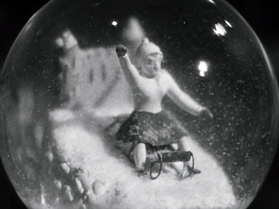
Our Town (1940).
Posted in 1940s Hollywood, Books, Critics: Agee, Hollywood: Artistic traditions, Hollywood: The business, Narrative strategies |  open printable version
| Comments Off on REINVENTING HOLLYWOOD: Out of the past open printable version
| Comments Off on REINVENTING HOLLYWOOD: Out of the past
|


